

Slate gray is one of those “always works” neutrals: cool, composed, and easy to scale from subtle backgrounds to bold typography.
Below are 20+ slate gray color palette ideas with HEX codes you can use for UI, branding, and interiors—plus quick pairing tips and AI prompts to generate visuals fast.
In this article
- Why Slate Gray Palettes Work So Well
-
- fogbound harbor
- blue steel and blush
- ashen sage studio
- storm window neutrals
- graphite and apricot
- rainy day editorial
- nordic concrete
- midnight teal accent
- dusty rose office
- mineral spa calm
- copper hardware
- winter wool
- candlelit bistro
- celestial night
- minimal museum
- pebble path
- olive drift
- ink and sand
- cloudy lavender
- harbor mist classroom
- smoky plum contrast
- What Colors Go Well with Slate Gray?
- How to Use a Slate Gray Color Palette in Real Designs
- Create Slate Gray Palette Visuals with AI
Why Slate Gray Palettes Work So Well
Slate gray sits in the sweet spot between blue-gray tones and muted neutrals, so it feels modern without reading as cold industrial by default. It can play “background” or “structure” depending on how dark you take it.
In digital products, slate gray supports strong hierarchy: deep tones for navigation and headings, lighter tints for surfaces, and one accent color for actions. That makes it especially effective for dashboards, fintech, and editorial layouts.
In physical design (interiors, packaging), slate gray adds calm weight. It pairs naturally with warm materials like wood, sand, brass, and terracotta—keeping the overall look grounded and premium.
20+ Slate Gray Color Palette Ideas (with HEX Codes)
1) Fogbound Harbor
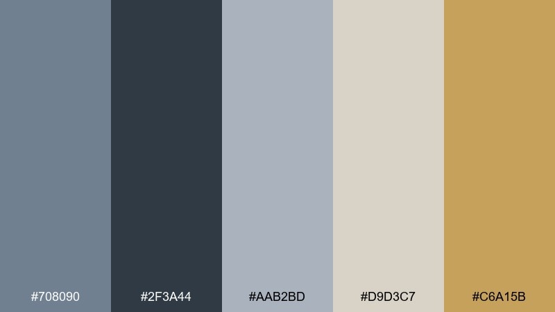
HEX: #708090 #2F3A44 #AAB2BD #D9D3C7 #C6A15B
Mood: calm, coastal, modern
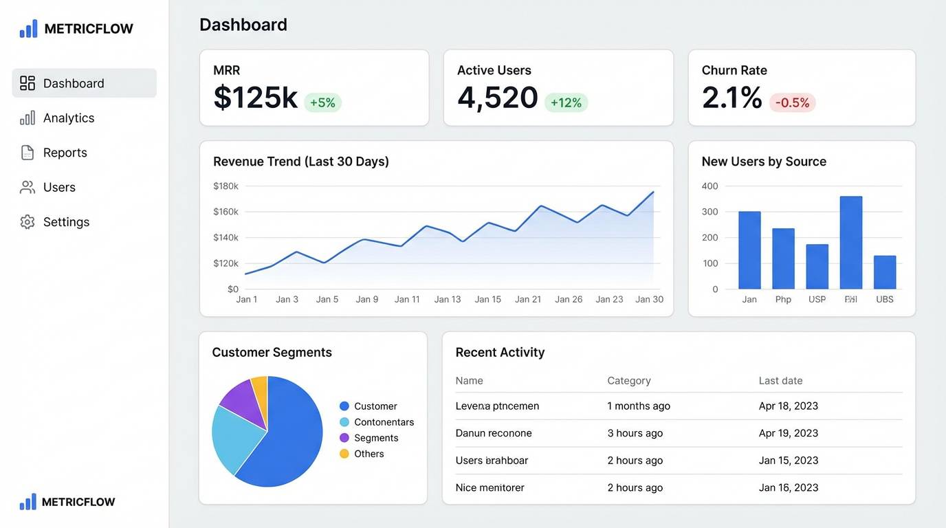
Best for: saas analytics dashboard ui
Cool harbor fog and brushed steel set a steady, focused tone. Use it for data-heavy interfaces where contrast and hierarchy matter, letting the darker charcoal anchor navigation and headers. Warm sand and muted gold keep it from feeling sterile, especially for charts, badges, and key metrics. Tip: reserve the gold for one primary action and keep the rest in grays for a cleaner scan.
Image example of fogbound harbor generated using media.io
Media.io is an online AI studio for creating and editing video, image, and audio in your browser.

2) Blue Steel and Blush
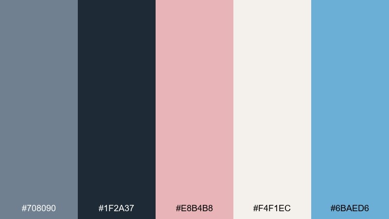
HEX: #708090 #1F2A37 #E8B4B8 #F4F1EC #6BAED6
Mood: polished, friendly, airy
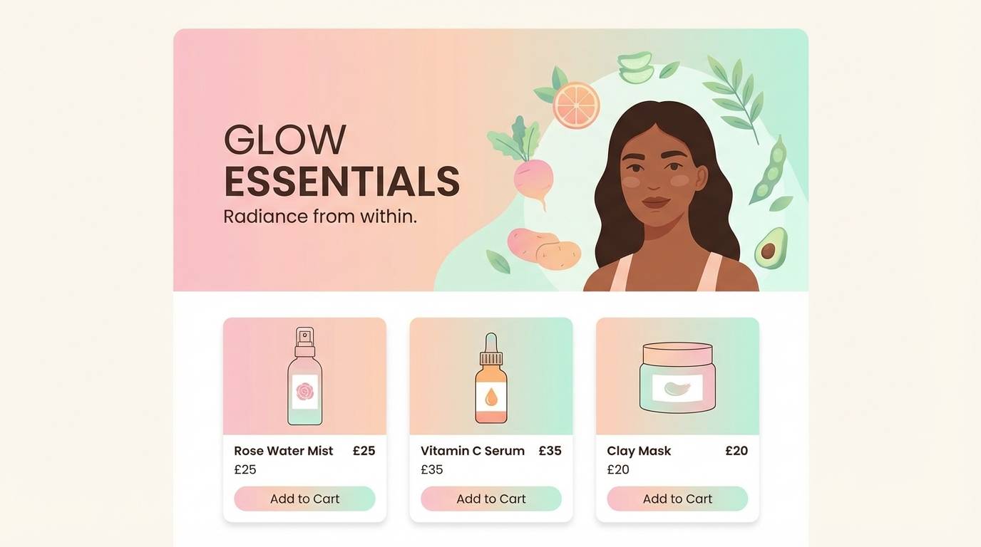
Best for: beauty brand landing page ui
Polished steel meets a soft blush for a look that feels confident yet approachable. These slate gray color combinations work well on landing pages where you want crisp structure with a gentle, human touch. Pair the blush with off-white for hero sections, then use the sky blue for links and secondary buttons. Tip: keep body text on the off-white and use the deepest navy for headings to maintain accessibility.
Image example of blue steel and blush generated using media.io
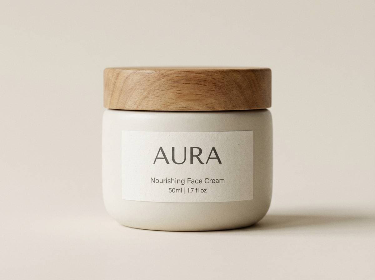
3) Ashen Sage Studio
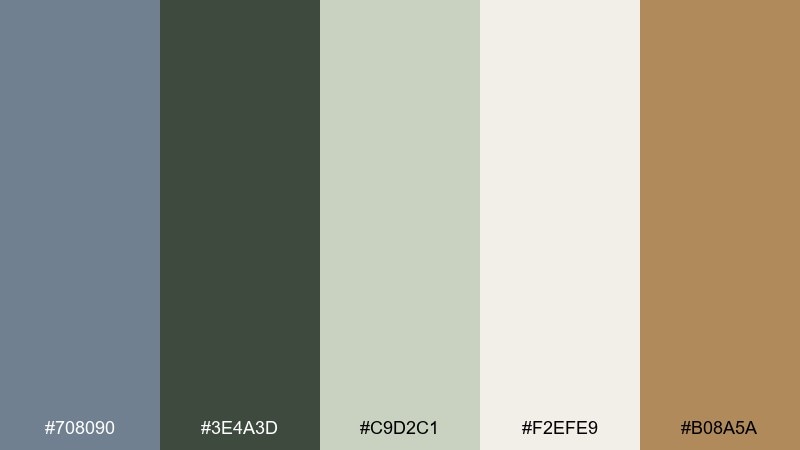
HEX: #708090 #3E4A3D #C9D2C1 #F2EFE9 #B08A5A
Mood: organic, quiet, editorial
Best for: ceramic product packaging
Quiet studio light and earthy clay notes create an organic, craft-forward mood. Use the sage and warm tan to soften the cool base, especially on packaging where tactility and calm matter. Off-white provides breathing room for typography, while the deeper green supports icons and ingredient callouts. Tip: print the slate tone as the main label field and keep accents to one earthy highlight for a premium feel.
Image example of ashen sage studio generated using media.io
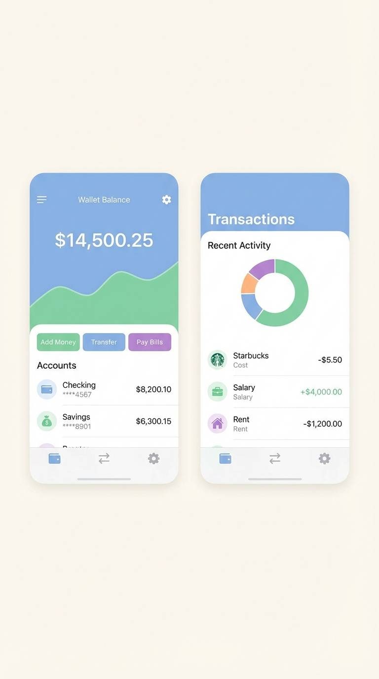
4) Storm Window Neutrals
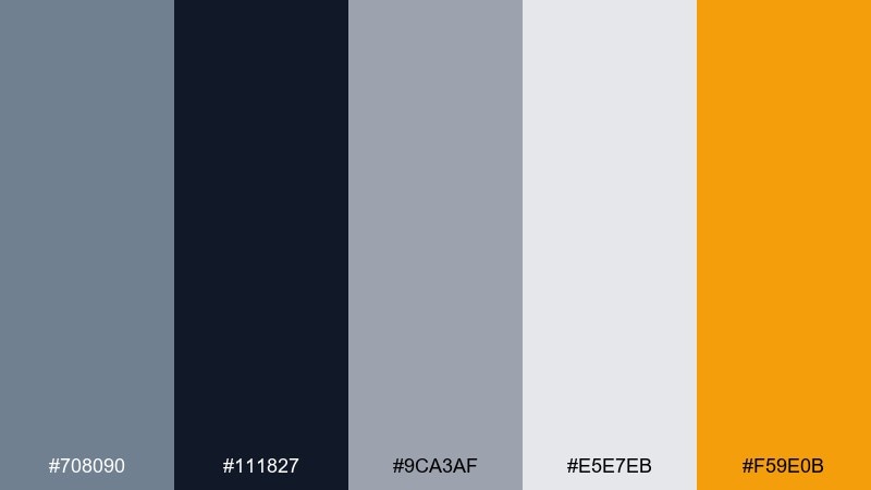
HEX: #708090 #111827 #9CA3AF #E5E7EB #F59E0B
Mood: sleek, high-contrast, urban
Best for: fintech mobile app ui screens
Stormy window reflections and city shadows give this mix a sharp, urban edge. A slate gray color palette like this is ideal for fintech flows that need clarity, trust, and strong contrast for numbers. Use the near-black for primary text and navigation, then let the amber highlight status, warnings, and key CTAs. Tip: keep the amber to under 10 percent of the interface so it stays meaningful and not noisy.
Image example of storm window neutrals generated using media.io
5) Graphite and Apricot
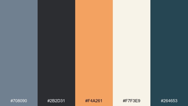
HEX: #708090 #2B2D31 #F4A261 #F7F3E9 #264653
Mood: warm contrast, modern, confident
Best for: startup pitch deck slides
Graphite depth with apricot warmth feels energetic without turning loud. It works beautifully for pitch decks where you need crisp headlines, clear charts, and a memorable accent. Keep the off-white as the main canvas, then use apricot for callouts and key numbers. Tip: match the teal to supporting visuals and icons so the deck stays cohesive across sections.
Image example of graphite and apricot generated using media.io
6) Rainy Day Editorial
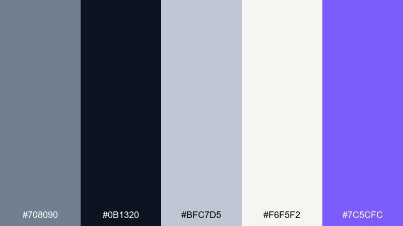
HEX: #708090 #0B1320 #BFC7D5 #F6F5F2 #7C5CFC
Mood: moody, refined, editorial
Best for: magazine feature layout
Rainy-day quiet and inky contrast create a refined, print-ready feel. The pale steel tint keeps long reads comfortable, while the near-black adds authority to headlines and pull quotes. Use the violet sparingly for section dividers, captions, or a single standout stat. Tip: set body text in the darkest tone and keep line lengths generous to preserve the editorial calm.
Image example of rainy day editorial generated using media.io
7) Nordic Concrete
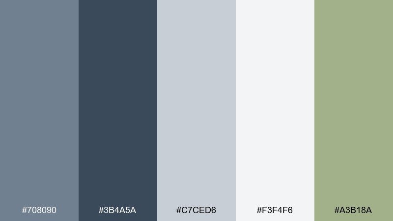
HEX: #708090 #3B4A5A #C7CED6 #F3F4F6 #A3B18A
Mood: minimal, airy, architectural
Best for: modern living room interior palette guide
Nordic light on concrete walls brings a minimal, breathable mood. Use the slate and steel tones for paint, built-ins, or upholstery, then soften the room with pale gray-white surfaces. The muted olive makes an understated accent for plants, ceramics, or a single chair. Tip: repeat the olive in two small spots rather than one large item for a more balanced look.
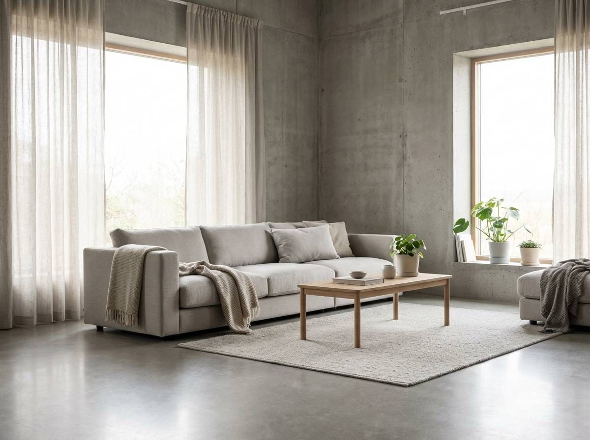
Image example of nordic concrete generated using media.io
8) Midnight Teal Accent
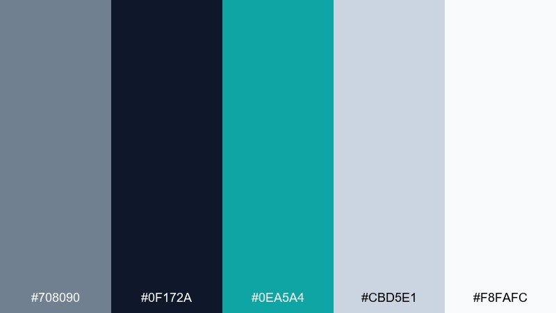
HEX: #708090 #0F172A #0EA5A4 #CBD5E1 #F8FAFC
Mood: high-tech, crisp, cool
Best for: smartwatch product ad
Midnight depth with a teal spark feels futuristic and clean. The pale grays keep the design clinical in a good way, perfect for tech ads that rely on clarity. Use teal for feature highlights, glow accents, and subtle motion cues, while the darkest tone frames the product silhouette. Tip: keep backgrounds near-white and push contrast into typography so the device remains the hero.
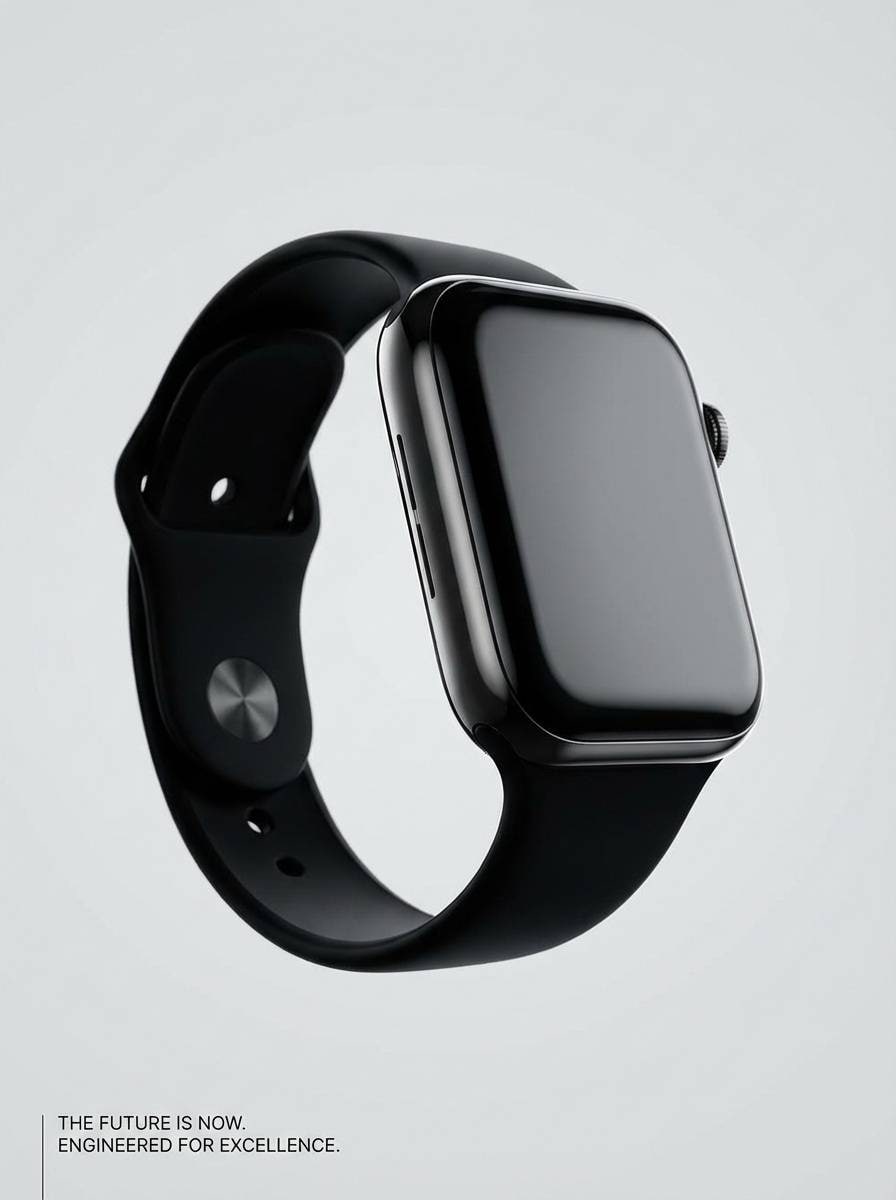
Image example of midnight teal accent generated using media.io
9) Dusty Rose Office
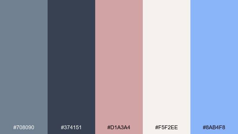
HEX: #708090 #374151 #D1A3A4 #F5F2EE #8AB4F8
Mood: professional, soft, welcoming
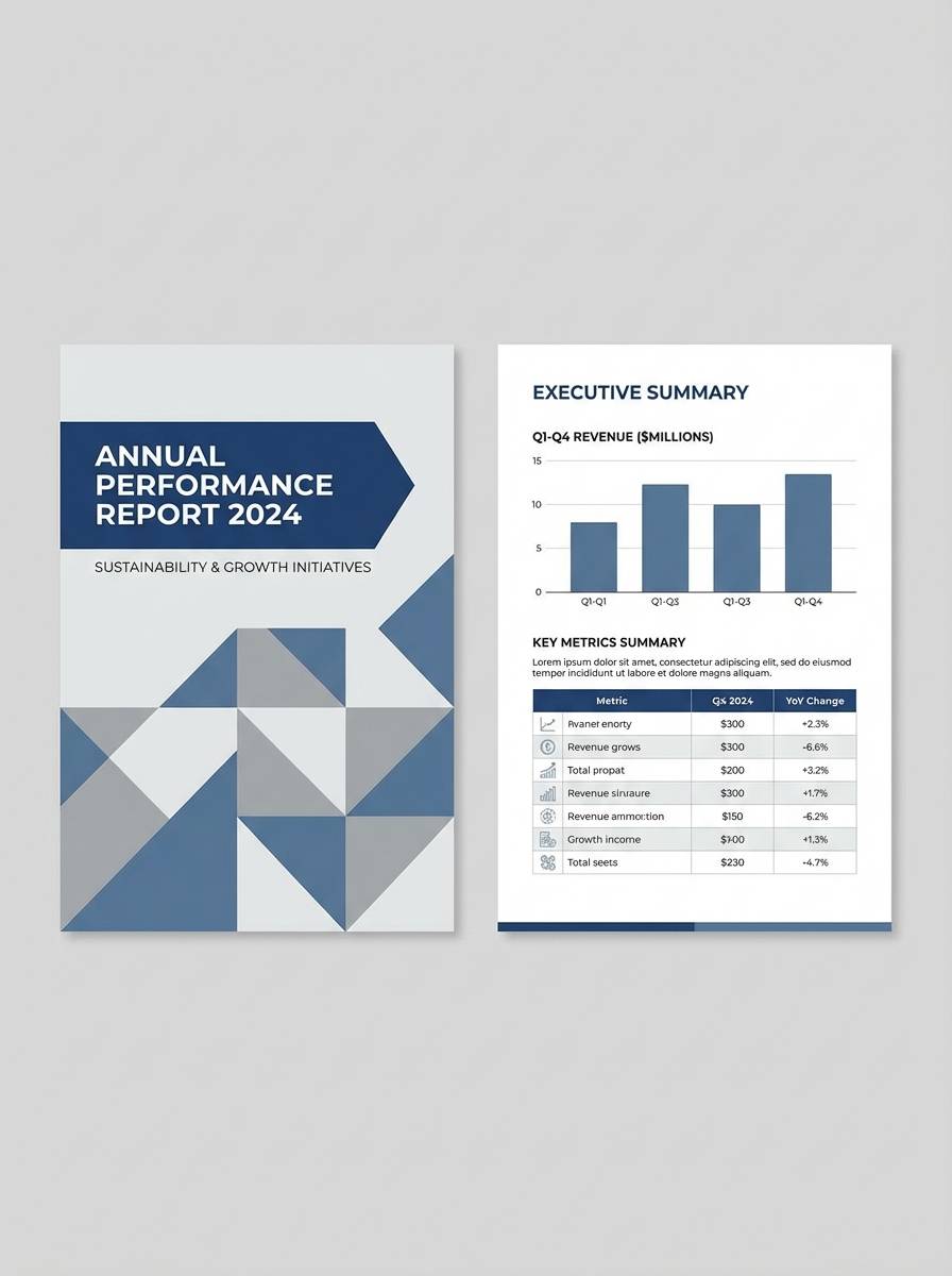
Best for: corporate report template
Soft office light and muted rose notes make a professional layout feel more welcoming. Use the deepest gray for headings and table lines, then lean on the warm off-white for long sections of text. The dusty rose works nicely for section headers, while the light blue helps links and references stand out. Tip: keep charts to two data colors plus neutrals so the report reads quickly.
Image example of dusty rose office generated using media.io
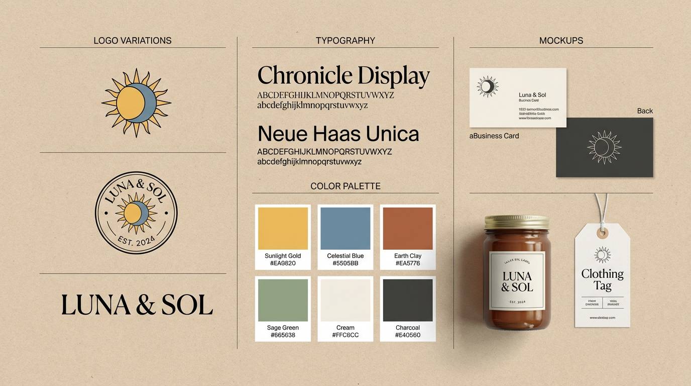
10) Mineral Spa Calm
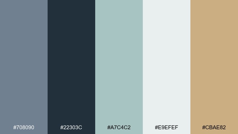
HEX: #708090 #22303C #A7C4C2 #E9EFEF #CBAE82
Mood: soothing, clean, restorative
Best for: wellness brand identity kit
Mineral water tones and soft steam create a restorative, clean mood. The seafoam and misty white bring freshness, while the warmer beige adds a human, natural counterpoint. Use the darker tones for logo marks and typography, then keep packaging and social posts bright and airy. Tip: choose one texture, like subtle paper grain, to keep the identity calm rather than glossy.
Image example of mineral spa calm generated using media.io
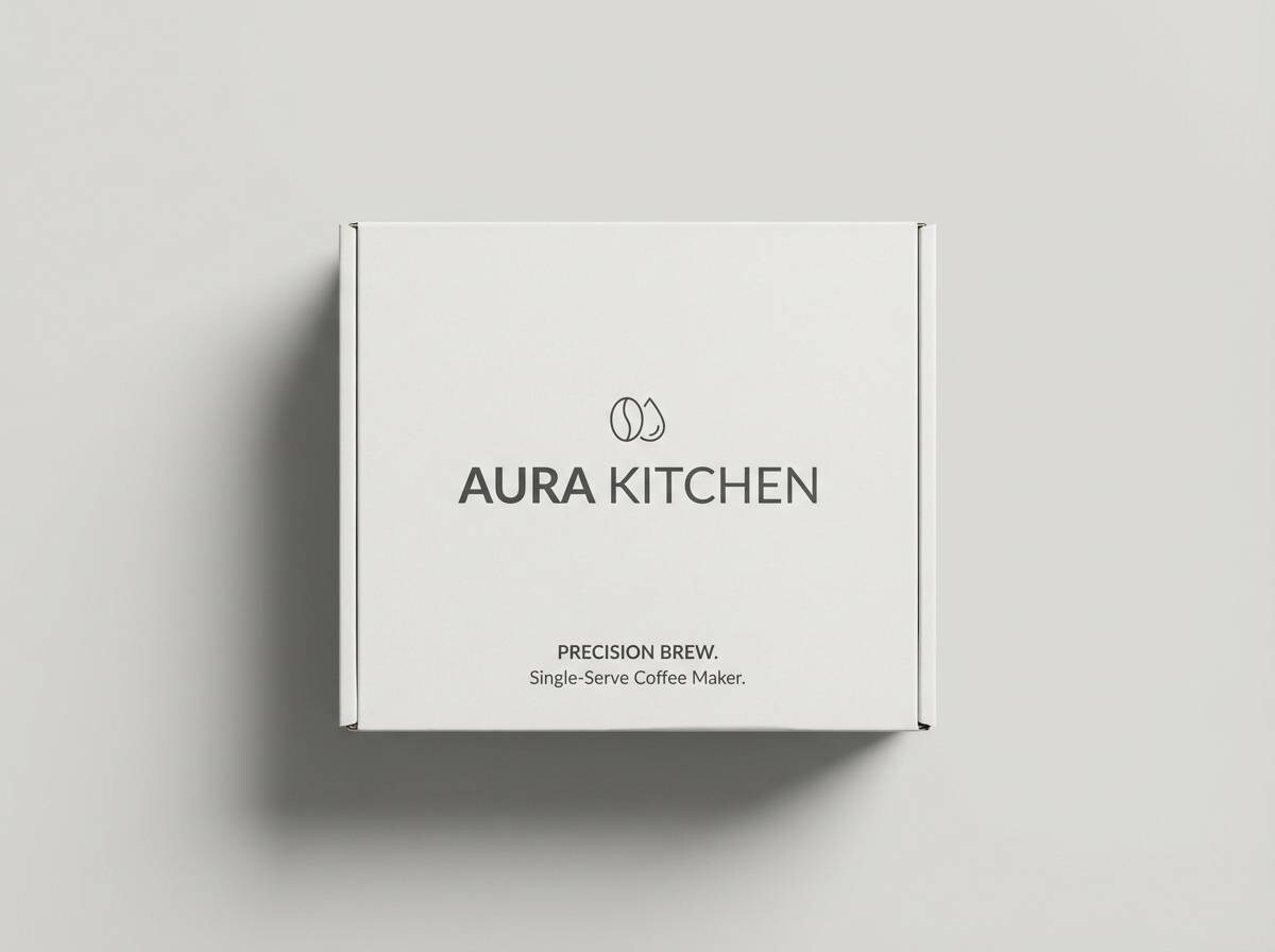
11) Copper Hardware
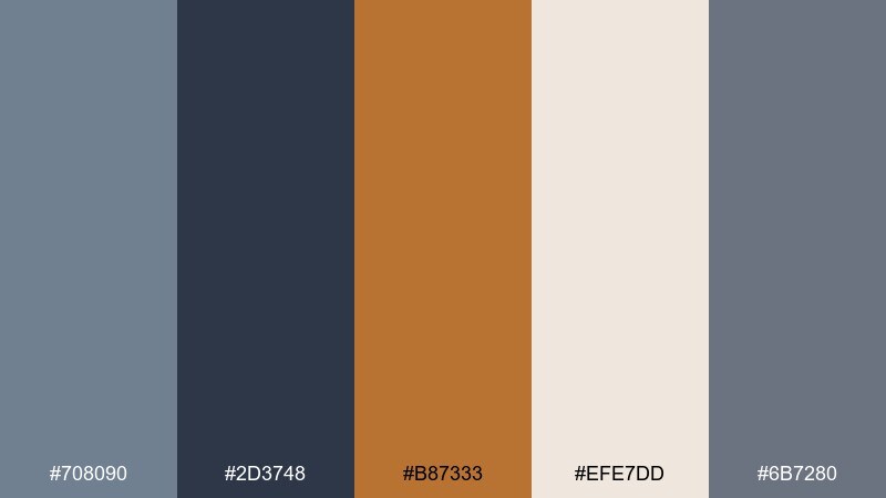
HEX: #708090 #2D3748 #B87333 #EFE7DD #6B7280
Mood: industrial, warm, premium
Best for: kitchen appliance packaging
Industrial steel with a copper wink feels premium and a bit workshop-cool. Use the warm metallic tone for badges and model names, while the off-white supports clean instructions and feature lists. Mid-gray keeps secondary panels and icons subtle without disappearing. Tip: print copper as a spot or foil accent to elevate the box without overusing shine.
Image example of copper hardware generated using media.io
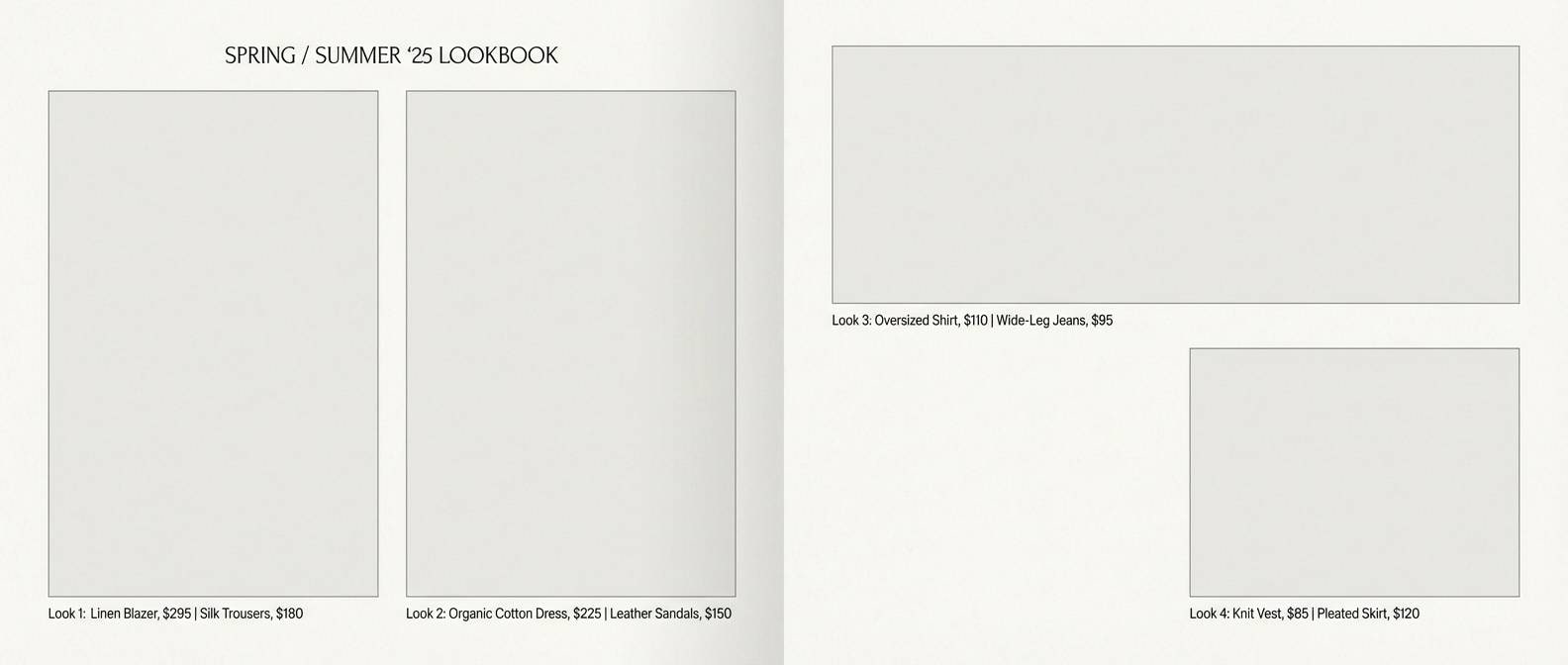
12) Winter Wool
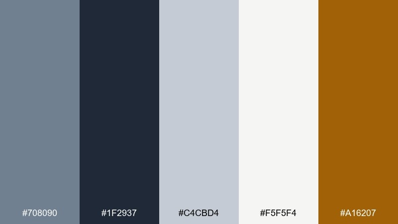
HEX: #708090 #1F2937 #C4CBD4 #F5F5F4 #A16207
Mood: cozy, tailored, timeless
Best for: fashion lookbook spread
Tailored wool and cold air come through as cozy, understated elegance. Use the soft grays for backgrounds and margins, then rely on the deep tone for strong headlines and pricing. The warm brown-gold makes a tasteful highlight for callouts, page numbers, or small graphic rules. Tip: keep photography cooler in temperature so the accent color feels intentional and not accidental.
Image example of winter wool generated using media.io
13) Candlelit Bistro
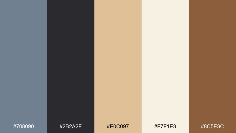
HEX: #708090 #2B2A2F #E0C097 #F7F1E3 #8C5E3C
Mood: intimate, warm, upscale
Best for: restaurant menu design
Candlelight warmth against dark stone feels intimate and upscale. Use the deepest tone for menu headings and section dividers, then keep body copy on the creamy paper tone for easy reading. The tan and cocoa shades work well for icons, dietary labels, and subtle borders. Tip: reserve the warmest brown for signature dishes so highlights look curated, not busy.
Image example of candlelit bistro generated using media.io
14) Celestial Night
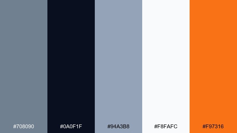
HEX: #708090 #0A0F1F #94A3B8 #F8FAFC #F97316
Mood: dramatic, modern, energetic
Best for: music festival poster
A celestial night vibe adds drama, with bright highlights that feel like neon against deep sky. Use the near-black for the poster field, then let slate and pale gray structure the type hierarchy. A vivid orange punch is perfect for dates, ticket info, or a single focal graphic. Tip: keep the orange to one typographic weight so it reads like a deliberate signal.
Image example of celestial night generated using media.io
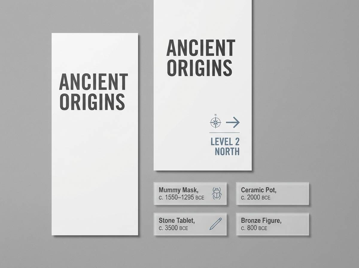
15) Minimal Museum
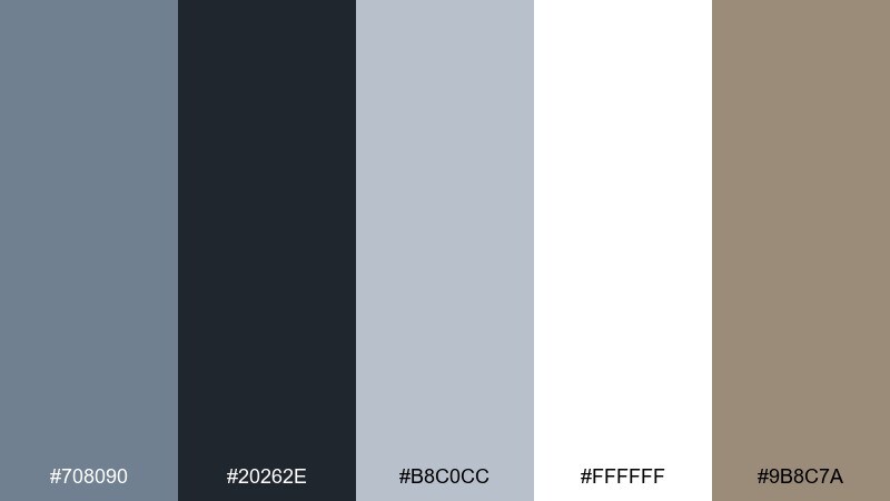
HEX: #708090 #20262E #B8C0CC #FFFFFF #9B8C7A
Mood: quiet, curated, gallery-clean
Best for: museum wayfinding signage
Quiet, curated tones feel like a gallery wall with deliberate spacing. Use white as the primary field for signage, then rely on the darker tones for arrows, room numbers, and legible headings. The warm stone accent helps highlight special exhibits without clashing with artwork. Tip: choose one weight of iconography and keep contrast high for readability at distance.
Image example of minimal museum generated using media.io
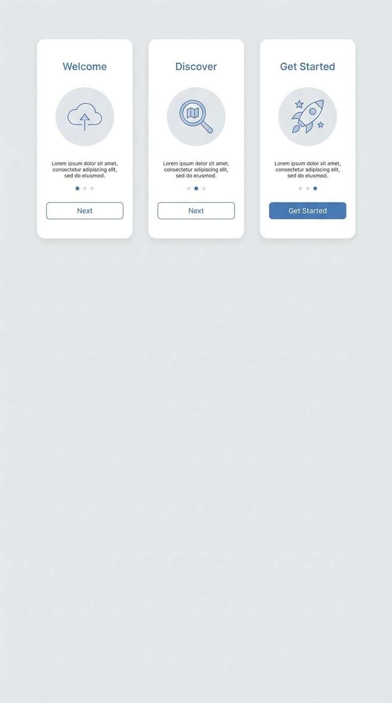
16) Pebble Path
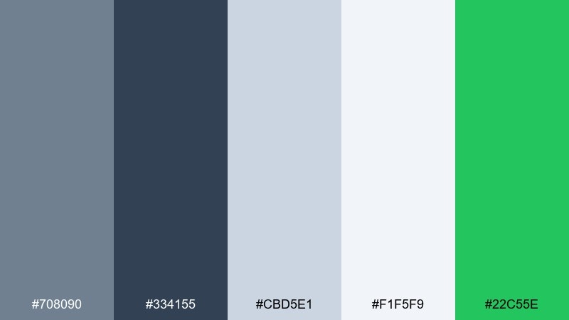
HEX: #708090 #334155 #CBD5E1 #F1F5F9 #22C55E
Mood: fresh, clean, lightly playful
Best for: app onboarding ui
Smooth pebbles and fresh air come through as clean, lightly playful energy. Use the pale tones for spacious onboarding screens, then bring in green as a positive cue for progress, success states, and confirmations. The darker gray keeps titles grounded and helps illustrations pop. Tip: make progress indicators green only on the active step so users instantly understand where they are.
Image example of pebble path generated using media.io
17) Olive Drift
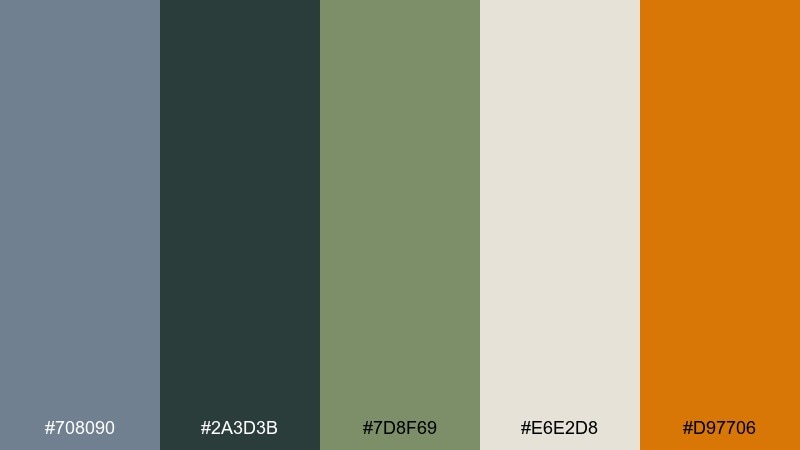
HEX: #708090 #2A3D3B #7D8F69 #E6E2D8 #D97706
Mood: adventurous, grounded, earthy
Best for: outdoor gear ecommerce banner
Grounded, trail-ready tones feel adventurous without going overly rugged. The olive and deep green-gray pair well with product photography, while the light sand keeps banners readable and open. Use the warm orange as a small attention grab for discounts or limited drops. Tip: keep the accent behind short text only, so it highlights the offer instead of fighting the product shot.
Image example of olive drift generated using media.io

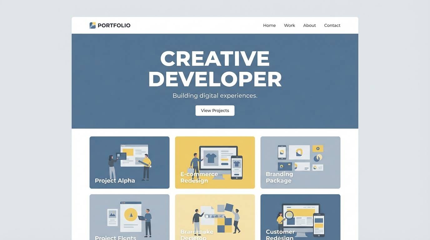
18) Ink and Sand
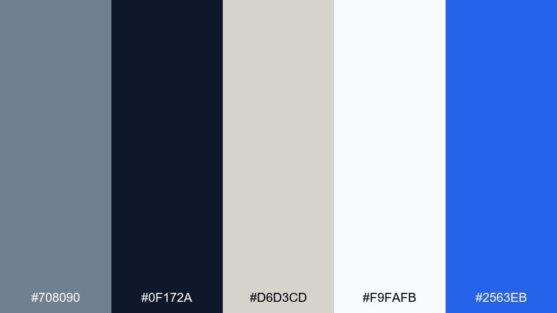
HEX: #708090 #0F172A #D6D3CD #F9FAFB #2563EB
Mood: crisp, modern, confident
Best for: portfolio website ui
Ink-dark contrast on soft sand feels crisp and modern, like a well-set page. This slate gray color palette is a strong fit for portfolio sites where projects need breathing room and typography leads the story. Pair the cool blues with neutral sections for links and hover states, keeping the deepest tone for navigation and headings. Tip: use the blue only for interactive elements so visitors instantly recognize what is clickable.
Image example of ink and sand generated using media.io
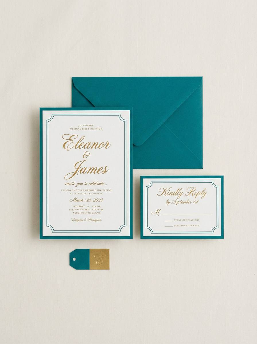
19) Cloudy Lavender
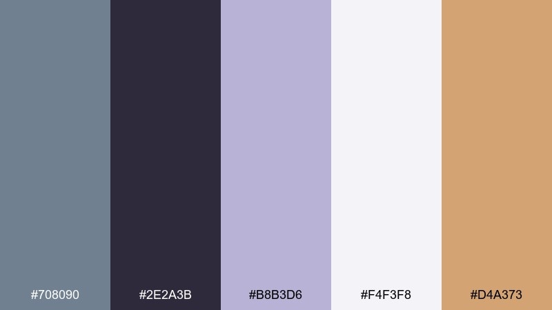
HEX: #708090 #2E2A3B #B8B3D6 #F4F3F8 #D4A373
Mood: romantic, soft, modern
Best for: wedding invitation set
Cloudy lavender and soft gray feel romantic while staying modern and clean. Use the pale lavender as the main paper field, then set typography in the deep plum-gray for an elegant read. The warm tan adds a subtle, celebratory touch for monograms, borders, or small motifs. Tip: keep decorative elements thin and minimal so the palette stays airy, not overly sweet.
Image example of cloudy lavender generated using media.io
20) Harbor Mist Classroom
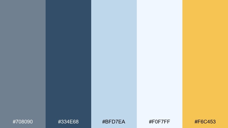
HEX: #708090 #334E68 #BFD7EA #F0F7FF #F6C453
Mood: bright, friendly, organized
Best for: educational infographic
Bright misty blues feel friendly and organized, like a calm classroom wall. Use the pale sky tones for sections and boxes, while the deeper blue-gray keeps headings and labels legible. The sunny yellow works well for key facts, icons, and highlights that guide the eye. Tip: apply yellow to one recurring element, such as callout bubbles, to create a consistent visual cue.
Image example of harbor mist classroom generated using media.io
21) Smoky Plum Contrast
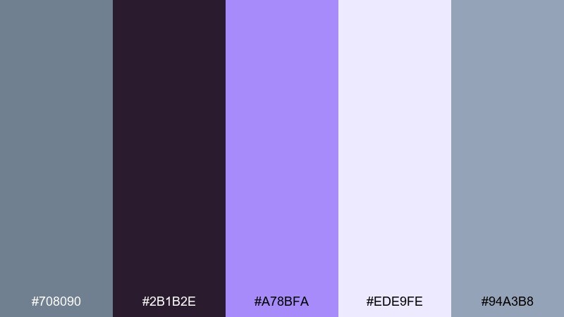
HEX: #708090 #2B1B2E #A78BFA #EDE9FE #94A3B8
Mood: creative, luxe, slightly moody
Best for: book cover design
Smoky plum and soft violet feel creative and slightly luxe, like twilight ink on textured paper. Use the deep plum for the background or title block, then bring in pale violet for author name and small details. The cool gray-blue keeps the design grounded so it does not drift into overly sweet purple. Tip: set the main title in a high-contrast serif and keep other type minimal for a modern finish.
Image example of smoky plum contrast generated using media.io
What Colors Go Well with Slate Gray?
Slate gray pairs effortlessly with warm neutrals like sand, cream, beige, and wheat when you want a softer, more inviting look. These hues “warm up” the blue-gray base without losing the modern feel.
For crisp digital contrast, combine slate gray with near-black/navy and a clean off-white, then add one high-visibility accent (amber, orange, teal, or electric blue) for CTAs and states.
If you’re after a more expressive palette, slate gray also plays well with muted pastels (dusty rose, lavender) and earth greens (sage, olive), which keep the scheme calm while adding personality.
How to Use a Slate Gray Color Palette in Real Designs
Start by assigning roles: use a dark slate/charcoal for primary text and navigation, a mid slate for secondary UI elements, and very light grays for surfaces and spacing. This keeps layouts readable and consistent across pages.
Then pick one accent family and commit to it. Warm accents (gold, apricot, copper) feel premium and friendly, while cool accents (teal, sky, violet) feel sharper and more technical.
Finally, test contrast early—especially for buttons, small labels, and data visualizations. Slate gray is subtle, so a deliberate hierarchy prevents everything from blending into the same “nice gray” tone.
Create Slate Gray Palette Visuals with AI
If you’re building a moodboard, UI concept, or packaging mockup, generating palette-based visuals can help you validate the vibe before you commit to production files.
With Media.io’s text-to-image tool, you can paste a prompt (like the examples above), specify the aspect ratio, and iterate quickly until the lighting, materials, and style match your brand.
Once you like a direction, keep the slate gray base consistent and swap only the accent color to explore multiple variants without redesigning from scratch.
Slate Gray Color Palette FAQs
-
What is the HEX code for slate gray?
A commonly used slate gray HEX is #708090. Many designers also use darker or lighter blue-gray tints around it to build a full slate gray color scheme. -
Is slate gray warm or cool?
Slate gray is typically cool because it leans blue. You can make it feel warmer by pairing it with beige, sand, wheat, copper, or soft off-white backgrounds. -
What accent colors look best with slate gray?
For high-contrast accents, try amber/orange, teal, or vivid blue. For softer accents, dusty rose, lavender, sage, and warm tan work well with blue gray tones. -
How do I use slate gray in a UI without it feeling dull?
Use multiple values (dark for text/nav, light for surfaces) and keep one accent color reserved for interactive elements (buttons, links, active states). This creates clear hierarchy and avoids “all-gray” flatness. -
Does slate gray work for branding?
Yes—slate gray reads modern, stable, and professional. It’s especially strong for SaaS, finance, and premium product branding when paired with a warm metallic or a clean, saturated accent. -
What’s a good neutral background with slate gray?
Off-whites and soft grays (cream, mist, light stone) are ideal. They keep contrast comfortable, let slate typography stay crisp, and give you room to introduce a single accent color. -
How many colors should a slate gray palette include?
For most projects, 5 colors is a sweet spot: 2–3 slates (dark/mid/light), 1 background neutral, and 1 accent. This is enough for consistent UI tokens or a cohesive print system.
Next: Wheat Color Palette


