Ivory is one of those rare “quiet” colors that can look modern, romantic, rustic, or premium depending on what you pair it with. It brings warmth without the heaviness of beige and feels softer than pure white.
Below are ivory color palette ideas with HEX codes you can use for branding, interiors, UI, packaging, and wedding stationery—plus AI prompts to generate matching visuals in minutes.
In this article
- Why Ivory Palettes Work So Well
-
- linen sunrise
- warm gallery wall
- pearl sage calm
- vintage bookshop
- buttercream bistro
- coastal shellwash
- mocha linen
- terracotta studio
- soft tech neutral
- midnight ink pop
- blush ceremony
- olive brunch table
- powder blue porcelain
- charcoal minimal grid
- copper craft label
- lavender fog ui
- sunlit marble ad
- forest cream cabin
- rosewood paper goods
- citrus cream pop
- What Colors Go Well with Ivory?
- How to Use a Ivory Color Palette in Real Designs
- Create Ivory Palette Visuals with AI
Why Ivory Palettes Work So Well
Ivory sits in the sweet spot between crisp white and warm cream, so it keeps designs bright while still feeling human and inviting. It’s especially useful when pure white looks too stark or “digital.”
Because ivory is a gentle neutral, it adapts to both warm and cool partners—terracotta and mocha feel cozy, while slate, blue, and sage feel clean and calm. That flexibility makes ivory color combinations reliable across branding systems and seasonal updates.
It also supports readability: ivory backgrounds reduce glare and can feel softer on the eyes than #FFFFFF, particularly for long-form editorial layouts, menus, and UI surfaces.
20+ Ivory Color Palette Ideas (with HEX Codes)
1) Linen Sunrise
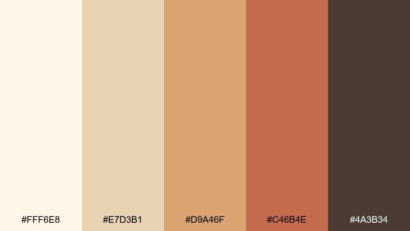
HEX: #FFF6E8 #E7D3B1 #D9A46F #C46B4E #4A3B34
Mood: warm, welcoming, romantic
Best for: wedding invitations and day-of stationery
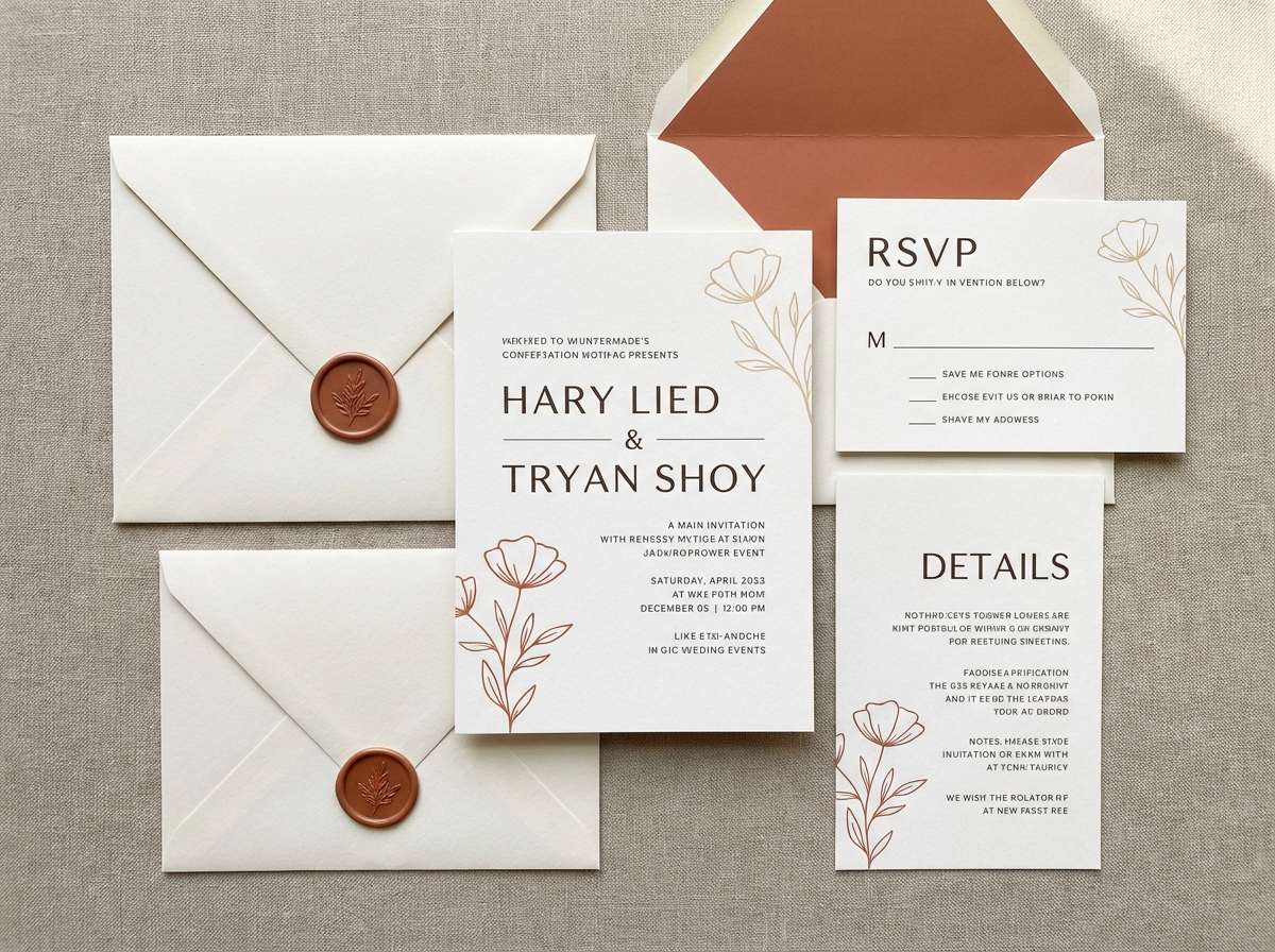
Warm and softly radiant, it feels like early sunlight on linen and handmade paper. The creamy base keeps layouts airy, while caramel and terracotta add a heartfelt, artisanal note. Use it for invitation suites, place cards, and menus, pairing the darker brown for typography to keep contrast readable. Tip: reserve the terracotta shade for one hero element like names or a monogram so the set stays refined in this ivory color palette.
Image example of linen sunrise generated using media.io
Media.io is an online AI studio for creating and editing video, image, and audio in your browser.

2) Warm Gallery Wall
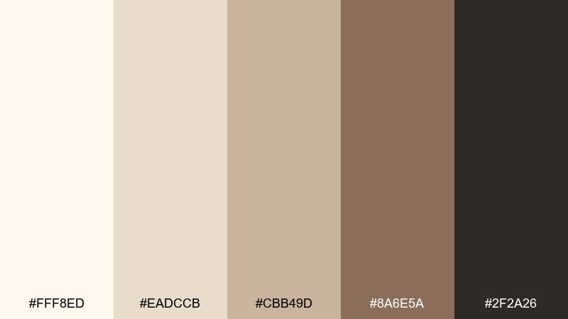
HEX: #FFF8ED #EADCCB #CBB49D #8A6E5A #2F2A26
Mood: cozy, curated, timeless
Best for: living rooms and gallery wall styling
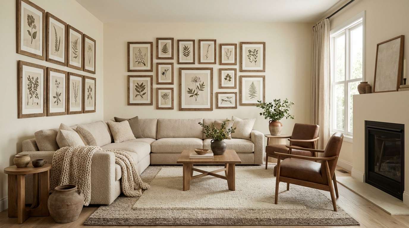
Cozy and collected, it recalls sunlit plaster, oak frames, and quiet afternoons. Layer the light neutrals across large surfaces like walls and rugs, then bring depth with walnut-brown accents. It works beautifully with natural materials such as leather, brass, and woven textiles. Tip: repeat the darkest tone in two or three small details (frames, lamp base, or hardware) to make the room feel intentionally curated.
Image example of warm gallery wall generated using media.io
3) Pearl Sage Calm
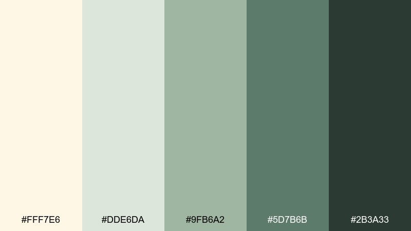
HEX: #FFF7E6 #DDE6DA #9FB6A2 #5D7B6B #2B3A33
Mood: fresh, calm, restorative
Best for: spa branding and wellness packaging
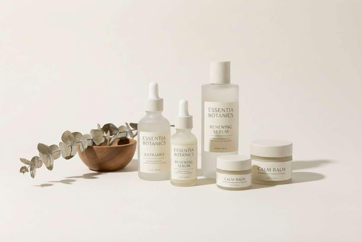
Fresh and restorative, it evokes steamed towels, leafy herbs, and quiet spa light. The pale neutral keeps the look clean, while sage greens signal nature and trust. Use the deeper green for logos and headings, and keep backgrounds softly tinted for a premium feel. Tip: add subtle texture (paper grain or matte label) so the greens feel botanical rather than flat.
Image example of pearl sage calm generated using media.io
4) Vintage Bookshop
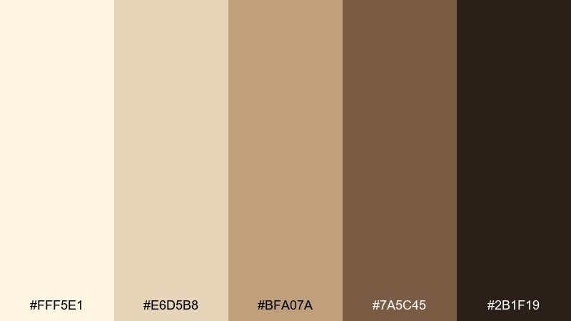
HEX: #FFF5E1 #E6D5B8 #BFA07A #7A5C45 #2B1F19
Mood: nostalgic, literary, grounded
Best for: editorial layouts and book cover concepts
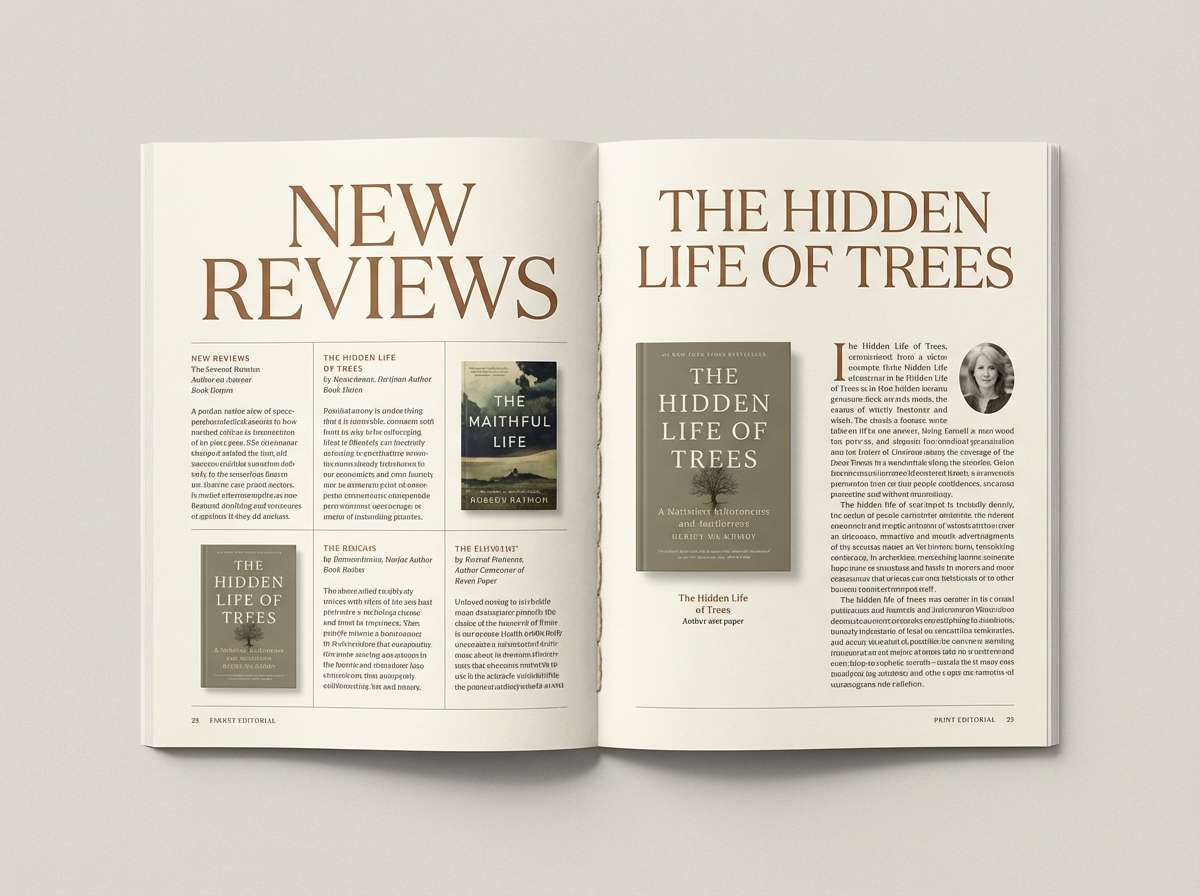
Nostalgic and grounded, it feels like parchment pages, worn leather, and dusty shelves. The lighter tones create a classic backdrop for long-form reading, while the rich browns add authority. Use the darkest shade for body text and pull quotes to keep legibility high. Tip: pair with a serif headline font and generous margins to lean into the literary mood.
Image example of vintage bookshop generated using media.io
5) Buttercream Bistro
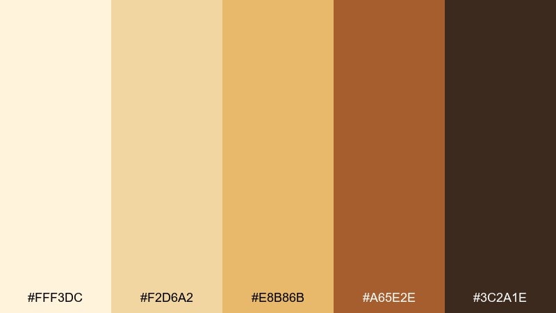
HEX: #FFF3DC #F2D6A2 #E8B86B #A65E2E #3C2A1E
Mood: cheerful, appetizing, vintage
Best for: cafe menus and countertop signage
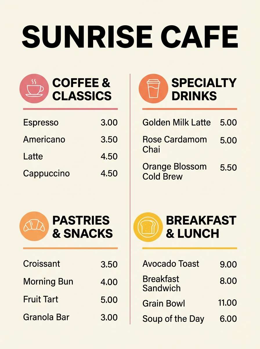
Cheerful and appetizing, it brings to mind brioche, honey drizzle, and warm café lights. Use the pale cream as the menu canvas, then let the golden tones highlight specials and pricing. The espresso brown anchors text and keeps everything easy to scan from a distance. Tip: limit the brightest yellow to small badges so the design stays classy, not loud.
Image example of buttercream bistro generated using media.io
6) Coastal Shellwash
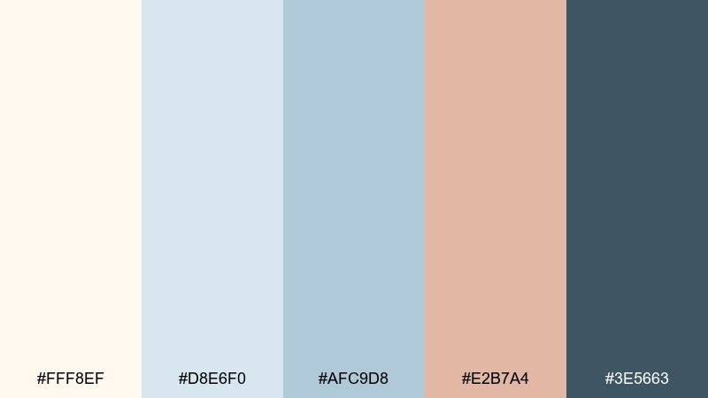
HEX: #FFF8EF #D8E6F0 #AFC9D8 #E2B7A4 #3E5663
Mood: airy, seaside, relaxed
Best for: summer lifestyle branding and lookbooks
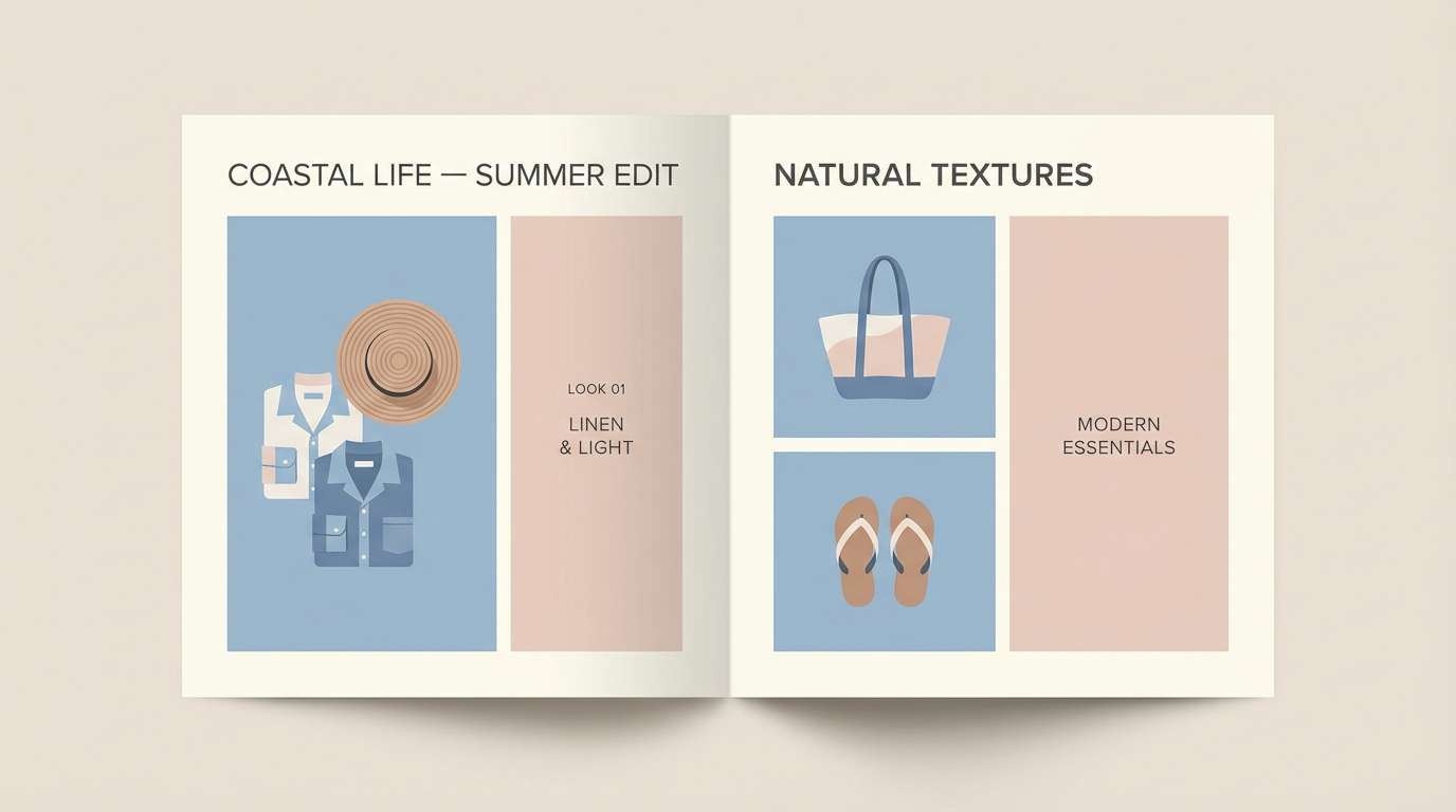
Airy and seaside, it suggests seafoam mist, pale shells, and sun-faded driftwood. Let the cool blues carry backgrounds and containers, with the blush sand tone as a friendly accent. The deep blue-gray works well for headlines and icons without feeling harsh. Tip: keep photography slightly desaturated so the palette tones stay cohesive across a full campaign.
Image example of coastal shellwash generated using media.io
7) Mocha Linen
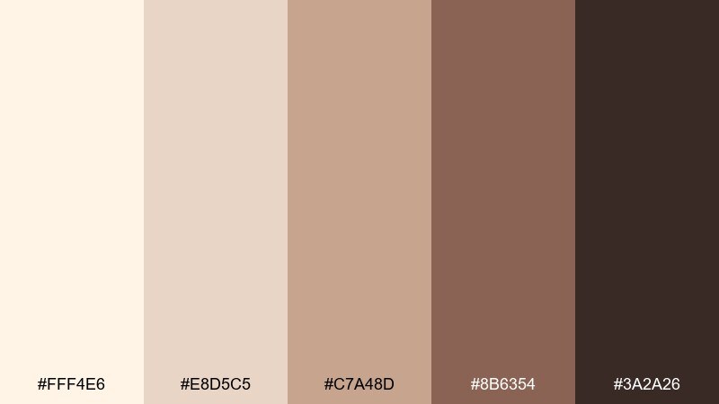
HEX: #FFF4E6 #E8D5C5 #C7A48D #8B6354 #3A2A26
Mood: soft, minimal, sophisticated
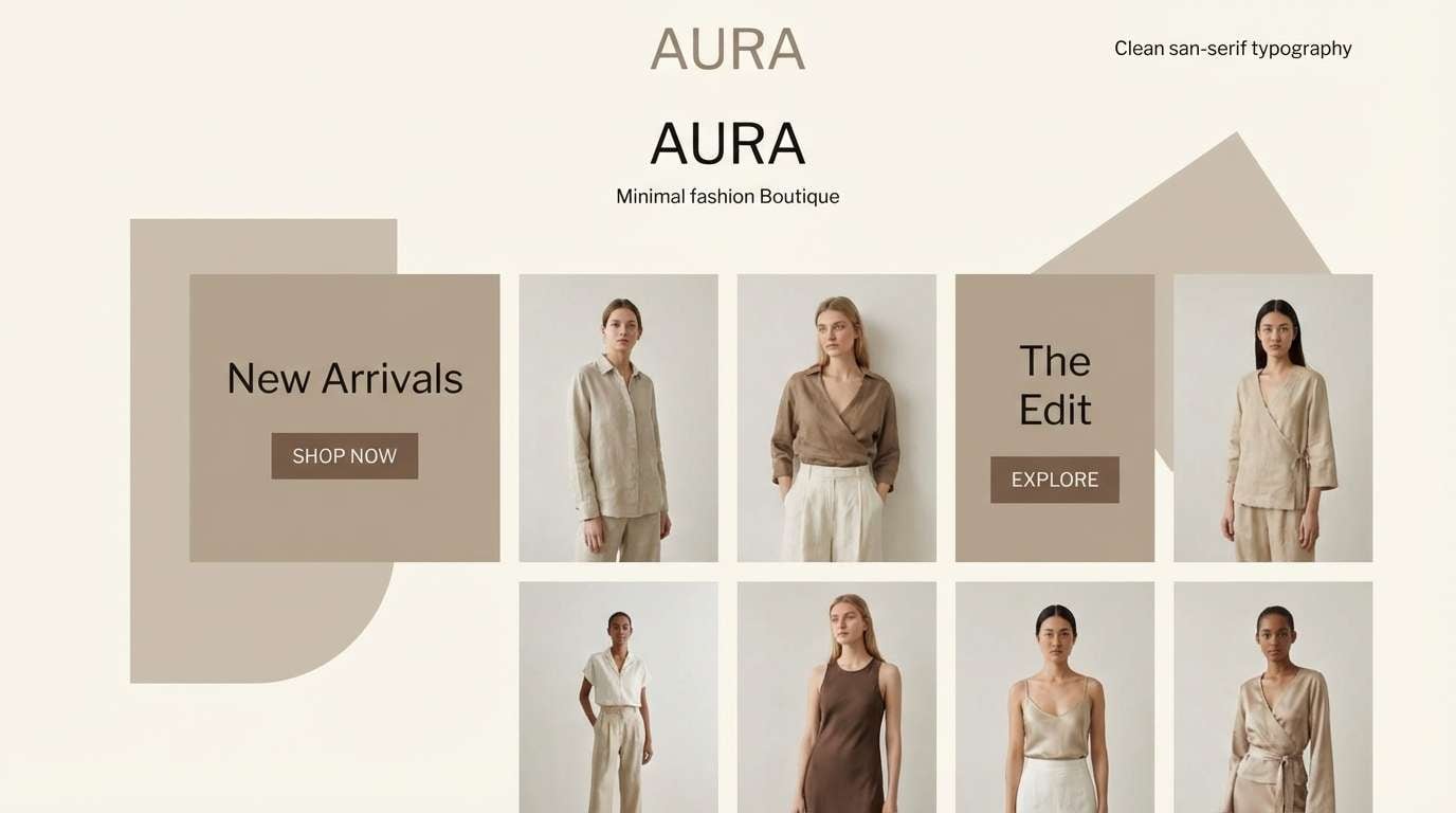
Best for: fashion branding and boutique websites
Soft and sophisticated, it feels like linen suiting, café mocha, and matte leather. Use the light neutrals for whitespace-heavy layouts, then build hierarchy with mid-tone taupes. The deep cocoa shade makes an elegant logo and button color that still reads modern. Tip: add a single warm highlight (like the camel tone) on CTAs to guide attention without breaking the calm.
Image example of mocha linen generated using media.io
8) Terracotta Studio
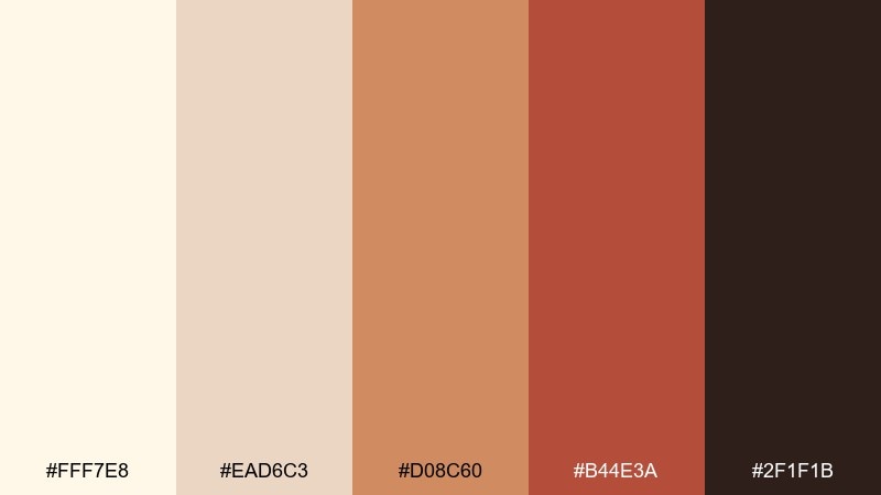
HEX: #FFF7E8 #EAD6C3 #D08C60 #B44E3A #2F1F1B
Mood: earthy, creative, sunbaked
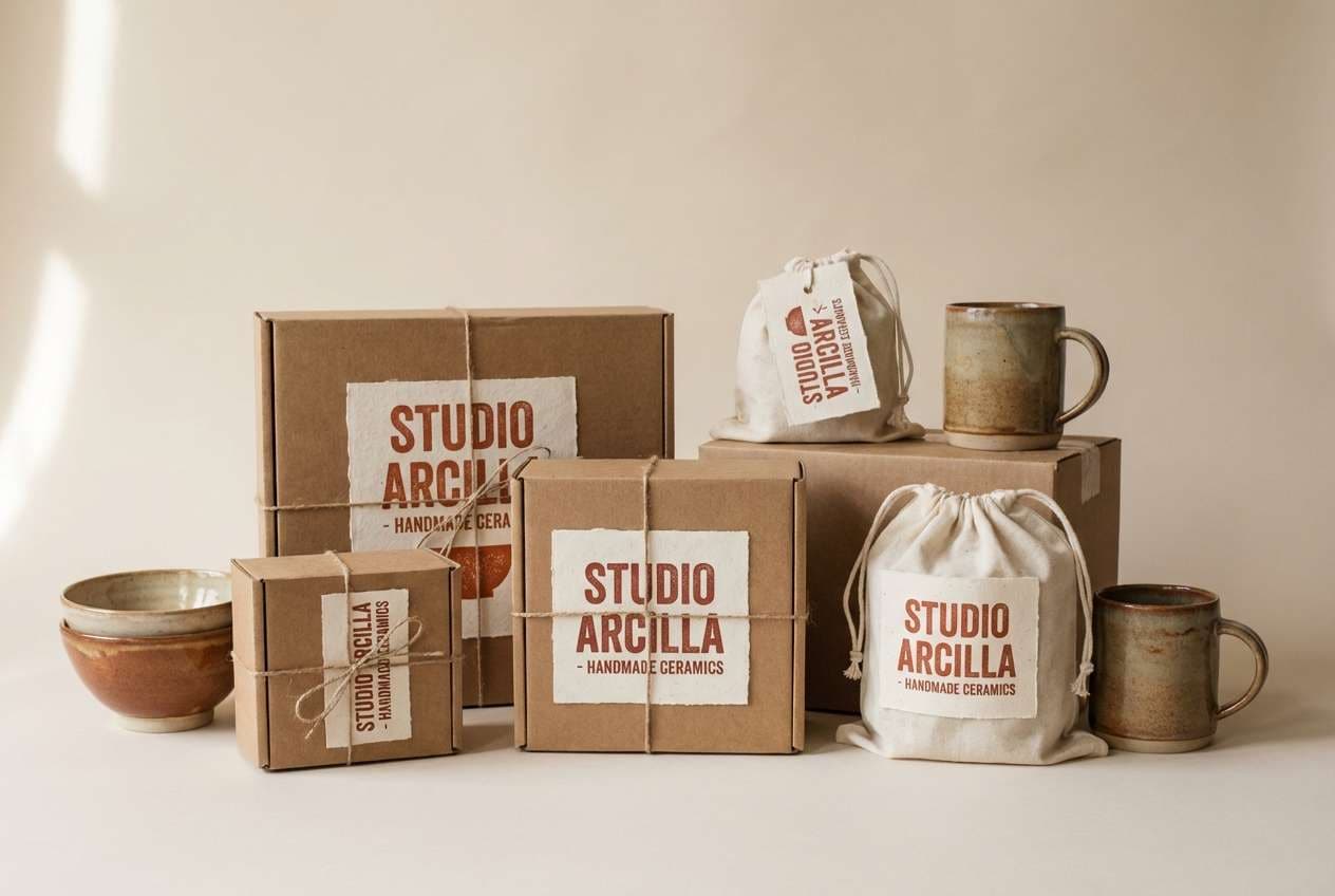
Best for: ceramics brands and artisan shop packaging
Earthy and sunbaked, it echoes clay dust, kiln warmth, and handcrafted bowls. The pale base keeps labels clean, while terracotta and brick reds add a maker-forward signature. Use the near-black brown for SKU text and small details so it stays legible on kraft or matte stock. Tip: emboss the logo in the darkest tone and keep the red as a secondary stamp for a premium artisan feel.
Image example of terracotta studio generated using media.io
9) Soft Tech Neutral
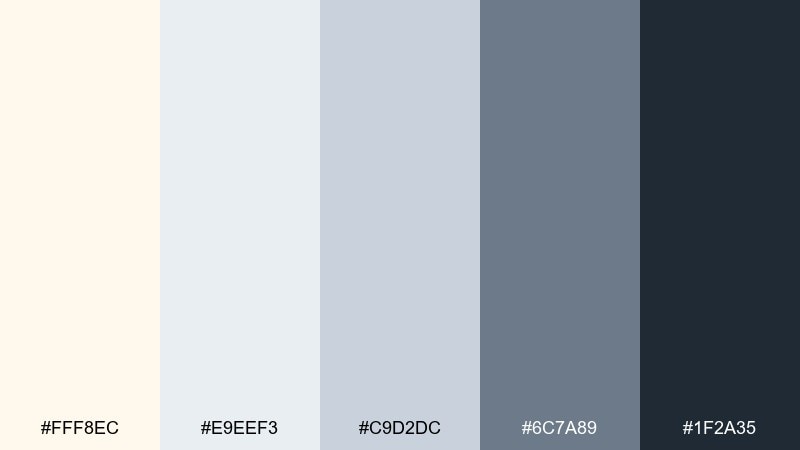
HEX: #FFF8EC #E9EEF3 #C9D2DC #6C7A89 #1F2A35
Mood: clean, modern, trustworthy
Best for: SaaS dashboards and settings screens
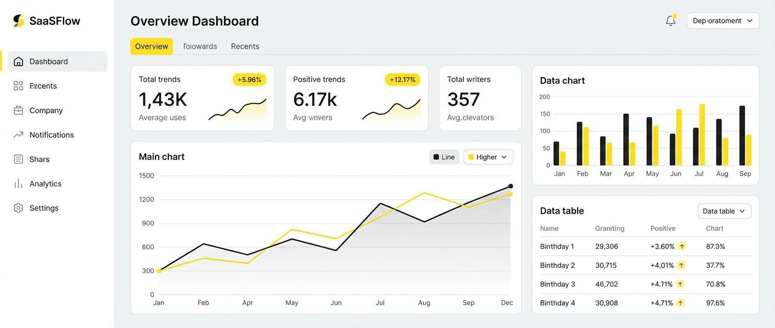
Clean and modern, it looks like a quiet workspace with soft daylight and polished steel. The off-white and cool grays build a stable foundation for dense UI, while the slate tones create clear hierarchy. Keep the darkest shade for primary navigation and key metrics to avoid eye strain. Tip: add subtle 1px borders using the mid-gray so cards and tables separate without heavy shadows.
Image example of soft tech neutral generated using media.io
10) Midnight Ink Pop
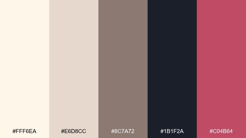
HEX: #FFF6EA #E6D8CC #8C7A72 #1B1F2A #C04B64
Mood: bold, editorial, dramatic
Best for: brand identities and campaign key art
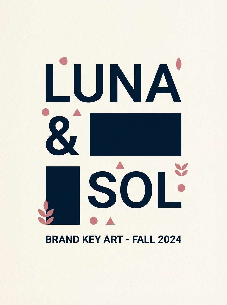
Bold and editorial, it feels like ink on cream paper with a confident rose hit. The near-black creates striking contrast for logos and headlines, while the warm neutrals soften the edges. Use the rose as an accent for highlights, links, or badges, keeping it under 10 percent of the layout. Tip: these ivory color combinations shine when you lean into large type and generous whitespace.
Image example of midnight ink pop generated using media.io
11) Blush Ceremony
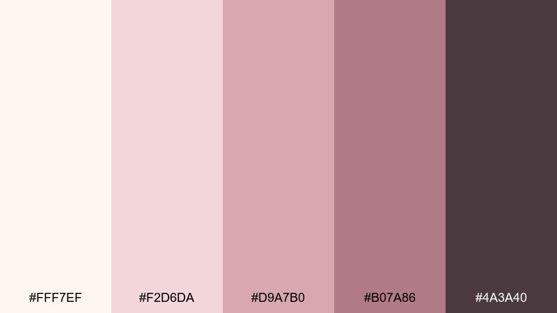
HEX: #FFF7EF #F2D6DA #D9A7B0 #B07A86 #4A3A40
Mood: tender, romantic, graceful
Best for: bridal florals and spring announcements
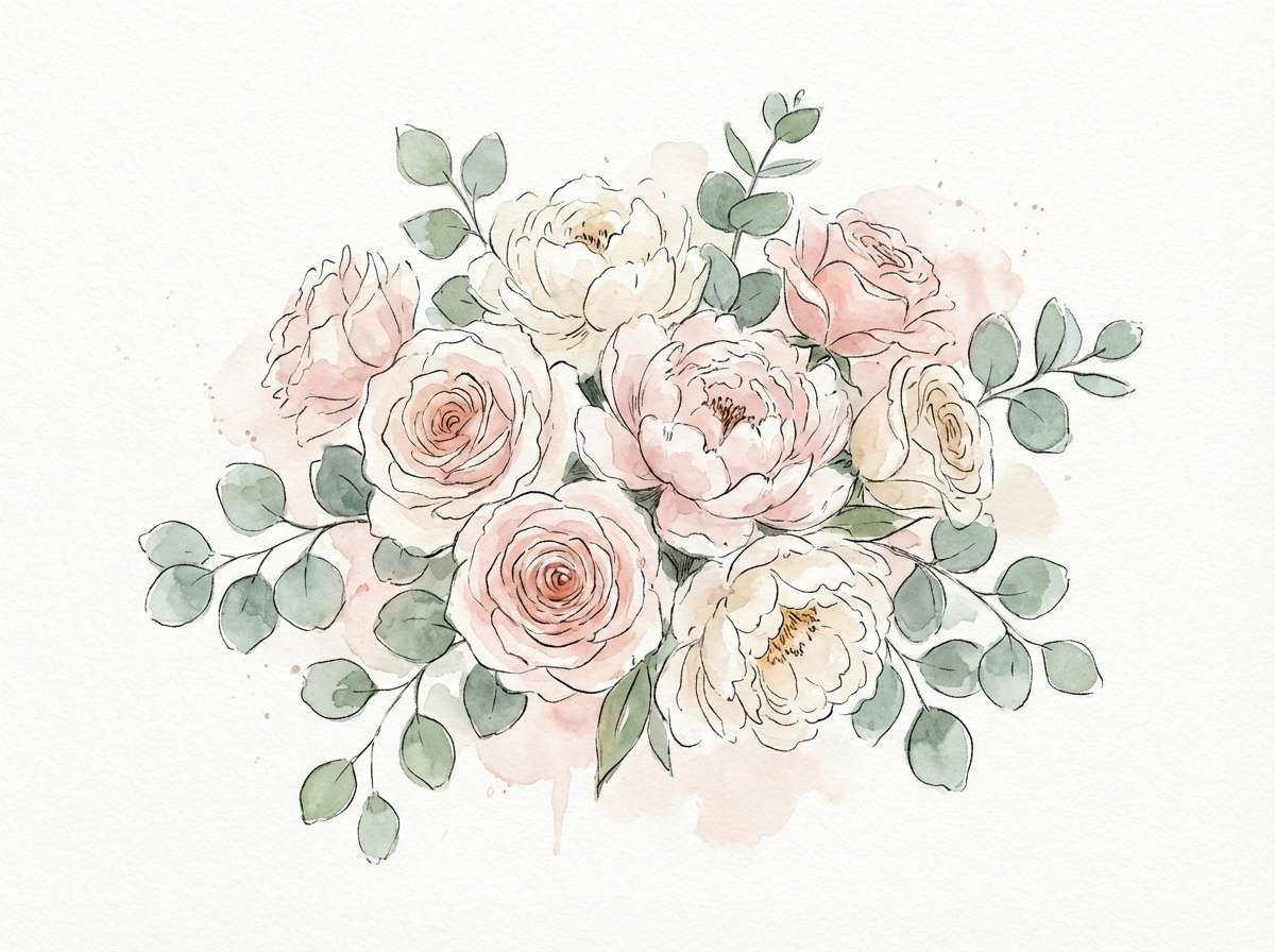
Tender and graceful, it evokes blush petals, soft tulle, and candlelit vows. Keep the lightest tones as background so the pinks read delicate rather than sugary. The muted mauve and cocoa shades work well for serif headlines and monograms. Tip: pair with watercolor florals and let the darker mauve outline only the key elements for a timeless finish.
Image example of blush ceremony generated using media.io
12) Olive Brunch Table
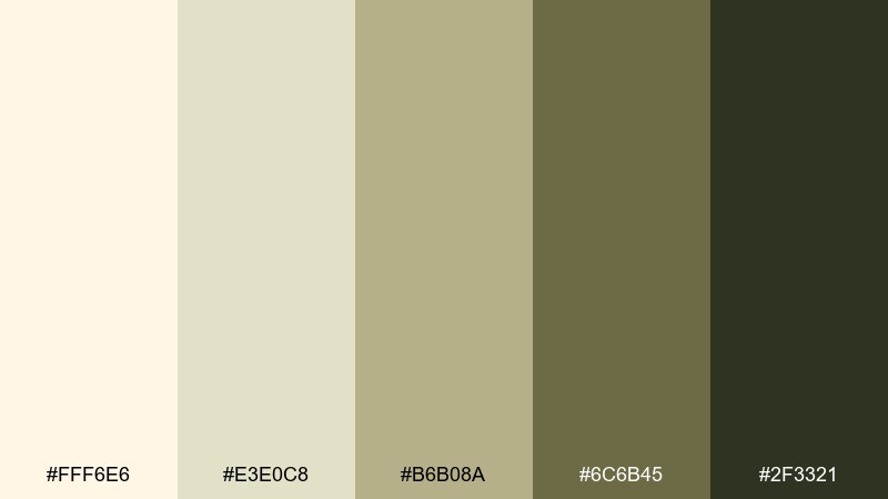
HEX: #FFF6E6 #E3E0C8 #B6B08A #6C6B45 #2F3321
Mood: natural, rustic, appetizing
Best for: Mediterranean restaurant branding
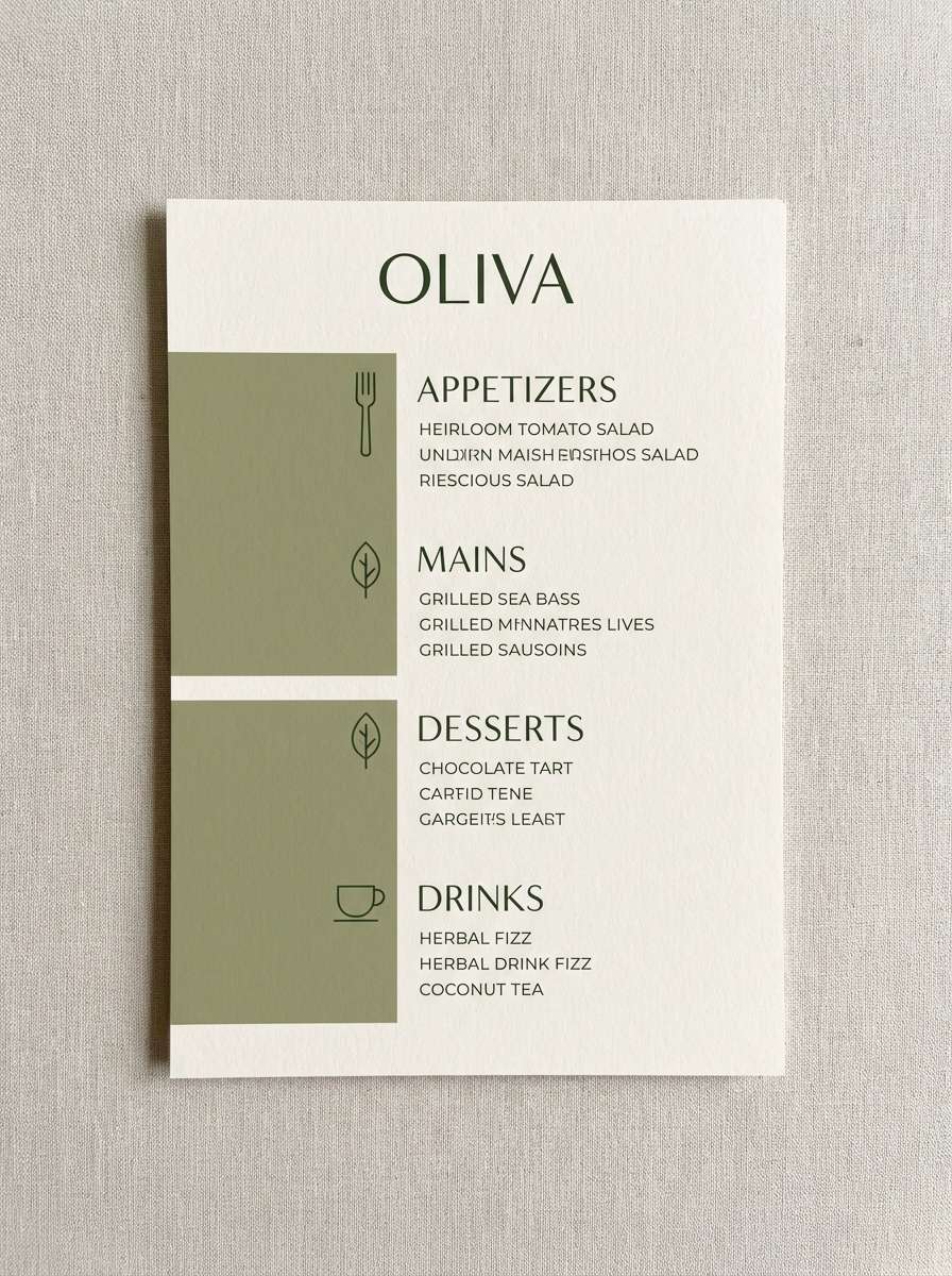
Natural and rustic, it brings up olive leaves, stoneware plates, and slow weekend brunch. Use the pale neutral for menus and signage, then let the olive tones guide section headers and icons. The deep green-black adds weight for typography and can double as a stamp color. Tip: pair with uncoated paper and simple line illustrations to keep the brand feeling honest and handcrafted.
Image example of olive brunch table generated using media.io
13) Powder Blue Porcelain
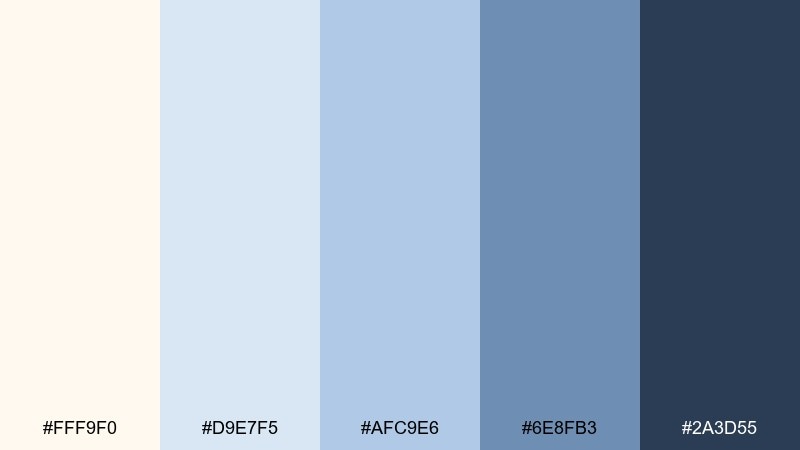
HEX: #FFF9F0 #D9E7F5 #AFC9E6 #6E8FB3 #2A3D55
Mood: gentle, airy, classic
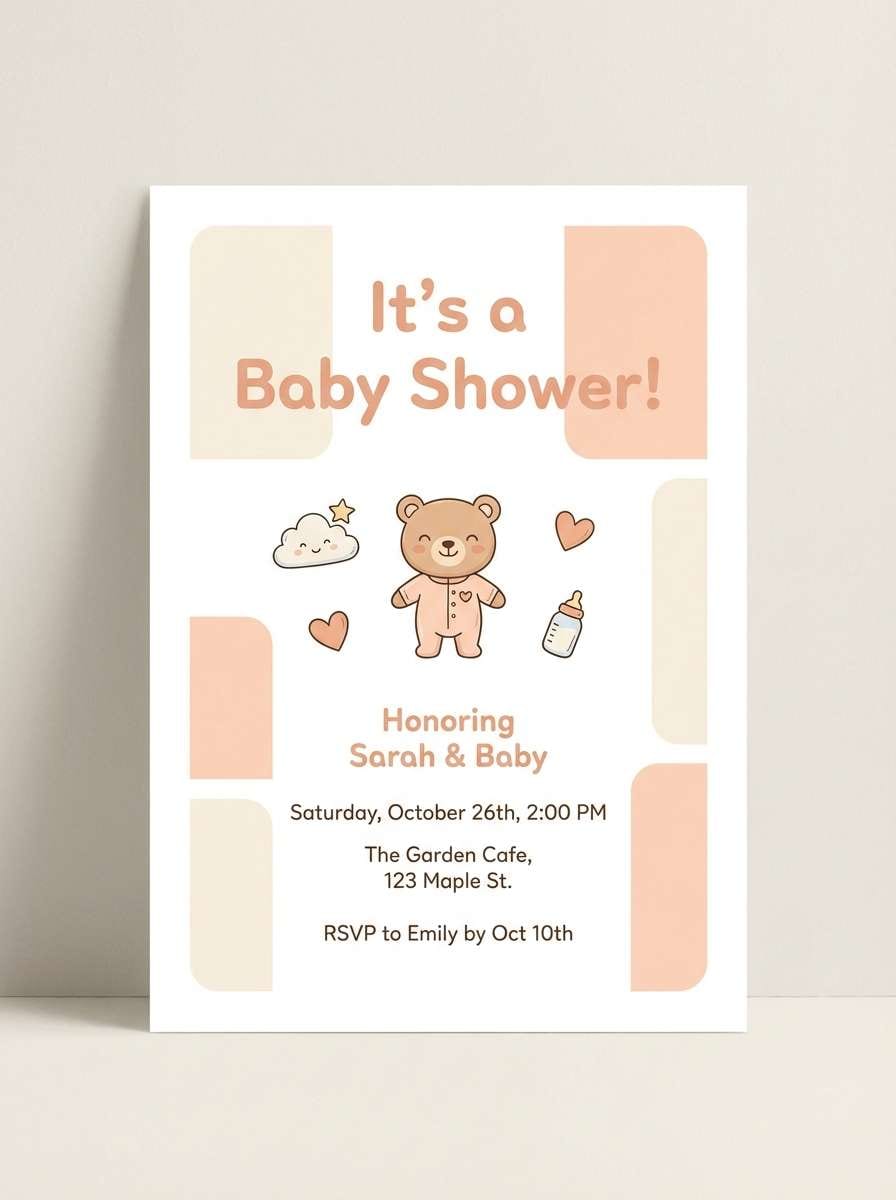
Best for: nursery decor and baby shower designs
Gentle and airy, it feels like porcelain patterns and a clear morning sky. The creamy base keeps it cozy, while the powder blues add calm without turning cold. Use the deeper blue for headings, outlines, and small motifs to keep designs crisp. Tip: add rounded shapes and soft gradients for a soothing nursery look that still feels polished.
Image example of powder blue porcelain generated using media.io
14) Charcoal Minimal Grid
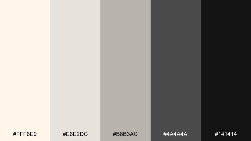
HEX: #FFF6E9 #E6E2DC #B8B3AC #4A4A4A #141414
Mood: minimal, sharp, premium
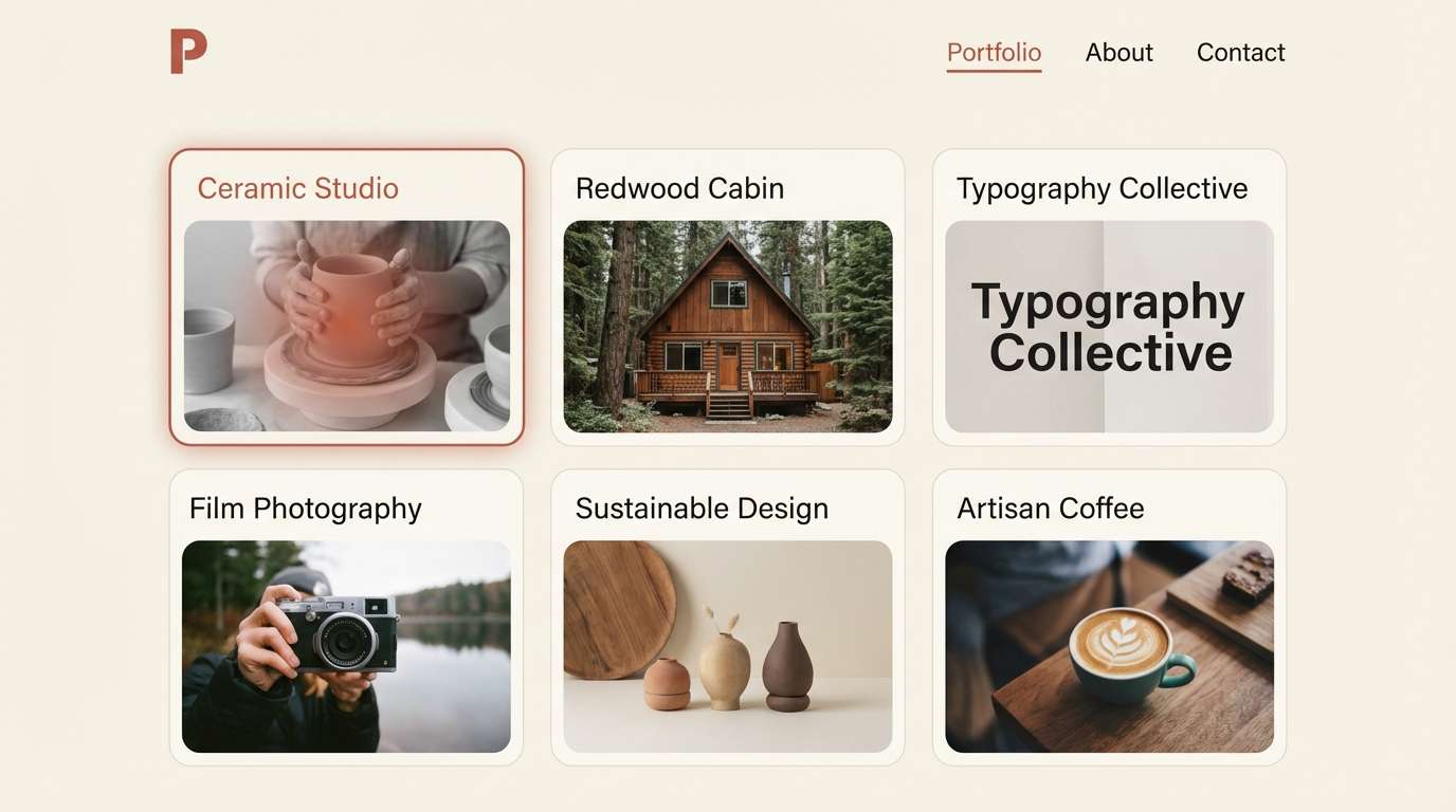
Best for: portfolio sites and monochrome UI
Minimal and sharp, it evokes gallery lighting, matte paper, and modern architecture. The off-white base keeps screens bright, while layered grays build structure for cards and navigation. Use the near-black for hero type and primary buttons to create decisive contrast without relying on loud color. Tip: this ivory color palette works best with a strict grid and consistent spacing, so keep radii and shadows subtle across components.
Image example of charcoal minimal grid generated using media.io
15) Copper Craft Label
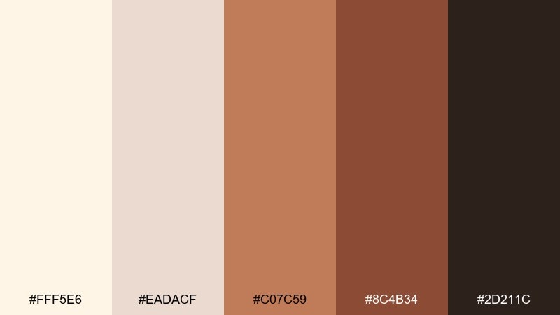
HEX: #FFF5E6 #EADACF #C07C59 #8C4B34 #2D211C
Mood: artisanal, warm, premium
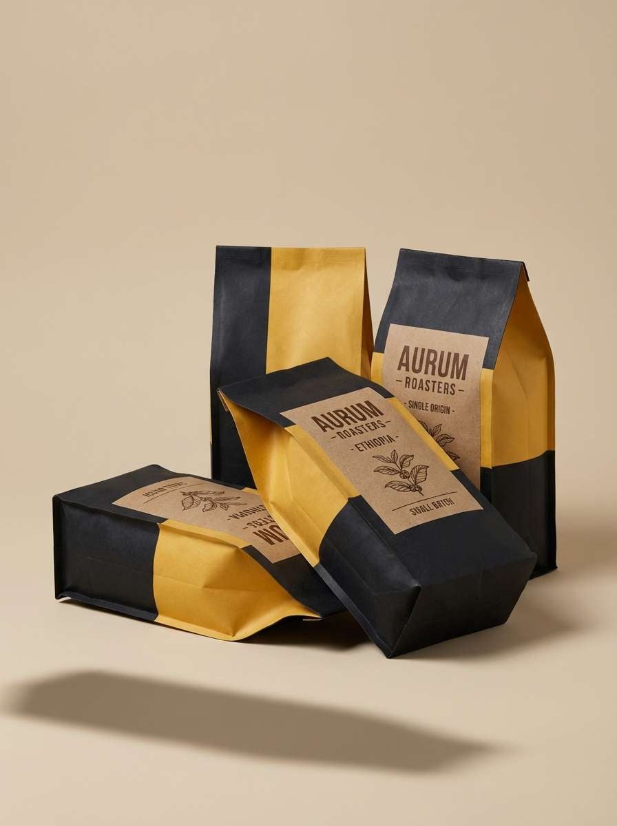
Best for: coffee bags and small-batch packaging
Artisanal and premium, it feels like copper foil, roasted beans, and letterpress paper. Use the light neutral as the label base, then let copper and chestnut tones carry badges and borders. The deep brown keeps product names readable and adds a grounded, craft-forward finish. Tip: choose one metallic effect (copper) and keep other elements matte to avoid visual clutter.
Image example of copper craft label generated using media.io
16) Lavender Fog UI
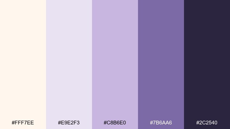
HEX: #FFF7EE #E9E2F3 #C8B6E0 #7B6AA6 #2C2540
Mood: dreamy, soft, modern
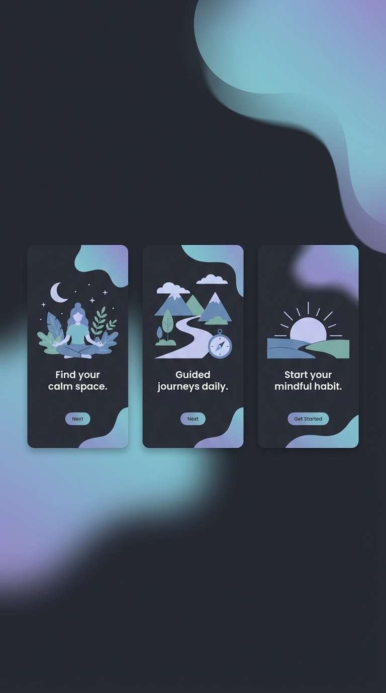
Best for: meditation apps and onboarding screens
Dreamy and modern, it suggests lavender haze, evening calm, and gentle focus. The pale base keeps screens light, while lilac tones add personality without overwhelming content. Use the darkest purple sparingly for primary actions and key labels to maintain a relaxed vibe. Tip: try subtle gradient headers from ivory to lavender to make onboarding feel smooth and guided.
Image example of lavender fog ui generated using media.io
17) Sunlit Marble Ad
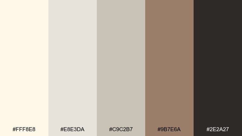
HEX: #FFF8E8 #E8E3DA #C9C2B7 #9B7E6A #2E2A27
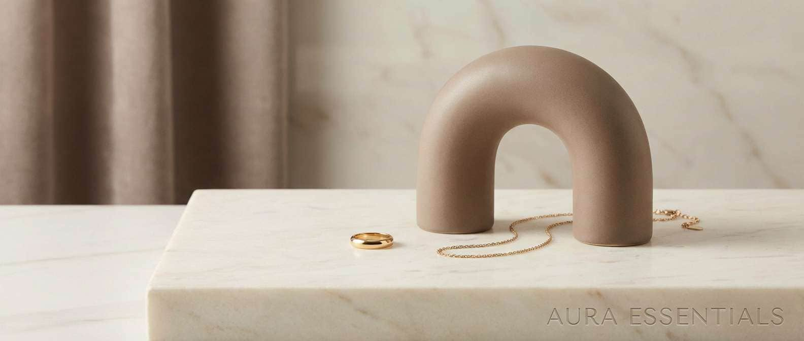
Mood: luxurious, clean, refined
Best for: jewelry product ads and hero banners
Luxurious and clean, it recalls marble veining, soft highlights, and quiet elegance. Use the pale tones for backgrounds so products feel elevated, then bring in the warm taupe for secondary text and pricing. The deep charcoal-brown helps anchors and logos stand out without looking stark. Tip: keep shadows soft and edges crisp to match the polished, gallery-like mood.
Image example of sunlit marble ad generated using media.io
18) Forest Cream Cabin
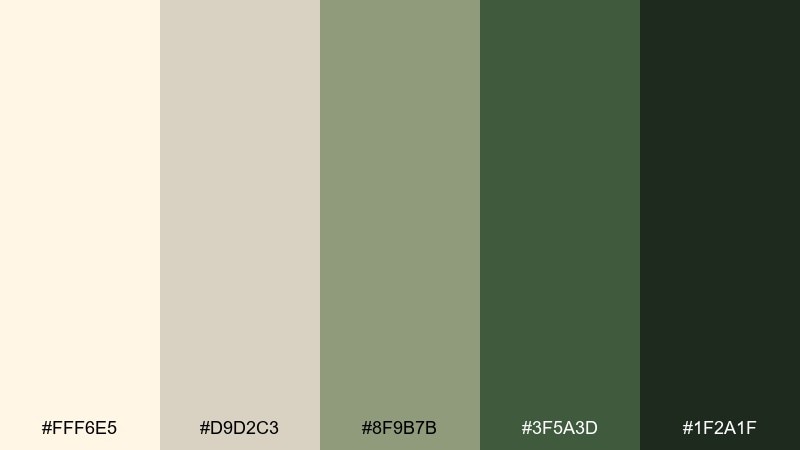
HEX: #FFF6E5 #D9D2C3 #8F9B7B #3F5A3D #1F2A1F
Mood: cozy, outdoorsy, grounded
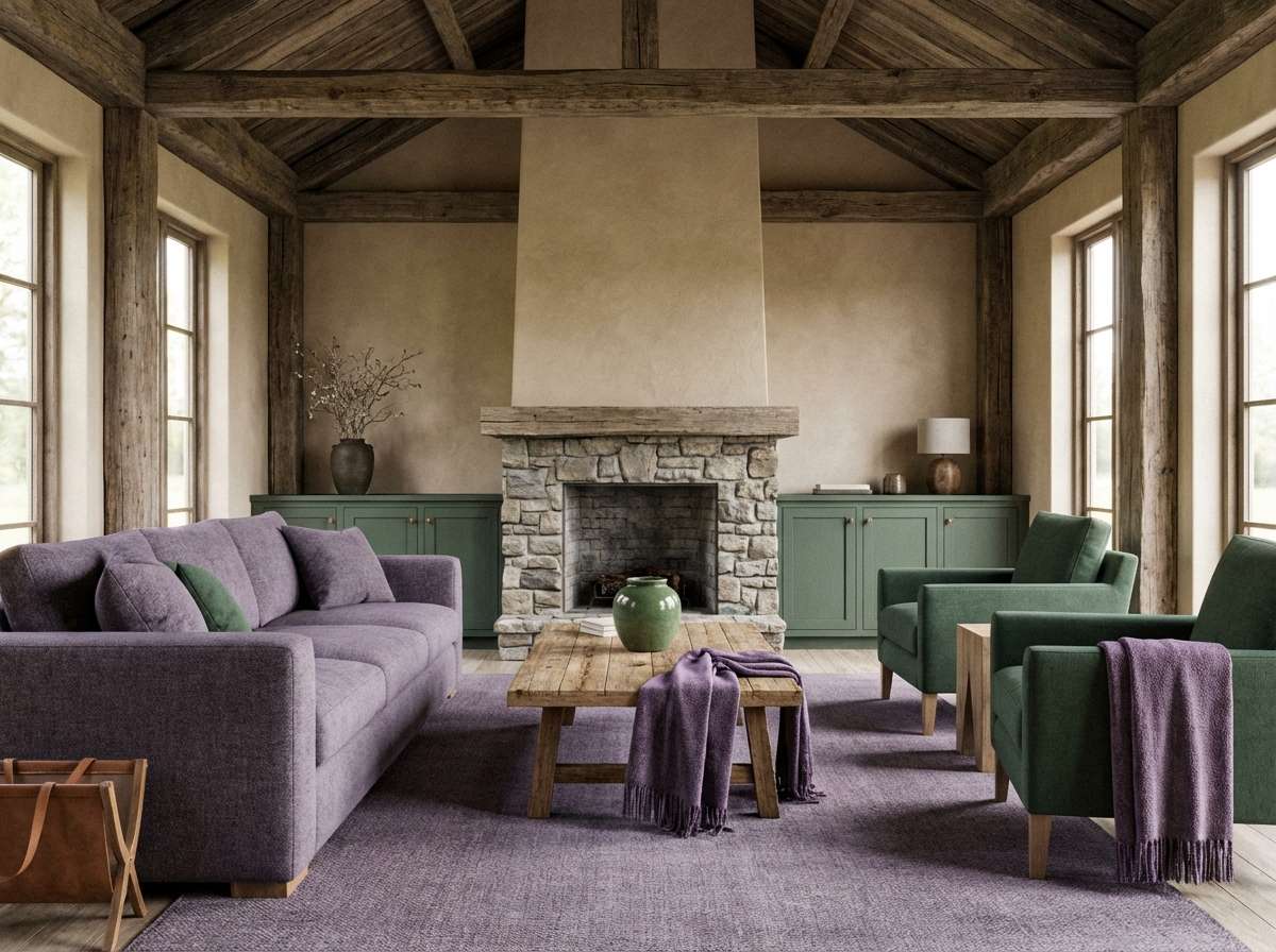
Best for: cabin rentals and rustic interior design
Cozy and grounded, it feels like a cabin morning with wool throws and pine outside the window. Keep the creamy neutral on walls and large textiles, then use the forest greens for trim, signage, or feature pieces. The darkest green-black is ideal for wayfinding text and icons in rental materials. Tip: pair with warm wood tones and brushed metal so the greens stay inviting, not heavy.
Image example of forest cream cabin generated using media.io
19) Rosewood Paper Goods
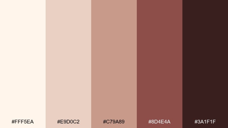
HEX: #FFF5EA #E9D0C2 #C79A89 #8D4E4A #3A1F1F
Mood: romantic, classic, artisanal
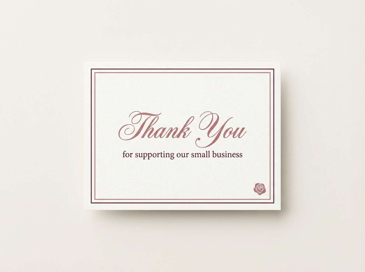
Best for: thank you cards and boutique stationery
Romantic and classic, it evokes rosewood ink, blush envelopes, and handwritten notes. Use the pale base for paper stock, then add dusty rose for borders and small illustrations. The deep wine-brown makes elegant typography that reads well even in small sizes. Tip: print the darkest tone in a slightly textured ink or letterpress for a tactile finish.
Image example of rosewood paper goods generated using media.io
20) Citrus Cream Pop
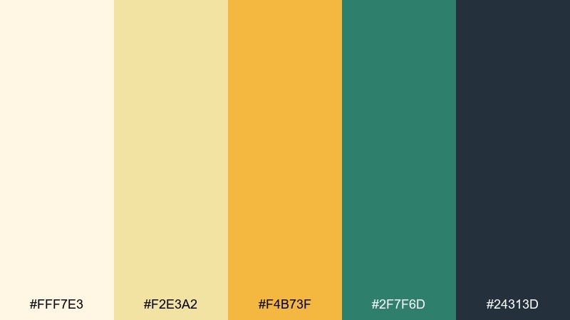
HEX: #FFF7E3 #F2E3A2 #F4B73F #2F7F6D #24313D
Mood: bright, playful, contemporary
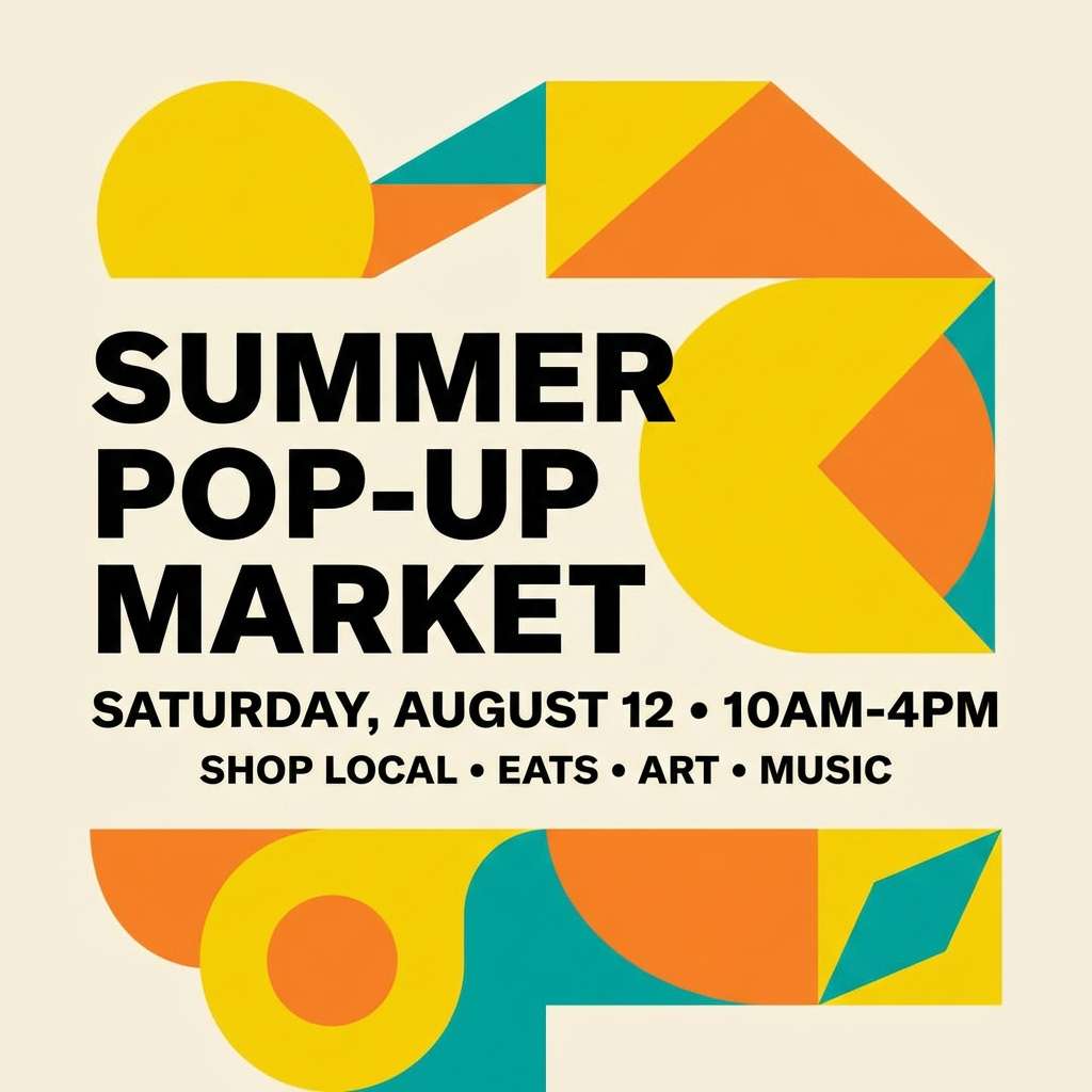
Best for: social ads and seasonal campaign graphics
Bright and contemporary, it feels like citrus zest over whipped cream with a surprising green twist. The creamy base gives the yellows room to shine, while teal keeps the energy modern and fresh. Use the dark blue-gray for type and the orange for a single callout to avoid a cluttered look. Tip: these ivory color combinations work best with bold shapes and short headlines, especially for scroll-stopping promos.
Image example of citrus cream pop generated using media.io
What Colors Go Well with Ivory?
Ivory pairs beautifully with earthy warms like tan, camel, terracotta, and cocoa—these combinations feel organic, handcrafted, and welcoming. They’re ideal for packaging, café branding, and wedding stationery where warmth matters.
For a cleaner, more modern direction, combine ivory with cool neutrals (misty gray, slate, charcoal) or muted blues. This keeps interfaces and layouts readable while staying softer than pure white backgrounds.
If you want accent energy, use controlled pops like rose, teal, or golden yellow. Keeping that accent under 10–15% of the layout helps ivory remain the “calm canvas” while the accent guides attention.
How to Use a Ivory Color Palette in Real Designs
Start with ivory as the main background and pick one dark anchor color for text (deep brown, charcoal, or blue-black). This creates contrast and prevents the palette from feeling washed out, especially in web and UI designs.
Use mid-tones (taupe, sage, slate, or dusty rose) to build hierarchy—cards, sections, borders, and secondary buttons. Keep gradients subtle and prefer soft shadows so the overall look stays refined.
In print (menus, labels, invitations), choose uncoated or lightly textured stock to make ivory feel intentional. Then repeat your darkest tone in a few key spots (headers, icons, monograms) to create a cohesive system.
Create Ivory Palette Visuals with AI
If you want fast mockups that match your ivory palette—menus, packaging, UI screens, invitations, or ad banners—generate them from a prompt and iterate in minutes. This is especially useful when you need several on-brand variations for A/B tests or campaign rollouts.
Use the prompts above as templates, then swap in your product type, layout style, and aspect ratio. Keep the words “ivory base” plus 1–2 accent colors to steer the output toward the right balance.
When your visual looks close, try refining with small constraints like “no hands,” “plain background,” “minimal typography,” or “clean grid” to keep the design usable for real-world layouts.
Ivory Color Palette FAQs
-
What hex code is ivory?
Ivory doesn’t have a single universal HEX, but common ivory-like choices include warm off-whites such as #FFF6E8, #FFF7EE, and #FFF8ED. Pick the one that best matches your lighting (warmer) or UI background (slightly cooler). -
Is ivory warm or cool?
Ivory is typically warm because it carries a subtle yellow or beige undertone. However, some “ivory” shades lean cooler when mixed with gray or blue, which can be better for modern UI and tech branding. -
What colors go best with ivory for a modern look?
For a modern style, pair ivory with slate/charcoal, cool grays, and one restrained accent (rose, teal, or muted blue). This keeps layouts crisp while avoiding the harshness of pure white. -
Does ivory work well as a website background?
Yes—ivory is a great background for websites because it reduces glare and feels softer than #FFFFFF. Use a dark anchor text color (charcoal, blue-black, or deep brown) to maintain accessibility and contrast. -
How do I keep ivory palettes from looking “too beige”?
Add one deeper contrast color (near-black, espresso, or deep forest) and one cleaner supporting tone (cool gray, slate, or soft blue). This mix keeps the palette intentional, not muddy. -
What are good ivory color combinations for weddings?
Ivory pairs well with terracotta, blush, dusty rose, sage, and warm browns. These combinations photograph beautifully and translate well to paper goods, signage, florals, and attire accents. -
Can I use ivory with bold accent colors?
Yes—ivory is an ideal “quiet” base for bold accents like rose, teal, or citrus tones. Keep bold accents limited (around 10–15%) so the design stays elegant and readable.
Next: Army Green Color Palette


