Camel is a warm neutral that sits between tan and light brown, making it easy to pair with both creamy whites and deeper earth tones. In branding, UI, and interiors, it brings a grounded, premium feel without looking heavy.
Below are 20 camel color palette ideas with ready-to-use HEX codes, plus practical tips and AI prompts you can reuse to generate matching visuals.
In this article
Why Camel Palettes Work So Well
Camel is a “bridge” color: it’s warm enough to soften cool grays and blues, but neutral enough to sit comfortably next to creams, browns, and blacks. That balance makes camel palettes feel cohesive even when you add one bold accent.
Because camel carries natural, material cues (linen, leather, sand, wood), it quickly communicates comfort and quality. This is why camel color schemes are common in lifestyle brands, premium packaging, and editorial-style layouts.
In digital design, camel also plays well with accessibility when paired with deep charcoal or espresso text. You can keep backgrounds light and readable while still adding warmth through buttons, tags, and highlight states.
20+ Camel Color Palette Ideas (with HEX Codes)
1) Desert Linen
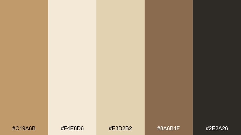
HEX: #C19A6B #F4E8D6 #E3D2B2 #8A6B4F #2E2A26
Mood: airy, sunwashed, calm
Best for: minimalist skincare packaging and clean branding
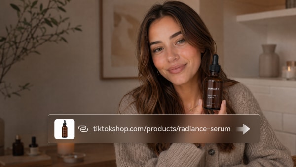
Airy and sunwashed, these tones feel like linen curtains in late-afternoon light. Use the soft creams as your main background and let the camel and deep brown handle logos and key text. It works especially well for wellness, beauty, and artisan goods where you want warmth without looking rustic. Tip: keep layouts spacious and use the darkest shade for accessibility on light surfaces.
Image example of desert linen generated using media.io
Media.io is an online AI studio for creating and editing video, image, and audio in your browser.

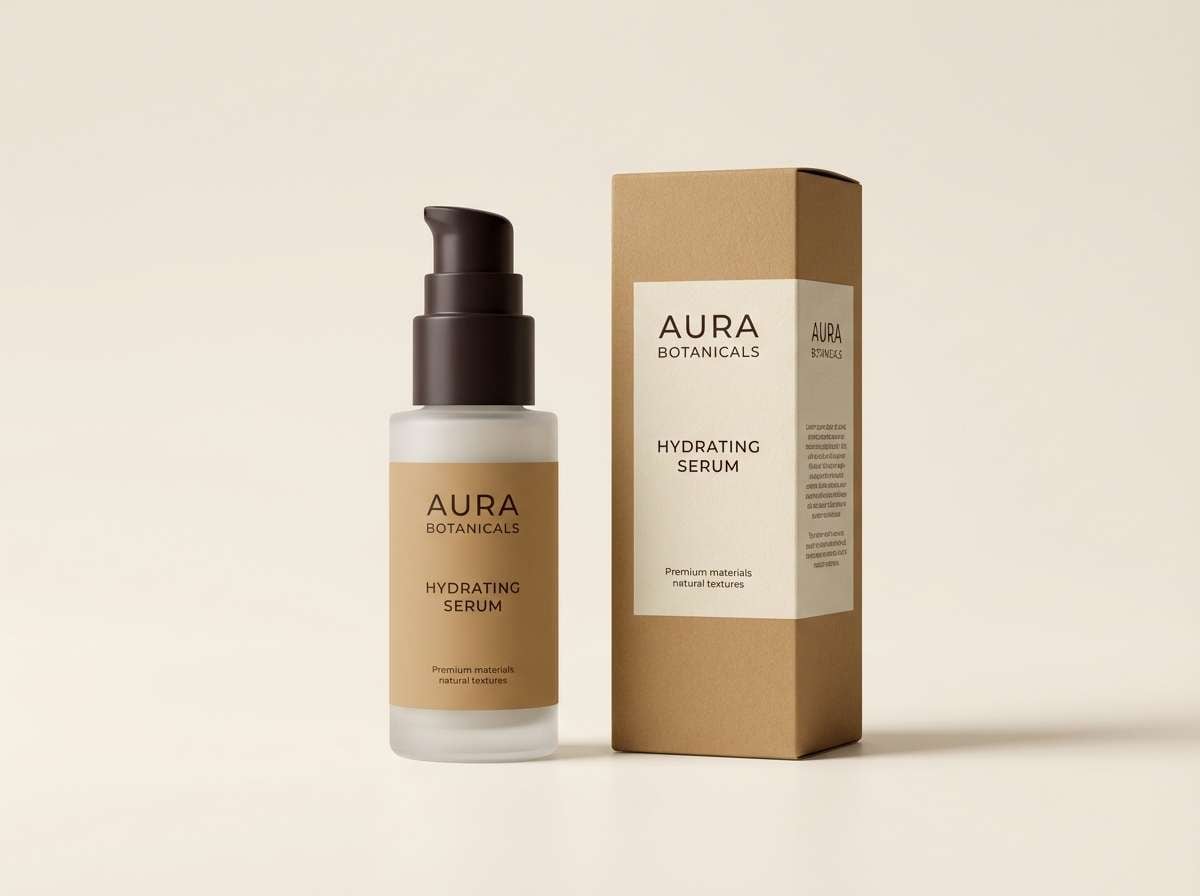
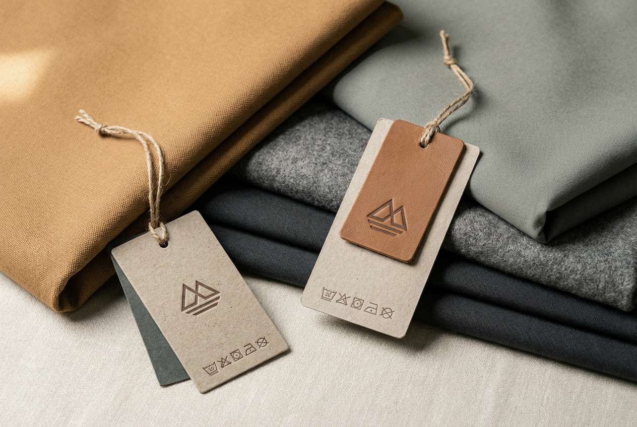
2) Saddle & Stone
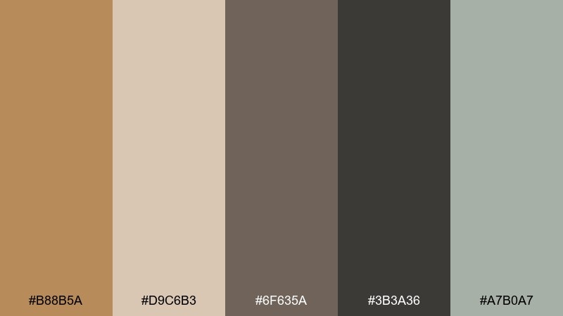
HEX: #B88B5A #D9C6B3 #6F635A #3B3A36 #A7B0A7
Mood: rugged, grounded, refined
Best for: outdoor apparel branding and hang tags
Rugged and grounded, it brings to mind worn leather, river rock, and weathered canvas. These camel color combinations shine on labels, hang tags, and utility-style brand systems where texture is implied even on flat graphics. Pair the warm tan with stone gray for balance, then reserve the near-black for type and icons. Tip: add a subtle grain overlay on print to amplify the heritage feel.
Image example of saddle & stone generated using media.io
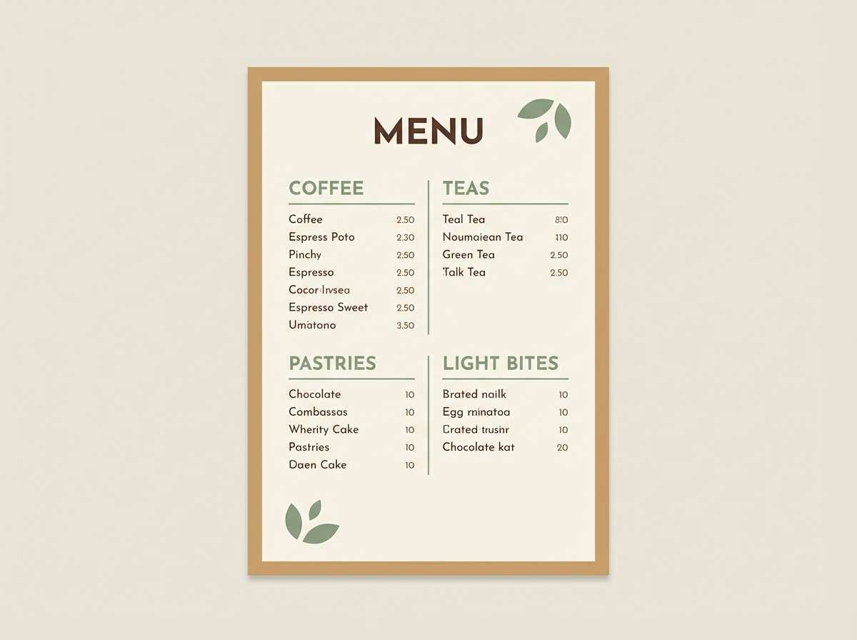
3) Toffee Orchard
HEX: #C08A5A #F6F0E6 #A2B59F #7A4E2D #3C2F2A
Mood: cozy, fresh, approachable
Best for: cafe menus, bakery labels, and signage
Cozy and welcoming, it feels like toffee drizzle with a hint of fresh-picked green. The creamy off-white keeps menus readable while the cocoa browns support headers and pricing. Use the soft sage as a small accent for icons, dividers, or a stamp-style mark. Tip: print on uncoated stock to keep the warmth natural instead of glossy.
Image example of toffee orchard generated using media.io
4) Caravan Sunset
HEX: #C49A6C #E7BFA1 #D66A4A #6B4A3A #1F1A17
Mood: adventurous, golden, dramatic
Best for: travel posters and destination campaigns
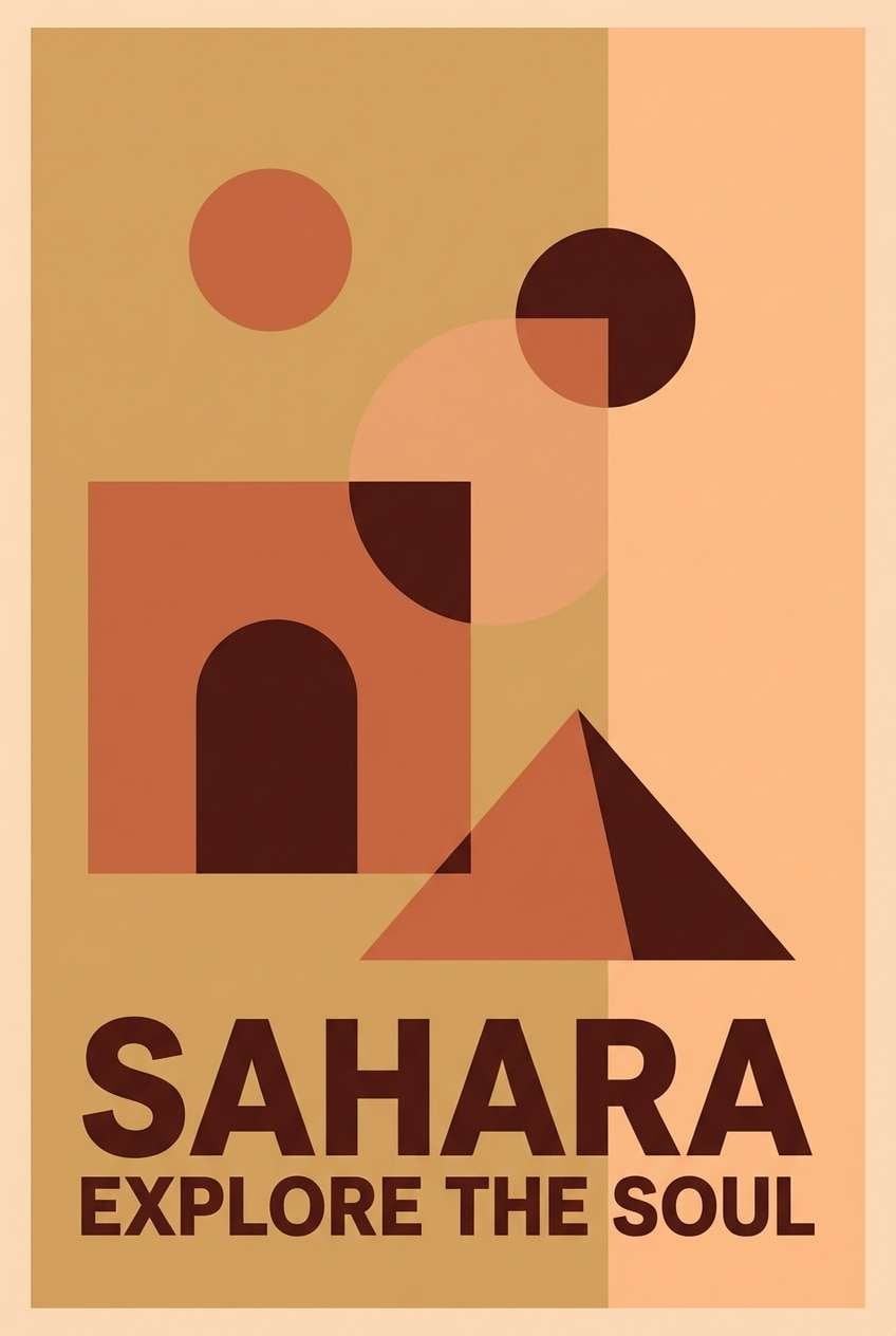
Adventurous and cinematic, it evokes dunes at sunset and ember-lit streets. This camel color palette is ideal when you want warmth plus a strong focal accent, using the terracotta as the hero color. Keep headlines in the deep brown or near-black for contrast, and let the peach soften large background areas. Tip: try a gradient from camel to peach behind bold type for instant depth.
Image example of caravan sunset generated using media.io
5) Sandstone Studio
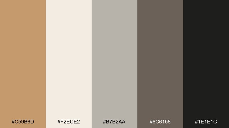
HEX: #C59B6D #F2ECE2 #B7B2AA #6C6158 #1E1E1C
Mood: modern, neutral, architectural
Best for: product dashboards and web UI systems
Modern and architectural, these shades feel like sandstone walls and polished concrete. Use the warm off-white as the main canvas, then build hierarchy with mid-grays and the charcoal for navigation and key labels. The camel works best as a soft highlight for buttons, tags, or active states. Tip: keep shadows subtle and rely on contrast rather than heavy borders.
Image example of sandstone studio generated using media.io

6) Copper Clay
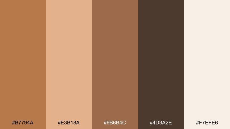
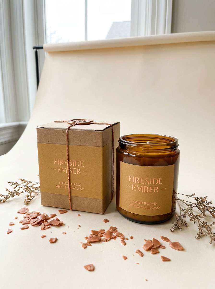
HEX: #B7794A #E3B18A #9B6B4C #4D3A2E #F7EFE6
Mood: handmade, warm, tactile
Best for: candle labels and artisan product packaging
Handmade and tactile, it recalls glazed pottery, copper tools, and clay dust. The light cream keeps labels airy while the copper and camel tones deliver the craft warmth. Pair it with simple serif type or a stamped logo to lean into the artisanal vibe. Tip: use the darkest brown for small print so ingredients and warnings stay legible.
Image example of copper clay generated using media.io
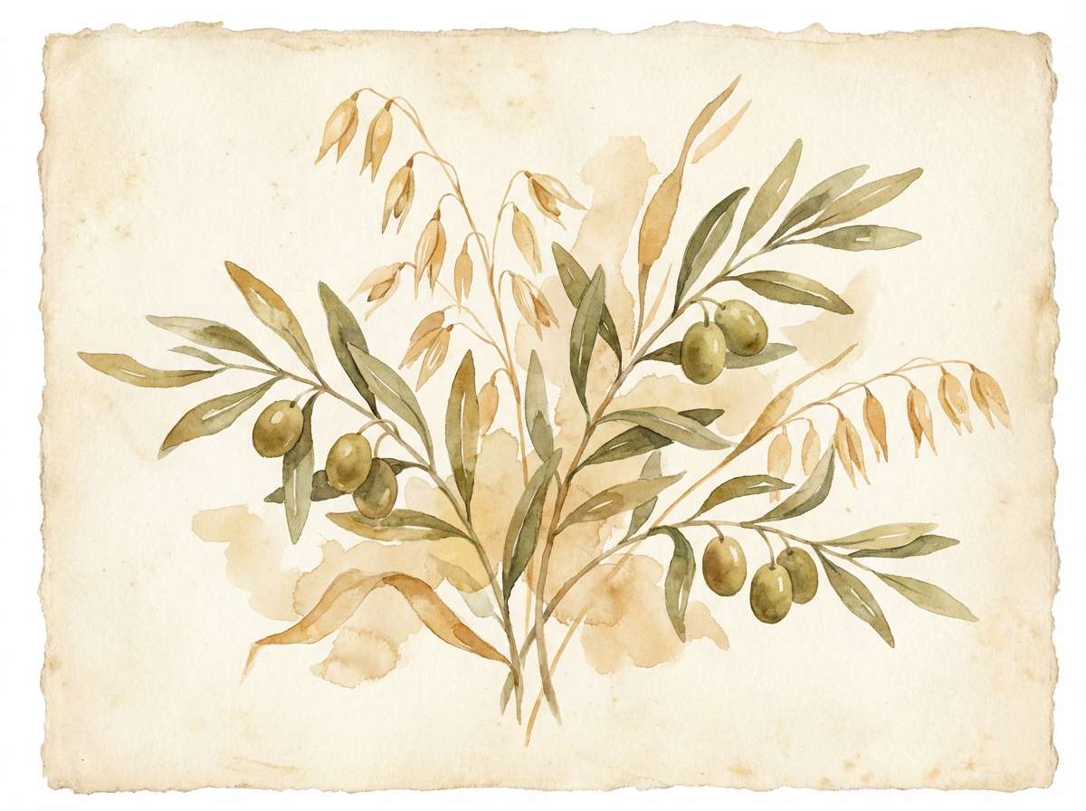
7) Oat & Olive
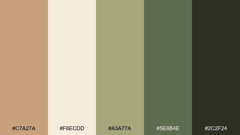
HEX: #C7A27A #F6ECDD #A3A77A #5E6B4E #2C2F24
Mood: organic, calm, fresh
Best for: botanical prints and eco brand illustrations
Organic and calming, it brings to mind oat milk, olive leaves, and shaded gardens. Let the cream and camel carry large areas, then use the greens for stems, icons, and secondary highlights. It suits eco packaging, farm-to-table menus, and nature-inspired editorial graphics. Tip: keep green accents under 20% so the palette stays soft and grounded.
Image example of oat & olive generated using media.io
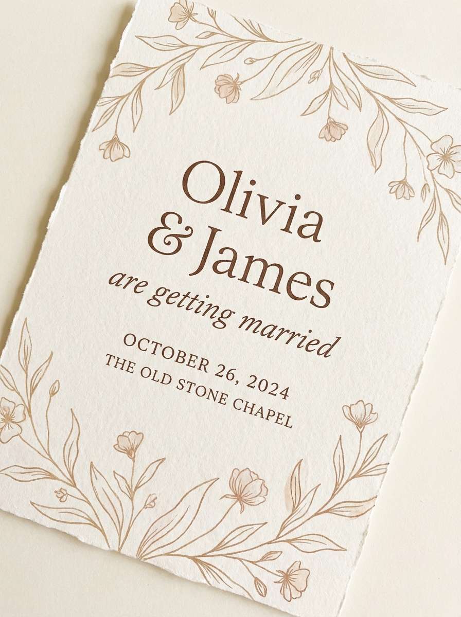
8) Cocoa Blush
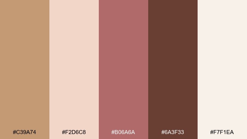
HEX: #C39A74 #F2D6C8 #B06A6A #6A3F33 #F7F1EA
Mood: romantic, soft, elegant
Best for: wedding invitations and event stationery
Romantic and soft, it feels like cocoa powder over rose petals. These camel color combinations are perfect for wedding stationery where you want warmth without heavy contrast. Use the blush and dusty rose for borders, monograms, or floral motifs, and keep the deepest brown for names and key details. Tip: choose a warm white paper stock to preserve the gentle tone shifts.
Image example of cocoa blush generated using media.io
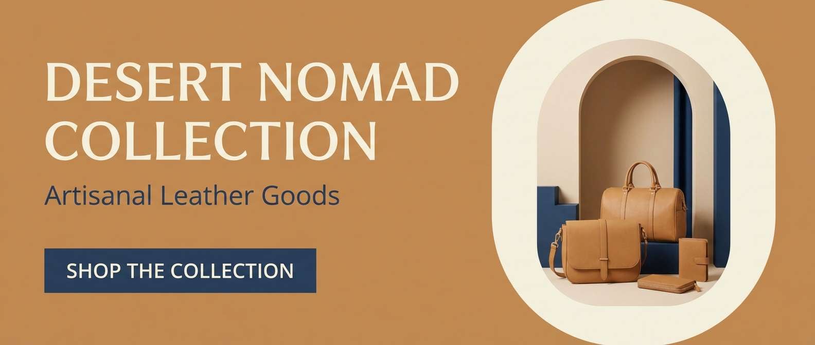
9) Nomad Denim
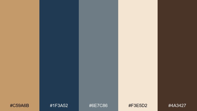
HEX: #C59A6B #1F3A52 #6E7C86 #F3E5D2 #4A3427
Mood: confident, casual, contemporary
Best for: ecommerce hero banners and lifestyle brands
Confident and contemporary, it mixes worn denim with warm sand. Use the navy as your anchor for headers and CTAs, then bring camel in through backgrounds, cards, or product highlights. The pale cream keeps the layout light and helps photos feel cohesive. Tip: keep denim blues to one or two UI elements so the warmth stays dominant.
Image example of nomad denim generated using media.io
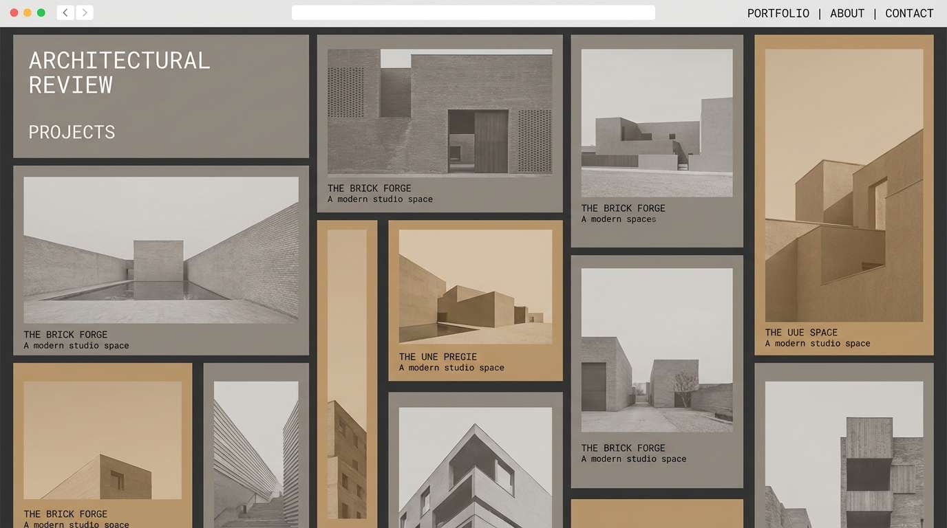
10) Warm Concrete
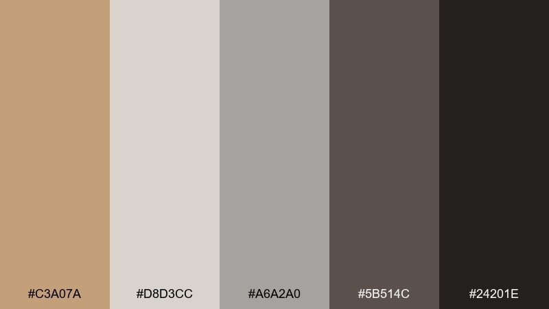
HEX: #C3A07A #D8D3CC #A6A2A0 #5B514C #24201E
Mood: urban, understated, polished
Best for: architecture portfolios and studio websites
Urban and understated, it suggests concrete, timber, and soft studio light. The grays make a stable base for layouts, while the warm tan prevents the design from feeling cold. Use the near-black for grid lines, captions, and navigation to keep everything crisp. Tip: pair with high-contrast black-and-white photography for a gallery-like finish.
Image example of warm concrete generated using media.io
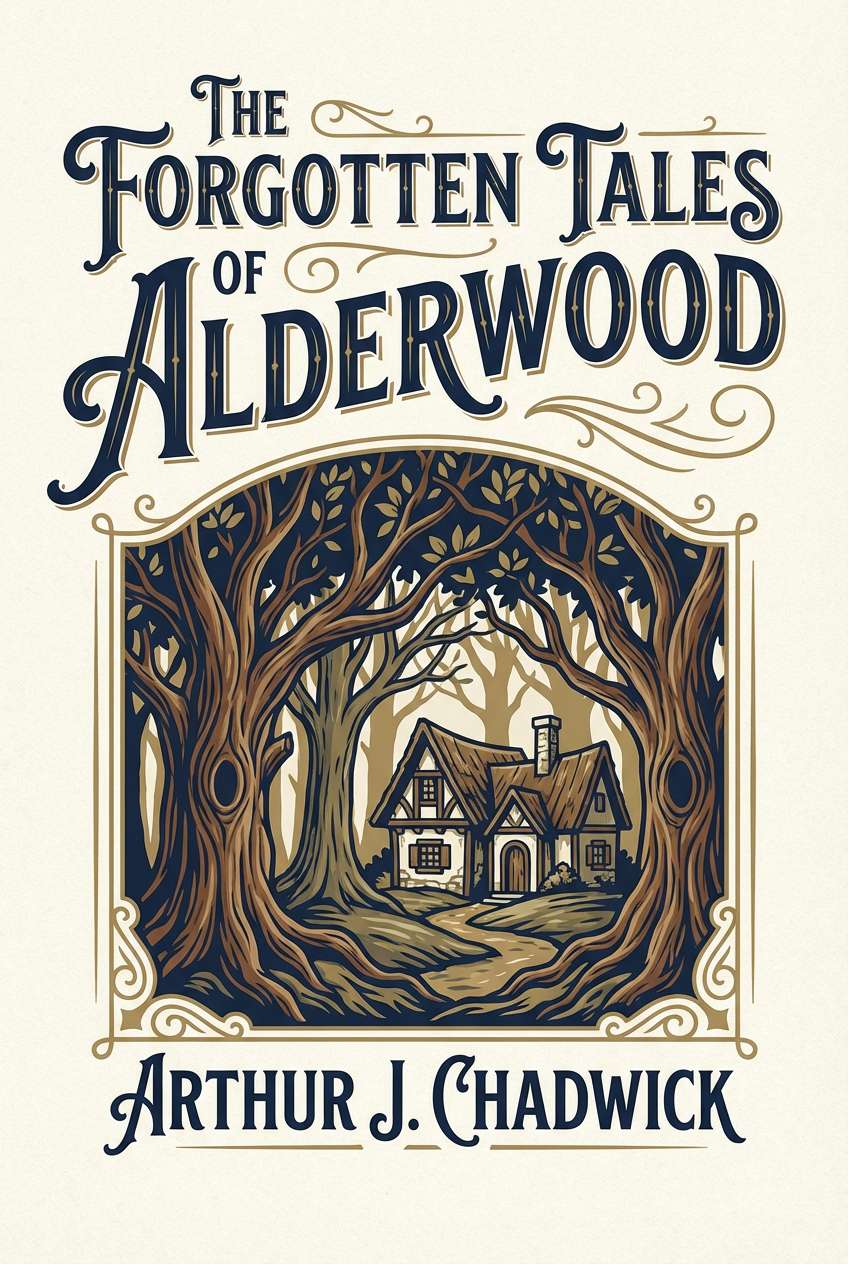
11) Heritage Library
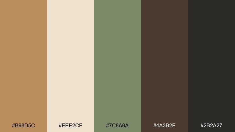
HEX: #B98D5C #EEE2CF #7C8A6A #4A3B2E #2B2A27
Mood: classic, scholarly, cozy
Best for: book covers and editorial layouts
Classic and scholarly, it evokes leather-bound books and quiet reading lamps. This camel color scheme pairs beautifully with muted green for section dividers, pull quotes, or subtle illustration accents. Keep backgrounds light and let the espresso browns handle typography for a timeless look. Tip: use textured paper or a subtle noise overlay to mimic a printed-page feel.
Image example of heritage library generated using media.io
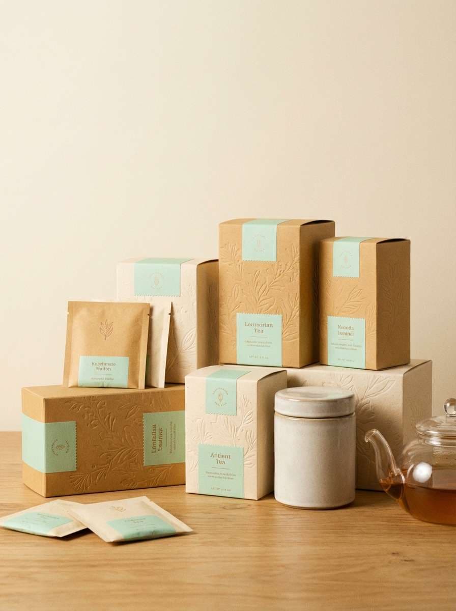
12) Marzipan Mint
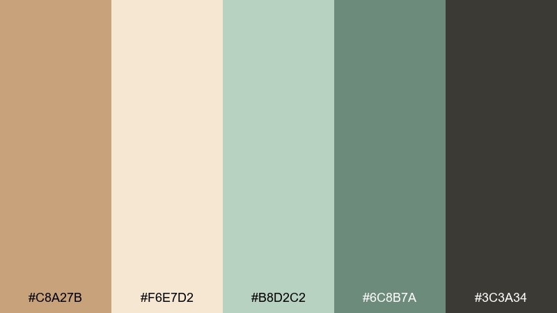
HEX: #C8A27B #F6E7D2 #B8D2C2 #6C8B7A #3C3A34
Mood: light, friendly, refreshing
Best for: tea packaging and wellness social posts
Light and friendly, it feels like marzipan sweets with a cool herbal finish. The minty greens add freshness without turning the palette cold, especially when the cream stays dominant. Use camel for brand blocks and the darker green for small headings or ingredient callouts. Tip: keep photography warm-toned so the greens read as natural, not clinical.
Image example of marzipan mint generated using media.io
13) Amber Noir
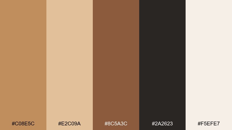
HEX: #C08E5C #E2C09A #8C5A3C #2A2623 #F5EFE7
Mood: luxurious, moody, cinematic
Best for: fragrance ads and premium product pages
Luxurious and moody, it reads like amber resin against a dark velvet backdrop. Push the near-black for drama and let the lighter tan and cream create spotlight moments for product details. It works well for premium beauty, jewelry, and editorial landing pages. Tip: use gold-leaning gradients sparingly so the palette stays refined, not flashy.
Image example of amber noir generated using media.io
14) Prairie Sky
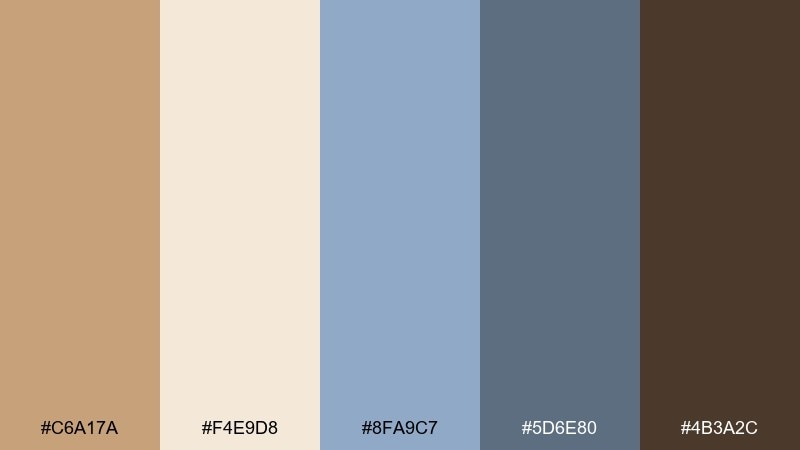
HEX: #C6A17A #F4E9D8 #8FA9C7 #5D6E80 #4B3A2C
Mood: open, calm, airy
Best for: summer lookbooks and lifestyle editorial
Open and airy, it brings prairie grasses under a calm blue sky. Use the sky blues as accents for headings, buttons, or section breaks while keeping the warm neutrals as the main foundation. It suits lookbooks, travel blogs, and product storytelling where you want a relaxed pace. Tip: pair with plenty of white space so the blue feels like a breath of fresh air.
Image example of prairie sky generated using media.io
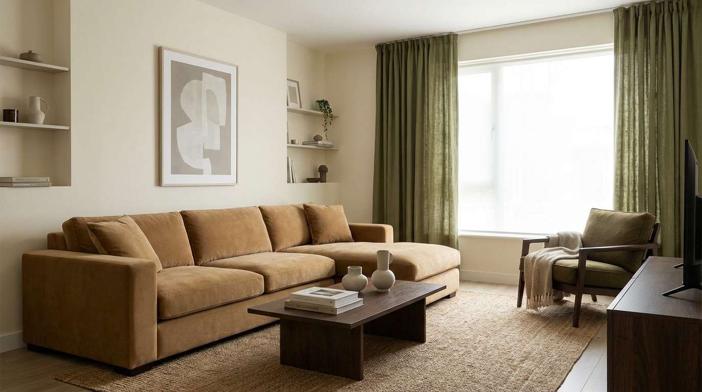
15) Modern Safari
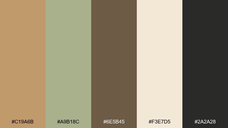
HEX: #C19A6B #A9B18C #6E5B45 #F3E7D5 #2A2A28
Mood: natural, confident, grounded
Best for: interior styling concepts and decor mockups
Natural and grounded, it feels like a modern lodge with clean lines and sunlit wood. This camel color palette works best when you treat tan and cream as the big surfaces, then layer olive and deep brown in smaller details. Pair it with matte black hardware and warm oak textures to keep the look contemporary. Tip: add one repeating accent (like olive cushions) to tie the room together.
Image example of modern safari generated using media.io
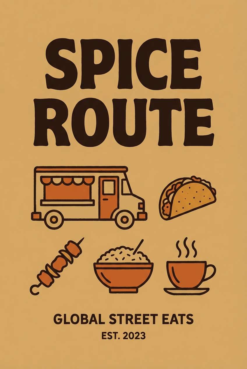
16) Spice Market
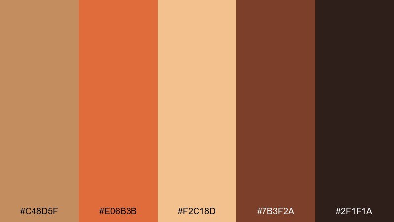
HEX: #C48D5F #E06B3B #F2C18D #7B3F2A #2F1F1A
Mood: energetic, bold, flavorful
Best for: food truck posters and restaurant promos
Energetic and bold, it evokes paprika, toasted cumin, and bustling market stalls. The bright orange is a natural attention-grabber for prices and promo bursts, while the darker browns keep typography grounded. Use the pale spice tone as a friendly background so everything stays readable. Tip: limit the orange to key elements so it feels premium rather than loud.
Image example of spice market generated using media.io
17) Terracotta Haze
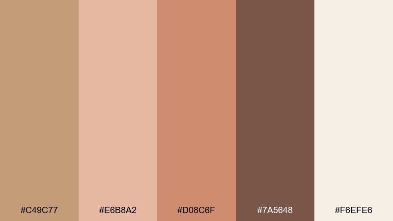
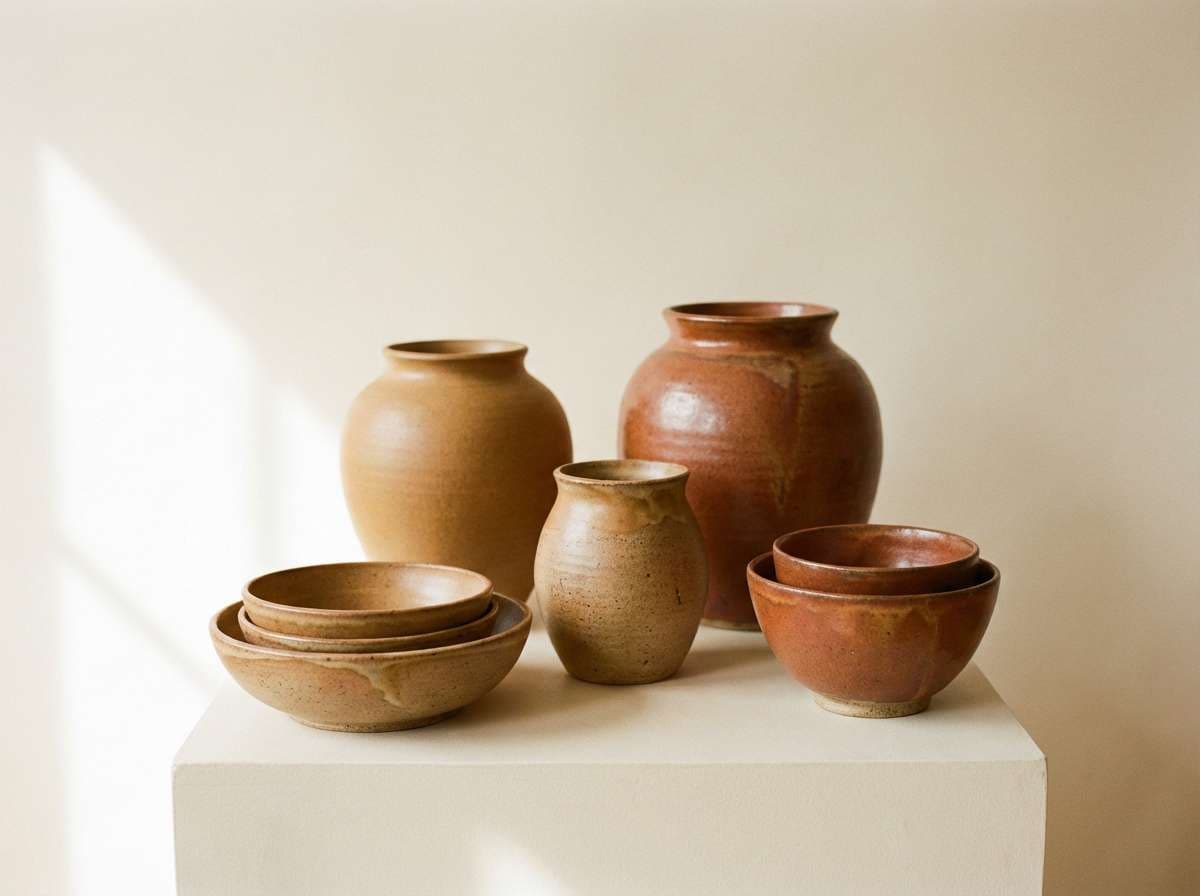
HEX: #C49C77 #E6B8A2 #D08C6F #7A5648 #F6EFE6
Mood: soft, earthy, romantic
Best for: ceramic product launches and craft shop ads
Soft and earthy, it suggests terracotta pots cooling in the shade. Use the creamy tone for negative space, then let the clay and blush hues shape patterns, labels, and highlight blocks. It pairs nicely with natural textures like paper, linen, and matte ceramics. Tip: choose one mid-tone (terracotta or clay) as the hero and keep the rest supporting.
Image example of terracotta haze generated using media.io
18) Quiet Pebble
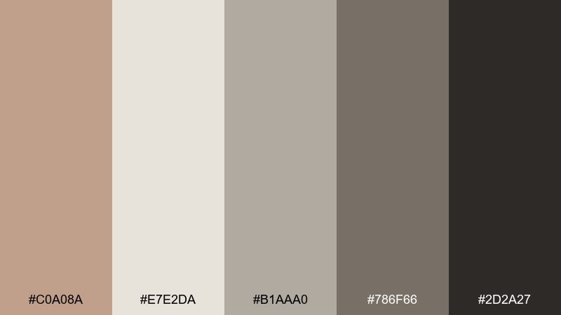
HEX: #C0A08A #E7E2DA #B1AAA0 #786F66 #2D2A27
Mood: soft, balanced, understated
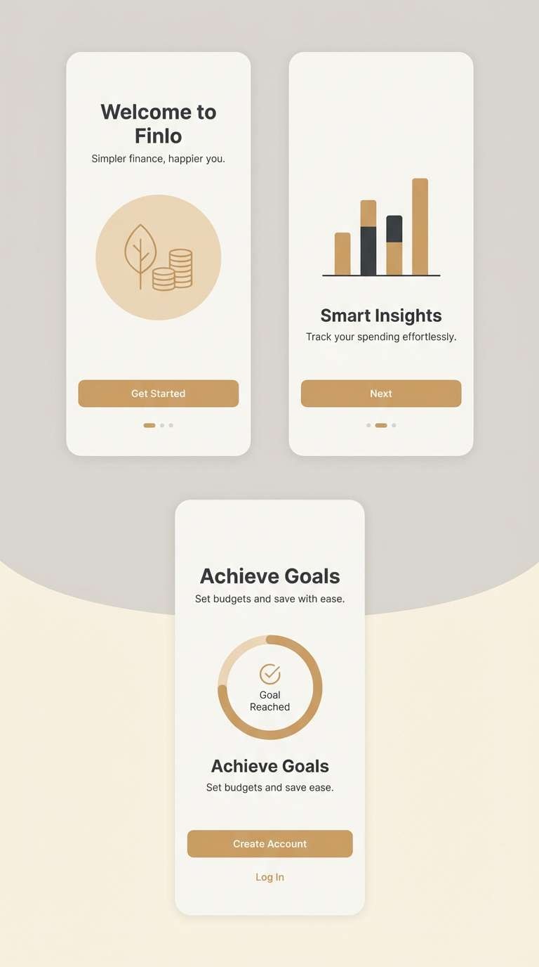
Best for: finance apps and calm onboarding screens
Soft and balanced, it feels like smooth pebbles and warm taupe paper. Use the light gray as a friendly canvas for forms and onboarding, then bring in the darker shades for structure and readable text. The warm tan prevents the interface from feeling sterile. Tip: rely on spacing and type weight for hierarchy, not extra colors.
Image example of quiet pebble generated using media.io
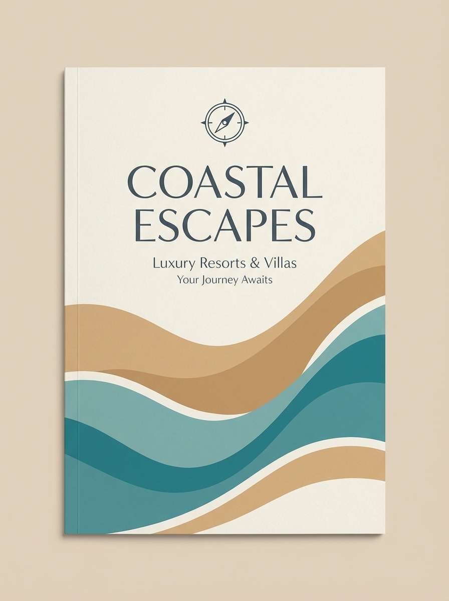
19) Coastal Camel
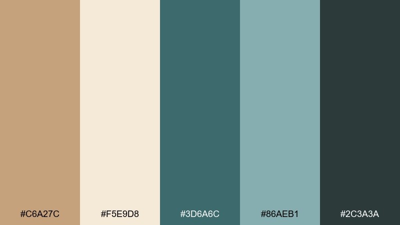
HEX: #C6A27C #F5E9D8 #3D6A6C #86AEB1 #2C3A3A
Mood: breezy, grounded, refreshing
Best for: resort branding and travel brochures
Breezy yet grounded, it mixes sandy paths with sea-glass blues. These camel color combinations feel especially fresh for hospitality branding, where warmth and calm need to coexist. Use teal for accents like icons and section headers, while the cream and tan carry the larger brand surfaces. Tip: keep teal saturated on small elements so it pops without overpowering the neutrals.
Image example of coastal camel generated using media.io
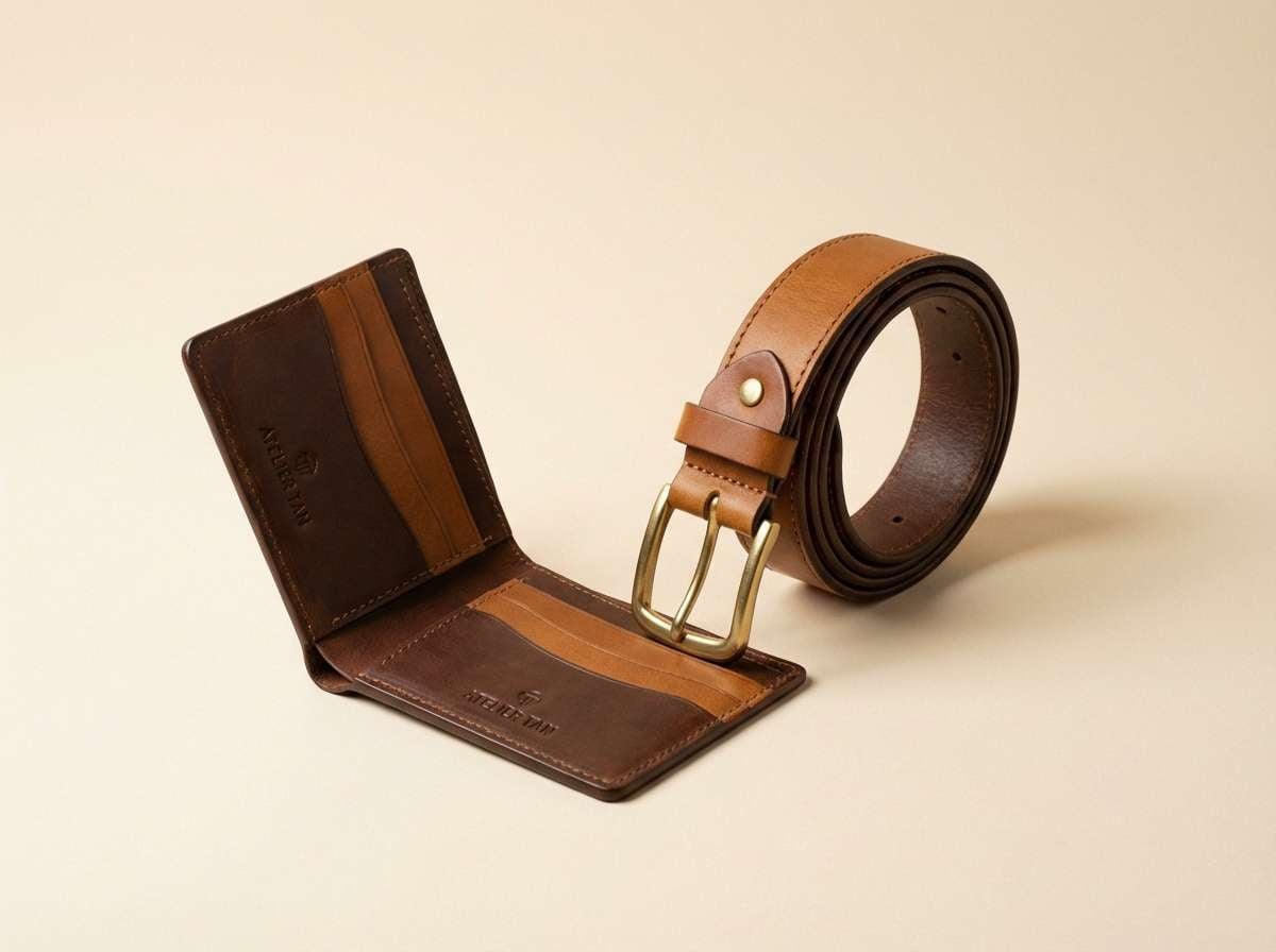
20) Walnut Creme
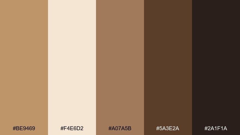
HEX: #BE9469 #F4E6D2 #A07A5B #5A3E2A #2A1F1A
Mood: classic, rich, dependable
Best for: leather goods ads and premium storefronts
Classic and dependable, it evokes walnut wood, creamy foam, and stitched leather. Use the creme as a clean stage for product photos, then bring in the deeper browns for price blocks and button states. It suits heritage brands, menswear, and upscale accessories that need warmth and authority. Tip: keep typography simple and let material-focused photography do the storytelling.
Image example of walnut creme generated using media.io
What Colors Go Well with Camel?
Camel pairs naturally with warm whites (cream, ivory) and deep browns (espresso, walnut) for a tonal, premium look. This is the easiest route for minimalist branding and product pages where you want softness without losing contrast.
For fresher combinations, add muted greens (sage, olive) or coastal teals to bring life into the neutral base. For sharper, modern contrast, camel also works well with navy and charcoal—great for CTAs, headlines, and navigation.
If you want a standout accent, try terracotta or spice orange, but keep the bold shade limited to key moments (badges, price highlights, hero blocks) so the palette still reads as sophisticated.
How to Use a Camel Color Palette in Real Designs
Start by choosing your “surface” colors: a warm off-white for backgrounds and a camel mid-tone for cards, panels, or large brand blocks. Then pick one dark anchor (deep brown or charcoal) for text and icons to keep readability high.
Use accents strategically: a muted green or blue can signal interactivity (links, buttons, active tabs), while terracotta works best as a campaign highlight. In print, camel looks especially rich on uncoated paper or with subtle grain, which reinforces its natural, tactile feel.
When in doubt, keep the palette calm by limiting saturated colors and leaning on hierarchy—type weight, spacing, and contrast—rather than adding extra hues.
Create Camel Palette Visuals with AI
If you need on-brand images that match your camel color scheme, generate them from a prompt and keep the palette consistent across ads, packaging mockups, and UI scenes. This is especially useful when you’re exploring multiple directions and want quick visual proof.
With Media.io’s text-to-image, you can reuse the prompts above, swap product types, and keep the same warm-neutral tone. Save the strongest results as references for future campaigns so your brand stays cohesive.
Camel Color Palette FAQs
-
What is the HEX code for camel?
A commonly used camel HEX is #C19A6B, but “camel” can vary from lighter tan to deeper brown depending on the palette and lighting. -
Is camel the same as tan or beige?
Not exactly. Beige is usually lighter and more muted, tan is often lighter and more yellow, while camel typically sits a bit deeper with a warm, slightly brown undertone. -
What colors complement camel best?
Cream, espresso brown, charcoal, navy, and muted greens (sage/olive) are reliable complements. For a bolder accent, terracotta or spice orange works well in small doses. -
How do I make camel work in a modern UI?
Use an off-white background, camel as a highlight (buttons, chips, active states), and charcoal for text. Keep shadows subtle and ensure contrast meets accessibility needs. -
Can camel be used for luxury branding?
Yes. Pair camel with near-black/charcoal and warm cream to create a “spotlight” effect, then use minimal typography and restrained accents for a premium feel. -
What’s the easiest camel palette for beginners?
Start with camel + warm off-white + deep brown, then add one soft accent (sage or dusty rose). This keeps the design cohesive and easy to control. -
How can I generate images that match a camel color palette?
Use a text-to-image prompt that explicitly names camel/tan/cream and includes a dark anchor (espresso/charcoal). Generate variations and keep the best prompt as a reusable template.
Next: Flax Color Palette
