

A black silver color palette blends deep charcoal and near-black bases with metallic-like light grays for clean contrast. It’s a reliable choice for modern UI, premium branding, and editorial layouts where you want depth without loud color.
Below are 20+ black and silver tones with HEX codes, plus practical use cases and AI prompts you can reuse to generate matching visuals fast.
In this article
- Why Black Silver Palettes Work So Well
-
- midnight chrome
- steel shadow
- noir brushed metal
- graphite pearl
- urban alloy
- silverline minimal
- smoky quartz
- carbon and nickel ui
- lunar charcoal
- tuxedo shine
- industrial slate
- frosted gunmetal
- monochrome luxe
- velvet steel
- museum label
- neonless night
- clouded titanium
- silver static
- executive nightfall
- cinematic metallic
- architectural ink
- quiet hardware
- What Colors Go Well with Black Silver?
- How to Use a Black Silver Color Palette in Real Designs
- Create Black Silver Palette Visuals with AI
Why Black Silver Palettes Work So Well
Black and silver palettes feel premium because they mimic real materials: ink, stone, graphite, chrome, and brushed aluminum. That “material” association helps designs look intentional even when the layout is minimal.
They also solve hierarchy cleanly: deep blacks anchor backgrounds, mid-grays support structure, and pale silvers create readable type and highlight states. With fewer hues in play, spacing and typography do more of the heavy lifting.
Finally, black silver color schemes adapt across mediums—dark mode UI, print packaging, and editorial grids—because they’re flexible with contrast. You can push high contrast for drama or soften it for a calmer, more refined read.
20+ Black Silver Color Palette Ideas (with HEX Codes)
1) Midnight Chrome
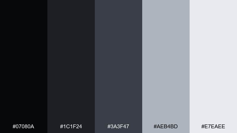
HEX: #07080A #1C1F24 #3A3F47 #AEB4BD #E7EAEE
Mood: sleek, high-contrast, futuristic
Best for: SaaS landing page hero and navigation UI
Sleek midnight tones with a chrome-like lift feel cinematic and precise, like city lights on polished metal. Use it for hero sections, top nav, and pricing cards where contrast and clarity matter. Pair the light silver with generous spacing so text stays crisp on deep charcoal. Tip: keep accents to the pale silver and reserve near-black for backgrounds to avoid a muddy interface.
Image example of midnight chrome generated using media.io

Media.io is an online AI studio for creating and editing video, image, and audio in your browser.

2) Steel Shadow
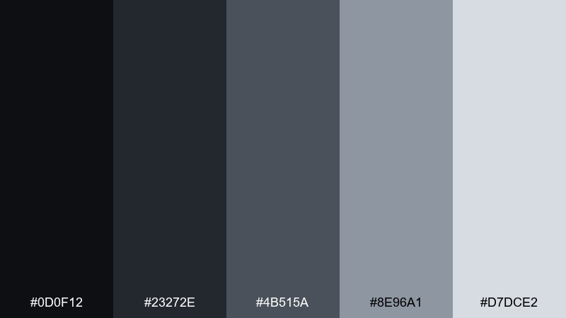
HEX: #0D0F12 #23272E #4B515A #8E96A1 #D7DCE2
Mood: confident, industrial, modern
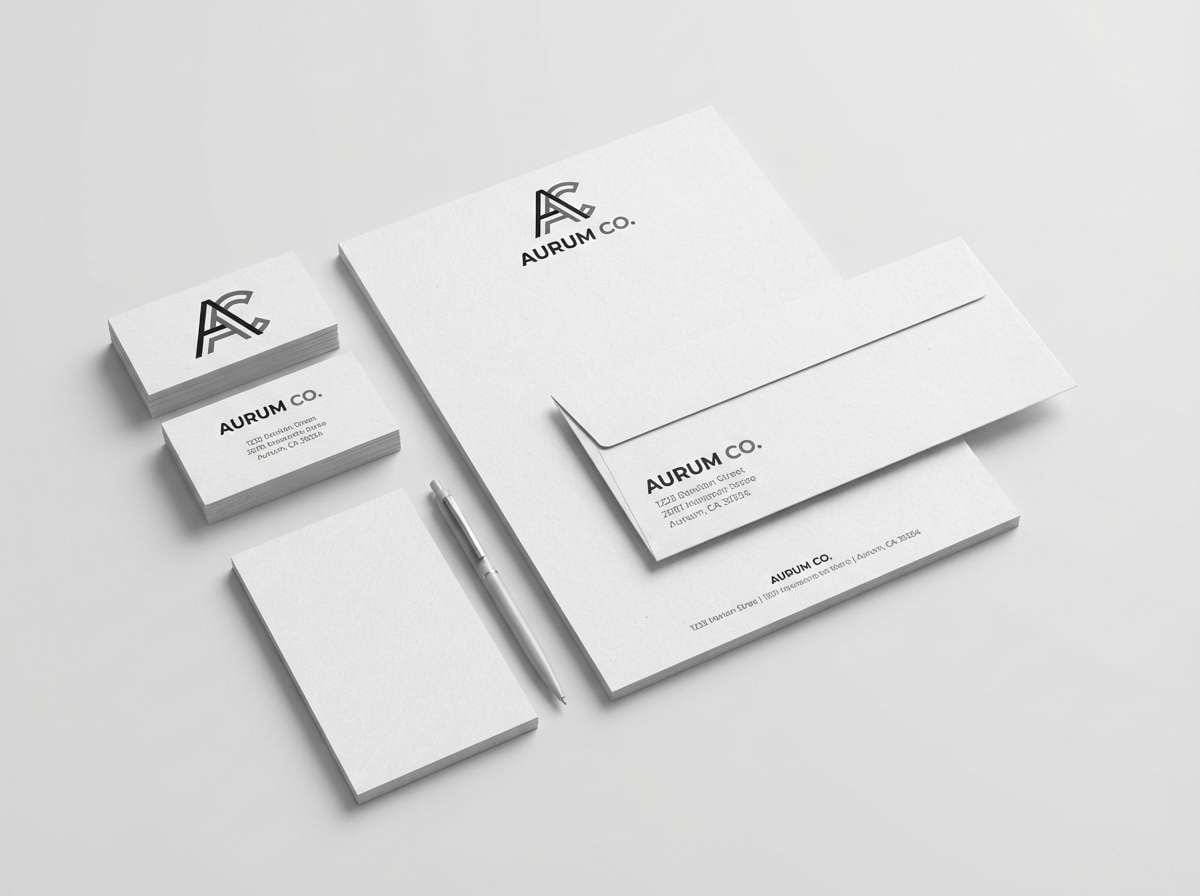
Best for: tech brand logo system and stationery
Confident steel grays and shadowy blacks evoke precision tools and modern architecture. It works well for logos, letterheads, and icon sets that need to feel engineered yet premium. Balance the darker pair with the pale gray for negative space and readable small type. Tip: print proofs matter here, so test the mid-gray on uncoated paper to avoid flat results.
Image example of steel shadow generated using media.io
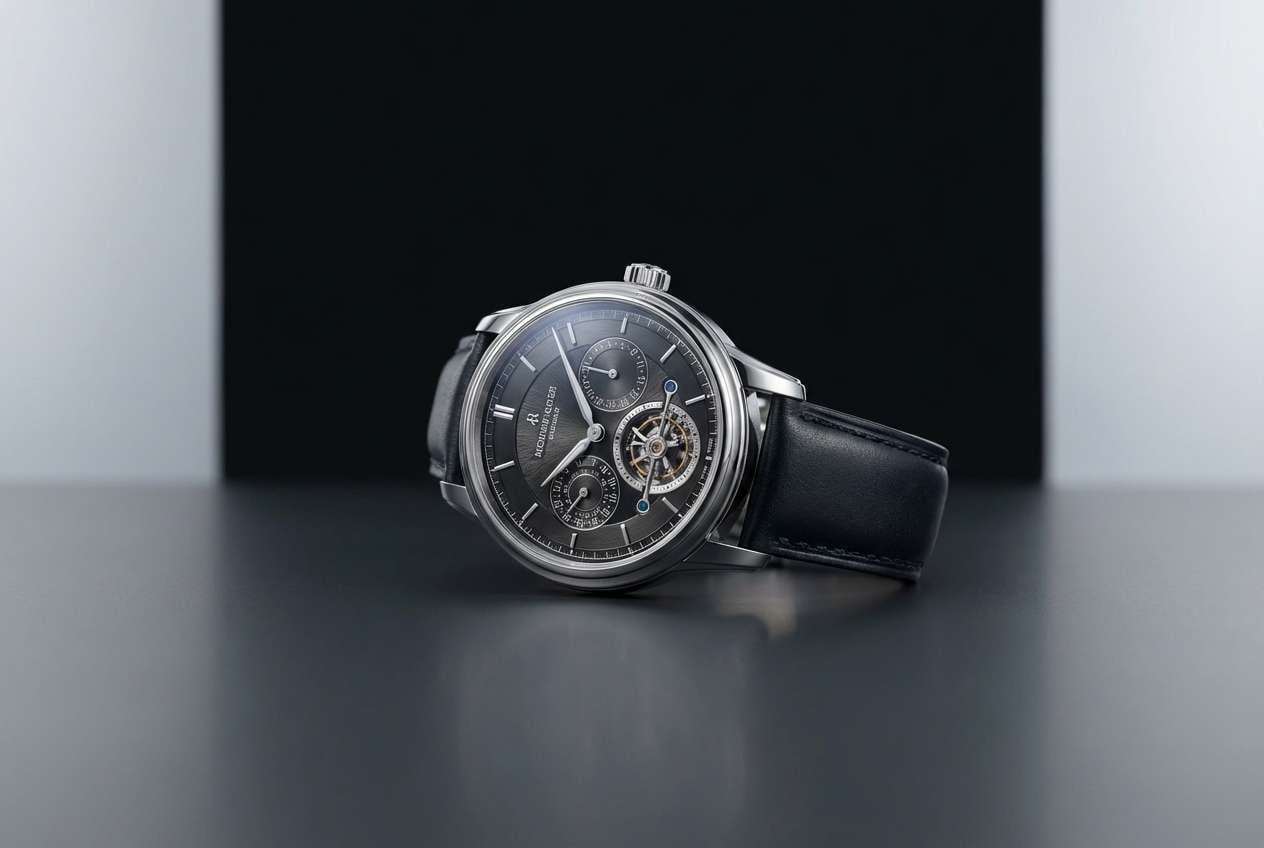
3) Noir Brushed Metal

HEX: #090A0C #16181D #2E333B #B6BDC7 #F1F3F6
Mood: luxury, glossy, editorial
Best for: watch or jewelry product ad
Glossy noir and brushed-metal silvers feel like a showroom spotlight hitting a finely machined surface. This black silver color palette shines for luxury ads, product detail pages, and premium packaging. Pair it with macro photography and clean sans-serif type to keep the look modern. Tip: use the brightest silver only for highlights and key pricing so it reads like a reflective glint.
Image example of noir brushed metal generated using media.io
4) Graphite Pearl
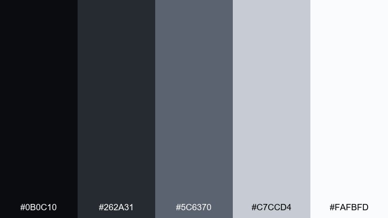
HEX: #0B0C10 #262A31 #5C6370 #C7CCD4 #FAFBFD
Mood: clean, airy, professional
Best for: presentation deck and report design
Airy pearl whites against graphite grays feel calm, orderly, and business-ready. Use it for slides, charts, and long-form reports where legibility is everything. The mid-gray is ideal for gridlines and secondary labels without adding visual noise. Tip: keep headings in near-black and reserve the brightest white for margins and callout boxes.
Image example of graphite pearl generated using media.io
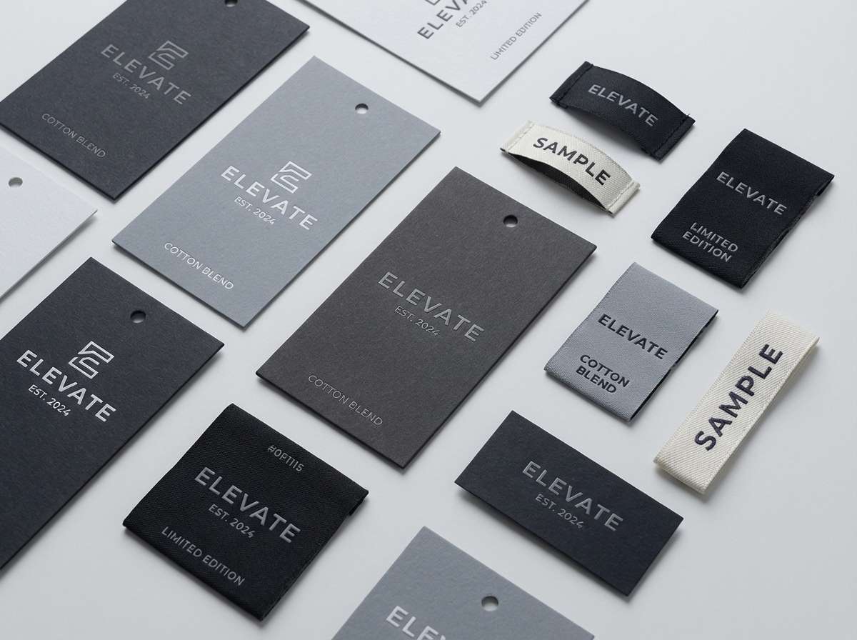
5) Urban Alloy
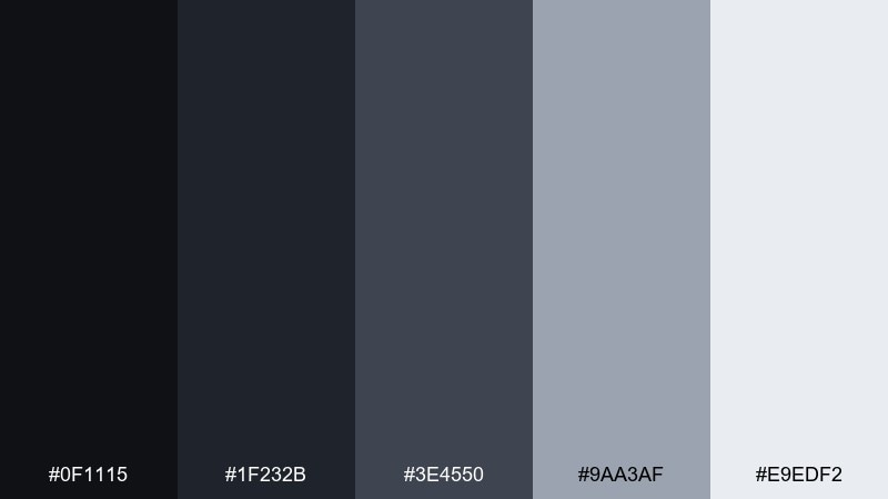
HEX: #0F1115 #1F232B #3E4550 #9AA3AF #E9EDF2
Mood: street-smart, bold, structured
Best for: streetwear hangtag and label design
Bold urban grays with alloy highlights evoke concrete, steel beams, and clean typography on a hangtag. It fits apparel labels, hangtags, and monochrome brand marks that need edge without chaos. Pair with condensed type and simple symbols so the contrast does the work. Tip: use the light gray for barcode blocks and care icons to keep them readable.
Image example of urban alloy generated using media.io
6) Silverline Minimal
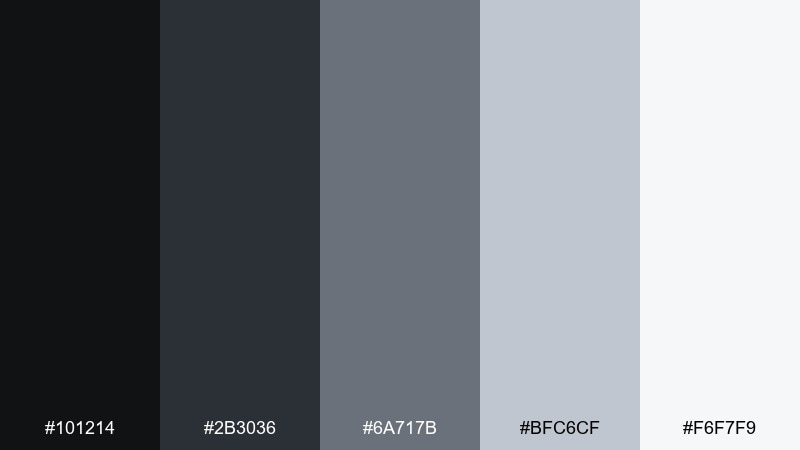
HEX: #101214 #2B3036 #6A717B #BFC6CF #F6F7F9
Mood: minimal, tidy, Scandinavian
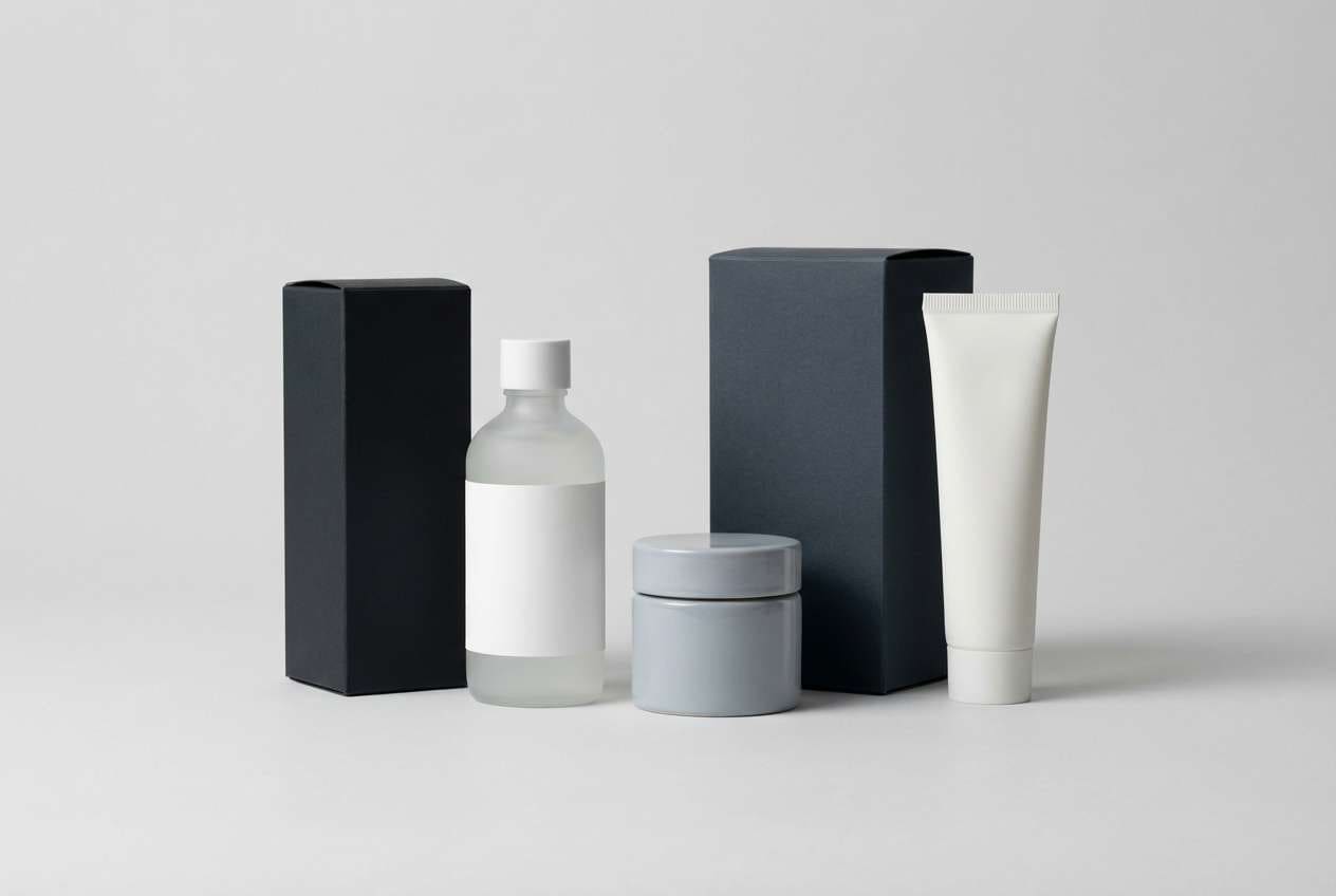
Best for: product packaging for skincare or grooming
Minimal silver lines and soft grays feel hygienic and modern, like a calm bathroom shelf. These black silver color combinations work beautifully on skincare cartons, labels, and subscription boxes where simplicity signals quality. Pair with matte finishes and a single thin rule line to elevate the layout. Tip: keep ingredient text in the medium gray to reduce harsh contrast while staying readable.
Image example of silverline minimal generated using media.io
7) Smoky Quartz
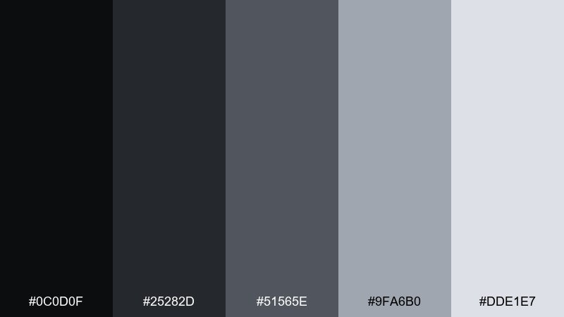
HEX: #0C0D0F #25282D #51565E #9FA6B0 #DDE1E7
Mood: moody, soft, refined
Best for: interior design moodboard and catalog
Smoky quartz grays feel soft and tactile, like velvet curtains and stone countertops. Use it for interior moodboards, catalog spreads, and architectural presentations that need depth without heavy contrast. Pair with warm materials like oak or beige linen in photos to keep it inviting. Tip: set body text in the darker mid-tone for a gentler reading experience than pure black.
Image example of smoky quartz generated using media.io
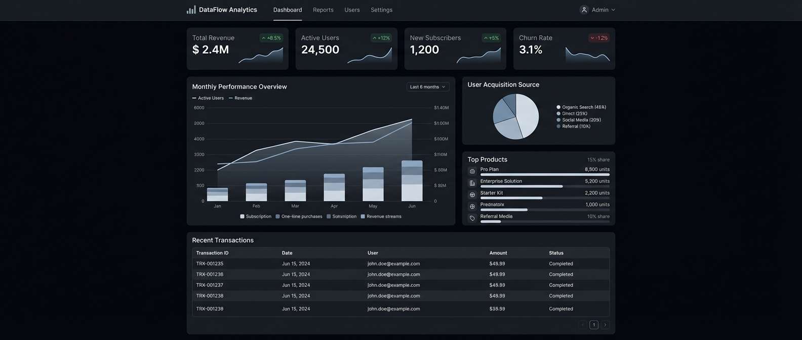
8) Carbon and Nickel UI
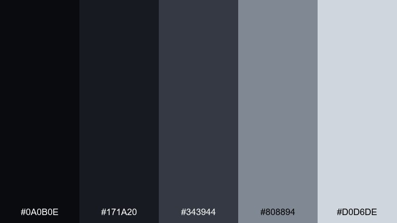
HEX: #0A0B0E #171A20 #343944 #808894 #D0D6DE
Mood: technical, sharp, quiet power
Best for: dark mode dashboard UI
Technical carbon blacks and nickel grays create a focused, low-glare feel, like an instrument panel at night. A black silver color scheme is ideal for dashboards with dense data, tables, and filters. Pair the lightest gray with generous padding so metrics pop without looking busy. Tip: use the medium gray for dividers and hover states to keep interactions subtle.
Image example of carbon and nickel ui generated using media.io
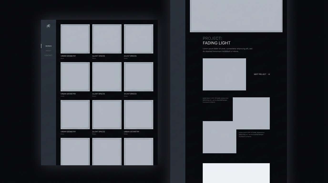
9) Lunar Charcoal
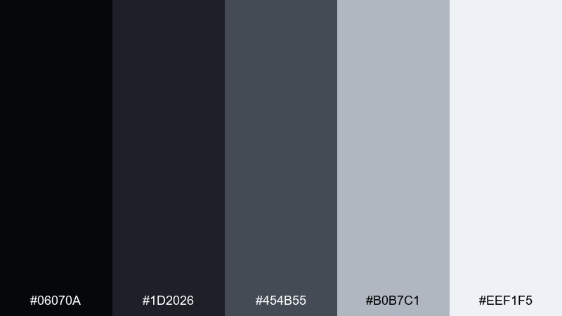
HEX: #06070A #1D2026 #454B55 #B0B7C1 #EEF1F5
Mood: calm, lunar, understated
Best for: photography portfolio website
Lunar lights over charcoal shadows feel quiet and gallery-like, letting imagery take center stage. Use it for photography portfolios, case study pages, and image-heavy grids with minimal UI chrome. Pair with thin borders and muted captions to keep attention on the work. Tip: give thumbnails a soft light-gray frame so they don't disappear on the darker background.
Image example of lunar charcoal generated using media.io
10) Tuxedo Shine
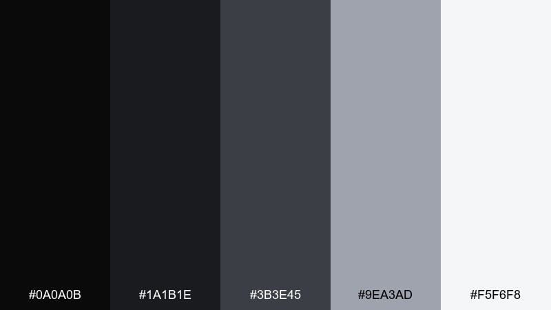
HEX: #0A0A0B #1A1B1E #3B3E45 #9EA3AD #F5F6F8
Mood: formal, crisp, high-end
Best for: event flyer for a gala or awards night
Crisp tuxedo blacks with bright silvery highlights feel formal and polished, like satin lapels under stage lights. This black silver color combination suits gala flyers, awards posters, and VIP invitations where elegance matters. Pair with high-contrast typography and minimal ornament to keep it contemporary. Tip: treat the brightest tone as a spotlight for the date and venue so it reads instantly.
Image example of tuxedo shine generated using media.io

11) Industrial Slate
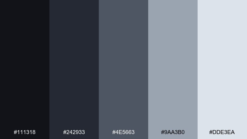
HEX: #111318 #242933 #4E5663 #9AA3B0 #DDE3EA
Mood: rugged, utilitarian, trustworthy
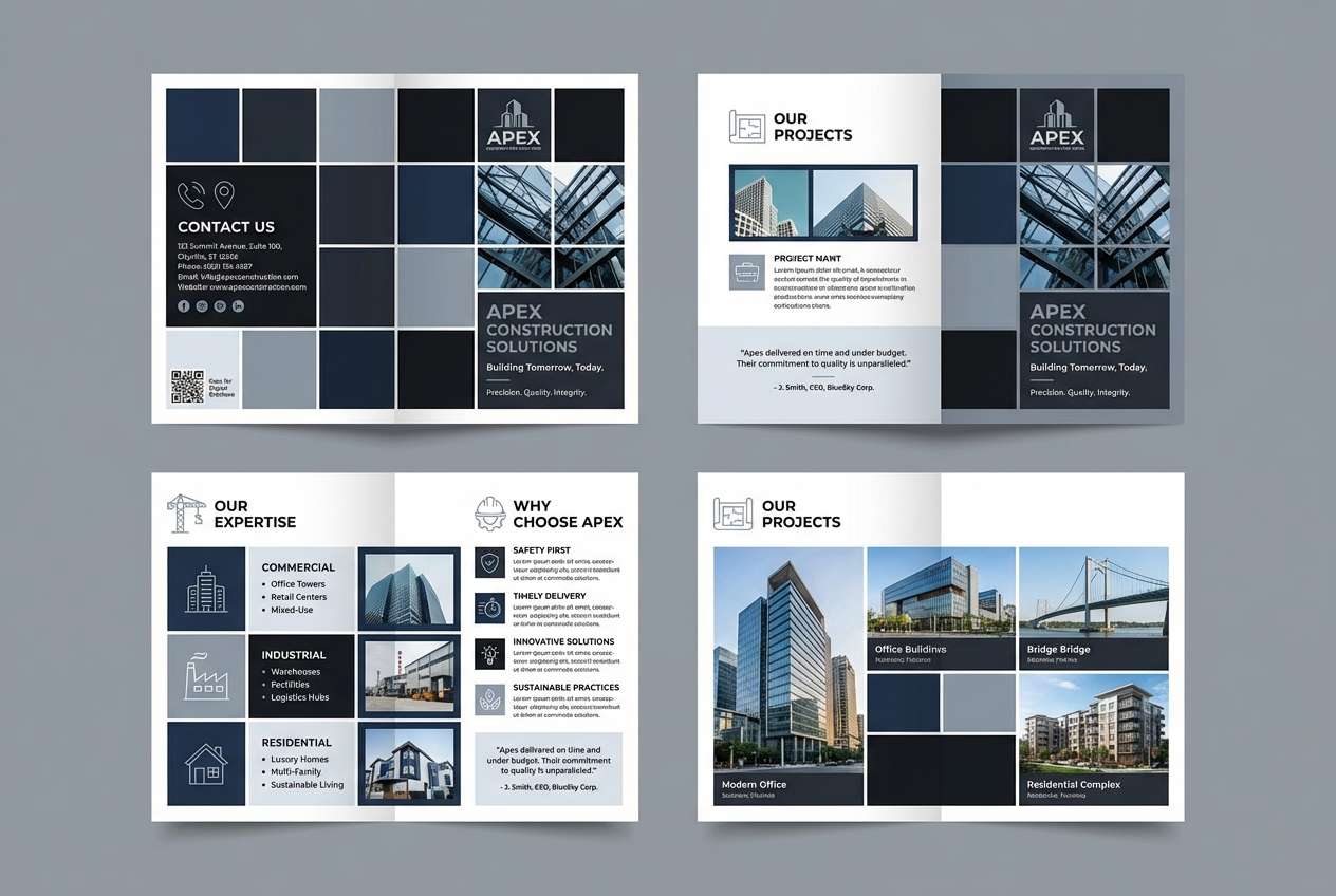
Best for: construction company brochure
Rugged slate tones suggest steel beams, site plans, and dependable workmanship. It fits brochures, capability decks, and proposal templates that need to look solid and organized. Pair with strong grids, simple icons, and plenty of whitespace so content stays scannable. Tip: use the mid-gray for section dividers and callout panels instead of heavy rules.
Image example of industrial slate generated using media.io
12) Frosted Gunmetal
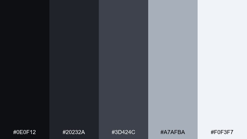
HEX: #0E0F12 #20232A #3D424C #A7AFBA #F0F3F7
Mood: cool, wintery, premium tech
Best for: consumer electronics product page
Cool gunmetal with frosted light grays feels clean and technical, like brushed aluminum in winter light. Use it on product pages for headphones, laptops, or accessories where specs and imagery share space. Pair with subtle gradients and thin strokes to suggest metal without going glossy. Tip: keep CTAs in the lightest tone with dark text for a refined, non-flashy conversion button.
Image example of frosted gunmetal generated using media.io
13) Monochrome Luxe
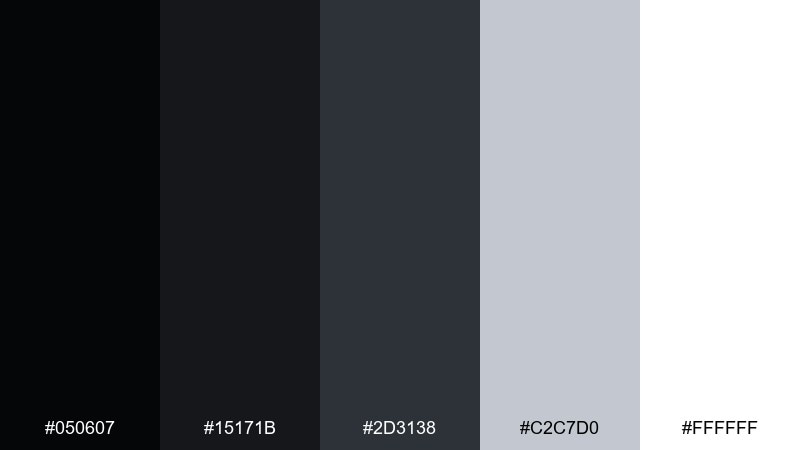
HEX: #050607 #15171B #2D3138 #C2C7D0 #FFFFFF
Mood: luxurious, crisp, gallery-clean
Best for: fashion editorial magazine layout
Gallery-clean whites with deep blacks and a soft metallic gray feel like a high-fashion spread. It works for editorial layouts, lookbooks, and typography-led covers where negative space is the star. Pair with serif headlines and fine rules to emphasize luxury. Tip: use the silver-gray for captions and page numbers so the hierarchy stays elegant.
Image example of monochrome luxe generated using media.io
14) Velvet Steel
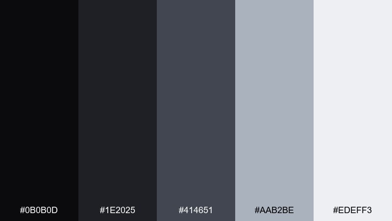
HEX: #0B0B0D #1E2025 #414651 #AAB2BE #EDEFF3
Mood: soft, cinematic, upscale
Best for: movie title card and poster typography
Velvet-dark shadows and steel highlights feel cinematic, like a slow reveal in a theater. This black silver color palette is great for title cards, posters, and motion graphics where typography needs drama without loud color. Pair with wide tracking and subtle grain for a filmic finish. Tip: keep the brightest gray for the title only, and let supporting credits sit in the mid-tone.
Image example of velvet steel generated using media.io
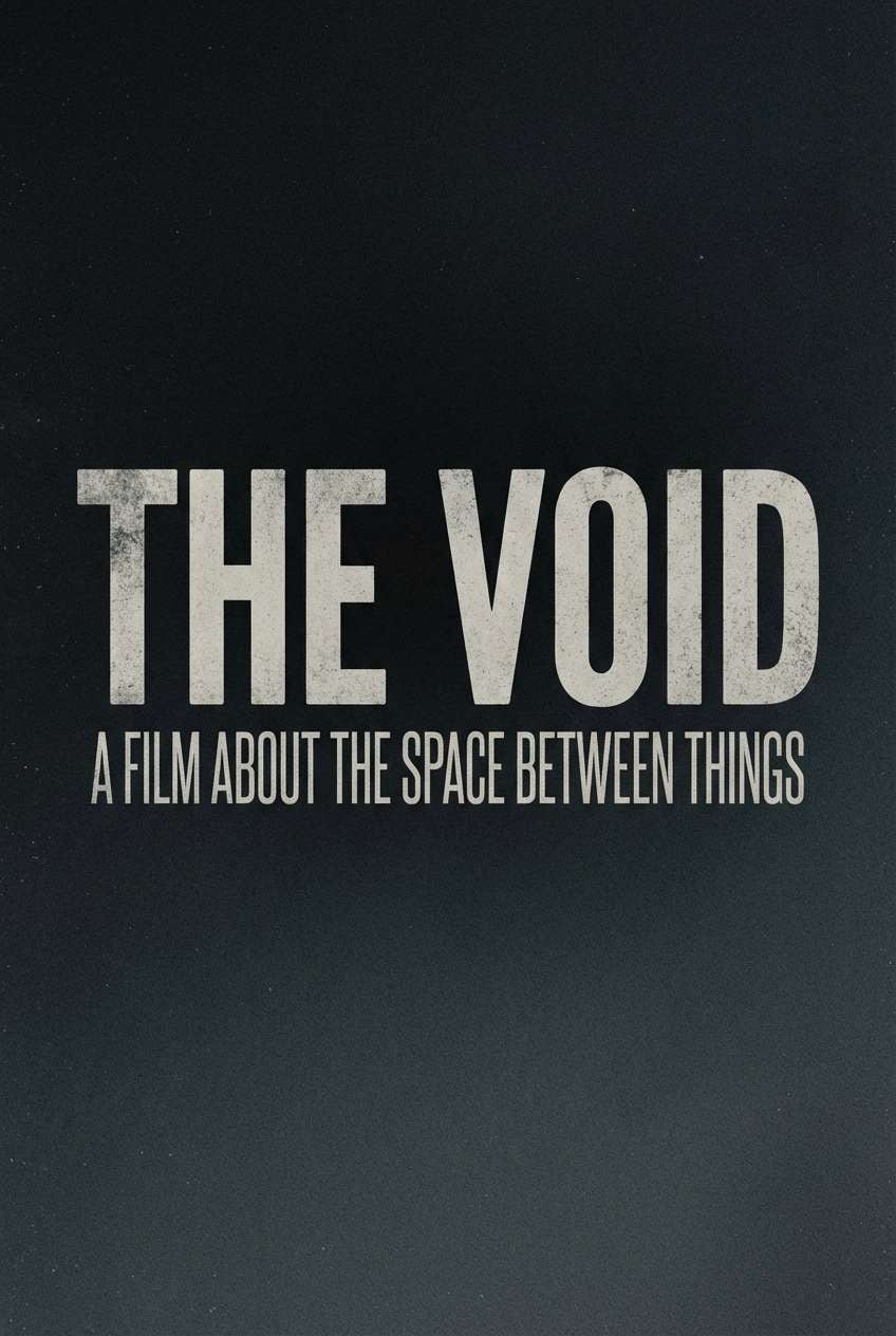
15) Museum Label
HEX: #0F1012 #2A2D33 #5A606A #BFC5CE #F8F9FB
Mood: quiet, academic, curated
Best for: museum signage and exhibit labels
Curated neutrals feel scholarly and calm, like gallery labels beside sculpture. Use it for signage systems, wayfinding, and exhibit panels where readability and restraint are key. Pair with a clean sans-serif and consistent spacing for a cohesive visitor experience. Tip: keep background in the off-white and use the near-black only for headings and arrows.
Image example of museum label generated using media.io
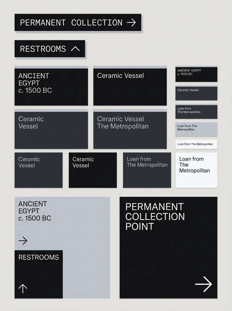
16) Neonless Night
HEX: #050509 #14151A #2A2D36 #7D8591 #D6DAE1
Mood: subtle, nocturnal, modern
Best for: music streaming app interface
Nocturnal grays without neon accents feel focused and mature, like late-night listening in a dim room. It fits streaming interfaces, playlist pages, and player controls where the content artwork should dominate. Pair with soft shadows and restrained highlights so buttons stay discoverable. Tip: use the lightest gray for active states and keep inactive icons in the muted mid-tone.
Image example of neonless night generated using media.io
17) Clouded Titanium

HEX: #0C0D10 #1B1E24 #3C424D #B3BAC5 #F2F4F8
Mood: cool, polished, corporate
Best for: fintech mobile app onboarding screens
Clouded titanium grays feel secure and polished, like a brushed metal card under soft daylight. Use it for onboarding screens, permission prompts, and trust-first fintech flows. Pair with simple illustrations and strong typographic hierarchy to reduce cognitive load. Tip: keep progress indicators in the pale silver so they're visible without becoming loud.
Image example of clouded titanium generated using media.io
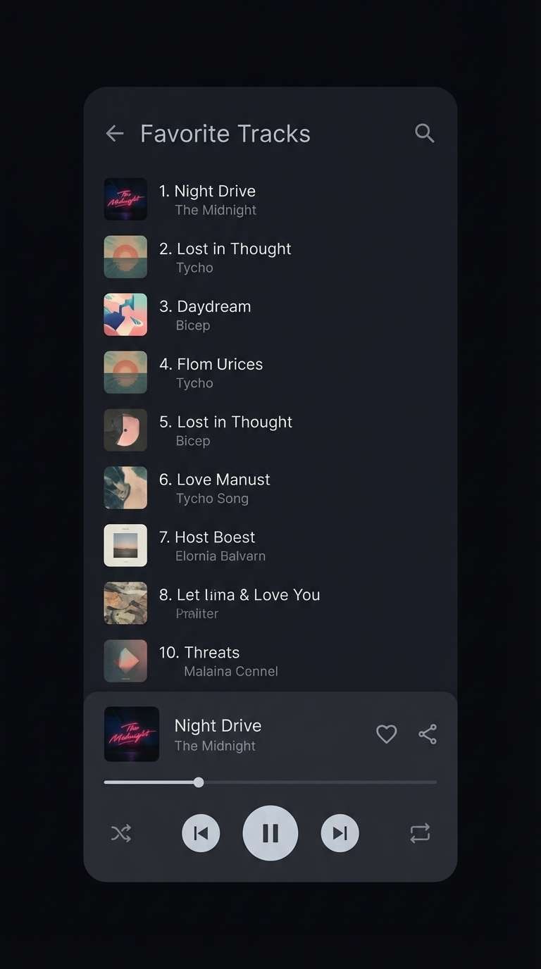
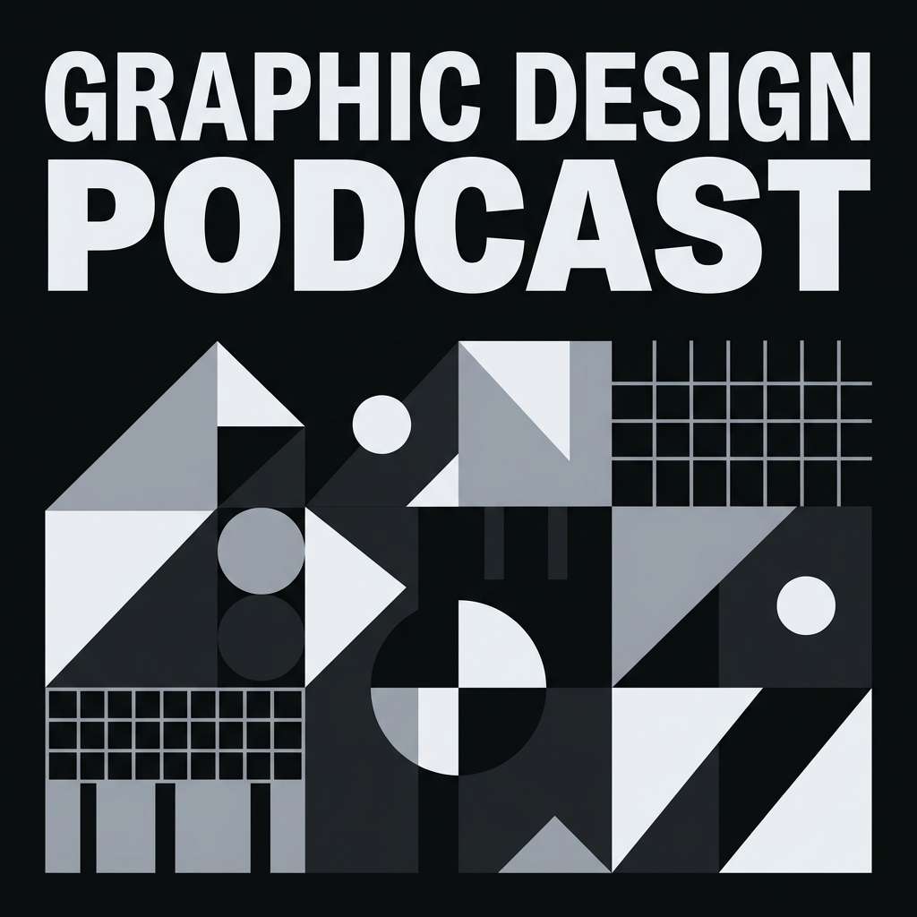
18) Silver Static
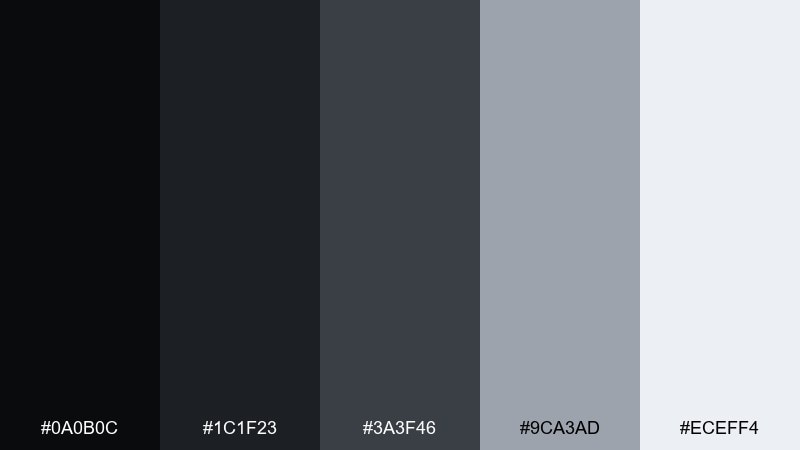
HEX: #0A0B0C #1C1F23 #3A3F46 #9CA3AD #ECEFF4
Mood: edgy, modern, tech-forward
Best for: podcast cover art
Edgy dark tones with a static-like silver highlight feel digital and contemporary. It works for podcast cover art, thumbnails, and social tiles where you want instant contrast at small sizes. Pair with bold type and a single geometric motif to keep it recognizable. Tip: make the background nearly black and let the silver do the outlining for maximum punch.
Image example of silver static generated using media.io
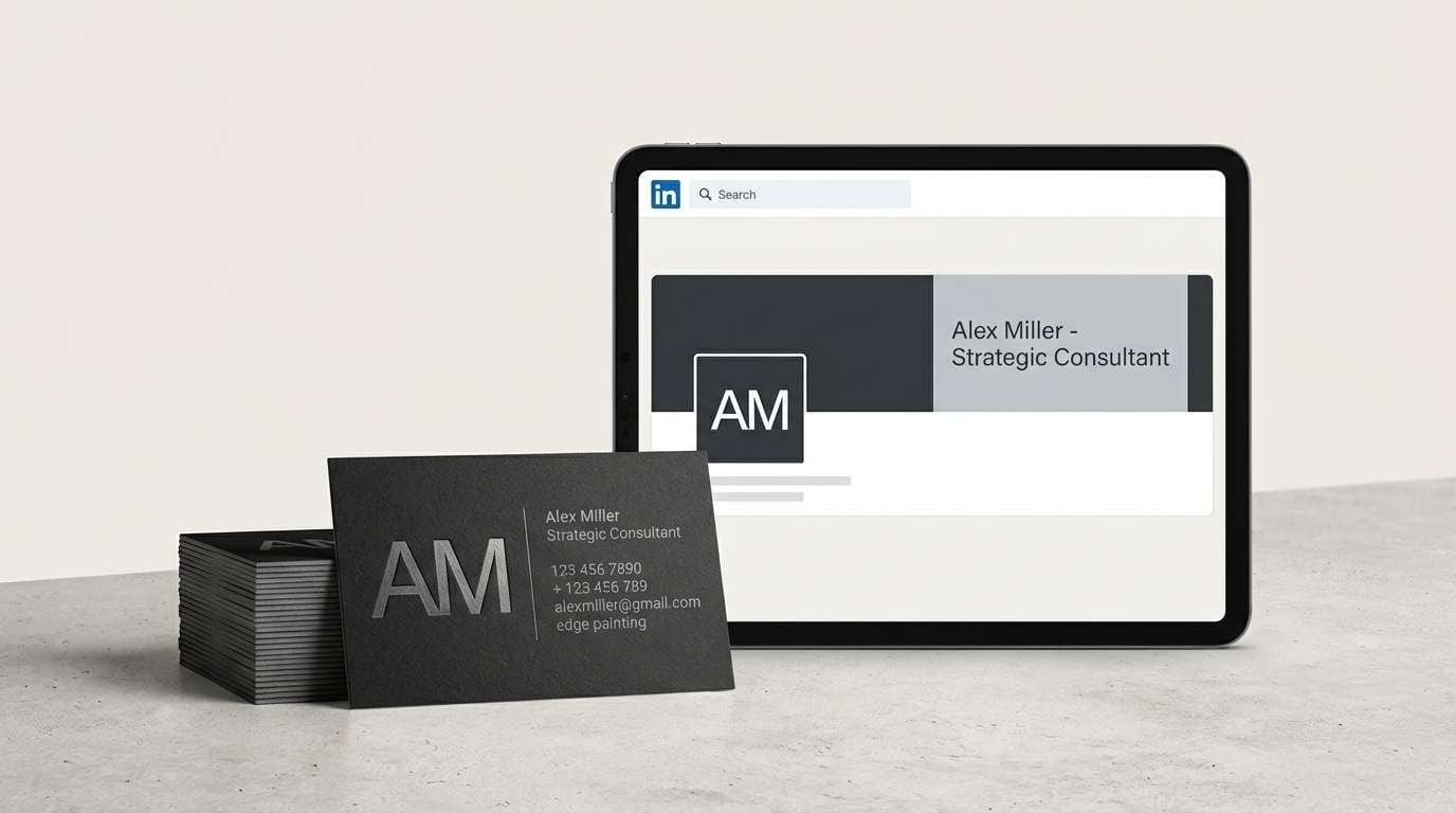
19) Executive Nightfall
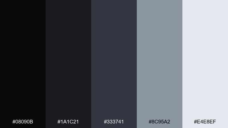
HEX: #08090B #1A1C21 #333741 #8C95A2 #E4E8EF
Mood: executive, composed, premium
Best for: business card and LinkedIn banner set
Composed nightfall blacks with refined silvers feel executive and timeless, like a tailored suit and polished cufflinks. These black silver color combinations are ideal for business cards, profile banners, and personal branding that needs authority without flash. Pair with a single monogram mark and plenty of breathing room. Tip: use the light silver for the name line and keep supporting details in the mid-gray for a clean hierarchy.
Image example of executive nightfall generated using media.io
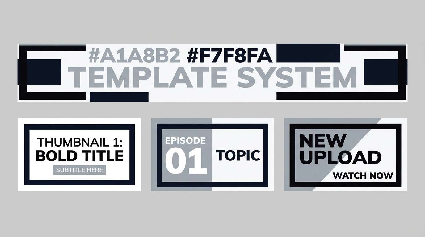
20) Cinematic Metallic
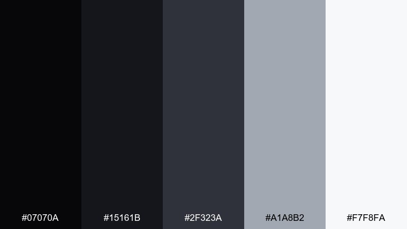
HEX: #07070A #15161B #2F323A #A1A8B2 #F7F8FA
Mood: dramatic, glossy, high-impact
Best for: YouTube channel banner and thumbnail system
Dramatic near-black with crisp metallic lights feels like a studio rig catching reflective surfaces. Use it for channel banners, thumbnail templates, and motion-style graphics where contrast must read instantly. Black silver color combinations work best here with oversized type and strong outlines. Tip: keep the lightest tone for the subject outline or key words so the design stays legible on mobile.
Image example of cinematic metallic generated using media.io
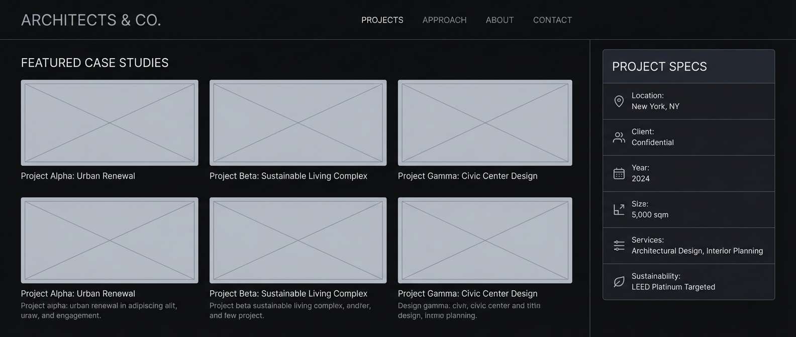
21) Architectural Ink
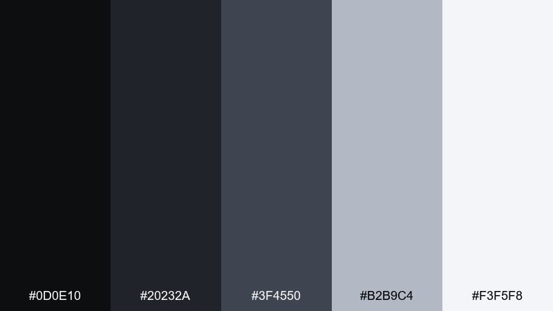
HEX: #0D0E10 #20232A #3F4550 #B2B9C4 #F3F5F8
Mood: structured, precise, architectural
Best for: architecture firm project case study page
Architectural ink tones feel precise and structured, like drafting lines on premium paper. Use it for case study pages, project galleries, and proposal decks where grids and spacing matter. Pair with fine line icons and monochrome photography for a cohesive look. Tip: set captions in the lighter mid-gray so the page stays quiet and professional.
Image example of architectural ink generated using media.io
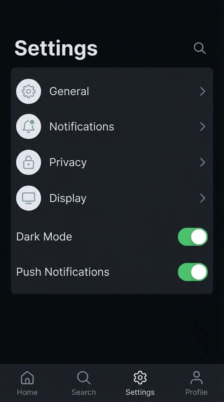
22) Quiet Hardware
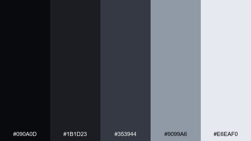
HEX: #090A0D #1B1D23 #353944 #9099A6 #E6EAF0
Mood: practical, calm, tool-like
Best for: app icon set and settings UI
Quiet hardware grays feel practical and tool-like, perfect for settings screens and utility apps. A restrained black silver color combination keeps icons readable and avoids the harshness of pure black-and-white. Pair with rounded corners and consistent stroke weight for a friendly, modern finish. Tip: use the pale gray for toggles and active states to create clear affordances without bright color.
Image example of quiet hardware generated using media.io
What Colors Go Well with Black Silver?
Black silver palettes pair naturally with cool accents like icy blue, cyan, and deep teal—these hues feel “tech” and keep the overall look crisp. They also work well with muted purples (lavender, mauve) when you want a softer, more editorial vibe.
For warmth, add one controlled highlight: amber, copper, gold, or sand. A single warm accent can make the metallic neutrals feel more premium while preserving the clean monochrome foundation.
If you need a safer, corporate-friendly companion, try navy, slate blue, or desaturated green. These tones maintain seriousness while improving differentiation in charts, UI states, and category labels.
How to Use a Black Silver Color Palette in Real Designs
Start with role-based assignments: near-black for backgrounds, dark gray for surfaces/cards, mid-gray for dividers and secondary text, and pale silver for primary text and key highlights. This prevents the common “all darks blend together” problem.
Use texture thoughtfully: subtle gradients, noise, or thin strokes can imply metal without becoming glossy. In print, consider matte blacks plus spot UV or foil-like silver accents for a controlled premium feel.
Keep accessibility in mind—especially in dark mode. Test contrast for body text and UI components, and avoid using the lightest silver everywhere so you preserve hierarchy and reduce glare.
Create Black Silver Palette Visuals with AI
If you already have a palette, the fastest way to validate it is to generate mock visuals (UI screens, posters, packaging) using the same HEX colors. This helps you see balance, contrast, and “material feel” before you commit to production.
With Media.io Text-to-Image, you can paste a prompt, include your HEX codes, set an aspect ratio, and iterate quickly. Try generating multiple lighting styles (matte, brushed, glossy) to find the best black-silver finish for your project.
Black Silver Color Palette FAQs
-
Is black and silver a good color combination for branding?
Yes. Black and silver reads modern, premium, and confident, making it popular for tech, luxury, automotive, and professional services. The key is to use silver as an accent/highlight so the brand doesn’t feel flat or overly monochrome. -
What HEX codes are commonly used for a black silver palette?
Typical sets include a near-black base (around #050607 to #111318), one or two dark grays (e.g., #1A1C21, #2D3138), a mid-gray for structure (e.g., #5A606A or #808894), and a pale silver for readability (e.g., #D7DCE2 to #F7F8FA). -
How do I keep a black silver design from looking “muddy”?
Separate tones by assigning clear roles: darkest for background, slightly lighter for surfaces, mid-gray for dividers/secondary UI, and light silver for text/highlights. Add spacing and thin borders so panels don’t blend together. -
What accent color works best with black and silver?
For a cool, modern feel, use teal, cyan, or icy blue. For a premium look, use a controlled warm accent like gold/amber/copper. Keep accents minimal so silver still feels like the highlight. -
Is black and silver good for dark mode UI?
It’s one of the best foundations for dark mode because you can create hierarchy with multiple grays instead of pure black and pure white. Use pale silver for primary text and ensure contrast is high enough for accessibility. -
How do I create matching black silver visuals with AI?
Use prompts that specify your HEX codes, material cues (brushed metal, matte, chrome), and layout type (dashboard, flyer, packaging). In Media.io Text-to-Image, iterate by adjusting lighting words (soft studio light, subtle gradients) to control how “metallic” the silver feels. -
Does black and silver print well on packaging?
Yes, especially with matte black plus subtle silver typography or finishes. Always run print tests: mid-grays can shift on different papers, and very dark tones may lose detail if ink coverage is heavy.


