

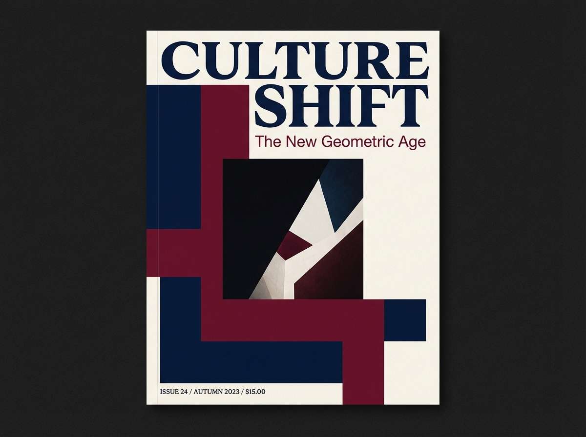
Blue and maroon is a refined color pairing that balances cool confidence with warm intensity. It can feel timeless and formal, or modern and energetic, depending on the shade and contrast.
Below are 20 curated blue maroon color palette ideas (with HEX codes) you can use for branding, UI, print design, and seasonal campaigns.
In this article
- Why Blue Maroon Palettes Work So Well
-
- midnight burgundy glow
- harbor wine slate
- velvet theater
- denim merlot minimal
- winterberry navy pop
- classic prep stripe
- brick cellar blue
- dusty indigo rosewood
- coastal dusk cranberry
- gallery night neutrals
- royal ink oxblood
- soft smoke sangria
- retro collegiate
- autumn plum with blue steel
- night sky cabernet
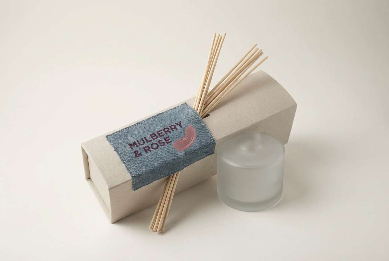
- muted denim mulberry
- modern saas dark mode
- wedding evening elegance
- artisan coffeehouse
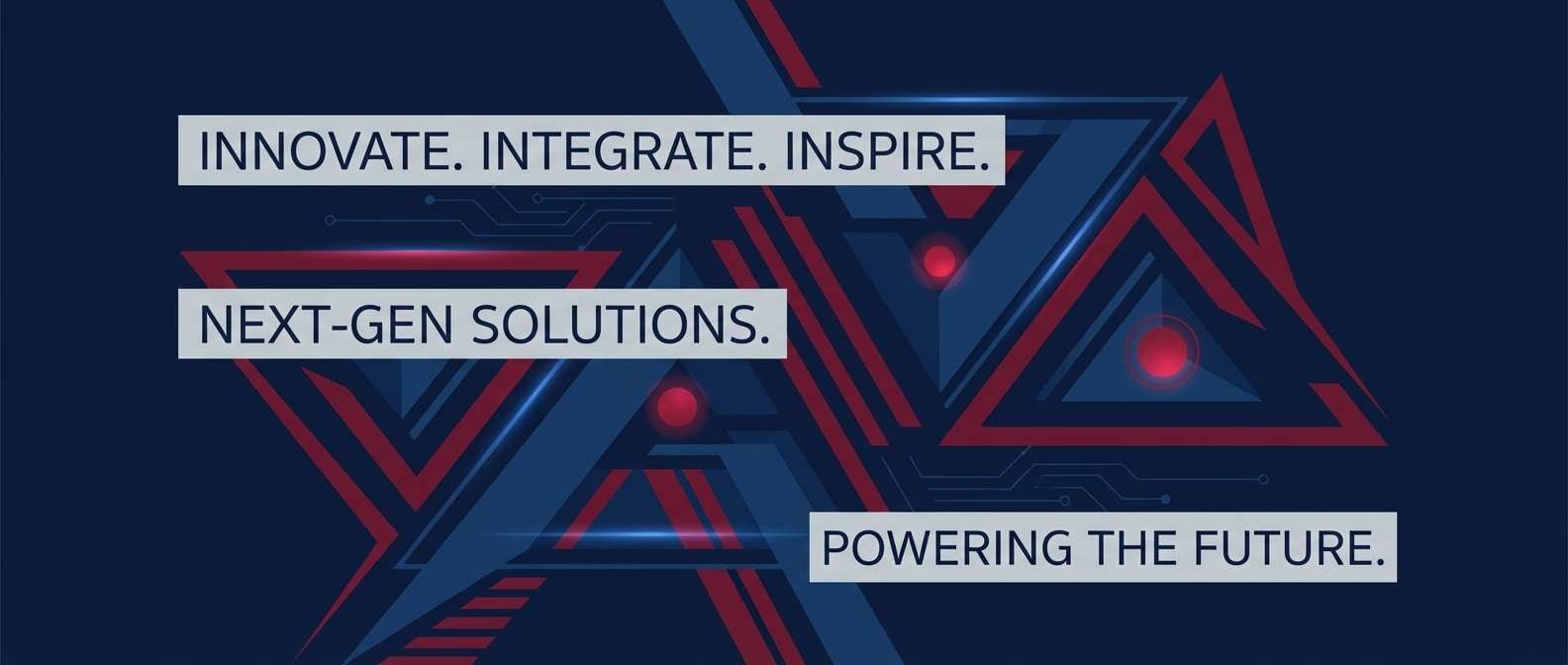
- neon accent tech
- What Colors Go Well with Blue Maroon?
- How to Use a Blue Maroon Color Palette in Real Designs
- Create Blue Maroon Palette Visuals with AI
Why Blue Maroon Palettes Work So Well
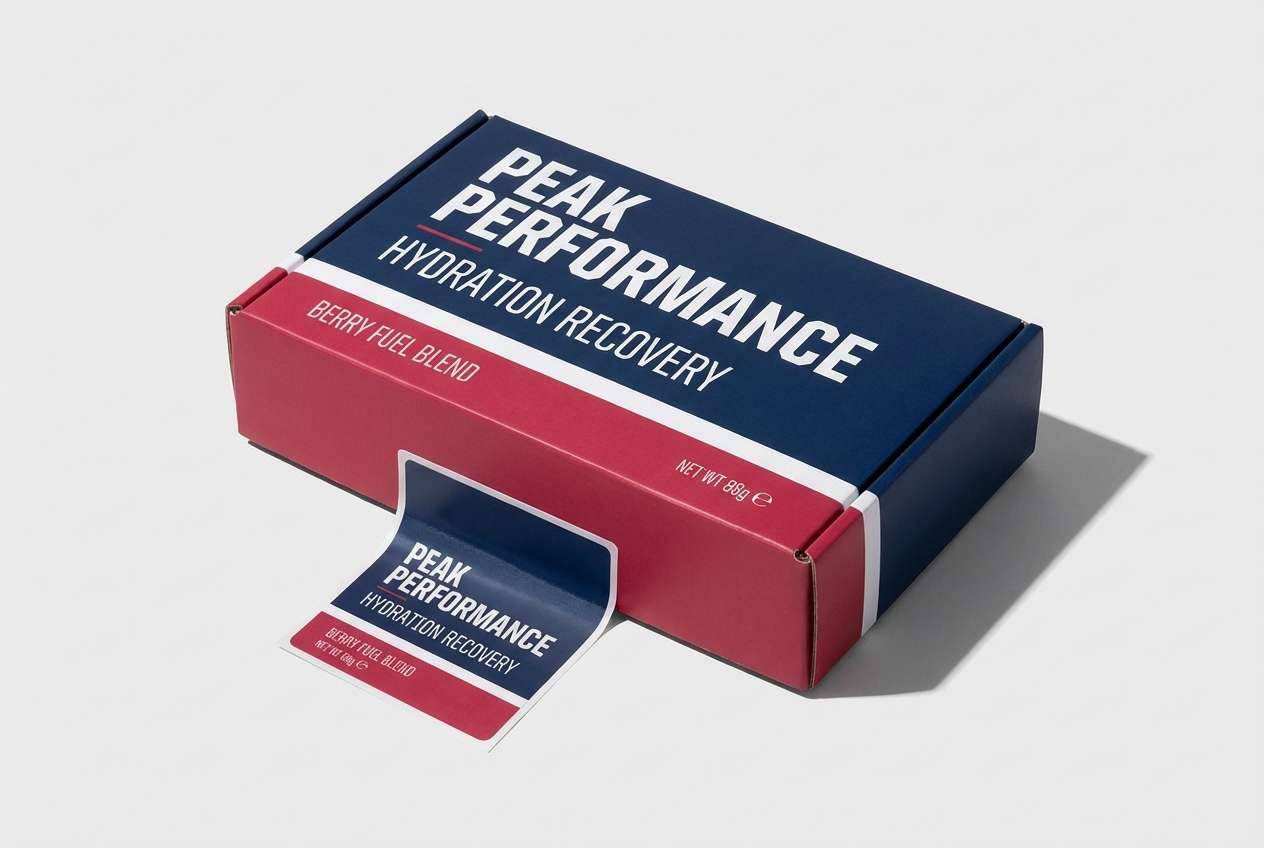
Blue brings structure, trust, and clarity, while maroon adds depth, warmth, and a premium feel. Together, they create contrast that reads as intentional rather than loud.
This pairing is flexible across industries: navy-maroon can feel corporate and authoritative, while brighter blues with berry reds can feel sporty, youthful, or campaign-ready.
Because both colors can skew dark, adding a clean neutral (cream, ivory, or cool near-white) helps maintain readability and keeps layouts from feeling heavy.
20+ Blue Maroon Color Palette Ideas (with HEX Codes)
1) Midnight Burgundy Glow
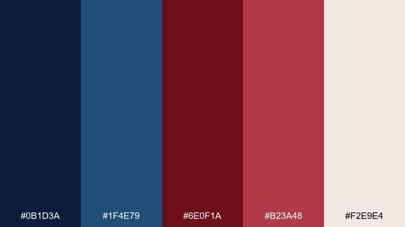
HEX: #0B1D3A #1F4E79 #6E0F1A #B23A48 #F2E9E4
Mood: moody, cinematic, refined
Best for: luxury branding, book covers, editorial headers
Moody midnight blues and burgundy highlights feel like velvet curtains and city lights after dark. Use it for premium brands, dramatic headlines, and cover art that needs depth. Pair the off-white with plenty of breathing room and let the warm maroons carry accents like buttons or callouts. Tip: keep the darkest navy as the main background to avoid a muddy mid-tone mix.
Image example of midnight burgundy glow generated using media.io
Media.io is an online AI studio for creating and editing video, image, and audio in your browser.

2) Harbor Wine Slate
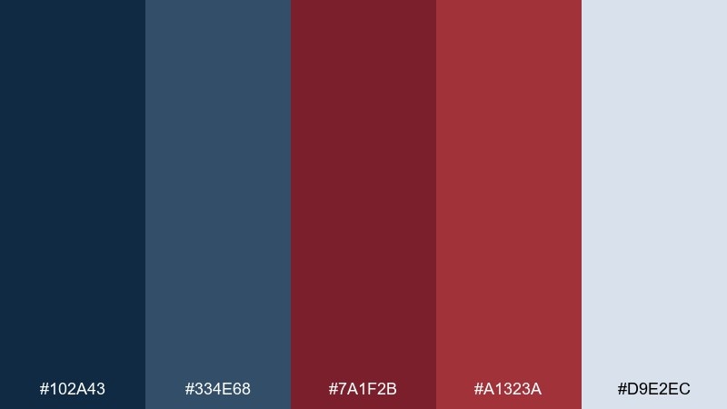
HEX: #102A43 #334E68 #7A1F2B #A1323A #D9E2EC
Mood: steady, coastal, professional
Best for: corporate decks, finance dashboards, product one-pagers
Slate blues and harbor-night navy bring a steady, trustworthy tone, while wine reds add authority without shouting. This works well for B2B pages, reports, and data-heavy screens where clarity matters. Use the pale gray-blue as your canvas and reserve maroon for key metrics and alerts. Tip: keep charts mostly in blues and use maroon only for one highlighted series.
Image example of harbor wine slate generated using media.io
3) Velvet Theater
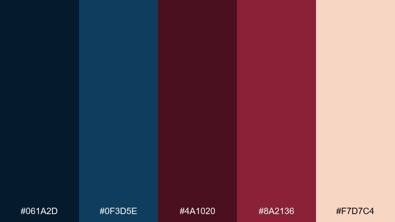
HEX: #061A2D #0F3D5E #4A1020 #8A2136 #F7D7C4
Mood: dramatic, romantic, vintage
Best for: event posters, theater programs, album art
Dramatic and romantic, these tones evoke old playbills, candlelight, and deep velvet seats. The blue maroon color palette shines on posters and cover designs where you want rich contrast and a nostalgic mood. Let the peachy cream act as spotlight space for titles and dates, and keep maroon for the focal typography. Tip: add subtle grain or paper texture to enhance the vintage feel without reducing legibility.
Image example of velvet theater generated using media.io
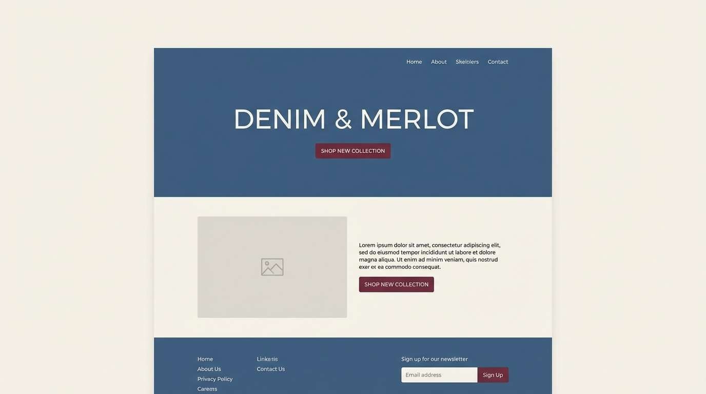
4) Denim Merlot Minimal
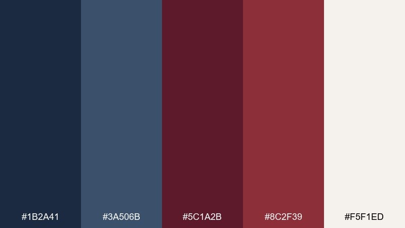
HEX: #1B2A41 #3A506B #5C1A2B #8C2F39 #F5F1ED
Mood: calm, modern, understated
Best for: minimal websites, portfolio pages, app onboarding
Clean denim blues with merlot reds feel modern, quiet, and confident. This set fits minimal layouts where you want a strong accent without loud saturation. Use the warm off-white for backgrounds and apply merlot to primary CTAs or section dividers. Tip: keep typography in the darkest blue to maintain a soft, cohesive contrast.
Image example of denim merlot minimal generated using media.io
5) Winterberry Navy Pop
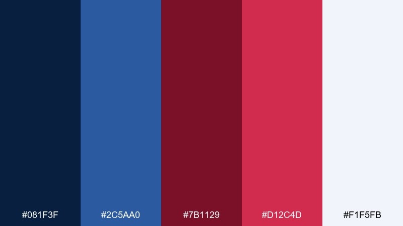
HEX: #081F3F #2C5AA0 #7B1129 #D12C4D #F1F5FB
Mood: crisp, energetic, festive
Best for: seasonal campaigns, social ads, sporty branding
Crisp navy and bright berry reds feel like cold air, wool coats, and neon storefronts in winter. These blue maroon color combinations work when you need punchy contrast for banners, promos, and fast-scrolling social creative. Keep the icy near-white as a buffer so the hot pink-red does not overwhelm the design. Tip: use the brighter red only for one hero element per layout, like a discount badge or primary button.
Image example of winterberry navy pop generated using media.io
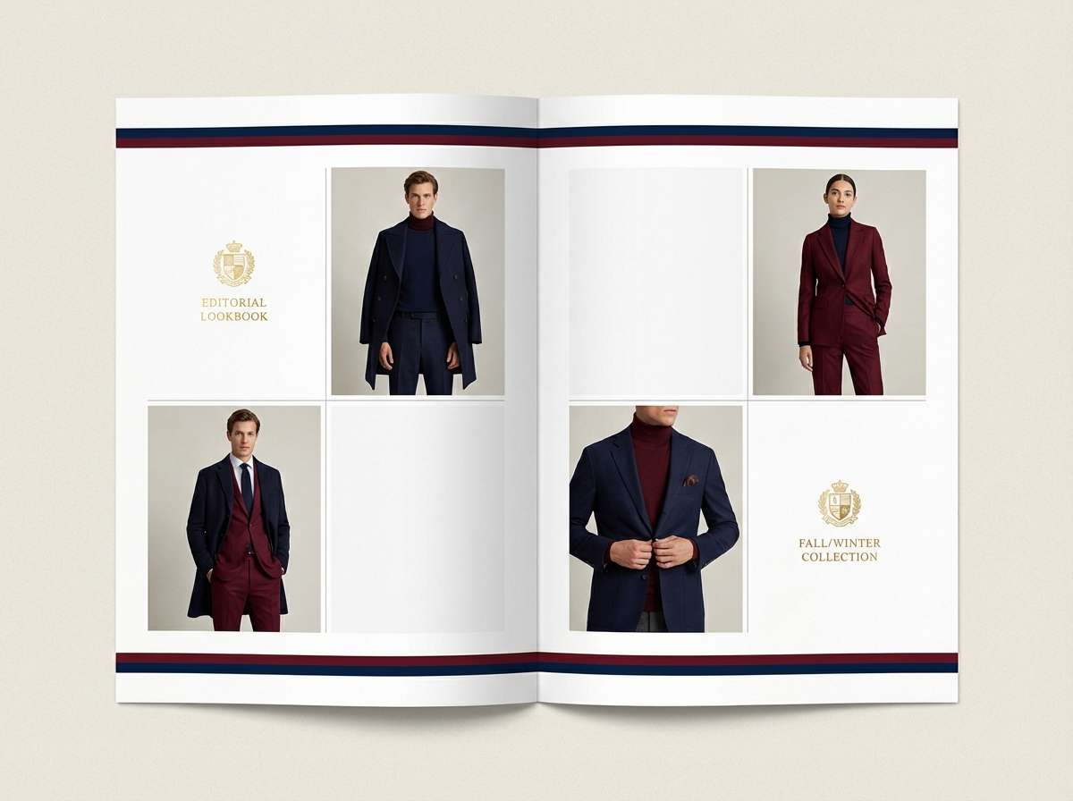
6) Classic Prep Stripe
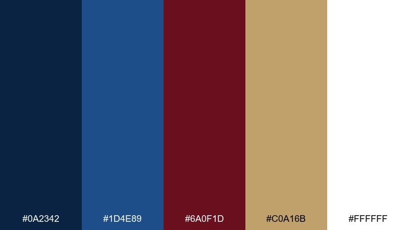
HEX: #0A2342 #1D4E89 #6A0F1D #C0A16B #FFFFFF
Mood: classic, collegiate, polished
Best for: fashion lookbooks, club branding, stationery
Polished and collegiate, this mix recalls blazers, striped ties, and gold crests. The tan-gold softens the deep tones and makes the reds feel more heritage than dramatic. Use white for clean margins and let the gold act as a thin rule line or seal detail. Tip: avoid large gold blocks and keep it as a trim color for a more upscale result.
Image example of classic prep stripe generated using media.io
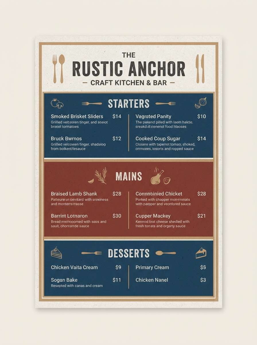
7) Brick Cellar Blue
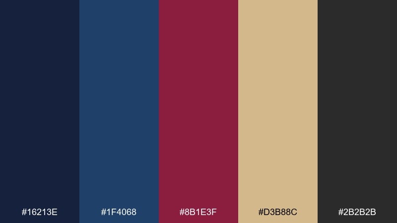
HEX: #16213E #1F4068 #8B1E3F #D3B88C #2B2B2B
Mood: rustic, grounded, bold
Best for: restaurant menus, craft labels, interiors moodboards
Grounded blues and brick maroon feel like old cellars, aged wood, and warm lamplight. The sandy tan adds an earthy lift that keeps the scheme from turning too heavy. Use charcoal for type and outlines, then reserve maroon for section headers and stamps. Tip: add subtle texture like kraft paper or linen to reinforce the craft vibe.
Image example of brick cellar blue generated using media.io
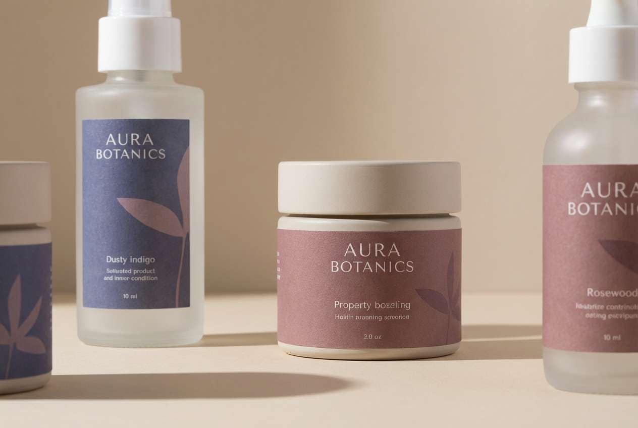
8) Dusty Indigo Rosewood
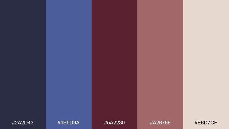
HEX: #2A2D43 #4B5D9A #5A2230 #A26769 #E6D7CF
Mood: soft, mature, cozy
Best for: wellness brands, lifestyle blogs, soft packaging
Soft indigo and rosewood tones evoke knit blankets, dried florals, and quiet mornings. The muted mauve bridges the cool and warm sides, making this feel gentle rather than high-contrast. Use the pale beige for background panels and keep indigo for navigation and headings. Tip: pair with warm photography and avoid pure black to preserve the cozy mood.
Image example of dusty indigo rosewood generated using media.io
9) Coastal Dusk Cranberry
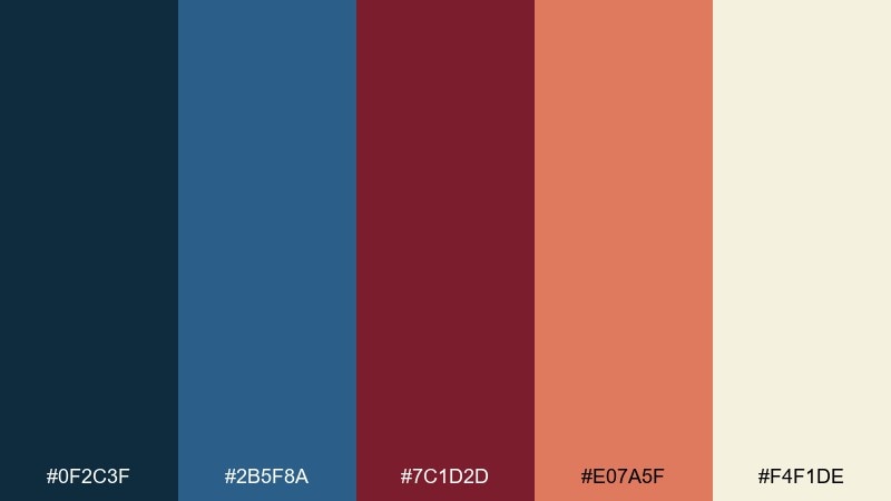
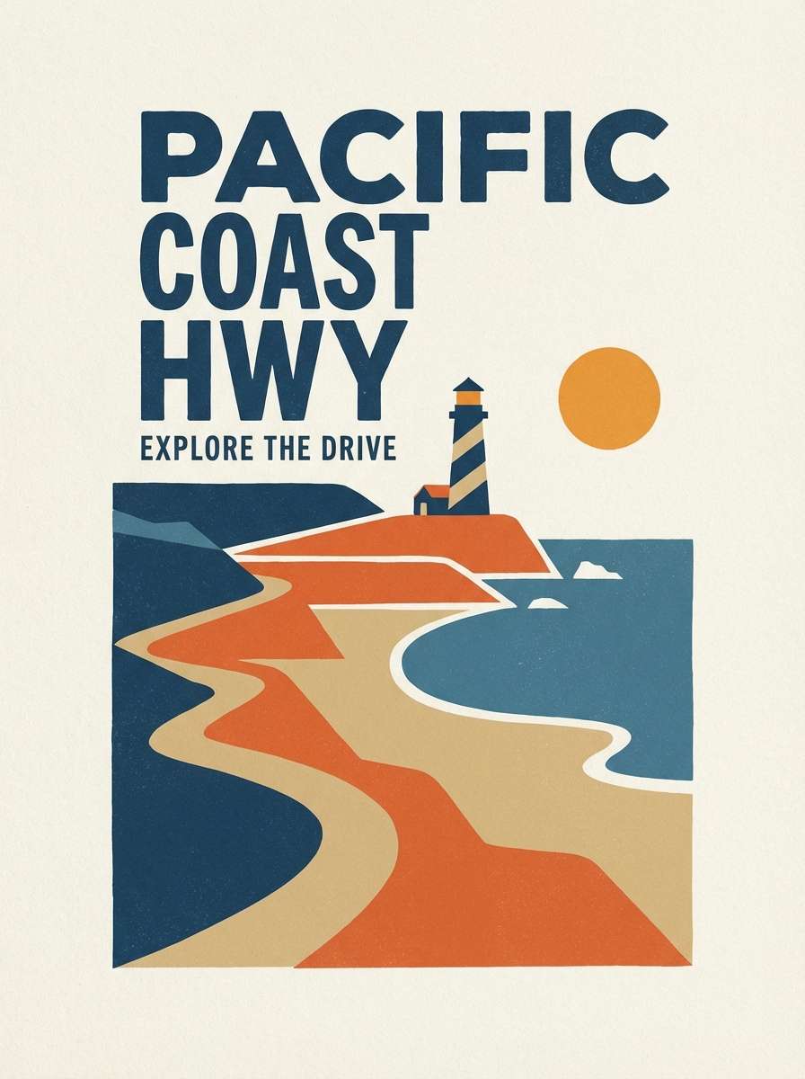
HEX: #0F2C3F #2B5F8A #7C1D2D #E07A5F #F4F1DE
Mood: sunset, inviting, artsy
Best for: travel posters, cafe branding, creator merch
Coastal dusk blues with cranberry and soft coral feel like a sunset walk near the water. The warm cream keeps the palette friendly and readable, even with saturated accents. Use coral for supporting highlights and let cranberry handle the main callouts like pricing or featured items. Tip: keep gradients subtle so the design stays clean and not overly beachy.
Image example of coastal dusk cranberry generated using media.io
10) Gallery Night Neutrals
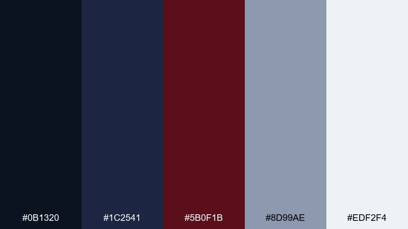
HEX: #0B1320 #1C2541 #5B0F1B #8D99AE #EDF2F4
Mood: sleek, curated, contemporary
Best for: art portfolios, architecture sites, gallery flyers
Sleek navy and oxblood with cool neutrals feels like a modern gallery wall under spotlights. The gray-blue is perfect for grids, captions, and subtle UI dividers. Use the near-white for negative space and keep oxblood for one strong focal element per page. Tip: choose one font family with multiple weights to match the curated, restrained tone.
Image example of gallery night neutrals generated using media.io
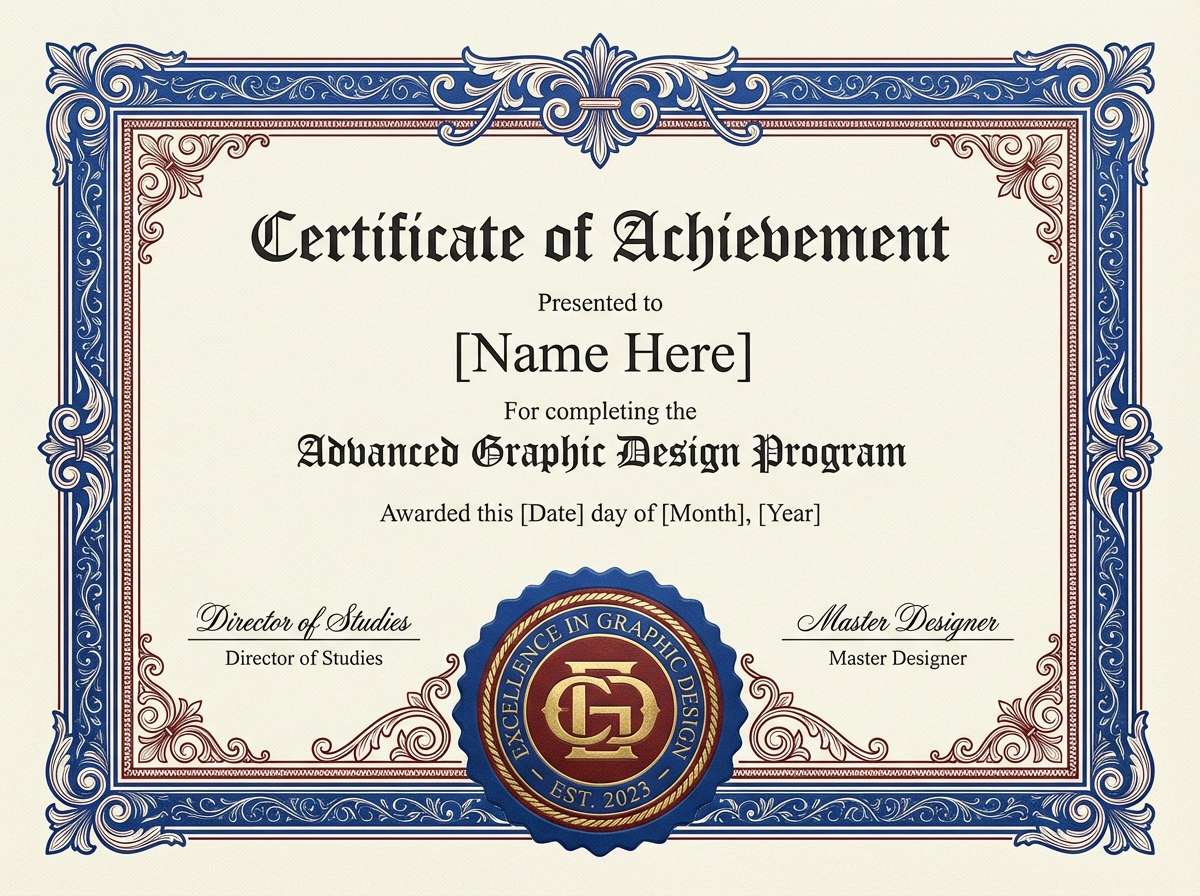
11) Royal Ink Oxblood
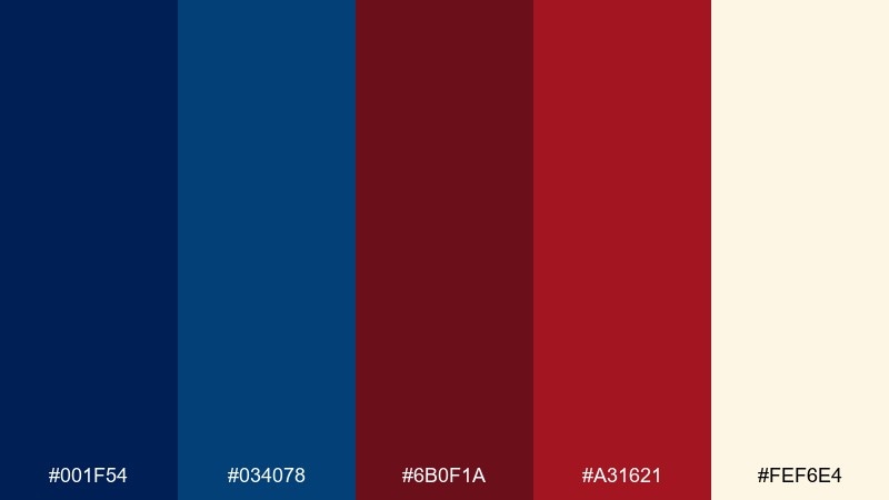
HEX: #001F54 #034078 #6B0F1A #A31621 #FEF6E4
Mood: regal, bold, timeless
Best for: premium logos, certificates, nonprofit branding
Regal ink blues and oxblood reds create a timeless, ceremonial feel. For marks and badges, this blue maroon color palette reads authoritative without looking overly corporate. Use the soft cream as a parchment-like base and keep the brightest red for seals or key emphasis. Tip: when printing, test the reds on uncoated stock to avoid over-darkening.
Image example of royal ink oxblood generated using media.io
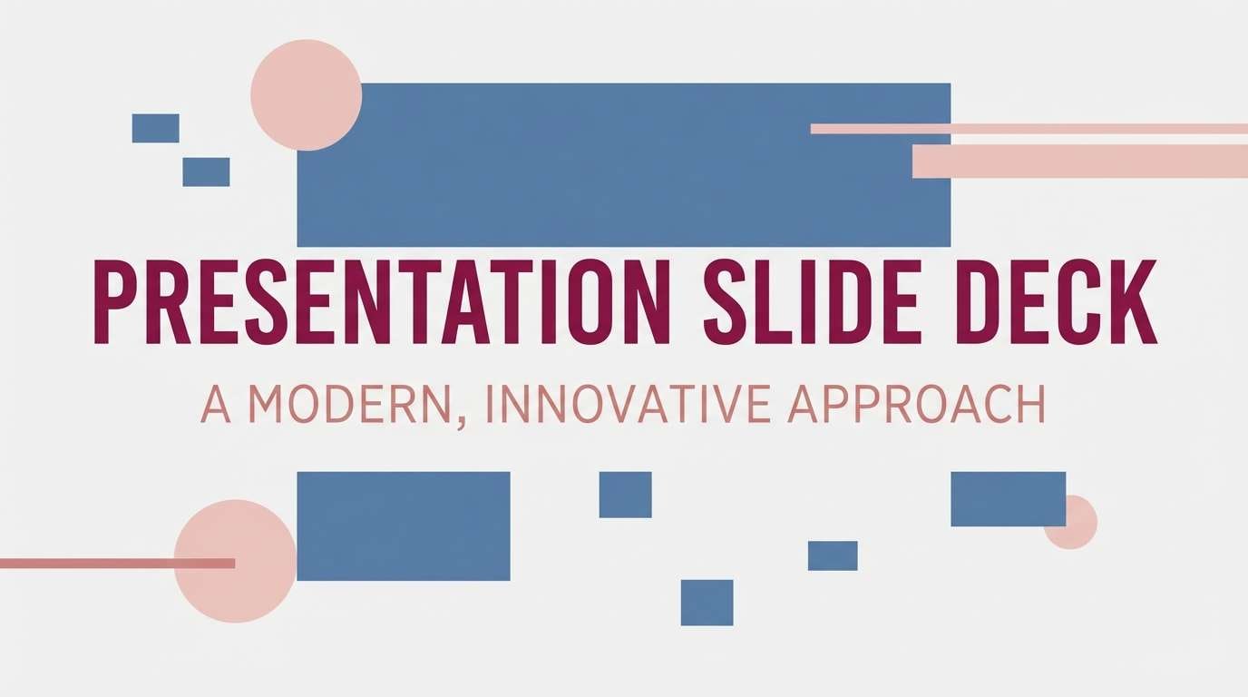
12) Soft Smoke Sangria
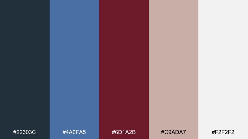
HEX: #22303C #4A6FA5 #6D1A2B #C9ADA7 #F2F2F2
Mood: muted, friendly, contemporary
Best for: blog themes, service brands, presentation templates
Muted blues with sangria and blushy neutrals feel approachable, like soft smoke and brushed linen. The dusty pink-beige makes the maroon easier to use in large areas without feeling too intense. Try it for slides, service sites, and long-form pages where comfort matters. Tip: use the blush tone for cards and the maroon for section titles to keep hierarchy clear.
Image example of soft smoke sangria generated using media.io
13) Retro Collegiate
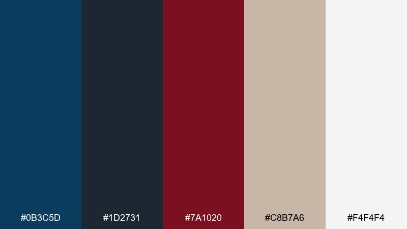
HEX: #0B3C5D #1D2731 #7A1020 #C8B7A6 #F4F4F4
Mood: retro, sporty, confident
Best for: team merch, badge designs, school events
Retro sporty tones bring to mind varsity jackets, stitched patches, and worn-in bleachers. The warm beige neutral keeps the look classic rather than harsh. Use the darkest shade for outlines and the maroon for emblem fills or type highlights. Tip: add a subtle distressed effect to badges to push the vintage athletic vibe.
Image example of retro collegiate generated using media.io
14) Autumn Plum with Blue Steel
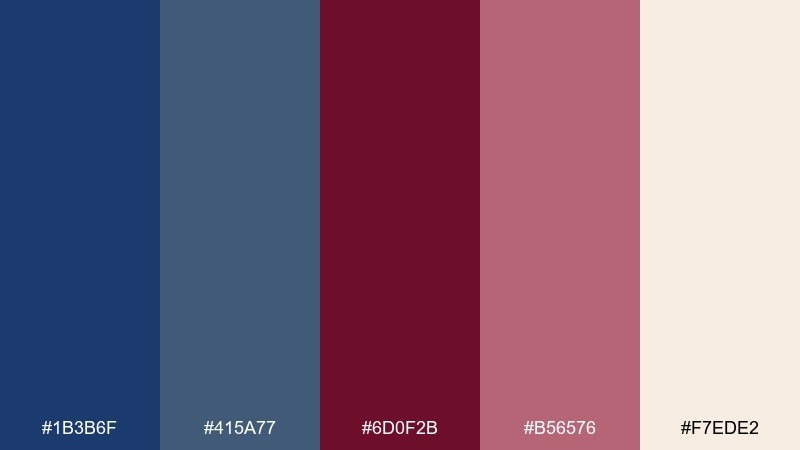
HEX: #1B3B6F #415A77 #6D0F2B #B56576 #F7EDE2
Mood: warm, romantic, seasonal
Best for: fall wedding suites, boutique labels, lookbooks
Warm plum and blue steel feel like autumn petals against a cloudy sky. These blue maroon color combinations are perfect for romantic projects that need both softness and structure. Use the cream as the paper base, then layer plum for titles and the lighter maroon for florals or ribbons. Tip: keep body text in blue steel for readability while staying gentle.
Image example of autumn plum with blue steel generated using media.io
15) Night Sky Cabernet
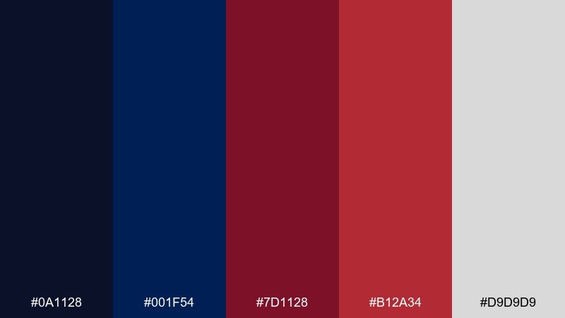
HEX: #0A1128 #001F54 #7D1128 #B12A34 #D9D9D9
Mood: intense, modern, high-contrast
Best for: tech branding, esports visuals, hero banners
Intense night-sky blues with cabernet reds create a sharp, modern contrast that feels fast and focused. The light gray offers a neutral break for typography and UI chrome. Use the brighter red for interactive states like hover or active, and keep the darker cabernet for primary accents. Tip: limit gradients and lean on crisp edges to maintain the tech-forward feel.
Image example of night sky cabernet generated using media.io
16) Muted Denim Mulberry
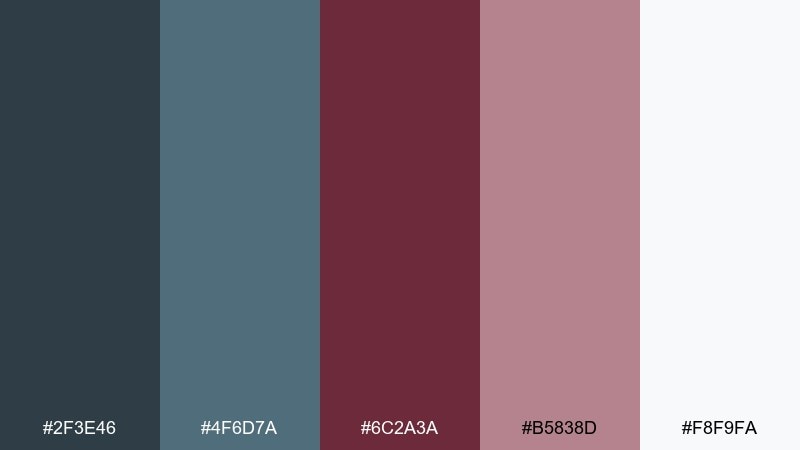
HEX: #2F3E46 #4F6D7A #6C2A3A #B5838D #F8F9FA
Mood: soft, balanced, everyday
Best for: home decor shops, newsletters, lifestyle packaging
Balanced denim tones with mulberry and dusty rose feel everyday and wearable, like casual layers in cool weather. The gentle rose makes it easy to add warmth without leaning too pink. Use the near-white as your primary background and let mulberry handle headings and small icons. Tip: pair with matte finishes and soft shadows rather than glossy effects.
Image example of muted denim mulberry generated using media.io
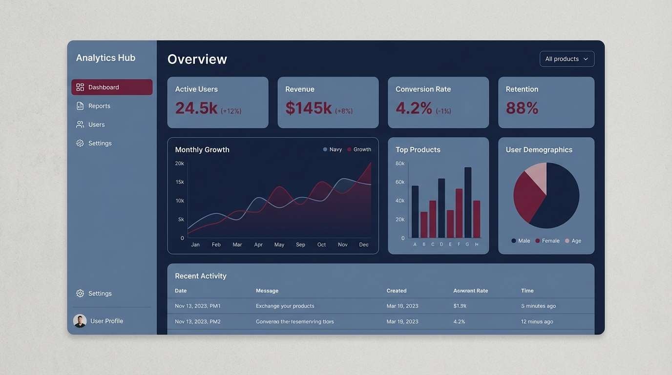
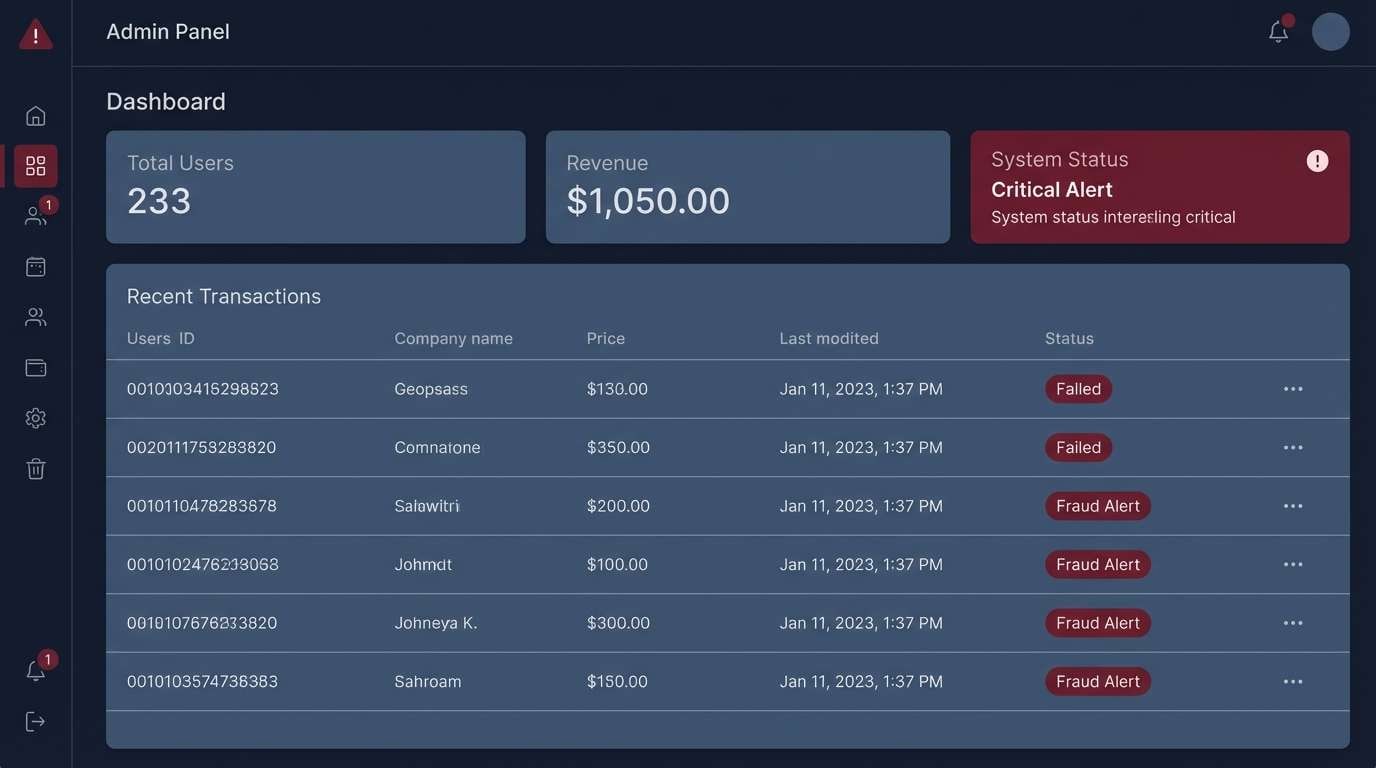
17) Modern SaaS Dark Mode
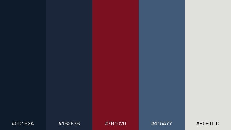
HEX: #0D1B2A #1B263B #7B1020 #415A77 #E0E1DD
Mood: sleek, technical, confident
Best for: dark mode apps, admin panels, developer tools
Sleek dark blues with a precise maroon accent feel like a late-night workspace with focused screens. The light gray-green keeps the UI readable without harsh white glare. Use maroon sparingly for destructive actions, alerts, or one standout KPI. Tip: increase spacing and use subtle borders to separate panels instead of bright dividers.
Image example of modern saas dark mode generated using media.io
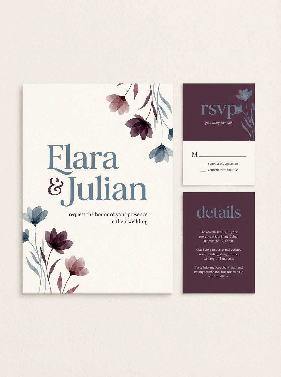
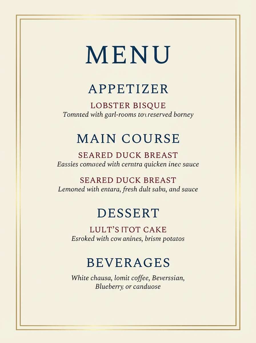
18) Wedding Evening Elegance
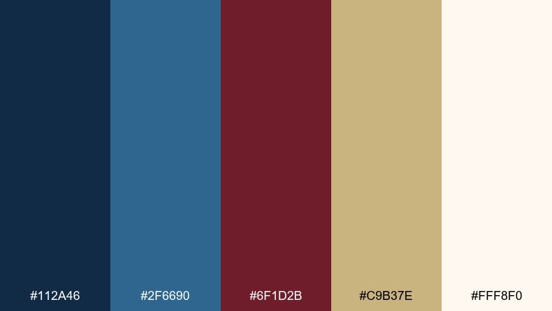
HEX: #112A46 #2F6690 #6F1D2B #C9B37E #FFF8F0
Mood: elegant, celebratory, romantic
Best for: wedding signage, RSVP cards, reception menus
Elegant evening blues with maroon and champagne gold evoke candlelit dinners and formal attire. The warm ivory base makes the palette feel welcoming while still upscale. Use gold as a fine-line accent for borders and monograms, and keep maroon for names or table numbers. Tip: choose one metallic treatment only, either foil or ink, to avoid visual clutter.
Image example of wedding evening elegance generated using media.io
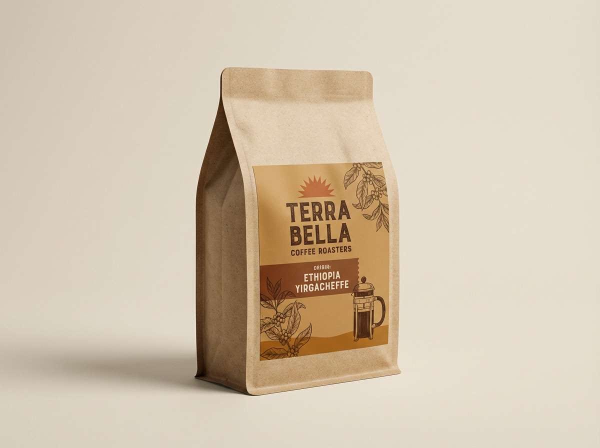
19) Artisan Coffeehouse
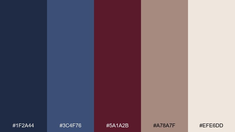
HEX: #1F2A44 #3C4F76 #5A1A2B #A78A7F #EFE6DD
Mood: warm, artisanal, inviting
Best for: coffee packaging, cafe menus, loyalty cards
Warm, artisanal tones bring to mind espresso crema, vintage mugs, and handwritten labels. The taupe-brown softens the contrast and makes the maroon feel more earthy than dramatic. Use the cream as a label base and the deeper blue for brand blocks or stamps. Tip: pair with tactile paper textures and simple iconography for an authentic craft look.
Image example of artisan coffeehouse generated using media.io
20) Neon Accent Tech
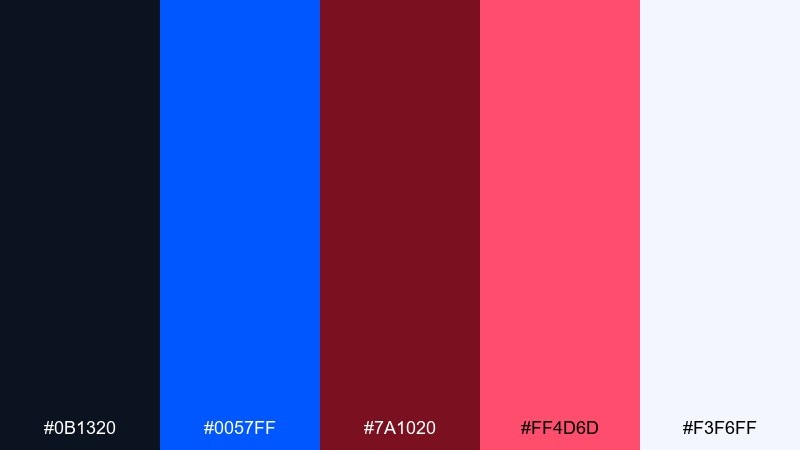
HEX: #0B1320 #0057FF #7A1020 #FF4D6D #F3F6FF
Mood: bold, futuristic, playful
Best for: startup ads, app promos, streaming overlays
Bold electric blue and neon rose against near-black feels futuristic and a little rebellious. The brighter accents are perfect for promos, feature announcements, and energetic hero sections. Use the pale ice tone for text panels and keep the neon limited to highlights so it stays premium. Tip: use large type and simple shapes to prevent the high saturation from becoming noisy.
Image example of neon accent tech generated using media.io
What Colors Go Well with Blue Maroon?
Neutrals are the easiest bridge: ivory, warm off-white, and light gray keep blue-and-maroon designs readable and give the palette room to breathe. For a more contemporary look, try cool gray-blues and slate tones.
Metallic-like accents (gold, champagne, tan) add a heritage feel, especially with navy and deep maroon. For more energy, pair brighter blues with berry or rose tones and keep the background near-white.
If you need extra contrast in UI, charcoal and near-black work better than pure black, while soft creams avoid the harshness of stark white against dark navies.
How to Use a Blue Maroon Color Palette in Real Designs
For branding, assign blue to the “system” layer (logo base, navigation, typography) and maroon to the “signal” layer (CTAs, highlights, badges). This keeps the palette consistent and prevents red tones from taking over.
In UI design, use light neutrals as surfaces, blues for structure (tabs, headers, charts), and maroon for one key emphasis per screen (alerts, a primary metric, or a primary button). The result feels focused and professional.
For print, test dark blues and maroons on your actual stock; they can over-darken on uncoated paper. Adding a cream background and maintaining generous margins usually improves legibility instantly.
Create Blue Maroon Palette Visuals with AI
If you want to preview how a blue maroon color scheme looks on posters, landing pages, packaging, or invitations, generating quick mock visuals helps you decide faster than swatches alone.
With Media.io’s text-to-image tool, you can paste a prompt, specify your layout style, and iterate until the palette balance (navy vs. maroon vs. neutral space) feels right for your project.
Blue Maroon Color Palette FAQs
-
What does a blue and maroon color palette communicate?
Blue signals trust, stability, and clarity, while maroon adds sophistication and warmth. Together, they often read as premium, established, and intentional—popular for brands that want confidence without looking overly loud. -
Is navy and maroon a good combination for branding?
Yes. Navy gives a strong foundation for logos and typography, and maroon works well as an accent for seals, CTAs, or product highlights. Add an off-white or cream to keep the identity versatile across web and print. -
What neutral works best with blue maroon schemes?
Warm off-whites (ivory, cream) are the most forgiving because they soften both colors at once. Cool light grays and gray-blues also work well for modern UI layouts and grid-heavy pages. -
How do I keep blue and maroon from feeling too dark?
Use a light neutral as the main background, keep one dark color dominant (usually navy), and reserve maroon for smaller focal elements. Increasing whitespace and using mid-tone blues/slates for secondary surfaces also helps. -
Can I use maroon for error states in dark mode UI?
You can, but use it sparingly and ensure contrast meets accessibility guidelines. Many teams use maroon for destructive actions while keeping informational and neutral UI components in blues and grays. -
Are blue maroon palettes suitable for weddings?
Definitely. Deep blues and maroons feel formal and romantic, especially when paired with champagne gold or ivory. Use gold as a thin-line detail and keep maroon for names, monograms, or table numbers. -
What’s a quick way to preview these palettes on real designs?
Generate sample posters, invitations, packaging, or UI screens using an AI visual tool. It helps you validate contrast, spacing, and the balance between navy, maroon, and neutrals before committing to a final design system.


