

Yellow peach is the sweet spot between sunny optimism and soft, flattering warmth. It reads friendly, approachable, and modern across digital and print—without feeling loud.
Below you’ll find curated yellow peach color palette ideas with HEX codes, plus practical tips for pairing, contrast, and real-world use in branding, UI, packaging, and seasonal graphics.
In this article
- Why Yellow Peach Palettes Work So Well
-
- sunlit apricot
- peach sorbet
- honey blush
- desert nectar
- citrus linen
- warm clay glow
- orchard morning
- buttercream studio
- coral peach pop
- golden petal
- vintage marmalade
- sandstone peach
- soft sunrise ui
- peach tea branding
- minimal peach neutral
- spring bouquet wash
- apricot product glow
- cozy kitchen notes
- peach fizz gradient
- market day peach
- festival peach heat
- evening apricot noir
- What Colors Go Well with Yellow Peach?
- How to Use a Yellow Peach Color Palette in Real Designs
- Create Yellow Peach Palette Visuals with AI
Why Yellow Peach Palettes Work So Well
Yellow peach palettes feel naturally “lit”—they mimic warm daylight, which makes layouts look healthier and more inviting. That warmth helps everything from product photos to illustrations feel cohesive and flattering.
They’re also flexible: push them lighter for airy minimalism, or deepen them with browns and near-blacks for premium contrast. Because the hue family sits between yellow and orange, it can skew fresh, cozy, or energetic depending on the accents you add.
Finally, yellow peach is a strong usability color when handled carefully: warm neutrals can replace stark white, while dark cocoa text stays readable without the harshness of pure black.
20+ Yellow Peach Color Palette Ideas (with HEX Codes)
1) Sunlit Apricot
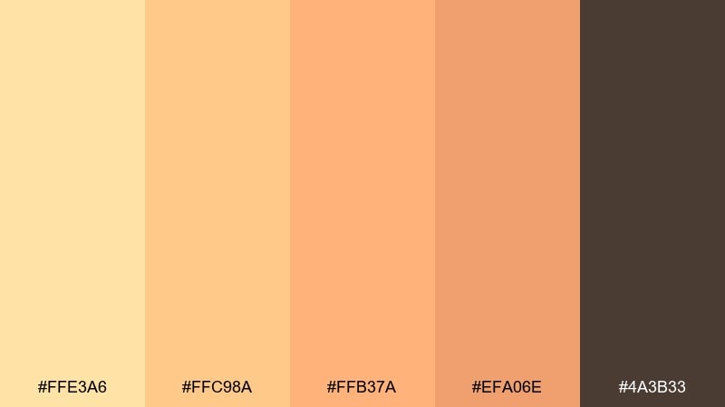
HEX: #FFE3A6 #FFC98A #FFB37A #EFA06E #4A3B33
Mood: bright, welcoming, sun-kissed
Best for: brand identity and hero banners
Bright and sun-kissed, these tones feel like late-morning light hitting ripe fruit. Use the pale yellow as breathing room, then let peach and apricot carry headlines or large shapes. The cocoa brown anchors the warmth for logos and navigation. Tip: keep gradients subtle from #FFE3A6 to #FFC98A to avoid a candy look.
Image example of sunlit apricot generated using media.io

Media.io is an online AI studio for creating and editing video, image, and audio in your browser.

2) Peach Sorbet
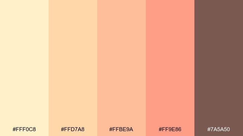
HEX: #FFF0C8 #FFD7A8 #FFBE9A #FF9E86 #7A5A50
Mood: playful, creamy, upbeat
Best for: social media templates
Playful and creamy, it evokes a scoop of sorbet melting on a warm afternoon. Use #FFF0C8 as the base for text-heavy slides, then punch up buttons with #FF9E86. The muted brown keeps captions readable and prevents the pastels from washing out. Tip: pair with off-white backgrounds and a single bold type weight for clarity.
Image example of peach sorbet generated using media.io
3) Honey Blush
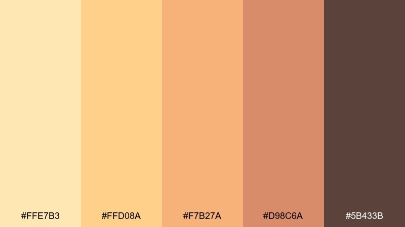
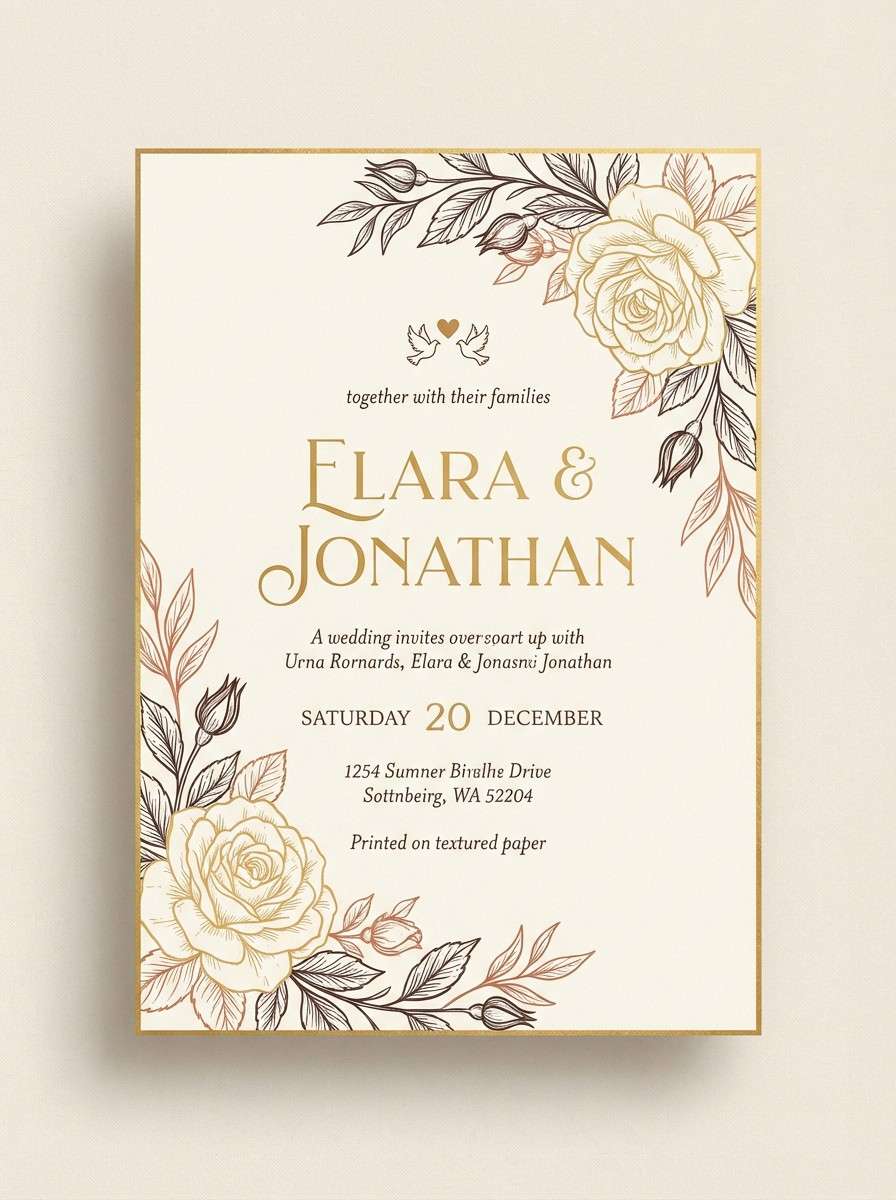
HEX: #FFE7B3 #FFD08A #F7B27A #D98C6A #5B433B
Mood: cozy, natural, softly romantic
Best for: wedding invitations and stationery
Cozy and softly romantic, it feels like honeyed light over blush petals. This yellow peach color palette works beautifully for invitations when you keep #FFE7B3 as the paper tone and use #5B433B for type. Add #D98C6A in small motifs like borders, monograms, or wax-seal graphics. Tip: print tests matter here, since warm peaches can shift under different papers.
Image example of honey blush generated using media.io
4) Desert Nectar
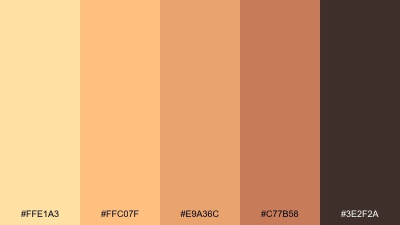
HEX: #FFE1A3 #FFC07F #E9A36C #C77B58 #3E2F2A
Mood: earthy, grounded, warm
Best for: packaging for artisan goods
Earthy and grounded, it recalls sun-warmed sand and stone fruit skins. Use #FFC07F as the main label color, then add #C77B58 for seals, badges, or flavor callouts. The near-espresso #3E2F2A is ideal for ingredient lists and barcodes without looking harsh. Tip: choose matte finishes to keep the palette feeling natural rather than glossy.
Image example of desert nectar generated using media.io
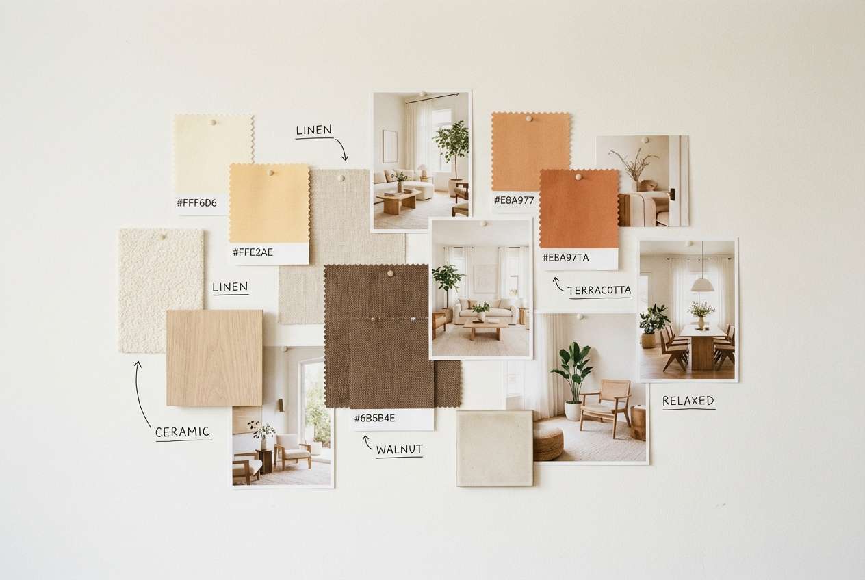
5) Citrus Linen
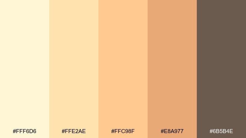
HEX: #FFF6D6 #FFE2AE #FFC98F #E8A977 #6B5B4E
Mood: clean, airy, relaxed
Best for: interior mood boards
Clean and airy, these colors feel like linen curtains in soft citrus light. Build your base with #FFF6D6 and #FFE2AE, then layer #E8A977 in textiles or feature walls. The warm taupe #6B5B4E keeps the look sophisticated for wood accents and typography. Tip: add natural materials like oak and rattan to amplify the calm.
Image example of citrus linen generated using media.io
6) Warm Clay Glow
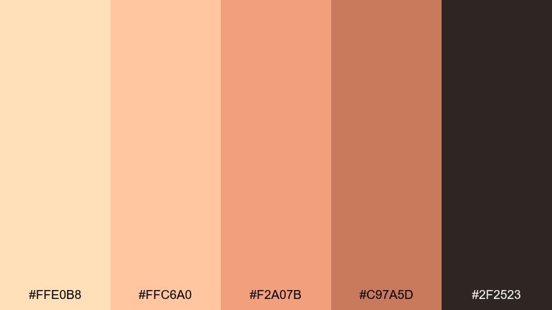
HEX: #FFE0B8 #FFC6A0 #F2A07B #C97A5D #2F2523
Mood: rustic, bold, handmade
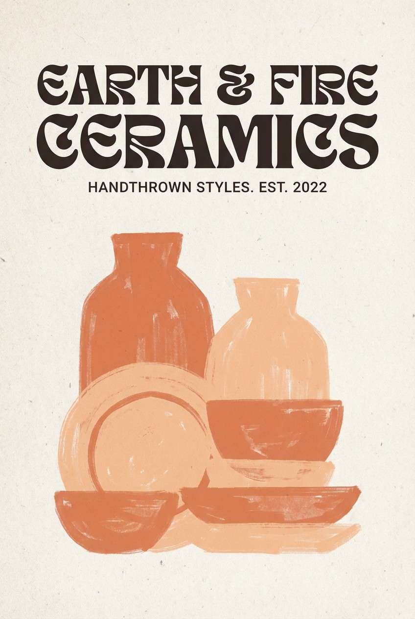
Best for: ceramic and craft brand visuals
Rustic and handmade, it brings to mind clay pots cooling in a kiln. Use #F2A07B for strong blocks of color, balanced by #FFE0B8 for whitespace and breathing room. The deep charcoal-brown #2F2523 gives craft logos a stamped, tactile feel. Tip: use subtle grain textures to reinforce the artisan vibe.
Image example of warm clay glow generated using media.io
7) Orchard Morning
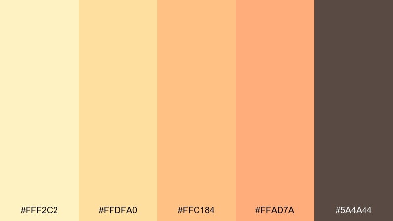
HEX: #FFF2C2 #FFDFA0 #FFC184 #FFAD7A #5A4A44
Mood: fresh, optimistic, light
Best for: blog headers and lifestyle covers
Fresh and optimistic, it feels like an early walk through a sunlit orchard. Let #FFF2C2 hold the background while #FFAD7A highlights headings, icons, or callout tags. #5A4A44 keeps body copy crisp without turning the layout too high-contrast. Tip: pair with soft photography and warm overlays for a cohesive header system.
Image example of orchard morning generated using media.io

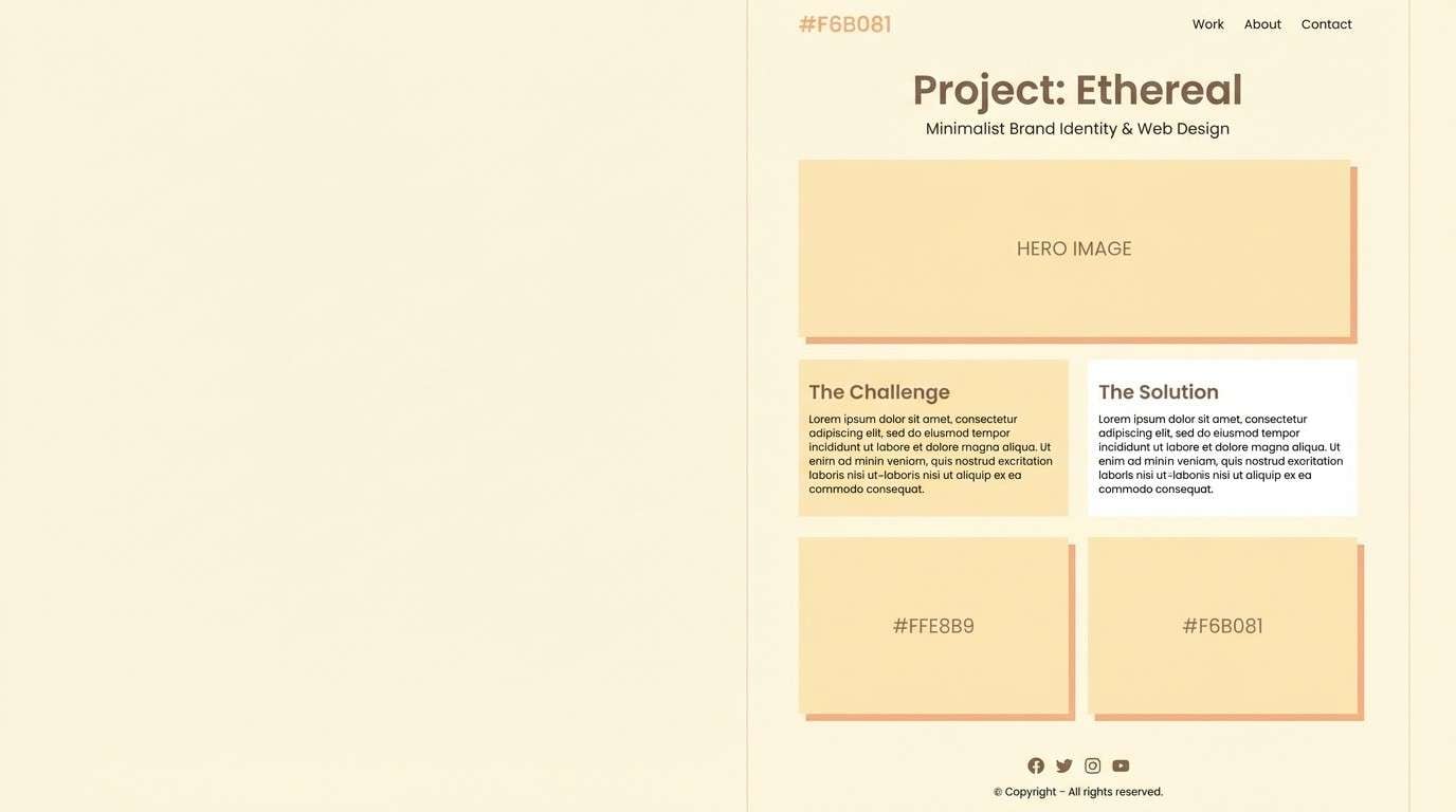
8) Buttercream Studio
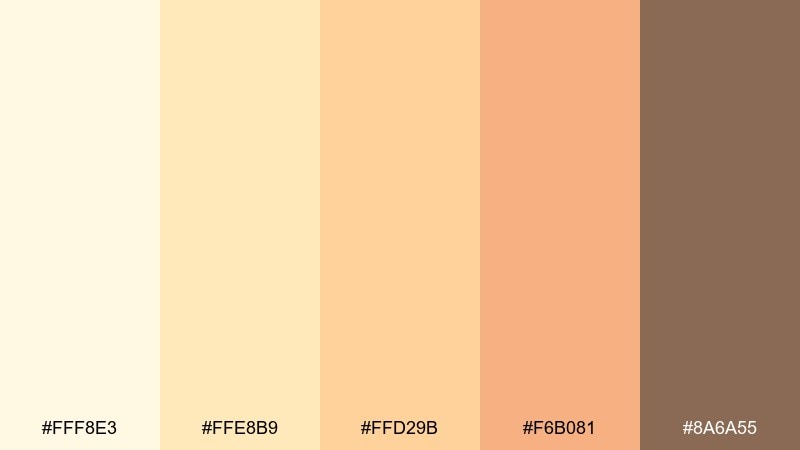
HEX: #FFF8E3 #FFE8B9 #FFD29B #F6B081 #8A6A55
Mood: soft, minimal, polished
Best for: portfolio sites and case studies
Soft and polished, these buttercream tones feel calm without going bland. Use #FFF8E3 for large sections and #FFE8B9 for cards to create quiet depth. #8A6A55 works well for UI labels and small dividers where pure black would feel too heavy. Tip: keep shadows low-contrast so the palette stays airy.
Image example of buttercream studio generated using media.io
9) Coral Peach Pop
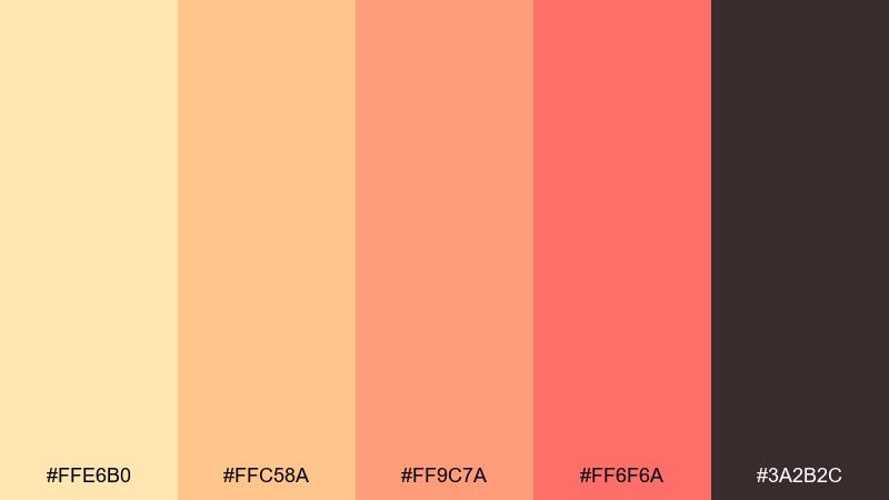
HEX: #FFE6B0 #FFC58A #FF9C7A #FF6F6A #3A2B2C
Mood: energetic, youthful, bold
Best for: launch ads and promos
Energetic and youthful, it looks like a sunset burst with a coral punch. These yellow peach color combinations shine in promos when #FF6F6A is reserved for CTAs and price tags. Use #FFE6B0 and #FFC58A to keep the background warm and readable. Tip: avoid adding extra bright hues so the coral stays the star.
Image example of coral peach pop generated using media.io

10) Golden Petal
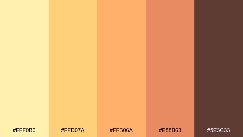
HEX: #FFF0B0 #FFD07A #FFB06A #E88B63 #5E3C33
Mood: cheerful, sunny, floral
Best for: spring campaign illustrations
Cheerful and floral, it brings to mind golden petals and warm breezes. Use #FFF0B0 and #FFD07A for broad fills, then add #E88B63 for depth in shadows or outlines. The deep brown #5E3C33 helps linework stay crisp in prints and stickers. Tip: keep strokes slightly textured for a hand-drawn spring feel.
Image example of golden petal generated using media.io
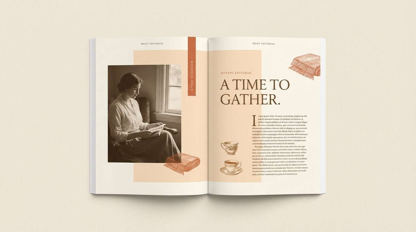
11) Vintage Marmalade
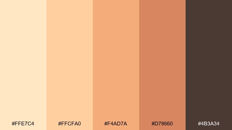
HEX: #FFE7C4 #FFCFA0 #F4AD7A #D78660 #4B3A34
Mood: nostalgic, warm, classic
Best for: editorial layouts and magazines
Nostalgic and warm, it feels like a well-loved cookbook and a jar of marmalade. Use #FFE7C4 for margins and #FFCFA0 for sidebars to keep pages readable. #D78660 creates tasteful highlights for pull quotes and section labels. Tip: pair with serif typography and subtle halftone textures for a vintage editorial tone.
Image example of vintage marmalade generated using media.io
12) Sandstone Peach
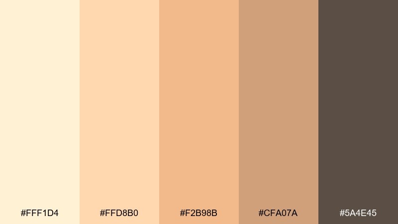
HEX: #FFF1D4 #FFD8B0 #F2B98B #CFA07A #5A4E45
Mood: calm, neutral, architectural
Best for: real estate and architecture decks
Calm and architectural, it suggests sandstone walls warmed by afternoon light. Use #FFF1D4 and #FFD8B0 as slide backgrounds to keep charts and text easy to scan. #5A4E45 is ideal for titles and icons when you want contrast without stark black. Tip: limit accent usage to one highlight color per slide for a premium look.
Image example of sandstone peach generated using media.io
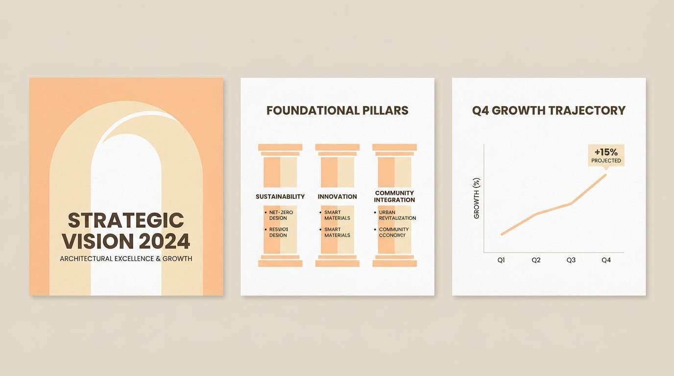
13) Soft Sunrise UI
HEX: #FFF4D1 #FFE1B8 #FFC9A2 #FFA58B #3C3534
Mood: gentle, modern, friendly
Best for: dashboard UI and onboarding
Gentle and modern, it looks like a soft sunrise fading into warm peach. A yellow peach color scheme like this works best when #FFF4D1 is the canvas and #FFA58B is reserved for primary actions. Use #3C3534 for text to keep contrast accessible while staying warm. Tip: apply #FFE1B8 to cards and modals to separate layers without harsh borders.
Image example of soft sunrise ui generated using media.io
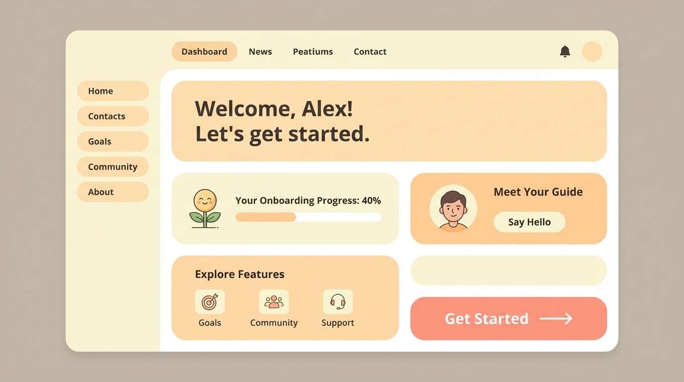
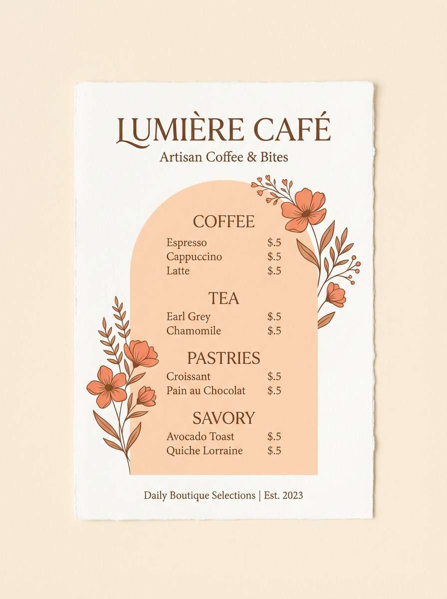
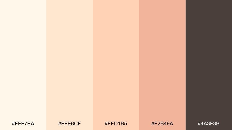
14) Peach Tea Branding
HEX: #FFF0D9 #FFD4B8 #FFB892 #E99675 #6A4B3F
Mood: comforting, boutique, inviting
Best for: cafe menus and drink labels
Comforting and boutique, it evokes a cup of peach tea with steamed milk. Use #FFF0D9 as the menu background and #6A4B3F for headings so prices stay legible. #E99675 is great for drink callouts and seasonal badges without overpowering the layout. Tip: add thin dividers in #FFD4B8 to keep sections organized and soft.
Image example of peach tea branding generated using media.io
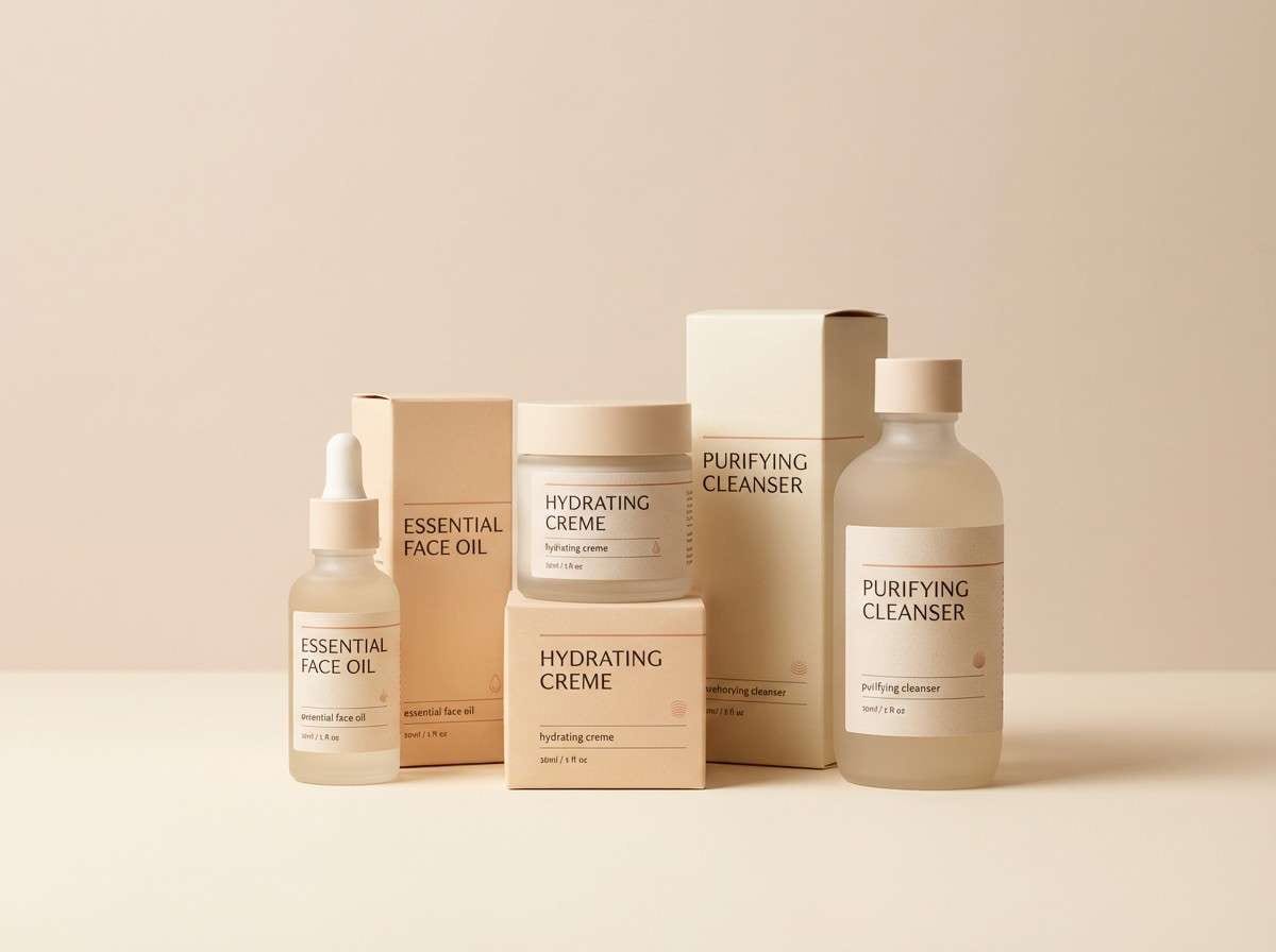
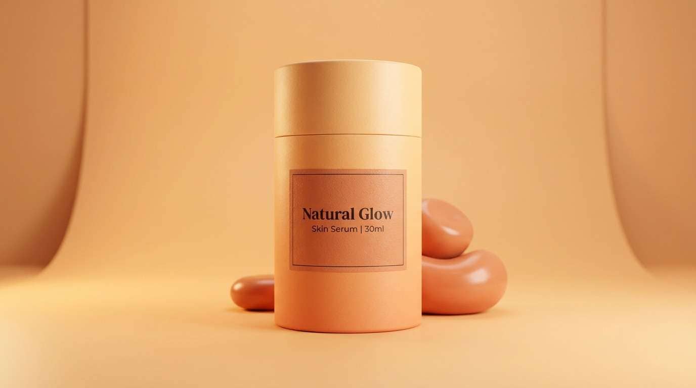
15) Minimal Peach Neutral
HEX: #FFF7EA #FFE6CF #FFD1B5 #F2B49A #4A3F3B
Mood: minimal, soft, premium
Best for: skincare packaging and labels
Minimal and premium, it feels like a quiet spa space with warm daylight. This yellow peach color palette suits skincare when you keep #FFF7EA dominant and use #F2B49A sparingly for seals or key claims. #4A3F3B provides an elegant ink tone for ingredients and regulatory text. Tip: combine with lots of negative space and a single sans-serif family for a modern finish.
Image example of minimal peach neutral generated using media.io
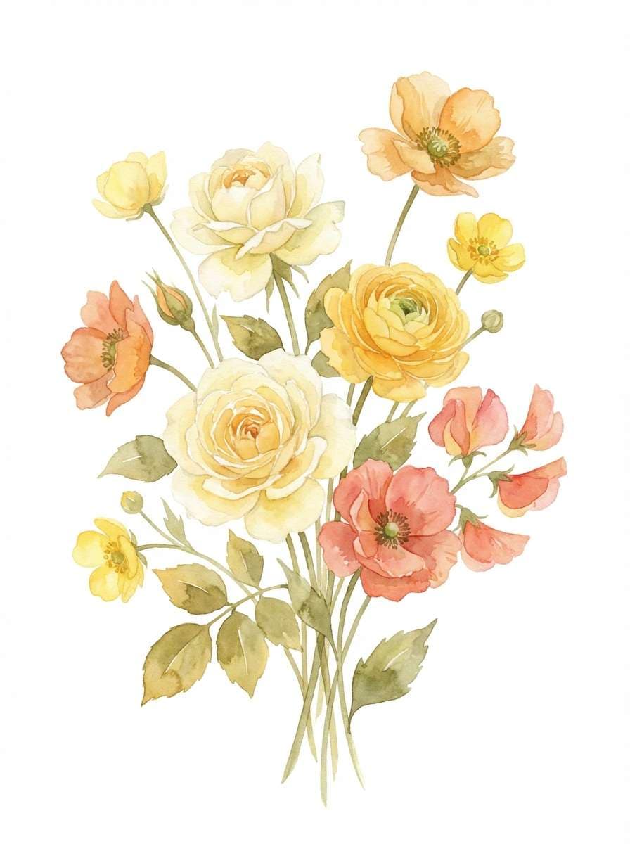
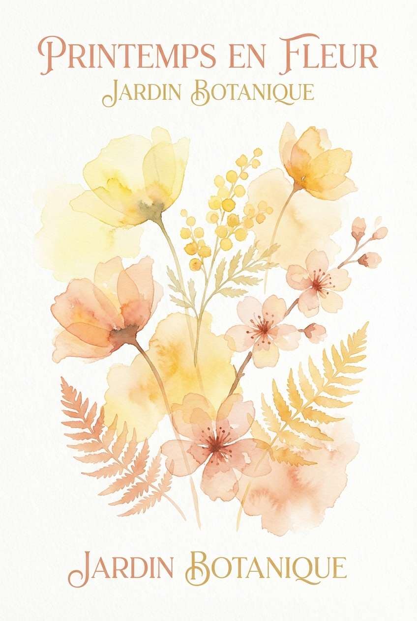
16) Spring Bouquet Wash
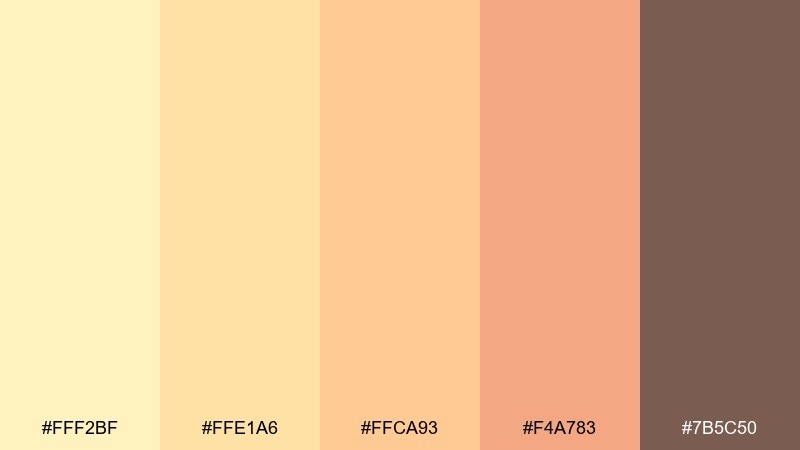
HEX: #FFF2BF #FFE1A6 #FFCA93 #F4A783 #7B5C50
Mood: fresh, delicate, artistic
Best for: botanical prints and posters
Fresh and delicate, it resembles a watercolor bouquet with sunlit petals. Use #FFF2BF and #FFE1A6 for gentle paper washes, then deepen shadows with #F4A783 to keep florals from looking flat. The muted brown #7B5C50 works well for captions and artist signatures. Tip: keep edges soft and let the palette bleed slightly for an authentic wash effect.
Image example of spring bouquet wash generated using media.io
17) Apricot Product Glow
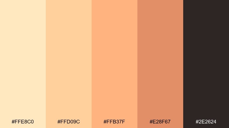
HEX: #FFE8C0 #FFD09C #FFB37F #E28F67 #2E2624
Mood: appetizing, glossy, confident
Best for: product ads and e-commerce banners
Appetizing and confident, it suggests a glossy apricot glaze under studio lights. Use #FFE8C0 for negative space, then let #FFB37F and #E28F67 shape the product spotlight and CTA blocks. The deep #2E2624 gives you crisp pricing and high contrast without a cold feel. Tip: keep shadows warm so the banner reads cohesive across devices.
Image example of apricot product glow generated using media.io
18) Cozy Kitchen Notes
HEX: #FFF3D8 #FFE0B9 #FFC89E #F0A982 #5C463E
Mood: homey, friendly, nostalgic
Best for: recipe cards and food blogs
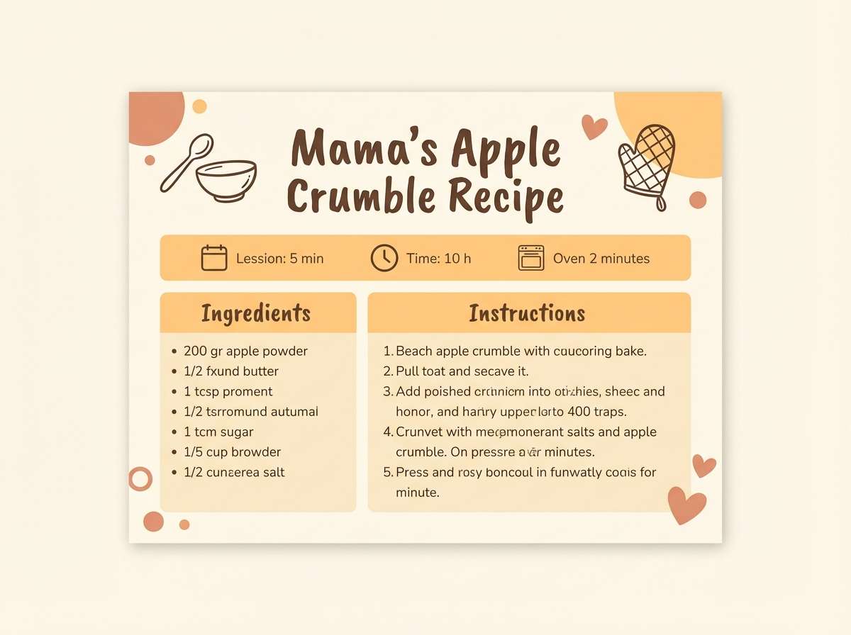
Homey and nostalgic, it feels like recipe cards tucked into a warm kitchen drawer. Use #FFF3D8 for backgrounds and #FFC89E for section headers to keep ingredient lists readable. #5C463E is ideal for body text, while #F0A982 can highlight tips or substitutions. Tip: add simple line icons in #5C463E to keep the design cohesive and easy to scan.
Image example of cozy kitchen notes generated using media.io
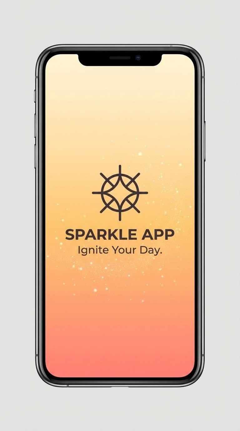
19) Peach Fizz Gradient
HEX: #FFF1B8 #FFD28B #FFB07C #FF8E79 #3B3032
Mood: sparkly, modern, upbeat
Best for: app splash screens and gradients
Sparkly and upbeat, it resembles peach soda bubbles catching the light. Build a gradient from #FFF1B8 through #FFD28B to #FF8E79 for a lively, modern splash. Keep UI text in #3B3032 so it stays readable over warmer transitions. Tip: use the gradient only on key moments, then return to solid fills for everyday screens.
Image example of peach fizz gradient generated using media.io
20) Market Day Peach
HEX: #FFE9B6 #FFD19A #F8B081 #E48D66 #4A3834
Mood: lively, organic, community
Best for: farmers market flyers
Lively and organic, it brings to mind fruit crates and handwritten signs. Use #FFE9B6 for the flyer base, then set bold blocks in #F8B081 and #E48D66 for dates and locations. #4A3834 reads like ink and pairs well with hand-lettered type. Tip: keep the layout chunky and high-contrast for distance readability.
Image example of market day peach generated using media.io
21) Festival Peach Heat
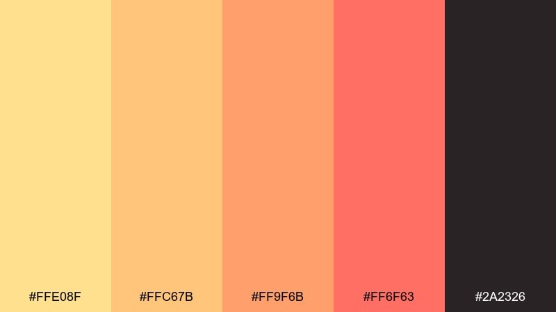
HEX: #FFE08F #FFC67B #FF9F6B #FF6F63 #2A2326
Mood: hot, loud, celebratory
Best for: event posters and ticket graphics
Hot and celebratory, it feels like stage lights and summer air. Yellow peach color combinations like this are made for posters: use #FF6F63 for the headline, and keep #FFE08F as the glow behind key info. Balance the heat with #2A2326 for type and separators so details stay sharp. Tip: stick to two font styles and let color do the energy work.
Image example of festival peach heat generated using media.io

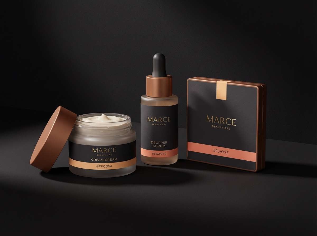
22) Evening Apricot Noir
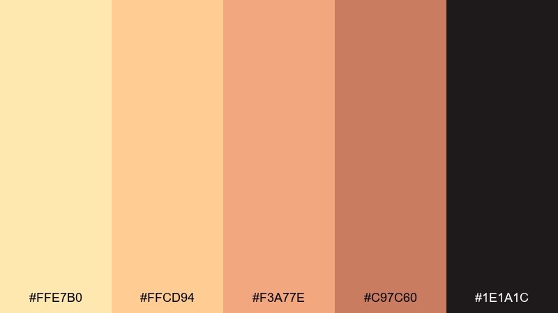
HEX: #FFE7B0 #FFCD94 #F3A77E #C97C60 #1E1A1C
Mood: moody, luxe, cinematic
Best for: beauty campaigns and premium branding
Moody and cinematic, it pairs glowing apricot with near-black drama. Use #1E1A1C as the background for luxury layouts, then highlight products or headlines with #FFCD94. #C97C60 adds depth for shadows, ribbons, or secondary badges without turning muddy. Tip: keep metallic effects subtle so the warmth stays elegant rather than flashy.
Image example of evening apricot noir generated using media.io
What Colors Go Well with Yellow Peach?
Yellow peach pairs beautifully with warm neutrals like cocoa, taupe, and cream because they preserve the palette’s softness while improving readability. These neutrals are ideal for typography, UI chrome, and print details.
For fresher contrast, add gentle greens (sage, olive, eucalyptus) or dusty blues to calm the warmth and broaden seasonal versatility. If you want a premium look, swap black for near-black browns or charcoal to keep the overall tone warm.
For bold moments, coral and warm reds amplify energy, while metallic gold accents can add a luxe finish—just keep them subtle to avoid a flashy “candy” effect.
How to Use a Yellow Peach Color Palette in Real Designs
Start with a light yellow-peach as your base and treat it like “warm white” for backgrounds, cards, and negative space. Then choose one mid-peach for large shapes and one deeper accent for CTAs, badges, or highlights.
In UI, reserve the most saturated peach/coral for primary actions and keep text in deep warm browns for accessible contrast. In packaging and print, test proofs: peaches can shift depending on paper, lamination, and lighting.
To keep designs modern, limit the palette to 2–3 main tones per layout and let texture (grain, matte finishes, soft shadows) add depth instead of extra colors.
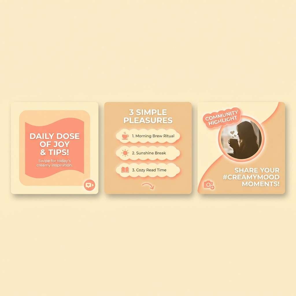
Create Yellow Peach Palette Visuals with AI
If you’re building a mood board, hero banner, or packaging mockup, AI-generated visuals help you validate how yellow peach behaves with lighting, texture, and typography. It’s an easy way to explore multiple art directions fast.
Use the palette HEX codes in your prompt, specify the format (poster, UI mockup, label, illustration), and lock a consistent aspect ratio so variations stay comparable. Then refine with small tweaks like “matte finish,” “paper grain,” or “warm studio lighting.”
Yellow Peach Color Palette FAQs
-
What is a yellow peach color palette?
A yellow peach color palette is a warm set of tones that sit between pale yellow, apricot, and soft peach, usually balanced with a grounding dark neutral (like cocoa brown) for contrast and readability. -
Which HEX codes work as a “base” yellow peach background?
Look for very light, low-saturation options like #FFF8E3, #FFF6D6, #FFF4D1, or #FFF7EA. They behave like warm off-whites and keep layouts airy. -
What text color is best on yellow peach backgrounds?
Deep warm browns or near-black charcoals (for example #4A3B33, #3C3534, or #1E1A1C) usually read cleaner than pure black while keeping the palette cohesive. -
What colors complement yellow peach for accents?
Sage/olive greens, muted blues, cocoa/taupe neutrals, and coral accents all pair well. Greens and blues add calm balance; corals add energy for CTAs and promo moments. -
How do I keep a yellow peach palette from looking “too sweet”?
Use subtle gradients, add a grounding dark neutral, and keep saturation controlled. Matte textures, minimal typography, and restrained accent usage also help avoid a candy-like look. -
Is yellow peach a good choice for branding?
Yes—yellow peach often signals friendliness, comfort, and approachability. It works especially well for lifestyle brands, food/drink, wellness, beauty, and modern handmade products when paired with strong neutrals. -
Can I use yellow peach palettes in UI design?
Yes, but reserve the strongest peach/coral for key actions and keep most surfaces light. Use warm dark text for accessibility and separate layers with gentle tonal shifts instead of hard borders.


