

Thunderstorm palettes blend deep navies, slate grays, and high-contrast accents to create designs that feel modern, bold, and instantly cinematic.
Below are 20 curated thunderstorm color combinations with HEX codes, plus practical pairing tips for branding, UI, posters, and packaging.
In this article
- Why Thunderstorm Palettes Work So Well
-
- lightning over slate
- rainwashed concrete
- storm cloud lavender
- thunderhead teal
- umbrella noir
- wet asphalt glow
- distant rumble olive
- static charge rose
- lightning cut copper
- harbor storm blue
- hailstone mint
- midnight downpour
- charged indigo
- foggy pier neutrals
- electric horizon cyan
- storm lantern gold
- rainy day pastels
- thunder alley burgundy
- afterstorm sunrise
- calm after rain
- What Colors Go Well with Thunderstorm?
- How to Use a Thunderstorm Color Palette in Real Designs
- Create Thunderstorm Palette Visuals with AI
Why Thunderstorm Palettes Work So Well
Thunderstorm colors naturally create hierarchy: dark bases (navy, charcoal, slate) make typography and UI components feel anchored, while lighter mist tones add breathing room for readability.
They also deliver “instant mood.” Stormy blues and cool neutrals signal confidence and professionalism, while a single lightning accent (yellow, cyan, amber, or gold) provides high-impact contrast without needing many colors.
Because these palettes sit between neutral and saturated, they adapt across mediums—from sleek SaaS dashboards to cinematic posters—while staying timeless and modern.
20+ Thunderstorm Color Palette Ideas (with HEX Codes)
1) Lightning Over Slate
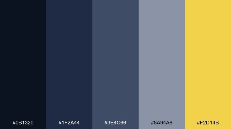
HEX: #0B1320 #1F2A44 #3E4C66 #8A94A6 #F2D14B
Mood: dramatic, electric, modern
Best for: tech startup landing page hero
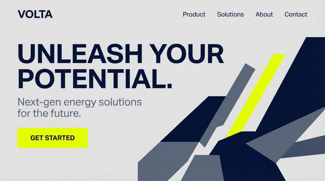
Dramatic midnight blues and storm-slate grays feel like clouds splitting open for a flash of lightning. Use this thunderstorm color palette for hero sections, headlines, and bold CTAs that need instant contrast. Pair the yellow with lots of negative space and let the cooler tones carry the background. Usage tip: keep the lightning yellow to one primary action element to avoid visual noise.
Image example of lightning over slate generated using media.io
Media.io is an online AI studio for creating and editing video, image, and audio in your browser.

2) Rainwashed Concrete
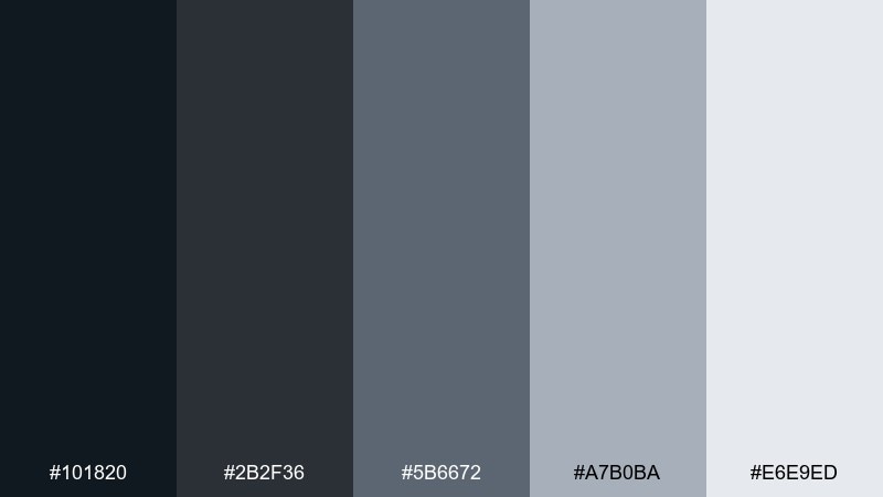
HEX: #101820 #2B2F36 #5B6672 #A7B0BA #E6E9ED
Mood: minimal, cool, grounded
Best for: minimalist UI dashboard
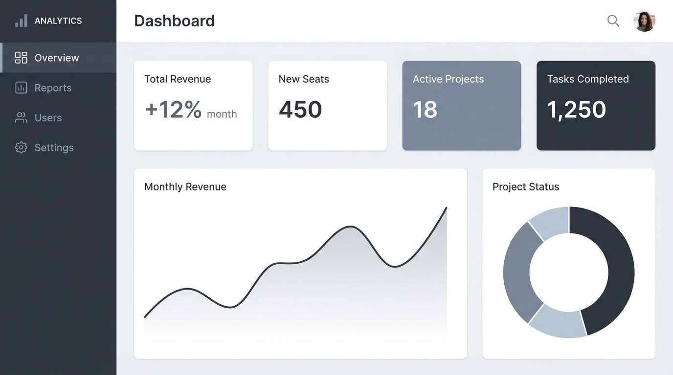
Cool concrete grays evoke slick city streets after a long shower, calm and focused. These tones work beautifully for dashboards, data tables, and admin panels where readability matters most. Pair with a single saturated accent color only if you need alerts or status labels. Usage tip: reserve the lightest gray for cards and surfaces to keep hierarchy crisp.
Image example of rainwashed concrete generated using media.io
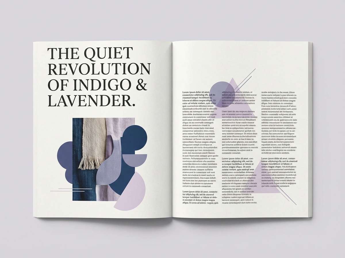
3) Storm Cloud Lavender
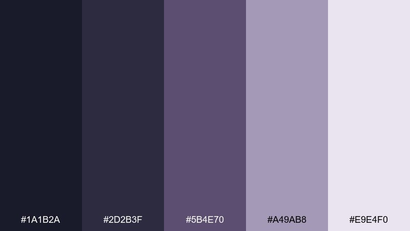
HEX: #1A1B2A #2D2B3F #5B4E70 #A49AB8 #E9E4F0
Mood: dreamy, moody, editorial
Best for: editorial magazine spread
Smoky indigo and muted lavender feel like twilight clouds drifting across a quiet skyline. The mix is perfect for magazine features, poetry pages, and sophisticated lookbooks that want softness without losing depth. Pair with off-white margins and restrained serif type to lean into an editorial vibe. Usage tip: use the pale lilac as a highlight for pull quotes and section dividers.
Image example of storm cloud lavender generated using media.io
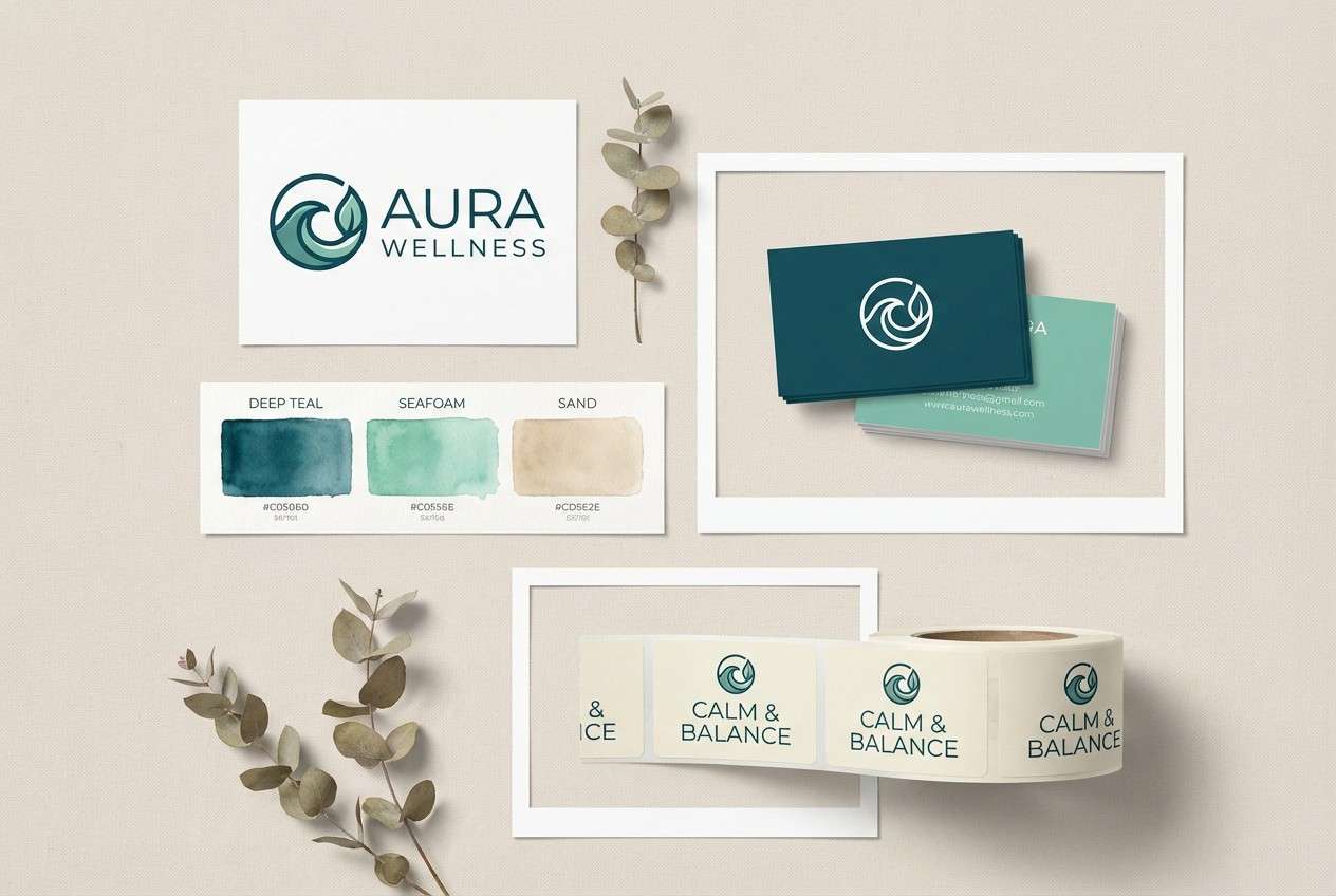
4) Thunderhead Teal
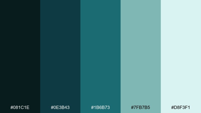
HEX: #081C1E #0E3B43 #1B6B73 #7FB7B5 #D8F3F1
Mood: fresh, aquatic, confident
Best for: wellness brand identity
Deep oceanic teal with misty seafoam reads like rain rolling off coastal cliffs. These thunderstorm color combinations shine in wellness branding, spa packaging, and calming app visuals where trust is key. Pair with soft neutrals and rounded sans fonts for a friendly, modern feel. Usage tip: use the light seafoam as the primary background and let the darker teals anchor logos and headers.
Image example of thunderhead teal generated using media.io
5) Umbrella Noir
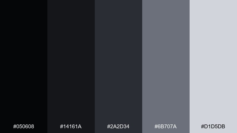
HEX: #050608 #14161A #2A2D34 #6B707A #D1D5DB
Mood: sleek, urban, high-contrast
Best for: fashion lookbook layout
Inky blacks and graphite grays feel like a late-night walk under streetlights and umbrellas. The palette supports sharp product photography, fashion editorials, and luxury typography without fighting for attention. Pair with one metallic accent in print finishes if you want extra polish. Usage tip: keep body text on the lightest gray for comfort, and use near-black for headlines.
Image example of umbrella noir generated using media.io
6) Wet Asphalt Glow
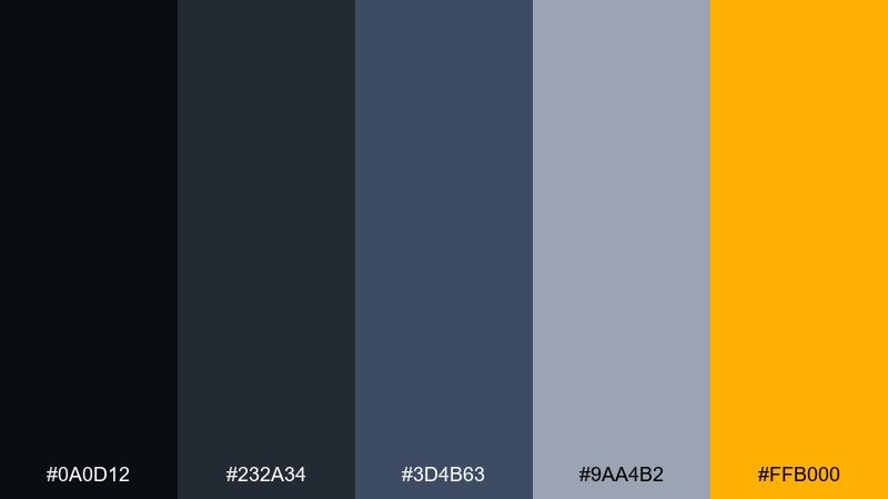
HEX: #0A0D12 #232A34 #3D4B63 #9AA4B2 #FFB000
Mood: energetic, gritty, night-city
Best for: night event poster
Gritty asphalt blues and dark steel feel cinematic, like neon reflecting on wet pavement. It works best for concerts, nightlife posters, and tech meetups that need a bold focal point. Pair with condensed type and a strong grid to keep the energy controlled. Usage tip: use the amber as a spotlight effect on key details like date and venue.
Image example of wet asphalt glow generated using media.io
7) Distant Rumble Olive
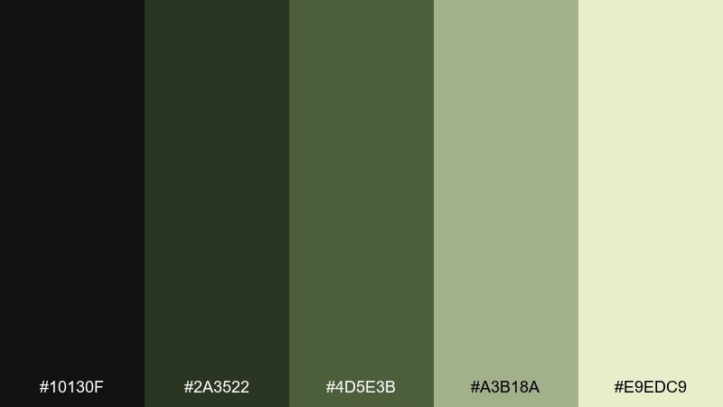
HEX: #10130F #2A3522 #4D5E3B #A3B18A #E9EDC9
Mood: earthy, rugged, calm
Best for: outdoor apparel packaging
Mossy olive and muted khaki bring to mind rainclouds over a forest trail, steady and rugged. These tones fit outdoor apparel, sustainable goods, and heritage labels where nature should feel authentic. Pair with kraft textures or matte finishes to enhance the grounded mood. Usage tip: keep the light khaki for background panels so product info stays readable.
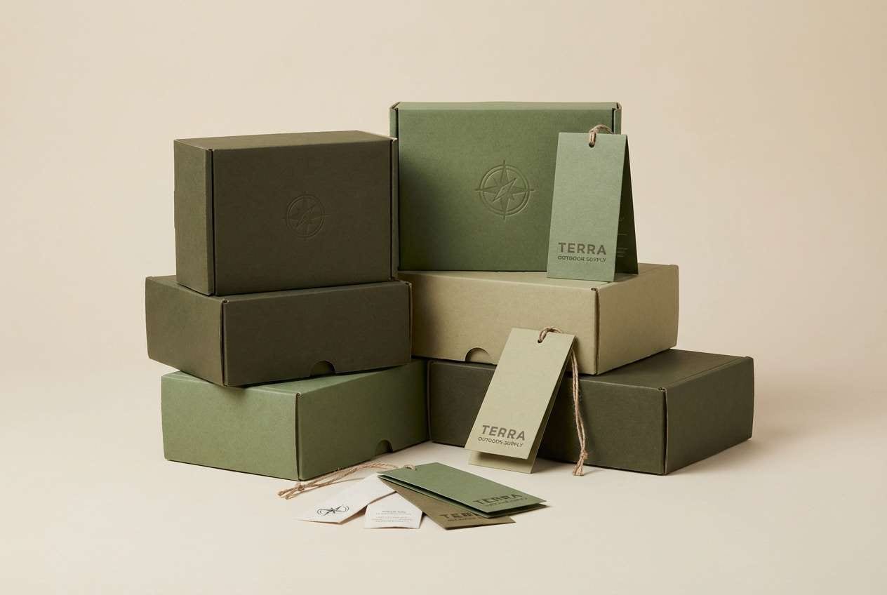
Image example of distant rumble olive generated using media.io
8) Static Charge Rose
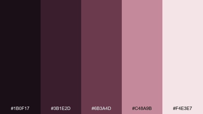
HEX: #1B0F17 #3B1E2D #6B3A4D #C48A9B #F4E3E7
Mood: romantic, edgy, nocturnal
Best for: album cover design
Dark berry shadows and dusty rose highlights feel like distant thunder with a soft pulse. The mix is great for album art, poetry chapbooks, and boutique campaigns that want emotion without cliché. Pair with high-contrast type and grain textures for a modern, moody finish. Usage tip: use the palest blush as a thin border or label to frame the artwork.
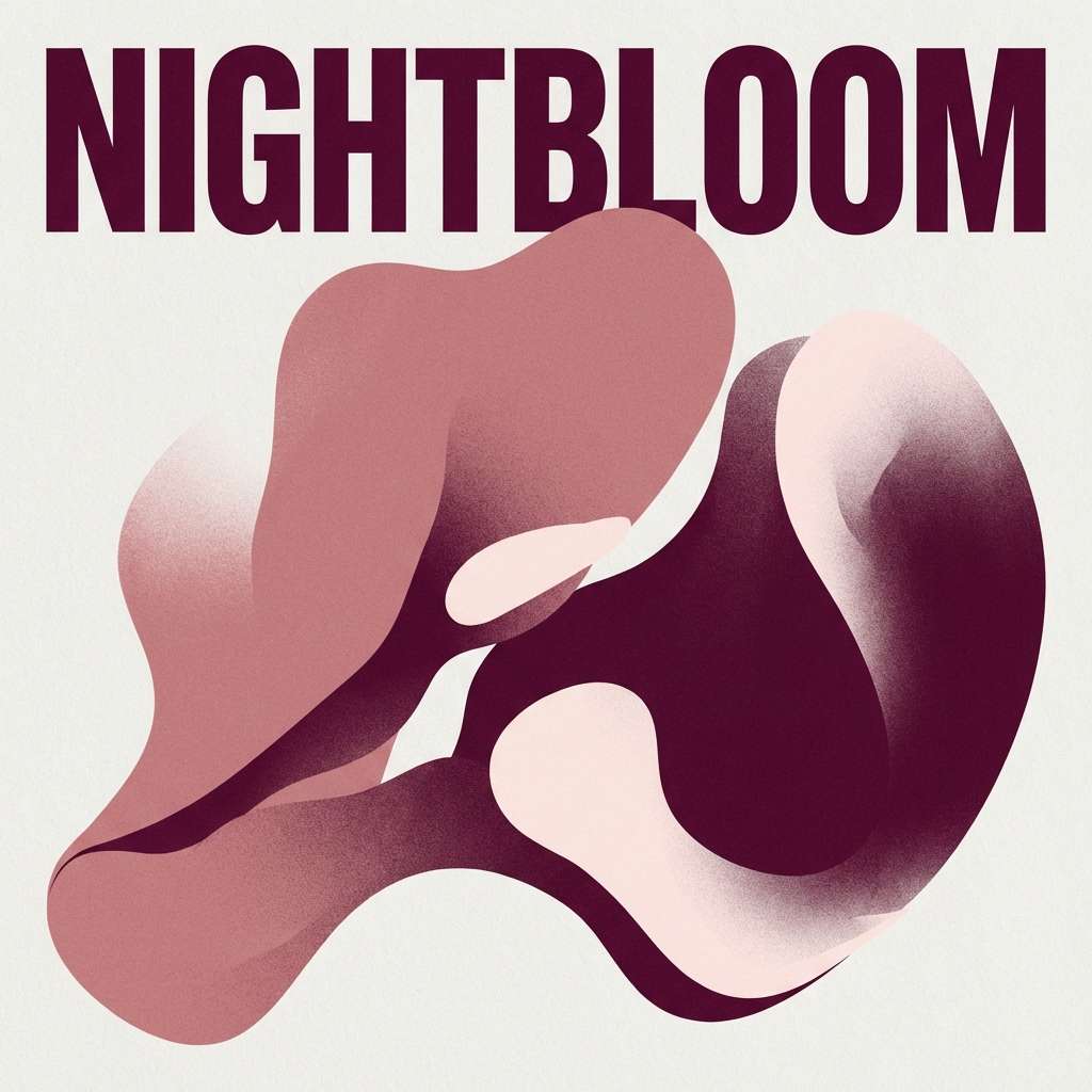
Image example of static charge rose generated using media.io
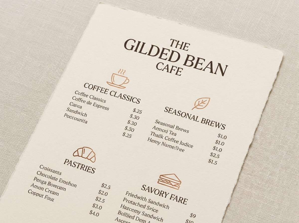
9) Lightning Cut Copper
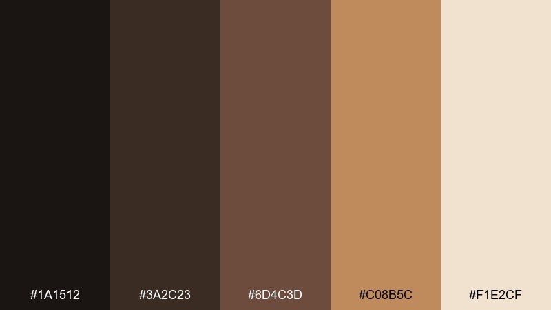
HEX: #1A1512 #3A2C23 #6D4C3D #C08B5C #F1E2CF
Mood: warm, rustic, refined
Best for: cafe menu print
Smoky espresso browns and copper warmth feel like lamplight during a rainy evening. These tones work wonderfully for cafe menus, artisan food brands, and cozy stationery. Pair with cream paper and classic serif fonts for an approachable, premium look. Usage tip: highlight signature items in copper while keeping body copy in the deeper brown for balance.
Image example of lightning cut copper generated using media.io
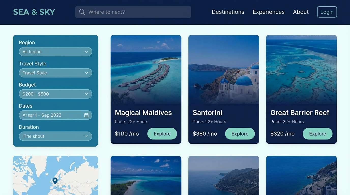
10) Harbor Storm Blue
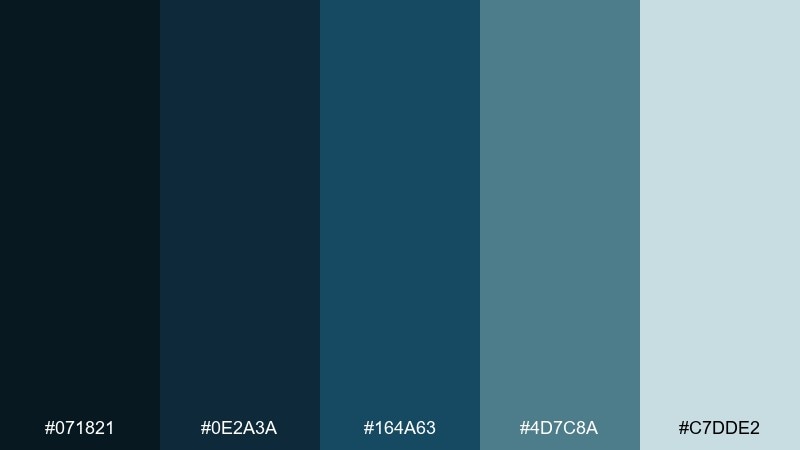
HEX: #071821 #0E2A3A #164A63 #4D7C8A #C7DDE2
Mood: nautical, steady, professional
Best for: travel website UI
Harbor blues and sea-glass accents evoke rolling waves under heavy skies, dependable and calm. The palette supports travel platforms, booking flows, and content-heavy pages that need clear sections. Pair with warm photography and let the mid-blue handle buttons and links. Usage tip: use the pale aqua as a background for filters and secondary panels to reduce visual weight.
Image example of harbor storm blue generated using media.io
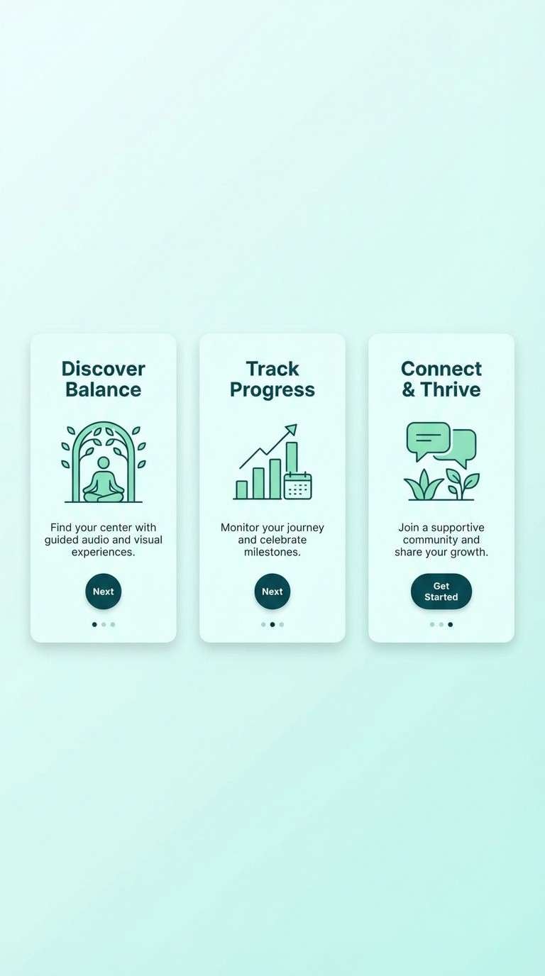
11) Hailstone Mint
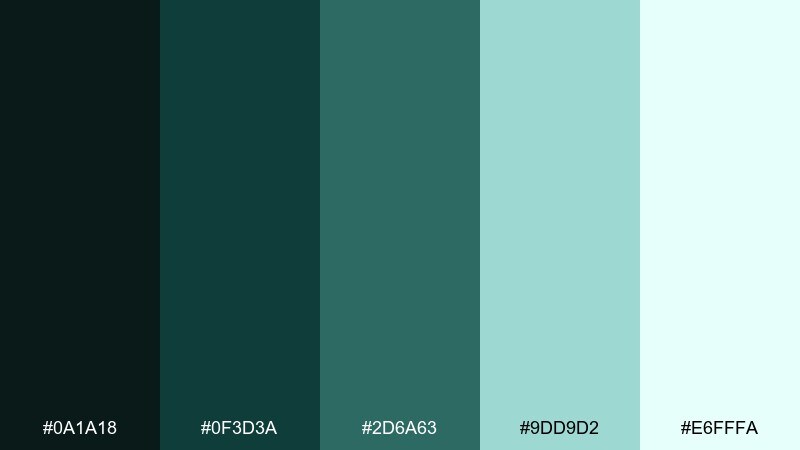
HEX: #0A1A18 #0F3D3A #2D6A63 #9DD9D2 #E6FFFA
Mood: crisp, clean, refreshing
Best for: mobile app onboarding screens
Crisp green-blue tones feel like icy rain and fresh air after the storm breaks. They are ideal for onboarding flows, health apps, and clean product UX where reassurance matters. Pair with simple icons and generous spacing to keep the experience light. Usage tip: use the mint as the primary surface color and keep the darkest teal for navigation and active states.
Image example of hailstone mint generated using media.io
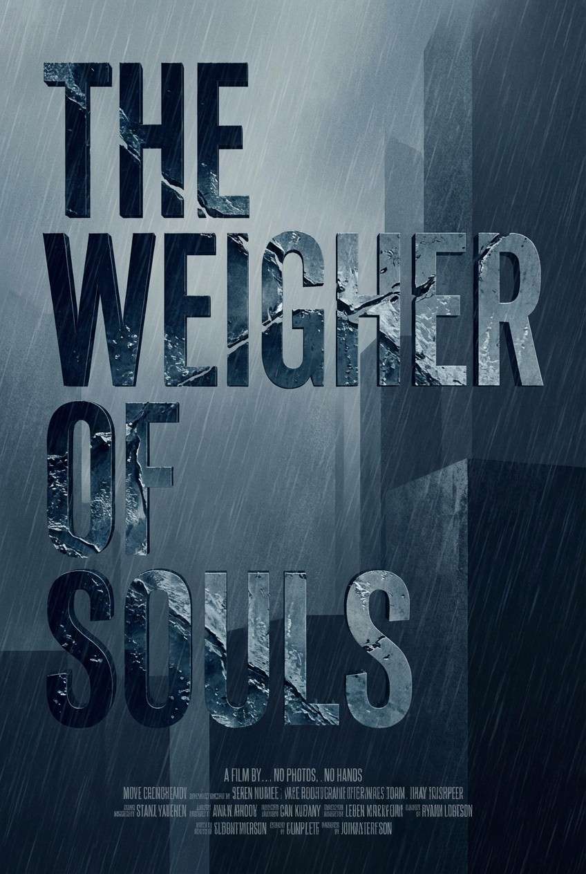
12) Midnight Downpour
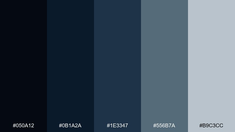
HEX: #050A12 #0B1A2A #1E3347 #556B7A #B9C3CC
Mood: cinematic, moody, intense
Best for: cinematic movie poster
Cinematic midnight blues and cold steel grays suggest rain streaks on glass and a city humming in the dark. This thunderstorm color palette is a strong fit for film posters, book covers, and dramatic campaign key art. Pair with a single warm accent in the imagery if you need a focal point, but keep the typography cool and sharp. Usage tip: use the light gray for credits and fine print so it stays legible without breaking the mood.
Image example of midnight downpour generated using media.io
13) Charged Indigo
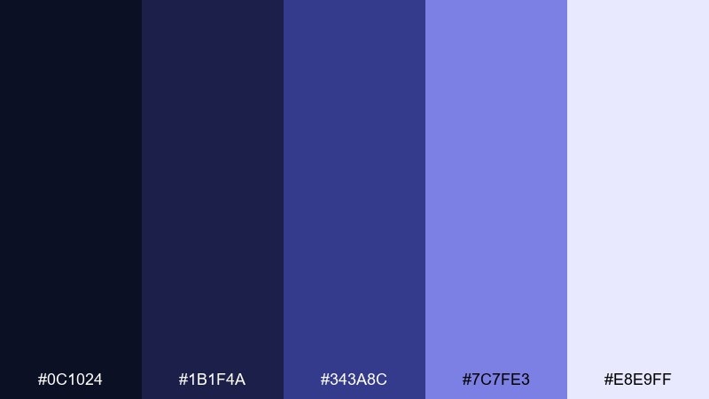
HEX: #0C1024 #1B1F4A #343A8C #7C7FE3 #E8E9FF
Mood: bold, futuristic, high-energy
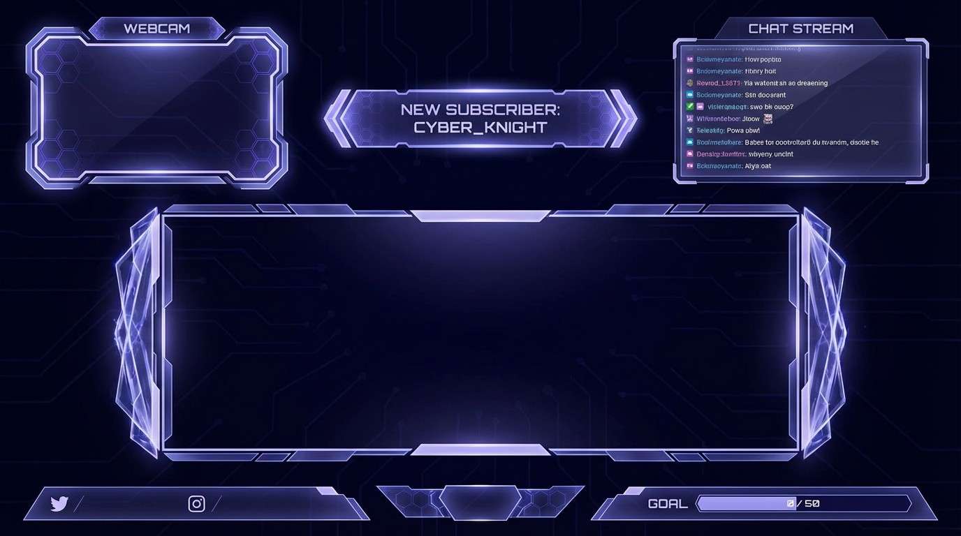
Best for: gaming stream overlay UI
Charged indigos and electric periwinkle feel like distant lightning lighting up thick clouds. These thunderstorm color combinations are made for streaming overlays, esports panels, and punchy UI that needs depth plus glow. Pair with clean geometric shapes and keep text mostly light for contrast. Usage tip: use the brightest periwinkle only for active states and notifications to maintain hierarchy.
Image example of charged indigo generated using media.io
14) Foggy Pier Neutrals
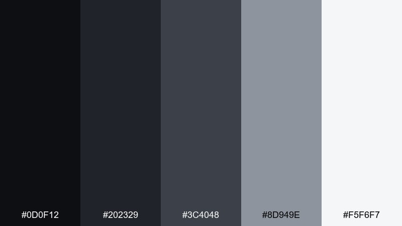
HEX: #0D0F12 #202329 #3C4048 #8D949E #F5F6F7
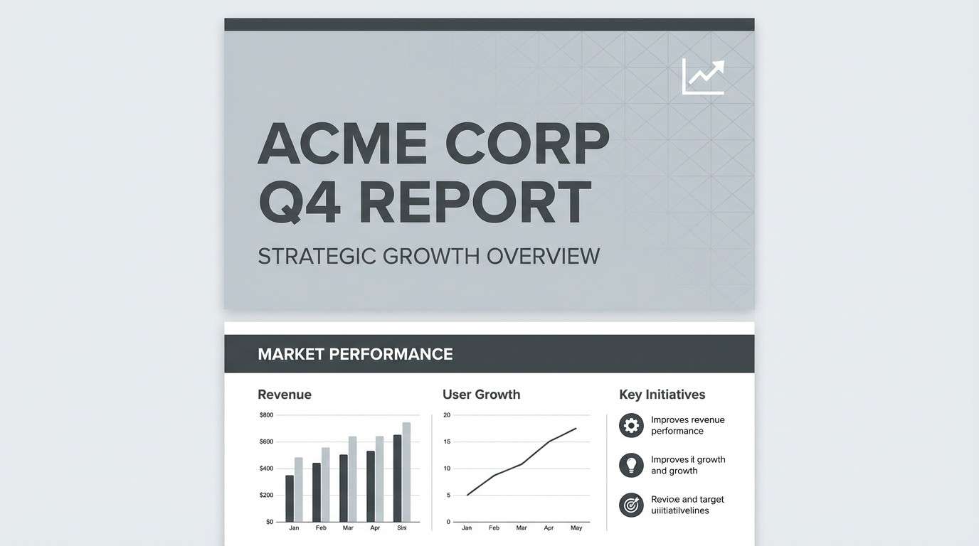
Mood: neutral, polished, corporate
Best for: corporate presentation deck template
Soft fog grays and near-black accents feel like a quiet pier disappearing into mist. The neutral range is perfect for presentations, reports, and clean business templates that rely on structure. Pair with a single brand color for charts and key metrics to keep slides from feeling flat. Usage tip: use the lightest gray as your base slide background and reserve dark tones for headers and dividers.
Image example of foggy pier neutrals generated using media.io
15) Electric Horizon Cyan
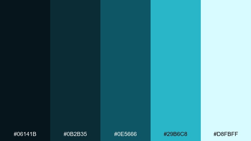
HEX: #06141B #0B2B35 #0E5666 #29B6C8 #D8FBFF
Mood: bright, techy, clean
Best for: SaaS explainer infographic
Bright cyan against deep blue-green feels like a storm clearing to reveal a glowing horizon. It is a strong choice for SaaS infographics, feature explainers, and diagrams that need quick visual grouping. Pair with thin line icons and plenty of spacing to keep the design airy. Usage tip: keep cyan for key numbers and highlights, and use the darker tones for structure and labels.
Image example of electric horizon cyan generated using media.io

16) Storm Lantern Gold
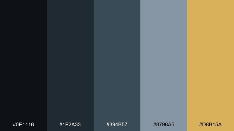
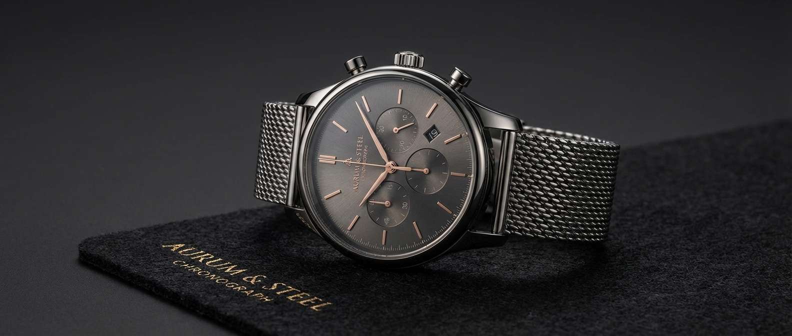
HEX: #0E1116 #1F2A33 #394B57 #8796A5 #D8B15A
Mood: luxury, warm-accented, confident
Best for: premium watch product ad
Deep graphite and cool steel set a luxury tone, while lantern gold adds a controlled warmth like light in a storm. This mix works for premium product ads, high-end tech, and sleek ecommerce banners. Pair with minimal copy and strong typography to keep it sophisticated. Usage tip: use gold sparingly for the logo mark, price, or one key detail to signal quality.
Image example of storm lantern gold generated using media.io
17) Rainy Day Pastels
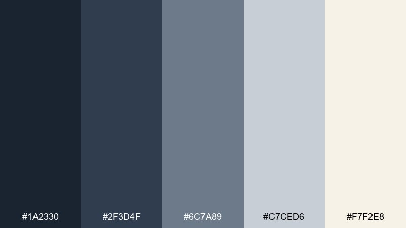
HEX: #1A2330 #2F3D4F #6C7A89 #C7CED6 #F7F2E8
Mood: soft, understated, elegant
Best for: wedding invitation suite
Soft blue-grays and warm ivory feel like a gentle drizzle outside a candlelit room. The palette fits modern wedding stationery, minimalist invites, and refined announcement cards. Pair with delicate line art and a classic serif to keep it timeless. Usage tip: print the darkest tone for names and headings, and use the lighter grays for borders and details.
Image example of rainy day pastels generated using media.io
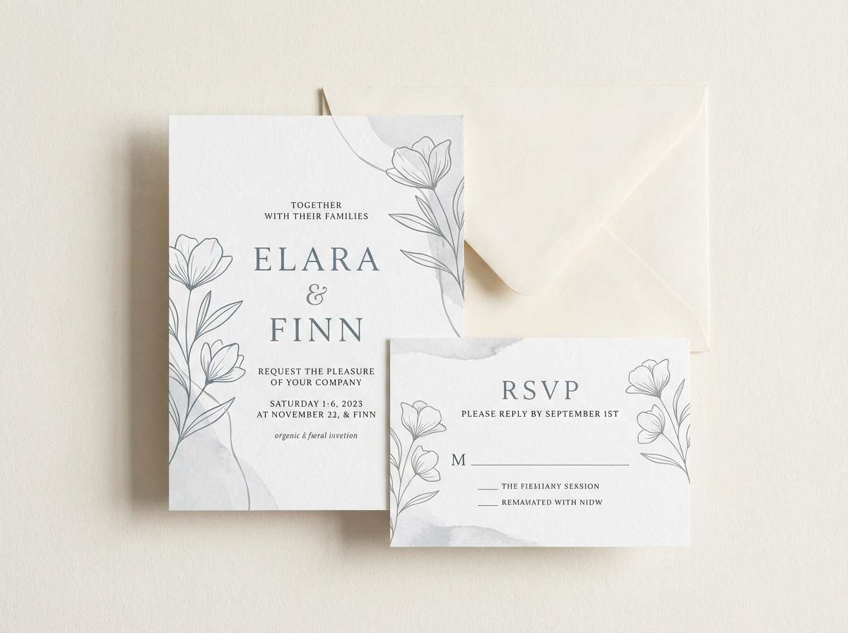
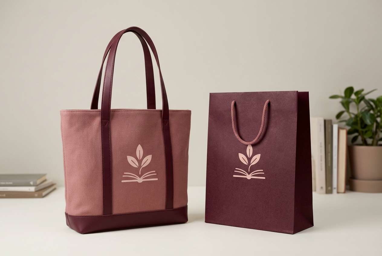
18) Thunder Alley Burgundy
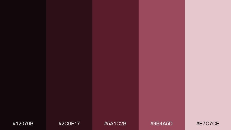
HEX: #12070B #2C0F17 #5A1C2B #9B4A5D #E7C7CE
Mood: bold, romantic, atmospheric
Best for: bookstore branding and tote bag
Deep burgundy and dusty blush feel like thunder rolling down a narrow alley lit by warm storefronts. It is ideal for bookstore branding, literary events, and packaging that wants character and depth. Pair with cream paper stock and vintage-inspired type for a cozy, curated look. Usage tip: keep blush as the background and use burgundy for logos and stamps so they feel rich and intentional.
Image example of thunder alley burgundy generated using media.io
19) Afterstorm Sunrise
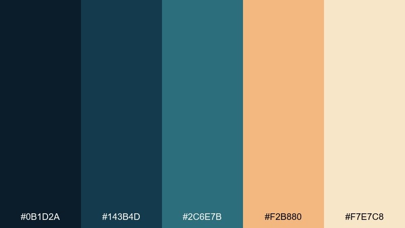
HEX: #0B1D2A #143B4D #2C6E7B #F2B880 #F7E7C8
Mood: hopeful, balanced, fresh
Best for: social media template set
Cool storm blues paired with soft sunrise peach feel like the moment clouds thin and light returns. This balance works well for social posts, carousel templates, and lifestyle branding that wants contrast without harshness. Pair with clean sans-serif type and simple shapes so the colors do the storytelling. Usage tip: use peach for callouts and stickers, and keep the blues for structure and consistency.
Image example of afterstorm sunrise generated using media.io
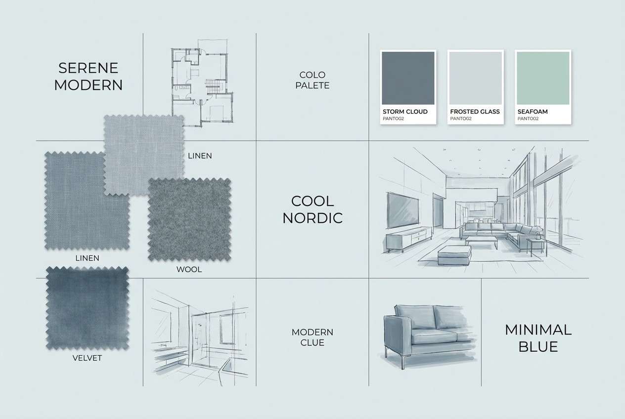
20) Calm After Rain
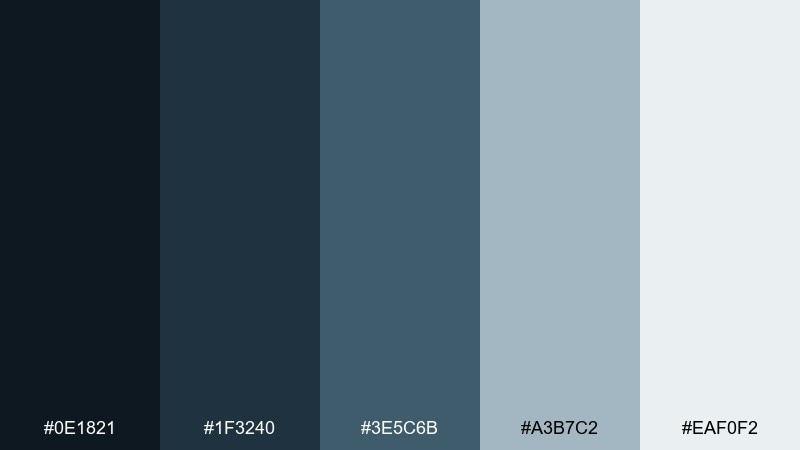
HEX: #0E1821 #1F3240 #3E5C6B #A3B7C2 #EAF0F2
Mood: calm, airy, contemporary
Best for: interior design mood board
Cool blue-grays and light mist tones evoke quiet skies after the last drops fade. The palette suits interior mood boards, architecture portfolios, and calm lifestyle branding. Pair with warm wood textures or soft beige neutrals if you want to add comfort without losing clarity. Usage tip: let the lightest tone dominate the canvas and use deeper blues for labels and swatches.
Image example of calm after rain generated using media.io
What Colors Go Well with Thunderstorm?
Thunderstorm tones pair best with clean cool neutrals (fog gray, off-white, steel) to keep layouts readable and modern. These support backgrounds, cards, and large text areas without diluting the mood.
For accents, choose one “lightning” color: amber/yellow for urgency and CTAs, cyan for a techy highlight, or gold for premium branding. Keep it sparse so the palette stays controlled rather than chaotic.
If you need warmth, bring in soft peach, copper, or blush—especially for lifestyle, editorial, or packaging—while keeping the stormy blues/charcoals as the primary structure.
How to Use a Thunderstorm Color Palette in Real Designs
Start with a dark base (navy/charcoal) for headers, hero sections, or navigation, then use a mid-tone slate/steel for secondary panels and dividers. This creates depth without relying on heavy shadows.
Assign the lightest tint to backgrounds and content surfaces so typography remains comfortable to read. In UI, keep interactive states consistent by mapping one mid-tone to buttons and one accent to “active/primary.”
In print (posters, menus, packaging), thunderstorm palettes look especially refined with matte finishes, subtle grain, or soft gradients—just avoid overusing multiple accents in the same layout.
Create Thunderstorm Palette Visuals with AI
If you want to see how stormy tones behave in real compositions, generate quick mockups (hero sections, posters, packaging, or onboarding screens) before committing to a final design system.
With Media.io’s text-to-image, you can test typography contrast, accent placement, and overall mood in minutes—then iterate prompts to match your brand’s style.
Use your favorite HEX set above, describe the layout, and call out one accent color as the focal point for the cleanest thunderstorm look.
Thunderstorm Color Palette FAQs
-
What is a thunderstorm color palette?
A thunderstorm color palette is a moody set of colors built around deep navy/charcoal bases, slate or steel mid-tones, and optional high-contrast accents (like lightning yellow, cyan, or gold) to create a modern storm-inspired look. -
Are thunderstorm colors good for UI design?
Yes—stormy blues and cool grays are excellent for dashboards and apps because they create clear hierarchy. Use the lightest tones for surfaces, keep text high-contrast, and reserve one bright accent for primary actions or alerts. -
What accent color works best with stormy blues?
Lightning yellow/amber gives the strongest CTA contrast, cyan feels more “tech,” and gold feels premium. Pick one accent and keep it consistent across buttons, highlights, and key numbers. -
How do I keep a thunderstorm palette from looking too dark?
Increase the proportion of light mist/gray backgrounds, use mid-tones for large blocks instead of near-black, and add whitespace. You can also introduce a soft warm tint (ivory or peach) for balance. -
Do thunderstorm palettes work for branding and packaging?
They do—especially for tech, fashion, outdoor, and premium products. Dark storm tones feel confident and modern, while a controlled metallic or warm accent can elevate packaging without making it loud. -
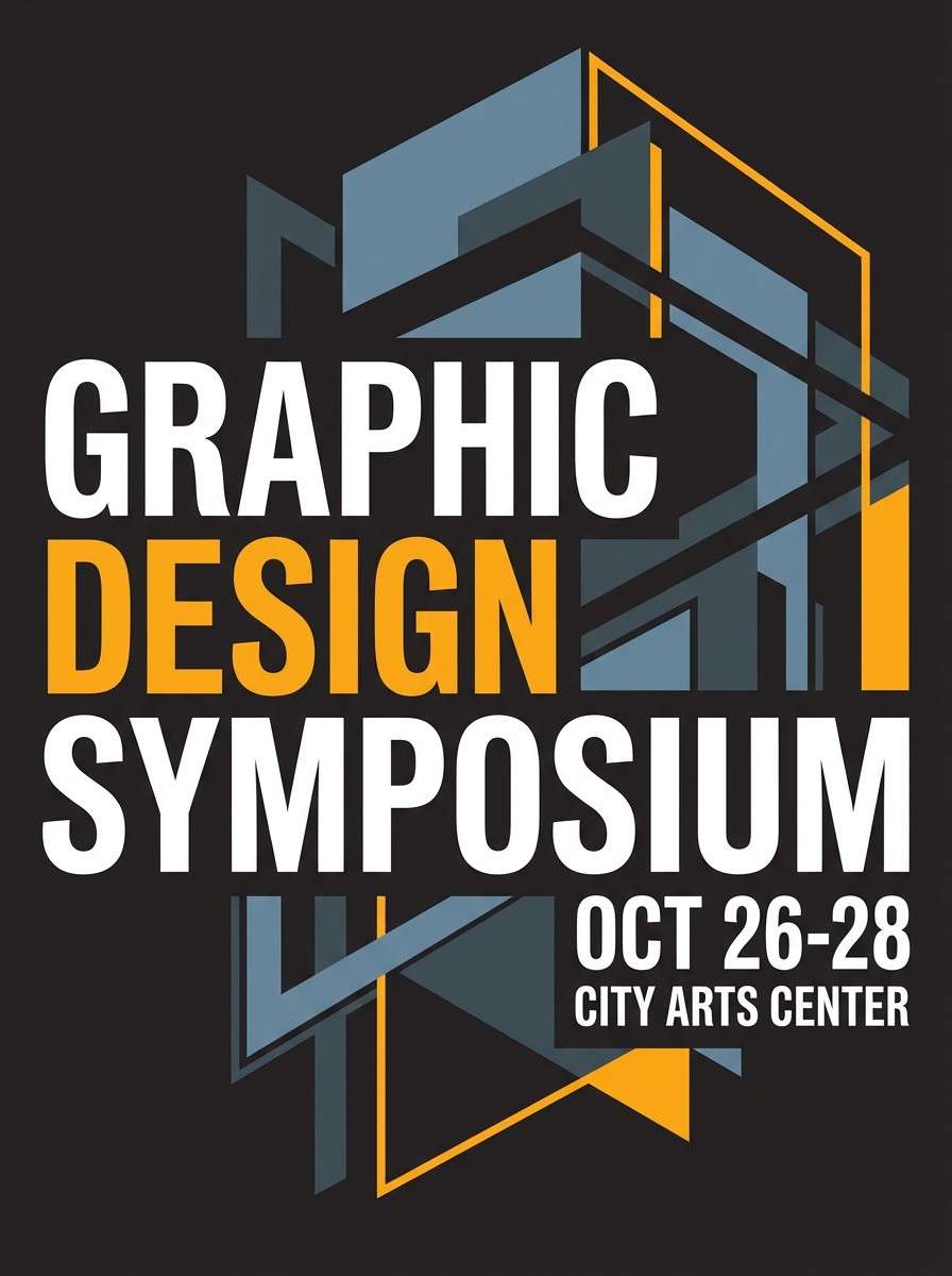
Which thunderstorm palette is best for posters?
High-contrast sets like Wet Asphalt Glow or Midnight Downpour work well for posters because they support bold typography and strong focal points. Use the accent color to emphasize date, venue, or a headline. -
Can I generate thunderstorm palette mockups with AI?
Yes. Use Media.io text-to-image to generate UI screens, brand boards, posters, or packaging by describing your layout and specifying your storm tones plus one accent color for highlights.


