

Winter color palettes are crisp by nature: cool blues, deep evergreens, soft neutrals, and high-contrast darks that feel instantly modern. They’re a reliable choice for branding, UI, packaging, and social graphics when you want clarity and calm confidence.
Below are 20 refined winter color combinations with HEX codes, plus practical notes on contrast, balance, and where each palette shines in real designs.
In this article
Why Winter Palettes Work So Well
Winter palettes tend to balance cool tones with strong neutrals, which makes layouts feel clean and organized. That clarity is especially helpful for UI, typography-heavy pages, and packaging where readability matters.
They also naturally create contrast: icy tints against charcoal, deep navy against pale blue, evergreen against snowy off-white. With contrast built in, you can guide attention to CTAs and key content without relying on loud colors.
Finally, winter color schemes can swing from minimal to cozy with small shifts in accent choices—add cranberry or copper for warmth, or keep it foggy and monochrome for a modern, editorial vibe.
20+ Winter Color Palette Ideas (with HEX Codes)
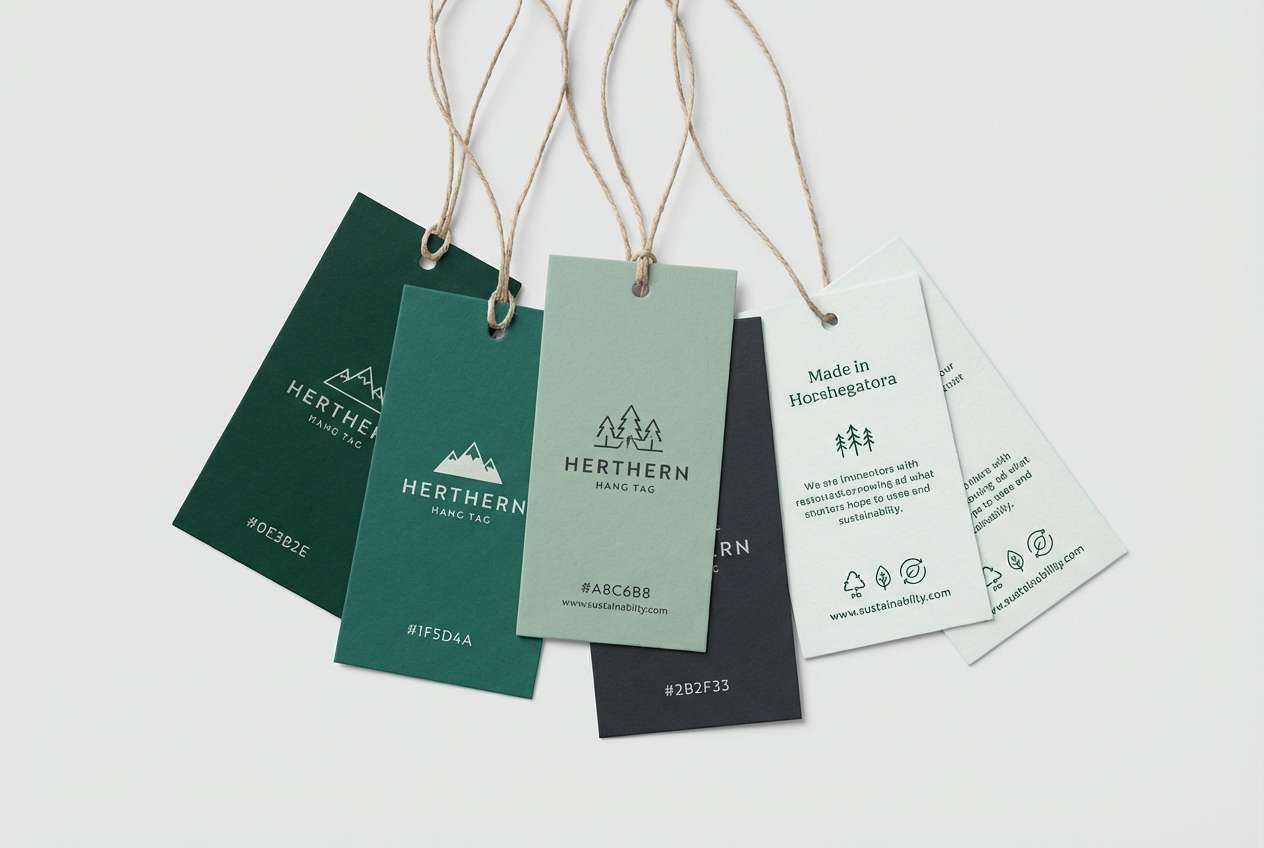
1) Frosted Pine
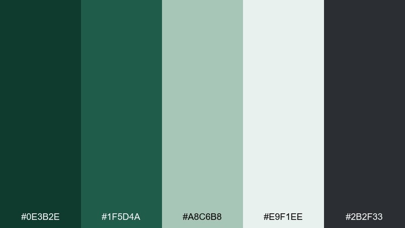
HEX: #0E3B2E #1F5D4A #A8C6B8 #E9F1EE #2B2F33
Mood: crisp, evergreen, grounded
Best for: outdoor brand identity and hang tags
Crisp evergreens and fresh snow come to mind, with deep greens anchored by soft frost. Use it for outdoorsy branding, winter apparel tags, or eco packaging where you want calm confidence. Pair the dark pine with the pale minty neutral for clean contrast, then add charcoal for text legibility. Tip: keep the lightest shade as your main background so the greens feel bright, not heavy.
Image example of frosted pine generated using media.io
Media.io is an online AI studio for creating and editing video, image, and audio in your browser.

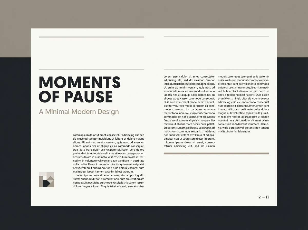
2) Snowdrift Neutral
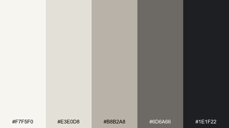
HEX: #F7F5F0 #E3E0D8 #B8B2A8 #6D6A66 #1E1F22
Mood: minimal, airy, modern
Best for: portfolio websites and editorial layouts
Soft snowdrifts and overcast skies create a quiet, minimalist feel that reads instantly modern. These neutrals shine in portfolios, long-form editorial pages, and product detail screens where typography is the hero. Pair the off-white base with the mid warm gray for panels, then reserve near-black for headlines and icons. Tip: add texture through photography or subtle grain so the palette stays warm, not flat.
Image example of snowdrift neutral generated using media.io
3) Cranberry Cabin
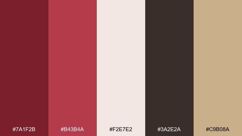
HEX: #7A1F2B #B43B4A #F2E7E2 #3A2E2A #C9B08A
Mood: cozy, rustic, festive
Best for: holiday menus and café posters
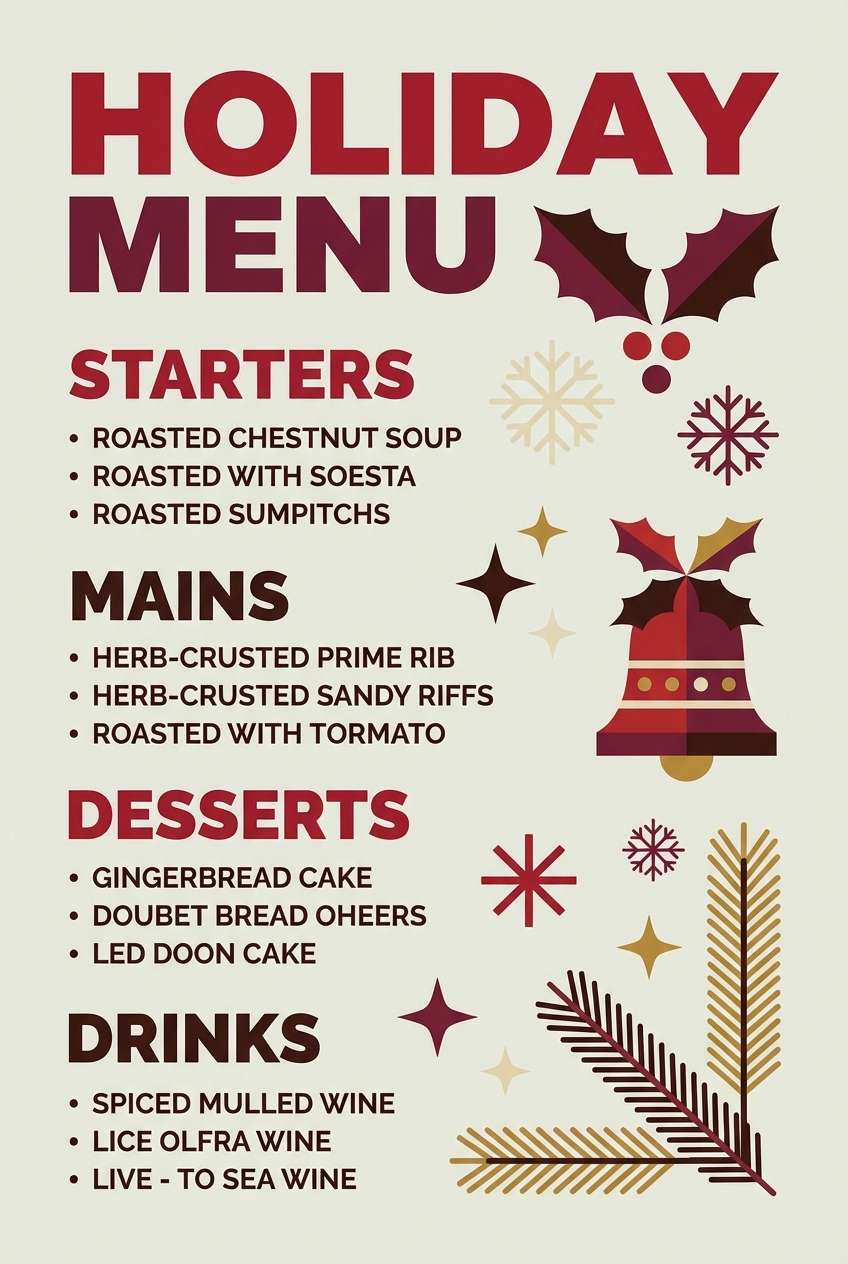
Cozy cabin warmth meets a tart cranberry pop, like knit throws and a mug by the window. This winter color palette works beautifully for holiday menus, café posters, and seasonal promos that need comfort with energy. Pair the cranberry with cream for readable type, then use deep espresso for borders and headings. Tip: keep gold-tan as a small accent on icons or dividers to avoid a heavy red block.
Image example of cranberry cabin generated using media.io
4) Icy Lavender
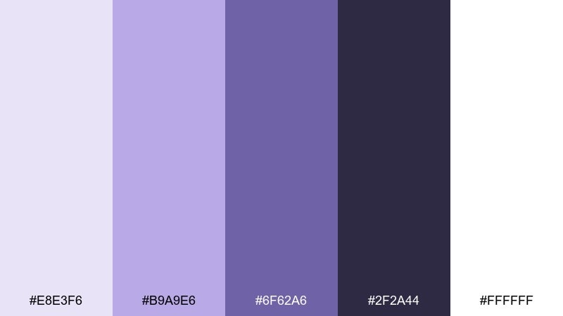
HEX: #E8E3F6 #B9A9E6 #6F62A6 #2F2A44 #FFFFFF
Mood: dreamy, cool, polished
Best for: beauty packaging and skincare ads
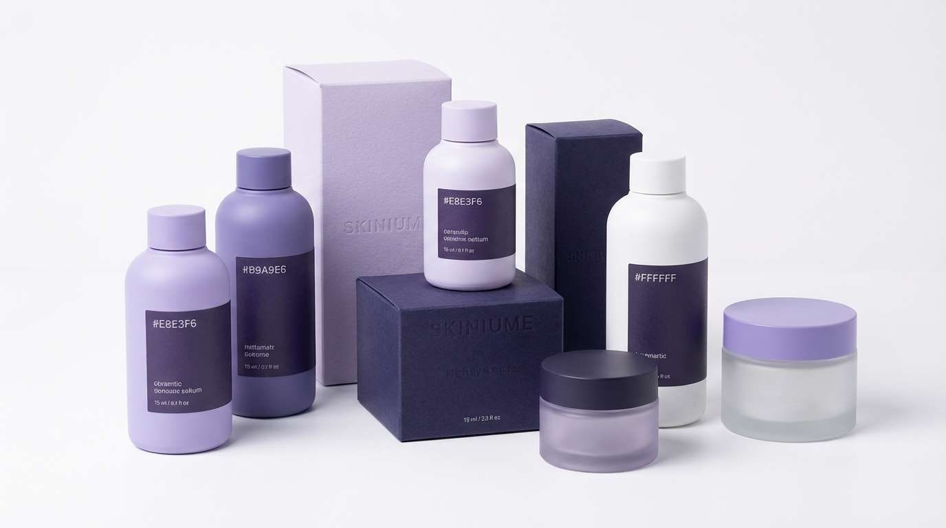
Dreamy lavender haze feels like twilight on fresh snow, cool but softly inviting. Use these tones for skincare packaging, beauty ads, or a gentle landing page that needs a premium touch. Pair the pale lilac with deep violet for contrast, and lean on white to keep everything clean and luminous. Tip: use the mid-purple as your primary brand color and reserve the darkest shade for small type.
Image example of icy lavender generated using media.io
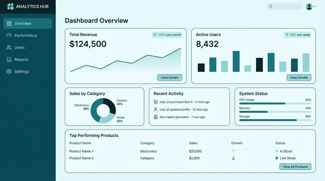
5) Glacier Teal
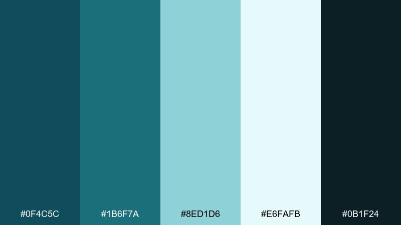
HEX: #0F4C5C #1B6F7A #8ED1D6 #E6FAFB #0B1F24
Mood: fresh, clean, energetic
Best for: SaaS dashboards and data visualizations
Glacier water clarity gives these teals a brisk, modern energy that still feels trustworthy. Use them in dashboards, charts, and analytics UI where you want clean hierarchy and calm focus. Pair the pale aqua as the canvas, then build components with teal and deep blue-black for contrast. Tip: keep saturation concentrated in buttons and highlights so the interface stays breathable.
Image example of glacier teal generated using media.io
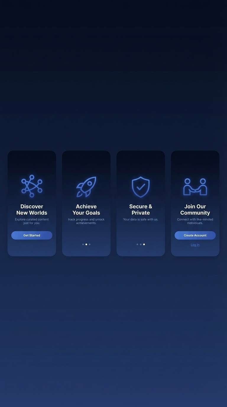
6) Nordic Night
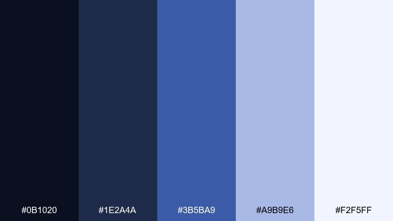
HEX: #0B1020 #1E2A4A #3B5BA9 #A9B9E6 #F2F5FF
Mood: bold, midnight, cinematic
Best for: tech hero sections and app onboarding
Midnight skies and icy starlight make this palette feel cinematic and bold. It fits tech hero sections, app onboarding screens, and presentations that need depth without going fully black. Pair the inky base with the bright periwinkle for CTAs, then use the pale tint for spacious panels. Tip: add a subtle gradient between the two darkest tones to avoid banding on large backgrounds.
Image example of nordic night generated using media.io
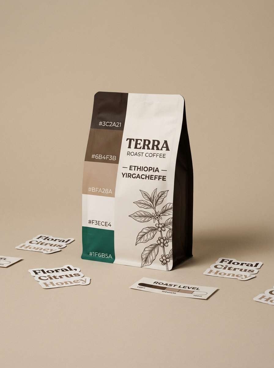
7) Alpine Cocoa
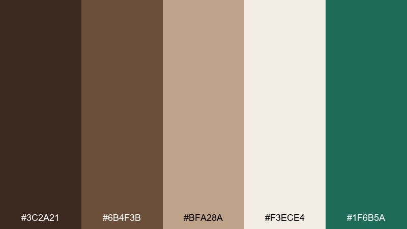
HEX: #3C2A21 #6B4F3B #BFA28A #F3ECE4 #1F6B5A
Mood: warm, earthy, comforting
Best for: coffee packaging and artisan labels
Warm cocoa and woodgrain tones feel comforting, like a lodge kitchen after a long hike. Use them for coffee packaging, artisan labels, or lifestyle branding that wants handmade credibility. Pair cream as the label base, then bring in the deep brown for typography and the forest teal as a crisp accent. Tip: keep the teal to small stamps or seals so the warmth stays in the lead.
Image example of alpine cocoa generated using media.io
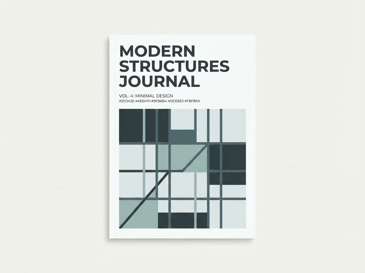
8) Silver Fir
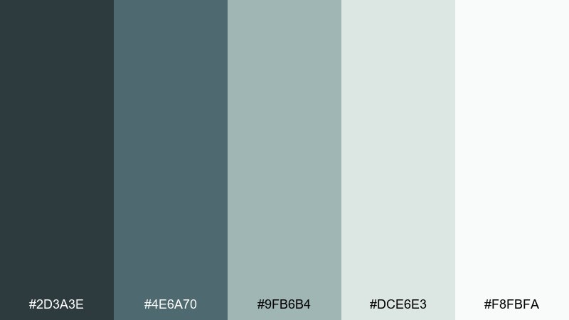
HEX: #2D3A3E #4E6A70 #9FB6B4 #DCE6E3 #F8FBFA
Mood: cool, foggy, sophisticated
Best for: architectural portfolios and brochures
Fog over fir trees gives these cool grays a refined, quietly luxe mood. They work well for architecture portfolios, brochures, and minimalist brand systems that rely on strong grids. Pair the pale mint-gray with slate for sections and captions, and use the darkest tone for crisp lines and navigation. Tip: introduce one high-contrast photo per page so the palette supports, rather than competes.
Image example of silver fir generated using media.io
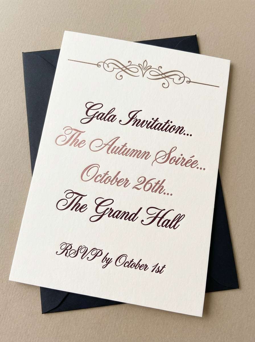
9) Mulled Wine
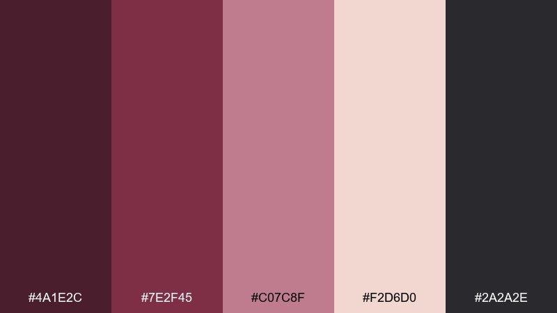
HEX: #4A1E2C #7E2F45 #C07C8F #F2D6D0 #2A2A2E
Mood: rich, romantic, moody
Best for: event invitations and wine labels
Rich mulled wine tones feel romantic and moody, like candlelight on velvet. Use them for event invitations, wine labels, or seasonal social graphics that need depth and warmth. Pair the deep burgundy with blush for elegant contrast, then add graphite for fine text and borders. Tip: foil effects look great here, but keep them subtle so the palette stays modern.
Image example of mulled wine generated using media.io
10) Powder Blue Pop
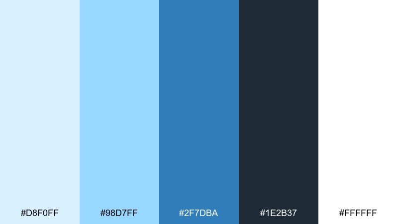
HEX: #D8F0FF #98D7FF #2F7DBA #1E2B37 #FFFFFF
Mood: bright, icy, playful
Best for: social templates and promo banners
Powdery blues feel like fresh tracks across a bright slope, upbeat and clean. Use this mix for social templates, promo banners, and thumbnails where you need crisp contrast at small sizes. Pair the light blue background with the bold mid-blue for buttons and stickers, then ground it with deep navy for type. Tip: keep gradients gentle so the palette stays airy instead of loud.
Image example of powder blue pop generated using media.io

11) Evergreen Ink
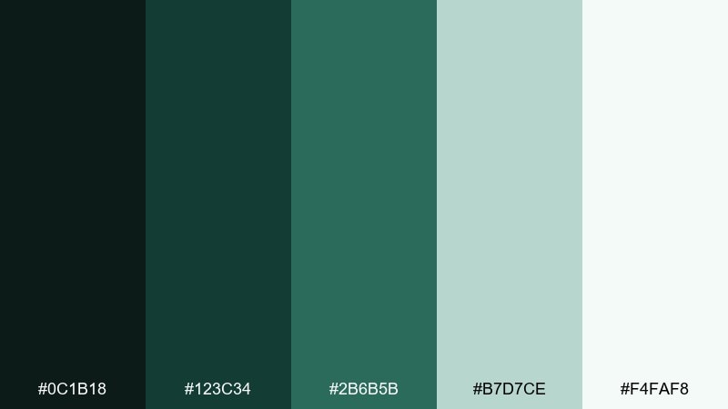
HEX: #0C1B18 #123C34 #2B6B5B #B7D7CE #F4FAF8
Mood: classic, calm, premium
Best for: luxury branding and monogram marks
Deep ink greens feel classic and premium, like embossed stationery on a quiet evening. Use them for luxury branding, monograms, and packaging where restraint matters. Pair the darkest green with the pale mint for high-end contrast and plenty of negative space. Tip: print tests are key, since the two darkest tones can merge under low lighting.
Image example of evergreen ink generated using media.io
12) Arctic Sunrise
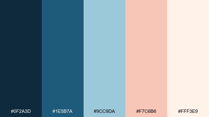
HEX: #0F2A3D #1E5B7A #9CC9DA #F7C6B6 #FFF3E9
Mood: optimistic, airy, balanced
Best for: lifestyle branding and landing pages
A soft sunrise over ice brings a hopeful mix of cool blues and warm blush. This winter color scheme is great for lifestyle brands and landing pages that want freshness without feeling sterile. Pair navy with blush for standout CTAs, and keep the peachy cream as your main background for warmth. Tip: use the light blue for cards and sections to create structure without heavy borders.
Image example of arctic sunrise generated using media.io
13) Stormy Harbor
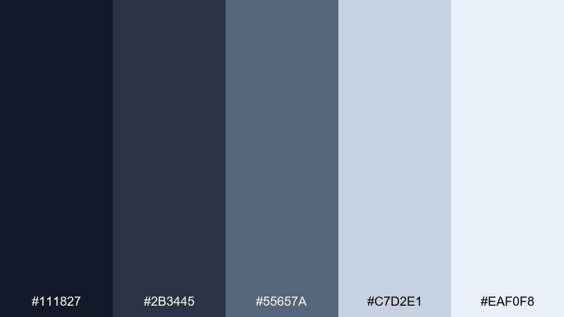
HEX: #111827 #2B3445 #55657A #C7D2E1 #EAF0F8
Mood: serious, steady, professional
Best for: finance apps and B2B decks
Stormy harbor grays feel steady and professional, like steel and sea mist. Use them for finance apps, B2B decks, or documentation sites where clarity and trust are everything. Pair the darkest tone for navigation with the pale blue-gray for content areas, then use the mid gray for dividers and secondary text. Tip: add one accent color outside the palette sparingly if you need stronger status signals.
Image example of stormy harbor generated using media.io
14) Cozy Flannel
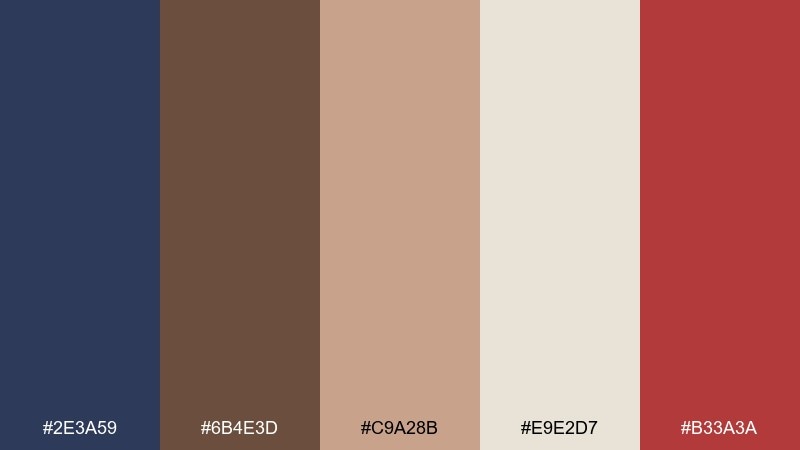
HEX: #2E3A59 #6B4E3D #C9A28B #E9E2D7 #B33A3A
Mood: homey, handcrafted, bold accent
Best for: seasonal email headers and blog graphics
Flannel blues and warm browns feel homey, like a weekend cabin trip with a bold red accent. Use it for seasonal email headers, blog graphics, and craft brands that want approachable warmth. Pair navy with oatmeal for structure, then drop in the red for sale tags or key callouts. Tip: keep red to 5 to 10 percent so it reads as intentional, not noisy.
Image example of cozy flannel generated using media.io
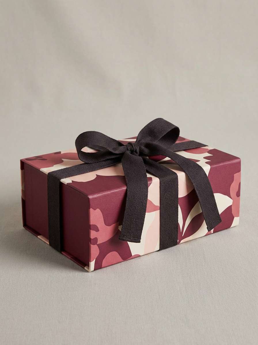
15) Winterberry Cream
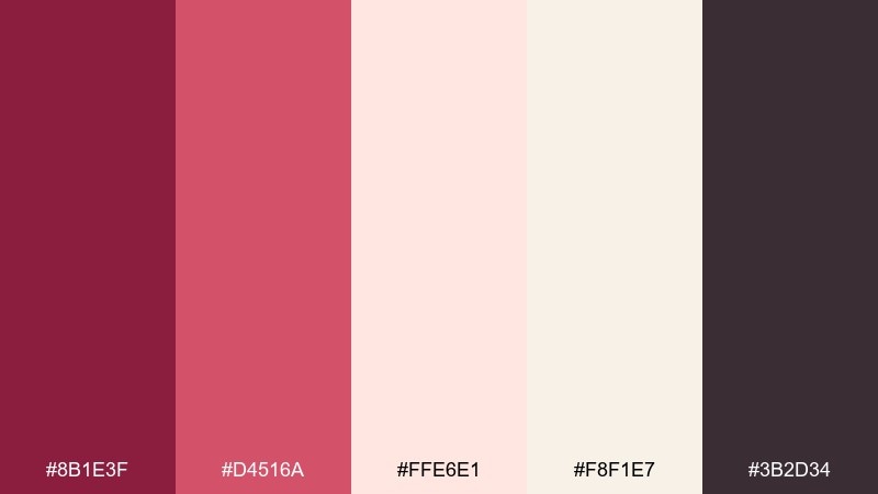
HEX: #8B1E3F #D4516A #FFE6E1 #F8F1E7 #3B2D34
Mood: sweet, soft, celebratory
Best for: gift packaging and beauty promos
Berry tones with whipped-cream neutrals feel celebratory and soft, like wrapped gifts under warm lights. Use it for gift packaging, beauty promos, or membership cards where you want friendly elegance. Pair the deep berry with cream for headlines, and let the rosy midtone carry icons and stickers. Tip: choose one cream as your standard background to keep prints consistent across materials.
Image example of winterberry cream generated using media.io
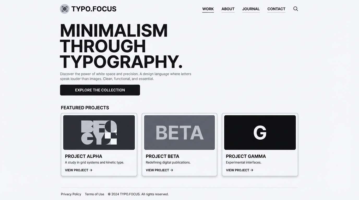
16) Slate and Sable
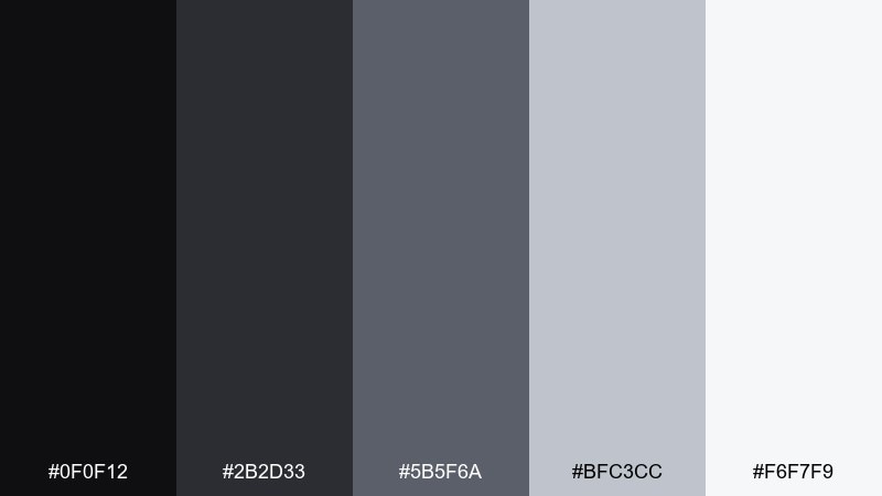
HEX: #0F0F12 #2B2D33 #5B5F6A #BFC3CC #F6F7F9
Mood: sleek, monochrome-leaning, modern
Best for: product UI and typography-heavy sites
Slate and sable tones feel sleek and modern, like polished stone and soft shadow. They are ideal for product UI, typography-heavy sites, and portfolios that need a sharp hierarchy. Pair the near-black for headers with the light gray background to make spacing and alignment feel intentional. Tip: lean on font weight and scale changes, since the color shifts are subtle by design.
Image example of slate and sable generated using media.io
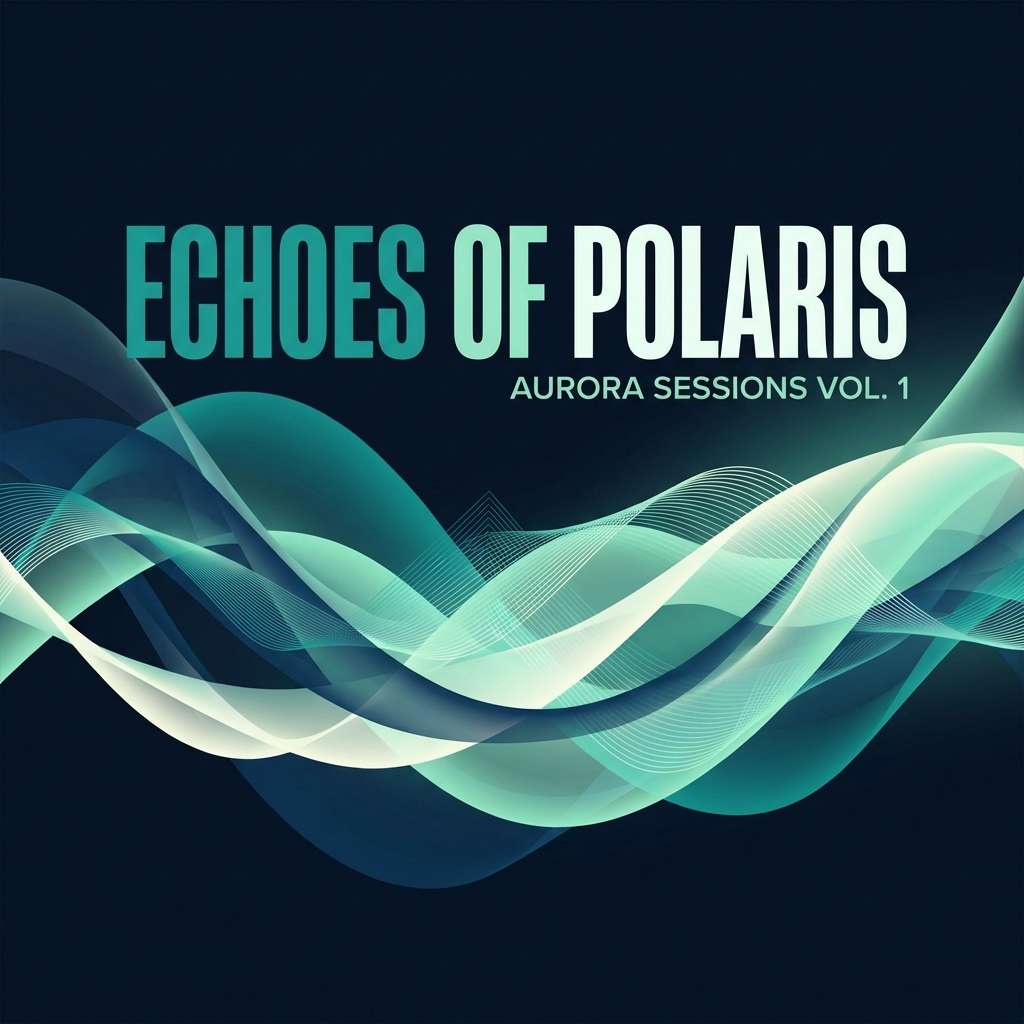
17) Midnight Aurora
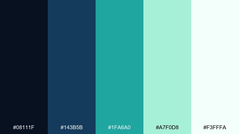
HEX: #08111F #143B5B #1FA6A0 #A7F0D8 #F3FFFA
Mood: mysterious, luminous, cool
Best for: music covers and streaming thumbnails
Aurora lights over midnight skies give this mix a mysterious glow with a crisp, modern edge. Use it for music covers, streaming thumbnails, or event promos that need to feel nocturnal but inviting. Pair the deep navy with teal for strong contrast, then use the mint tint for highlights and text blocks. Tip: add subtle light streak shapes in the background to reinforce the aurora vibe without clutter.
Image example of midnight aurora generated using media.io
18) Candlelit Copper
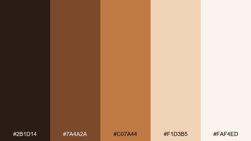
HEX: #2B1D14 #7A4A2A #C07A44 #F1D3B5 #FAF4ED
Mood: glowing, intimate, warm
Best for: restaurant promos and artisan product ads
Candlelight glow and copper warmth make this set feel intimate and inviting. Use it for restaurant promos, artisan product ads, and seasonal campaigns that need warmth against a clean background. Pair the cream base with copper for headings and highlights, then use the dark espresso for body text and contrast. Tip: use copper as a lighting accent in imagery so the color feels natural, not painted on.
Image example of candlelit copper generated using media.io
19) Ice Hotel
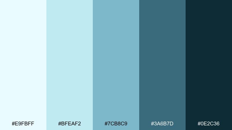
HEX: #E9FBFF #BFEAF2 #7CB8C9 #3A6B7D #0E2C36
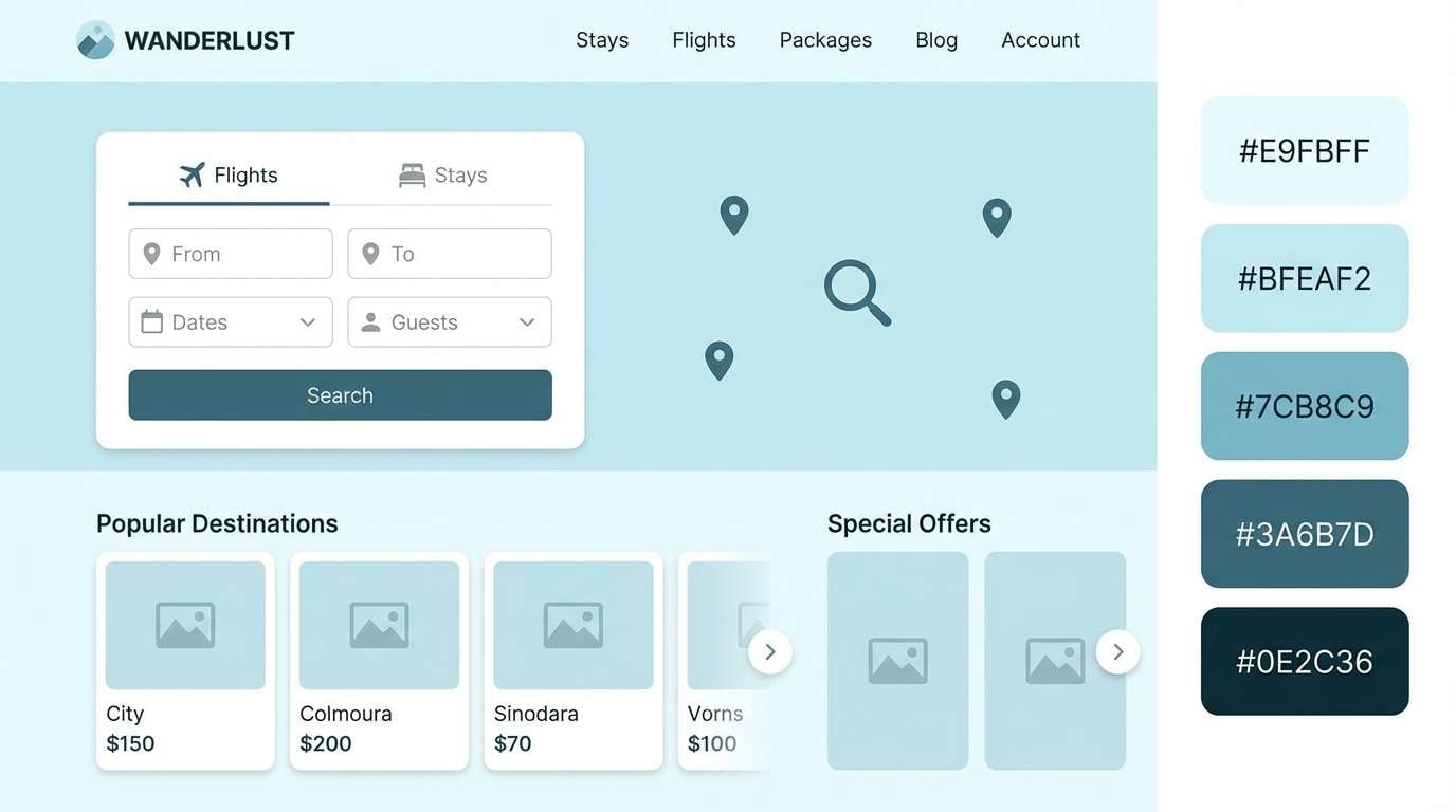
Mood: frosty, clean, high-contrast
Best for: travel brochures and booking pages
Frosty blues feel like glassy ice walls and crisp air, clean and high-contrast. Use them for travel brochures, booking pages, or tour posters where you want refreshing clarity. Pair the pale aqua with the deep teal for strong CTAs, and let the mid blue support icons and maps. Tip: keep typography dark and simple to maintain readability on the lightest shades.
Image example of ice hotel generated using media.io
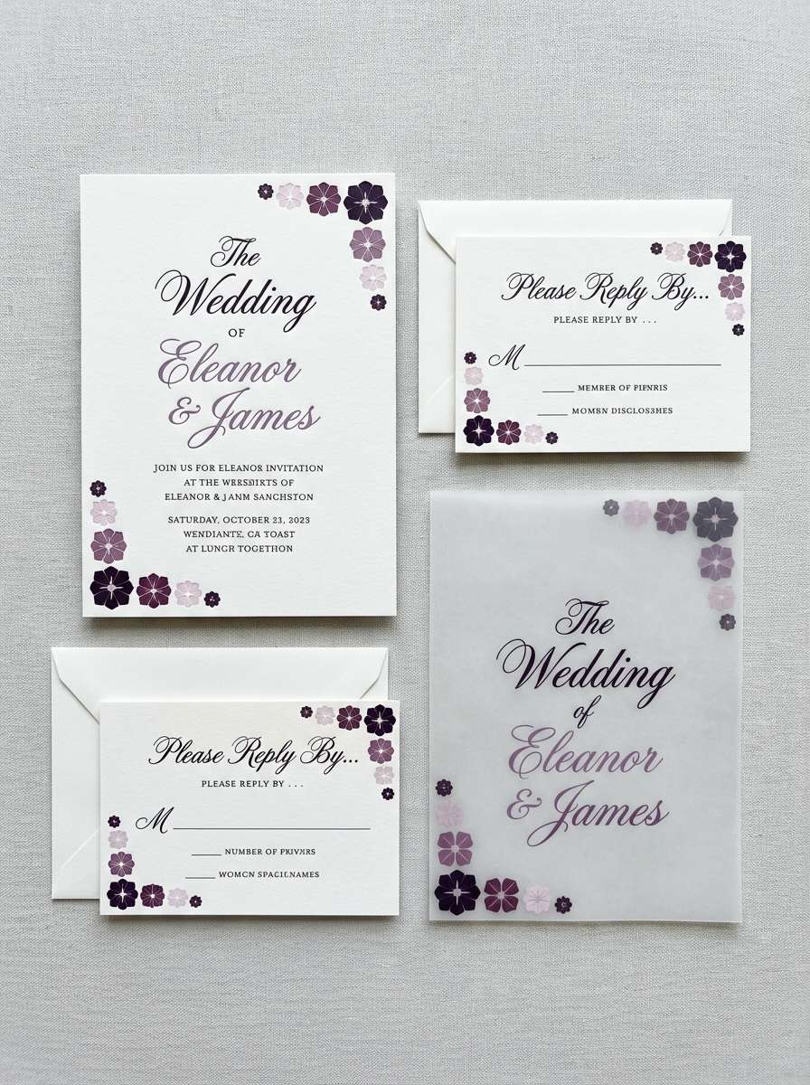
20) Hushed Plum
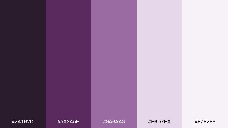
HEX: #2A1B2D #5A2A5E #9A6AA3 #E6D7EA #F7F2F8
Mood: soft, elegant, intimate
Best for: wedding stationery and boutique branding
Hushed plum tones feel elegant and intimate, like twilight velvet softened by powdery lavender. These winter color combinations are great for wedding stationery, boutique branding, and refined social templates. Pair the darkest plum with the pale lilac for crisp contrast, and use the mid purple for monograms or section headers. Tip: choose uncoated paper for print so the soft tints stay airy rather than glossy.
Image example of hushed plum generated using media.io
What Colors Go Well with Winter?
Winter palettes pair best with cool neutrals (snowy off-whites, fog grays) and deep anchors (charcoal, ink navy, near-black). This combo keeps designs readable while still feeling atmospheric.
For accents, choose one “seasonal punch” color—cranberry, periwinkle, teal, or copper—and use it sparingly for buttons, stickers, or small highlights. That restraint is what makes winter color schemes look premium instead of busy.
If your design risks feeling too cold, add a warm softener like cream, tan, blush, or cocoa. A small warm shift can make winter colors feel inviting without losing the crisp vibe.
How to Use a Winter Color Palette in Real Designs
Start with a light winter neutral as the main background, then pick one dark tone for text and navigation. This instantly gives you hierarchy and comfortable contrast for web and print.
Next, assign one mid-tone as your “system color” for UI components (cards, borders, icons), and reserve the most saturated shade for CTAs and highlights. Winter palettes work best when saturation is concentrated in a few key places.
For packaging and posters, test ink coverage and readability under different lighting—deep greens and near-blacks can merge. Keeping plenty of negative space (and using the lightest tint generously) preserves that clean winter feel.
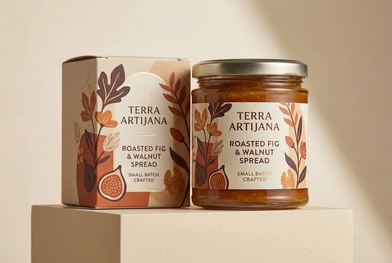
Create Winter Palette Visuals with AI
If you want to preview how a winter color palette looks on real assets—labels, menus, dashboards, social banners—generate mock visuals first. It’s a fast way to confirm contrast, mood, and accent balance before committing.
With Media.io’s text-to-image, you can paste a prompt (including your HEX codes) and generate consistent, on-brand winter scenes or clean UI mockups. Adjust the prompt slightly to explore different materials, lighting, and layout styles.
Once you have a strong direction, reuse the same palette across multiple outputs (hero images, ads, thumbnails) to keep seasonal branding cohesive.
Winter Color Palette FAQs
-
What is a winter color palette?
A winter color palette is a set of cool-leaning colors—icy blues, deep navies, evergreens, purples, and crisp neutrals—designed to feel clean, high-contrast, and seasonal while staying modern and readable. -
Which winter colors are best for modern UI design?
Light icy backgrounds plus deep anchors (charcoal or navy) work best. Palettes like Glacier Teal, Nordic Night, Stormy Harbor, and Slate and Sable give strong hierarchy and clear component states. -
How do I keep winter palettes from looking too cold?
Add a warm balancing accent such as blush, cream, tan, cocoa, or copper. Use it in small areas (CTAs, icons, dividers) to bring friendliness without losing the winter freshness. -
What’s a good accent color for winter branding?
Cranberry/berry reds, teal, periwinkle, or copper are reliable winter accents. The key is using one accent consistently and keeping it to a small percentage of the layout so it feels intentional. -
Are winter color schemes good for print and packaging?
Yes, especially with matte paper and plenty of negative space. Run print tests for very dark greens and near-blacks, since they can appear similar under low light or heavy ink coverage. -
How many colors should a winter palette include?
Five colors is a practical set: one light background, one dark text/anchor, one mid-tone for UI structure, and one to two accents. This keeps contrast controlled and the overall look crisp. -
Can I generate winter-themed palette mockups with AI?
Yes. Include your HEX codes in a text prompt and specify the asset you want (packaging, UI dashboard, invitation, banner). Media.io can generate multiple variations quickly so you can compare contrast and mood.
Next: Monochrome Color Palette


