A monochrome color palette uses one base hue (or neutral) and stretches it from light to dark to create clean hierarchy without visual clutter.
Below are 20 ready-to-use monochrome palettes with HEX codes, plus realistic AI prompt examples you can generate in Media.io for UI, branding, and editorial layouts.
In this article
Why Monochrome Palettes Work So Well
Monochrome palettes make design decisions easier because every color already “matches.” Instead of juggling multiple hues, you rely on value (lightness/darkness) to build structure.
They also improve clarity. From navigation to charts to headings, tonal steps create a predictable hierarchy that feels calm and easy to scan.
Finally, monochrome tones photograph and print well, especially in editorial and brand systems where consistency across screens and materials matters.
20+ Monochrome Color Palette Ideas (with HEX Codes)
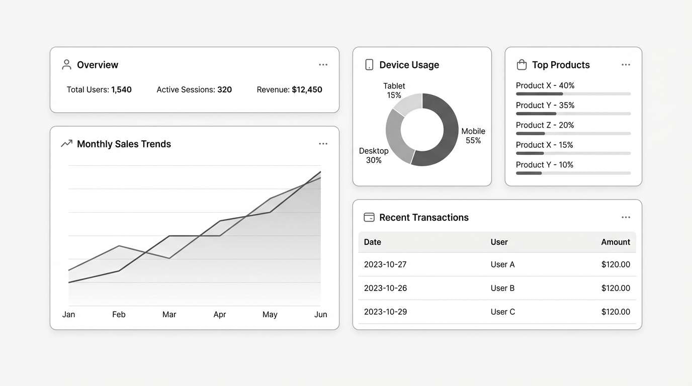
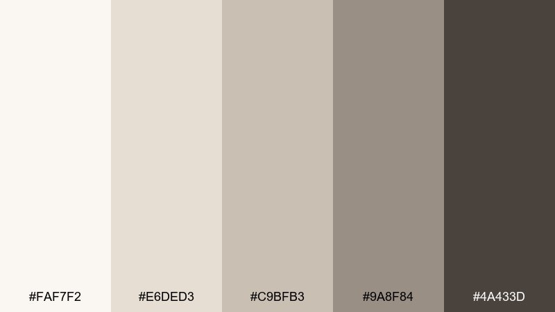
1) Graphite Mist
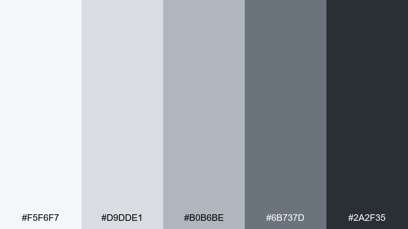
HEX: #F5F6F7 #D9DDE1 #B0B6BE #6B737D #2A2F35
Mood: clean, calm, editorial
Best for: UI dashboards and data-heavy SaaS screens
Clean and quiet like a foggy morning over concrete, these graphite neutrals feel steady and modern. They excel in dashboards where hierarchy matters and glare should stay low. Pair with a single bold accent for alerts or CTAs, and keep icon strokes slightly darker than body text for crisp readability. Tip: reserve the deepest shade for headers and key numbers so the interface stays breathable.
Image example of graphite mist generated using media.io
Media.io is an online AI studio for creating and editing video, image, and audio in your browser.

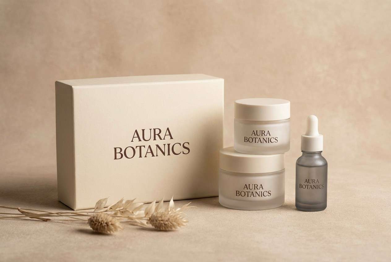
2) Porcelain Smoke
HEX: #FAF7F2 #E6DED3 #C9BFB3 #9A8F84 #4A433D
Mood: soft, refined, premium
Best for: luxury branding and packaging systems
Soft and refined like porcelain dusted with smoke, these warm neutrals read expensive without trying too hard. They work beautifully on packaging, hang tags, and brand stationery where paper texture matters. Pair with matte finishes and subtle embossing, and keep type in the deepest tone for contrast. Tip: use the mid tones for borders and dividers to avoid harsh lines.
Image example of porcelain smoke generated using media.io
3) Inkwash Navy
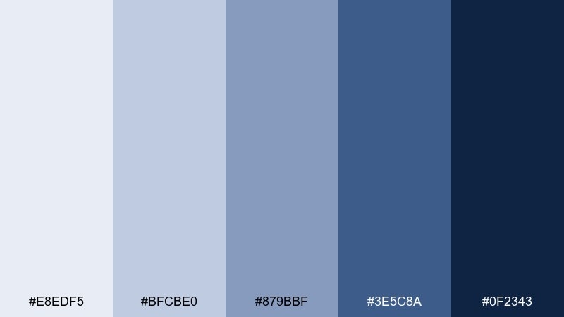
HEX: #E8EDF5 #BFCBE0 #879BBF #3E5C8A #0F2343
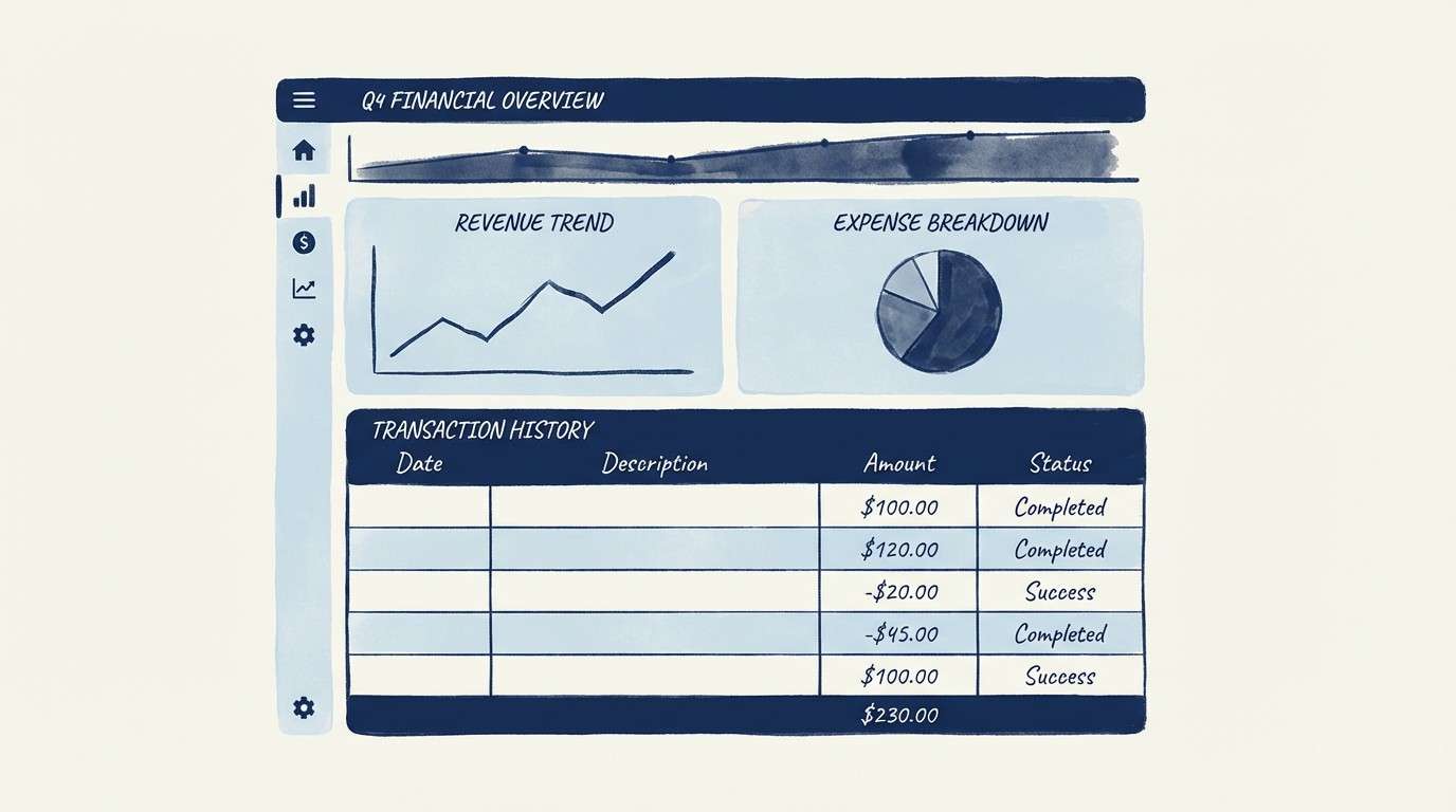
Mood: confident, focused, professional
Best for: finance apps and enterprise UI kits
Confident and focused like ink spreading through water, these navy tones feel trustworthy and precise. This monochrome color scheme is a strong fit for finance UI, analytics, and admin tools that need clarity under pressure. Pair with generous spacing and light surfaces so the dark shades do not overwhelm the layout. Tip: use the lightest tone for chart backgrounds and the mid blues for series lines to keep data legible.
Image example of inkwash navy generated using media.io
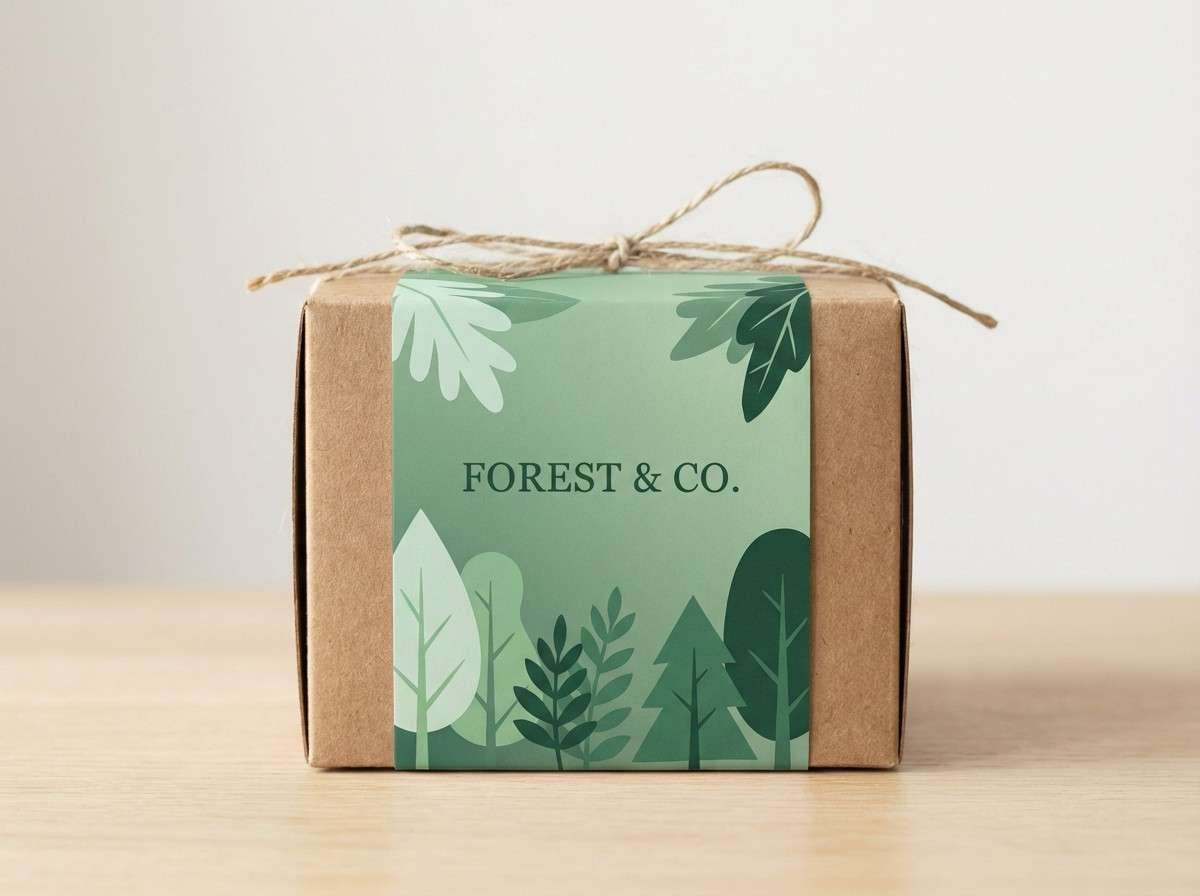
4) Forest Shade
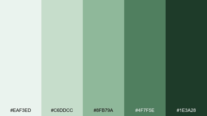
HEX: #EAF3ED #C6DDCC #8FB79A #4F7F5E #1E3A28
Mood: fresh, grounded, eco-minded
Best for: eco product packaging and sustainable brands
Fresh and grounded like a shaded trail after rain, these greens signal nature and trust. They suit sustainable packaging, organic labels, and wellness branding that wants calm credibility. Pair with recycled paper textures and minimal line icons in the darkest green. Tip: keep large backgrounds in the palest tone to avoid a heavy, overly saturated look.
Image example of forest shade generated using media.io
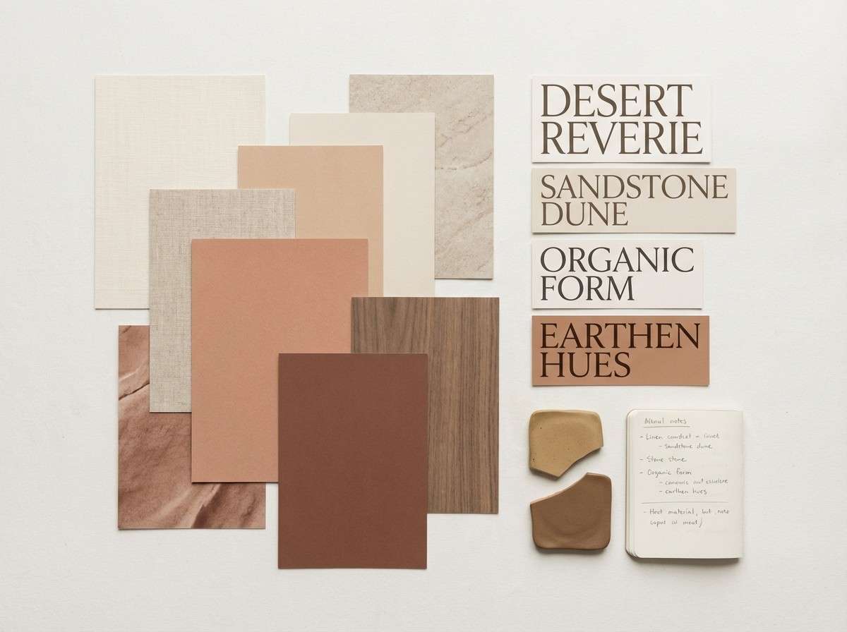
5) Sandstone Dune
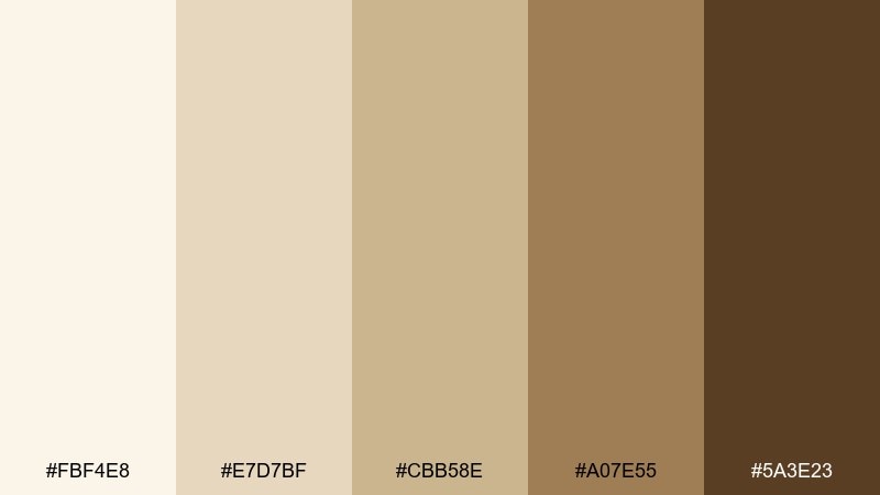
HEX: #FBF4E8 #E7D7BF #CBB58E #A07E55 #5A3E23
Mood: warm, earthy, inviting
Best for: interior design mood boards and home decor brands
Warm and earthy like sunlit dunes, these sand-to-clay tones feel welcoming and timeless. They are ideal for interior mood boards, catalog layouts, and calm ecommerce experiences. Pair with natural materials like linen or wood photography and keep accents to black or deep brown for structure. Tip: use the mid sand shade for large blocks and reserve the darkest tone for small type and icons.
Image example of sandstone dune generated using media.io
6) Rosewood Quiet
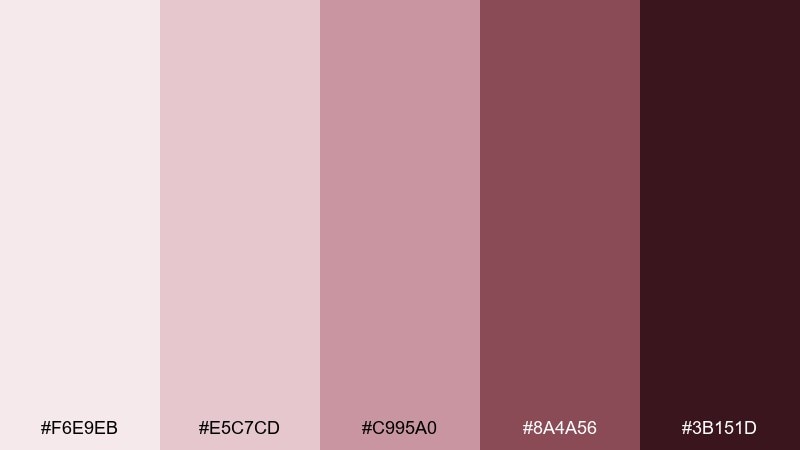
HEX: #F6E9EB #E5C7CD #C995A0 #8A4A56 #3B151D
Mood: romantic, elegant, intimate
Best for: wedding invitations and event stationery
Romantic and intimate like dried roses in a keepsake book, these rosewood tones feel classic and personal. They shine on wedding invitations, RSVP cards, and premium envelopes where subtle contrast matters. Pair with fine serif typography and plenty of negative space so the darker shades feel like ink, not blocks. Tip: print the deepest tone for names and details, and use the blush mid tones for borders or monograms.
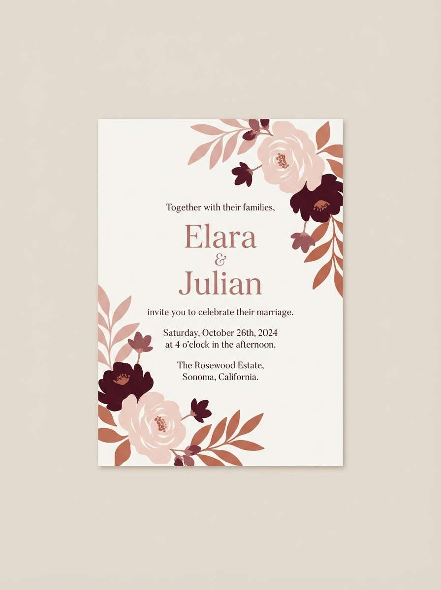
Image example of rosewood quiet generated using media.io
7) Lavender Fog
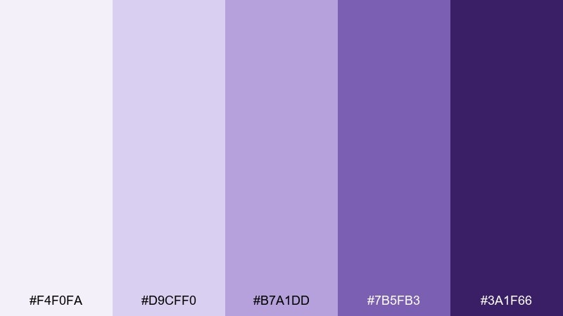
HEX: #F4F0FA #D9CFF0 #B7A1DD #7B5FB3 #3A1F66
Mood: dreamy, gentle, modern
Best for: skincare ads and beauty brand visuals
Dreamy and gentle like mist drifting through lavender fields, these purples feel soothing and contemporary. They work well for skincare campaigns, product detail pages, and soft-gradient social creatives. Pair with clean sans-serif type and a bright white background to keep it airy. Tip: use the deepest purple sparingly for headlines so the overall look stays calm.
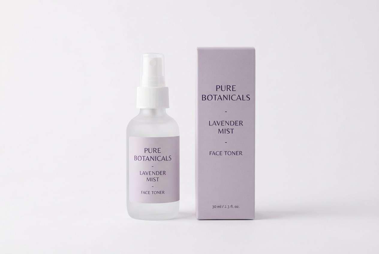
Image example of lavender fog generated using media.io
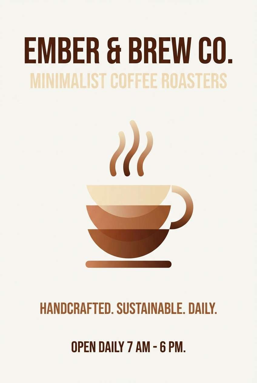
8) Copper Ember
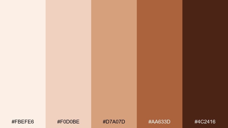
HEX: #FBEFE6 #F0D0BE #D7A07D #AA633D #4C2416
Mood: cozy, artisanal, spirited
Best for: coffee shop posters and seasonal promos
Cozy and artisanal like embers glowing in a hearth, these copper browns bring instant warmth. They are great for cafe posters, menu highlights, and seasonal promos that want a handmade feel. Pair with paper-like textures and simple illustrations to keep it friendly, not heavy. Tip: set body text in the darkest shade and use the mid copper tone for shapes behind key prices.
Image example of copper ember generated using media.io
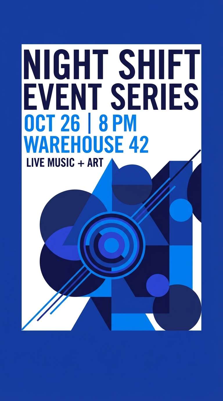
9) Cobalt Night
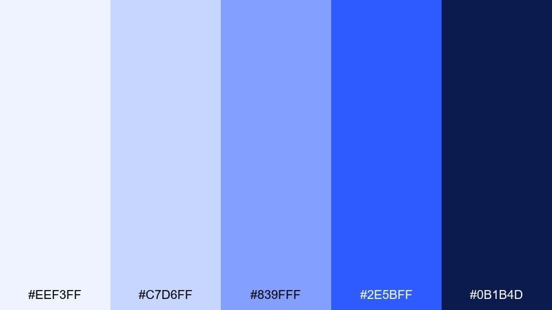
HEX: #EEF3FF #C7D6FF #839FFF #2E5BFF #0B1B4D
Mood: bold, electric, youthful
Best for: event flyers and nightlife posters
Bold and electric like city lights after dark, these cobalt blues feel energetic and modern. They work best for event flyers, club posters, and announcement graphics where you want impact at a glance. Pair with tight typography and high contrast spacing so the bright blue does not become noisy. Tip: keep the neon-like blue for one focal element, then support it with the paler tones for balance.
Image example of cobalt night generated using media.io
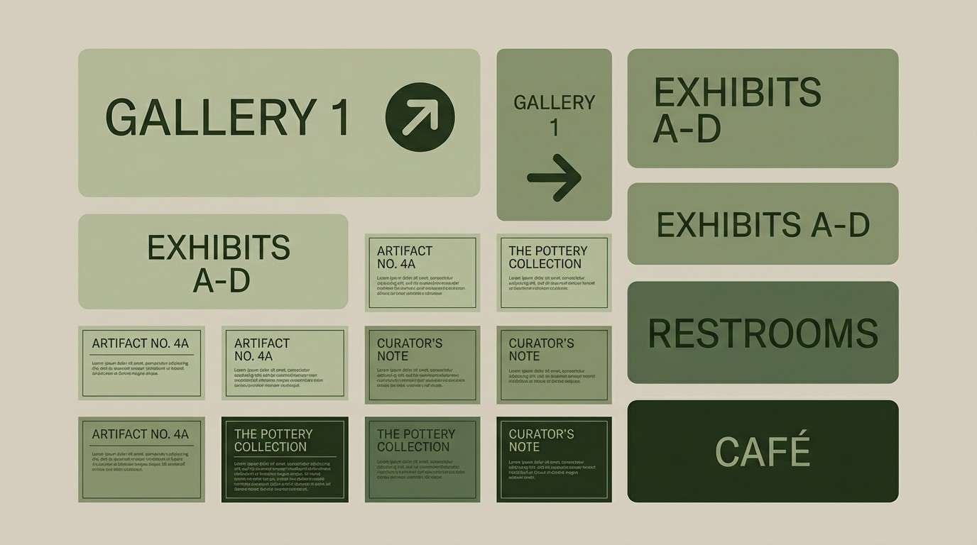
10) Olive Archive
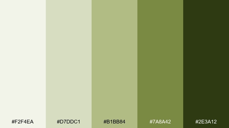
HEX: #F2F4EA #D7DDC1 #B1BB84 #7A8A42 #2E3A12
Mood: heritage, scholarly, understated
Best for: museum wayfinding and exhibit label systems
Heritage and scholarly like aged paper and pressed leaves, these olives feel curated and calm. They fit museum labels, exhibit signage, and educational print pieces where readability is essential. Pair with cream backgrounds and crisp black line work for diagrams. Tip: use the darkest olive for section headers and the mid olive for secondary navigation to keep the system consistent.
Image example of olive archive generated using media.io
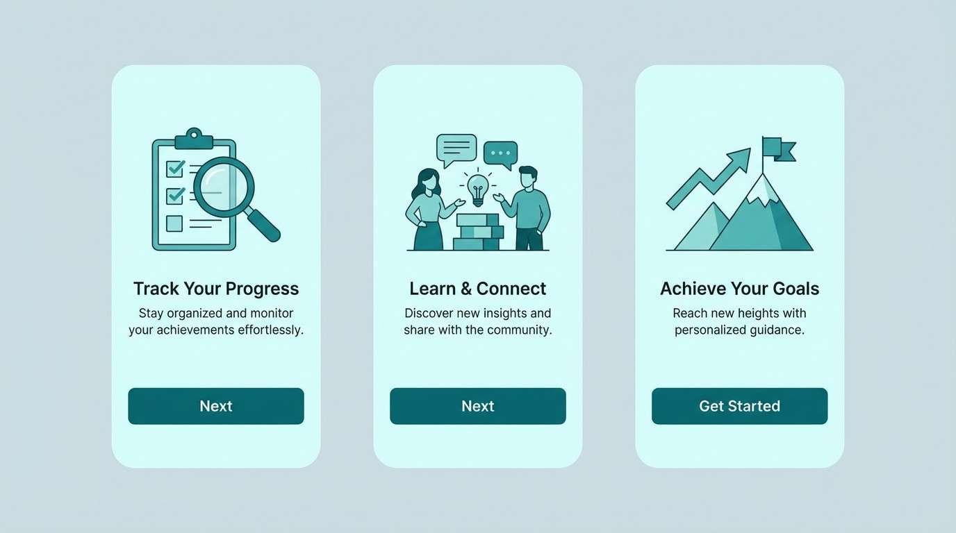
11) Teal Current
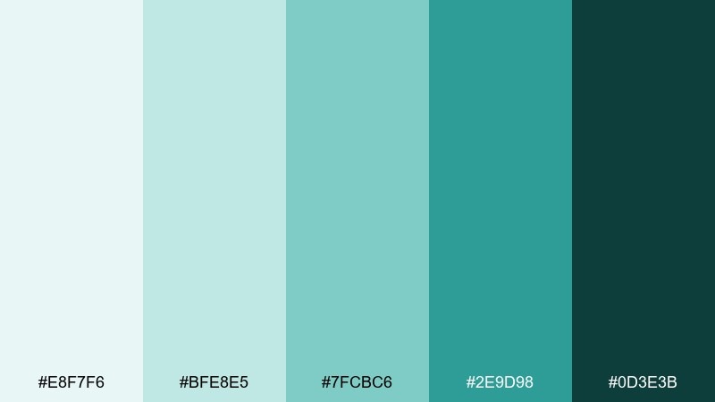
HEX: #E8F7F6 #BFE8E5 #7FCBC6 #2E9D98 #0D3E3B
Mood: fresh, techy, optimistic
Best for: app onboarding and feature walkthrough UI
Fresh and optimistic like light moving through water, these teals feel clean and modern. They are a strong choice for onboarding screens, product tours, and feature callouts that need gentle energy. Pair with rounded UI components and plenty of white space so the teal stays crisp. Tip: reserve the darkest teal for primary buttons and use the lightest tint for cards and sections.
Image example of teal current generated using media.io
12) Chocolate Noir
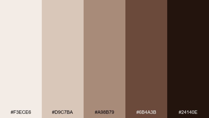
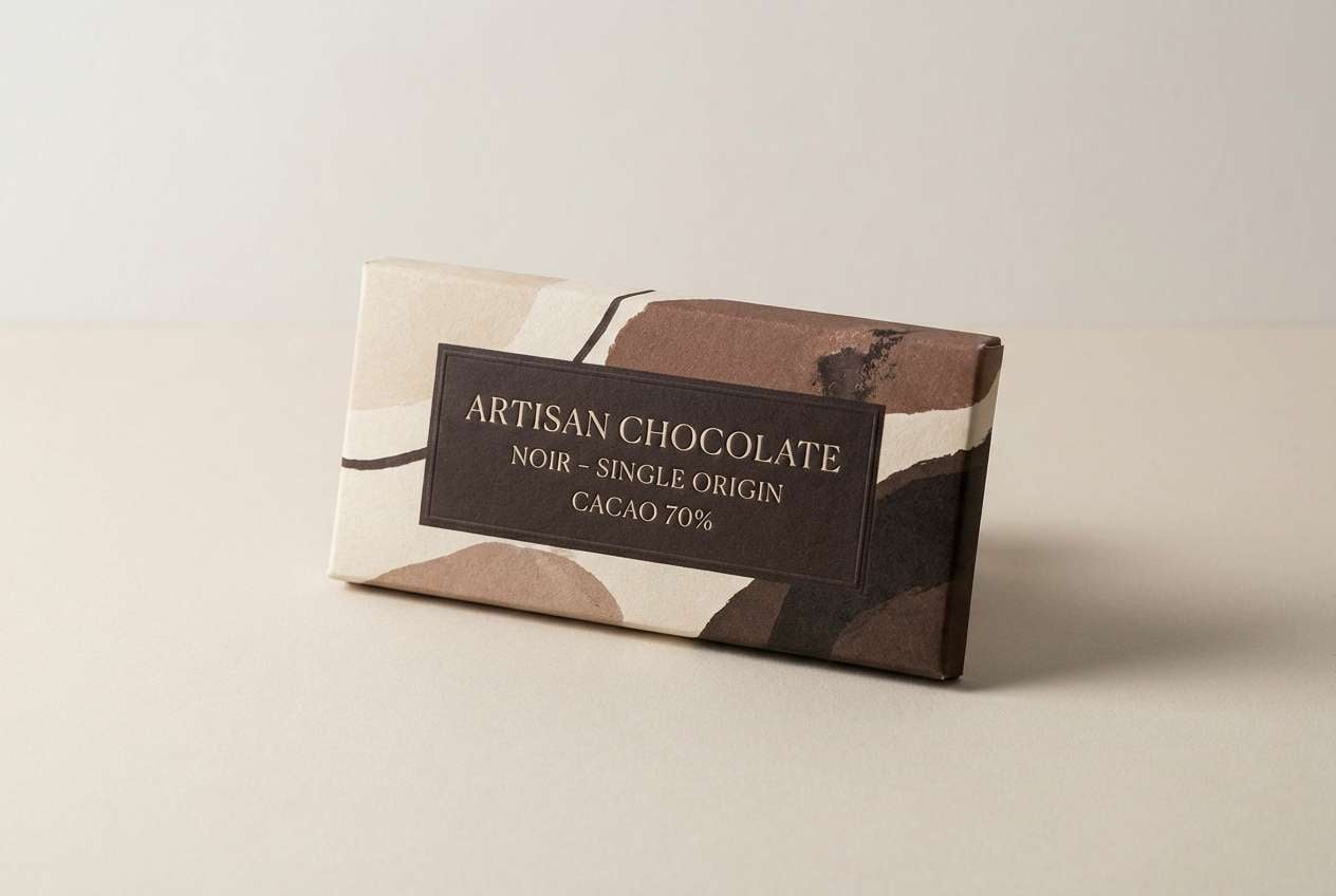
HEX: #F3ECE6 #D9C7BA #A98B79 #6B4A3B #24140E
Mood: rich, intimate, craft-focused
Best for: artisan chocolate packaging and labels
Rich and intimate like a dark dessert bar, these browns feel handcrafted and indulgent. As a monochrome color combination, it keeps packaging cohesive while still giving you room for hierarchy through value shifts. Pair with gold foil details or uncoated stock to bring out the warmth. Tip: keep ingredient lists on the lightest shade panel for easy reading.
Image example of chocolate noir generated using media.io
13) Sky Steel
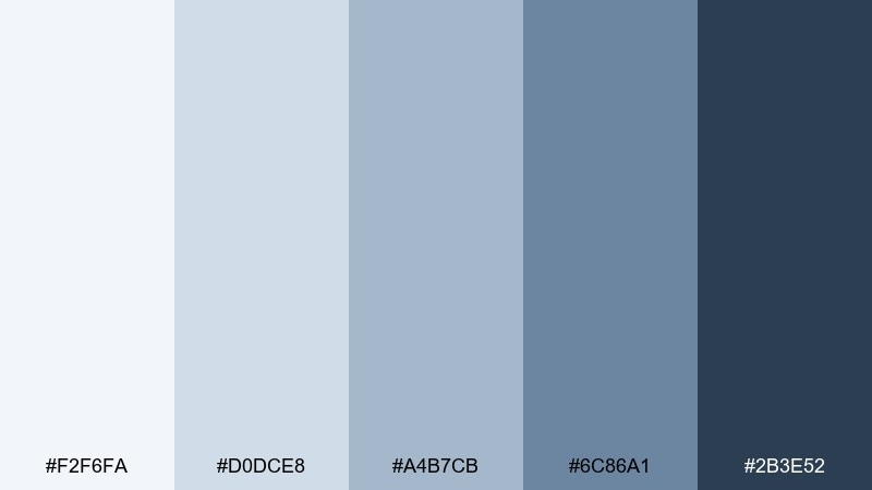
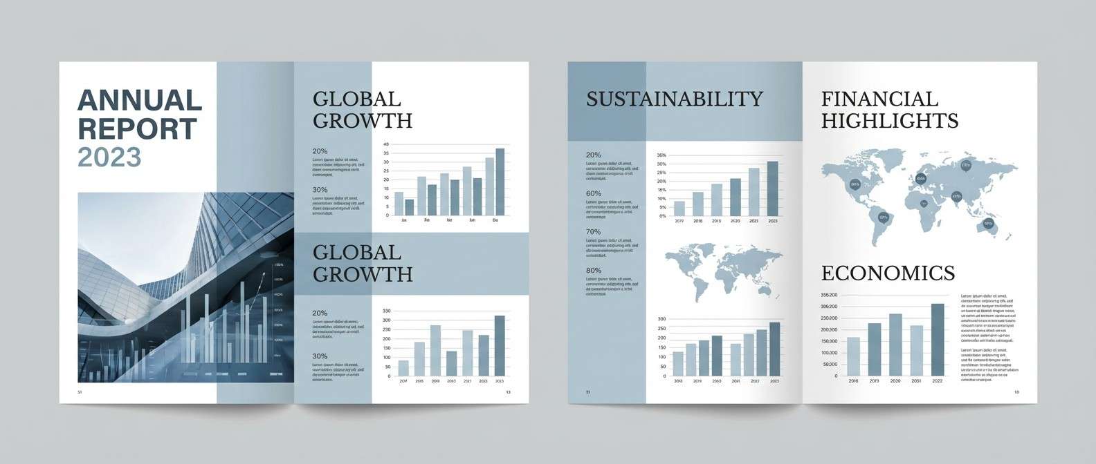
HEX: #F2F6FA #D0DCE8 #A4B7CB #6C86A1 #2B3E52
Mood: cool, orderly, corporate
Best for: annual reports and B2B editorial layouts
Cool and orderly like a winter sky over steel beams, these blue-grays feel structured and credible. They suit annual reports, case studies, and long-form PDFs that need calm pacing across many pages. Pair with simple charts and consistent heading styles to make scanning effortless. Tip: use the second-lightest tone for table rows to improve legibility without heavy borders.
Image example of sky steel generated using media.io
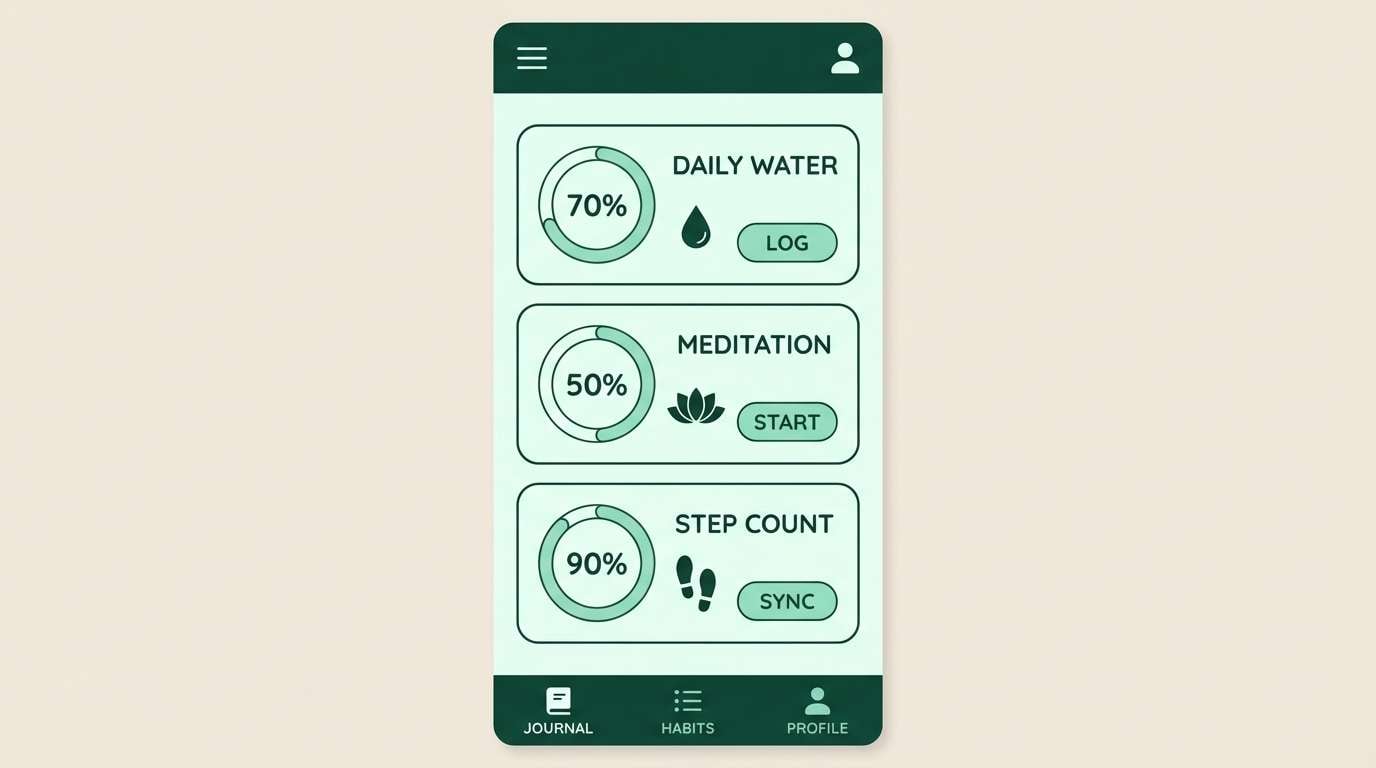
14) Mint Minimal
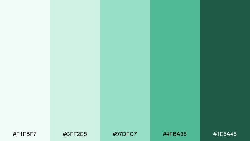
HEX: #F1FBF7 #CFF2E5 #97DFC7 #4FBA95 #1E5A45
Mood: light, restorative, friendly
Best for: wellness app UI and habit trackers
Light and restorative like a cool breath of mint, these greens feel reassuring and easy to live with. They are perfect for habit trackers, wellness UI, and calming micro-interactions. Pair with soft shadows and rounded cards to keep the experience approachable. Tip: use the mid mint for progress states and the deepest green for active tabs and key actions.
Image example of mint minimal generated using media.io
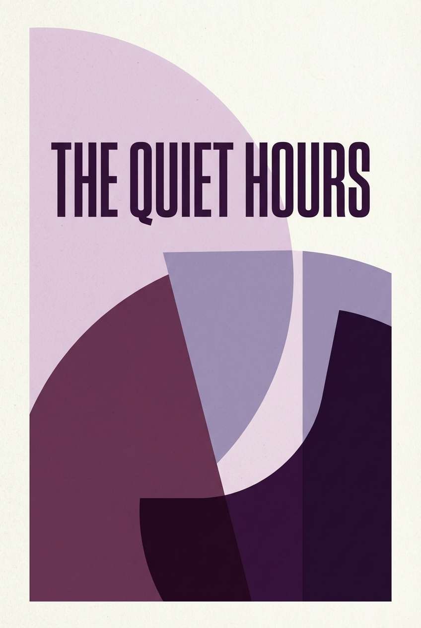
15) Plum Velvet
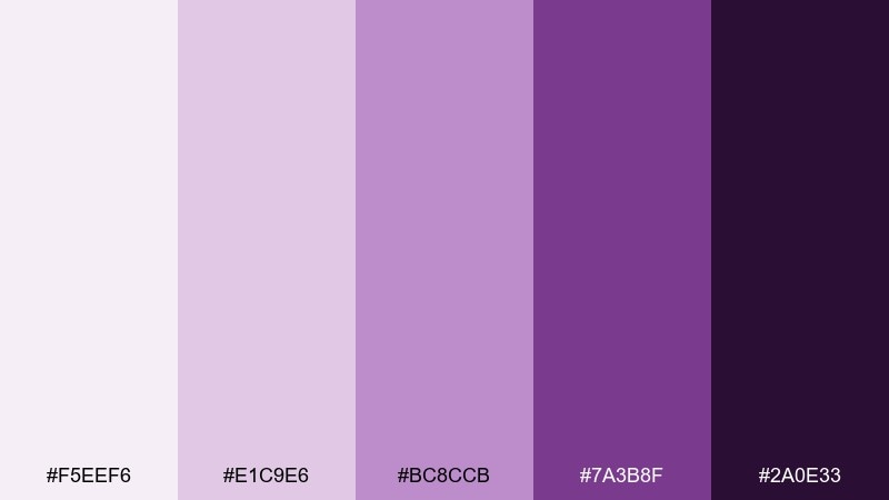
HEX: #F5EEF6 #E1C9E6 #BC8CCB #7A3B8F #2A0E33
Mood: dramatic, elegant, creative
Best for: book covers and album artwork
Dramatic and elegant like velvet under low light, these plum tones feel artistic and premium. They work well for book covers, album art, and campaign key visuals that need a strong mood. Pair with minimal layouts and sharp typographic contrast to keep the purple from feeling overly sweet. Tip: use the deepest shade as a backdrop, then pull highlights from the lighter tints for titles and badges.
Image example of plum velvet generated using media.io
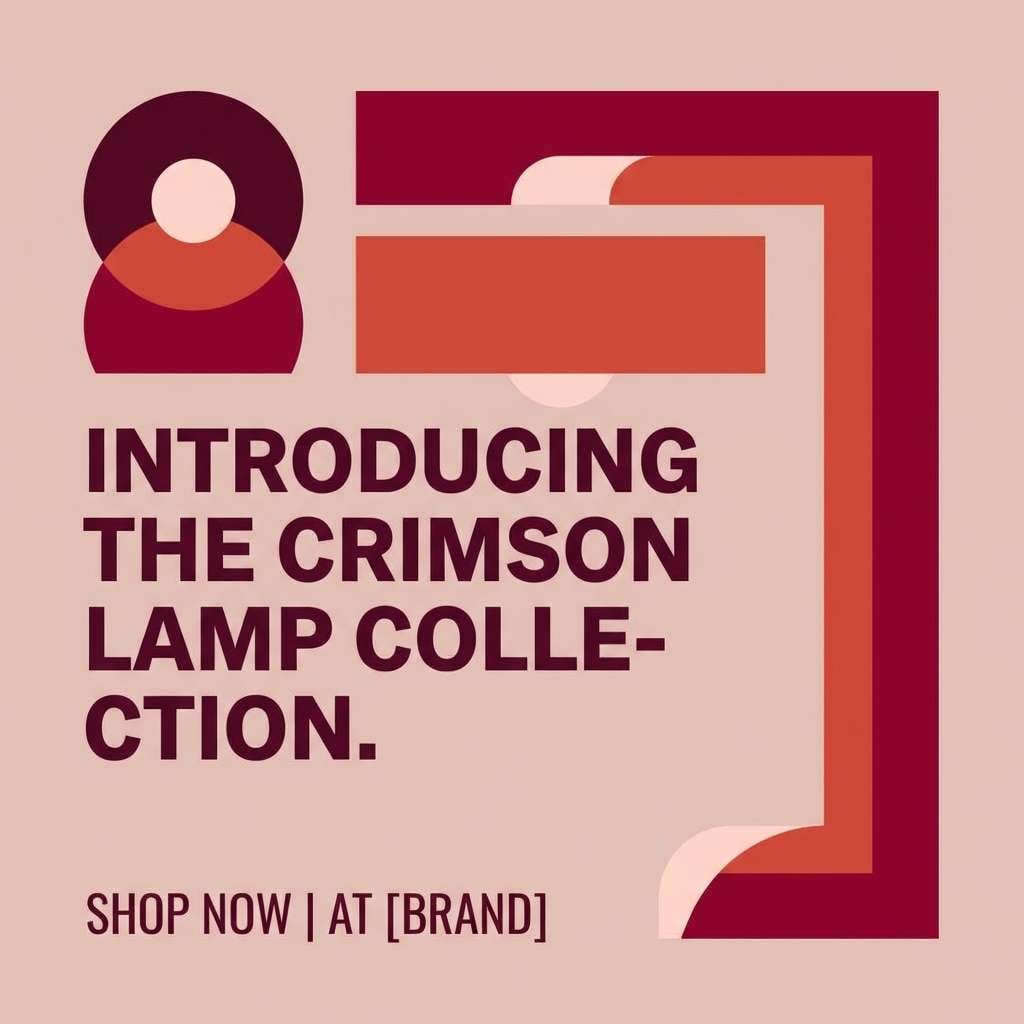
16) Crimson Lamp
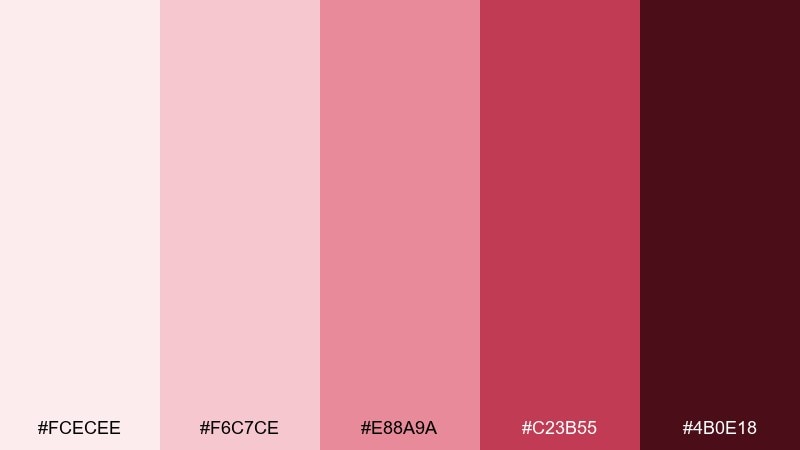
HEX: #FCECEE #F6C7CE #E88A9A #C23B55 #4B0E18
Mood: bold, passionate, high-impact
Best for: product launch social ads and promo graphics
Bold and passionate like a red lamp glowing at night, these crimson shades create instant urgency. Monochrome color combinations like this are great for promo graphics because they keep focus on the message while still feeling dynamic. Pair with simple shapes and strong typographic rhythm, and let the mid crimson carry most of the layout. Tip: save the darkest shade for price or deadline details so they pop without shouting.
Image example of crimson lamp generated using media.io
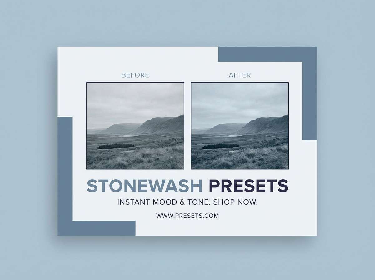
17) Stonewash Blue
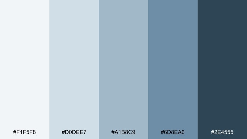
HEX: #F1F5F8 #D0DEE7 #A1B8C9 #6D8EA6 #2E4555
Mood: relaxed, coastal, dependable
Best for: photography preset promos and lifestyle branding
Relaxed and dependable like faded denim by the sea, these blues feel approachable and calm. They are a natural fit for lifestyle branding, preset promo cards, and clean web sections that need softness. Pair with airy photography and keep UI accents minimal so the palette does not compete with images. Tip: use the darkest blue for small labels and captions to maintain readability over light imagery.
Image example of stonewash blue generated using media.io
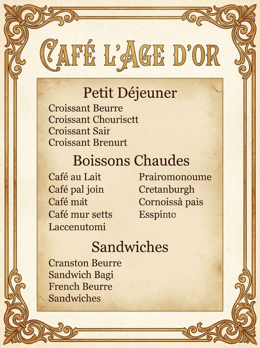
18) Golden Parchment
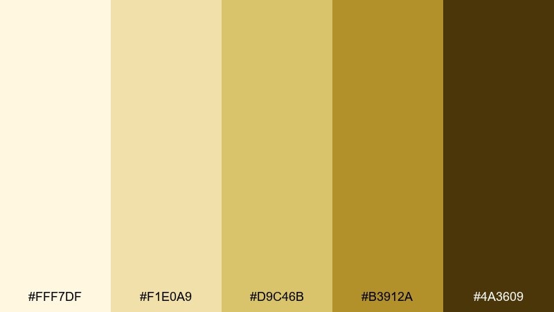
HEX: #FFF7DF #F1E0A9 #D9C46B #B3912A #4A3609
Mood: vintage, sunny, nostalgic
Best for: vintage menus and cafe print materials
Vintage and sunny like an old parchment page, these golden tones feel nostalgic and inviting. They work great for menus, cafe loyalty cards, and retro poster layouts where warmth is the hero. Pair with classic serif type and simple iconography, and avoid adding cool colors that fight the golden temperature. Tip: keep the darkest brown for fine text and use the mid gold for section headers.
Image example of golden parchment generated using media.io
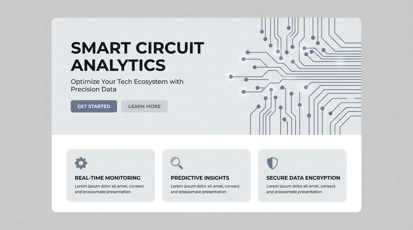
19) Slate Circuit
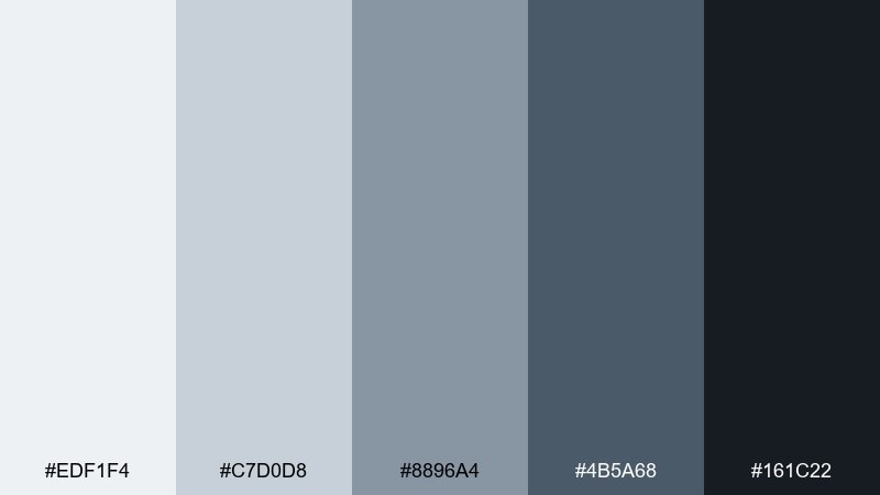
HEX: #EDF1F4 #C7D0D8 #8896A4 #4B5A68 #161C22
Mood: sleek, technical, modern
Best for: tech landing pages and product UI sections
Sleek and technical like brushed metal and circuitry, these slate tones feel precise and high-end. They are ideal for tech landing pages, feature grids, and documentation that needs strong contrast without pure black. Pair with thin line icons and subtle gradients between the light slates for depth. Tip: use the mid slate for card backgrounds and the near-black for headers to keep the page scannable.
Image example of slate circuit generated using media.io
20) Ivory Ash
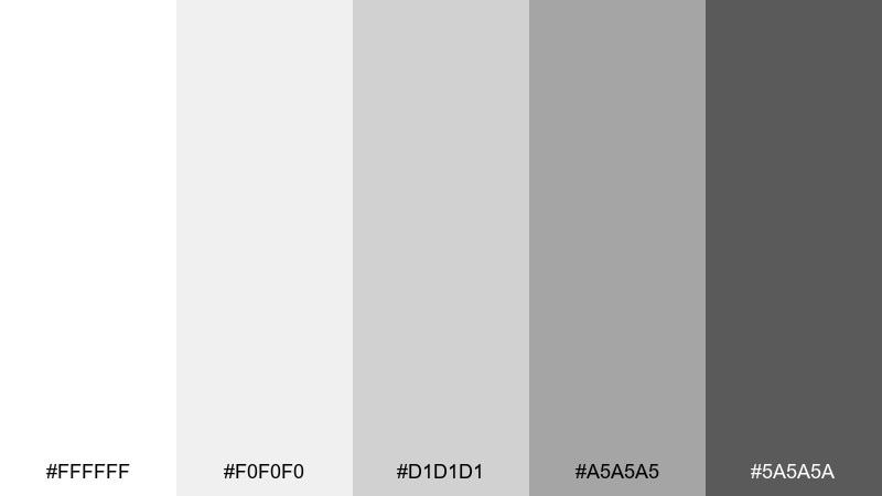
HEX: #FFFFFF #F0F0F0 #D1D1D1 #A5A5A5 #5A5A5A
Mood: minimal, airy, gallery-like
Best for: minimalist posters and gallery prints
Minimal and airy like a quiet gallery wall, these ivory-to-ash grays feel intentional and timeless. They are perfect for posters, portfolios, and typographic prints where layout and spacing do the talking. Pair with bold type weights and carefully aligned grids for a crisp, curated finish. Tip: choose one medium gray for key elements and keep everything else in near-white to avoid muddy contrast.
Image example of ivory ash generated using media.io
What Colors Go Well with Monochrome?
Monochrome systems pair well with a single accent color. A bright accent (like cyan, lime, or red) adds a clear call-to-action without breaking the calm structure of tonal design.
Metallics and “material” accents also work nicely—think gold foil on warm neutrals, or chrome-like highlights with cool grays—because they read as texture rather than a competing palette.
If you need more variety, keep the monochrome base and add one neighboring hue (analogous) at very low saturation, so the overall look still feels unified.
How to Use a Monochrome Color Palette in Real Designs
Start with roles, not swatches: assign the lightest tint to backgrounds, mid tones to surfaces and borders, and the deepest shade to headings and key data. This keeps contrast predictable.
When using monochrome tones in UI, rely on spacing, weight, and component states (hover/active/disabled) to avoid “everything looks the same.” A small value shift is often enough.
For branding and editorial layouts, let imagery or typography be the hero. Monochrome colors create a quiet stage that makes photos, titles, and product details feel more intentional.
Create Monochrome Palette Visuals with AI
Want to see a monochrome palette in action before you design? Generate instant mockups—posters, packaging, UI screens, and mood boards—using Media.io text-to-image.
Copy one of the prompts above, adjust the subject (your product, your app, your event), and keep the “plain background” and lighting notes for clean, portfolio-ready results.
Once you like the direction, iterate by swapping keywords like “matte,” “premium,” “minimal,” or “editorial” to refine texture and composition while staying in the same tonal scheme.
Monochrome Color Palette FAQs
-
What is a monochrome color palette?
A monochrome palette is built from one base hue (or a neutral like gray) and expanded into multiple tints, tones, and shades—typically from very light to very dark—for consistent contrast and hierarchy. -
Is monochrome the same as grayscale?
No. Grayscale is specifically black-to-white (neutral grays). Monochrome can be any single hue (like navy, olive, or plum) plus its lighter and darker variations. -
How many shades should a monochrome palette include?
Five is a practical starting point: background, surface, border, secondary text/UI, and primary text/strong elements. You can add more steps for complex design systems, but keep roles clear. -
How do I keep monochrome UI from looking flat?
Use value contrast for structure, then add depth with spacing, typography, subtle shadows, and a single accent color for CTAs or alerts. Small tonal shifts work best when paired with strong layout rules. -
What’s the best accent color for a monochrome palette?
Pick one accent with strong contrast against your mid and dark tones (often a saturated complementary or high-chroma color). Use it sparingly for buttons, links, and key states to avoid visual noise. -
How can I check contrast in a monochrome palette?
Test your lightest background against your primary text shade (usually the darkest) and verify readability for body text and UI labels. If contrast is low, deepen the text shade or lighten the background role. -
Can I generate monochrome design mockups with AI?
Yes. With Media.io text-to-image, you can paste a prompt (like the examples above) and generate matching visuals for dashboards, packaging, posters, and brand layouts—then iterate quickly by changing the subject or style keywords.
Next: Museum Color Palette
