

Wildlife safari color palettes balance sunbaked neutrals with leafy greens, creating a grounded look that feels calm, authentic, and easy to trust.
From eco-travel branding to modern UI, these safari color schemes stay versatile because they work well with textures (kraft paper, linen, grain) and still keep type readable.
In this article
- Why Wildlife Safari Palettes Work So Well
-
- savanna dawn
- riverbank khaki
- dusty jeep trail
- baobab bark
- golden grasslands
- twilight waterhole
- spotted fawn
- ranger uniform
- campfire ember
- canopy moss
- sunbleached bone
- cheetah sprint
- monsoon mud
- termite mound
- kudu horn
- safari sunset
- night patrol
- oasis mirage
- wild fig grove
- acacia shade
- elephant hide
- copper creek
- What Colors Go Well with Wildlife Safari?
- How to Use a Wildlife Safari Color Palette in Real Designs
- Create Wildlife Safari Palette Visuals with AI
Why Wildlife Safari Palettes Work So Well
Wildlife safari palettes are built on nature’s most reliable cues: sand, bark, clay, stone, and canopy greens. That makes them feel familiar and “true,” which is ideal for brands that want authenticity and calm confidence.
They also create strong hierarchy without harsh contrast. Light beiges and creams keep layouts breathable, while deep olives and charcoals provide a stable anchor for navigation, headlines, and small text.
Because the colors sit in a warm-to-neutral range, they pair easily with photography and natural textures. You can push them premium with minimal layouts, or go rugged with grain overlays and bold typography.
20+ Wildlife Safari Color Palette Ideas (with HEX Codes)
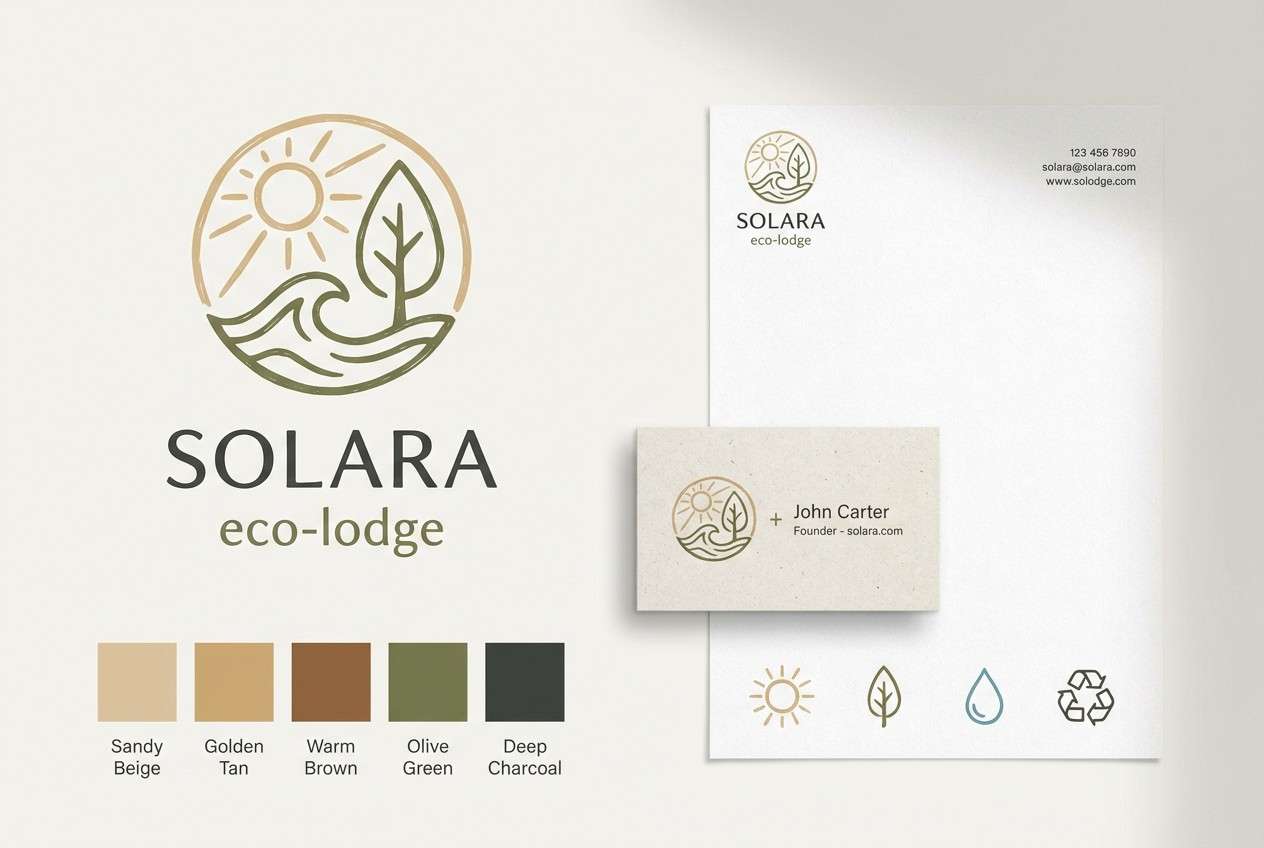
1) Savanna Dawn
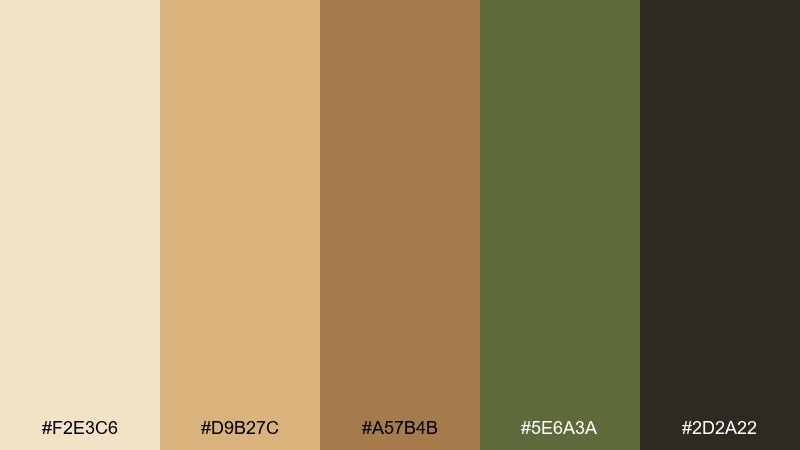
HEX: #F2E3C6 #D9B27C #A57B4B #5E6A3A #2D2A22
Mood: warm, grounded, optimistic
Best for: eco lodge branding and stationery
Warm and grounded like sunrise over tall grass, these tones feel welcoming without being loud. The sandy base keeps layouts airy, while olive and deep charcoal add structure. Use this wildlife safari color palette for logos, business cards, and wayfinding where legibility matters. Pair it with kraft paper textures and a clean sans serif, then reserve the darkest shade for headlines to keep contrast crisp.
Image example of savanna dawn generated using media.io
Media.io is an online AI studio for creating and editing video, image, and audio in your browser.

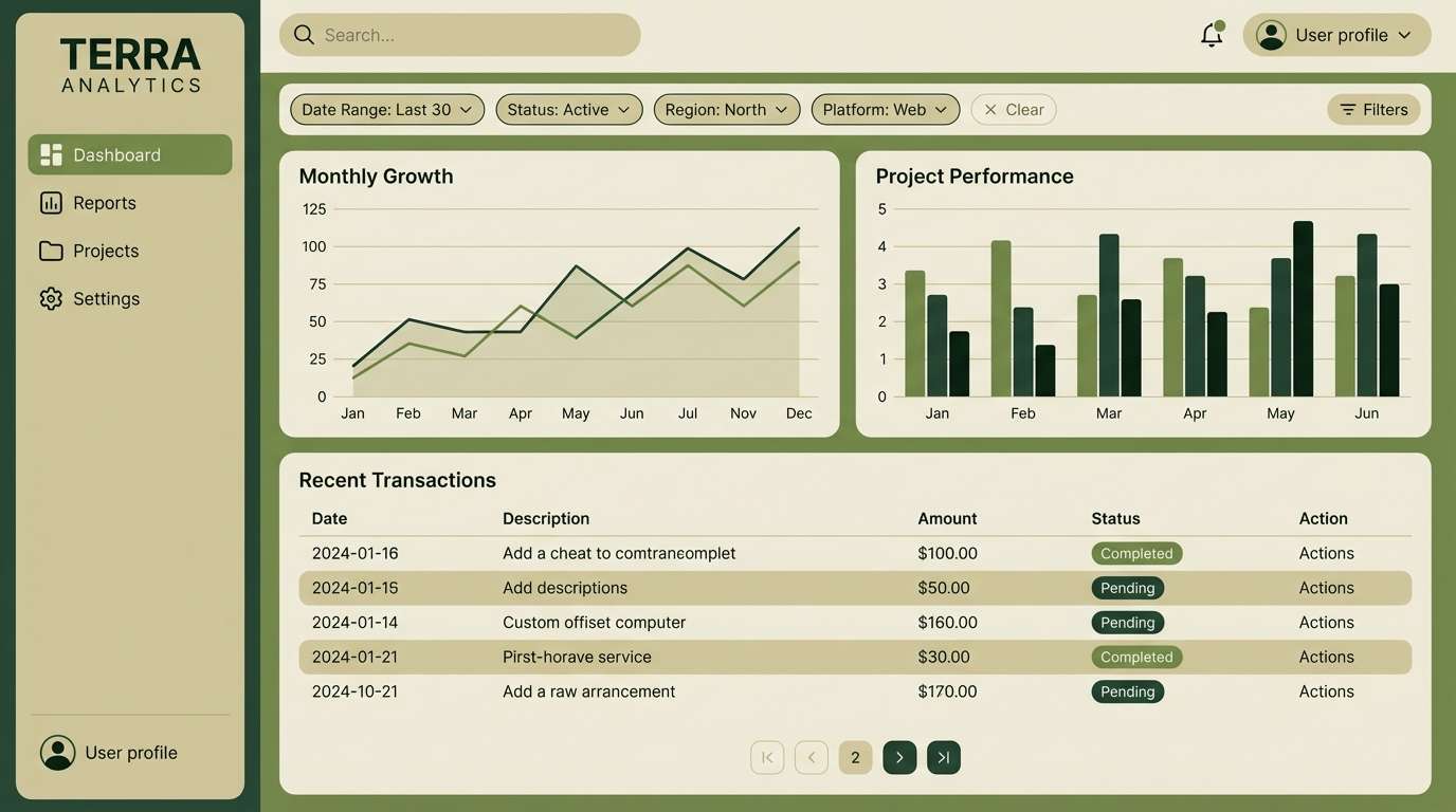
2) Riverbank Khaki
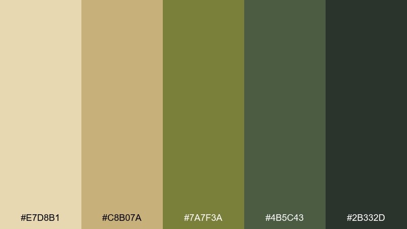
HEX: #E7D8B1 #C8B07A #7A7F3A #4B5C43 #2B332D
Mood: calm, practical, natural
Best for: dashboard UI and data-heavy web apps
Calm and practical like reeds along a slow river, this mix leans neutral with a quiet green backbone. Khaki and oat keep the interface light, while moss and deep forest shades anchor navigation. It works especially well for analytics screens, filters, and table-heavy layouts where you need soft backgrounds. Tip: use the darkest green for active states and keep the mid green for subtle badges or toggles.
Image example of riverbank khaki generated using media.io
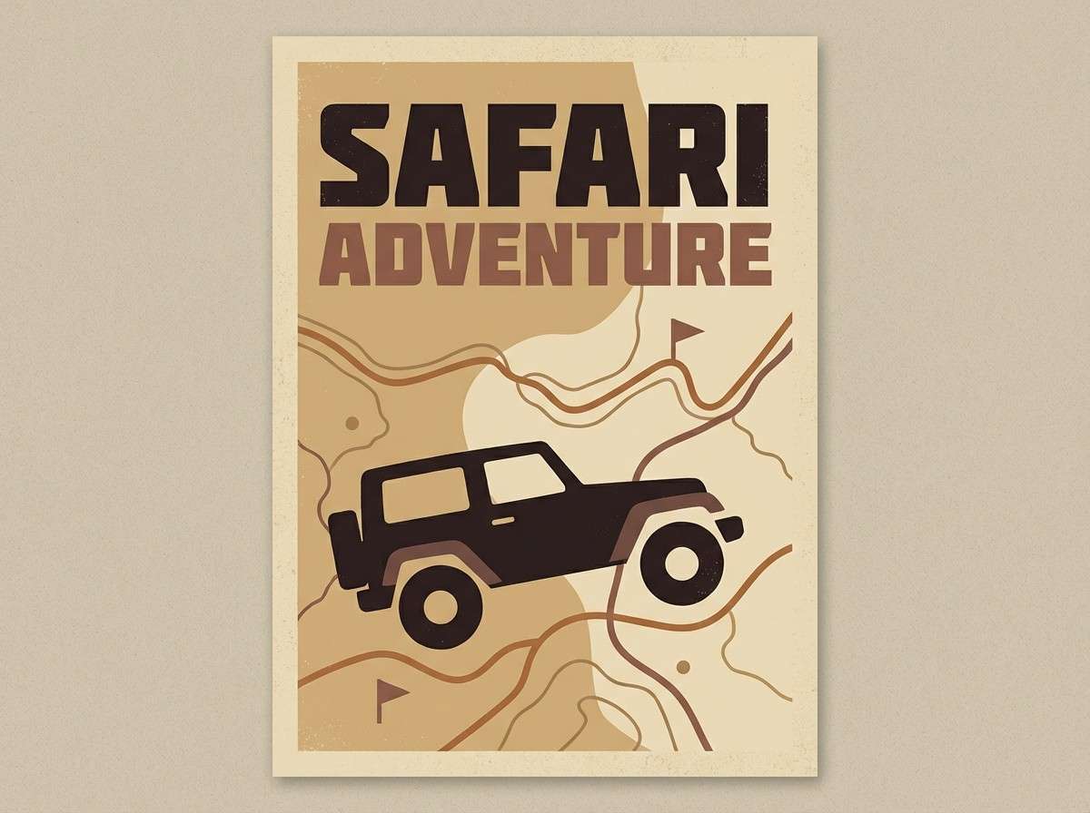
3) Dusty Jeep Trail
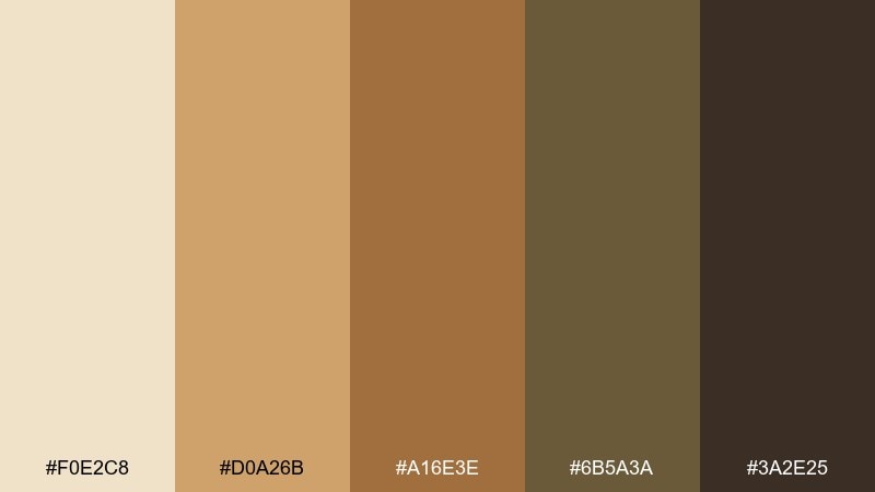
HEX: #F0E2C8 #D0A26B #A16E3E #6B5A3A #3A2E25
Mood: adventurous, rugged, sunbaked
Best for: travel posters and tour print ads
Adventurous and rugged, these sunbaked browns feel like a dirt track stretching to the horizon. The pale sand gives you breathing room, while caramel and saddle tones bring instant warmth. Try it on travel posters with bold typography and a vintage grain overlay for character. A good pairing is off-white paper stock and a single dark brown used consistently for titles and pricing.
Image example of dusty jeep trail generated using media.io
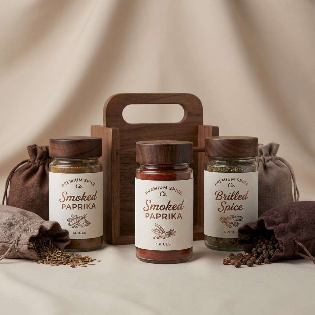
4) Baobab Bark
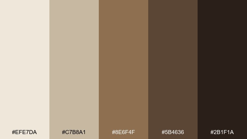
HEX: #EFE7DA #C7B8A1 #8E6F4F #5B4636 #2B1F1A
Mood: heritage, earthy, premium
Best for: coffee, spice, or chocolate packaging
Heritage and earthy, these shades echo textured bark and dry soil after heat. The creamy top note keeps the palette premium, while layered browns create a crafted feel. Use it for packaging that needs to signal authenticity, like single-origin coffee or spice blends. Tip: emboss the mid brown on the light base, then add the darkest tone only for small legal text and barcodes.
Image example of baobab bark generated using media.io
5) Golden Grasslands
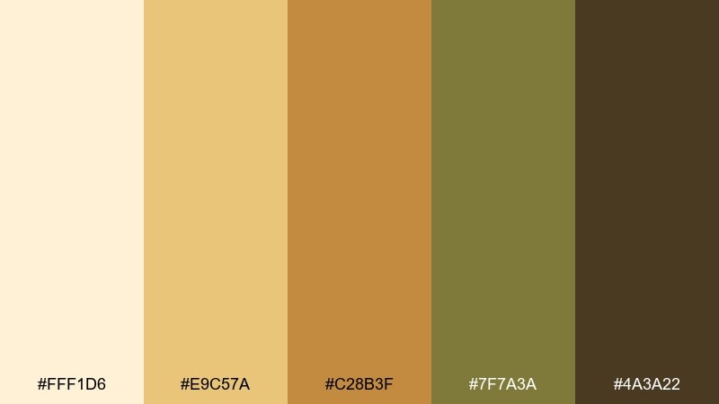
HEX: #FFF1D6 #E9C57A #C28B3F #7F7A3A #4A3A22
Mood: sunlit, cheerful, open-air
Best for: event flyers and outdoor festival invites
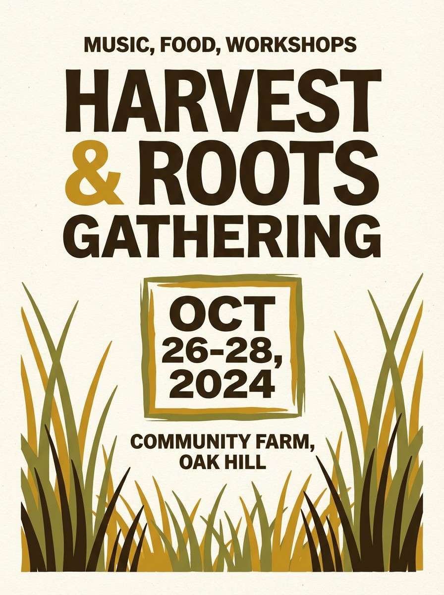
Sunlit and cheerful, the mix feels like tall grass catching light and shadow. Buttery cream and gold do the heavy lifting, while olive and deep brown keep the layout grounded. It is a strong choice for flyers where you want warmth without neon intensity. Keep the gold as the hero color, then use olive for dividers and section labels to avoid visual clutter.
Image example of golden grasslands generated using media.io
6) Twilight Waterhole
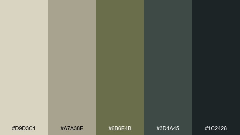
HEX: #D9D3C1 #A7A38E #6B6E4B #3D4A45 #1C2426
Mood: quiet, cinematic, moody
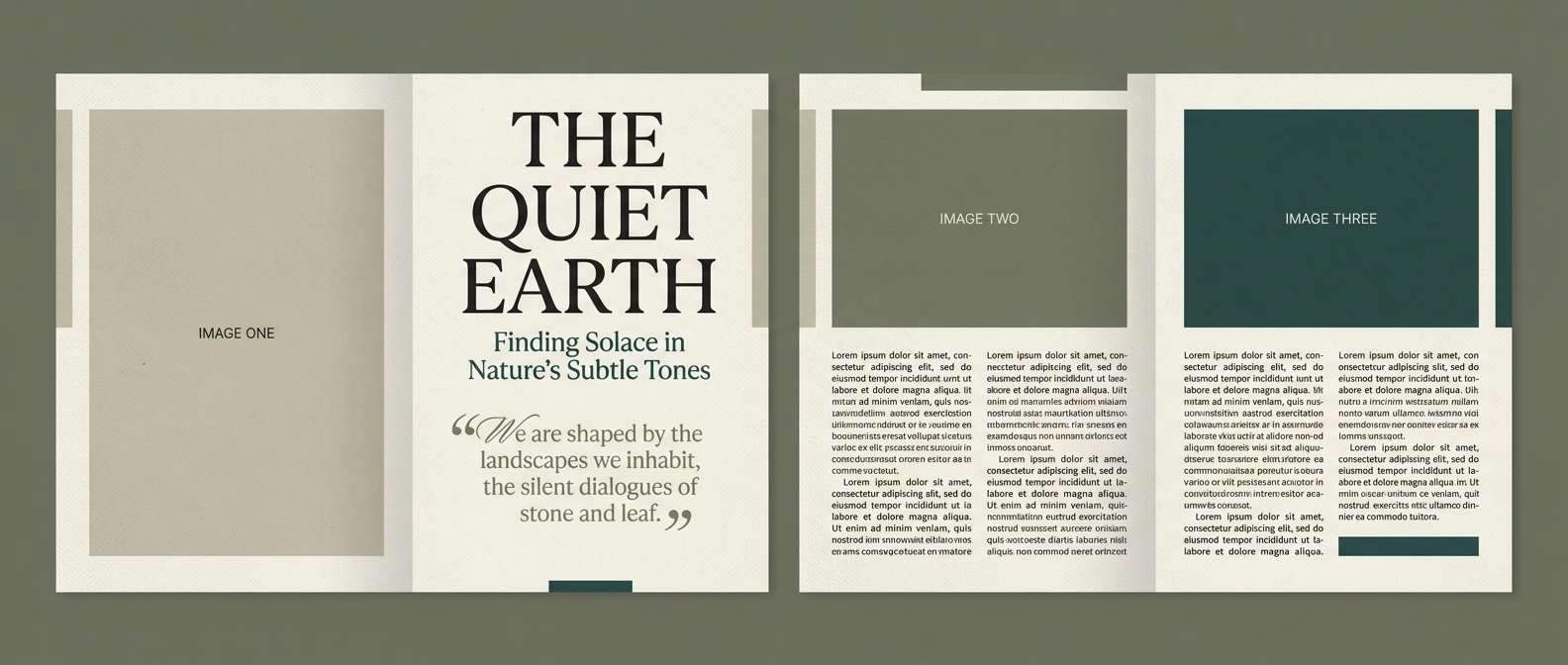
Best for: magazine features and editorial layouts
Quiet and cinematic, these muted neutrals feel like dusk settling over a still waterhole. The silvery beige keeps spreads refined, while slate greens and near-black add drama for pull quotes. For wildlife safari color combinations that lean modern, use the darkest tone for typography and the mid slate for rules and caption blocks. Tip: keep photos slightly desaturated so the palette stays in control rather than fighting the imagery.
Image example of twilight waterhole generated using media.io
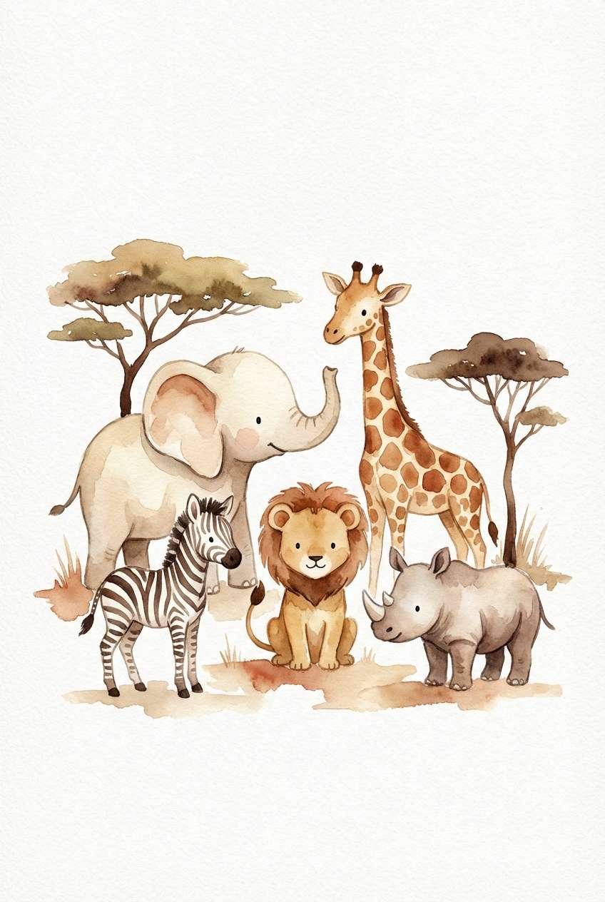
7) Spotted Fawn
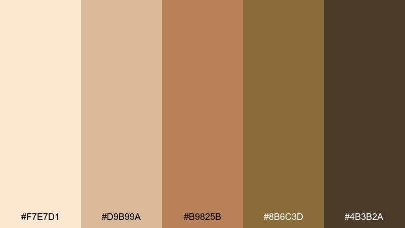
HEX: #F7E7D1 #D9B99A #B9825B #8B6C3D #4B3B2A
Mood: soft, friendly, storybook
Best for: kids book illustrations and nursery prints
Soft and friendly, these warm creams and browns evoke a gentle storybook scene with dappled light. The lighter shades are perfect for backgrounds, while the richer browns define characters and outlines. It fits nursery prints, sticker sets, and illustrated maps where you want calm warmth. Tip: keep linework in the darkest brown and use the mid tan for shading so the art stays readable at small sizes.
Image example of spotted fawn generated using media.io
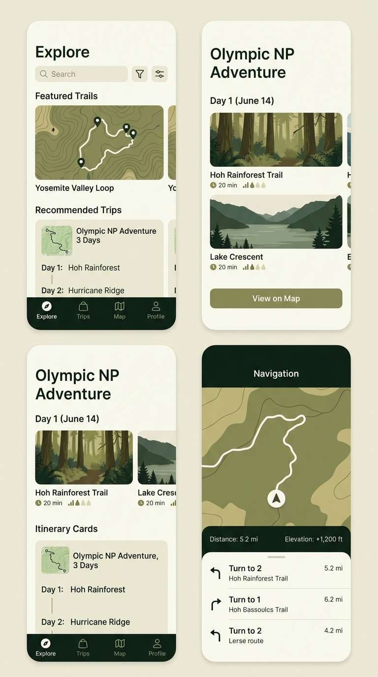
8) Ranger Uniform
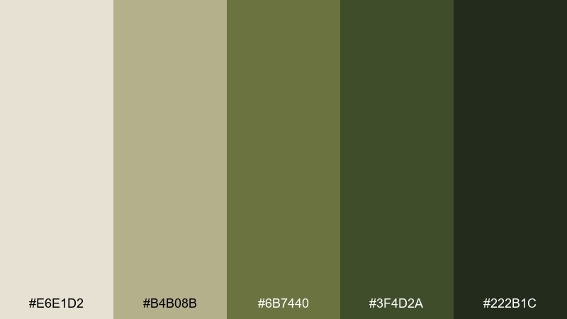
HEX: #E6E1D2 #B4B08B #6B7440 #3F4D2A #222B1C
Mood: structured, outdoorsy, reliable
Best for: mobile app UI for hiking and travel planning
Structured and outdoorsy, these tones feel like canvas gear and well-worn field notes. The light neutral keeps screens clean, while layered greens make actions and navigation feel confident. Use the mid olive for buttons and the darkest green for selected tabs to signal hierarchy clearly. Pair it with simple icons and plenty of spacing so the palette reads modern instead of military.
Image example of ranger uniform generated using media.io
9) Campfire Ember
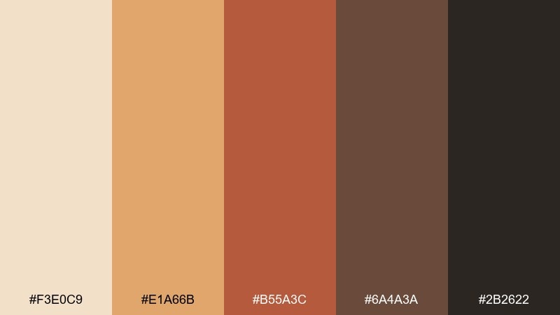
HEX: #F3E0C9 #E1A66B #B55A3C #6A4A3A #2B2622
Mood: cozy, bold, energetic
Best for: social ads and announcement graphics
Cozy but bold, these shades recall embers, toasted sand, and smoky night air. The warm orange-brown is a natural attention grabber, balanced by deep cocoa for contrast. Use this wildlife safari color palette for social promos where you need instant warmth and readable type over flat color blocks. Tip: keep the ember tone for CTAs and use the light sand as padding around text to avoid a heavy look.
Image example of campfire ember generated using media.io

10) Canopy Moss
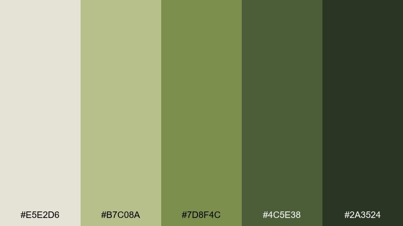
HEX: #E5E2D6 #B7C08A #7D8F4C #4C5E38 #2A3524
Mood: lush, fresh, restorative
Best for: botanical illustrations and nature blog headers
Lush and restorative, these greens feel like filtered light under a dense canopy. The pale stone neutral keeps it airy, while moss and fern tones do the storytelling. It suits illustrated headers, eco product labels, and calm hero sections. Tip: use the light neutral for backgrounds and let the two middle greens carry most shapes to keep the design cohesive.
Image example of canopy moss generated using media.io
11) Sunbleached Bone
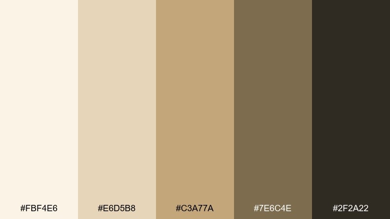
HEX: #FBF4E6 #E6D5B8 #C3A77A #7E6C4E #2F2A22
Mood: minimal, refined, desert-calm
Best for: slide decks and presentation templates
Minimal and desert-calm, these neutrals feel like sun-bleached stone and dry sand. The creamy base makes charts and text easy to read, while the mid tans add gentle emphasis. Use it for pitch decks, reports, and templates that should look premium but not cold. Tip: keep accent usage tight by assigning one tan to highlights and using the dark brown only for headers and key numbers.
Image example of sunbleached bone generated using media.io
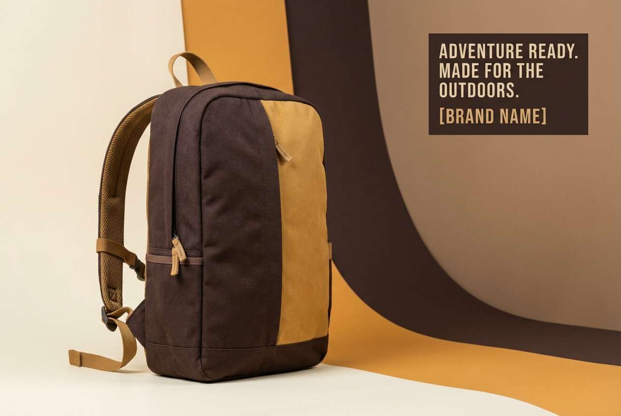
12) Cheetah Sprint
HEX: #F6E3C8 #E1B36C #C07A2D #6D542F #2E241A
Mood: fast, confident, high-contrast
Best for: outdoor gear product ads and banners
Fast and confident, these tones capture the punch of golden fur against deep shadow. The bright amber works as an energetic highlight, while the darker browns give you serious contrast for copy. Use it for gear launches, promo banners, and hero images where the call to action needs to pop. Tip: limit the amber to one focal element per layout so it stays premium rather than loud.
Image example of cheetah sprint generated using media.io
13) Monsoon Mud
HEX: #DCD7CC #B3A89A #7B6D5A #4E463B #24211C
Mood: moody, neutral, architectural
Best for: interior mood boards and paint guides
Moody and architectural, these taupes and deep browns feel like wet earth and stone after rain. The range is ideal for showing material samples, text blocks, and quiet accent lines. Use it in interior mood boards, paint guides, or portfolio PDFs where texture photos do the talking. Tip: set body text in the darkest shade and use the mid taupe for annotation callouts to keep everything legible.
Image example of monsoon mud generated using media.io
14) Termite Mound
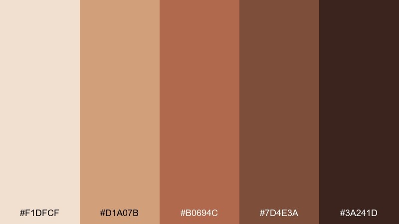
HEX: #F1DFCF #D1A07B #B0694C #7D4E3A #3A241D
Mood: earthy, handcrafted, bold
Best for: restaurant menus and rustic brand collateral
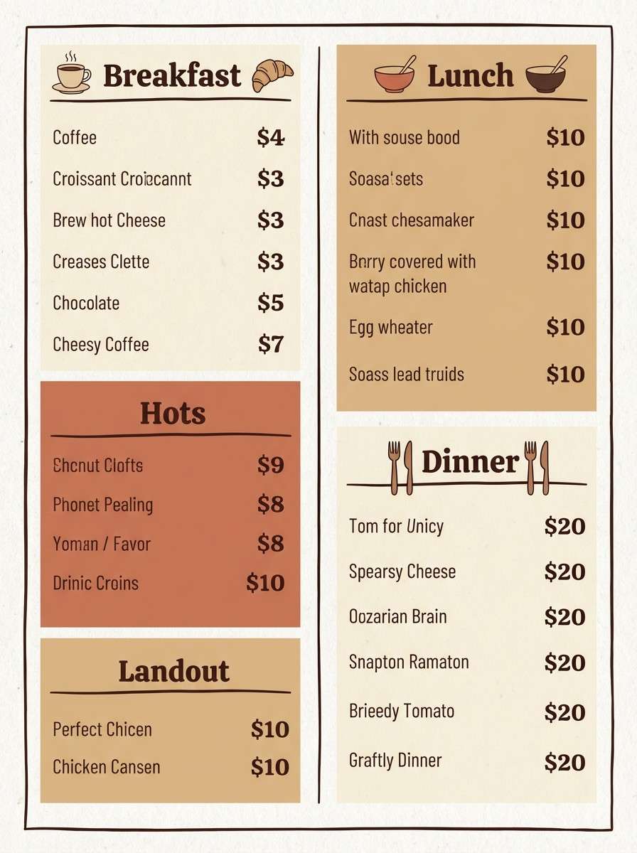
Earthy and handcrafted, these clay-forward tones bring a rustic confidence. The light peachy neutral gives menus a friendly base, while terracotta and cocoa create strong section hierarchy. It is especially effective with serif headlines and simple line icons. Tip: use the clay color for category bars and keep the deepest shade for prices and footer details.
Image example of termite mound generated using media.io
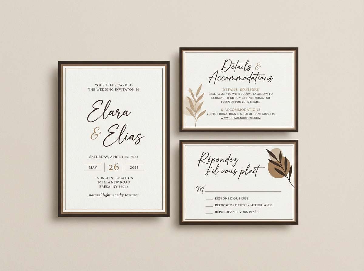
15) Kudu Horn
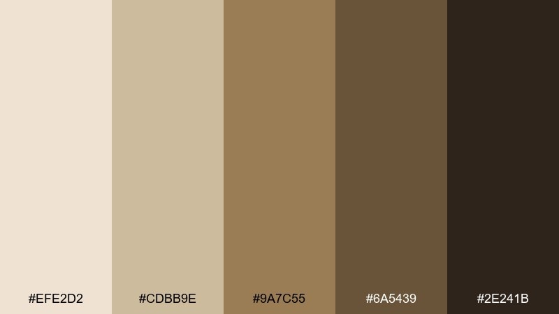
HEX: #EFE2D2 #CDBB9E #9A7C55 #6A5439 #2E241B
Mood: classic, balanced, quietly luxe
Best for: wedding stationery with natural themes
Classic and quietly luxe, these neutrals feel like polished wood, linen, and soft shade. The light base prints beautifully, and the layered browns give you elegant contrast for names and dates. It suits invitation suites, place cards, and seating charts where readability is everything. Tip: add subtle paper grain and keep ink coverage light so the palette stays airy and refined.
Image example of kudu horn generated using media.io
16) Safari Sunset
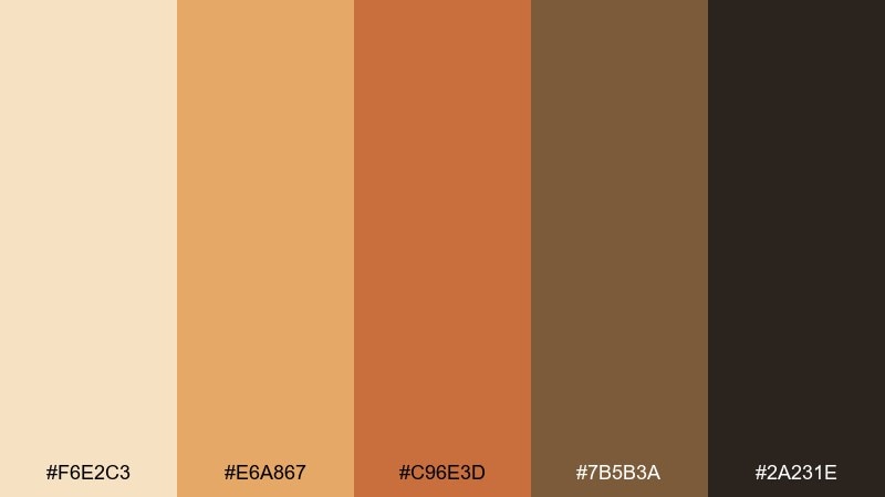
HEX: #F6E2C3 #E6A867 #C96E3D #7B5B3A #2A231E
Mood: dramatic, warm, cinematic
Best for: tour posters, headers, and hero banners
Dramatic and warm, this set feels like the sky turning amber as silhouettes sharpen at dusk. The bright sunset tone adds instant energy, while the deep browns prevent the design from feeling sugary. For wildlife safari color combinations that need impact, use the orange as your hero accent and keep the rest as steady supporting neutrals. Tip: add large soft gradients only within the warm tones so the palette stays cohesive.
Image example of safari sunset generated using media.io

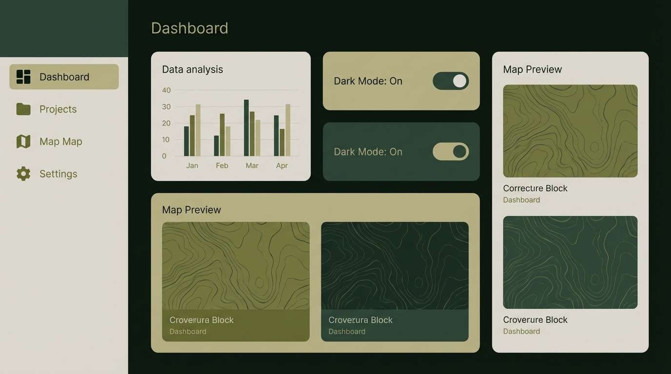
17) Night Patrol
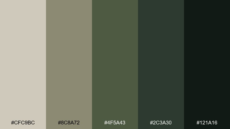
HEX: #CFC9BC #8C8A72 #4F5A43 #2C3A30 #121A16
Mood: stealthy, modern, high-contrast
Best for: dark mode UI and navigation-heavy apps
Stealthy and modern, these deep greens read like night vision and shadowed brush. The light greige works as a soft text color, while the near-black base keeps screens sleek. It is ideal for dark mode navigation, maps, and settings panels where glare control matters. Tip: use the mid olive for focus rings and selected states so users can track interaction without harsh neon accents.
Image example of night patrol generated using media.io
18) Oasis Mirage
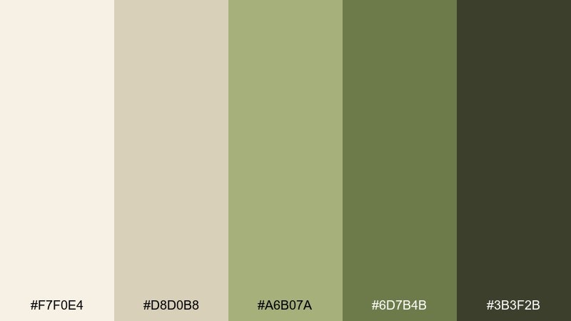
HEX: #F7F0E4 #D8D0B8 #A6B07A #6D7B4B #3B3F2B
Mood: fresh, airy, balanced
Best for: skincare packaging and wellness branding
Fresh and airy, these tones feel like pale sand with a hint of green found near water. The light cream keeps the look clean for wellness, while the sage-to-olive range adds a natural signal. Use it on labels, boxes, and product pages where you want calm credibility. Tip: print the darkest tone sparingly and let sage carry most of the brand color for a softer finish.
Image example of oasis mirage generated using media.io
19) Wild Fig Grove
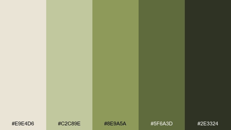
HEX: #E9E4D6 #C2C89E #8E9A5A #5F6A3D #2E3324
Mood: leafy, organic, calming
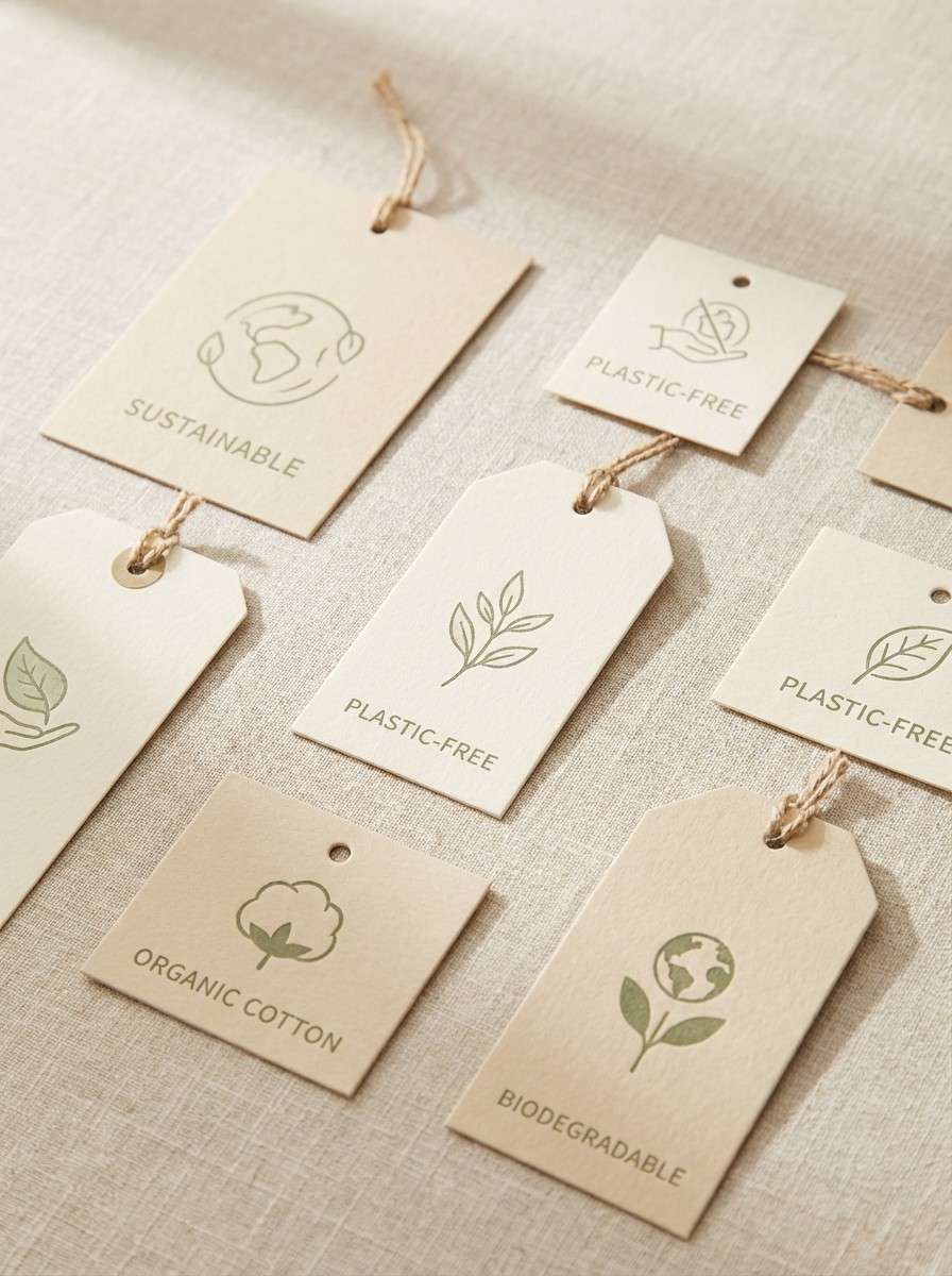
Best for: product labels and eco-friendly tag designs
Leafy and calming, these greens feel like shade under a fig grove with sunlit dust in the air. The warm neutral base keeps type clean, while the green range gives you flexible accents for seals and badges. It works well for hang tags, recyclable packaging notes, and small label systems. Tip: use the lightest neutral as the main label field and keep the darkest green for short, high-importance claims like organic or refill.
Image example of wild fig grove generated using media.io
20) Acacia Shade
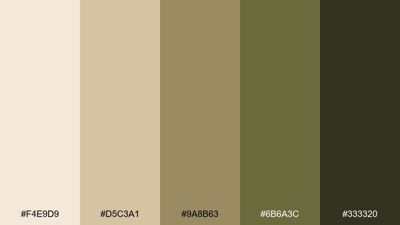
HEX: #F4E9D9 #D5C3A1 #9A8B63 #6B6A3C #333320
Mood: shaded, calm, understated
Best for: website headers and long-form articles
Shaded and understated, these tones evoke cool ground beneath an acacia with filtered sunlight above. The soft cream and beige keep pages readable, while muted olive adds just enough personality for links and buttons. It is a dependable pairing for blogs, knowledge bases, and documentation hubs. Tip: keep backgrounds in the lightest two shades and use olive sparingly for interactive elements to maintain a clean reading rhythm.
Image example of acacia shade generated using media.io
21) Elephant Hide
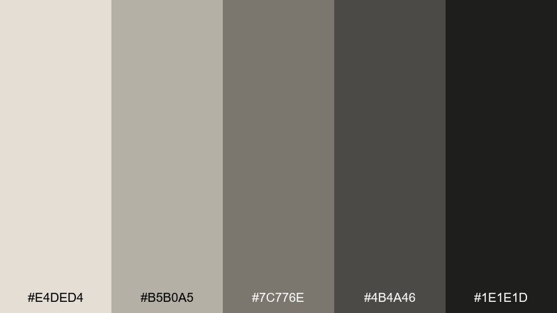
HEX: #E4DED4 #B5B0A5 #7C776E #4B4A46 #1E1E1D
Mood: neutral, sturdy, minimalist
Best for: corporate reports and professional templates
Neutral and sturdy, these grays feel like textured hide and dusty stone. The soft light gray works as a clean canvas, while the darker steps give you a disciplined hierarchy for charts and tables. It is a safe choice for reports, proposals, and anything that needs to look serious without feeling cold. Tip: add a single warm accent from imagery or icons to keep the grayscale from looking flat.
Image example of elephant hide generated using media.io
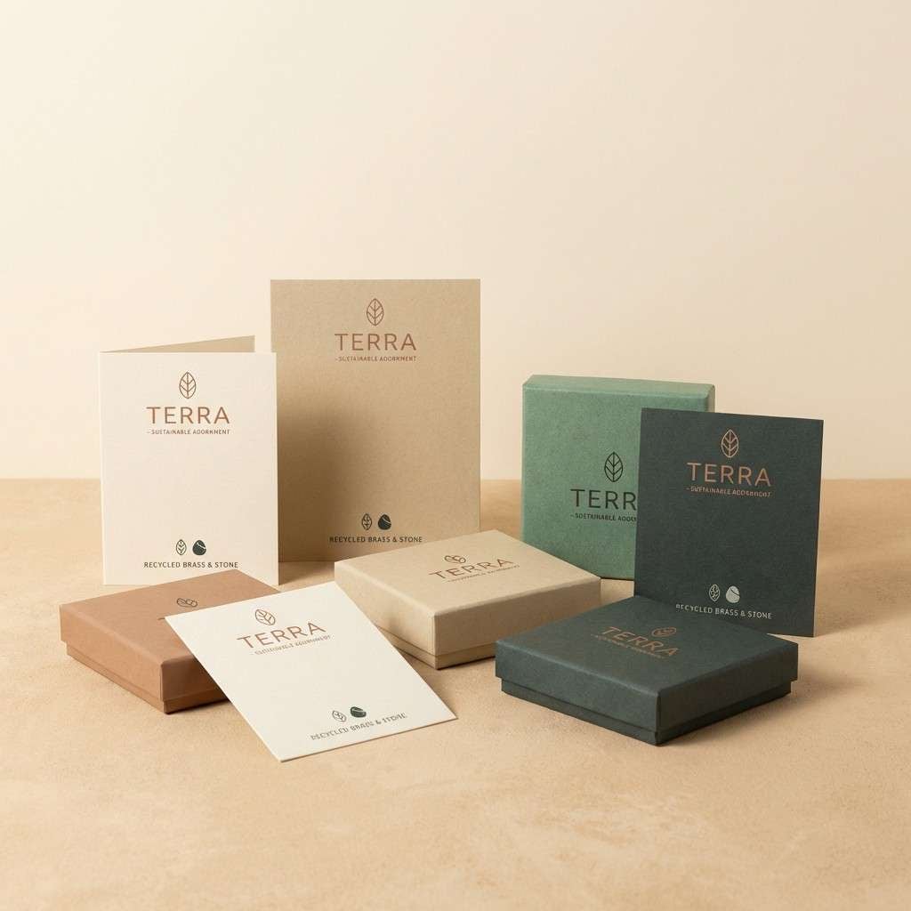
22) Copper Creek
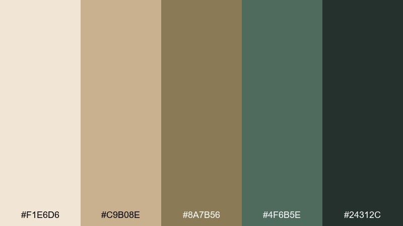
HEX: #F1E6D6 #C9B08E #8A7B56 #4F6B5E #24312C
Mood: earthy, refined, green-leaning
Best for: sustainable jewelry branding and product cards
Earthy and refined, these tones blend warm sand with a cool green mineral note, like water moving over coppery rock. The mix reads premium on uncoated paper and feels modern next to simple geometric layouts. Use this wildlife safari color palette for product cards, lookbooks, and small packaging where restraint signals quality. Tip: let the green mineral shade act as the signature accent and keep the darkest tone for tiny type and marks only.
Image example of copper creek generated using media.io
What Colors Go Well with Wildlife Safari?
Wildlife safari colors pair best with other nature-adjacent tones: warm whites, sand, khaki, bark browns, and layered greens (sage, moss, olive). This keeps the palette cohesive and “real” rather than overly stylized.
For contrast, add a deep anchor like espresso brown, charcoal, or near-black green. This improves readability in UI and print while preserving the earthy vibe.
If you want a modern twist, introduce one mineral accent (muted copper, stone teal, or slate). Use it sparingly—one signature accent is usually enough to keep the safari scheme premium.
How to Use a Wildlife Safari Color Palette in Real Designs
Start with a light neutral as your main background (cream, oat, pale sand), then assign one mid-tone for surfaces (cards, panels, packaging fields). Reserve the darkest shade for text, icons, and key dividers to maintain clean hierarchy.
In branding, safari palettes shine with texture: kraft paper, linen, matte uncoated stock, and subtle grain overlays. In digital layouts, mimic that warmth with soft shadows and gentle borders instead of heavy strokes.
Keep accents disciplined. Pick one hero color (amber, terracotta, or olive) for CTAs, badges, or section headers, and reuse it consistently so the design feels intentional.
Create Wildlife Safari Palette Visuals with AI
If you want to preview these wildlife safari color combinations in posters, packaging, UI screens, or brand boards, generate quick mockups with AI. It helps you test contrast, mood, and “real-world” readability before committing to a full design.
Try prompting for the exact deliverable you need—like “eco lodge brand board,” “dark mode dashboard,” or “skincare label set”—then keep refining typography and layout keywords until the result matches your style.
Once you find a direction, reuse the same prompt structure across multiple palettes to compare options side by side.
Wildlife Safari Color Palette FAQs
-
What is a wildlife safari color palette?
A wildlife safari color palette is a set of earthy neutrals (sand, beige, brown, charcoal) paired with natural greens (sage, moss, olive) inspired by savannas, trails, bark, and canopy foliage. -
Which HEX colors are most common in safari color schemes?
Common safari HEX families include warm creams (#F6E2C3, #FBF4E6), khakis and tans (#D9B27C, #C8B07A), bark browns (#8E6F4F, #6A5439), and olives/deep greens (#5E6A3A, #2C3A30). -
How do I keep safari palettes from looking dull?
Use one clear hero accent (amber, terracotta, or a mineral green) and keep the rest neutral. Texture (grain, paper feel) and strong typography also add energy without breaking the natural mood. -
Are wildlife safari palettes good for UI design?
Yes—especially for dashboards, maps, and content-heavy pages. Use light neutrals for backgrounds, deep green/charcoal for text, and olive or amber for active states so contrast stays readable. -
What’s the best way to choose a safari palette for print packaging?
Pick a light base that prints cleanly, then add 1–2 browns for structure and one green for brand identity. Keep the darkest tone for small text and marks to avoid heavy ink coverage on uncoated stock. -
Can I use a wildlife safari palette for dark mode?
Yes—use near-black green as the base, muted olive for controls and focus states, and soft greige for text. This keeps the theme consistent while reducing glare and maintaining hierarchy. -
How can I generate wildlife safari palette mockups quickly?
Use an AI text-to-image tool and describe the exact layout (poster, label, dashboard, invitation). Specify the palette colors and include style cues like “minimal,” “uncoated paper,” or “vintage grain” for consistent results.


