

Green copper is that modern sweet spot between verdigris greens and warm metal accents—calm, grounded, and quietly premium. It’s versatile enough for branding systems, interiors, and UI, especially when you want depth without going too dark.
Below are 20 curated green copper color palette combinations with HEX codes, plus AI-ready prompts you can use to generate on-brand visuals fast.
In this article
- Why Green Copper Palettes Work So Well
-
- verdigris loft
- copper fern retreat
- sea glass patina
- urban oxide
- botanical stationery
- minted copper accent
- rainy courtyard
- modern spa tile
- heritage brass and patina
- coastal copper sunrise
- forest circuit ui
- gallery patina neutrals
- stone and succulent
- copper moss kitchen
- minimal evergreen copper
- vintage bookcloth
- clay pot greenwash
- neonless night market
- soft classroom calm
- copperleaf wedding suite
- What Colors Go Well with Green Copper?
- How to Use a Green Copper Color Palette in Real Designs
- Create Green Copper Palette Visuals with AI
Why Green Copper Palettes Work So Well
Green copper palettes balance “cool” and “warm” in a way that feels naturally sophisticated. Patina greens bring stability and calm, while copper, brass, and clay accents add human warmth and visual energy.
They also read as material-first and believable—like oxidized metal, glazed tile, leather, stone, and paper—so the palette feels premium even with muted saturation. That’s why it works across modern branding, hospitality, and product design.
In digital UI, green copper tones can feel trustworthy without leaning clinical. With the right neutral base (cream, warm gray, charcoal), you get high contrast and a modern look that stays easy on the eyes.
20+ Green Copper Color Palette Ideas (with HEX Codes)
1) Verdigris Loft
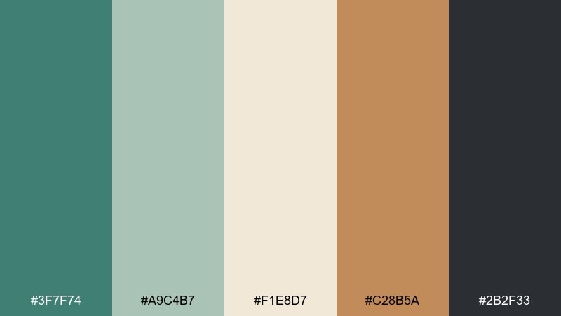
HEX: #3F7F74 #A9C4B7 #F1E8D7 #C28B5A #2B2F33
Mood: calm, industrial, refined
Best for: modern loft interior styling
Calm and architectural, like patinaed metal against warm plaster and shadowy steel. Use it for open-plan spaces where you want a grounded green without going rustic. Pair the copper-brown with matte black fixtures and keep the cream as your largest surface. Tip: repeat the dark charcoal in small accents to sharpen edges and avoid a washed-out look.
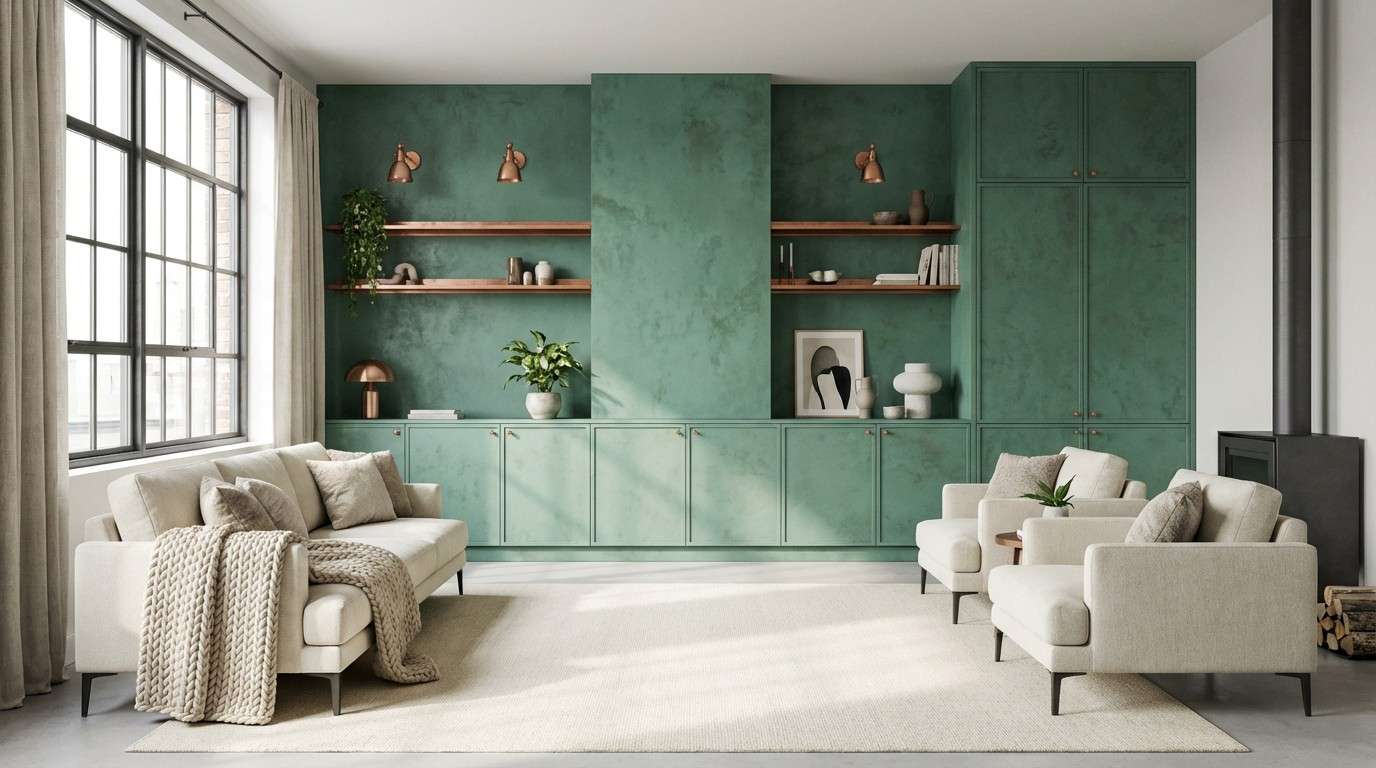
Image example of verdigris loft generated using media.io
Media.io is an online AI studio for creating and editing video, image, and audio in your browser.

2) Copper Fern Retreat
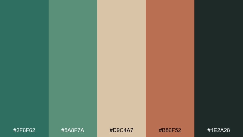
HEX: #2F6F62 #5A8F7A #D9C4A7 #B86F52 #1E2A28
Mood: earthy, restorative, natural
Best for: eco skincare packaging and labels
Earthy and restorative, like damp forest air with a hint of warm clay. The deep green and soft sage create a trustworthy base for natural product lines. Pair the sand tone with generous whitespace and use the clay copper for seals, caps, or callouts. Tip: keep typography dark and simple so the palette reads premium, not rustic.
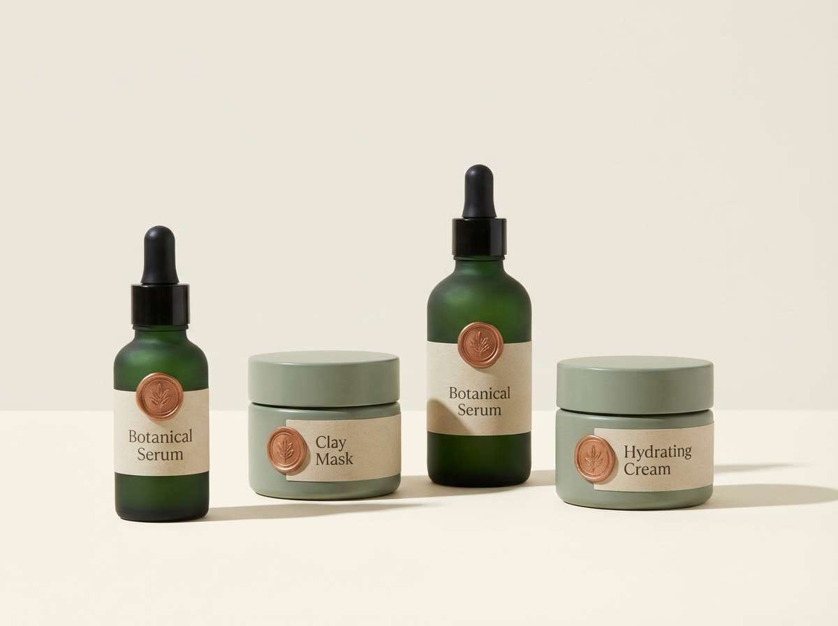
Image example of copper fern retreat generated using media.io
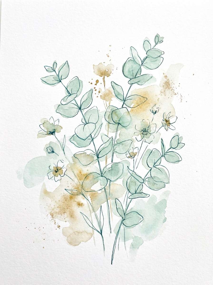
3) Sea Glass Patina
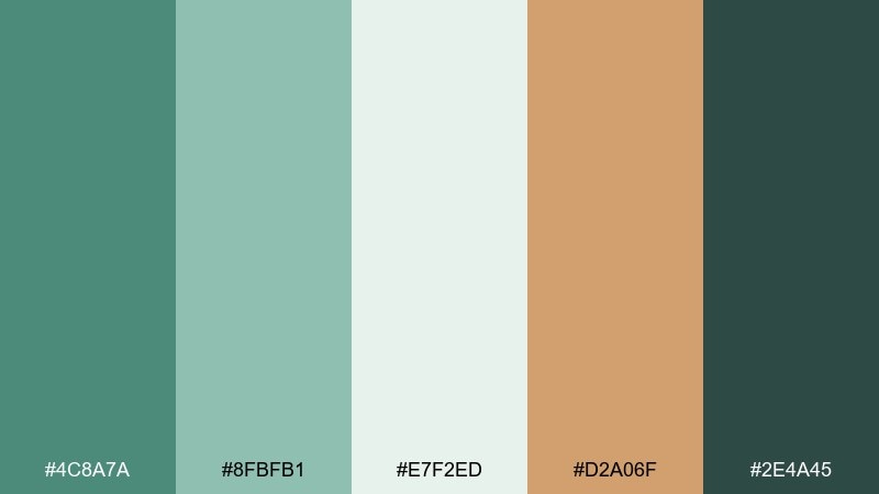
HEX: #4C8A7A #8FBFB1 #E7F2ED #D2A06F #2E4A45
Mood: fresh, coastal, airy
Best for: watercolor botanical illustrations
Fresh and airy, like sea glass scattered near weathered driftwood. Use the pale mint and misty off-white for light washes, then anchor details with the deep green-teal. The sandy gold works beautifully for pollen centers, stems, or small highlights. Tip: keep the gold accents sparse so the illustration stays breezy, not autumnal.
Image example of sea glass patina generated using media.io
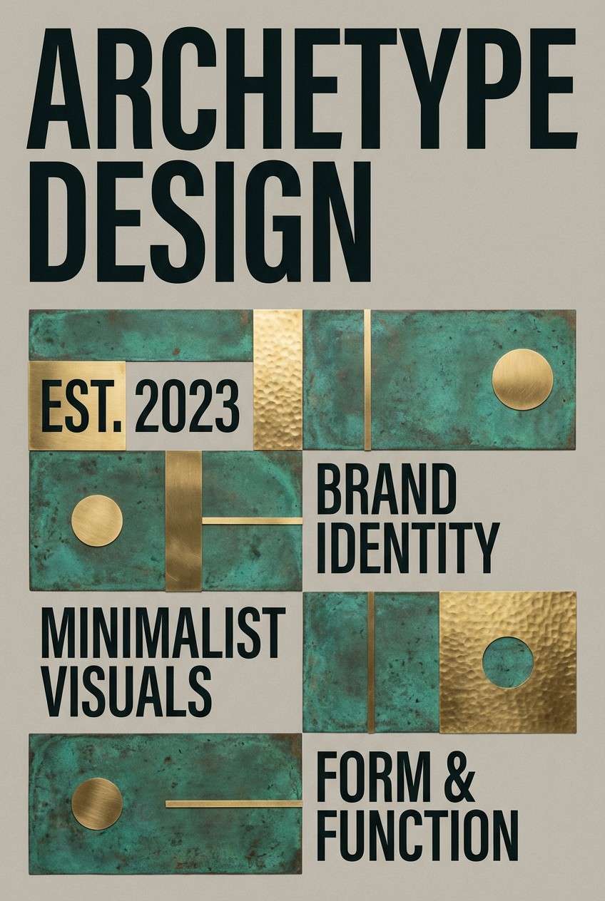
4) Urban Oxide
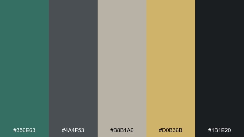
HEX: #356E63 #4A4F53 #B8B1A6 #D0B36B #1B1E20
Mood: moody, modern, confident
Best for: brand poster and headline graphics
Moody and confident, like oxidized railings against concrete and streetlight glow. The grayscale neutrals let the green read sophisticated rather than playful. Pair the brass-gold with bold typography for premium emphasis points. Tip: limit the near-black to text and frames so the palette stays crisp.
Image example of urban oxide generated using media.io
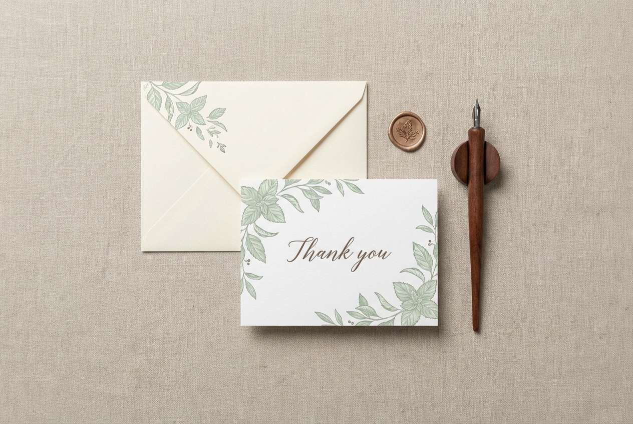
5) Botanical Stationery
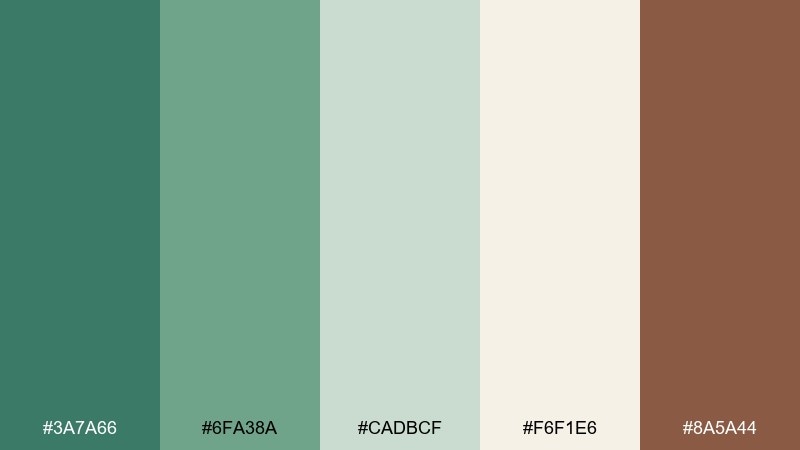
HEX: #3A7A66 #6FA38A #CADBCF #F6F1E6 #8A5A44
Mood: gentle, organic, welcoming
Best for: stationery sets and thank you cards
Gentle and welcoming, like pressed leaves on creamy paper with a hint of warm leather. The soft mint and pale sage make an easy background for handwritten or script fonts. Pair the cocoa brown with envelopes, wax seals, or small border lines. Tip: use the cream as the dominant base to keep prints looking clean and premium.
Image example of botanical stationery generated using media.io
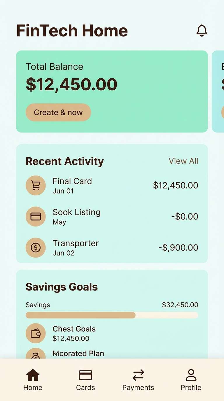
6) Minted Copper Accent
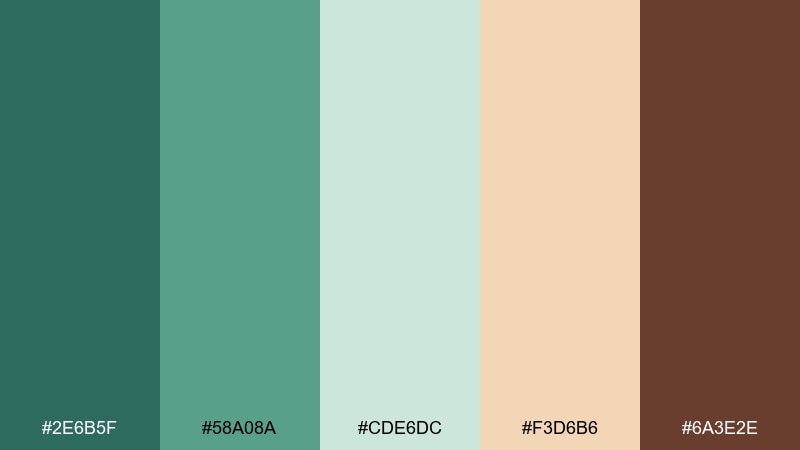
HEX: #2E6B5F #58A08A #CDE6DC #F3D6B6 #6A3E2E
Mood: bright, friendly, modern
Best for: fintech mobile app UI screens
Bright and friendly, like polished copper warmed by daylight through frosted glass. This green copper color palette works well when you want trust and approachability in a modern interface. Pair the mint and pale aqua for surfaces, then use the warm beige for cards or highlights. Tip: reserve the deep brown for critical actions and text to maintain contrast.
Image example of minted copper accent generated using media.io
7) Rainy Courtyard

HEX: #2B5E55 #4F7D73 #9FB6AE #E4DDCF #433A36
Mood: quiet, cozy, understated
Best for: cafe interior branding and menus
Quiet and cozy, like wet stone planters and steam rising from a mug by the window. The muted greens keep the vibe relaxed while the warm cream softens everything for hospitality. Pair the espresso brown with menu type and small icon lines. Tip: use the mid green for section headers so guests can scan quickly without harsh contrast.
Image example of rainy courtyard generated using media.io
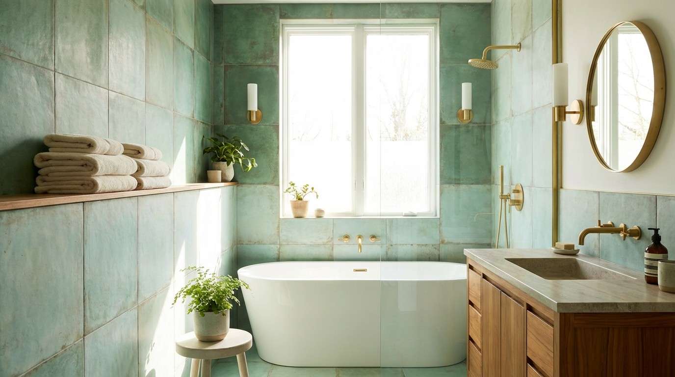
8) Modern Spa Tile

HEX: #3C7C72 #72B2A2 #D6EFEA #F7F3EA #B08A5A
Mood: clean, soothing, elevated
Best for: bathroom remodel and spa visuals
Clean and soothing, like glazed tiles, warm towels, and a faint metallic shimmer. The aqua-leaning greens feel hygienic without turning icy. Pair the brass-tan with wood accents and brushed hardware for a calmer luxury. Tip: keep the brightest mint on larger surfaces and use the tan only for small focal points.
Image example of modern spa tile generated using media.io
9) Heritage Brass and Patina
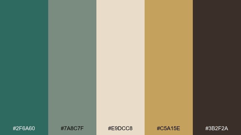
HEX: #2F6A60 #7A8C7F #E9DCC8 #C5A15E #3B2F2A
Mood: heritage, warm, timeless
Best for: whiskey label packaging
Heritage and warm, like aged brass plaques and patinaed barrels in a dim cellar. The cream and mossy neutral set up a classic base for serif type. Pair the brass with embossing or foil to suggest craft and provenance. Tip: keep the darkest brown for borders and legal copy to preserve that vintage label clarity.
Image example of heritage brass and patina generated using media.io
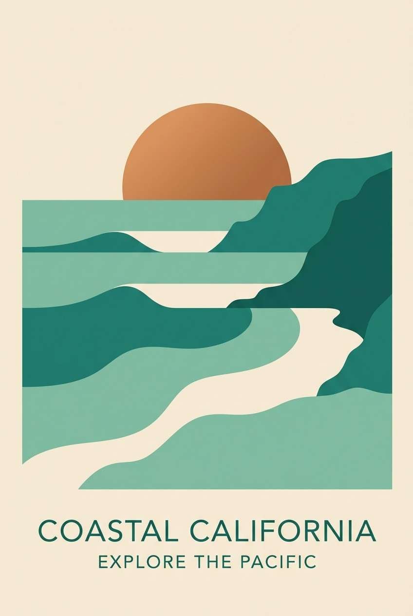
10) Coastal Copper Sunrise
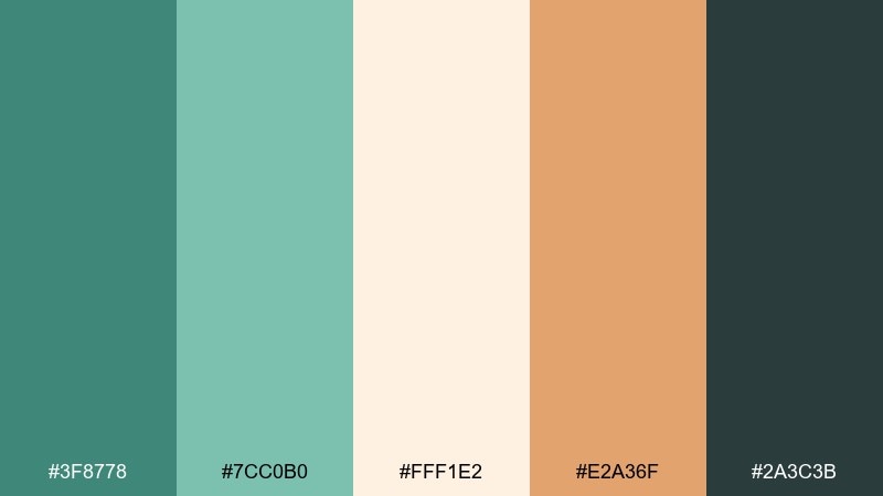
HEX: #3F8778 #7CC0B0 #FFF1E2 #E2A36F #2A3C3B
Mood: optimistic, breezy, warm
Best for: travel poster graphics
Optimistic and breezy, like sunrise reflecting on sea foam with a warm copper glow. The creamy near-white keeps layouts light, while the coral-copper brings friendly energy. Pair the dark teal with headline text and simple icon shapes. Tip: use the copper tone for one strong focal element so the design stays airy.
Image example of coastal copper sunrise generated using media.io
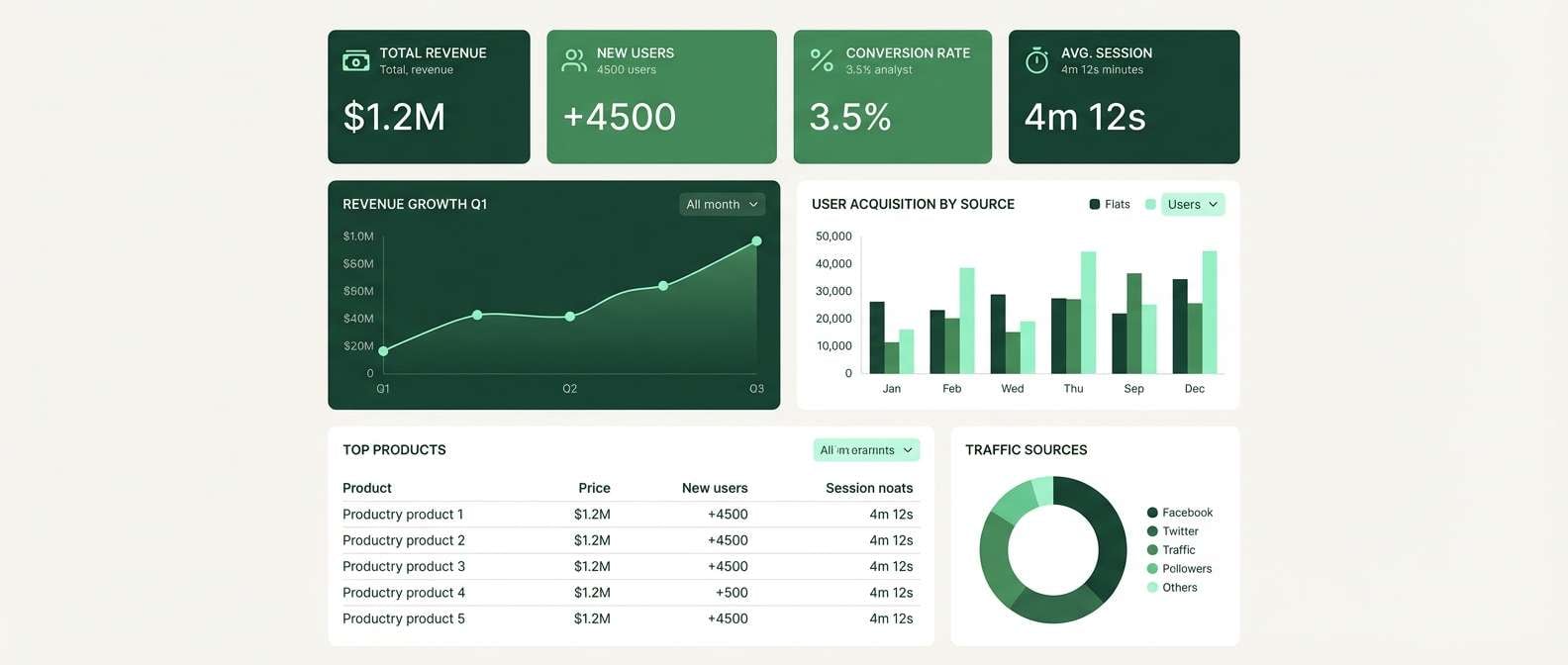
11) Forest Circuit UI
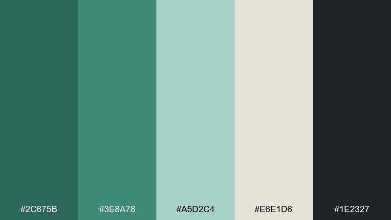
HEX: #2C675B #3E8A78 #A5D2C4 #E6E1D6 #1E2327
Mood: techy, grounded, calm
Best for: analytics dashboard UI
Techy but grounded, like circuit traces hidden under a forest canopy. The minty highlight color helps charts and toggles pop without shouting. Pair the off-white with generous spacing for readable dashboards, and use the near-black for data labels. Tip: apply the mid green to active states only so interactions feel consistent.
Image example of forest circuit ui generated using media.io
12) Gallery Patina Neutrals
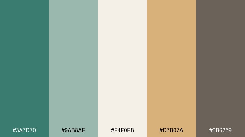
HEX: #3A7D70 #9AB8AE #F4F0E8 #D7B07A #6B6259
Mood: quiet luxury, curated, soft
Best for: editorial magazine layouts
Quiet luxury and curated, like a sunlit gallery with muted walls and brass nameplates. These green copper color combinations shine in editorial work where you need restraint plus warmth. Pair the soft cream with roomy margins, then use the brass-tan for pull quotes or section markers. Tip: keep body text in the warm gray so the green stays the hero color.
Image example of gallery patina neutrals generated using media.io
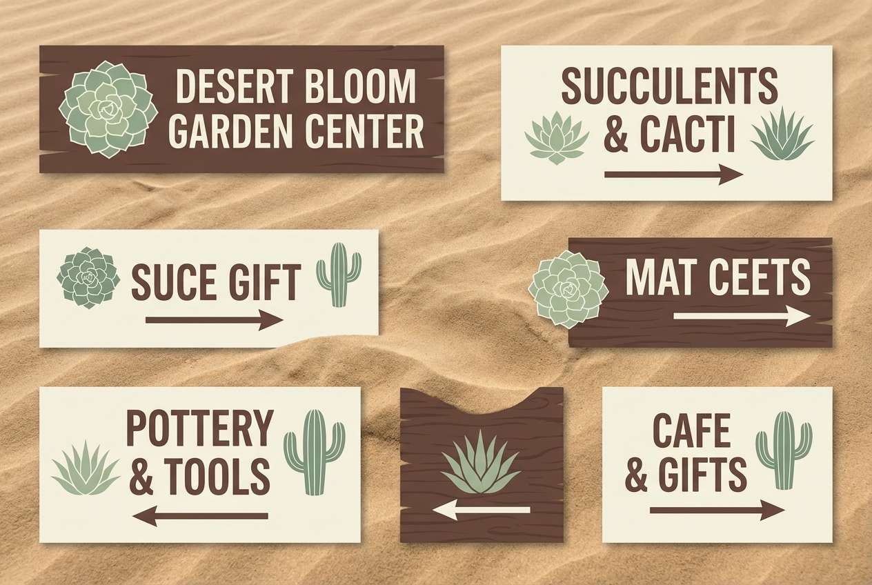
13) Stone and Succulent
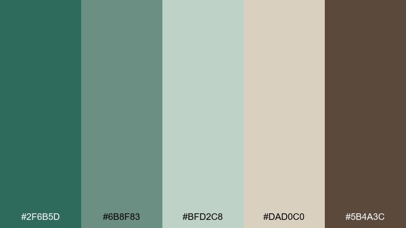
HEX: #2F6B5D #6B8F83 #BFD2C8 #DAD0C0 #5B4A3C
Mood: grounded, muted, organic
Best for: garden center signage
Grounded and muted, like succulents set in stone planters with dusty soil. The gray-green range is perfect for signage that needs to feel natural and readable. Pair the sandy neutral with simple illustrations and use the cocoa brown for key information. Tip: avoid tiny thin type on the mid green and opt for bold weights for distance legibility.
Image example of stone and succulent generated using media.io
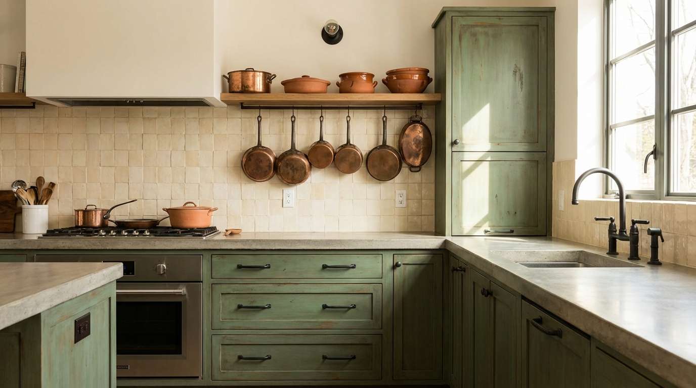
14) Copper Moss Kitchen

HEX: #3A776B #86A89B #EFE6D9 #C77A4A #262B2B
Mood: homey, stylish, warm
Best for: kitchen cabinet and backsplash concepts
Homey and stylish, like mossy greens warmed by terracotta cookware. The creamy neutral keeps cabinetry looking fresh while the copper-orange adds appetite-friendly energy. Pair the near-black with hardware and pendant lights for a modern finish. Tip: use the copper tone in smaller doses, like stools or ceramics, to keep the kitchen timeless.
Image example of copper moss kitchen generated using media.io
15) Minimal Evergreen Copper
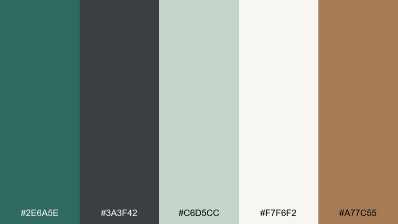
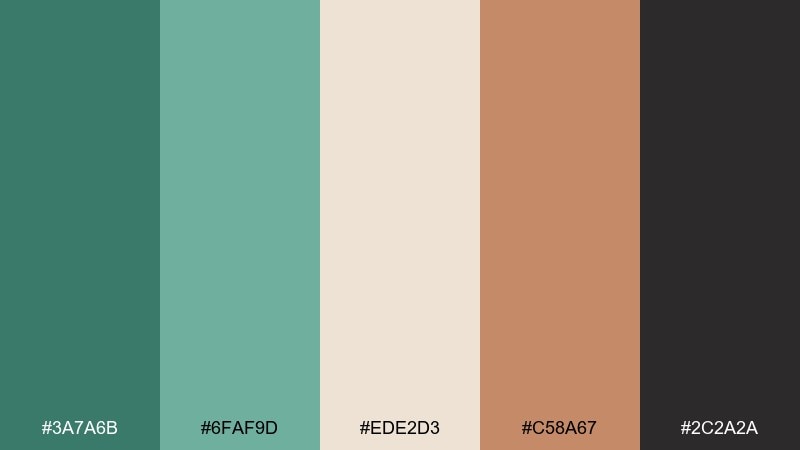
HEX: #2E6A5E #3A3F42 #C6D5CC #F7F6F2 #A77C55
Mood: minimal, professional, balanced
Best for: logo and brand identity kits
Minimal and professional, like evergreen ink on crisp paper with a touch of warm metal. The palette gives you a strong dark base without feeling heavy. Pair the copper-brown with small brand marks, dividers, or icon strokes, and let the off-white carry the layout. Tip: keep gradients out and stick to flat fills for a sharper identity system.
Image example of minimal evergreen copper generated using media.io

16) Vintage Bookcloth
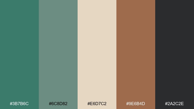
HEX: #3B7B6C #6C8D82 #E6D7C2 #9E6B4D #2A2C2E
Mood: vintage, literary, textured
Best for: book cover design
Vintage and literary, like textured bookcloth with aged paper edges. The moss and gray-green tones create depth for illustrated covers and classic typography. Pair the warm tan with border rules or a small emblem to nod to heritage printing. Tip: use the deep charcoal for title type to keep contrast strong on the softer greens.
Image example of vintage bookcloth generated using media.io
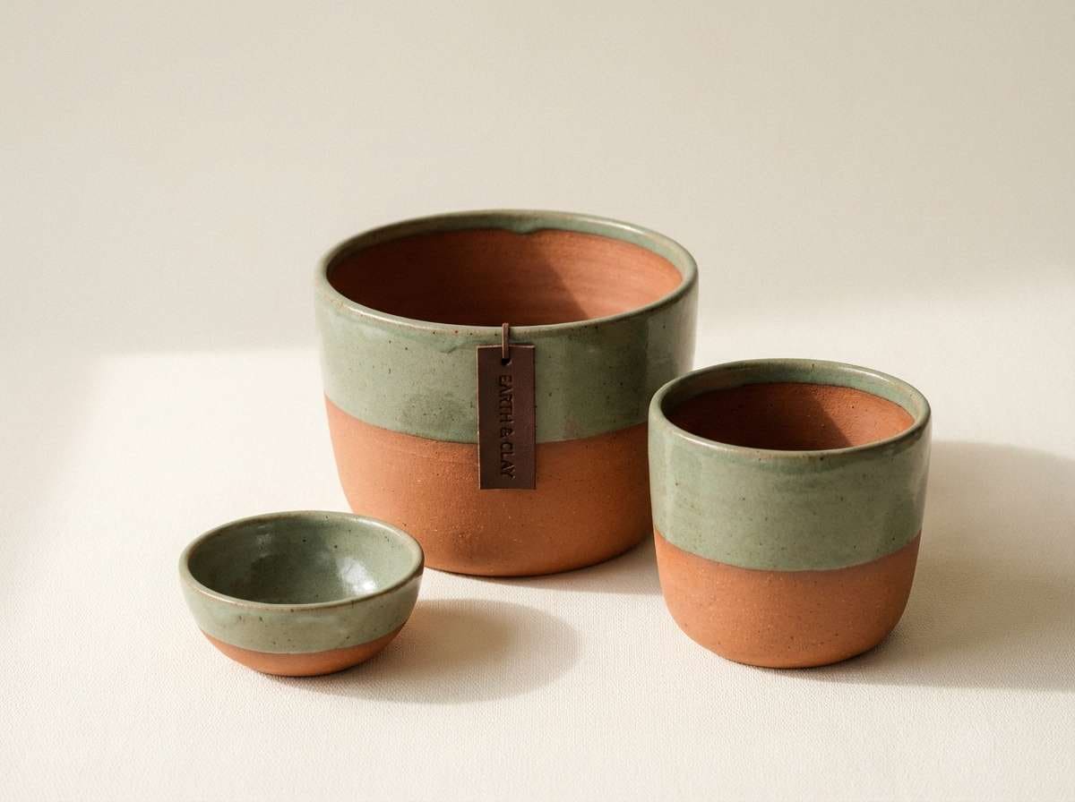
17) Clay Pot Greenwash
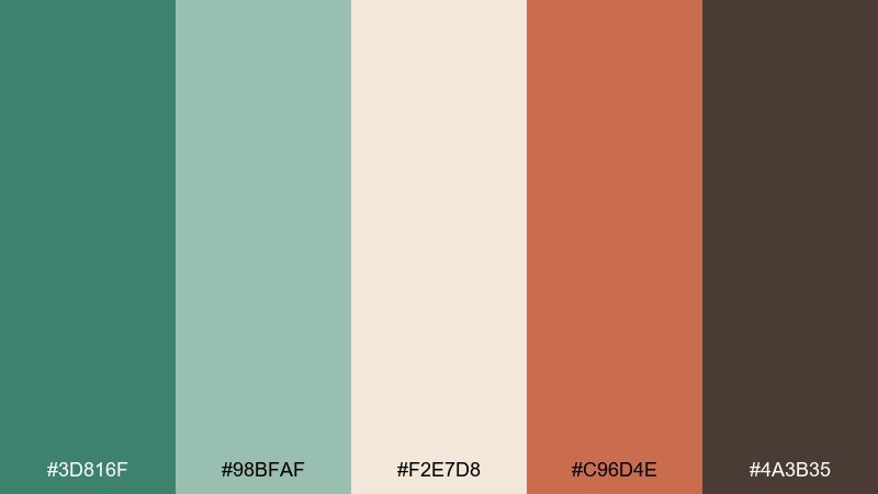
HEX: #3D816F #98BFAF #F2E7D8 #C96D4E #4A3B35
Mood: artisanal, sunny, inviting
Best for: ceramic product ads
Artisanal and sunny, like hand-thrown clay pots beside freshly washed herbs. The soft cream and sage set a friendly backdrop for lifestyle-forward product photography. Pair the terracotta with the ceramics themselves and keep the dark brown for brand marks. Tip: add texture through materials, not extra colors, so the palette stays cohesive.
Image example of clay pot greenwash generated using media.io
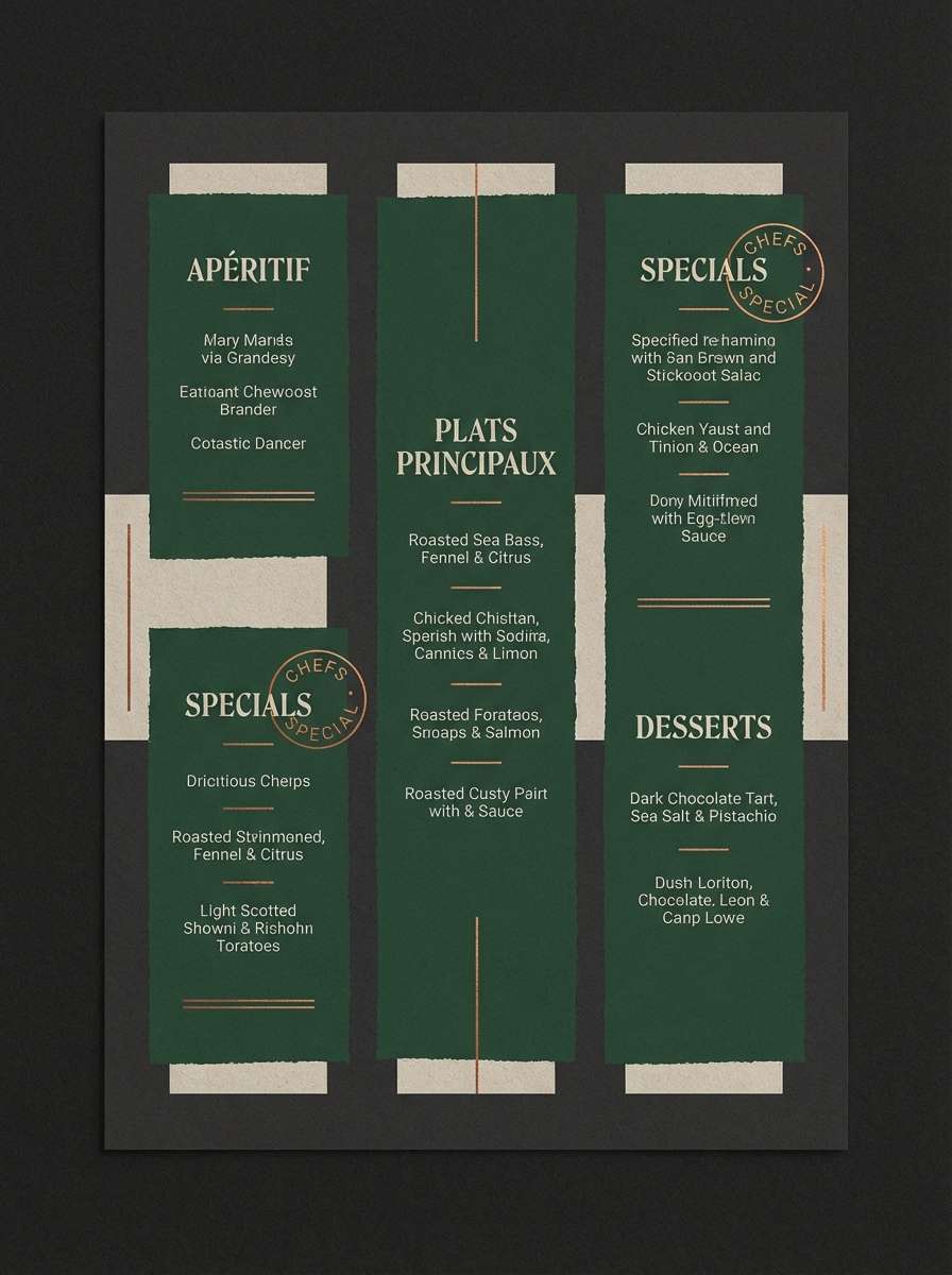
18) Neonless Night Market
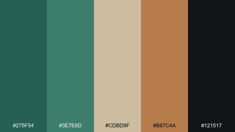
HEX: #275F54 #3E7E6D #CDBD9F #B67C4A #121517
Mood: dramatic, savory, cinematic
Best for: restaurant menu flyer
Dramatic and cinematic, like a night market lit by warm lanterns without the neon glare. A green copper color combination like this makes food menus feel upscale and slightly mysterious. Pair the sand tone for menu sections, then use copper-brown to highlight specials or prices. Tip: keep the background very dark and increase line spacing so the menu stays readable.
Image example of neonless night market generated using media.io
19) Soft Classroom Calm
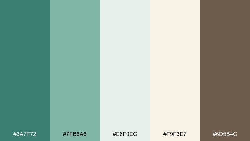
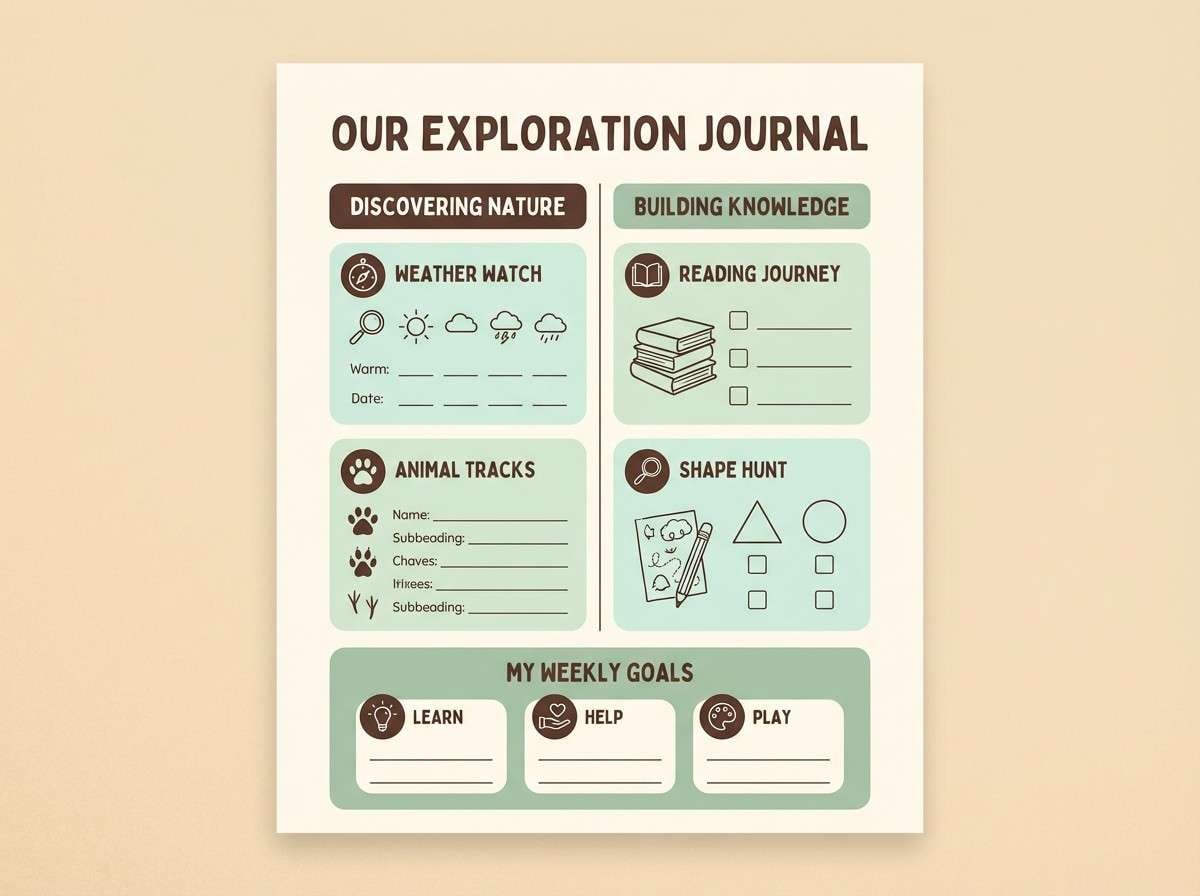
HEX: #3A7F72 #7FB6A6 #E8F0EC #F9F3E7 #6D5B4C
Mood: calm, friendly, focused
Best for: educational worksheet and infographic design
Calm and focused, like a quiet classroom with soft daylight and tidy chalkboards. The gentle mints help information feel approachable while still structured. Pair the warm cream with generous whitespace and use the cocoa tone for headings and icons. Tip: reserve the darkest text for key learning points to guide the eye.
Image example of soft classroom calm generated using media.io
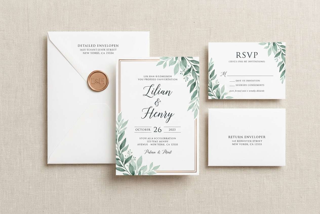
20) Copperleaf Wedding Suite
HEX: #3A7A6B #6FAF9D #EDE2D3 #C58A67 #2C2A2A
Mood: romantic, elegant, natural
Best for: wedding invitation suite
Romantic and elegant, like copper leaves pressed into vellum over soft greenery. The warm neutral keeps invitations feeling timeless, while the patina greens add a fresh botanical twist. Pair the copper tone with monograms, borders, or small floral linework. Tip: print the darkest color sparingly for text to maintain a light, airy finish.
Image example of copperleaf wedding suite generated using media.io
What Colors Go Well with Green Copper?
Green copper pairs naturally with warm neutrals like cream, sand, and putty—these keep the palette soft and elevated while letting patina greens stay the hero. For a sharper, modern edge, add charcoal or near-black as a framing and typography color.
For accent colors, copper-brown, terracotta, brass-gold, and muted coral all reinforce the “metal + earth” story without clashing. If you want a fresher feel, use pale mint or seafoam as a highlight and keep metallic tones minimal.
When in doubt, keep saturation low and rely on contrast: one deep green, one light neutral, one dark neutral, and a single copper/brass accent usually looks the most premium.
How to Use a Green Copper Color Palette in Real Designs
In branding, treat green copper as a system: use deep patina green for primary brand blocks, a warm off-white for backgrounds, and copper tones for emphasis like icons, dividers, stamps, or CTAs. This keeps the identity consistent and easy to scale.
In UI, prioritize accessibility with contrast. Reserve the darkest tones for text and critical actions, use mid greens for active states, and keep light mint/cream for surfaces so the interface feels calm and readable.
In interiors and packaging, make the “metal” feel real by pairing copper colors with material cues—matte black hardware, brushed brass, textured paper, stone, or wood. The palette looks best when it feels tactile, not overly glossy.
Create Green Copper Palette Visuals with AI
If you’re pitching a concept or building a moodboard, AI can help you visualize green copper palettes in minutes—interiors, product mockups, posters, invitations, and UI screens. Start with one palette above and reuse its prompt for consistent results.
For best output, describe lighting (soft daylight vs. moody interior), materials (brass hardware, cream paper, glazed tile), and composition (top-down flat lay, clean grid, minimal styling). Keep “no people” if you want distraction-free brand visuals.
Green Copper Color Palette FAQs
-
What is a green copper color palette?
A green copper palette combines patina/verdigris-style greens with copper, brass, or clay-toned accents, usually supported by warm neutrals (cream, sand) and deep charcoals for contrast. -
Is green copper the same as verdigris?
They’re closely related. Verdigris typically refers to the blue-green patina that forms on copper, while “green copper” often describes the broader design palette inspired by that patina plus complementary copper-metal accents. -
What colors complement green copper best?
Warm off-whites, beige/sand, warm gray, charcoal/near-black, and metallic-inspired accents like brass-gold or copper-brown pair especially well and keep the look modern and balanced. -
Does green copper work for modern UI design?
Yes—especially for fintech, analytics, wellness, and productivity interfaces. Use light neutrals for surfaces, deeper greens for states and charts, and reserve copper tones for small emphasis elements to avoid visual noise. -
How do I keep a green copper palette from looking rustic?
Use cleaner neutrals (cool gray, off-white), add strong dark framing (charcoal), keep saturation muted, and apply copper as a controlled accent (lines, icons, small badges) instead of large blocks. -
What’s a good text color on patina green backgrounds?
Near-black or deep charcoal usually gives the most reliable readability. For darker greens, use warm off-white/cream for text, and always check contrast if the design is for web or app UI. -
Can I generate green copper palette images with AI?
Yes. Use Media.io Text-to-Image with a clear prompt describing the scene, materials, and lighting, then add your palette colors as the dominant tones to keep outputs consistent across a series.
Next: Heliotrope Color Palette


