

Watercolor palettes bring a soft, organic feel that instantly makes layouts more human and premium. From airy pastels to inky blooms, the right watercolor tones can elevate branding, UI, packaging, and editorial work.
Below are 20 watercolor color palette ideas with HEX codes, plus quick pairing tips and AI prompts you can use to generate matching visuals in minutes.
In this article
- Why Watercolor Palettes Work So Well
-
- misty citrus wash
- rose clay blush
- coastal seafoam
- lavender fog
- golden oat latte
- berry ink bloom
- sage stone
- coral peach sorbet
- indigo smoke
- minted lilac
- terracotta dusk
- powder blue haze
- sunlit meadow
- plum velvet
- sandstone sepia
- arctic aqua
- petal rain
- olive brass patina
- sunset waterline
- monochrome graphite
- What Colors Go Well with Watercolor?
- How to Use a Watercolor Color Palette in Real Designs
- Create Watercolor Palette Visuals with AI
Why Watercolor Palettes Work So Well
Watercolor color palettes feel dimensional because they naturally imply transparency, layering, and soft edges. Even in flat digital designs, these hues suggest depth without needing heavy shadows or complex effects.
They also create a gentler contrast profile than many saturated schemes, which can make layouts feel calmer and more approachable. That’s especially useful for wellness, lifestyle, stationery, and premium packaging aesthetics.
Finally, watercolor tones pair beautifully with paper textures, grain, and subtle gradients—so your brand visuals can look tactile and crafted while staying modern and minimal.
20+ Watercolor Color Palette Ideas (with HEX Codes)
1) Misty Citrus Wash
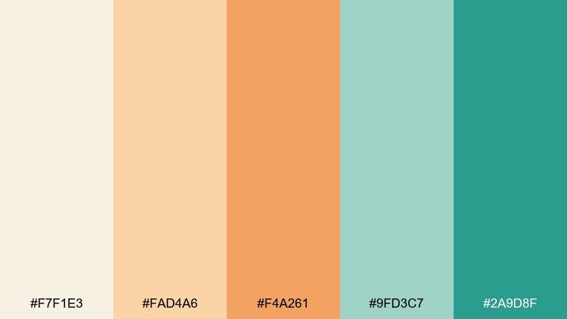
HEX: #F7F1E3 #FAD4A6 #F4A261 #9FD3C7 #2A9D8F
Mood: airy, fresh, uplifting
Best for: spring brand refresh and lifestyle social posts
Airy and optimistic, it feels like morning light drifting through citrus blossoms and a cool sea breeze. Use the cream and apricot as your background and spacing colors, then let teal carry buttons, headings, or key shapes. This watercolor color palette works especially well with natural textures like paper grain and soft gradients. Tip: keep the orange to small highlights so the teal stays calm and modern.
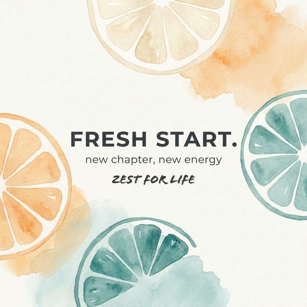
Image example of misty citrus wash generated using media.io
Media.io is an online AI studio for creating and editing video, image, and audio in your browser.

2) Rose Clay Blush
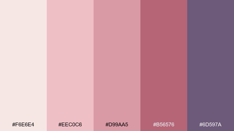
HEX: #F6E6E4 #EEC0C6 #D99AA5 #B56576 #6D597A
Mood: romantic, warm, vintage
Best for: wedding invitations and beauty packaging
Romantic and softly nostalgic, these tones read like rose petals pressed into handmade paper. Pair blush and clay for backgrounds and envelopes, then use the deep mauve and plum for type and monograms. It shines on uncoated stock, foil accents, and minimalist line art. Tip: choose one dark shade for text and keep the rest as gentle washes to avoid muddy contrast.
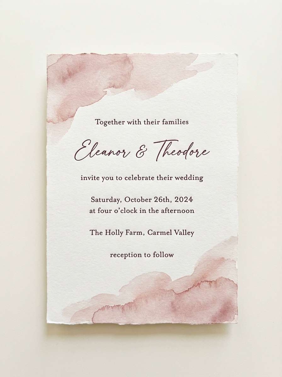
Image example of rose clay blush generated using media.io
3) Coastal Seafoam
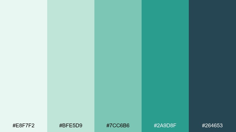
HEX: #E8F7F2 #BFE5D9 #7CC6B6 #2A9D8F #264653
Mood: clean, coastal, calming
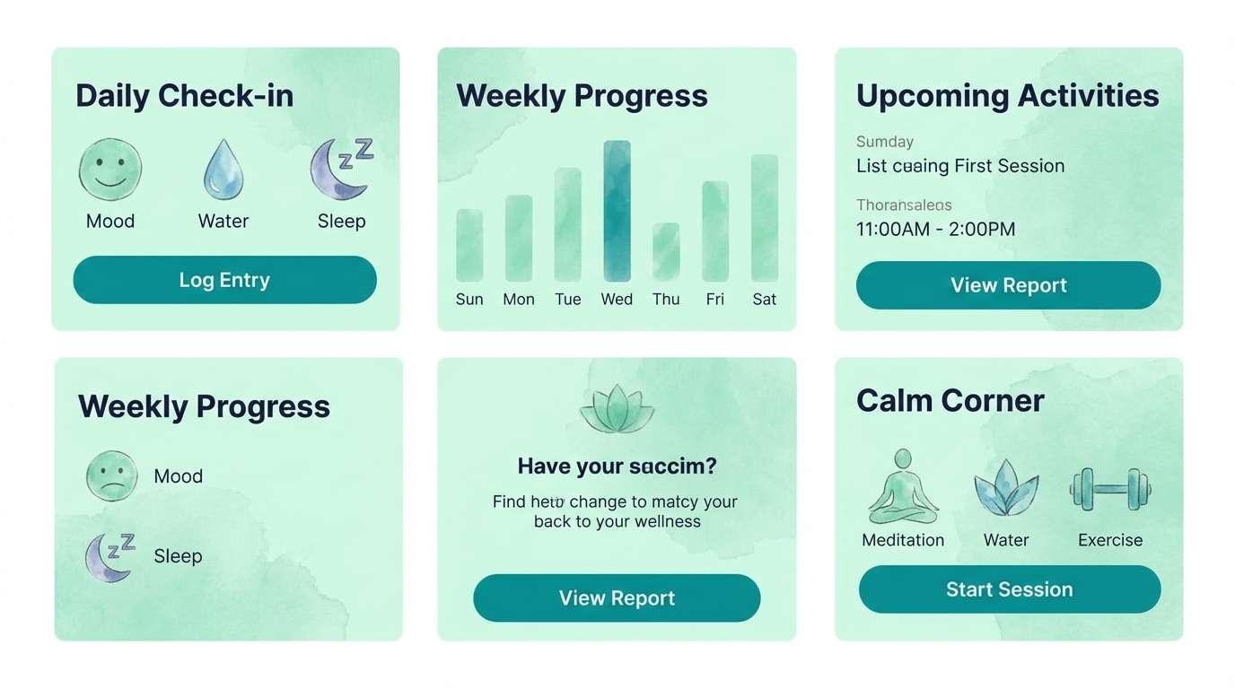
Best for: wellness apps and spa landing pages
Clean and calming, it evokes seafoam rolling onto dark coastal rocks. Build the interface with pale mint surfaces, then reserve the deeper teal for primary actions and navigation. The navy anchor shade keeps accessibility strong without turning harsh. Tip: add generous white space and use teal only where you need clear hierarchy.
Image example of coastal seafoam generated using media.io
4) Lavender Fog
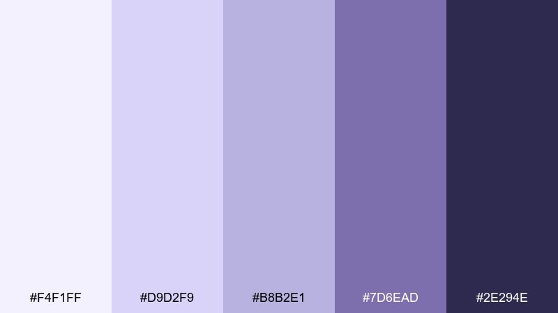
HEX: #F4F1FF #D9D2F9 #B8B2E1 #7D6EAD #2E294E
Mood: dreamy, quiet, elegant
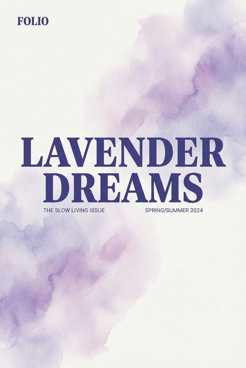
Best for: editorial covers and boutique branding
Dreamy and quiet, it feels like a lavender field fading into evening haze. Use the pale lilac for large negative space and let the mid purple set gentle sections or labels. The deep indigo is perfect for crisp headlines and logo marks. Tip: keep images desaturated so the violet tones remain the hero.
Image example of lavender fog generated using media.io
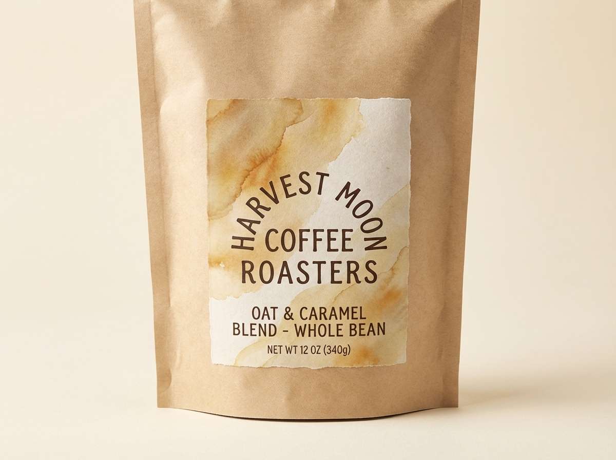
5) Golden Oat Latte
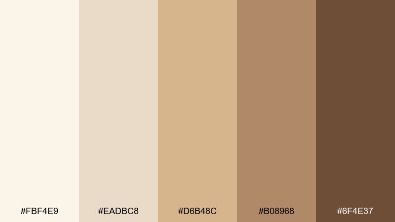
HEX: #FBF4E9 #EADBC8 #D6B48C #B08968 #6F4E37
Mood: cozy, grounded, artisanal
Best for: coffee packaging and cafe menus
Cozy and grounded, it brings to mind frothed oat milk, toasted grain, and warm café wood. These watercolor color combinations are ideal for kraft labels, minimalist icons, and menu hierarchies that feel handmade but polished. Let the cream and sand run large, then use caramel for borders and the espresso brown for typography. Tip: add a single thin dark line around light elements to keep legibility on textured paper.
Image example of golden oat latte generated using media.io
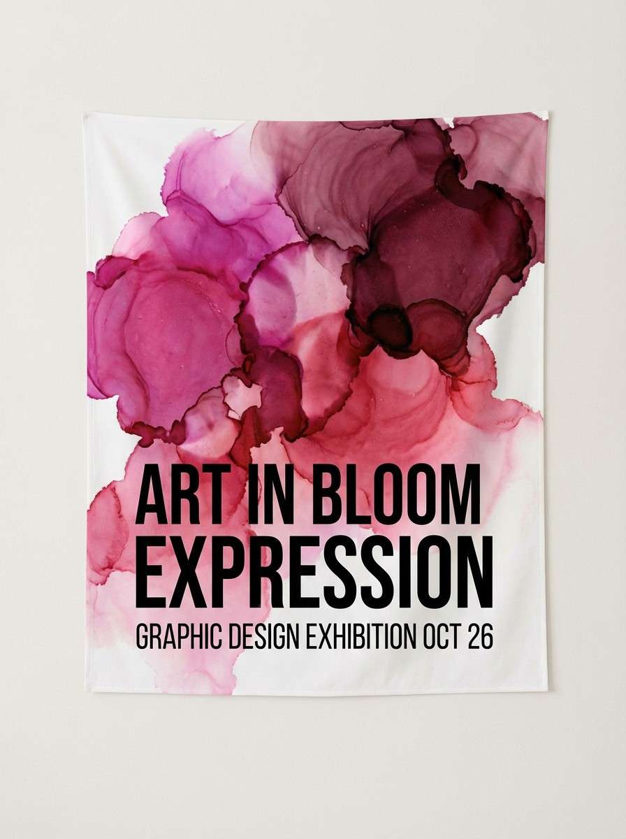
6) Berry Ink Bloom
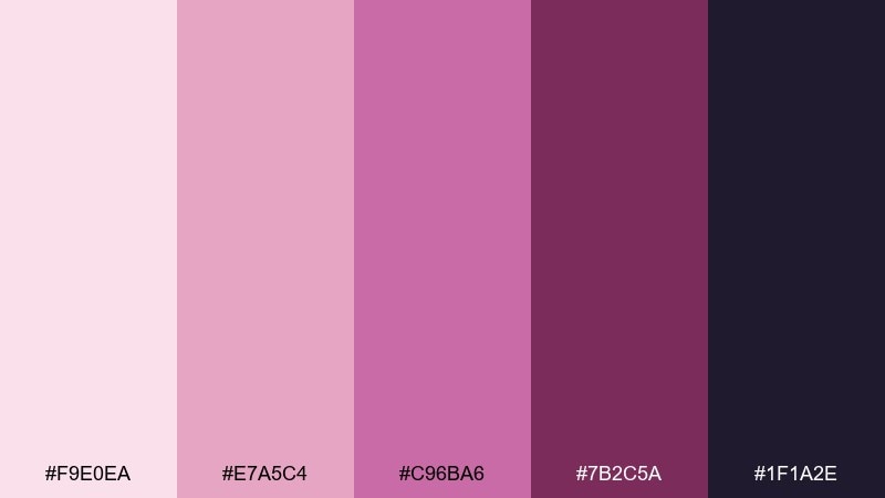
HEX: #F9E0EA #E7A5C4 #C96BA6 #7B2C5A #1F1A2E
Mood: bold, expressive, artistic
Best for: album art and event posters
Bold and expressive, it feels like berry dye spreading through wet paper with inky edges. Use the pale pink as breathing room, then let magenta shapes and deep wine shadows carry the drama. It fits posters, music visuals, and statement headlines that need impact without neon glare. Tip: blur one magenta layer slightly to mimic real pigment bloom and add depth.
Image example of berry ink bloom generated using media.io
7) Sage Stone
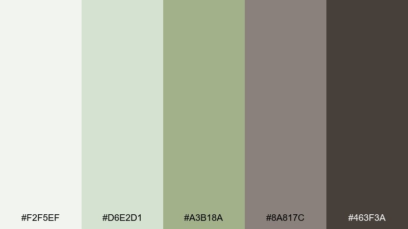
HEX: #F2F5EF #D6E2D1 #A3B18A #8A817C #463F3A
Mood: natural, balanced, understated
Best for: eco brands and product one-pagers
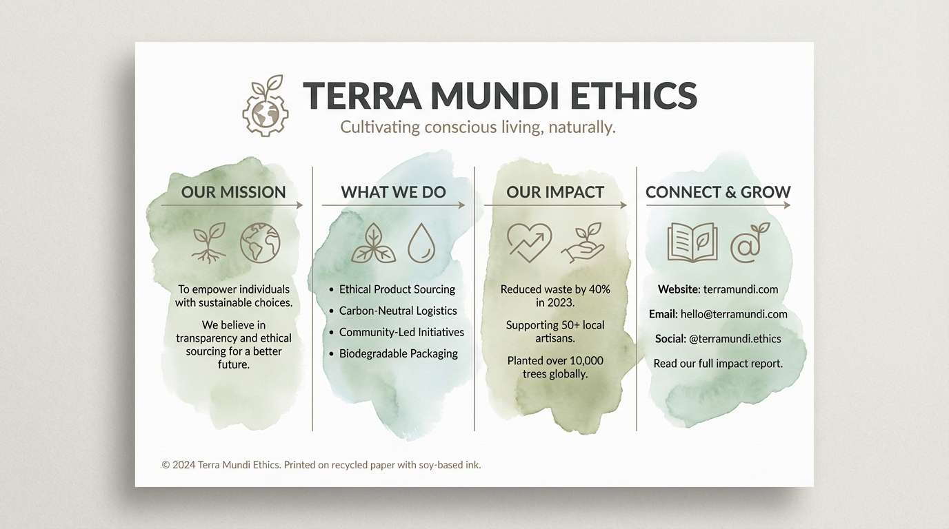
Natural and balanced, it recalls garden sage, linen fabric, and smooth river stone. Use the pale green-gray as a clean canvas and bring in sage for charts, badges, and icons. The warm taupe and charcoal keep typography readable and premium. Tip: pair with simple botanical line drawings for a calm, trustworthy look.
Image example of sage stone generated using media.io
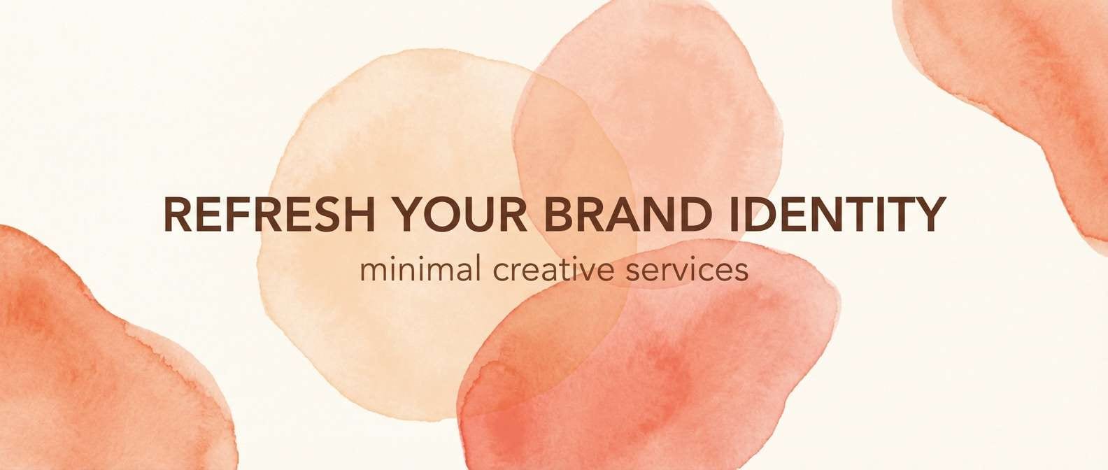
8) Coral Peach Sorbet
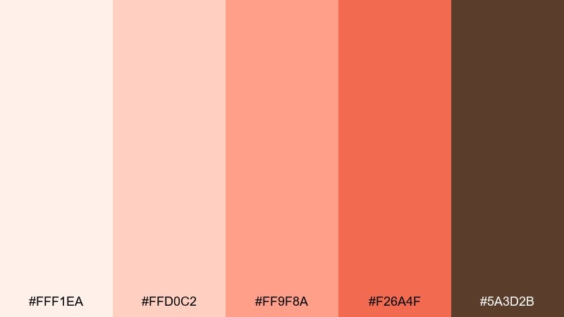
HEX: #FFF1EA #FFD0C2 #FF9F8A #F26A4F #5A3D2B
Mood: playful, sunny, friendly
Best for: summer promos and food delivery banners
Playful and sunny, it looks like peach sorbet melting into a coral glaze. Use the soft cream as negative space and let peach gradients fill hero shapes or background blobs. The deep cocoa shade keeps text grounded and mature. Tip: keep coral as your call-to-action color and avoid adding extra brights so the palette stays fresh, not loud.
Image example of coral peach sorbet generated using media.io
9) Indigo Smoke
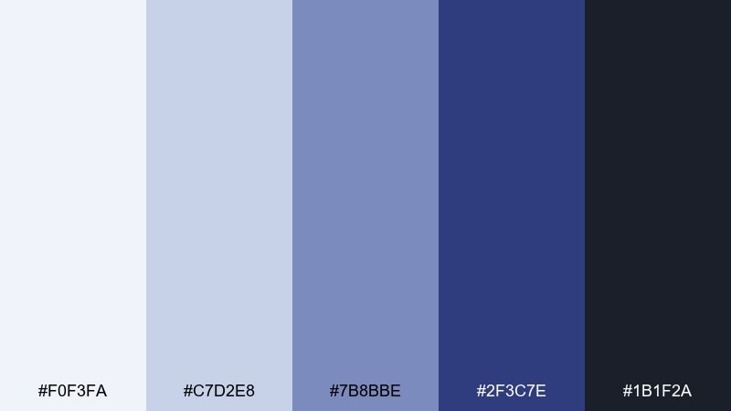
HEX: #F0F3FA #C7D2E8 #7B8BBE #2F3C7E #1B1F2A
Mood: moody, modern, confident
Best for: fintech dashboards and data reports
Moody and confident, it evokes twilight haze drifting across an indigo skyline. As a watercolor color scheme, it pairs pale blue surfaces with strong navy actions for a serious, modern UI. Use the near-black only for the most important text, and let the mid indigo handle charts and active states. Tip: keep backgrounds very light so the darker blues look crisp rather than heavy.
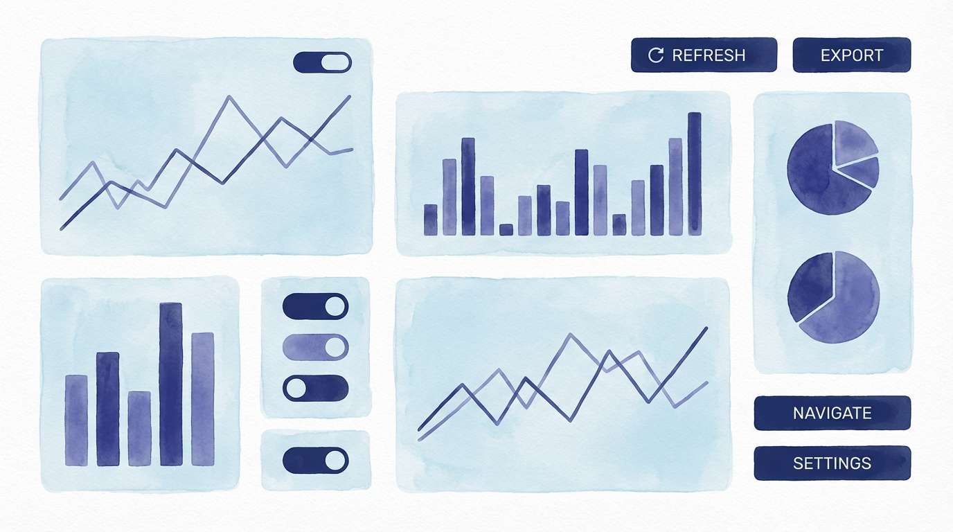
Image example of indigo smoke generated using media.io
10) Minted Lilac
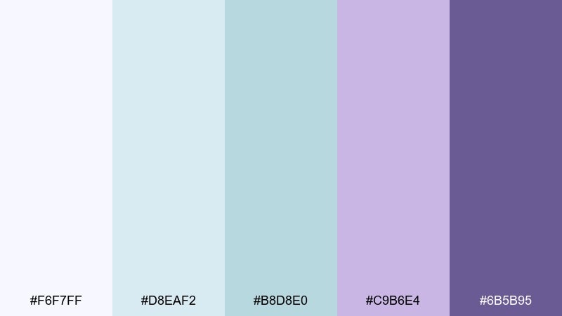
HEX: #F6F7FF #D8EAF2 #B8D8E0 #C9B6E4 #6B5B95
Mood: soft, airy, modern
Best for: skincare branding and product inserts
Soft and airy, it feels like mint mist layered over lilac petals. Use the pale periwinkle as a clean field, then bring mint and lilac in gentle blocks for sections and labels. The deeper purple gives you a refined accent for logos or key claims. Tip: print with a matte finish to keep the pastels looking creamy instead of glossy.
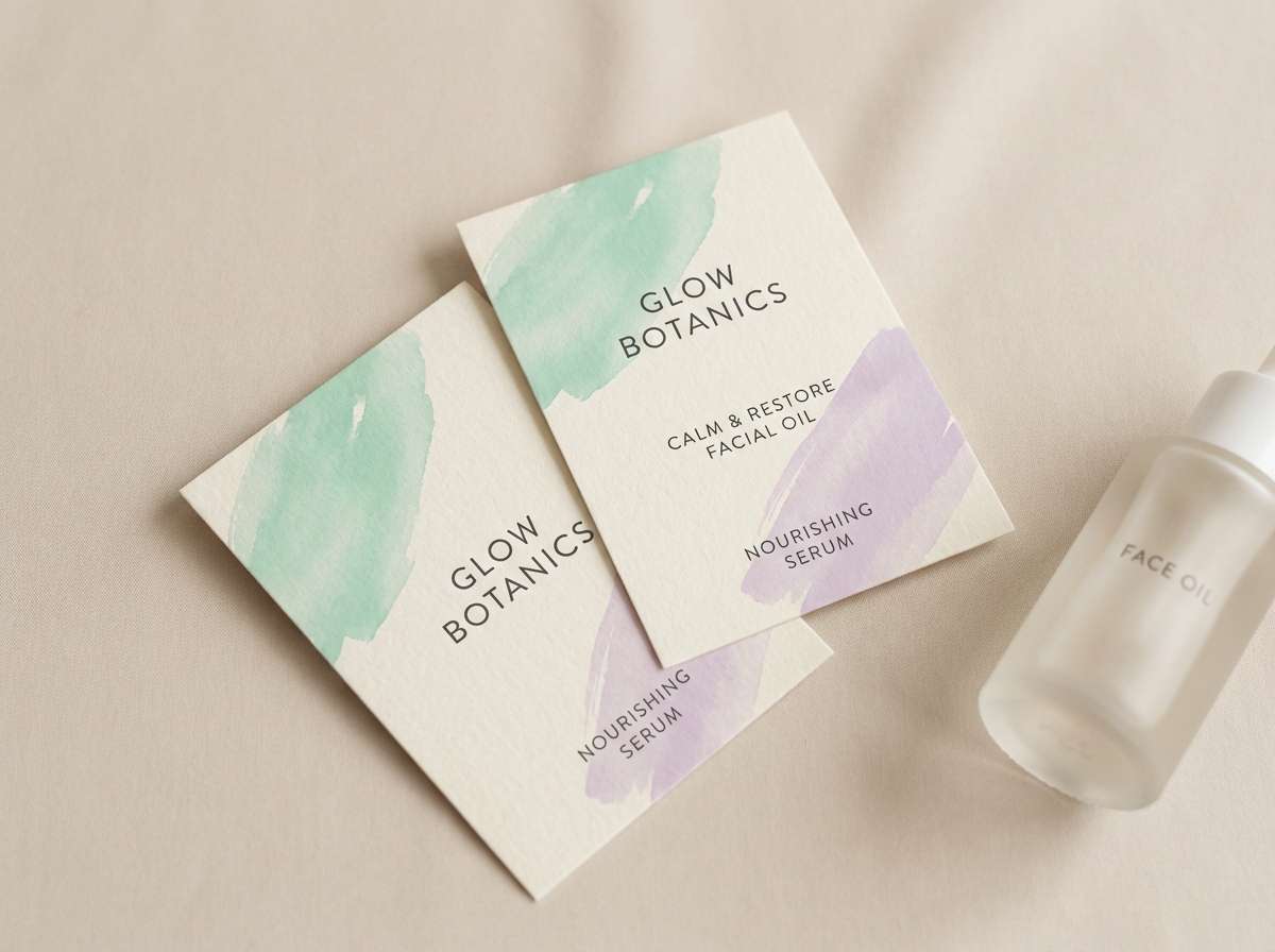
Image example of minted lilac generated using media.io
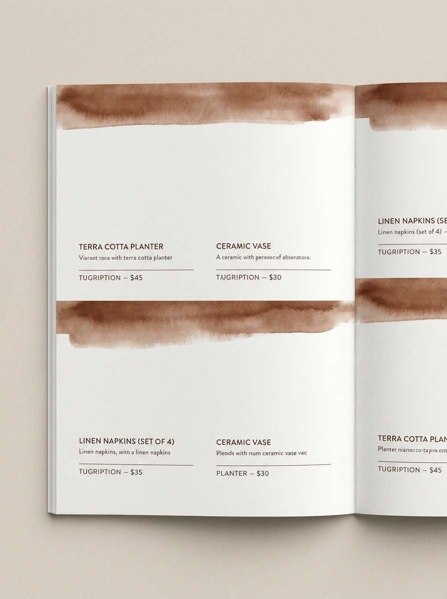
11) Terracotta Dusk
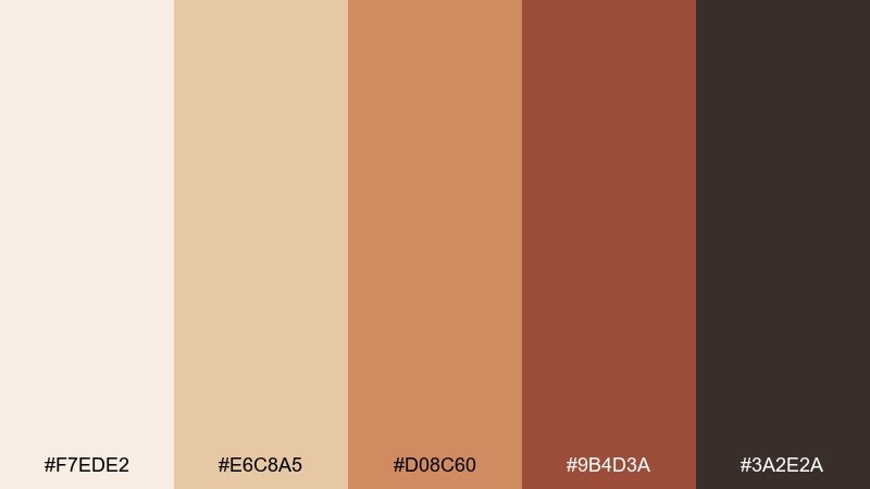
HEX: #F7EDE2 #E6C8A5 #D08C60 #9B4D3A #3A2E2A
Mood: earthy, warm, rustic
Best for: home decor catalogs and artisan labels
Earthy and warm, it resembles sun-baked clay cooling at dusk. Use the creamy sand for page backgrounds and let terracotta carry headlines, stamps, or price tags. The deep cocoa shade adds contrast for product names and details. Tip: combine with subtle paper texture and simple geometric borders to keep it handcrafted but tidy.
Image example of terracotta dusk generated using media.io
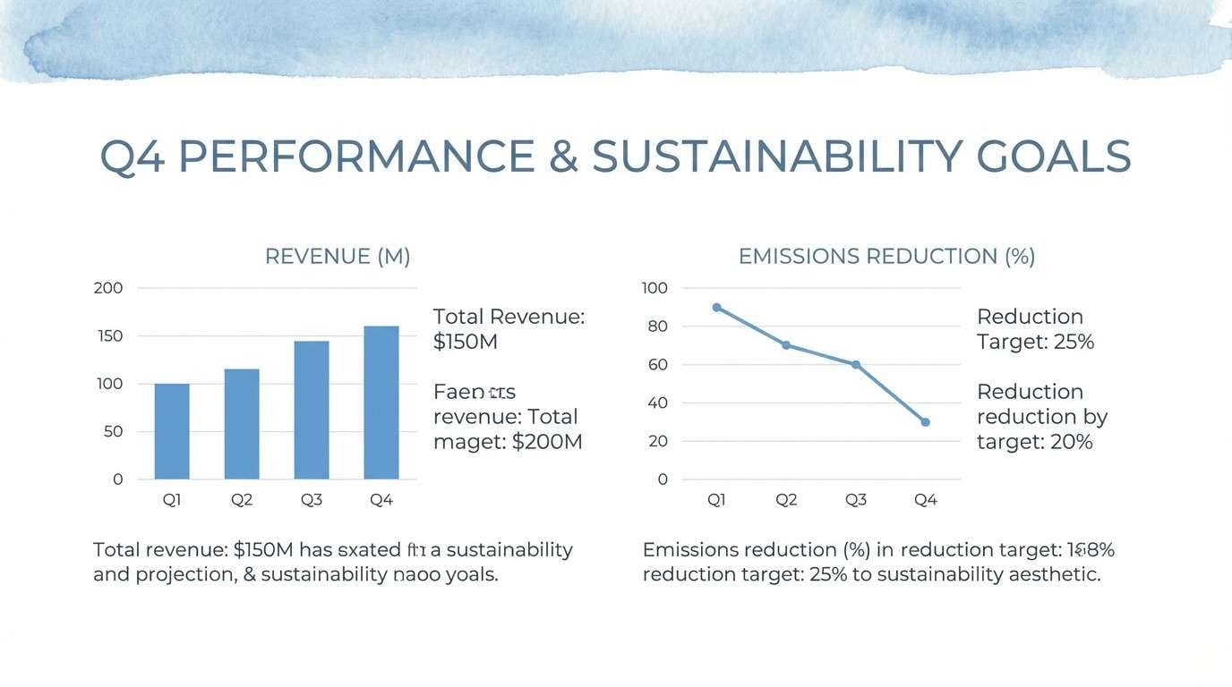
12) Powder Blue Haze
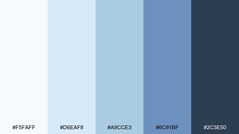
HEX: #F5FAFF #D6EAF8 #A9CCE3 #6C91BF #2C3E50
Mood: cool, gentle, professional
Best for: presentation templates and SaaS onboarding
Cool and gentle, it reads like distant sky layered with soft mist. Use the lightest blues for slide backgrounds and cards, then let the mid blues highlight steps, icons, and progress. The deep slate works for headings and charts when you need authority. Tip: keep gradients subtle and use one consistent accent shade for calls to action.
Image example of powder blue haze generated using media.io
13) Sunlit Meadow
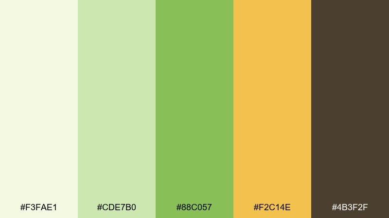
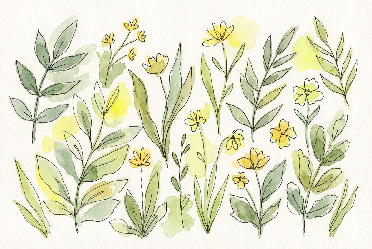
HEX: #F3FAE1 #CDE7B0 #88C057 #F2C14E #4B3F2F
Mood: cheerful, organic, outdoorsy
Best for: botanical illustrations and garden event flyers
Cheerful and outdoorsy, it brings up a meadow of new grass with warm sunlight on wildflowers. Use the pale green as paper tone, then layer leaf greens for stems and shadows. The golden yellow works as a bright focal point for petals, badges, or date highlights. Tip: keep the brown minimal so the greens stay luminous and fresh.
Image example of sunlit meadow generated using media.io
14) Plum Velvet
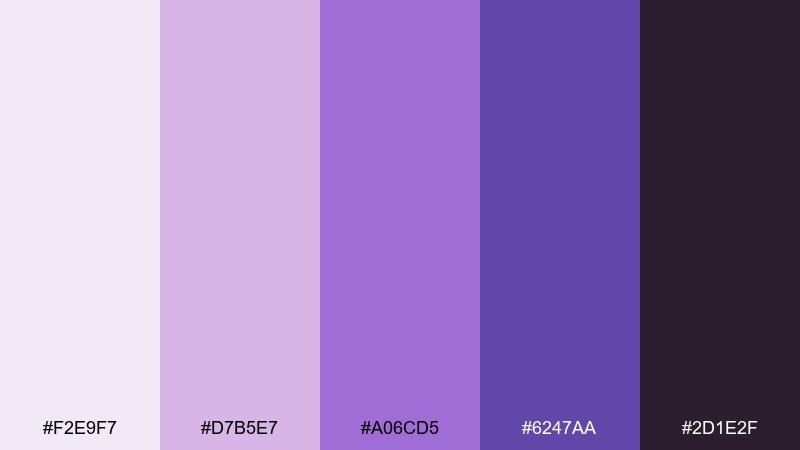
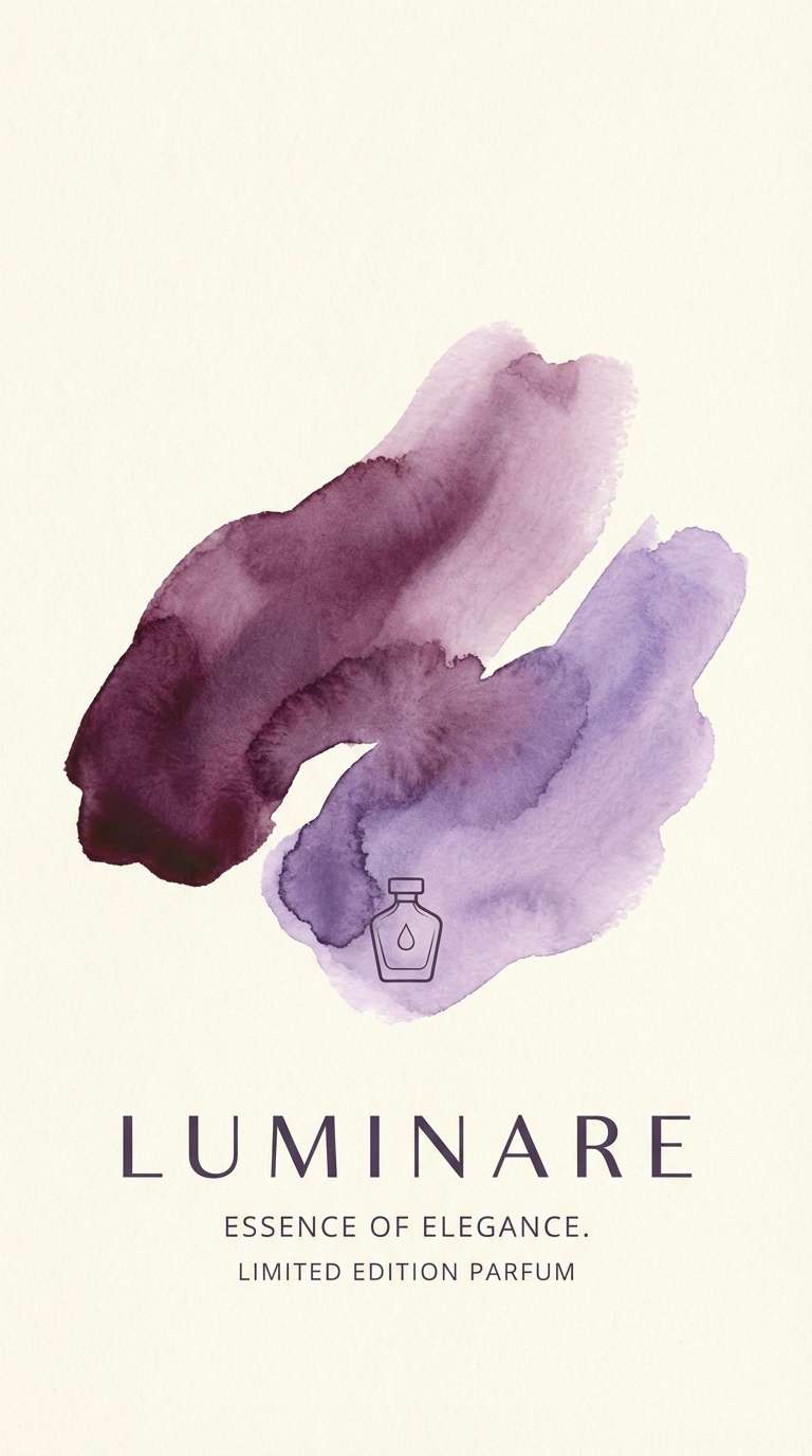
HEX: #F2E9F7 #D7B5E7 #A06CD5 #6247AA #2D1E2F
Mood: luxurious, artistic, nocturnal
Best for: premium product ads and nightlife posters
Luxurious and nocturnal, it feels like plum velvet under gallery lights. Use the pale lilac as negative space and let the mid purple set large shapes for a premium look. Deep violet and near-black create sharp contrast for headlines and pricing. Tip: add a soft vignette wash behind the hero text to make the purple glow without turning neon.
Image example of plum velvet generated using media.io
15) Sandstone Sepia
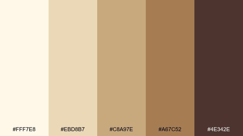
HEX: #FFF7E8 #EBD8B7 #C8A97E #A67C52 #4E342E
Mood: timeless, warm, documentary
Best for: heritage branding and museum brochures
Timeless and documentary, it resembles sunlit sandstone and old sepia prints. Use the creamy tones as generous margins and the tan shades for blocks, captions, and subtle dividers. This watercolor color palette pairs beautifully with archival photos, serif typography, and simple maps. Tip: keep the darkest brown for body text only, so the page stays light and readable.
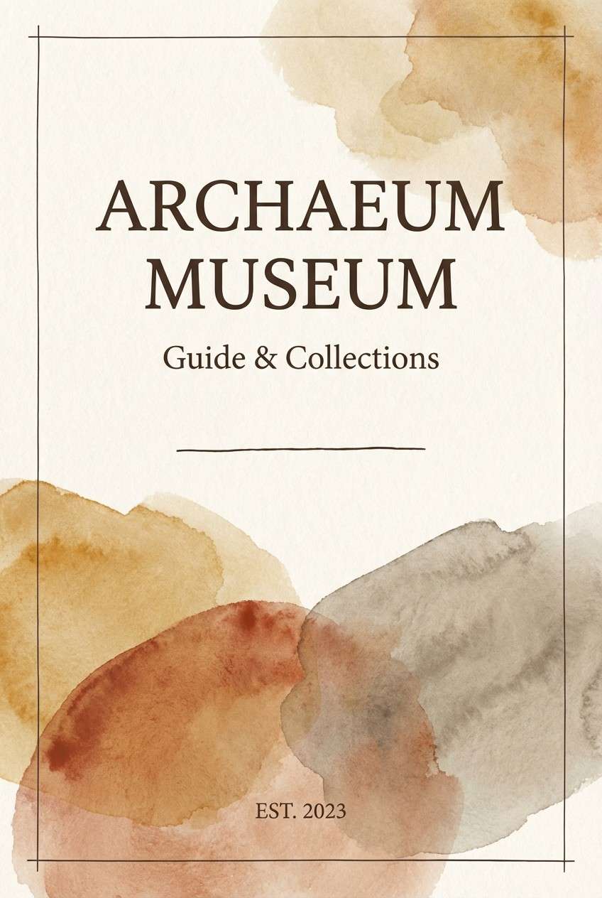
Image example of sandstone sepia generated using media.io
16) Arctic Aqua
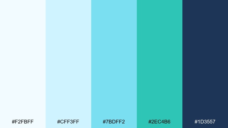
HEX: #F2FBFF #CFF3FF #7BDFF2 #2EC4B6 #1D3557
Mood: crisp, energizing, clean
Best for: tech startup landing pages and app icons
Crisp and energizing, it suggests glacier water and bright, clean air. Use the icy tints for sections and cards, then make aqua the signature accent for links and buttons. Navy keeps the palette grounded for headings and icon strokes. Tip: pair with rounded shapes and thin lines to emphasize the fresh, modern feel.
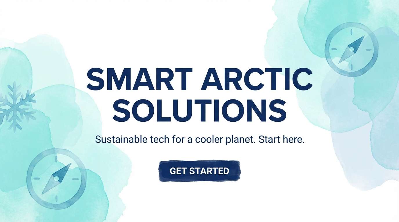
Image example of arctic aqua generated using media.io
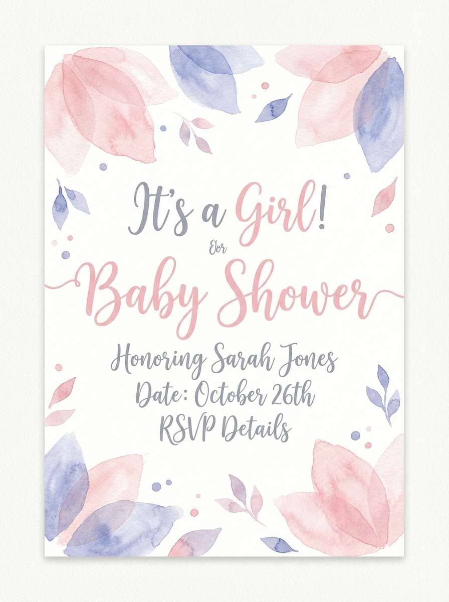
17) Petal Rain
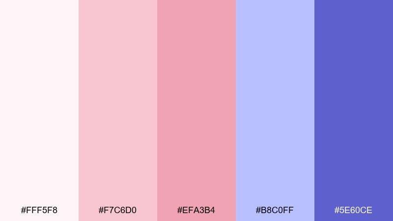
HEX: #FFF5F8 #F7C6D0 #EFA3B4 #B8C0FF #5E60CE
Mood: gentle, whimsical, romantic
Best for: baby shower invites and stationery sets
Gentle and whimsical, it feels like pink petals drifting through a light violet drizzle. Keep the blush and soft pink as your main wash layers, then use periwinkle for borders and small icons. The saturated violet can anchor names, dates, or a monogram without overwhelming the sweetness. Tip: avoid heavy shadows and use thin outlines to maintain the airy look.
Image example of petal rain generated using media.io
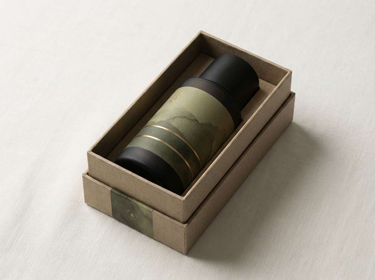
18) Olive Brass Patina
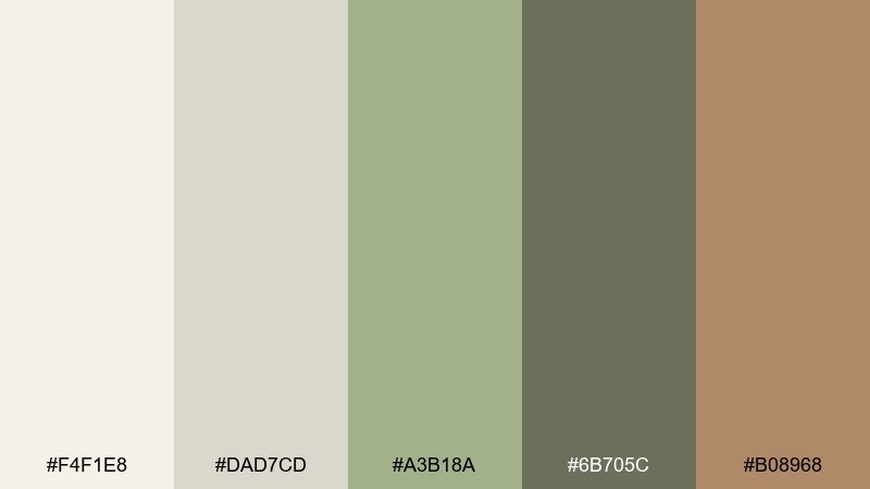
HEX: #F4F1E8 #DAD7CD #A3B18A #6B705C #B08968
Mood: heritage, earthy, sophisticated
Best for: mens grooming packaging and labels
Heritage and earthy, it recalls olive leaves, aged brass, and worn canvas. Use the light bone shades for labels and negative space, then bring olive and moss into patterns or seals. A warm brass accent keeps it premium without going flashy. Tip: limit the brass tone to small highlights so the greens remain the main story.
Image example of olive brass patina generated using media.io
19) Sunset Waterline
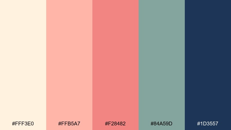
HEX: #FFF3E0 #FFB5A7 #F28482 #84A59D #1D3557
Mood: nostalgic, balanced, coastal
Best for: travel postcards and summer campaign creatives
Nostalgic and balanced, it suggests sunset blush reflected on a calm waterline. These watercolor color combinations work well for travel graphics where you want warmth and coolness to coexist. Use peach as the hero wash, add dusty coral for emphasis, and keep sea green for secondary blocks or stamps. Tip: save the deep navy for small text and tiny borders to prevent it from feeling too formal.
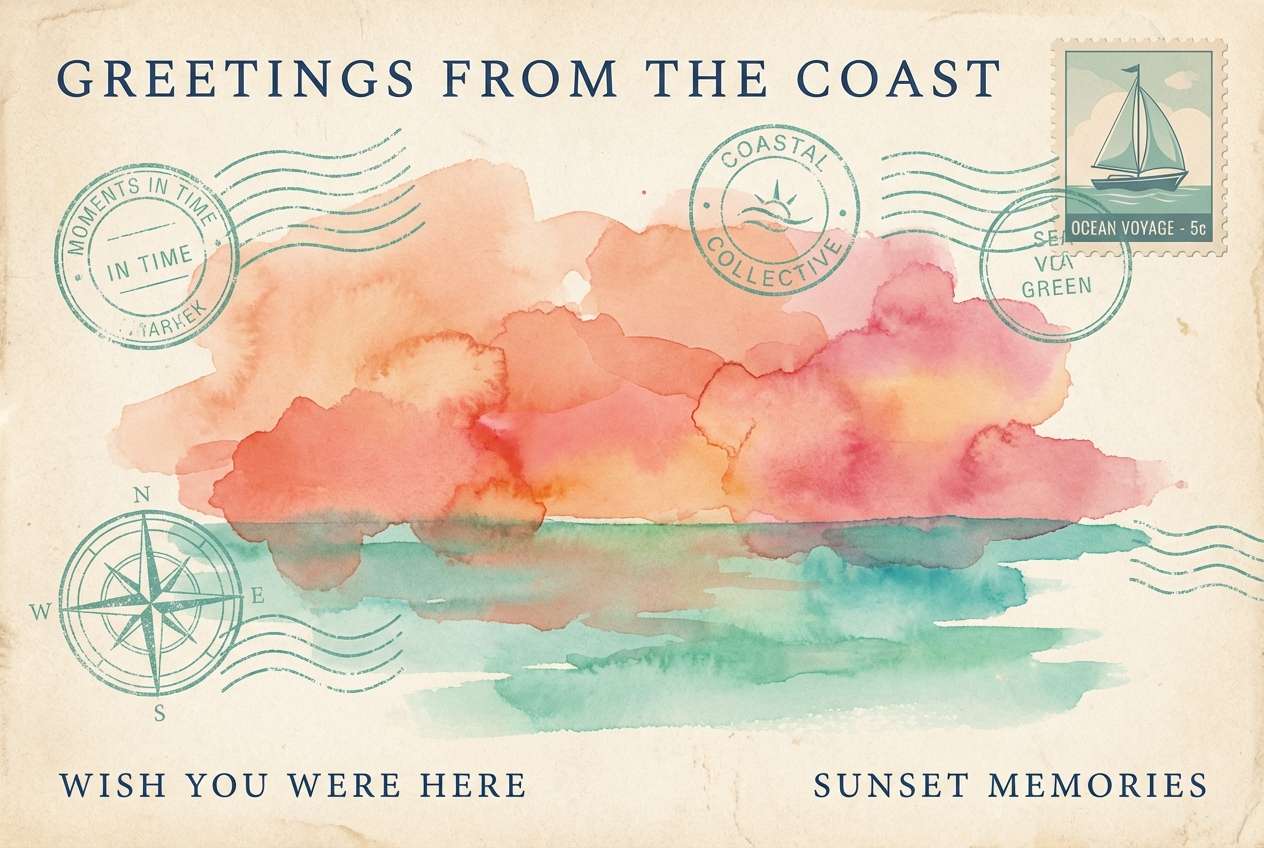
Image example of sunset waterline generated using media.io
20) Monochrome Graphite
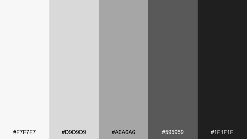
HEX: #F7F7F7 #D9D9D9 #A6A6A6 #595959 #1F1F1F
Mood: minimal, sharp, contemporary
Best for: portfolio websites and typography posters
Minimal and sharp, it looks like graphite dust blended across watercolor paper. Use the light grays for spacious backgrounds, then stack mid gray blocks for rhythm and structure. The darkest tones are ideal for typographic impact and fine-line illustrations. Tip: add a single soft wash texture to keep the monochrome from feeling sterile.
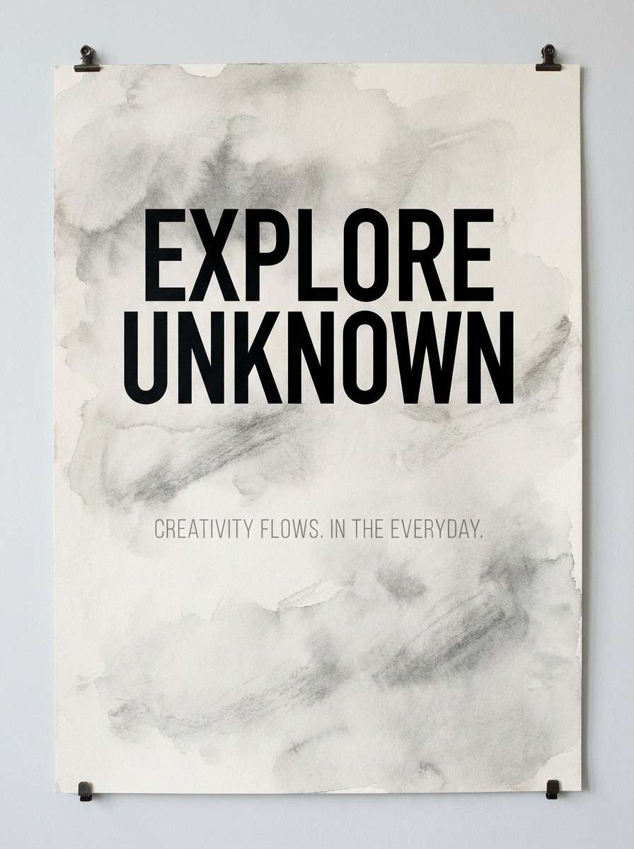
Image example of monochrome graphite generated using media.io
What Colors Go Well with Watercolor?
Watercolor works best with supportive neutrals like warm whites, creams, light grays, and soft charcoals—these shades preserve the “paper” feeling and keep washes from looking overly digital.
For contrast, pick one anchor color (navy, espresso brown, deep plum, or near-black) to carry typography and key UI states. This keeps your layout readable while still letting the watercolor tones feel airy.
Metallic accents (brass, rose gold) and muted complementary hues also pair well—just keep them minimal so the palette stays painterly rather than loud.
How to Use a Watercolor Color Palette in Real Designs
Start by assigning roles: choose 1–2 light washes for backgrounds, 1 mid-tone for sections or shapes, and 1 dark anchor for text. This prevents the common watercolor issue of “everything feels the same softness.”
In UI, keep surfaces very light and use watercolor texture as a subtle overlay, not heavy noise. In print, select uncoated or matte finishes so the colors stay creamy and natural.
When mixing multiple washes, avoid stacking too many mid-tones in the same area. Give the palette room—white space is part of the watercolor look.
Create Watercolor Palette Visuals with AI
If you already have HEX codes, you can turn them into on-brand watercolor visuals by prompting for “soft washes,” “pigment bloom,” and “paper texture” while keeping layouts minimal. This is great for quick mood boards, social posts, invite mockups, and landing hero concepts.
Use a consistent composition (poster, invitation, UI mockup, or packaging label), then swap only the color mood and accent shade. That way your experiments stay comparable and easier to evaluate.
With Media.io, you can generate watercolor-style images fast, iterate prompts, and save the best variations for your design system.
Watercolor Color Palette FAQs
-
What makes a watercolor color palette look “painterly”?
Painterly watercolor palettes rely on soft value transitions, slightly muted saturation, and plenty of light “paper” space. Using one deeper anchor color for contrast helps the washes feel intentional instead of faded. -
Are watercolor palettes good for UI design?
Yes—use very light washes for backgrounds and reserve deeper tones for buttons, active states, and headings. Keep textures subtle so accessibility and clarity remain strong. -
How do I keep watercolor colors from looking muddy?
Avoid layering multiple mid-tones at similar brightness in the same area, and pick a single dark shade for text. In layouts, separate washes with clean margins or light neutrals. -
What neutral colors pair best with watercolor tones?
Warm whites, creams, pale grays, and soft charcoal are the easiest neutrals to pair with watercolor. They preserve the handmade feel while keeping typography readable. -
How many colors should I use from a watercolor palette?
For most designs, 3–5 colors is enough: one background wash, one supporting wash, one accent, and one dark anchor (plus an optional secondary accent). This keeps the composition calm and cohesive. -
Do watercolor palettes print well?
They print best on matte or uncoated stock where subtle transitions don’t become glossy or overly saturated. Adding a thin dark outline around light elements can improve legibility on textured paper. -
Can AI generate watercolor-style palette visuals reliably?
Yes—prompts that mention “watercolor wash,” “pigment bloom,” “soft edges,” and “paper texture” tend to produce consistent results. Iterate by locking the layout type and adjusting only color emphasis and accents.
Next: Shadow Color Palette


