Shadow color palettes sit in the sweet spot between bold contrast and quiet neutrality, making them easy to use across UI, print, and brand systems.
Below are 20 modern shadow-toned palette combos with HEX codes, plus practical pairing tips and AI prompts you can reuse for fast visual mockups.
In this article
Why Shadow Palettes Work So Well
Shadow palettes are built on near-blacks, charcoal grays, and softened accents, so they naturally create hierarchy without feeling loud. You get depth and structure even when layouts stay minimal.
They also translate well across devices and print because they avoid extremes like pure black or ultra-saturated brights. That keeps gradients smoother, typography calmer, and backgrounds more forgiving.
Most importantly, shadow tones make accents look intentional. A single mauve, copper, teal, or olive note can carry brand personality while the neutral base keeps everything cohesive.
20+ Shadow Color Palette Ideas (with HEX Codes)
1) Midnight Veil
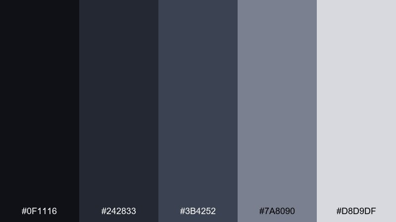
HEX: #0f1116 #242833 #3b4252 #7a8090 #d8d9df
Mood: mysterious, clean, high-contrast
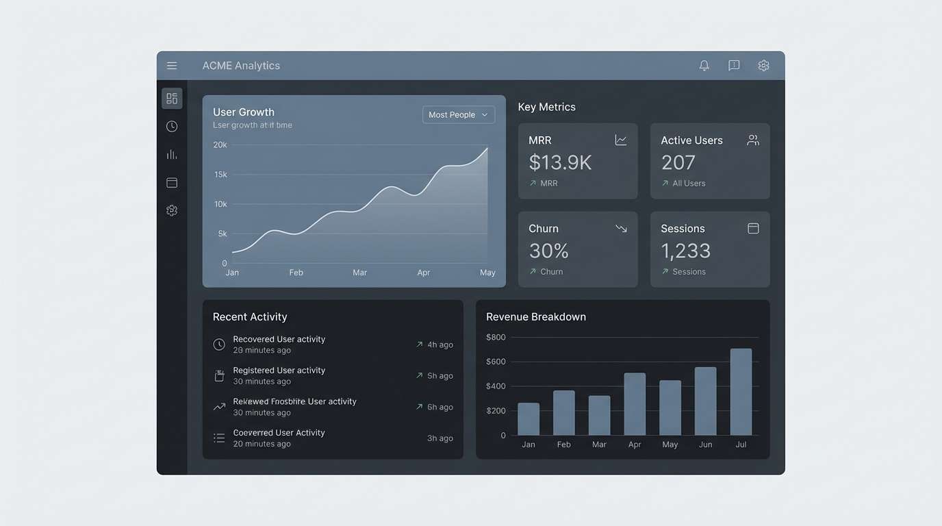
Best for: dark mode SaaS dashboard UI
Mysterious and crisp like city lights cutting through late-night haze. Use it for dark mode layouts where hierarchy matters and text clarity must stay sharp. Pair the deepest charcoal with the pale gray for readability, then use slate as a steady mid-tone for cards and panels. Tip: reserve the lightest shade for key metrics and primary buttons to keep focus tight.
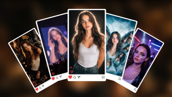
Image example of midnight veil generated using media.io
Media.io is an online AI studio for creating and editing video, image, and audio in your browser.

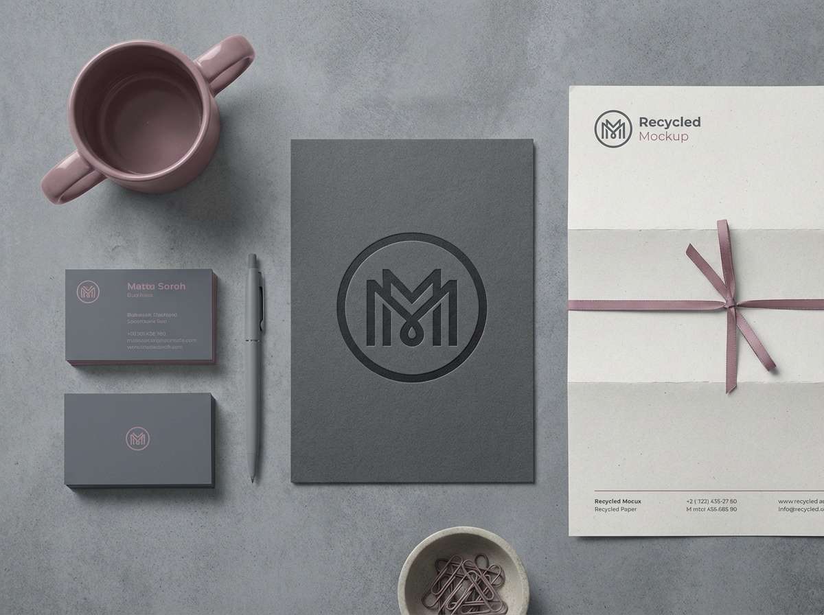
2) Graphite Bloom
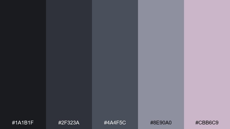
HEX: #1a1b1f #2f323a #4a4f5c #8e90a0 #cbb6c9
Mood: modern, soft, slightly romantic
Best for: beauty brand identity set
Modern and velvety, like graphite dust with a blush of petals. It works beautifully for beauty branding where you want elegance without going fully pastel. Anchor logos and type in deep graphite, then bring the mauve tint in through accents, patterns, or social templates. Tip: keep background areas in cool grays so the rosy note feels intentional, not sugary.
Image example of graphite bloom generated using media.io
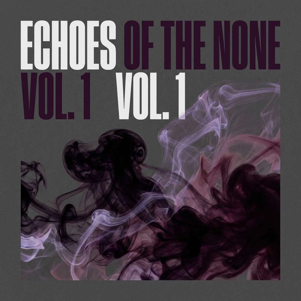
3) Smoke and Mulberry
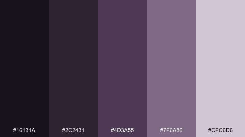
HEX: #16131a #2c2431 #4d3a55 #7f6a86 #cfc6d6
Mood: moody, luxe, creative
Best for: album cover artwork
Moody and luxurious, like incense smoke curling through a velvet room. These tones suit music visuals, indie releases, and cinematic cover art with a dramatic edge. Let mulberry sit on top of near-black for bold typography, and soften the frame with lavender-gray for depth. Tip: add subtle grain to the darkest areas to keep them rich instead of flat.
Image example of smoke and mulberry generated using media.io
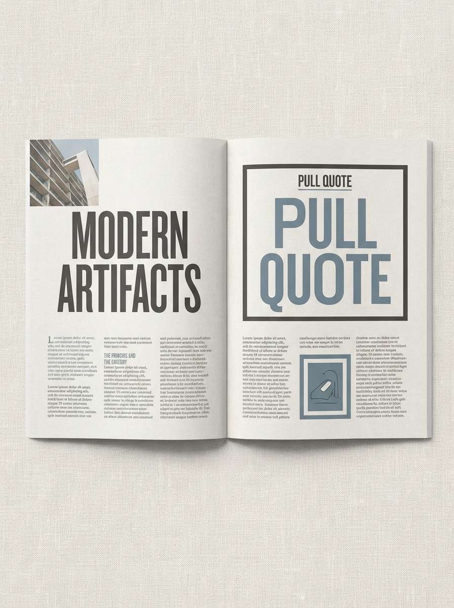
4) Inkstone Linen
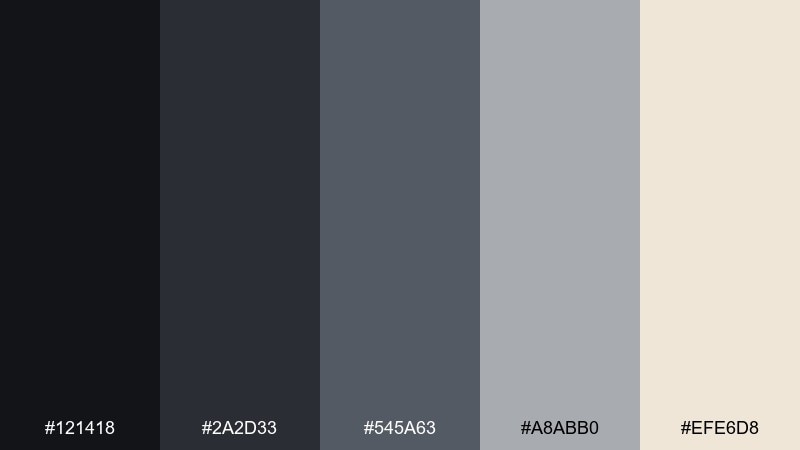
HEX: #121418 #2a2d33 #545a63 #a8abb0 #efe6d8
Mood: editorial, grounded, timeless
Best for: magazine feature layout
Grounded and editorial, like ink pressed into textured linen. These shadow color combinations are ideal for long-form reading where contrast is calm, not harsh. Use the warm linen tone for margins and negative space, then build structure with charcoal rules and slate subheads. Tip: keep body text in the mid-dark gray to reduce eye strain across dense pages.
Image example of inkstone linen generated using media.io
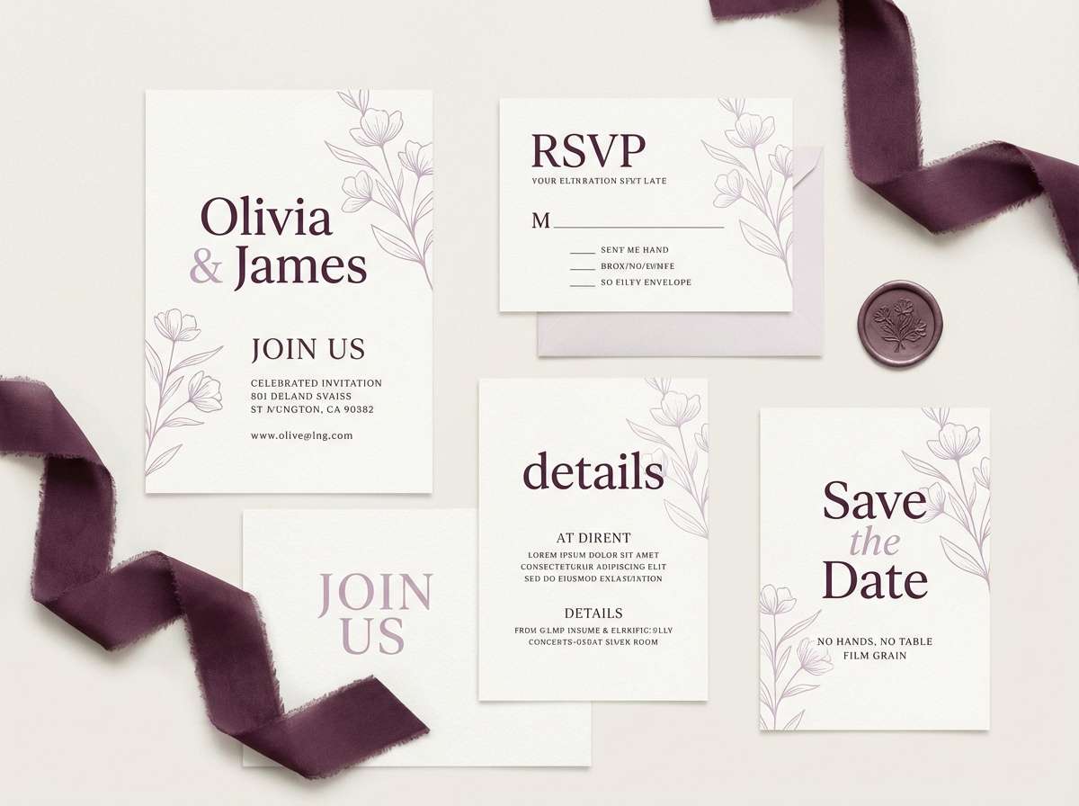
5) Dusk Orchid
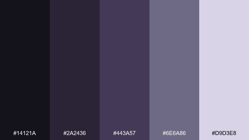
HEX: #14121a #2a2436 #443a57 #6e6a86 #d9d3e8
Mood: dreamy, elegant, subdued
Best for: wedding invitation suite
Dreamy and elegant, like orchids dimly lit at twilight. It fits invitations that want romance without bright florals, especially for evening events. Pair the darkest purple with soft lilac for type and monograms, then use the grayer tones for borders and fine details. Tip: print on uncoated stock so the deep shades stay soft rather than glossy.
Image example of dusk orchid generated using media.io
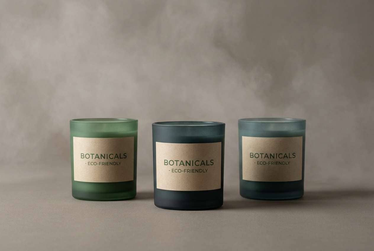
6) Fogbound Pine
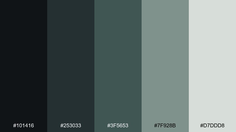
HEX: #101416 #253033 #3f5653 #7f928b #d7ddd8
Mood: quiet, outdoorsy, balanced
Best for: eco product packaging
Quiet and outdoorsy, like pine needles disappearing into morning fog. It works well for eco packaging where you want natural cues without going bright green. Use the deep teal-charcoal for labels, then bring in the pale mist tone for whitespace and ingredient blocks. Tip: add a matte finish so the darker inks feel earthy and premium.
Image example of fogbound pine generated using media.io
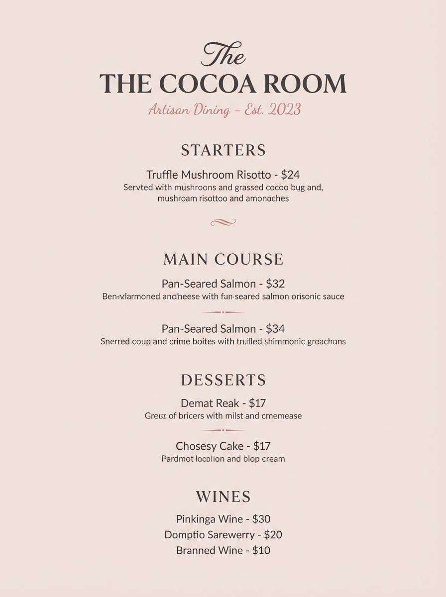
7) Cinder Rose
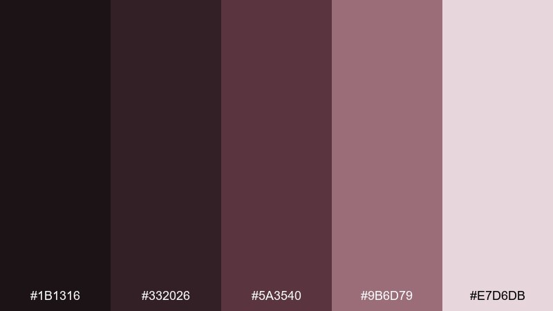
HEX: #1b1316 #332026 #5a3540 #9b6d79 #e7d6db
Mood: smoky, warm, intimate
Best for: restaurant menu design
Smoky and warm, like embers glowing under rose-tinted ash. These tones suit menus and hospitality design where you want intimacy and appetite appeal without loud colors. Set headings in the darkest shade, then use dusty rose for section dividers and callouts. Tip: keep the lightest pink-beige for paper or background areas to avoid a heavy overall feel.
Image example of cinder rose generated using media.io
8) Shadow Harbor
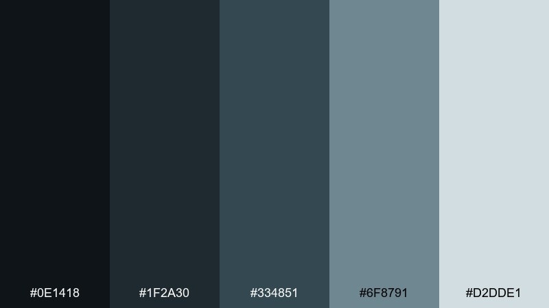
HEX: #0e1418 #1f2a30 #334851 #6f8791 #d2dde1
Mood: cool, nautical, professional
Best for: finance landing page UI
Cool and steady, like a harbor at dusk with steel-blue water. It fits finance and consulting pages that need trust, structure, and a modern edge. Use the dark blue-black for headers and hero areas, then layer in muted blues for cards and charts. Tip: keep calls to action in the lightest shade with dark text for a calm, confident click path.
Image example of shadow harbor generated using media.io

9) Quiet Obsidian
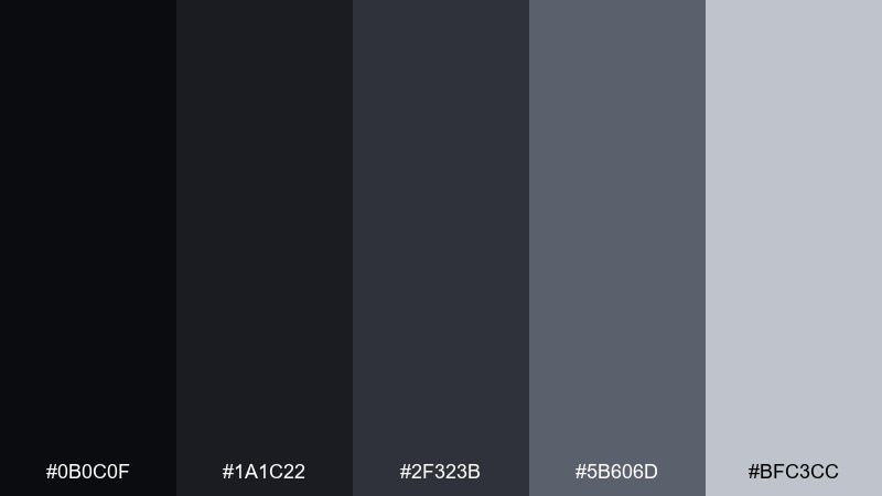
HEX: #0b0c0f #1a1c22 #2f323b #5b606d #bfc3cc
Mood: minimal, focused, premium
Best for: photography portfolio website
Minimal and focused, like obsidian polished to a soft sheen. Use it for portfolios where the work should lead and the interface stays nearly invisible. Build layers with subtle gray steps so galleries, captions, and navigation feel intentional. Tip: avoid pure black for large areas and lean on the near-black tone to preserve detail on different screens.
Image example of quiet obsidian generated using media.io
10) Slate Lavender
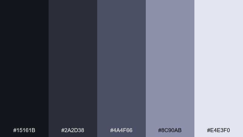
HEX: #15161b #2a2d38 #4a4f66 #8c90ab #e4e3f0
Mood: calm, techy, approachable
Best for: health app onboarding screens
Calm and approachable, like lavender mist over cool slate. These hues work well for health or habit apps where reassurance matters more than intensity. Use slate for primary UI surfaces, then sprinkle lavender into icons and progress states. Tip: keep contrast consistent by using the pale tone for background panels and the darkest tone for key labels.
Image example of slate lavender generated using media.io

11) Coal and Clay
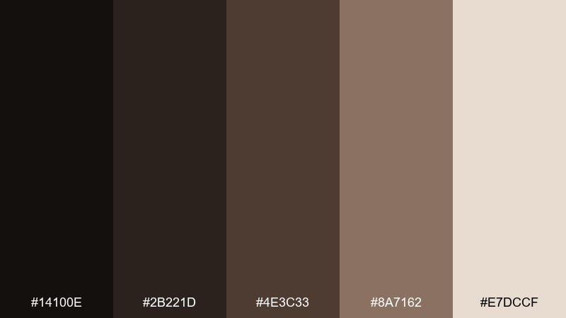
HEX: #14100e #2b221d #4e3c33 #8a7162 #e7dccf
Mood: earthy, tactile, rustic
Best for: ceramic studio branding
Earthy and tactile, like coal dust on warm clay. It suits makers, pottery studios, and craft labels that want honest materials and a grounded feel. Let deep brown-black handle logos and stamps, while clay beige carries packaging backgrounds and receipts. Tip: add a single textured pattern using the mid-brown to suggest handmade surfaces without overwhelming the design.
Image example of coal and clay generated using media.io
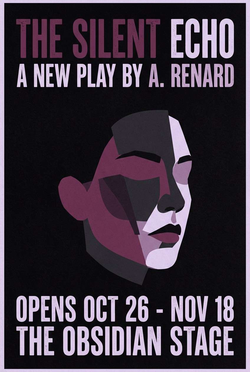
12) Stormy Plum
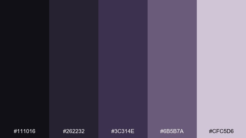
HEX: #111016 #262232 #3c314e #6b5b7a #cfc5d6
Mood: dramatic, artistic, refined
Best for: theater poster design
Dramatic and refined, like storm clouds rolling over plum velvet curtains. These shadow color combinations shine on posters where you need depth, contrast, and a sense of anticipation. Use the near-black for the background, then place plum typography and soft lavender accents to guide the eye. Tip: keep one strong focal element and let the dark space do the heavy lifting.
Image example of stormy plum generated using media.io
13) Ashen Olive
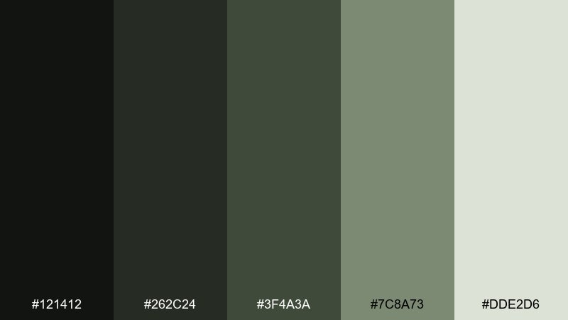
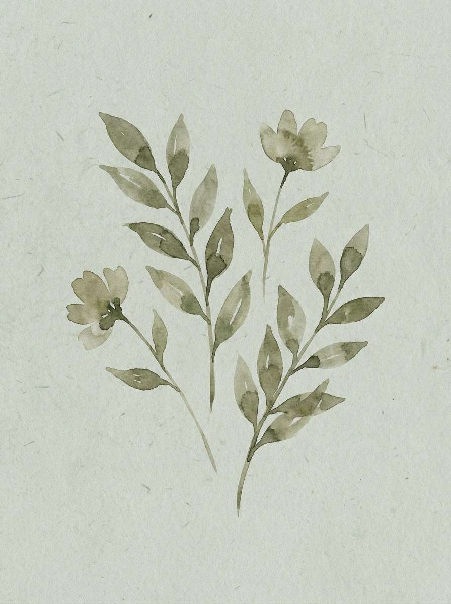
HEX: #121412 #262c24 #3f4a3a #7c8a73 #dde2d6
Mood: muted, natural, calming
Best for: botanical watercolor print
Muted and calming, like olive leaves dried in shade. It is a strong fit for botanical art, wellness prints, and nature-forward stationery. Keep the pale gray-green as paper tone, then build foliage shapes with the mid olive and deep moss. Tip: use soft edges and transparent washes so the palette stays airy rather than military.
Image example of ashen olive generated using media.io
14) Phantom Teal
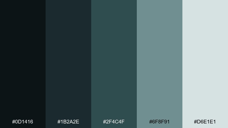
HEX: #0d1416 #1b2a2e #2f4c4f #6f8f91 #d6e1e1
Mood: sleek, cool, futuristic
Best for: cybersecurity product ad
Sleek and cool, like teal light reflecting off dark glass. It works for cybersecurity ads that need a modern, technical mood without neon overload. Use deep teal for background blocks and the pale aqua-gray for highlights, badges, and icon strokes. Tip: keep gradients subtle and confine brighter tones to small signals such as status indicators.
Image example of phantom teal generated using media.io

15) Moonlit Cocoa
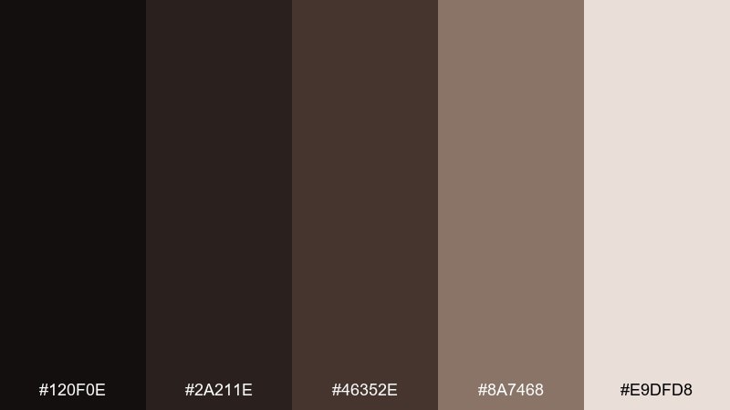
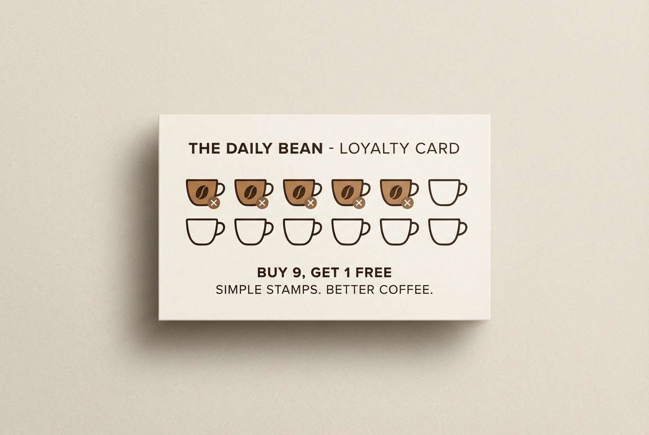
HEX: #120f0e #2a211e #46352e #8a7468 #e9dfd8
Mood: cozy, warm, upscale
Best for: coffee shop loyalty card
Cozy and upscale, like cocoa steam in dim café light. These warm neutrals are perfect for coffee branding, loyalty cards, and small packaging that should feel inviting. Use the darkest espresso tone for type and stamps, then balance it with creamy beige backgrounds and soft brown accents. Tip: add a thin border in the mid-brown to frame the design without making it feel heavy.
Image example of moonlit cocoa generated using media.io
16) Iron Lilac
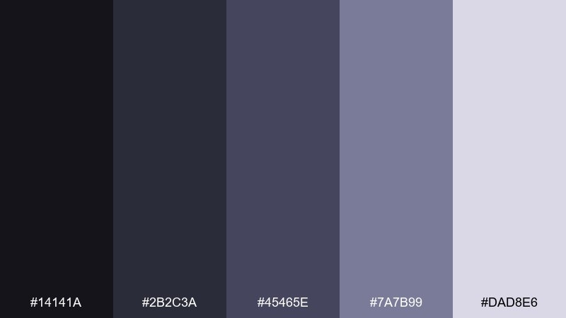
HEX: #14141a #2b2c3a #45465e #7a7b99 #dad8e6
Mood: industrial, soft, contemporary
Best for: architecture studio website
Industrial yet softened, like iron beams under lilac evening light. It is a confident fit for architecture or interior studios that want technical precision with a human touch. Let the darkest tones handle navigation and headlines, while lilac-gray supports grids, captions, and project tags. Tip: keep plenty of whitespace so the subtle purple reads as refined, not decorative.
Image example of iron lilac generated using media.io
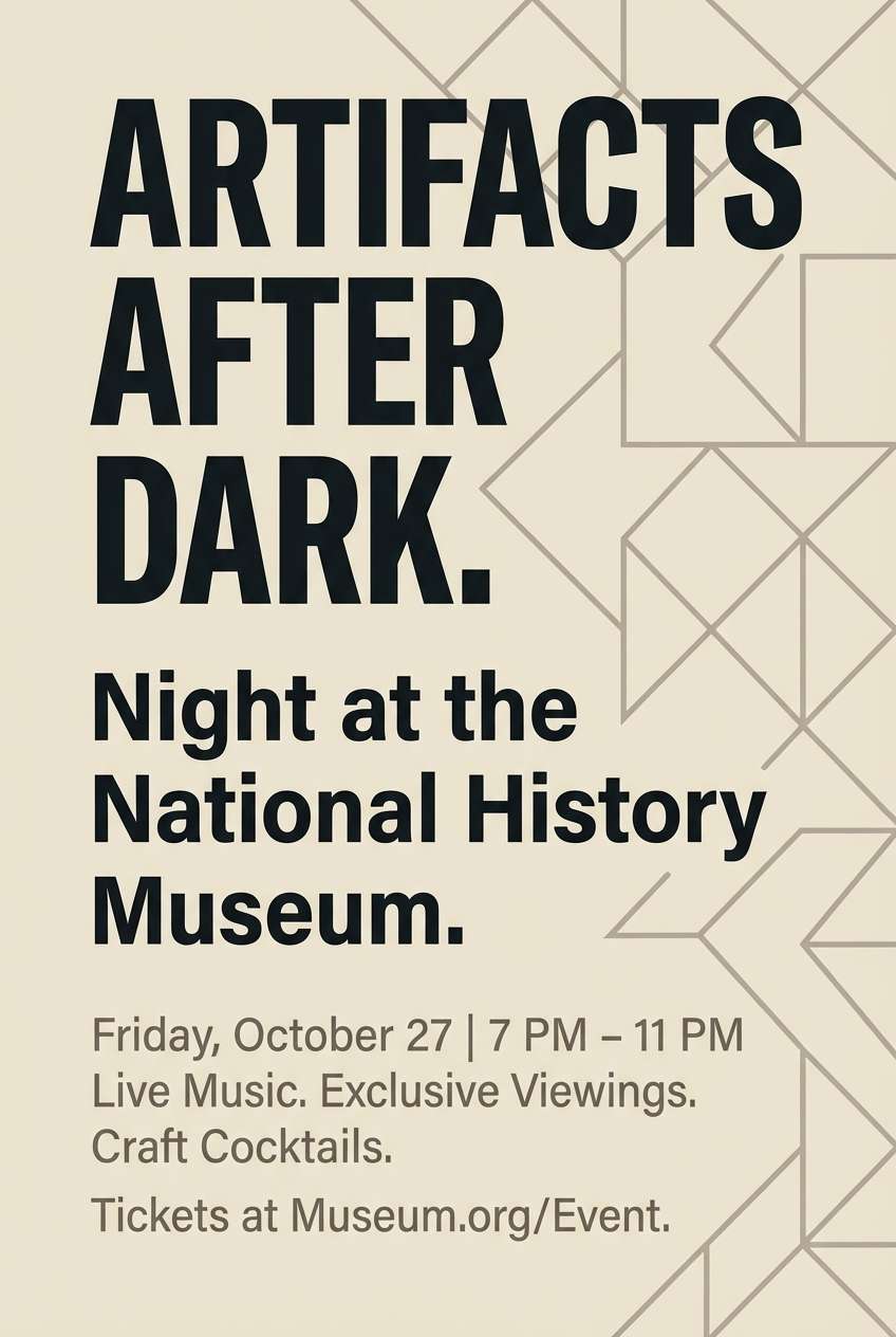
17) Sooty Sandstone
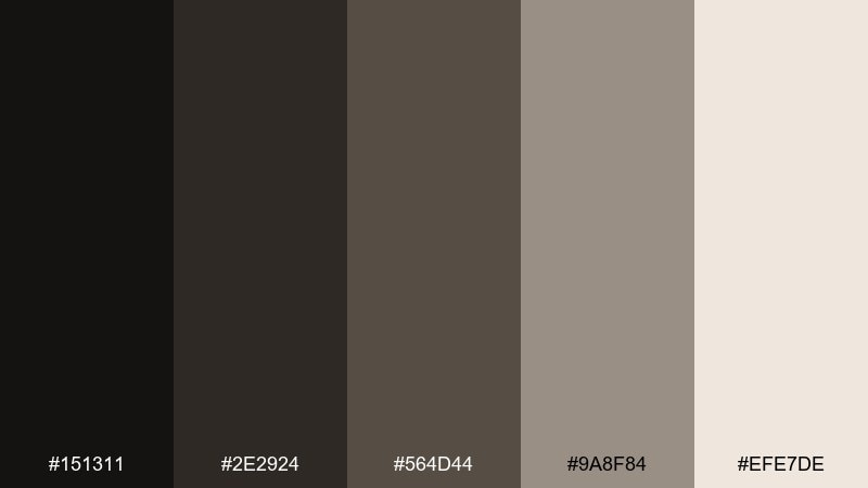
HEX: #151311 #2e2924 #564d44 #9a8f84 #efe7de
Mood: heritage, natural, understated
Best for: museum flyer design
Heritage and understated, like soot settling on old sandstone walls. The mix suits museums and cultural events that want credibility and warmth in the same breath. Use the dark brown-gray for titles and dates, then layer sandy neutrals for backgrounds and information blocks. Tip: choose one serif and one sans font pairing to echo the old-meets-new tone.
Image example of sooty sandstone generated using media.io
18) Ravenberry
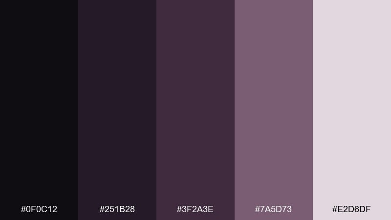
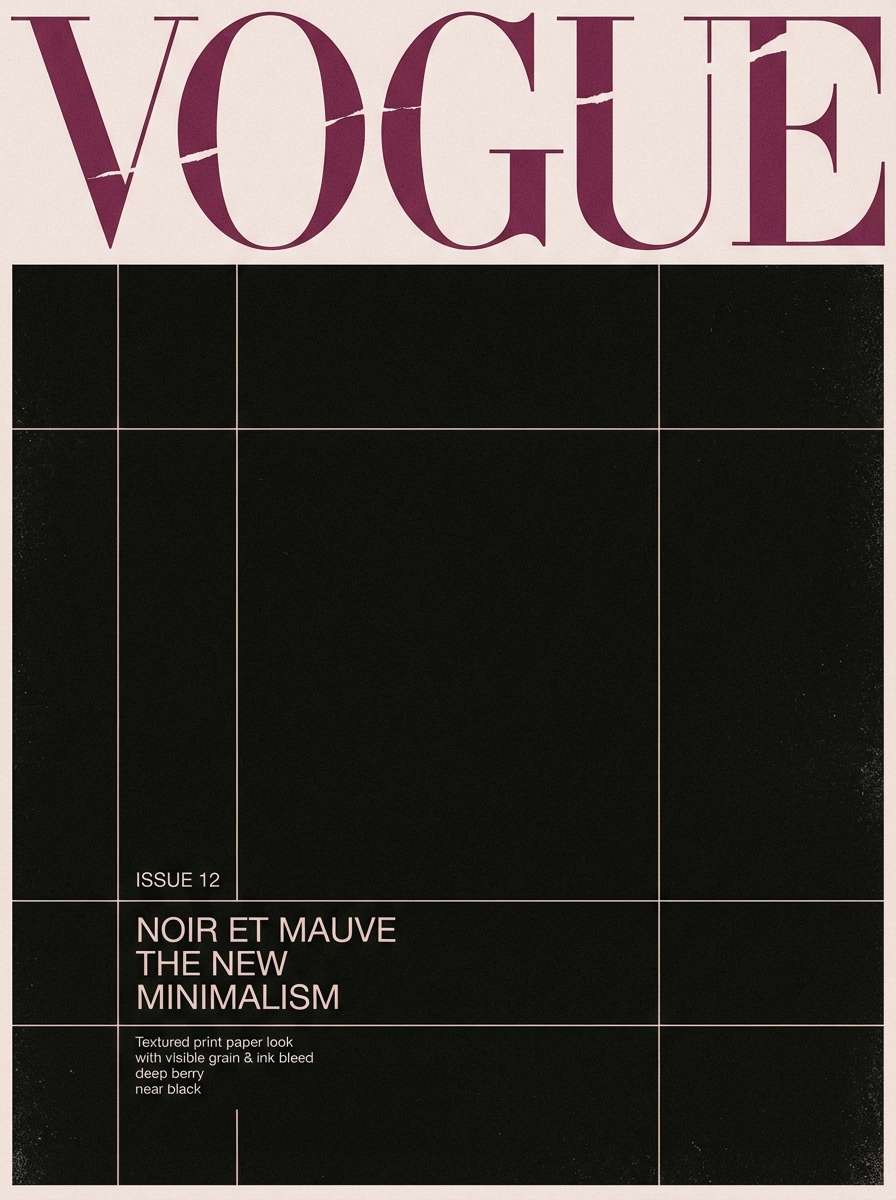
HEX: #0f0c12 #251b28 #3f2a3e #7a5d73 #e2d6df
Mood: enigmatic, bold, stylish
Best for: fashion editorial cover
Enigmatic and stylish, like dark berries under raven feathers. It is made for fashion editorials that lean dramatic but still feel refined on print. Set the cover background in near-black, then bring berry mauve into headlines and thin rules for a luxe finish. Tip: keep accent elements small and intentional so the darker tones stay dominant.
Image example of ravenberry generated using media.io
19) Misty Charcoal
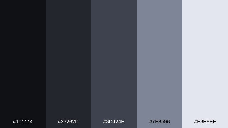
HEX: #101114 #23262d #3d424e #7e8596 #e3e6ee
Mood: neutral, airy, dependable
Best for: presentation slide deck
Neutral and airy, like charcoal softened by coastal mist. It is a safe, modern choice for slide decks where charts, numbers, and headings need consistent clarity. Use mid charcoal for body text, the pale tint for canvases, and the darker tones for section dividers. Tip: apply the lightest shade as a subtle panel behind key data to improve scan speed.
Image example of misty charcoal generated using media.io
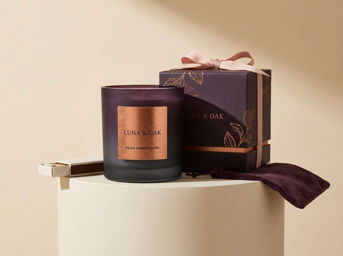
20) Nocturne Copper
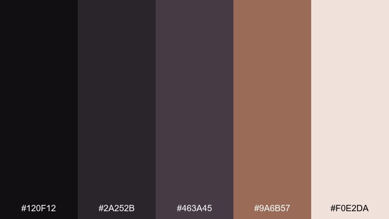
HEX: #120f12 #2a252b #463a45 #9a6b57 #f0e2da
Mood: moody, warm, premium
Best for: luxury candle packaging
Moody and premium, like copper catching light in a dark room. This shadow color palette is perfect for luxury candles, fragrance labels, and gift boxes that need warmth without brightness. Use the copper tone sparingly on foil-stamped details, then rely on deep plum-charcoal for the main label structure. Tip: keep the background light and creamy to make metallic accents feel intentional and expensive.
Image example of nocturne copper generated using media.io
What Colors Go Well with Shadow?
Shadow tones pair best with softened lights (misty whites, linen beiges, pale lilacs) because they maintain readability without the harsh jump of pure white. This makes UI surfaces and editorial pages feel smoother.
For accents, choose one restrained hue that can repeat across components: mauve, copper, slate-blue, muted teal, or ashen olive. When the base is dark-neutral, even a low-saturation accent reads as deliberate.
If you need more energy, add a single “signal” color in small doses (buttons, badges, chart highlights). Keep it controlled so the palette stays shadow-forward rather than turning into a full high-saturation scheme.
How to Use a Shadow Color Palette in Real Designs
Start with role-based mapping: darkest for headers/footers, mid-dark for primary surfaces, mid for borders and secondary panels, and the lightest tint for cards, modals, or key data backgrounds.
In branding, keep logos and typography anchored in the deepest neutral, then let the accent show up in packaging trims, social templates, or foil/spot details. Shadow palettes feel premium when repetition is consistent.
For editorial layouts, avoid overusing the darkest tone on large blocks. A near-black base with warm off-white margins often reads more refined and prints more reliably.
Create Shadow Palette Visuals with AI
If you already have HEX codes, the fastest way to validate a shadow palette is to generate realistic mockups (UI screens, posters, packaging) before you design everything by hand. You can quickly test whether contrast, mood, and accent balance feel right.
Reuse the prompts above, swap in your concept (brand type, layout, subject), and keep the palette direction consistent (charcoal, slate, muted accents). This is especially helpful for pitch decks and early brand exploration.
With Media.io, you can generate multiple variations in minutes, then refine the prompt to steer lighting, texture, and composition while keeping the shadow tone intact.
Shadow Color Palette FAQs
-
What is a shadow color palette?
A shadow color palette is a set of dark neutrals (near-black, charcoal, slate) plus a few muted mid-tones and light tints, designed to create depth and hierarchy without relying on bright saturation. -
Is shadow the same as black and gray?
Not exactly. Shadow palettes usually avoid pure black and include colored neutrals (blue-charcoal, plum-charcoal, teal-charcoal) plus soft highlights so designs feel dimensional instead of flat. -
Are shadow palettes good for dark mode UI?
Yes—shadow tones are ideal for dark mode because they provide multiple “steps” of gray for surfaces and borders, making it easier to separate cards, panels, and navigation while keeping text readable. -
How do I pick an accent color for a shadow palette?
Choose one muted accent (like mauve, copper, olive, or teal) and use it sparingly for emphasis. In shadow palettes, small accent areas go a long way, especially for CTAs and key highlights. -
What background works best with shadow tones in print?
Warm off-whites (linen, sandstone, blush-beige) often print more elegantly than stark white and help dark inks feel softer. They also reduce contrast fatigue in long-form layouts. -
How can I keep shadow designs from looking too heavy?
Increase spacing and whitespace, use the lightest tint for large areas (cards, margins), and reserve the deepest shade for anchors like titles, nav, or hero sections rather than full-page fills. -
Can I generate shadow palette mockups with AI?
Yes. Use a consistent prompt style (layout + lighting + “dominant charcoal/slate tones with muted accent”) and iterate variations to test mood, contrast, and where your highlight color should appear.
