

Warm color palettes bring instant energy, comfort, and approachability to any design—from branding and packaging to UI and posters.
Below are 20 warm color combinations with HEX codes, plus practical tips and AI prompts you can reuse to generate matching visuals fast.
In this article
Why Warm Color Combinations Work So Well
Warm tones—reds, oranges, ambers, peaches, and terracottas—are closely tied to sunlight, firelight, and natural materials, so they feel instantly human and inviting.
They also create clear hierarchy fast: a bright warm accent can pull attention to CTAs, headlines, and highlights, while deeper browns and wines add weight for readability and contrast.
When balanced with creamy off-whites and soft neutrals, warm palettes stay modern (not overwhelming) and translate beautifully across print, web, and packaging.
20+ Warm Color Palette Ideas (with HEX Codes)
1) Saffron Sunset
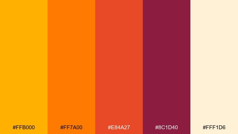
HEX: #FFB000 #FF7A00 #E84A27 #8C1D40 #FFF1D6
Mood: radiant and festive
Best for: summer event poster design
Radiant and festive, this warm color scheme feels like late sun hitting city walls and turning everything golden. Use the bright saffron and tangerine as headline colors, then ground the layout with the deep berry tone for contrast. Cream works best as breathing room so the hot hues do not overwhelm. Tip: keep body text in the darker shades and reserve the brightest orange for calls to action.
Image example of saffron sunset generated using media.io

Media.io is an online AI studio for creating and editing video, image, and audio in your browser.

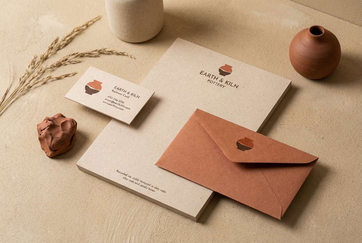
2) Terracotta Glow
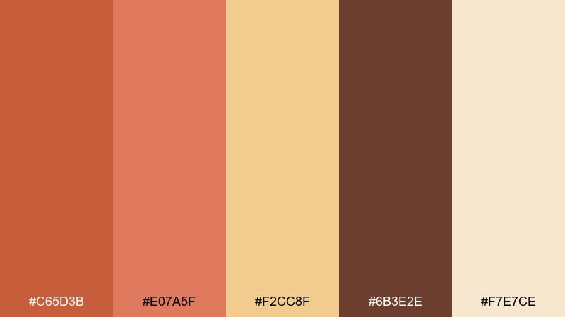
HEX: #C65D3B #E07A5F #F2CC8F #6B3E2E #F7E7CE
Mood: earthy and handcrafted
Best for: pottery studio branding kit
Earthy and handcrafted, these warm tones evoke fired clay, sun-warmed stucco, and a cozy workshop. Lean on terracotta and cocoa brown for logos, then use the sandy beige for stationery backgrounds. The softer peach helps transitions between blocks of color without feeling harsh. Tip: try a single-color mark in dark brown and let the lighter tones carry the rest of the system.
Image example of terracotta glow generated using media.io
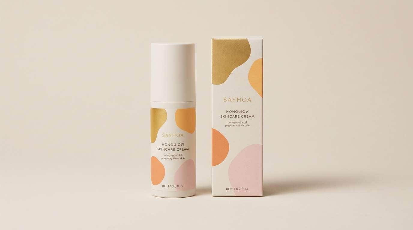
3) Honeyed Apricot
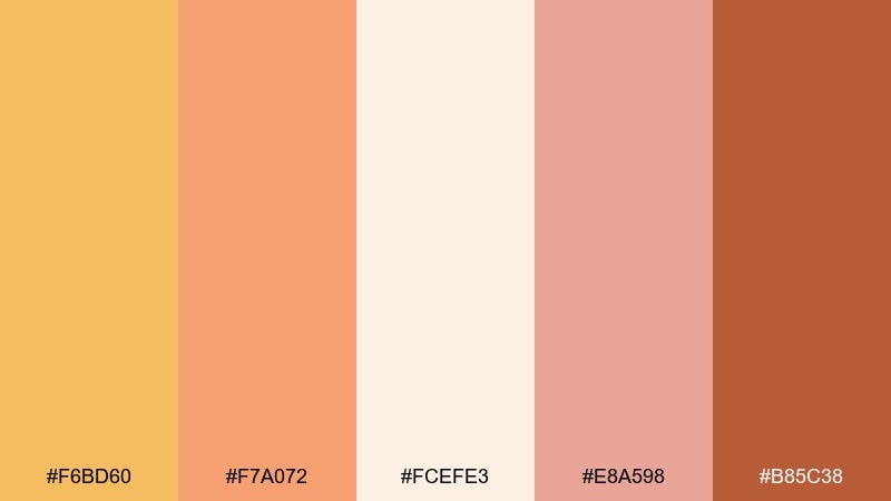
HEX: #F6BD60 #F7A072 #FCEFE3 #E8A598 #B85C38
Mood: sweet and sunlit
Best for: skincare product ad creative
Sweet and sunlit, it brings to mind apricot nectar, soft blush, and golden highlights on skin. These warm color combinations work especially well when you keep the background creamy and let apricot carry the hero area. Add the toasted brown for product names and small details so the palette stays premium. Tip: use gentle gradients between the peach and honey tones for a smoother, more luxe feel.
Image example of honeyed apricot generated using media.io
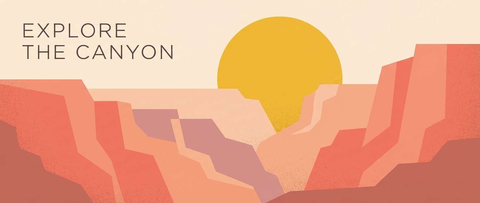
4) Coral Canyon
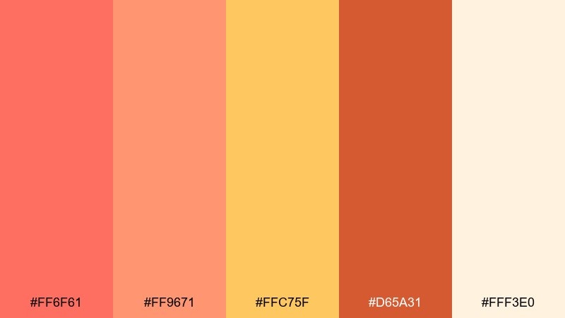
HEX: #FF6F61 #FF9671 #FFC75F #D65A31 #FFF3E0
Mood: adventurous and bright
Best for: travel blog hero banner
Adventurous and bright, this warm color palette feels like coral rock, dusty trails, and a sherbet sky at dusk. Use the coral as the focal color for buttons or headlines, then layer in mango and peach for depth. Cream keeps the composition airy and stops the oranges from becoming too heavy. Tip: pair with a clean sans-serif and plenty of negative space for a modern travel vibe.
Image example of coral canyon generated using media.io
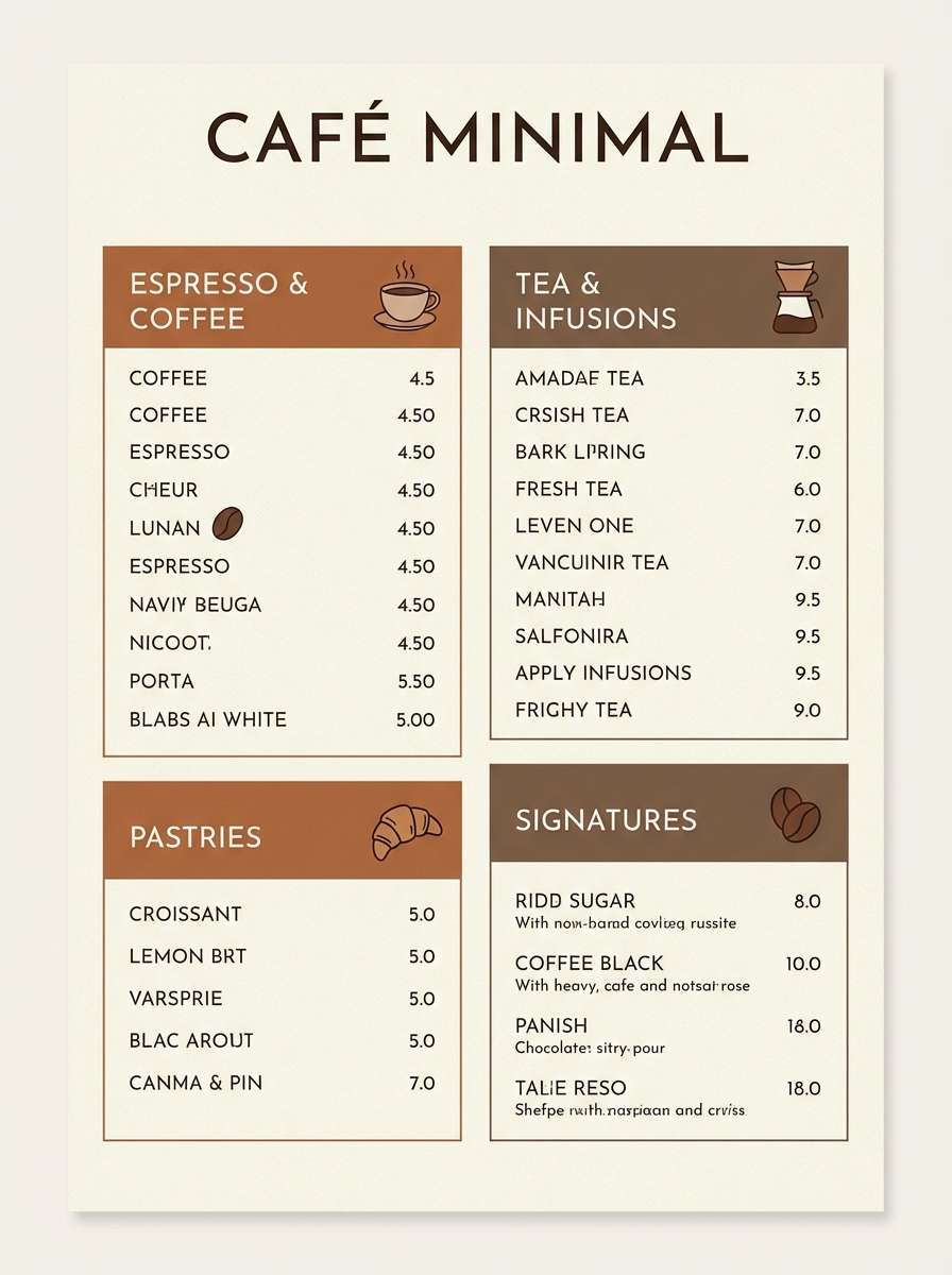
5) Cinnamon Latte
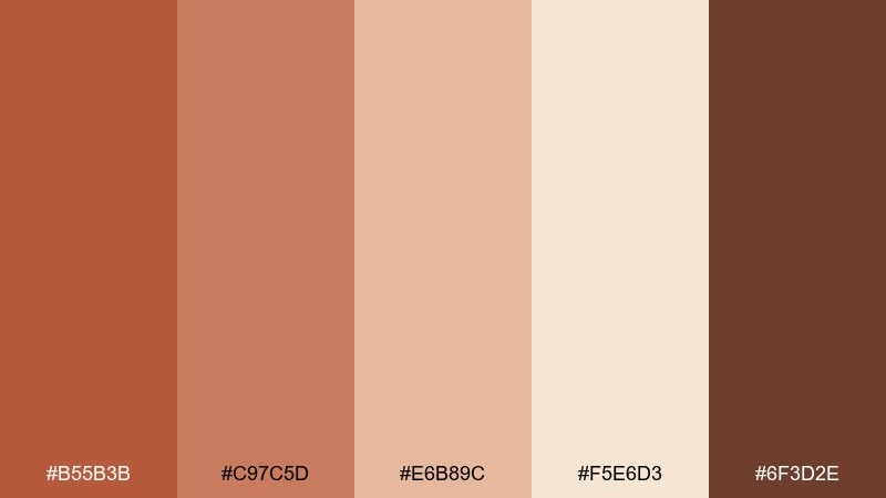
HEX: #B55B3B #C97C5D #E6B89C #F5E6D3 #6F3D2E
Mood: cozy and café-like
Best for: coffee shop menu layout
Cozy and café-like, these browns and creams echo cinnamon dust, steamed milk, and toasted pastries. Use the cream as the menu base, with cinnamon and mocha for section headers and pricing. The lighter tan is great for dividers or highlight boxes without adding clutter. Tip: keep iconography in the darkest brown so it stays legible even on warm paper textures.
Image example of cinnamon latte generated using media.io
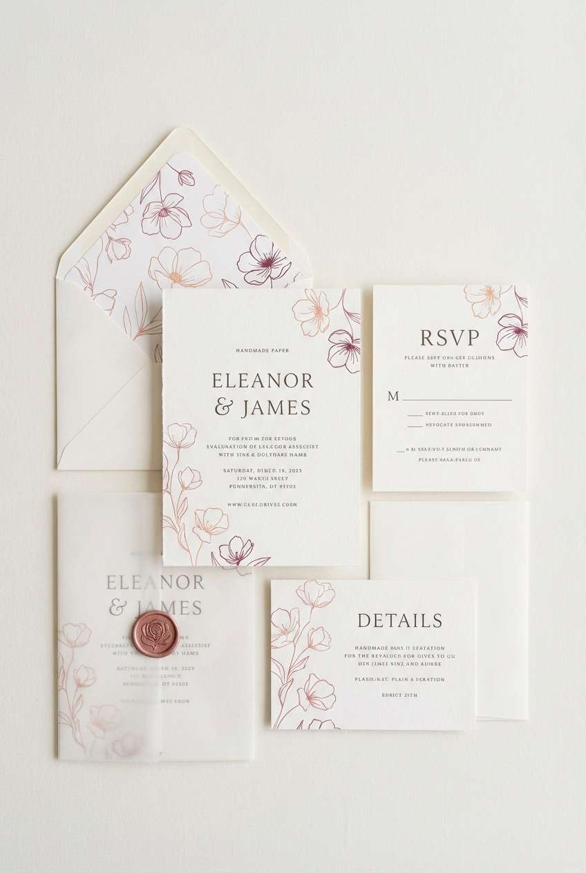
6) Peach Sorbet
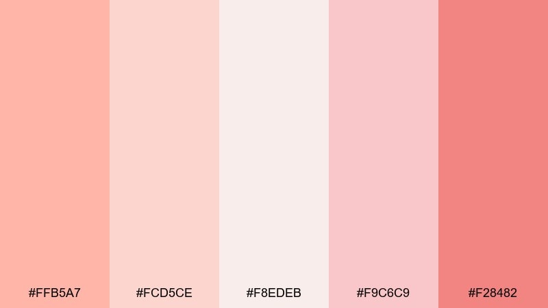
HEX: #FFB5A7 #FCD5CE #F8EDEB #F9C6C9 #F28482
Mood: romantic and airy
Best for: wedding invitation suite
Romantic and airy, this warm color scheme reads like soft petals, blush fabric, and a pastel dessert table. Let the palest tint carry the background while the deeper rose adds emphasis to names and dates. For a refined look, keep decorative flourishes thin and avoid heavy borders. Tip: print the darkest shade as foil or letterpress for a subtle but elevated finish.
Image example of peach sorbet generated using media.io
7) Ember Spice
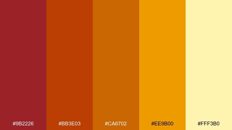
HEX: #9B2226 #BB3E03 #CA6702 #EE9B00 #FFF3B0
Mood: bold and fiery
Best for: album cover graphic
Bold and fiery, this warm color palette suggests glowing embers, chili heat, and stage lights cutting through smoke. Use the deep red for the main title block and let ember orange punch through as highlights. The pale butter tone is perfect for small type and subtle texture overlays. Tip: add a grainy gradient from red to orange to make the design feel loud without adding extra elements.
Image example of ember spice generated using media.io

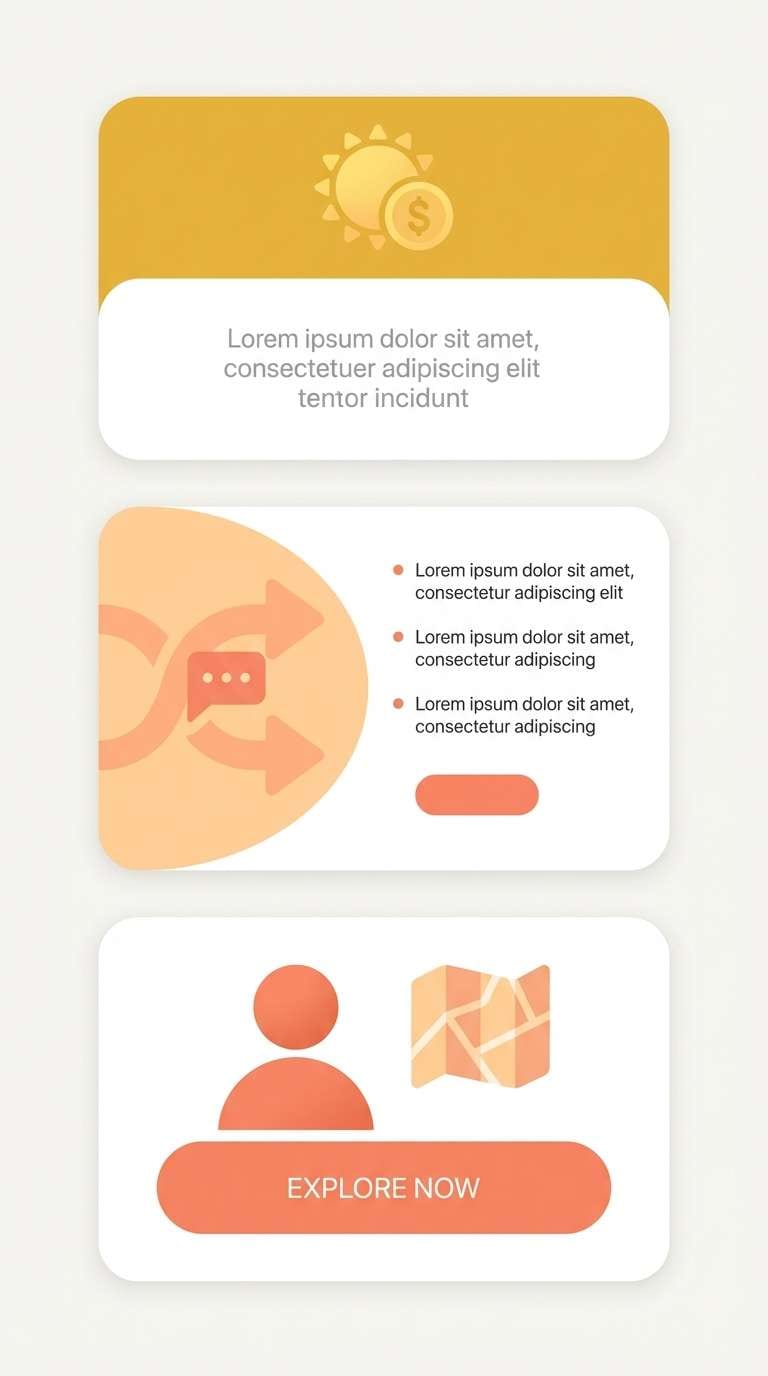
8) Golden Hour
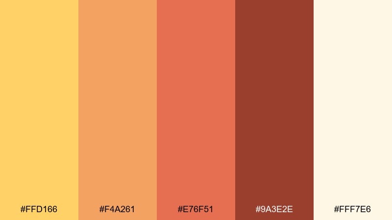
HEX: #FFD166 #F4A261 #E76F51 #9A3E2E #FFF7E6
Mood: optimistic and cinematic
Best for: mobile app onboarding screens
Optimistic and cinematic, it feels like a lens flare over warm rooftops right before sunset. As a warm color scheme, it shines when you keep screens light and use coral for primary buttons. The dark cocoa tone helps with headings and accessibility-friendly contrast. Tip: reserve the brightest yellow for small moments like progress dots or success states so it stays special.
Image example of golden hour generated using media.io
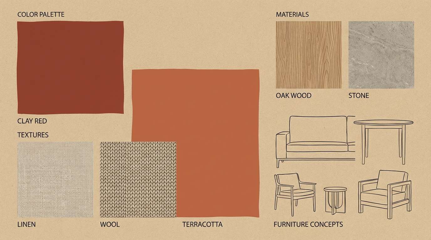
9) Desert Clay
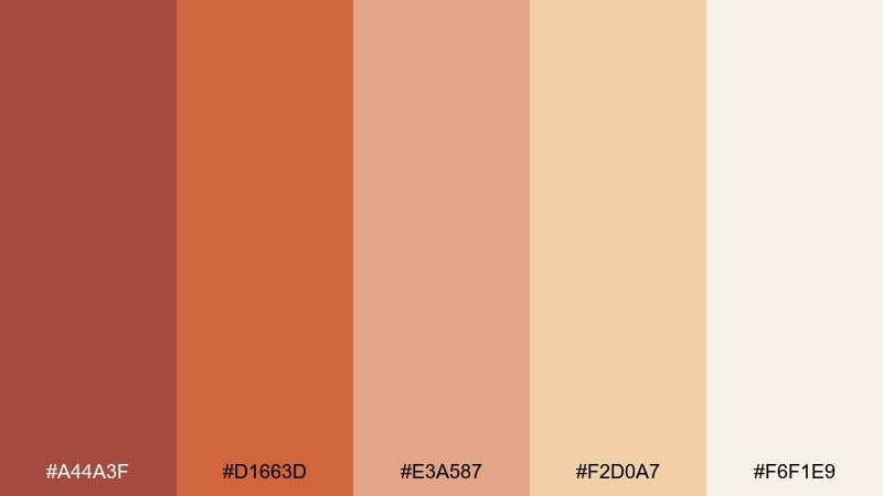
HEX: #A44A3F #D1663D #E3A587 #F2D0A7 #F6F1E9
Mood: sunbaked and calm
Best for: interior design moodboard slide
Sunbaked and calm, it recalls adobe walls, linen throws, and dust-soft light. Use clay and rust for key swatches or headings, then let the sandy neutrals hold most of the space. The pale off-white keeps the palette breathable and modern. Tip: combine with natural textures like rattan, oak, and matte plaster finishes for a cohesive look.
Image example of desert clay generated using media.io
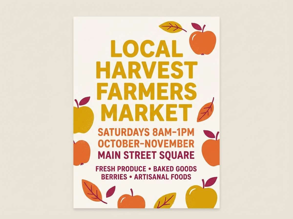
10) Autumn Orchard
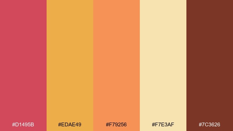
HEX: #D1495B #EDAE49 #F79256 #F7E3AF #7C3626
Mood: playful and seasonal
Best for: farmers market flyer
Playful and seasonal, this warm color palette feels like apple skins, spiced cider, and market crates at harvest. The golden tone makes an inviting backdrop for headlines, while the berry red grabs attention for dates and locations. Use the deep brown for small text so it stays readable on lighter blocks. Tip: add simple fruit icons in a single color to keep the flyer crisp and not overly rustic.
Image example of autumn orchard generated using media.io
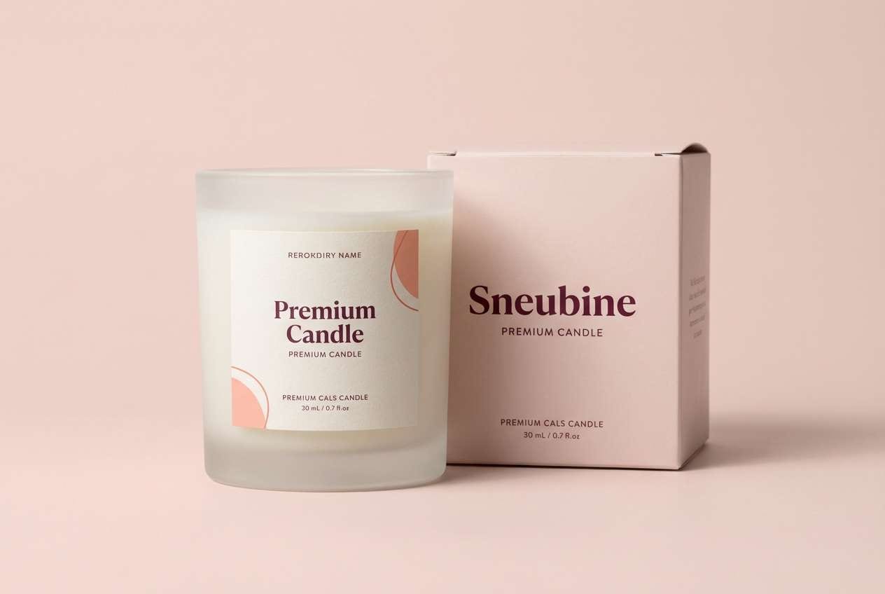
11) Rosewood Blush
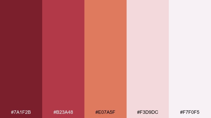
HEX: #7A1F2B #B23A48 #E07A5F #F3D9DC #F7F0F5
Mood: luxurious and intimate
Best for: boutique candle packaging
Luxurious and intimate, it reads like rosewood furniture, velvet ribbons, and a soft blush glow. Use the deep wine shade for the brand mark and keep the label background very pale for contrast. Coral works nicely for scent variants or small seals without turning the design loud. Tip: choose matte finishes and minimal type to let the dark red feel rich instead of heavy.
Image example of rosewood blush generated using media.io
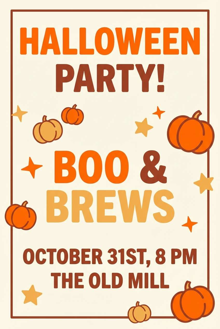
12) Pumpkin Patch
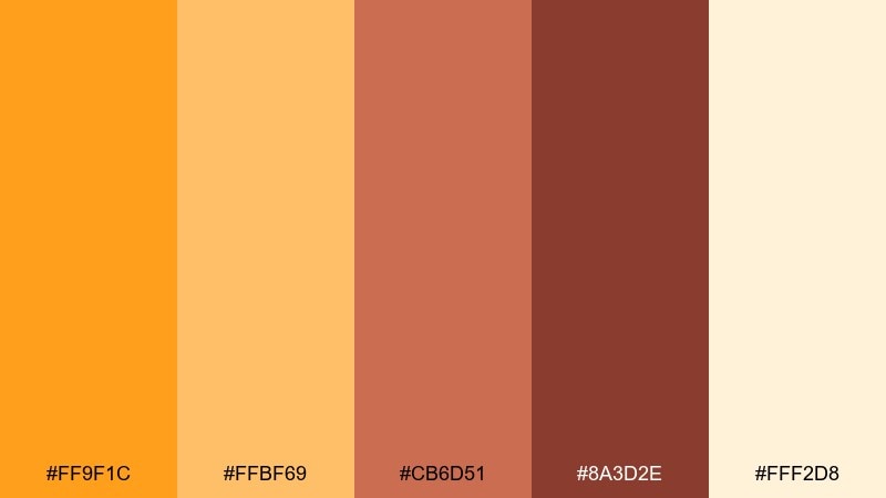
HEX: #FF9F1C #FFBF69 #CB6D51 #8A3D2E #FFF2D8
Mood: cheerful and punchy
Best for: halloween party invitation
Cheerful and punchy, it suggests pumpkin lanterns, caramel treats, and crisp evening air. These warm color combinations work best when orange leads and the darker brick tone is saved for typography. Keep the background creamy to avoid a muddy look and to make icons pop. Tip: use a single accent color for RSVP details so the invitation stays easy to scan.
Image example of pumpkin patch generated using media.io
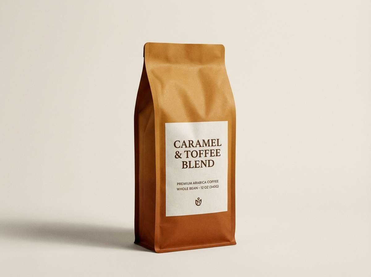
13) Maple Toffee
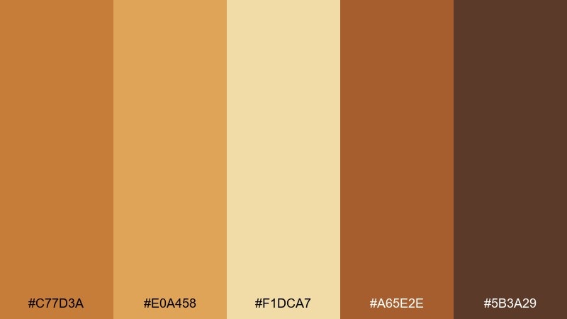
HEX: #C77D3A #E0A458 #F1DCA7 #A65E2E #5B3A29
Mood: rich and comforting
Best for: coffee bean packaging label
Rich and comforting, it brings maple syrup, toasted sugar, and roasted beans to mind. Use the mid caramel as the main field color, then set product names in the darkest brown for maximum clarity. The pale gold works well for badges like roast level or origin. Tip: a subtle paper texture pairs beautifully with these hues and keeps the label from feeling too glossy.
Image example of maple toffee generated using media.io
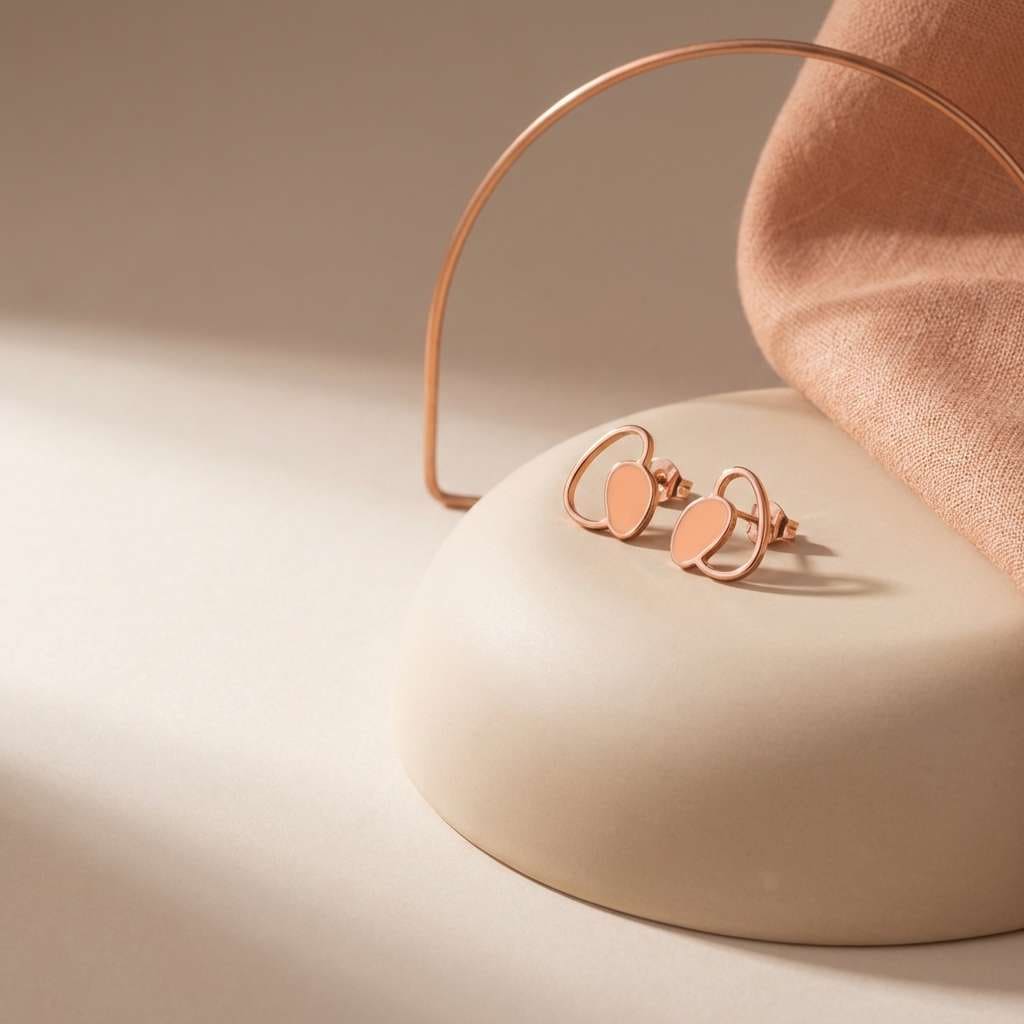
14) Copper Bloom
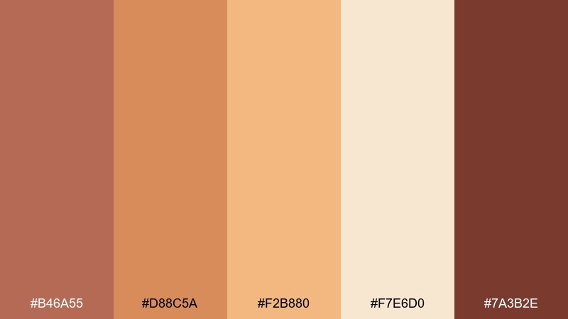
HEX: #B46A55 #D88C5A #F2B880 #F7E6D0 #7A3B2E
Mood: warm and polished
Best for: jewelry brand social ad
Warm and polished, it evokes copper metal, peach light, and soft nude tones. Put the darkest shade behind pricing or promo text, then let the lighter peachy hues keep the layout airy. Creamy beige backgrounds help jewelry feel premium without turning yellow. Tip: use simple geometric frames in copper tones to guide the eye while staying minimal.
Image example of copper bloom generated using media.io
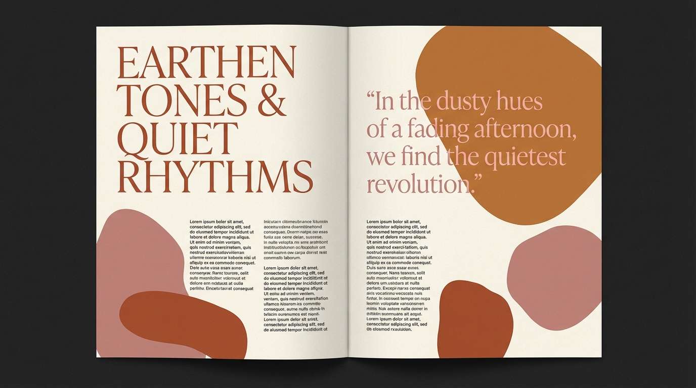
15) Rust and Rose
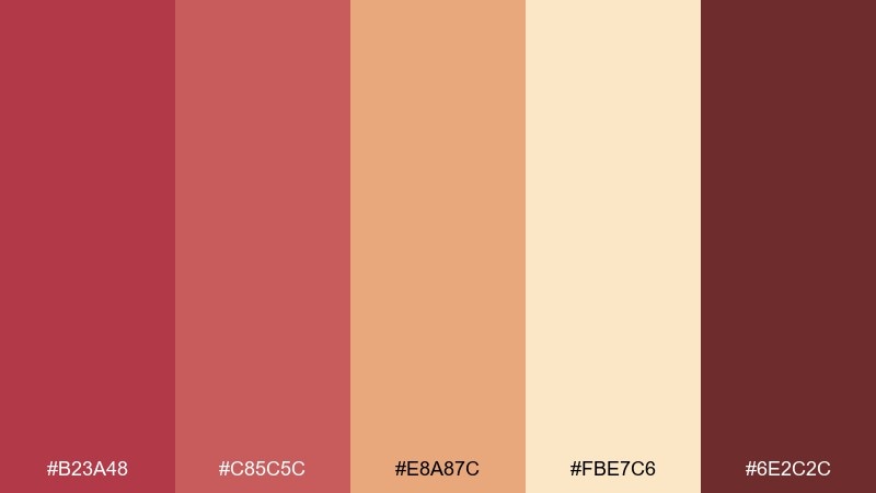
HEX: #B23A48 #C85C5C #E8A87C #FBE7C6 #6E2C2C
Mood: vintage and romantic
Best for: editorial magazine spread
Vintage and romantic, this warm color scheme feels like dried roses, worn leather, and sun-faded posters. Use the dusty rose tones for pull quotes and section headers, then keep long-form copy on the light cream for readability. The deep maroon anchors the grid and helps with strong typographic hierarchy. Tip: add thin rules and small caps to lean into an editorial, collectible vibe.
Image example of rust and rose generated using media.io
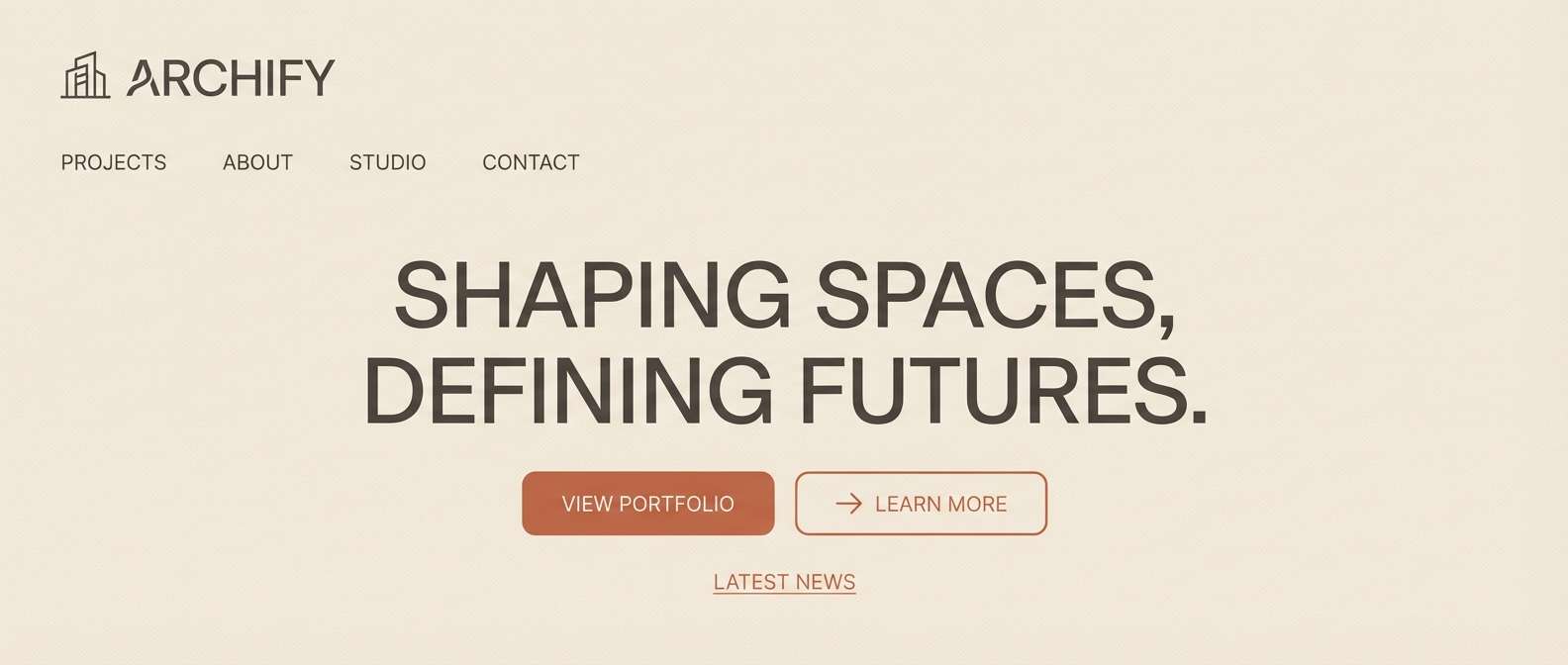
16) Sunbaked Sandstone
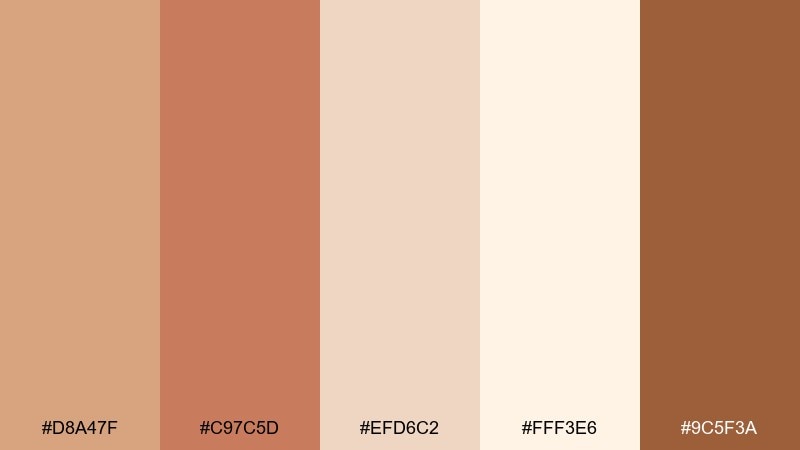
HEX: #D8A47F #C97C5D #EFD6C2 #FFF3E6 #9C5F3A
Mood: minimal and architectural
Best for: architecture firm website header
Minimal and architectural, it resembles sandstone blocks, warm concrete, and clean daylight. Use the pale tones as the page foundation, with medium terracotta for navigation states and section labels. The deeper brown is ideal for high-contrast text and small UI strokes. Tip: keep shadows subtle and rely on spacing rather than heavy borders to maintain the calm feel.
Image example of sunbaked sandstone generated using media.io
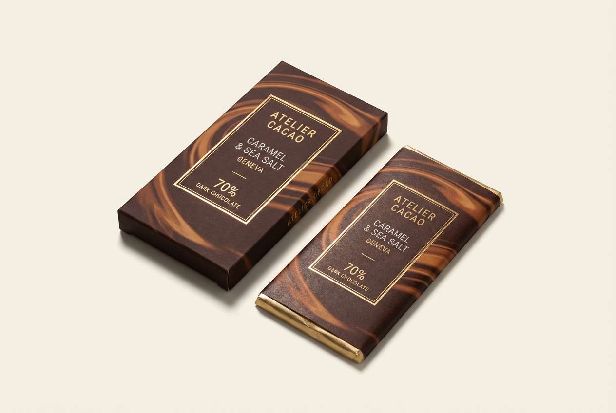
17) Spiced Cocoa
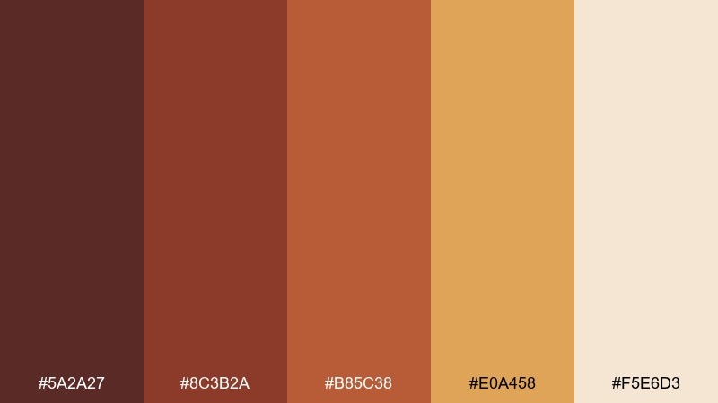
HEX: #5A2A27 #8C3B2A #B85C38 #E0A458 #F5E6D3
Mood: deep and indulgent
Best for: chocolate bar wrapper design
Deep and indulgent, it channels dark chocolate, cinnamon bark, and golden caramel drizzle. A warm color palette like this looks best when the darkest brown owns most of the wrapper and the gold is used as a premium accent. Keep the cream tone for small ingredient text and nutrition blocks so they stay readable. Tip: combine gold with simple line patterns to suggest craft without becoming busy.
Image example of spiced cocoa generated using media.io
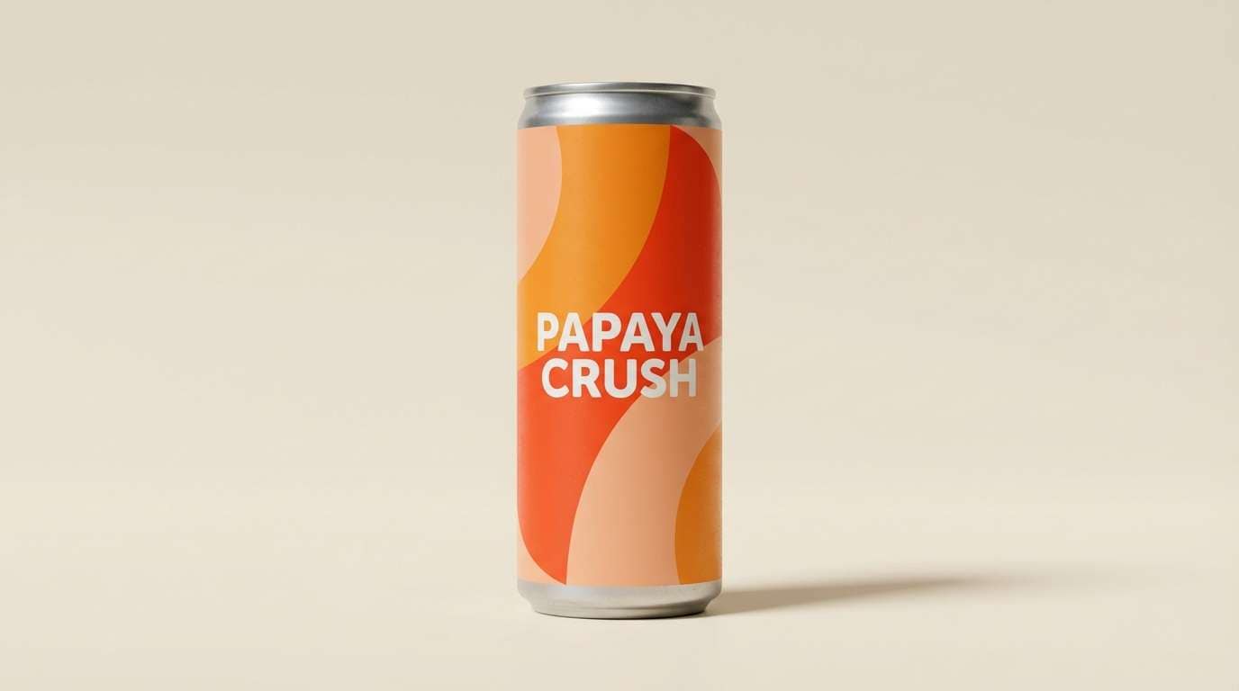
18) Papaya Punch
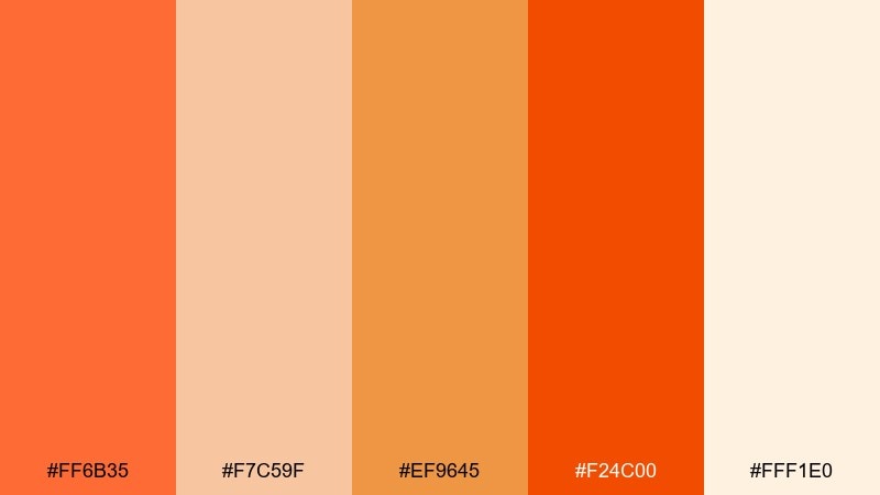
HEX: #FF6B35 #F7C59F #EF9645 #F24C00 #FFF1E0
Mood: tropical and energetic
Best for: summer drink product ad
Tropical and energetic, it feels like juicy papaya, bright citrus zest, and sunlit beach snacks. Use the vivid orange-red for the product name, then soften the layout with the peachy tint for backgrounds and secondary panels. The cream keeps the ad clean and modern, especially in web placements. Tip: limit gradients to one hero element so the overall design stays punchy, not chaotic.
Image example of papaya punch generated using media.io
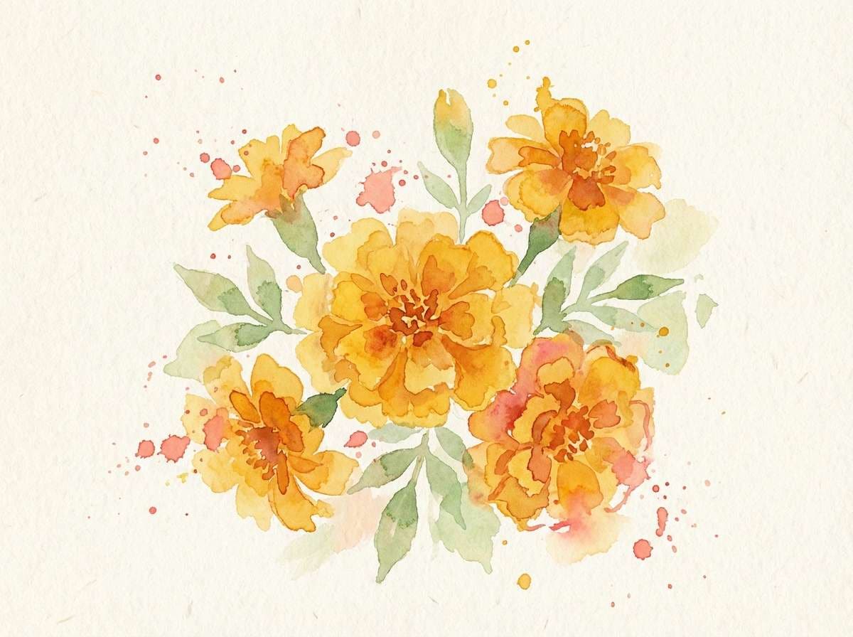
19) Marigold Drift
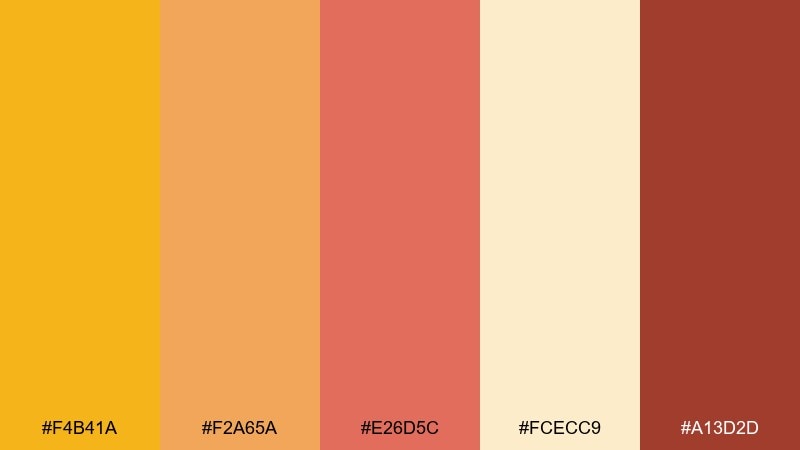
HEX: #F4B41A #F2A65A #E26D5C #FCECC9 #A13D2D
Mood: bright and botanical
Best for: watercolor floral art print
Bright and botanical, it brings marigold petals, clay pots, and sun-dappled gardens to mind. Let the yellow lead in the blooms, with coral used sparingly for depth and shadow. The pale cream is perfect for paper texture and negative space around the illustration. Tip: keep outlines minimal and let watercolor edges do the work for a soft, handmade look.
Image example of marigold drift generated using media.io
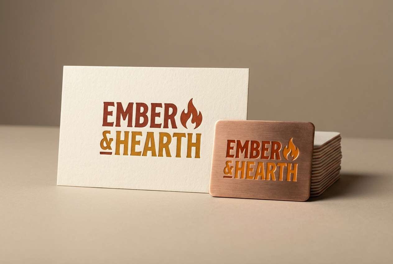
20) Fireside Brick
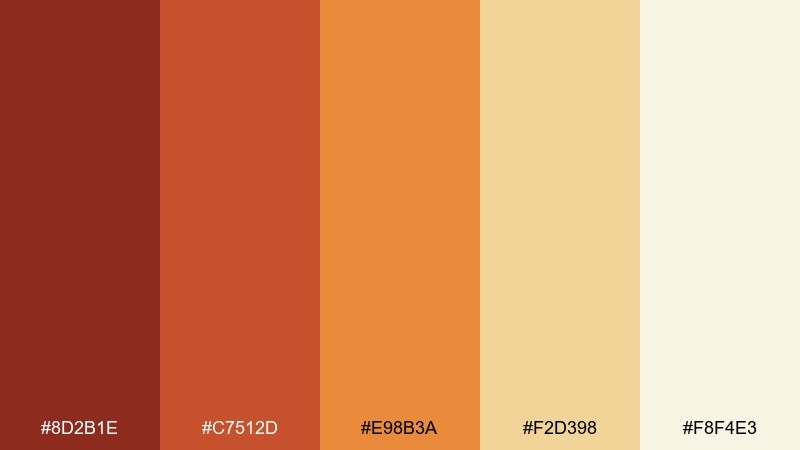
HEX: #8D2B1E #C7512D #E98B3A #F2D398 #F8F4E3
Mood: rustic and welcoming
Best for: restaurant logo and signage mockup
Rustic and welcoming, this warm color scheme feels like brick ovens, toasted crust, and lamplight in a cozy dining room. A warm color palette like this suits bold logotypes in dark brick with amber used for highlights and secondary marks. Keep backgrounds creamy so the signage stays legible and upscale rather than heavy. Tip: use the brightest orange only for one focal element, such as a badge or icon, to avoid visual noise.
Image example of fireside brick generated using media.io
What Colors Go Well with Warm?
Warm tones pair naturally with soft neutrals like cream, ivory, sand, and warm gray—these keep layouts airy and prevent oranges/reds from feeling too intense.
For crisp contrast, add cool counterparts in small doses: deep navy, slate blue, teal, or eucalyptus green can make warm accents look sharper and more premium.
If you want a tonal look, stay within warm families (peach → terracotta → cocoa) and use one darker shade for text and structure.
How to Use a Warm Color Palette in Real Designs
Start with a background neutral (cream/off-white), pick one “hero” warm for CTAs or key headlines, and use a deeper shade (brick, wine, cocoa) for body text and icons.
In branding and packaging, warm palettes feel most elevated when you limit saturation: let one bright warm pop, and keep the rest muted or earthy.
For UI, prioritize accessibility by checking contrast—warm mid-tones can be tricky for text, so reserve them for fills, chips, and accents rather than paragraphs.
Create Warm Palette Visuals with AI
Want matching visuals for your warm palette (posters, product mockups, social ads, or UI concepts)? Use the prompts above as a starting point, then swap in your brand keywords and layout needs.
With Media.io, you can quickly generate consistent images in the same warm color scheme, iterate on composition, and export options for different aspect ratios.
Warm Color Palette FAQs
-
What are warm colors?
Warm colors usually include reds, oranges, yellows, and warm-leaning neutrals (like beige and brown). They’re associated with sunlight, fire, and warmth, which is why they often feel energetic and welcoming. -
What is a warm color palette used for in branding?
Warm palettes are popular for brands that want to feel friendly, bold, appetizing, or handcrafted—think food and beverage, wellness, hospitality, events, and lifestyle products. -
How do I balance a warm palette so it doesn’t look too loud?
Use a light neutral background (cream/ivory), keep only one warm shade highly saturated, and rely on deeper warm tones (cocoa, wine, brick) for structure and typography. -
What’s the best text color on warm backgrounds?
Deep browns, maroons, or near-black warm shades often read better than pure black on warm designs. Always verify contrast for accessibility, especially on orange and yellow fills. -
Do warm colors work well for UI design?
Yes—warm accents can make CTAs and key states stand out. The key is restraint: use warm tones for buttons, highlights, and illustrations, while keeping most surfaces neutral for readability. -
What cool colors pair best with warm palettes?
Navy, slate blue, teal, and muted greens are classic complements. They sharpen warm oranges and reds, adding modern contrast without fighting the palette. -
How can I generate warm palette images from a text prompt?
Describe the scene and specify the dominant warm colors (e.g., terracotta, saffron, ember orange) plus the style (vector, studio product shot, watercolor). Using a consistent prompt structure helps you keep a coherent warm look across multiple images.
Next: Starry Sky Color Palette


