

Starry sky palettes capture the depth of night—inky bases, luminous midtones, and tiny “starlight” accents that instantly feel premium. They’re a go-to for UI, branding, posters, and editorial layouts when you want contrast without harshness.
Below are 20 night-inspired color palette ideas with HEX codes, plus practical tips and AI prompts you can reuse to generate matching visuals.
In this article
Why Starry Sky Palettes Work So Well
Starry sky colors naturally build hierarchy: a deep “space” base for structure, midtones for components, and bright highlights that read like stars. That makes them easy to apply across layouts without constantly fighting contrast.
They also feel emotionally versatile. Depending on your accent (gold, mint, coral, blush), the same night foundation can look cinematic, calming, futuristic, or romantic.
Finally, these palettes photograph and render beautifully in digital products. Dark sections reduce visual noise, while controlled highlights guide attention to CTAs, data points, and key messages.
20+ Starry Sky Color Palette Ideas (with HEX Codes)
1) Midnight Nebula
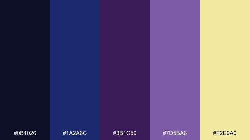
HEX: #0B1026 #1A2A6C #3B1C59 #7D5BA6 #F2E9A0
Mood: cinematic, mysterious, polished
Best for: SaaS landing page UI
Cinematic and mysterious, like clouds of ink drifting across a clear night. The deep navy and indigo carry layouts with confidence, while violet adds depth without feeling loud. Use the pale starlight yellow as a restrained highlight for primary buttons or key metrics. Tip: keep body text on the lighter panels to maintain accessibility on dark sections.
Image example of midnight nebula generated using media.io

Media.io is an online AI studio for creating and editing video, image, and audio in your browser.

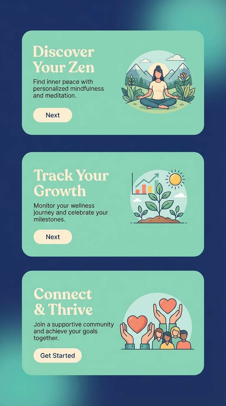
2) Starlit Harbor
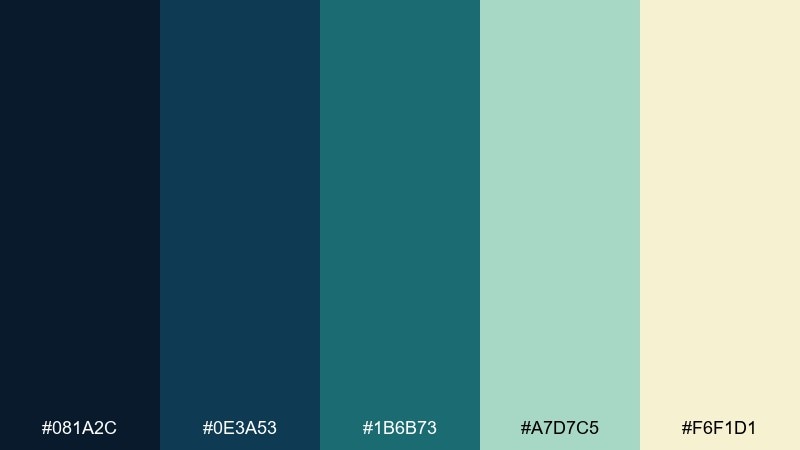
HEX: #081A2C #0E3A53 #1B6B73 #A7D7C5 #F6F1D1
Mood: calm, airy, coastal
Best for: wellness app onboarding screens
Calm and airy, like moonlight shimmering on quiet water. The blue-green midtones feel restorative, while the pale mint and warm cream keep screens friendly. Pair with rounded icons and generous spacing for a softer, slower rhythm. Tip: reserve the teal for progress states and key actions to avoid visual fatigue.
Image example of starlit harbor generated using media.io
3) Aurora Dust
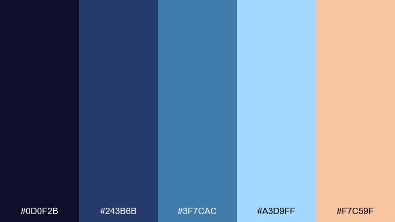
HEX: #0D0F2B #243B6B #3F7CAC #A3D9FF #F7C59F
Mood: dreamy, uplifting, crisp
Best for: travel poster design
Dreamy and uplifting, like aurora haze floating above a winter horizon. These starry sky color combinations balance cool blues with a gentle peach glow for headlines or badges. Use the light ice blue for negative space to keep type and imagery feeling open. Tip: add a subtle grain texture to the dark base to prevent banding in gradients.
Image example of aurora dust generated using media.io
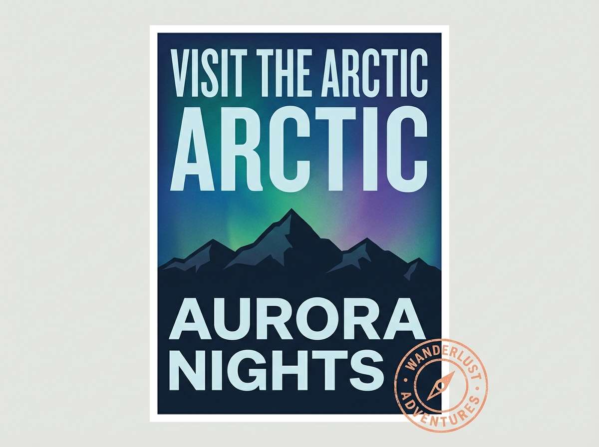
4) Telescope Brass
HEX: #0A0C1D #1E2749 #4B3F72 #C9A227 #F1F4F8
Mood: classic, intellectual, premium
Best for: book cover design
Classic and intellectual, like an old observatory lined with brass instruments. The dark base reads authoritative, while the muted purple adds a literary twist that still feels grown-up. Use brass sparingly for titles or foil-style details, and keep plenty of light gray for legibility. Tip: set the title in a high-contrast serif to echo the vintage mood.
Image example of telescope brass generated using media.io
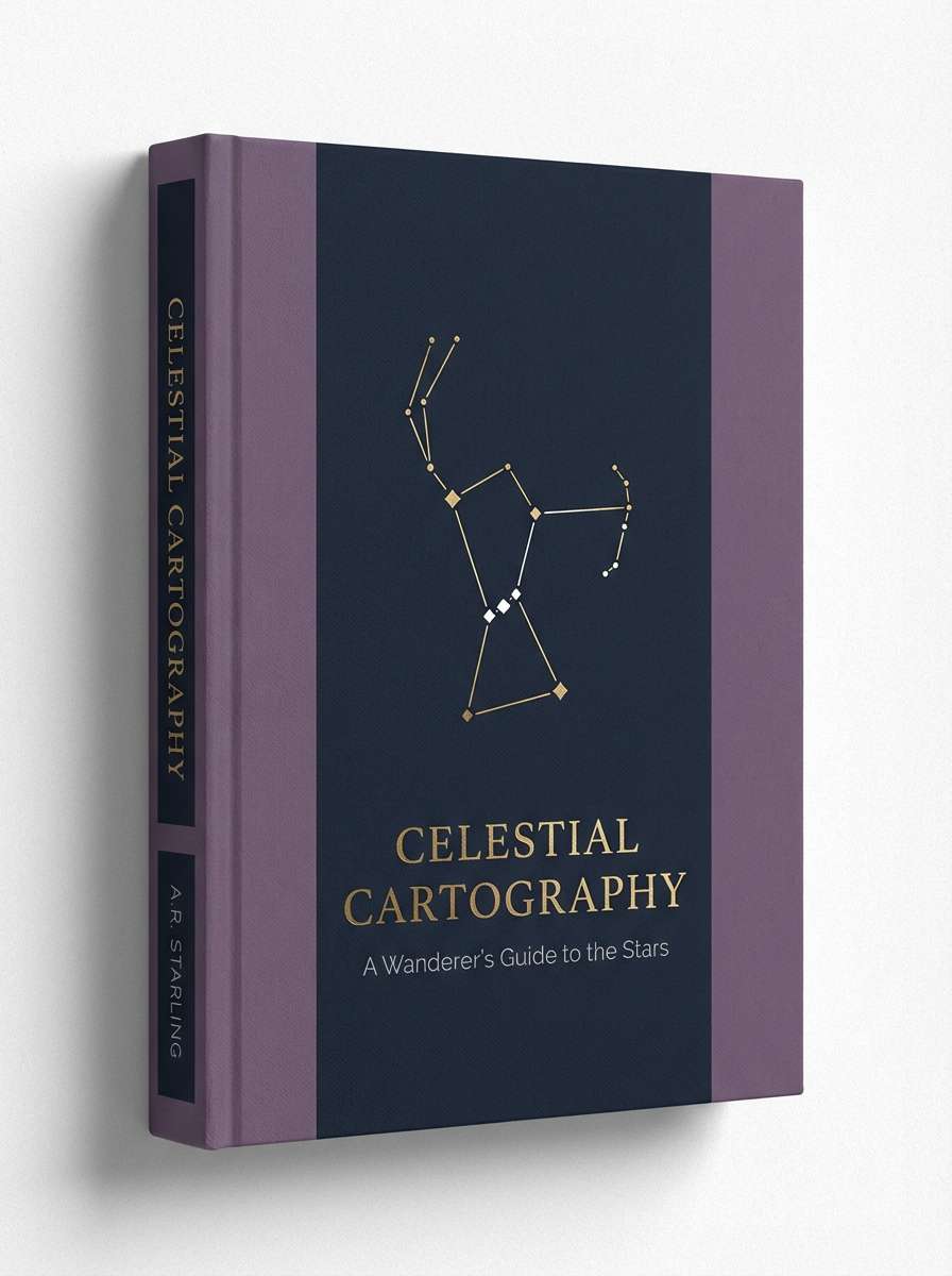
5) Cosmic Orchid
HEX: #120A2A #2B1055 #5A189A #C77DFF #FFE5EC
Mood: romantic, bold, modern
Best for: beauty brand packaging
Romantic and bold, like velvet petals under ultraviolet light. The layered purples create instant depth for packaging, while the blush tint softens the overall feel for skincare and cosmetics. Pair with minimal typography and lots of breathing room so the color can do the talking. Tip: use the light pink as a label field to keep ingredient text clean and readable.
Image example of cosmic orchid generated using media.io
6) Meteorite Ink
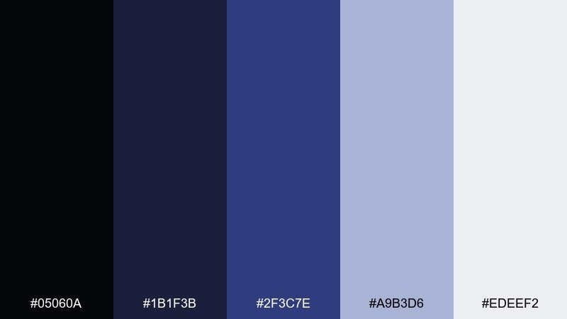
HEX: #05060A #1B1F3B #2F3C7E #A9B3D6 #EDEEF2
Mood: sleek, technical, high-contrast
Best for: data dashboard UI
Sleek and technical, like a control room lit by distant screens. This starry sky color scheme is built for clarity: inky blacks for structure, strong indigo for focus states, and cool gray-lavender for surfaces. Pair with thin grid lines and restrained shadows to keep charts crisp. Tip: map indigo to primary data series and reserve the lightest gray for labels and tooltips.
Image example of meteorite ink generated using media.io

7) Moonlit Sage
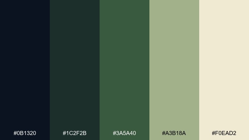
HEX: #0B1320 #1C2F2B #3A5A40 #A3B18A #F0EAD2
Mood: grounded, natural, soothing
Best for: botanical illustration set
Grounded and soothing, like night air moving through a quiet garden. The deep blue-black anchors compositions, while layered greens bring a natural, mature tone. Use the warm cream for paper-like space and captions to keep illustrations airy. Tip: wash the mid green lightly in watercolor to avoid muddy overlaps on dark outlines.
Image example of moonlit sage generated using media.io
8) Satellite Silver
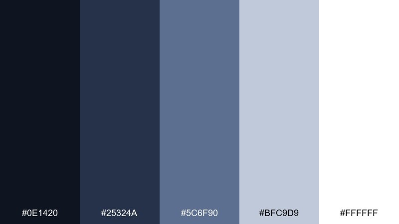
HEX: #0E1420 #25324A #5C6F90 #BFC9D9 #FFFFFF
Mood: minimal, professional, calm
Best for: corporate presentation template
Minimal and professional, like brushed metal against a clear night. The slate blues keep slides authoritative without feeling heavy, and the soft silver-gray provides clean structure for charts. Pair with one bold accent color from your brand if you need extra punch. Tip: use the darkest tone only for headings to preserve the airy feel of white space.
Image example of satellite silver generated using media.io

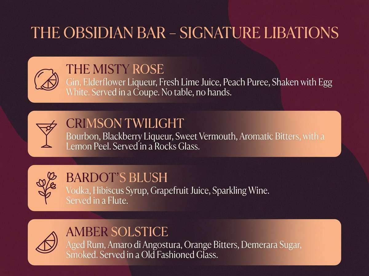
9) Nightfall Cherry
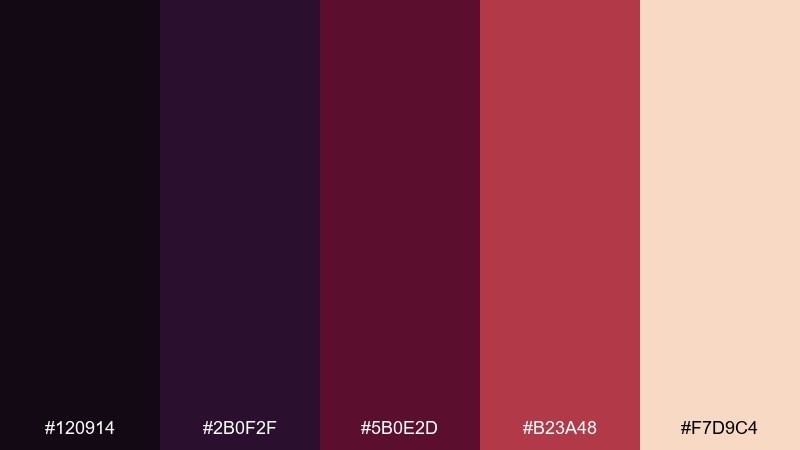
HEX: #120914 #2B0F2F #5B0E2D #B23A48 #F7D9C4
Mood: moody, dramatic, intimate
Best for: cocktail menu design
Moody and intimate, like a late-night lounge with low red light. The plum and wine tones feel indulgent, while the soft peach keeps menus readable and warm. Pair with thin divider lines and simple icons to avoid visual clutter. Tip: use the bright cherry only for featured drinks or section headers to guide the eye.
Image example of nightfall cherry generated using media.io
10) Deep Space Denim
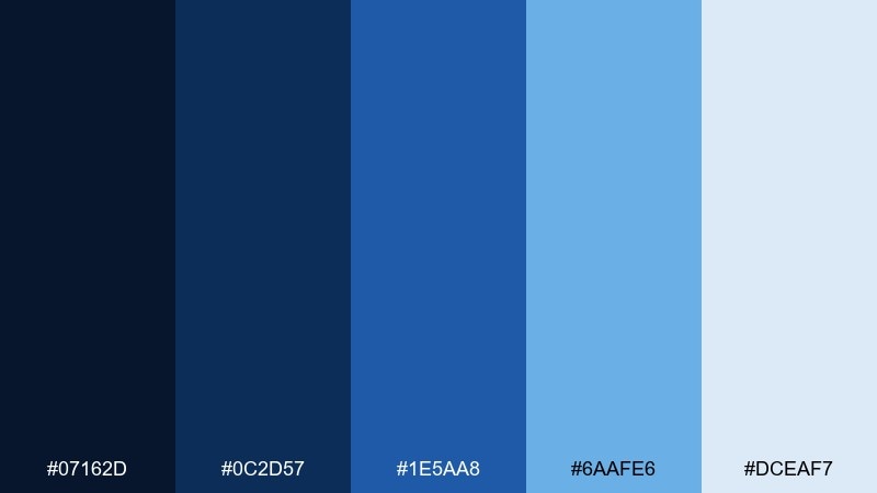
HEX: #07162D #0C2D57 #1E5AA8 #6AAFE6 #DCEAF7
Mood: confident, clean, tech-forward
Best for: fintech app UI
Confident and clean, like sharp denim-blue light cutting through darkness. The strong mid-blue is ideal for navigation and active states, while pale sky-blue supports cards and empty states. Pair with neutral grays for secondary text so the blues stay dominant. Tip: keep gradients subtle and linear to maintain a trustworthy fintech vibe.
Image example of deep space denim generated using media.io
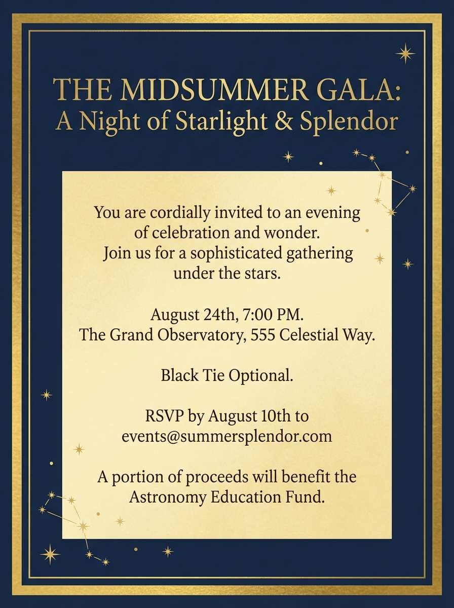
11) Comet Tail Gold
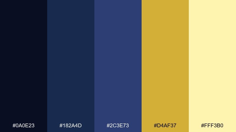
HEX: #0A0E23 #182A4D #2C3E73 #D4AF37 #FFF3B0
Mood: festive, elegant, radiant
Best for: event invitation flyer
Festive and elegant, like a comet streaking through a velvet sky. The gold accents feel celebratory without turning gaudy thanks to the deep blues underneath. Pair with centered typography and simple border lines for a formal invitation look. Tip: use the soft butter tone as a background panel for dates and venue details.
Image example of comet tail gold generated using media.io
12) Nebula Smoke
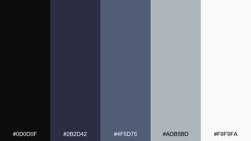
HEX: #0D0D0F #2B2D42 #4F5D75 #ADB5BD #F8F9FA
Mood: editorial, modern, understated
Best for: magazine editorial layout
Understated and modern, like fog rolling over a city at midnight. The charcoal-to-silver range creates strong hierarchy for headlines, pull quotes, and captions. Pair with high-quality photography and keep accent colors minimal to maintain the editorial tone. Tip: set body copy in the mid-gray to reduce glare while keeping contrast.
Image example of nebula smoke generated using media.io
13) Polaris Teal
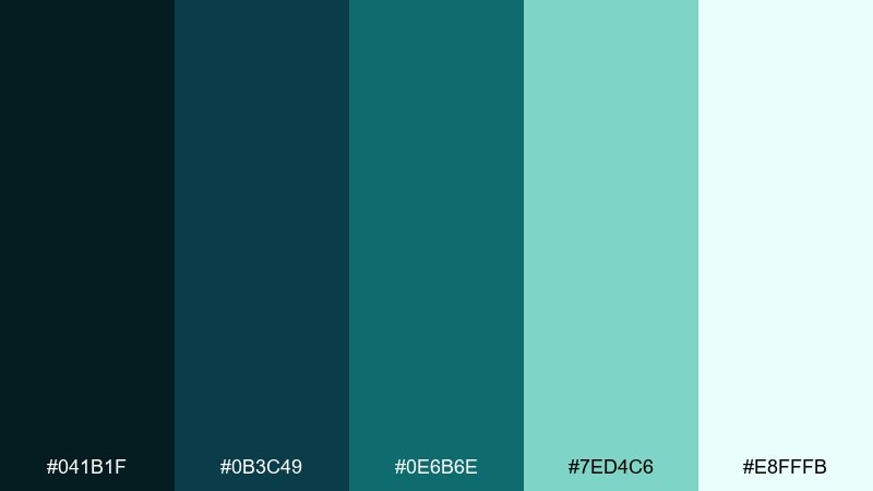
HEX: #041B1F #0B3C49 #0E6B6E #7ED4C6 #E8FFFB
Mood: fresh, icy, modern
Best for: app icon set and UI accents
Fresh and icy, like polar light reflecting on dark water. The deep teal base feels premium, while minty highlights add a clean, modern lift for icons and micro-interactions. Pair with geometric shapes and thin strokes to keep details sharp at small sizes. Tip: limit the brightest mint to active states so it stays special and noticeable.
Image example of polaris teal generated using media.io
14) Starship Violet
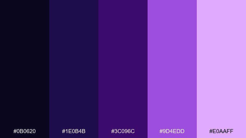
HEX: #0B0620 #1E0B4B #3C096C #9D4EDD #E0AAFF
Mood: electric, futuristic, bold
Best for: gaming stream overlay
Electric and futuristic, like neon thrusters fading into deep space. The layered violets give instant depth for panels and alerts without relying on heavy textures. Pair with sharp sans-serif type and thin glow effects for a high-energy look. Tip: keep the light lilac for notifications only, so it punches through the darker layout.
Image example of starship violet generated using media.io
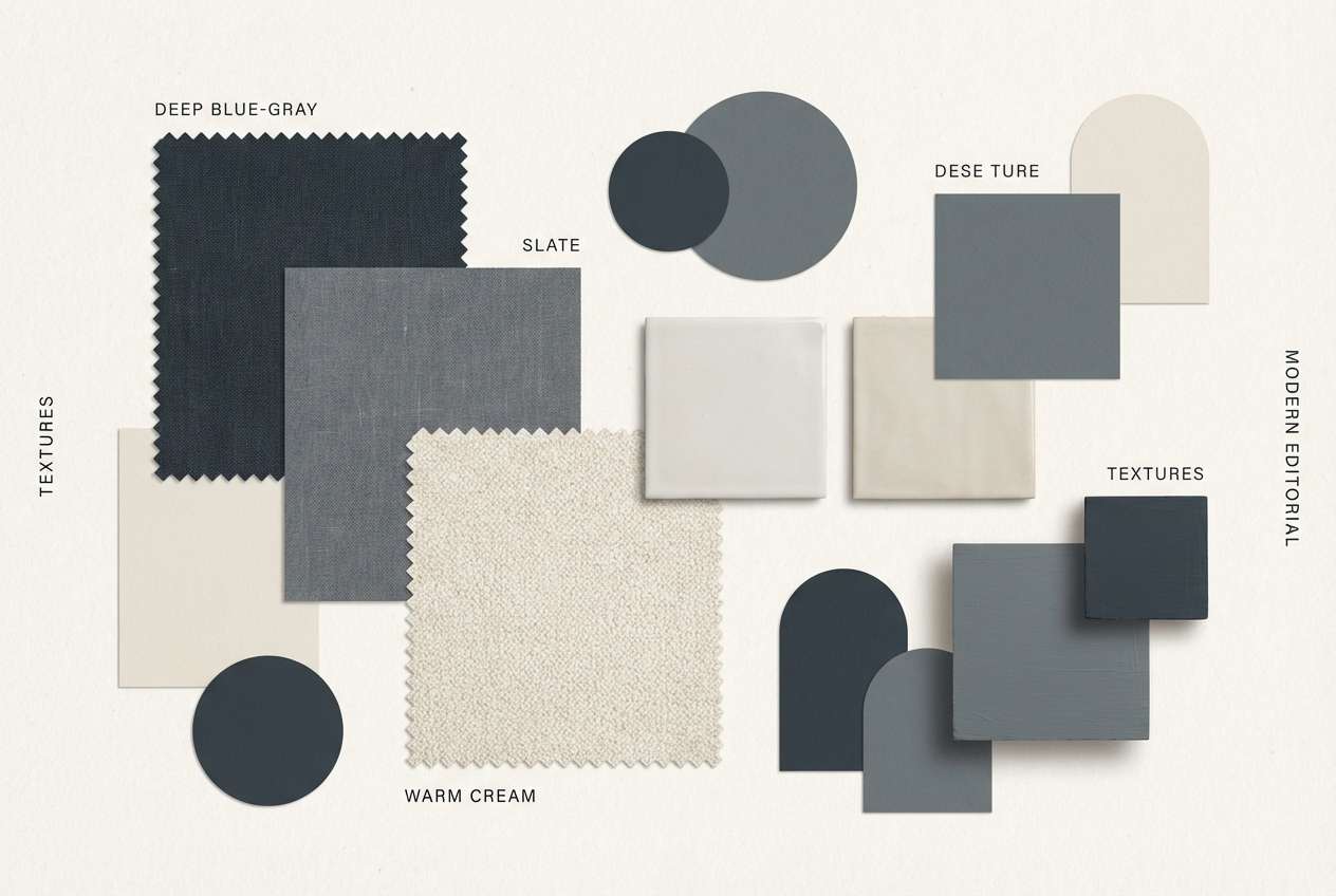
15) Milky Way Latte
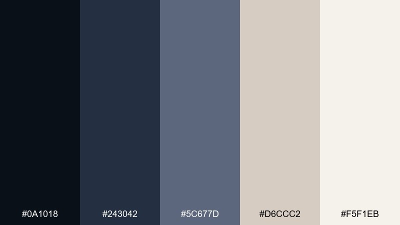
HEX: #0A1018 #243042 #5C677D #D6CCC2 #F5F1EB
Mood: cozy, refined, neutral
Best for: interior design mood board
Cozy and refined, like warm café light against a clear night window. This starry sky color palette mixes deep blue-gray structure with creamy neutrals that feel calm and lived-in. Pair with walnut wood textures, linen fabrics, and matte black hardware for a modern home aesthetic. Tip: use the darkest tone for framing and shadows to keep the beige tones from feeling flat.
Image example of milky way latte generated using media.io
16) Eclipse Coral
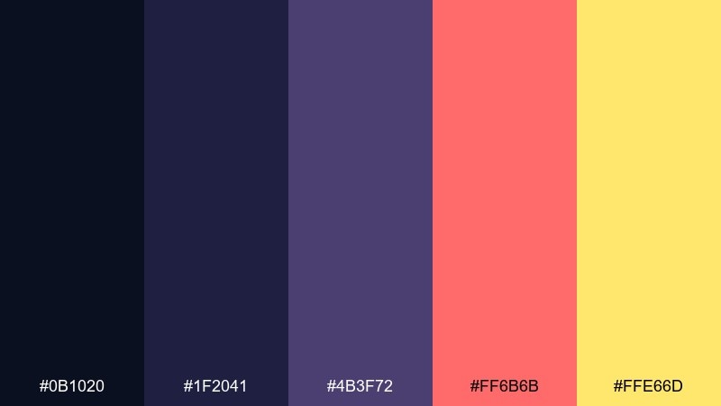
HEX: #0B1020 #1F2041 #4B3F72 #FF6B6B #FFE66D
Mood: dramatic, playful, punchy
Best for: social media ad creative
Dramatic and playful, like a bright flare breaking through an eclipse. The dark blues and muted purple set a premium base, then coral and warm yellow add instant energy for CTAs. Pair with bold shapes and short, confident copy to keep the message snappy. Tip: use coral for one primary action and keep yellow to small highlights to avoid competing accents.
Image example of eclipse coral generated using media.io

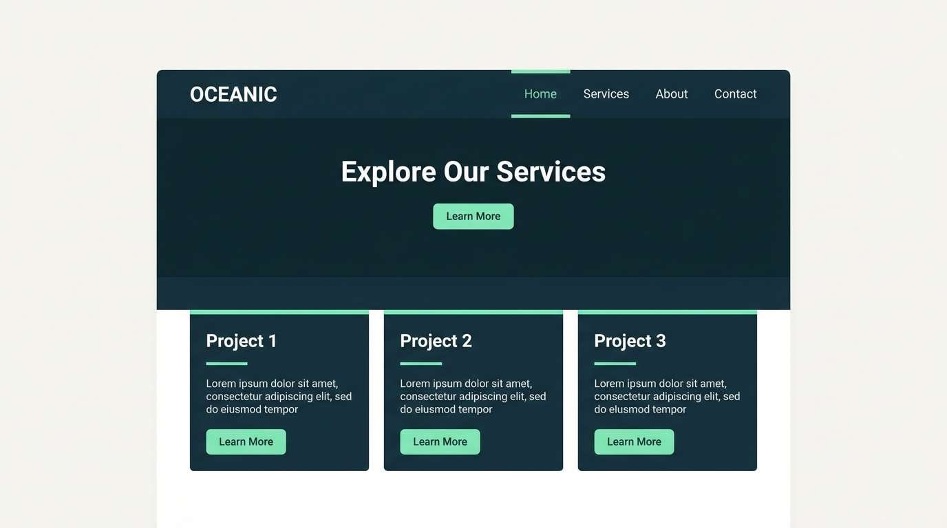
17) Celestial Mint
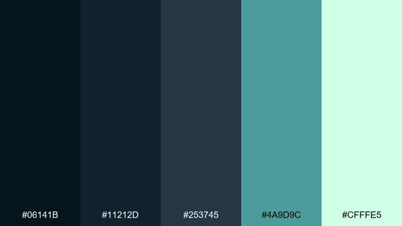
HEX: #06141B #11212D #253745 #4A9D9C #CFFFE5
Mood: cool, serene, minimalist
Best for: minimalist website theme
Cool and serene, like a quiet night breeze with a hint of sea mist. The dark blue-green stack creates a refined backdrop, while mint brings clarity to links and interactive states. Pair with plenty of whitespace and thin dividers for a calm, modern layout. Tip: keep the light mint for hover and focus states to maintain a consistent interaction language.
Image example of celestial mint generated using media.io
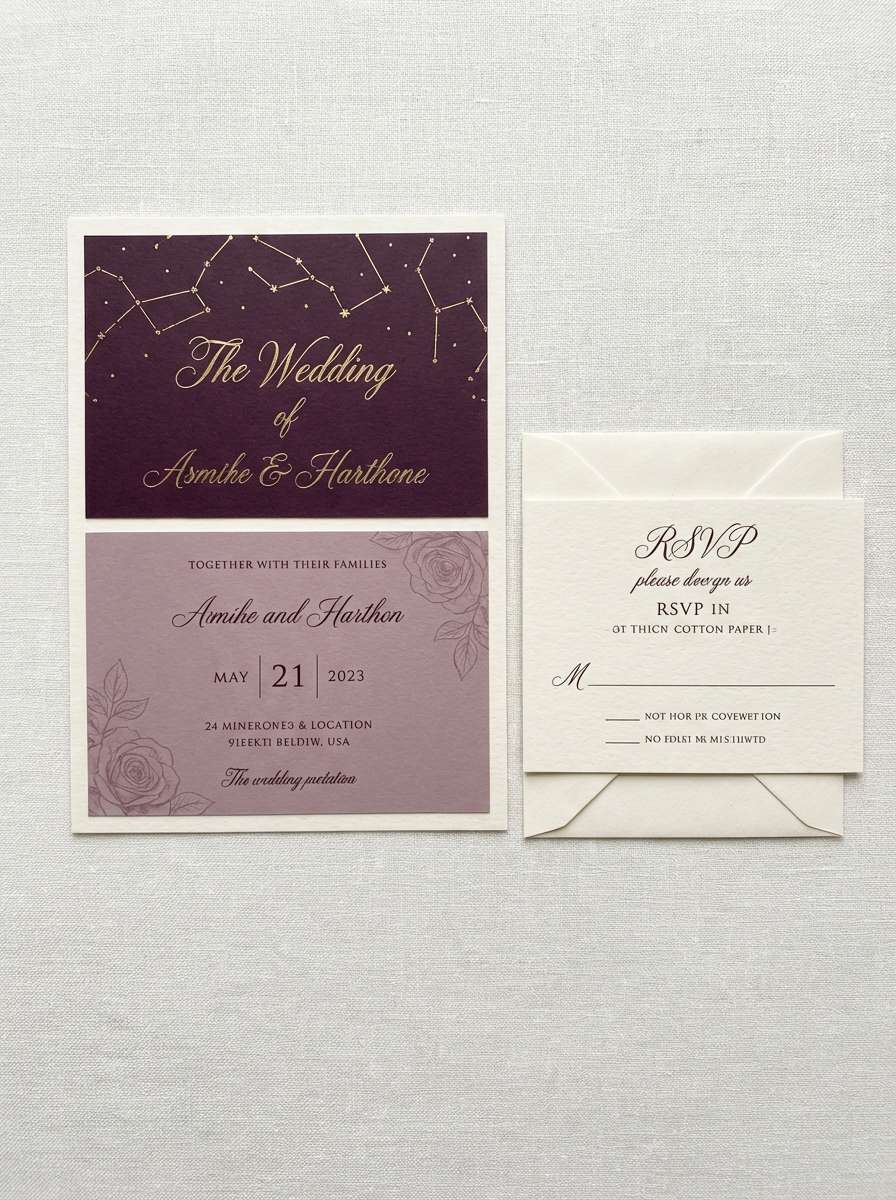
18) Constellation Rose
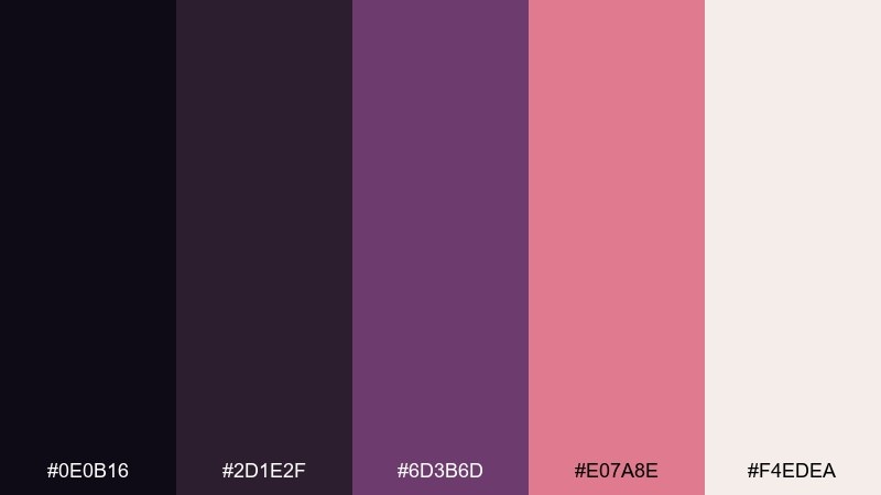
HEX: #0E0B16 #2D1E2F #6D3B6D #E07A8E #F4EDEA
Mood: romantic, soft, dreamy
Best for: wedding invitation suite
Romantic and dreamy, like constellations drawn in rose ink on twilight paper. A starry sky color combination like this works beautifully for invitations where you want elegance without stark contrast. Pair with delicate line art and plenty of off-white space to keep the design breathable. Tip: use the darkest plum for names and the rose tone for small flourishes or monograms.
Image example of constellation rose generated using media.io
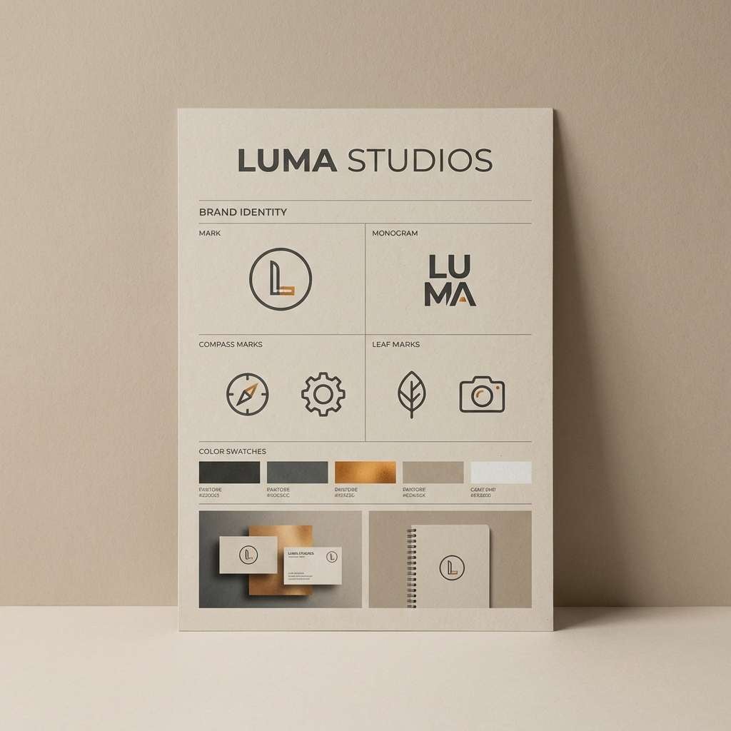
19) Zodiac Amber
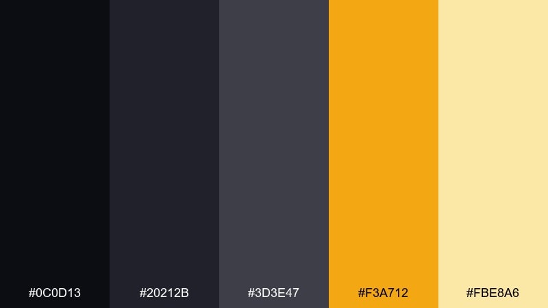
HEX: #0C0D13 #20212B #3D3E47 #F3A712 #FBE8A6
Mood: mystical, warm, grounded
Best for: logo and brand identity
Mystical and warm, like candlelight on a night chart of the zodiac. The graphite neutrals keep logos timeless, while amber adds an optimistic spark for marks, icons, and highlights. Pair with simple geometry and strong spacing to make the amber feel intentional. Tip: test the amber on both dark and light backgrounds to keep brand assets consistent across formats.
Image example of zodiac amber generated using media.io
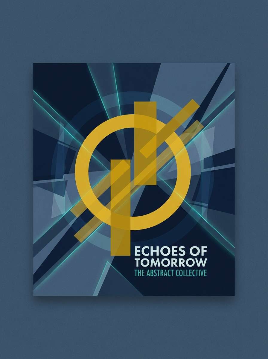
20) Dusk Prism
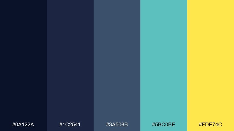
HEX: #0A122A #1C2541 #3A506B #5BC0BE #FDE74C
Mood: vibrant, adventurous, modern
Best for: album cover art
Vibrant and adventurous, like twilight shifting into the first bright stars. This starry sky color palette shines on album covers where you want depth plus a bold pop of color. Pair the teal with clean sans-serif type and let the yellow act as a single focal flare for titles or stickers. Tip: keep the background in the darker blues so the yellow stays punchy without overpowering the design.
Image example of dusk prism generated using media.io
What Colors Go Well with Starry Sky?
Starry sky palettes pair best with high-clarity neutrals and one intentional accent. Cool whites, silver grays, and soft creams keep dark bases readable while preserving that night-time mood.
For accents, metals (gold/brass/amber) feel premium and classic, while mint/teal reads modern and tech-forward. Coral and blush add warmth and approachability—great for ads, events, and lifestyle branding.
If you need extra depth, add one muted midtone (slate, denim blue, dusty purple) to bridge from your darkest “space” shade to lighter surfaces.
How to Use a Starry Sky Color Palette in Real Designs
Start with a dark base for headers, hero sections, or backgrounds, then build surfaces using a midtone and a light neutral. This gives you clear separation between containers without relying on heavy borders.
Use your “star” color (the brightest swatch) for the few moments that matter: primary buttons, key data points, badges, or notification states. Keeping it scarce is what makes it pop.
For typography, avoid pure white everywhere on deep backgrounds—try off-white or cool gray for body text, and reserve the brightest white for headings and UI highlights.
Create Starry Sky Palette Visuals with AI
If you already have HEX codes, you can generate matching mockups, posters, or UI concepts by describing the layout and calling out the palette’s role (base, surfaces, accents). This helps you preview how your starry sky scheme behaves across real compositions.
For the most consistent results, reuse a prompt structure: style + subject + background + where each color goes + a clean constraint (flat design, no hands, plain background). Then iterate by swapping only the accent color.
Use Media.io to turn your palette ideas into visuals you can test in minutes—before committing to a full design system.
Starry Sky Color Palette FAQs
-
What is a starry sky color palette?
A starry sky palette is a set of night-inspired colors—usually deep navy/black bases, cool mid-blues or purples, and a small bright “starlight” accent (like mint, gold, or soft yellow) for emphasis. -
Which accent color works best on midnight blue?
Gold and butter-yellow accents create the most classic contrast on midnight blue, while mint/teal feels more modern. Coral also works well when you want a punchier, playful CTA against dark sections. -
How do I keep text readable on dark starry backgrounds?
Use off-white or cool light gray for body text, reserve pure white for headings, and keep long paragraphs on slightly lighter panels. Also ensure your accent colors aren’t used for small text unless contrast is tested. -
Are starry sky palettes good for UI design?
Yes—dark bases help focus attention, and bright accents make states (active, hover, selected) clear. The key is using the brightest color sparingly so it stays meaningful and doesn’t create visual fatigue. -
What’s a safe way to combine teal and purple in a starry sky scheme?
Anchor the design with a deep navy/blue-black, use purple for secondary panels, and keep teal as the interaction accent (links, toggles, focus rings). Add a neutral light surface to avoid oversaturation. -
Can I use starry sky colors for branding and logos?
Yes—graphite and navy create a timeless base, and a single warm accent (amber/gold) can make marks feel distinctive. Test the logo on both dark and light backgrounds to ensure consistent brand usage. -
How can I generate starry sky palette mockups quickly?
Use an AI image generator and include your layout type (UI, poster, packaging), the palette role (dark base, midtone panels, bright CTA), and a clean style constraint (flat design, plain background). Then iterate by changing only one element per prompt.


