

Terra cotta is an earthy clay-red that instantly adds warmth, craft, and human texture to modern spaces and digital designs. It’s bold enough to anchor a palette, but soft enough to live alongside neutrals.
Below you’ll find modern terra cotta color palette combinations with HEX codes for branding, interiors, UI, and print—plus AI prompts you can reuse to generate matching visuals.
In this article
- Why Terra Cotta Color Schemes Work So Well
-
- sunbaked adobe
- desert linen
- clay and sage
- copper canyon
- terracotta twilight
- tuscan kitchen
- minimal clay ui
- rosewood spice
- earthy modernist
- boho market
- coastal clay
- rustic winery
- gallery neutral
- sunset stucco
- vintage poster ink
- soft nursery clay
- botanical terrarium
- luxe retail box
- warm cafe menu
- ceramic studio
- winter clay contrast
- What Colors Go Well with Terra Cotta?
- How to Use a Terra Cotta Color Palette in Real Designs
- Create Terra Cotta Palette Visuals with AI
Why Terra Cotta Color Schemes Work So Well
Terra cotta sits in a sweet spot between orange, red, and brown, so it feels lively without turning neon. That makes it easy to use as an accent color that still reads premium and grounded.
Because it’s inspired by clay and baked earth, it naturally pairs with materials people already associate with comfort—linen, wood, leather, stone, and uncoated paper. Those associations translate well into branding and UI, where warmth can increase approachability.
Modern color combinations with terra cotta also balance well with cool counterpoints like slate blue, seafoam teal, and steel navy. That warm-cool contrast is one of the quickest ways to keep “rustic” from feeling dated.
20+ Terra Cotta Color Palette Ideas (with HEX Codes)
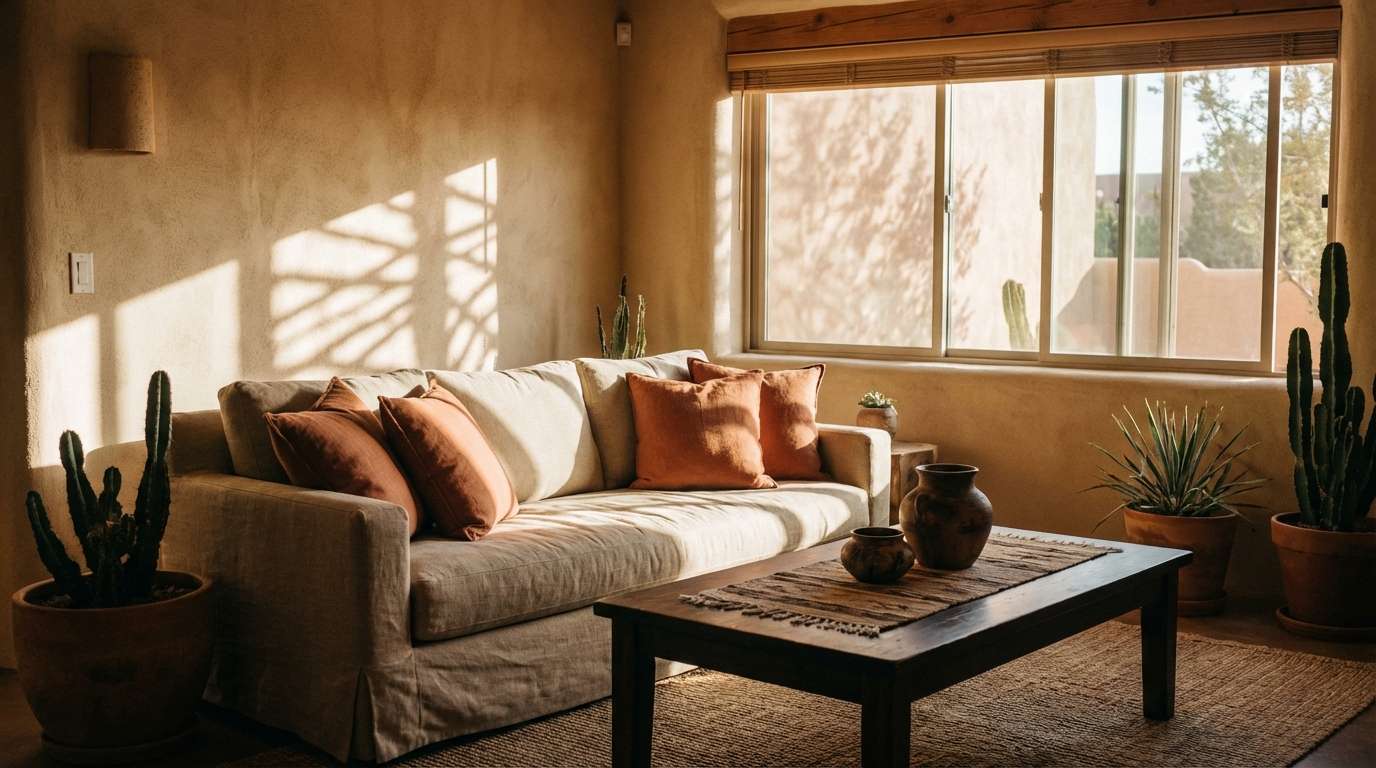
1) Sunbaked Adobe
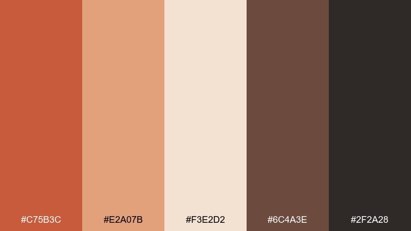
HEX: #C75B3C #E2A07B #F3E2D2 #6C4A3E #2F2A28
Mood: warm, grounded, handcrafted
Best for: southwest living room styling
Warm and grounded like sunlit adobe walls and worn leather. Use these terra cotta colors for living rooms, entryways, or hospitality spaces where you want instant coziness without feeling heavy. Pair the clay red with creamy textiles and dark espresso accents for depth. Tip: repeat the light beige on large surfaces and save the deep brown for smaller anchors like frames and hardware.
Image example of sunbaked adobe generated using media.io
Media.io is an online AI studio for creating and editing video, image, and audio in your browser.

2) Desert Linen
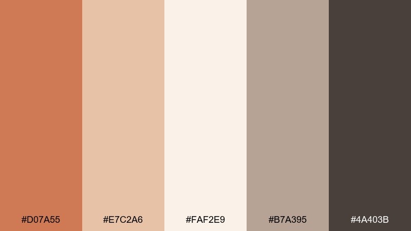
HEX: #D07A55 #E7C2A6 #FAF2E9 #B7A395 #4A403B
Mood: airy, calm, minimal
Best for: minimal home decor moodboard
Airy and calm, like wind over dunes and fresh linen in soft light. This terra cotta color palette works beautifully for minimal decor boards, lifestyle photography direction, and serene landing pages. Keep the warm clay as a gentle accent and let the off-white do most of the work. Tip: use the greige as a bridge tone between warm terracotta and darker text elements.
Image example of desert linen generated using media.io
3) Clay and Sage
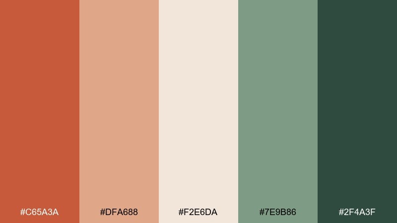
HEX: #C65A3A #DFA688 #F2E6DA #7E9B86 #2F4A3F
Mood: fresh, organic, balanced
Best for: wellness brand identity
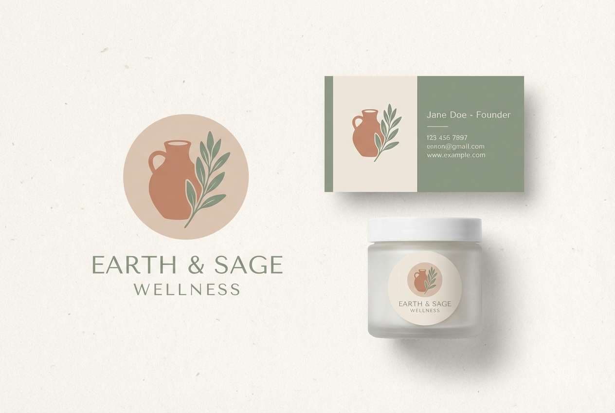
Fresh and organic, like clay planters beside herb leaves. These color combinations with terra cotta feel especially modern for wellness branding because the sage greens cool the warmth without dulling it. Use the deepest green for logos and headings, and keep the clay tone for highlights and badges. Tip: add plenty of negative space so the warm accent reads intentional, not noisy.
Image example of clay and sage generated using media.io
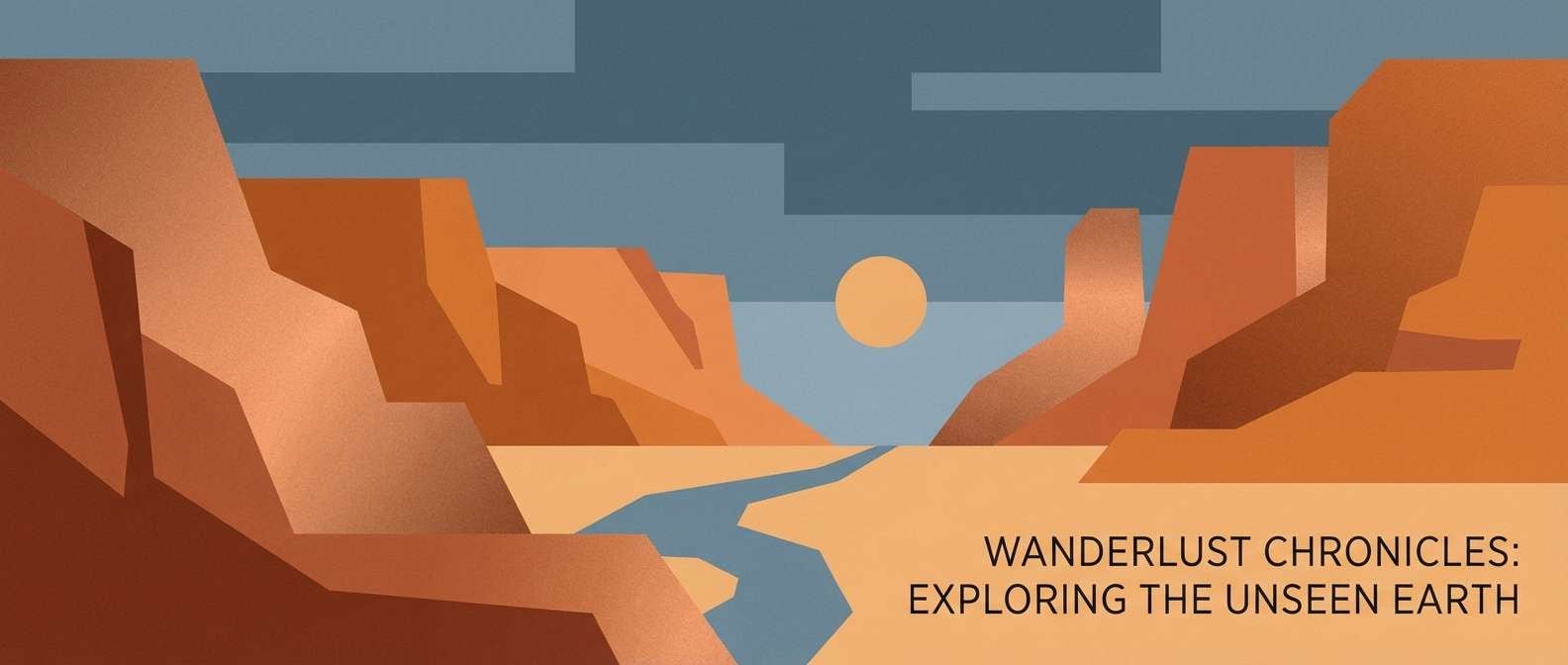
4) Copper Canyon
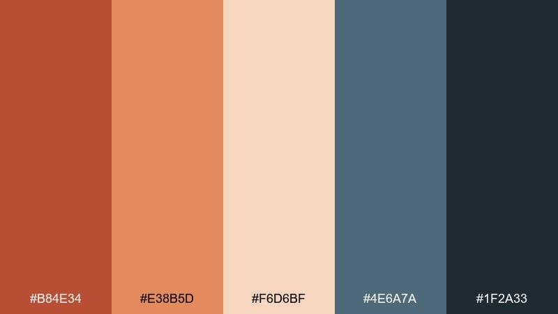
HEX: #B84E34 #E38B5D #F6D6BF #4E6A7A #1F2A33
Mood: adventurous, cinematic, bold
Best for: travel blog hero banner
Bold and cinematic, like canyon rock against a blue-gray horizon. Use this terra cotta color scheme for travel headers, YouTube thumbnails, or campaign banners that need warmth plus contrast. The slate blue keeps the copper tones from feeling too rustic. Tip: reserve the near-black for text and icons to maintain readability on the peachy midtones.
Image example of copper canyon generated using media.io
5) Terracotta Twilight
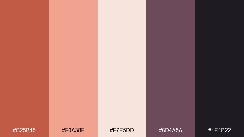
HEX: #C25B45 #F0A38F #F7E5DD #6D4A5A #1E1B22
Mood: romantic, dusky, refined
Best for: evening event poster
Romantic and dusky, like twilight light hitting rose clay walls. This terra cotta color palette fits evening event posters, music promos, and elegant social graphics where you want warmth with a moody edge. Use the plum tone for headings and the blush for soft gradients or background shapes. Tip: keep type simple and high-contrast so the palette stays sophisticated.
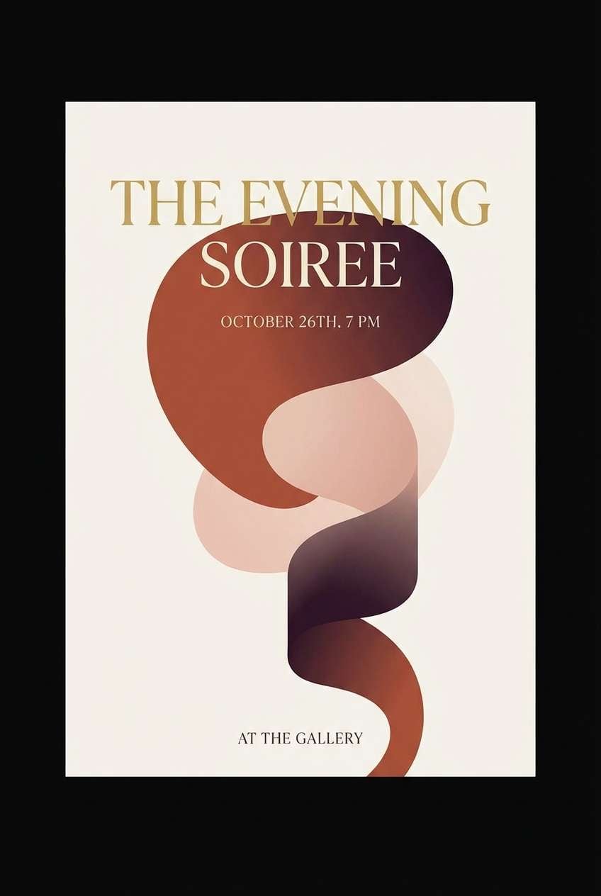
Image example of terracotta twilight generated using media.io
6) Tuscan Kitchen
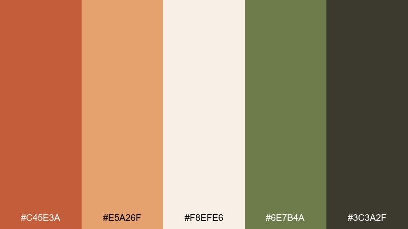
HEX: #C45E3A #E5A26F #F8EFE6 #6E7B4A #3C3A2F
Mood: appetizing, rustic, sunny
Best for: recipe blog layout
Appetizing and sunny, like roasted vegetables and olive branches on a farmhouse table. These terra cotta colors shine on recipe blogs, cookbook layouts, and food packaging where warmth equals comfort. Let the cream act as your page base and use the herb green for buttons or section labels. Tip: pair with natural paper textures to make the colors feel even more homemade.
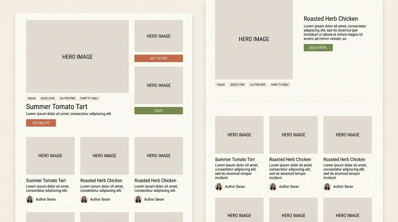
Image example of tuscan kitchen generated using media.io
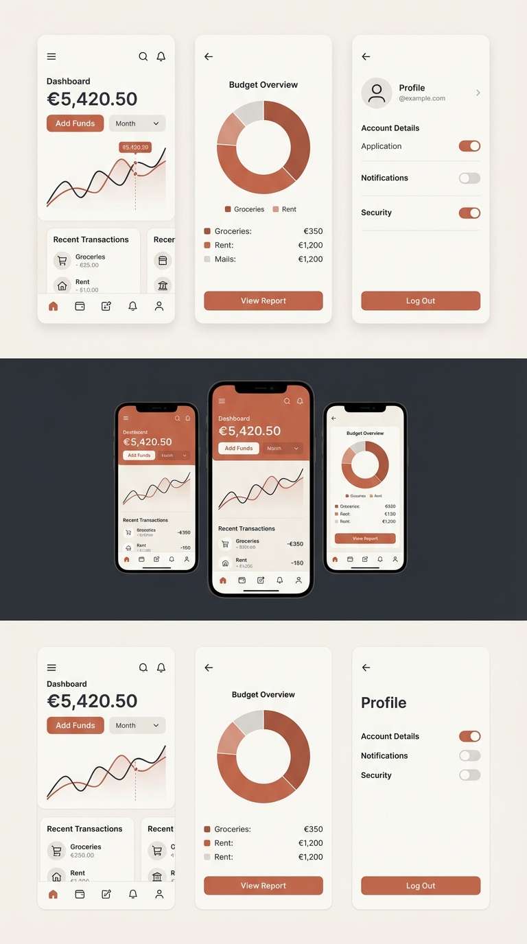
7) Minimal Clay UI
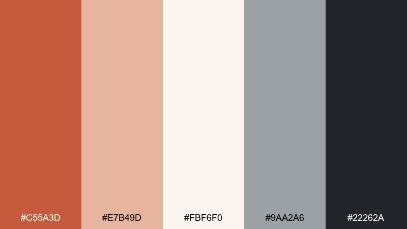
HEX: #C55A3D #E7B49D #FBF6F0 #9AA2A6 #22262A
Mood: clean, modern, approachable
Best for: finance app UI kit
Clean and approachable, like matte clay paired with cool stone. This terra cotta color palette works well for finance UI when you need warmth without losing clarity. Use charcoal for text, off-white for surfaces, and clay for call-to-action states. Tip: keep accent usage consistent, such as one primary button color and one alert color, to avoid visual noise.
Image example of minimal clay ui generated using media.io
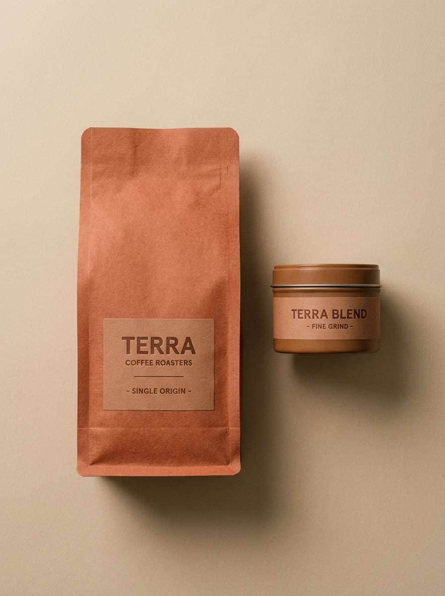
8) Rosewood Spice
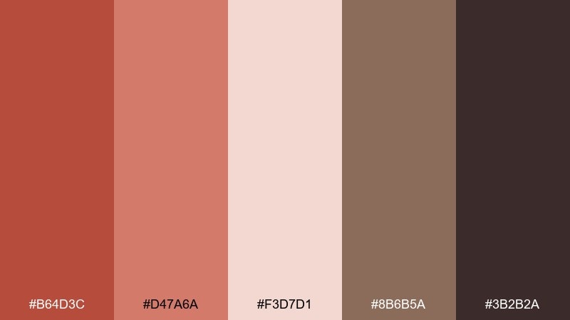
HEX: #B64D3C #D47A6A #F3D7D1 #8B6B5A #3B2B2A
Mood: cozy, intimate, vintage
Best for: coffee packaging design
Cozy and intimate, like rosewood shelves and spiced foam on a cappuccino. Great for coffee packaging, boutique labels, and artisan goods where you want a vintage touch. Lean on the dusty rose as a secondary accent to soften the darker browns. Tip: use simple line illustrations to keep the palette feeling premium rather than busy.
Image example of rosewood spice generated using media.io
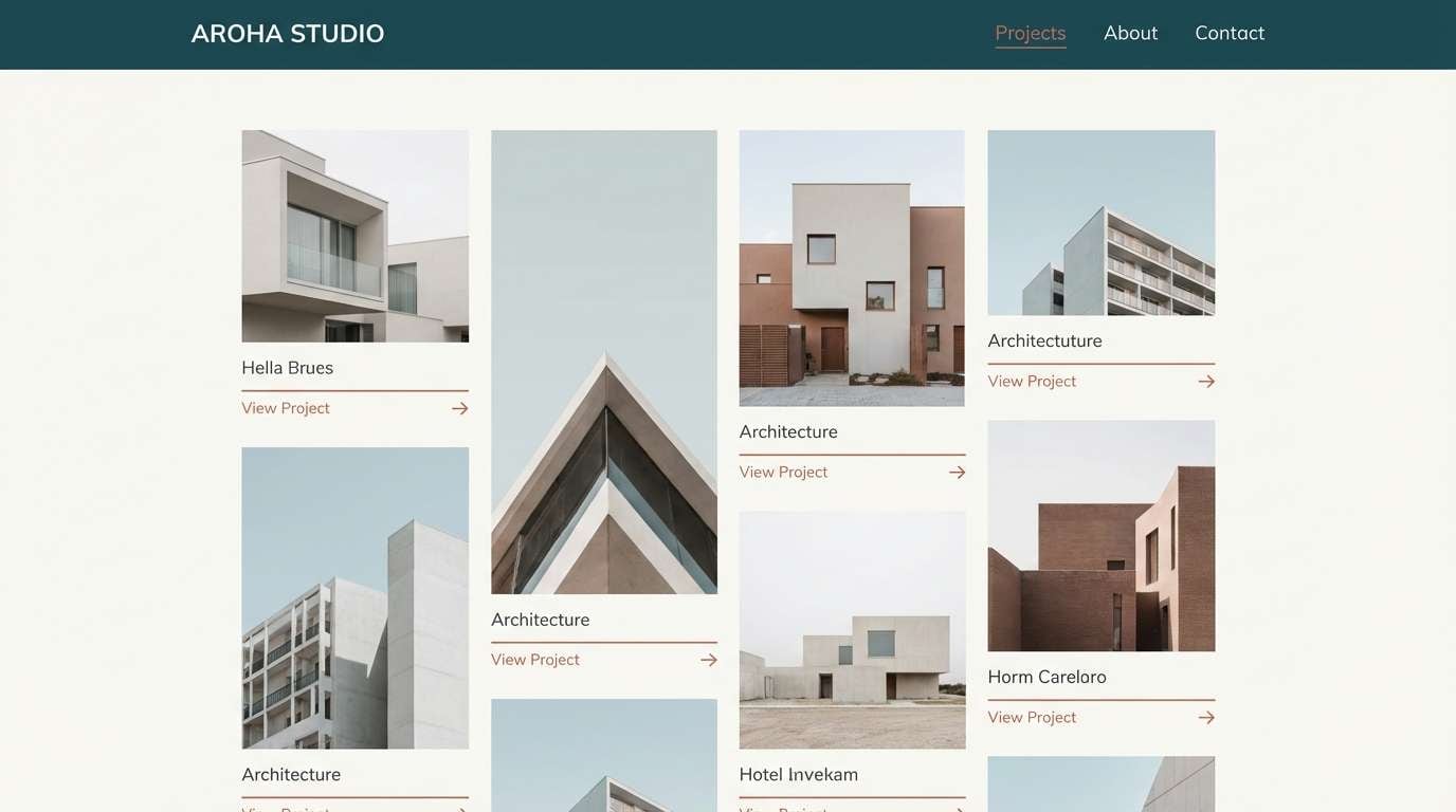
9) Earthy Modernist
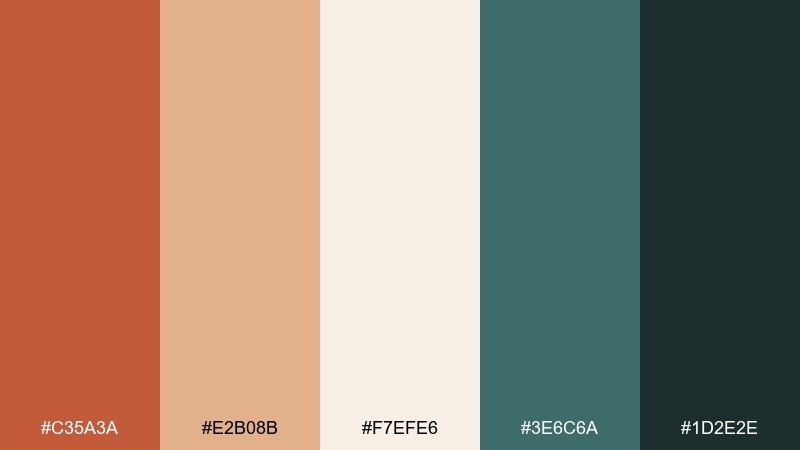
HEX: #C35A3A #E2B08B #F7EFE6 #3E6C6A #1D2E2E
Mood: confident, design-forward, grounded
Best for: architecture portfolio site
Confident and design-forward, like polished concrete warmed by clay accents. Use this terra cotta color scheme for architecture portfolios, studio websites, and case studies where structure matters. The teal-green tones add a contemporary counterpoint to warm earth colors. Tip: apply the darkest teal to navigation and captions, and keep the terracotta for highlights like project tags.
Image example of earthy modernist generated using media.io
10) Boho Market
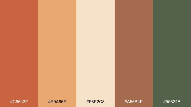
HEX: #C8643F #E9A86F #F6E2C8 #A56B4F #55624B
Mood: playful, sunny, handcrafted
Best for: handmade shop flyer
Playful and sunny, like woven baskets and citrus stalls at an outdoor market. Ideal for handmade shop flyers, craft fairs, and social promos that need warmth and charm. Use the golden peach for big blocks and let the olive green ground the composition. Tip: pair with stamped textures or imperfect shapes to amplify the handmade vibe.
Image example of boho market generated using media.io

11) Coastal Clay
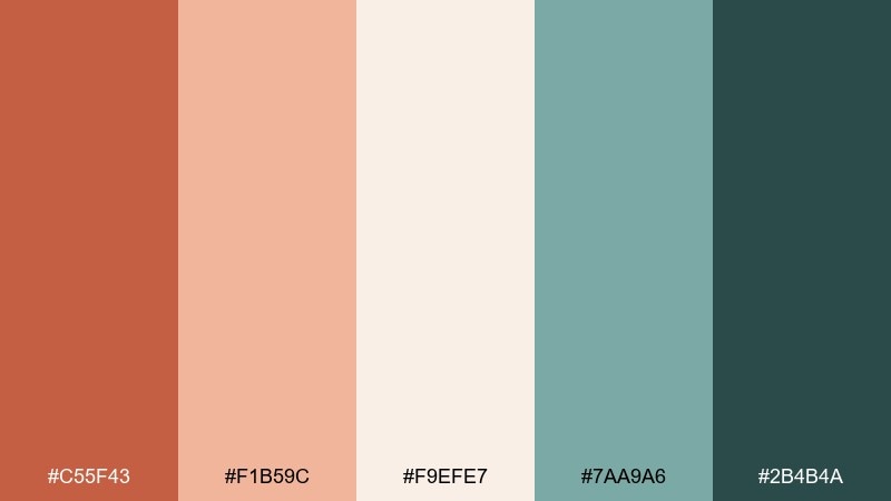
HEX: #C55F43 #F1B59C #F9EFE7 #7AA9A6 #2B4B4A
Mood: relaxed, breezy, modern
Best for: boutique hotel landing page
Relaxed and breezy, like clay tiles near sea glass and salt air. These terra cotta tones suit boutique hotel landing pages, spa promos, and travel branding that wants warmth without heaviness. Use the seafoam teal for links and subtle UI states while keeping the blushy clay for accents. Tip: keep photography bright and low-contrast so the palette feels coastal, not autumnal.
Image example of coastal clay generated using media.io
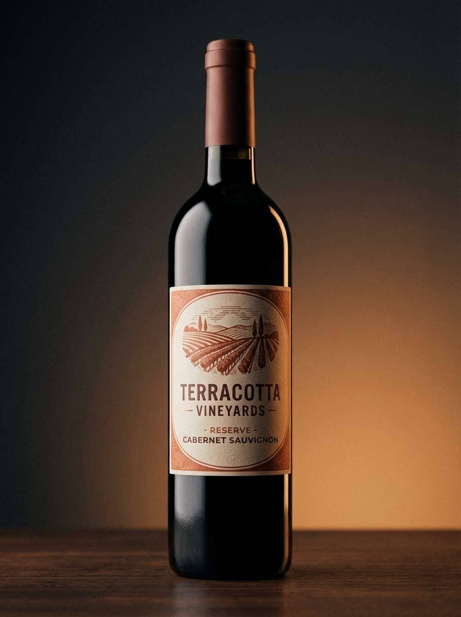
12) Rustic Winery
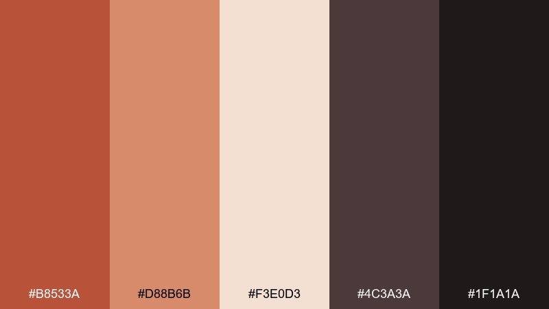
HEX: #B8533A #D88B6B #F3E0D3 #4C3A3A #1F1A1A
Mood: rich, moody, inviting
Best for: wine label design
Rich and moody, like cellar wood and a pour of red at golden hour. This terra cotta color palette works for wine labels, tasting menus, and premium product storytelling. Keep the deep cocoa for type and borders, and use the warm midtone as the main label field. Tip: add subtle emboss or foil effects in mockups to make the warm clay hues look luxurious.
Image example of rustic winery generated using media.io
13) Gallery Neutral
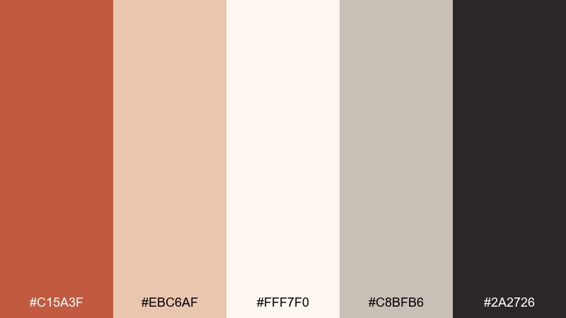
HEX: #C15A3F #EBC6AF #FFF7F0 #C8BFB6 #2A2726
Mood: quiet, curated, timeless
Best for: art gallery brochure
Quiet and curated, like a calm gallery wall with a single warm accent. Use it for brochures, exhibit cards, and portfolios that need neutrality with personality. The terracotta works best as a small callout, while the soft grays keep layouts orderly. Tip: choose one serif and one sans font family to echo the refined, museum-like mood.
Image example of gallery neutral generated using media.io
14) Sunset Stucco
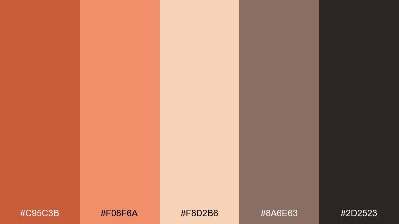
HEX: #C95C3B #F08F6A #F8D2B6 #8A6E63 #2D2523
Mood: golden, nostalgic, radiant
Best for: summer festival poster
Golden and nostalgic, like sunset washing over stucco and brick. This terra cotta color palette is ideal for summer festival posters and street-market promos where you want energy without neon. Use the bright peach for big shapes and keep the dark brown for tight type and logos. Tip: add grain and halftone textures to make the poster feel screen-printed and lively.
Image example of sunset stucco generated using media.io

15) Vintage Poster Ink
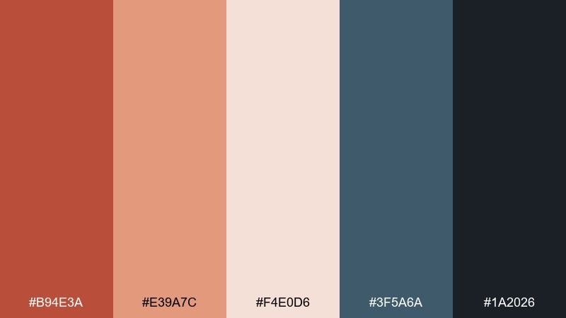
HEX: #B94E3A #E39A7C #F4E0D6 #3F5A6A #1A2026
Mood: retro, graphic, confident
Best for: retro movie poster design
Retro and graphic, like inked outlines on aged paper. Perfect for movie posters, album art, and merch graphics where contrast and limited color do the heavy lifting. The blue-gray gives the warm clay a crisp counterbalance. Tip: keep fills flat and use the darkest tone for linework to nail the vintage print look.
Image example of vintage poster ink generated using media.io

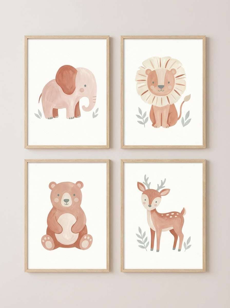
16) Soft Nursery Clay
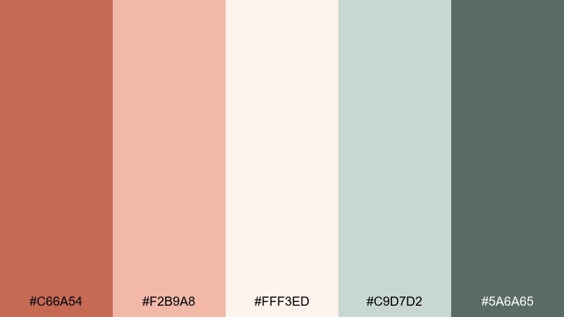
HEX: #C66A54 #F2B9A8 #FFF3ED #C9D7D2 #5A6A65
Mood: gentle, soothing, nurturing
Best for: nursery wall art prints
Gentle and soothing, like warm blush paint and soft cotton. Use it for nursery prints, baby shower stationery, and calm family photography presets. The minty gray-green keeps the warmth from becoming too sugary. Tip: stick to rounded shapes and light outlines so the palette stays quiet and comforting.
Image example of soft nursery clay generated using media.io
17) Botanical Terrarium
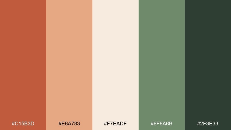
HEX: #C15B3D #E6A783 #F7EADF #6F8A6B #2F3E33
Mood: natural, earthy, refreshing
Best for: botanical illustration set
Natural and refreshing, like potting soil, clay pots, and leafy cuttings. It is a strong fit for botanical illustration sets, plant shop branding, and eco packaging. Keep the greens dominant and use the warm clay as a pot-and-label accent. Tip: in prints, choose uncoated paper so the warm tones stay soft and organic.
Image example of botanical terrarium generated using media.io
18) Luxe Retail Box
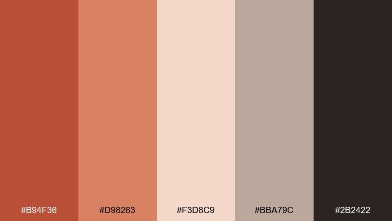
HEX: #B94F36 #D98263 #F3D8C9 #BBA79C #2B2422
Mood: premium, warm, polished
Best for: cosmetics packaging
Premium and polished, like a matte box with a warm glow at the edges. These terra cotta color combinations are excellent for cosmetics packaging because the soft blush tones feel friendly while the deep brown signals luxury. Use the mid clay for brand blocks and the pale blush for background panels. Tip: add subtle spot gloss on the darkest tone for a high-end contrast without adding new colors.
Image example of luxe retail box generated using media.io
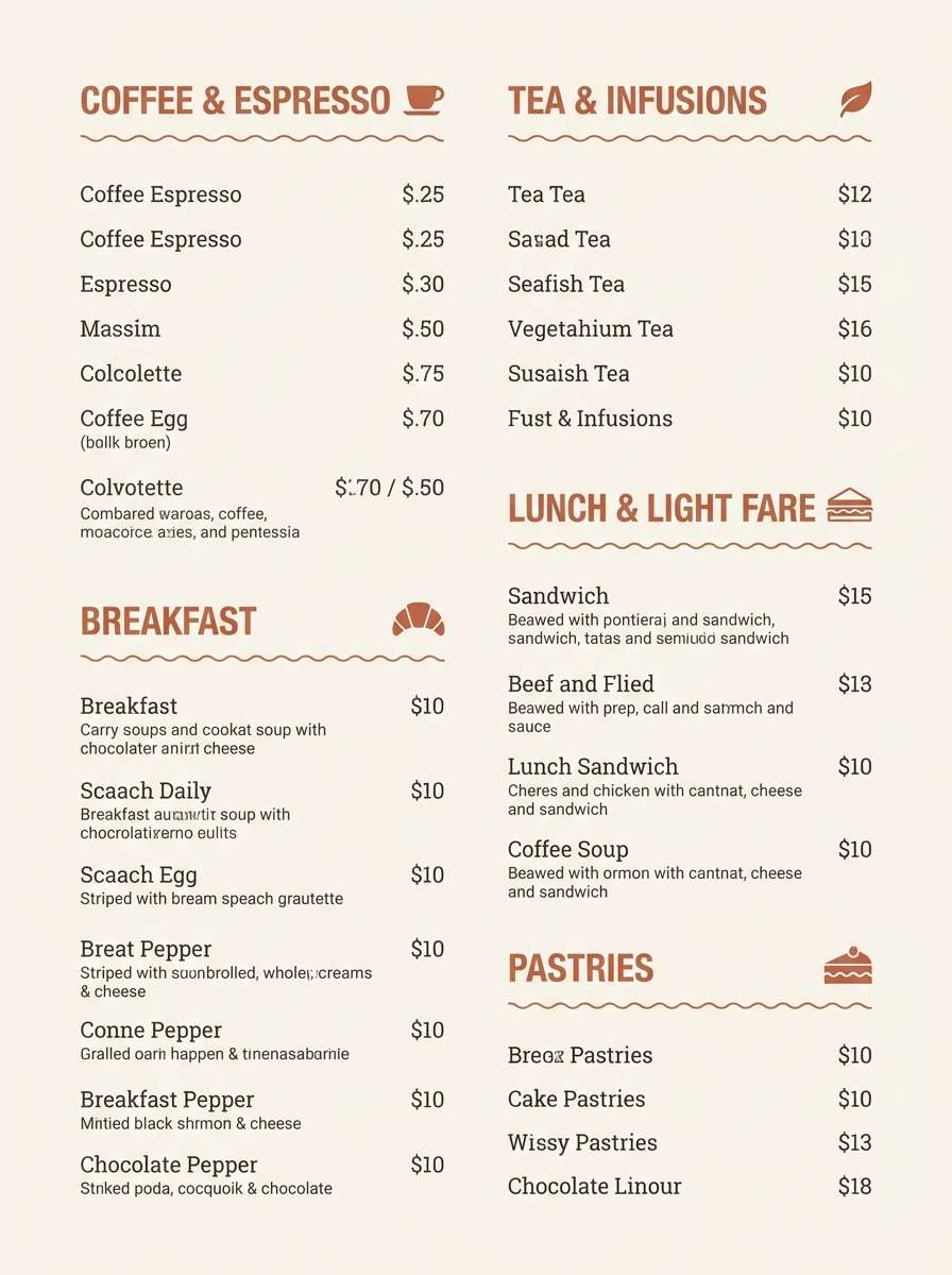
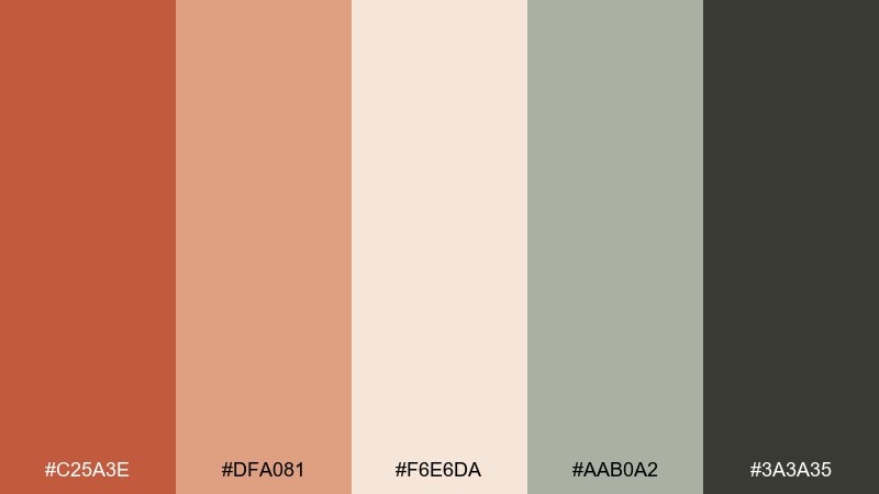
19) Warm Cafe Menu
HEX: #C45F3D #E8A97D #F9EFE6 #7C6A5B #2E2A28
Mood: welcoming, cozy, readable
Best for: cafe menu design
Welcoming and cozy, like toasted pastry crusts and warm ceramic mugs. Use this terra cotta color scheme for cafe menus, loyalty cards, and signage where readability matters as much as vibe. Keep the cream background, set body text in charcoal, and use terracotta for section headers. Tip: limit the mid orange to small highlights so the menu stays clean and easy to scan.
Image example of warm cafe menu generated using media.io
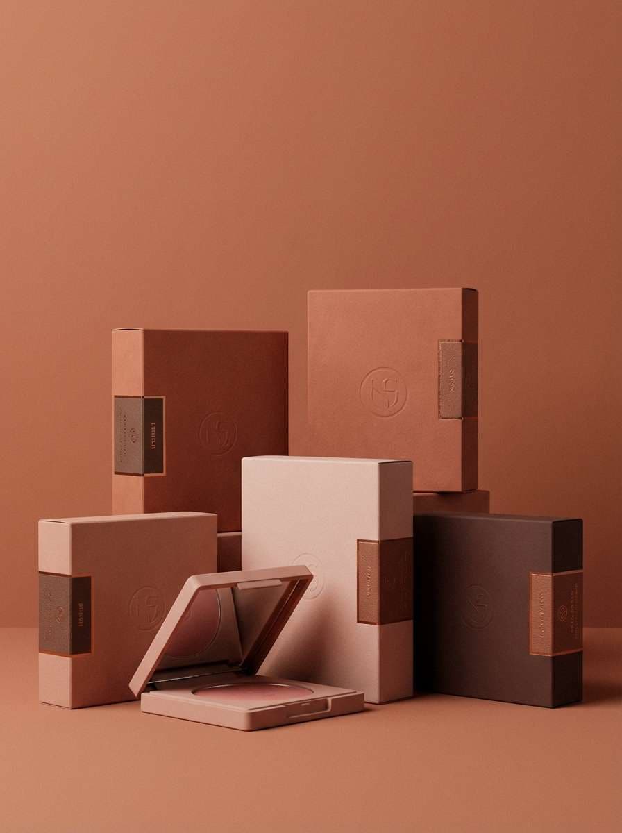
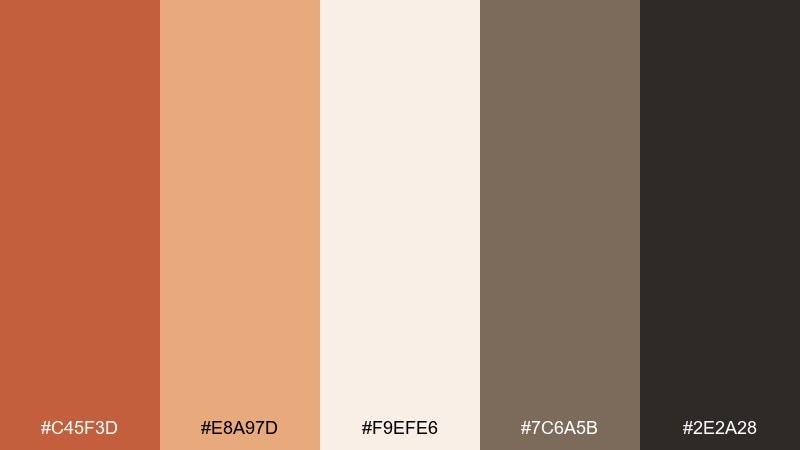
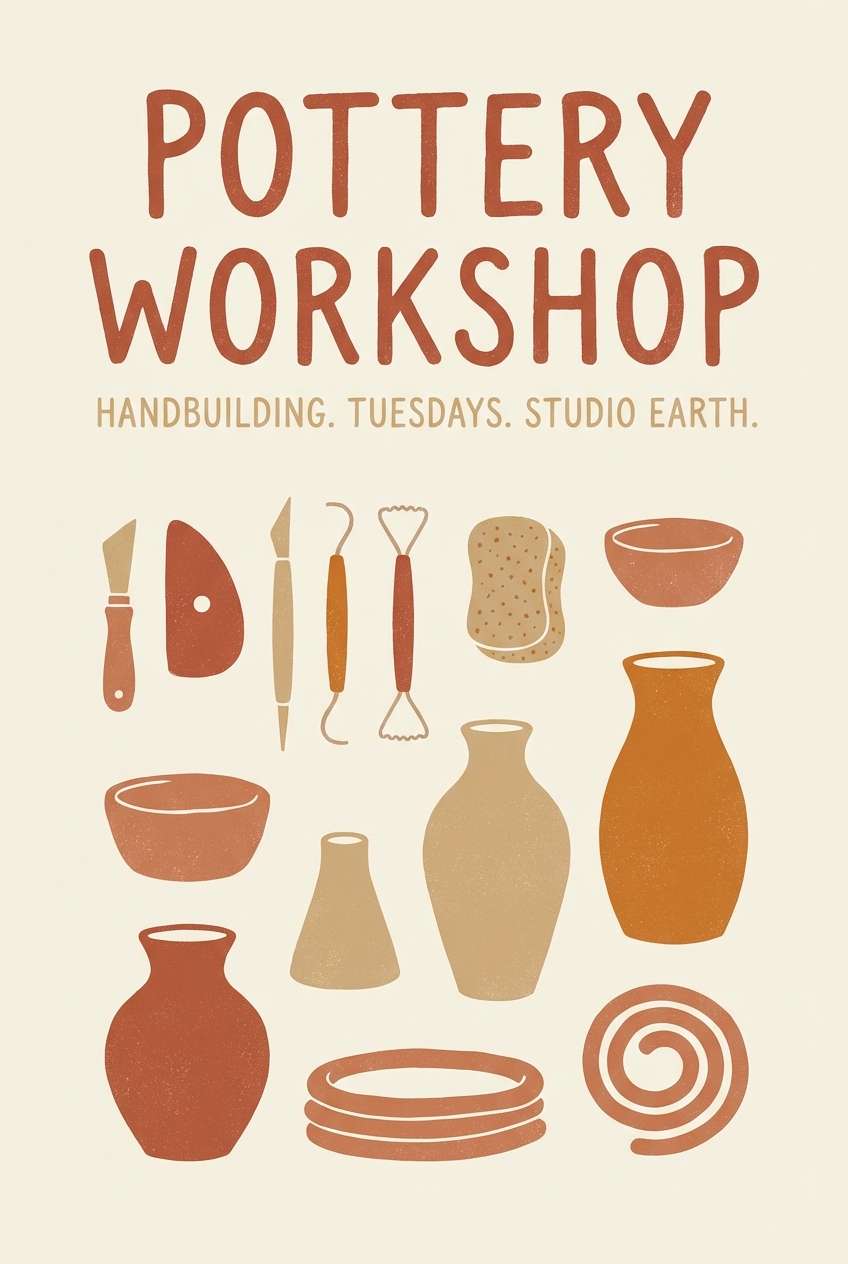
20) Ceramic Studio
HEX: #C25A3E #DFA081 #F6E6DA #AAB0A2 #3A3A35
Mood: artisan, calm, tactile
Best for: pottery workshop poster
Artisan and tactile, like wheel-thrown clay drying on a studio shelf. It is great for workshop posters, class schedules, and community announcements that should feel friendly and hands-on. Use the warm midtone for big shapes and let the soft cream keep everything breathable. Tip: pair with simple clay-tool line icons to reinforce the craft story without clutter.
Image example of ceramic studio generated using media.io
21) Winter Clay Contrast
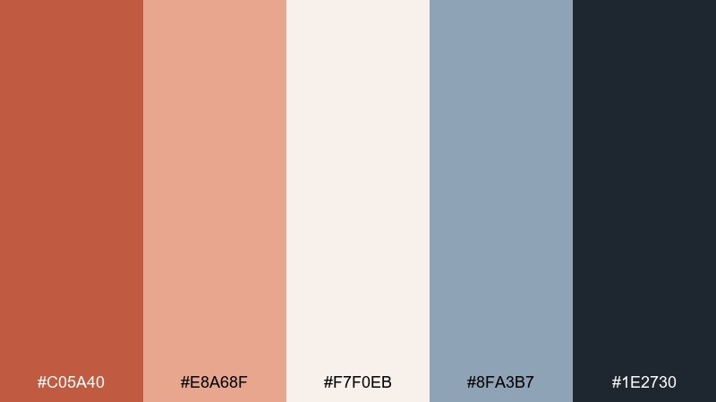
HEX: #C05A40 #E8A68F #F7F0EB #8FA3B7 #1E2730
Mood: crisp, modern, balanced
Best for: tech brand social templates
Crisp and modern, like warm clay against a winter sky. Use these terra cotta colors for tech brand social templates, announcement cards, and product update posts where you need contrast without harsh primaries. The cool steel blue refreshes the warm tones and keeps layouts feeling contemporary. Tip: set the darkest navy as your base text color and treat terracotta as a repeatable accent for CTAs.
Image example of winter clay contrast generated using media.io

What Colors Go Well with Terra Cotta?
Terra cotta pairs beautifully with warm neutrals like cream, sand, and greige, which help it feel architectural and airy. Deep espresso or charcoal adds definition for type, frames, and UI contrast.
To modernize the warmth, add cool balancing tones such as slate blue, steel navy, seafoam, or teal-green. These hues keep terra cotta from reading overly “fall” and make palettes feel more contemporary.
For a softer, lifestyle look, try dusty pinks and blush tones, especially in event design and packaging. Keep one dark anchor color in the system so the overall scheme stays readable and premium.
How to Use a Terra Cotta Color Palette in Real Designs
Start with proportion: let off-whites and light beiges do the heavy lifting as backgrounds, then use terra cotta as a controlled accent (buttons, labels, highlights, or decor objects). This keeps layouts clean and prevents the palette from feeling heavy.
Build hierarchy with contrast by assigning a single very dark tone for text and icons, then reserve mid-tones for surfaces and cards. In interiors, repeat terra cotta in small doses (pillows, vases, art) for cohesion without turning the whole room orange.
If you’re using photography, match the grade to the palette—slightly warm whites and low-contrast shadows work especially well. For print, uncoated or textured paper makes terra cotta look softer and more tactile.
Create Terra Cotta Palette Visuals with AI
When you already have HEX codes and a design direction, generating consistent images is much faster with AI. You can turn a palette into moodboards, posters, UI mockups, or packaging scenes by describing the subject and the style.
Reuse the prompts above as templates, then swap the scene (living room, brochure, product shot) while keeping the same color language. This is a quick way to validate a terra cotta color scheme before you commit to final assets.
Use Media.io to generate images in the right aspect ratio for your platform, then refine or iterate until the visuals match your brand tone.
Terra Cotta Color Palette FAQs
-
What is the HEX code for terra cotta?
Terra cotta doesn’t have one single HEX value, but common modern terra cotta tones sit around clay-red/orange-brown ranges like #C75B3C, #C55A3D, or #C45E3A depending on how red or muted you want it. -
Is terra cotta warm or cool?
Terra cotta is a warm color. It carries orange and red undertones, so it feels sunbaked and earthy—especially when paired with cream, sand, and wood tones. -
What colors complement terra cotta best?
Great complements include sage/olive greens, slate or steel blues, teal, and deep charcoals. These cooler hues balance terra cotta’s warmth and make palettes feel more modern. -
Does terra cotta work for modern branding and UI?
Yes—terra cotta can feel friendly and premium when used as an accent against off-white surfaces with charcoal text. Keep accent usage consistent (one primary button color, limited highlights) to maintain clarity. -
How do you keep a terra cotta palette from looking too rustic?
Pair terra cotta with cooler counterpoints (navy, slate blue, teal) and clean neutrals (off-white, warm gray). Use minimal textures and add plenty of whitespace so the warmth reads intentional rather than “country.” -
Can terra cotta be used in small rooms?
Yes. Use lighter neutrals for most walls and large surfaces, then add terra cotta in smaller repeating accents (art, pillows, pottery). This keeps the space bright while still getting the cozy clay vibe. -
What’s the difference between terra cotta and burnt orange?
Burnt orange is typically brighter and more saturated, while terra cotta is more muted and clay-like, often leaning slightly brown or dusty. Terra cotta usually feels softer and more natural in interiors and packaging.


