

Warm black is a deep, near-black neutral with subtle brown or red undertones, so it feels softer and more human than pure #000000. It’s a go-to for premium branding, editorial layouts, and modern UI where you want contrast without harshness.
Below are 20 warm black color palette ideas (with HEX codes), plus practical guidance on pairing, accessibility, and how to generate on-brand visuals quickly using AI.
In this article
- Why Warm Black Palettes Work So Well
-
- smoked espresso
- brass & ink
- cocoa charcoal
- night market
- ember olive
- velvet merlot
- sandstone studio
- copper typo
- walnut smoke
- saffron shadow
- clay & graphite
- mocha minimal ui
- noir botanical
- golden hour print
- hearthstone branding
- desert vinyl
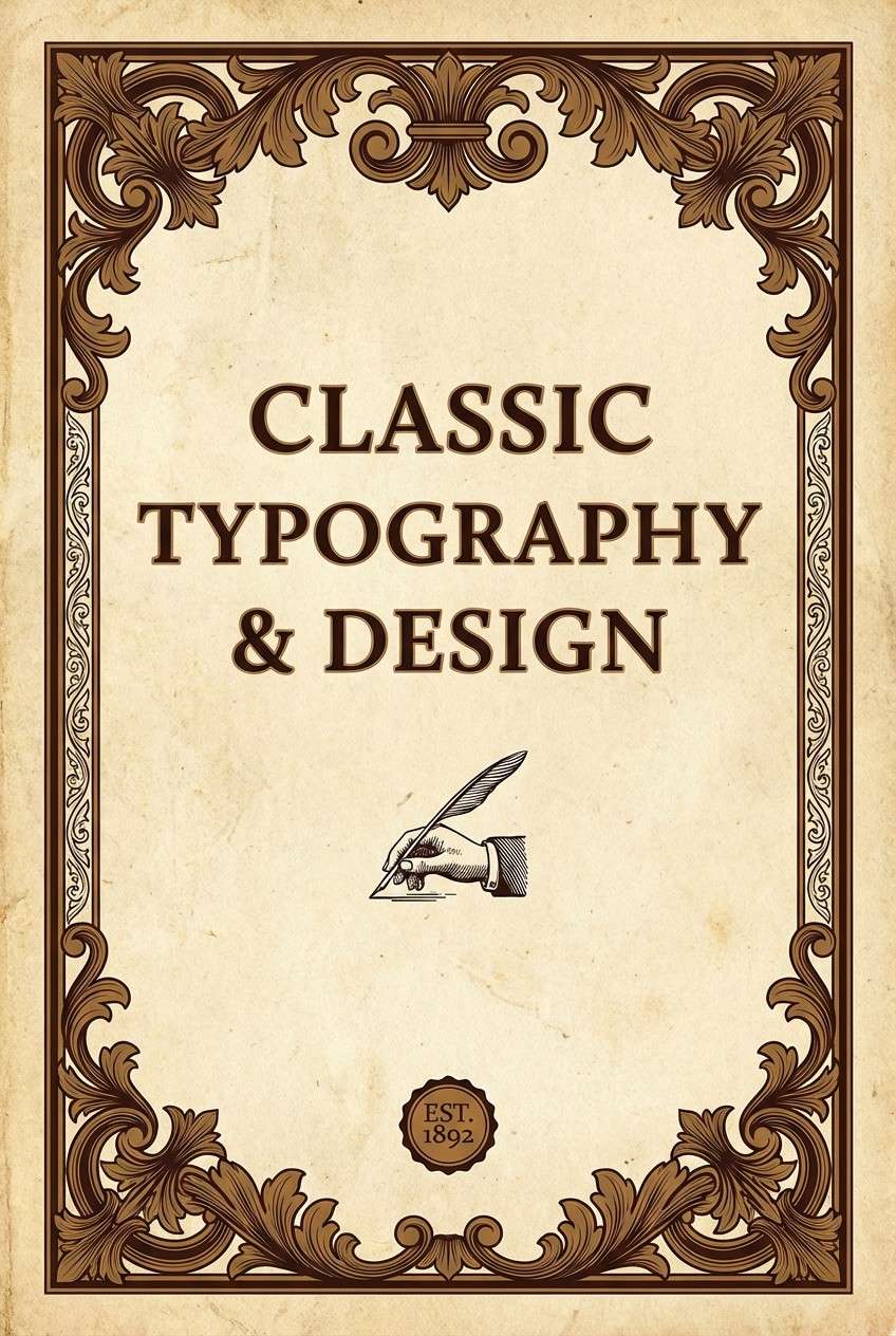
- antique library
- roast & rose
- terracotta lantern
- pine tar & linen
- What Colors Go Well with Warm Black?
- How to Use a Warm Black Color Palette in Real Designs
- Create Warm Black Palette Visuals with AI
Why Warm Black Palettes Work So Well
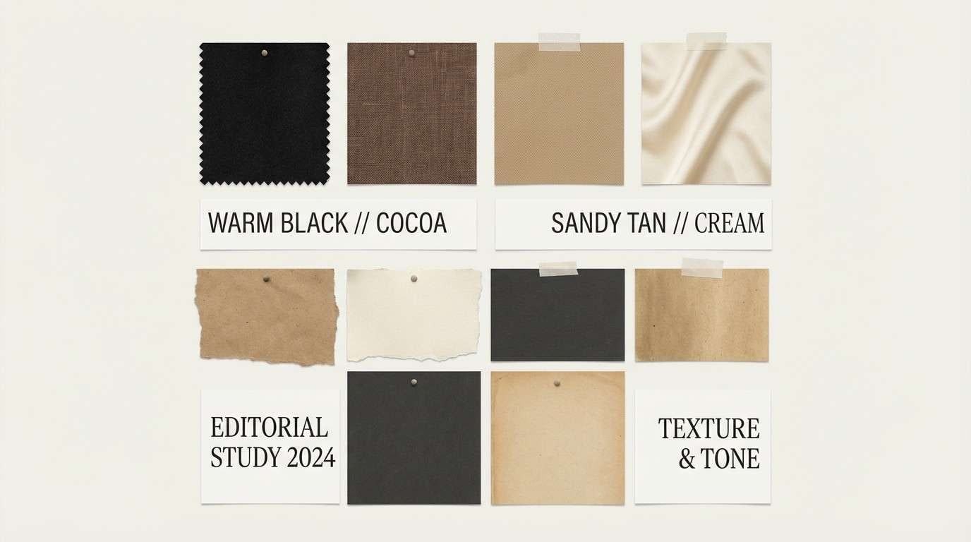
Warm black palettes add depth without the “inkiness” of pure black, so layouts feel more natural and less sterile. That subtle warmth also plays nicely with skin tones, food photography, wood textures, and paper-like backgrounds.
They’re versatile: the near-black anchors typography and structure, while warm midtones (caramel, taupe, terracotta) supply hierarchy and emphasis without looking loud. This makes warm black a strong base for both minimal and highly visual designs.
In print and on screens, warm black can reduce eye strain compared with stark black-on-white contrast. When paired with creamy off-whites, you get readability plus a premium, editorial finish.
20+ Warm Black Color Palette Ideas (with HEX Codes)
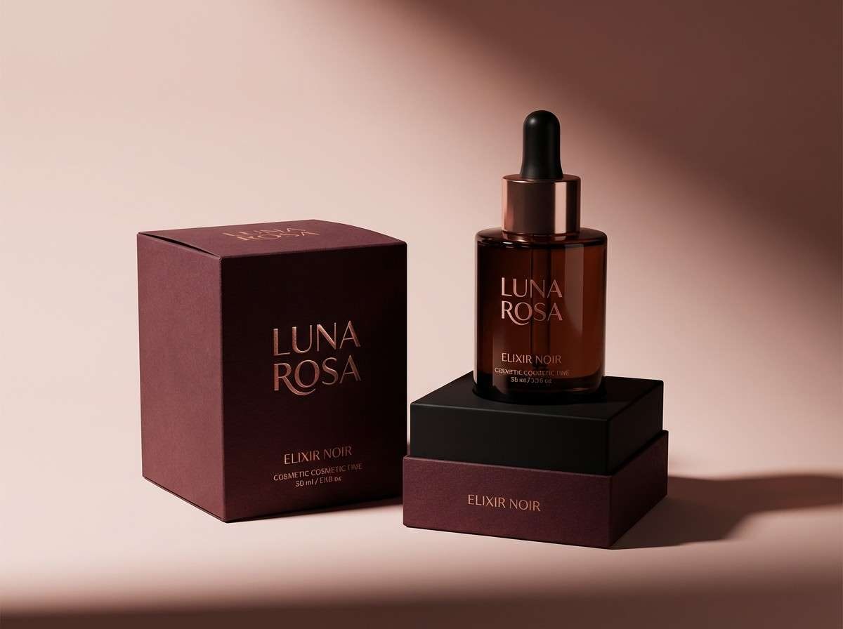
1) Smoked Espresso

HEX: #1B1410 #2A1C16 #4B342A #A3754C #F1E4D2
Mood: moody, grounded, artisanal
Best for: coffee shop branding and packaging
Moody and roasted, this mix feels like espresso crema against dark wood. Use the near-black base for logos and type, then lean on caramel and oat tones for highlights and labels. Pair it with uncoated paper textures, debossing, or matte finishes to keep the look premium. Tip: reserve the light cream for negative space so the dark tones stay rich, not heavy.
Image example of smoked espresso generated using media.io
Media.io is an online AI studio for creating and editing video, image, and audio in your browser.

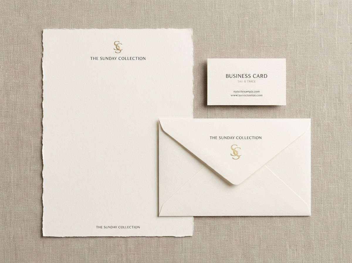
2) Brass & Ink

HEX: #16110F #2B221B #5A4A3A #B08D57 #E7D7B3
Mood: elegant, editorial, vintage-luxe
Best for: luxury brand identity and stationery
Elegant and slightly vintage, it evokes brass fixtures, inked paper, and quiet lobbies. Let the warm black and deep taupe carry typography, then use brass as a restrained accent for seals, rules, and icons. Pair with serif type, fine linework, and plenty of breathing room to avoid visual noise. Tip: keep the gold tone under 10 percent coverage for a truly upscale finish.
Image example of brass & ink generated using media.io
3) Cocoa Charcoal

HEX: #14100D #2A221C #6B5A4B #C6A07A #F6EFE5
Mood: calm, cozy, refined
Best for: interior mood boards and lifestyle blogs
Calm and cozy, these tones suggest cocoa powder, linen throws, and soft shadows at dusk. Use the darkest shades for headers and frames, with the sandy midtones for surfaces and cards. Pair with warm photography, natural materials, and subtle grain to keep it tactile. Tip: if a layout feels flat, add contrast by pushing one element all the way to the deepest charcoal.
Image example of cocoa charcoal generated using media.io
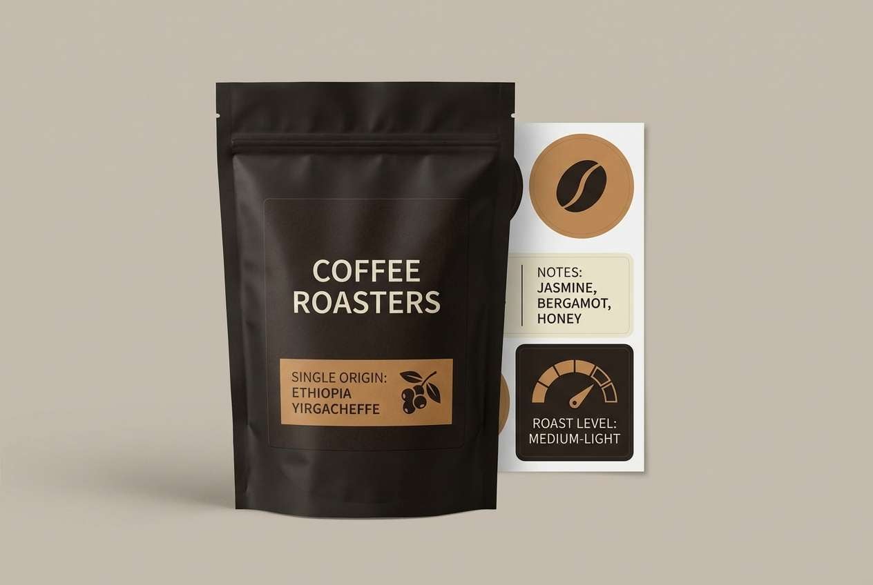
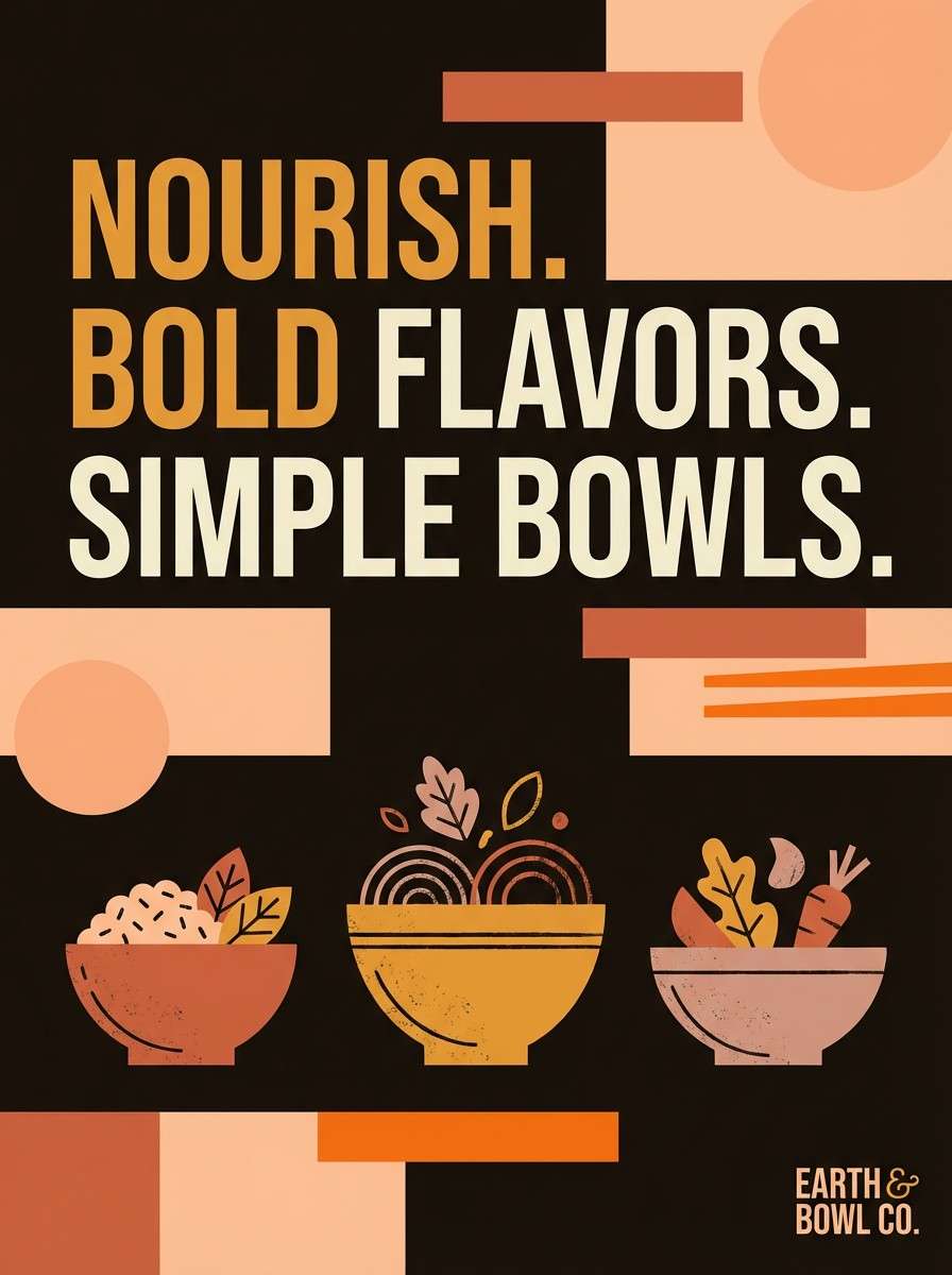
4) Night Market
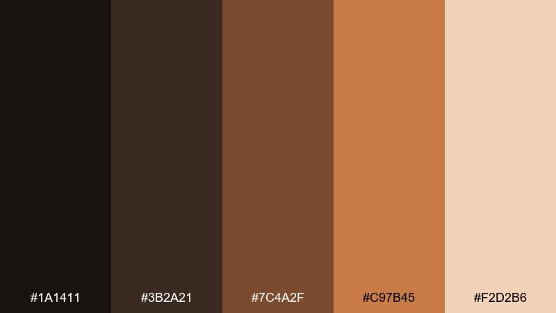
HEX: #1A1411 #3B2A21 #7C4A2F #C97B45 #F2D2B6
Mood: lively, warm, street-food
Best for: food posters and social ads
Lively and warm, it feels like lantern light hitting wood stalls and spice-laden steam. These warm black color combinations work best when the inky base anchors bold headlines and the orange-browns carry appetizing highlights. Pair with chunky sans fonts, high-contrast photography, and tight crop compositions. Tip: put the light peach behind price tags or callouts so they pop without turning neon.
Image example of night market generated using media.io
5) Ember Olive
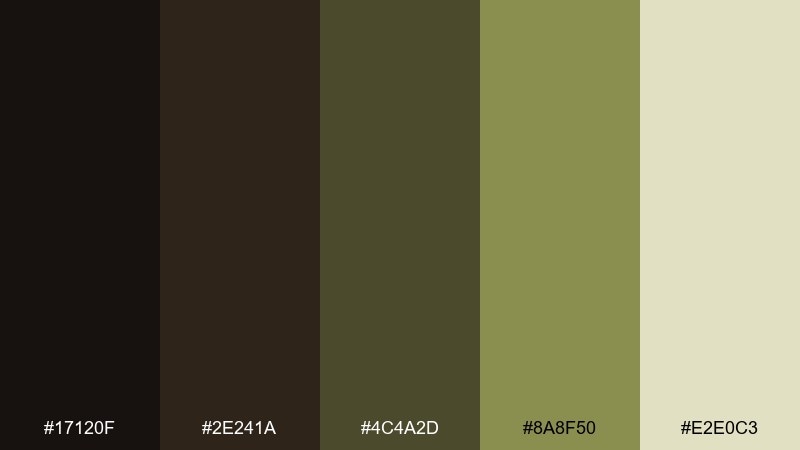
HEX: #17120F #2E241A #4C4A2D #8A8F50 #E2E0C3
Mood: earthy, outdoorsy, grounded
Best for: eco product packaging and labels
Earthy and outdoorsy, the palette reads like campfire embers under olive branches. Use the deep base for label text and outlines, then bring in olive and sage for badges, ingredients, and eco marks. Pair with kraft paper, minimal icons, and organic shapes for a credible natural vibe. Tip: test small text in the darkest two shades to maintain legibility on recycled stock.
Image example of ember olive generated using media.io
6) Velvet Merlot
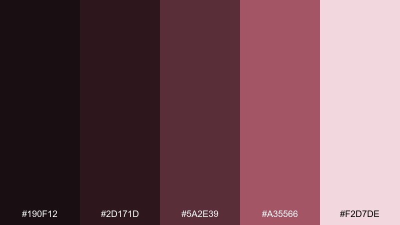
HEX: #190F12 #2D171D #5A2E39 #A35566 #F2D7DE
Mood: romantic, dramatic, boutique
Best for: beauty branding and promo banners
Romantic and dramatic, it brings velvet curtains, merlot lipstick, and low-lit glamour. Keep the near-black as the primary base, then layer plum and rose for gradients, buttons, or highlight text. Pair with high-contrast portrait shots and elegant spacing to avoid a heavy feel. Tip: use the pale blush sparingly as a soft glow behind product names.
Image example of velvet merlot generated using media.io
7) Sandstone Studio
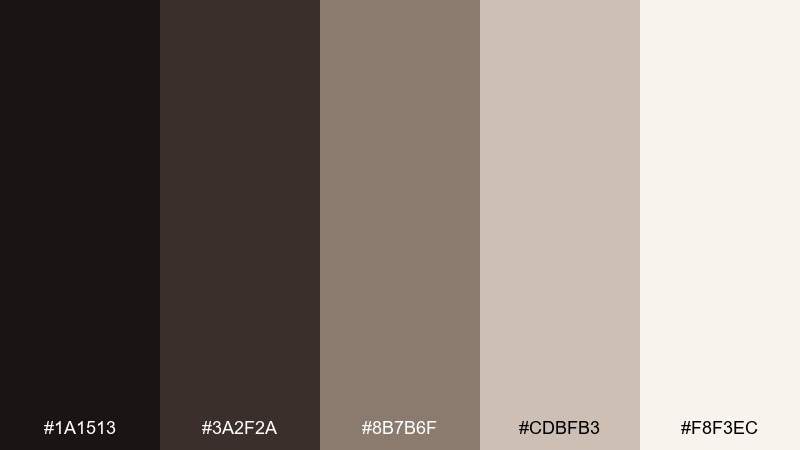
HEX: #1A1513 #3A2F2A #8B7B6F #CDBFB3 #F8F3EC
Mood: minimal, soft, modern-neutral
Best for: portfolio websites and architecture decks
Minimal and soft, it feels like polished concrete warmed by late-afternoon sun. Use the deep tones for navigation and captions, while the mid neutrals build calm sections and grids. Pair with clean typography, thin dividers, and generous margins for an architectural sensibility. Tip: set the warm black as your primary text color instead of pure black to reduce harsh contrast.
Image example of sandstone studio generated using media.io
8) Copper Typo

HEX: #15110F #2B201B #6B3E2E #B76A4A #F3E2D5
Mood: industrial, creative, handcrafted
Best for: event flyers and typography posters
Industrial and creative, it recalls copper plate, ink rollers, and workshop dust. Let the dark base carry the poster field, then punch in copper and clay for oversized type or date blocks. Pair with textured halftones, bold weights, and simple geometry to keep it modern. Tip: use the light peach as a margin or footer bar to keep the layout readable from a distance.
Image example of copper typo generated using media.io

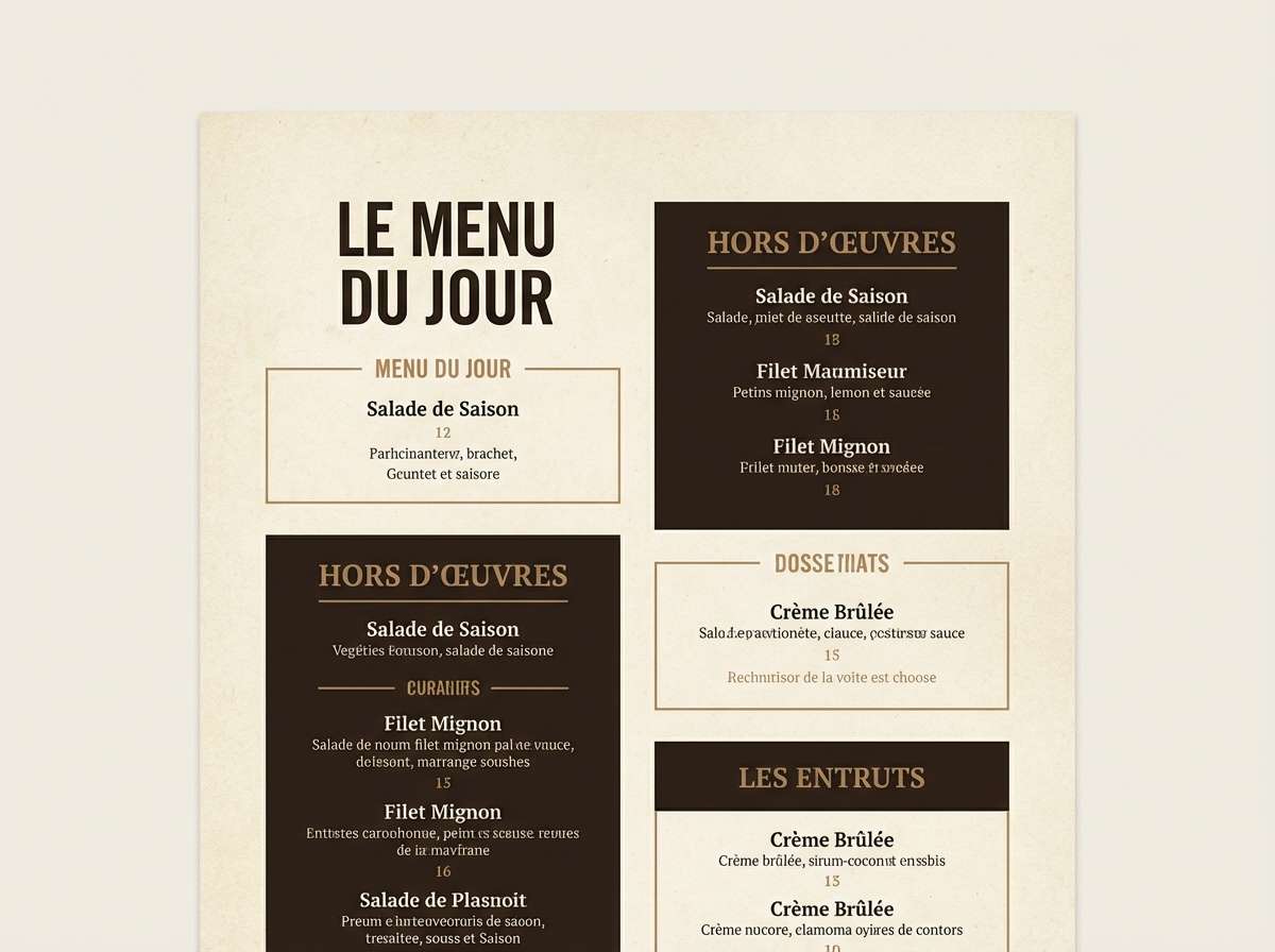
9) Walnut Smoke

HEX: #1C1512 #33241E #5A4035 #9C7B67 #EDE0D6
Mood: classic, comfortable, timeless
Best for: restaurant menus and brand guides
Classic and comfortable, these hues feel like walnut tables and soft candle smoke. Use the darkest shade for headings and borders, with the warm browns for section dividers and icons. Pair with paper-like backgrounds, subtle patterns, and warm food photography for cohesion. Tip: keep body copy on the light cream to maintain contrast without losing the cozy mood.
Image example of walnut smoke generated using media.io
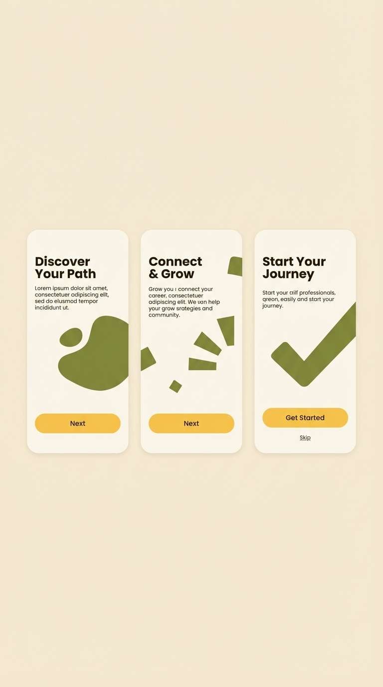
10) Saffron Shadow
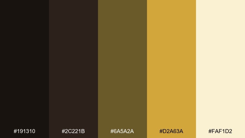
HEX: #191310 #2C221B #6A5A2A #D2A63A #FAF1D2
Mood: bold, sunny, modern
Best for: app onboarding screens and CTAs
Bold and sunny, it looks like saffron threads glowing against deep shadows. Use the warm black for structure and navigation, then let the saffron be your primary action color for buttons and highlights. Pair with simple iconography and short copy so the yellow reads crisp, not chaotic. Tip: choose the pale cream for large backgrounds to reduce glare while keeping the contrast punchy.
Image example of saffron shadow generated using media.io
11) Clay & Graphite

HEX: #181311 #2F2622 #725245 #C18A74 #F4E7DF
Mood: warm, approachable, handmade
Best for: ceramics brands and shop headers
Warm and approachable, it evokes clay dust on hands and graphite sketches in a studio notebook. Use the dark neutrals for type and outlines, with terracotta and blush for feature areas and product tags. Pair with natural photography, rounded shapes, and simple patterns for a friendly craft aesthetic. Tip: keep the blush as a background for product names to improve scannability on mobile.
Image example of clay & graphite generated using media.io

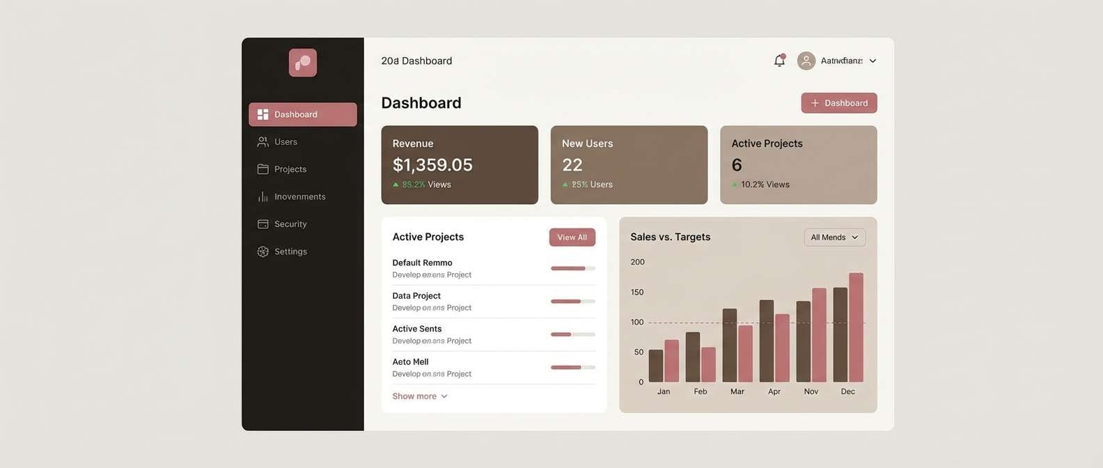
12) Mocha Minimal UI

HEX: #161211 #2C2422 #5C4A44 #B69D93 #F6F1EE
Mood: quiet, modern, premium
Best for: dashboard UI and SaaS branding
Quiet and premium, it reads like mocha foam and soft shadowed panels. This warm black color palette shines in dashboards where contrast must feel calm, not stark. Pair the deepest tone with off-white surfaces, and use the dusty rose-taupe for active states and chips. Tip: set cards one shade apart from the page background to create depth without borders.
Image example of mocha minimal ui generated using media.io
13) Noir Botanical

HEX: #14110F #2A241E #3D4A2F #8E9B6A #E9E7D5
Mood: botanical, calm, sophisticated
Best for: wellness packaging and herb labels
Botanical and calm, it feels like shadowed leaves in a greenhouse at dusk. Use the warm black for ingredient lists and logotypes, then bring in olive greens for botanical marks and category coding. Pair with line illustrations, textured paper, and minimal layouts for a refined apothecary look. Tip: keep the light sage-cream as the main label background so the greens stay fresh.
Image example of noir botanical generated using media.io

14) Golden Hour Print
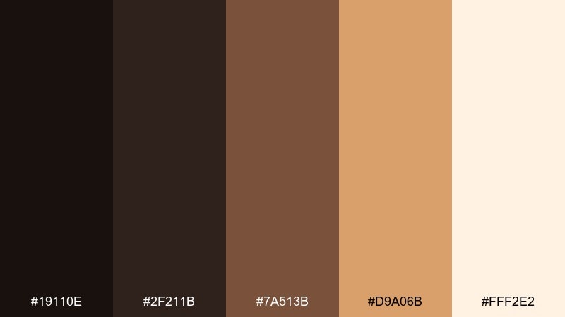
HEX: #19110E #2F211B #7A513B #D9A06B #FFF2E2
Mood: sunlit, nostalgic, cinematic
Best for: magazine spreads and editorial covers
Sunlit and nostalgic, these colors mimic golden-hour film on warm skin tones. Use the deep shades for mastheads and captions, while the honey and cream create inviting blocks and pull quotes. Pair with serif headlines, wide margins, and muted photography for a cinematic feel. Tip: print tests matter here, so adjust the honey tone to avoid oversaturation on coated paper.
Image example of golden hour print generated using media.io
15) Hearthstone Branding

HEX: #1B1512 #362820 #6E4C3B #C28B5C #EFE1D3
Mood: welcoming, rustic, trustworthy
Best for: small business branding and signage
Welcoming and rustic, it suggests hearthstone, toasted grain, and warm lamplight. A warm black color scheme like this works well for signs and logos where you want depth without looking harsh. Pair the dark base with caramel accents for icon fills, borders, and wayfinding arrows. Tip: use the light cream as a consistent background across touchpoints to keep the brand cohesive.
Image example of hearthstone branding generated using media.io
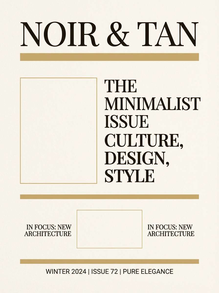
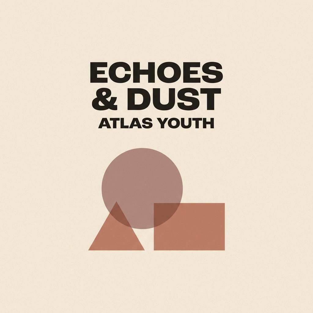
16) Desert Vinyl
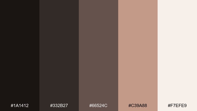
HEX: #1A1412 #332B27 #66524C #C39A88 #F7EFE9
Mood: soft-retro, warm, understated
Best for: album covers and creator merch
Soft-retro and understated, it feels like dusty desert roads and worn vinyl sleeves. Use the deepest tone for titles and barcodes, then lean on muted rose-browns for gradients and shapes. Pair with grain, subtle vignette effects, and minimal illustrations for a modern throwback. Tip: keep the lightest shade for the track list area so the text stays clear.
Image example of desert vinyl generated using media.io
17) Antique Library

HEX: #171210 #2E251F #4B3B32 #7A6A55 #D9D1C3
Mood: scholarly, classic, quiet
Best for: book covers and academic slides
Scholarly and quiet, it evokes leather spines, aged paper, and the hush of a reading room. Use the warm black and deep brown for titles and section headers, then pull in the parchment tone for backgrounds. Pair with traditional serif type and subtle ornaments for credibility. Tip: keep charts and callouts in the mid olive-brown to avoid a stark, corporate look.
Image example of antique library generated using media.io
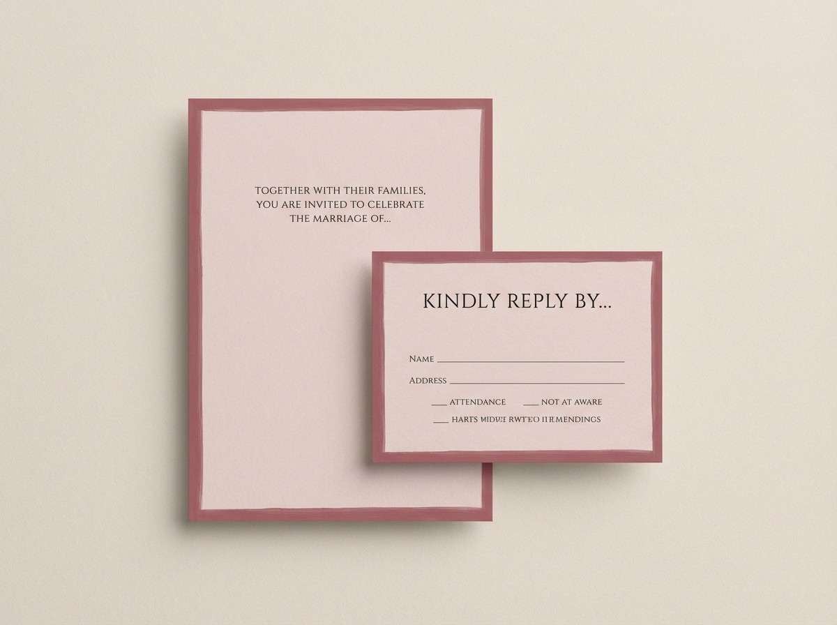
18) Roast & Rose
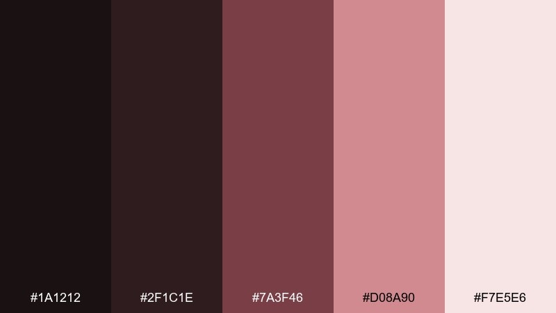
HEX: #1A1212 #2F1C1E #7A3F46 #D08A90 #F7E5E6
Mood: cozy, romantic, modern
Best for: wedding invitations and RSVP cards
Cozy and romantic, it suggests dried roses on dark wood with candlelit shadows. Use the near-black for names and key details, and reserve the dusty rose for borders, monograms, or wax-seal motifs. Pair with textured paper and minimal florals to keep it modern rather than overly sweet. Tip: print the blush background very light to prevent text from sinking into the page.
Image example of roast & rose generated using media.io
19) Terracotta Lantern

HEX: #181210 #2E201A #6B3C2A #D07B54 #F3D9CB
Mood: warm, festive, handcrafted
Best for: seasonal sale banners and storefront posters
Warm and festive, it feels like terracotta lanterns glowing against a night sky. These warm black color combinations are ideal for seasonal promos where you want contrast plus friendly warmth. Pair the dark base with terracotta shapes for headlines, badges, and percentage-off stamps. Tip: use the peach tone as a background for legal text so it stays readable without stealing attention.
Image example of terracotta lantern generated using media.io

20) Pine Tar & Linen
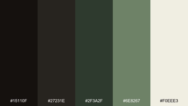
HEX: #15110F #27231E #2F3A2F #6E8267 #F0EEE3
Mood: rugged, natural, contemporary
Best for: outdoor gear branding and lookbooks
Rugged and natural, it brings pine tar, forest shade, and linen canvas to mind. Use the warm black for logotypes and navigation, with muted greens for category tags and functional details. Pair with matte textures, topographic lines, and straightforward typography for a confident outdoor tone. Tip: keep the linen off-white as the main page background to prevent the greens from turning muddy.
Image example of pine tar & linen generated using media.io
What Colors Go Well with Warm Black?
Warm black pairs best with other warm neutrals: cream, oat, beige, parchment, and taupe. These combinations keep contrast readable while maintaining a soft, premium vibe.
For accents, choose warmed-up metals and earth tones like brass, honey, caramel, terracotta, and copper. If you want a fresher direction, muted olives and sages add contrast without fighting the base.
For modern UI or branding systems, keep one warm black as your anchor, one light off-white as your canvas, and one accent color for actions or highlights. This three-part structure stays consistent across web, print, and social.
How to Use a Warm Black Color Palette in Real Designs
Use warm black for core structure: headings, navigation, logo marks, frames, and key type. Compared with pure black, it usually feels less severe—especially on large backgrounds or long-scroll pages.
Build hierarchy with midtones (walnut, cocoa, taupe) for cards, dividers, and secondary sections, then reserve your light cream for negative space and readability. This keeps designs deep and “moody” without becoming heavy.
If you’re designing for accessibility, test contrast early: warm blacks can look similar to deep browns on some screens. Use the lightest shade for body copy backgrounds and keep accent colors bold enough to read clearly in buttons and small UI states.
Create Warm Black Palette Visuals with AI
If you need mockups fast—posters, packaging, UI screens, or brand boards—AI image generation can help you explore warm black combinations before you commit to final production files. The key is to describe materials (matte paper, foil, linen) and lighting (low-lit, golden hour, studio) so the warmth comes through.
Start with one palette above, copy its prompt style, and swap in your product type and layout format (menu, label, dashboard, album cover). Iterate with small tweaks: “more negative space,” “subtle grain,” or “minimal vector layout.”
When you like a direction, keep the same prompt structure across multiple assets so your brand visuals stay consistent.
Warm Black Color Palette FAQs
-
What is “warm black” in design?
Warm black is a near-black shade with warm undertones (often brown, red, or olive). It reads as black at a glance, but feels softer and more natural than pure black in branding, UI, and print. -
Is warm black better than pure black (#000000) for UI?
Often, yes. Warm black can reduce harsh contrast and make interfaces feel more premium. For accessibility, still check contrast ratios—especially for small text and thin icons. -
What background colors look best with warm black?
Cream, ivory, oat, parchment, and light beige are the most reliable backgrounds. They keep readability high while preserving the warm, editorial look. -
What accent colors pair well with warm black?
Brass/gold, caramel, terracotta, dusty rose, and muted olive are strong options. Choose one main accent for CTAs and keep the rest as supporting neutrals. -
How do I keep a warm black palette from looking muddy?
Use clear value separation: one deep anchor, one light canvas, and midtones that are visibly distinct. Add contrast by pushing at least one element to the darkest shade or the lightest shade. -
Can I use warm black palettes for print packaging?
Yes—warm blacks look especially good on uncoated stocks and matte finishes. Do small print tests to confirm the darkest tones stay rich and don’t shift too brown under your lighting. -
How can I generate warm black palette mockups quickly?
Use Media.io Text-to-Image with a prompt that specifies your design type (label, UI, poster), materials (matte, kraft, foil), and lighting (studio, low-lit, golden hour). Then iterate while keeping your HEX palette consistent.
Next: Board Game Color Palette


