

A great board game color palette does two jobs at once: it sells the theme on the box and keeps information readable during play.
Below are board game color scheme ideas you can apply to packaging, rulebooks, cards, player aids, and modern companion UIs, with HEX codes for fast handoff to design tools.
In this article
- Why Board Game Palettes Work So Well
-
- thistle tactician
- meeple meadow
- dice neon arcade
- wooden token tan
- kingdom map parchment
- cosmic campaign
- candy quest
- steampunk score
- ocean route
- mystery manor
- retro card table
- minimal rulebook
- pirate port
- festival tilework
- space trader ui
- forest dungeon
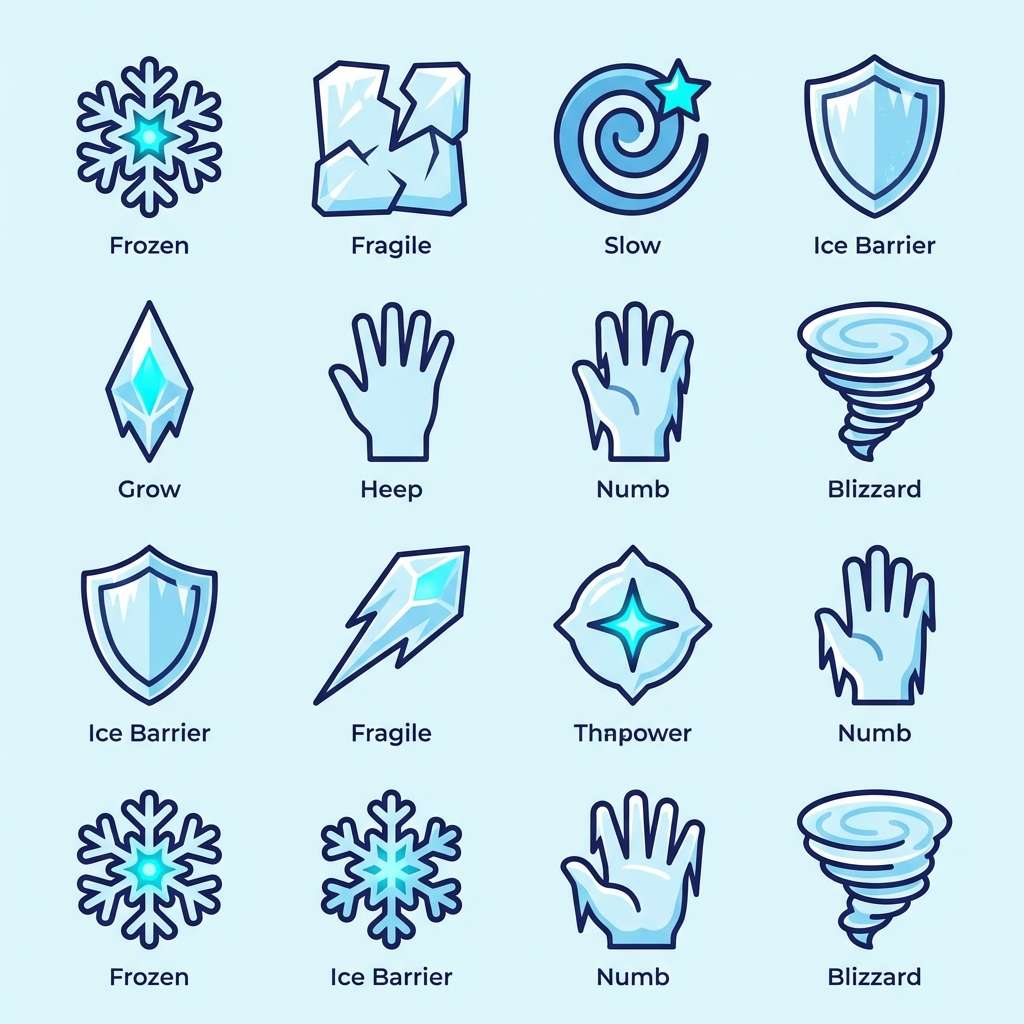
- ice dragon
- desert caravan
- noir detective
- storybook tavern
- hero badge pop
- thistle and brass
- What Colors Go Well with Board Game?
- How to Use a Board Game Color Palette in Real Designs
- Create Board Game Palette Visuals with AI
Why Board Game Palettes Work So Well
Board games demand clarity: players need to parse icons, tracks, and card text fast, often under warm lighting and from a distance. A disciplined palette makes hierarchy obvious, so turns move smoothly and mistakes drop.
They also thrive on theme. Whether it’s parchment fantasy, neon arcade, or cozy wood tones, tabletop game colors tell a story instantly and create shelf impact before anyone reads the title.
Finally, board game color combinations are naturally modular. You can assign colors to factions, resources, rarity, and actions, then reuse them across the box, rulebook, cards, and digital UI for a unified brand.
20+ Board Game Color Palette Ideas (with HEX Codes)
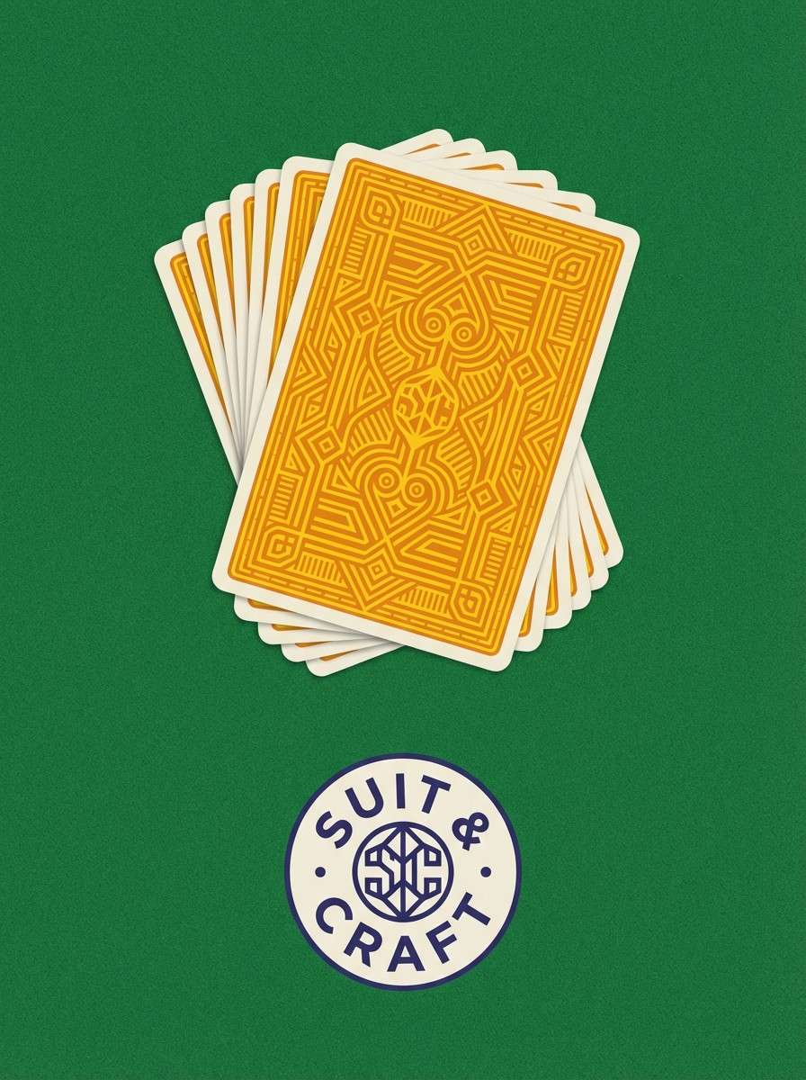
1) Thistle Tactician
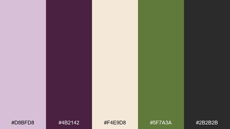
HEX: #D8BFD8 #4B2142 #F4E9D8 #5F7A3A #2B2B2B
Mood: whimsical, clever, and slightly regal
Best for: board game box cover and rulebook layout
Whimsical thistle tones meet inky plum and parchment, like a strategy guide tucked into a fantasy satchel. Use the dark plum for titles and rules headers, then let parchment carry body text for comfortable reading. Moss works best as a secondary accent for icons, faction markers, or resource tracks. Usage tip: keep charcoal for small text only, and reserve thistle highlights for callouts so the board game color palette stays legible at a glance.
Image example of thistle tactician generated using media.io
Media.io is an online AI studio for creating and editing video, image, and audio in your browser.

2) Meeple Meadow
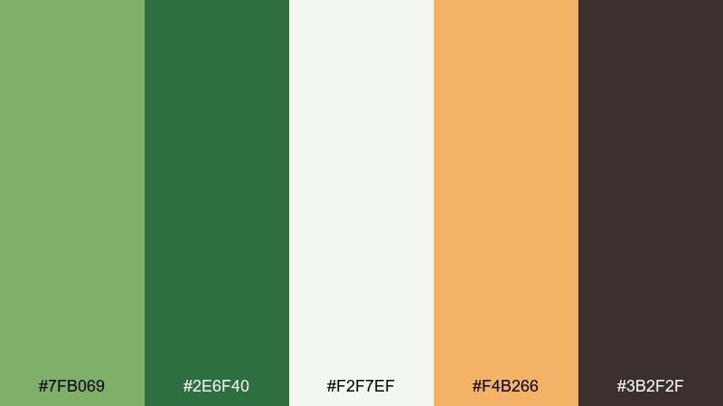
HEX: #7FB069 #2E6F40 #F2F7EF #F4B266 #3B2F2F
Mood: fresh, friendly, and outdoorsy
Best for: family-friendly tile icons and player tokens
Fresh meadow greens with a warm honey accent feel like a sunny game night on the patio. Use the pale near-white as the main surface color so icons stay crisp and approachable. The deeper green makes a steady base for token silhouettes and section headers, while honey pops for highlights and turn cues. Usage tip: keep the dark brown for outlines and numerals to avoid muddy midtones.
Image example of meeple meadow generated using media.io
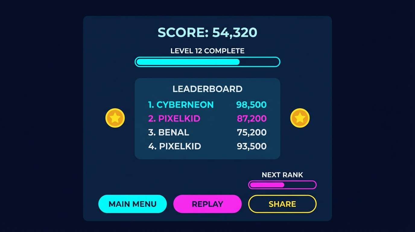
3) Dice Neon Arcade
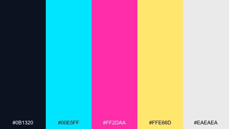
HEX: #0B1320 #00E5FF #FF2DAA #FFE66D #EAEAEA
Mood: energetic, futuristic, and competitive
Best for: stream overlays and digital score screens
Electric cyan and hot magenta on a deep night base evoke an arcade cabinet under blacklight. Use the dark navy as the canvas, then assign cyan to navigation and magenta to alerts or power-ups. Yellow works best for score highlights and achievement badges, with light gray to soften long text blocks. Usage tip: limit neon to 20 to 30 percent of the UI so the glow stays punchy instead of overwhelming.
Image example of dice neon arcade generated using media.io
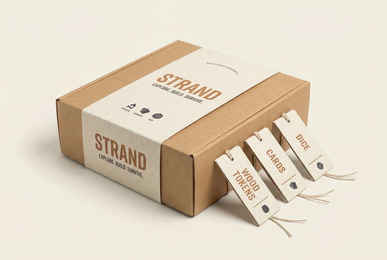
4) Wooden Token Tan
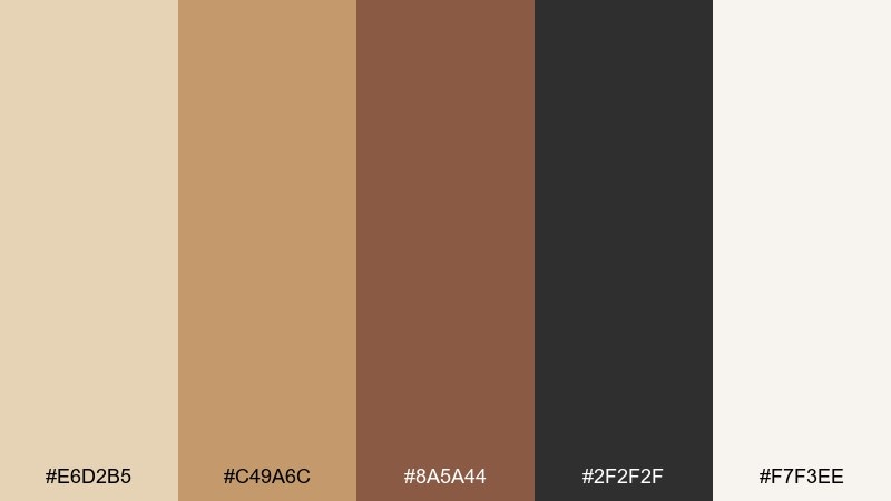
HEX: #E6D2B5 #C49A6C #8A5A44 #2F2F2F #F7F3EE
Mood: cozy, tactile, and classic
Best for: Euro-style packaging and component labels
Soft tans and toasted browns feel like wooden tokens and linen bags on a well-worn table. Use the light cream as your main background to keep layouts airy and premium. Mid tan is ideal for panels and dividers, while the darker brown anchors logos and category headers. Usage tip: add charcoal sparingly for small-print contrast and keep the overall look warm and matte.
Image example of wooden token tan generated using media.io
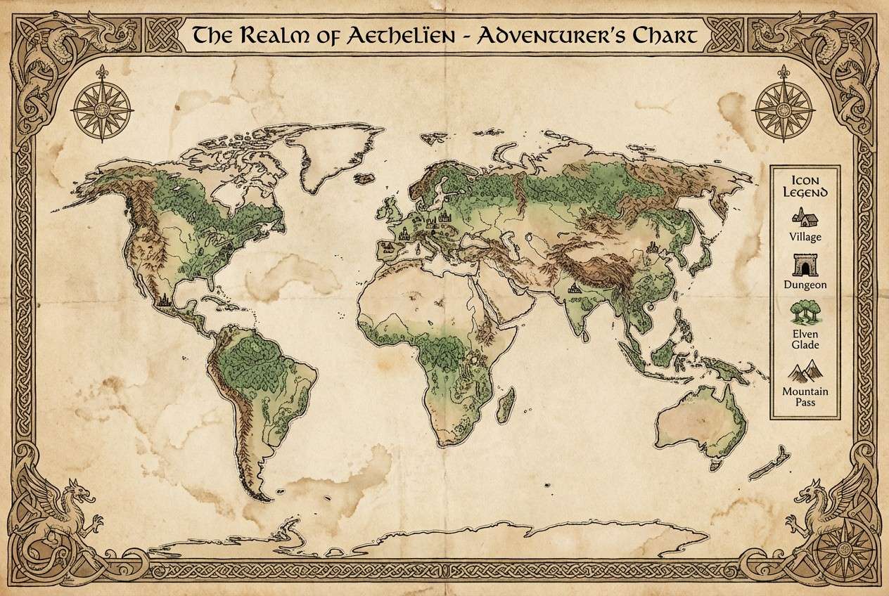
5) Kingdom Map Parchment
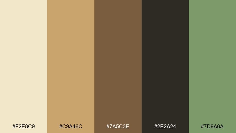
HEX: #F2E8C9 #C9A46C #7A5C3E #2E2A24 #7D9A6A
Mood: adventurous, aged, and story-driven
Best for: fantasy map boards and quest cards
Aged parchment and ink-brown shades evoke a hand-drawn realm map with mossy borders. Use parchment for the board surface, then layer dark ink for routes, labels, and legend text. The muted green works as a natural accent for forests, safe zones, and objective markers. Usage tip: keep gradients subtle so the map still reads clearly under warm room lighting.
Image example of kingdom map parchment generated using media.io
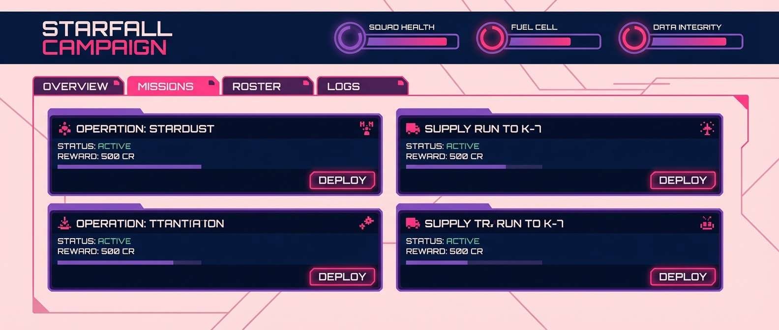
6) Cosmic Campaign
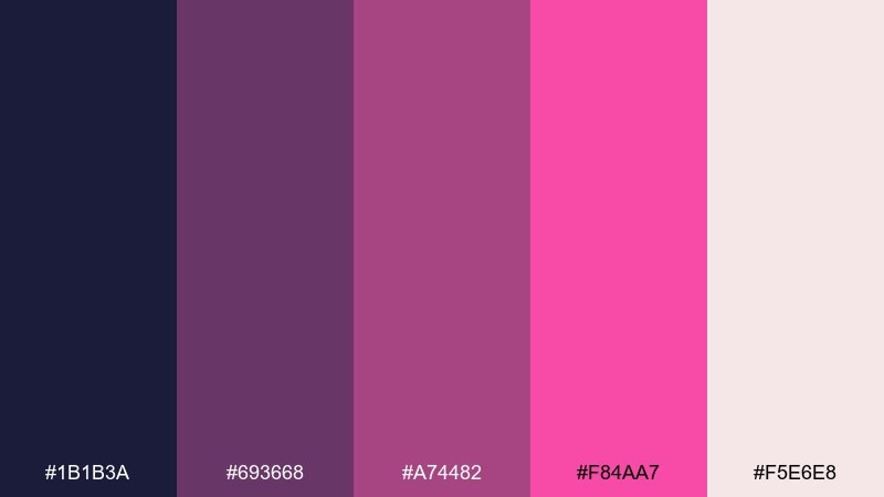
HEX: #1B1B3A #693668 #A74482 #F84AA7 #F5E6E8
Mood: dramatic, mysterious, and sci-fi luxe
Best for: sci-fi faction branding and campaign dashboards
Velvety midnight and layered violets feel like a nebula seen through a cockpit window. Use the darkest tone for backplates and panels, then stack the mid purples for hierarchy in charts and faction badges. The bright pink is best as a rare spotlight for mission alerts or key actions. Usage tip: treat these as board game color schemes for emphasis and balance them with the soft blush neutral to keep long sessions easy on the eyes.
Image example of cosmic campaign generated using media.io
7) Candy Quest
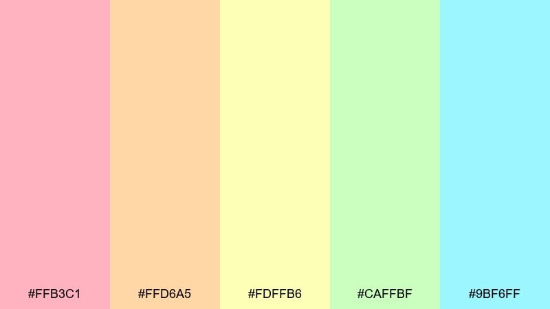
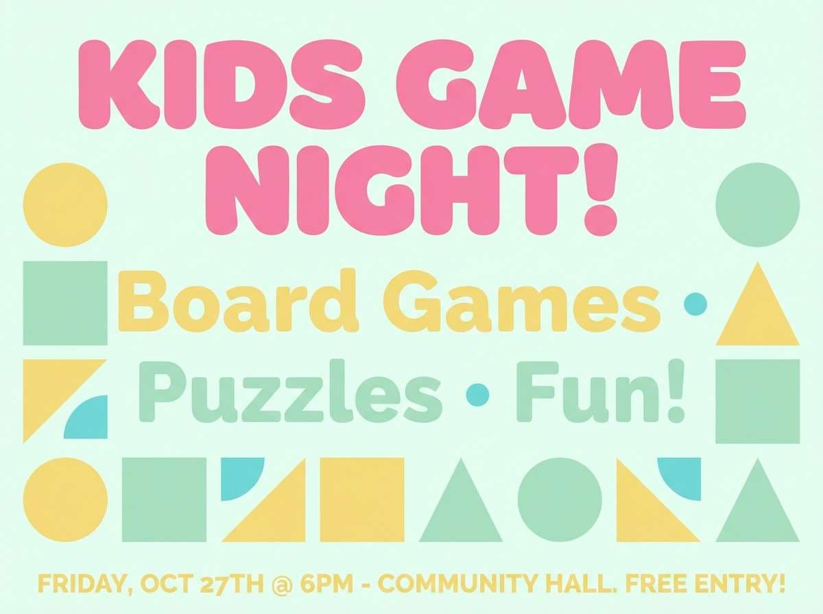
HEX: #FFB3C1 #FFD6A5 #FDFFB6 #CAFFBF #9BF6FF
Mood: playful, sweet, and upbeat
Best for: kids game flyers and store promo posters
Soft candy pastels look like gummy tiles and bonus cards scattered across the table. Use the yellow and mint as big background blocks, then layer pink for headers and callouts. Peach works nicely for secondary panels, while aqua can carry buttons or directional arrows. Usage tip: add plenty of white space so the pastels stay clean instead of turning into a blur.
Image example of candy quest generated using media.io
8) Steampunk Score
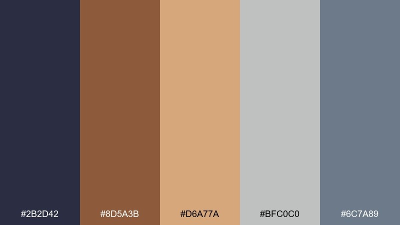
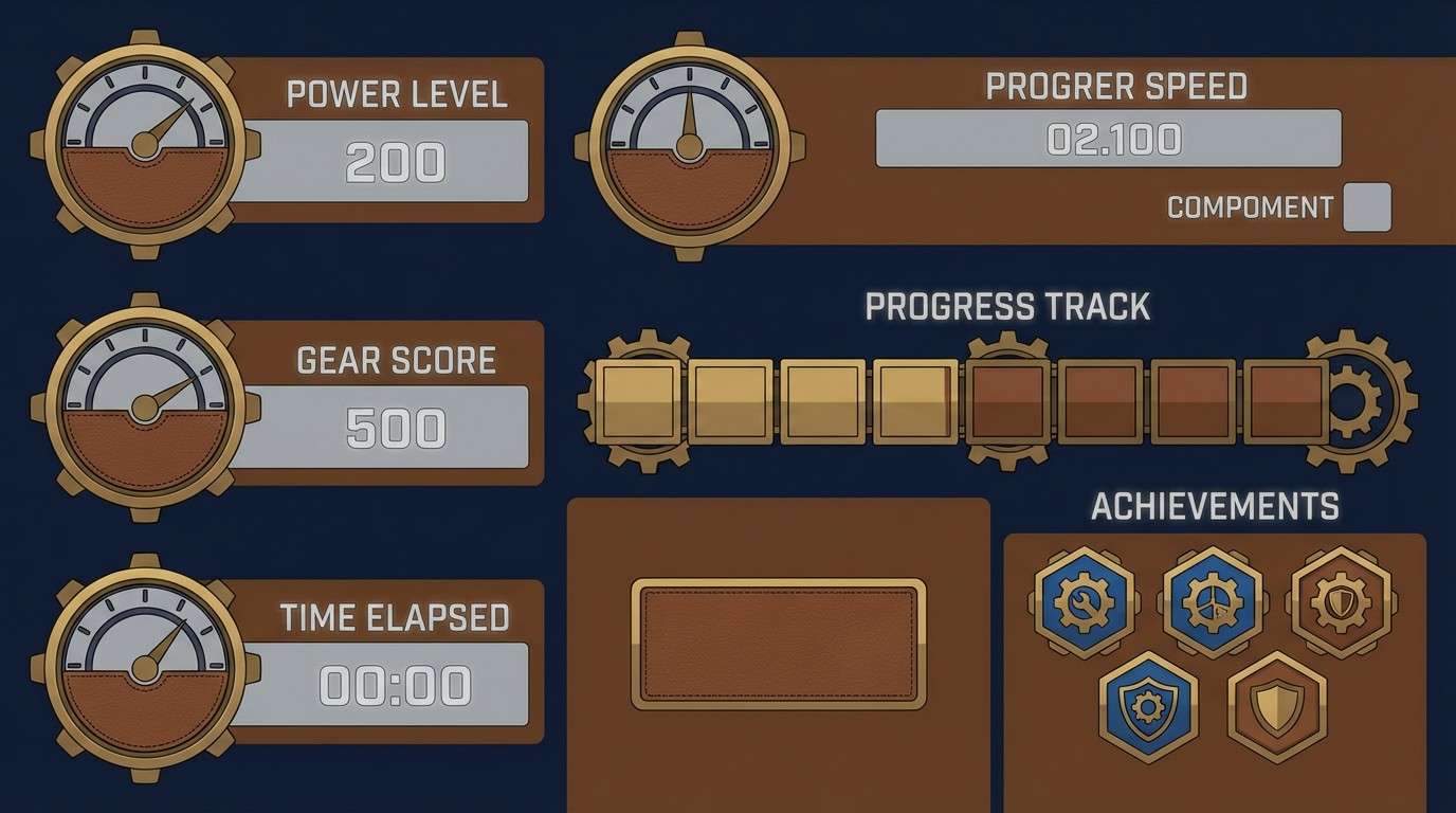
HEX: #2B2D42 #8D5A3B #D6A77A #BFC0C0 #6C7A89
Mood: industrial, clever, and vintage
Best for: score tracks and gadget-themed UI panels
Steel gray and oiled leather browns bring to mind brass dials, gears, and stamped score plates. Use the dark navy for title bars and icon backers, then let the warm browns define tracks and frames. The pale metal gray supports text and separators without feeling stark. Usage tip: keep the blue-gray as a tertiary accent so the vintage warmth stays dominant.
Image example of steampunk score generated using media.io
9) Ocean Route
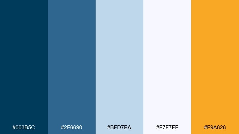
HEX: #003B5C #2F6690 #BFD7EA #F7F7FF #F9A826
Mood: breezy, confident, and travel-ready
Best for: navigation boards and route cards
Deep sea blue with airy sky tints feels like charting paths between islands. Use the darkest blue for routes and icons, and keep the pale blue as the main board field. White supports labels and card margins, while the amber works as a crisp marker for ports, objectives, or warnings. Usage tip: repeat amber consistently for interactive points so players learn the pattern fast.
Image example of ocean route generated using media.io

10) Mystery Manor
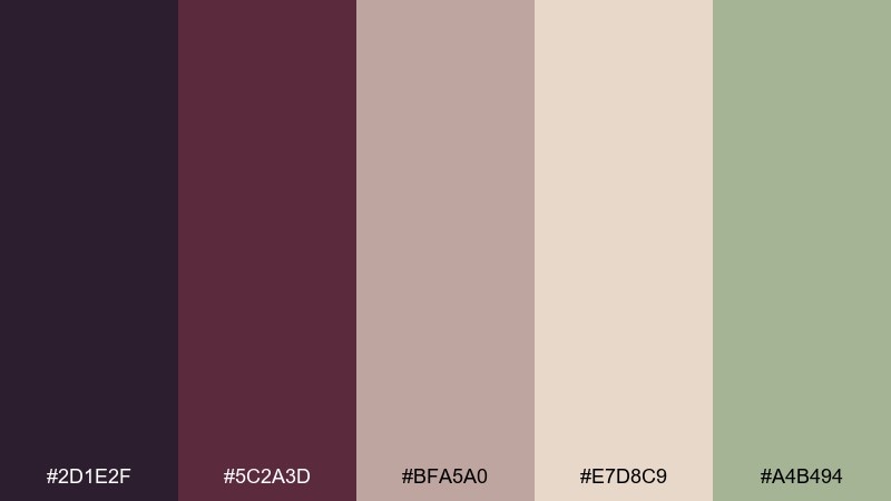
HEX: #2D1E2F #5C2A3D #BFA5A0 #E7D8C9 #A4B494
Mood: moody, elegant, and suspenseful
Best for: detective clue cards and narrative menus
Plum shadows and dusty rose neutrals feel like velvet curtains and candlelit corridors. Use the darkest tone for backgrounds and dramatic headers, then bring in warm beige for readable text areas. The sage green adds an unexpected twist for evidence markers, door states, or UI toggles. Usage tip: keep contrast high on clue text so the mystery vibe never hurts legibility.
Image example of mystery manor generated using media.io
11) Retro Card Table
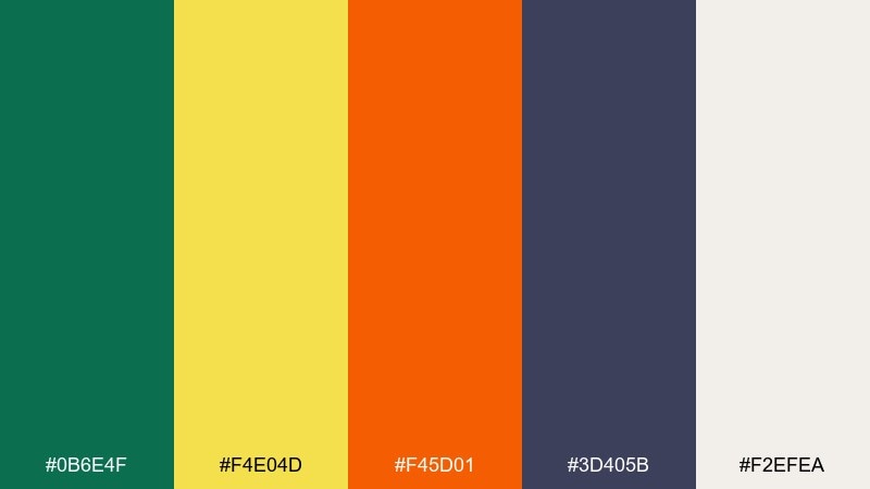
HEX: #0B6E4F #F4E04D #F45D01 #3D405B #F2EFEA
Mood: nostalgic, bold, and lively
Best for: classic card backs and party game branding
Green felt energy with sunny yellow and punchy orange feels like a lively shuffle at the card table. Use the felt green as the anchor, then pop yellow for badges and score callouts. Orange is best for action prompts and playful warnings, while the indigo keeps typography grounded. Usage tip: keep card-back patterns simple so the high-contrast colors do not create visual noise when fanned.
Image example of retro card table generated using media.io
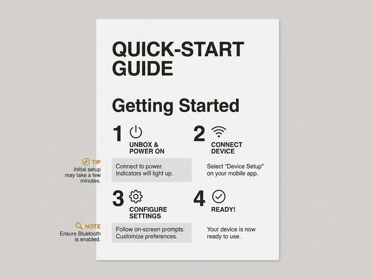
12) Minimal Rulebook
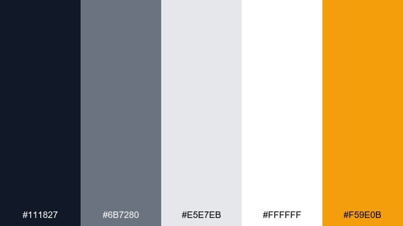
HEX: #111827 #6B7280 #E5E7EB #FFFFFF #F59E0B
Mood: clean, modern, and instructional
Best for: rulebooks, quick-start guides, and player aids
Crisp neutrals with a single amber accent feel like a well-edited manual that respects the reader. Use white and light gray for spacious pages, then rely on near-black for headings and diagrams. The mid gray supports captions and secondary notes without looking washed out. Usage tip: reserve amber for only the most important callouts, like setup steps and warnings, so scanning becomes effortless.
Image example of minimal rulebook generated using media.io
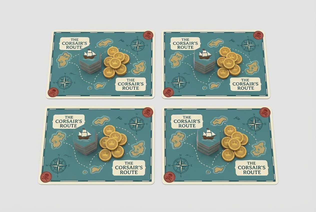
13) Pirate Port
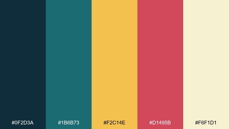
HEX: #0F2D3A #1B6B73 #F2C14E #D1495B #F6F1D1
Mood: adventurous, salty, and sun-warmed
Best for: treasure maps, ship tiles, and event cards
Deep harbor teal with sun-gold and rum-red evokes flags snapping over a busy port. Use the dark teal for borders and headings, then let the cream support map fields and card text. Gold is ideal for coins, rewards, and objective seals, while the red signals danger or high-stakes events. Usage tip: repeat gold sparingly across the board to keep rewards feeling special.
Image example of pirate port generated using media.io
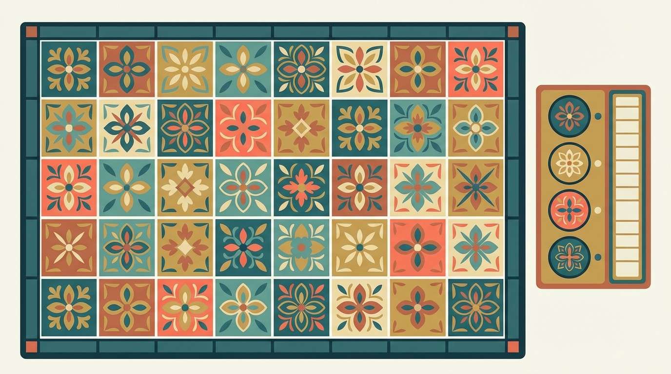
14) Festival Tilework
HEX: #2A9D8F #E9C46A #F4A261 #E76F51 #264653
Mood: warm, festive, and handcrafted
Best for: patterned boards and player mat accents
Sunlit teal and terracotta tones feel like painted tiles and market banners. Use the deep blue-green as a steady base for outlines and grids, then rotate teal and gold as the main fill colors. The orange and coral work best for limited highlights, like turn order, bonus spaces, or reward ribbons. Usage tip: these board game color schemes shine when you keep one warm accent dominant and treat the rest as supporting notes.
Image example of festival tilework generated using media.io
15) Space Trader UI
HEX: #0E0F1A #3A86FF #8338EC #FFBE0B #F1F5F9
Mood: sleek, optimistic, and high-tech
Best for: companion app UI and market dashboards
Crisp electric blue and violet on near-black feels like scanning prices on a spaceport terminal. Use the dark base for panels, then assign blue to primary actions and violet to secondary controls. The warm yellow is perfect for profit, alerts, and standout badges, while the near-white keeps data tables readable. Usage tip: keep yellow highlights consistent so players instantly recognize the most important numbers.
Image example of space trader ui generated using media.io
16) Forest Dungeon
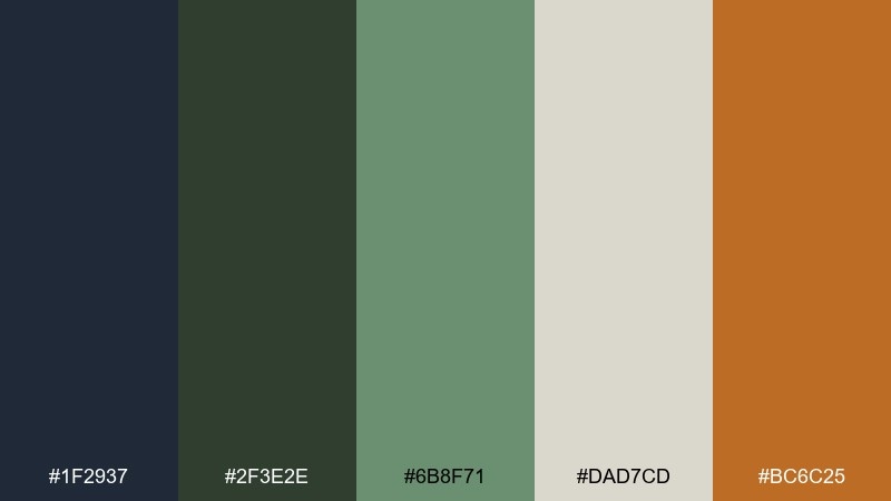
HEX: #1F2937 #2F3E2E #6B8F71 #DAD7CD #BC6C25
Mood: grounded, eerie, and adventurous
Best for: dungeon tiles and encounter cards
Shadowy greens and stone neutrals evoke torchlight cutting through a damp forest ruin. Use the dark slate for borders and room outlines, then lean on muted green for terrain and status icons. The pale stone color gives you safe space for readable encounter text and item descriptions. Usage tip: save the rusty orange for traps, rare loot, and danger markers to keep tension clear.
Image example of forest dungeon generated using media.io
17) Ice Dragon
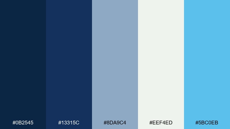
HEX: #0B2545 #13315C #8DA9C4 #EEF4ED #5BC0EB
Mood: icy, heroic, and crisp
Best for: winter expansions and spell effect icons
Cold blues and frosted neutrals feel like a breath of winter across the board. Use the deepest navy for headings and silhouettes, while pale ice tones create airy card faces and calm negative space. The bright cyan is best for magical effects, active states, and energy bars. Usage tip: keep large cyan areas minimal so the palette stays sharp rather than neon.
Image example of ice dragon generated using media.io
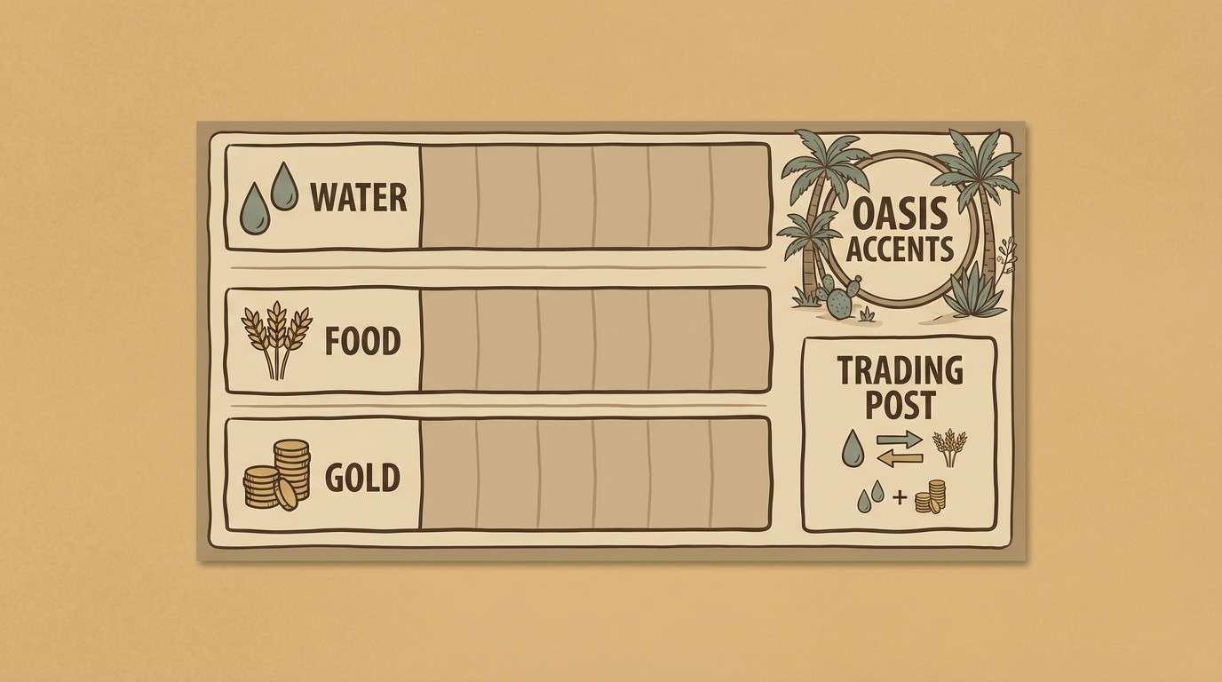
18) Desert Caravan
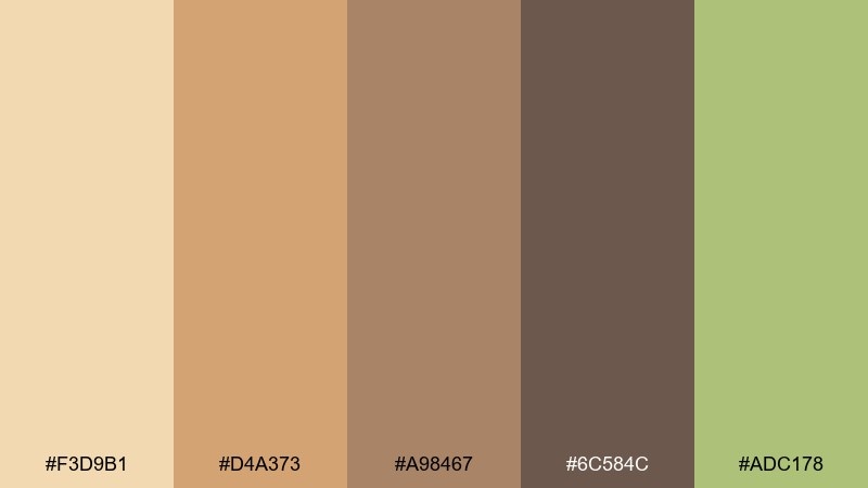
HEX: #F3D9B1 #D4A373 #A98467 #6C584C #ADC178
Mood: sun-baked, calm, and adventurous
Best for: resource boards and trading tokens
Sandy creams and sun-worn browns evoke a caravan route marked by weathered signs. Use the pale sand as the main board tone for a warm, inviting feel. Mid browns work well for token silhouettes and track lines, while the muted green brings life to oasis markers or special resources. Usage tip: keep text in the darkest brown to avoid low-contrast printing surprises.
Image example of desert caravan generated using media.io
19) Noir Detective
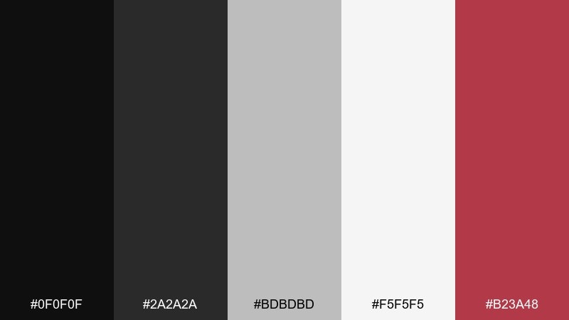
HEX: #0F0F0F #2A2A2A #BDBDBD #F5F5F5 #B23A48
Mood: tense, cinematic, and sharp
Best for: mystery game branding and evidence sheets
High-contrast noir grays with a blood-red accent feel like case files under a desk lamp. Use black and charcoal for dramatic headers and heavy dividers, then let off-white carry the reading experience. Red should be the single point of emphasis for suspect flags, critical alerts, or time-sensitive clues. Usage tip: avoid large red fills and use it as a signal so the layout stays classy and clear.
Image example of noir detective generated using media.io
20) Storybook Tavern
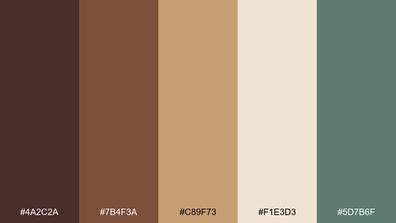
HEX: #4A2C2A #7B4F3A #C89F73 #F1E3D3 #5D7B6F
Mood: warm, welcoming, and narrative
Best for: RPG-style player sheets and tavern menus
Toasty browns and creamy parchment feel like a storybook tavern menu by lantern light. Use the cream as the main paper tone, with mid brown for section headers and frames. The muted green works nicely for class icons, skill tags, or subtle decorative flourishes. Usage tip: keep your darkest brown reserved for body text so even dense tables remain readable.
Image example of storybook tavern generated using media.io
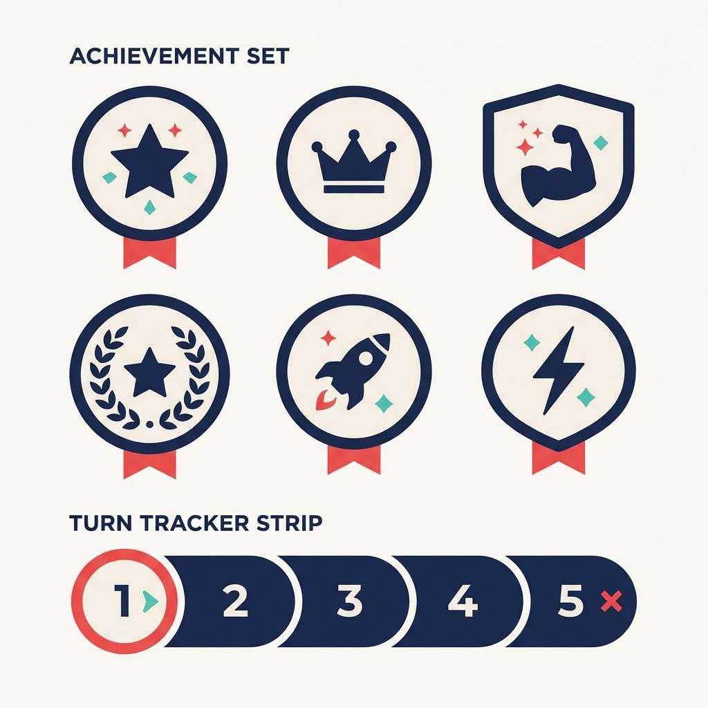
21) Hero Badge Pop
HEX: #1D3557 #E63946 #F1FAEE #A8DADC #457B9D
Mood: bold, clean, and heroic
Best for: achievement badges and turn trackers
Crisp blues with a confident red accent feel like medals, shields, and victory banners. Use the navy for badge outlines and main headers, then rely on the pale mint-white for readable surfaces. Red should mark the active player, urgent timers, or key actions, while the soft teals support secondary states. Usage tip: keep badges to two dominant colors at a time so they stay recognizable at small sizes.
Image example of hero badge pop generated using media.io
22) Thistle and Brass
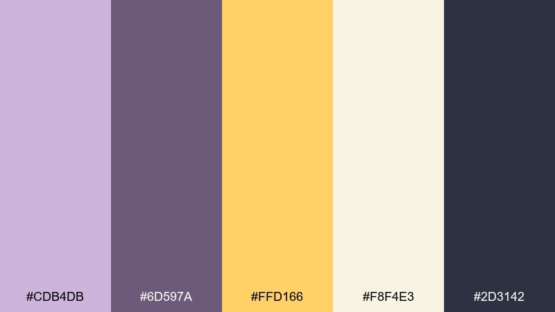
HEX: #CDB4DB #6D597A #FFD166 #F8F4E3 #2D3142
Mood: polished, creative, and slightly magical
Best for: premium box accents and collector edition labels
Soft thistle paired with brass-gold highlights feels like an upgraded edition with foil details. Use the near-white as the main label field and the deep slate for typography to keep everything sharp. Gold is best for seals, icons, or limited-edition marks, while the two purples create depth in backgrounds and frames. Usage tip: test gold on both light and dark areas so it reads as metallic rather than mustard.
Image example of thistle and brass generated using media.io
What Colors Go Well with Board Game?
Board game palettes work best when you mix a readable neutral (white, parchment, light gray) with one dark anchor (navy, charcoal, deep brown). That pairing keeps rule text, icon labels, and score tracks clear across different print finishes.
Then add 1–2 accents with distinct roles: one for “primary action” (turn cues, active player, buttons) and another for “special” (rare loot, warnings, objectives). Gold/amber, red, and cyan are reliable accent choices because they stand out quickly.
If you’re using multiple factions or resources, aim for colors that stay separable under warm light and for color-blind players. Teal vs orange, purple vs yellow, and blue vs red usually read better than similar midtones like green vs olive.
How to Use a Board Game Color Palette in Real Designs
Start with function: assign background, text, borders, and highlights before you stylize. For rulebook layout colors, keep body text on a very light surface and reserve your darkest tone for headers, diagrams, and small-print contrast.
For board game box design palettes, push theme and shelf impact with bigger color blocks, but keep the logo and key info high-contrast. A single consistent accent color helps unify the box, cards, and player aids.
In card game UI colors and companion apps, cap your accent coverage so the interface doesn’t fatigue players. Use your neutral to “rest the eyes,” then deploy the accent only where you want attention and faster decision-making.
Create Board Game Palette Visuals with AI
If you’re pitching a concept or iterating on packaging, AI-generated mockups help you validate contrast, mood, and hierarchy fast. You can generate box covers, rulebook spreads, icon sets, and digital score screens using one consistent prompt style.
To keep results cohesive, reuse the same subject description and swap only the palette direction (e.g., “parchment and ink browns” vs “neon cyan and magenta”). That makes it easier to compare variations and pick the strongest board game branding colors.
Once you have a direction, export visuals for presentations, storefront listings, and production notes so printers and UI designers can match the intended look.
Board Game Color Palette FAQs
-
How many colors should a board game color palette include?
Most tabletop game colors systems work best with 5–7 colors: a light background, a dark text/outline color, 1–2 midtones for surfaces, and 1–2 accents for actions and alerts. -
What’s the safest background color for cards and rulebooks?
Off-white, parchment, or very light gray are the most forgiving for print and readability. Pair them with near-black or deep brown for text so small font sizes stay clear. -
How do I choose accent colors for turn order and warnings?
Use one highly visible accent (red, amber, or cyan) for “look here now,” and keep it consistent across components. Avoid using the same accent for both rewards and danger unless you differentiate with shapes/icons too. -
What are good board game color combinations for fantasy themes?
Parchment + ink brown + moss green is a classic map-and-quest combo, while thistle/purple + cream + gold adds a premium magical vibe for collector-style packaging. -
How can I make faction colors easier to tell apart?
Pick hues that differ strongly in both color and brightness (e.g., navy vs yellow, teal vs orange). Also add pattern, icon shape, or outline rules so players aren’t relying on color alone. -
Do neon palettes work for board games?
Yes, especially for digital score screens, stream overlays, or cyber themes. The key is to keep neon accents limited and leave enough dark/neutral space so the UI stays readable. -
What’s a quick way to preview a board game box design palette?
Generate a box-cover mockup and a rulebook page using the same palette and typography direction. If both look cohesive and readable, the palette is likely production-ready.
Next: Thistle Color Palette


