

Viridian is a blue-green classic that feels both natural and polished. It can read coastal, botanical, or modern depending on what you pair it with.
Below are 20 viridian color palette ideas with HEX codes, plus practical tips for UI, branding, interiors, illustration, and AI image generation.
In this article
- Why Viridian Palettes Work So Well
-
- harbor viridian
- botanical ink
- vintage apothecary
- soft sage mist
- copper reef
- midnight conservatory
- coastal linen
- orchid lagoon
- desert cactus
- nordic ceramic
- citrus spritz
- studio monochrome
- autumn moss
- jewel tones
- calm classroom
- modern dashboard
- wedding eucalyptus
- poster pop
- packaging minimal
- winter evergreen
- What Colors Go Well with Viridian?
- How to Use a Viridian Color Palette in Real Designs
- Create Viridian Palette Visuals with AI
Why Viridian Palettes Work So Well
Viridian sits between green and blue, so it naturally bridges “fresh” and “professional.” That makes it a dependable anchor color for brands that want calm confidence rather than loud energy.
It also plays well with both warm and cool companions: creamy off-whites and tans make it relaxed and organic, while charcoals and near-blacks make it feel cinematic and premium.
Because it has built-in depth, viridian holds up across backgrounds, icons, and illustration shading. You can use it as a hero color or as a subtle structural tone for UI and layouts.
20+ Viridian Color Palette Ideas (with HEX Codes)
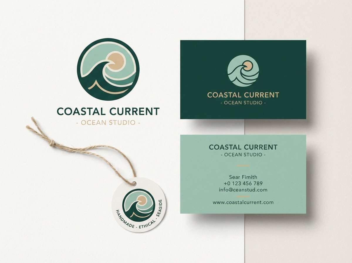
1) Harbor Viridian
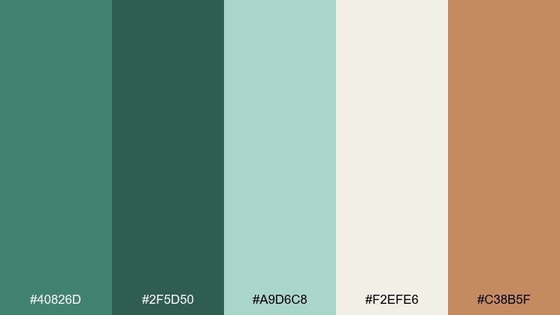
HEX: #40826D #2F5D50 #A9D6C8 #F2EFE6 #C38B5F
Mood: fresh, nautical, grounded
Best for: brand identity for coastal lifestyle goods
Fresh sea-air energy meets weathered dock wood in this crisp mix. Use the deep greens for logos and headings, then let the pale aqua and warm cream open up negative space. The sandy copper works best as a small accent on tags, buttons, or seals. Tip: keep the copper under 10 percent to preserve the calm, maritime feel.
Image example of harbor viridian generated using media.io
Media.io is an online AI studio for creating and editing video, image, and audio in your browser.

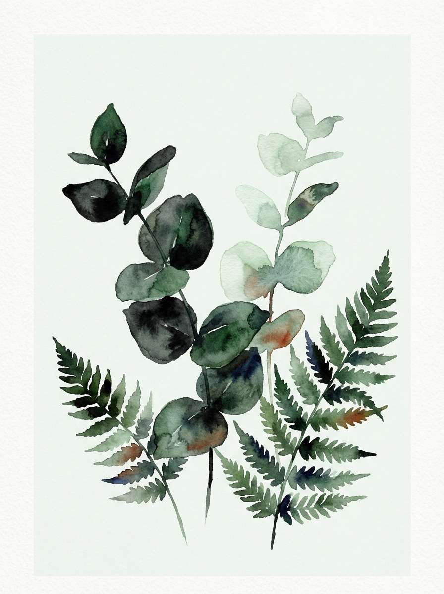
2) Botanical Ink
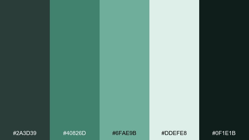
HEX: #2A3D39 #40826D #6FAE9B #DDEFE8 #0F1E1B
Mood: moody, botanical, inky
Best for: watercolor plant illustration and prints
Moody greenhouse shadows and wet ink washes set a quiet, refined tone. Layer the near-black greens for depth, then glaze the mid viridian and soft mint to suggest translucent leaves. Pale misty green works well as paper tone or background wash. Tip: reserve the darkest ink for stems and focal edges so the illustration stays airy, not heavy.
Image example of botanical ink generated using media.io
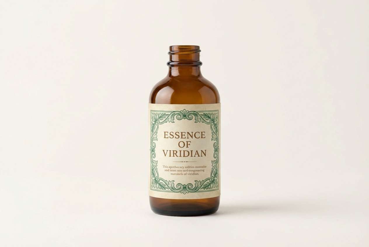
3) Vintage Apothecary
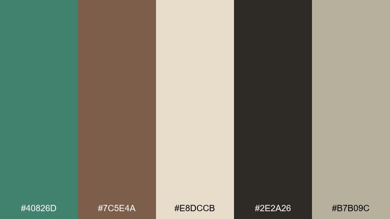
HEX: #40826D #7C5E4A #E8DCCB #2E2A26 #B7B09C
Mood: heritage, earthy, collected
Best for: label design for soaps, oils, and tinctures
Heritage cabinet vibes and hand-labeled bottles make this feel timeless and trustworthy. The viridian color palette shines on kraft textures, especially when paired with warm brown typography and a creamy base. Use the near-black sparingly for fine linework, borders, and ingredient lists. Tip: add a thin aged-olive rule line to separate sections without cluttering the label.
Image example of vintage apothecary generated using media.io
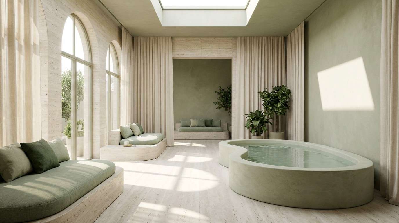
4) Soft Sage Mist
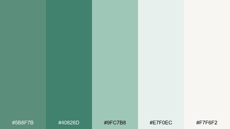
HEX: #5B8F7B #40826D #9FC7B8 #E7F0EC #F7F6F2
Mood: soft, airy, restorative
Best for: spa interior concepts and wellness blogs
A misty morning calm comes through with gentle greens and cloud-light neutrals. Use the two deeper greens for anchors like navigation, headers, or trim, and let the pale tones carry the background. This pairing looks especially clean with light wood and matte stone textures. Tip: choose one green for text and the other for accents to keep the layout serene.
Image example of soft sage mist generated using media.io
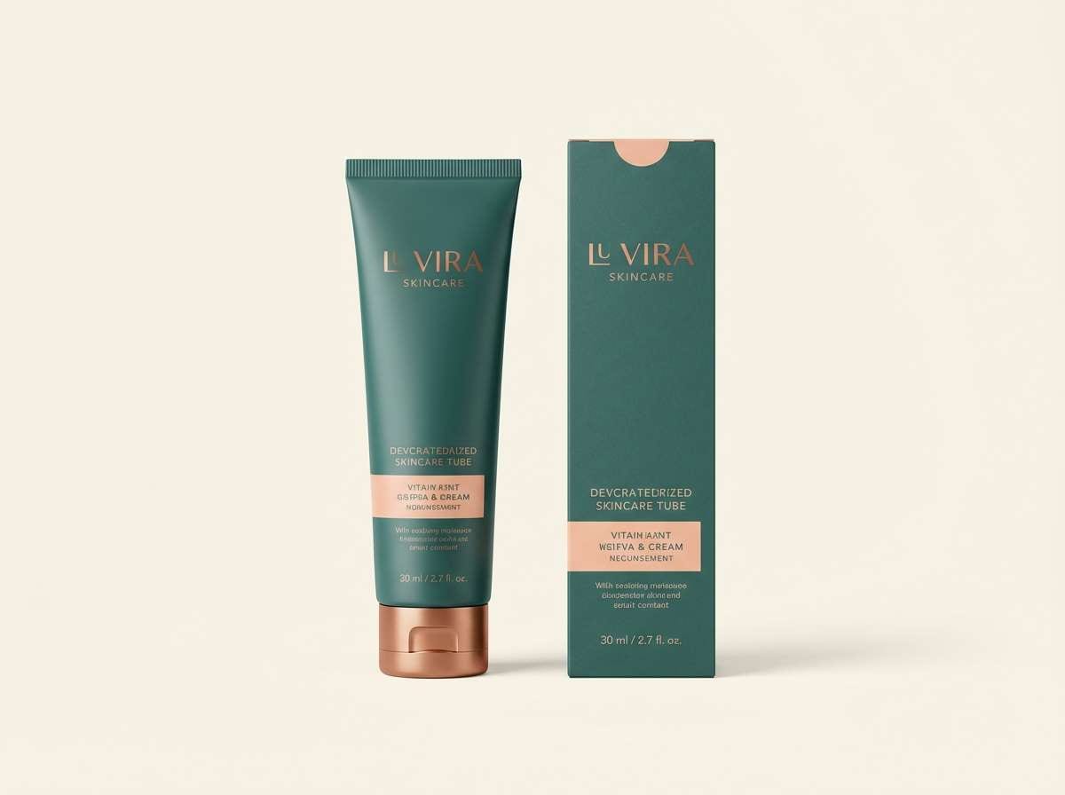
5) Copper Reef
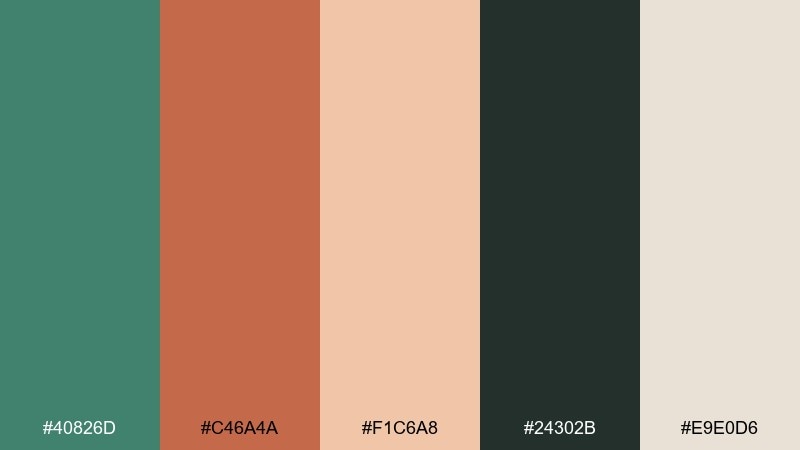
HEX: #40826D #C46A4A #F1C6A8 #24302B #E9E0D6
Mood: bold, warm, modern
Best for: skincare product ads and hero banners
Sun-warmed copper against cool green reads confident and premium. Let the dark charcoal-green carry copy and contrast, then use viridian for the primary brand cue. The peachy highlight is great for glow effects, swatches, or subtle gradients. Tip: keep backgrounds creamy and clean so the copper stays punchy without feeling loud.
Image example of copper reef generated using media.io
6) Midnight Conservatory
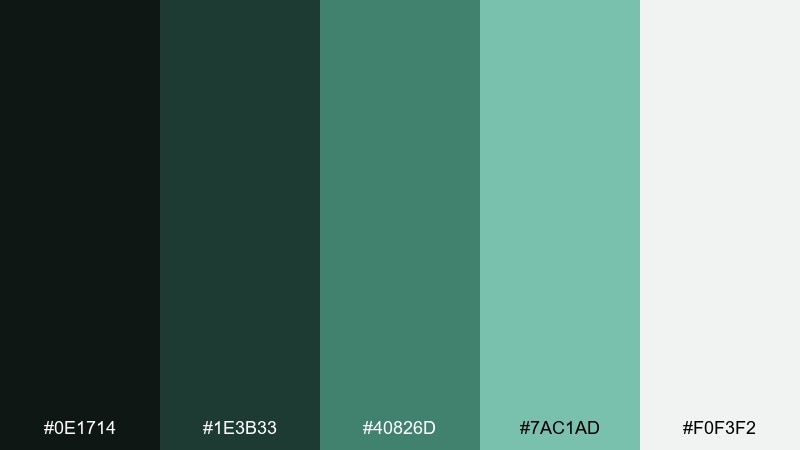
HEX: #0E1714 #1E3B33 #40826D #7AC1AD #F0F3F2
Mood: cinematic, lush, nocturnal
Best for: movie poster or album cover artwork
Cinematic night greens feel like glasshouse leaves under moonlight. The inky base supports dramatic typography, while the minty highlight can pick out focal details and glow edges. Use the soft off-white for credits and small text so it stays readable against the darks. Tip: add a subtle vignette with the two deepest tones to pull attention to the center.
Image example of midnight conservatory generated using media.io

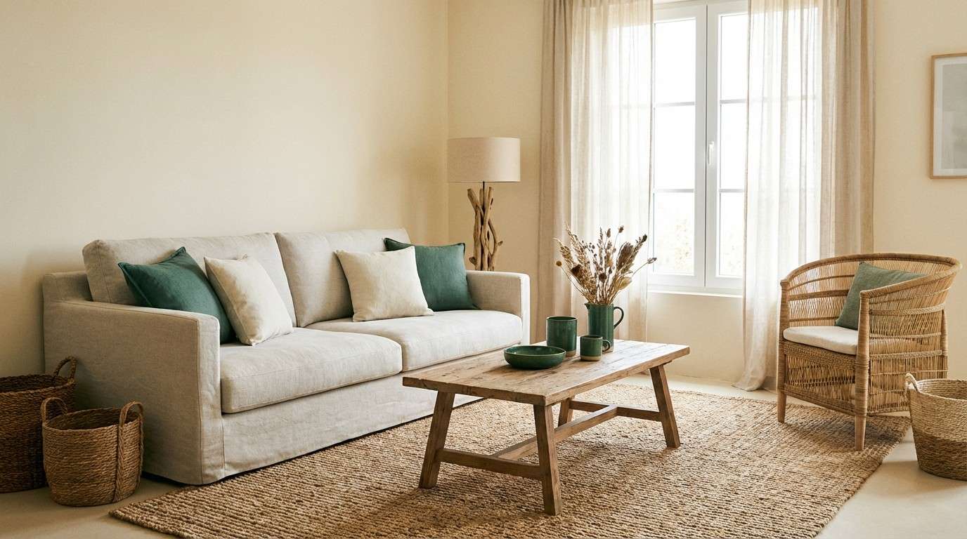
7) Coastal Linen
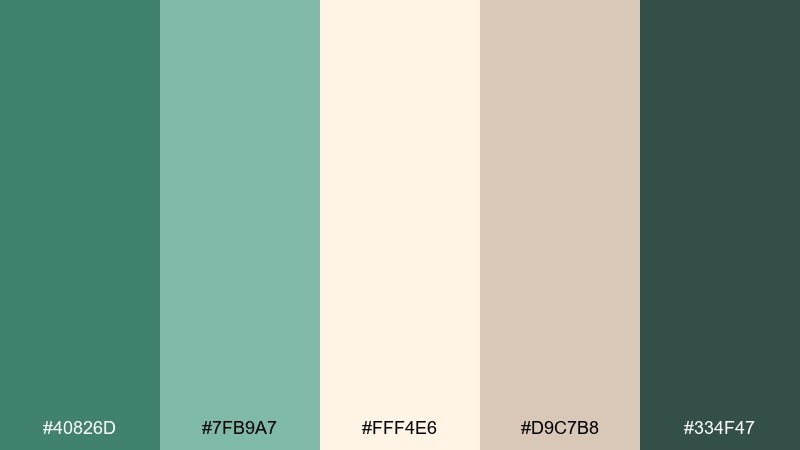
HEX: #40826D #7FB9A7 #FFF4E6 #D9C7B8 #334F47
Mood: breezy, sun-faded, relaxed
Best for: beach house interior palettes and textiles
Breezy linen neutrals soften the green into something lived-in and welcoming. Use the creamy tone for walls or backgrounds, then bring in viridian through cushions, ceramics, or a painted door. The deeper green is perfect for grounding outlines and trim details. Tip: repeat the tan once or twice in small decor to keep the space from leaning too cool.
Image example of coastal linen generated using media.io
8) Orchid Lagoon
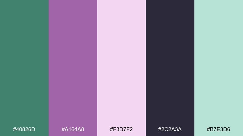
HEX: #40826D #A164A8 #F3D7F2 #2C2A3A #B7E3D6
Mood: playful, artistic, dreamy
Best for: music cover art and creative branding
Dreamy lagoon greens with orchid purple create a playful, art-forward vibe. Keep the dark violet for titles and high-contrast shapes, then let the pink act as a soft glow or gradient edge. The pale mint works nicely as a calm buffer so the purple does not overpower. Tip: use purple for one hero element only, and echo it in tiny details for cohesion.
Image example of orchid lagoon generated using media.io

9) Desert Cactus
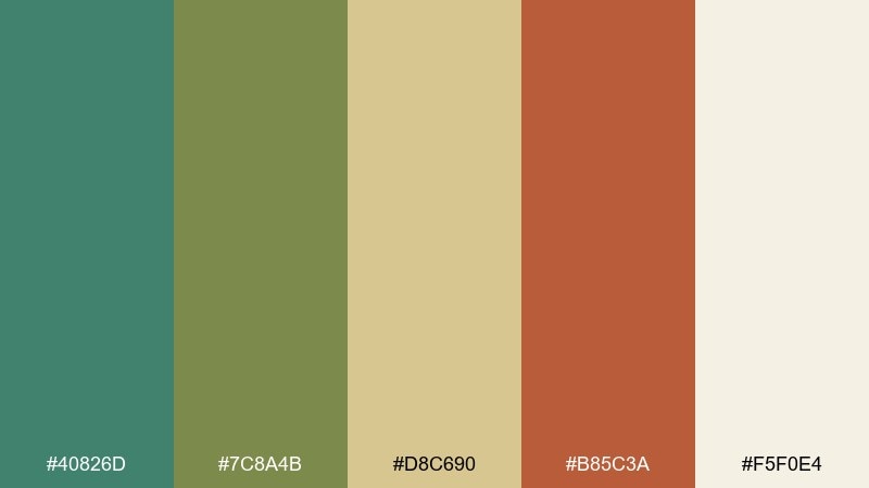
HEX: #40826D #7C8A4B #D8C690 #B85C3A #F5F0E4
Mood: earthy, sunbaked, adventurous
Best for: outdoor gear branding and badges
Sunbaked desert tones make the green feel rugged and trail-ready. Pair viridian with the cactus olive for patches, badges, and icon sets, then use sand as your background neutral. The clay red is a strong call-to-action accent for labels and small highlights. Tip: use the clay only for key touchpoints like price tags or buttons to keep it crisp.
Image example of desert cactus generated using media.io

10) Nordic Ceramic
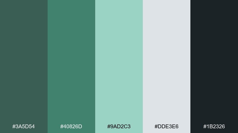
HEX: #3A5D54 #40826D #9AD2C3 #DDE3E6 #1B2326
Mood: clean, cool, contemporary
Best for: modern homeware ecommerce pages
Cool, clean tones evoke glazed ceramics and minimal Scandinavian shelving. Use the blue-gray as a page base, then rely on viridian for primary buttons and category highlights. Charcoal keeps product names legible without looking stark black. Tip: try mint for hover states and subtle badges to maintain a calm, modern rhythm.
Image example of nordic ceramic generated using media.io
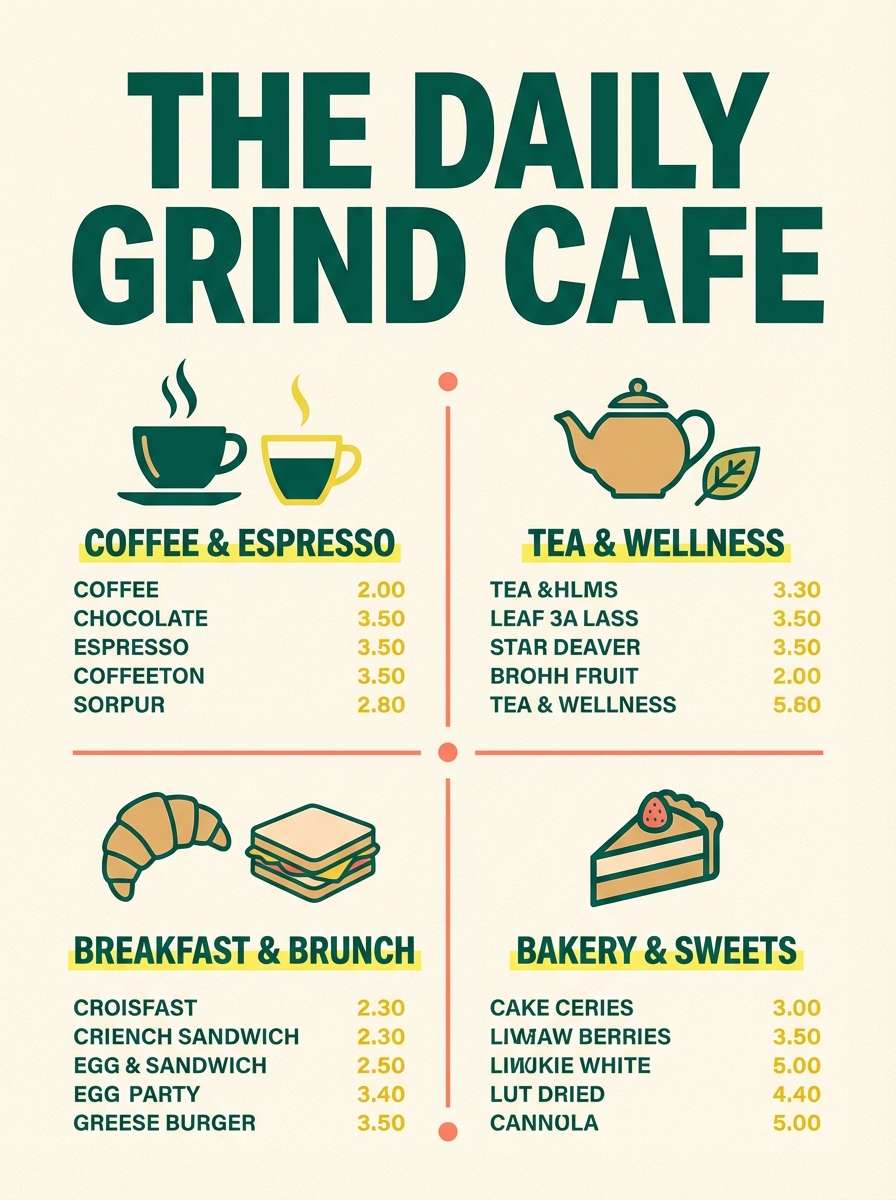
11) Citrus Spritz
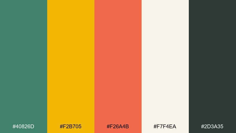
HEX: #40826D #F2B705 #F26A4B #F7F4EA #2D3A35
Mood: zesty, upbeat, summer
Best for: cafe menus and seasonal promos
Zesty citrus pops make the green feel energetic rather than reserved. Use viridian and charcoal for structure, then let yellow lead headlines and price highlights. The coral works best in small bursts, like icons, stamps, or a single featured item. Tip: keep the background creamy so the bright accents read fresh instead of neon.
Image example of citrus spritz generated using media.io
12) Studio Monochrome
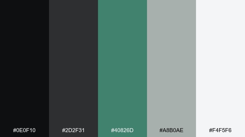
HEX: #0E0F10 #2D2F31 #40826D #A8B0AE #F4F5F6
Mood: sleek, technical, high-contrast
Best for: editorial layouts and product spec sheets
Sleek monochrome structure gets a confident green signal for focus. These viridian color combinations work well when you need a mostly neutral design with one unmistakable brand color. Use the light gray as generous whitespace, then reserve viridian for charts, links, and key callouts. Tip: avoid using green for body text; keep it for emphasis so it stays premium and readable.
Image example of studio monochrome generated using media.io
13) Autumn Moss
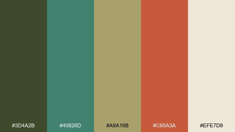
HEX: #3D4A2B #40826D #A9A16B #C65A3A #EFE7D8
Mood: cozy, rustic, seasonal
Best for: fall campaign creatives and home decor
Cozy mossy greens with baked clay accents feel like early hikes and warm kitchens. Use the creamy neutral for background and texture overlays, then bring in viridian for focal graphics and headings. The golden khaki bridges green and red so the palette stays harmonious. Tip: keep the clay red to small highlights like sale badges or section dividers.
Image example of autumn moss generated using media.io

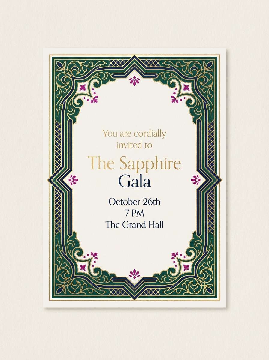
14) Jewel Tones
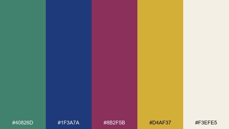
HEX: #40826D #1F3A7A #8B2F5B #D4AF37 #F3EFE5
Mood: luxurious, dramatic, celebratory
Best for: premium branding and event collateral
Rich jewel tones give the green a luxurious, evening-ready edge. Pair the gold with the cream base for elegant whitespace, then use navy for structure and hierarchy. Magenta works best as a limited accent for badges or key dates so it feels intentional. Tip: add subtle gold rules or icons to elevate the layout without crowding it.
Image example of jewel tones generated using media.io
15) Calm Classroom
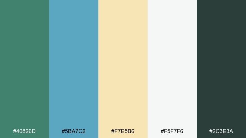
HEX: #40826D #5BA7C2 #F7E5B6 #F5F7F6 #2C3E3A
Mood: friendly, clear, supportive
Best for: education slide decks and worksheets
Friendly greens and soft sky blue keep learning materials calm and approachable. Use viridian for section headers, then let the pale paper tone carry long reading areas. The warm pastel yellow is great for highlights and callout boxes without looking harsh. Tip: set body text in the deep green-gray for a softer alternative to pure black.
Image example of calm classroom generated using media.io

16) Modern Dashboard
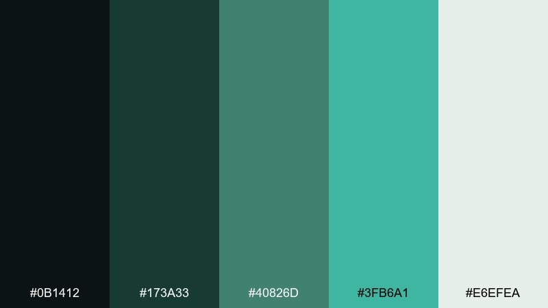
HEX: #0B1412 #173A33 #40826D #3FB6A1 #E6EFEA
Mood: confident, modern, data-forward
Best for: 2D SaaS analytics UI mockups
Confident dark panels and clean mint highlights feel modern and data-first. A viridian color combination like this is ideal for primary actions, selected states, and success messaging without leaning neon. Keep the pale green-gray for backgrounds and cards so charts have room to breathe. Tip: use the bright teal only for interactive states, not large fills, to avoid visual fatigue.
Image example of modern dashboard generated using media.io

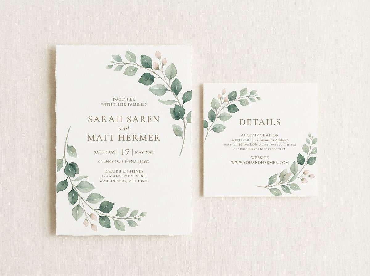
17) Wedding Eucalyptus
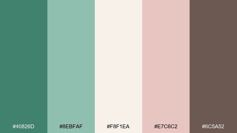
HEX: #40826D #8EBFAF #F8F1EA #E7C6C2 #6C5A52
Mood: romantic, natural, understated
Best for: wedding stationery suites
Romantic eucalyptus greens with blush details feel soft, modern, and timeless. Use the cream as your paper base, then bring in viridian for monograms, borders, and envelope liners. The dusty rose is best as a small floral accent or wax seal color. Tip: set long text in the warm taupe to keep the invitation readable and gentle.
Image example of wedding eucalyptus generated using media.io
18) Poster Pop
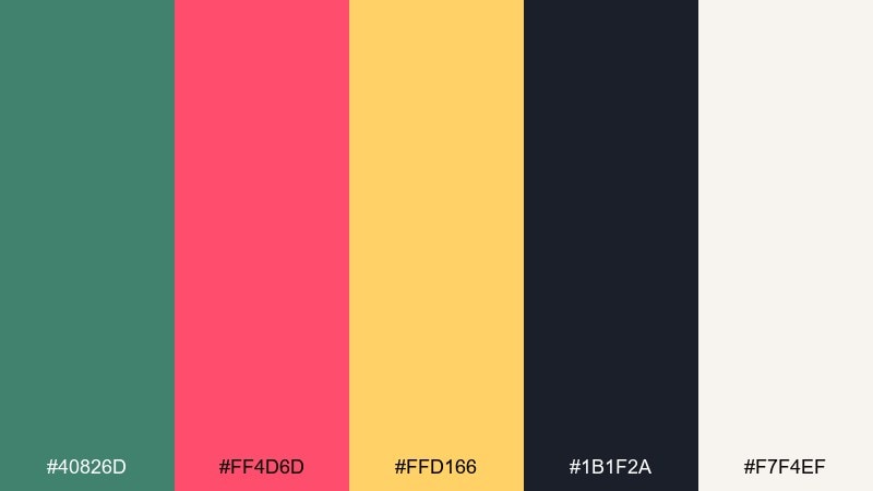
HEX: #40826D #FF4D6D #FFD166 #1B1F2A #F7F4EF
Mood: energetic, youthful, punchy
Best for: event flyers and social posters
Punchy pop colors bring a lively street-poster attitude to the greens. The viridian color palette holds the layout together while hot pink and sunny yellow deliver instant energy. Use the dark navy for bold type and framing blocks, and let the off-white keep breathing room. Tip: pick one bright as the hero and use the other only for small markers like dates or icons.
Image example of poster pop generated using media.io

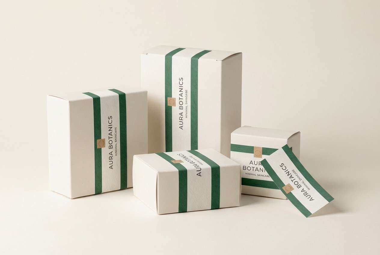
19) Packaging Minimal
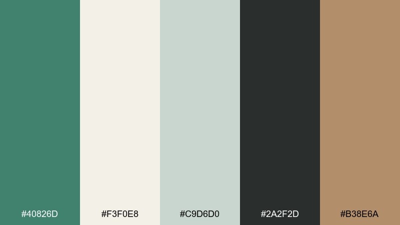
HEX: #40826D #F3F0E8 #C9D6D0 #2A2F2D #B38E6A
Mood: minimal, organic, premium
Best for: modern product packaging and labels
Minimal, organic tones feel like recycled paper, clean typography, and quiet confidence. Use the warm off-white as the dominant package color, then bring in viridian for a single brand band or mark. The muted tan works well for small icons and secondary text, especially on matte finishes. Tip: keep contrast high by using the charcoal for ingredient lists and fine print.
Image example of packaging minimal generated using media.io
20) Winter Evergreen
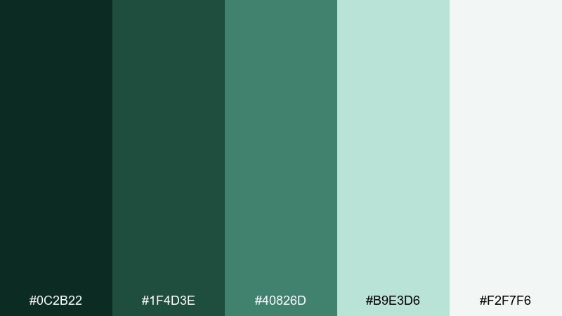
HEX: #0C2B22 #1F4D3E #40826D #B9E3D6 #F2F7F6
Mood: crisp, wintry, evergreen
Best for: holiday cards and seasonal illustration
Crisp evergreen tones feel like frosted needles and cold, clear air. Use the darkest green for silhouettes and type, then layer viridian and pine for depth in trees and patterns. The icy mint and near-white are perfect for snow, highlights, and gentle gradients. Tip: add tiny mint sparkles or linework to suggest frost without introducing extra colors.
Image example of winter evergreen generated using media.io

What Colors Go Well with Viridian?
Viridian pairs beautifully with warm neutrals like cream, sand, and tan when you want an organic, calming look. These combinations are especially strong for packaging, interiors, and lifestyle branding.
For sharper contrast, add charcoal, near-black green, or deep navy to create hierarchy and readability in UI or editorial layouts. This pushes viridian toward a premium, modern feel.
If you want energy, use a bright accent sparingly: citrus yellow, coral, copper, or hot pink can make viridian feel playful without losing structure.
How to Use a Viridian Color Palette in Real Designs
In UI, treat viridian as your primary action and selection color, then build the system with cool grays or warm off-whites for background and spacing. Keep body text in charcoal for comfortable reading.
In branding, viridian works best as a consistent anchor (logo, label band, headers), while one warm accent (copper, clay, gold) is reserved for highlights like seals, badges, or CTAs.
In illustration and interiors, viridian makes an excellent midtone. Layer deeper greens for shadows and add pale mints or creams for highlights to keep the result light and dimensional.
Create Viridian Palette Visuals with AI
If you have HEX codes but need real visuals (posters, packaging mockups, UI screens, or illustration concepts), generating on-style examples helps you validate contrast, mood, and composition fast.
Start with one palette, describe the design context (brand kit, interior scene, poster layout), then specify where viridian should dominate and which color should be the accent.
Use Media.io Text-to-Image to turn these viridian palette prompts into ready-to-share concept images in minutes.
Viridian Color Palette FAQs
-
What is viridian (and what HEX code is it)?
Viridian is a blue-green pigment color often used as a balanced teal-green. In these palettes, the core viridian is shown as #40826D, which is a practical digital equivalent for design work. -
Is viridian more green or more blue?
Viridian typically leans slightly blue compared to many “forest” greens, which makes it feel cooler and cleaner. Pair it with warm creams or tans to bring back warmth, or with navy/charcoal to emphasize the cool, modern side. -
What are good accent colors for a viridian color palette?
Strong accents include copper, coral, clay red, gold, and citrus yellow for punch, or orchid purple/hot pink for a creative contrast. Keep bold accents limited (often under 10–15%) so viridian stays the anchor. -
Does viridian work well for UI design?
Yes—viridian is great for buttons, active states, and success messaging because it reads confident without looking neon. For readability, use charcoal for body text and reserve viridian for emphasis and interaction. -
How do I make a viridian palette look more “natural”?
Combine viridian with warm off-whites, kraft-like beiges, soft sages, and muted browns. Adding texture cues (linen, paper, stone, wood) also helps the palette feel grounded and organic. -
How do I keep viridian from looking too dark or heavy?
Increase negative space and introduce light tints like pale mint, misty green, or near-white backgrounds. Use the darkest greens only for small areas like headings, borders, or focal edges. -
Can I generate viridian palette mockups with AI?
Yes—use a prompt that names your design type (packaging, poster, dashboard, invitation), states that viridian is dominant, and calls out your accent colors. Then iterate with aspect ratio and lighting/style until it matches your brand.
Next: Eclipse Color Palette


