

An underwater color palette captures the depth, calm, and contrast of ocean light—perfect for interfaces, branding, and artwork that needs a clean but immersive mood.
Below are 20 ocean-inspired underwater color combinations with HEX codes you can copy, plus practical use tips and AI prompts to generate matching visuals fast.
In this article
Why Underwater Palettes Work So Well
Underwater tones naturally balance calm and clarity: deep navies create structure, while teals and aquas add freshness without feeling overly saturated. That makes them easy to apply across UI, packaging, and editorial layouts.
They also support strong hierarchy. Dark “depth” colors work as anchors for text and navigation, while pale tints act like light filtering through water—ideal for backgrounds, cards, and negative space.
Finally, ocean palettes pair well with modern design trends like gradients, soft shadows, and minimal iconography. You can keep things premium and quiet—or introduce one bright accent (gold, coral, red) for instant focus.
20+ Underwater Color Palette Ideas (with HEX Codes)
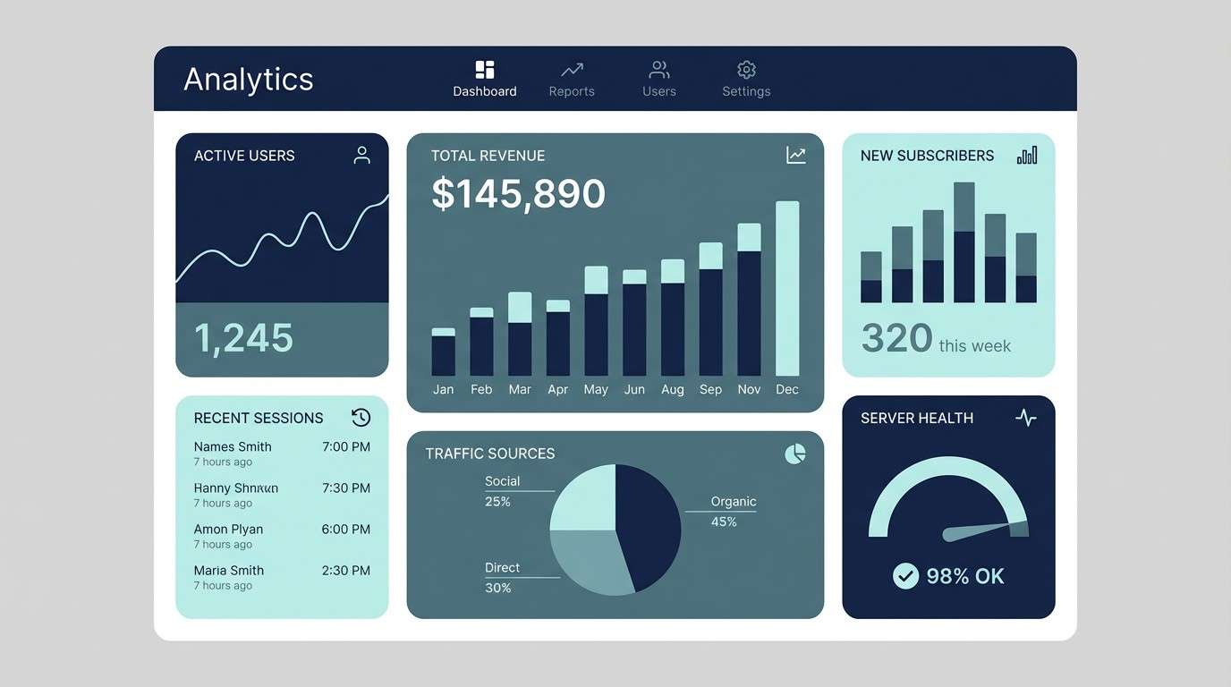
1) Abyssal Drift
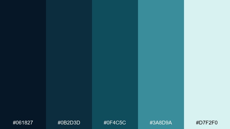
HEX: #061827 #0B2D3D #0F4C5C #3A8D9A #D7F2F0
Mood: moody, focused, modern
Best for: fintech dashboard UI and data-heavy web apps
Moody depths and quiet currents set a focused, modern tone that feels confident without being loud. Use it for dashboards where contrast and legibility matter, especially with light text on the darkest navy. Pair with simple line icons and generous spacing to keep the mid-teals from feeling busy. Tip: reserve the pale aqua for highlights and success states so the interface stays calm.
Image example of abyssal drift generated using media.io
Media.io is an online AI studio for creating and editing video, image, and audio in your browser.

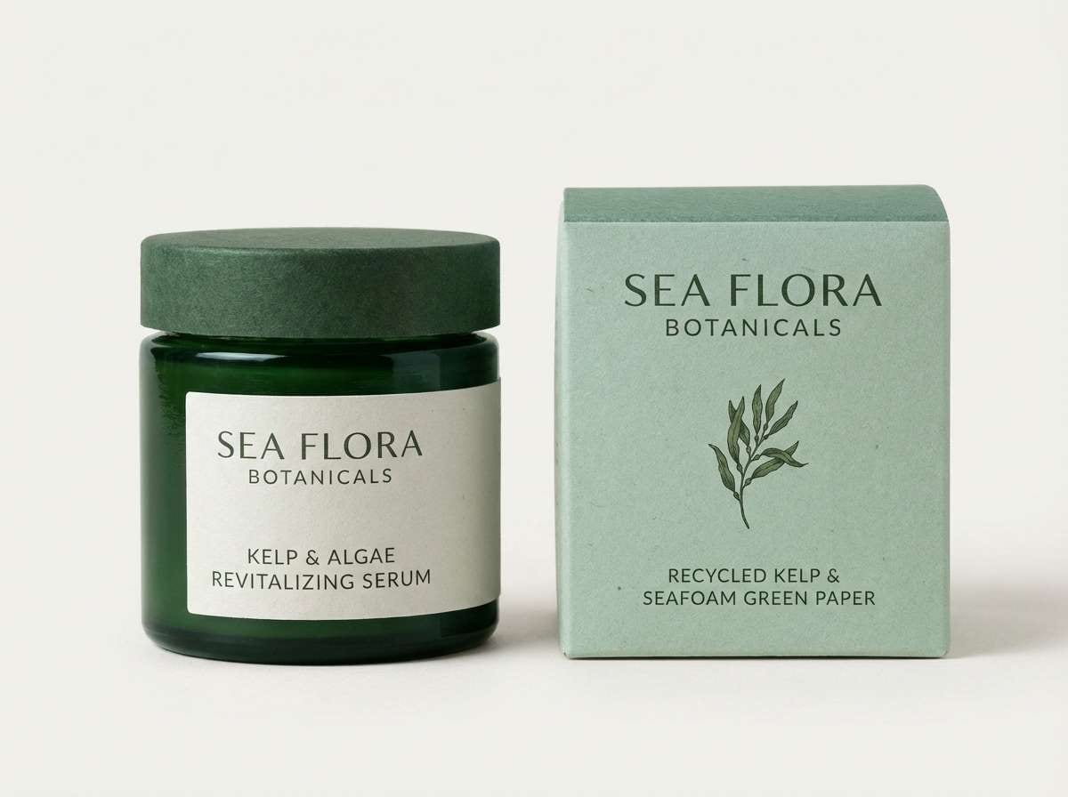
2) Kelp Forest
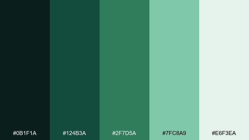
HEX: #0B1F1A #124B3A #2F7D5A #7FC8A9 #E6F3EA
Mood: earthy, fresh, restorative
Best for: eco brand identities and sustainable product labels
Earthy greens and softened seafoam evoke kelp fronds swaying in filtered light, grounding the look in nature. It works beautifully for eco brands, refill packaging, and wellness labels where a calm, responsible feel matters. Pair with warm off-white paper textures or muted kraft neutrals for authenticity. Tip: use the darkest green for logos and the seafoam as a gentle field color to keep typography crisp.
Image example of kelp forest generated using media.io
3) Pearl Lagoon
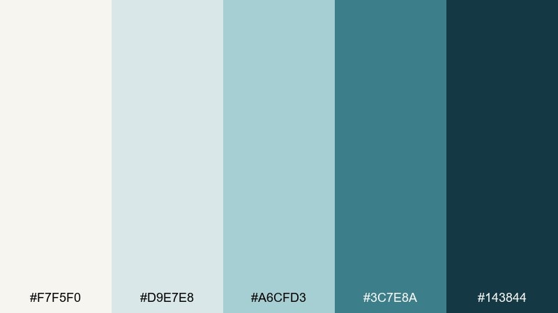
HEX: #F7F5F0 #D9E7E8 #A6CFD3 #3C7E8A #143844
Mood: clean, airy, spa-like
Best for: wellness websites and minimalist editorial layouts
Airy pearl tones and soft lagoon blues create a clean, spa-like atmosphere with a polished finish. Use it for wellness sites, lookbooks, and calm editorial spreads where whitespace is part of the design. Pair with thin serif headings or light sans fonts to match the gentle contrast. Tip: keep the darkest teal for titles and separators so the page structure stays clear.
Image example of pearl lagoon generated using media.io
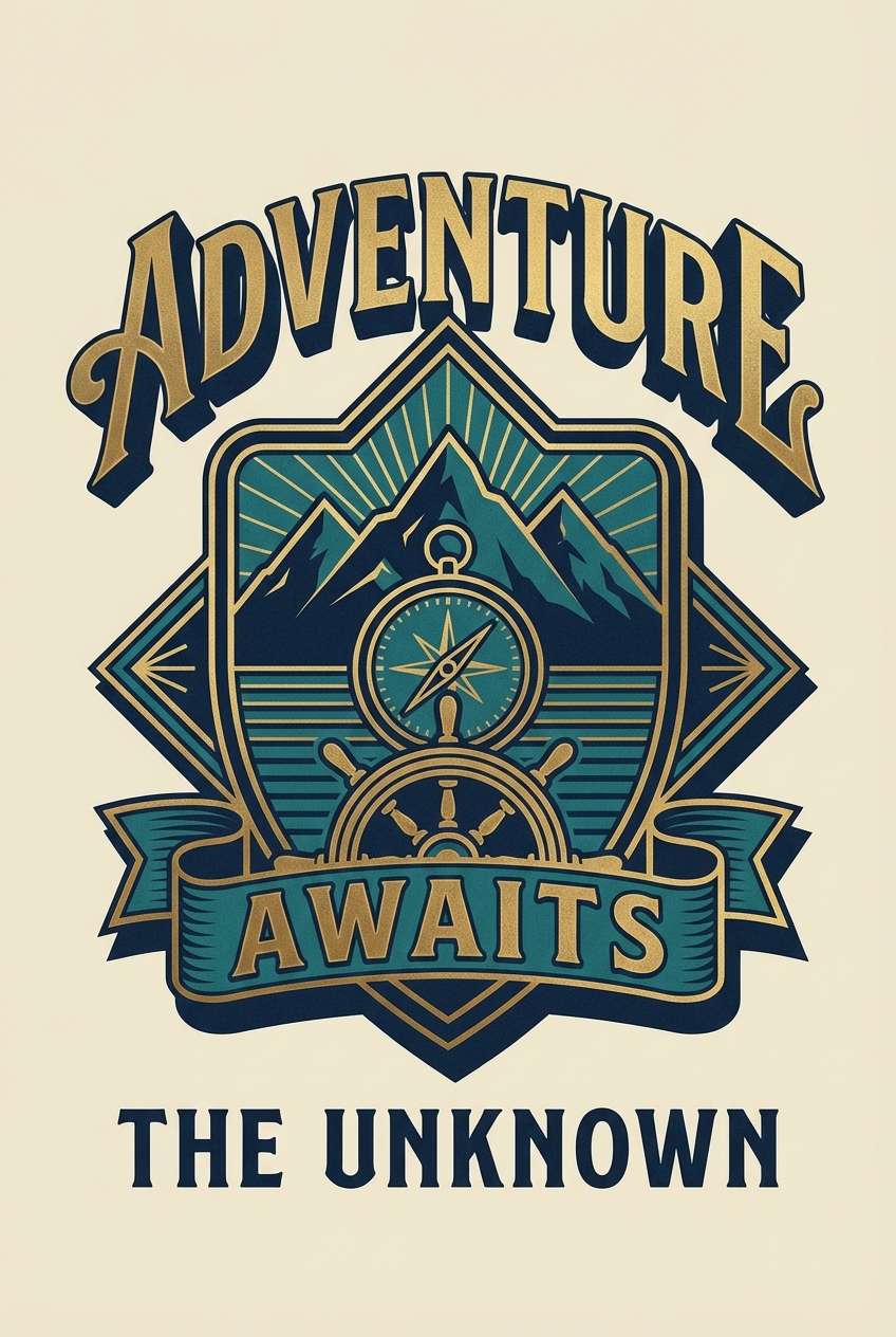
4) Sunken Treasure
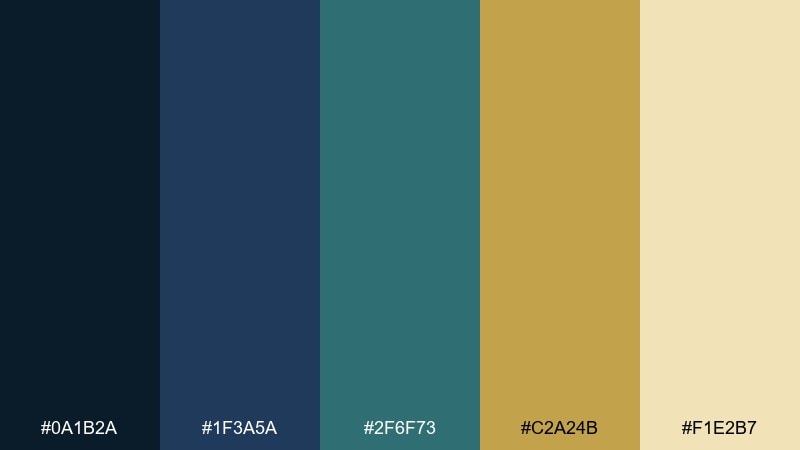
HEX: #0A1B2A #1F3A5A #2F6F73 #C2A24B #F1E2B7
Mood: adventurous, premium, cinematic
Best for: game posters and adventure-themed branding
Cinematic navy and sea-worn teal feel like a shipwreck reveal, while the brass gold adds a premium spark. It suits game key art, expedition brands, and cinematic posters where drama and hierarchy are essential. Pair with textured gradients and subtle grain to mimic aged metal and deep water. Tip: treat the gold as a rare accent for buttons, badges, or the focal headline only.
Image example of sunken treasure generated using media.io
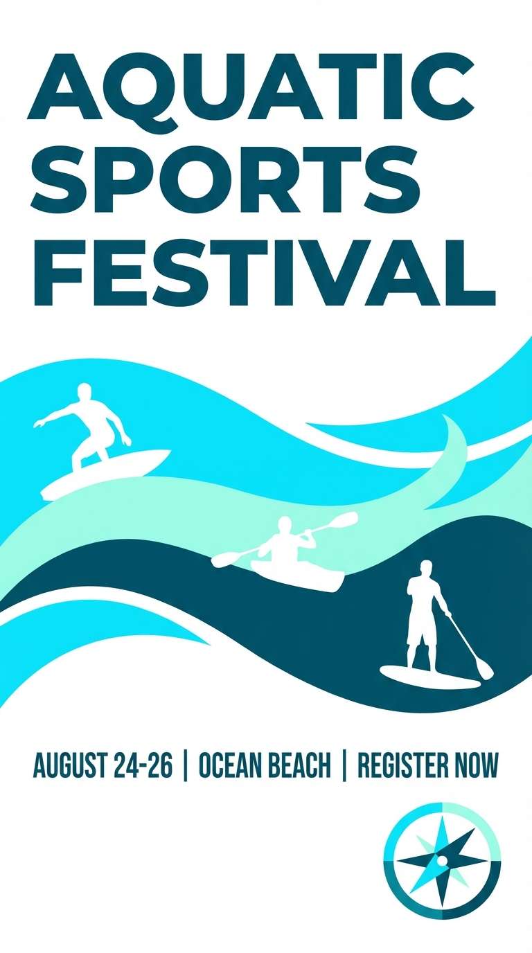
5) Tidepool Glass
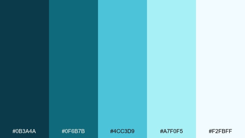
HEX: #0B3A4A #0F6B7B #4CC3D9 #A7F0F5 #F2FBFF
Mood: bright, playful, refreshing
Best for: summer event flyers and aquatic sports promos
Bright glassy blues feel like sunlight bouncing off tidepools, giving the design a lively, refreshing lift. It is ideal for summer flyers, swim events, and youth-focused promos where clarity and energy are key. Pair with rounded type and simple geometric waves to keep it friendly. Tip: use the lightest tint as the base so the brighter cyan reads as the hero color.
Image example of tidepool glass generated using media.io
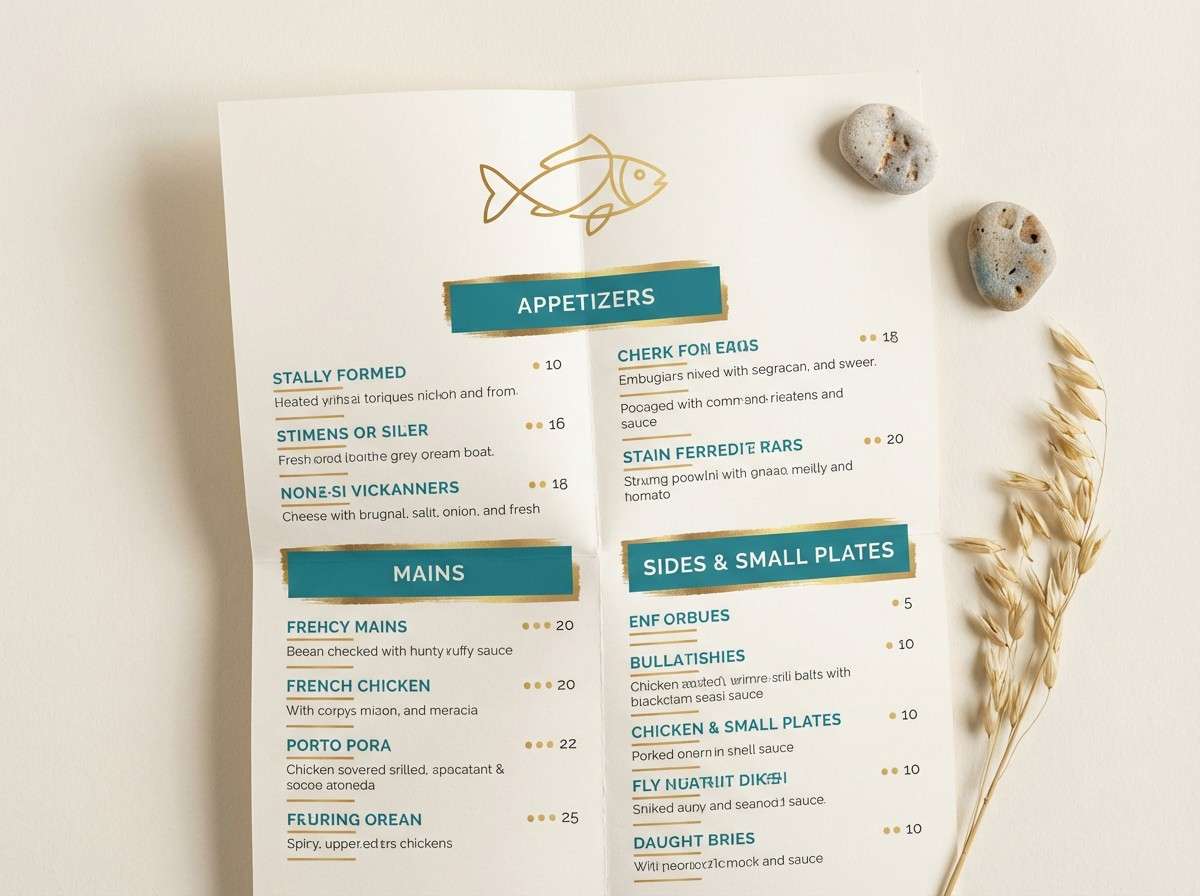
6) Reef Lantern
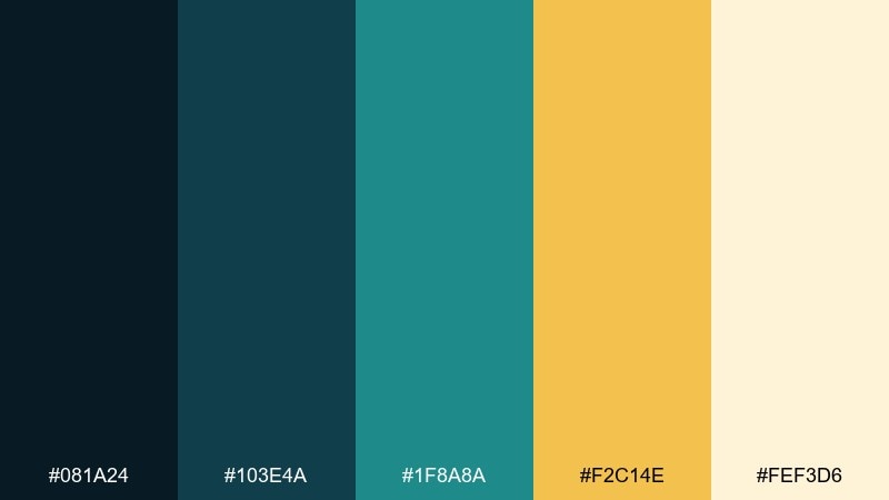
HEX: #081A24 #103E4A #1F8A8A #F2C14E #FEF3D6
Mood: warm, inviting, coastal
Best for: seafood restaurant menus and coastal hospitality branding
Warm lantern gold against reefy teals feels like a dockside dinner at dusk, inviting and comforting. Use it for menus, hospitality branding, and signage where you want a cozy coastal vibe without going rustic. Pair with cream backgrounds and simple nautical line art for a clean finish. Tip: keep gold for callouts like specials and section headers to guide scanning.
Image example of reef lantern generated using media.io
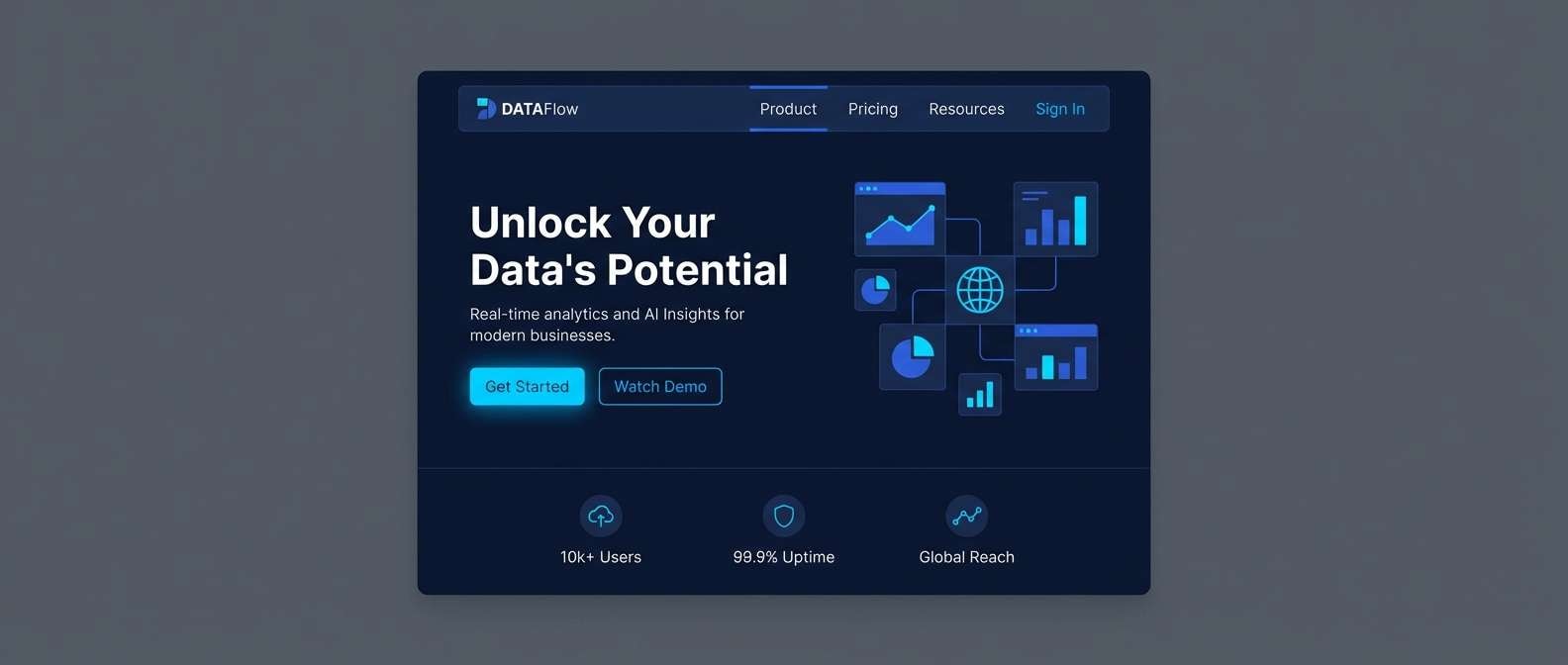
7) Midnight Current
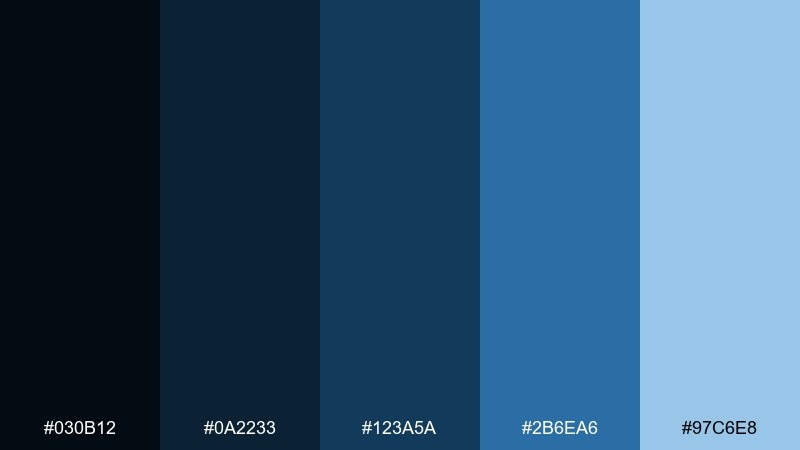
HEX: #030B12 #0A2233 #123A5A #2B6EA6 #97C6E8
Mood: sleek, techy, nocturnal
Best for: SaaS landing pages and security branding
Sleek midnight blues and electric ocean highlights evoke fast currents and quiet depth, perfect for a tech-forward feel. It fits SaaS landing pages, security products, and presentations that need authority and polish. Pair with sharp iconography and subtle gradients to add dimensionality without clutter. Tip: use the light blue sparingly for links and primary CTAs so the page stays premium.
Image example of midnight current generated using media.io
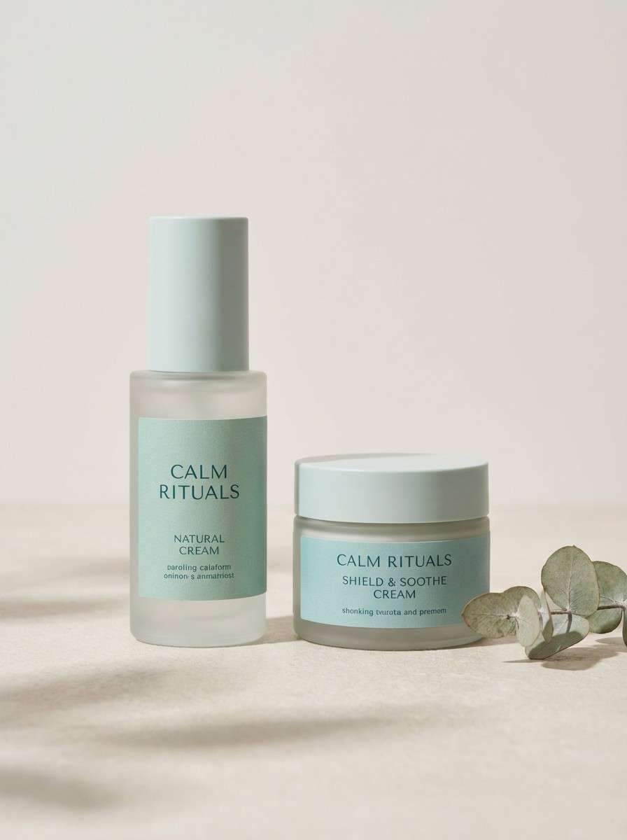
8) Seafoam Mist
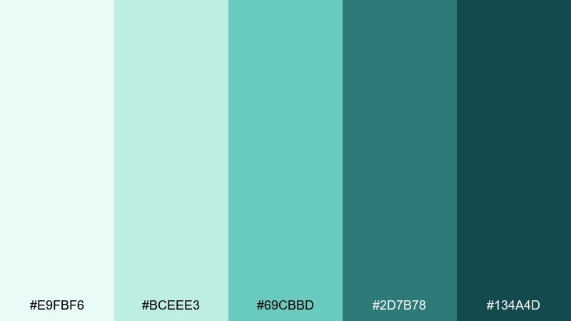
HEX: #E9FBF6 #BCEEE3 #69CBBD #2D7B78 #134A4D
Mood: soft, soothing, coastal
Best for: beauty packaging and calming social templates
Soft seafoam and misty teals bring a soothing coastal calm that feels clean and gentle. It works well for beauty packaging, skincare posts, and self-care templates where softness matters. Pair with thin borders, airy spacing, and a warm neutral paper tone if you want it less clinical. Tip: anchor the design with the deepest teal for text so the pastel tones stay readable.
Image example of seafoam mist generated using media.io
9) Nautilus Shell
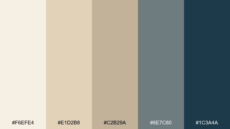
HEX: #F6EFE4 #E1D2B8 #C2B29A #6E7C80 #1C3A4A
Mood: neutral, timeless, refined
Best for: lifestyle blogs and premium stationery
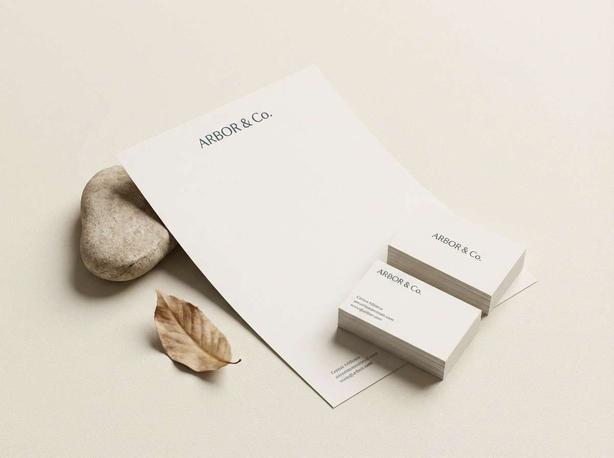
Creamy shell neutrals with slate and deep blue-grey feel timeless, like worn ceramic and driftwood. Use it for lifestyle blogs, premium stationery, and wedding collateral where subtlety reads as luxury. Pair with embossed textures, thin rules, and a single dark anchor color for headings. Tip: keep contrast high for body text by using the navy-grey over the lightest cream.
Image example of nautilus shell generated using media.io
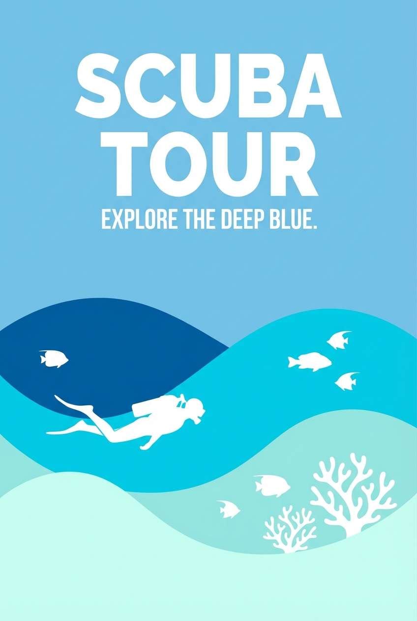
10) Blue Grotto
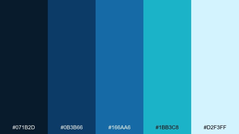
HEX: #071B2D #0B3B66 #166AA6 #1BB3C8 #D2F3FF
Mood: vibrant, crisp, adventurous
Best for: travel ads and scuba tour posters
Vibrant grotto blues and clean aqua highlights feel crisp and adventurous, like a hidden cove at midday. It is a strong fit for travel ads, tour posters, and banners that need immediate clarity from a distance. Pair with bold sans headlines and high-contrast photo masks or vector waves. Tip: use the palest blue for negative space so the cyan stays punchy and readable.
Image example of blue grotto generated using media.io
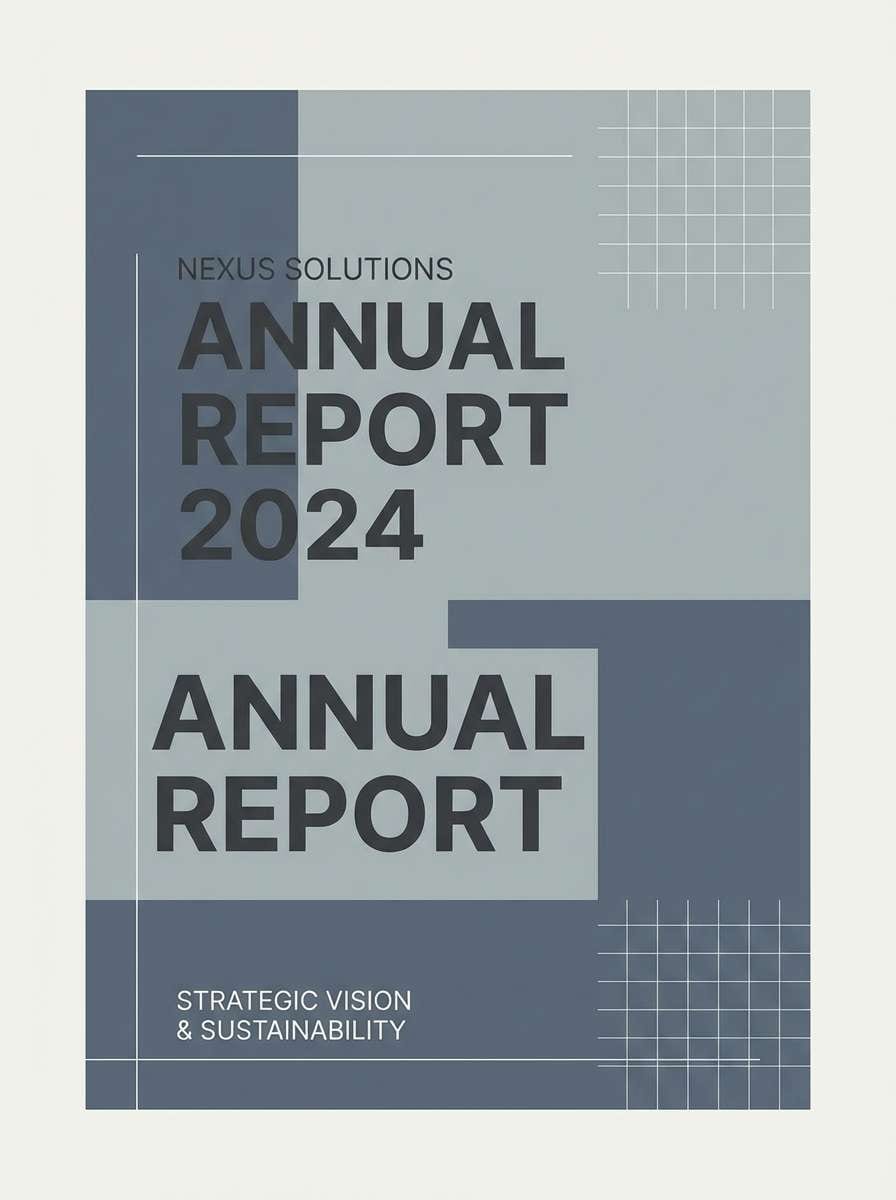
11) Harbor Stone
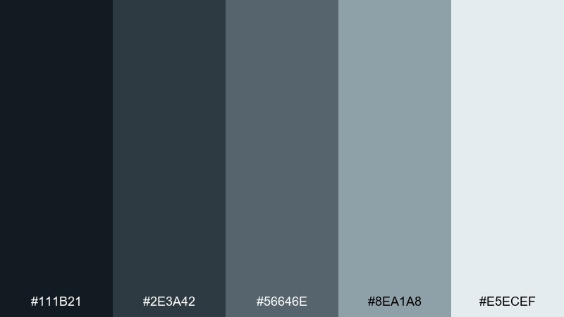
HEX: #111B21 #2E3A42 #56646E #8EA1A8 #E5ECEF
Mood: industrial, quiet, dependable
Best for: architecture presentations and corporate reports
Cool harbor greys feel industrial and dependable, like wet stone and steel rails near the pier. Use it for architecture decks, corporate reports, and portfolios where neutrality supports the content. Pair with one teal or blue accent if you need a modern lift without losing seriousness. Tip: rely on the lightest grey for section backgrounds to create structure without heavy borders.
Image example of harbor stone generated using media.io
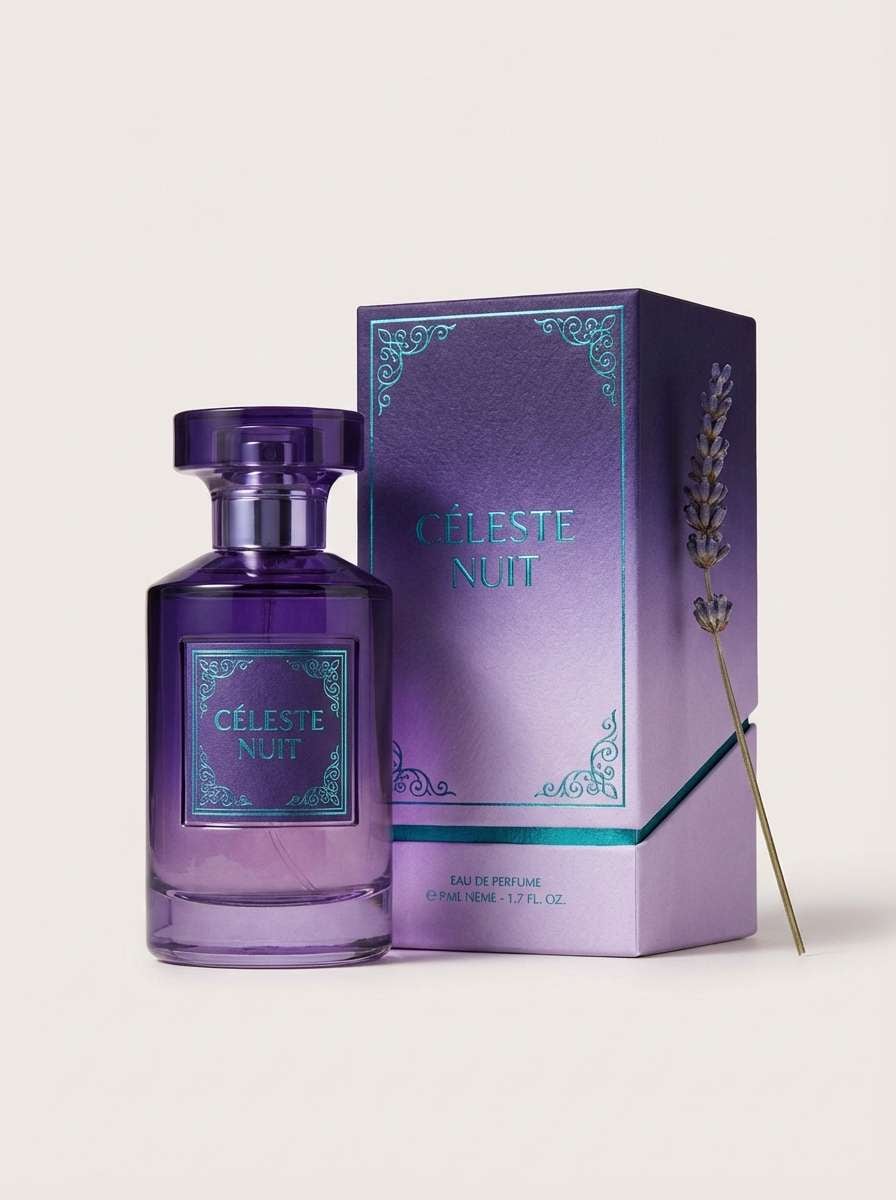
12) Mermaid Silk
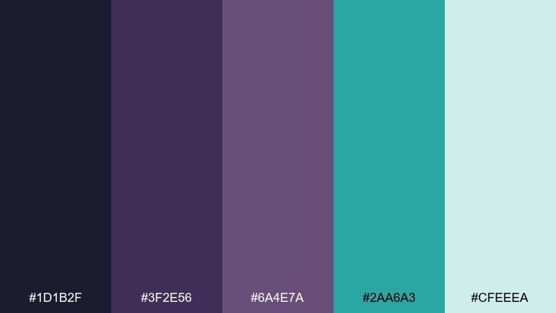
HEX: #1D1B2F #3F2E56 #6A4E7A #2AA6A3 #CFEEEa
Mood: dreamy, luxe, slightly mystical
Best for: beauty branding and boutique social campaigns
Dreamy violet shadows with a mermaid teal shimmer feel luxe and slightly mystical, like satin catching low light. It suits beauty branding, boutique campaigns, and creative promos that want elegance with a twist. Pair with glossy gradients or soft blur effects to amplify the silky feel. Tip: keep teal as a highlight color for icons and small graphics so the purples remain the main voice.
Image example of mermaid silk generated using media.io
13) Arctic Fjord
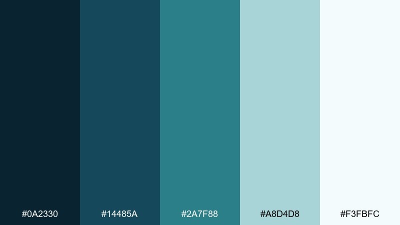
HEX: #0A2330 #14485A #2A7F88 #A8D4D8 #F3FBFC
Mood: cold, clean, spacious
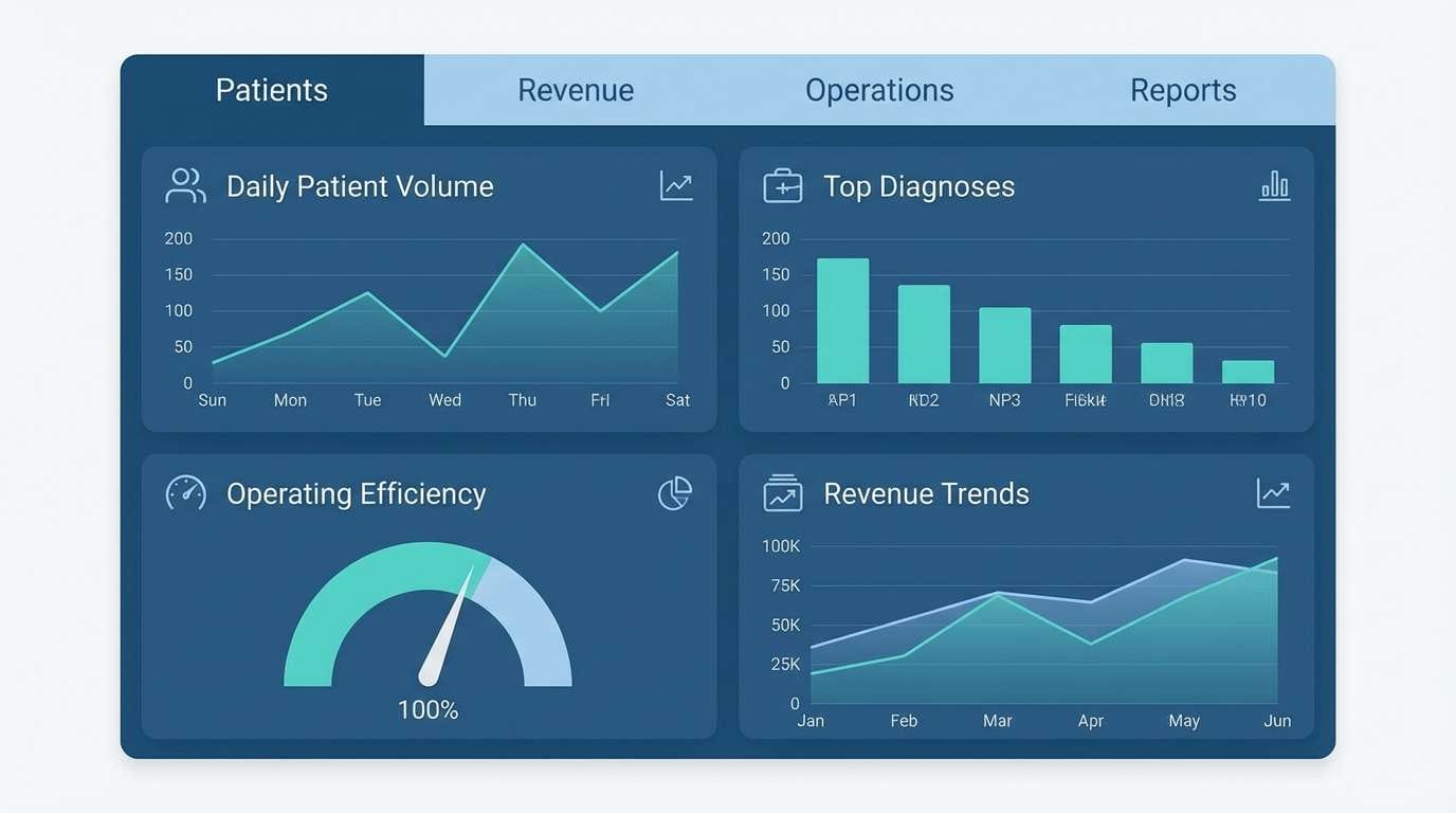
Best for: medical tech UI and minimalist presentations
Cold fjord blues and airy ice tints feel clean and spacious, like breath in winter air. It works well for medical tech, science decks, and minimalist UI where clarity is the priority. Pair with thin dividers and simple charts to keep the interface feeling clinical but welcoming. Tip: use the near-white ice tint as the main canvas and apply the darker blues for navigation and labels.
Image example of arctic fjord generated using media.io
14) Plankton Glow
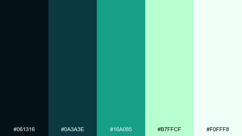
HEX: #061316 #0A3A3E #16A085 #B7FFCF #F0FFF8
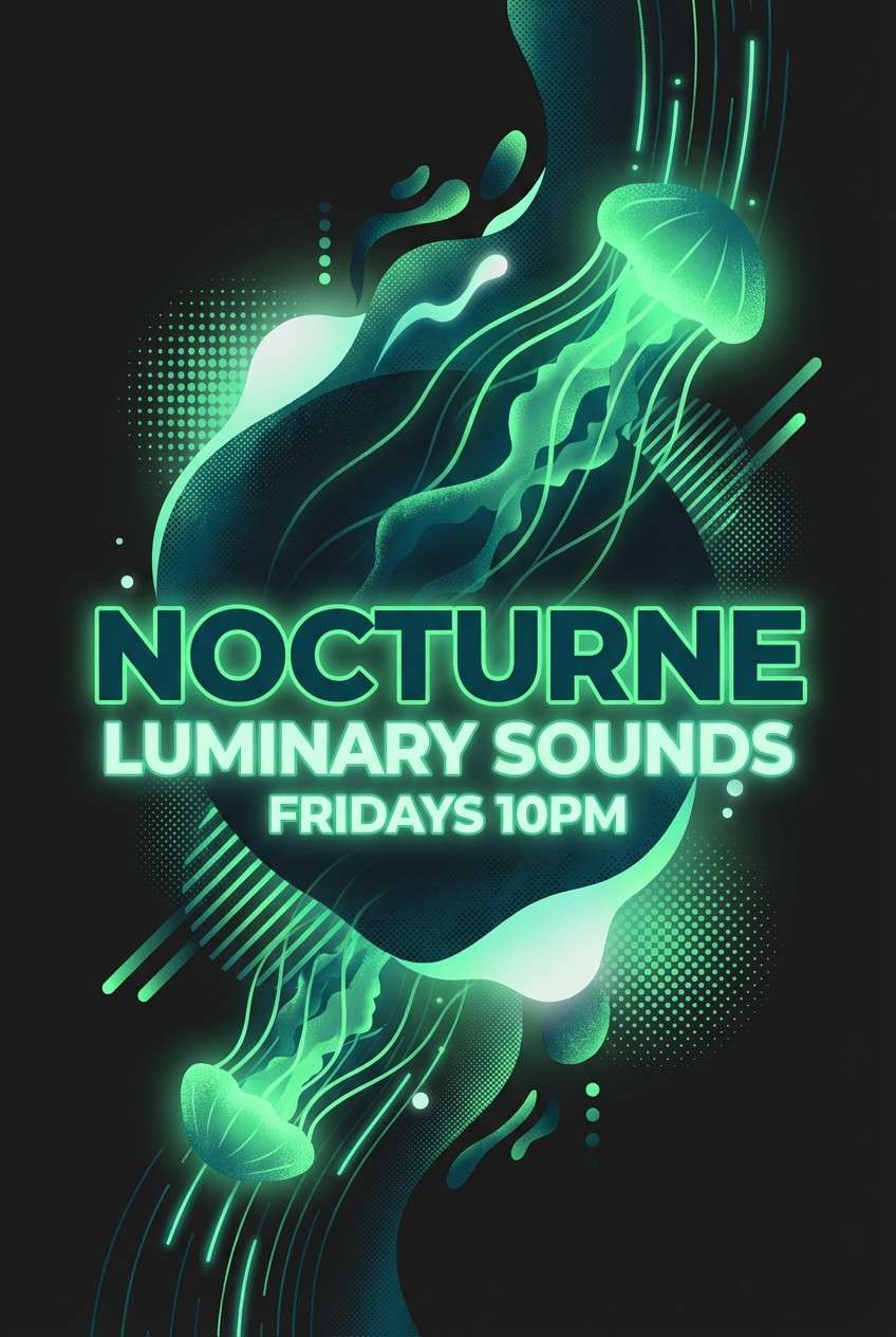
Mood: energetic, modern, bioluminescent
Best for: music visuals and nightlife posters
Bioluminescent greens and deep teal shadows feel energetic, like plankton lighting up a night swim. It is great for music visuals, nightlife posters, and bold digital banners where you want a fresh pop without neon chaos. Pair with black or near-black backgrounds to let the glow tones breathe. Tip: keep the brightest mint for key text or a single focal shape so it does not overpower the layout.
Image example of plankton glow generated using media.io
15) Deep Dive Denim
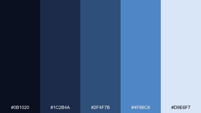
HEX: #0B1020 #1C2B4A #2F4F7B #4F86C6 #D9E6F7
Mood: confident, approachable, classic
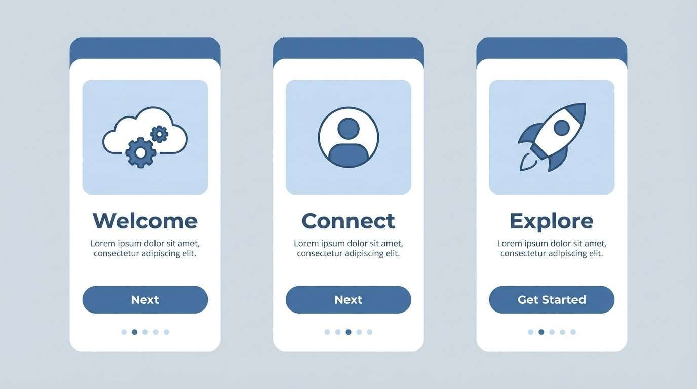
Best for: app onboarding screens and education products
Classic denim blues feel confident and approachable, like a familiar favorite with a deeper edge. Use it for onboarding flows, education products, and clean web UI where you need trust and friendliness together. Pair with rounded cards and simple illustrations to keep it light. Tip: let the mid-blue do most of the work and use the darkest tone only for headings and key UI states.
Image example of deep dive denim generated using media.io
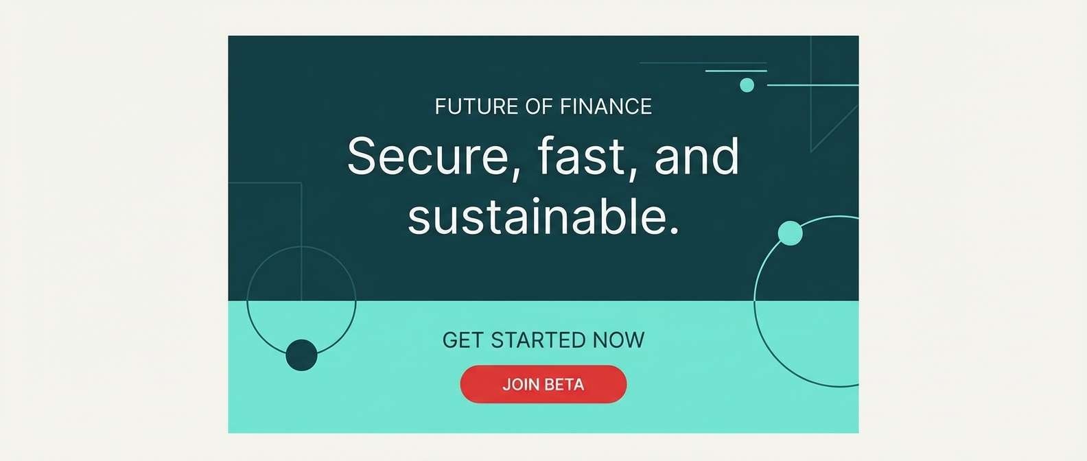
16) Siren Signal
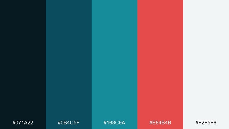
HEX: #071A22 #0B4C5F #168C9A #E64B4B #F2F5F6
Mood: bold, alert, high-contrast
Best for: CTA-driven landing pages and promo banners
Bold teal depths with a sharp red signal feel urgent yet controlled, like a beacon cutting through fog. It is excellent for landing pages and banners where the call-to-action needs to stand out instantly. Pair with clean white space and minimal iconography so the red reads as intentional, not noisy. Tip: keep red only for primary buttons and critical badges, then let teal carry the rest of the layout.
Image example of siren signal generated using media.io
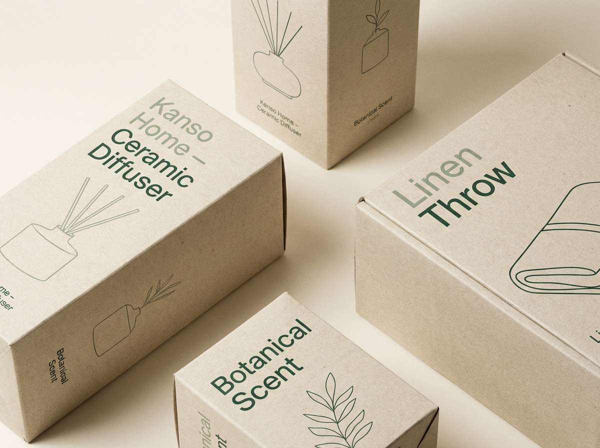
17) Seagrass Neutral
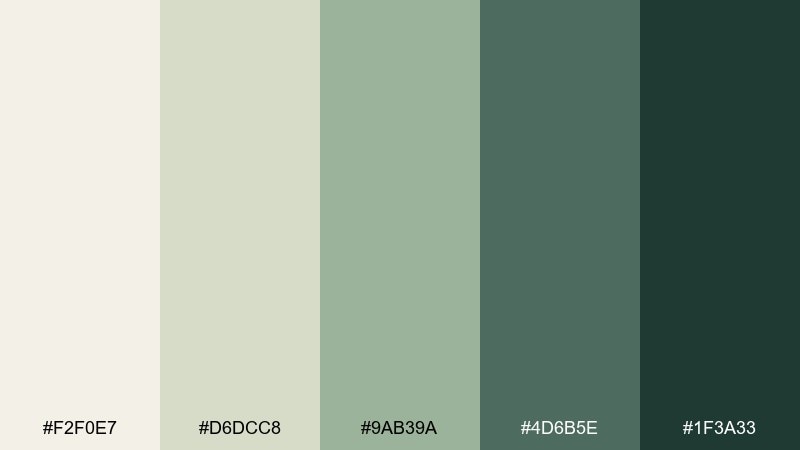
HEX: #F2F0E7 #D6DCC8 #9AB39A #4D6B5E #1F3A33
Mood: natural, calm, understated
Best for: home goods branding and minimalist packaging
Soft seagrass neutrals feel natural and understated, like linen, clay, and coastal plants. They work well for home goods, minimalist packaging, and lifestyle brands that want warmth without bright color. Pair with tactile materials such as uncoated paper and subtle embossing for a premium touch. Tip: use the darkest green for small type and barcodes so the lighter greens stay airy.
Image example of seagrass neutral generated using media.io
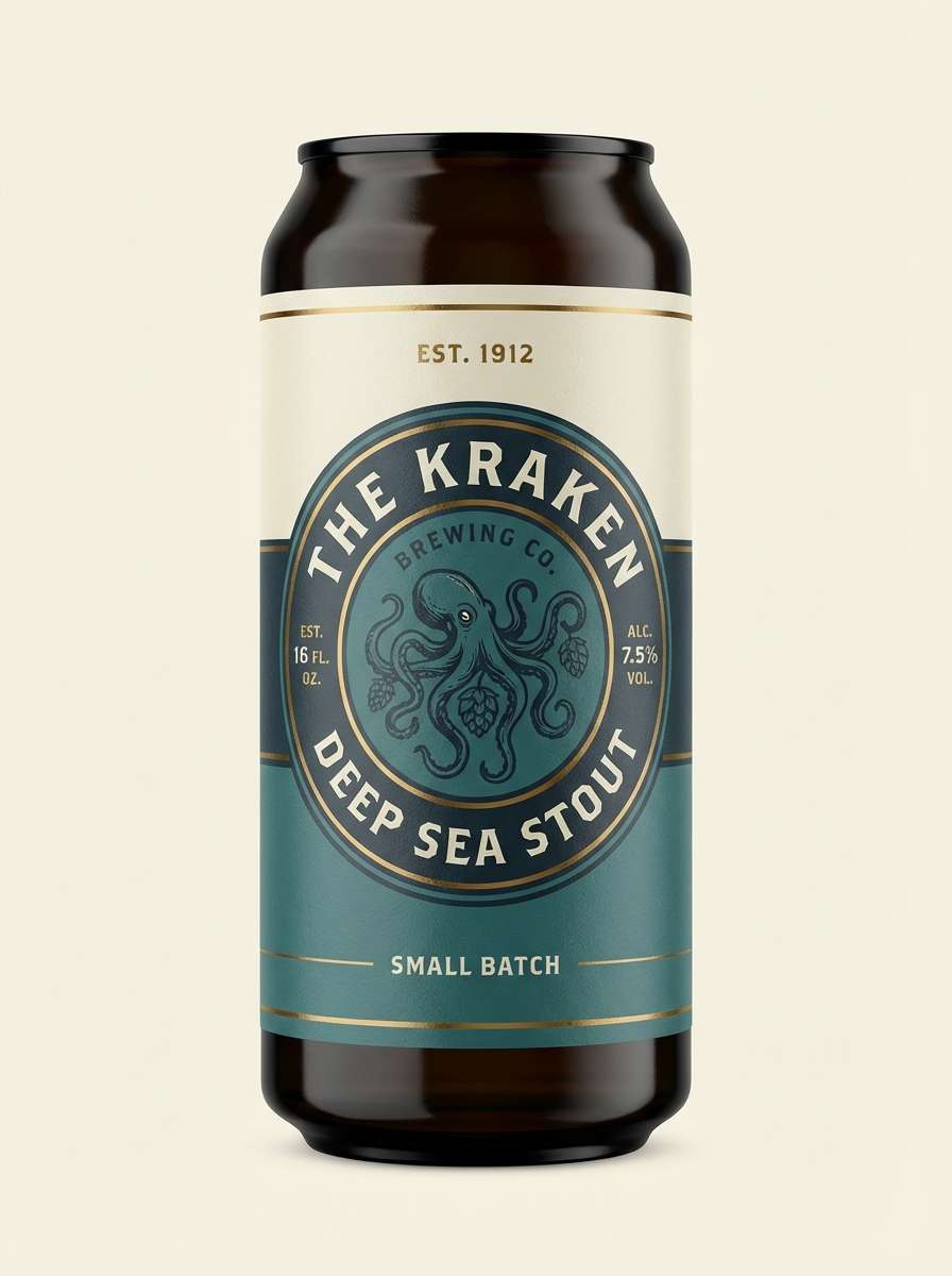
18) Submarine Brass
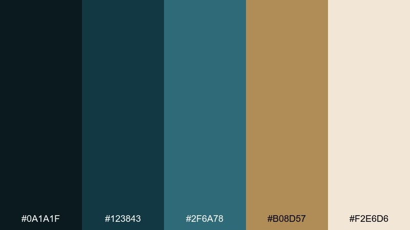
HEX: #0A1A1F #123843 #2F6A78 #B08D57 #F2E6D6
Mood: vintage, engineered, nautical
Best for: craft beer labels and heritage brand marks
Deep submarine tones with brass warmth feel engineered and vintage, like rivets, gauges, and polished metal. Use it for craft beer labels, heritage marks, and packaging that leans nautical without looking kitschy. Pair with serif typography or badge-style emblems to amplify the old-world mood. Tip: keep the cream as the label base and use brass sparingly for stamps and trim lines.
Image example of submarine brass generated using media.io
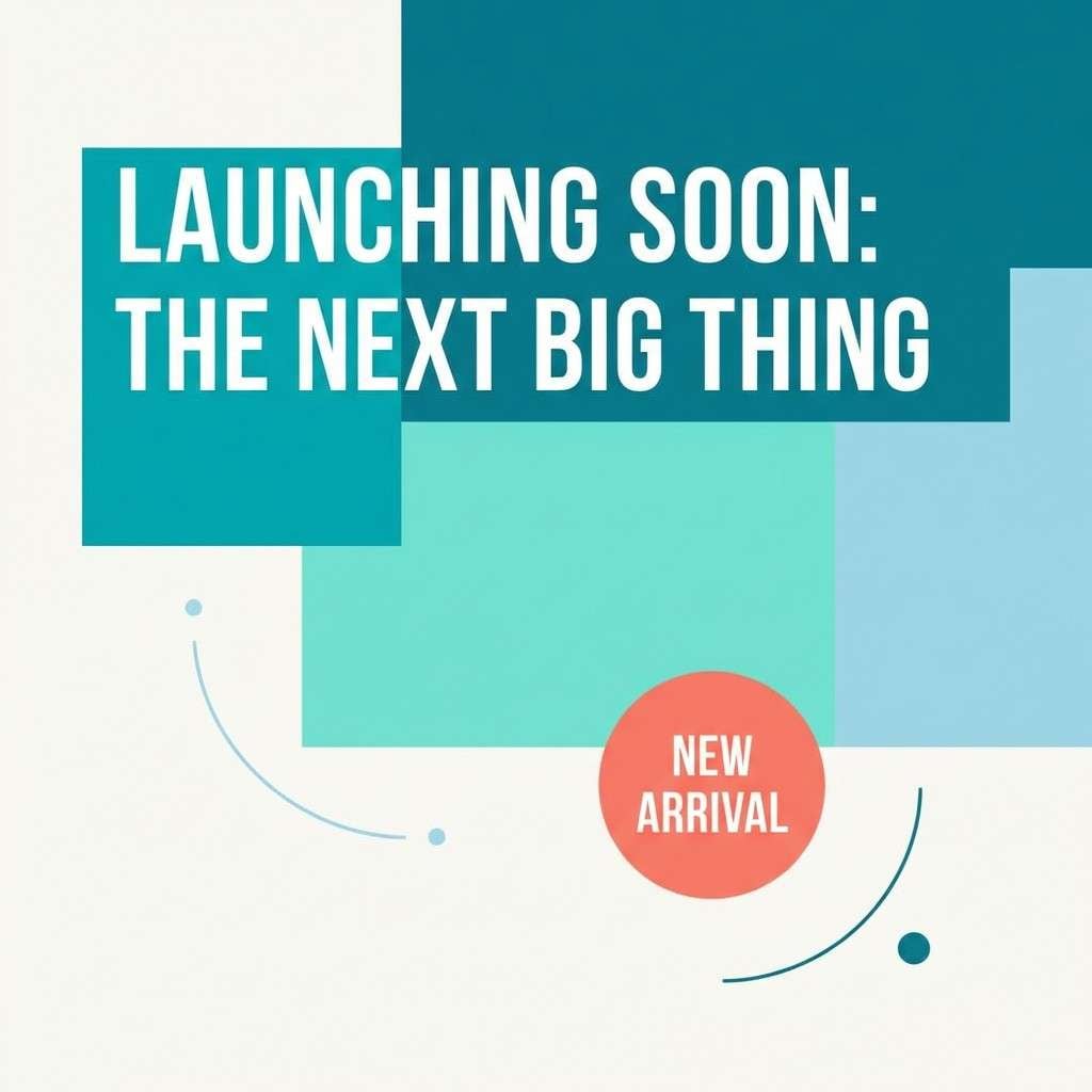
19) Coral Flicker
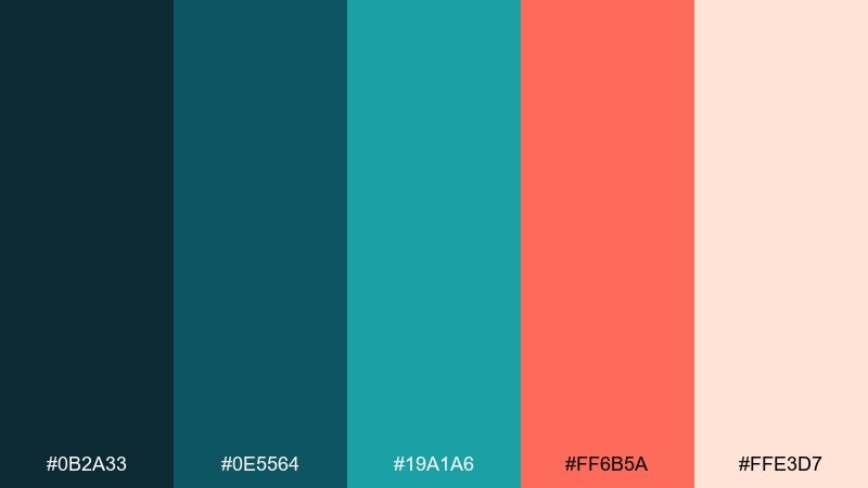
HEX: #0B2A33 #0E5564 #19A1A6 #FF6B5A #FFE3D7
Mood: lively, tropical, eye-catching
Best for: social ads and summer product launches
Lively reef teals with a coral flicker feel tropical and attention-grabbing, like a flash of color between waves. These underwater color combinations are perfect for social ads and summer launches when you need one bold accent to do the heavy lifting. Pair with simple layouts and plenty of pale peach breathing room so the coral stays premium. Tip: apply coral only to one or two elements per frame, such as price tags or a single button.
Image example of coral flicker generated using media.io
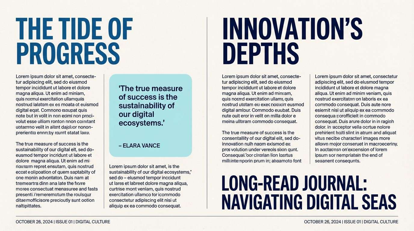
20) Saltwater Ink
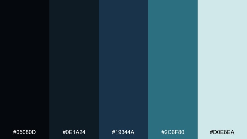
HEX: #05080D #0E1A24 #19344A #2C6F80 #D0E8EA
Mood: serious, editorial, sophisticated
Best for: publishing brands and long-read web articles
Inky blacks and deep ocean blues feel serious and editorial, like a long read you can trust. Use it for publishing brands, article templates, and portfolios where typography leads the experience. Pair with soft off-white backgrounds and restrained accent blocks for navigation. Tip: keep the light aqua for pull quotes and highlight panels to break up dense text without distracting.
Image example of saltwater ink generated using media.io
What Colors Go Well with Underwater?
Underwater palettes pair best with neutrals that mimic sand, salt, and foam—think warm off-whites, creamy beiges, and soft greys. These keep your composition breathable and help teal-heavy schemes feel less “digital.”
For contrast, add a single accent that reads like a signal in deep water: coral, brass gold, or red. Used sparingly on CTAs, badges, or key data points, these accents create instant hierarchy without fighting the ocean tones.
If you want a more editorial or premium look, introduce inky blacks and blue-greys. They support typography-forward layouts and keep gradients, photos, and UI components grounded.
How to Use a Underwater Color Palette in Real Designs
Start with one anchor dark (navy/ink) for text, nav, and outlines, then choose one mid-tone teal for large surfaces like cards or panels. Finish with a pale aqua or ice tint for backgrounds to maintain legibility.
In branding, underwater color combinations work well when you limit the “hero” to one hue family (blue-green) and reserve any warm accent (coral/gold/red) for tiny, repeatable moments—icons, seals, or a single button style.
For UI, test contrast early. Many aquas are bright but low-contrast on white; switching to off-white canvases, adding subtle borders, or using deeper teals for labels keeps components accessible and crisp.
Create Underwater Palette Visuals with AI
If you want to preview these marine colors in posters, packaging, landing pages, or social ads, generate quick mockups with AI. You can reuse the prompts above and simply swap the subject (menu, dashboard, flyer) to match your project.
Media.io makes it easy to iterate: try different ratios, adjust lighting, and test accent colors (coral or gold) until your underwater palette feels balanced and on-brand.
Once you like the direction, export your favorites and use the HEX codes here to recreate the same color system in Figma, Canva, or your design tool of choice.
Underwater Color Palette FAQs
-
What is an underwater color palette?
An underwater color palette is a set of ocean-inspired tones—typically deep navy, teal, aqua, seafoam, and icy light tints—designed to evoke depth, calm, and clarity in visual design. -
Which underwater colors are best for UI design?
Deep navy or ink works best for structure and readable text, paired with mid-teal for surfaces and a pale aqua for backgrounds. Use one bright accent (like coral or red) only for primary CTAs or critical states. -
How do I keep teal and aqua from looking too bright?
Reduce how much bright cyan you use, place it on off-white instead of pure white, and anchor the layout with a very dark navy. Bright aquas look more premium when they appear as highlights rather than full backgrounds. -
What accent colors go with ocean tones?
Coral, brass gold, and signal red are the most effective accents because they contrast naturally with blue-green palettes. Neutral accents like sand-beige and cool grey also pair well for a softer look. -
Are underwater palettes good for branding?
Yes—underwater color combinations communicate trust, calm, cleanliness, and modernity. They’re popular in wellness, tech, sustainability, travel, and editorial brands where a polished mood matters. -
How can I generate underwater palette mockups with AI?
Use a text-to-image tool like Media.io and describe the design format (dashboard, menu, flyer, packaging) plus your lighting/style (minimal, premium, editorial). Then apply the palette’s HEX codes in your final design system for consistency. -
What’s a quick underwater palette rule for beginners?
Pick 1 dark anchor, 1 mid-tone teal, 1 light background tint, and 1 optional warm accent for emphasis. Keeping the accent rare is the easiest way to make ocean palettes feel intentional.
Next: Red Coral Color Palette


