

Red coral is a modern warm tone that sits between lively red and soft peach, so it feels energetic without being harsh. In palettes, it instantly adds friendliness, appetite appeal, and a “human” touch to otherwise neutral layouts.
Below are 20+ red coral color palette ideas with HEX codes, plus real-use tips for branding, UI, and print. You can also generate matching visuals using Media.io prompts included for each combo.
In this article
- Why Red Coral Palettes Work So Well
-
- sunset gelato
- coastal clay
- coral linen neutral
- sage garden pop
- retro diner neon
- coral night swim
- apricot sandstone
- blush copper luxe
- coral tech minimal
- tropical punch
- desert rose quiet
- ocean coral balance
- charcoal coral edge
- coral candy cloud
- rustic terracotta market
- coral steel contrast
- rose gold weekend
- coral citrus editorial
- athletic coral drive
- coral tea ceremony
- soft coral workspace
- coral museum modern
- coral midnight bloom
- What Colors Go Well with Red Coral?
- How to Use a Red Coral Color Palette in Real Designs
- Create Red Coral Palette Visuals with AI
Why Red Coral Palettes Work So Well
Red coral balances warmth and softness, so it feels inviting while still grabbing attention. That makes it a reliable “hero accent” for CTAs, headlines, badges, and product highlights.
It pairs naturally with warm neutrals for premium minimal looks, and it also pops against deep navies and charcoals for high readability. This flexibility helps coral work across branding, UI components, and print pieces without feeling out of place.
Because coral sits close to skin-tone warmth, it often reads friendly and approachable in digital designs. Used in the right proportion, it can modernize a layout without pushing it into neon territory.
20+ Red Coral Color Palette Ideas (with HEX Codes)
1) Sunset Gelato
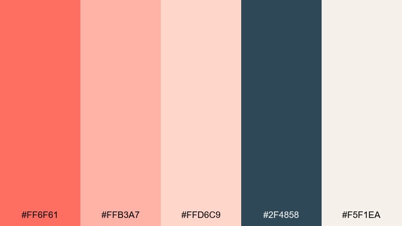
HEX: #ff6f61 #ffb3a7 #ffd6c9 #2f4858 #f5f1ea
Mood: playful, warm, creamy
Best for: ice cream shop branding and menu design
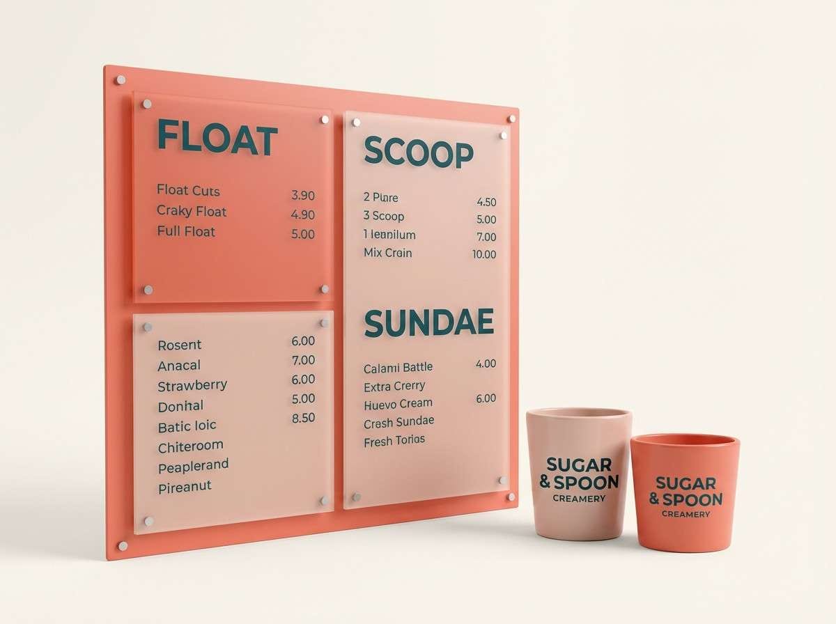
Playful sunset sweetness with creamy highlights and a cool deep counterpoint. The mix reads friendly and appetizing, perfect for menus, labels, and punchy social posts. Use the dark teal for headlines and pricing so the coral stays soft, not loud. For a clean finish, keep backgrounds airy with the warm off-white and let coral be the hero accent in this red coral color palette.
Image example of sunset gelato generated using media.io
Media.io is an online AI studio for creating and editing video, image, and audio in your browser.

2) Coastal Clay
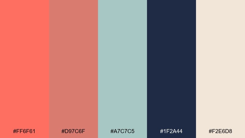
HEX: #ff6f61 #d97c6f #a7c7c5 #1f2a44 #f2e6d8
Mood: sun-warmed, grounded, coastal
Best for: interior mood boards and lifestyle blog graphics
Sun-warmed clay tones meet a breezy sea-glass tint for an easy coastal feel. It works beautifully in mood boards, blog headers, and home decor lookbooks where you want warmth without oversaturation. Pair the navy with coral for strong contrast in titles, then use cream to keep layouts breathable. A small pop of sea-glass in icons or dividers makes the whole set feel curated.
Image example of coastal clay generated using media.io
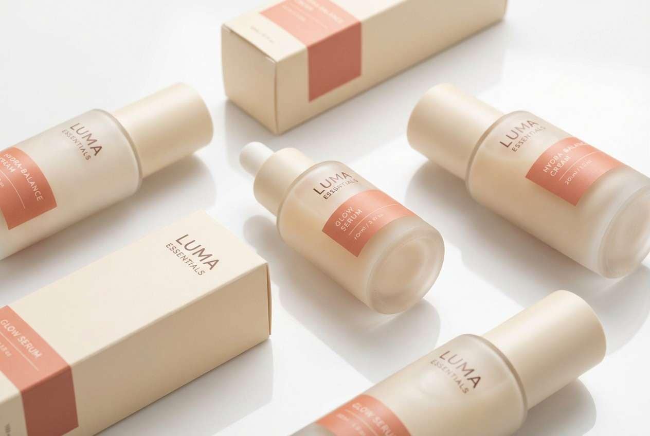
3) Coral Linen Neutral
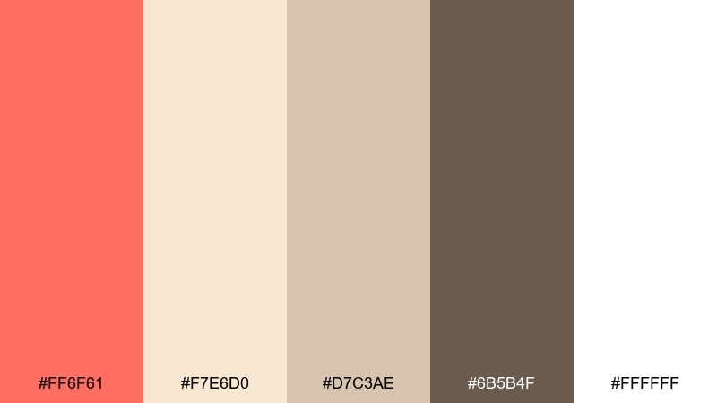
HEX: #ff6f61 #f7e6d0 #d7c3ae #6b5b4f #ffffff
Mood: soft, minimal, elevated
Best for: skincare packaging and clean product labels
Soft linen neutrals with a fresh coral lift feel calm, clean, and premium. The palette is ideal for skincare labels, wellness products, and minimal packaging where type needs to stay readable. Use the cocoa brown for ingredient lists and keep coral for seals, caps, or small callouts. Printing tip: let the warm cream dominate so coral reads refined rather than fluorescent.
Image example of coral linen neutral generated using media.io
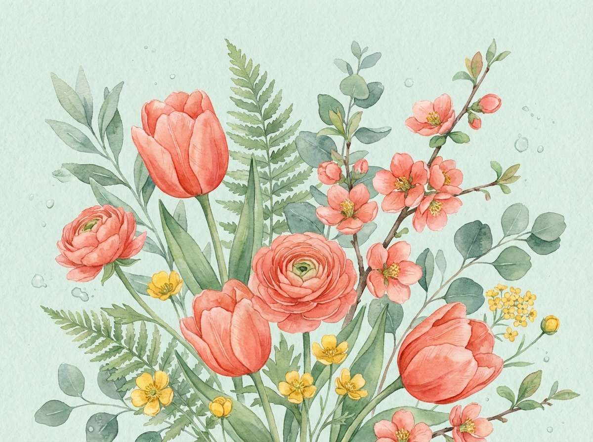
4) Sage Garden Pop
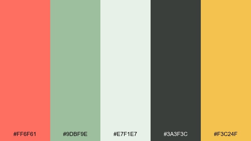
HEX: #ff6f61 #9dbf9e #e7f1e7 #3a3f3c #f3c24f
Mood: fresh, botanical, optimistic
Best for: spring botanical illustration and stationery
Fresh garden air with a cheerful citrus wink makes the mood feel light and optimistic. It suits spring stationery, botanical artwork, and cheerful announcements where color should feel alive but not neon. Let sage and pale mint carry backgrounds while coral highlights blooms or headings. A small touch of golden yellow works best as a sparing accent for stamps or icons.
Image example of sage garden pop generated using media.io
5) Retro Diner Neon
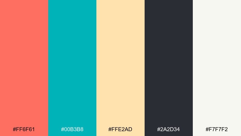
HEX: #ff6f61 #00b3b8 #ffe2ad #2a2d34 #f7f7f2
Mood: retro, energetic, high-contrast
Best for: event posters and retro-themed promos
Retro diner energy with crisp contrast feels bold, fun, and a little nostalgic. These red coral color combinations shine on posters, merch, and social tiles where you need instant punch. Use charcoal as the primary type color to keep legibility high, then reserve teal for borders and small graphic shapes. Tip: keep the pale cream as the main field so the bright accents do not fight each other.
Image example of retro diner neon generated using media.io

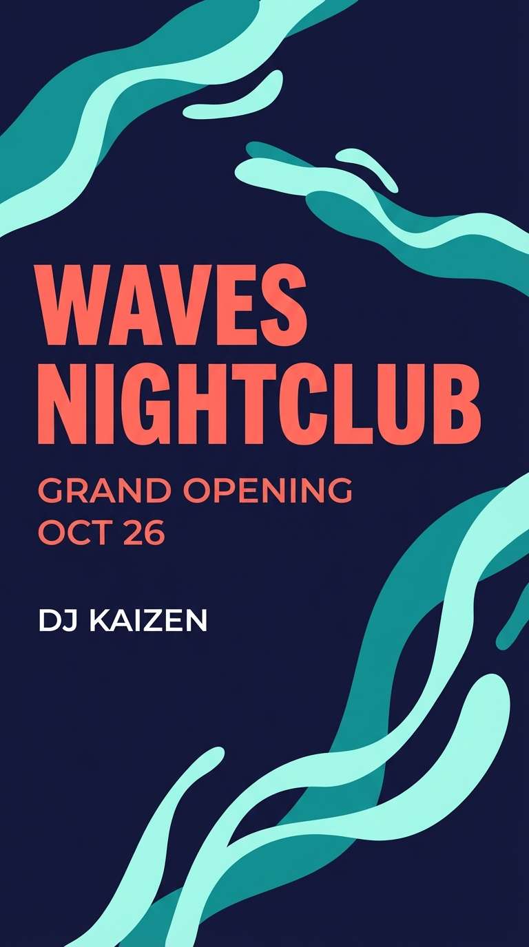
6) Coral Night Swim
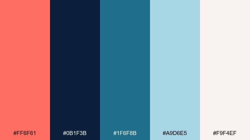
HEX: #ff6f61 #0b1f3b #1f6f8b #a9d6e5 #f9f4ef
Mood: moody, cool, cinematic
Best for: music cover art and nightlife flyers
Moody night water with a coral flare feels cinematic and slightly mysterious. It works well for music covers, club flyers, and hero banners that need depth. Let navy dominate the background while coral becomes the spotlight element on titles or key visuals. For readability, place light aqua behind small text blocks rather than setting type directly on coral.
Image example of coral night swim generated using media.io
7) Apricot Sandstone
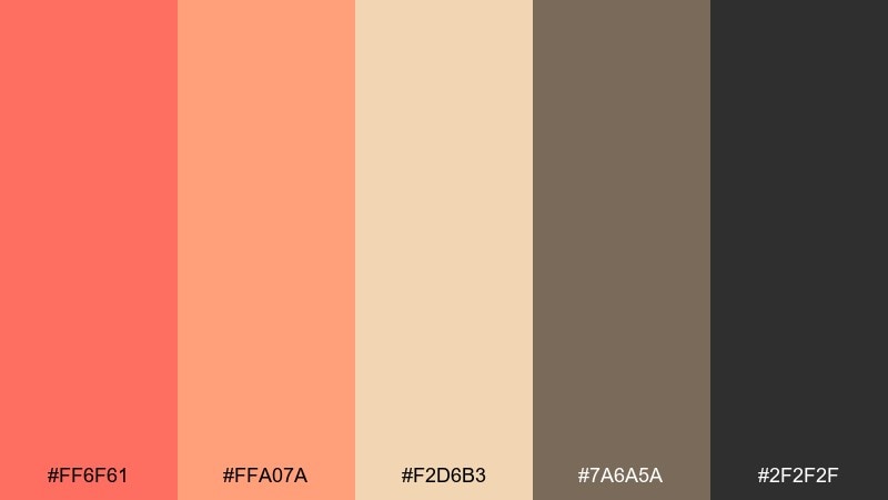
HEX: #ff6f61 #ffa07a #f2d6b3 #7a6a5a #2f2f2f
Mood: earthy, sunlit, rustic
Best for: cafe menu layouts and food packaging
Sunlit apricot and sandstone tones feel rustic, cozy, and grounded. Great for cafe menus, artisan food packaging, and chalkboard-style layouts that still need warmth. Use the dark charcoal for body copy and the warm brown for subheads to keep hierarchy clear. Tip: use coral sparingly on price tags, badges, or small illustrations so it reads intentional.
Image example of apricot sandstone generated using media.io
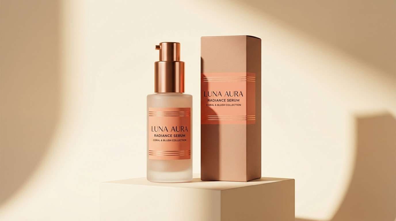
8) Blush Copper Luxe
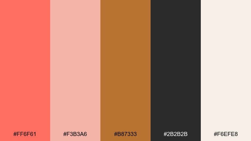
HEX: #ff6f61 #f3b3a6 #b87333 #2b2b2b #f6efe8
Mood: luxurious, warm, polished
Best for: beauty product ads and premium branding
Polished blush and copper warmth feels luxe without going overly glossy. Ideal for beauty ads, premium branding, and product detail pages that need a refined glow. Pair copper with coral for focal points like product names or key benefits, and keep black for crisp contrast. Usage tip: use the soft cream as the main canvas to make metallic cues feel believable in print.
Image example of blush copper luxe generated using media.io
9) Coral Tech Minimal
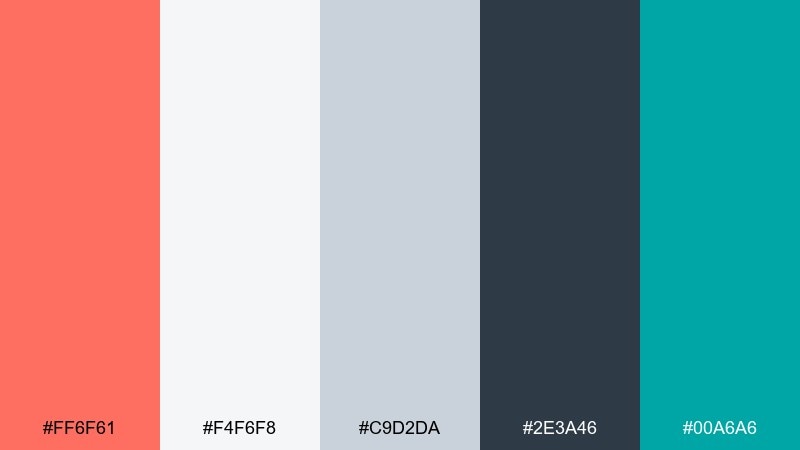
HEX: #ff6f61 #f4f6f8 #c9d2da #2e3a46 #00a6a6
Mood: clean, modern, efficient
Best for: SaaS dashboard UI and data widgets
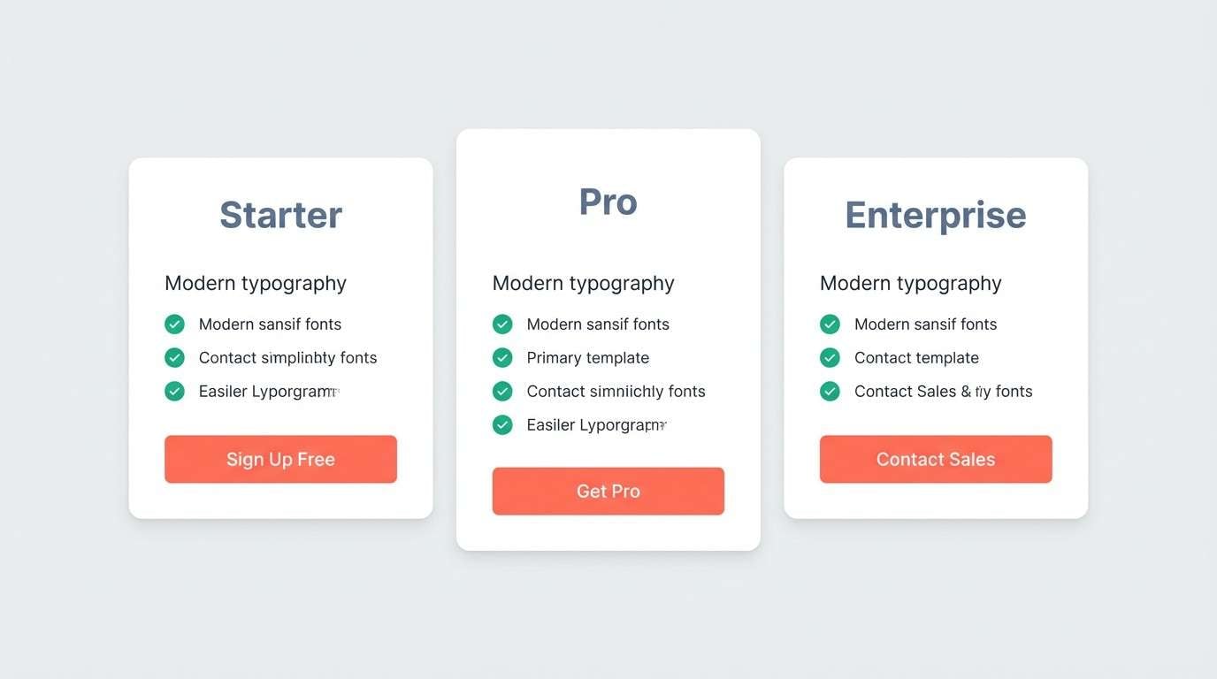
Clean tech minimalism with a coral highlight feels efficient and contemporary. A red coral color combination like this works well for dashboards, settings screens, and onboarding where clarity matters. Use slate for navigation, light grays for surfaces, and reserve coral for primary buttons or key status points. Tip: keep teal to micro-accents like toggles so the UI stays focused.
Image example of coral tech minimal generated using media.io
10) Tropical Punch
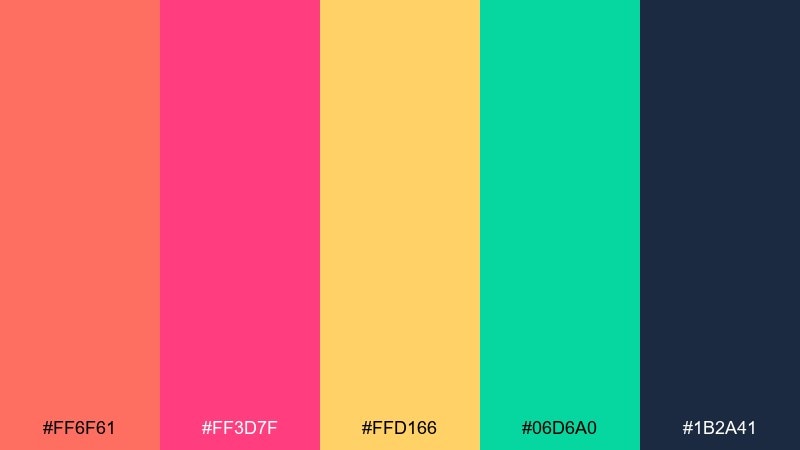
HEX: #ff6f61 #ff3d7f #ffd166 #06d6a0 #1b2a41
Mood: vibrant, festive, tropical
Best for: summer campaign banners and social ads
Tropical punch energy feels loud, festive, and ready for summer. These colors are built for campaign banners, social ads, and punchy promo graphics that need to stop the scroll. Keep navy as the anchor for type, and pick just one of the bright accents as a secondary highlight per layout. Tip: use generous whitespace so the saturation reads intentional rather than chaotic.
Image example of tropical punch generated using media.io

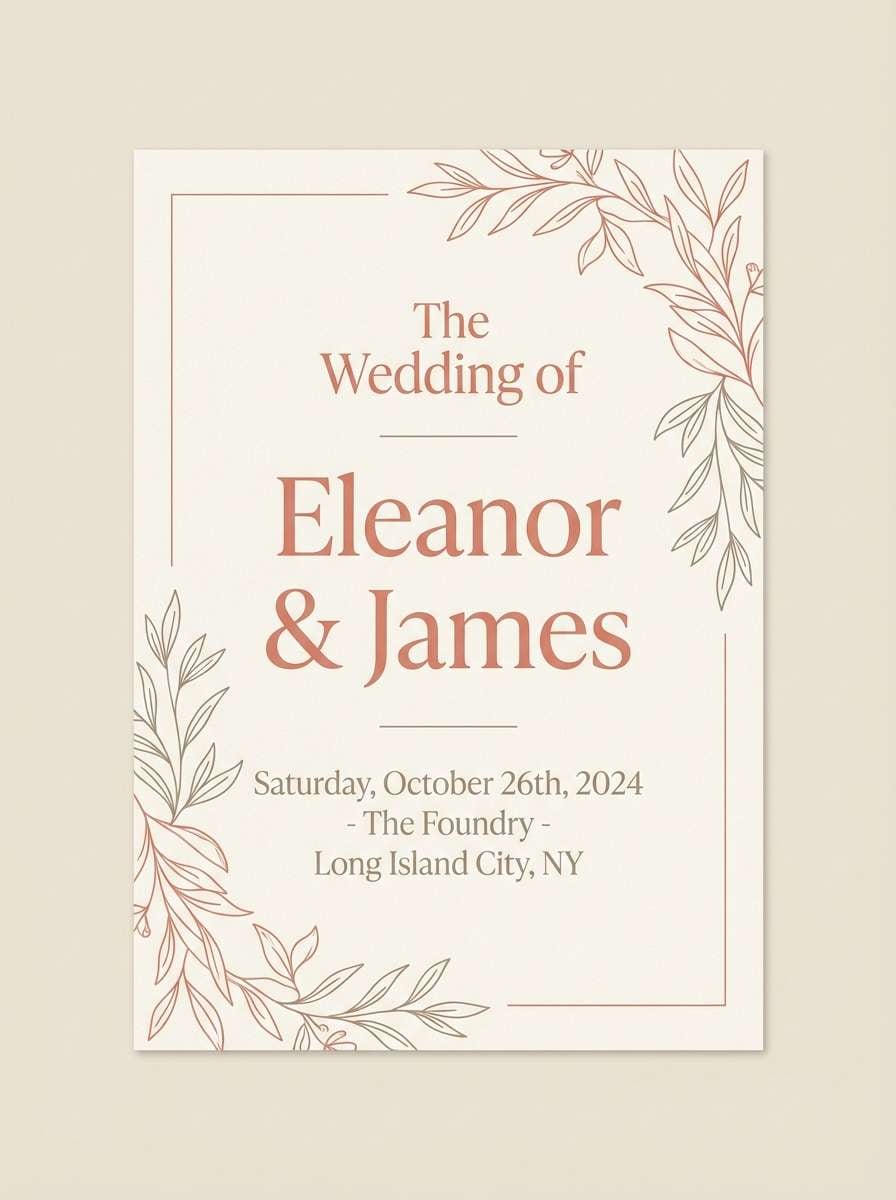
11) Desert Rose Quiet
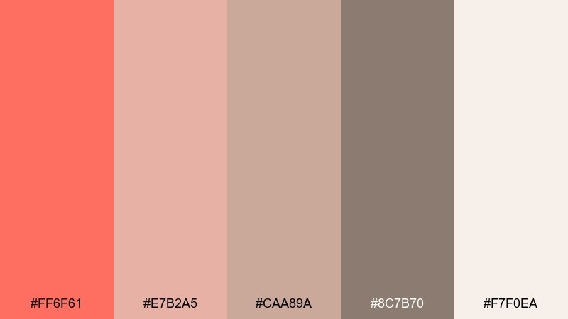
HEX: #ff6f61 #e7b2a5 #caa89a #8c7b70 #f7f0ea
Mood: quiet, romantic, dusty
Best for: wedding invitations and RSVP cards
Dusty romance and desert rose quietness create an intimate, timeless vibe. Perfect for invitations, RSVP cards, and day-of stationery where you want warmth without bright contrast. Let the soft creams and taupes carry the paper-like base, then use coral for names or monograms. Tip: print coral as a small accent or foil-style detail to keep it elegant.
Image example of desert rose quiet generated using media.io
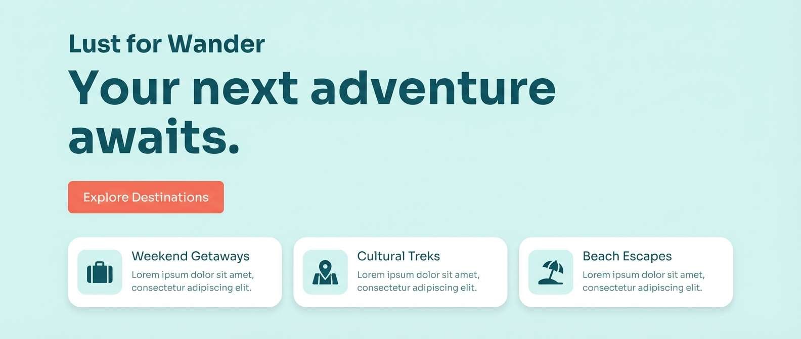
12) Ocean Coral Balance
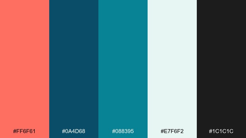
HEX: #ff6f61 #0a4d68 #088395 #e7f6f2 #1c1c1c
Mood: balanced, coastal, confident
Best for: travel landing pages and hero sections
Coastal confidence with cool ocean layers keeps the mood fresh and balanced. It fits travel landing pages, booking CTAs, and hero sections where you want a warm call-to-action against calm blues. Use coral for the primary button and deep teal for headlines to guide attention fast. Tip: keep the pale aqua as the main section background so components feel airy.
Image example of ocean coral balance generated using media.io
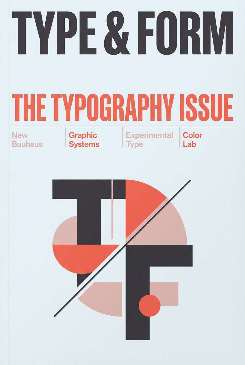
13) Charcoal Coral Edge
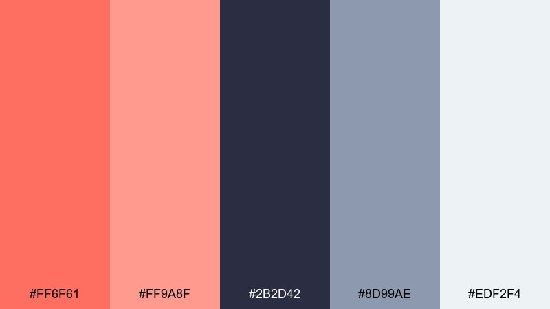
HEX: #ff6f61 #ff9a8f #2b2d42 #8d99ae #edf2f4
Mood: bold, modern, editorial
Best for: magazine covers and editorial layouts
Editorial edge with crisp charcoal contrast feels modern and confident. It suits magazine covers, feature headers, and lookbooks where typography leads the story. Keep charcoal for the masthead and body copy, then use coral and blush for punchy cover lines. Tip: use the cool gray-blue for secondary rules and captions to soften the contrast.
Image example of charcoal coral edge generated using media.io
14) Coral Candy Cloud
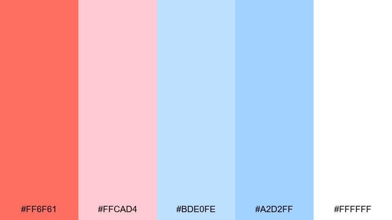
HEX: #ff6f61 #ffcad4 #bde0fe #a2d2ff #ffffff
Mood: sweet, airy, youthful
Best for: kids app onboarding screens
Sweet candy clouds with airy blues feel youthful and friendly. Great for kids app onboarding, playful micro-illustrations, and gentle callouts that should feel safe. Use coral for primary actions and keep the blues for background panels or progress steps. Tip: avoid heavy outlines and rely on soft shapes to maintain the light mood.
Image example of coral candy cloud generated using media.io

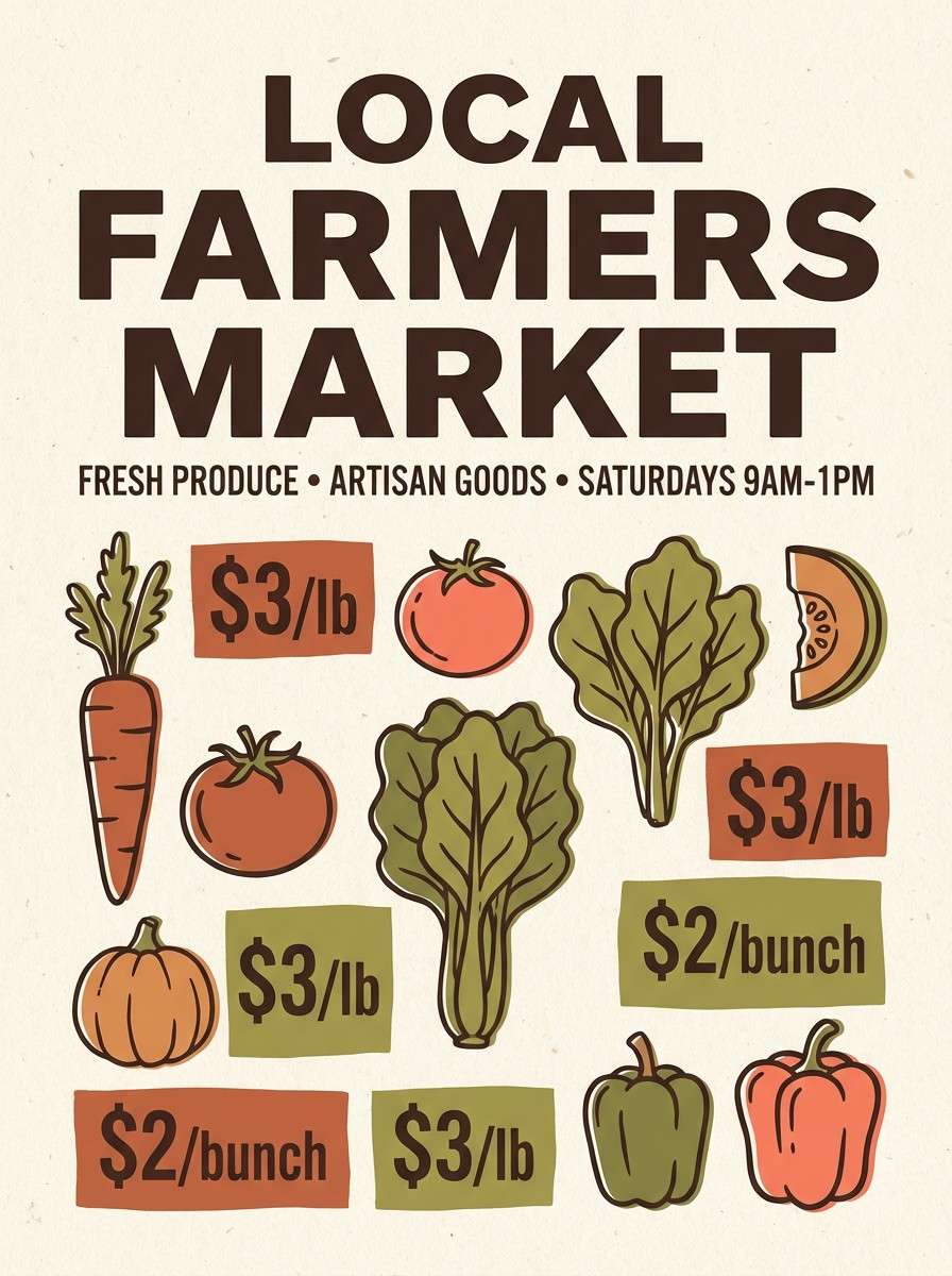
15) Rustic Terracotta Market
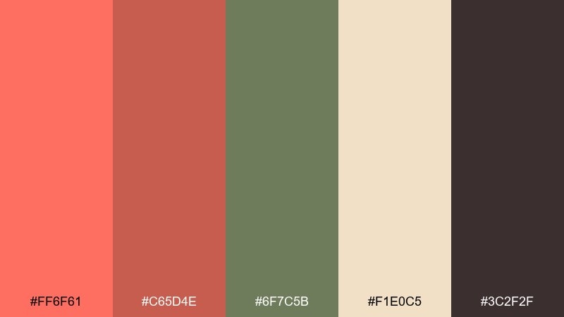
HEX: #ff6f61 #c65d4e #6f7c5b #f1e0c5 #3c2f2f
Mood: artisanal, earthy, market-fresh
Best for: farmers market posters and labels
Artisanal market warmth with earthy greens feels fresh-from-the-stall. It is ideal for farmers market posters, handmade labels, and craft signage where you want a natural, approachable tone. Pair the olive green with terracotta for illustration elements, then use dark brown for strong, readable pricing. Tip: keep the cream as the dominant paper tone for a print-friendly look.
Image example of rustic terracotta market generated using media.io
16) Coral Steel Contrast
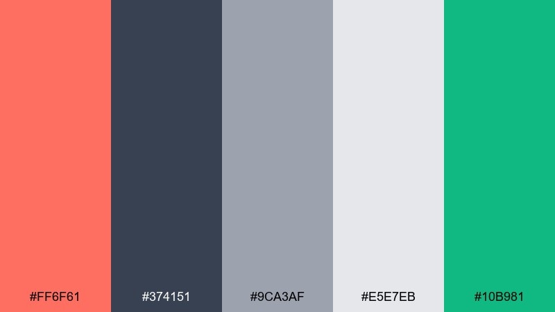
HEX: #ff6f61 #374151 #9ca3af #e5e7eb #10b981
Mood: sharp, professional, tech-forward
Best for: B2B landing pages and pricing tables
Sharp steel neutrals with a coral spark feel professional and tech-forward. The contrast supports pricing tables, feature grids, and conversion-focused sections without looking overly corporate. Use coral for primary CTAs and the emerald for positive states like success tags or checkmarks. Tip: keep the mid-gray for borders and dividers so components stay tidy.
Image example of coral steel contrast generated using media.io
17) Rose Gold Weekend
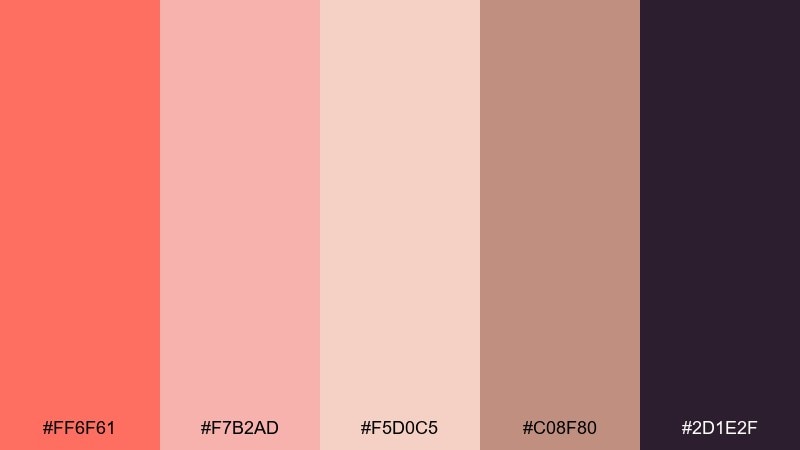
HEX: #ff6f61 #f7b2ad #f5d0c5 #c08f80 #2d1e2f
Mood: romantic, trendy, cozy
Best for: Instagram story templates and creators
Cozy weekend romance with a deeper plum anchor feels trendy and intimate. Use it for creator templates, quote cards, and soft promotional stories where the vibe matters as much as the message. Let coral and blush handle the gradients, then use plum for text to keep contrast strong. Tip: avoid pure black and stick to plum so the palette stays warm.
Image example of rose gold weekend generated using media.io
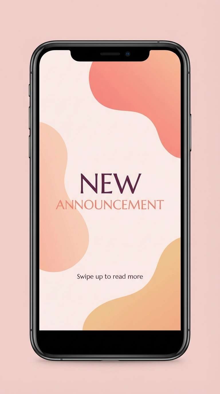
18) Coral Citrus Editorial
HEX: #ff6f61 #ffcc80 #fff3e0 #2a2a2a #6d9f71
Mood: bright, editorial, sunny
Best for: food magazine spreads and recipe cards
Sunny citrus light with a touch of herb green feels fresh and editorial. It is a great fit for recipe cards, food magazine layouts, and packaging inserts where clarity and warmth matter. Keep charcoal for body text, then use coral for headings and callouts to guide scanning. Tip: use pale peach as the main field and bring green in only for small markers or section tabs.
Image example of coral citrus editorial generated using media.io
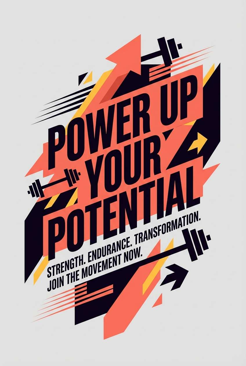
19) Athletic Coral Drive
HEX: #ff6f61 #ff4d4d #111827 #f3f4f6 #fbbf24
Mood: driven, bold, high-energy
Best for: sports posters and fitness promos
High-energy drive with sharp contrast feels fast and motivating. These red coral color combinations work well for sports posters, fitness promos, and countdown graphics. Use the deep near-black for big type and the light gray for breathing room, then reserve yellow for small highlights like dates or badges. Tip: keep coral as the main accent and avoid using both reds at full strength in the same block of text.
Image example of athletic coral drive generated using media.io
20) Coral Tea Ceremony
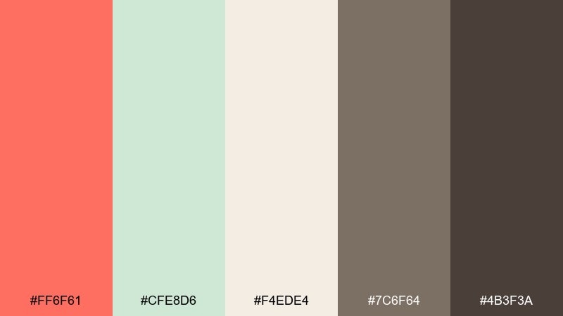
HEX: #ff6f61 #cfe8d6 #f4ede4 #7c6f64 #4b3f3a
Mood: calm, mindful, handcrafted
Best for: tea packaging and artisan labels
Mindful calm with soft herbal greens feels handcrafted and comforting. It works well for tea tins, paper labels, and boutique product lines with a slow-living tone. Use the warm creams for the label base, then bring coral in as a small stamp or flavor marker. Tip: choose the deeper brown for typography so fine print stays crisp on textured stock.
Image example of coral tea ceremony generated using media.io
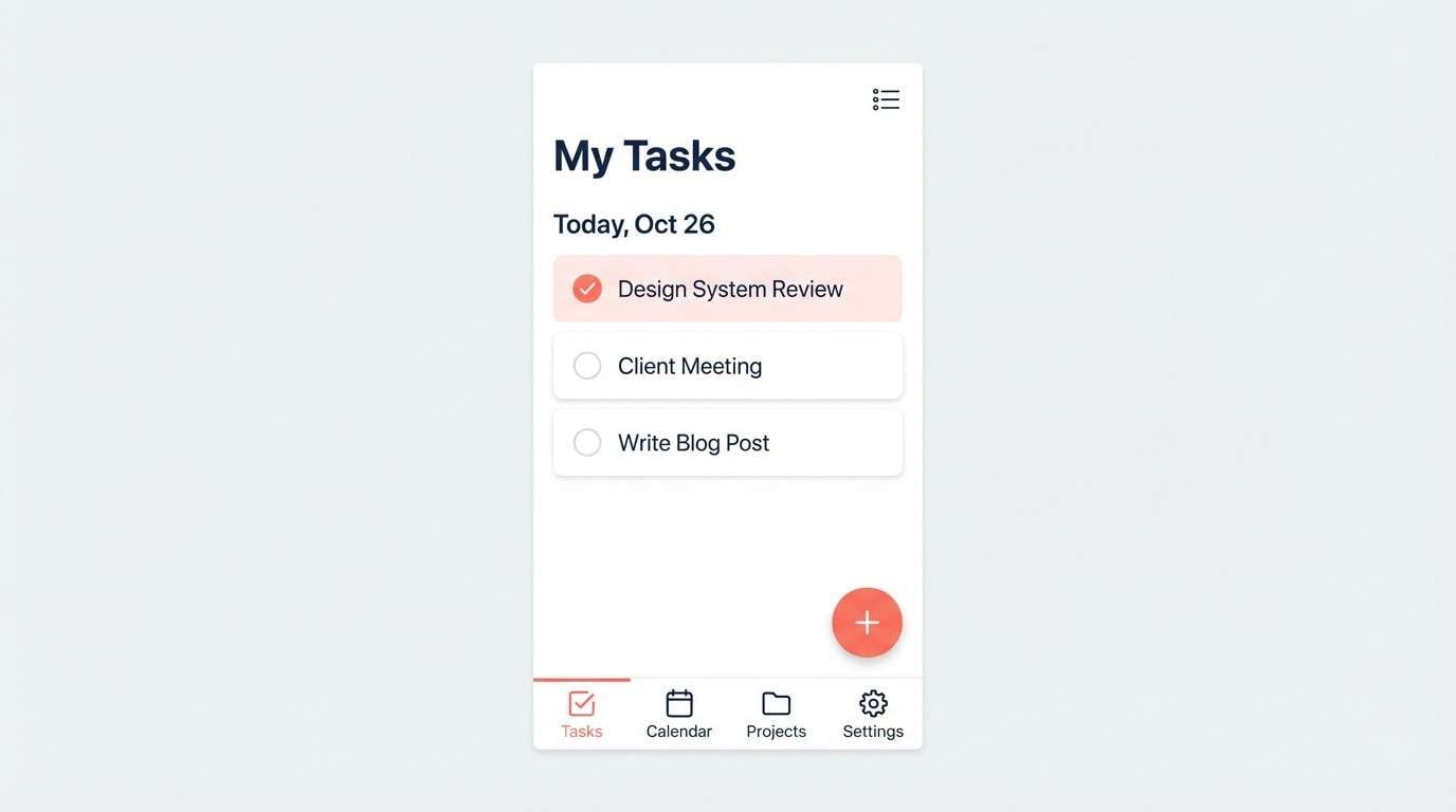
21) Soft Coral Workspace
HEX: #ff6f61 #ffd1c7 #f5f5f5 #2c3e50 #9aa5b1
Mood: approachable, organized, calm
Best for: productivity app UI and task lists
Approachable calm with tidy neutrals feels organized and easy to work with. It is perfect for productivity apps, task lists, and calendar views that need gentle hierarchy. Use navy for primary text and navigation, and keep coral for the active state like selected dates or primary actions. Tip: reduce coral usage on dense screens and rely on blush for larger surfaces to avoid fatigue.
Image example of soft coral workspace generated using media.io
22) Coral Museum Modern
HEX: #ff6f61 #f2f0eb #b8b0a6 #2f2f2f #7f8c8d
Mood: modern, cultured, understated
Best for: gallery posters and exhibition titles
Cultured understatement with gallery neutrals feels modern and curated. This red coral color palette is a strong choice for exhibition posters, museum wayfinding, and minimalist catalogs. Use charcoal for type, warm gray for secondary information, and coral only for the exhibition title or a single geometric motif. Tip: keep margins generous so the coral accent reads like intentional curation.
Image example of coral museum modern generated using media.io
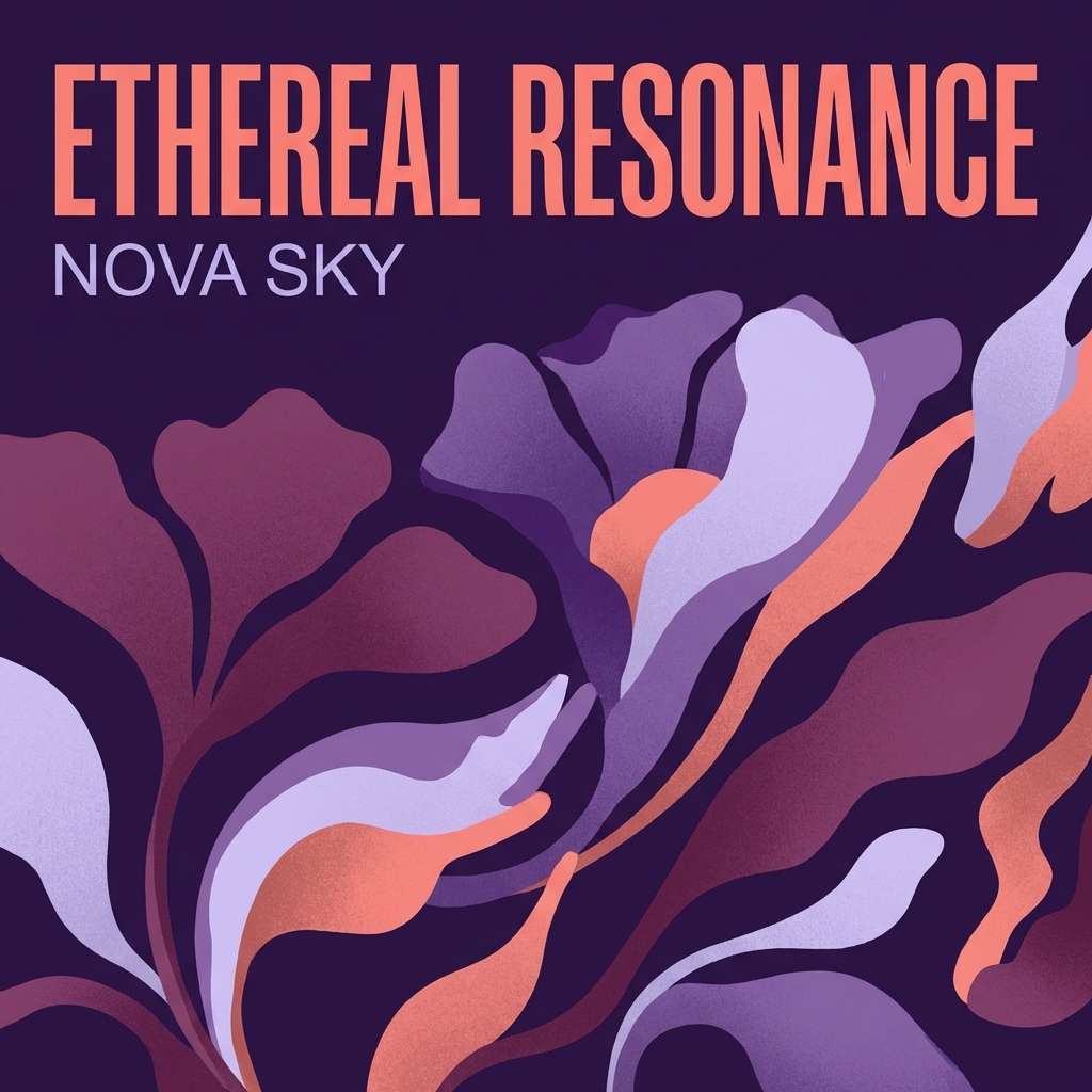
23) Coral Midnight Bloom
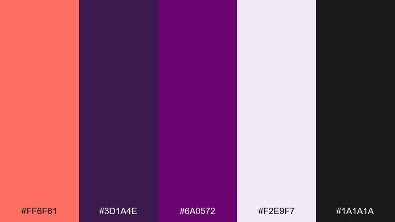
HEX: #ff6f61 #3d1a4e #6a0572 #f2e9f7 #1a1a1a
Mood: dramatic, romantic, night-floral
Best for: album artwork and dramatic posters
Midnight bloom drama with velvety purples feels romantic and expressive. For album art, dramatic posters, and bold typographic covers, it creates instant mood without needing imagery. Use coral as a highlight on titles or a single emblem, while purples take over backgrounds. Tip: keep the light lavender for small text panels so details remain readable.
Image example of coral midnight bloom generated using media.io
What Colors Go Well with Red Coral?
Red coral pairs best with deep cool anchors like navy, charcoal, and slate because they create clean contrast while keeping the palette modern. This is especially useful in UI, where coral can be the CTA color without sacrificing readability.
For softer branding and print, combine coral with warm neutrals like cream, sand, linen beige, and cocoa browns. These tones make coral feel premium and “editorial” rather than loud.
If you want extra energy, add a small punch of teal, mint, or golden yellow as a secondary accent. The key is to keep coral as the primary highlight and use other brights in small doses.
How to Use a Red Coral Color Palette in Real Designs
In branding, treat coral as a signature accent: logos, labels, badges, and key headlines. Support it with neutral backgrounds so the coral reads intentional and consistent across packaging, web, and social.
In UI design, reserve coral for primary buttons, active states, and high-priority tags. Keep large surfaces in light grays or pale creams, then use dark nav/typography colors for clarity and accessibility.
For print, test coral on the target paper stock and consider using it at smaller areas (stamps, rules, highlights). A warm off-white base often keeps coral looking refined rather than overly saturated.
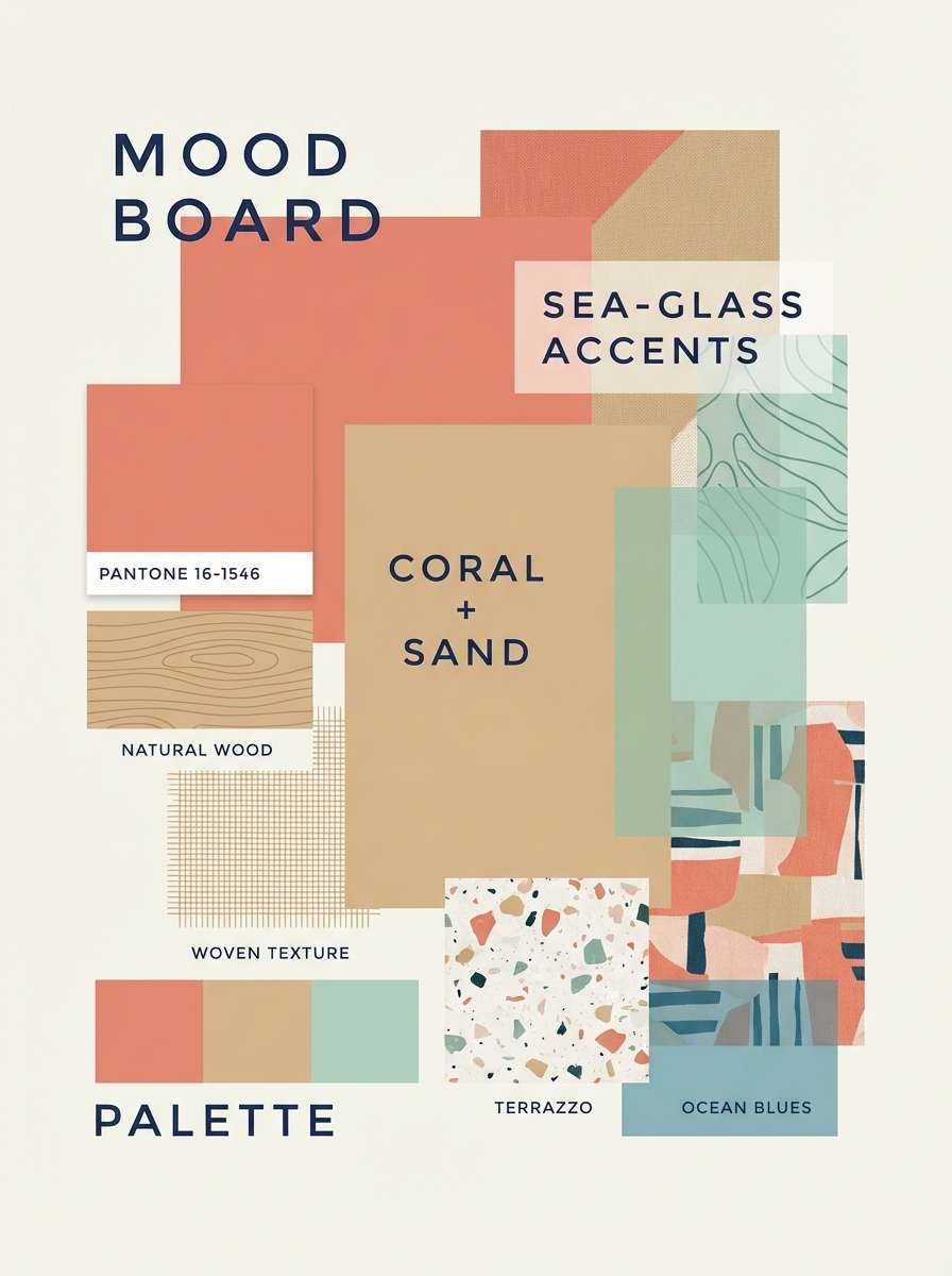
Create Red Coral Palette Visuals with AI
If you already have HEX codes, the fastest way to validate a palette is to see it applied to real layouts—posters, packaging, UI screens, and hero sections. AI image generation helps you preview those directions before you commit to full design production.
Use the included prompts above as starting points, then swap the scene (menu, dashboard, invitation) to match your project. Keep your coral as the main accent and let neutrals carry most of the background for a clean, modern result.
With Media.io, you can generate on-brand palette visuals in minutes and iterate quickly until the mood and contrast feel right.
Red Coral Color Palette FAQs
-
What is a red coral color (and is it closer to red or orange)?
Red coral usually sits between warm red and peachy orange. It keeps the energy of red but adds softness and warmth, which is why it feels friendly and modern in branding and UI. -
What HEX code is commonly used for red coral?
A popular red coral starting point is #ff6f61. From there, you can build lighter blush tints or deeper terracotta shades depending on the mood you want. -
What colors pair best with red coral for high contrast?
For strong contrast, pair red coral with deep navy, charcoal, or near-black. These anchors make coral pop for headlines and CTAs while keeping text readable. -
What are the best neutral colors to use with coral?
Warm neutrals like cream, sand, linen beige, and soft warm gray work especially well. They keep coral looking premium and help prevent the palette from feeling overly saturated. -
Is red coral a good CTA button color for websites and apps?
Yes—coral is attention-grabbing but less aggressive than pure red. For best results, keep surrounding UI surfaces neutral and use a dark text color (or white text with sufficient contrast) for accessibility. -
How do I keep a coral palette from looking too “neon”?
Use coral as an accent (not a full background), add warm off-whites, and include one deep anchor like navy or charcoal. Limiting bright secondary accents (teal/yellow/pink) also keeps the look controlled. -
Can I generate red coral palette mockups with AI?
Yes. Copy a prompt from the palette examples, keep the same coral HEX direction, and generate multiple layout variations (poster, packaging, UI) to quickly preview how the colors behave in real designs.


