

Tomato is a warm, energetic red that instantly signals freshness, appetite, and bold personality. It’s a go-to choice for food brands, lifestyle visuals, and UI accents that need to feel lively without going fully neon.
Below are ready-to-use tomato color palette ideas with HEX codes, plus AI prompts you can reuse to generate matching visuals in seconds.
In this article
- Why Tomato Palettes Work So Well
-
- sunlit market
- italian bistro
- garden clay
- retro soda pop
- sunset terracotta
- coastal salsa
- modern farmhouse
- citrus basil
- midnight marinara
- blush linen
- spice route
- studio minimal
- autumn harvest
- playful picnic
- rosewood dusk
- apricot glow
- urban neon
- desert adobe
- fresh typography
- warm editorial
- peppery contrast
- What Colors Go Well with Tomato?
- How to Use a Tomato Color Palette in Real Designs
- Create Tomato Palette Visuals with AI
Why Tomato Palettes Work So Well
Tomato sits in that sweet spot between classic red and coral, so it feels friendly and modern while still delivering strong visual punch. It naturally draws the eye, which makes it perfect for headlines, CTAs, labels, and key UI states.
Because tomato carries “fresh” and “food-forward” associations, it’s especially effective for hospitality, grocery, DTC product packaging, and wellness brands that want warmth without looking too formal.
It also pairs easily: creamy neutrals keep it breathable, deep navies and charcoals make it look premium, and greens/teals add a crisp counterbalance that reads as clean and natural.
20+ Tomato Color Palette Ideas (with HEX Codes)
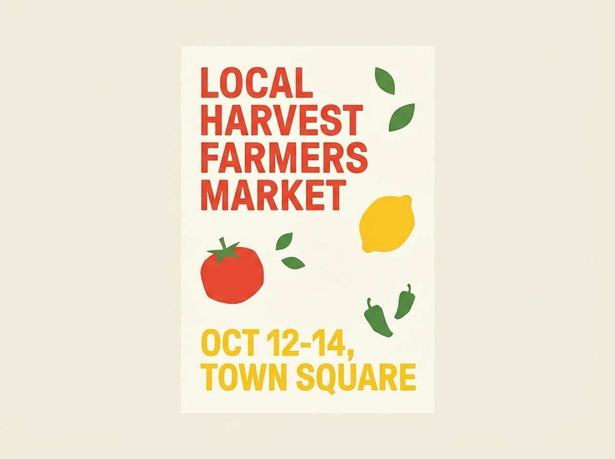
1) Sunlit Market
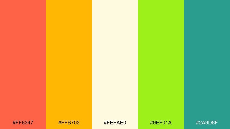
HEX: #ff6347 #ffb703 #fefae0 #9ef01a #2a9d8f
Mood: bright, fresh, energetic
Best for: farmers market poster design
Bright and juicy like produce under morning sun, these tones feel upbeat and inviting. Use the tomato red as your headline anchor, then let citrus yellow carry highlights and calls to action. Pair with the airy cream for negative space so the layout stays readable. Tip: keep green as a small accent for tags and price bubbles so it feels fresh, not loud.
Image example of sunlit market generated using media.io
Media.io is an online AI studio for creating and editing video, image, and audio in your browser.

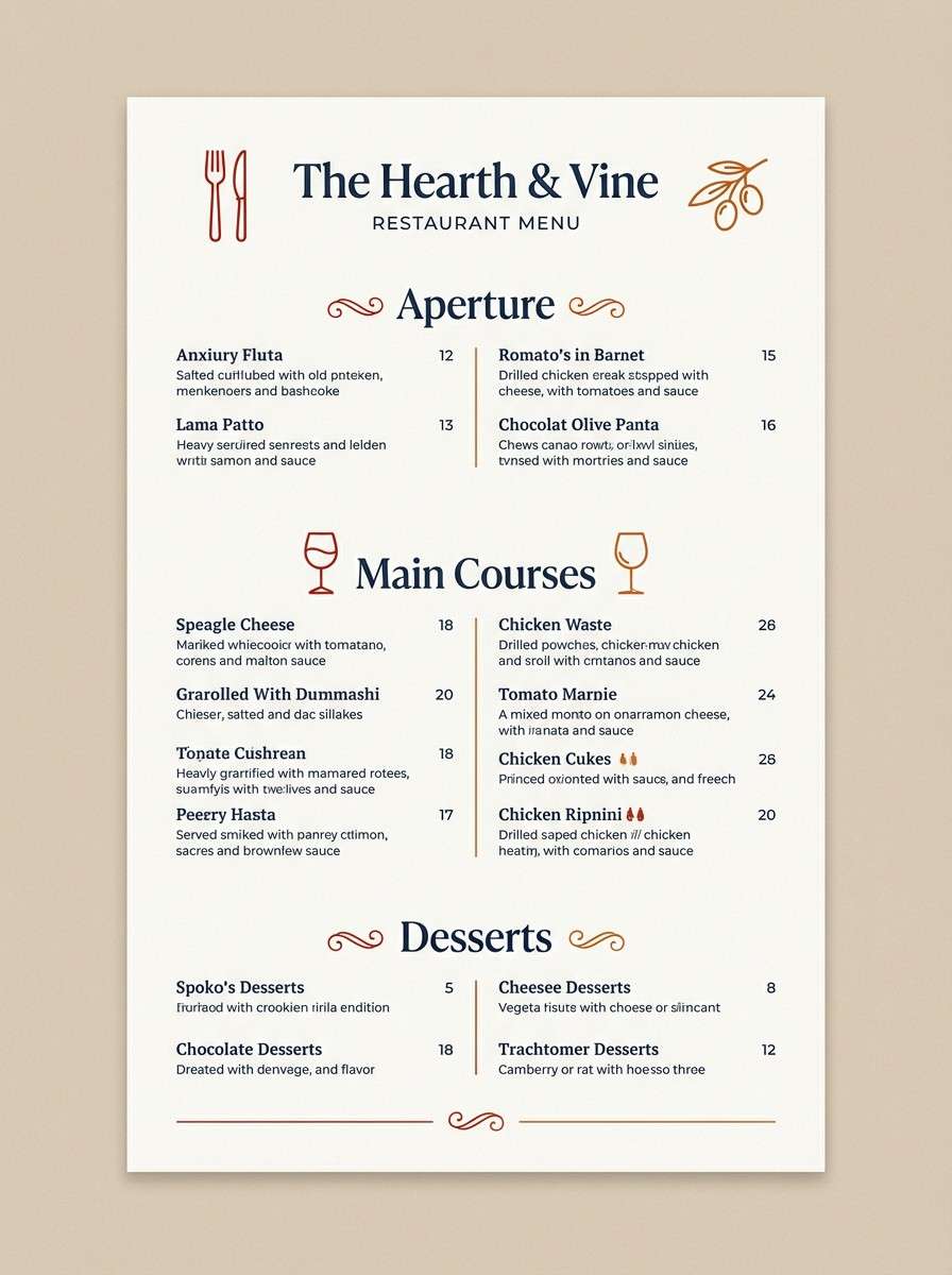
2) Italian Bistro
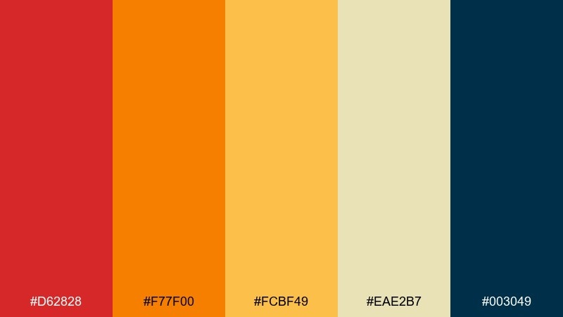
HEX: #d62828 #f77f00 #fcbf49 #eae2b7 #003049
Mood: cozy, appetizing, classic
Best for: restaurant menu layout
Cozy and savory like a candlelit trattoria, this mix leans rich and traditional. These tomato color combinations work best when the deep navy is used for body text and rules to keep the page polished. Let the warm oranges and golds carry section headers and icons without overpowering the food photography. Tip: use the pale wheat tone as your menu background to reduce glare and boost legibility.
Image example of italian bistro generated using media.io
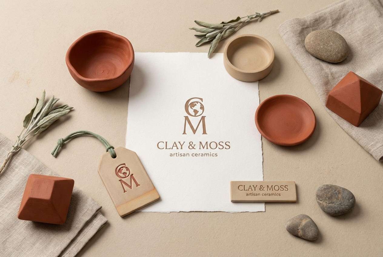
3) Garden Clay
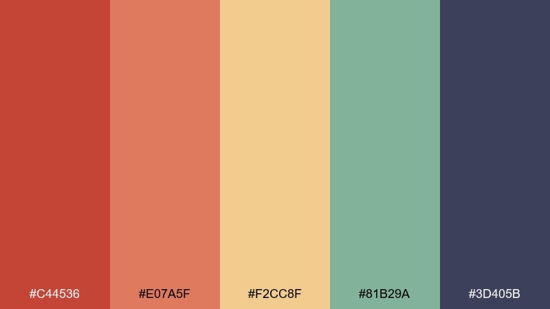
HEX: #c44536 #e07a5f #f2cc8f #81b29a #3d405b
Mood: earthy, grounded, calm
Best for: ceramic brand identity
Earthy and tactile like sun-warmed terracotta pots, this set feels calm and handcrafted. Use the clay red for marks and packaging stamps, and lean on the sandy beige for paper textures and labels. Sage green adds a botanical lift without turning the look too rustic. Tip: keep the deep indigo for small type and legal copy to maintain contrast on natural materials.
Image example of garden clay generated using media.io
4) Retro Soda Pop
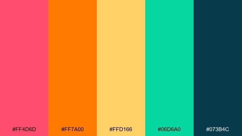
HEX: #ff4d6d #ff7a00 #ffd166 #06d6a0 #073b4c
Mood: playful, punchy, nostalgic
Best for: summer social media ad
Playful and fizzy like a vintage soda label, these colors pop with confident contrast. Use the pink-red for the main message, then let the orange and sunny yellow create a candy-like gradient effect. Teal keeps the palette from feeling too sweet and helps balance bright blocks. Tip: reserve the deep blue-green for small text and logos so the ad stays crisp on mobile.
Image example of retro soda pop generated using media.io
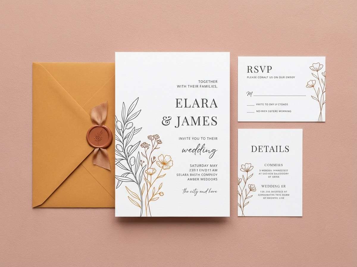
5) Sunset Terracotta
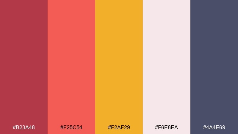
HEX: #b23a48 #f25c54 #f2af29 #f6e8ea #4a4e69
Mood: romantic, warm, elegant
Best for: wedding invitation suite
Romantic like a late-summer sky over stone walls, this palette feels warm and elegant. Use the soft blush as the paper base, then set typography in the muted charcoal-purple for refinement. Terracotta and amber make beautiful monograms and border details without shouting. Tip: add foil or letterpress only on the darker red to keep the design timeless.
Image example of sunset terracotta generated using media.io
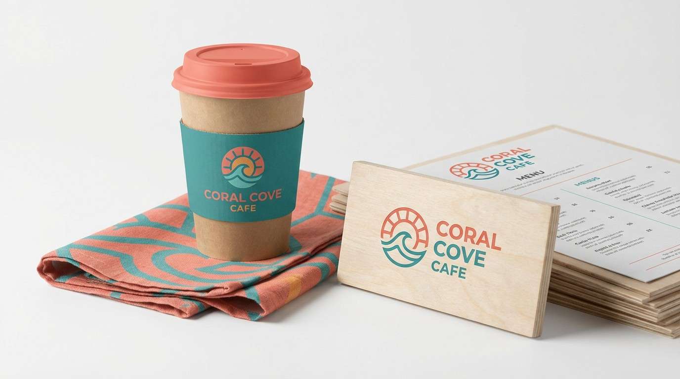
6) Coastal Salsa
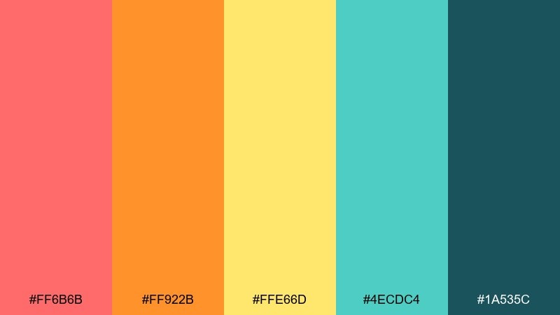
HEX: #ff6b6b #ff922b #ffe66d #4ecdc4 #1a535c
Mood: sunny, breezy, fun
Best for: beach cafe branding
Sunny and breezy like a seaside snack bar, these tones feel carefree and welcoming. Let coral lead the logo and signage, while teal supports secondary buttons and background panels. The lemon yellow is perfect for small bursts like price tags or badges. Tip: keep the darker sea-green for type to avoid readability issues on bright outdoor prints.
Image example of coastal salsa generated using media.io
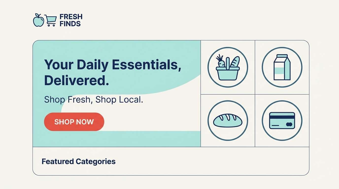
7) Modern Farmhouse
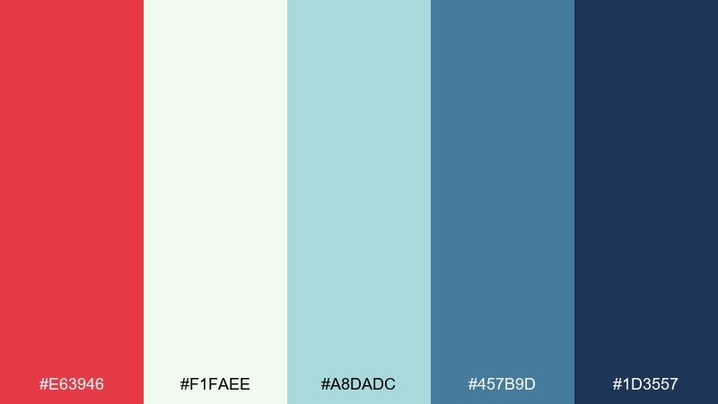
HEX: #e63946 #f1faee #a8dadc #457b9d #1d3557
Mood: clean, friendly, trustworthy
Best for: homepage hero for a local grocery
Clean and friendly like painted wood and fresh linens, this mix keeps warmth without clutter. A tomato color palette like this shines when the red is used sparingly for primary buttons and key highlights. Balance it with lots of soft off-white and airy aqua sections for a modern, breathable layout. Tip: set body copy in the deep navy to maintain accessibility on light backgrounds.
Image example of modern farmhouse generated using media.io
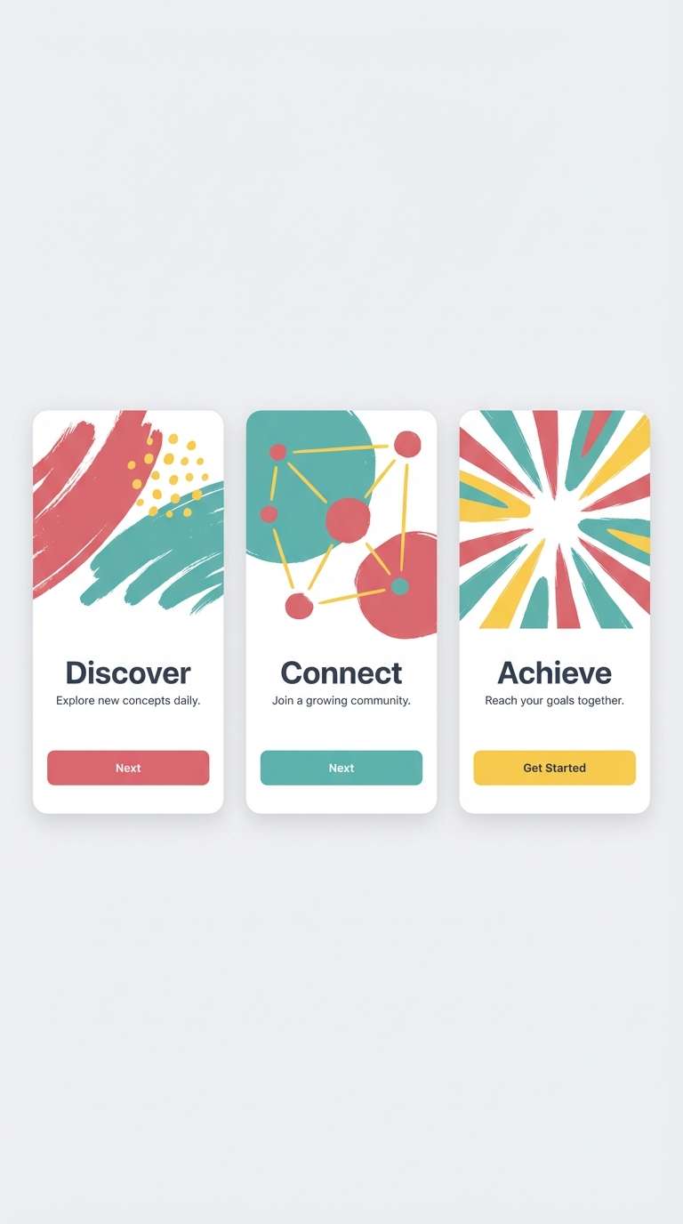
8) Citrus Basil
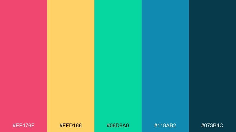
HEX: #ef476f #ffd166 #06d6a0 #118ab2 #073b4c
Mood: zesty, modern, upbeat
Best for: mobile app onboarding screens
Zesty like citrus slices with fresh herbs, this set feels modern and upbeat. Use the rosy red for key illustrations or progress states, then build contrast with teal and ocean blue for navigation. The golden yellow works best as a highlight behind short phrases or icons. Tip: keep onboarding screens to two dominant colors plus one accent to avoid visual fatigue.
Image example of citrus basil generated using media.io
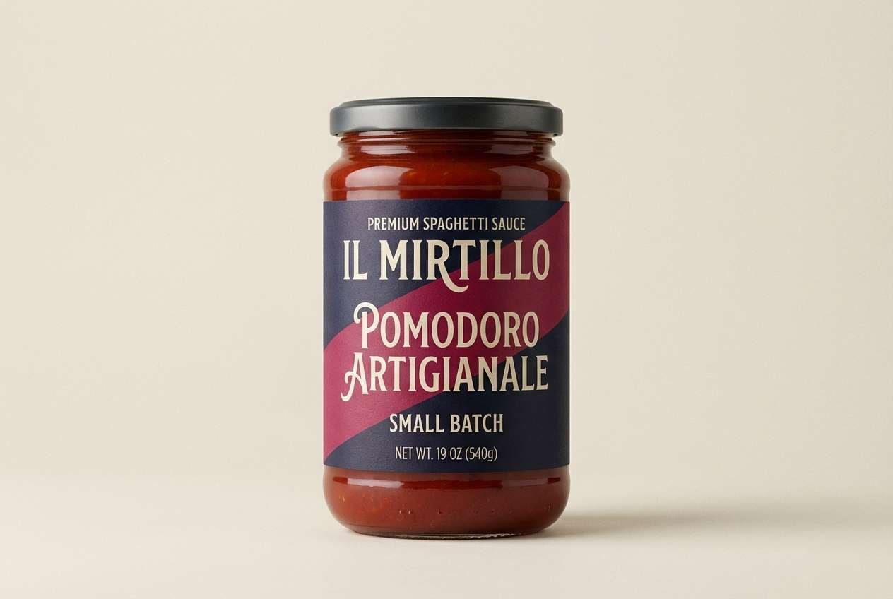
9) Midnight Marinara
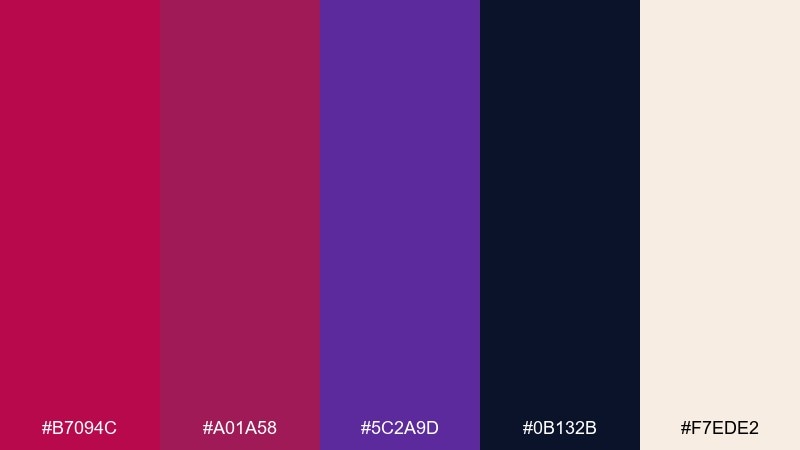
HEX: #b7094c #a01a58 #5c2a9d #0b132b #f7ede2
Mood: dramatic, luxe, moody
Best for: premium pasta sauce packaging
Dramatic and velvety like a late-night dinner scene, this palette feels premium and bold. Use the deep berry reds as the label background and let the creamy off-white handle ingredients and small print. Purple adds a luxe edge that sets the product apart on shelf. Tip: add matte finishes and minimal gold linework only if you can keep contrast high for readability.
Image example of midnight marinara generated using media.io
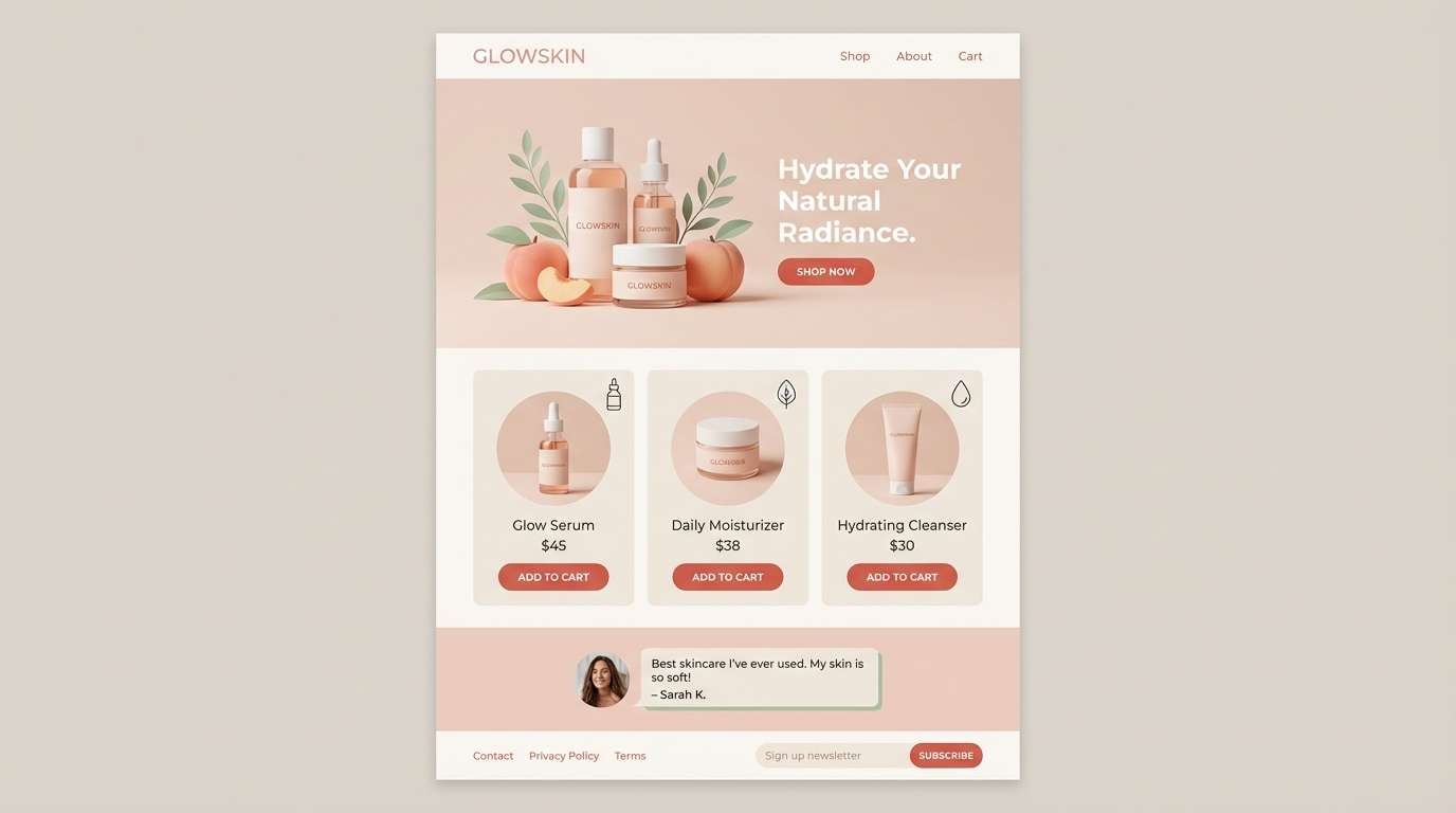
10) Blush Linen
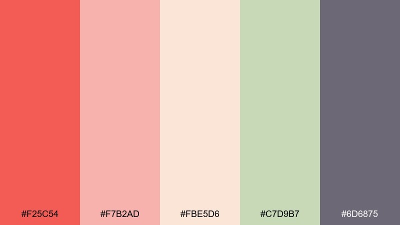
HEX: #f25c54 #f7b2ad #fbe5d6 #c7d9b7 #6d6875
Mood: soft, airy, approachable
Best for: skincare product landing page
Soft and airy like linen in warm light, these tones feel gentle and approachable. Use the muted tomato as a small accent for buttons and price highlights, and let blush and peach carry backgrounds and cards. The powdery green is great for trust cues like badges or ingredient callouts. Tip: keep typography in the smoky gray-purple to avoid harsh contrast against pastels.
Image example of blush linen generated using media.io
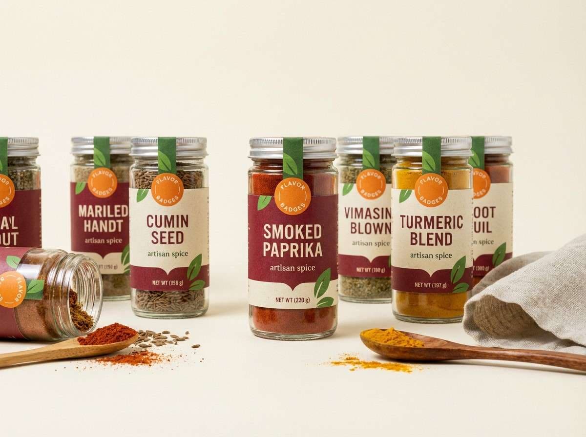
11) Spice Route

HEX: #c1121f #fdf0d5 #f2a65a #a7c957 #386641
Mood: warm, rustic, adventurous
Best for: artisan spice label set
Warm and rustic like open spice jars, this mix feels adventurous and handmade. Use the deep red for primary label blocks and type, and keep the creamy tone as your breathable background. Orange brings heat for flavor markers, while the greens signal freshness and herbs. Tip: repeat one small badge shape across the set to keep multiple SKUs consistent.
Image example of spice route generated using media.io
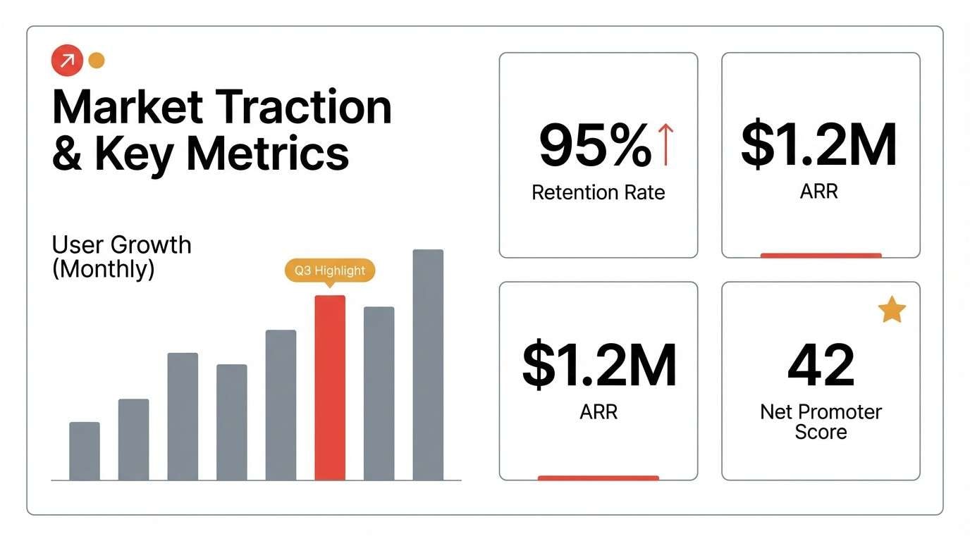
12) Studio Minimal
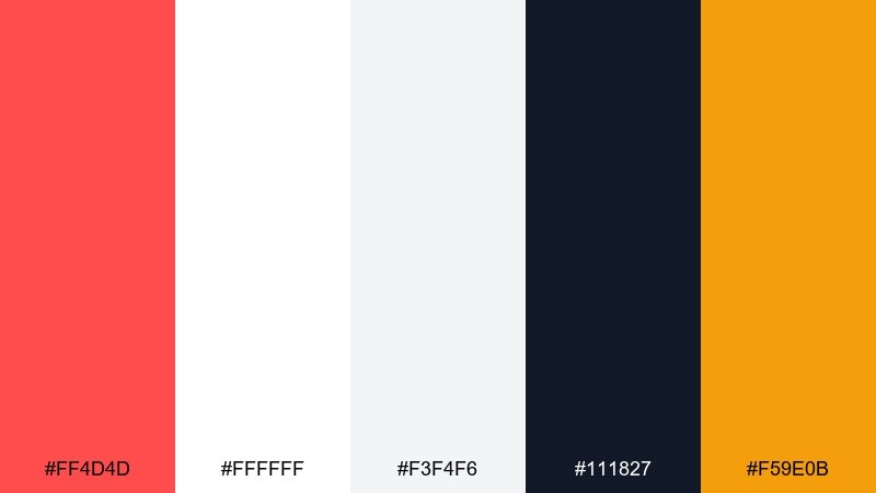
HEX: #ff4d4d #ffffff #f3f4f6 #111827 #f59e0b
Mood: minimal, sharp, high-contrast
Best for: startup pitch deck slides
Minimal and sharp like a modern studio wall, this set is built for clarity. Use red for section dividers and key metrics, then rely on white and cool gray to keep slides calm. Amber works as a secondary highlight for charts without competing with the primary accent. Tip: keep charts mostly grayscale and add color only to the one data series you want remembered.
Image example of studio minimal generated using media.io
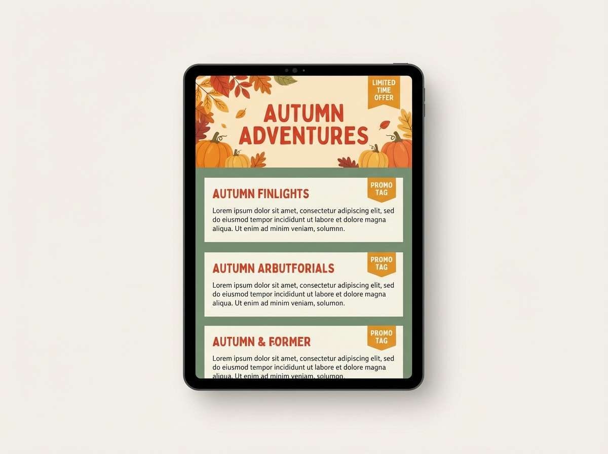
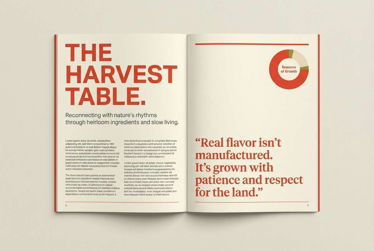
13) Autumn Harvest
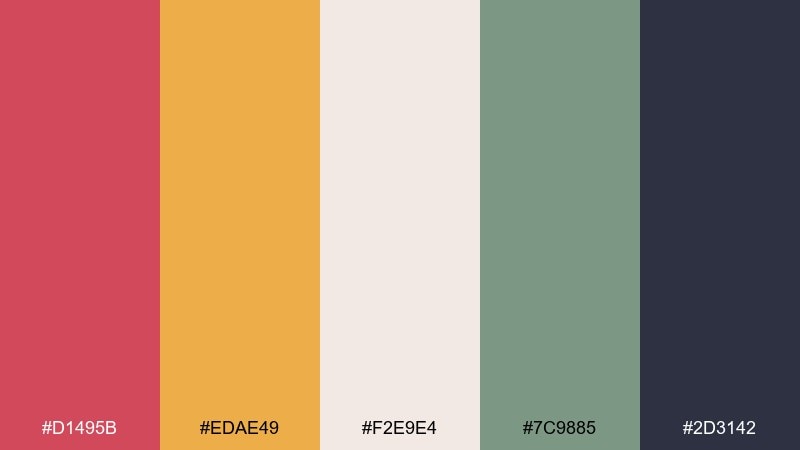
HEX: #d1495b #edae49 #f2e9e4 #7c9885 #2d3142
Mood: seasonal, cozy, inviting
Best for: fall email newsletter
Seasonal and cozy like a harvest table, these tones feel inviting without going overly dark. These tomato color combinations are perfect for headers, promo banners, and small illustration accents. Keep the soft cream as the main canvas, and use the muted green for dividers and secondary buttons. Tip: limit the dark slate to short text blocks so the email stays light and scannable.
Image example of autumn harvest generated using media.io
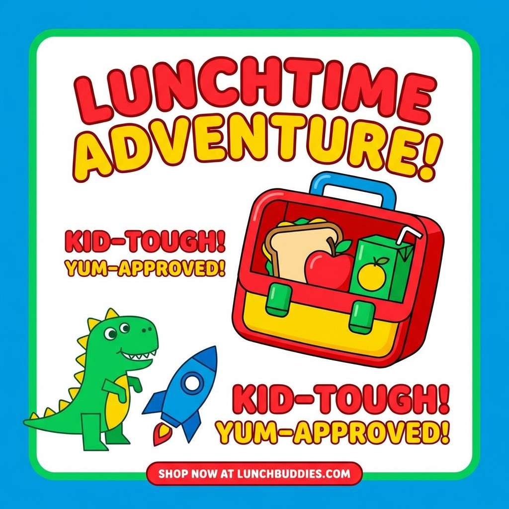
14) Playful Picnic
HEX: #ff595e #ffca3a #8ac926 #1982c4 #6a4c93
Mood: cheerful, bold, youthful
Best for: kids lunchbox product ad
Cheerful and bold like a patterned picnic blanket, this palette feels youthful and fun. Use red and yellow as the main headline duo, then bring in green for freshness cues and feature callouts. Blue works well for secondary blocks, while purple adds a playful twist for icons and stickers. Tip: keep the background mostly white so the colors read as happy, not chaotic.
Image example of playful picnic generated using media.io
15) Rosewood Dusk
HEX: #8d0801 #bf0603 #e5383b #f5f3f4 #161a1d
Mood: bold, refined, cinematic
Best for: luxury fashion poster
Bold and cinematic like velvet under gallery lights, this palette feels refined and editorial. Use the dark rosewood as the background field, then layer brighter reds for title hierarchy and small graphic bars. The near-white adds sharp contrast for credits and dates. Tip: keep the layout spacious and align text to a strict grid to make the drama feel intentional.
Image example of rosewood dusk generated using media.io
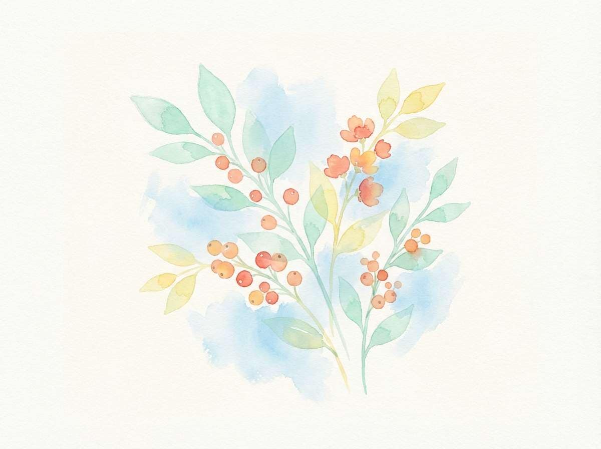
16) Apricot Glow
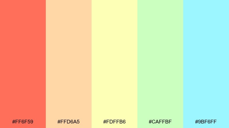
HEX: #ff6f59 #ffd6a5 #fdffb6 #caffbf #9bf6ff
Mood: light, optimistic, springy
Best for: watercolor botanical illustration
Light and optimistic like spring fruit blossoms, these tones feel soft and uplifting. Use the warm coral-apricot for focal petals and fruit, then wash in pale yellow for sunlit highlights. Mint and sky blue keep the scene airy and clean. Tip: let the background stay mostly white so the watercolor edges and gradients feel delicate.
Image example of apricot glow generated using media.io
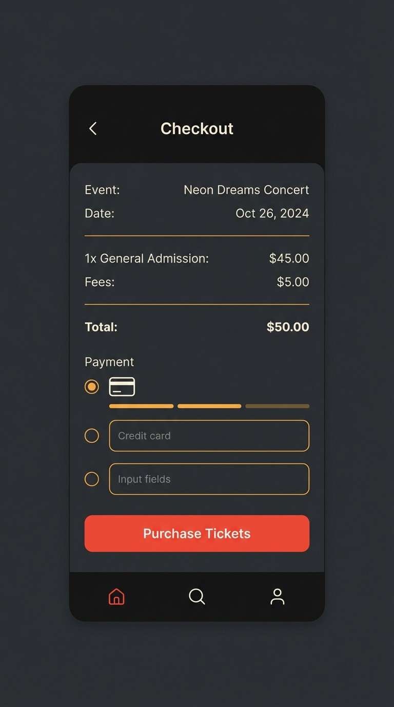
17) Urban Neon
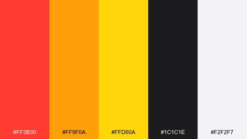
HEX: #ff3b30 #ff9f0a #ffd60a #1c1c1e #f2f2f7
Mood: edgy, modern, attention-grabbing
Best for: event ticket UI
Edgy and modern like neon signage against asphalt, this mix is made for attention. Use the bright red for primary actions, and bring in amber and yellow for status chips and highlights. The near-black background makes the accents feel electric, while the cool off-white keeps typography clean. Tip: add subtle shadows and keep button text large to maintain contrast on dark UI.
Image example of urban neon generated using media.io
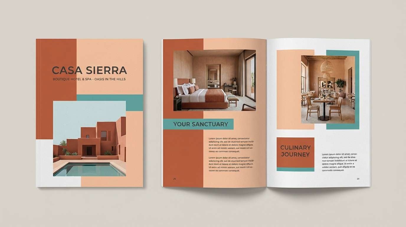
18) Desert Adobe
HEX: #c8553d #f28f3b #ffd5c2 #588b8b #2b303a
Mood: sunbaked, relaxed, earthy-modern
Best for: boutique hotel brochure
Sunbaked and relaxed like adobe walls at golden hour, this palette blends warmth with calm. Use the terracotta-red for section titles, and let the soft peach carry large background panels. Teal adds a cooling counterpoint for maps and amenity icons, while charcoal anchors the typography. Tip: keep photography warm-toned so the brochure feels cohesive from cover to back page.
Image example of desert adobe generated using media.io
19) Fresh Typography
HEX: #ff5a5f #00a699 #fc642d #f7f7f7 #484848
Mood: clean, contemporary, brand-ready
Best for: brand guideline page
Clean and contemporary like a crisp brand book spread, these tones feel instantly usable. A tomato color palette like this works best when red is reserved for emphasis and teal for interactive elements. Keep the light gray as the dominant base so type and spacing can do the heavy lifting. Tip: test red-on-gray combinations at small sizes to ensure accessibility on web and print.
Image example of fresh typography generated using media.io
20) Warm Editorial
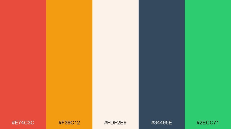
HEX: #e74c3c #f39c12 #fdf2e9 #34495e #2ecc71
Mood: confident, readable, magazine-like
Best for: magazine feature layout
Confident and readable like a modern magazine feature, this mix balances warmth with structure. Use the red for pull quotes and section markers, and set long-form text in the slate blue-gray for comfort. The creamy background keeps spreads bright, while green adds a fresh accent for charts or callout labels. Tip: stick to one accent per spread so the editorial rhythm feels intentional.
Image example of warm editorial generated using media.io
21) Peppery Contrast
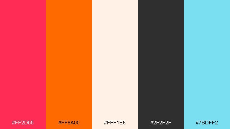
HEX: #ff2d55 #ff6a00 #fff1e6 #2f2f2f #7bdff2
Mood: bold, modern, high-impact
Best for: tech product launch banner
Bold and punchy like cracked pepper over a bright sauce, these colors deliver high impact. Use the hot red for the product name and the orange for supporting highlights, keeping the cream background wide and clean. Charcoal grounds the typography and makes the layout feel premium. Tip: add the icy blue only for secondary badges so it reads as a deliberate contrast, not a theme shift.
Image example of peppery contrast generated using media.io
What Colors Go Well with Tomato?
Tomato pairs beautifully with creamy whites, warm beiges, and soft blush tones because they let the red stay vibrant while keeping the layout breathable. These neutrals are especially helpful for backgrounds, cards, packaging bases, and long-form reading surfaces.
For contrast and a more premium feel, add deep navy, charcoal, or near-black for typography and structure. If you want a fresher, more modern balance, bring in teal, sea-green, sage, or basil greens as supporting accents.
To boost energy for ads and UI states, tomato also works well with citrus yellows and amber—just keep those brights as highlights so the palette doesn’t become visually loud.
How to Use a Tomato Color Palette in Real Designs
Use tomato as the “attention color”: primary buttons, key labels, promo tags, and important icons. Then assign one dark tone (navy/charcoal) for type and one light tone (cream/off-white) for background to maintain clarity and accessibility.
In branding, tomato is strong for logos and packaging marks, but it’s often best to keep large background areas softer (cream, blush, or light gray) to avoid fatigue. For editorial and slide design, tomato is ideal for pull quotes, dividers, and data highlights.
When mixing tomato with greens or teals, keep saturation balanced—use the cool color for secondary actions and UI panels, and reserve tomato for the moments you want users to notice and remember.
Create Tomato Palette Visuals with AI
If you already have HEX codes, you can generate consistent mockups by describing the layout style (poster, UI, packaging), the dominant colors, and the background material (paper, studio, flat UI). This helps AI outputs stay on-brand and repeatable.
Start with one palette above, reuse the provided prompt, then iterate by changing only the format (e.g., “menu” → “label” or “hero section”) while keeping the same color mood and composition notes.
With Media.io, you can quickly create tomato-themed visuals for ads, brand boards, landing pages, and packaging concepts—without installing anything.
Tomato Color Palette FAQs
-
What HEX code is tomato red?
A widely used tomato red HEX is #ff6347. It’s a bright, warm red-orange that works well for CTAs, highlights, and food-forward branding. -
Is tomato closer to red or orange?
Tomato sits between red and orange, with a noticeable warm/orange undertone. That’s why it feels energetic and friendly compared to a cooler, deeper true red. -
What colors complement tomato?
Cool tones like teal, sea-green, and deep navy complement tomato by balancing its warmth. Creamy neutrals also pair well by keeping designs light and readable. -
Can I use tomato in UI design without overwhelming the screen?
Yes—use tomato sparingly for primary actions, alerts, or key highlights, and keep most surfaces neutral (white/cream/light gray). Reserve darker colors for typography to maintain contrast. -
What’s the best background color for tomato text?
Light backgrounds like off-white, cream, or very pale blush usually work best. For dark UIs, use tomato for buttons or badges and keep text in off-white for accessibility. -
Does tomato work for luxury branding?
It can, especially when paired with deep charcoals, near-black, or dark navy and used with lots of spacing. Palettes like “Rosewood Dusk” and “Midnight Marinara” show how tomato-adjacent reds can feel premium. -
How do I generate tomato palette images with AI?
Pick a palette, describe the design format (poster, packaging, UI), call out the dominant colors, and specify a clean background and lighting. You can reuse the prompts above in Media.io and iterate quickly.


