

Olive green sits right between nature and neutral, which makes it one of the easiest “grounding” colors to design with. It can feel rustic, modern, cozy, or premium depending on what you pair it with.
Below are curated olive green color palette ideas with HEX codes, plus practical tips for branding, rooms, and UI—so you can pick a mood and apply it fast.
In this article
Why Olive Green Color Combinations Work So Well
Olive green is naturally balanced: it has the calm of green but with a muted, earthy undertone that reads “mature” and dependable. That’s why it works across industries—from wellness to tech—without feeling trendy or loud.
Because it’s close to neutrals in perceived intensity, olive green pairs smoothly with creams, tans, warm grays, charcoal, and soft pastels. It can support content-heavy layouts while still giving the design a signature personality.
It’s also a great contrast tool: deep olive can replace black for softer typography, while pale sage-olive surfaces reduce glare compared to pure white backgrounds in UI.
20+ Olive Green Color Palette Ideas (with HEX Codes)
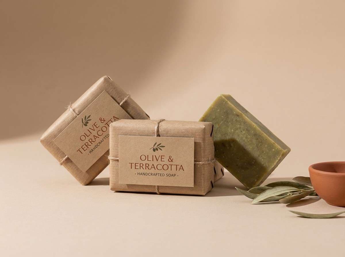
1) Desert Herb
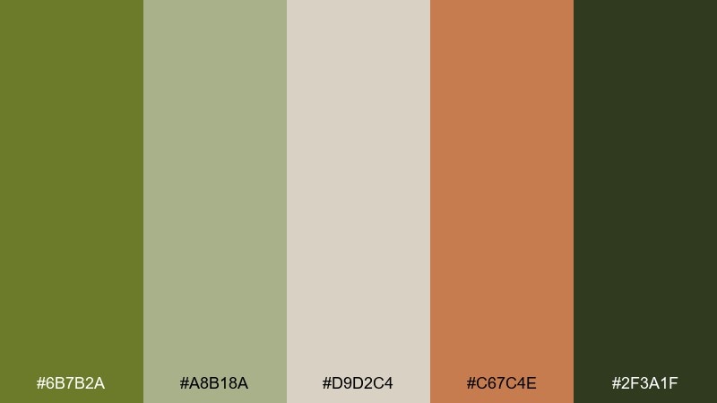
HEX: #6B7B2A #A8B18A #D9D2C4 #C67C4E #2F3A1F
Mood: earthy, sun-baked, grounded
Best for: rustic brand identity and craft packaging
Earthy and sun-baked, these tones feel like dry trails, sagebrush, and warm clay under late light. Use the olive and deep green as primaries, then soften layouts with the sandy neutral. The terracotta accent adds friendly energy for callouts, seals, or icons. Tip: keep contrast high by pairing the darkest green with the lightest beige for headlines and small text.
Image example of desert herb generated using media.io
Media.io is an online AI studio for creating and editing video, image, and audio in your browser.

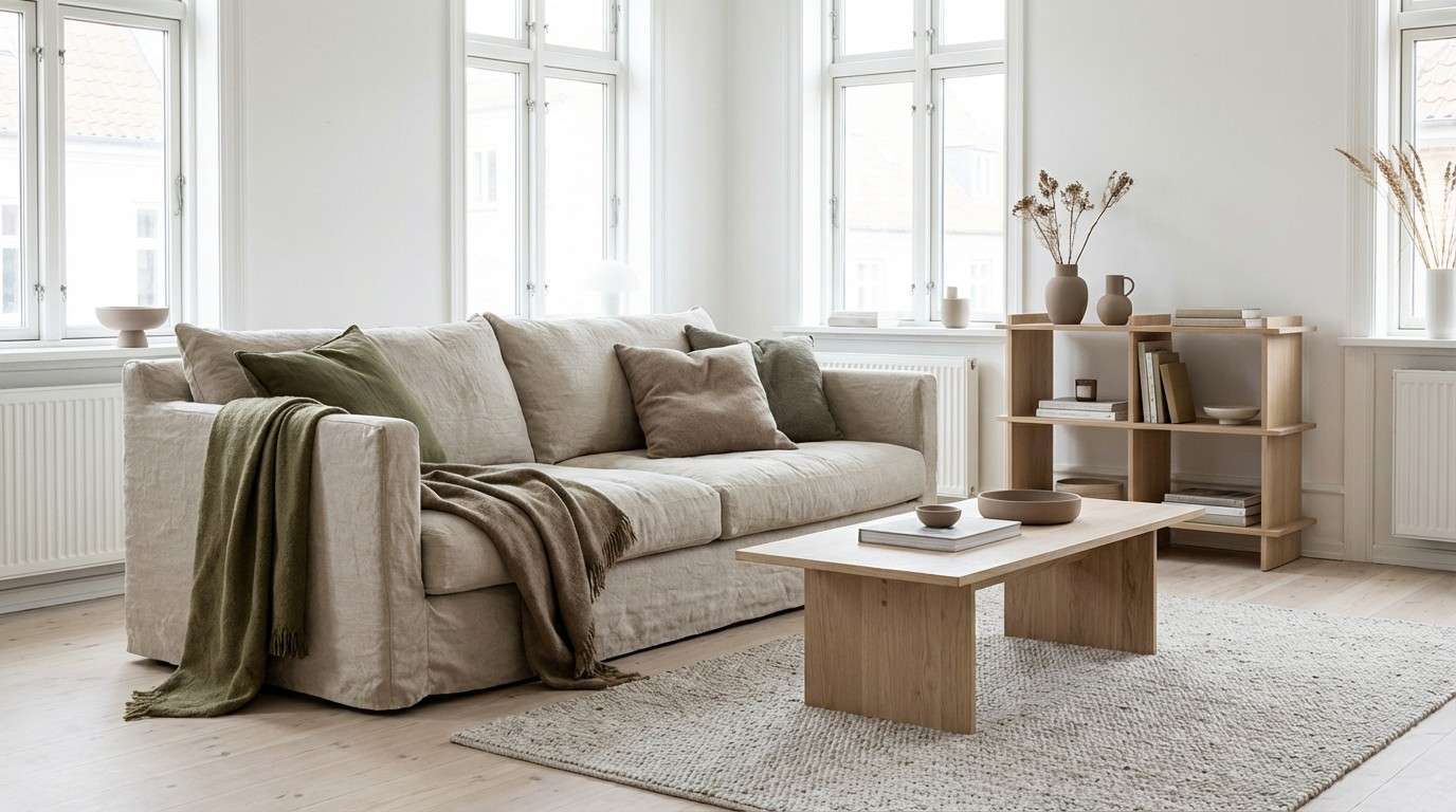
2) Forest Linen
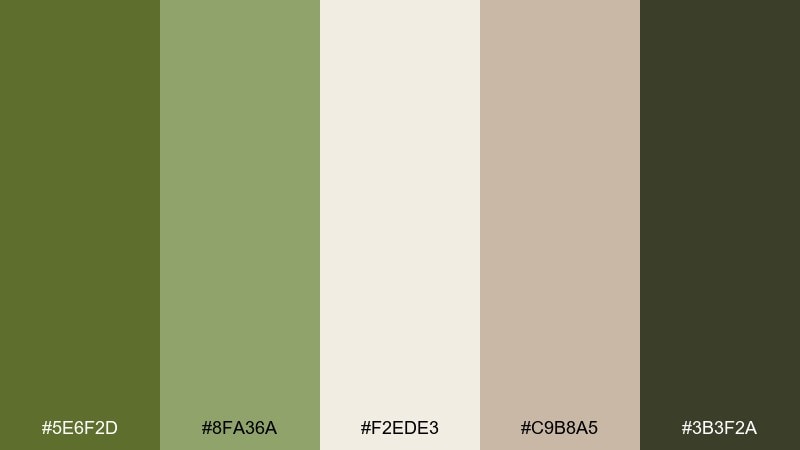
HEX: #5E6F2D #8FA36A #F2EDE3 #C9B8A5 #3B3F2A
Mood: calm, natural, airy
Best for: scandinavian interiors and lifestyle blogs
Calm and airy, this olive green mix evokes linen curtains, leafy shade, and quiet mornings. Let the off-white lead for spaciousness, then layer olive and soft green in textiles or UI sections. The warm taupe keeps everything cozy without turning yellow. Tip: repeat the mid green as a subtle divider color to make long pages feel organized.
Image example of forest linen generated using media.io
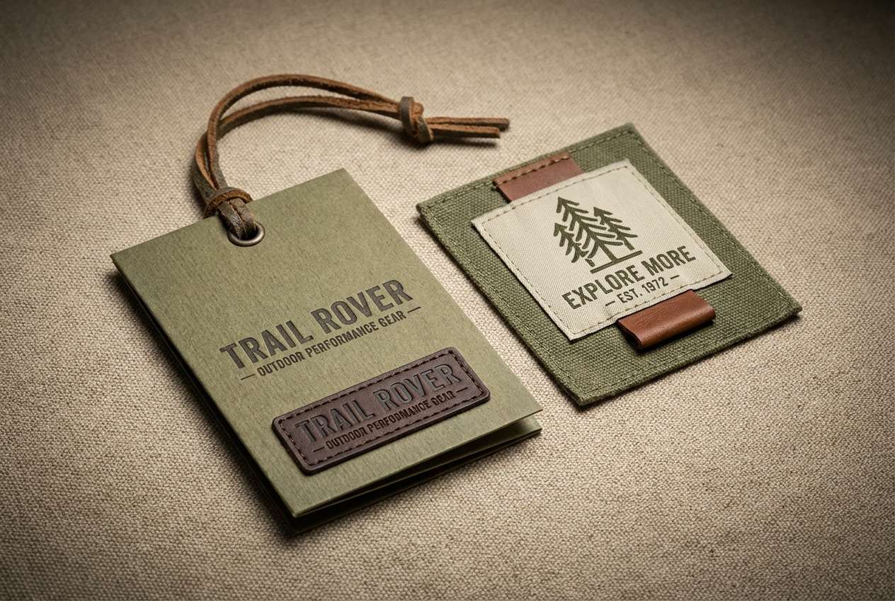
3) Vintage Military
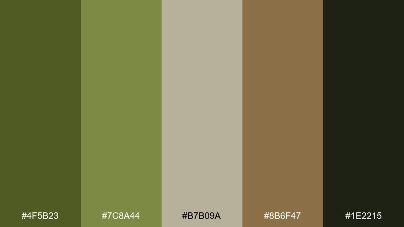
HEX: #4F5B23 #7C8A44 #B7B09A #8B6F47 #1E2215
Mood: rugged, heritage, utilitarian
Best for: outdoor apparel branding and labels
Rugged and heritage-driven, these olive green shades recall canvas jackets, worn leather, and field gear. Anchor the design with the near-black green, then build depth with the muted olive steps. The tan-gray works well as a label background, while the brown makes a strong badge or stitch-detail color. Tip: use the light neutral for negative space so the palette stays premium, not heavy.
Image example of vintage military generated using media.io
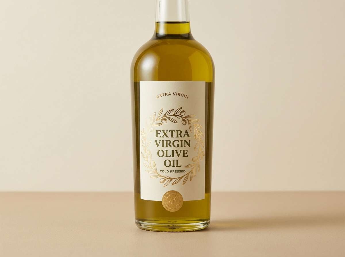
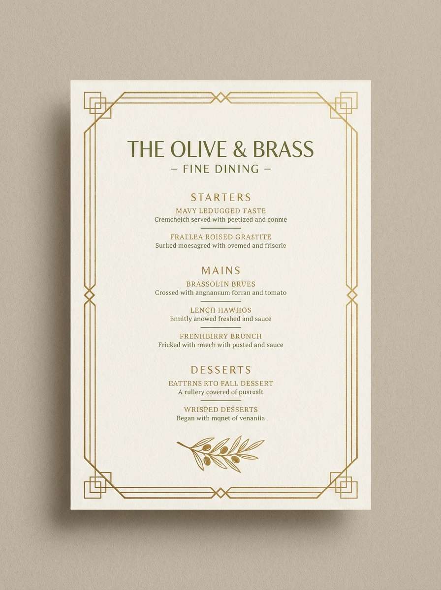
4) Olive Orchard
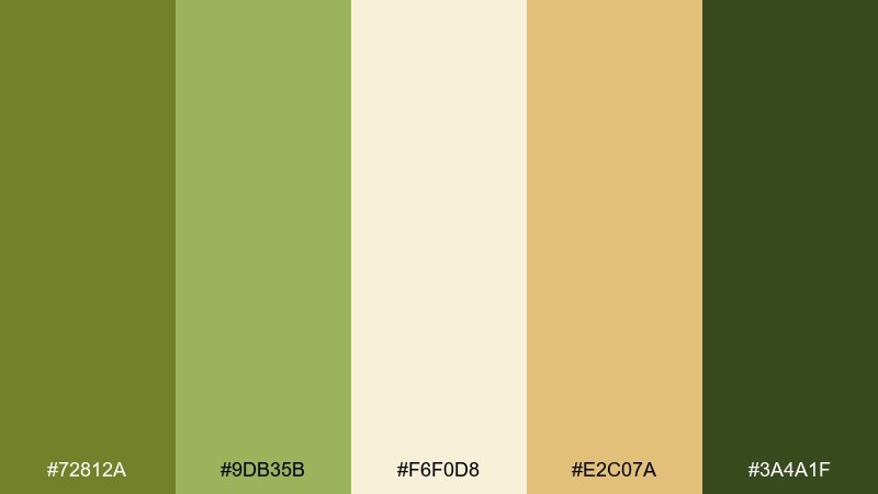
HEX: #72812A #9DB35B #F6F0D8 #E2C07A #3A4A1F
Mood: fresh, mediterranean, sunny
Best for: food packaging and restaurant menus
Fresh and Mediterranean, it brings to mind olive trees, sunlit stone, and golden oil. These olive green color combinations shine when the cream is the main background and the darkest green handles typography. Use the warm gold as a highlight for prices, buttons, or key menu items. Tip: keep the mid green for secondary sections so the gold accent stays special.
Image example of olive orchard generated using media.io
5) Mossy Stone
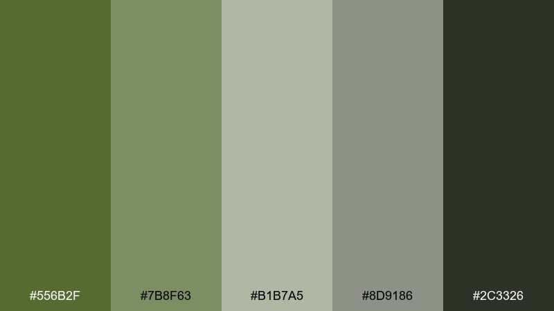
HEX: #556B2F #7B8F63 #B1B7A5 #8D9186 #2C3326
Mood: misty, quiet, grounded
Best for: architecture portfolios and minimalist sites
Misty and quiet, these olive green tones feel like moss on stone after rain. The gray-greens are ideal for large blocks, letting content breathe without stark white glare. Add the dark green for strong navigation and high-contrast captions. Tip: use the mid gray as a border and grid color to keep layouts crisp and architectural.
Image example of mossy stone generated using media.io
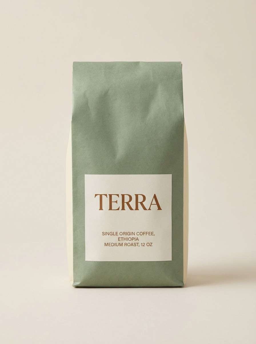
6) Sage Latte
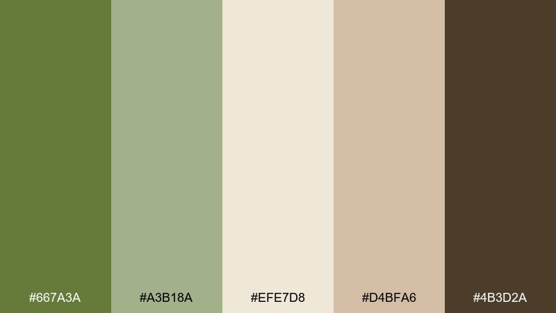
HEX: #667A3A #A3B18A #EFE7D8 #D4BFA6 #4B3D2A
Mood: soft, cozy, organic
Best for: cafes, wellness brands, and packaging
Soft and cozy, the olive green color palette suggests steamed milk, dried herbs, and warm ceramic. Pair the creamy beige with sage for a gentle base, then use the brown for logo marks and ingredient lists. The muted tan keeps the palette from feeling too cool. Tip: for packaging, print the darker green as a spot color and keep the rest as tints to avoid a muddy look.
Image example of sage latte generated using media.io
7) Rainy Parka
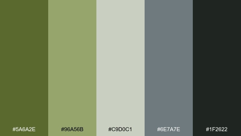
HEX: #5A6A2E #96A56B #C9D0C1 #6E7A7E #1F2622
Mood: urban, muted, overcast
Best for: streetwear lookbooks and editorial banners
Urban and overcast, these olive green shades feel like a matte parka against wet pavement. The cool gray-blue adds a modern edge that prevents the greens from reading too rustic. Use the pale gray-green for backgrounds and the near-black for type and logo lockups. Tip: reserve the mid olive for key CTAs so the palette stays calm but still converts.
Image example of rainy parka generated using media.io
8) Brass Olive
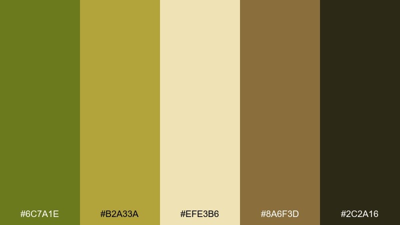
HEX: #6C7A1E #B2A33A #EFE3B6 #8A6F3D #2C2A16
Mood: vintage, warm, curated
Best for: boutique hotels and upscale menus
Vintage and curated, this olive green color palette recalls aged brass, candlelight, and velvet banquettes. Let the buttery cream carry most of the space, then bring in olive and brass for headings and small ornaments. The deep brown-black adds a luxe foundation for type. Tip: use the brass shade for thin rules and icons to create an elegant, old-world finish.
Image example of brass olive generated using media.io
9) Coastal Dune
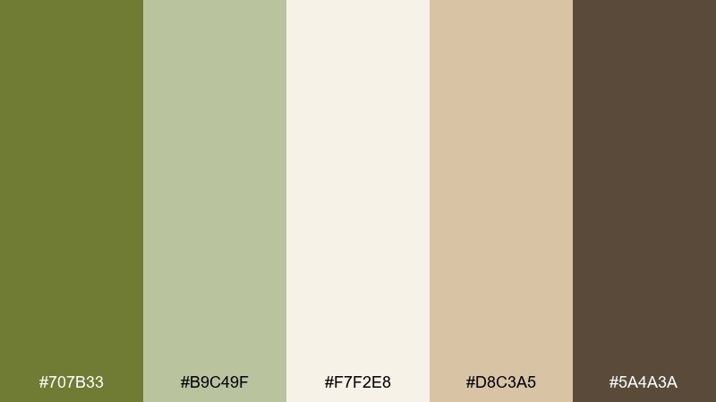
HEX: #707B33 #B9C49F #F7F2E8 #D8C3A5 #5A4A3A
Mood: relaxed, breezy, natural
Best for: beach rentals and travel landing pages
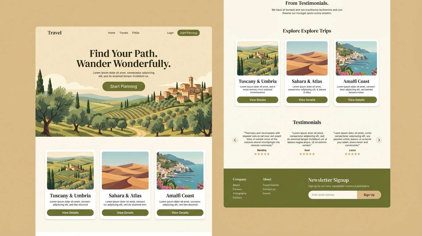
Relaxed and breezy, these olive green combinations evoke dune grass, driftwood, and sun-warmed sand. The creamy off-white keeps pages bright while the olive adds just enough structure for nav bars and section titles. Warm beige and brown support a friendly, hospitality feel. Tip: keep imagery warm-toned and slightly desaturated so the palette stays cohesive.
Image example of coastal dune generated using media.io
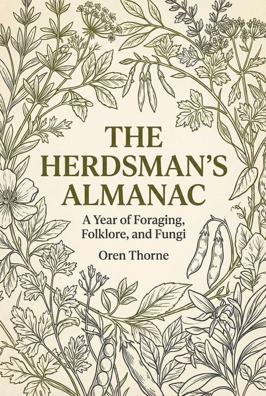
10) Botanical Ink
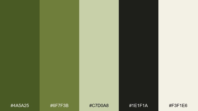
HEX: #4A5A25 #6F7F3B #C7D0A8 #1E1F1A #F3F1E6
Mood: moody, botanical, modern
Best for: book covers and apothecary branding
Moody and botanical, it feels like ink drawings pressed into a herbarium journal. Use the charcoal-black for crisp typography, then let olive and mossy green shape the main blocks. The pale cream reads like paper stock and keeps the design from getting too dark. Tip: add subtle grain or print texture so the palette looks intentionally vintage, not flat.
Image example of botanical ink generated using media.io
11) Autumn Grove
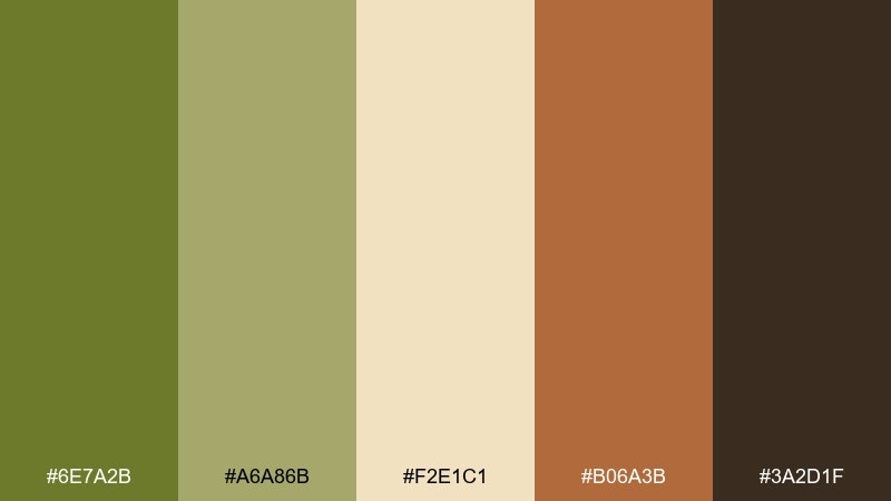
HEX: #6E7A2B #A6A86B #F2E1C1 #B06A3B #3A2D1F
Mood: warm, seasonal, inviting
Best for: fall campaigns and handcrafted goods
Warm and seasonal, the olive green color palette brings up crunchy leaves, apple skin, and spiced wood. The creamy tan is perfect for backgrounds and product labels, while olive and khaki build the main brand color. Use the burnt orange for stamps, sale tags, or small illustrations. Tip: keep the dark brown to typography only so the palette stays inviting rather than heavy.
Image example of autumn grove generated using media.io
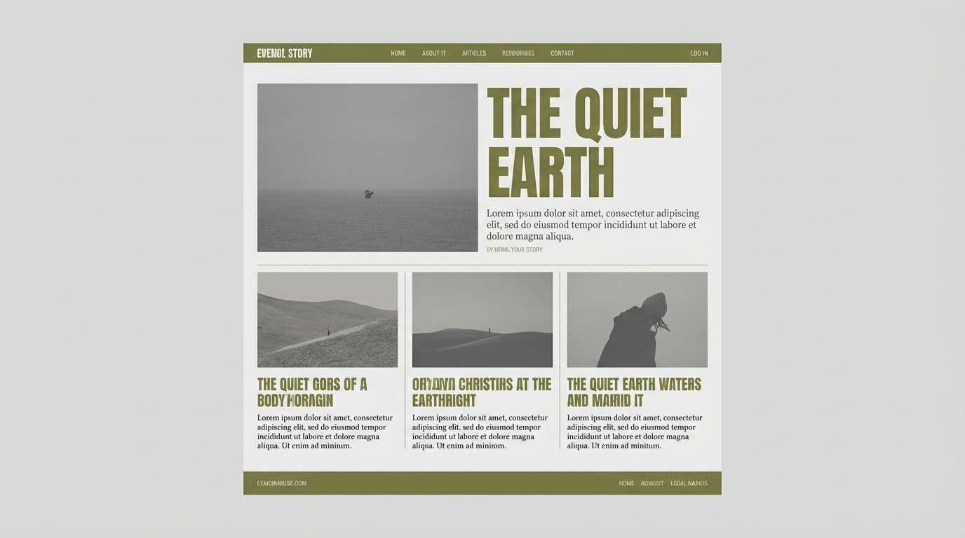
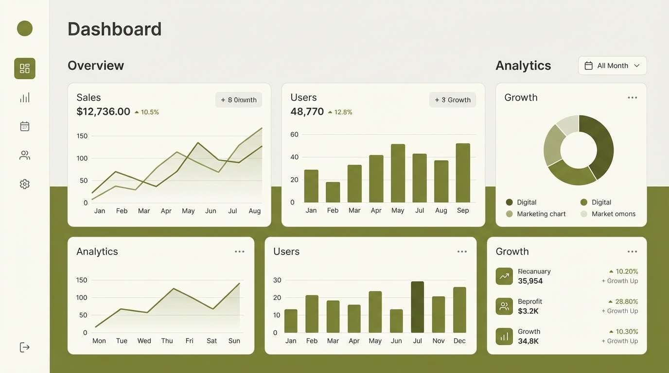
12) Minimal Olive UI
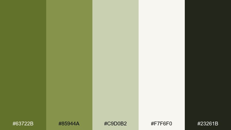
HEX: #63722B #85944A #C9D0B2 #F7F6F0 #23261B
Mood: clean, modern, functional
Best for: dashboard UI and productivity apps
Clean and functional, this set feels like a well-organized workspace with a touch of nature. An olive green color scheme works best here when the off-white leads and the dark green handles text and icons. Keep the mid olive for primary buttons and selected states, and use the pale green as gentle surface color for cards. Tip: test contrast on the mid tones and default to the dark shade for small UI labels.
Image example of minimal olive ui generated using media.io
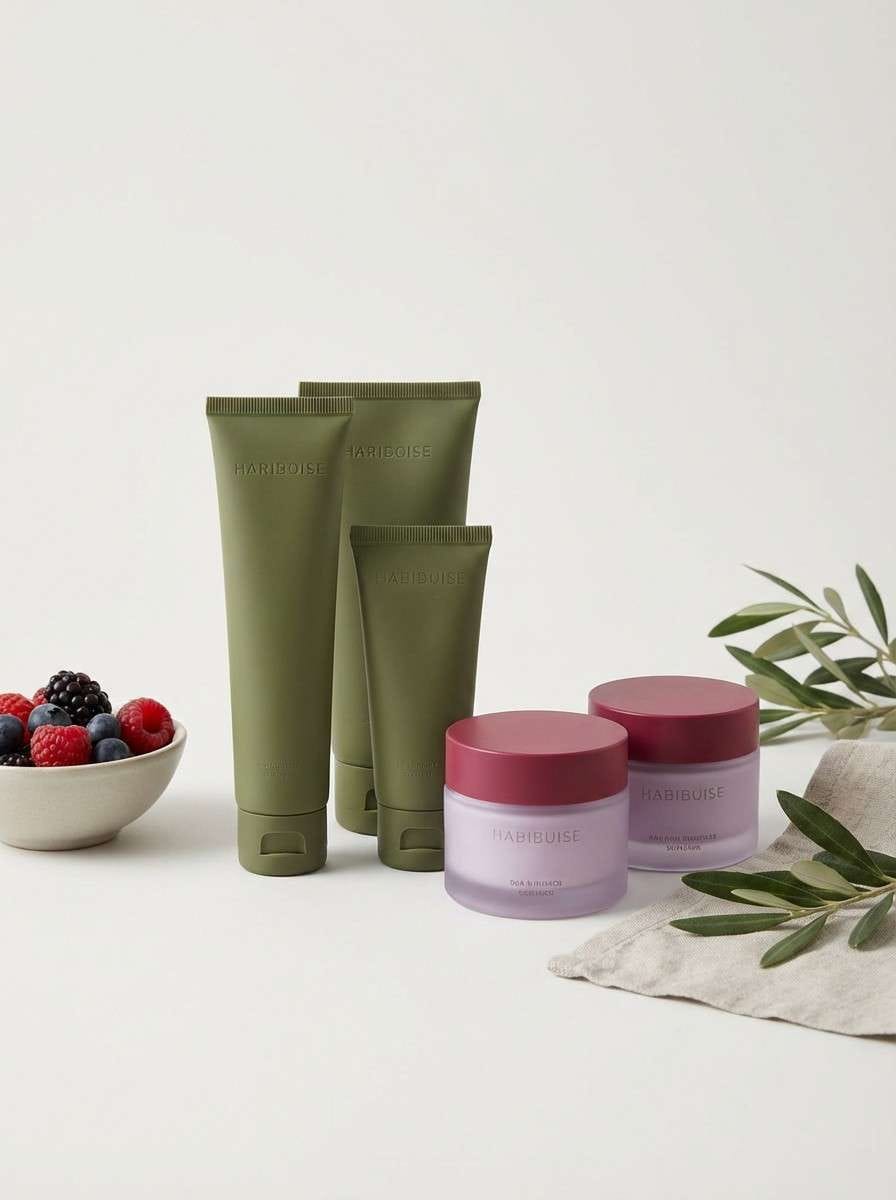
13) Orchid Olive
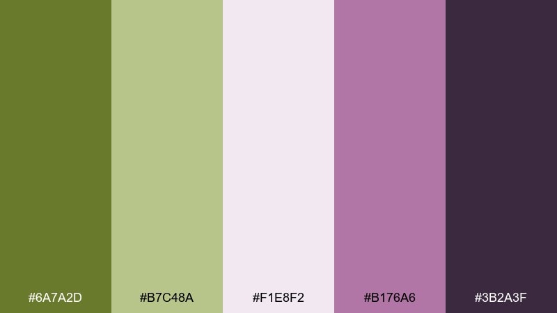
HEX: #6A7A2D #B7C48A #F1E8F2 #B176A6 #3B2A3F
Mood: romantic, playful, modern
Best for: beauty branding and social posts
Romantic and modern, the olive green color palette pairs leafy greens with soft orchid tones for a fresh twist. Use the pale lilac as negative space and let olive ground the layout so it still feels grown-up. The berry purple is strong for headlines, badges, or hero graphics. Tip: keep imagery minimal and rely on color blocking to make the purple pop without looking loud.
Image example of orchid olive generated using media.io
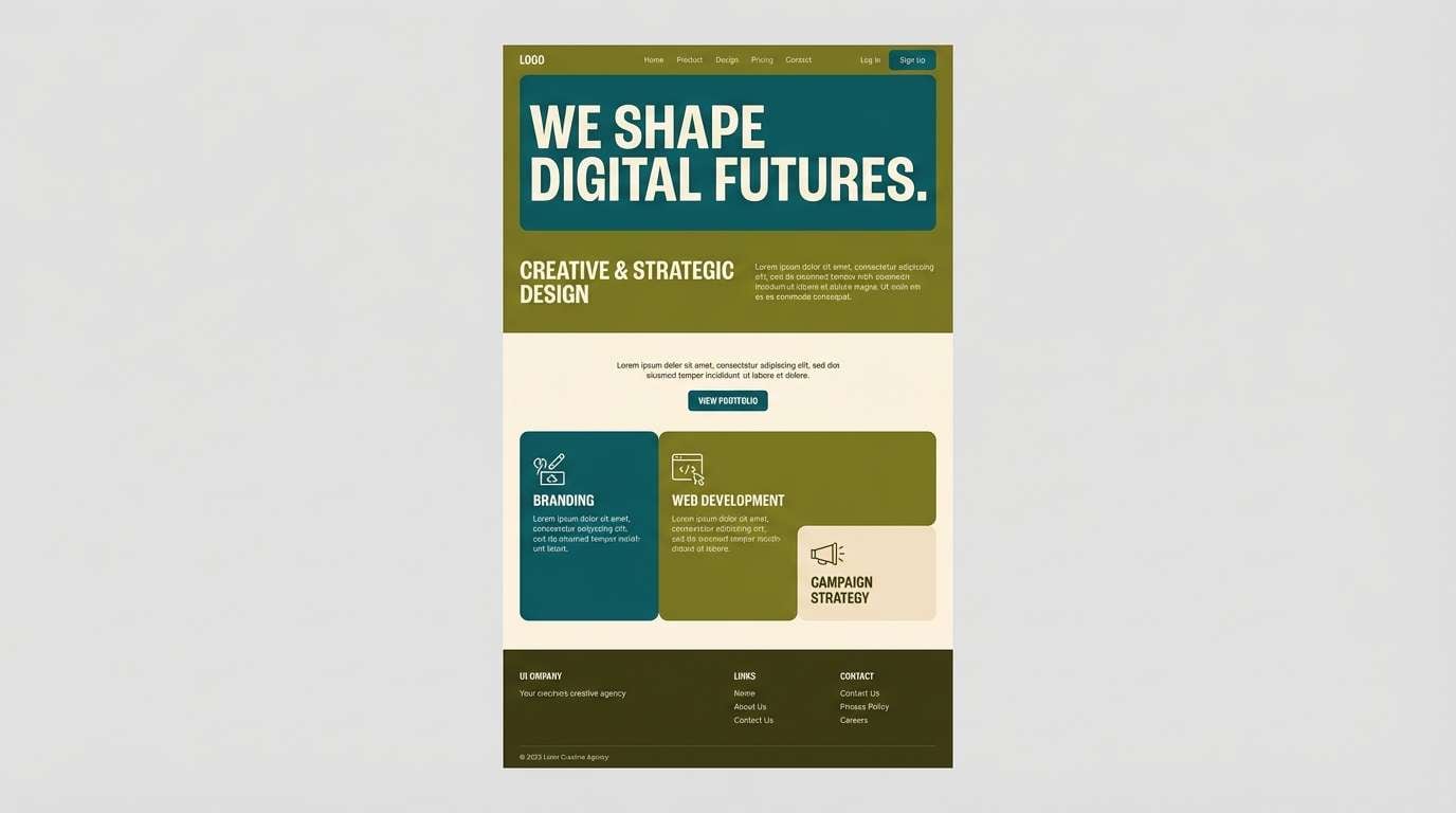
14) Teal Olive Studio
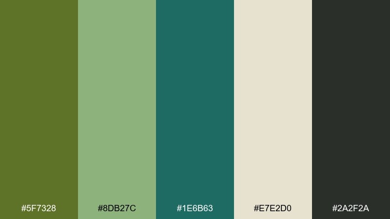
HEX: #5F7328 #8DB27C #1E6B63 #E7E2D0 #2A2F2A
Mood: creative, fresh, contemporary
Best for: agency websites and portfolio headers
Creative and contemporary, it feels like a plant-filled studio with a teal paint swatch on the wall. Teal adds a crisp counterpoint to olive, making sections and buttons feel more modern. Use the warm cream to keep the overall page bright and the charcoal for typography. Tip: limit teal to one or two interface roles so it reads as an accent, not a competing brand color.
Image example of teal olive studio generated using media.io
15) Citrus Olive Pop
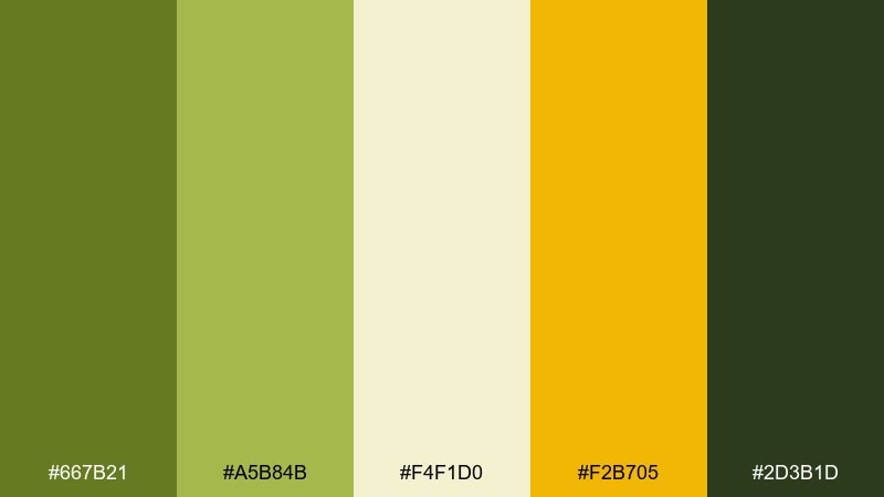
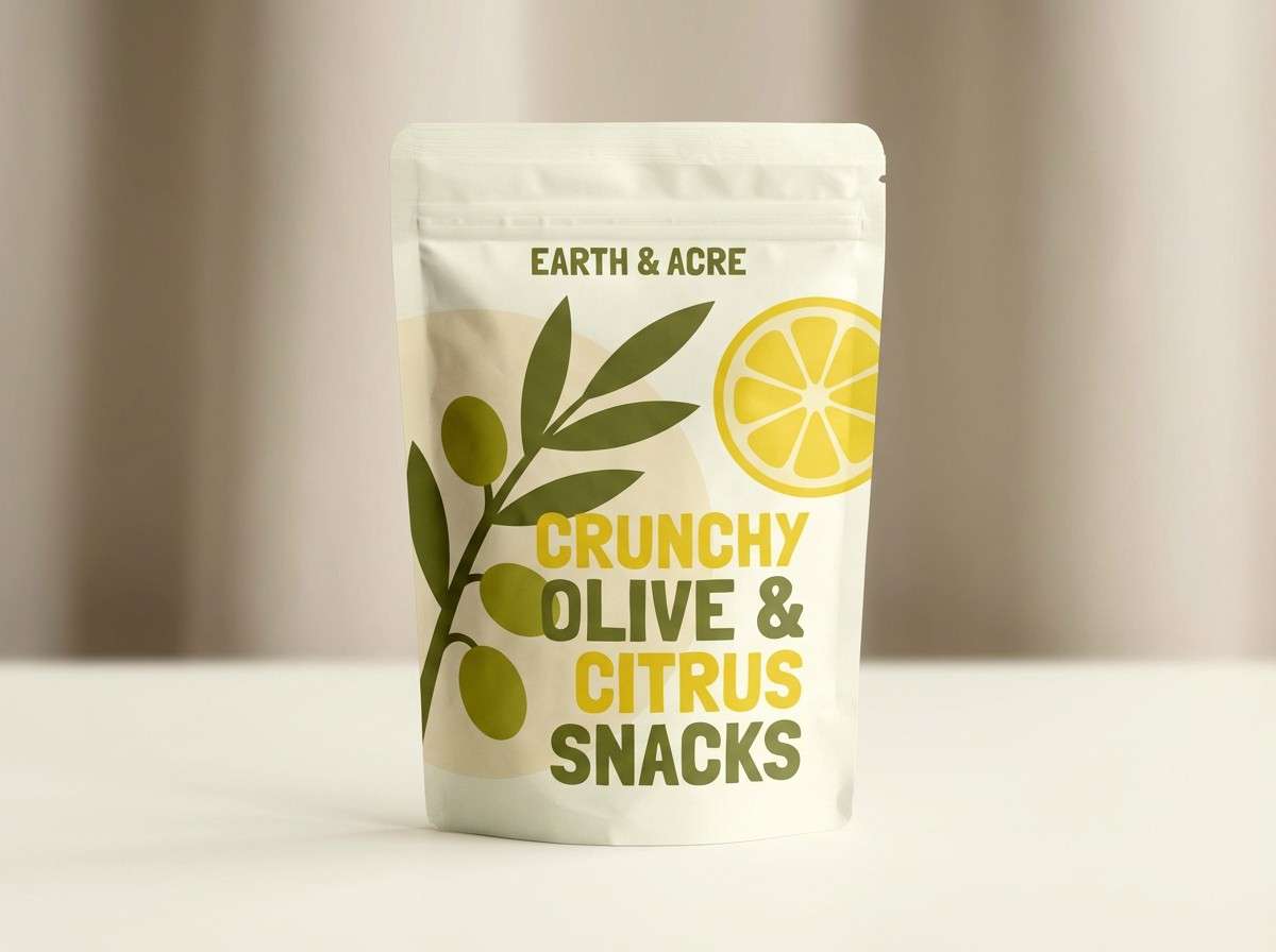
HEX: #667B21 #A5B84B #F4F1D0 #F2B705 #2D3B1D
Mood: bright, energetic, optimistic
Best for: summer promos and snack packaging
Bright and optimistic, this olive green color palette reads like citrus peel over leafy greens. The yellow-gold accent is perfect for stickers, limited-edition bursts, and primary CTAs. Keep the cream as the main surface to avoid overwhelming saturation, and use the deep green for sharp readability. Tip: pair bold shapes with plenty of whitespace so the pop color feels intentional, not noisy.
Image example of citrus olive pop generated using media.io
16) Charcoal Olive
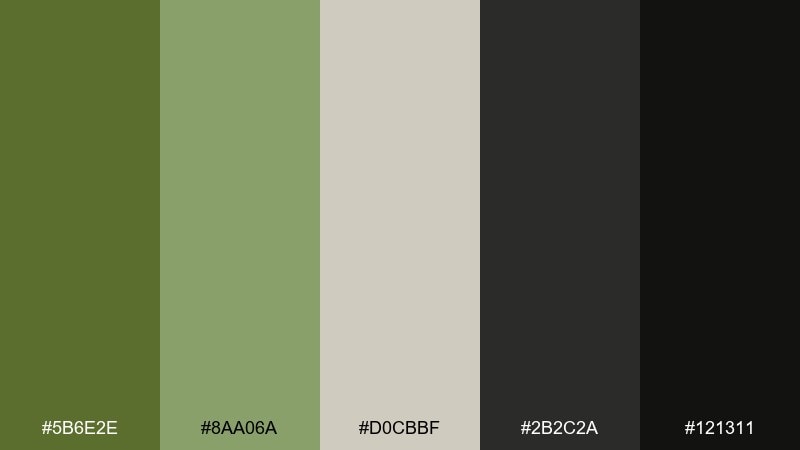
HEX: #5B6E2E #8AA06A #D0CBBF #2B2C2A #121311
Mood: serious, sleek, masculine
Best for: tech branding and premium product ads
Serious and sleek, it feels like matte metal with a subtle botanical edge. The charcoal range makes the greens look more refined and less rustic. Use the light greige for breathing room, then bring in olive for brand highlights and secondary panels. Tip: in ads, keep gradients minimal and rely on strong lighting and shadows for depth.
Image example of charcoal olive generated using media.io

17) Nordic Cabin
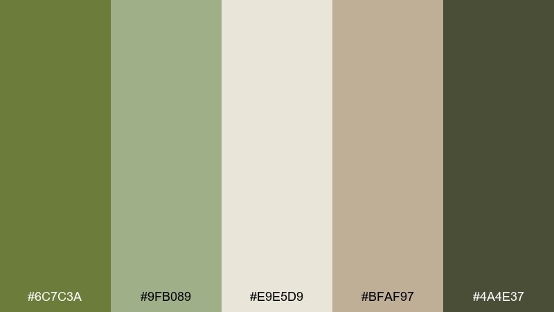
HEX: #6C7C3A #9FB089 #E9E5D9 #BFAF97 #4A4E37
Mood: cozy, natural, understated
Best for: home goods brands and lookbooks
Cozy and understated, these olive green color combinations evoke pine walls, wool blankets, and soft winter daylight. Use the light oatmeal shade as a clean base, then introduce olive in patterns and product details. The warm taupe makes a great supporting neutral for typography and pricing. Tip: keep greens slightly desaturated in photos so the palette stays calm and Nordic.
Image example of nordic cabin generated using media.io
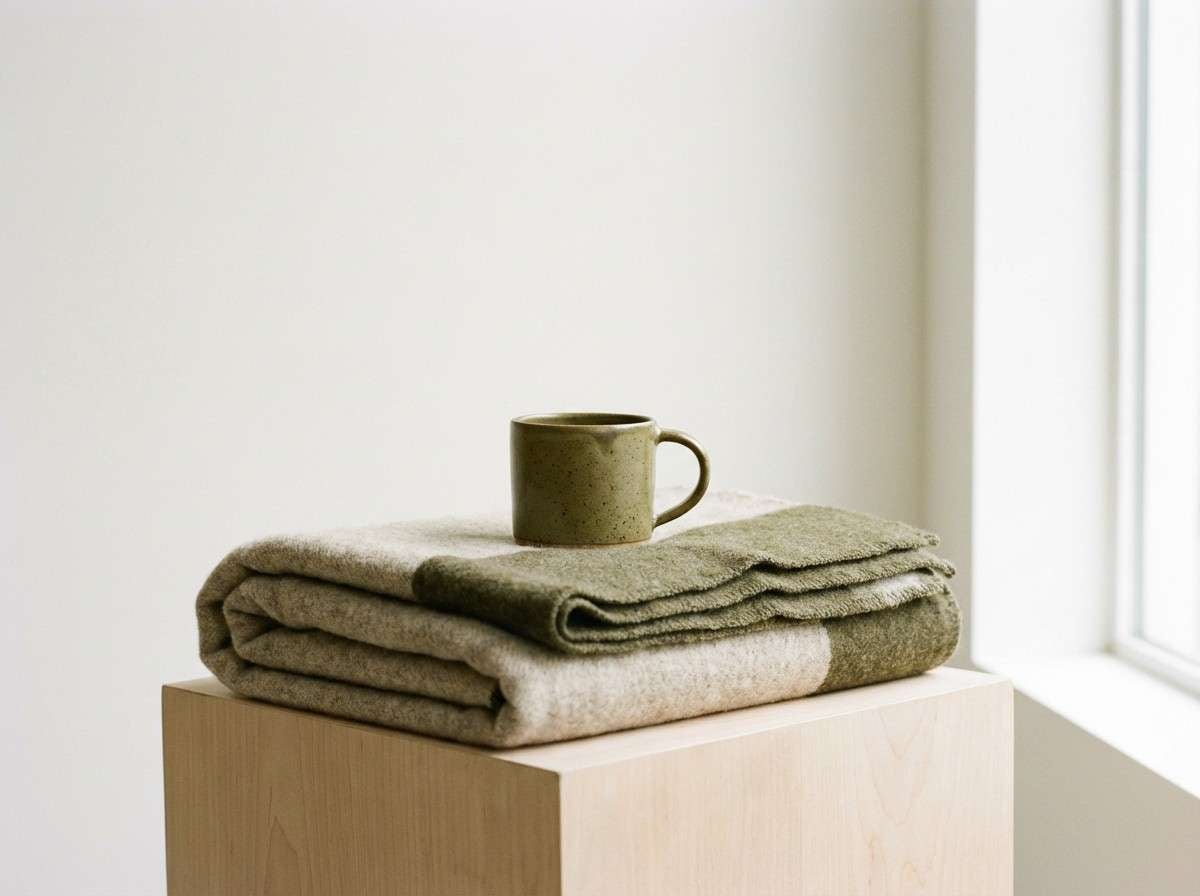
18) Blush Olive Wedding
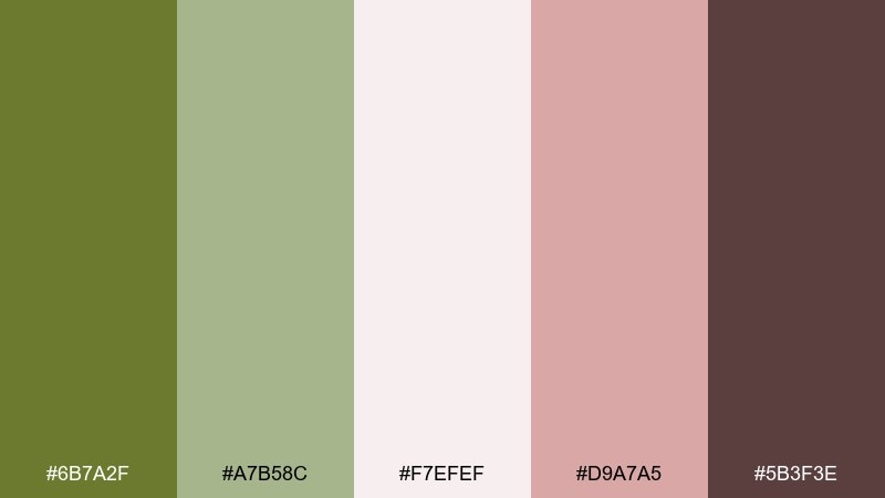
HEX: #6B7A2F #A7B58C #F7EFEF #D9A7A5 #5B3F3E
Mood: romantic, gentle, timeless
Best for: wedding invitations and stationery
Romantic and gentle, it suggests blush petals, olive branches, and soft candlelit dinners. This olive green color palette works beautifully when blush stays light and airy, letting the greens do the grounding. Use the deeper mauve-brown for names and key details, and keep plenty of open space for elegance. Tip: choose a warm off-white paper stock so the blush does not turn too cool in print.
Image example of blush olive wedding generated using media.io
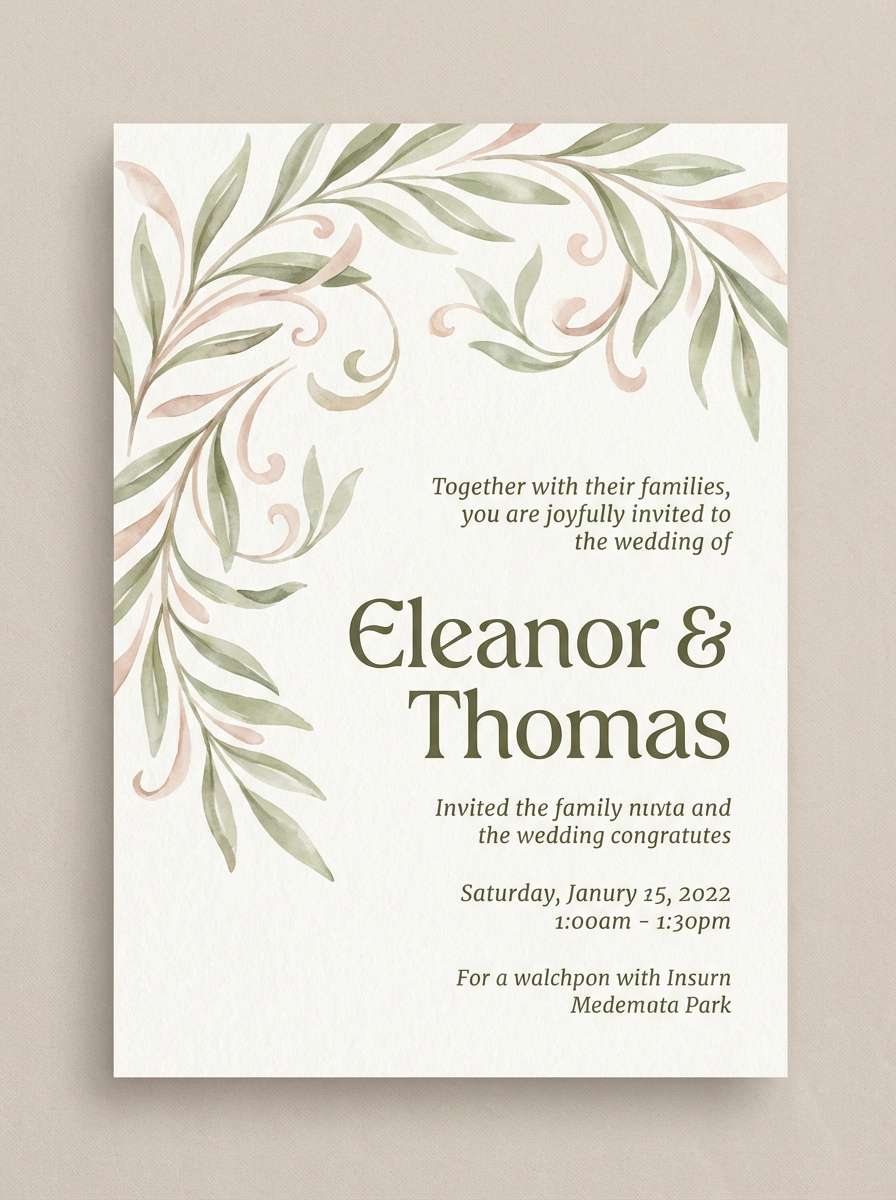
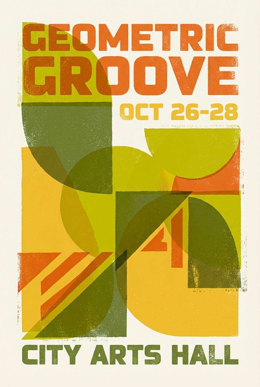
19) Retro Poster
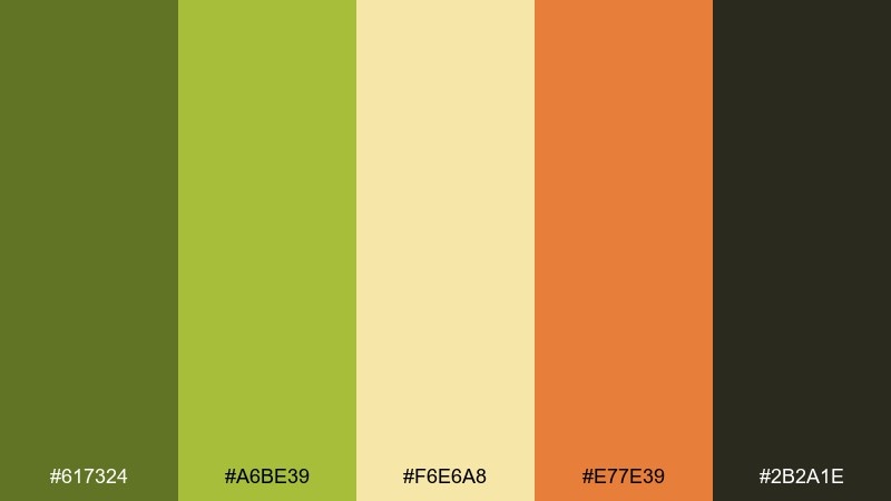
HEX: #617324 #A6BE39 #F6E6A8 #E77E39 #2B2A1E
Mood: retro, bold, upbeat
Best for: event posters and campaign graphics
Retro and upbeat, it feels like screen-printed ink with sun-faded warmth. These olive green color combinations pop when you push contrast between the bright chartreuse and the dark ink shade. The buttery yellow makes a perfect poster background, while the orange drives urgency for dates and ticket info. Tip: use chunky typography and simple shapes to match the vintage energy.
Image example of retro poster generated using media.io
20) Midnight Garden
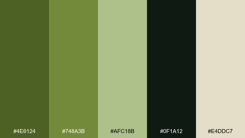
HEX: #4E6124 #748A3B #AFC18B #0F1A12 #E4DDC7
Mood: mysterious, lush, dramatic
Best for: luxury branding and moody hero sections
Mysterious and lush, it resembles garden foliage under moonlight with a soft warm glow. Use the inky green as a hero background and layer lighter olives for depth in shapes or illustrations. The warm cream makes a striking highlight for logos and small UI elements. Tip: keep accent usage minimal and let large dark areas create the drama.
Image example of midnight garden generated using media.io
What Colors Go Well with Olive Green?
Olive green pairs especially well with warm neutrals like cream, oatmeal, camel, and tan—these keep it earthy and approachable. For a cleaner, more modern look, try olive with off-white plus charcoal or near-black.
If you want more color, olive looks great with terracotta, burnt orange, mustard, and brass tones for warmth. For contrast that feels fresh, add cool accents like teal, slate blue, or soft lilac—just keep accents limited so olive remains the anchor.
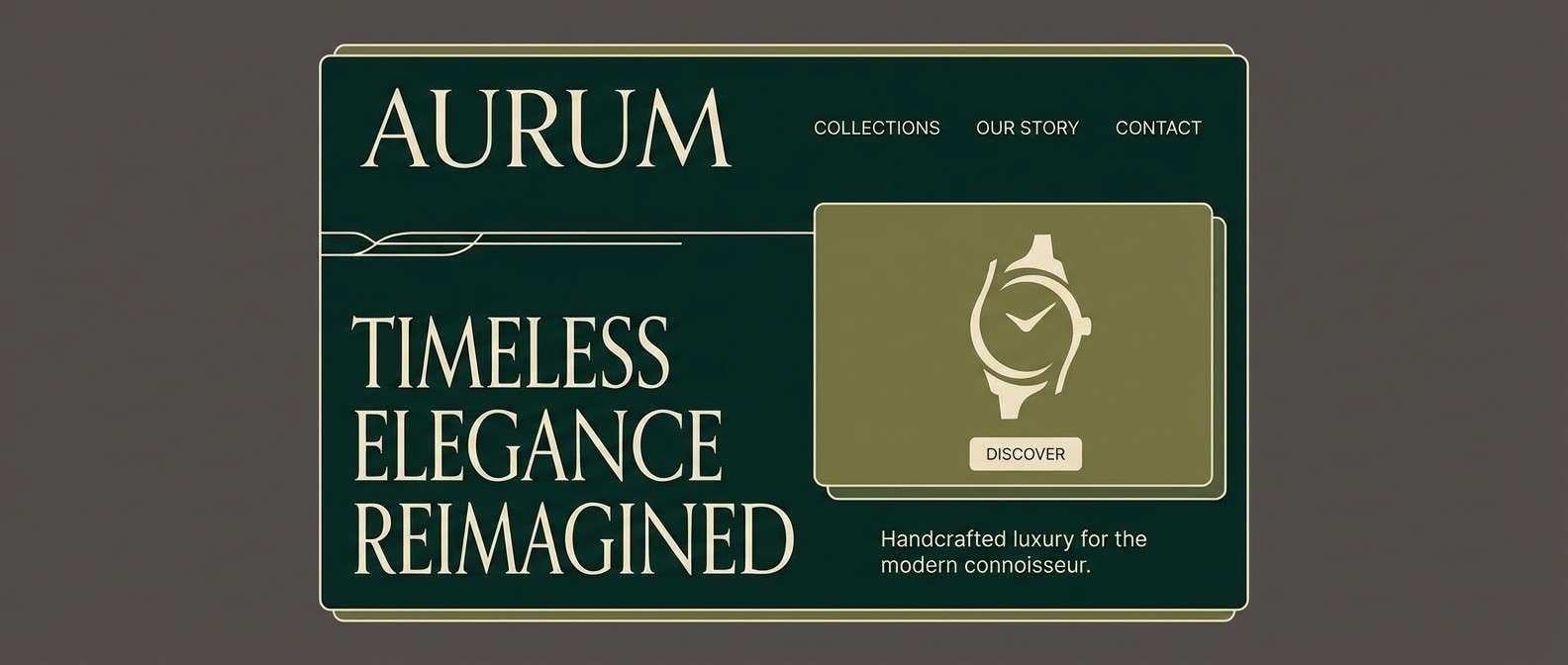
How to Use a Olive Green Color Combination in Real Designs
For branding, pick one deep olive for logos/type, one lighter olive for surfaces, and a warm neutral for backgrounds. Then add a single accent (gold, terracotta, or teal) for CTAs and highlights—this keeps the system consistent across packaging, web, and ads.
For interiors, treat olive like a “soft dark”: it works on cabinetry, feature walls, or textiles, while creams and wood tones keep rooms bright. In UI, default to off-white/cream for main surfaces, and use deep olive or charcoal for text to ensure accessibility.
Create Olive Green Palette Visuals with AI
If you’re pitching a concept or building a moodboard, generating quick palette-based visuals can save hours. With Media.io, you can turn a palette idea into product mockups, poster concepts, UI hero sections, and more—directly in your browser.
Start by choosing a palette above, paste its HEX colors into your prompt (or describe the mood), and generate variations until the lighting, materials, and vibe match your brand.
Olive Green Color Palette FAQs
-
What is the HEX code for olive green?
Olive green doesn’t have one single HEX code, but common olive tones often sit around #556B2F. In this article, you’ll see multiple olive variations (from muted to deep) to fit different design moods. -
Is olive green warm or cool?
Olive green is typically warm because it contains yellow and brown undertones. However, when paired with cool grays or teal accents, it can read more modern and slightly cooler. -
What neutral colors pair best with olive green?
Cream, off-white, oatmeal, warm taupe, greige, and charcoal are the easiest neutrals to pair with olive green. These keep the palette grounded while preserving readable contrast for text and UI. -
What accent colors make olive green pop?
Terracotta, mustard/gold, burnt orange, and brass give olive green a warm, energetic lift. For a fresher contrast, try teal or soft lilac—use them as accents, not base colors. -
How do I make an olive green UI accessible?
Use the darkest shade (deep olive/charcoal) for small text and icons, and keep mid olives for larger buttons or selected states. Always check contrast ratios, especially when olive is placed on beige or pale green surfaces. -
Does olive green work for luxury branding?
Yes—olive can feel premium when paired with charcoal/near-black and warm cream, with restrained accents like brass or gold. Avoid too many mid-tone greens at once to keep it from looking muddy. -
How can I generate olive green design mockups quickly?
Use Media.io’s AI image generator to create palette-driven mockups (packaging, posters, room scenes, or UI). Start with one of the prompts above and iterate by adjusting materials, lighting, and accent usage.


