

Flat colors are modern, readable, and easy to scale across screens—perfect for UI, branding, posters, and print. When the tones are clean (no gradients), your layout, typography, and hierarchy do the talking.
Below are 20 flat color palette ideas with HEX codes, moods, and practical usage tips—plus AI prompt examples you can reuse to generate matching visuals.
In this article
Why Flat Palettes Work So Well
Flat palettes strip away visual noise. Without gradients and heavy texture, users scan faster, UI states feel clearer, and typography stays crisp across devices.
They’re also predictable in production. Solid fills reproduce more consistently in web, app, and print workflows, and they’re easier to standardize in design systems.
Most importantly, flat colors make hierarchy obvious. You can assign roles (surface, primary, accent, text) and keep your interface or layout coherent as it grows.
20+ Flat Color Palette Ideas (with HEX Codes)
1) Calm Clay Neutrals
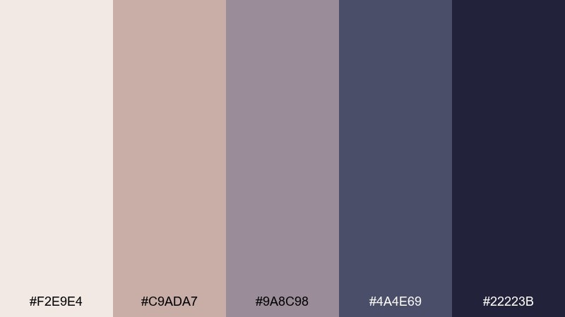
HEX: #f2e9e4 #c9ada7 #9a8c98 #4a4e69 #22223b
Mood: grounded, calm, refined
Best for: editorial brand guidelines
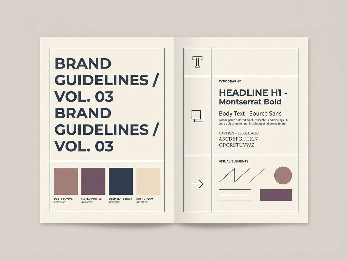
Grounded and gallery-like, these clay neutrals feel like linen paper, soft shadows, and quiet confidence. They work beautifully for brand guideline pages, lookbooks, and premium decks where typography needs room to breathe. Pair with a warm off-white background and one deep ink accent for headings. Usage tip: keep body text in the darkest navy and reserve mauve for callouts to maintain contrast without harshness.
Image example of calm clay neutrals generated using media.io
Media.io is an online AI studio for creating and editing video, image, and audio in your browser.

2) Minty Pop
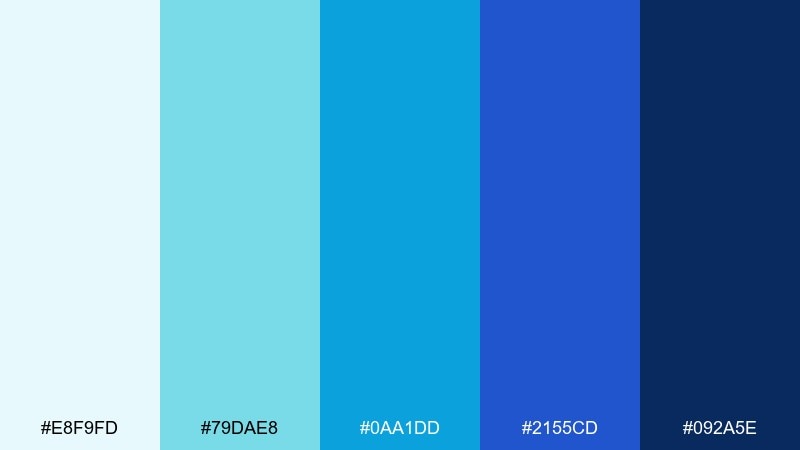
HEX: #e8f9fd #79dae8 #0aa1dd #2155cd #092a5e
Mood: fresh, crisp, energetic
Best for: 2d dashboard UI mockup
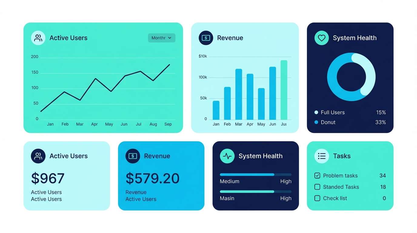
Crisp and techy, these mint-to-navy tones evoke clear water, clean data, and fast feedback. They shine in dashboards, analytics panels, and SaaS widgets where hierarchy matters. Balance the bright cyan with a deep navy sidebar and keep surfaces pale for readability. Usage tip: use the vivid blue for primary buttons and the softer aqua for hover or secondary states.
Image example of minty pop generated using media.io
3) Peach Soda
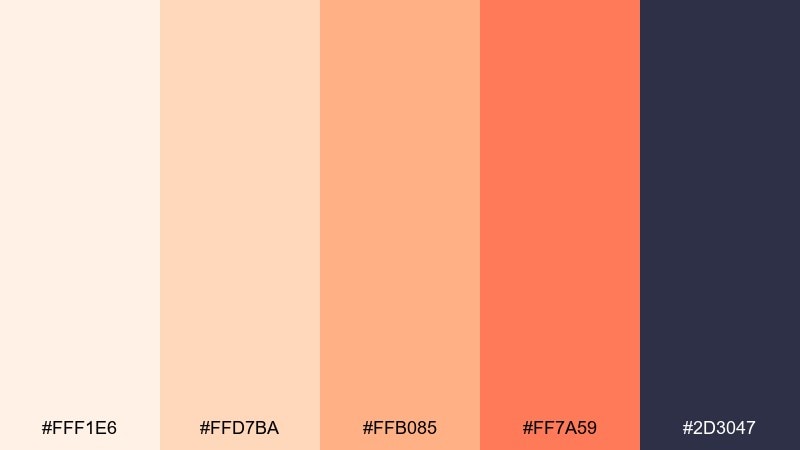
HEX: #fff1e6 #ffd7ba #ffb085 #ff7a59 #2d3047
Mood: playful, warm, modern
Best for: social media promo poster
Playful and snackable, this mix reads like peach fizz, soft cream, and a punchy sunset accent. These flat color combinations are great for social promos, creator announcements, and punchy quote graphics. Pair the coral with the deep indigo for strong type contrast, and let the pale peach carry the background. Usage tip: keep gradients off and rely on bold shapes to preserve the clean, modern feel.
Image example of peach soda generated using media.io

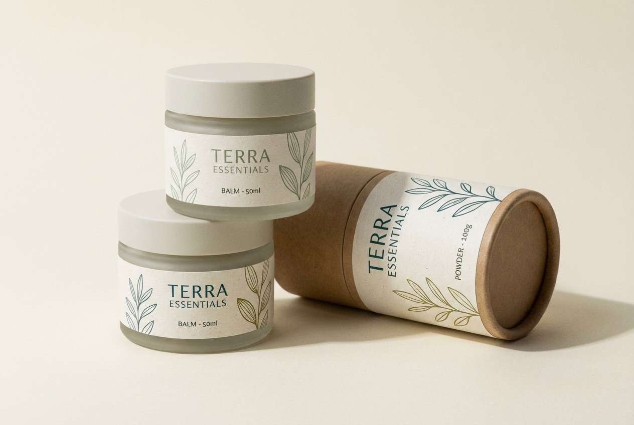
4) Forest Field Notes
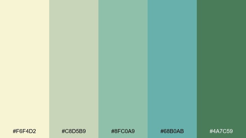
HEX: #f6f4d2 #c8d5b9 #8fc0a9 #68b0ab #4a7c59
Mood: earthy, calm, outdoorsy
Best for: eco packaging concept
Earthy and restorative, these greens feel like pressed leaves, recycled paper, and a morning hike. They fit eco packaging, sustainable product labels, and natural wellness branding. Pair with kraft textures or a clean cream backdrop to keep the look honest and breathable. Usage tip: use the darkest green for regulatory text and the mid greens for iconography to stay legible on light stock.
Image example of forest field notes generated using media.io
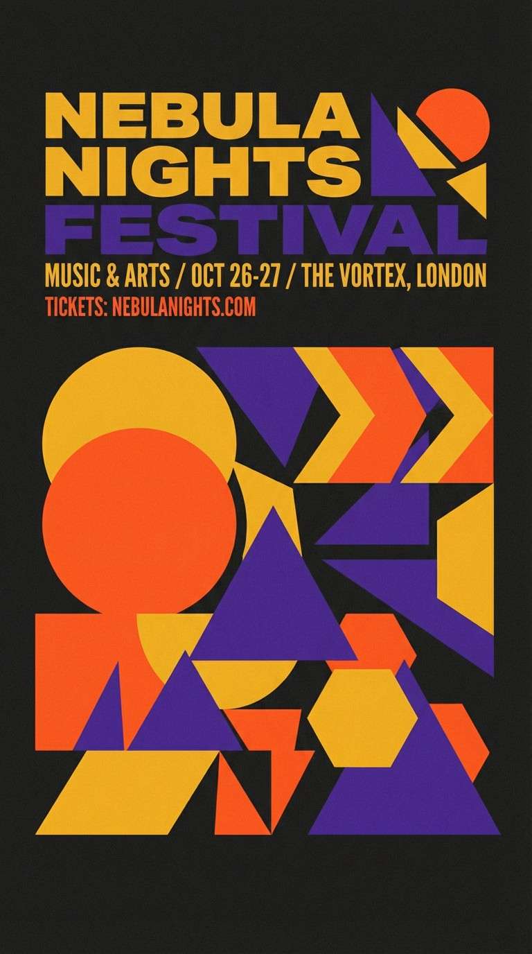
5) Night Arcade
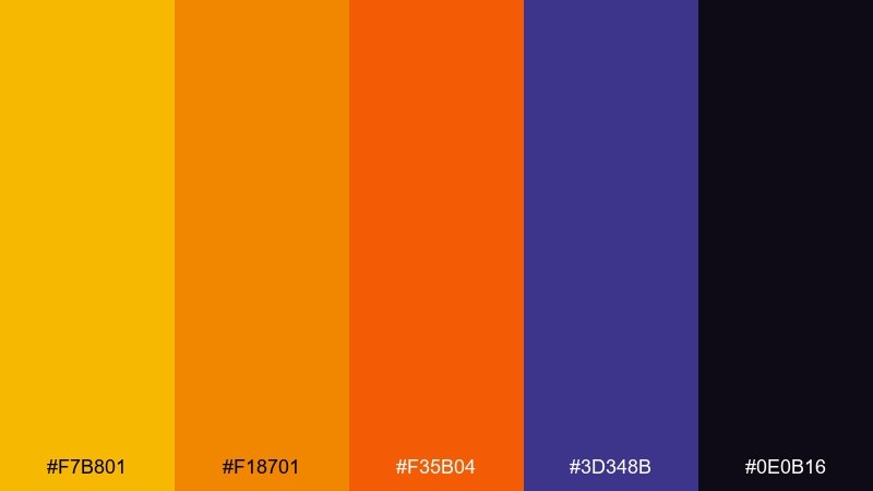
HEX: #f7b801 #f18701 #f35b04 #3d348b #0e0b16
Mood: bold, electric, dramatic
Best for: event flyer design
Electric and high-contrast, these tones evoke arcade lights, late-night snacks, and bold headlines. They work best for event flyers, club posters, and campaign graphics that need instant energy. Pair the warm oranges with the deep violet for punch, and keep black as negative space to avoid visual noise. Usage tip: limit text to two weights so the color does the heavy lifting.
Image example of night arcade generated using media.io
6) Soft Sky Office
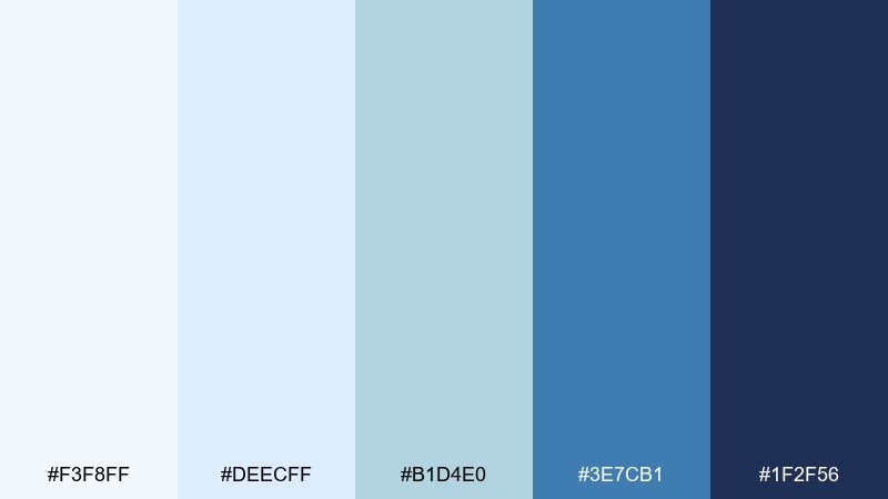
HEX: #f3f8ff #deecff #b1d4e0 #3e7cb1 #1f2f56
Mood: airy, trustworthy, calm
Best for: SaaS landing page UI
Airy and dependable, these sky blues feel like clear onboarding steps and a calm inbox. A flat color palette like this suits SaaS landing pages, feature sections, and pricing tables where trust is the main story. Pair with plenty of white space and a single navy for navigation to keep the experience anchored. Usage tip: make the mid blue your primary CTA and use the pale tints for section backgrounds to guide scrolling.
Image example of soft sky office generated using media.io

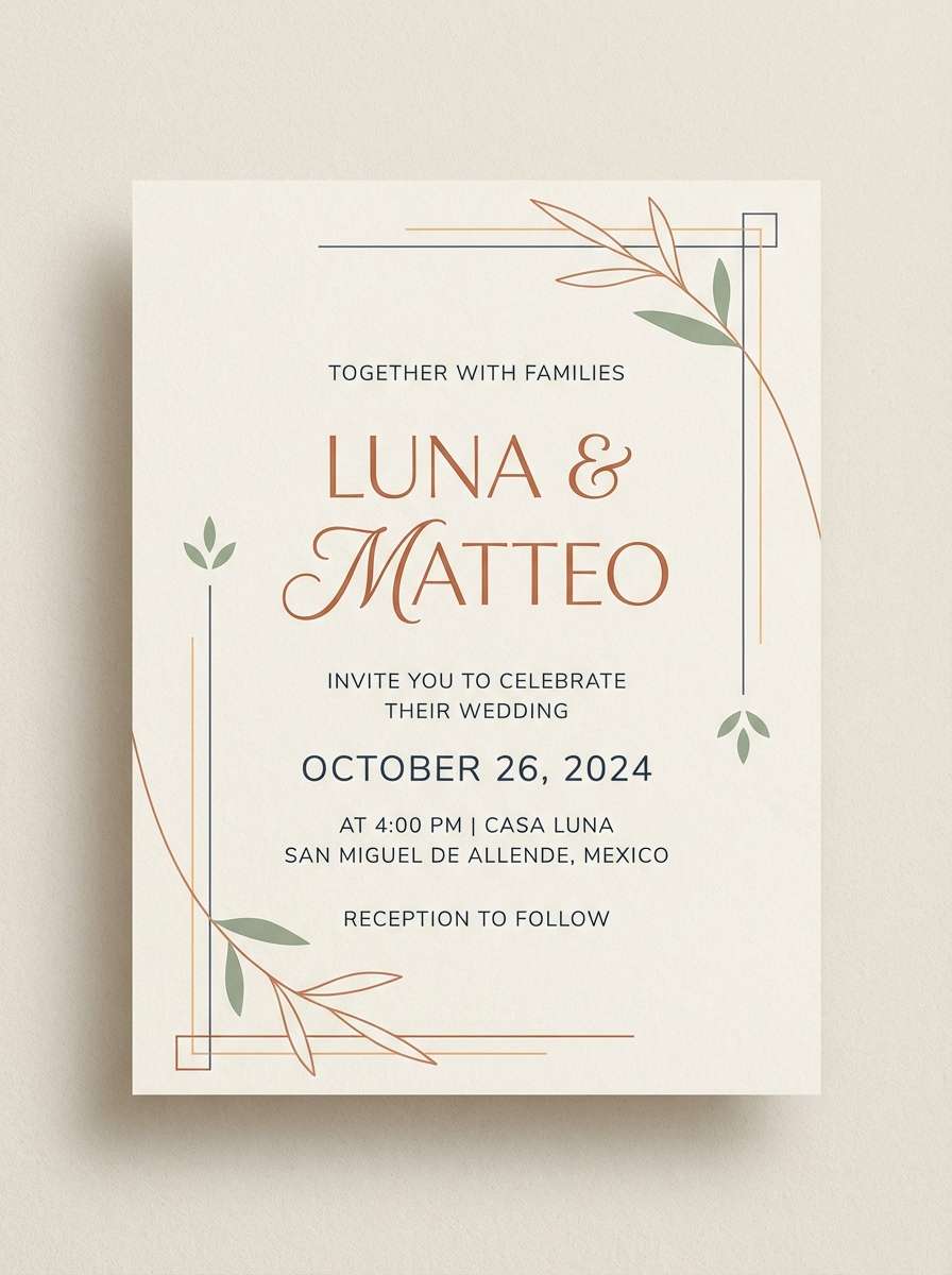
7) Desert Apricot
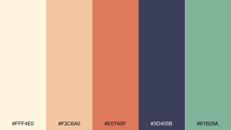
HEX: #fff4e0 #f2c6a0 #e07a5f #3d405b #81b29a
Mood: warm, artisanal, balanced
Best for: modern wedding invitation
Warm and artisanal, these tones recall sun-baked stone, apricot blush, and cool sage leaves. They are ideal for modern wedding invitations, save-the-dates, and minimal stationery suites. Pair the deep slate with cream for clean typography, then use apricot as a gentle highlight. Usage tip: keep embellishments simple, like thin lines or small icons, so the palette stays elegant rather than rustic.
Image example of desert apricot generated using media.io
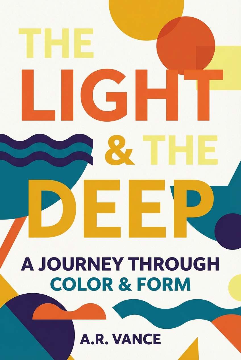
8) Citrus Library
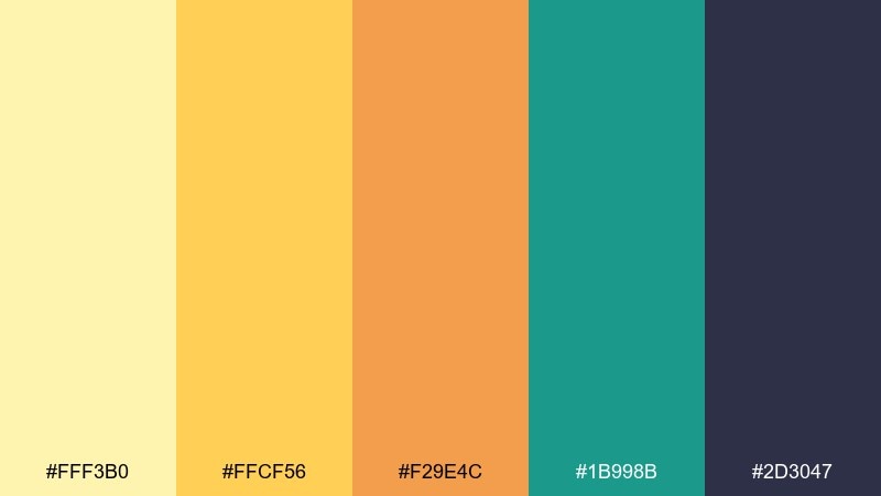
HEX: #fff3b0 #ffcf56 #f29e4c #1b998b #2d3047
Mood: smart, sunny, confident
Best for: book cover design
Smart and sunny, this set feels like highlighted pages, citrus peel, and a quiet teal underline. It works well for nonfiction book covers, course workbooks, and bold typographic jackets. Pair the inky indigo with yellow for sharp readability, and use teal as a modern counterpoint. Usage tip: keep imagery minimal and let oversized type carry the design so the colors stay crisp.
Image example of citrus library generated using media.io
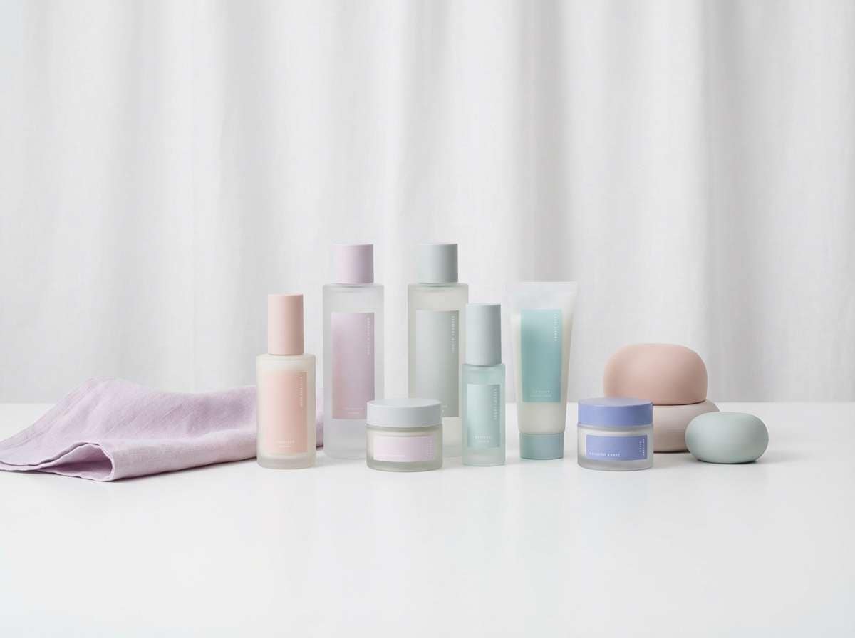
9) Lilac Bubbletea
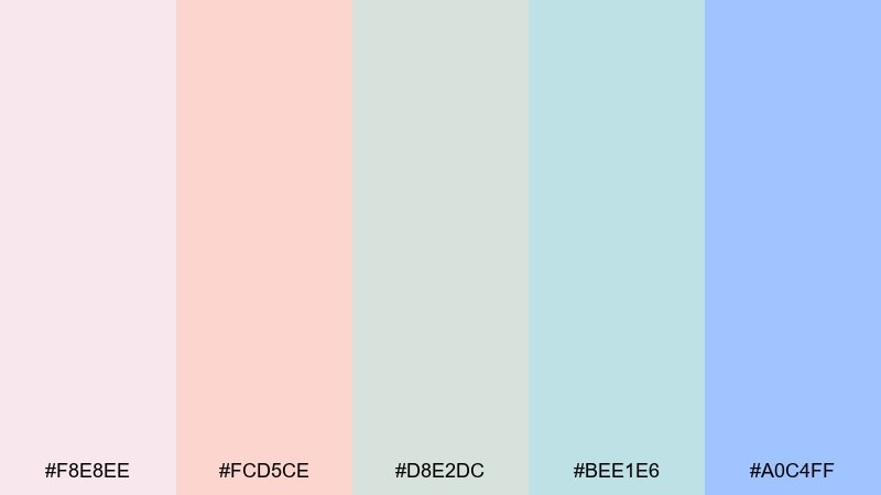
HEX: #f8e8ee #fcd5ce #d8e2dc #bee1e6 #a0c4ff
Mood: soft, cute, soothing
Best for: skincare product ad
Soft and comforting, these pastels evoke bubbletea foam, lilac sugar, and airy packaging. They suit skincare ads, gentle product launches, and wellness banners that need a calm tone. Pair with a clean white or very pale blush background and keep type light but high-contrast. Usage tip: choose one dominant pastel for the hero product and use the rest as supporting blocks to avoid a washed-out look.
Image example of lilac bubbletea generated using media.io
10) Monochrome Sprint
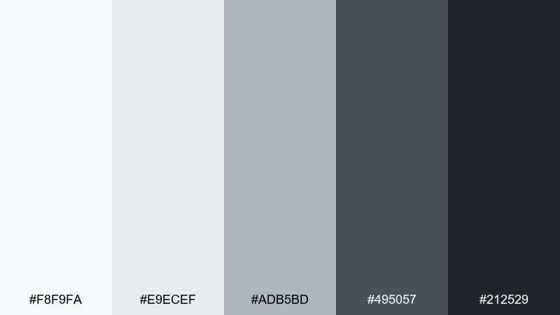
HEX: #f8f9fa #e9ecef #adb5bd #495057 #212529
Mood: minimal, fast, focused
Best for: icon set and UI components
Minimal and focused, these grays feel like a clean sprint board and a distraction-free workspace. They are perfect for icon sets, UI components, and documentation where consistency wins. Pair with a single brand accent color elsewhere in your system, and keep these neutrals for structure. Usage tip: reserve the darkest shade for text and borders, and use the lightest for surfaces to maintain accessible contrast.
Image example of monochrome sprint generated using media.io
11) Ocean Freight
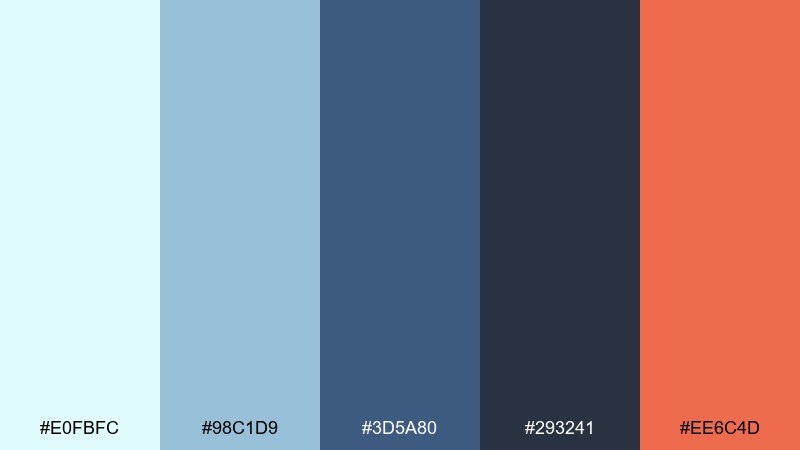
HEX: #e0fbfc #98c1d9 #3d5a80 #293241 #ee6c4d
Mood: nautical, bold, professional
Best for: presentation slide deck
Nautical and professional, these colors evoke shipping charts, cool air, and a confident coral signal. Use this flat color scheme for slide decks, reports, and keynote templates that need clarity with a bit of personality. Pair the pale aqua with deep navy for section dividers, and keep coral only for key numbers or CTAs. Usage tip: repeat the coral accent in small doses across slides to create a consistent rhythm.
Image example of ocean freight generated using media.io
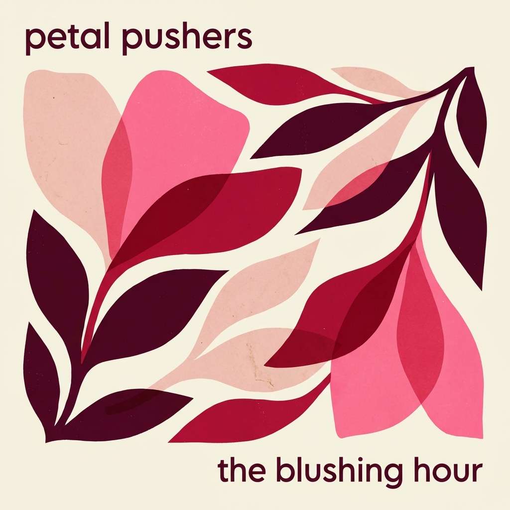
12) Sakura Night
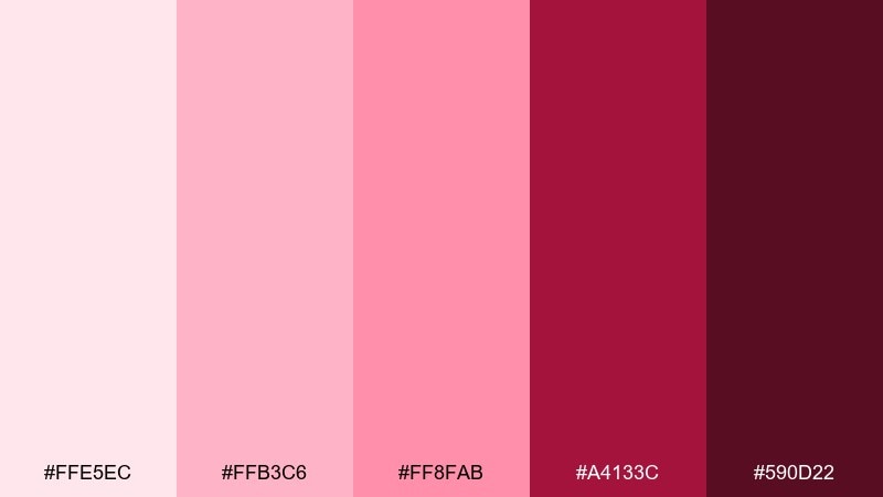
HEX: #ffe5ec #ffb3c6 #ff8fab #a4133c #590d22
Mood: romantic, dramatic, luxe
Best for: music album cover
Romantic with a dramatic edge, this palette feels like cherry blossoms under stage lights. It fits pop and R&B album covers, single art, and artist merch graphics that need a bold heart. Pair the pale pink with the deep wine shade for strong focal contrast, and keep typography simple. Usage tip: use the darkest tone as a vignette or frame to make the brighter pinks look intentional, not sugary.
Image example of sakura night generated using media.io
13) Alpine Morning
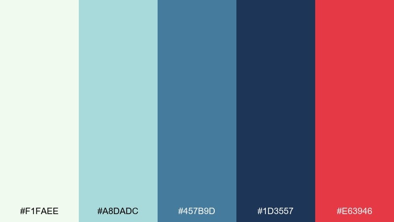
HEX: #f1faee #a8dadc #457b9d #1d3557 #e63946
Mood: crisp, adventurous, clear
Best for: travel blog hero header
Crisp and adventurous, these tones evoke cold air, glacier lakes, and a bright red trail marker. They work well for travel blog headers, destination guides, and editorial hero sections. Pair navy with the pale mint for clean readability, then use the red sparingly to point to key actions. Usage tip: keep the hero illustration simple and geometric so the colors read instantly at wide aspect ratios.
Image example of alpine morning generated using media.io

14) Terra Cotta Cafe
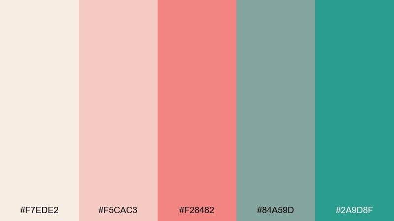
HEX: #f7ede2 #f5cac3 #f28482 #84a59d #2a9d8f
Mood: cozy, friendly, handcrafted
Best for: cafe menu design
Cozy and friendly, these colors feel like steamed milk, blush ceramics, and a mint plant on the counter. They are a strong fit for cafe menus, small business signage, and food packaging inserts. Pair the warm pinks with the cooler greens to keep the layout balanced, and use cream as breathing room. Usage tip: set prices in the deepest green so they stay readable against the softer background tones.
Image example of terra cotta cafe generated using media.io
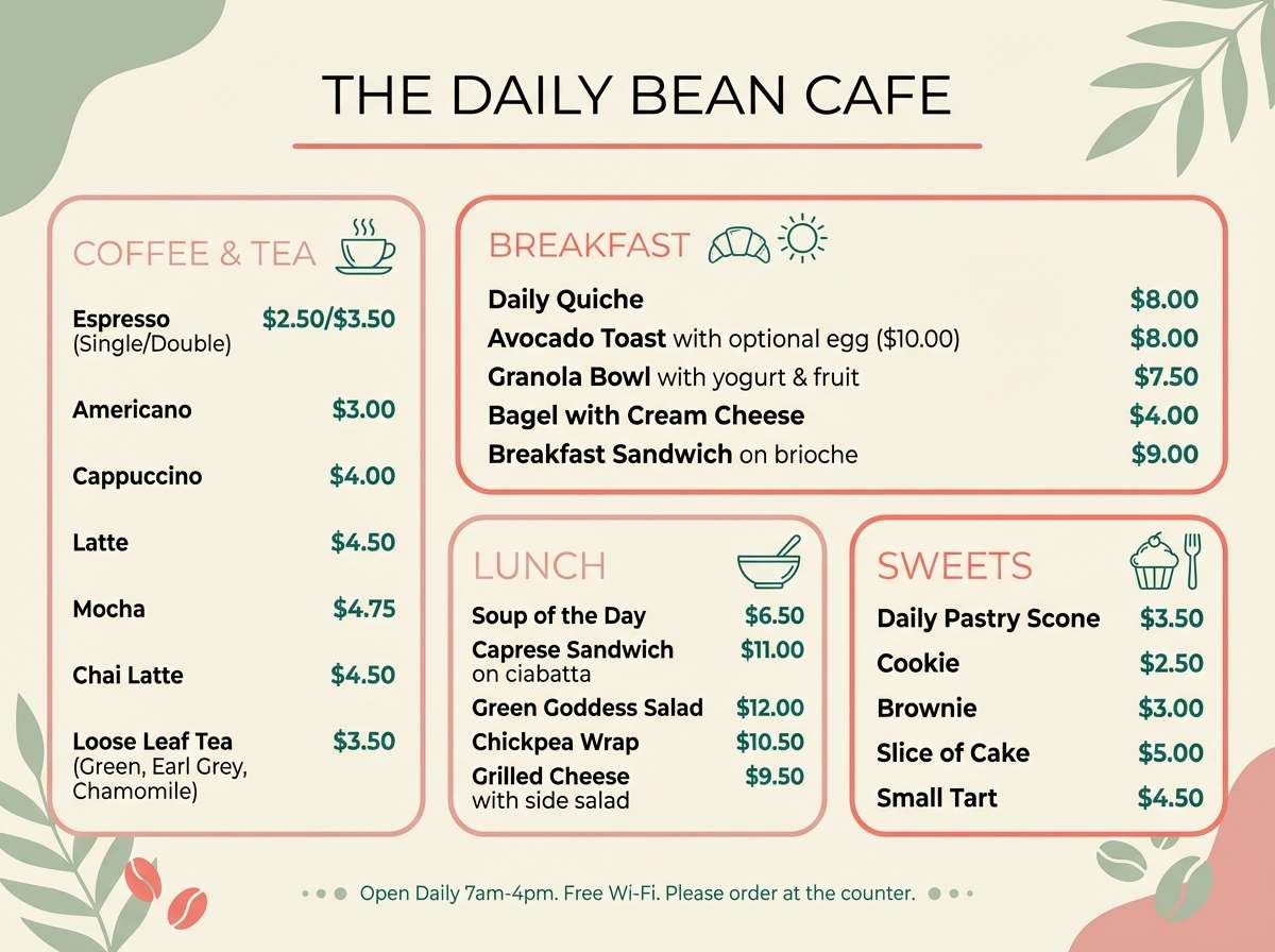
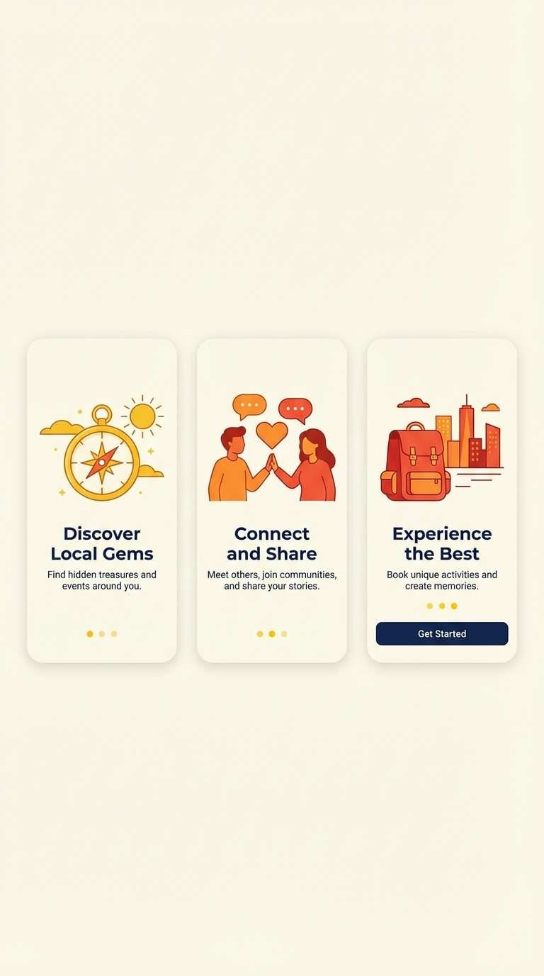
15) Retro Console
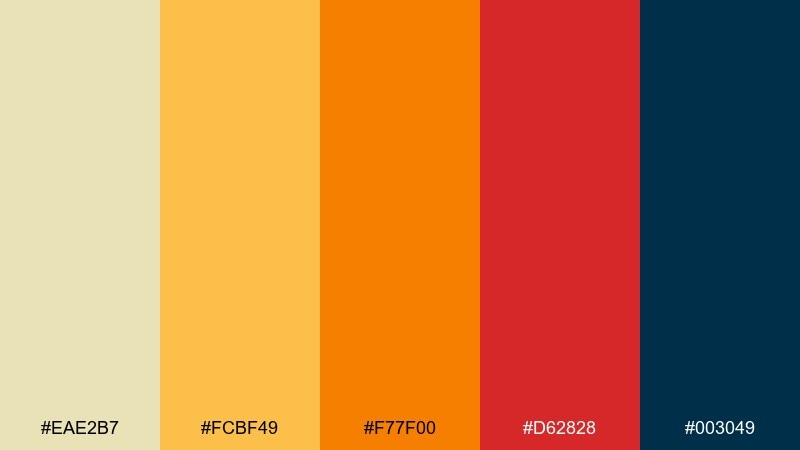
HEX: #eae2b7 #fcbf49 #f77f00 #d62828 #003049
Mood: retro, punchy, nostalgic
Best for: app onboarding screens
Retro and punchy, these tones bring to mind vintage consoles, arcade tokens, and bold screen prompts. These flat color combinations are excellent for onboarding screens where you want quick comprehension and playful momentum. Pair navy with cream for clear copy, then use orange or red for progress and highlights. Usage tip: keep illustrations simple and use consistent corner radii so the look stays cohesive across steps.
Image example of retro console generated using media.io
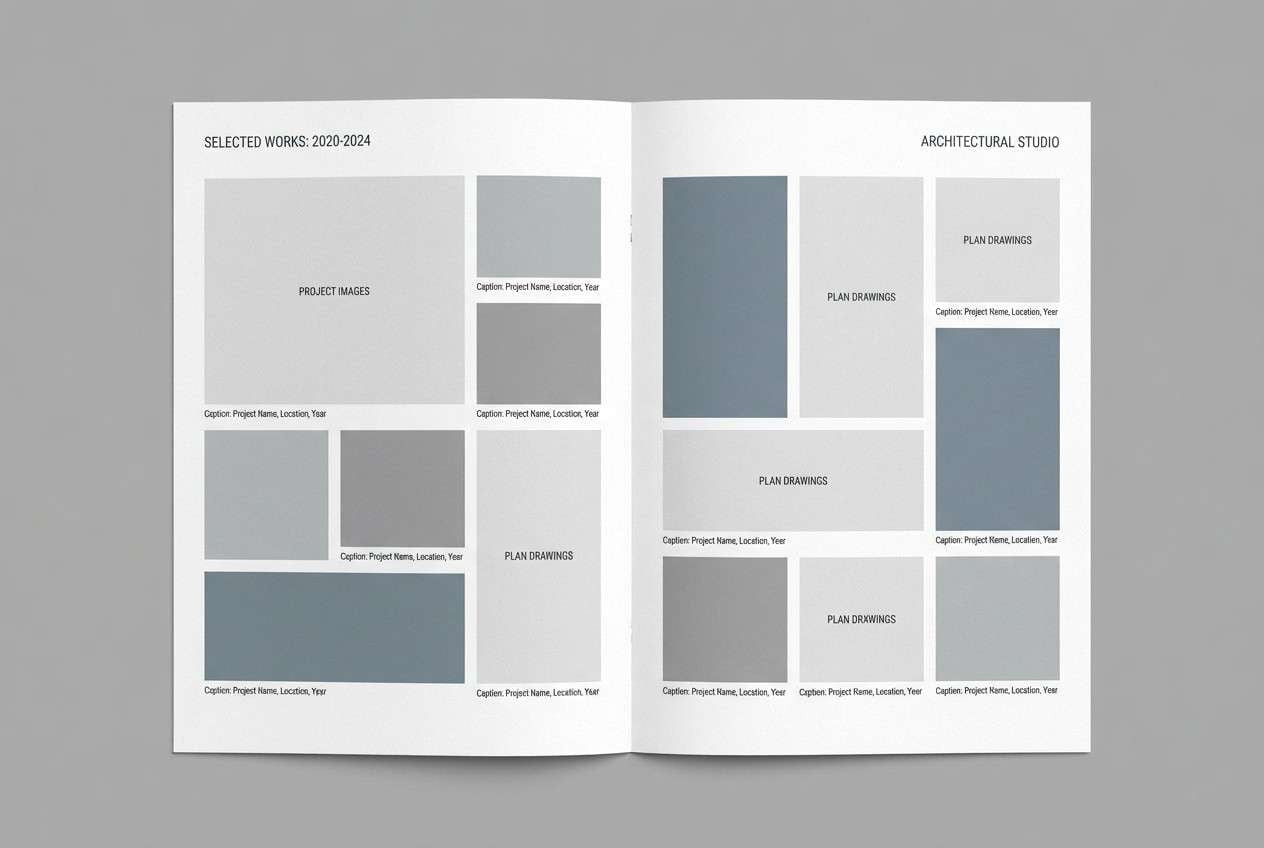
16) Cool Concrete
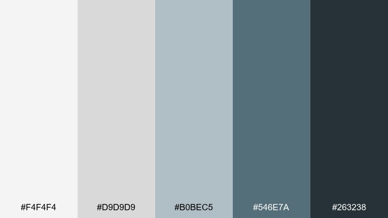
HEX: #f4f4f4 #d9d9d9 #b0bec5 #546e7a #263238
Mood: industrial, modern, understated
Best for: architecture portfolio layout
Industrial and understated, this set feels like concrete, steel, and soft overcast light. It suits architecture portfolios, case studies, and studio presentations where the work should stay center stage. Pair the darkest charcoal with lots of light gray margins, and keep the blue-gray as a subtle section cue. Usage tip: use thin rules and generous spacing instead of heavy blocks to maintain a premium, airy structure.
Image example of cool concrete generated using media.io
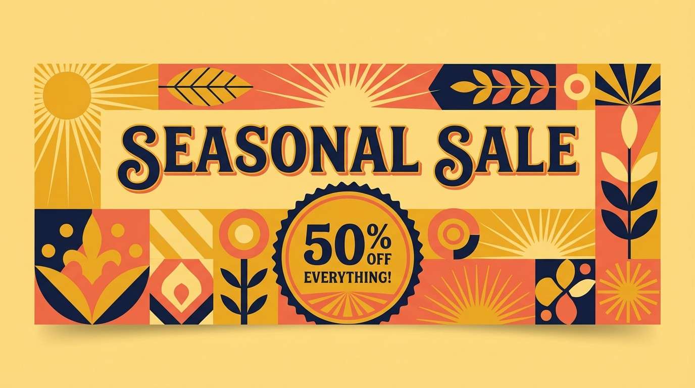
17) Autumn Market
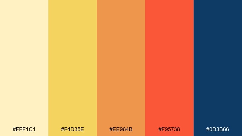
HEX: #fff1c1 #f4d35e #ee964b #f95738 #0d3b66
Mood: festive, warm, confident
Best for: seasonal sale banner
Festive and warm, these hues evoke market stalls, golden light, and a crisp navy jacket. They are great for seasonal sale banners, email headers, and retail promos that need friendly urgency. Pair the navy with yellow for high contrast and keep orange for badges or discount tags. Usage tip: avoid using all warm tones at once in large areas; let one warm color dominate and use the others as accents.
Image example of autumn market generated using media.io
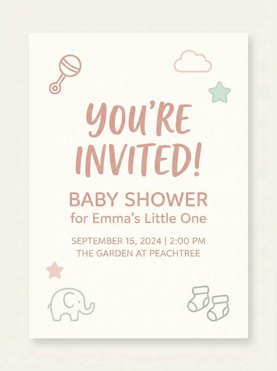
18) Ice Cream Parlor
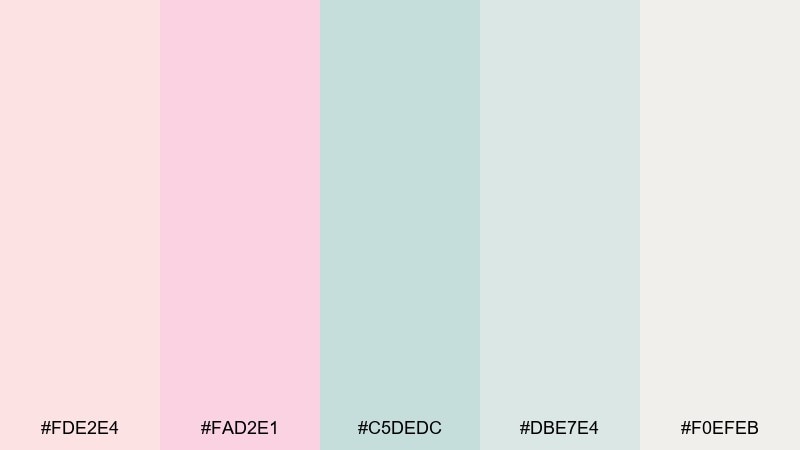
HEX: #fde2e4 #fad2e1 #c5dedc #dbe7e4 #f0efeb
Mood: sweet, light, airy
Best for: baby shower invitation
Sweet and airy, these pastel creams and mints feel like scoops in a chilled glass case. They fit baby shower invitations, soft announcements, and gentle party stationery. Pair with simple serif or rounded sans type and keep backgrounds mostly cream for readability. Usage tip: add a single darker text color, like charcoal, so the delicate tones do not reduce legibility.
Image example of ice cream parlor generated using media.io
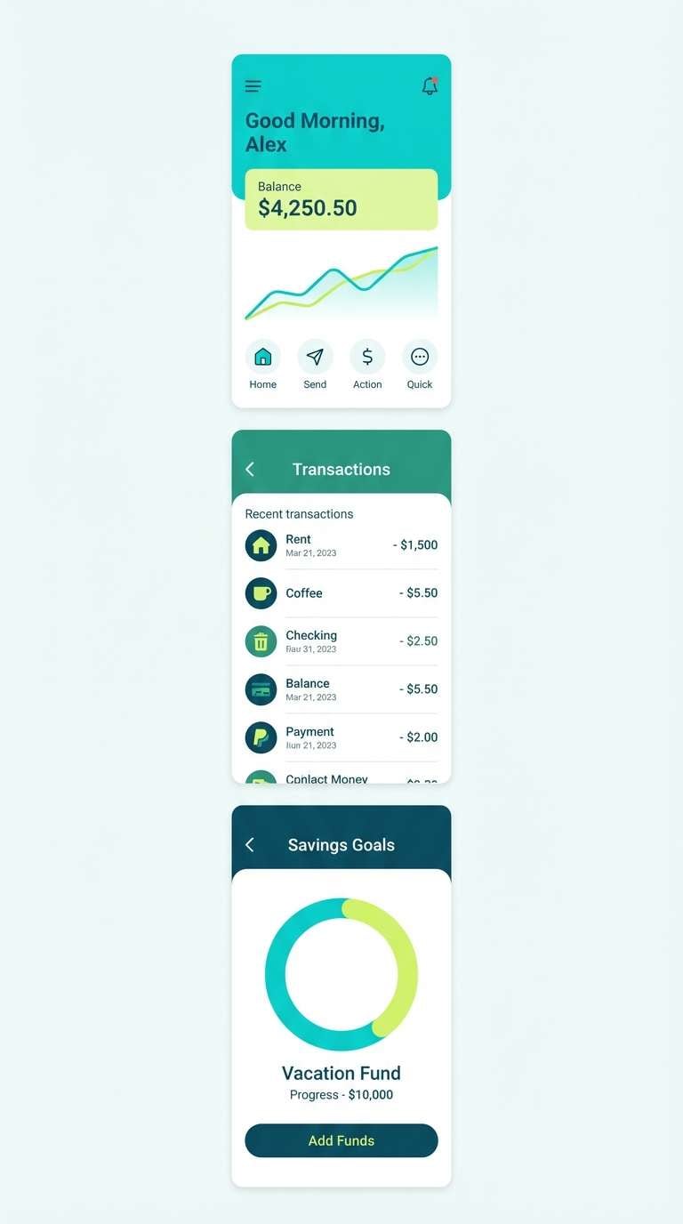
19) Galaxy Cutout
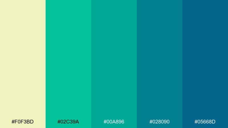
HEX: #f0f3bd #02c39a #00a896 #028090 #05668d
Mood: futuristic, clean, oceanic
Best for: fintech mobile UI
Futuristic and oceanic, these teals feel like a glowing dashboard in a dark room. They are a strong fit for fintech mobile UI, wallet screens, and security flows where clarity builds trust. Pair the pale lime as a highlight color and keep deeper teal for navigation and charts. Usage tip: use the brightest green-teal only for success states to make feedback instantly recognizable.
Image example of galaxy cutout generated using media.io
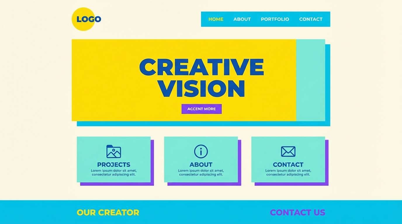
20) Sunlit Studio
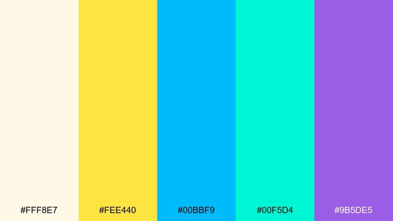
HEX: #fff8e7 #fee440 #00bbf9 #00f5d4 #9b5de5
Mood: creative, upbeat, modern
Best for: creator portfolio homepage
Upbeat and creative, these colors look like sunlight on a desk with bright markers nearby. They work well for creator portfolios, agency homepages, and playful personal brands. Pair the warm yellow with plenty of cream so it does not overwhelm, and use violet for buttons or key links. Usage tip: choose two dominant colors per section and keep the rest as small accents to avoid a noisy page.
Image example of sunlit studio generated using media.io
What Colors Go Well with Flat?
Flat color palettes pair best with clear neutrals (white, warm off-white, light gray, charcoal) because they preserve the clean, graphic look and keep contrast predictable.
Try a “one-hero + one-accent” approach: pick a dominant flat tone for large surfaces, then a single high-energy accent for CTAs, badges, or key numbers. This keeps the system modern instead of noisy.
If you need more depth without gradients, use a stepped ramp (light, mid, dark) of the same hue, plus one contrasting accent (like coral against navy or teal against orange).
How to Use a Flat Color Palette in Real Designs
Assign roles to each color before designing: background/surface, primary action, secondary action, text, and borders. Flat colors feel intentional when every tone has a job.
For UI, keep the lightest tones for surfaces and reserve your darkest color for text and dividers to protect accessibility. For print and posters, use large flat shapes and fewer type styles so the palette stays sharp.
To avoid a “toy-like” look, limit saturated colors to small areas and let softer tints handle most of the canvas—especially in modern branding and website layouts.
Create Flat Palette Visuals with AI
Need a quick mockup that matches your flat design palette? Generate consistent visuals (posters, UI screens, covers, packaging) by reusing a prompt style and swapping only the color cues.
With Media.io, you can paste the prompts above, tweak the aspect ratio, and create a set of cohesive images that match your brand system—without starting from scratch each time.
Once you like a result, save the prompt as a template so future assets stay consistent across campaigns, pages, and platforms.
Flat Color Palette FAQs
-
What is a flat color palette?
A flat color palette uses solid, unshaded colors (no gradients or heavy textures) to create a clean, modern look for UI, branding, and print. -
Are flat colors good for UI design?
Yes—flat colors make hierarchy and states easier to read. They’re also simpler to systemize (tokens for surfaces, text, borders, and CTAs) across components. -
How many colors should a flat palette have?
Most designs work well with 4–6 colors: 1–2 neutrals, 1 primary, 1 accent, and optional supporting tones for backgrounds or charts. -
How do I keep flat palettes accessible?
Use your darkest color for text, keep backgrounds light, and test contrast for buttons and links. Flat design relies on contrast and spacing, so readability is critical. -
Can I use flat palettes for print materials?
Absolutely. Flat colors are great for posters, flyers, and stationery because they reproduce cleanly and stay sharp with bold shapes and typography. -
What’s the difference between flat design and minimal design?
Flat design is a visual style focused on solid colors and simplified shapes. Minimal design is a broader approach about using fewer elements—flat colors often support minimal layouts, but they’re not the same thing. -
How can I generate flat-style mockups quickly?
Use AI image generation with prompts that specify “vector,” “2d,” “flat,” “no photography,” and a clear aspect ratio. You can reuse the prompts in this article inside Media.io to produce consistent visuals.
Next: Dandelion Color Palette


