

A haunted mansion palette lives in the in-between: candlelight vs. shadow, velvet vs. dust, old gold vs. soot. These color combinations feel cinematic because they’re built on low-key neutrals with a few carefully chosen accents.
Below are 20+ haunted mansion color palette ideas with HEX codes, plus practical use-cases for branding, UI, posters, packaging, and interiors.
In this article
- Why Haunted Mansion Palettes Work So Well
-
- candlelit velvet
- foggy stone hall
- tarnished brass and ash
- widows ink
- crypt moss
- dusty lilac drapes
- ravenwood library
- moonlit marble
- bloodwine brocade
- antique portrait frame
- thundercloud corridor
- bone candlewax
- midnight teal paneling
- soot and silver filigree
- haunted rose garden
- chapel stained glass
- cobweb lace
- poison apple parlor
- spectral blue smoke
- basement coal and amber
- ectoplasm mint dust
- attic sepia whisper
- What Colors Go Well with Haunted Mansion?
- How to Use a Haunted Mansion Color Palette in Real Designs
- Create Haunted Mansion Palette Visuals with AI
Why Haunted Mansion Palettes Work So Well
Haunted mansion color palettes feel immersive because they’re built on deep bases (near-black, charcoal, ink, espresso) that instantly signal mystery and age. That low-light foundation gives even simple layouts a dramatic, story-first mood.
They also rely on “material colors” rather than bright primaries: tarnished brass, candlewax cream, smoke gray, dusty lilac, worn leather. Those tones imply texture and history, which is why they work for gothic branding, dark academia, and vintage-inspired UI.
Most importantly, these palettes use restraint. One or two accents (gold, amber, wine, misty blue) become the visual “candle flame,” guiding attention to titles, buttons, or key details without breaking the atmosphere.
20+ Haunted Mansion Color Palette Ideas (with HEX Codes)
1) Candlelit Velvet
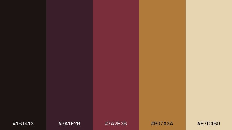
HEX: #1b1413 #3a1f2b #7a2e3b #b07a3a #e7d4b0
Mood: opulent, ominous, warm
Best for: luxury halloween event poster
Opulent shadows and velvet warmth evoke candle flames flickering over antique drapery. Use the deep wine and near-black as your base, then let the brass-gold carry headlines and borders. Pair it with subtle paper grain to keep the glow believable. Tip: reserve the cream tone for small highlights so the poster feels lit, not pastel.
Image example of candlelit velvet generated using media.io
Media.io is an online AI studio for creating and editing video, image, and audio in your browser.

2) Foggy Stone Hall
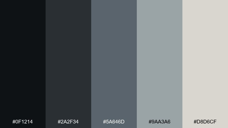
HEX: #0f1214 #2a2f34 #5a646d #9aa3a6 #d8d6cf
Mood: cold, quiet, cinematic
Best for: horror game menu UI
Cold fog and worn stone read like an empty corridor where sound disappears. Build your layout with charcoal panels and steel-gray separators, then use the pale stone for text contrast. This set stays clean even at small sizes, so it works well for settings screens and overlays. Tip: add a soft gradient behind key buttons to mimic mist without reducing legibility.
Image example of foggy stone hall generated using media.io
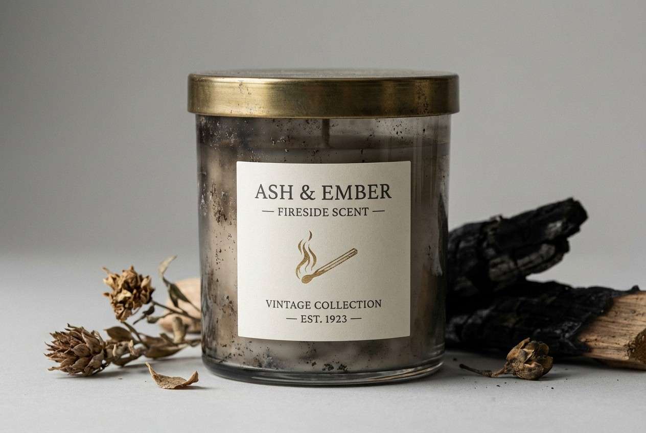
3) Tarnished Brass and Ash
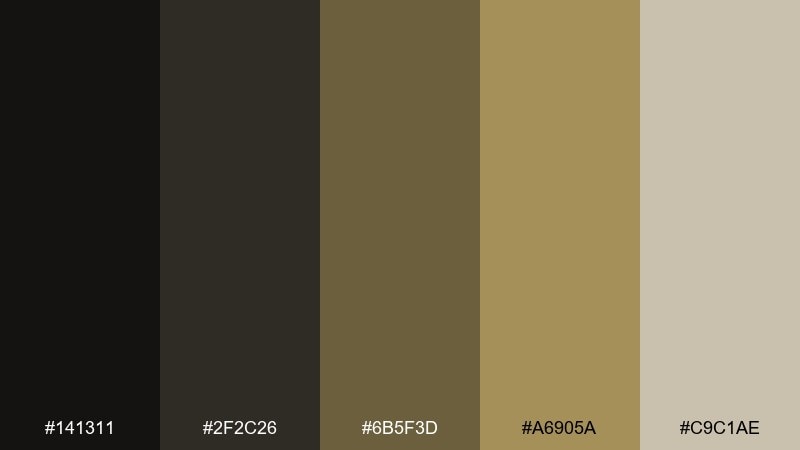
HEX: #141311 #2f2c26 #6b5f3d #a6905a #c9c1ae
Mood: aged, stately, smoky
Best for: vintage candle packaging
Aged brass against ash tones suggests old sconces, smoke, and timeworn frames. Let the dark soot shades set a premium base, then add the tarnished gold for stamps, lids, or foil details. The warm greige keeps everything readable without breaking the mood. Tip: use the brass only in small areas so it feels like patina, not glitter.
Image example of tarnished brass and ash generated using media.io
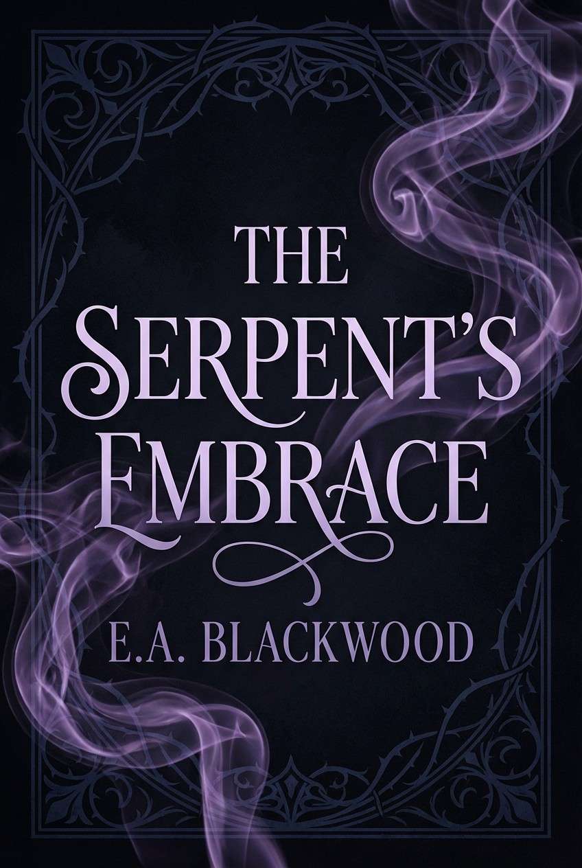
4) Widows Ink
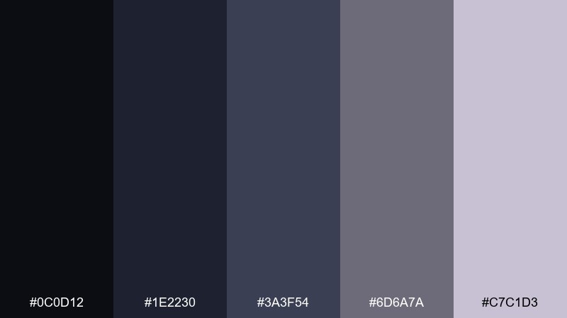
HEX: #0c0d12 #1e2230 #3a3f54 #6d6a7a #c7c1d3
Mood: mysterious, refined, nocturnal
Best for: dark romance book cover
Nocturnal ink and muted lavender feel like letters written at midnight beside a rain-streaked window. Use the near-black and navy for background depth, then let the smoky violet shape typography and ornaments. This pairing is perfect for serif titles, illustrated silhouettes, and subtle emboss effects. Tip: keep the light lilac for author name or small flourishes to avoid washing out the drama.
Image example of widows ink generated using media.io
5) Crypt Moss
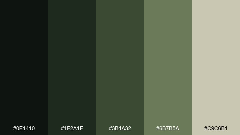
HEX: #0e1410 #1f2a1f #3b4a32 #6b7b5a #c9c6b1
Mood: earthy, damp, uncanny
Best for: haunted house brand logo and labels
Damp earth and creeping moss bring an uncanny calm, like stone steps reclaimed by green. As a haunted mansion color palette, it shines when you keep the blacks and deep greens dominant and let the sage act as secondary type. Pair it with rough paper stock or a stamped mark to reinforce the organic decay. Tip: choose one green for your logo mark and keep the rest for background texture and UI states.
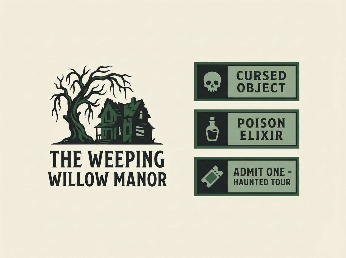
Image example of crypt moss generated using media.io
6) Dusty Lilac Drapes
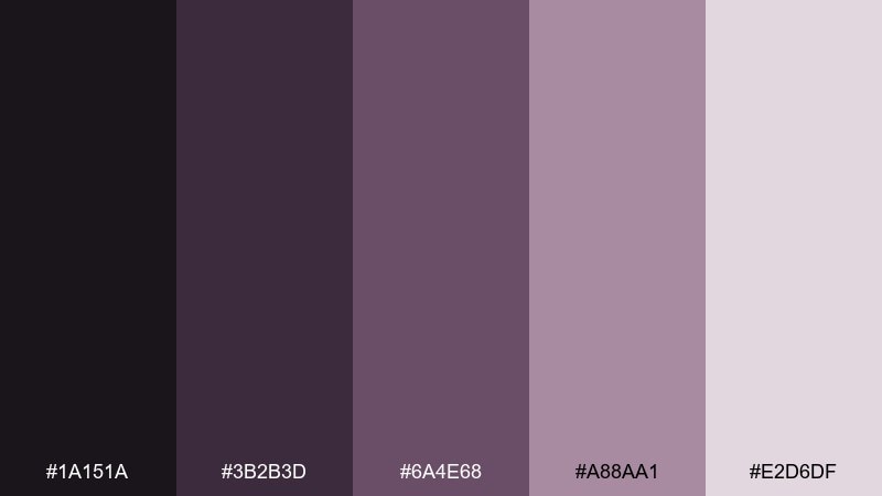
HEX: #1a151a #3b2b3d #6a4e68 #a88aa1 #e2d6df
Mood: faded, theatrical, romantic
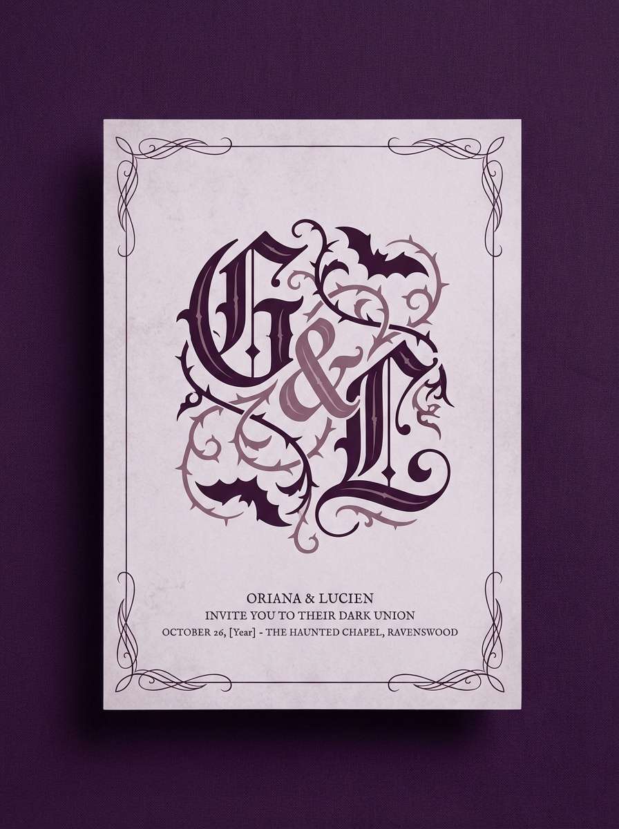
Best for: gothic wedding invitation
Faded lilac and plum feel like old stage curtains pulled back in a silent ballroom. Use the darkest tones for text and monograms, then layer the dusty mauve as a soft background wash. A delicate border or filigree detail looks especially elegant in this range. Tip: print the pale lavender as the paper base and use rich plum ink for crisp readability.
Image example of dusty lilac drapes generated using media.io
7) Ravenwood Library
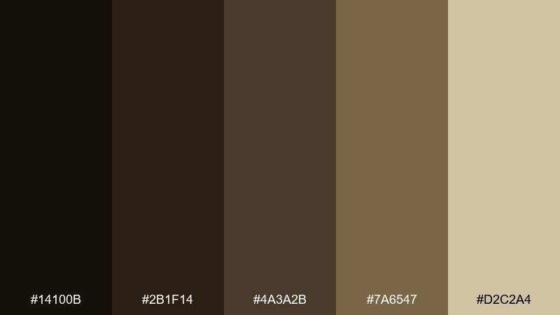
HEX: #14100b #2b1f14 #4a3a2b #7a6547 #d2c2a4
Mood: scholarly, shadowy, warm
Best for: dark academia editorial spread
Shadowy woods and worn leather read like a library where the air smells of dust and ink. Anchor the layout in espresso and bark brown, then use the parchment tone for pull quotes and margins. These tones work beautifully with serif fonts, small caps, and subtle rule lines. Tip: keep imagery warm and low-contrast so the page feels archival, not modern.
Image example of ravenwood library generated using media.io

8) Moonlit Marble
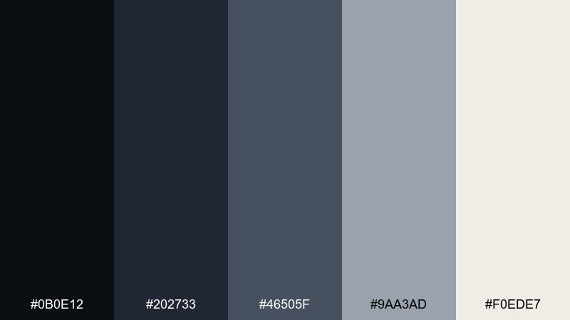
HEX: #0b0e12 #202733 #46505f #9aa3ad #f0ede7
Mood: elegant, chilly, modern
Best for: minimal website hero section
Chilly moonlight on polished marble feels sleek, quiet, and slightly unsettling. Use the midnight navy for your header and footer, then keep content areas in soft stone to maintain a premium look. This palette supports modern typography and thin-line icons without losing atmosphere. Tip: add one high-contrast call-to-action button in the palest tone to guide attention.
Image example of moonlit marble generated using media.io

9) Bloodwine Brocade
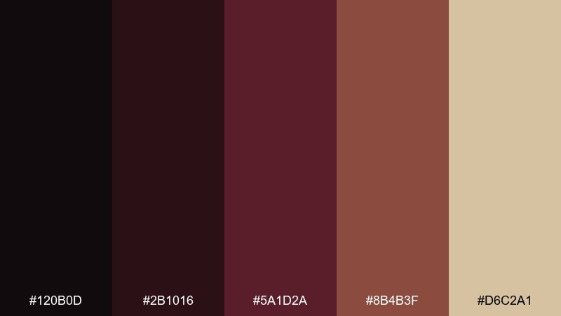
HEX: #120b0d #2b1016 #5a1d2a #8b4b3f #d6c2a1
Mood: dramatic, baroque, intense
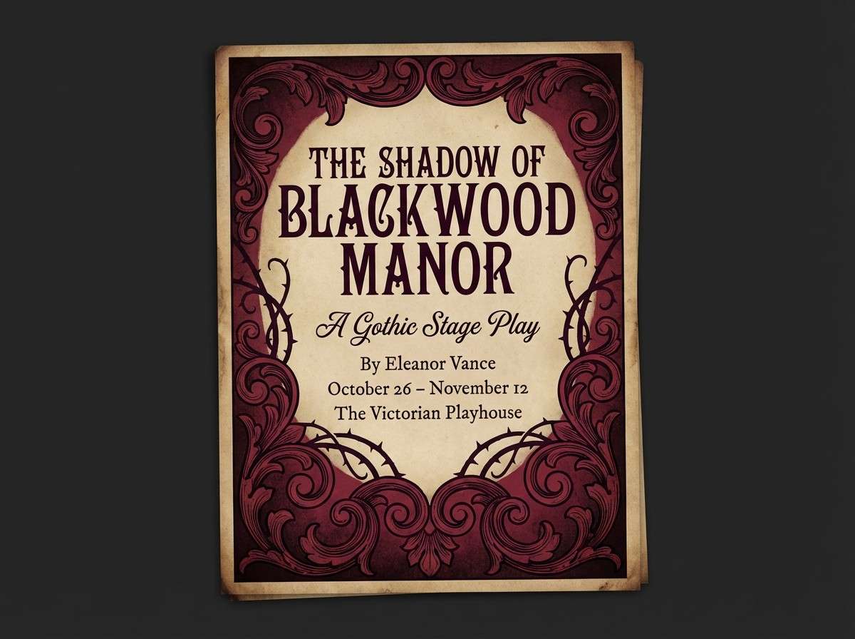
Best for: theater flyer for a gothic play
Dramatic bloodwine and brocade warmth evoke velvet seats, heavy curtains, and whispered secrets. These haunted mansion color combinations work best when the darkest tones take over the background and the copper-brown supports secondary text. Bring in the parchment beige as a spotlight for dates and ticket info. Tip: keep decorative flourishes thin so the deep reds stay the main event.
Image example of bloodwine brocade generated using media.io
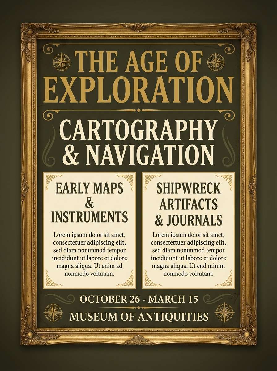
10) Antique Portrait Frame
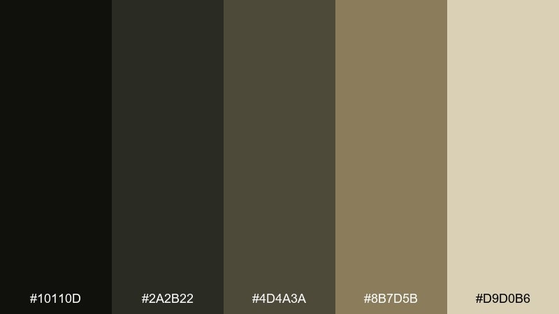
HEX: #10110d #2a2b22 #4d4a3a #8b7d5b #d9d0b6
Mood: vintage, muted, dignified
Best for: museum style exhibit poster
Muted olives and antique gold feel like a portrait frame catching low gallery light. Use the dark olive as the typographic anchor and let the brass tone define borders, seals, or section headers. The warm ivory keeps the design readable while still looking aged. Tip: add a slight vignette around the edges to mimic old paper without heavy texture.
Image example of antique portrait frame generated using media.io
11) Thundercloud Corridor
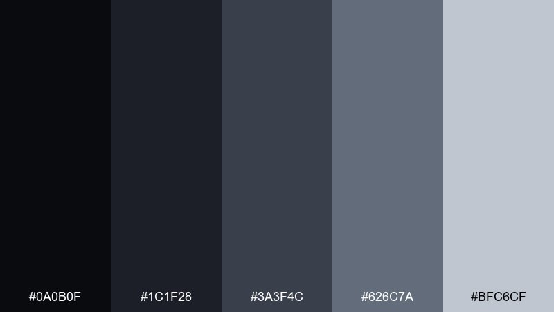
HEX: #0a0b0f #1c1f28 #3a3f4c #626c7a #bfc6cf
Mood: stormy, tense, sleek
Best for: streaming thumbnail template
Stormy grays and blue-black shadows feel like thunder building at the end of a long hallway. Use the darkest tones for the background and the cloud gray for bold, high-contrast titles. This set is reliable for thumbnails because it reads well even when small. Tip: add a single bright highlight only on the main word to avoid turning the whole card into flat gray.
Image example of thundercloud corridor generated using media.io

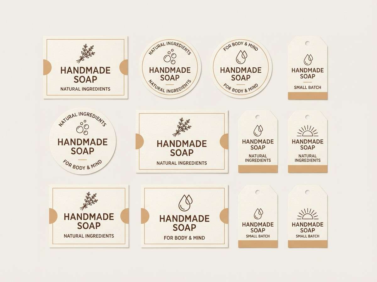
12) Bone Candlewax
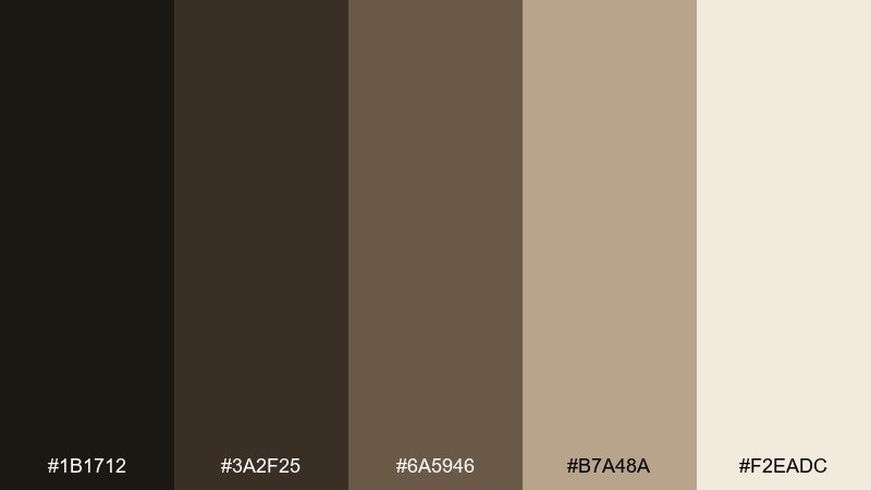
HEX: #1b1712 #3a2f25 #6a5946 #b7a48a #f2eadc
Mood: cozy, eerie, nostalgic
Best for: handmade soap label set
Warm bone and candlewax tones suggest drips on an old candlestick and the comfort of dim light. Build labels with the cream as your base, then use cocoa browns for type and icons. The mid tan adds warmth without pushing into orange. Tip: keep your illustrations simple line art so the label still feels artisanal and readable.
Image example of bone candlewax generated using media.io
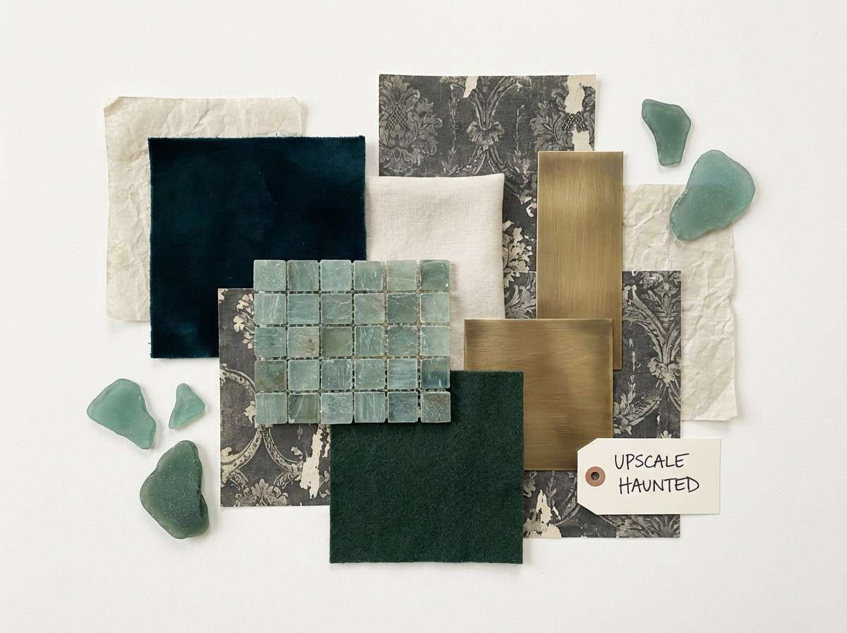
13) Midnight Teal Paneling
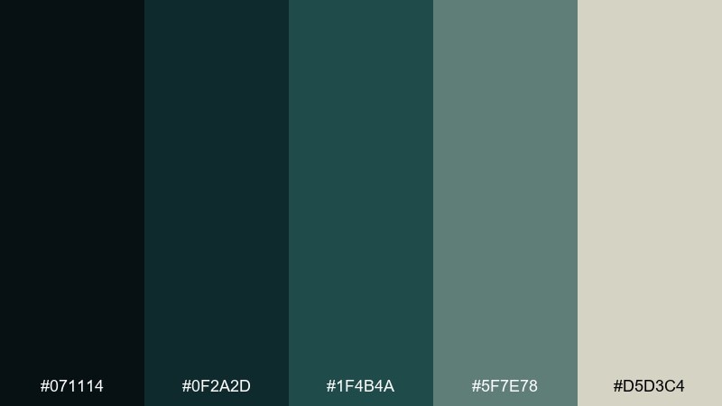
HEX: #071114 #0f2a2d #1f4b4a #5f7e78 #d5d3c4
Mood: aquatic, haunted, upscale
Best for: boutique hotel lobby moodboard
Deep teal paneling with misty sage hints at a grand house near the sea, quiet but watchful. Use the darkest teal for walls or large blocks, then lighten with the sea-glass green in textiles and accents. The soft bone tone keeps the room from feeling too heavy. Tip: pair with brushed brass hardware for contrast without adding more colors.
Image example of midnight teal paneling generated using media.io
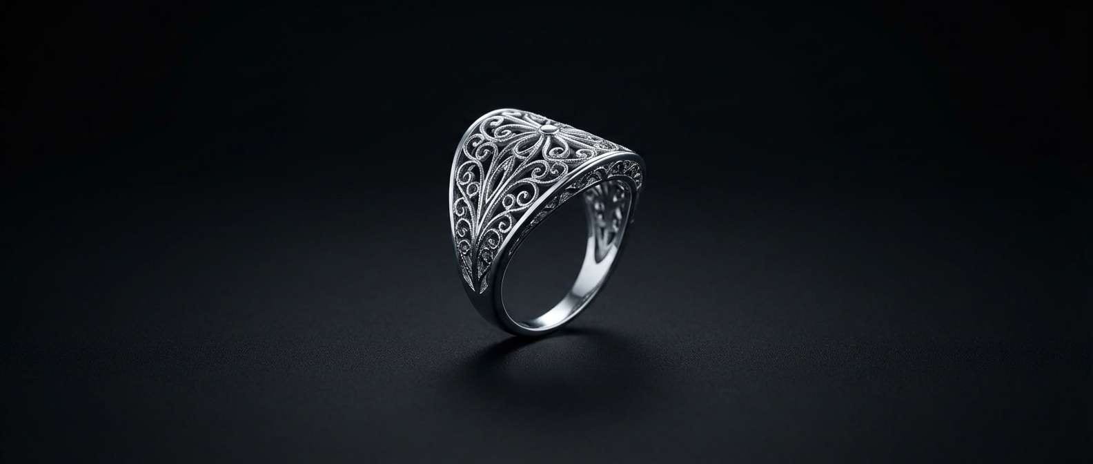
14) Soot and Silver Filigree
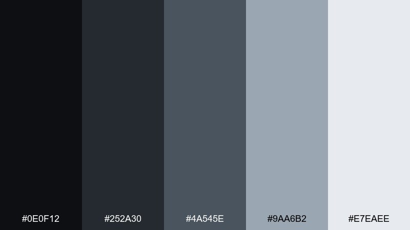
HEX: #0e0f12 #252a30 #4a545e #9aa6b2 #e7eaee
Mood: ornate, cold, polished
Best for: jewelry product ad banner
Polished silver against soot shadows feels like filigree catching a flash of lightning. Keep the background deep and matte, then let the silver-blue grays carry the product edges and fine details. This range works well for luxury ads where contrast should be crisp, not colorful. Tip: use the lightest tone as a thin rim light to make metal pop without blowing highlights.
Image example of soot and silver filigree generated using media.io
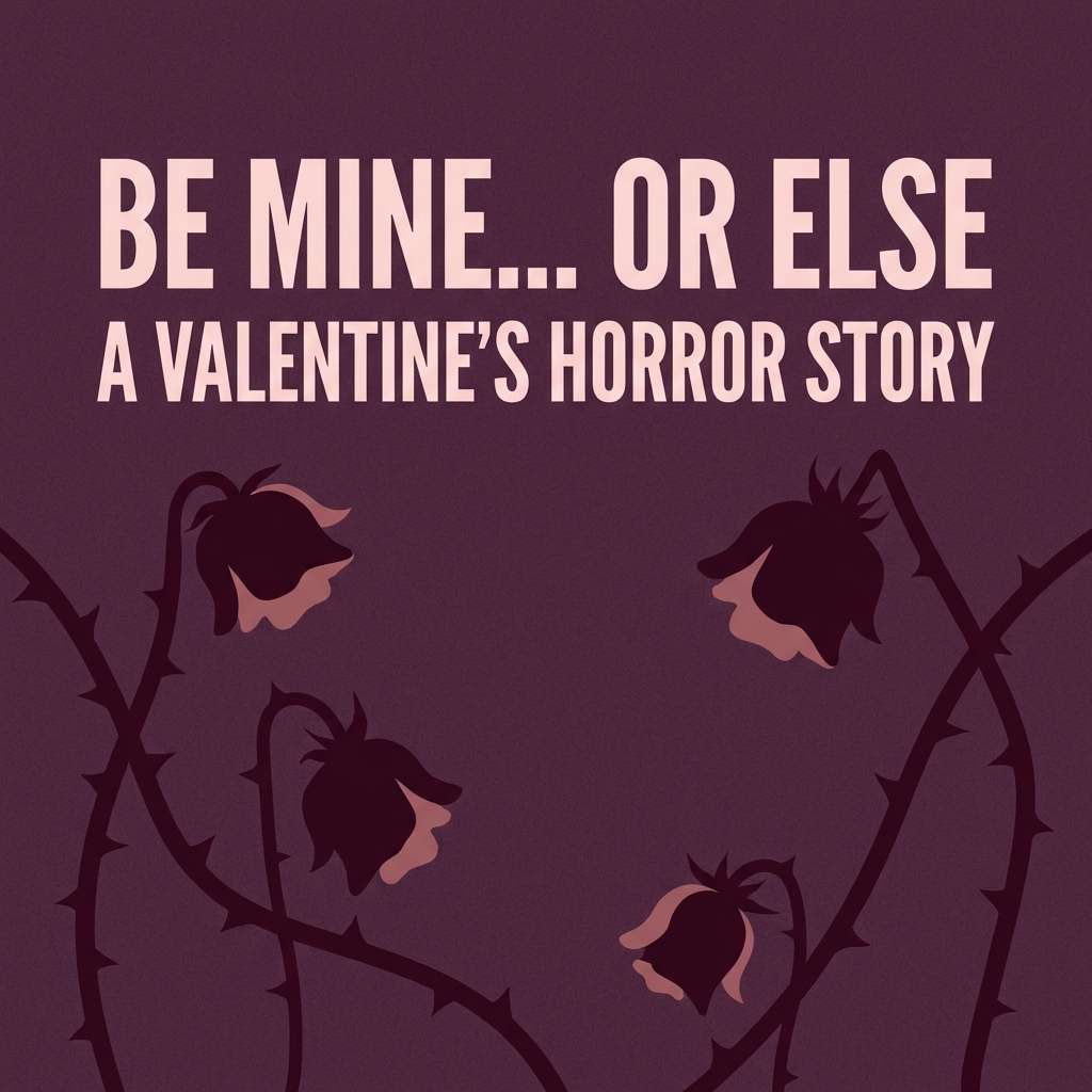
15) Haunted Rose Garden
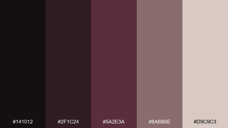
HEX: #141012 #2f1c24 #5a2e3a #8a6b6e #d9c9c3
Mood: romantic, wilted, dreamy
Best for: valentines horror social post
Wilted roses and dusty blush create a dreamy romance with a dark edge. As a haunted mansion color palette, it works best when the near-black plum frames the design and the soft rose is used for typography or small shapes. Pair it with grainy gradients and subtle floral silhouettes. Tip: avoid pure white text and choose the pale blush instead to keep the mood soft and eerie.
Image example of haunted rose garden generated using media.io
16) Chapel Stained Glass
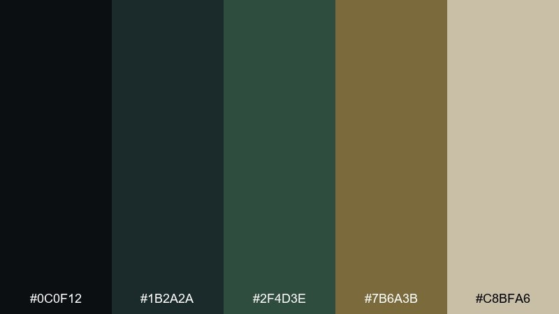
HEX: #0c0f12 #1b2a2a #2f4d3e #7b6a3b #c8bfa6
Mood: sacred, moody, vintage
Best for: album cover for dark folk music
Sacred shadows and stained-glass greens feel like a chapel tucked inside an old estate. Use the deep green and charcoal for the main fields, then add muted gold as a halo accent around the title. The warm parchment keeps small text readable without breaking the vintage vibe. Tip: a subtle geometric window motif ties the whole cover together without extra imagery.
Image example of chapel stained glass generated using media.io
17) Cobweb Lace
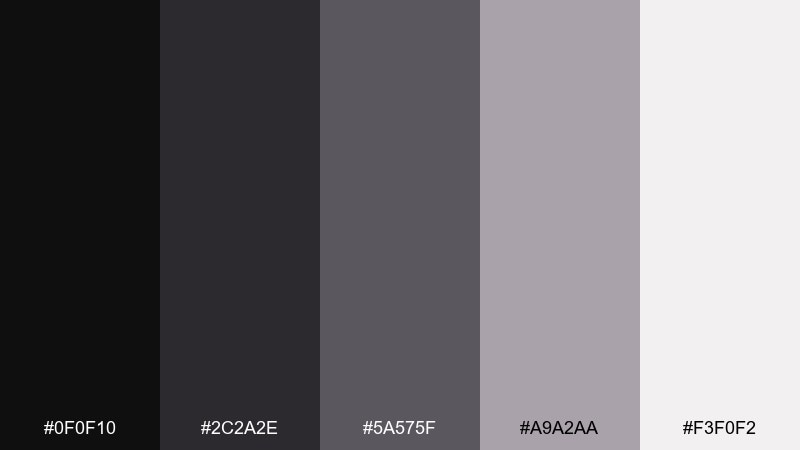
HEX: #0f0f10 #2c2a2e #5a575f #a9a2aa #f3f0f2
Mood: delicate, eerie, minimal
Best for: fashion lookbook layout
Delicate grays and soft whites evoke lace, cobwebs, and a hush of dust in the air. Use the near-black for headlines and the pale tones for generous negative space and clean grids. This palette supports modern fashion photography without competing for attention. Tip: keep accent lines thin and consistent so the design stays airy, not heavy.
Image example of cobweb lace generated using media.io
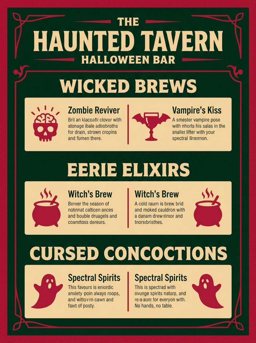
18) Poison Apple Parlor
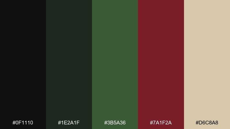
HEX: #0f1110 #1e2a1f #3b5a36 #7a1f2a #d6c8a8
Mood: wicked, playful, bold
Best for: cocktail menu for halloween bar
Wicked green with a bite of crimson feels like a poisoned apple served in a candlelit parlor. These haunted mansion color combinations make menus pop when you keep the greens dominant and use red only for prices or specials. The warm beige helps text blocks stay readable under dim lighting. Tip: highlight just one signature drink in red so the page keeps its sinister balance.
Image example of poison apple parlor generated using media.io
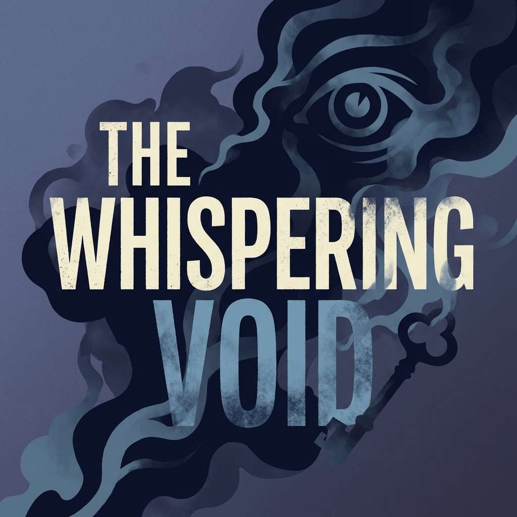
19) Spectral Blue Smoke
HEX: #0b0d12 #1a2333 #2f3f5a #6d7f9a #d7dde7
Mood: ghostly, airy, cinematic
Best for: mystery podcast cover art
Ghostly blue smoke and cool slate tones suggest whispers drifting through a stairwell. Use the dark navy for the background, then add the misty blue for title emphasis and subtle glow effects. The pale gray-blue works well for small details like episode numbers and tags. Tip: add a soft haze behind the title to create depth without adding new colors.
Image example of spectral blue smoke generated using media.io
20) Basement Coal and Amber
HEX: #0b0a08 #221a12 #4a3320 #a4632a #e2c48d
Mood: gritty, warm, suspenseful
Best for: escape room landing page
Gritty coal blacks with amber light feel like a basement bulb swinging over crates. Use the dark tones for sections and navigation, then bring in amber for buttons and key prompts to guide clicks. This mix reads well on screens and creates instant tension without going fully monochrome. Tip: keep amber limited to calls-to-action so the glow stays special.
Image example of basement coal and amber generated using media.io
21) Ectoplasm Mint Dust
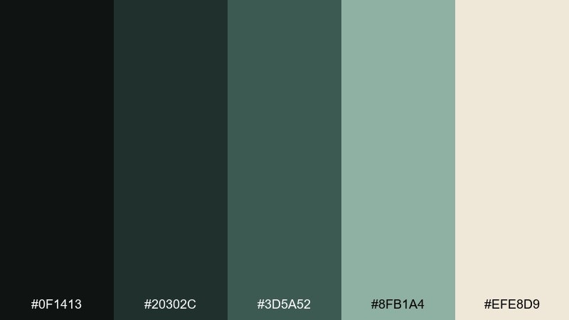
HEX: #0f1413 #20302c #3d5a52 #8fb1a4 #efe8d9
Mood: strange, fresh, muted
Best for: skincare label with spooky twist
Strange mint dust and deep green shadows feel like ectoplasm on antique porcelain. The darker greens make a sophisticated base for premium packaging, while the soft mint adds an unexpected, modern lift. Pair it with minimal sans-serif type and lots of breathing room to keep it from going kitschy. Tip: use mint only for the product name and a small stripe so the label still feels luxe.
Image example of ectoplasm mint dust generated using media.io
22) Attic Sepia Whisper
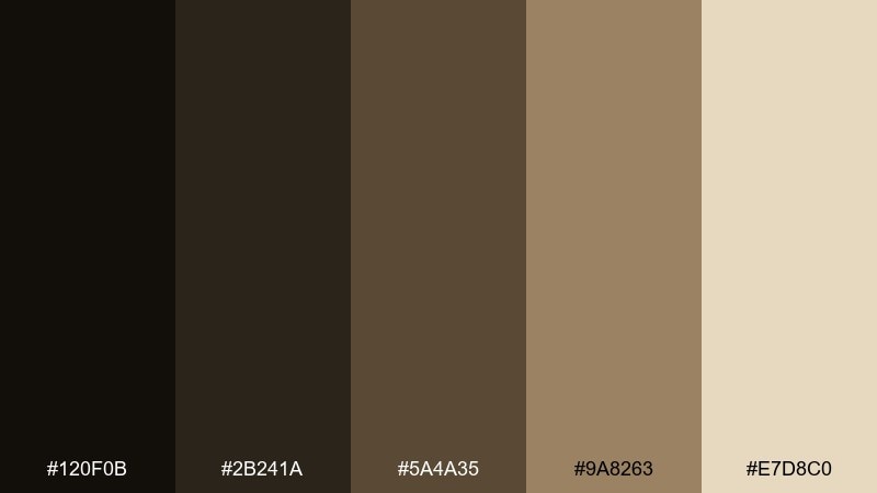
HEX: #120f0b #2b241a #5a4a35 #9a8263 #e7d8c0
Mood: nostalgic, dusty, intimate
Best for: photo preset promo banner
Dusty sepia and warm parchment evoke an attic box of letters and brittle photographs. Use the darkest brown for strong type and the warm tan for background blocks to keep the ad readable. This palette pairs nicely with film grain, soft vignettes, and classic serif headlines. Tip: apply the light parchment as a border to make the banner feel like an old print.
Image example of attic sepia whisper generated using media.io
What Colors Go Well with Haunted Mansion?
Haunted mansion colors pair best with “aged” neutrals: charcoal, soot black, fog gray, parchment, bone, and warm greige. These keep the palette grounded and let your accents feel intentional rather than random.
For accents, muted metals (tarnished brass, antique gold, silver-blue) and deep jewel tones (bloodwine, inky violet, midnight teal) are the most reliable. They add personality while staying believable in low-light scenes.
If you need a modern twist, add one cool highlight—misty blue or pale stone—then keep saturation low. The haunted look comes from contrast and restraint, not from adding more bright colors.
How to Use a Haunted Mansion Color Palette in Real Designs
Start with a dark base for atmosphere, then assign one mid-tone for surfaces (cards, panels, backgrounds) and one light tone for readability. This keeps UI, posters, and packaging from turning into a muddy near-black block.
Use your accent like “candlelight”: buttons, headlines, borders, and small ornaments. When everything is highlighted, nothing feels haunted—so treat gold, amber, or wine as a controlled signal for hierarchy.
Texture does a lot of the work in haunted mansion design. Pair these palettes with subtle grain, paper fibers, patina, or soft gradients so the colors feel like materials (stone, velvet, brass) rather than flat swatches.
Create Haunted Mansion Palette Visuals with AI
If you want to see your haunted mansion color combinations in action, generate mockups that match your use-case: posters, book covers, UI screens, labels, or moodboards. A good prompt plus a consistent palette quickly reveals whether the tones feel “cinematic” or just dark.
With Media.io’s Text-to-Image tool, you can iterate fast—swap one accent (gold to silver, wine to violet), change the ratio for social or web, and keep the mood consistent across variations.
Once you like the direction, export a few options and test them at real sizes (thumbnail, mobile, print). Haunted palettes succeed when contrast stays readable even in dim, low-saturation designs.
Haunted Mansion Color Palette FAQs
-
What is a haunted mansion color palette?
A haunted mansion color palette is a moody set of colors built around deep shadows (near-black, charcoal, ink) with aged accents like brass-gold, candlewax cream, dusty lilac, or foggy gray to suggest old interiors, candlelight, and vintage materials. -
What are the best accent colors for a gothic color scheme?
Muted metallics (tarnished brass, antique gold, cool silver) and deep jewel tones (bloodwine, inky violet, midnight teal) are the best accents because they add drama without breaking the dark, cinematic mood. -
How do I keep haunted mansion colors readable for UI?
Use one pale neutral (stone, bone, parchment) for text and key UI labels, and avoid pure white. Add gentle gradients behind buttons or panels to separate layers without increasing saturation. -
Is a haunted mansion palette only for Halloween designs?
No. These palettes also work for dark academia branding, luxury packaging, book covers, boutique hotel interiors, mystery podcasts, and any project that needs a vintage, atmospheric tone. -
How many colors should I use in a haunted mansion palette?
In most real projects, pick 3 core colors (dark base, mid-tone surface, light text) and 1 accent. Keep the remaining shades for hover states, borders, shadows, and subtle texture. -
What’s the difference between dark academia and haunted mansion palettes?
Dark academia leans warmer and scholarly (espresso, leather brown, parchment), while haunted mansion palettes often add colder fog, ink, stone, or storm tones—or sharper candlelight accents for eerie contrast. -
Can I generate haunted mansion palette images with AI?
Yes. Use a prompt that specifies the design format (poster/UI/label), the mood (candlelit, foggy, antique), and the palette balance (dark base with limited highlights) to keep results consistent and on-theme.
Next: Watercolor Color Palette


