

Thistle is a soft purple with a dusty, floral feel—calm enough for backgrounds, but expressive enough for brand accents. It’s a go-to when you want something more interesting than gray, yet less loud than bright violet.
Below are thistle color palette ideas you can copy fast, with HEX codes and practical notes for UI, branding, and print.
In this article
- Why Thistle Palettes Work So Well
-
- lavender haze
- dusty lilac minimal
- rosewood velvet
- sage garden mist
- midnight plum contrast
- warm neutral studio
- peachy bloom
- slate editorial
- cream wedding lace
- cyber pastel ui
- vintage botanical
- terracotta atelier
- frosted winter
- art deco mauve
- cozy knit
- ocean fog
- orchid nightlife
- scandinavian calm
- kids candy
- monochrome thistle
- What Colors Go Well with Thistle?
- How to Use a Thistle Color Palette in Real Designs
- Create Thistle Palette Visuals with AI
Why Thistle Palettes Work So Well
Thistle sits in a “safe” middle ground: it reads gentle and premium, but still brings color personality. That makes it easy to use across hero sections, packaging, and social templates without overpowering photos or typography.
It pairs well with both cool neutrals (slate, charcoal, icy blues) and warm accents (peach, terracotta, rosewood), so you can steer the mood from minimal to romantic to bold.
In print, thistle-style purples also tend to look elegant when you keep contrast controlled—using deep plum for type and leaving thistle for fills, borders, or soft gradients.
20+ Thistle Color Palette Ideas (with HEX Codes)
1) Lavender Haze
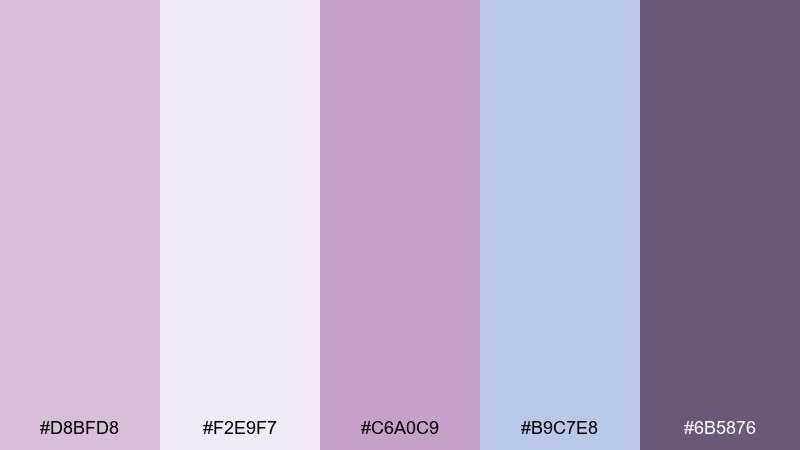
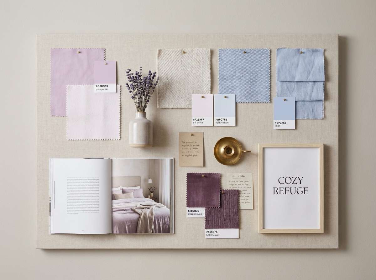
HEX: #D8BFD8 #F2E9F7 #C6A0C9 #B9C7E8 #6B5876
Mood: airy, dreamy, soothing
Best for: bedroom interior moodboard
Airy lilac mist and soft daylight vibes make this feel calm and slightly romantic. Use it for serene interiors, spa-like content, or lifestyle visuals where you want quiet color without looking washed out. Pair the light tones with warm wood, brushed nickel, and off-white textiles to keep it grounded. Usage tip: let the deepest purple act as a small accent in lampshades, throw pillows, or headings.
Image example of lavender haze generated using media.io
Media.io is an online AI studio for creating and editing video, image, and audio in your browser.

2) Dusty Lilac Minimal
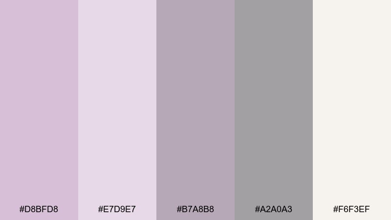
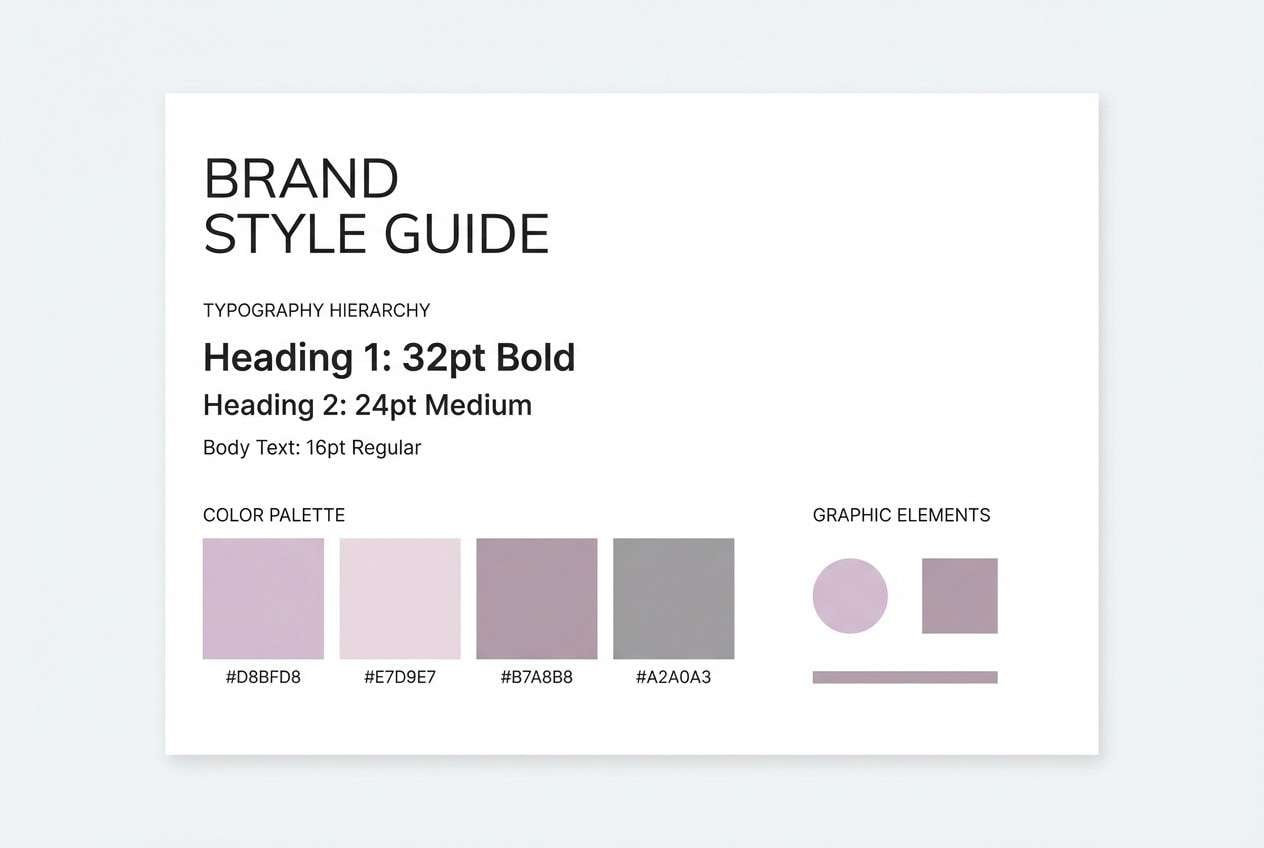
HEX: #D8BFD8 #E7D9E7 #B7A8B8 #A2A0A3 #F6F3EF
Mood: minimal, soft, modern
Best for: minimal brand style guide page
Soft powdery purples and clean grays create a quiet, modern look with just enough warmth. It works beautifully for minimalist brand systems, portfolios, and premium stationery where space and typography do the heavy lifting. Pair it with thin black lines, warm white paper textures, and a single muted accent. Usage tip: reserve the mid-gray for body text so the lilac stays airy and readable.
Image example of dusty lilac minimal generated using media.io
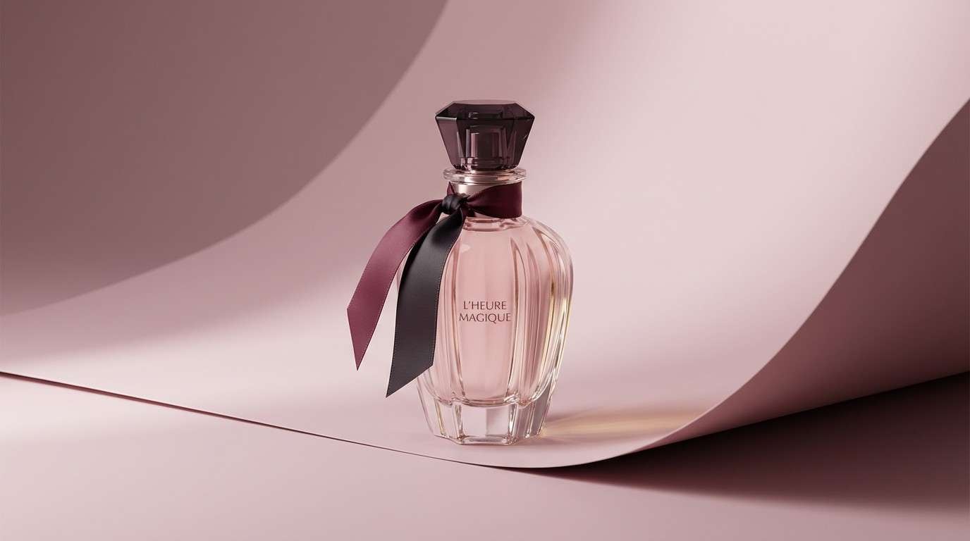
3) Rosewood Velvet
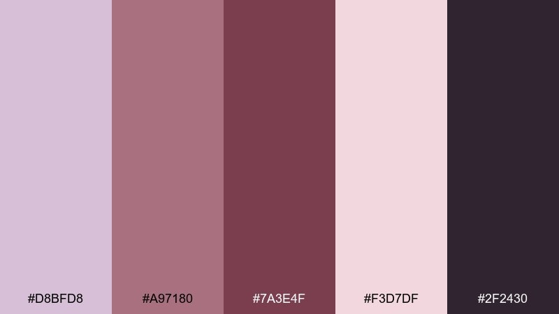
HEX: #D8BFD8 #A97180 #7A3E4F #F3D7DF #2F2430
Mood: romantic, rich, cinematic
Best for: perfume product ad
Velvety mauves and rosewood shadows bring a luxe, candlelit feel. These thistle color combinations are ideal for fragrance, cosmetics, and boutique campaigns that want softness with depth. Pair with matte black type, satin textures, and close-cropped florals for a premium finish. Usage tip: keep the darkest plum for logo marks and tiny details so it reads elegant, not heavy.
Image example of rosewood velvet generated using media.io
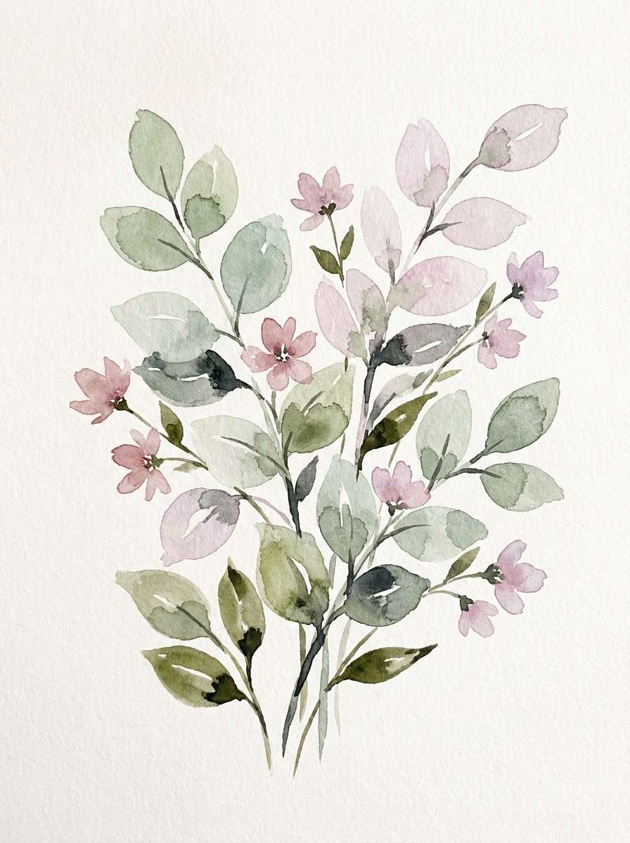
4) Sage Garden Mist
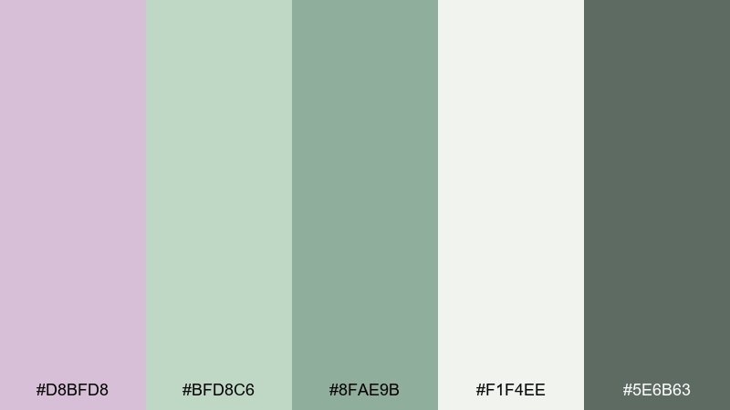
HEX: #D8BFD8 #BFD8C6 #8FAE9B #F1F4EE #5E6B63
Mood: fresh, botanical, balanced
Best for: watercolor botanical illustration
Fresh garden greens mixed with soft lilac feel like morning dew on petals. Use it for wellness branding, eco packaging, or spring content that needs a calm, natural direction. Pair with kraft paper, light cream backgrounds, and gentle serif typography. Usage tip: let the sage tones carry large areas, then use lilac as a delicate highlight on blooms or icons.
Image example of sage garden mist generated using media.io
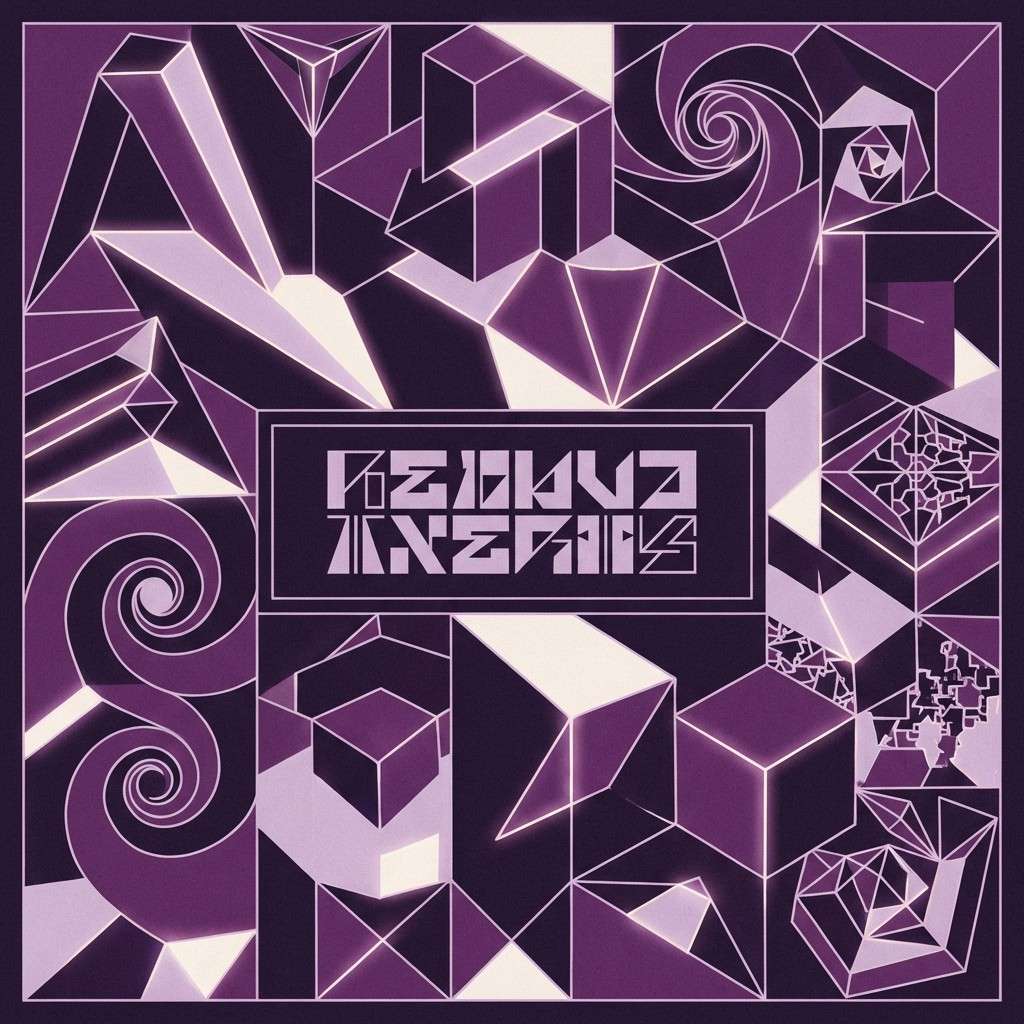
5) Midnight Plum Contrast
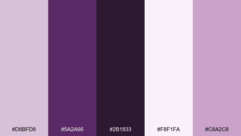
HEX: #D8BFD8 #5A2A66 #2B1833 #F8F1FA #C8A2C8
Mood: moody, bold, high-contrast
Best for: album cover artwork
Deep plum and inky purple set a night-sky mood while the pale tones keep it crisp. This palette shines on album art, nightlife posters, and striking hero banners with a dramatic focal point. Pair it with sharp geometric shapes and a touch of grain for texture. Usage tip: use the lightest tint behind text to preserve legibility against the dark base.
Image example of midnight plum contrast generated using media.io
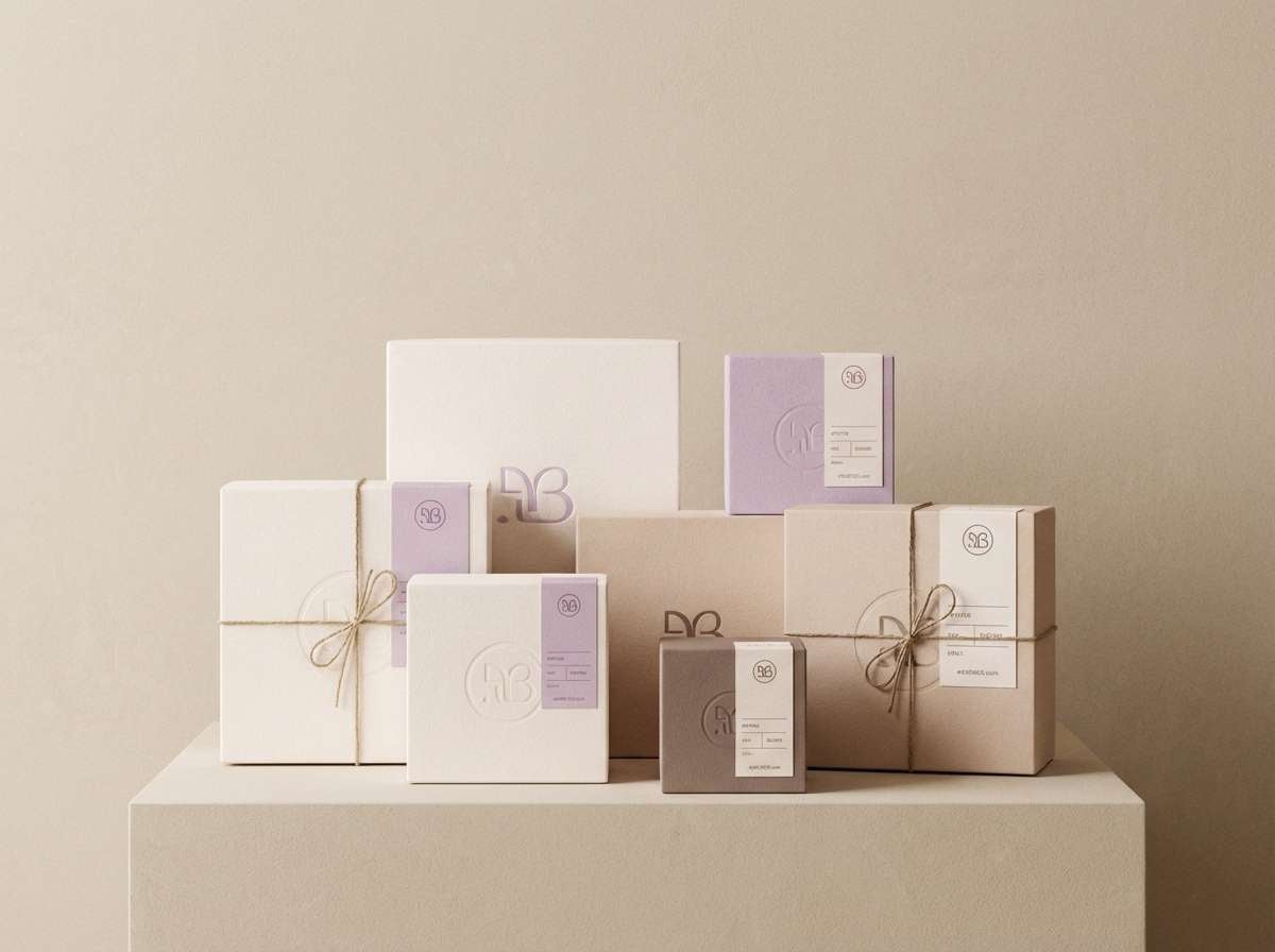
6) Warm Neutral Studio
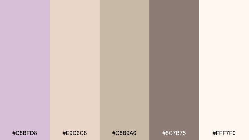
HEX: #D8BFD8 #E9D6C8 #C8B9A6 #8C7B75 #FFF7F0
Mood: cozy, understated, earthy
Best for: ceramic product packaging
Creamy neutrals with a lilac blush feel like sunlit clay and soft linen. A thistle color palette like this works well for ceramics, handmade goods, and calm ecommerce branding. Pair with natural fibers, uncoated paper, and warm photography to keep it tactile. Usage tip: print the lilac as a light wash and rely on taupe for structure and type.
Image example of warm neutral studio generated using media.io
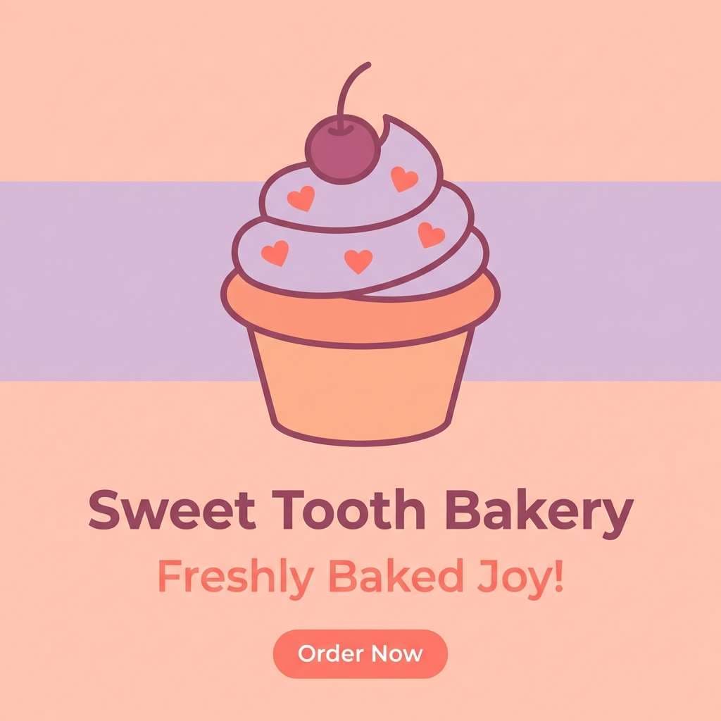
7) Peachy Bloom
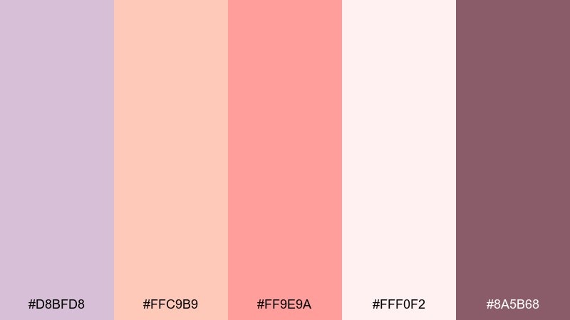
HEX: #D8BFD8 #FFC9B9 #FF9E9A #FFF0F2 #8A5B68
Mood: playful, sweet, inviting
Best for: bakery Instagram post design
Cotton-candy peach and lilac read cheerful, friendly, and a little nostalgic. Use it for bakery visuals, beauty promos, or social posts where you want warm energy without harsh saturation. Pair with rounded type, creamy backgrounds, and simple illustrated accents. Usage tip: keep the coral as the call-to-action color and let the lilac sit in the background shapes.
Image example of peachy bloom generated using media.io
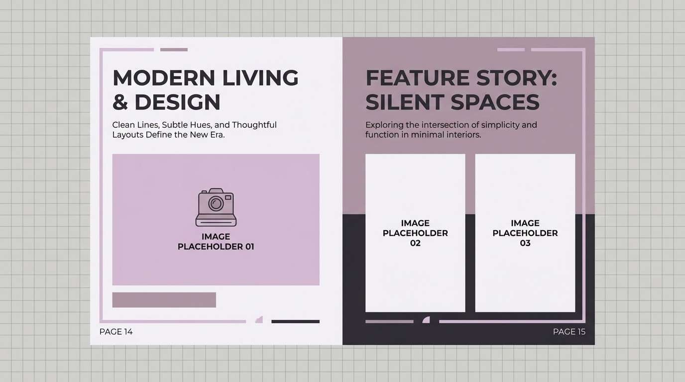
8) Slate Editorial
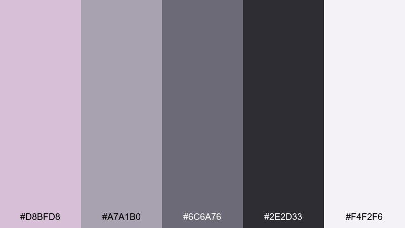
HEX: #D8BFD8 #A7A1B0 #6C6A76 #2E2D33 #F4F2F6
Mood: sleek, editorial, mature
Best for: magazine spread layout
Cool slate and lilac tints feel polished, like an editorial shoot under soft studio lights. It fits fashion lookbooks, design magazines, and premium decks where you need neutrals with personality. Pair with high-contrast photography and elegant serif headlines for a refined vibe. Usage tip: use the near-black for text and rules, then add lilac as a margin wash or section marker.
Image example of slate editorial generated using media.io
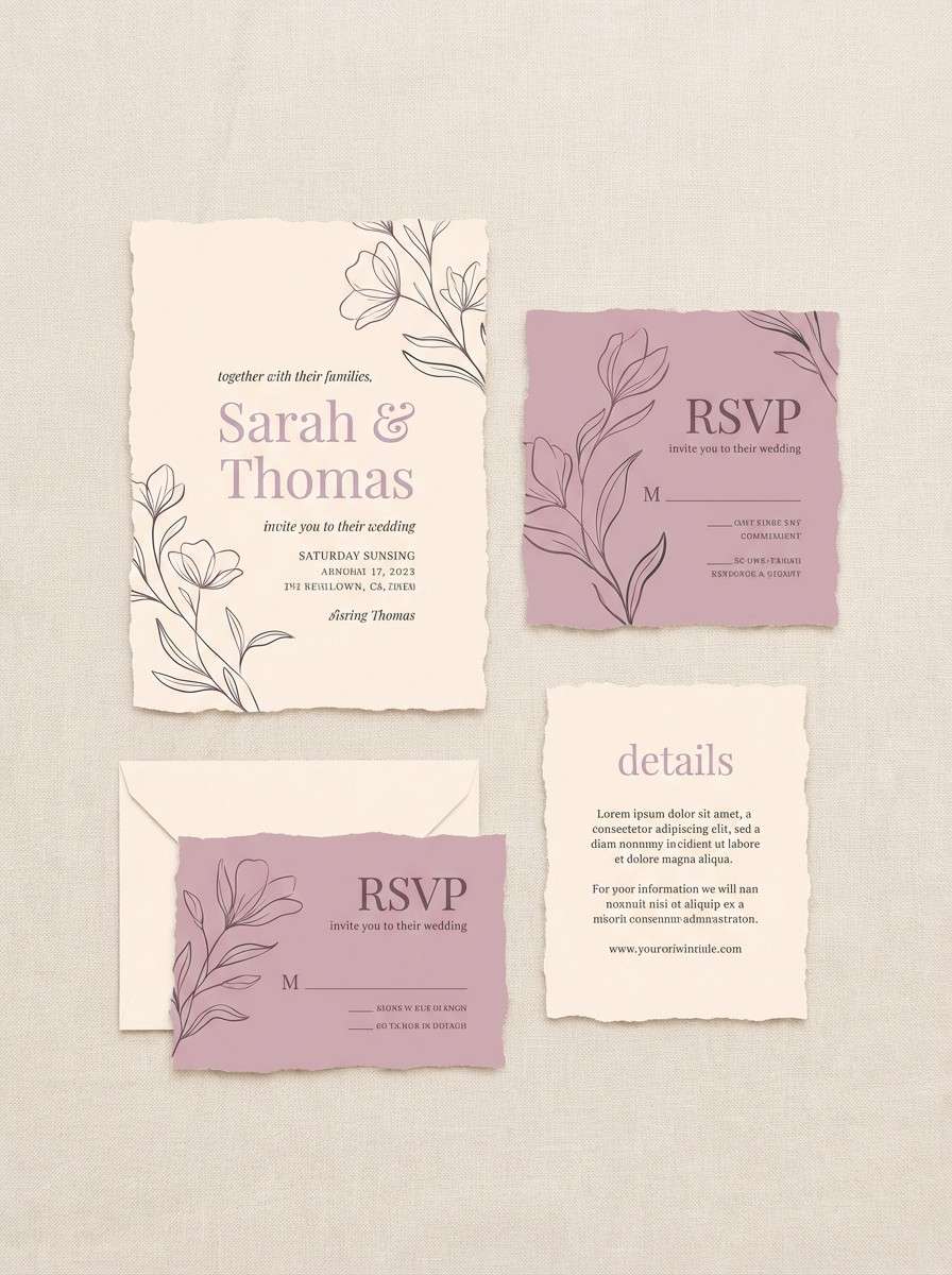
9) Cream Wedding Lace
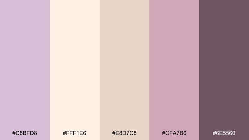
HEX: #D8BFD8 #FFF1E6 #E8D7C8 #CFA7B6 #6E5560
Mood: romantic, timeless, delicate
Best for: wedding invitation suite
Soft cream and dusty lilac feel like lace, pressed flowers, and candlelight. It works beautifully for wedding invitations, bridal shower stationery, and elegant RSVP cards. Pair with gold foil accents, fine line florals, and plenty of breathing room. Usage tip: set body copy in the warm taupe and use lilac only for headings or monograms.
Image example of cream wedding lace generated using media.io
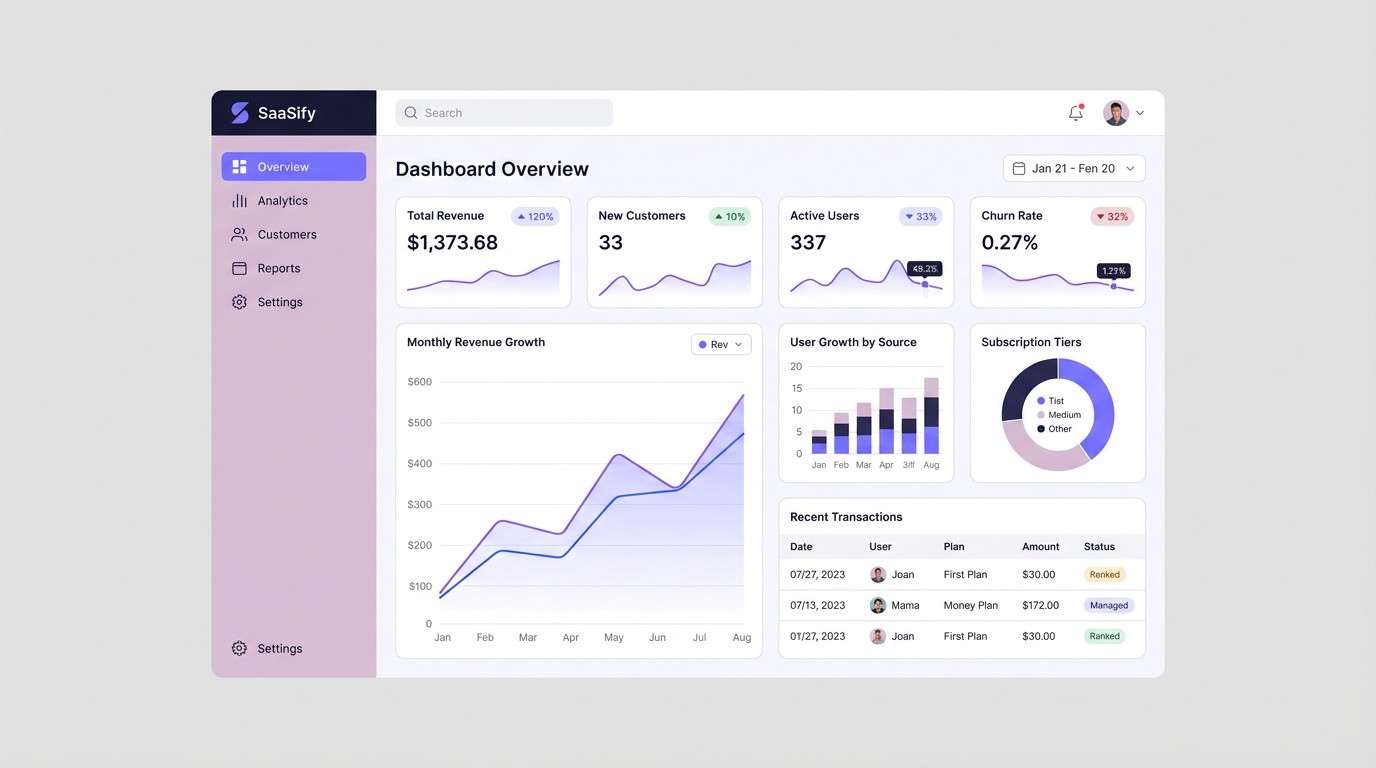
10) Cyber Pastel UI
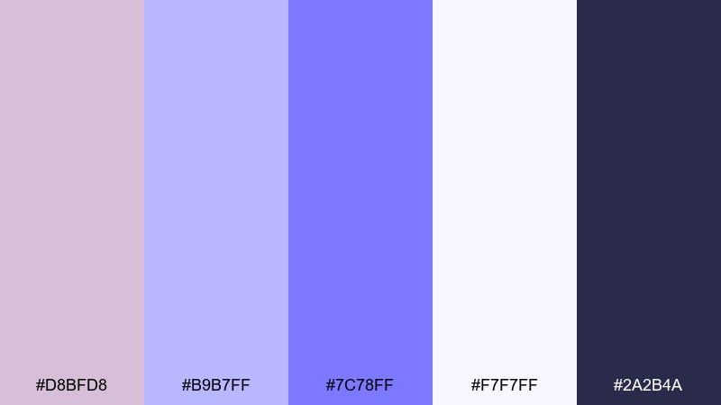
HEX: #D8BFD8 #B9B7FF #7C78FF #F7F7FF #2A2B4A
Mood: clean, techy, optimistic
Best for: SaaS dashboard UI mockup
Bright periwinkle and soft lilac give a modern, optimistic tech vibe without going neon. This thistle color scheme is a strong fit for SaaS dashboards, onboarding screens, and data cards that need friendly contrast. Pair it with crisp white space and deep navy for navigation and key labels. Usage tip: use the strongest violet only for active states and highlights to avoid visual fatigue.
Image example of cyber pastel ui generated using media.io
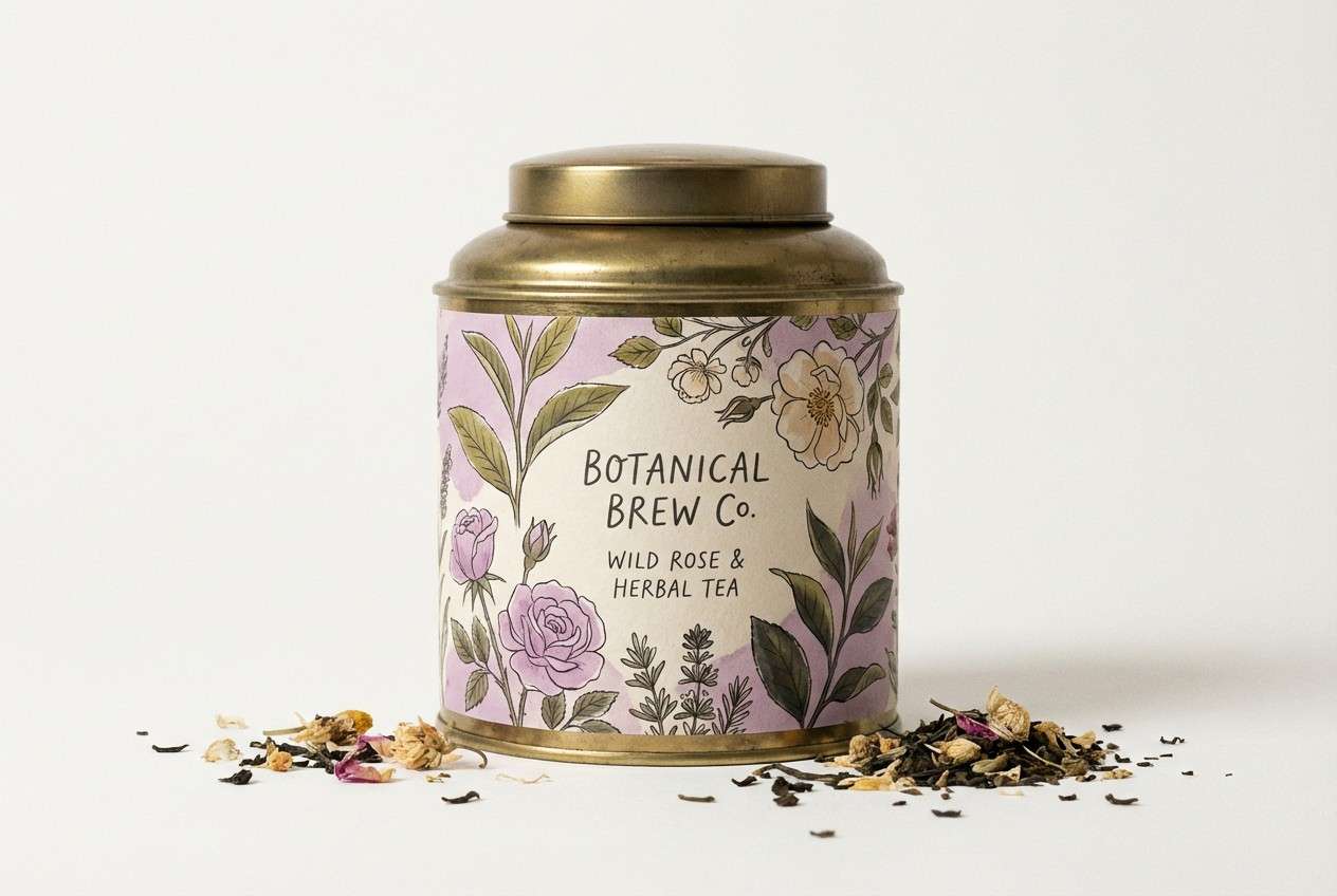
11) Vintage Botanical
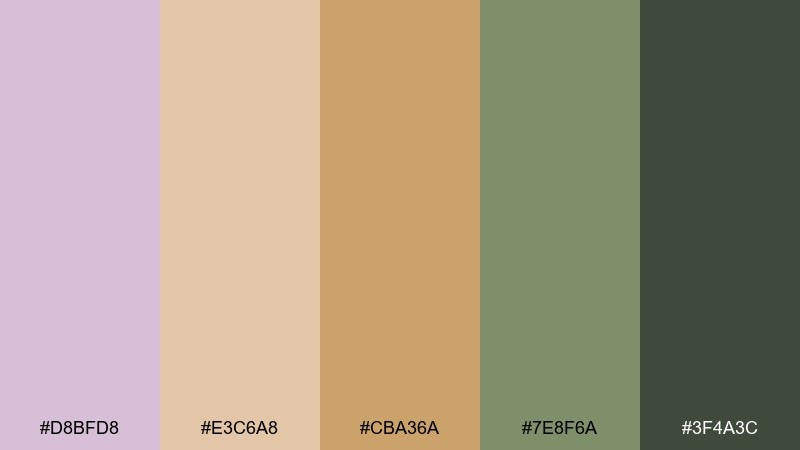
HEX: #D8BFD8 #E3C6A8 #CBA36A #7E8F6A #3F4A3C
Mood: heritage, natural, storybook
Best for: tea label illustration
Muted lilac with antique golds and herbal greens evokes apothecary labels and dried botanicals. It suits tea packaging, artisanal food brands, and slow-living editorial graphics. Pair with textured paper, vintage etching-style illustrations, and dark green typography. Usage tip: keep gold as a small accent on borders or seals so it feels classic, not flashy.
Image example of vintage botanical generated using media.io
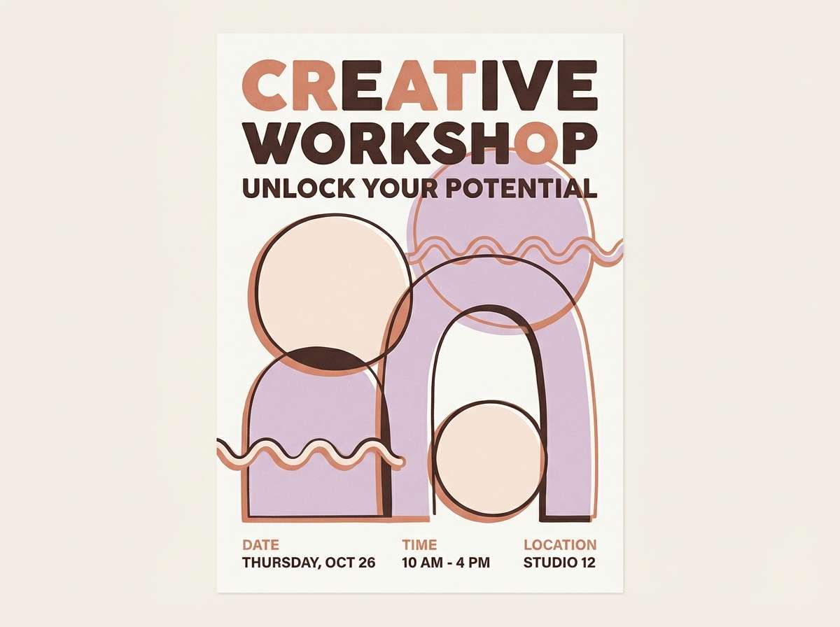
12) Terracotta Atelier
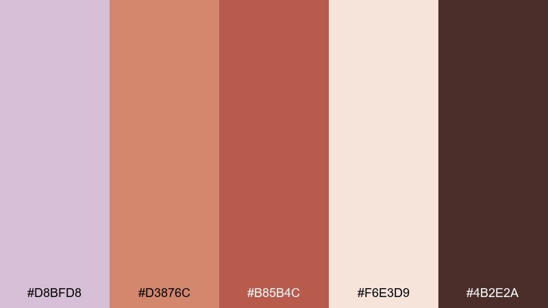
HEX: #D8BFD8 #D3876C #B85B4C #F6E3D9 #4B2E2A
Mood: artistic, warm, grounded
Best for: creative workshop poster
Warm terracotta and lilac feel like paint-stained aprons and a sunny studio corner. Use it for creative events, workshops, and small business posters that should feel handcrafted yet modern. Pair with bold sans-serif type and simple shapes to keep the warmth from getting too rustic. Usage tip: place the deepest brown behind key details like dates so they pop at a distance.
Image example of terracotta atelier generated using media.io
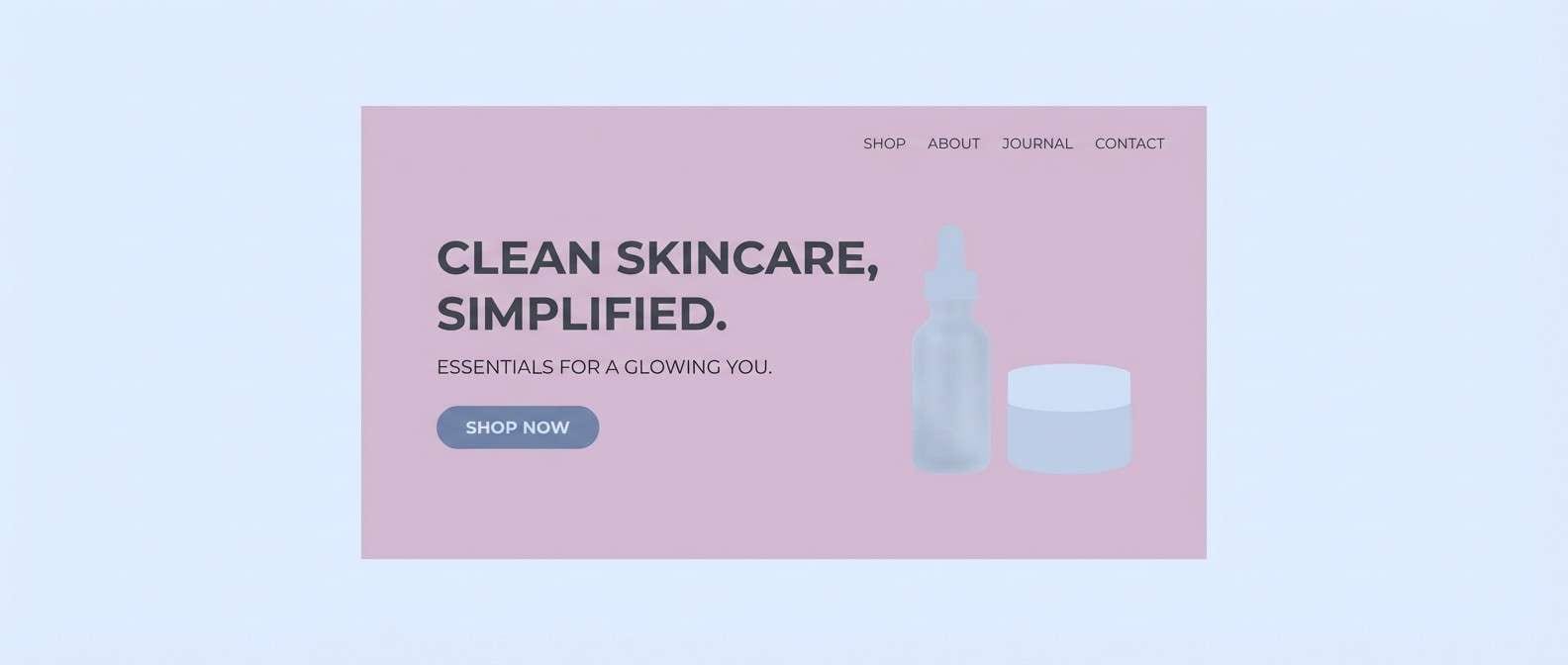
13) Frosted Winter
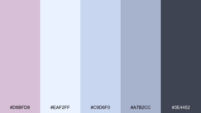
HEX: #D8BFD8 #EAF2FF #C9D6F0 #A7B2CC #3E4452
Mood: crisp, quiet, wintry
Best for: skincare landing page hero
Icy blues and pale lilac create a frosted, clean sensation like cold air and fresh water. It fits skincare, wellness apps, and minimalist landing pages where purity and softness matter. Pair with plenty of white space and a single dark slate for readability. Usage tip: use the coldest blue for backgrounds and keep lilac for glow effects around product shots or buttons.
Image example of frosted winter generated using media.io
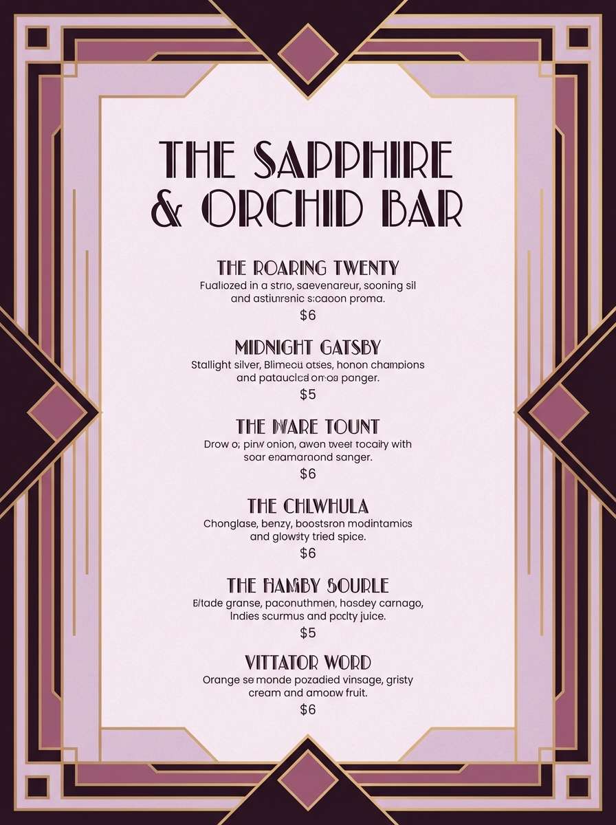
14) Art Deco Mauve
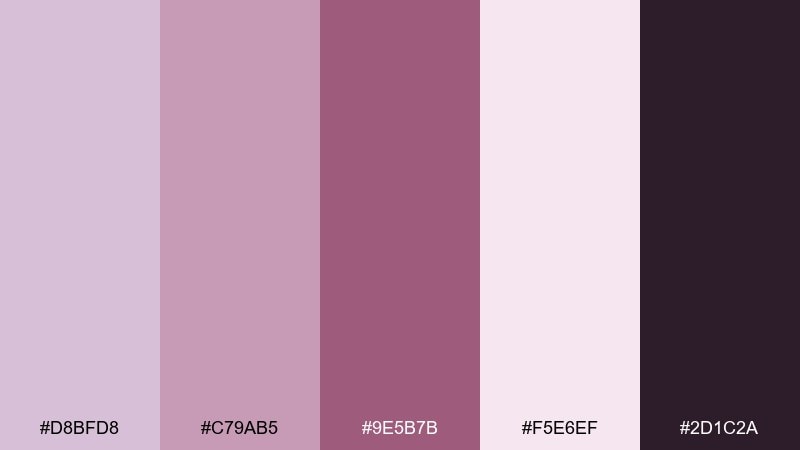
HEX: #D8BFD8 #C79AB5 #9E5B7B #F5E6EF #2D1C2A
Mood: glam, structured, vintage-luxe
Best for: cocktail bar menu design
Mauve, berry, and deep plum feel like velvet booths and polished brass. These thistle color combinations are perfect for menus, party invites, and boutique nightlife branding with a touch of drama. Pair with geometric deco frames and thin linework for that classic structure. Usage tip: keep the darkest shade for headings and separators so the softer tones stay glamorous, not sugary.
Image example of art deco mauve generated using media.io
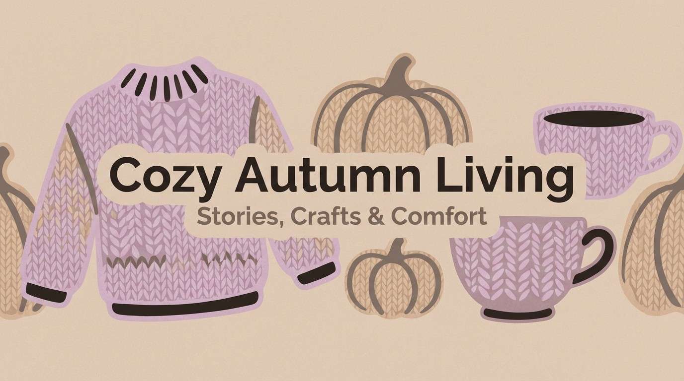
15) Cozy Knit
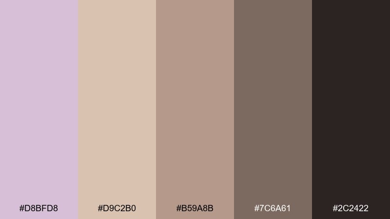
HEX: #D8BFD8 #D9C2B0 #B59A8B #7C6A61 #2C2422
Mood: warm, comforting, homey
Best for: fall lifestyle blog header
Soft lilac paired with warm taupes feels like knitwear, chai, and quiet evenings. Use it for fall lifestyle headers, home decor brands, or cozy recipe graphics. Pair with natural textures like burlap, wool, and matte photography treatments. Usage tip: keep the darkest brown for small text and icons so the page stays soft and welcoming.
Image example of cozy knit generated using media.io
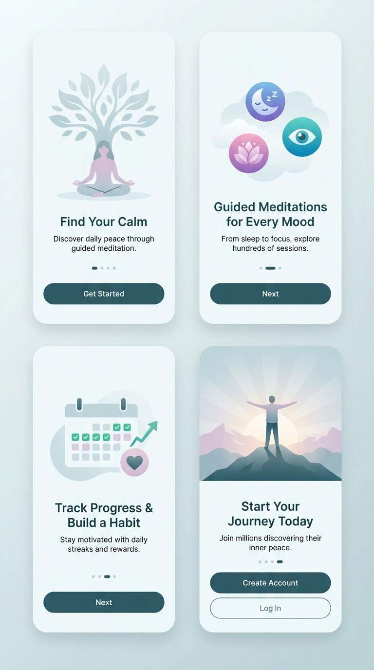
16) Ocean Fog
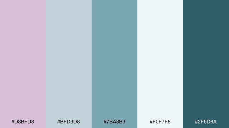
HEX: #D8BFD8 #BFD3D8 #7BA8B3 #F0F7F8 #2F5D6A
Mood: calm, coastal, breathable
Best for: meditation app onboarding screens
Mist, sea glass, and a hint of lilac create an easy-breathing coastal calm. It works well for meditation apps, retreat branding, and gentle wellness content. Pair with rounded UI elements, airy gradients, and simple iconography. Usage tip: let the pale aqua take most backgrounds and use the deep teal sparingly for primary buttons.
Image example of ocean fog generated using media.io
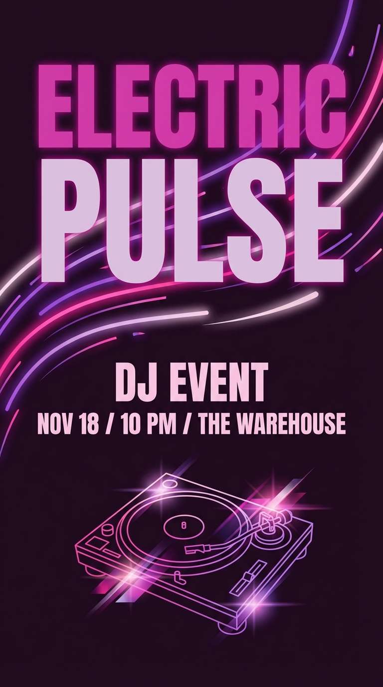
17) Orchid Nightlife
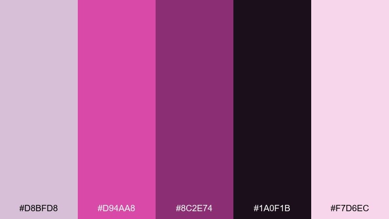
HEX: #D8BFD8 #D94AA8 #8C2E74 #1A0F1B #F7D6EC
Mood: electric, bold, glamorous
Best for: DJ event flyer
Neon orchid against deep night feels energetic, glossy, and unapologetic. Use it for DJ flyers, club promos, or bold social ads that need instant contrast. Pair with condensed type, bright gradients, and strong hierarchy to control the intensity. Usage tip: keep black as the main background so the pink and lilac glow instead of clashing.
Image example of orchid nightlife generated using media.io
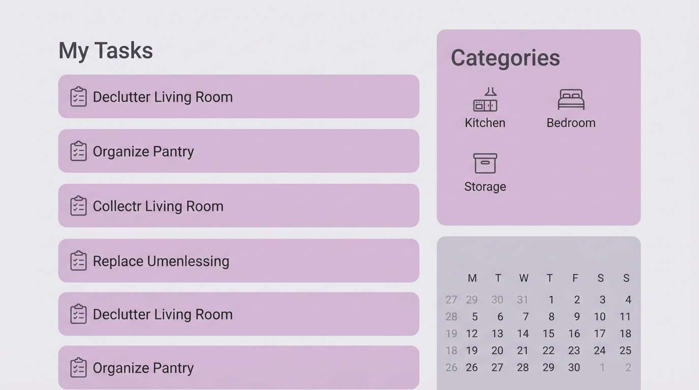
18) Scandinavian Calm
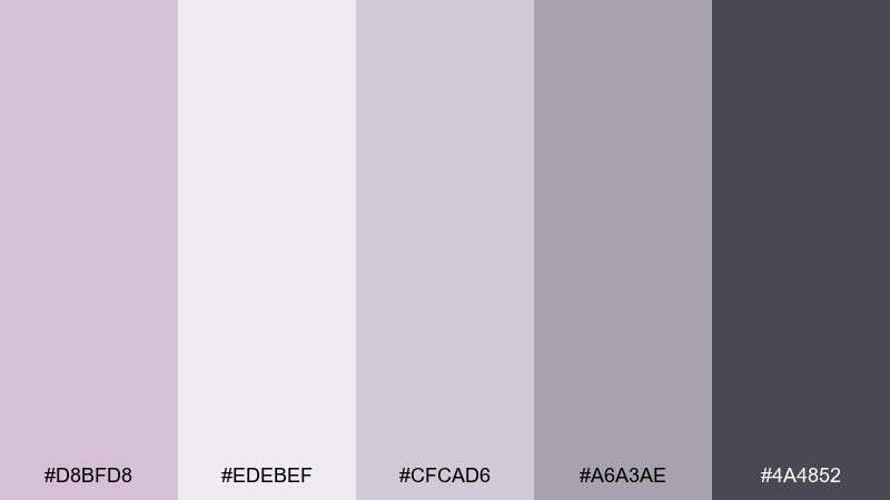
HEX: #D8BFD8 #EDEBEF #CFCAD6 #A6A3AE #4A4852
Mood: calm, clean, functional
Best for: home organization app UI
Quiet lilac and soft grays feel organized, calm, and effortlessly modern. A thistle color palette like this is ideal for productivity apps, home organization tools, and clean ecommerce interfaces. Pair with lots of spacing, subtle shadows, and a single dark neutral for labels. Usage tip: use lilac as a section highlight and keep core navigation in charcoal for clarity.
Image example of scandinavian calm generated using media.io
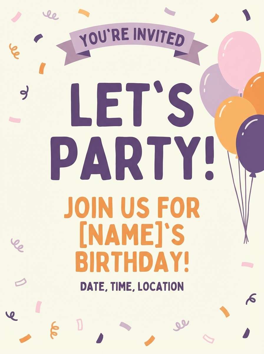
19) Kids Candy
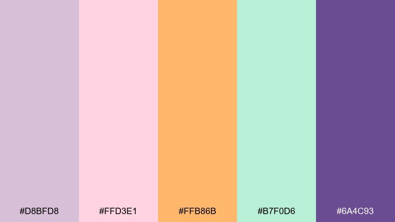
HEX: #D8BFD8 #FFD3E1 #FFB86B #B7F0D6 #6A4C93
Mood: fun, bright, friendly
Best for: kids party invitation
Candy pastels with a punchy purple feel joyful, playful, and easy to love. Use it for kids party invites, classroom printables, or toy branding where clear, happy color matters. Pair with chunky type, simple shapes, and lots of whitespace to avoid visual noise. Usage tip: choose one bright accent for key info like the date, and keep the rest as soft supporting blocks.
Image example of kids candy generated using media.io
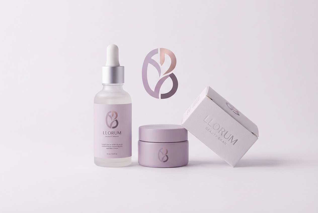
20) Monochrome Thistle
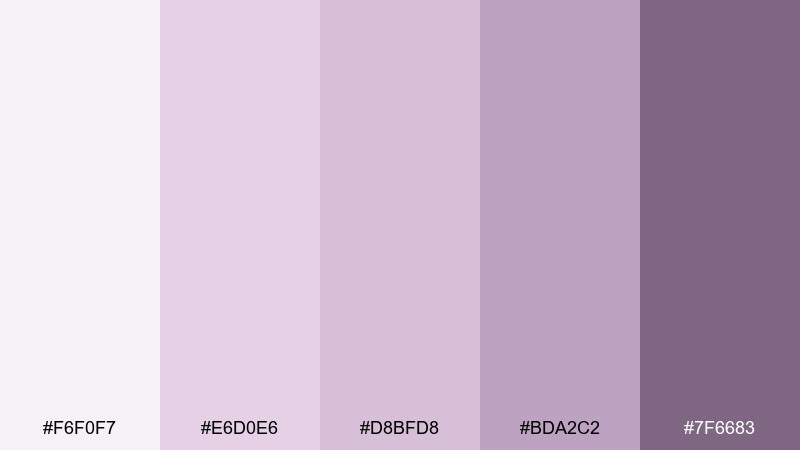
HEX: #F6F0F7 #E6D0E6 #D8BFD8 #BDA2C2 #7F6683
Mood: soft, cohesive, elegant
Best for: beauty brand logo and packaging set
Layered lilac tints create a smooth, monochrome look that feels polished and cohesive. It is a great choice for beauty branding, labels, and packaging when you want a single-color family with depth. Pair with clean typography, embossing, and subtle patterns to add interest without adding new hues. Usage tip: use the darkest shade for barcodes and fine print so everything stays readable on light packaging.
Image example of monochrome thistle generated using media.io
What Colors Go Well with Thistle?
Thistle pairs naturally with warm neutrals like cream, beige, taupe, and soft browns—perfect when you want a cozy, handmade, or wedding-ready look. For a modern minimal direction, mix thistle with cool grays and off-white.
If you need more energy, add a warm accent (peach, coral, terracotta) to make thistle feel approachable and social-friendly. For drama and contrast, deepen the palette with plum, near-black, or navy.
For nature-forward designs, sage and muted greens are the easiest complement: they balance the purple family without turning too sweet or overly feminine.
How to Use a Thistle Color Palette in Real Designs
In branding, thistle works best as a secondary color: use it for backgrounds, packaging fills, highlights, and social templates, then anchor your identity with a darker neutral for logos and text.
In UI, keep thistle for surfaces (cards, panels, section dividers) and reserve stronger violets for interactive states (active tabs, focus rings, primary buttons). This keeps the interface calm and reduces visual fatigue.
For print, test thistle tints on your paper stock—uncoated paper can soften it further. Pair with charcoal or deep plum text to maintain readable contrast, especially on invitations, labels, and menus.
Create Thistle Palette Visuals with AI
If you already have HEX codes, you can turn them into on-brand visuals fast by prompting a scene (product shot, UI mockup, poster, invitation) and specifying your palette as dominant colors and accents.
To keep results consistent, describe lighting, materials, and layout (e.g., “clean grid,” “soft shadows,” “matte paper texture”), then reuse the same structure across multiple generations.
Generate a few variations, pick one direction, and iterate by adjusting only one variable at a time—like switching the accent color from coral to plum while keeping the thistle base.
Thistle Color Palette FAQs
-
What is the HEX code for thistle?
A common thistle base is #D8BFD8. Many “thistle” palettes use this as the anchor and then add lighter lilac tints plus deeper plum accents. -
Is thistle closer to lavender or mauve?
Thistle usually sits between lavender and mauve: it’s a muted, dusty purple with a soft pink undertone, making it less blue than lavender and less brown than mauve. -
What colors complement thistle in design?
Great matches include cream and warm beige, slate/charcoal neutrals, sage greens, dusty rose, and deep plum. Pick complements based on whether you want cozy, minimal, natural, or dramatic. -
Does thistle work well for UI backgrounds?
Yes—thistle is gentle enough for cards and section backgrounds. For readability, use dark text (charcoal/navy) and keep saturated violet accents for active states only. -
How do I keep a thistle palette from looking too sweet?
Add structure with cool grays, slate, or near-black, and use thistle as a tint rather than the main text color. Deep plum or charcoal typography instantly makes it feel more editorial. -
Which thistle palettes are best for print invitations?
Try softer mixes like Cream Wedding Lace or Dusty Lilac Minimal. They print elegantly when paired with warm taupe text and optional foil accents. -
Can I generate thistle palette images with AI using HEX codes?
Yes—include your HEX codes in the prompt as dominant colors and accents, and describe the scene (e.g., “perfume ad,” “wedding invite,” “SaaS dashboard”). This helps the AI stay closer to your palette.
Next: Carnelian Color Palette


