

Carnelian is a modern warm earth tone that sits between terracotta, burnt sienna, and rust orange. It’s bold enough for hero elements, but grounded enough to feel premium and natural.
Below are 20 carnelian color palette ideas with HEX codes, plus practical guidance for balancing accents, neutrals, and contrast in real design work.
In this article
Why Carnelian Palettes Work So Well
Carnelian tones feel confident because they’re saturated and warm, yet still “earthy” enough to read as natural. That makes them versatile: they can look rugged for outdoor brands, refined for packaging, or clean and modern in UI.
They also pair easily with light neutrals (cream, stone, off-white) that create breathing room. With enough negative space, carnelian accents stay rich and intentional instead of overwhelming the layout.
Finally, carnelian plays well with deep near-blacks and espresso browns for contrast. Those dark anchors keep typography crisp while the warm hues do the emotional heavy lifting.
20+ Carnelian Color Palette Ideas (with HEX Codes)
1) Desert Ember
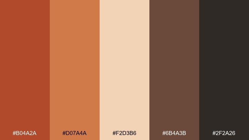
HEX: #b04a2a #d07a4a #f2d3b6 #6b4a3b #2f2a26
Mood: sunbaked, grounded, dramatic
Best for: outdoor brand identity and hero banners
Sunbaked and grounded, it feels like canyon walls at golden hour with a smoky shadow line. This carnelian color palette shines in bold headers, badge marks, and rugged lifestyle branding. Pair the warm core with creamy negative space and let the deep espresso tone handle text for contrast. Usage tip: keep the darkest shade for type and icons so the orange tones stay rich, not muddy.
Image example of desert ember generated using media.io

Media.io is an online AI studio for creating and editing video, image, and audio in your browser.

2) Burnt Sienna Studio
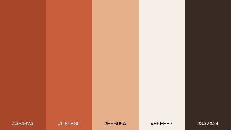
HEX: #a8462a #c85e3c #e6b08a #f6efe7 #3a2a24
Mood: artsy, warm, handcrafted
Best for: ceramic workshop poster design
Artsy and handcrafted, these tones evoke clay dust, kiln heat, and paper labels in a small studio. They work beautifully for posters, class schedules, and workshop promotions where warmth builds trust. Pair the sienna with off-white for breathing room and reserve the near-black for crisp type. Usage tip: use the lighter peach as a soft highlight behind dates and pricing.
Image example of burnt sienna studio generated using media.io

3) Clay and Cream
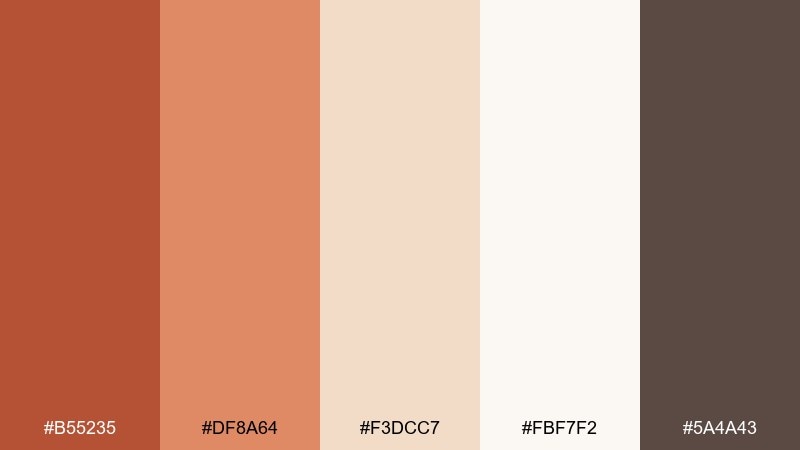
HEX: #b55235 #df8a64 #f3dcc7 #fbf7f2 #5a4a43
Mood: soft, minimal, welcoming
Best for: minimal app UI and onboarding screens
Soft and welcoming, it brings to mind clay pottery on a linen table with gentle afternoon light. It fits minimal UI, onboarding, and lifestyle apps where the interface should feel calm, not loud. Balance the warm tones with plenty of cream space and use the muted brown for labels and secondary text. Usage tip: keep the brightest orange as a micro-accent for toggles and progress states.
Image example of clay and cream generated using media.io
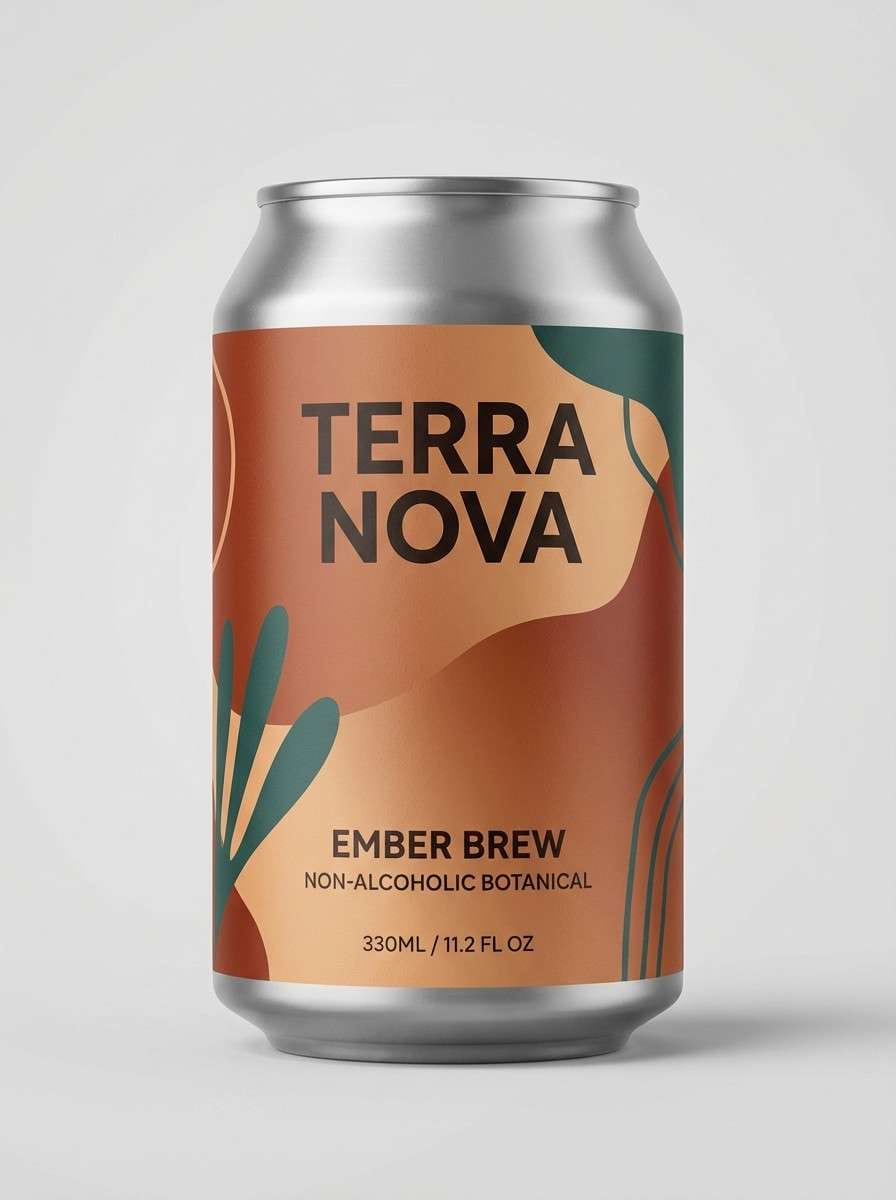
4) Copper Canyon
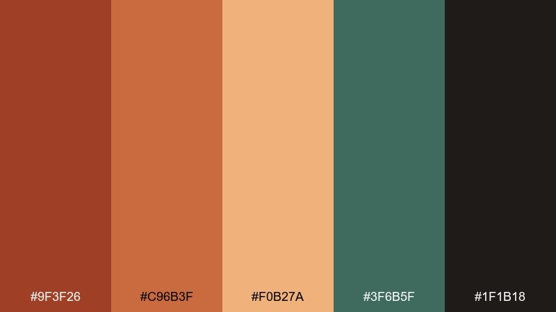
HEX: #9f3f26 #c96b3f #f0b27a #3f6b5f #1f1b18
Mood: bold, outdoorsy, high-contrast
Best for: beverage can packaging and product ads
Bold and outdoorsy, this mix feels like copper rock against a cool desert river. It suits beverage packaging, launch ads, and anything that needs instant shelf pop without neon. Let the green act as a grounding counterpoint to the warm oranges, and keep the black-brown for tight outlines and ingredients text. Usage tip: use the pale apricot as a soft gradient highlight on the can for depth.
Image example of copper canyon generated using media.io
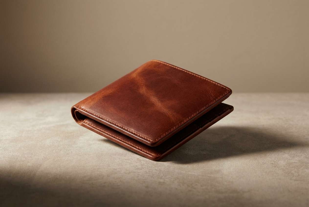
5) Vintage Leather

HEX: #8e3a26 #b85a3a #d9a07b #b7b0a6 #1f1c1a
Mood: heritage, premium, rugged
Best for: mens accessories product ads and ecommerce
Heritage and premium, it reads like worn leather, saddle stitching, and warm studio light. As a carnelian color scheme, it works for mens accessories, craft goods, and product pages that need rugged confidence. Pair the mid tan with the soft gray for calm spacing, then let the near-black handle typography and price tags. Usage tip: keep the darkest tone for buttons so calls to action feel weighty and intentional.
Image example of vintage leather generated using media.io
6) Terracotta Garden
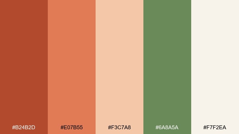
HEX: #b24b2d #e07b55 #f3c7a8 #6a8a5a #f7f2ea
Mood: fresh, earthy, botanical
Best for: botanical prints and spring illustrations
Fresh and earthy, it evokes terracotta pots, new leaves, and sunlit greenhouse glass. The warm clay tones play nicely with soft greens for botanical prints, labels, and seasonal promos. Keep the cream as your paper base and use the green for stems, borders, or navigation highlights. Usage tip: avoid equal weight between orange and green, pick one hero color and let the other support.
Image example of terracotta garden generated using media.io
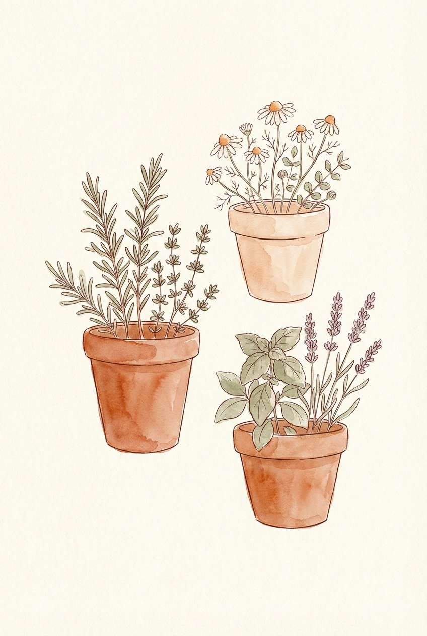
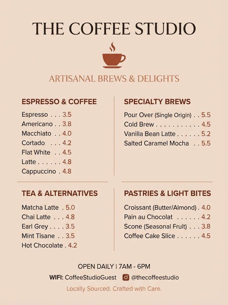
7) Spiced Cocoa
HEX: #7a3324 #a94a32 #d08a66 #f1e0d3 #3b2f2a
Mood: cozy, intimate, comfort-food
Best for: cafe menus and seasonal flyers
Cozy and intimate, it feels like cocoa powder, baked spice, and candlelight on a rainy day. It is perfect for cafe menus, bakery flyers, and fall specials where warmth should lead the message. Pair the creamy tint with the darker brown to keep readability high, and use the mid orange sparingly as a highlight. Usage tip: set headings in the darkest shade and use the warm tan for section dividers.
Image example of spiced cocoa generated using media.io
8) Modern Fiesta
HEX: #b6462a #f08a5b #ffd2b3 #2f5d62 #f7f4ef
Mood: playful, lively, modern
Best for: event invitations and social announcements
Playful and lively, it brings the energy of street lanterns and sun-warmed stucco. This carnelian color combination feels modern when you anchor it with deep teal and keep the background airy. Use the brightest peach for RSVP buttons or key details, and let the teal handle titles for strong contrast. Usage tip: repeat one accent shape in teal across the layout to tie the warm tones together.
Image example of modern fiesta generated using media.io

9) Autumn Orchard

HEX: #a3412a #d86a3b #f2b27f #7b5a3a #f7efe6
Mood: seasonal, nostalgic, inviting
Best for: seasonal social post templates and promos
Seasonal and nostalgic, it feels like apple skins, wooden crates, and late harvest light. These tones are ideal for autumn promos, recipe cards, and social templates that need a friendly, handmade touch. Pair the pale cream with the richer browns for typography and keep the brightest orange to highlight offers or key dates. Usage tip: use the tan as a subtle border to make posts look finished without heavy frames.
Image example of autumn orchard generated using media.io

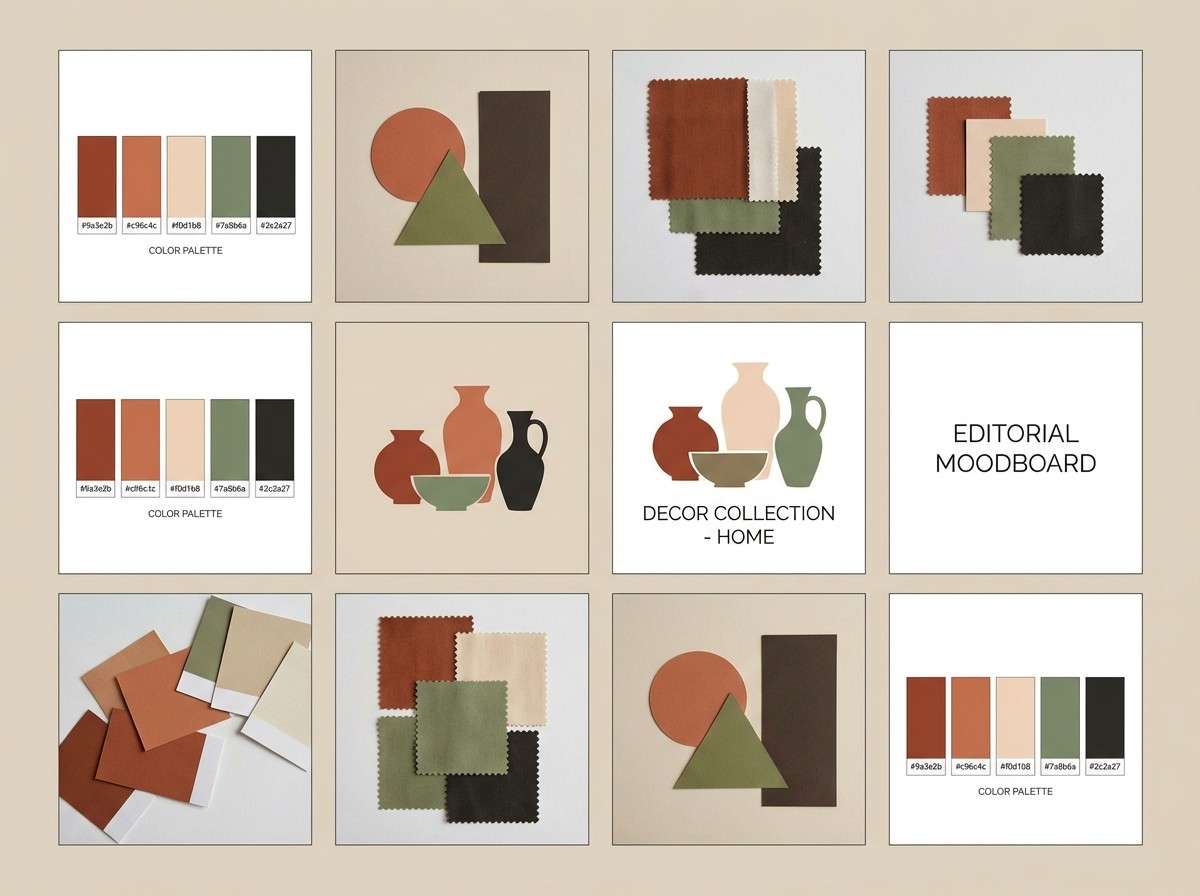
10) Brick and Sage
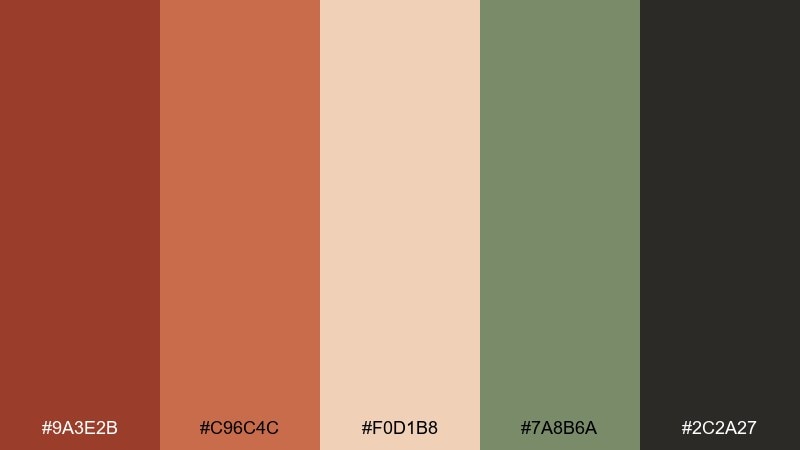
HEX: #9a3e2b #c96c4c #f0d1b8 #7a8b6a #2c2a27
Mood: balanced, natural, design-forward
Best for: home decor moodboards and lookbooks
Balanced and natural, it recalls brick walls, sage leaves, and matte ceramics in a curated home. It suits lookbooks, interior moodboards, and lifestyle branding that wants warmth without feeling rustic. Let sage carry secondary accents like bullets and icons while brick handles headlines and hero blocks. Usage tip: keep black as a thin-line tool only, so the palette stays soft and organic.
Image example of brick and sage generated using media.io
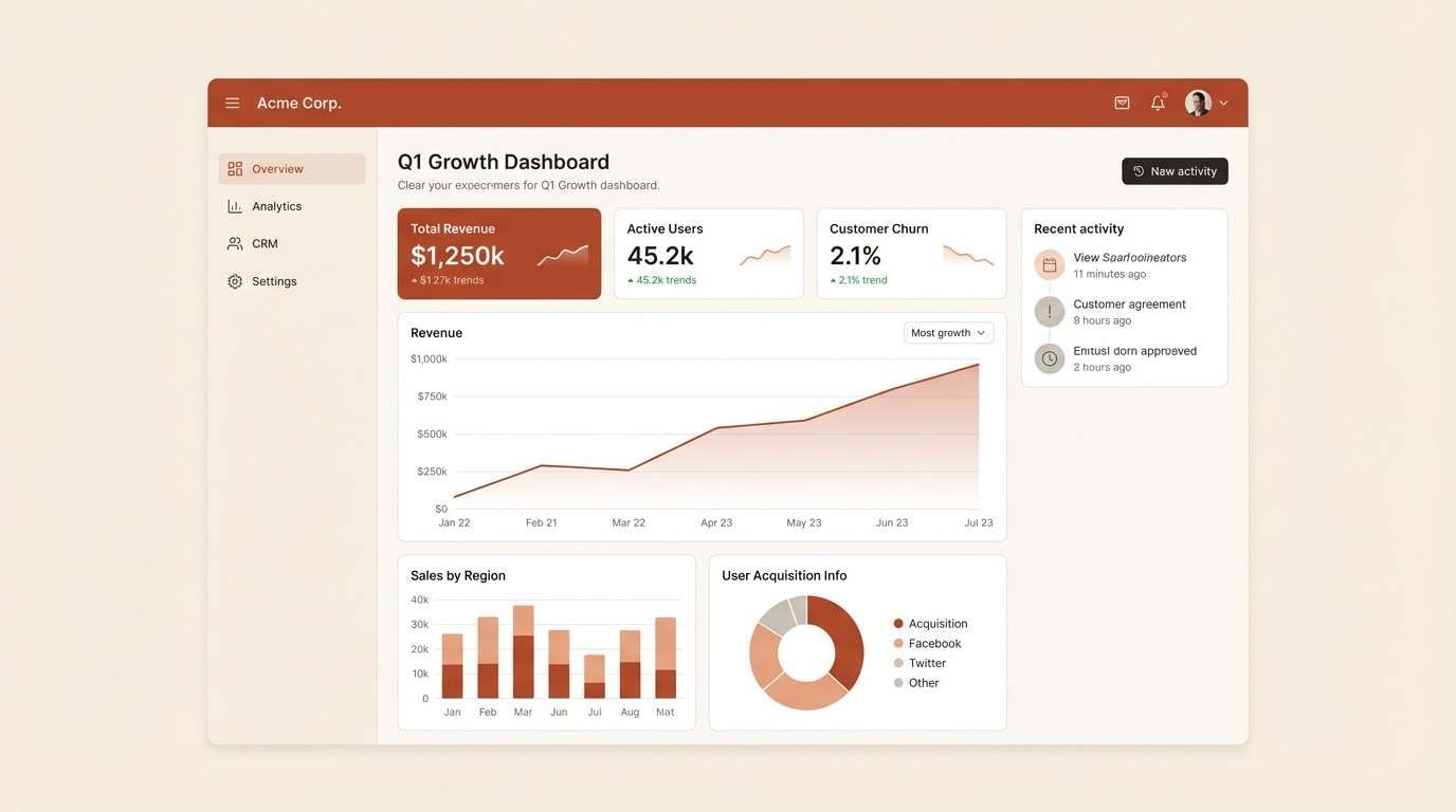
11) Hearthside Minimal
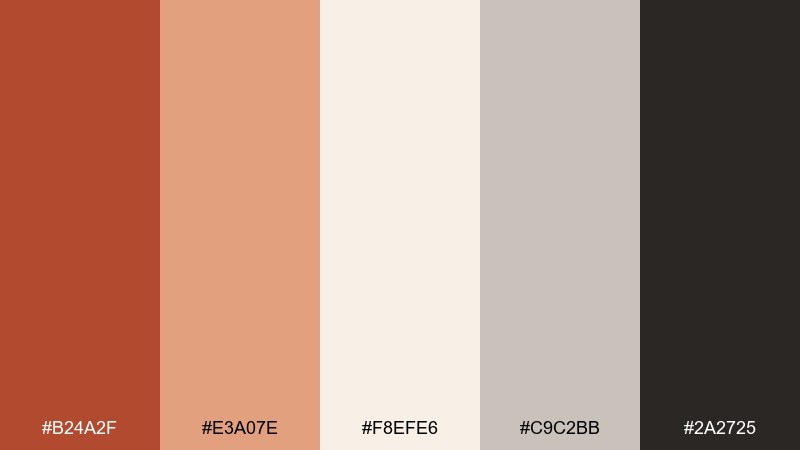
HEX: #b24a2f #e3a07e #f8efe6 #c9c2bb #2a2725
Mood: clean, warm, professional
Best for: SaaS dashboards and data UI
Clean and warm, it suggests a modern hearth with smooth plaster and quiet shadows. It works well in dashboards where you want friendly warmth without sacrificing clarity. Use the dark charcoal for primary text, keep backgrounds in the soft creams, and reserve the orange for status badges or active states. Usage tip: apply the accent to one UI element family only, like buttons, to avoid visual noise.
Image example of hearthside minimal generated using media.io
12) Sunset Kiln

HEX: #b1482c #e36f4a #ffb38a #f7e6d6 #3a2f2b
Mood: glowing, editorial, optimistic
Best for: travel magazine covers and feature spreads
Glowing and optimistic, it captures kiln heat fading into a soft sunset gradient. This carnelian color palette is great for travel covers, feature openers, and editorial typography that needs warmth and drama. Pair the brightest peach with plenty of creamy margins, then use the deep brown for mastheads and pull quotes. Usage tip: keep imagery warm-toned and avoid cool blues so the page feels cohesive.
Image example of sunset kiln generated using media.io
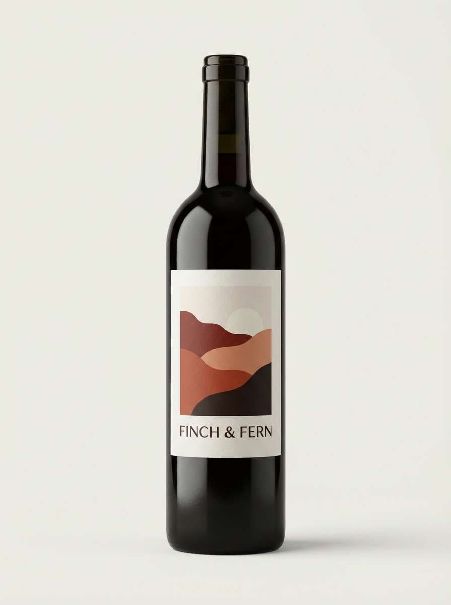
13) Rustic Winery
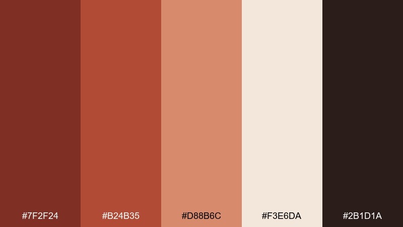
HEX: #7f2f24 #b24b35 #d88b6c #f3e6da #2b1d1a
Mood: moody, refined, romantic
Best for: wine labels and bottle packaging
Moody and refined, it feels like aged barrels, dried fruit, and candlelit tastings. These shades are ideal for wine labels, gourmet packaging, and boutique hospitality branding. Pair the creamy tint with deep burgundy-brown for elegant contrast and let the warm tan soften the layout. Usage tip: emboss or foil the darkest shade as a small crest to elevate the premium vibe.
Image example of rustic winery generated using media.io
14) Warm Adobe
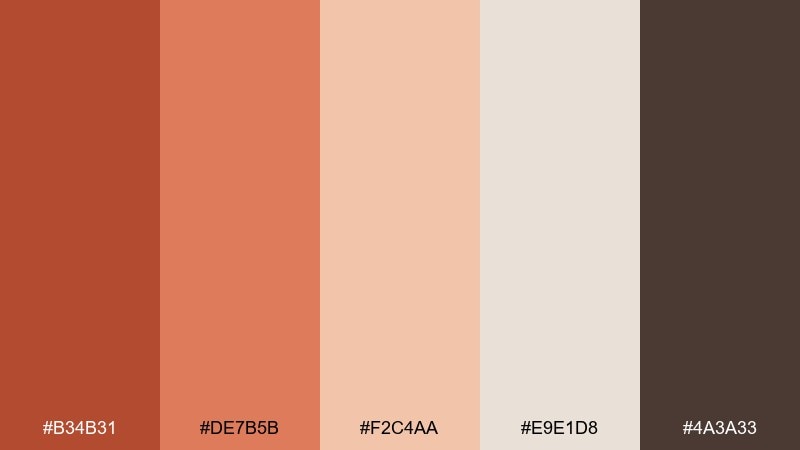
HEX: #b34b31 #de7b5b #f2c4aa #e9e1d8 #4a3a33
Mood: sunlit, modern, architectural
Best for: architecture portfolio landing pages
Sunlit and architectural, it suggests adobe walls, soft shadows, and clean lines. It is a strong fit for portfolio websites, studio introductions, and case-study pages where typography should feel confident. Keep backgrounds light and let the mid terracotta carry section headers or navigation hover states. Usage tip: use the darkest brown for a thin grid and dividers to make layouts feel intentional.
Image example of warm adobe generated using media.io
15) Rosewood Night
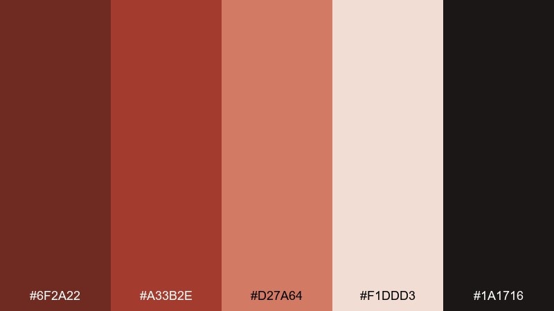
HEX: #6f2a22 #a33b2e #d27a64 #f1ddd3 #1a1716
Mood: luxurious, intimate, night-time
Best for: luxury skincare ads and packaging
Luxurious and intimate, it feels like rosewood lacquer under low light. It fits beauty campaigns and packaging where warmth should look expensive, not cute. Pair the soft blush-cream with the deepest near-black for premium contrast, then use the mid coral as a subtle highlight. Usage tip: keep the brightest tone for small glints, like ingredient callouts or seals, to avoid flattening the mood.
Image example of rosewood night generated using media.io
16) Coral Copper Pop
HEX: #b5462d #ff8a66 #ffc6b0 #f6f1ea #2e2a27
Mood: bright, upbeat, youthful
Best for: pop poster graphics and creator merch
Bright and upbeat, it channels coral candy, copper foil, and clean gallery walls. These carnelian color combinations work best when you choose two dominant warms and let the rest act as structure. Pair the charcoal with the cream for typography, then splash the vivid coral on shapes and headlines. Usage tip: keep gradients subtle and use flat blocks for a crisp, modern pop look.
Image example of coral copper pop generated using media.io
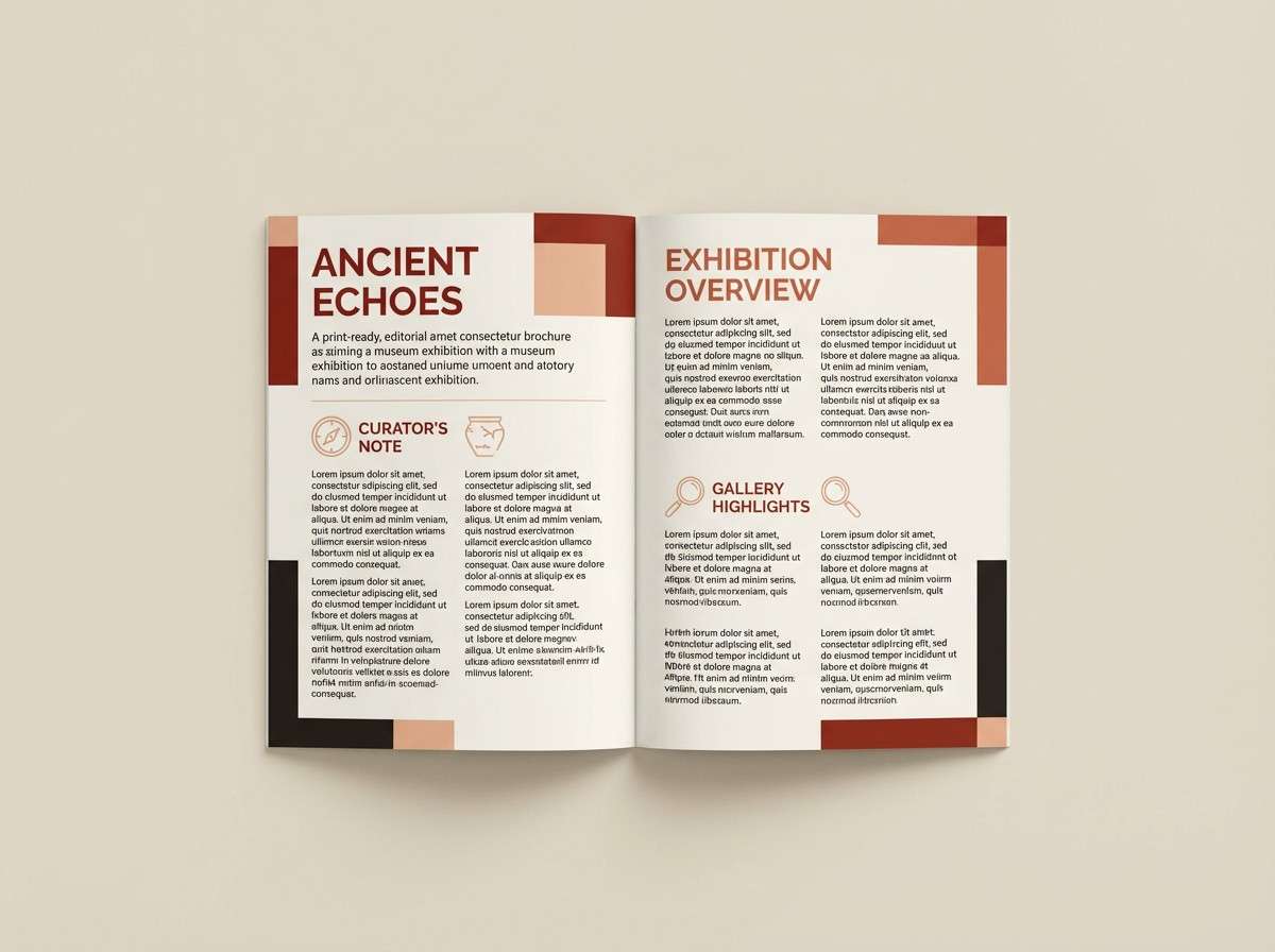
17) Museum Ochre
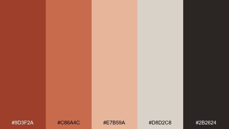
HEX: #9d3f2a #c86a4c #e7b59a #d8d2c8 #2b2624
Mood: cultured, calm, timeless
Best for: museum brochures and exhibition guides
Cultured and calm, it feels like terracotta artifacts, linen labels, and quiet gallery rooms. As a carnelian color scheme, it suits brochures and exhibition guides that need warmth without distraction. Pair the light stone neutral with rich ochre for section navigation, and keep the dark tone for body text. Usage tip: use the mid tan as a background panel behind captions to improve legibility.
Image example of museum ochre generated using media.io
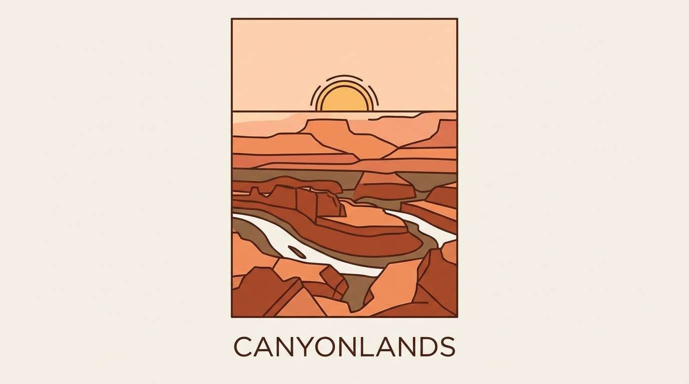
18) Canyon Sunrise
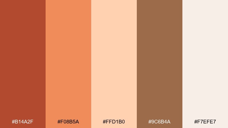
HEX: #b14a2f #f08b5a #ffd1b0 #9c6b4a #f7efe7
Mood: hopeful, airy, scenic
Best for: landscape illustrations and travel posters
Hopeful and airy, it looks like sunrise spilling over ridgelines with soft haze in the distance. It is great for travel posters and illustration-led campaigns that want warmth without heavy shadows. Pair the blush and cream for sky gradients, then use the deeper brown for silhouettes and type. Usage tip: keep details minimal so the gentle warm transitions stay the hero.
Image example of canyon sunrise generated using media.io
19) Cinnamon Latte
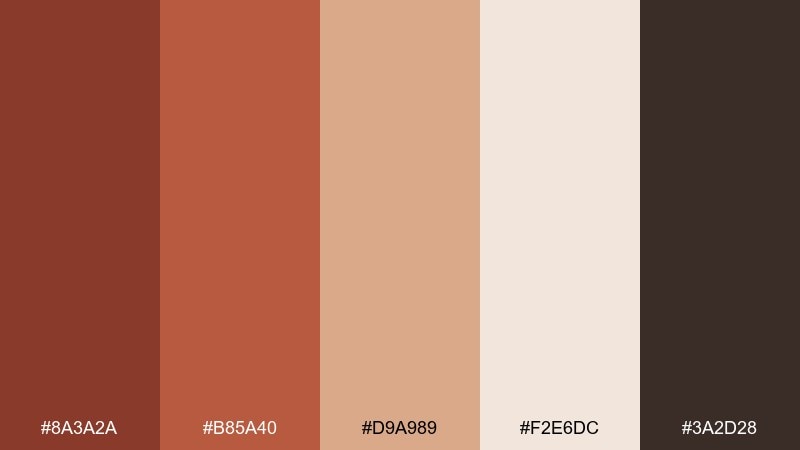
HEX: #8a3a2a #b85a40 #d9a989 #f2e6dc #3a2d28
Mood: comforting, creamy, understated
Best for: coffee packaging and cozy brand assets
Comforting and creamy, it brings to mind cinnamon foam, toasted sugar, and matte kraft labels. These tones are excellent for coffee packaging, loyalty cards, and simple brand systems that rely on texture and type. Pair the cream and tan for backgrounds and keep the darker brown for clear ingredient hierarchy. Usage tip: use one warm accent band near the top of a pouch to create a recognizable shelf signature.
Image example of cinnamon latte generated using media.io
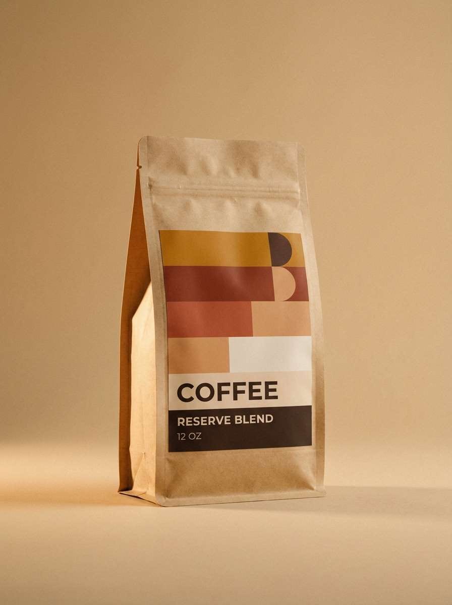
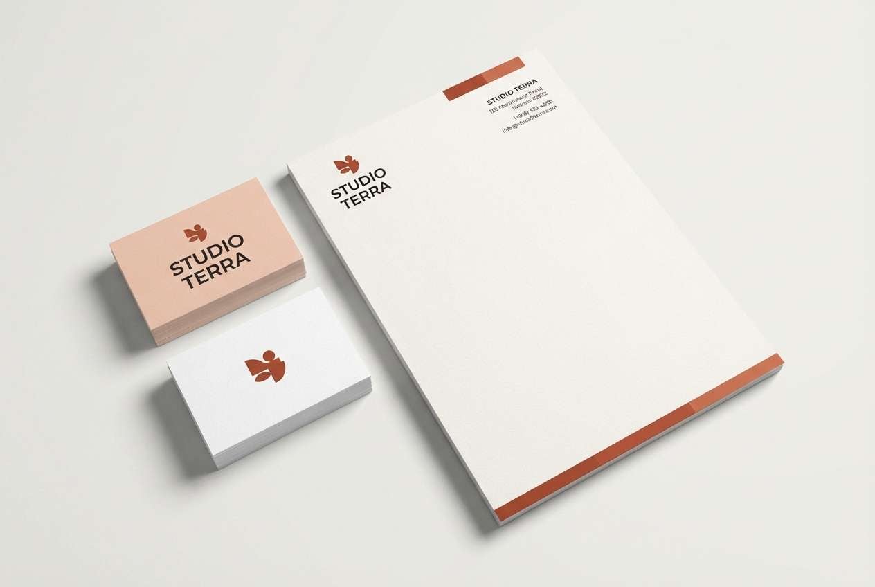
20) Redwood Accent
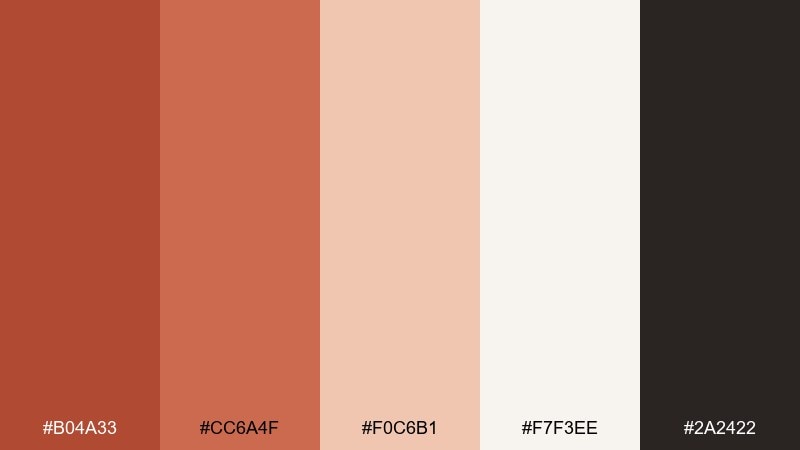
HEX: #b04a33 #cc6a4f #f0c6b1 #f7f3ee #2a2422
Mood: modern, friendly, brand-ready
Best for: startup branding kits and stationery
Modern and friendly, it feels like redwood stain with a soft blush highlight and clean paper stock. It works for branding kits, letterheads, and simple guidelines where the palette needs to look confident across print and digital. Pair the warm neutrals with the charcoal for type, then use the redwood tone as the signature accent on marks and dividers. Usage tip: test the accent on small elements first, like bullets and stamps, before using it as a large background.
Image example of redwood accent generated using media.io
What Colors Go Well with Carnelian?
Carnelian pairs best with warm neutrals like cream, linen, sand, and stone—these keep the palette airy and modern. For text and structure, espresso browns and near-black charcoals deliver clean readability without the harshness of pure black.
For contrast, cool accents like sage, dusty green, and deep teal are reliable choices. They complement carnelian’s warmth and create a balanced “warm vs. cool” harmony that feels design-forward.
If you want a softer look, choose blush-peach tints instead of bright whites. If you want more drama, deepen your shadows with burgundy-browns and reduce the number of mid-tones.
How to Use a Carnelian Color Palette in Real Designs
Start by choosing one role for carnelian: hero background, headline accent, or UI state color. Because it’s naturally attention-grabbing, using it everywhere can flatten hierarchy and make layouts feel heavy.
Keep neutrals doing most of the work—especially in web and UI—then apply carnelian to key actions (buttons), key moments (badges), or key brand assets (logo marks, packaging bands). Add a single cool counter-accent (like sage or teal) only when you need extra separation.
For accessibility, test contrast early: pair carnelian with cream for large areas, but switch to dark charcoal/espresso for body text and small UI elements. That keeps warmth high while maintaining clarity.
Create Carnelian Palette Visuals with AI
If you already have HEX codes, you can turn them into real-looking brand mockups, posters, packaging, and UI screens in minutes. The trick is to describe the layout (poster, landing page, label), restrict the colors, and specify lighting or style.
To stay consistent, reuse one prompt structure and swap only the HEX set and the subject (menu flyer, brochure, product shot). This helps you generate a cohesive set of visuals for moodboards, pitch decks, or client options.
Media.io makes it easy to generate, iterate, and export palette-based visuals directly in your browser.
Carnelian Color Palette FAQs
-
What hex code is carnelian?
A common modern carnelian pick is #b04a2a, a warm terracotta-rust tone that works well as an accent or hero color. -
Is carnelian closer to terracotta or burnt orange?
Carnelian usually sits between them: more earthy and clay-like than bright burnt orange, but often deeper and redder than classic terracotta. -
What neutral colors match carnelian best?
Creams, off-whites, sand, stone, and warm grays pair best because they preserve the warmth while keeping layouts light and readable. -
What accent colors complement carnelian?
Try sage green, dusty olive, deep teal, and muted blue-green for contrast. These cool accents balance carnelian without making it look neon. -
Can I use carnelian in UI design?
Yes—use it for buttons, active states, badges, or highlights, and keep most surfaces in light neutrals. Pair with charcoal text for accessibility. -
How do I keep a carnelian palette from looking too heavy?
Increase negative space, limit mid-tone oranges, and reserve the darkest shade for type. Let neutrals dominate and use carnelian strategically. -
What finish or texture pairs well with carnelian branding?
Matte paper, kraft textures, linen, leather, ceramic, and subtle foil accents work especially well because they reinforce the earthy, premium feel.


