

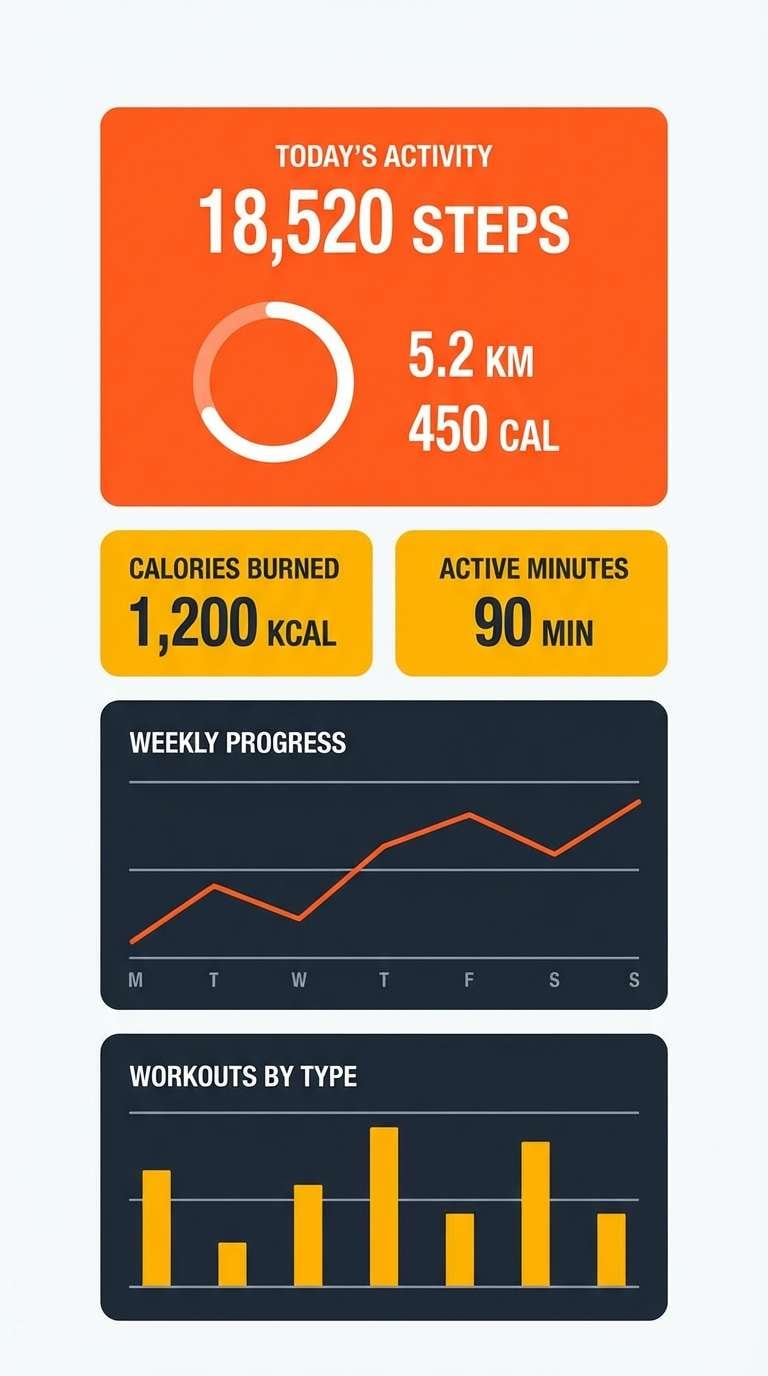
Tangerine is a modern warm that feels energetic without going neon, making it a go-to for brands that want positivity, momentum, and clarity. It also pairs beautifully with both soft neutrals and deep, high-contrast anchors for readable UI and print.
Below are 20 tangerine color palette ideas with HEX codes, plus real-use tips and AI prompts you can copy to generate matching visuals for ads, posters, onboarding screens, and brand kits.
In this article
- Why Tangerine Palettes Work So Well
-
- citrus sunrise
- desert apricot
- pumpkin spice neutrals
- coral glow
- tangerine teal pop
- retro soda shop
- autumn market
- peachy minimal
- mango mojito
- sunset boulevard
- clay and cream
- terracotta garden
- sporty energy
- nordic warmth
- festival lights
- coastal orange
- modern bistro
- kids storybook
- luxe copper
- nightfall ember
- What Colors Go Well with Tangerine?
- How to Use a Tangerine Color Palette in Real Designs
- Create Tangerine Palette Visuals with AI
Why Tangerine Palettes Work So Well
Tangerine sits in a sweet spot: warm enough to feel friendly and appetizing, yet bright enough to create instant emphasis for calls to action, badges, and key information. It’s especially effective in modern layouts where you want energy without visual noise.
From a usability perspective, tangerine plays well with deep charcoals and navies, helping designers maintain strong contrast and readable typography. That balance makes it a practical choice for UI systems, posters, and packaging where hierarchy matters.
It’s also highly flexible: shift it toward coral for a softer, wellness-friendly feel, or push it toward copper/terracotta for premium, artisanal moods. With the right neutral base, tangerine can look minimal, sporty, retro, or luxe.
20+ Tangerine Color Palette Ideas (with HEX Codes)
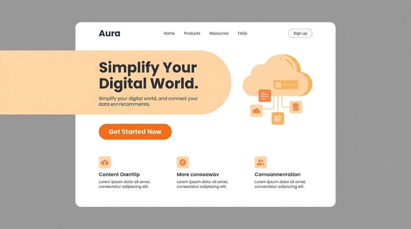
1) Citrus Sunrise
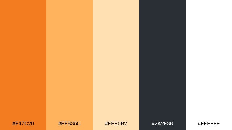
HEX: #f47c20 #ffb35c #ffe0b2 #2a2f36 #ffffff
Mood: bright, clean, optimistic
Best for: landing page hero UI
Bright and optimistic, this mix feels like morning light spilling over fresh citrus. Use the deep charcoal for type and navigation to keep contrast crisp. The softer apricot and cream are ideal for cards, sections, and spacious backgrounds. Tip: keep the vivid orange to one primary button and one highlight element for a polished, modern rhythm.
Image example of citrus sunrise generated using media.io
Media.io is an online AI studio for creating and editing video, image, and audio in your browser.

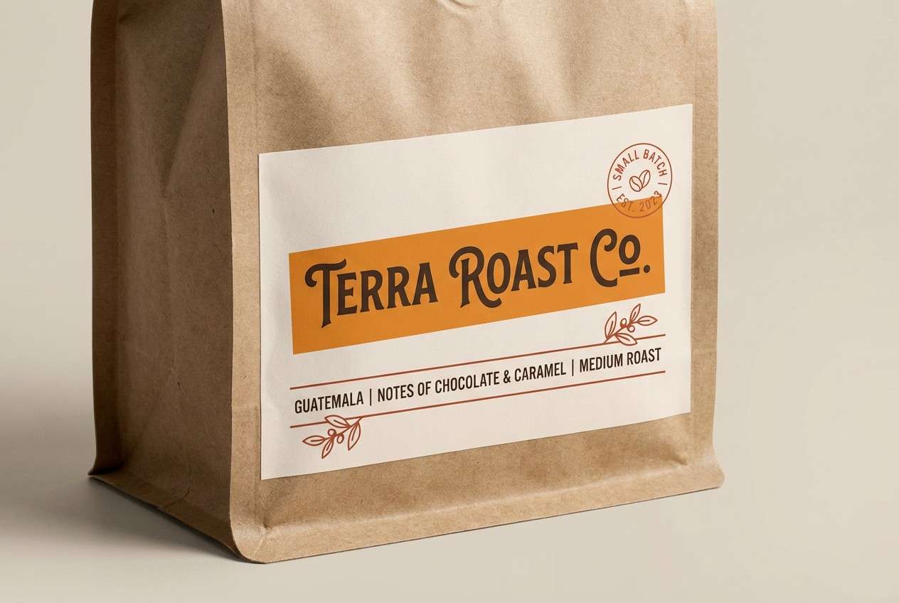
2) Desert Apricot
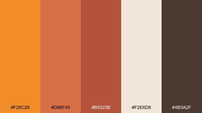
HEX: #f28c28 #d86f45 #b5523b #f2e6d8 #4b3a2f
Mood: sunbaked, earthy, calm
Best for: coffee label packaging
Sunbaked and grounded, these tones evoke desert clay and apricot skin. Pair the warm creams with the deeper brown for a premium, craft feel. The richer terracotta shades work best as bold label blocks or badges. Tip: add subtle grain and keep typography simple to let the earthy warmth read as authentic.
Image example of desert apricot generated using media.io
3) Pumpkin Spice Neutrals
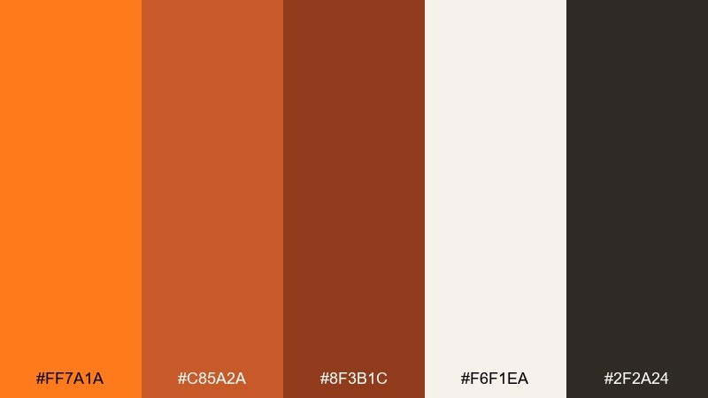
HEX: #ff7a1a #c85a2a #8f3b1c #f6f1ea #2f2a24
Mood: cozy, bold, seasonal
Best for: fall sale poster design
Cozy and bold, it brings to mind toasted spices and late-afternoon warmth. Use the off-white as a roomy canvas so the saturated orange pops without shouting. The deep espresso tone keeps headlines sharp and readable from a distance. Tip: limit accent shapes to one or two strong blocks to maintain a clean retail look.
Image example of pumpkin spice neutrals generated using media.io

4) Coral Glow
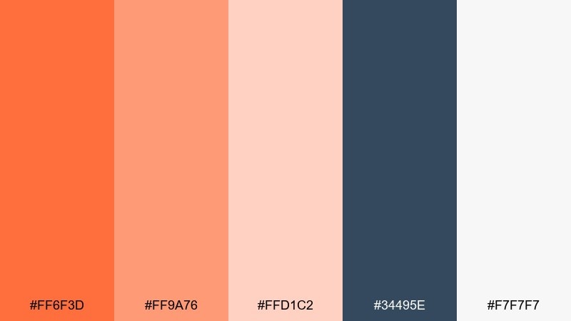
HEX: #ff6f3d #ff9a76 #ffd1c2 #34495e #f7f7f7
Mood: friendly, modern, airy
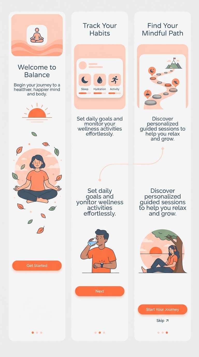
Best for: wellness app onboarding UI
Friendly and airy, the coral glow reads like soft light on skin tones. Anchor screens with slate blue for headers and icon strokes so the warm hues stay gentle. Use blush and light gray to keep onboarding steps calm and approachable. Tip: reserve the brightest coral for progress dots and primary actions to guide attention.
Image example of coral glow generated using media.io
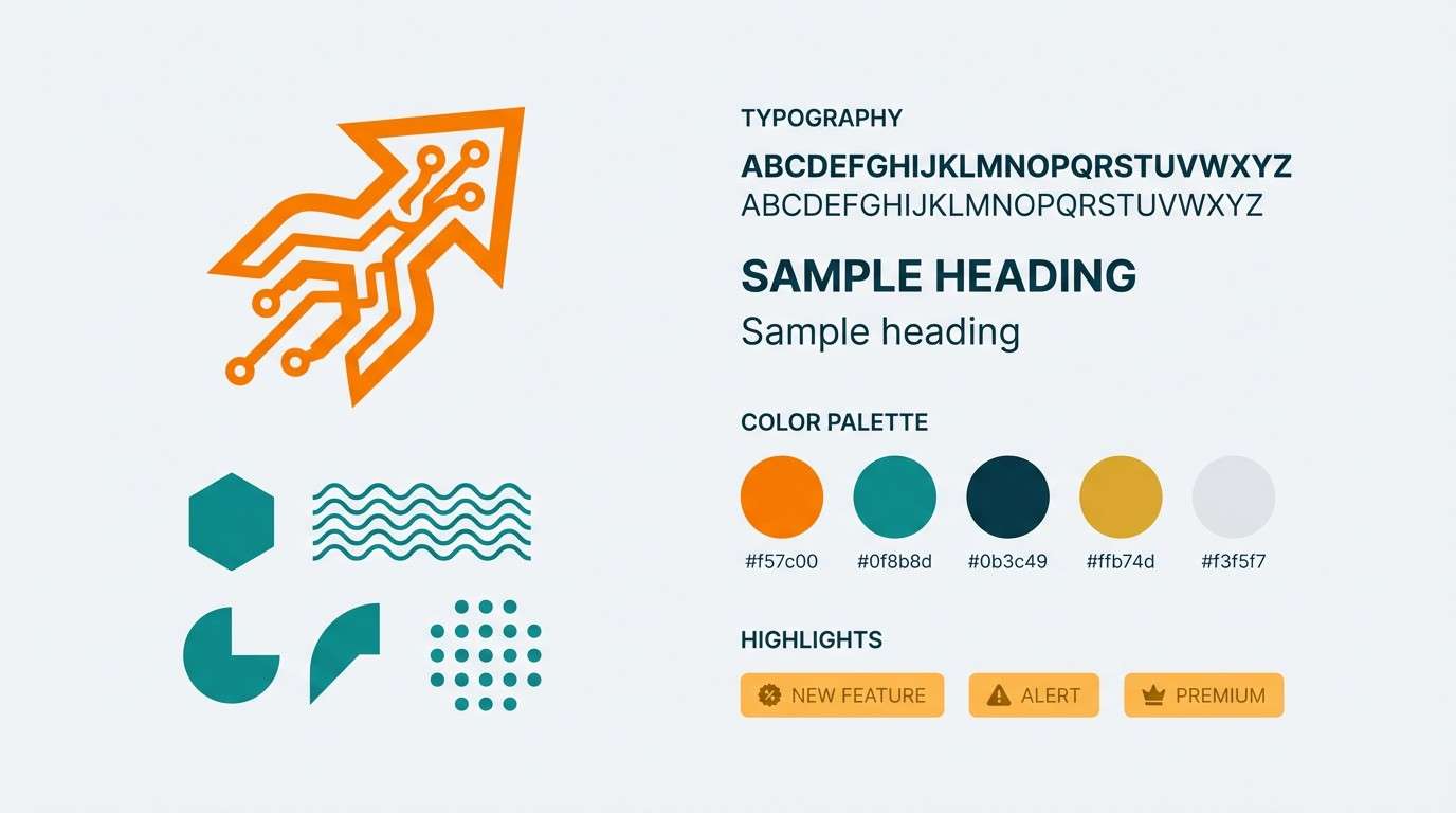
5) Tangerine Teal Pop
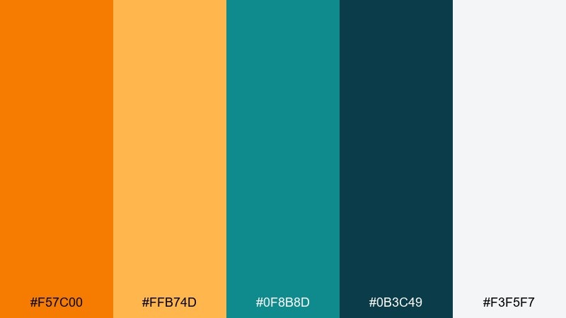
HEX: #f57c00 #ffb74d #0f8b8d #0b3c49 #f3f5f7
Mood: energetic, sporty, high-contrast
Best for: tech startup brand kit
Energetic and high-contrast, it feels like bright citrus against cool ocean water. These tangerine color combinations shine in logos, app icons, and bold social headers where clarity matters. Keep teal as your secondary accent and let the deep blue-green handle body text and outlines. Tip: use the light gray as negative space so the palette stays crisp instead of chaotic.
Image example of tangerine teal pop generated using media.io
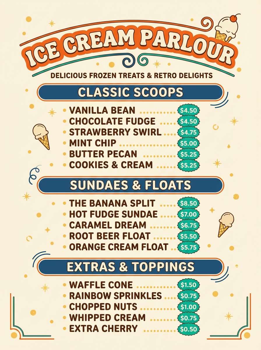
6) Retro Soda Shop
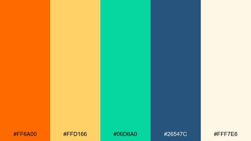
HEX: #ff6a00 #ffd166 #06d6a0 #26547c #fff7e6
Mood: playful, retro, punchy
Best for: ice cream menu flyer
Playful and punchy, this set evokes neon signage and fizzy summer treats. Balance the bright orange with creamy off-white so the layout stays readable. The mint green works best for small stickers, prices, and fun icons, while navy holds the menu structure together. Tip: stick to chunky type and simple shapes for a true retro vibe.
Image example of retro soda shop generated using media.io
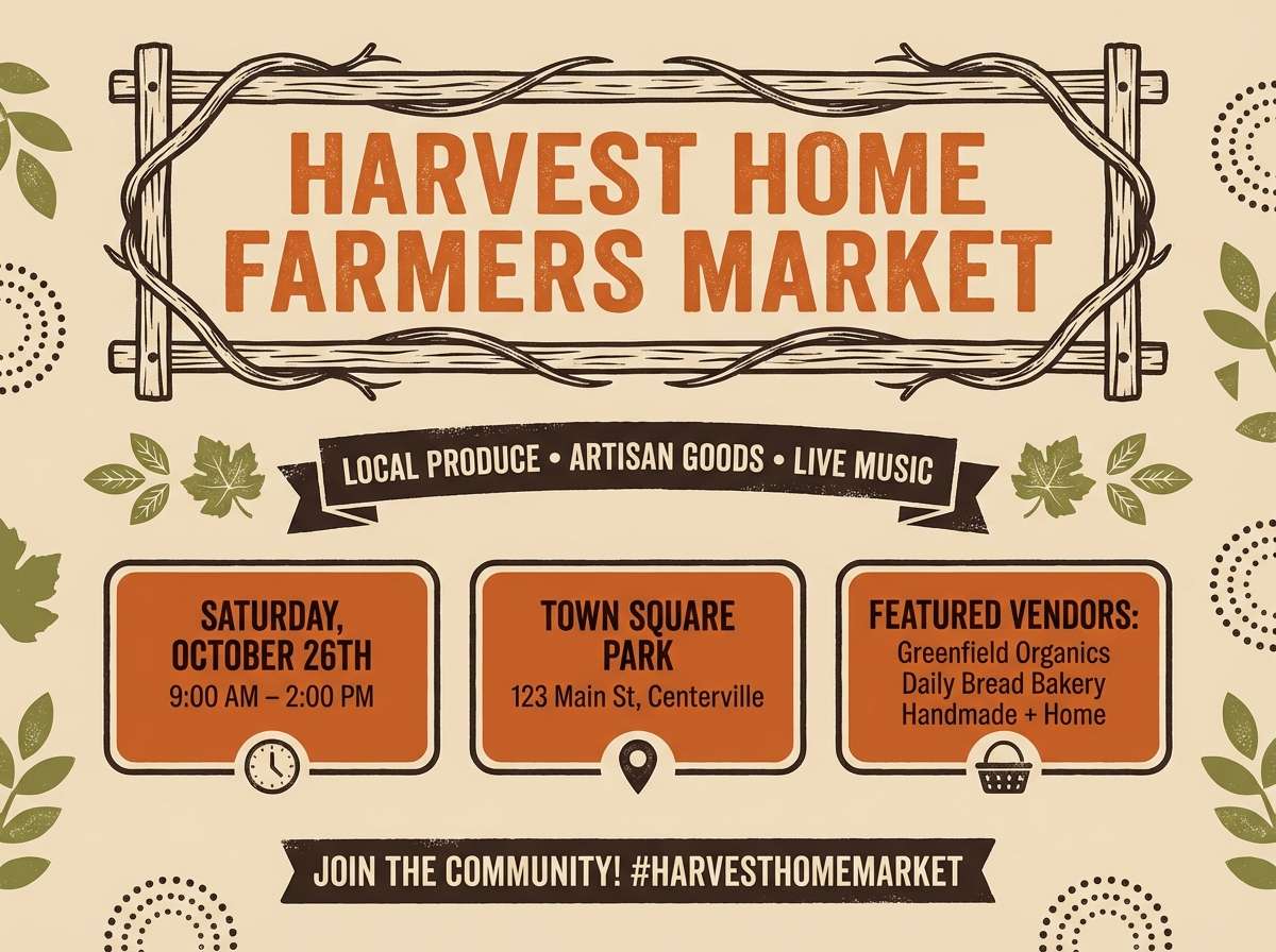
7) Autumn Market
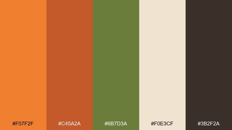
HEX: #f07f2f #c45a2a #6b7d3a #f0e3cf #3b2f2a
Mood: harvest, rustic, welcoming
Best for: farmers market event poster
Rustic and welcoming, it feels like harvest stalls, dried leaves, and handmade goods. Use the sage green to offset the warmth and keep the poster from leaning too orange. Creamy beige makes an excellent background for date and location details. Tip: add a simple border in the deep brown to frame the layout and boost legibility.
Image example of autumn market generated using media.io
8) Peachy Minimal
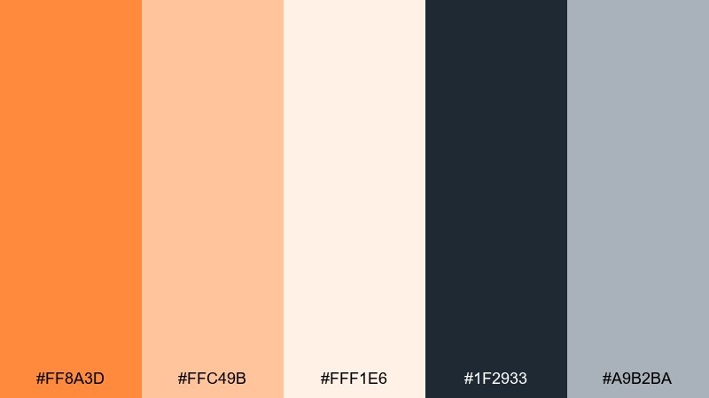
HEX: #ff8a3d #ffc49b #fff1e6 #1f2933 #a9b2ba
Mood: soft, minimal, refined
Best for: portfolio website UI
Soft and refined, these tones suggest warm light on linen and quiet studio spaces. Use the near-black for text and navigation so the pale peach can stay subtle and airy. Keep the gray for dividers and secondary buttons to maintain a minimal hierarchy. Tip: apply the bright accent sparingly on hover states and small badges for a premium feel.
Image example of peachy minimal generated using media.io
9) Mango Mojito
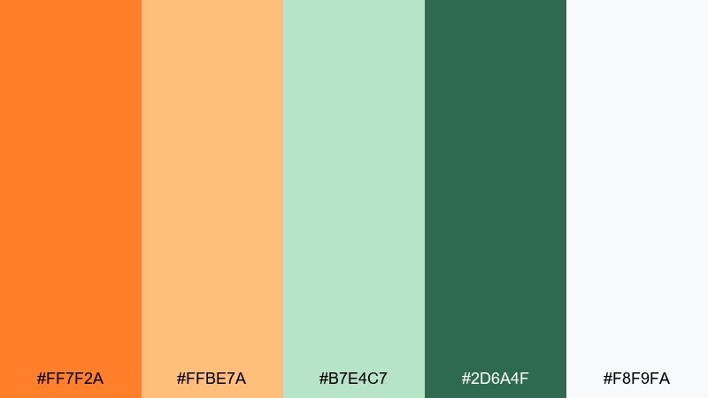
HEX: #ff7f2a #ffbe7a #b7e4c7 #2d6a4f #f8f9fa
Mood: fresh, tropical, relaxed
Best for: summer beverage product ad
Fresh and tropical, it calls up mango slices, mint leaves, and a breezy patio mood. Let the greens play a supporting role in garnish details and small text highlights. The light background keeps the composition clean while the orange sells the flavor fast. Tip: use strong shadows and condensation details to make the warm tones feel even juicier.
Image example of mango mojito generated using media.io
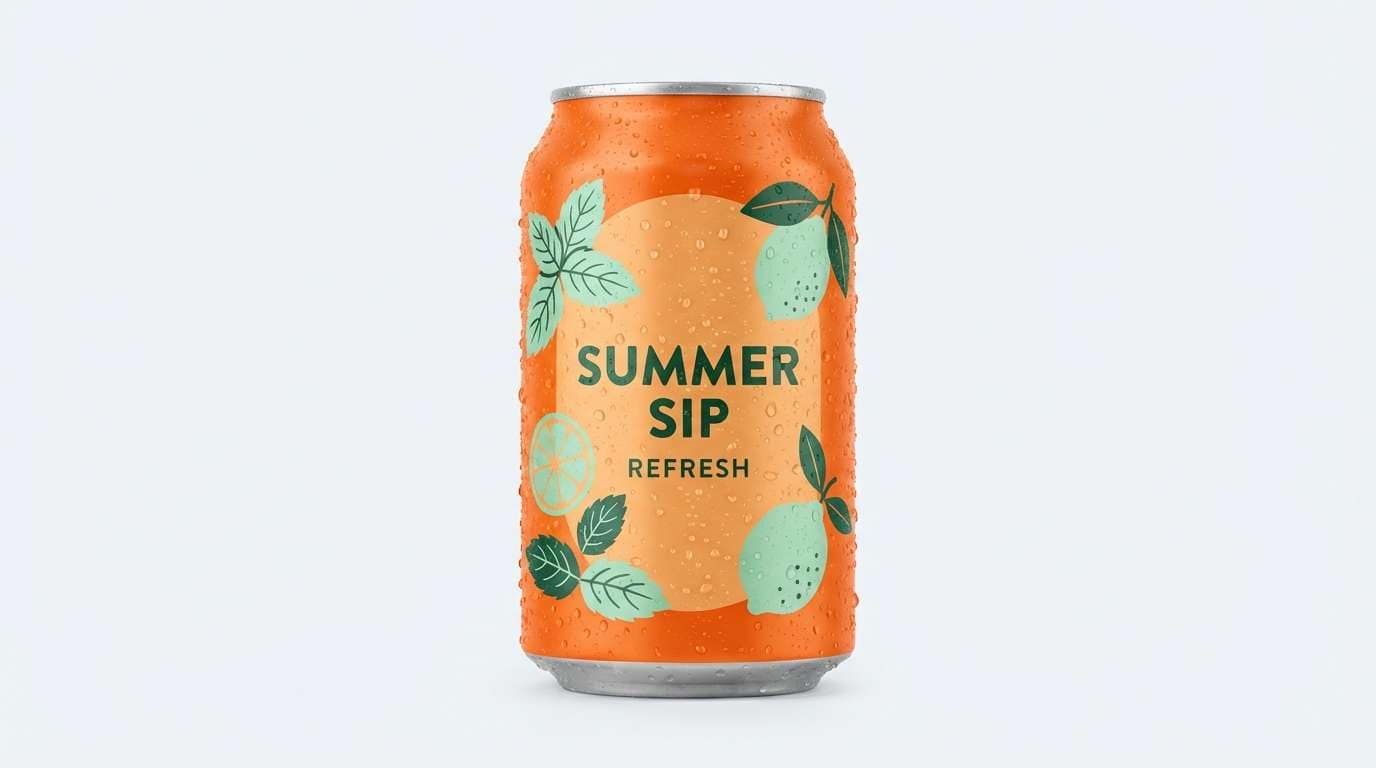
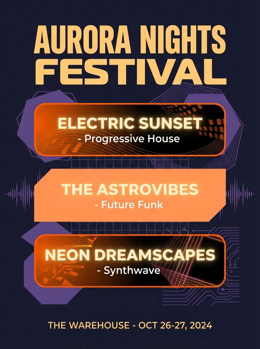
10) Sunset Boulevard
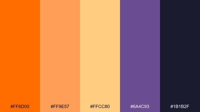
HEX: #ff6d00 #ff9e57 #ffcc80 #6a4c93 #1b1b2f
Mood: cinematic, bold, nightlife
Best for: music festival flyer
Cinematic and bold, it feels like a sunset fading into city nightlife. The purple and near-black create instant depth, while the warm oranges read as stage light. Use gradients sparingly and keep typography high-contrast for quick scanning. Tip: set the brightest orange as the date highlight so the key info jumps first.
Image example of sunset boulevard generated using media.io
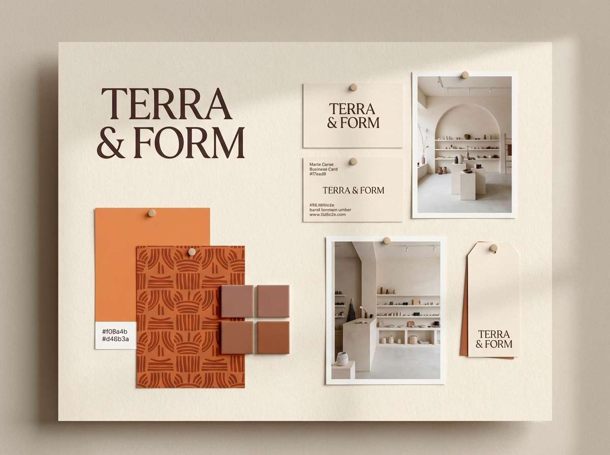
11) Clay and Cream
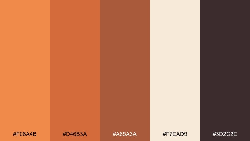
HEX: #f08a4b #d46b3a #a85a3a #f7ead9 #3d2c2e
Mood: handmade, warm, artisanal
Best for: ceramics shop branding
Handmade and warm, it echoes kiln-fired clay, glaze, and creamy stoneware. Use the darkest brown for wordmarks and small details to keep the look grounded. The mid terracotta tones are perfect for patterns, stamp marks, and packaging bands. Tip: pair with uncoated paper textures so the colors feel tactile and artisanal.
Image example of clay and cream generated using media.io
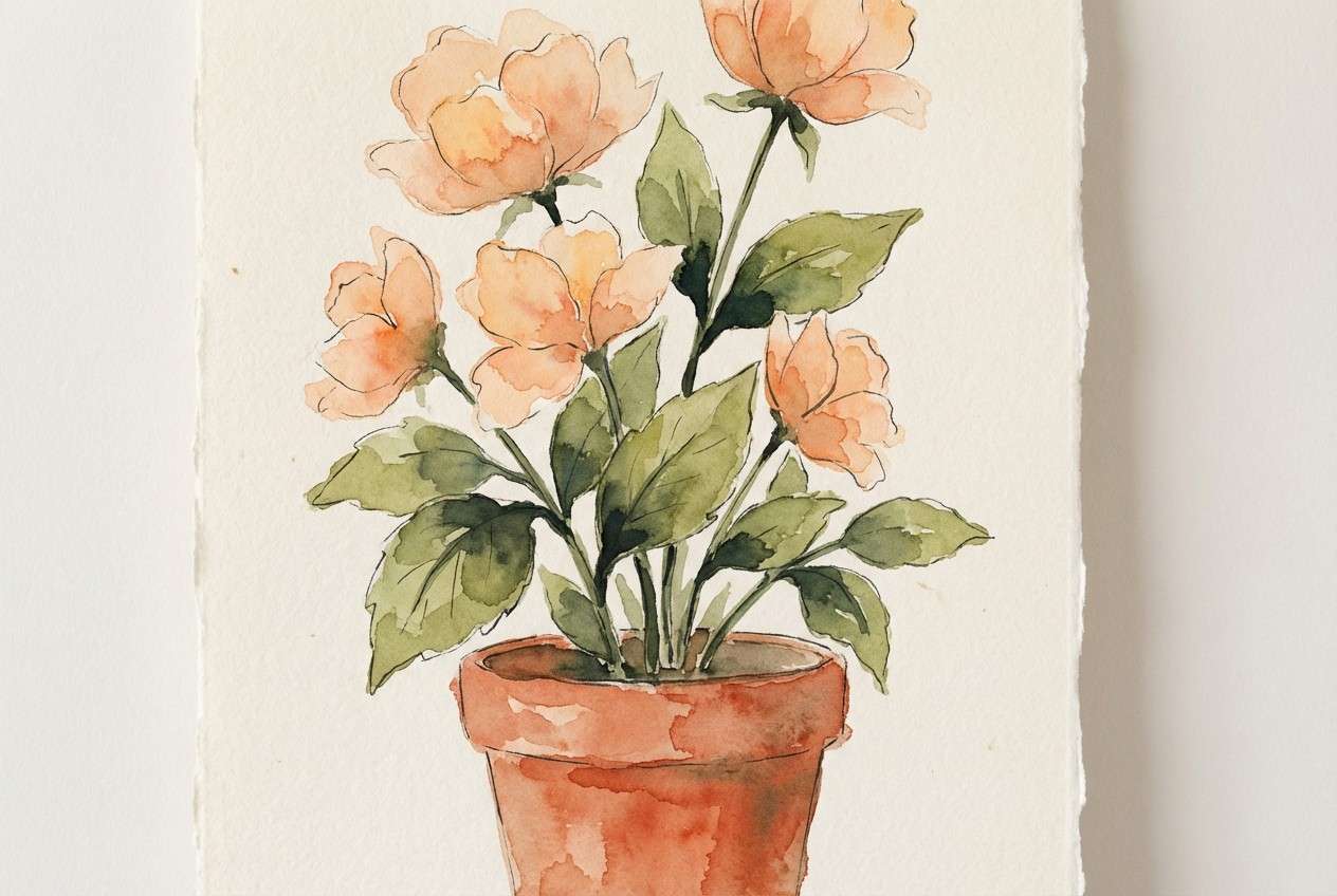
12) Terracotta Garden
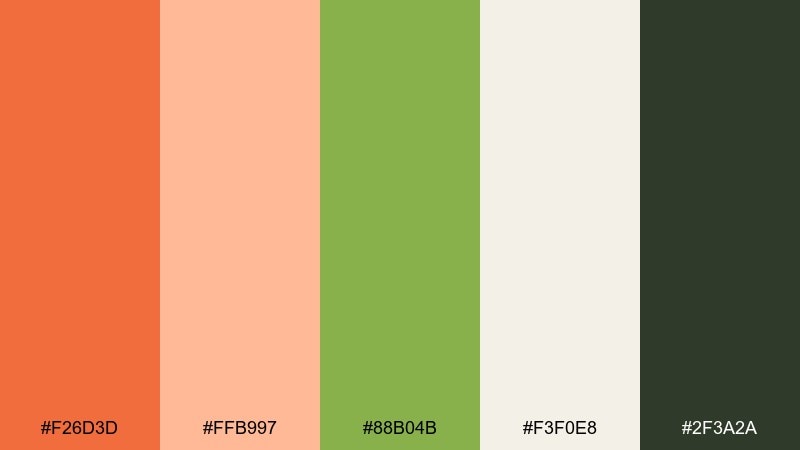
HEX: #f26d3d #ffb997 #88b04b #f3f0e8 #2f3a2a
Mood: botanical, sunny, natural
Best for: botanical illustration print
Sunny and natural, it suggests terracotta pots, soft petals, and fresh green leaves. Let the off-white behave like watercolor paper so the warm orange reads organic rather than digital. Use the leafy green for stems and small foliage details to keep the composition balanced. Tip: keep outlines minimal and let layered washes create depth.
Image example of terracotta garden generated using media.io
13) Sporty Energy
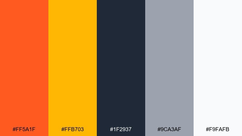
HEX: #ff5a1f #ffb703 #1f2937 #9ca3af #f9fafb
Mood: fast, confident, high-impact
Best for: fitness app dashboard UI
Fast and confident, these tones feel like a sprint timer and bright gym lighting. Use the dark slate for charts, labels, and navigation to keep data readable. The yellow works as a secondary alert color for goals and streaks without competing with the main orange. Tip: apply the hottest accent only to the top metric and one call to action per screen.
Image example of sporty energy generated using media.io
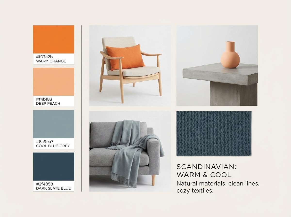
14) Nordic Warmth
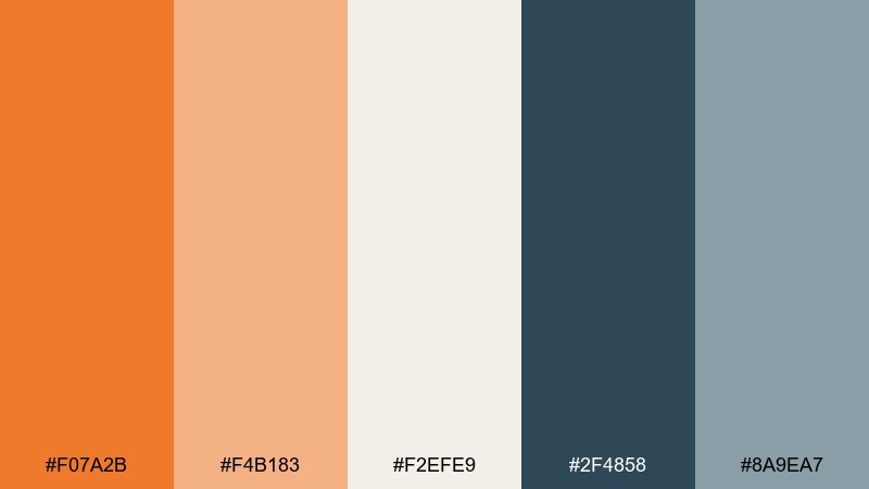
HEX: #f07a2b #f4b183 #f2efe9 #2f4858 #8a9ea7
Mood: cozy, modern, understated
Best for: interior design mood board
Cozy and understated, it feels like knit blankets, pale wood, and warm candlelight. These tangerine color combinations look best when the warm tones stay as accents against clean, cool blue-grays. Use the light neutral as the board base, then layer swatches and small typography in the deep slate. Tip: keep orange to textiles or a single statement object for a Scandinavian balance.
Image example of nordic warmth generated using media.io
15) Festival Lights
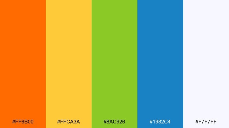
HEX: #ff6b00 #ffca3a #8ac926 #1982c4 #f7f7ff
Mood: joyful, bright, celebratory
Best for: community event invitation
Joyful and celebratory, it reads like string lights and confetti at golden hour. Keep the background airy so the bright accents stay friendly rather than overwhelming. Use blue for key information blocks and green for small decorative icons to balance the warm hues. Tip: keep to two dominant colors per panel and repeat them for visual unity.
Image example of festival lights generated using media.io

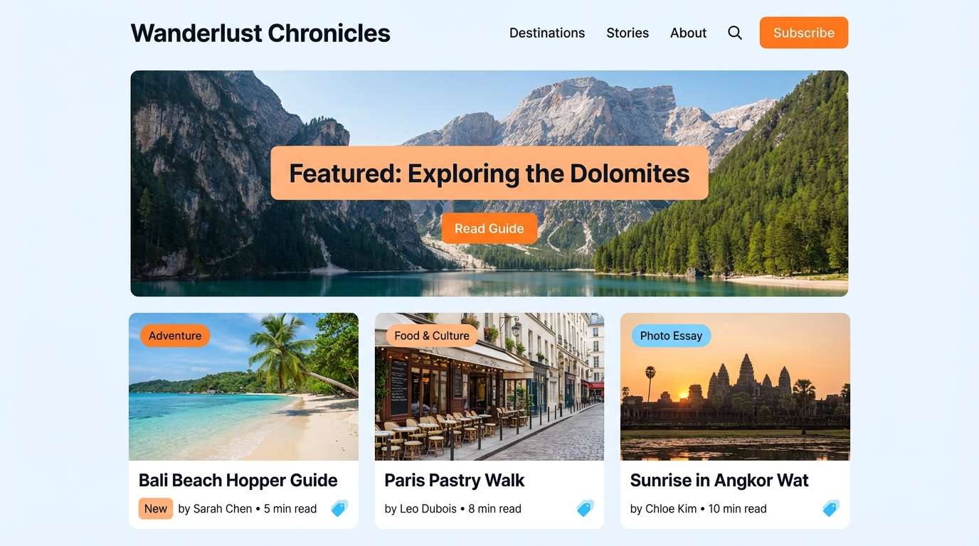
16) Coastal Orange
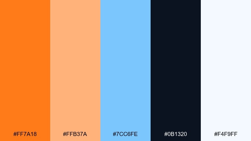
HEX: #ff7a18 #ffb37a #7cc6fe #0b1320 #f4f9ff
Mood: breezy, adventurous, fresh
Best for: travel blog header and cards
Breezy and adventurous, it feels like sunlit cliffs against a clear ocean sky. Use the pale blue as a supportive wash for cards and section headers, with the deep navy for titles and small UI lines. The warm orange works best for tags, buttons, and featured story highlights. Tip: keep orange accents consistent in size so the design stays calm and travel-ready.
Image example of coastal orange generated using media.io
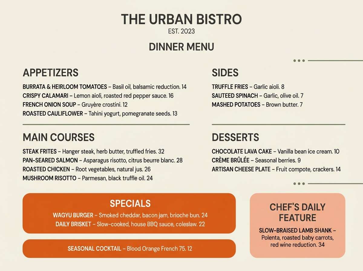
17) Modern Bistro
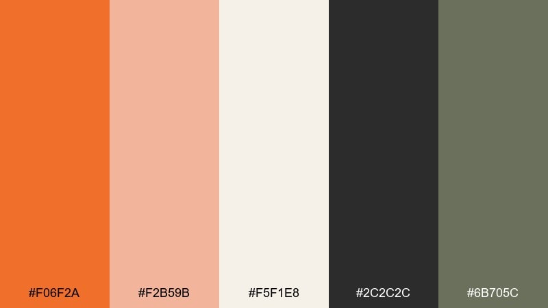
HEX: #f06f2a #f2b59b #f5f1e8 #2c2c2c #6b705c
Mood: appetizing, modern, cozy
Best for: restaurant menu layout
Appetizing and cozy, it suggests roasted vegetables, warm bread, and soft ambient lighting. The creamy base keeps the menu readable, while the dark gray handles typography without looking harsh. Use the muted olive as a subtle separator for sections and icons. Tip: highlight just the chef specials in the strongest orange so it feels intentional, not loud.
Image example of modern bistro generated using media.io
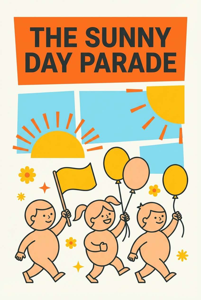
18) Kids Storybook
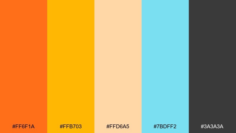
HEX: #ff6f1a #ffb703 #ffd6a5 #7bdff2 #3a3a3a
Mood: cheerful, playful, friendly
Best for: storybook cover illustration
Cheerful and playful, it feels like paper cutouts and sunny classroom crafts. Use the aqua as a sky or background wash to cool down the warm oranges. The soft peach works well for character details and friendly shapes without too much contrast. Tip: outline elements with the dark gray instead of pure black to keep the look gentle.
Image example of kids storybook generated using media.io
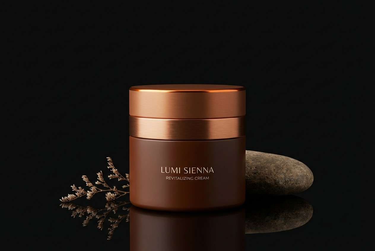
19) Luxe Copper
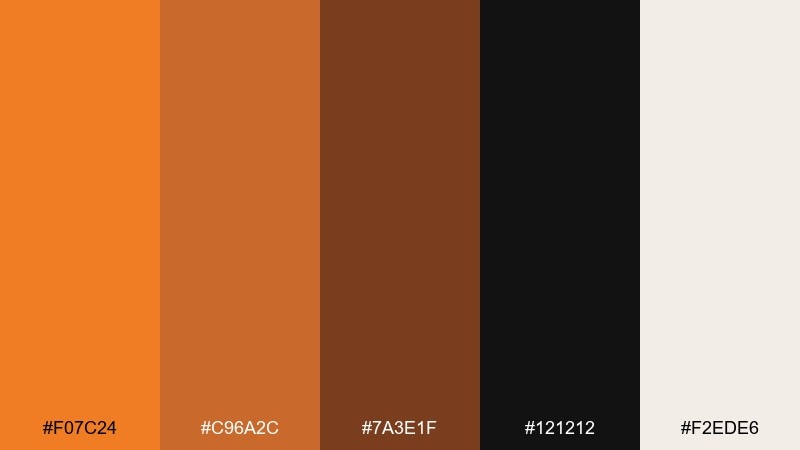
HEX: #f07c24 #c96a2c #7a3e1f #121212 #f2ede6
Mood: luxurious, moody, elegant
Best for: beauty product packaging
Luxurious and moody, it evokes copper foil, warm shadows, and a high-end vanity. A tangerine color palette like this benefits from lots of black space for contrast and drama. Use the pale cream for small legal text and to keep metallic-like browns from feeling heavy. Tip: apply the brightest tone only to a logo stamp or seal for a refined premium hit.
Image example of luxe copper generated using media.io
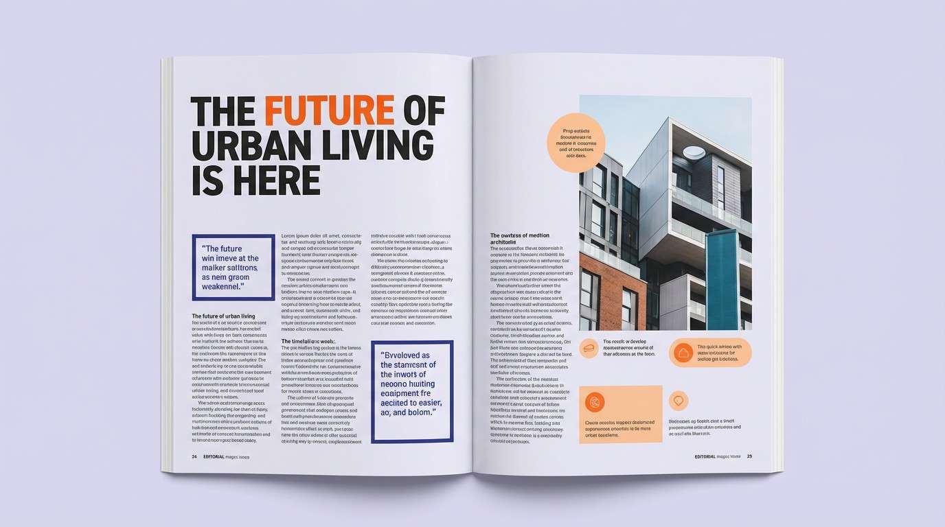
20) Nightfall Ember
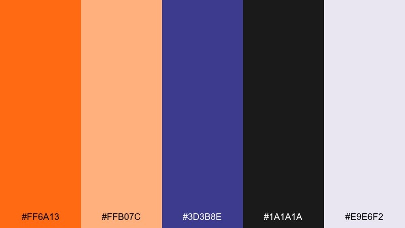
HEX: #ff6a13 #ffb07c #3d3b8e #1a1a1a #e9e6f2
Mood: dramatic, modern, creative
Best for: editorial magazine spread
Dramatic and modern, it feels like embers glowing against a deep evening sky. Use the violet as a strong secondary color for pull quotes and section markers. The pale lavender keeps white space soft and editorial, not stark. Tip: set orange only on key headings and a few small rules to create a confident cadence across the spread.
Image example of nightfall ember generated using media.io
What Colors Go Well with Tangerine?
Cool opposites are a reliable match: teal, ocean blue, and slate create clean contrast that makes tangerine feel even brighter and more modern. This is ideal for tech branding, sporty dashboards, and crisp landing pages.
For softer, editorial looks, pair tangerine with warm neutrals like cream, oatmeal, and off-white, then anchor with charcoal or espresso brown. This keeps layouts readable while preserving that sunlit warmth.
If you want drama, combine tangerine with deep violet or near-black, using the orange only on key headings and highlights. The result feels cinematic and premium without losing clarity.
How to Use a Tangerine Color Palette in Real Designs
Start by deciding what role tangerine plays: primary action (buttons), highlight (badges, dates), or atmosphere (large blocks and gradients). Most modern systems look best when tangerine is limited to one main action and a consistent set of accents.
Balance warmth with structure by choosing a dark anchor (charcoal/navy) for typography and UI lines, plus a light neutral for background space. This keeps contrast accessible and prevents orange-heavy designs from feeling crowded.
In print and packaging, tangerine reads especially well on matte stocks and textured papers, while digital layouts benefit from plenty of negative space. Keep accent sizes consistent across components so the palette feels intentional, not random.
Create Tangerine Palette Visuals with AI
If you already have HEX codes, you can generate matching mockups (posters, packaging, UI screens, mood boards) by describing layout, materials, and where each color should appear. Consistent placement is the quickest way to make AI results look on-brand.
Use the prompts above as templates: swap the product type, adjust the aspect ratio, and keep your key color assignments (background, typography, primary button, secondary accents) stable across variations.
With Media.io, you can iterate quickly—generate multiple concepts, compare contrast and mood, then refine details like texture, lighting, and typography to fit your design system.
Tangerine Color Palette FAQs
-
What is the HEX code for tangerine?
There isn’t one single “official” tangerine HEX, but popular tangerine-like options include #f47c20, #ff6a00, and #ff7a1a depending on how bright or spicy you want the orange to feel. -
Is tangerine more orange or more coral?
Tangerine typically sits in the orange family with a warm, citrus feel. If you add more red/pink, it shifts toward coral; if you add more yellow, it becomes more like mango or amber. -
What colors complement tangerine best?
Teal and blue-greens complement tangerine strongly, while navy and charcoal provide high-contrast anchors. Cream, beige, and off-white help soften it for minimal or editorial designs. -
Can I use tangerine as a primary brand color?
Yes—tangerine works well as a primary brand color when paired with a stable dark neutral for typography and a light neutral for backgrounds. Keep accent usage consistent so the brand stays polished instead of overly loud. -
How do I keep tangerine UI buttons accessible?
Check contrast between your tangerine button color and the button text (often white or near-black). If contrast is low, darken the orange slightly or switch to dark text, and use a dark neutral elsewhere for body copy. -
What’s a good neutral background for tangerine palettes?
Off-whites like #f6f1ea, creamy tones like #f7ead9, and light grays like #f3f5f7 are reliable bases. They keep the warmth without making the design feel saturated. -
How can I generate matching tangerine palette images quickly?
Use a text-to-image tool and specify exactly where each HEX color appears (background, buttons, typography, accents), plus a clear layout style and aspect ratio. This produces more consistent, brand-ready variations.


