

Straw is a soft, warm yellow-neutral that instantly makes layouts feel airy, friendly, and naturally premium. It’s a reliable base for branding, UI, and interiors because it brightens without looking stark.
Below are modern straw color palette combos with HEX codes, plus practical pairing tips and AI prompts you can use to generate matching visuals in minutes.
In this article
- Why Straw Palettes Work So Well
-
- sunlit wheat
- linen meadow
- honeyed minimal ui
- oat and clay studio
- strawberry shortcake neutrals
- field notes
- sandbar glow
- golden thatch
- warm canvas and ink
- citrus straw spark
- herbal harvest
- vintage pantry
- soft studio light
- amber and ash
- prairie dusk
- butter paper
- desert loom
- cozy cottage
- modern harvest accent
- calm corridor
- What Colors Go Well with Straw?
- How to Use a Straw Color Palette in Real Designs
- Create Straw Palette Visuals with AI
Why Straw Palettes Work So Well
Straw tones sit in the sweet spot between yellow and beige, so they read as warm and optimistic while still behaving like a neutral. That makes them easy to layer into layouts without overwhelming typography or imagery.
Because straw is naturally bright, it’s great for creating “sunlit” space in UI and print—especially when you want a softer alternative to pure white backgrounds. It also pairs cleanly with both cool and warm accents, from sage greens to ink blacks.
In branding, straw communicates wholesomeness, craft, and approachability. With the right contrast (dark olive, brown, or near-black), it stays highly legible and modern.
20+ Straw Color Palette Ideas (with HEX Codes)
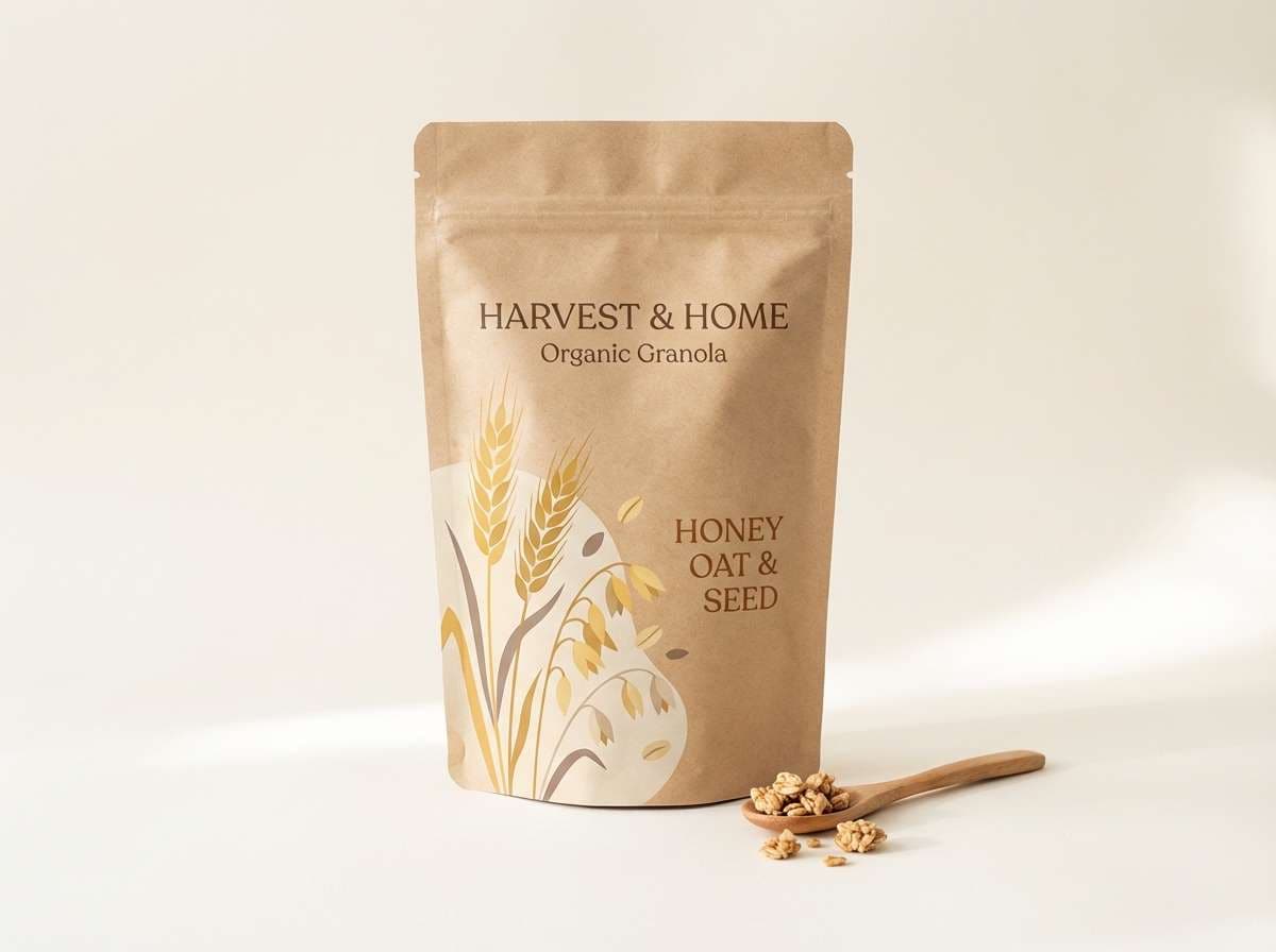
1) Sunlit Wheat
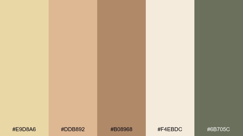
HEX: #E9D8A6 #DDB892 #B08968 #F4EBDC #6B705C
Mood: sunny, rustic, grounded
Best for: organic granola packaging
Sunny wheat fields and warm morning light come to mind, with a comforting, pantry-fresh feel. The creamy highlights keep it clean while the deeper browns add a handmade, trustworthy tone. It works beautifully on natural products, farmers market labels, and earthy DTC brands. Pair with kraft textures and simple sans-serif type, then use the dark olive as your barcode and body-text anchor for clarity.
Image example of sunlit wheat generated using media.io
Media.io is an online AI studio for creating and editing video, image, and audio in your browser.

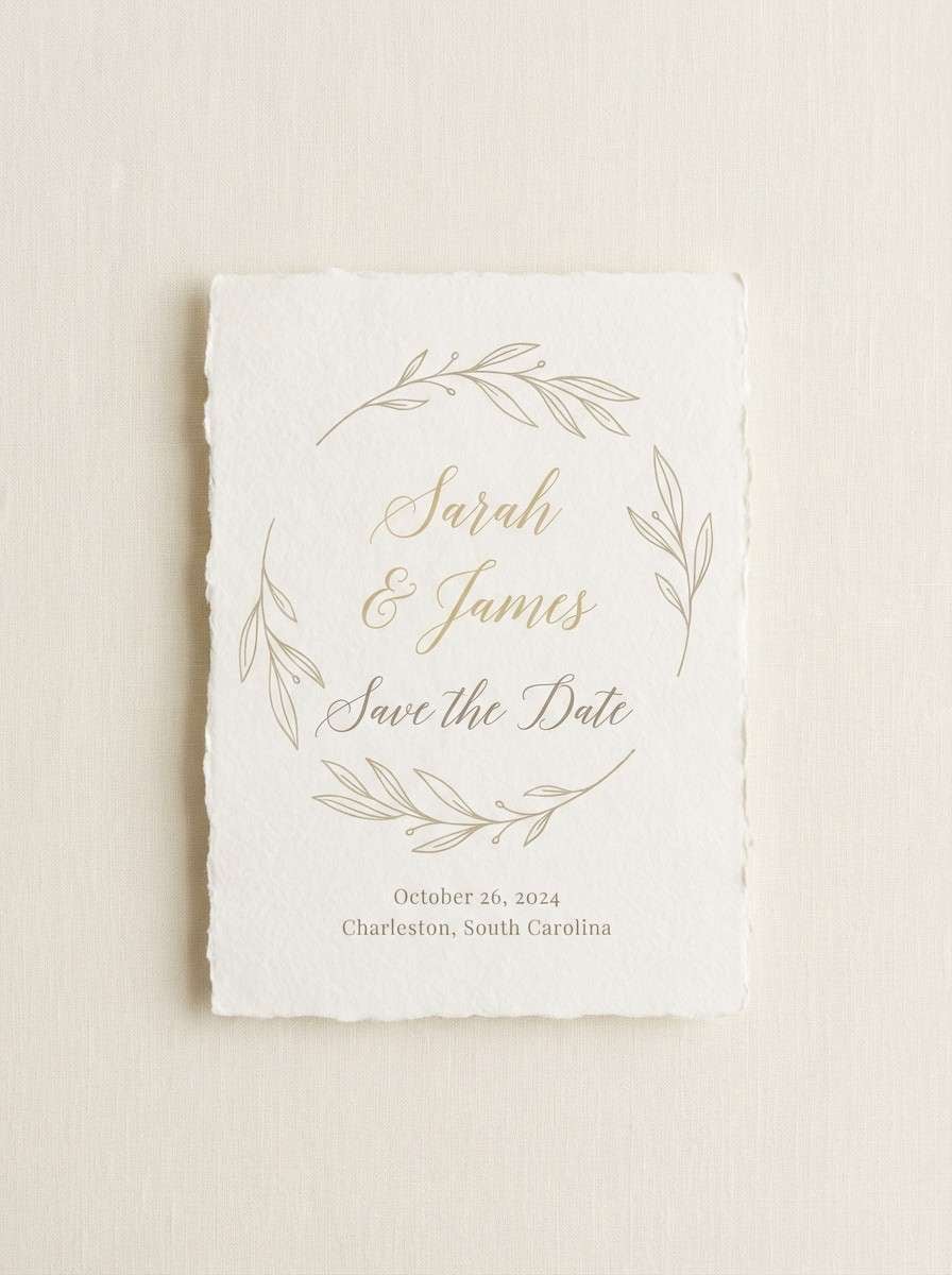
2) Linen Meadow
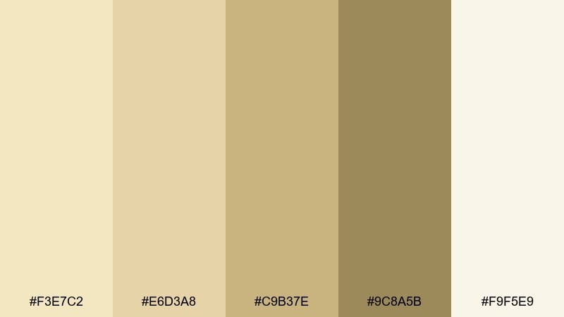
HEX: #F3E7C2 #E6D3A8 #C9B37E #9C8A5B #F9F5E9
Mood: romantic, airy, soft
Best for: spring wedding invitation
Soft linen and meadow grass vibes make this feel light, romantic, and quietly elegant. The pale cream tones give plenty of breathing room while the muted khaki adds structure for text and borders. It shines on invitations, stationery suites, and RSVP cards where you want warmth without looking vintage. Add a subtle botanical line illustration in the olive-tan shade and keep contrast high for legibility.
Image example of linen meadow generated using media.io
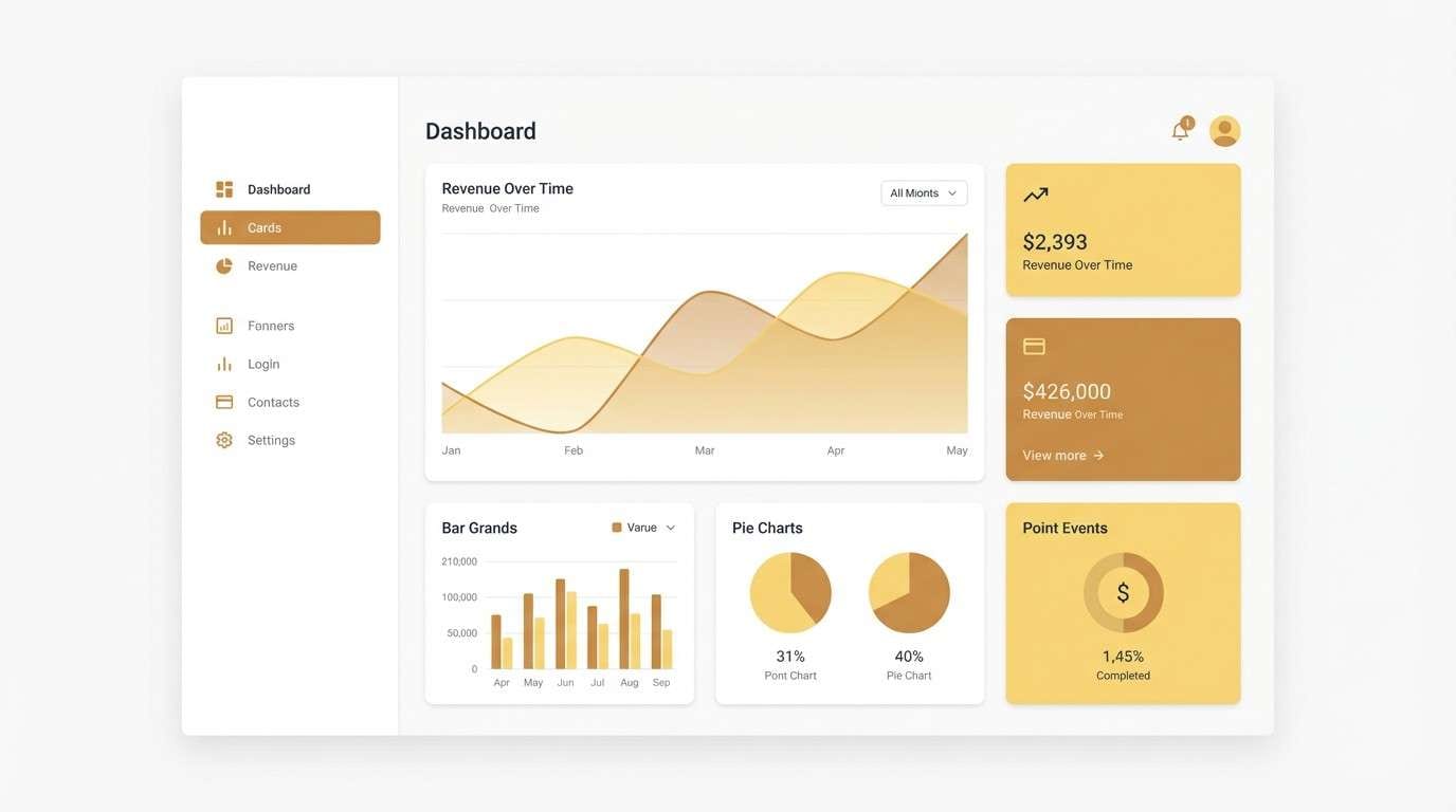
3) Honeyed Minimal UI
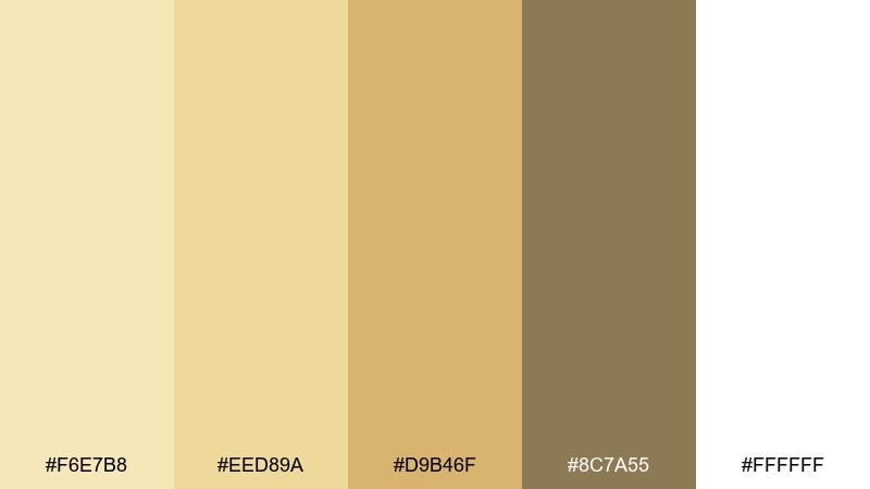
HEX: #F6E7B8 #EED89A #D9B46F #8C7A55 #FFFFFF
Mood: clean, friendly, modern
Best for: 2d dashboard ui mockup
Clean honeyed light and soft shadows give a welcoming, modern product feel. These tones make a straw color palette that reads warm and approachable without turning childish. Use the lightest shades for surfaces, reserve the caramel accent for primary buttons, and keep the brown for text and icons. Tip: add a thin 1px divider in the mid-tone to separate cards without harsh contrast.
Image example of honeyed minimal ui generated using media.io
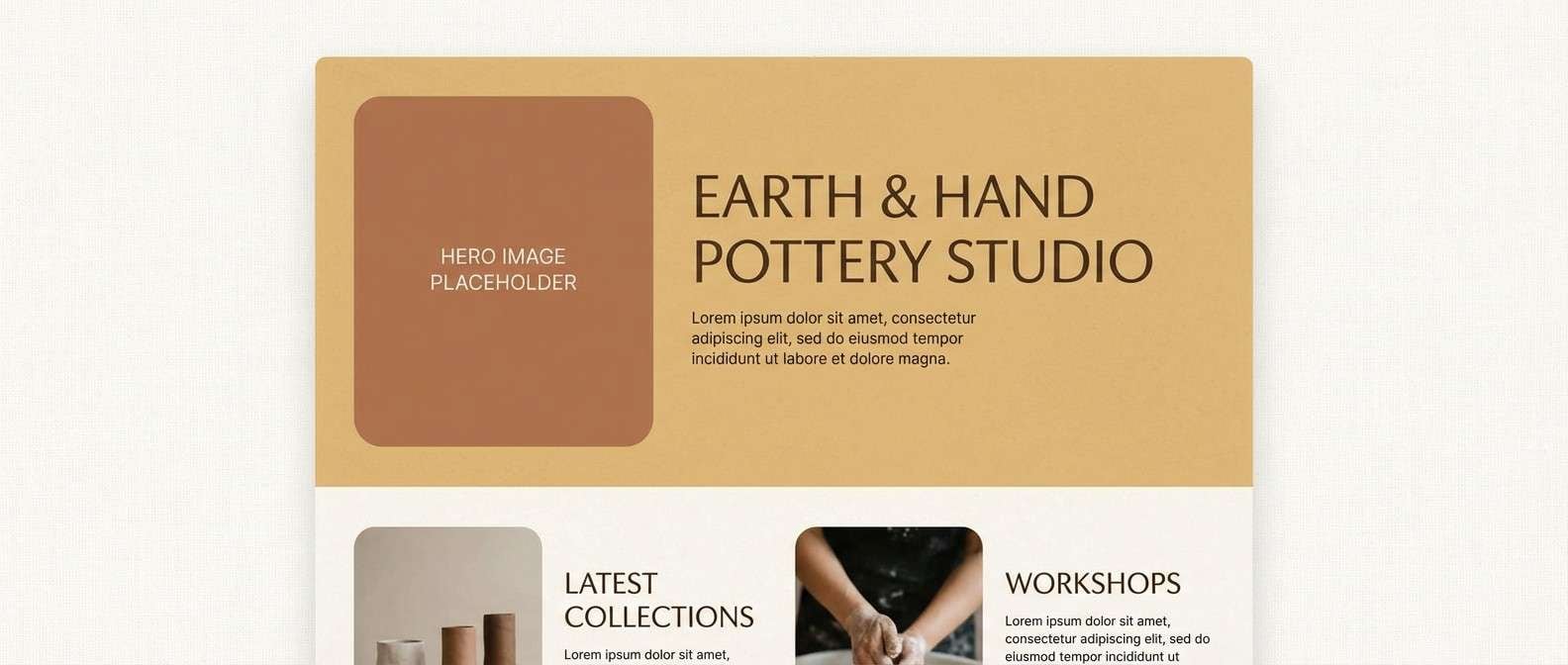
4) Oat and Clay Studio
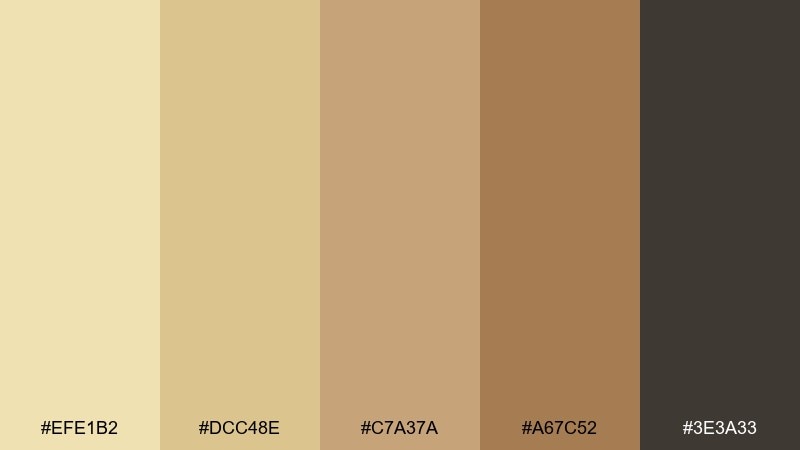
HEX: #EFE1B2 #DCC48E #C7A37A #A67C52 #3E3A33
Mood: handcrafted, earthy, calm
Best for: homepage ui mockup for pottery studio
Hand-thrown clay, sun-dried oats, and studio dust create an earthy calm that feels artisanal. The gentle light tones set a cozy backdrop, while the deeper clay brown adds authority for headings and CTAs. It fits maker portfolios, workshop landing pages, and small-batch craft brands. Use the darkest shade sparingly for nav and key links to keep the page feeling airy.
Image example of oat and clay studio generated using media.io
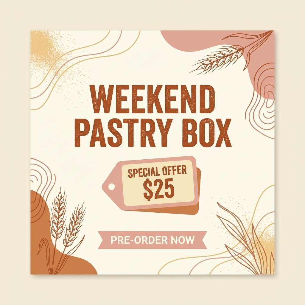
5) Strawberry Shortcake Neutrals
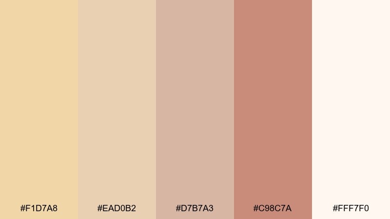
HEX: #F1D7A8 #EAD0B2 #D7B7A3 #C98C7A #FFF7F0
Mood: sweet, cozy, playful
Best for: bakery social post template
Soft sponge cake and whipped cream warmth make this feel cozy, sweet, and a little nostalgic. The blush and cinnamon accents keep it lively without overpowering the creamy base. It works well for bakery promos, cafe announcements, and seasonal specials where you want friendliness over luxury. Keep your headline in the deeper rose-cinnamon shade, and use the palest cream as negative space to avoid clutter.
Image example of strawberry shortcake neutrals generated using media.io
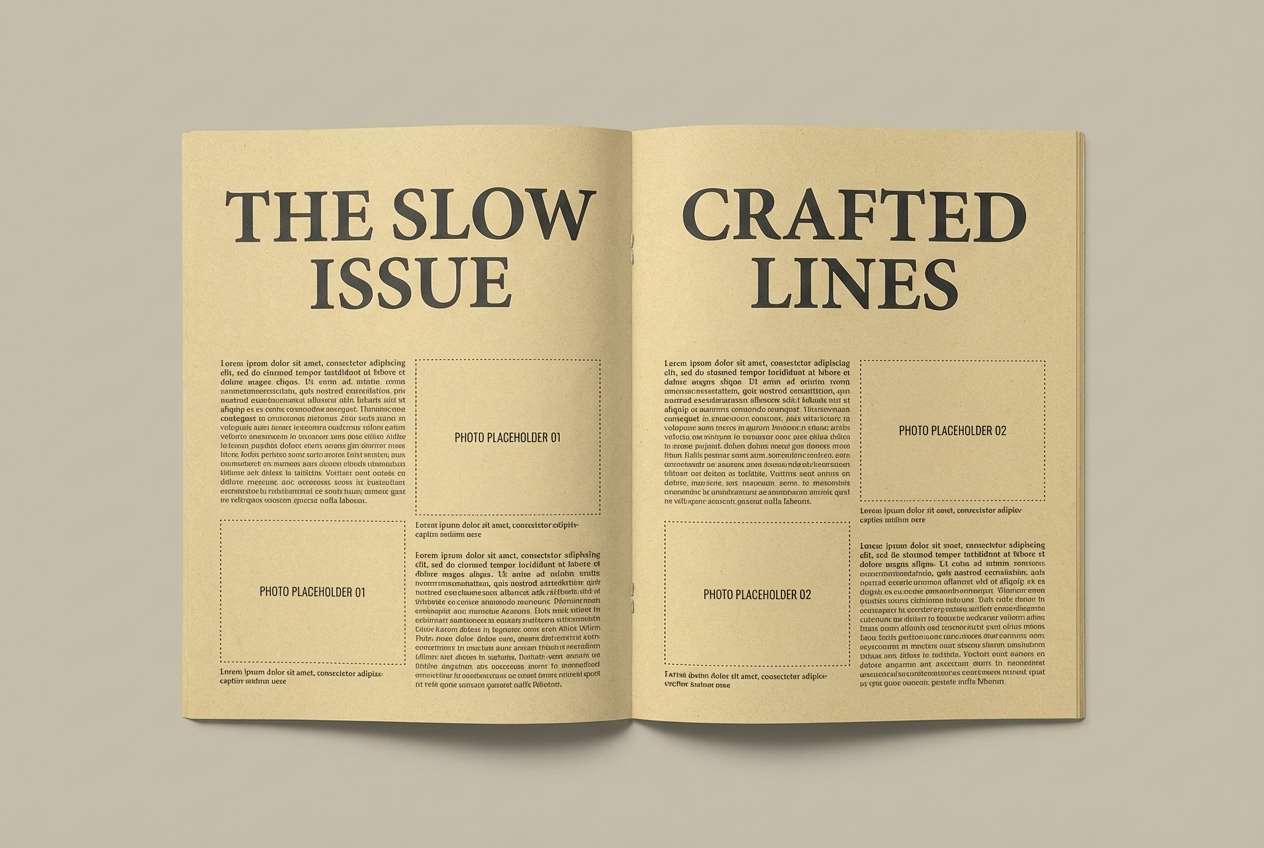
6) Field Notes
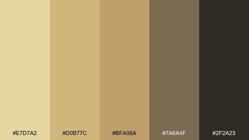
HEX: #E7D7A2 #D0B77C #BFA06A #7A6A4F #2F2A23
Mood: academic, textured, grounded
Best for: editorial magazine spread
Worn notebooks and sun-faded paper set a thoughtful, grounded tone with a hint of academia. The palette has enough contrast for long-form reading while still feeling warm and tactile. It suits magazine features, print zines, and research reports that want a human touch. Use the darkest shade for body text and pull quotes, and keep the mid-tan for section dividers to guide the eye.
Image example of field notes generated using media.io
7) Sandbar Glow
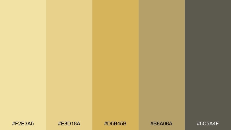
HEX: #F2E3A5 #E8D18A #D5B45B #B6A06A #5C5A4F
Mood: sun-kissed, relaxed, optimistic
Best for: summer event poster
Sun-kissed sandbars and late-afternoon glow give this a relaxed, upbeat energy. These straw color combinations pop nicely in large blocks, especially when paired with crisp white space and bold type. Use it for summer markets, outdoor concerts, and community events where you want warmth without loud saturation. Try a gradient from pale sand to golden accent behind the headline for instant depth.
Image example of sandbar glow generated using media.io

8) Golden Thatch
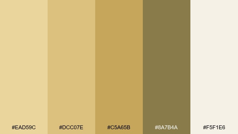
HEX: #EAD59C #DCC07E #C5A65B #8A7B4A #F5F1E6
Mood: organic, architectural, refined
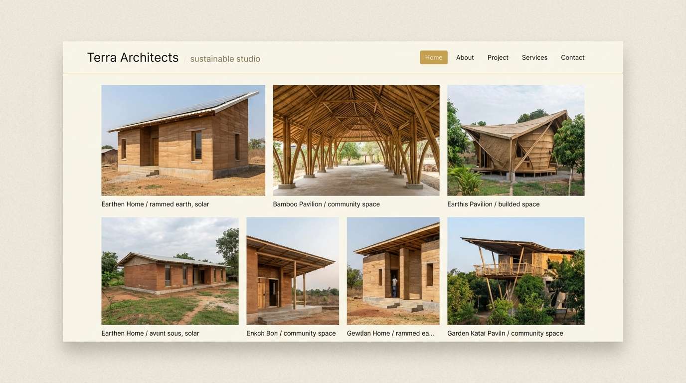
Best for: sustainable architecture portfolio
Golden thatch and sun-baked wood create a refined organic mood that feels architectural and intentional. The creamy base keeps layouts spacious while the olive-brown adds seriousness for captions and project details. It fits sustainable design studios, architecture portfolios, and material-focused case studies. Use the gold accent for small highlights like project tags, and let the neutrals do most of the work.
Image example of golden thatch generated using media.io
9) Warm Canvas and Ink
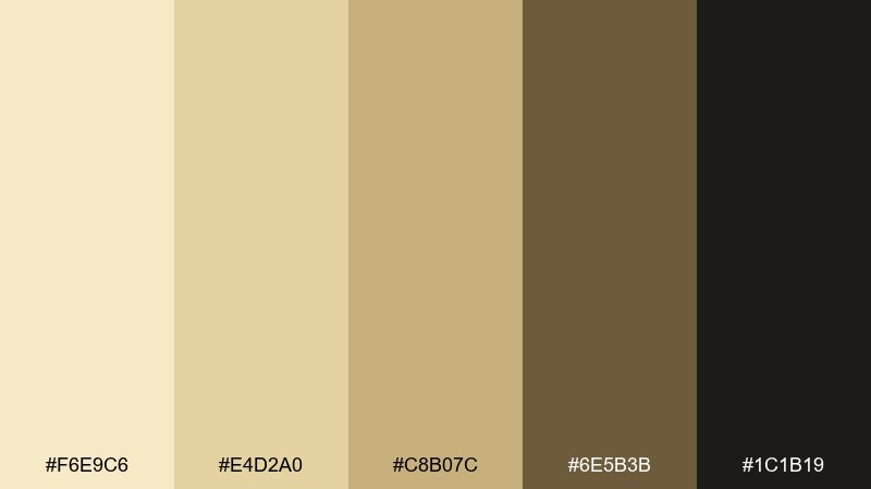
HEX: #F6E9C6 #E4D2A0 #C8B07C #6E5B3B #1C1B19
Mood: literary, classic, high-contrast
Best for: book cover design
Warm canvas paper and dark ink contrast feels literary, classic, and a little mysterious. The lighter tans support generous negative space, while the near-black brings crisp readability for title and author. It works well for essays, historical fiction, and thoughtful nonfiction covers. Keep the main title in the darkest shade and use the golden tan for a small emblem or series mark.
Image example of warm canvas and ink generated using media.io
10) Citrus Straw Spark
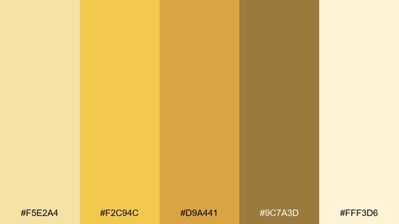
HEX: #F5E2A4 #F2C94C #D9A441 #9C7A3D #FFF3D6
Mood: bright, energetic, cheerful
Best for: pop-up market poster
Bright citrus warmth with a straw-soft base creates a cheerful, high-energy look. The vivid yellow makes headlines and badges feel instant and inviting, while the cream keeps the design from getting harsh. It is great for pop-up markets, limited-time drops, and fun announcements. Use the most saturated yellow only for key calls to action, and balance the rest with the pale background.
Image example of citrus straw spark generated using media.io

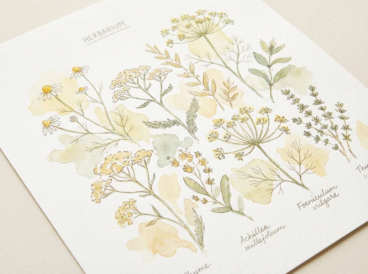
11) Herbal Harvest
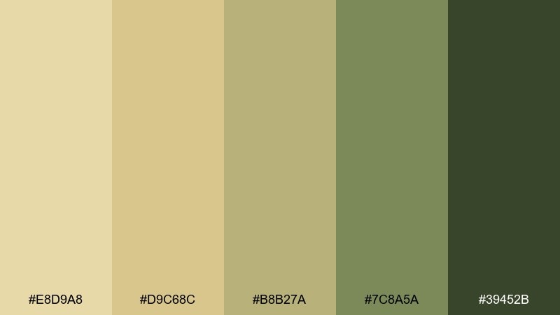
HEX: #E8D9A8 #D9C68C #B8B27A #7C8A5A #39452B
Mood: botanical, wholesome, calming
Best for: watercolor botanical illustration
Herbal leaves and garden clippings set a calming, wholesome botanical mood. The soft yellow-tans feel sunlit, while the green range adds a natural structure for stems, shadows, and text labels. It is perfect for spring illustrations, wellness content, and apothecary-inspired visuals. Keep the darkest green for fine outlines so the overall piece stays gentle and airy.
Image example of herbal harvest generated using media.io
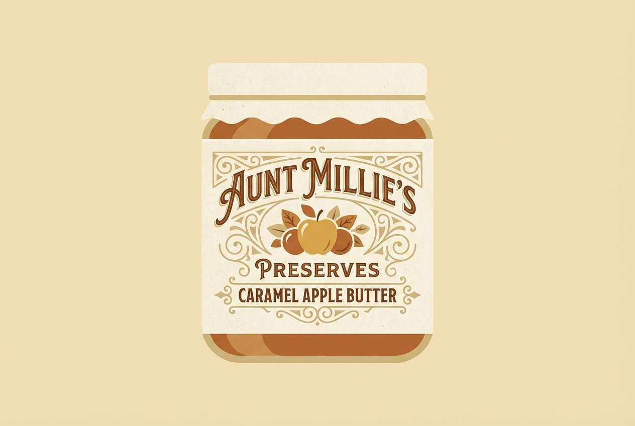
12) Vintage Pantry
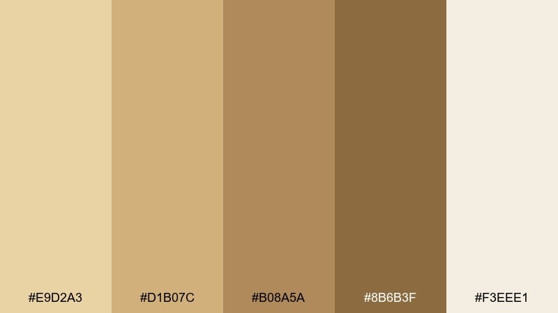
HEX: #E9D2A3 #D1B07C #B08A5A #8B6B3F #F3EEE1
Mood: retro, cozy, nostalgic
Best for: retro label design for preserves
A cozy, nostalgic pantry feel comes through like old recipe cards and glass jars on wooden shelves. The browned sugar tones add instant vintage character without becoming muddy. For small-batch jars, these hues make a straw color palette that reads warm, trustworthy, and handcrafted. Add a thin border in the darker brown and keep label copy short so the retro vibe stays clean.
Image example of vintage pantry generated using media.io
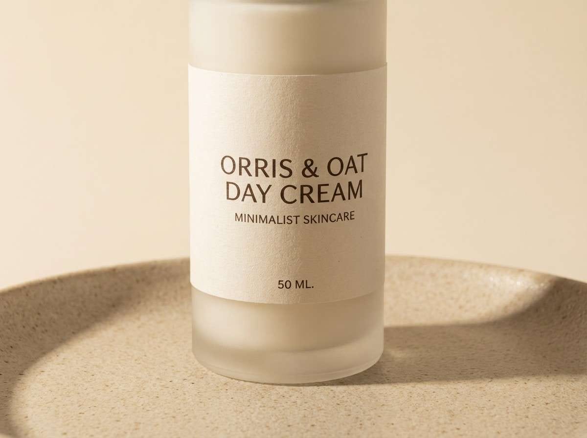
13) Soft Studio Light
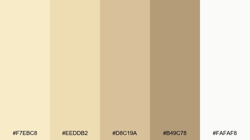
HEX: #F7EBC8 #EEDDB2 #D8C19A #B49C78 #FAFAF8
Mood: minimal, luminous, premium
Best for: skincare product ad
Soft studio light and creamy highlights give a minimal, premium mood that feels calm and expensive. The gentle beige ladder makes it easy to create depth with shadows while keeping everything warm. It is ideal for skincare, wellness, and boutique beauty ads where packaging should look clean and touchable. Use the mid-tone beige for subtle shadow cards, and let the near-white carry most of the background.
Image example of soft studio light generated using media.io
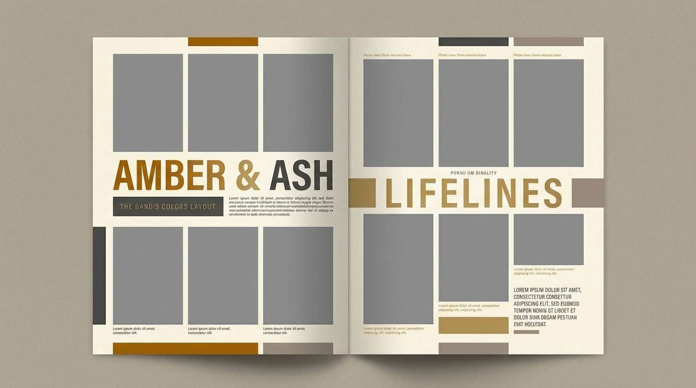
14) Amber and Ash
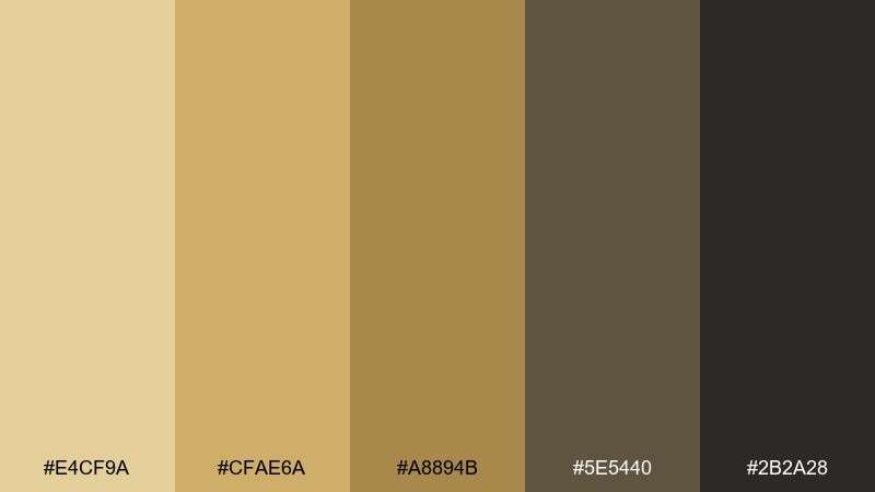
HEX: #E4CF9A #CFAE6A #A8894B #5E5440 #2B2A28
Mood: moody, polished, mature
Best for: menswear lookbook layout
Smoky ash and amber warmth create a mature, polished mood with a fashion-forward edge. The deep neutrals ground the brighter golds, making typography and grid systems feel intentional. It fits menswear lookbooks, premium catalogs, and minimalist campaigns with a warm undertone. Keep backgrounds light and reserve the darkest shades for titles, rules, and small text to maintain sophistication.
Image example of amber and ash generated using media.io
15) Prairie Dusk
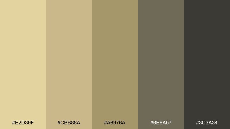
HEX: #E2D39F #CBB88A #A6976A #6E6A57 #3C3A34
Mood: quiet, natural, balanced
Best for: interior design mood board
Quiet prairie dusk feels balanced and natural, like sunlit grass fading into evening. The range from pale tan to deep charcoal makes it easy to map walls, trims, and furniture accents. It is a strong choice for interior mood boards, material palettes, and renovation presentations. Tip: use the green-gray for secondary notes and measurements so the board stays readable without stealing focus.
Image example of prairie dusk generated using media.io
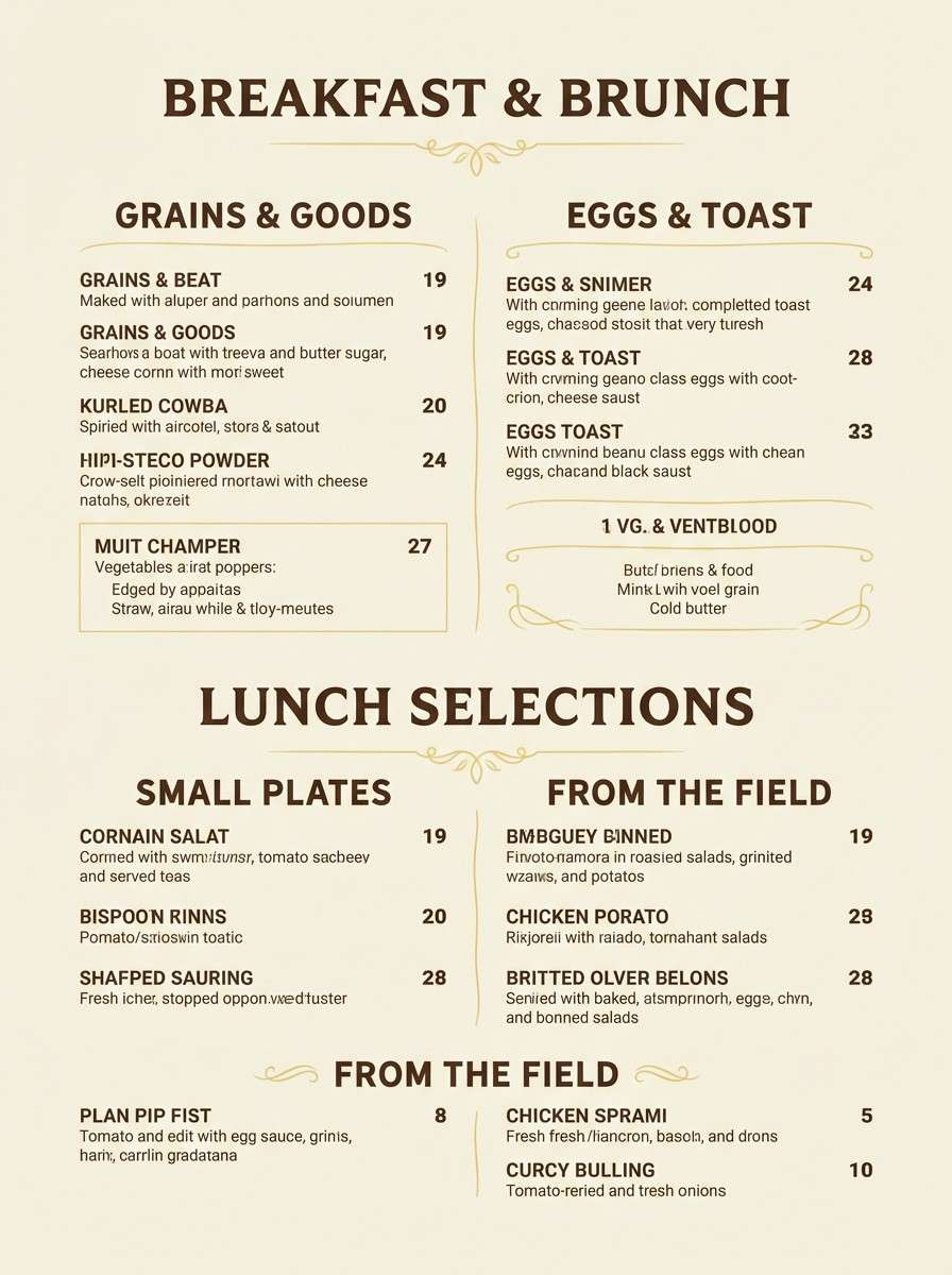
16) Butter Paper
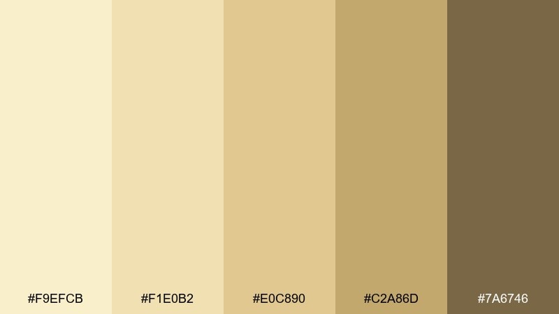
HEX: #F9EFCB #F1E0B2 #E0C890 #C2A86D #7A6746
Mood: inviting, classic, wholesome
Best for: restaurant menu design
Butter paper warmth feels inviting and classic, like a well-loved menu tucked into a neighborhood spot. The light tones keep the page bright, while the deeper brown supports strong hierarchy for prices and section headers. It works for brunch menus, farm-to-table restaurants, and cafes aiming for a wholesome look. Use the darkest brown only for type, and keep rules and icons in the mid-tone to avoid harshness.
Image example of butter paper generated using media.io
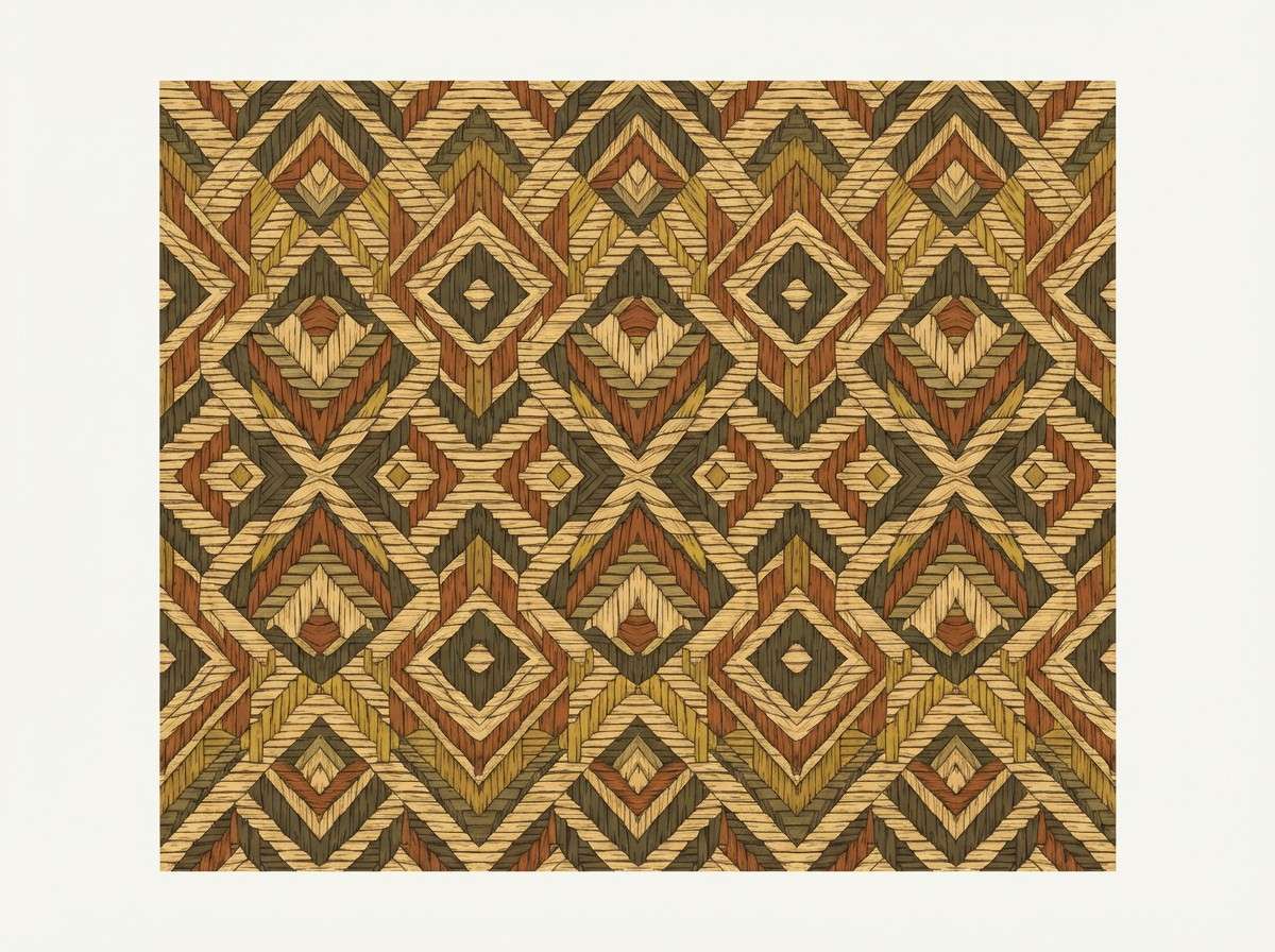
17) Desert Loom
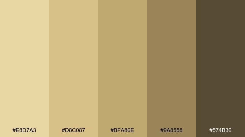
HEX: #E8D7A3 #D8C087 #BFA86E #9A8558 #574B36
Mood: woven, earthy, artisanal
Best for: textile pattern illustration
Woven fibers and desert earth give this a tactile, artisanal feel that looks crafted by hand. The mid-tones are perfect for repeating motifs, while the deeper brown adds definition to outlines and borders. It is great for textile pattern drafts, wallpaper concepts, and handmade goods branding. Keep pattern density moderate and let the lightest tone act as visual rest between motifs.
Image example of desert loom generated using media.io
18) Cozy Cottage
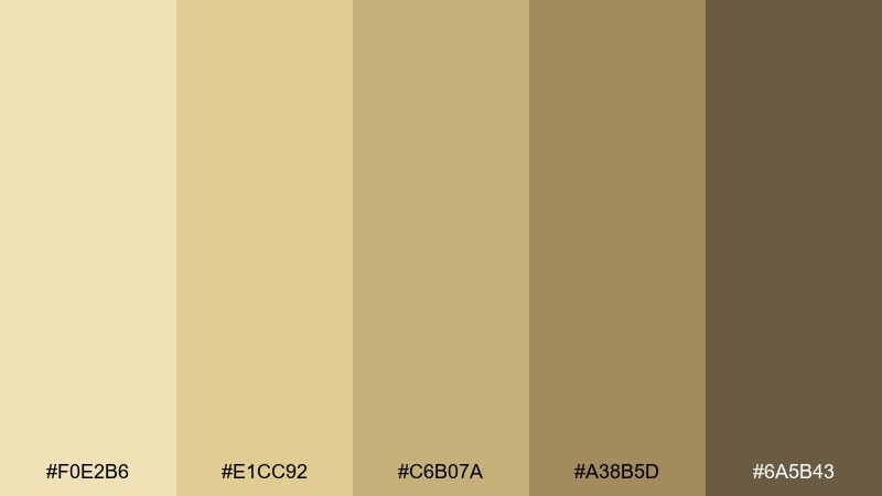
HEX: #F0E2B6 #E1CC92 #C6B07A #A38B5D #6A5B43
Mood: homey, warm, comforting
Best for: farmhouse kitchen paint guide
Homey cottage warmth shows up like sun through curtains and pale wood cabinets. The mellow tans and browns feel comforting, making spaces look lived-in rather than showroom-perfect. These straw color combinations work especially well with matte finishes, black hardware, and creamy tile. Tip: use the mid-tan as your main wall color and the deeper brown for trim accents to add definition without shrinking the room.
Image example of cozy cottage generated using media.io
19) Modern Harvest Accent
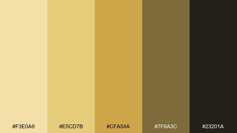
HEX: #F3E0A9 #E5CD7B #CFA54A #7F6A3C #23201A
Mood: bold, modern, confident
Best for: brand style guide page
Modern harvest warmth feels confident and graphic, with a punchy golden accent that reads instantly. The darker neutrals make it easy to build strong brand hierarchy for logos, headings, and UI states. It suits startups that want warmth with contrast, especially in food, education, or lifestyle. Use the brightest gold for CTAs and highlights only, and lean on the soft tan for backgrounds to keep it premium.
Image example of modern harvest accent generated using media.io

20) Calm Corridor
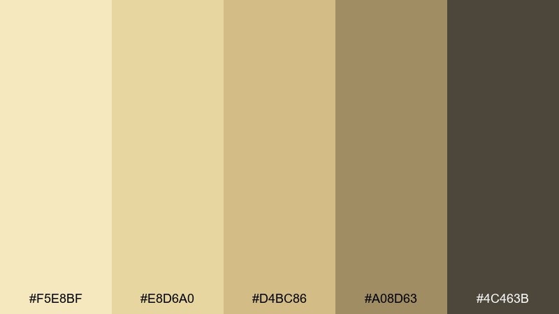
HEX: #F5E8BF #E8D6A0 #D4BC86 #A08D63 #4C463B
Mood: quiet, orderly, welcoming
Best for: hotel wayfinding signage mockup
Quiet corridor light feels orderly and welcoming, like a calm lobby with soft overhead glow. The warm neutrals keep signage friendly, while the deeper brown ensures text stays readable at a distance. It is ideal for hotel wayfinding, spa signage, and building directories. Keep icons simple and high-contrast, and use the mid-tone tan as the main sign field to reduce glare.
Image example of calm corridor generated using media.io

What Colors Go Well with Straw?
Straw pairs beautifully with crisp whites and creamy off-whites for a bright, breathable base. Add depth with warm browns, espresso, or ink black when you need strong readability for headings, labels, and UI icons.
For a natural look, combine straw with sage, olive, and muted forest greens—great for wellness, food, and eco branding. For a more playful direction, introduce soft blush, cinnamon, or a saturated citrus yellow as a controlled accent.
If you want modern contrast, try straw with cool grays or green-grays to keep the palette balanced. The key is to preserve contrast on text elements so the warmth stays clean rather than hazy.
How to Use a Straw Color Palette in Real Designs
In UI, use the lightest straw/cream tones for surfaces and backgrounds, then assign one mid-gold as your primary CTA color. Reserve the deepest brown/charcoal for text, icons, and key dividers to maintain accessibility and hierarchy.
In print and branding, straw works well with tactile textures like kraft paper, uncoated stock, or subtle grain overlays. Keep layouts minimal and let straw function as the “light source” behind typography, badges, and product photography.
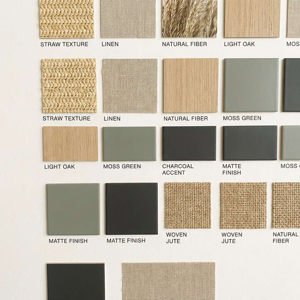
For interiors or mood boards, treat straw as a wall or large-area neutral, then bring definition through deeper wood tones and small high-contrast details (hardware, frames, signage). This keeps spaces warm without feeling flat.
Create Straw Palette Visuals with AI
If you already have HEX codes, you can turn them into on-brand mockups by describing the scene, layout type, and lighting style—then letting AI handle the visuals. This is especially useful for social templates, packaging drafts, and landing page hero concepts.
Start by naming the design format (poster, UI, label, invitation), then specify “dominant warm straw neutrals” plus one or two accent colors. Add constraints like “plain background,” “no hands,” or “no photos” to keep outputs clean and consistent.
Use Media.io Text to Image to generate quick concepts, then iterate prompts until the palette balance matches your brand.
Straw Color Palette FAQs
-
What color is “straw” in design terms?
Straw is a warm, pale yellow-beige that resembles dried wheat or hay. It usually sits between soft yellow and light tan, making it a bright neutral for backgrounds and highlights. -
Is straw a good background color for websites?
Yes—straw works as a softer alternative to white. Use a deep brown/charcoal for text to maintain contrast, and keep saturated yellows for small accents like buttons or badges. -
What are the best accent colors for a straw color scheme?
Muted greens (sage/olive), warm browns, ink black, and soft blush tones pair especially well. For a bolder look, add a controlled citrus yellow or amber accent. -
How do I keep straw palettes from looking “muddy”?
Increase contrast and reduce mid-tone overload. Use one very light cream, one deep anchor (dark brown/near-black), and keep the remaining straw tones as supporting fills rather than all competing at once. -
What vibe do straw palettes communicate in branding?
They tend to feel wholesome, approachable, natural, and premium in a quiet way. Depending on the dark anchor and accents, straw can read rustic, modern-minimal, or editorial. -
Can I use straw with cool grays?
Yes. Cool grays or green-grays can modernize straw and prevent it from feeling overly vintage. Just ensure your text color remains dark enough for readability. -
How can I generate straw-themed design mockups quickly?
Use an AI text-to-image tool and describe the format (UI, label, poster), lighting (soft diffused, studio), and “dominant warm straw neutrals,” then refine with constraints like “plain background” and “clean layout.”
Next: Cupcake Color Palette


