

Cupcake color palettes are a sweet spot between playful pastels and richer accents—perfect for brands that want to feel friendly, handcrafted, and memorable.
Below are 20 cupcake color schemes with HEX codes you can copy for packaging, social graphics, UI screens, menus, and more.
In this article
Why Cupcake Palettes Work So Well
Cupcake colors naturally communicate comfort and delight—think frosting tones, fruit glazes, and warm baked neutrals. That emotional cue helps designs feel approachable without needing extra copy.
They also offer an easy built-in hierarchy: a light “frosting” base, a mid-tone “cake” body, and a darker “cocoa/berry” shade for readable text and contrast.
Most cupcake color palette ideas translate beautifully across mediums—from matte packaging and menus to clean UI palettes—because they balance softness with just enough accent punch.
20+ Cupcake Color Palette Ideas (with HEX Codes)
1) Strawberry Cream
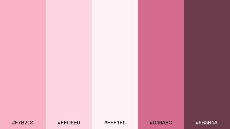
HEX: #F7B2C4 #FFD6E0 #FFF1F5 #D46A8C #6B3B4A
Mood: romantic, airy, sweet
Best for: bakery branding and social posts
Romantic strawberry mousse and whipped cream vibes make these tones feel light, friendly, and indulgent. Use the pale pinks for backgrounds and save the berry rose for headlines or price tags. Pair with warm white and subtle paper textures to keep it cozy, not candy-bright. Tip: keep contrast readable by using the deep cocoa-berry shade for body text.
Image example of strawberry cream generated using media.io
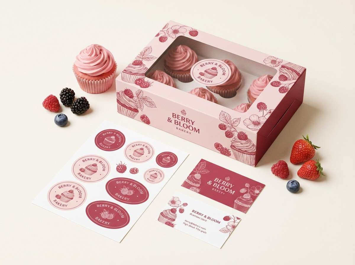
Media.io is an online AI studio for creating and editing video, image, and audio in your browser.

2) Vanilla Frosting
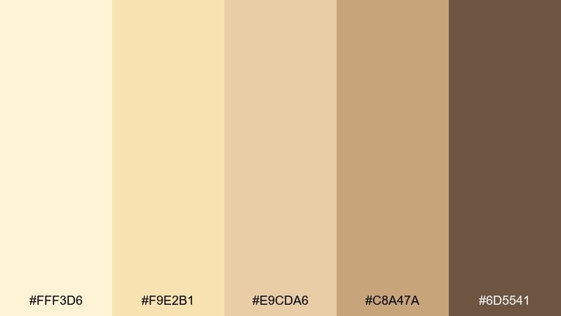
HEX: #FFF3D6 #F9E2B1 #E9CDA6 #C8A47A #6D5541
Mood: warm, creamy, inviting
Best for: cafe menus and packaging
Buttery vanilla and toasted sugar tones give a comforting, oven-warm feel. Let the light cream lead for spacious layouts, then layer the biscuit tans for sections and dividers. Pair with simple serif typography and kraft-paper textures for an approachable look. Tip: use the deep coffee brown sparingly for icons and key calls to action.
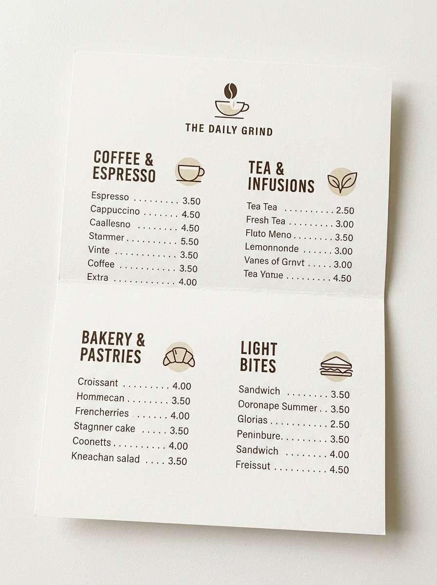
Image example of vanilla frosting generated using media.io
3) Lemon Zest
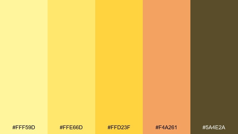
HEX: #FFF59D #FFE66D #FFD23F #F4A261 #5A4E2A
Mood: sunny, energetic, playful
Best for: summer promos and snack labels
Bright lemonade sunshine and golden peel notes make the set feel cheerful and punchy. This cupcake color scheme works best with plenty of breathing room so the yellows stay fresh rather than loud. Pair with clean neutrals and a touch of warm brown for grounded typography. Tip: reserve the orange-gold as a limited accent for buttons and discount badges.
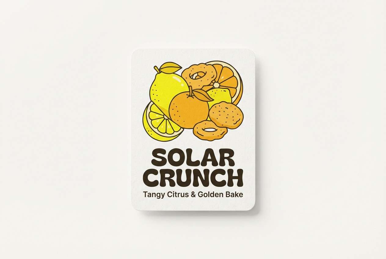
Image example of lemon zest generated using media.io
4) Blueberry Glaze
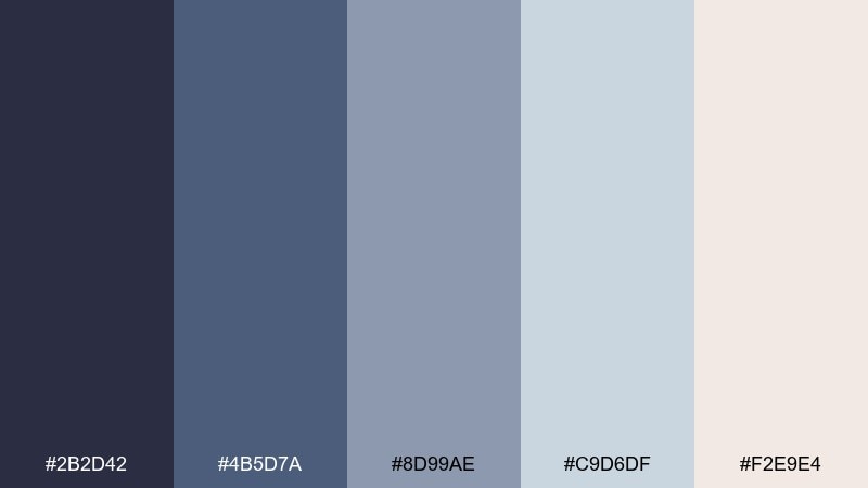
HEX: #2B2D42 #4B5D7A #8D99AE #C9D6DF #F2E9E4
Mood: cool, polished, modern
Best for: editorial layouts and premium branding
Blueberry syrup and slate ceramics give this mix a calm, upscale edge. Use the deep indigo as the anchor for type, while the misty blues keep grids airy and refined. Pair with minimal photography and matte paper styling for a boutique feel. Tip: let the soft cream act as the negative space to prevent the cool tones from feeling cold.
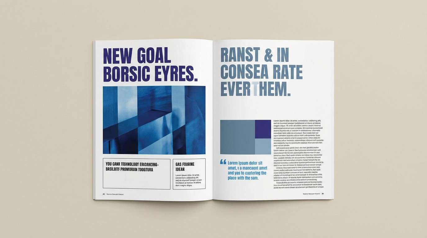
Image example of blueberry glaze generated using media.io
5) Mint Macaron

HEX: #DFF7F0 #B8EBD9 #6BC7B0 #2D8C7B #1B3A36
Mood: fresh, clean, spa-like
Best for: wellness brands and clean UI
Cool mint cream and eucalyptus tones evoke a crisp, just-whisked freshness. Use the palest mint as your canvas and bring in teal for navigation states and highlights. Pair with rounded UI components and subtle gradients to keep the look soft. Tip: rely on the deep green-black for accessibility-friendly text and key controls.
Image example of mint macaron generated using media.io

6) Raspberry Velvet

HEX: #B21E35 #D1495B #F28482 #F6BD60 #3D1A22
Mood: bold, rich, dramatic
Best for: beauty launches and statement posters
Velvet berry reds with a warm caramel spark feel confident and celebratory. Let the darker wine tone carry headlines, then use the softer coral as supporting blocks and gradients. Pair with minimal cream backgrounds and strong typography for a premium look. Tip: keep the caramel accent limited to small details like icons or separators so it reads intentional.
Image example of raspberry velvet generated using media.io
7) Lavender Sprinkle

HEX: #E8D7FF #CDB4FF #A594F9 #7B6CF6 #2E2A5A
Mood: dreamy, soft, whimsical
Best for: gift shop branding and pastel packaging
Sugared lavender and candy sprinkles bring a dreamy, daydream-on-clouds softness. This cupcake color palette shines on matte packaging where the lilacs look velvety instead of neon. Pair with simple line illustrations and a warm off-white base for balance. Tip: use the deep midnight violet for small text to keep everything legible.
Image example of lavender sprinkle generated using media.io

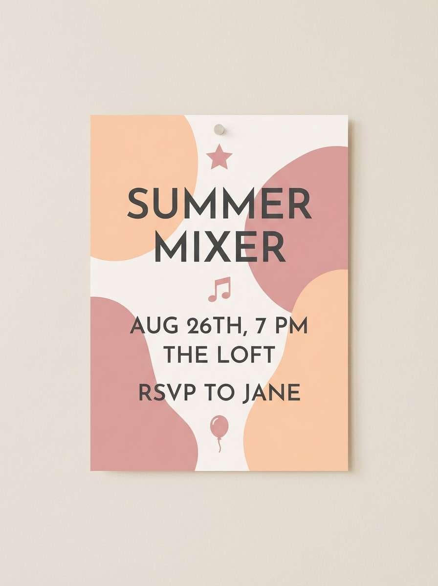
8) Peach Icing

HEX: #FFD6A5 #FFBFA3 #FF8FAB #D65DB1 #5B3C4D
Mood: flirty, warm, upbeat
Best for: party invitations and event flyers
Peach sorbet, blush icing, and a pop of magenta feel festive without getting harsh. Use the pale peach as the backdrop and let pink accents highlight dates, locations, and RSVP details. Pair with playful script headings and clean sans-serif body text for clarity. Tip: keep the darker plum tone for small dividers and QR codes so they scan cleanly.
Image example of peach icing generated using media.io
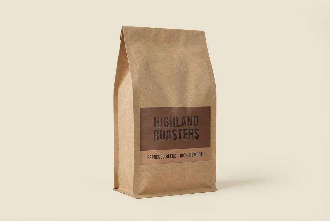
9) Chocolate Ganache

HEX: #2B1B14 #4E342E #8D6E63 #D7CCC8 #F5EFE6
Mood: cozy, grounded, artisanal
Best for: coffee labels and rustic packaging
Dark cocoa, mocha, and creamy latte tones evoke slow mornings and bakery warmth. Use the deepest chocolate for logos and stamps, then layer mid-browns for panels and ingredient callouts. Pair with kraft textures and simple iconography to lean into the handmade feel. Tip: keep the light cream as your negative space so the palette stays breathable.
Image example of chocolate ganache generated using media.io
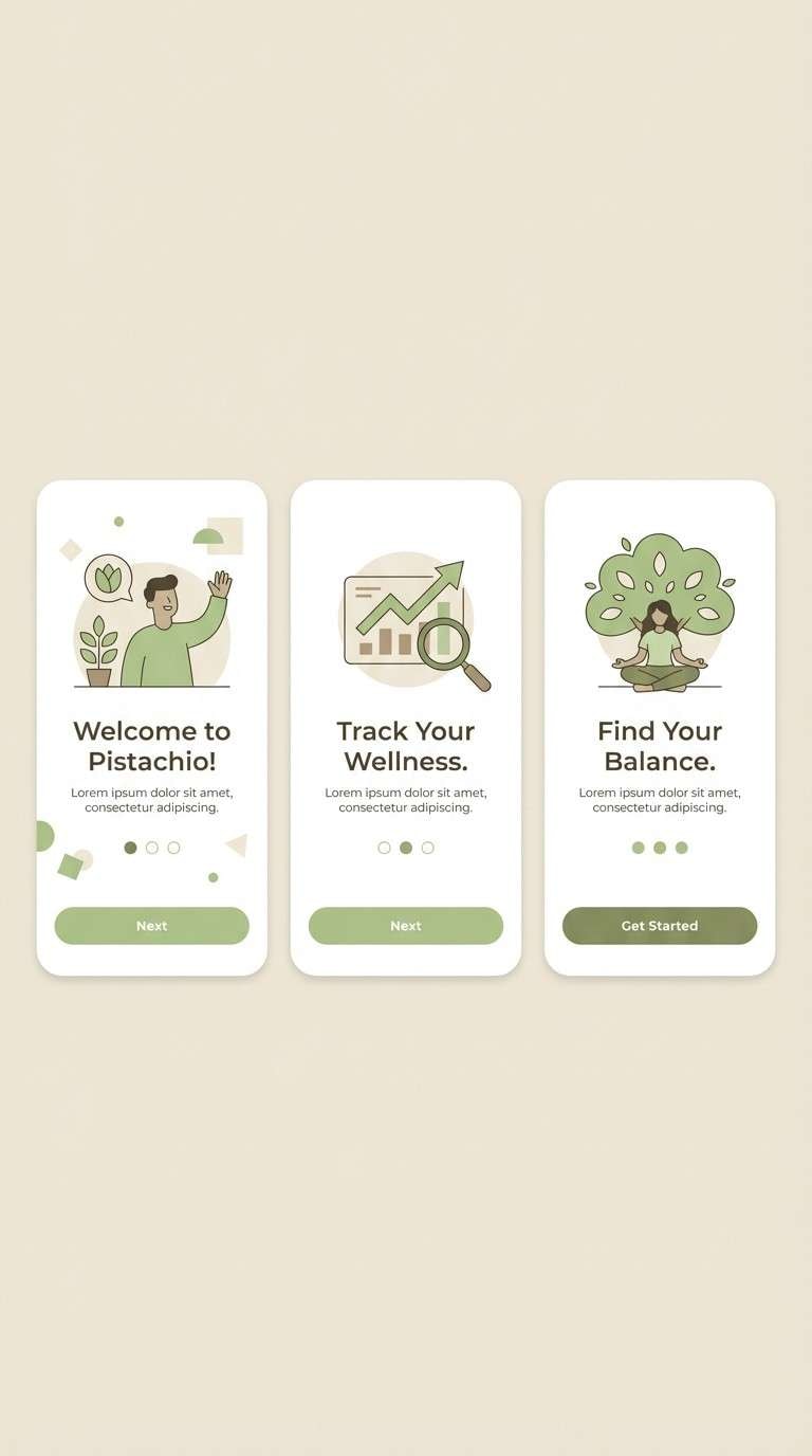
10) Pistachio Whip

HEX: #F1FAEE #CDEAC0 #A7D7A3 #5BAE6C #2B4D35
Mood: natural, bright, optimistic
Best for: eco brands and app onboarding
Soft pistachio cream with fresh garden greens feels clean, friendly, and modern. Use the pale minty-white for screens and the mid greens for progress states, badges, and highlights. Pair with rounded shapes and plenty of whitespace for a contemporary eco look. Tip: use the forest green for primary CTAs to keep contrast strong.
Image example of pistachio whip generated using media.io
11) Rosewater Blush
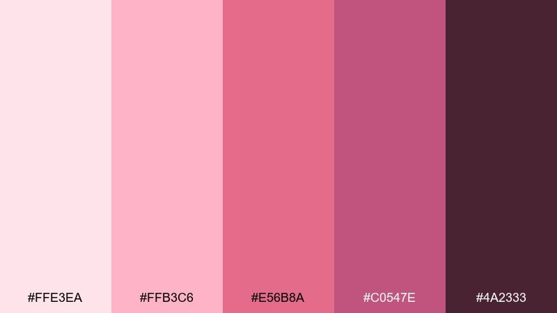
HEX: #FFE3EA #FFB3C6 #E56B8A #C0547E #4A2333
Mood: tender, elegant, romantic
Best for: wedding stationery and boutique branding
Rosewater petals and satin ribbon tones create a gentle, elegant mood. Use the light blush for backgrounds and the deeper rose for monograms, borders, and key names. Pair with warm cream paper and delicate line florals for a refined finish. Tip: keep body text in the deep plum for crisp readability on print.
Image example of rosewater blush generated using media.io
12) Caramel Drizzle

HEX: #FFE8C7 #F9D8A6 #E8B07B #B8743B #5A3B25
Mood: toasty, welcoming, nostalgic
Best for: dessert menus and product ads
Toasted caramel and baked crust notes make the palette feel nostalgic and hunger-inducing. These cupcake color combinations work especially well in food ads where warm highlights suggest sheen and freshness. Pair with creamy backgrounds, macro textures, and a strong brown for pricing and disclaimers. Tip: use the mid caramel as the dominant tone and keep the darkest brown for small, high-contrast details.
Image example of caramel drizzle generated using media.io
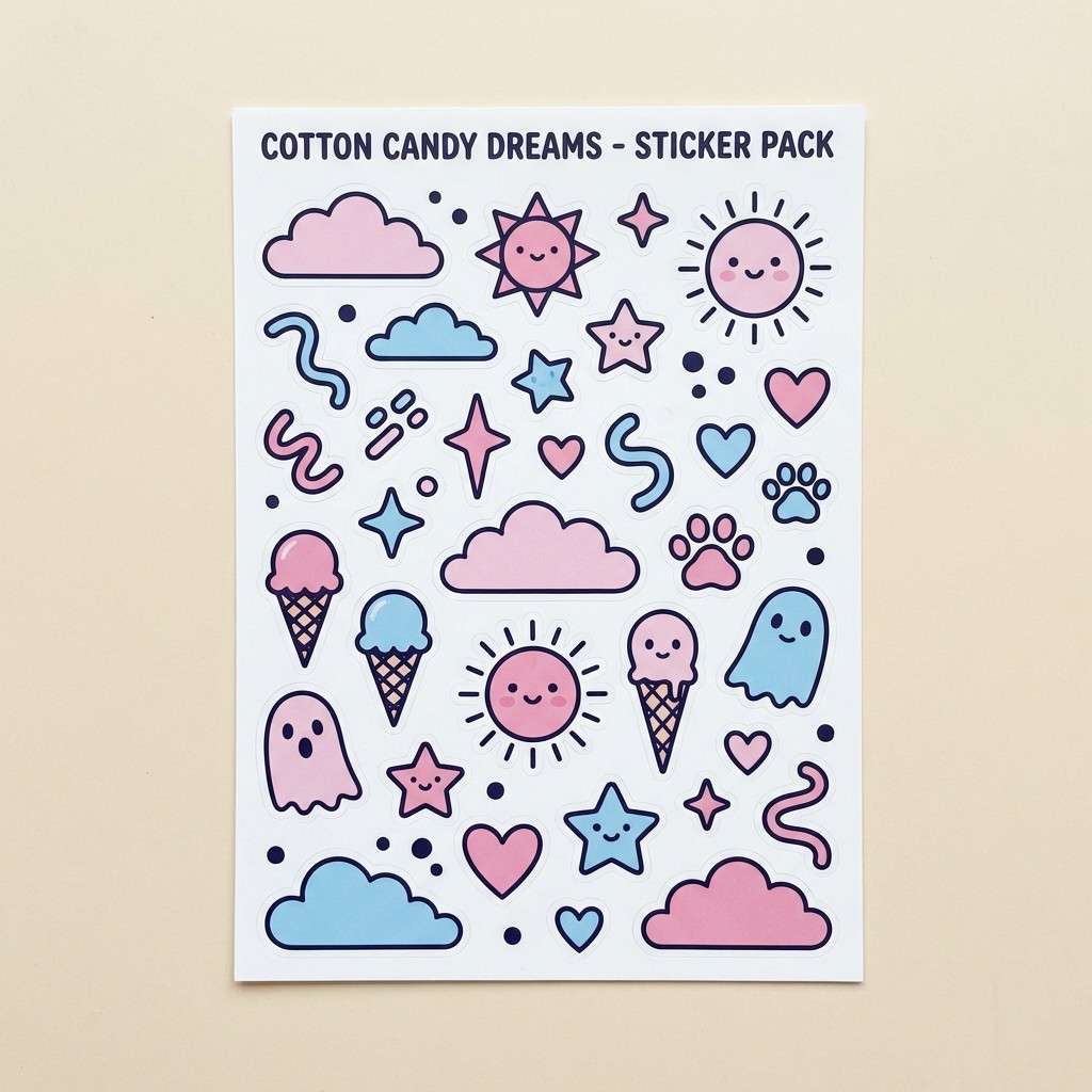
13) Cotton Candy

HEX: #FFB7D5 #FF8DC7 #BDE0FE #A2D2FF #2F2E41
Mood: playful, youthful, airy
Best for: kids party graphics and sticker packs
Fluffy cotton candy pink meets sky-blue sugar for a playful, lighthearted vibe. Keep the dark ink shade for outlines and type so the pastels stay crisp and readable. Pair with rounded icons, doodles, and simple patterns to enhance the fun. Tip: limit gradients to one or two areas so the design does not feel overly sweet.
Image example of cotton candy generated using media.io
14) Cherry Soda

HEX: #FF3B6A #FF6F91 #FFC75F #F9F871 #2B2D42
Mood: bright, poppy, retro
Best for: summer sale banners and social ads
Fizzing cherry soda and sunny citrus tones create a bold, retro pop. Use the cherry pink for the main headline and the yellow pair for offer highlights and stickers. Pair with simple geometric shapes and a deep navy for contrast that feels modern, not childish. Tip: keep the yellows as supporting accents to avoid overpowering the layout.
Image example of cherry soda generated using media.io

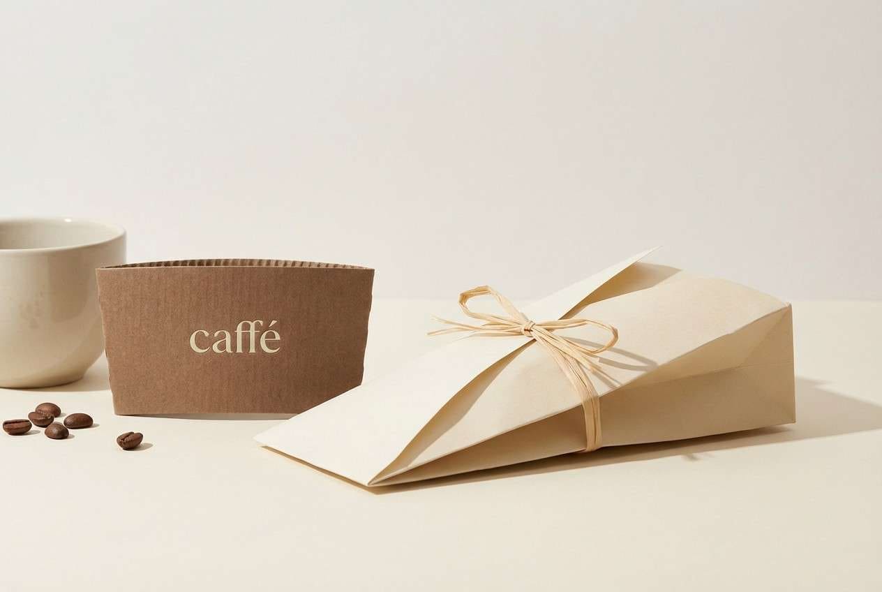
15) Almond Biscuit
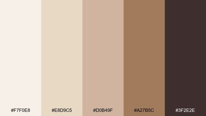
HEX: #F7F0E8 #E8D9C5 #D0B49F #A27B5C #3F2E2E
Mood: calm, minimal, earthy
Best for: lifestyle branding and stationery
Almond flour, oat milk, and warm wood tones give a minimal, grounded softness. Use the light cream as the primary base and the tan shades for panels, tags, and subtle gradients. Pair with black-brown typography and natural paper textures for an editorial feel. Tip: add interest with tone-on-tone patterns rather than extra colors.
Image example of almond biscuit generated using media.io

16) Mocha Swirl

HEX: #3B2F2F #6F4E37 #A67C52 #D7B89C #F3E9DC
Mood: smooth, mature, cozy
Best for: premium cafe branding and packaging
Espresso crema and cocoa swirls bring a smooth, grown-up warmth. This cupcake color palette is ideal for premium labels where subtle browns signal quality and comfort. Pair with serif headlines, gold-foil style details, and lots of cream negative space. Tip: build hierarchy by using one brown for text and one brown for blocks, rather than mixing all midtones at once.
Image example of mocha swirl generated using media.io
17) Sprinkles Party
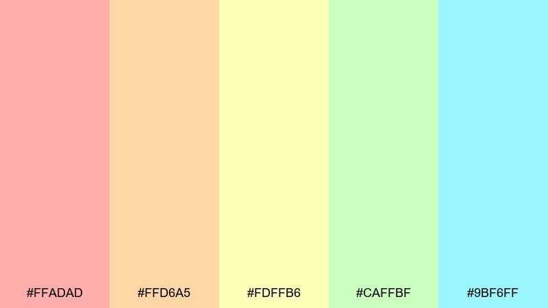
HEX: #FFADAD #FFD6A5 #FDFFB6 #CAFFBF #9BF6FF
Mood: cheerful, bright, inclusive
Best for: birthday flyers and classroom posters
Confetti sprinkles and light balloon tones make everything feel instantly celebratory. Use one warm shade as the base and rotate the others as accent blocks so the layout stays organized. Pair with bold sans-serif type and simple shapes for quick readability at a distance. Tip: add a thin dark outline only when needed to keep pastel elements from blending together.
Image example of sprinkles party generated using media.io

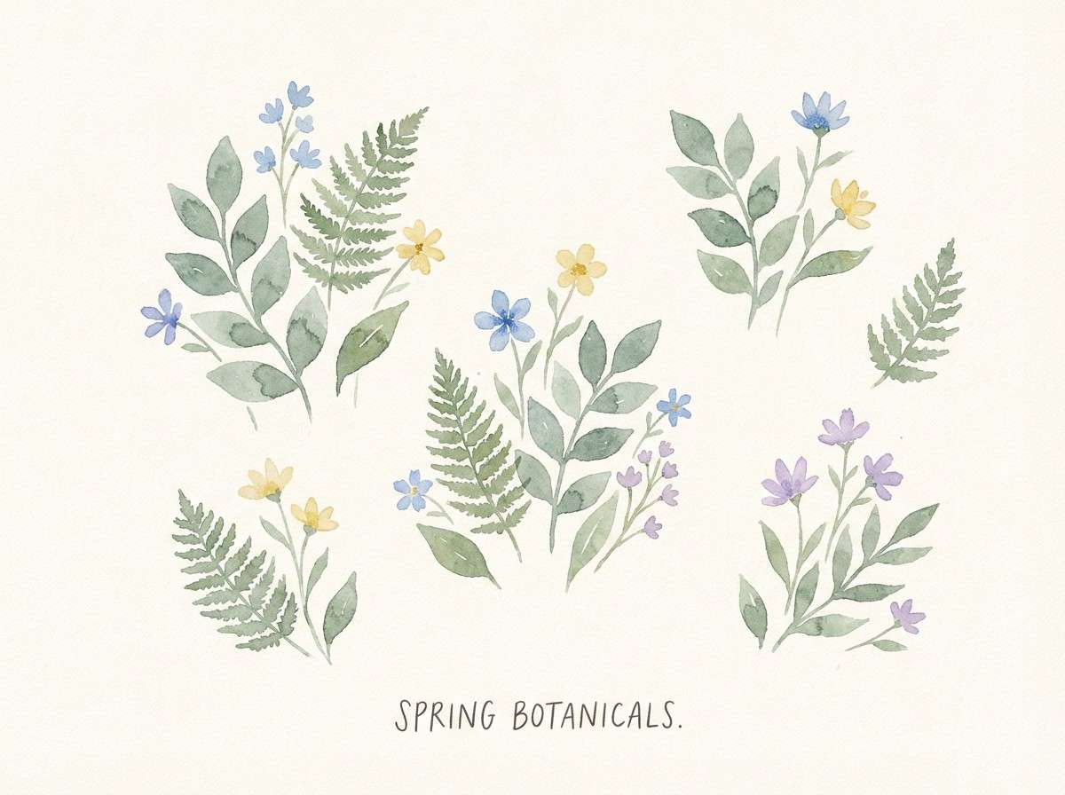
18) Buttercream Sage

HEX: #F6F3E7 #DCE4D2 #B6C4A2 #7A8B5A #2F3A2A
Mood: soft, botanical, vintage
Best for: botanical illustrations and spring branding
Sage leaves on buttercream feel calm, botanical, and quietly nostalgic. Use the light cream as a paper-like background, then build leafy layers with mid sages for depth. Pair with watercolor textures, fine linework, and warm neutrals to keep it organic. Tip: keep the darkest green for tiny details like stems, captions, and borders.
Image example of buttercream sage generated using media.io
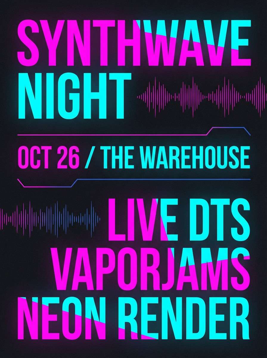
19) Neon Frost
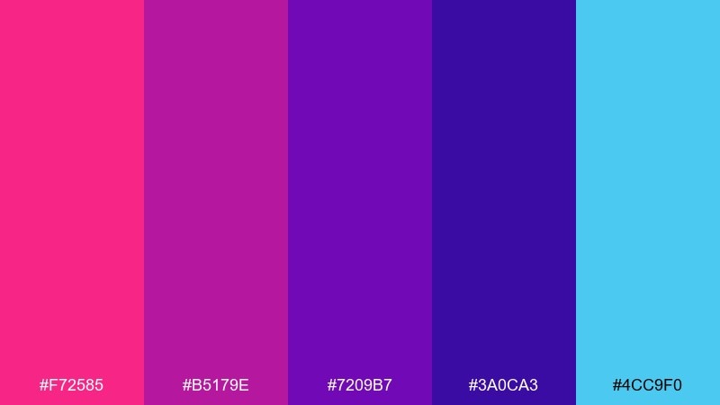
HEX: #F72585 #B5179E #7209B7 #3A0CA3 #4CC9F0
Mood: electric, futuristic, high-contrast
Best for: music posters and nightlife promos
Neon frosting energy feels like synth lights, glossy gel, and late-night motion. This cupcake color scheme thrives on dark backgrounds where cyan highlights pop against saturated pinks and purples. Pair with bold condensed typography and simple glow effects to keep it sharp. Tip: pick one neon as the hero and use the others as controlled accents to avoid visual noise.
Image example of neon frost generated using media.io
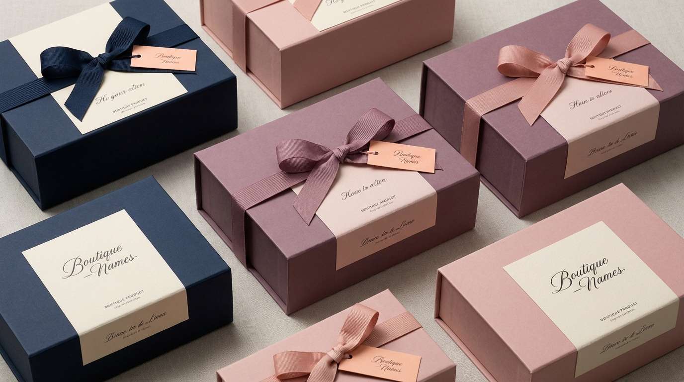
20) Berry Parfait

HEX: #2A2D43 #6D597A #B56576 #E56B6F #EAAC8B
Mood: moody, sophisticated, romantic
Best for: boutique packaging and editorial branding
Layered berries and cream create a moody, sophisticated sweetness with a hint of vintage glamour. Use the deep midnight base for structure, then let mauve and rose build warmth in headers and highlights. Pair with creamy neutrals and minimal photography for a boutique editorial vibe. Tip: these cupcake color combinations look best when you limit the peachy tone to small, intentional pops like seals or buttons.
Image example of berry parfait generated using media.io
What Colors Go Well with Cupcake?
Cupcake colors pair well with warm whites, creamy ivories, and soft grays—these neutrals keep pastel frosting tones looking airy rather than overwhelming.
For contrast, add a “baked” anchor like cocoa brown, deep plum, or navy. It improves readability in logos, menus, and UI text while keeping the dessert mood intact.
To modernize the look, use one bright accent (lemon, cherry, or neon cyan) sparingly for buttons, stickers, or promo badges.
How to Use a Cupcake Color Palette in Real Designs
Start with a frosting-like base color for backgrounds, then select one mid-tone for panels and highlights. Save the darkest shade for typography and key UI controls so the design stays accessible.
In packaging, matte textures and off-white paper help pastel color palettes look premium. Add small high-contrast details (price, flavor, ingredients) using the deepest palette tone.
For social posts, keep the palette consistent across templates: one headline color, one accent for stickers, and plenty of breathing room so sweet tones don’t feel cluttered.
Create Cupcake Palette Visuals with AI
If you already have HEX codes, you can turn them into on-brand mockups fast—labels, invitations, UI screens, posters, and product ads—without starting from scratch.
With Media.io text-to-image, paste a prompt that describes the layout and mood, then iterate until the lighting, paper texture, and color balance match your cupcake theme.
Try generating multiple variations with the same palette: one minimal, one playful, and one premium—then keep the strongest composition as your template.
Cupcake Color Palette FAQs
-
What is a cupcake color palette?
A cupcake color palette is a set of sweet-inspired colors—often frosting pastels plus deeper “baked” accents—used for cohesive branding, packaging, social posts, or UI design. -
Which cupcake colors are best for bakery branding?
Soft creams and warm pinks (like Strawberry Cream or Vanilla Frosting) feel friendly and appetizing, while a deep cocoa/berry shade helps logos and menu text stay readable. -
How do I keep pastel cupcake colors from looking childish?
Use an off-white or cream base, reduce saturation where possible, and add one dark anchor color (navy, plum, coffee brown). Matte textures and clean typography also make pastels feel premium. -
What is the best text color for cupcake palettes?
For accessibility, choose the darkest shade in the palette (deep plum, cocoa brown, or indigo). Avoid placing white text on light frosting tones unless you test contrast. -
Can cupcake color combinations work for UI design?
Yes. Palettes like Mint Macaron and Pistachio Whip work well for clean UI because they provide soft backgrounds, clear mid-tone states, and dark text/CTA options. -
How many colors should I use from a cupcake palette?
A practical setup is 3–4 colors: one background, one surface/panel, one accent, and one text/anchor. Keep the remaining colors for occasional highlights to avoid visual clutter. -
How can I generate cupcake-themed design mockups quickly?
Use Media.io text-to-image: describe the design (menu, label, invitation, UI), specify a clean background and materials (matte paper, kraft texture), then iterate until the palette feels balanced.
Next: Farmhouse Color Palette


