

A starry night color palette captures the quiet drama of deep blues, inky purples, and moonlit neutrals—perfect when you want designs to feel immersive, premium, and calm.
Below are 20 starry night color scheme ideas with HEX codes for UI, branding, posters, illustration, and more—each with an AI prompt you can reuse.
In this article
- Why Starry Night Palettes Work So Well
-
- midnight observatory
- indigo nebula
- moonlit harbor
- velvet cosmos
- northern lights hush
- stargazer ink
- twilight orchid
- constellation gold
- deep space minimal
- night bloom garden
- astral denim
- lunar silver smoke
- cosmic cocoa
- meteor shower pop
- quiet planet
- galaxy editorial
- observatory ui dark
- sapphire dusk
- milky way pastels
- afterglow noir
- What Colors Go Well with Starry Night?
- How to Use a Starry Night Color Palette in Real Designs
- Create Starry Night Palette Visuals with AI
Why Starry Night Palettes Work So Well
Starry night colors naturally create depth: near-black bases, layered navies, and soft highlight tones mimic how we perceive night skies—dark overall with selective points of glow.
They also make typography and UI hierarchy easier. Dark foundations push content forward, while pale “moonlight” neutrals give you readable surfaces for cards, labels, and long text.
Finally, starry palettes are emotionally flexible: they can feel cinematic, romantic, futuristic, or calm depending on whether you add gold warmth, violet mystique, or cool silver neutrals.
20+ Starry Night Color Palette Ideas (with HEX Codes)
1) Midnight Observatory
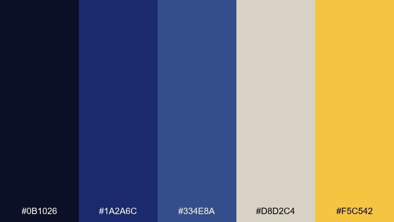
HEX: #0b1026 #1a2a6c #334e8a #d8d2c4 #f5c542
Mood: cinematic, grounded, celestial
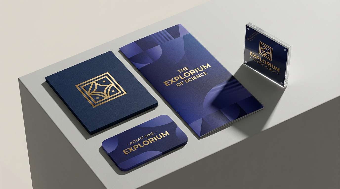
Best for: brand identity for a science museum
Cinematic midnight blues with a warm starlight pop feel like looking through a telescope on a clear, cold night. These starry night color combinations work beautifully for logos, signage, and web headers where you want authority with a hint of wonder. Pair the gold with the light neutral for badges, icons, or callouts to keep contrast crisp. Usage tip: keep #0b1026 as the main background and reserve #f5c542 for only one focal element per section.
Image example of midnight observatory generated using media.io
Media.io is an online AI studio for creating and editing video, image, and audio in your browser.

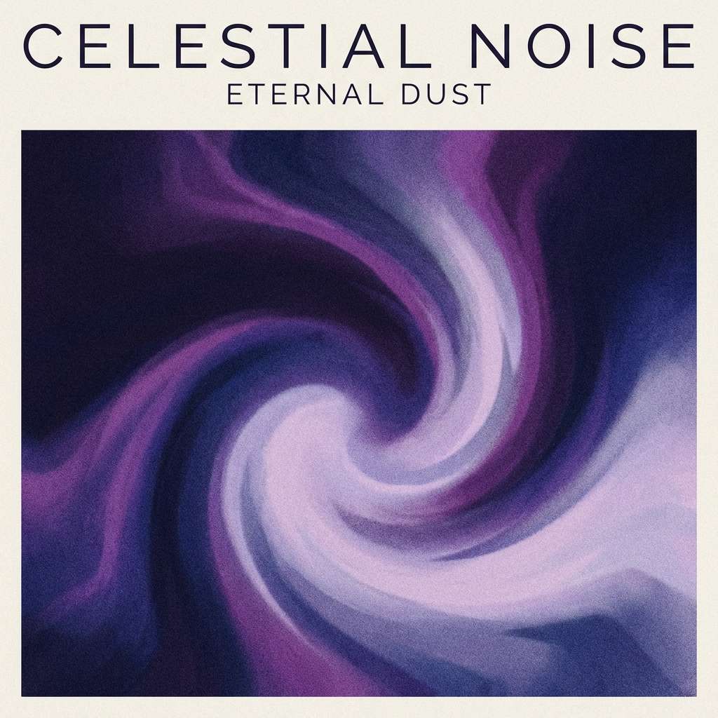
2) Indigo Nebula
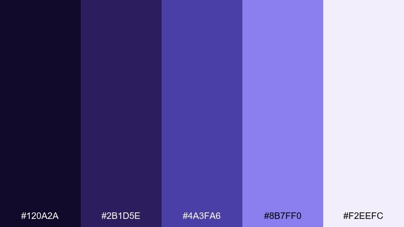
HEX: #120a2a #2b1d5e #4a3fa6 #8b7ff0 #f2eefc
Mood: dreamy, mystical, luminous
Best for: album cover artwork
Dreamy indigos and electric violets glow like a nebula fading into soft mist. The gradient-friendly steps make it ideal for cover art, social headers, and motion backgrounds that need depth without harsh contrast. Pair the pale lavender with the deepest purple for readable type and a polished finish. Usage tip: use #8b7ff0 as a glow layer behind titles rather than a flat fill.
Image example of indigo nebula generated using media.io
3) Moonlit Harbor
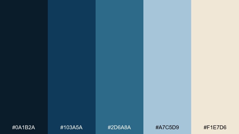
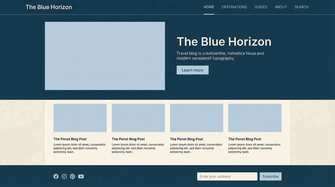
HEX: #0a1b2a #103a5a #2d6a8a #a7c5d9 #f1e7d6
Mood: calm, coastal, reflective
Best for: travel blog website design
Calm ocean blues and misty sky tones evoke quiet docks and distant lights across water. The mix is perfect for travel blogs, hospitality landing pages, and editorial layouts that want an airy, trustworthy feel. Pair the cream with the darkest blue for long-form readability and soft section breaks. Usage tip: keep #a7c5d9 for large background panels and let #2d6a8a handle buttons and links.
Image example of moonlit harbor generated using media.io
4) Velvet Cosmos
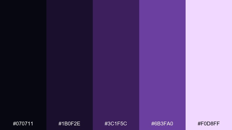
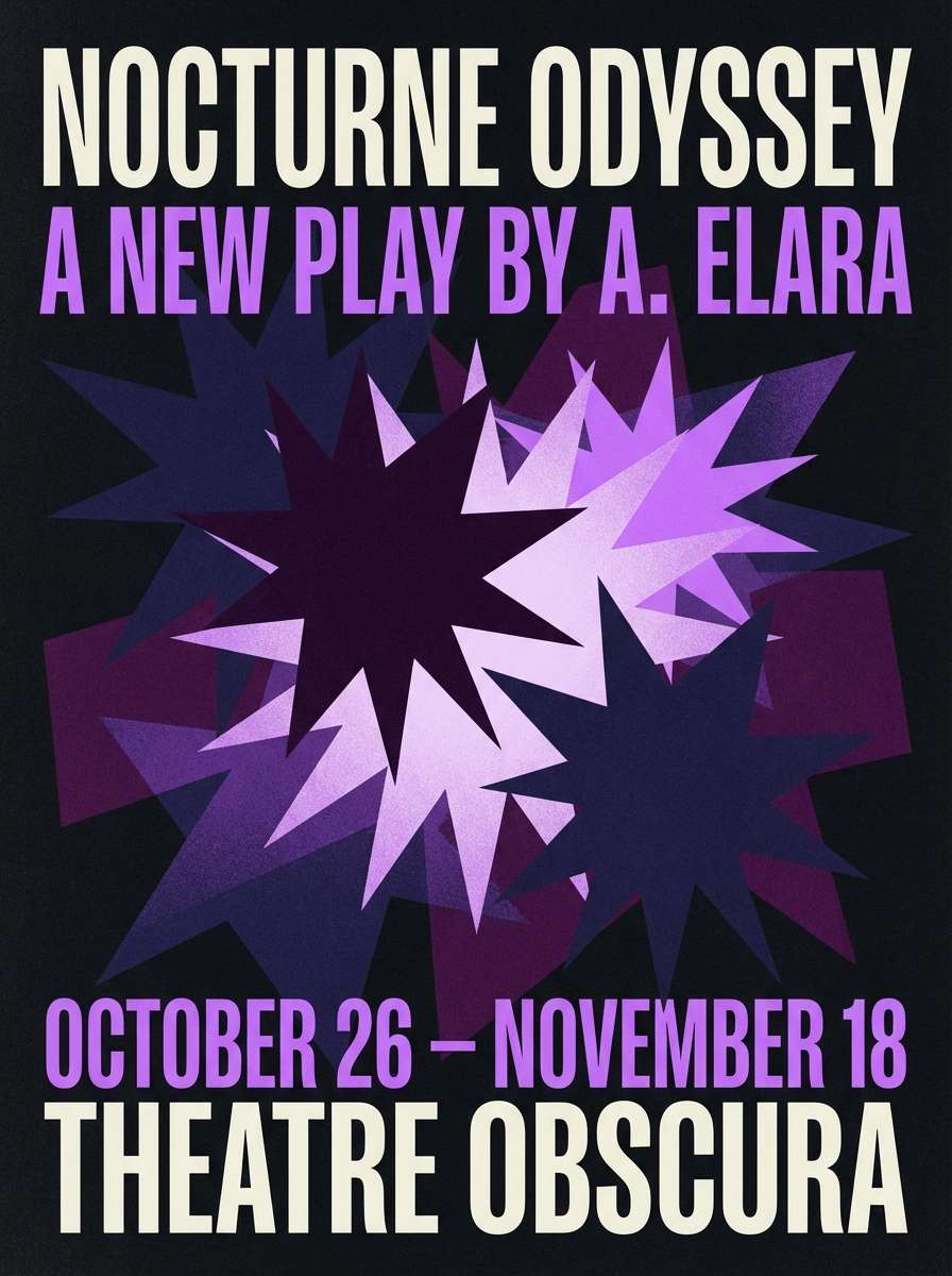
HEX: #070711 #1b0f2e #3c1f5c #6b3fa0 #f0d8ff
Mood: lush, dramatic, artistic
Best for: theater poster design
Lush velvet purples and near-black shadows feel like stage curtains opening to a cosmic scene. The strong contrast makes it great for posters, playbills, and event promos that need instant drama. Pair the pale lilac with the deep plum for headlines that stay legible from a distance. Usage tip: add texture or subtle grain to large dark areas to avoid flat banding in print.
Image example of velvet cosmos generated using media.io
5) Northern Lights Hush
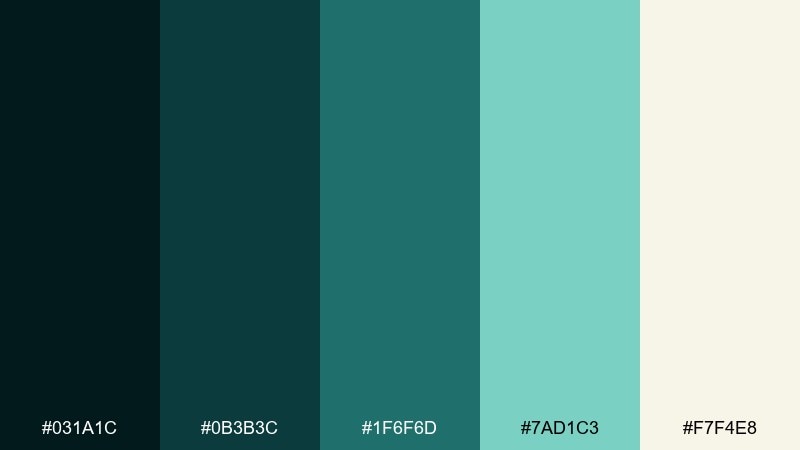
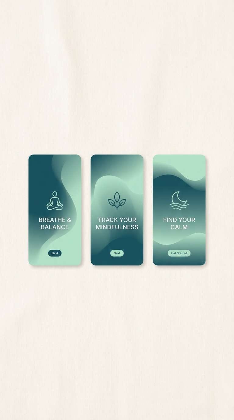
HEX: #031a1c #0b3b3c #1f6f6d #7ad1c3 #f7f4e8
Mood: fresh, airy, meditative
Best for: wellness app onboarding screens
Fresh teal shadows and soft mint light suggest aurora shimmer over still snow. These tones suit wellness onboarding, breathing exercises, and calming dashboards where clarity matters. Pair the off-white with the darkest teal for clean copy and minimal iconography. Usage tip: use #7ad1c3 sparingly as progress indicators to keep the experience soothing, not loud.
Image example of northern lights hush generated using media.io
6) Stargazer Ink
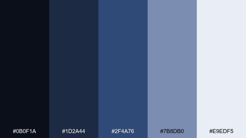
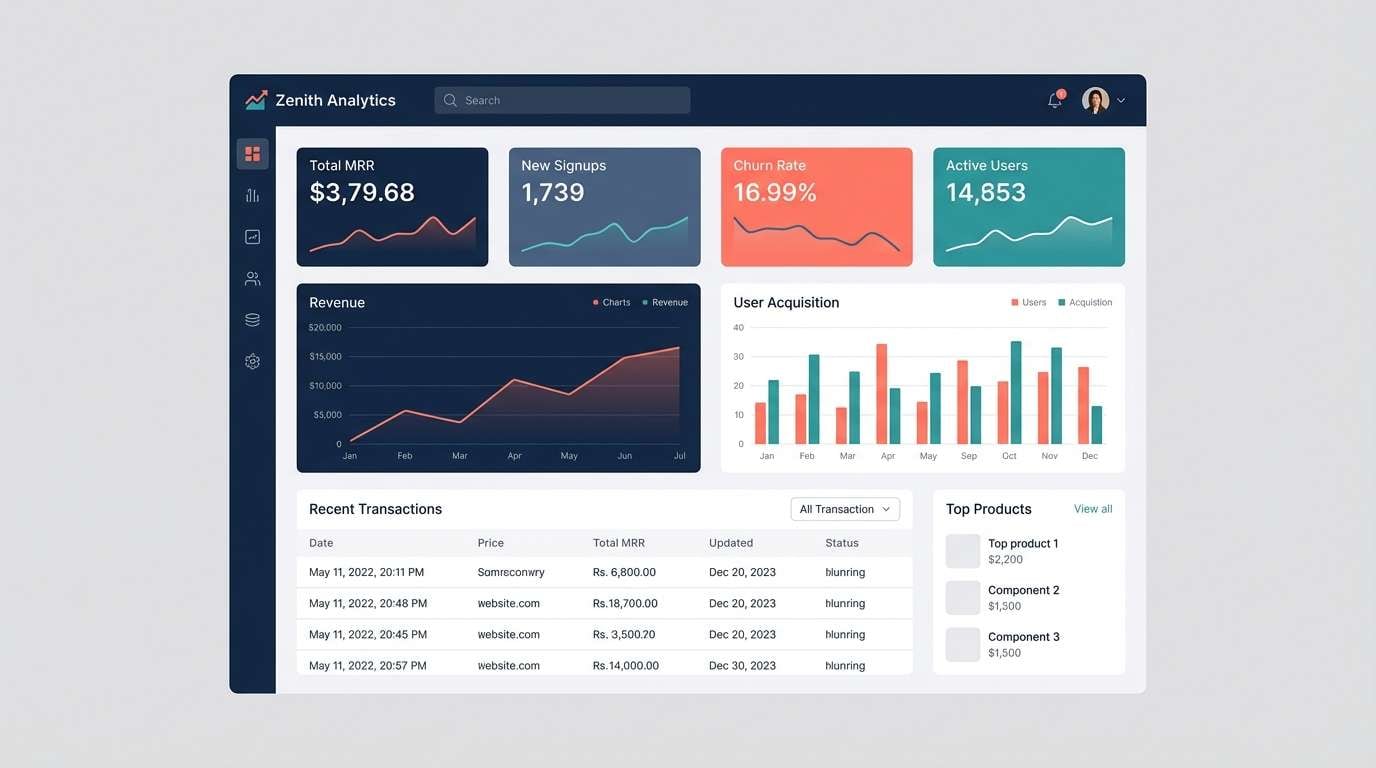
HEX: #0b0f1a #1d2a44 #2f4a76 #7b8db0 #e9edf5
Mood: professional, cool, dependable
Best for: SaaS dashboard UI
Cool ink blues and soft slate neutrals feel like a late-night workspace with a quiet glow. The palette is built for dashboards, tables, and data-heavy screens that need hierarchy without harshness. Pair the lightest tone with mid-blue for cards, and keep the darkest for nav and headers. Usage tip: reserve #2f4a76 for primary actions and use #7b8db0 for secondary states.
Image example of stargazer ink generated using media.io
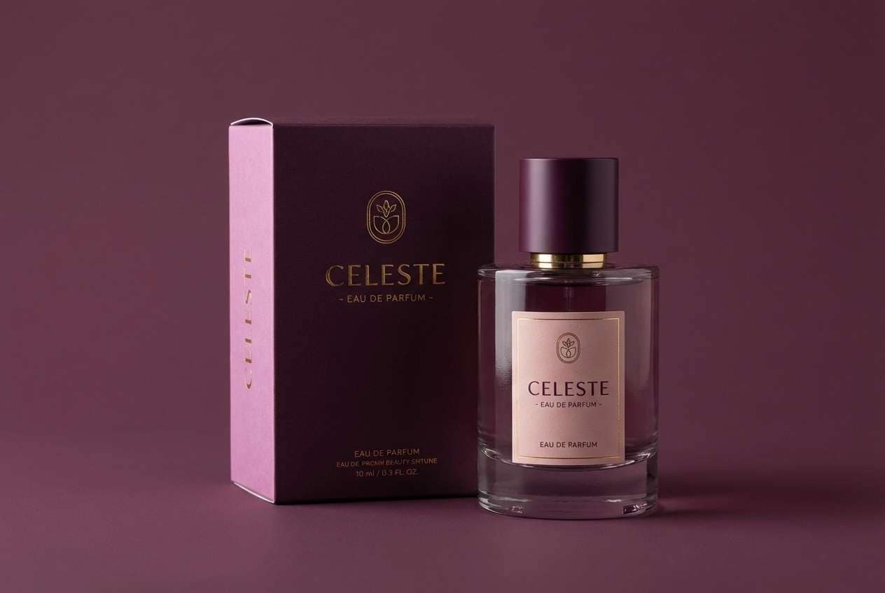
7) Twilight Orchid
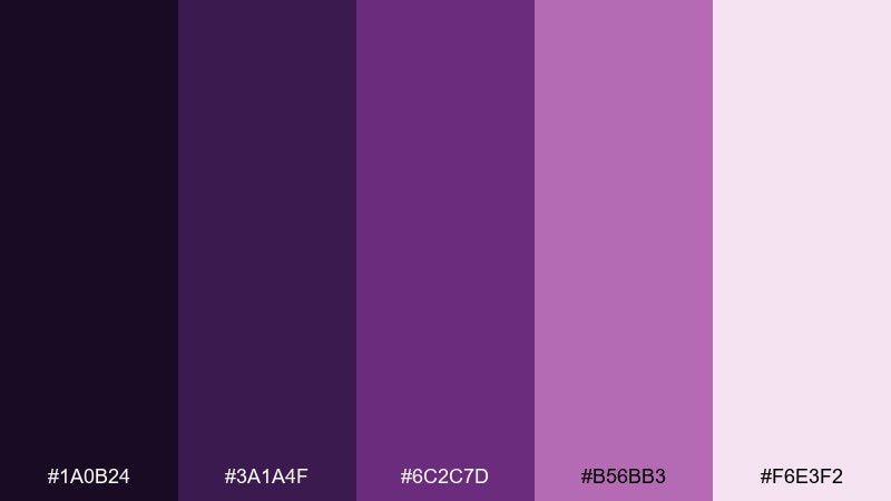
HEX: #1a0b24 #3a1a4f #6c2c7d #b56bb3 #f6e3f2
Mood: romantic, playful, velvety
Best for: beauty product packaging
Romantic orchid purples with soft blush highlights evoke twilight blooms and silky fabric. The mix works well for cosmetics, fragrance labels, and boutique packaging where you want elegance with personality. Pair the palest pink with the deep plum for readable ingredient text and barcode areas. Usage tip: use metallic foil on #b56bb3 elements to add premium shine without changing the color balance.
Image example of twilight orchid generated using media.io
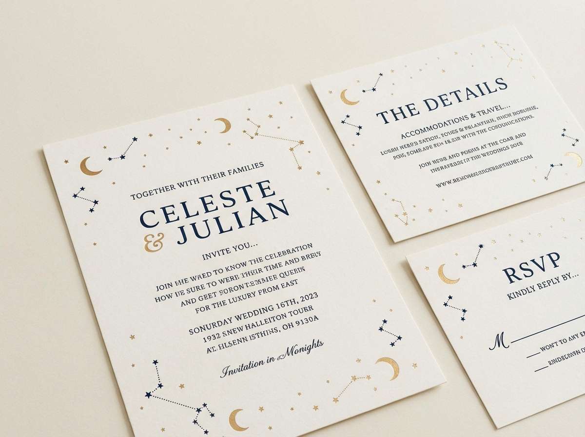
8) Constellation Gold
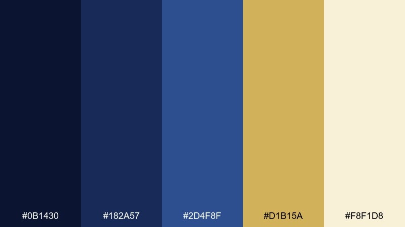
HEX: #0b1430 #182a57 #2d4f8f #d1b15a #f8f1d8
Mood: regal, warm, night-sky luxe
Best for: wedding invitation suite
Regal navy and constellation gold feel like handwritten vows under a sky full of stars. This starry night color palette is perfect for invitations, menus, and monograms that need timeless contrast. Pair the cream with gold for delicate borders, then anchor the layout with deep blue typography. Usage tip: keep gold as linework and small icons so it reads refined rather than heavy.
Image example of constellation gold generated using media.io
9) Deep Space Minimal
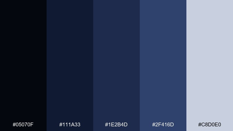
HEX: #05070f #111a33 #1e2b4d #2f416d #c8d0e0
Mood: minimal, serious, modern
Best for: tech pitch deck design
Deep space blues and clean steel tints create a focused, minimal atmosphere. It fits pitch decks, keynote templates, and product briefs where you want confidence without visual noise. Pair the pale gray-blue with the darkest tone for charts and captions that remain crisp on projectors. Usage tip: use #2f416d as your single accent and let the other blues handle structure and depth.
Image example of deep space minimal generated using media.io
10) Night Bloom Garden
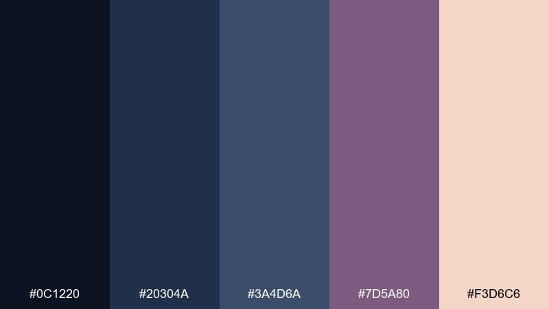
HEX: #0c1220 #20304a #3a4d6a #7d5a80 #f3d6c6
Mood: moody, floral, intimate
Best for: botanical illustration series
Moody blue-grays with dusty mauve feel like flowers opening after dark. The tones are ideal for botanical illustration, stationery prints, and gentle storytelling visuals. Pair the peachy highlight with the deepest navy to bring petals and labels forward. Usage tip: keep outlines in #20304a instead of pure black for a softer, more cohesive finish.
Image example of night bloom garden generated using media.io
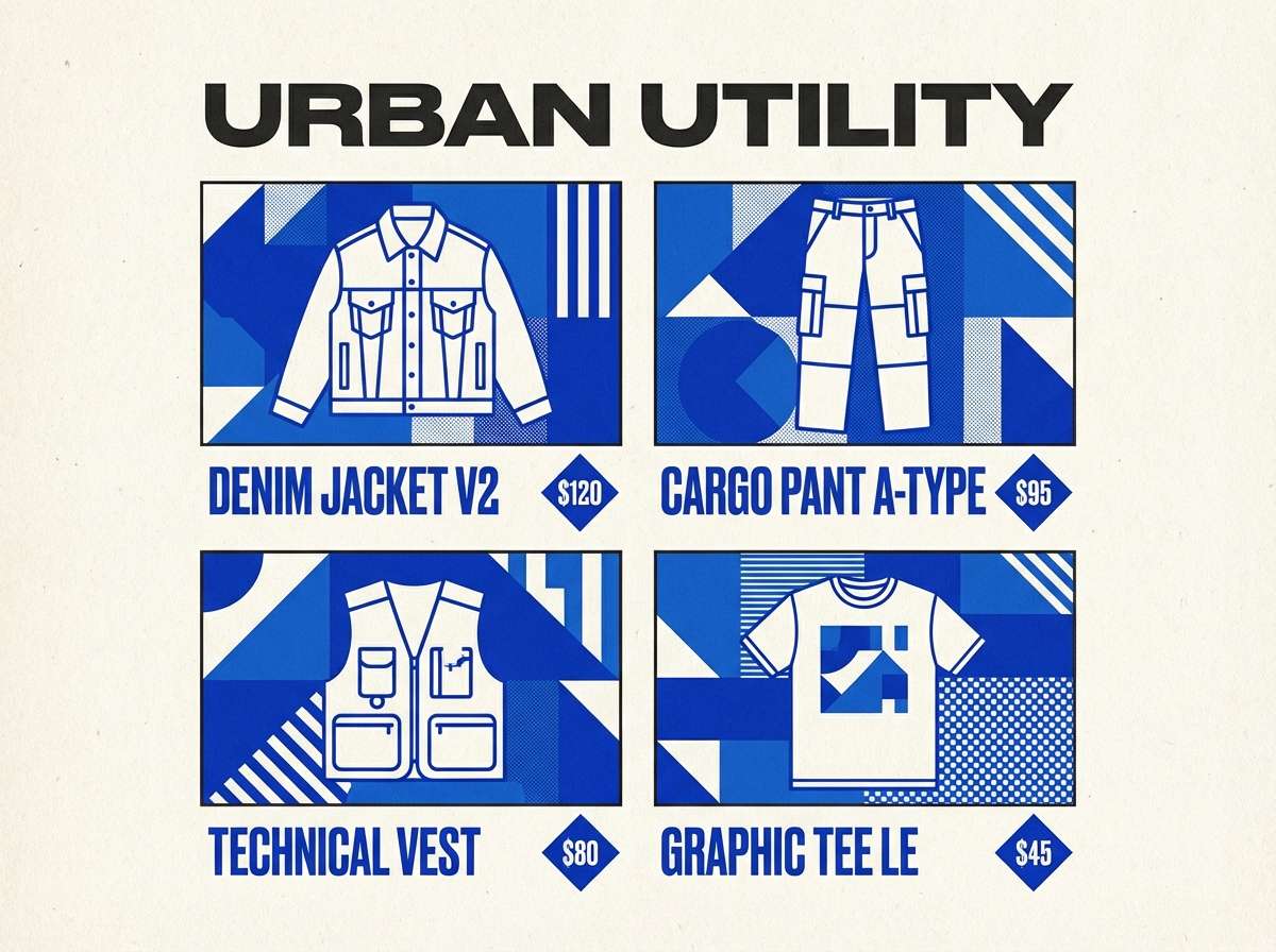
11) Astral Denim
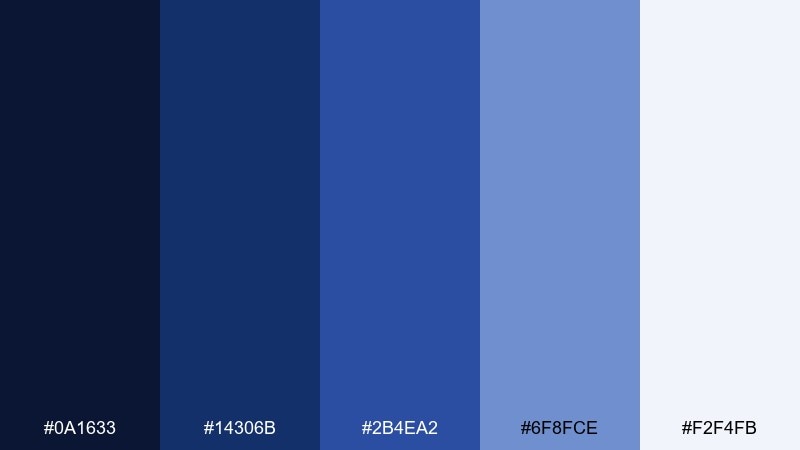
HEX: #0a1633 #14306b #2b4ea2 #6f8fce #f2f4fb
Mood: clean, energetic, everyday-cool
Best for: streetwear lookbook layout
Denim blues with crisp highlights evoke city nights and clean storefront light. This set works for lookbooks, e-commerce banners, and sporty branding that needs punch without neon. Pair the lightest tone with mid-blue for product cards and size guides. Usage tip: use #14306b for headings and #2b4ea2 for buttons so the hierarchy stays obvious.
Image example of astral denim generated using media.io
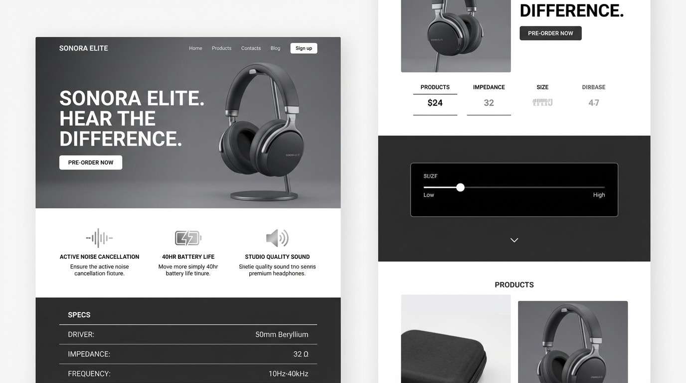
12) Lunar Silver Smoke
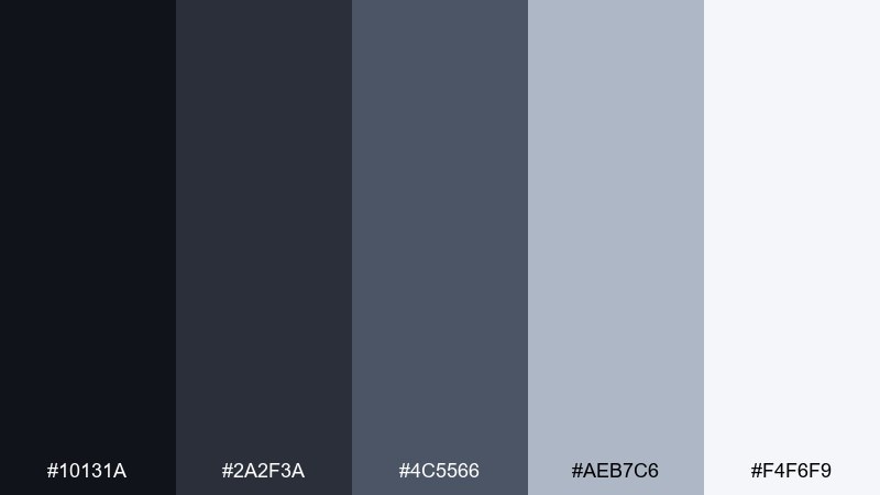
HEX: #10131a #2a2f3a #4c5566 #aeb7c6 #f4f6f9
Mood: sleek, quiet, futuristic
Best for: product landing page for headphones
Sleek charcoals and lunar silvers feel like moonlight diffused through soft smoke. The neutral-forward range is great for product pages, hardware branding, and photography-heavy layouts where the visuals should lead. Pair the lightest gray with charcoal for specs and comparison tables. Usage tip: add a single cool-blue underline or icon detail only if you need extra interaction cues.
Image example of lunar silver smoke generated using media.io
13) Cosmic Cocoa
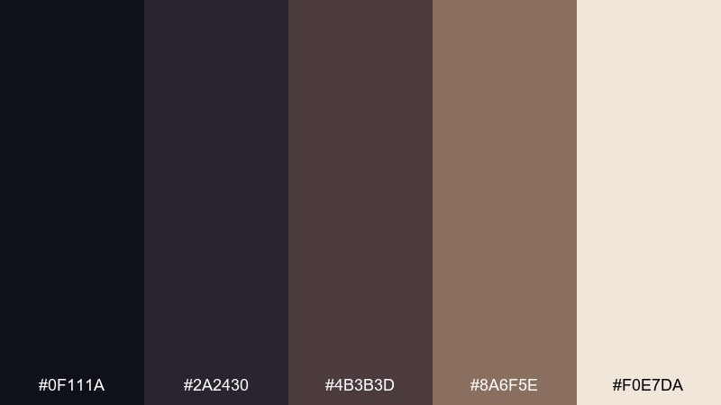
HEX: #0f111a #2a2430 #4b3b3d #8a6f5e #f0e7da
Mood: warm, earthy-leaning, sophisticated
Best for: coffee brand packaging
Warm cocoa browns mixed with midnight charcoal evoke late-night cafés and soft lamplight. It is a great fit for coffee bags, craft labels, and cozy lifestyle branding that still feels modern. Pair the cream with deep charcoal for strong type and roast notes. Usage tip: use #8a6f5e for small pattern elements to add texture without darkening the overall look.
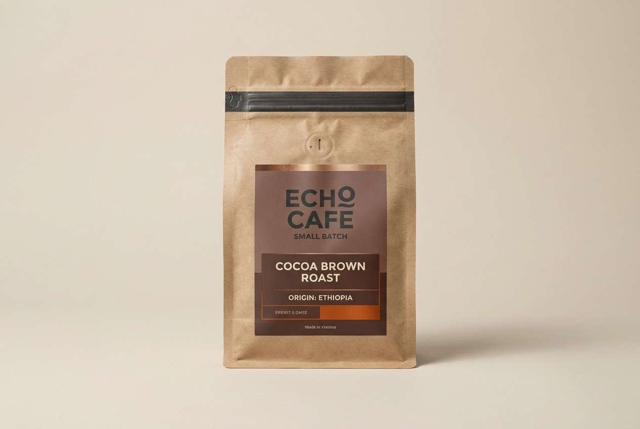
Image example of cosmic cocoa generated using media.io
14) Meteor Shower Pop
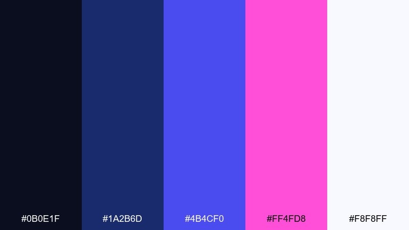
HEX: #0b0e1f #1a2b6d #4b4cf0 #ff4fd8 #f8f8ff
Mood: bold, electric, night-life
Best for: music festival flyer
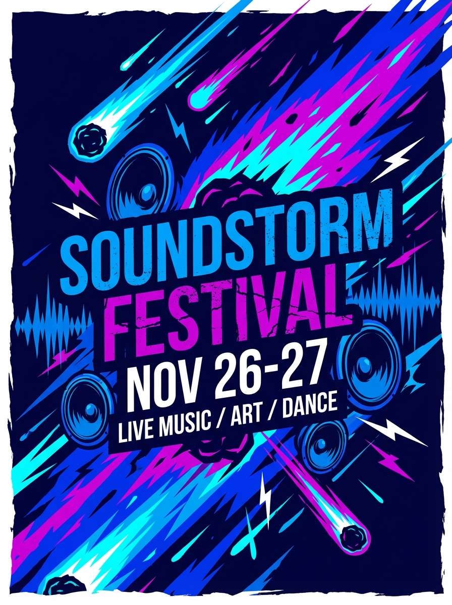
Electric blues and hot magenta streak across a dark base like meteors cutting through the sky. These starry night color combinations are made for flyers, social promos, and motion graphics that need instant energy. Pair the near-white with the deepest navy for small text so details stay readable. Usage tip: keep magenta as an accent stripe or headline color, not a full background block.
Image example of meteor shower pop generated using media.io
15) Quiet Planet
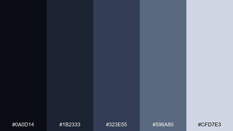
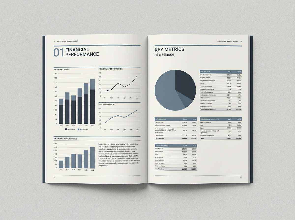
HEX: #0a0d14 #1b2333 #323e55 #596a80 #cfd7e3
Mood: calm, balanced, thoughtful
Best for: annual report design
Quiet blue-grays and softened contrast feel steady, measured, and corporate without being cold. The range suits annual reports, case studies, and long reads where hierarchy and comfort matter. Pair the lightest tone with the darkest for headings and pull quotes to keep pages airy. Usage tip: use #596a80 for charts and infographics to avoid over-saturating data visuals.
Image example of quiet planet generated using media.io
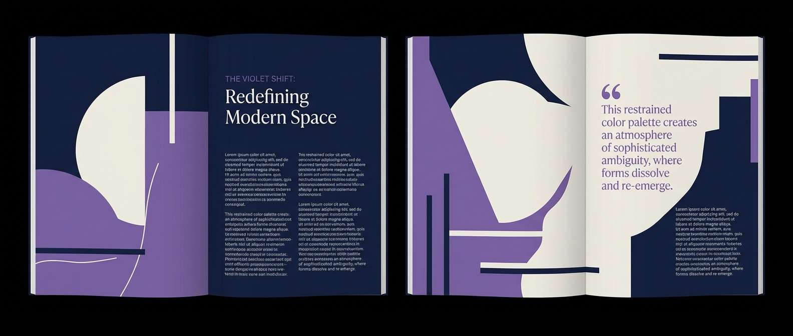
16) Galaxy Editorial
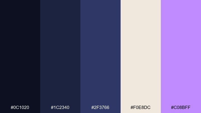
HEX: #0c1020 #1c2340 #2f3766 #f0e8dc #c08bff
Mood: editorial, artistic, contemporary
Best for: magazine feature layout
Inky blues with a soft paper neutral and a violet accent feel like a modern art magazine at midnight. The palette supports strong typography, pull quotes, and minimal illustration without losing warmth. Pair the paper tone with deep navy for body copy, then use violet for section labels and page numbers. Usage tip: keep violet under 10 percent of the layout so it reads as a deliberate editorial cue.
Image example of galaxy editorial generated using media.io
17) Observatory UI Dark
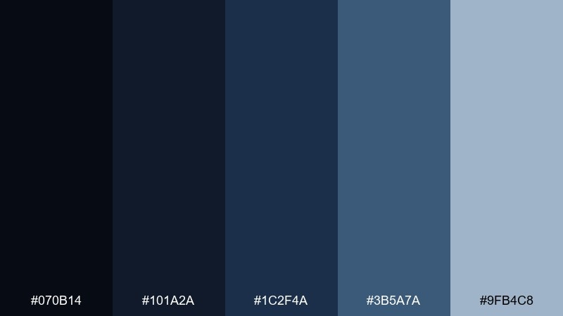
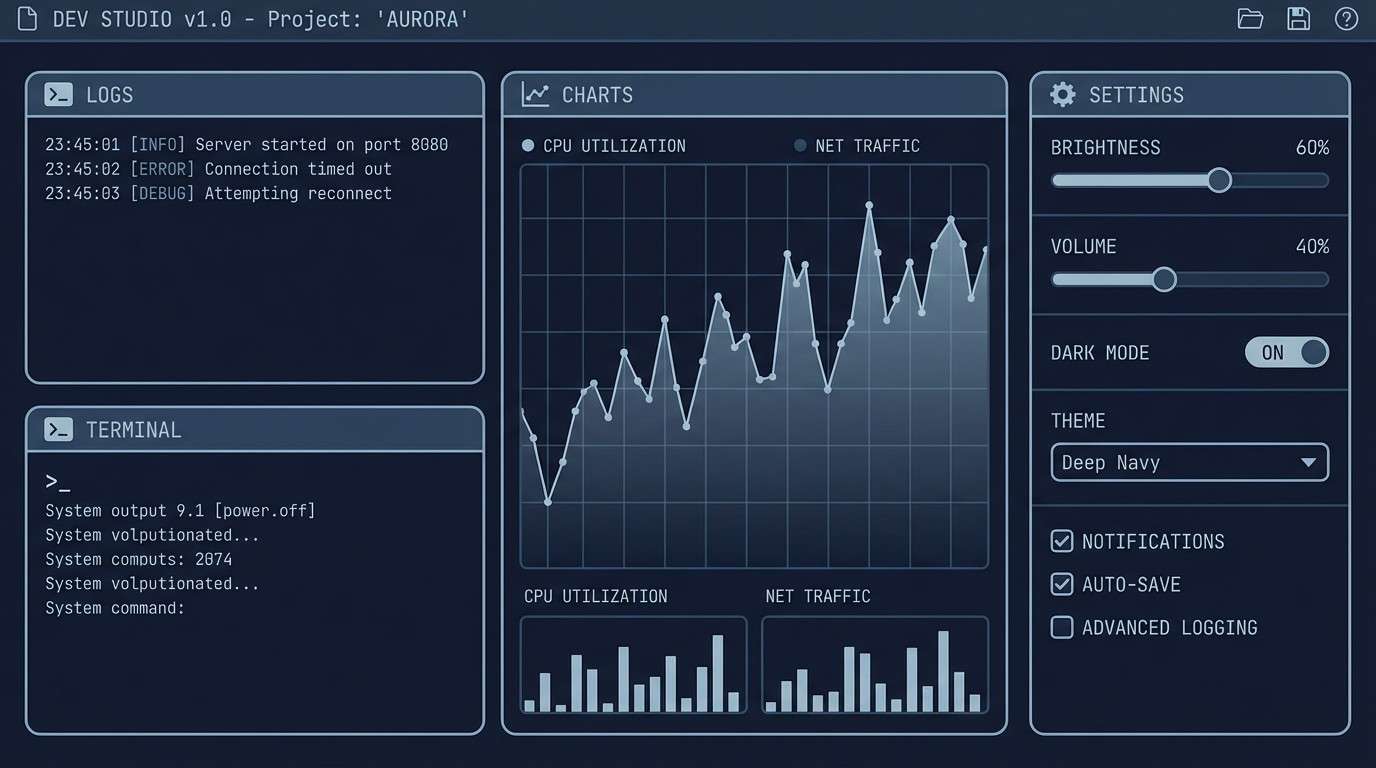
HEX: #070b14 #101a2a #1c2f4a #3b5a7a #9fb4c8
Mood: focused, technical, night mode
Best for: developer tool interface
Focused navy layers and cool steel accents feel like a well-tuned terminal in night mode. This starry night color palette suits developer tools, monitoring panels, and settings screens where contrast and calm both matter. Pair the light steel tone with the darkest background for readable code blocks and labels. Usage tip: avoid using #3b5a7a for large fills; it works best as hover states and selection highlights.
Image example of observatory ui dark generated using media.io
18) Sapphire Dusk
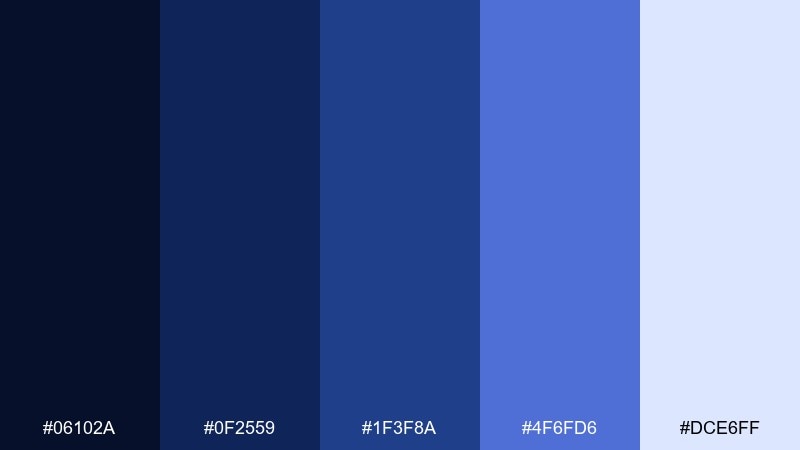
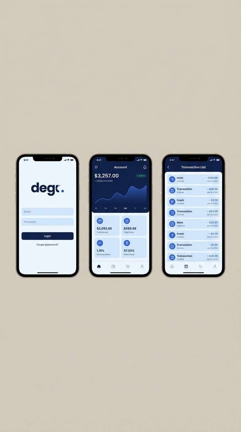
HEX: #06102a #0f2559 #1f3f8a #4f6fd6 #dce6ff
Mood: crisp, confident, luminous
Best for: fintech app UI
Crisp sapphire blues brighten from dusk to moonlit glow, giving the set a confident, modern edge. It is ideal for fintech UI, signup flows, and trust-forward product pages where blue needs to feel premium, not generic. Pair the palest blue with the darkest navy for forms and confirmation states. Usage tip: use #4f6fd6 as the only strong accent so the interface stays clean and credible.
Image example of sapphire dusk generated using media.io
19) Milky Way Pastels
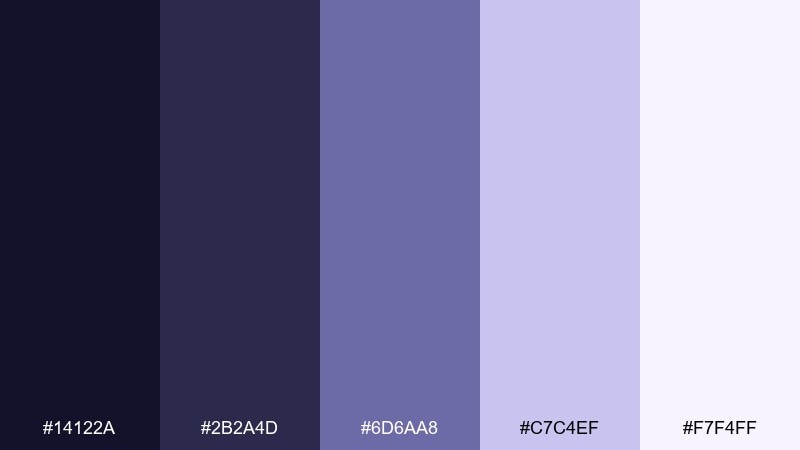
HEX: #14122a #2b2a4d #6d6aa8 #c7c4ef #f7f4ff
Mood: soft, whimsical, airy
Best for: children book cover illustration
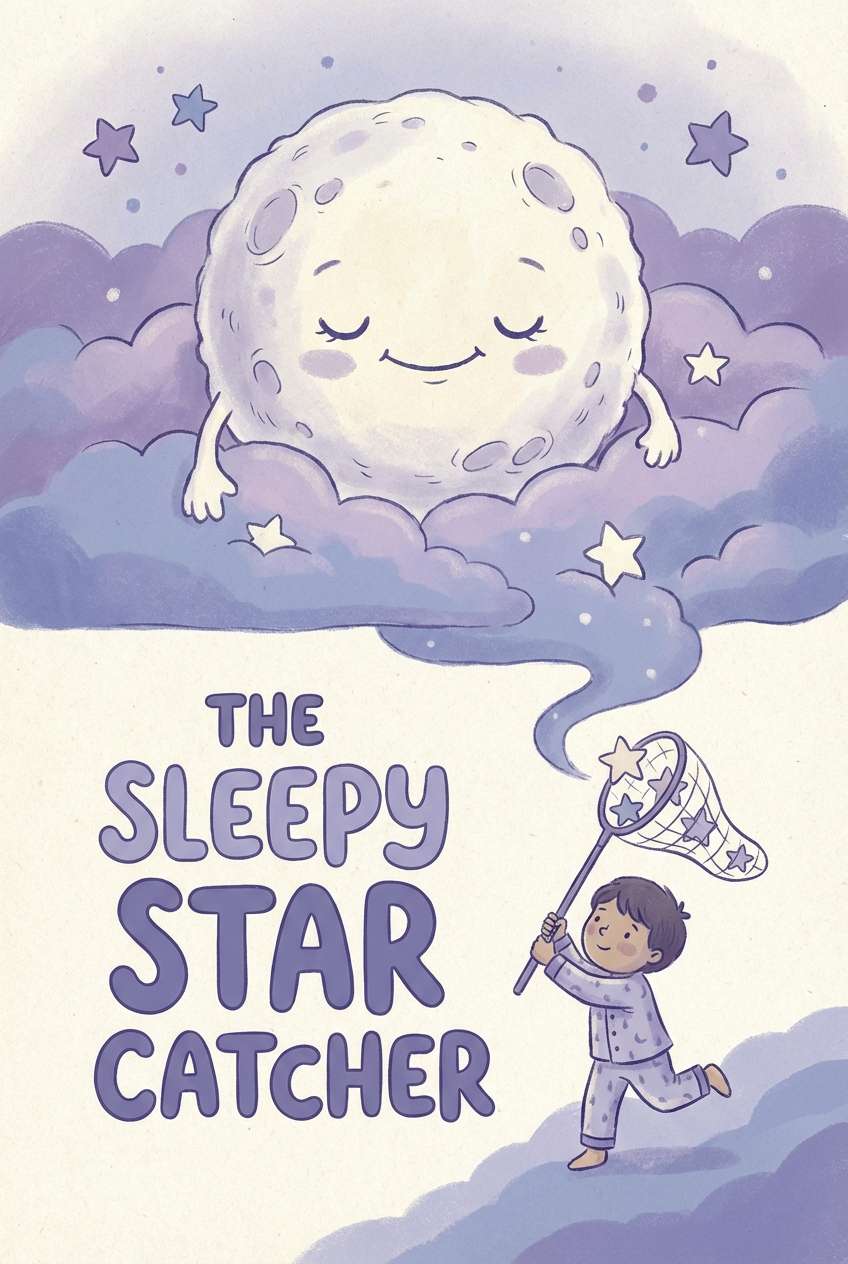
Soft periwinkle and gentle violet feel like stardust scattered across a pastel night sky. The lighter steps make it friendly for kids illustrations, dreamy covers, and gentle classroom materials. Pair the darkest violet with the near-white for titles that remain clear and cozy. Usage tip: use the mid periwinkle as the main fill and keep the deepest tone for outlines only.
Image example of milky way pastels generated using media.io
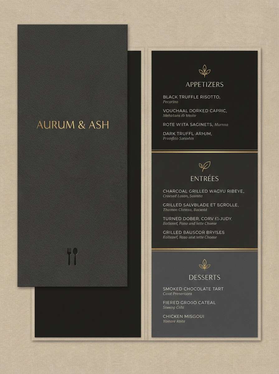
20) Afterglow Noir
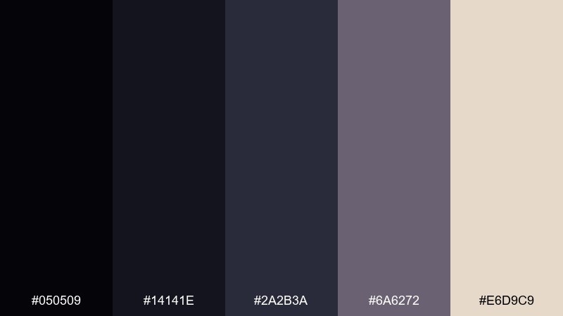
HEX: #050509 #14141e #2a2b3a #6a6272 #e6d9c9
Mood: noir, understated, elegant
Best for: luxury restaurant menu
Noir charcoals with a warm linen highlight feel like candlelight against dark stone. The palette is ideal for menus, wine lists, and refined brand systems that rely on typography and spacing. Pair the linen tone with near-black for classic readability and a premium feel. Usage tip: use #6a6272 for thin rules and separators to keep the layout subtle.
Image example of afterglow noir generated using media.io
What Colors Go Well with Starry Night?
Starry night palettes pair especially well with warm metallics (gold, brass, champagne) because the contrast feels like starlight against a dark sky. Even a small gold accent can make navies and indigos look more premium.
For a calmer, modern look, combine starry blues with lunar neutrals like fog gray, cool white, and soft steel. This keeps the palette readable for UI while still feeling atmospheric.
If you want a more artistic or romantic direction, add muted mauves, lilacs, or blush tones. These hues keep the night vibe but soften the overall mood for packaging, editorial, or illustration.
How to Use a Starry Night Color Palette in Real Designs
Start with one “space” background color (deep navy or near-black), then layer two mid-tones for structure—sidebars, panels, gradients, and section breaks. This prevents a flat dark layout and makes interfaces feel dimensional.
Reserve your brightest color for meaning: primary buttons, key icons, or a single highlight per section. Starry night schemes look best when accents feel rare, like stars, rather than spread everywhere.
For print, avoid pure black outlines when possible. Using a dark blue-gray from the palette for text and rules keeps the design cohesive and reduces harsh contrast.
Create Starry Night Palette Visuals with AI
If you already have HEX codes, the fastest way to validate them is to see the palette in context—on posters, UI mockups, packaging, or editorial layouts. That’s where contrast, readability, and “mood” become obvious.
With Media.io, you can generate starry night themed visuals from text prompts and iterate quickly—swap accent colors, try different ratios, or create a full set of on-brand images for campaigns.
Starry Night Color Palette FAQs
-
What is a starry night color palette?
A starry night palette is a set of dark, cool base colors (navy, indigo, near-black) paired with lighter “moonlit” neutrals and a small accent (often gold, violet, or electric blue) to mimic the depth and sparkle of the night sky. -
Which HEX colors are commonly used for a starry night theme?
Common picks include deep navies like #0b1026 or #06102a, indigos like #1a2a6c, soft neutrals like #d8d2c4 or #f4f6f9, and accents like gold #f5c542 or violet #c08bff. -
Are starry night colors good for dark UI design?
Yes—starry night palettes are ideal for dark UI because they provide layered dark tones for structure plus light neutrals for readable surfaces. Keep one strong accent for primary actions and avoid using bright colors as large backgrounds. -
What accent color works best with midnight blues?
Warm gold is the classic choice for a “stars” effect, while violet adds a mystical feel and cool silver keeps things sleek and minimal. Choose one accent and use it sparingly to maintain a night-sky mood. -
How do I keep text readable on starry night backgrounds?
Use a soft off-white or pale blue for body text, reserve true white for highlights, and avoid over-saturating mid-blues behind paragraphs. Testing contrast on key screens (forms, tables, captions) is especially important. -
Can I use starry night palettes for branding and print?
Absolutely—navy/indigo foundations feel premium in branding, and warm neutrals help on paper. For print, add subtle texture to large dark areas to reduce banding and consider metallic finishing for gold accents. -
How can I generate starry night palette mockups quickly?
You can use Media.io’s text-to-image generator to create UI screens, posters, invitations, and packaging concepts from prompts, then iterate by adjusting accent colors and layout ratios until the palette feels right.
Next: Earthy Color Palette


