

Snow white (#FFFAFA) is the modern neutral that makes interfaces feel clearer, interiors feel brighter, and branding feel more premium. It reads cleaner than beige, softer than pure white, and it plays nicely with both cool grays and warm naturals.
Below are 20+ snow white color palette ideas with HEX codes, plus practical pairing tips and AI-ready prompts so you can visualize each look fast.
In this article
Why Snow White Palettes Work So Well
Snow white sits just off pure white, so it keeps designs bright without feeling sterile. That tiny hint of warmth helps UI backgrounds, product shots, and print layouts look more natural.
It also improves flexibility: you can push contrast with deep ink tones for an editorial feel, or stay soft with grays and pastels for wellness, weddings, and minimalist branding.
Most importantly, snow white makes other colors look intentional. Accents like sage, terracotta, navy, or blush feel cleaner and more “designed” when they’re framed by a consistent, airy neutral.
20+ Snow White Color Palette Ideas (with HEX Codes)
1) Frosted Pearl
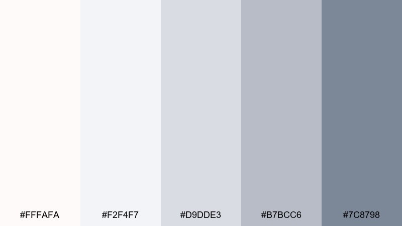
HEX: #FFFAFA #F2F4F7 #D9DDE3 #B7BCC6 #7C8798
Mood: crisp, airy, polished
Best for: SaaS dashboard UI
Crisp and airy like morning frost on glass, these tones feel polished without going cold. Use this snow white color palette for layouts that need clarity, spaciousness, and gentle contrast. Pair the mid grays for borders and tables, then reserve the slate accent for active states and charts. Tip: keep shadows subtle and rely on spacing to maintain the clean look.
Image example of frosted pearl generated using media.io

Media.io is an online AI studio for creating and editing video, image, and audio in your browser.

2) Alpine Minimal
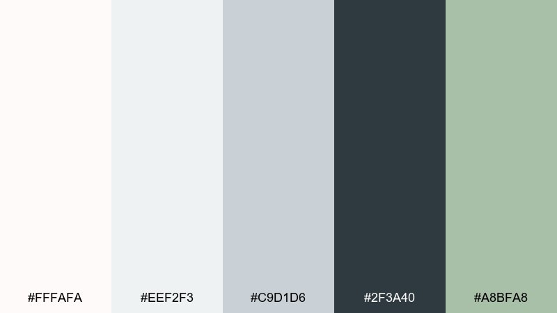
HEX: #FFFAFA #EEF2F3 #C9D1D6 #2F3A40 #A8BFA8
Mood: modern, calm, structured
Best for: architect portfolio website UI
Modern and calm like a quiet alpine lodge, the mix balances soft whites with confident dark structure. Let the charcoal handle navigation, headlines, and key CTAs while the pale tones keep pages breathable. The muted green is best as a small accent for tags, hover states, or section dividers. Tip: use plenty of negative space and thin rules for that architectural precision.
Image example of alpine minimal generated using media.io

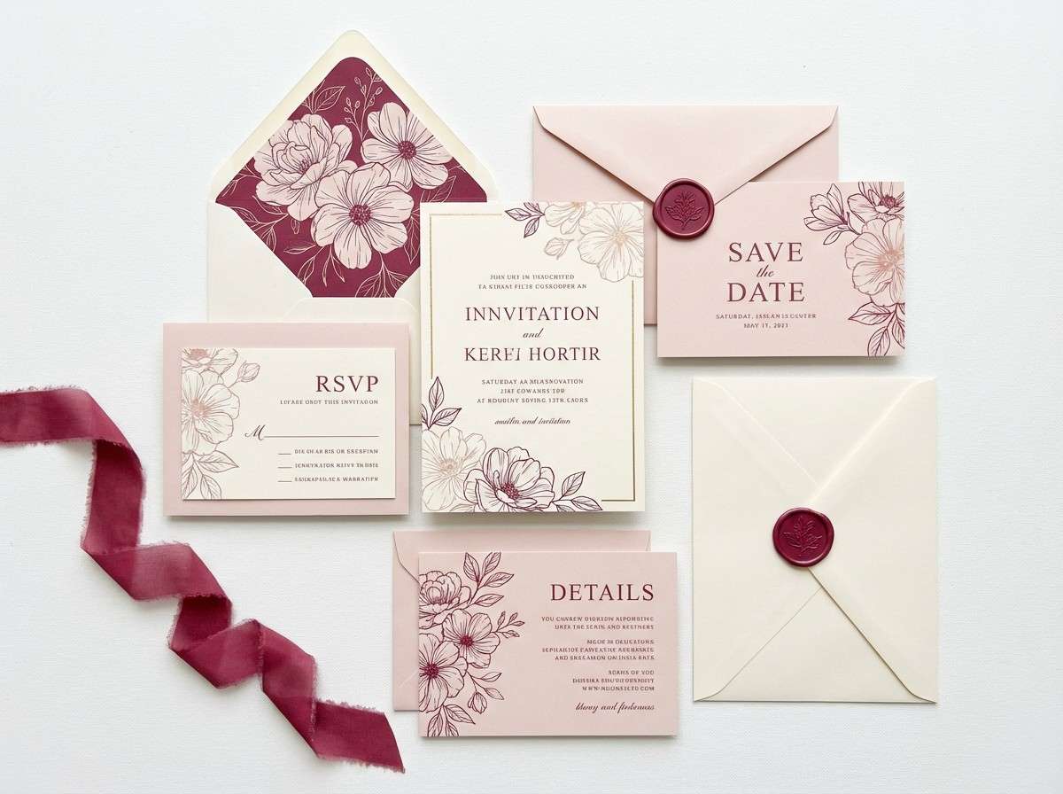
3) Winter Rose
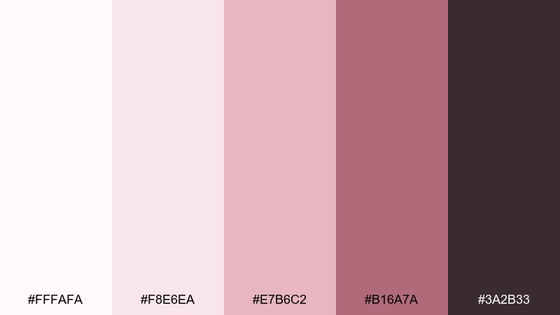
HEX: #FFFAFA #F8E6EA #E7B6C2 #B16A7A #3A2B33
Mood: romantic, soft, refined
Best for: wedding invitation set
Romantic and soft like blush petals dusted with snow, this set feels refined and intimate. These snow white color combinations shine on invitations, menus, and save-the-dates where typography needs a gentle halo. Keep the deeper berry for monograms or wax-seal style elements, and use blush as the main field color for warmth. Tip: print on textured cotton stock to make the pale tones feel intentional.
Image example of winter rose generated using media.io
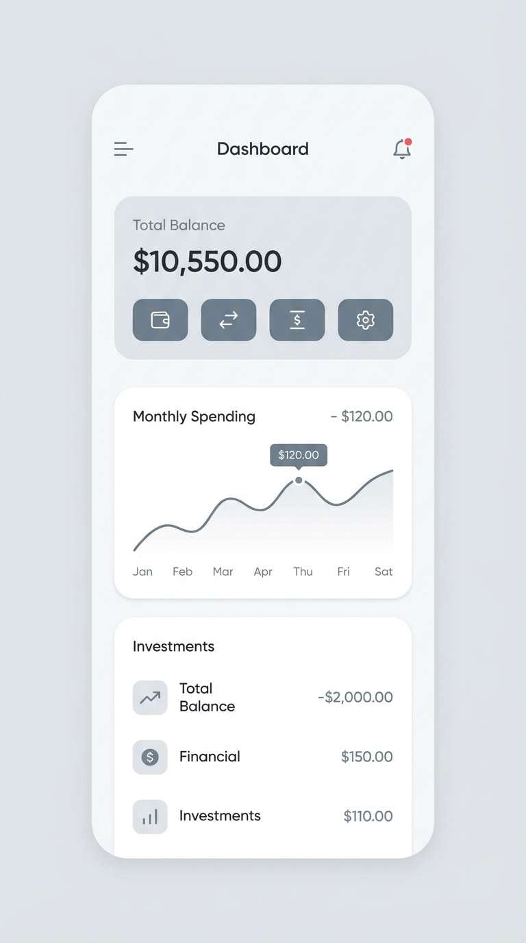
4) Silver Lining
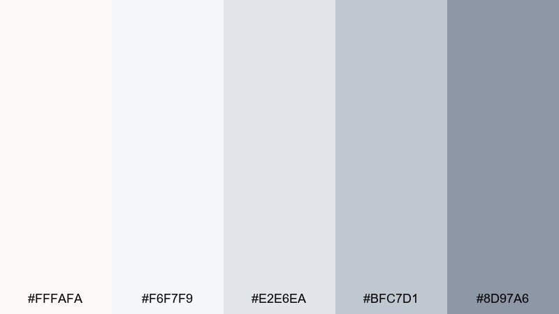
HEX: #FFFAFA #F6F7F9 #E2E6EA #BFC7D1 #8D97A6
Mood: neutral, sleek, professional
Best for: finance mobile app UI
Neutral and sleek like brushed metal under soft light, the contrast stays professional and easy on the eyes. Use the light grays for card backgrounds and the mid tones for separators, toggles, and secondary buttons. Save the steel accent for balances, totals, and critical UI highlights. Tip: bump font weight slightly to keep readability high against pale surfaces.
Image example of silver lining generated using media.io
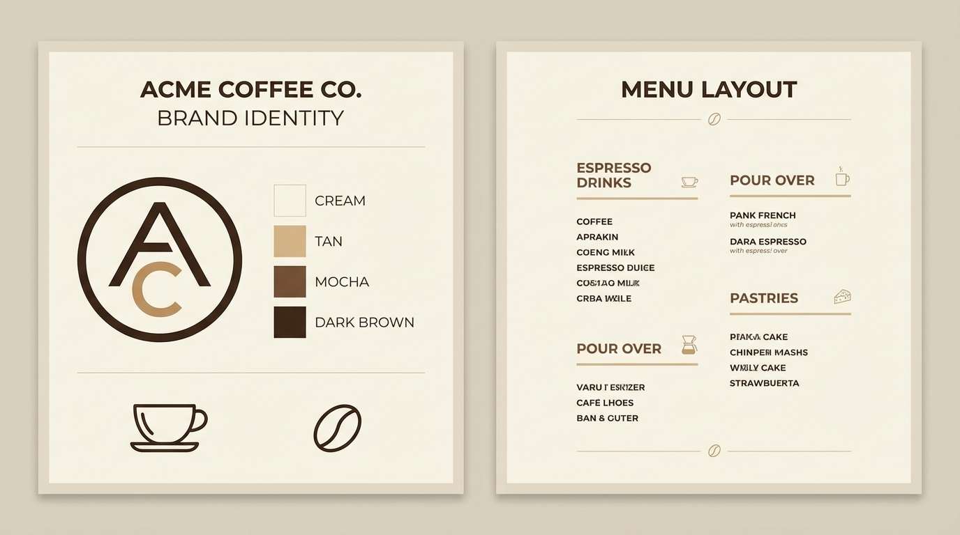
5) Linen and Latte
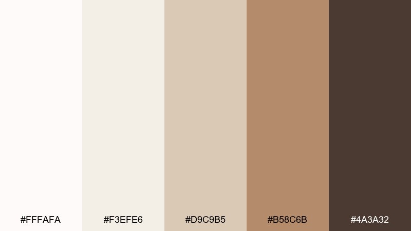
HEX: #FFFAFA #F3EFE6 #D9C9B5 #B58C6B #4A3A32
Mood: cozy, grounded, natural
Best for: coffee shop brand kit
Cozy and grounded like warm linen beside a latte, this mix reads approachable and craft-focused. Use the cream and tan as your primary fields, then lean on mocha for logos, stamps, and packaging copy. The deeper brown works best for menu headers or loyalty card typography. Tip: pair with uncoated paper and subtle grain textures to reinforce the handmade vibe.
Image example of linen and latte generated using media.io
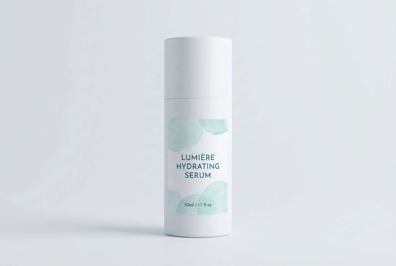
6) Glacier Mint
HEX: #FFFAFA #E8F6F3 #BFE8DE #6DB7A8 #2B5B55
Mood: fresh, clean, uplifting
Best for: skincare packaging
Fresh and clean like glacial water with a minty breeze, these hues signal purity and care. Let the pale aqua carry the label background while the deeper teal anchors product names and ingredients. The darkest tone should be used sparingly for barcode areas or small regulatory text. Tip: a matte white bottle makes the mint accents feel brighter without turning neon.
Image example of glacier mint generated using media.io
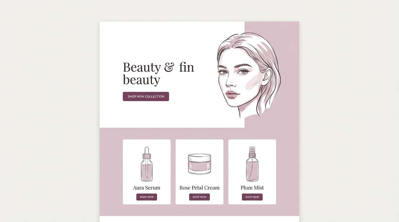
7) Blush Marble
HEX: #FFFAFA #F7EFF2 #E5D6DD #C1A0B2 #6A4B5B
Mood: elegant, soft, boutique
Best for: beauty landing page UI
Elegant and soft like blush marble in a boutique, the tones feel delicate yet premium. Use the pale mauves for sections and cards, and reserve plum for primary buttons and headline emphasis. Keep imagery bright and airy so the palette reads upscale rather than heavy. Tip: add a single plum accent per screen to avoid visual clutter.
Image example of blush marble generated using media.io
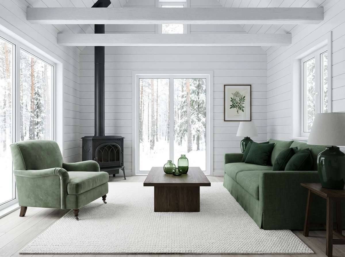
8) Nordic Pine
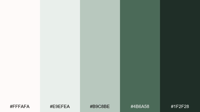
HEX: #FFFAFA #E9EFEA #B9C8BE #4B6A58 #1F2F28
Mood: quiet, outdoorsy, balanced
Best for: cabin living room interior concept
Quiet and outdoorsy like pine boughs against fresh snow, this set feels balanced and restorative. Use white and sage as the base for walls, textiles, and large surfaces, then bring in pine green through cabinetry or a statement chair. The near-black green works as hardware, window frames, or a fireplace surround. Tip: mix matte finishes with natural wood to keep the greens from feeling too formal.
Image example of nordic pine generated using media.io
9) Ink and Ivory
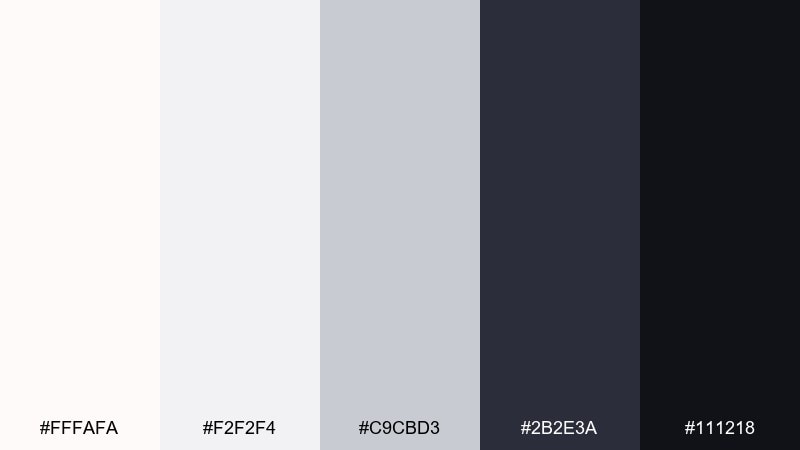
HEX: #FFFAFA #F2F2F4 #C9CBD3 #2B2E3A #111218
Mood: bold, editorial, high-contrast
Best for: magazine editorial layout
Bold and editorial like ink on heavy paper, this high-contrast set looks confident and modern. Let ivory handle margins and whitespace, then use near-black for body text and pull quotes. The mid grays are perfect for captions, rules, and image labels without competing with photography. Tip: keep one strong grid and avoid extra decorative elements so the contrast feels intentional.
Image example of ink and ivory generated using media.io
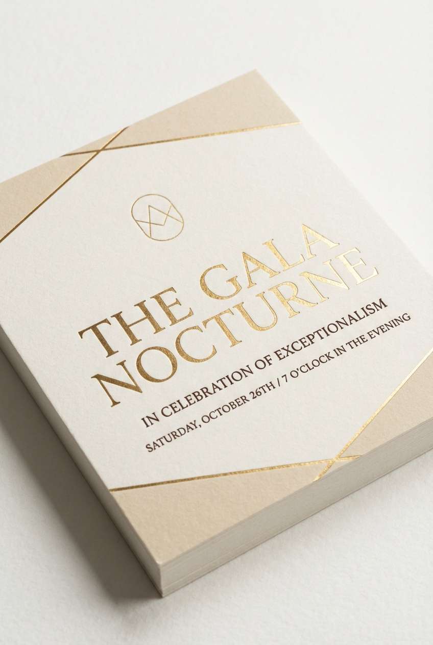
10) Champagne Hush
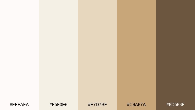
HEX: #FFFAFA #F5F0E6 #E7D7BF #C9A67A #6D563F
Mood: warm, celebratory, refined
Best for: luxury event flyer
Warm and celebratory like a quiet champagne toast, the neutrals feel refined rather than flashy. Use the creamy tones as the main background and the gold-tan for borders, icons, or subtle patterns. The deep brown adds authority for dates, locations, and key details. Tip: choose a minimalist serif and let spacing do the luxury work.
Image example of champagne hush generated using media.io
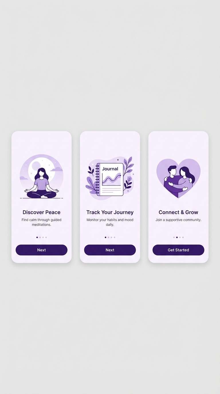
11) Lavender Fog
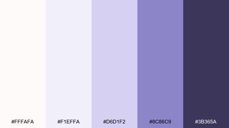
HEX: #FFFAFA #F1EFFA #D6D1F2 #8C86C9 #3B365A
Mood: dreamy, gentle, modern
Best for: wellness app onboarding screens
Dreamy and gentle like lavender fog at sunrise, this palette relaxes without looking childish. Use the soft lilac for gradients and onboarding panels, and keep deep violet for headings and progress indicators. Snowy white works best as breathing room around illustrations and copy blocks. Tip: avoid pure black text here, and stick to the dark violet to maintain the calm mood.
Image example of lavender fog generated using media.io
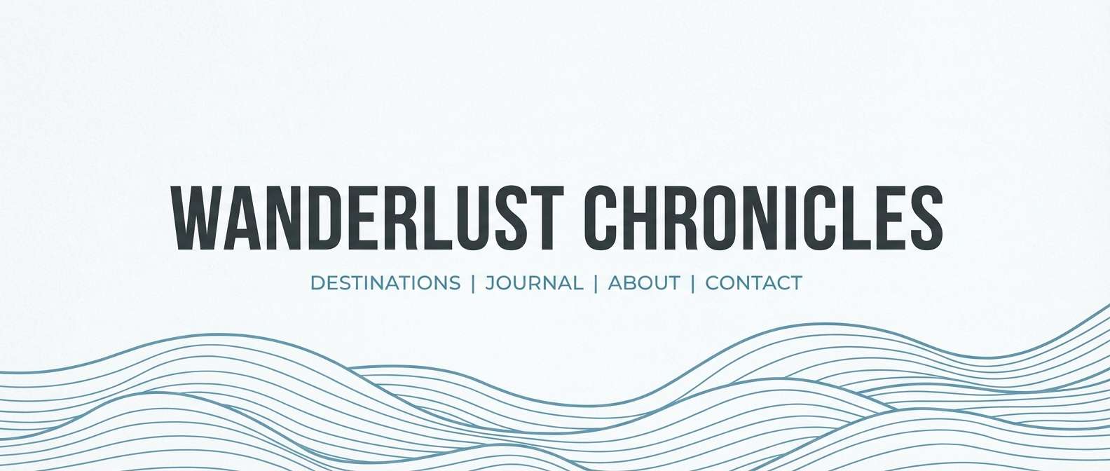
12) Coastal Drift
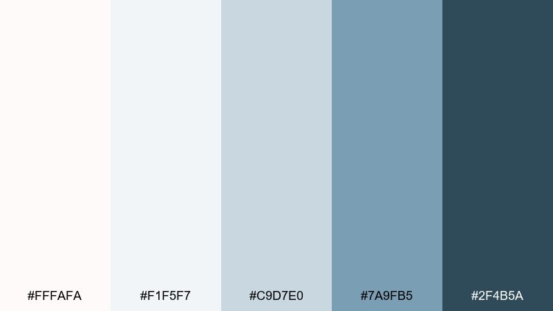
HEX: #FFFAFA #F1F5F7 #C9D7E0 #7A9FB5 #2F4B5A
Mood: breezy, coastal, clean
Best for: travel blog header design
Breezy and coastal like sea mist over pale sand, these blues stay clean and modern. Use snow white and misty gray as the canvas, then bring in denim blue for links and callouts. The deep blue-gray is ideal for navigation and footer areas to ground the airy top. Tip: pair with wide photography crops and minimal overlays for a fresh, open feel.
Image example of coastal drift generated using media.io
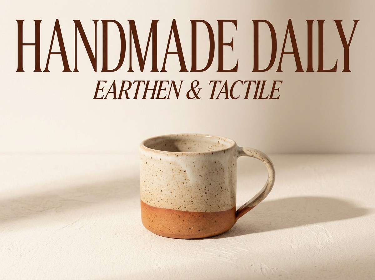
13) Terracotta Snow
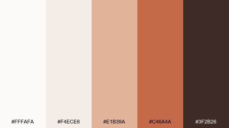
HEX: #FFFAFA #F4ECE6 #E1B39A #C46A4A #3F2B26
Mood: artisan, warm, inviting
Best for: ceramics shop product ad
Artisan and warm like sun-baked clay against fresh white linen, the contrast feels inviting and handmade. This snow white color combination works especially well for product ads that need warmth without losing clarity. Use terracotta for the hero object and buttons, and let the off-white keep the layout breathable. Tip: keep backgrounds clean so the clay tone stays the star.
Image example of terracotta snow generated using media.io
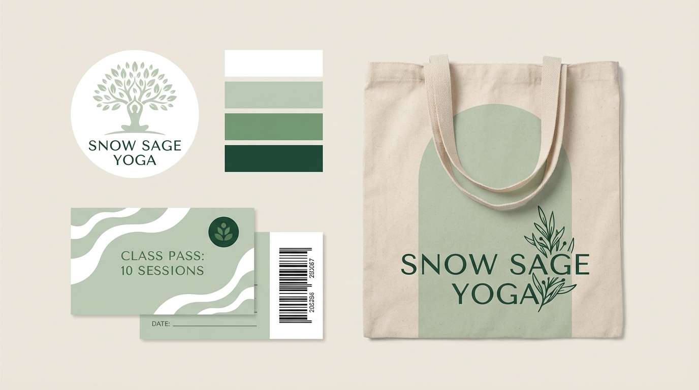
14) Sage Studio
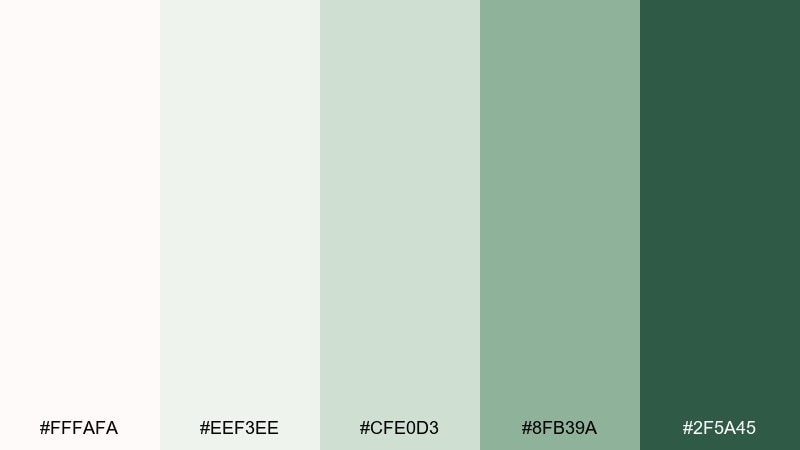
HEX: #FFFAFA #EEF3EE #CFE0D3 #8FB39A #2F5A45
Mood: fresh, natural, studio-clean
Best for: yoga studio brand identity
Fresh and natural like a sunlit studio with eucalyptus in the air, these greens feel calming and clean. Use the pale sage as your main field color and the darker green for logos, signage, and class schedule highlights. For snow white color combinations, this mix keeps everything light while still giving you a strong anchor tone. Tip: choose one shade of green for all CTAs to keep the identity consistent.
Image example of sage studio generated using media.io
15) Goldleaf Gallery
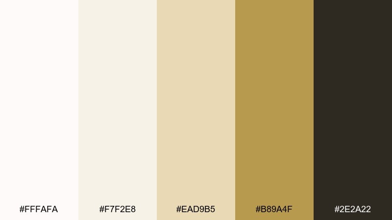
HEX: #FFFAFA #F7F2E8 #EAD9B5 #B89A4F #2E2A22
Mood: classic, curated, upscale
Best for: art gallery poster
Classic and curated like a quiet gallery room with gilded frames, this set feels upscale and timeless. Use the creamy whites for negative space and let the muted gold handle lines, badges, or exhibit titles. The dark espresso tone gives sharp readability for dates and venue details. Tip: keep imagery monochrome or warm-toned so the gold reads elegant, not loud.
Image example of goldleaf gallery generated using media.io

16) Midnight Velvet
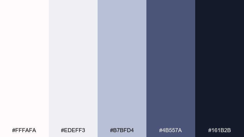
HEX: #FFFAFA #EDEFF3 #B7BFD4 #4B557A #161B2B
Mood: dramatic, luxe, night-sky
Best for: premium subscription landing page
Dramatic and luxe like midnight velvet under soft spotlights, these blues elevate a premium feel. Use the deep navy for hero sections and headers, then balance it with snowy whites for content blocks and pricing cards. The periwinkle tones work well for secondary buttons, icons, and subtle gradients. Tip: keep animations slow and minimal so the palette stays sophisticated.
Image example of midnight velvet generated using media.io
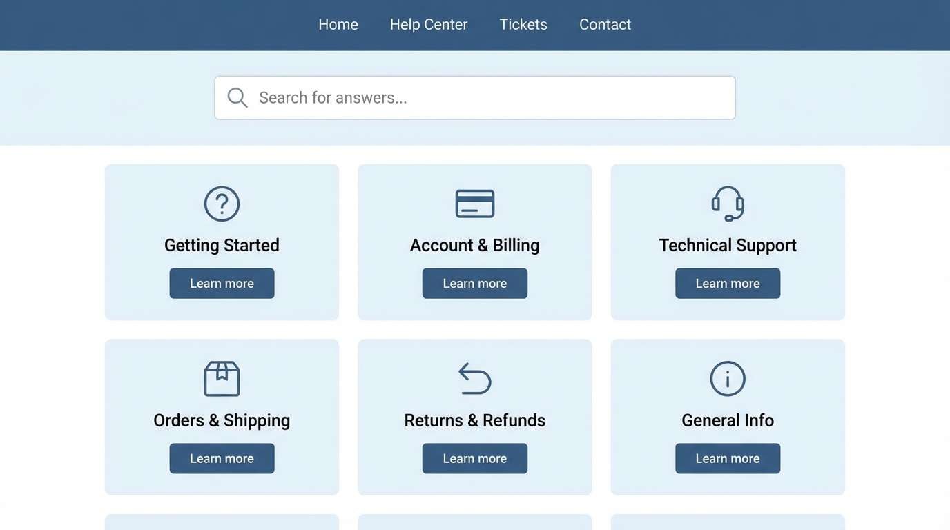
17) Cloudy Denim
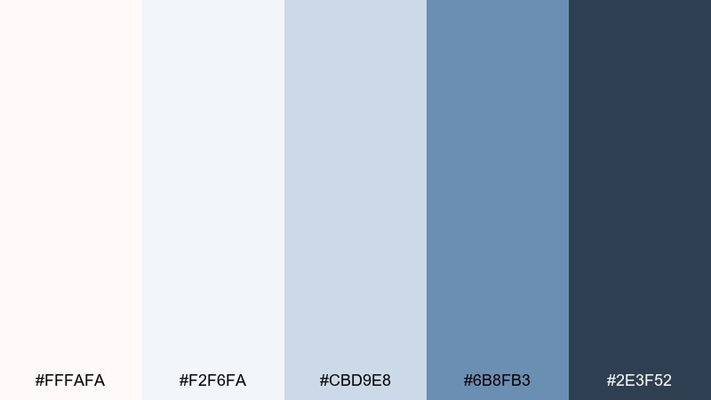
HEX: #FFFAFA #F2F6FA #CBD9E8 #6B8FB3 #2E3F52
Mood: casual, friendly, dependable
Best for: customer support help center UI
Casual and friendly like denim softened by clouds, this blue set feels dependable and approachable. Use the light blues for panels and FAQs, and keep the deeper denim for links, tabs, and active states. Snow white is best for page backgrounds so content feels effortless to scan. Tip: add simple line icons in denim to guide users without adding visual noise.
Image example of cloudy denim generated using media.io
18) Peach Sorbet
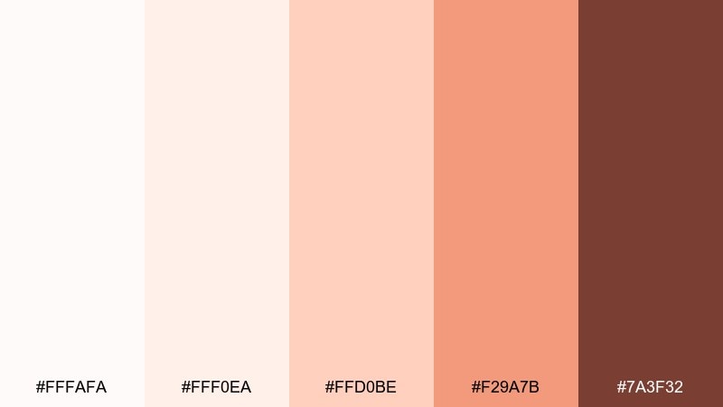
HEX: #FFFAFA #FFF0EA #FFD0BE #F29A7B #7A3F32
Mood: playful, sunny, sweet
Best for: bakery social media ad
Playful and sunny like peach sorbet in a chilled bowl, these hues feel sweet but still modern. Use the pale peach as the main background for posts, then pop the coral for headlines and price tags. The cocoa-brown keeps text readable and adds a baked-good warmth. Tip: keep props minimal and let one hero pastry carry the composition.
Image example of peach sorbet generated using media.io

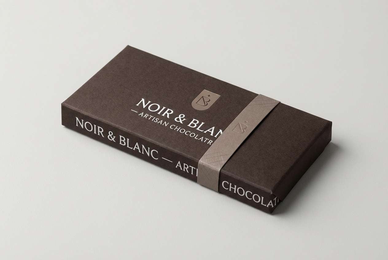
19) Mocha Frost
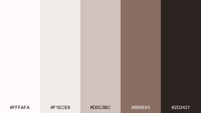
HEX: #FFFAFA #F1ECE8 #D0C3BC #8B6E63 #2D2421
Mood: moody, cozy, premium
Best for: chocolate packaging
Moody and cozy like mocha foam on a winter morning, this set reads premium and indulgent. Use the near-black brown for the main wrapper, then bring in snow white for typography and small label blocks. The warm taupes help with secondary information like cacao percentage or tasting notes. Tip: use spot gloss on the darkest tone to add depth without adding extra colors.
Image example of mocha frost generated using media.io
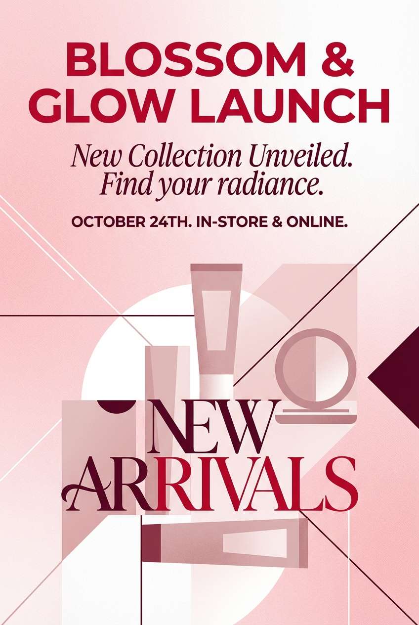
20) Cherry Quartz
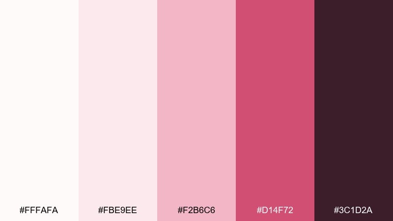
HEX: #FFFAFA #FBE9EE #F2B6C6 #D14F72 #3C1D2A
Mood: bold, flirty, modern
Best for: cosmetics product launch poster
Bold and flirty like cherry quartz catching light, this palette makes announcements feel energetic and modern. Use the soft pink as a buffer around bright accents, and reserve the cherry tone for the headline and key callouts. The deep wine works for fine print and gives the composition a grounded edge. Tip: keep shapes geometric and clean so the color does the talking.
Image example of cherry quartz generated using media.io
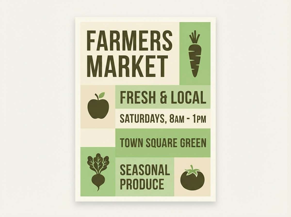
21) Quiet Orchard
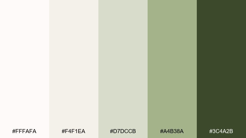
HEX: #FFFAFA #F4F1EA #D7DCCB #A4B38A #3C4A2B
Mood: organic, calm, sunlit
Best for: farmers market flyer
Organic and calm like a sunlit orchard in early spring, these greens and creams feel wholesome. Use the soft cream as your background, then highlight sections with the gentle leaf green. The darker olive makes headings and locations stand out without looking harsh. Tip: pair with simple illustrated produce icons to keep the flyer friendly and legible.
Image example of quiet orchard generated using media.io
What Colors Go Well with Snow White?
Snow white pairs beautifully with cool neutrals like pearl gray, steel, slate, and ink tones—perfect when you want a crisp, modern “clean UI” look with strong readability.
For warmer, more lifestyle-friendly designs, combine snow white with latte, tan, terracotta, mocha, champagne beige, or muted gold. These keep the palette soft while adding a welcoming, premium warmth.
If you want a fresh pop, lean into muted greens (sage, pine, viridian-leaning teals) or calm pastels (blush, lilac, soft peach). Snow white gives these accents space so they feel intentional instead of loud.
How to Use a Snow White Color Palette in Real Designs
Start with snow white as your primary canvas, then choose one “structure” color (charcoal, navy, deep brown) for text, navigation, and key hierarchy. This keeps contrast consistent across pages and components.
Use your mid-tones for UI mechanics: borders, dividers, secondary buttons, table rows, and disabled states. When everything is pale, small shifts in value matter—so keep spacing generous and shadows subtle.
Reserve your accent color for actions and highlights (CTAs, selected tabs, badges, key numbers). With snow white, you typically need less accent than you think for the design to feel vibrant.
Create Snow White Palette Visuals with AI
If you’re pitching a concept or building a mood board, AI visuals help you validate how snow white behaves with different accents (warm vs. cool, editorial vs. cozy) before you commit to a full design system.
Use the prompts above as-is, then swap the use case (UI, packaging, flyer, interior) while keeping the same HEX-driven color direction. You’ll get consistent variations that are easy to compare.
When your results feel too flat, add notes like “soft diffused lighting,” “subtle shadows,” or “matte paper texture” to make snow white read intentional rather than empty.
Snow White Color Palette FAQs
-
What HEX code is snow white?
In this guide, snow white is #FFFAFA. It’s a soft off-white that stays bright without the harshness of pure white. -
Is snow white warm or cool?
Snow white is slightly warm (a gentle rosy tint), but it still works in cool palettes with grays, steel blues, and slate accents. -
What’s the difference between snow white and pure white in UI?
Pure white can feel stark and increase glare on screens. Snow white softens the background, making layouts feel calmer while still looking clean and modern. -
What colors go best with snow white for modern branding?
Charcoal or ink for typography, one muted accent (sage, denim, plum, terracotta), and a mid neutral (pearl gray or taupe) for support creates a balanced, premium brand system. -
How do I keep contrast readable on snow white backgrounds?
Use deep neutrals (near-black, navy, espresso) for body text, and reserve light grays for dividers and secondary UI. Slightly increasing font weight also improves readability on pale surfaces. -
Do snow white palettes work for print designs like invitations and flyers?
Yes—snow white looks especially refined on textured or uncoated stock. Pair it with a strong dark ink and one accent (blush, gold-tan, berry) for elegant, legible print. -
Can I generate snow white palette mockups with AI?
Yes. Use Media.io Text-to-Image with a clear prompt (design type + lighting + “dominant snow white” + accent colors). Keeping the background “plain” helps the palette read accurately.
Next: Viridian Color Palette


