

A snow color palette is all about soft whites, cool grays, and icy tints that make layouts feel calm, clean, and breathable. It’s a go-to choice for minimalist interfaces, winter-themed branding, and print designs that need quiet elegance.
Below are 20+ snow color palette ideas with HEX codes, plus practical tips for contrast, accents, and how to generate matching visuals with AI.
In this article
- Why Snow Palettes Work So Well
-
- frosted linen
- glacier mist
- arctic pearl
- powder blue hush
- silver drift
- winter birch
- ice lavender veil
- frost pine contrast
- cloudy quartz
- polar sunrise
- icy steel
- alpine cocoa
- northern ink
- snowdrop meadow
- crystal candy
- blizzard denim
- chalkstone minimal
- aurora chill
- moonlit slope
- clean slate pop
- frostfire accent
- What Colors Go Well with Snow?
- How to Use a Snow Color Palette in Real Designs
- Create Snow Palette Visuals with AI
Why Snow Palettes Work So Well
Snow palettes keep the focus on content. Because the base tones are light and low-saturation, typography, icons, and product imagery feel clearer and more “premium” with less effort.
They’re also flexible across mediums. The same white-and-gray foundation can shift warmer for cozy prints or cooler for technical UIs, simply by choosing the right mid-tones and one accent.
Most importantly, snow color combinations make contrast planning straightforward. A deep charcoal or navy anchor improves readability, while pale tints create soft section separation without loud backgrounds.
20+ Snow Color Palette Ideas (with HEX Codes)
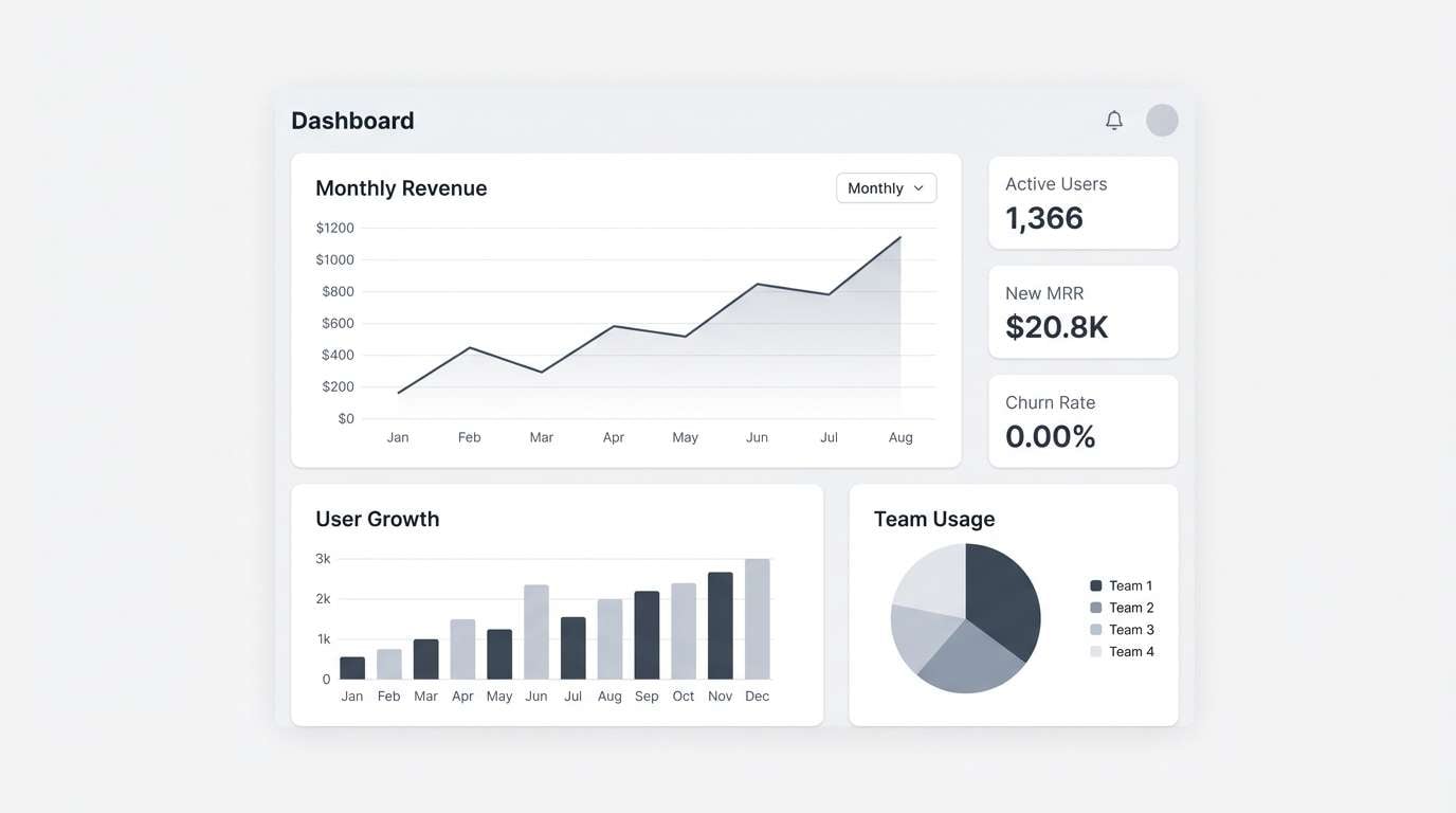
1) Frosted Linen

HEX: #F8FAFC #E9EEF3 #CED7E0 #AAB6C3 #2E3A44
Mood: clean, calm, modern
Best for: SaaS dashboard UI
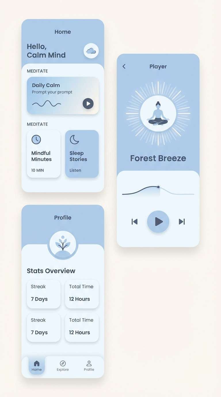
Clean and airy like fresh powder on crisp fabric, these tones feel quiet and polished. The light neutrals keep layouts breathable, while the deep charcoal anchors navigation and data tables. Use subtle shadows and thin borders to separate cards without adding visual noise. Pair with a single cool accent icon color for key actions and alerts.
Image example of frosted linen generated using media.io
Media.io is an online AI studio for creating and editing video, image, and audio in your browser.

2) Glacier Mist
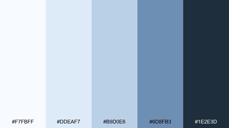
HEX: #F7FBFF #DDEAF7 #B9D0E6 #6D8FB3 #1E2E3D
Mood: crisp, fresh, airy
Best for: travel landing page hero
Crisp and breezy, it evokes mountain air and distant horizons. The pale blue layers build depth without feeling heavy, while the navy keeps headings readable. Use the lightest tint for backgrounds and the mid blue for buttons and links. Keep imagery cool-toned and let whitespace do most of the work.
Image example of glacier mist generated using media.io

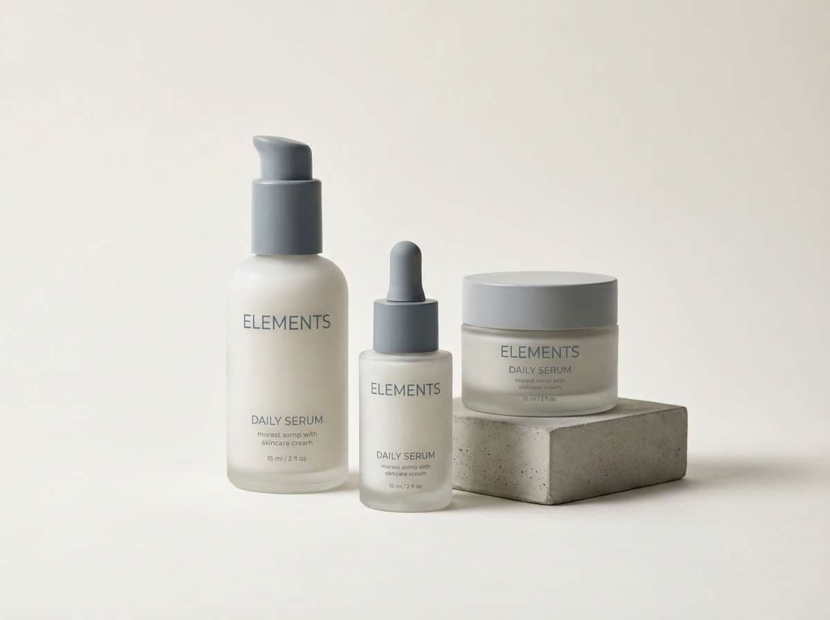
3) Arctic Pearl

HEX: #FFFEFD #F1F2F4 #D7DADF #B8BCC4 #6A707A
Mood: soft, minimal, premium
Best for: skincare packaging
Soft and luxurious like pearl sheen on winter light, these neutrals read premium and restrained. The gray ladder gives you easy hierarchy for labels, from background panels to fine print. Use the warm off-white as the main base and reserve the darker slate for ingredient blocks. A matte finish plus subtle embossing makes the palette feel expensive without extra color.
Image example of arctic pearl generated using media.io
4) Powder Blue Hush
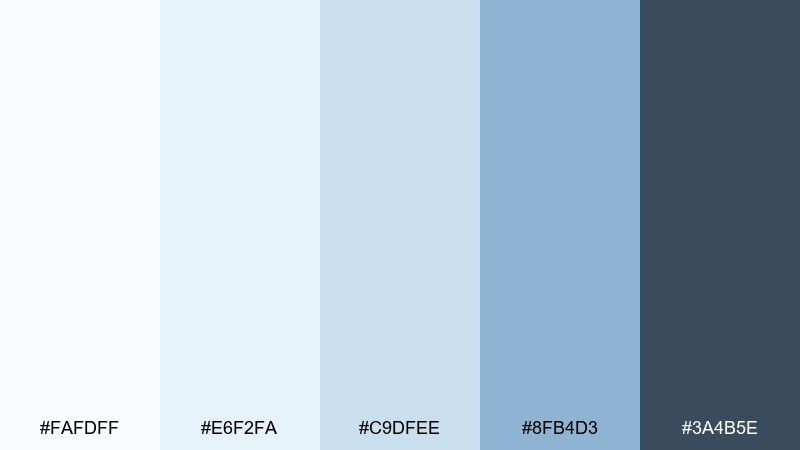
HEX: #FAFDFF #E6F2FA #C9DFEE #8FB4D3 #3A4B5E
Mood: gentle, soothing, open
Best for: meditation app UI
Gentle and quiet like a morning sky after snowfall, the blues stay soft and reassuring. Use the pale tints for screens and modals, then step up to the mid blue for progress rings and primary buttons. The deep slate keeps copy crisp without the harshness of pure black. For a smoother feel, favor rounded components and low-contrast dividers.
Image example of powder blue hush generated using media.io
5) Silver Drift
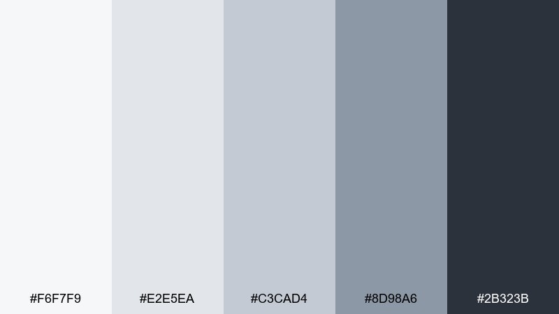
HEX: #F6F7F9 #E2E5EA #C3CAD4 #8D98A6 #2B323B
Mood: structured, editorial, sharp
Best for: magazine layout
Structured and cool like wind-sculpted drifts, it brings a confident editorial edge. The mid grays are ideal for rules, captions, and sidebars, while the near-white keeps spreads bright. Use the darkest tone for headlines and pull quotes to lock in contrast. Add texture through photography grain or paper simulation instead of extra colors.
Image example of silver drift generated using media.io
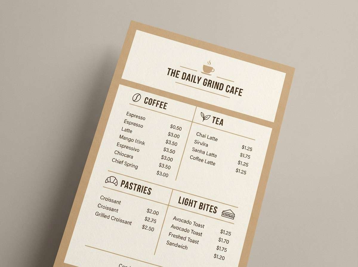
6) Winter Birch
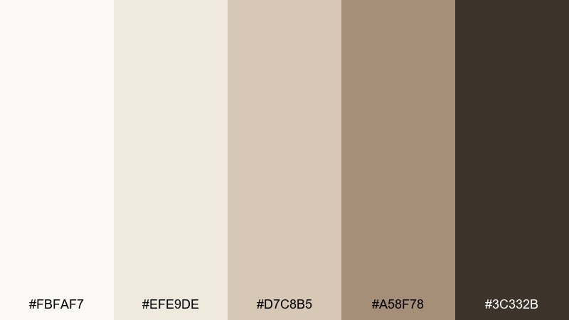
HEX: #FBFAF7 #EFE9DE #D7C8B5 #A58F78 #3C332B
Mood: cozy, natural, rustic
Best for: cafe menu design
Cozy and grounded like birch bark and warm steam in cold air, these neutrals feel inviting. The creamy base keeps menus readable, while the tan and bark tones add warmth without turning orange. Use the darkest brown for section headers and the mid tan for separators and icons. Pair with simple line illustrations and plenty of breathing room.
Image example of winter birch generated using media.io
7) Ice Lavender Veil
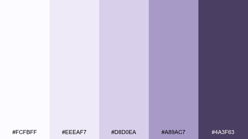
HEX: #FCFBFF #EEEAF7 #D8D0EA #A89AC7 #4A3F63
Mood: dreamy, elegant, quiet
Best for: wedding invitation suite
Dreamy and delicate like twilight reflecting on snow, the lavender cast feels romantic but modern. Use the palest tone for paper and the muted purple for monograms and borders. Keep typography in the deep plum for clean legibility, especially on smaller details. Foil accents look best in silver rather than gold to stay cool and refined.
Image example of ice lavender veil generated using media.io
8) Frost Pine Contrast

HEX: #F7FAF9 #DDE7E3 #A9C0B8 #2F5A52 #0F1F1C
Mood: refreshing, outdoorsy, bold
Best for: outdoor brand logo and stationery
Refreshing and outdoorsy like evergreen shadows on bright ground, it balances calm with grit. The muted teals work beautifully for secondary shapes, while the deep green-black makes logos feel trustworthy. Use the near-white as negative space and let one dark mark carry the identity. For print, choose uncoated stock to keep the greens natural and not glossy.
Image example of frost pine contrast generated using media.io
9) Cloudy Quartz
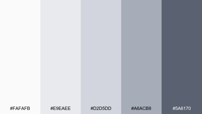
HEX: #FAFAFB #E9EAEE #D2D5DD #A6ACB8 #5A6170
Mood: neutral, professional, balanced
Best for: presentation template
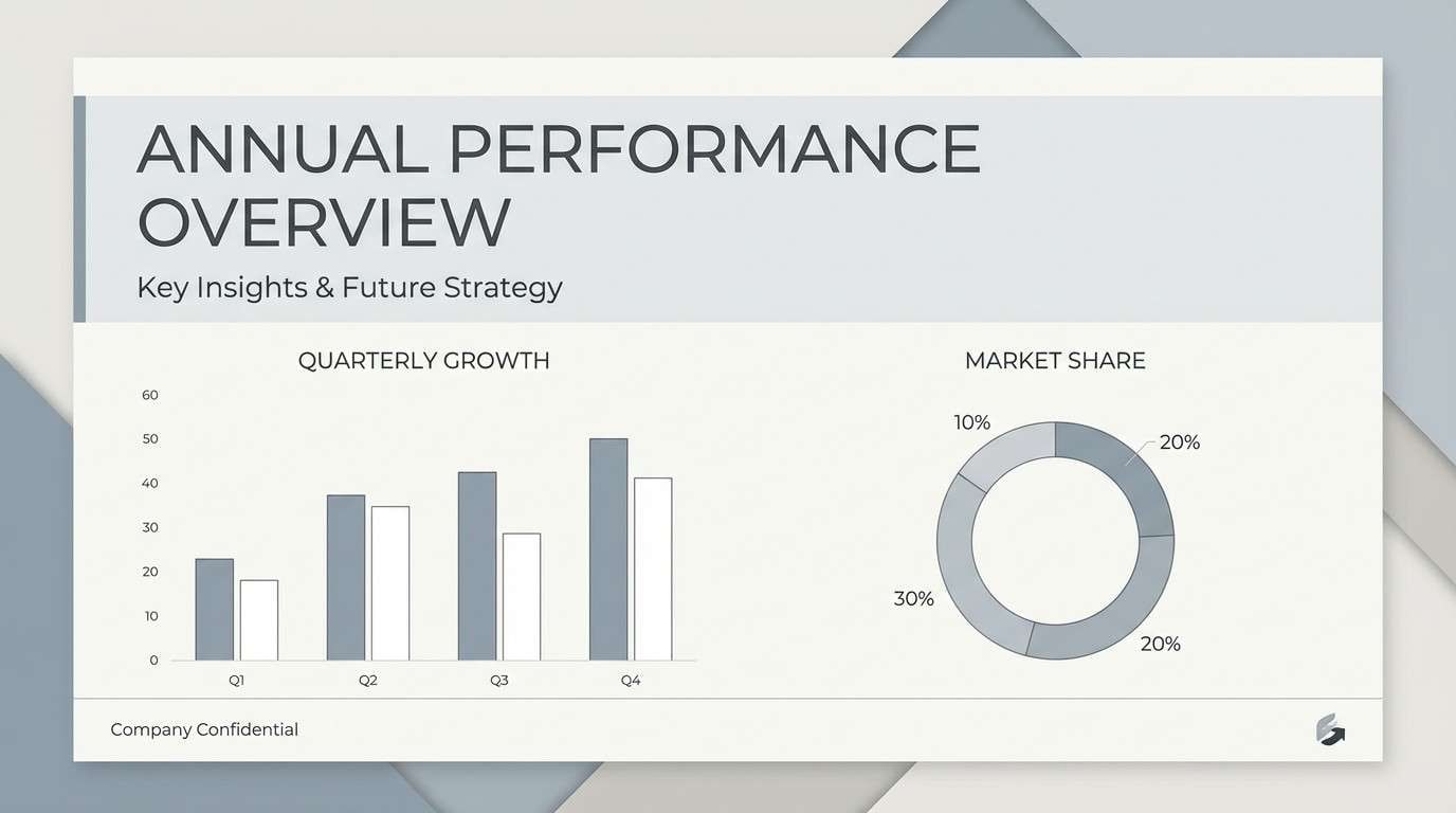
Neutral and steady like overcast light, it keeps attention on content instead of decoration. The stepped grays make slide hierarchies effortless, from backgrounds to charts and captions. Use the darkest tone for titles and the mid gray for axis labels and dividers. Add one brand accent color sparingly to highlight conclusions and key metrics.
Image example of cloudy quartz generated using media.io
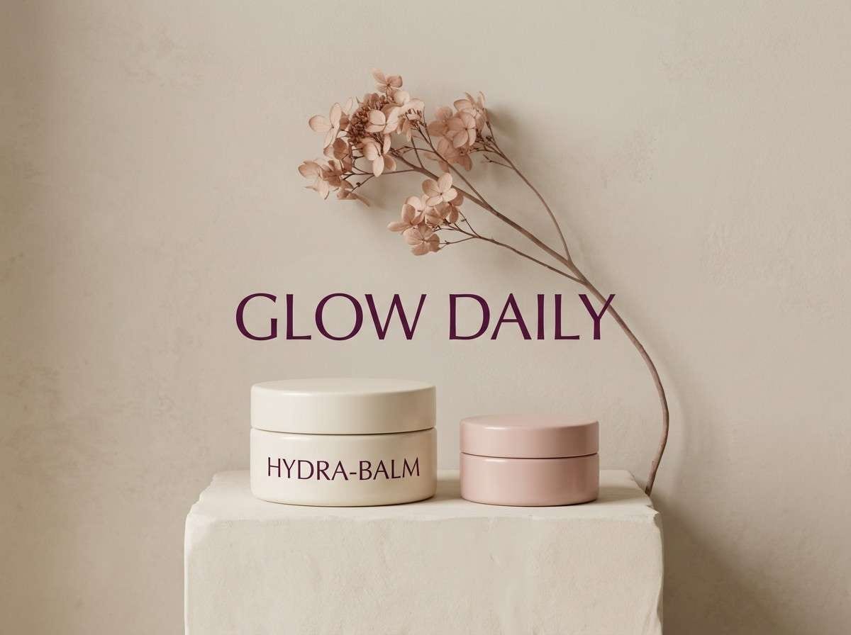
10) Polar Sunrise
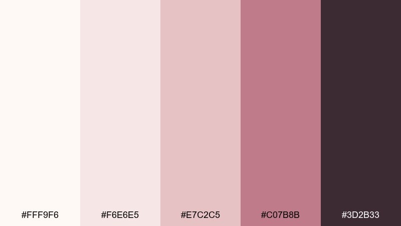
HEX: #FFF9F6 #F6E6E5 #E7C2C5 #C07B8B #3D2B33
Mood: soft, romantic, warm-cool
Best for: beauty product ad
Soft and rosy like early light on a cold horizon, it blends warmth into an otherwise cool set. The blush tones add approachability, while the deep plum keeps headlines punchy. Use the pale cream as a clean backdrop and keep the accent pink for small highlights like price tags or callouts. Avoid overly saturated reds so the look stays gentle and premium.
Image example of polar sunrise generated using media.io
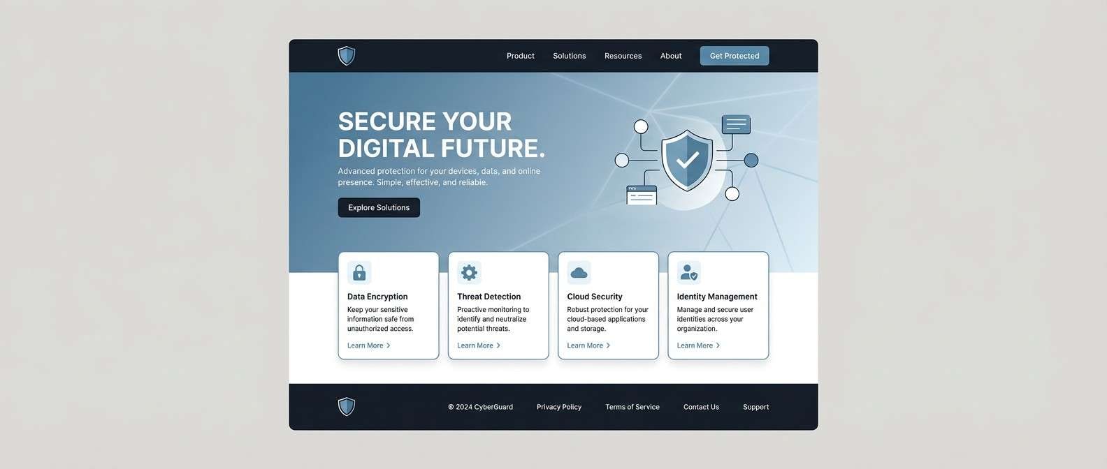
11) Icy Steel
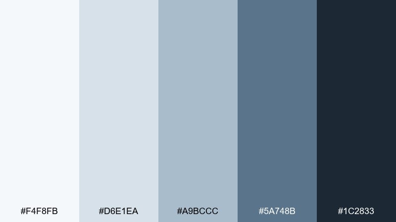
HEX: #F4F8FB #D6E1EA #A9BCCC #5A748B #1C2833
Mood: technical, confident, cool
Best for: cybersecurity website UI
Technical and cool like steel under frost, it signals security and competence. Use the lightest tint for panels, then bring in the slate-blue for buttons and active states. The deep near-black is ideal for nav bars and data-heavy sections. For accessibility, keep body text in the darkest tone and reserve mid blues for non-critical UI chrome.
Image example of icy steel generated using media.io
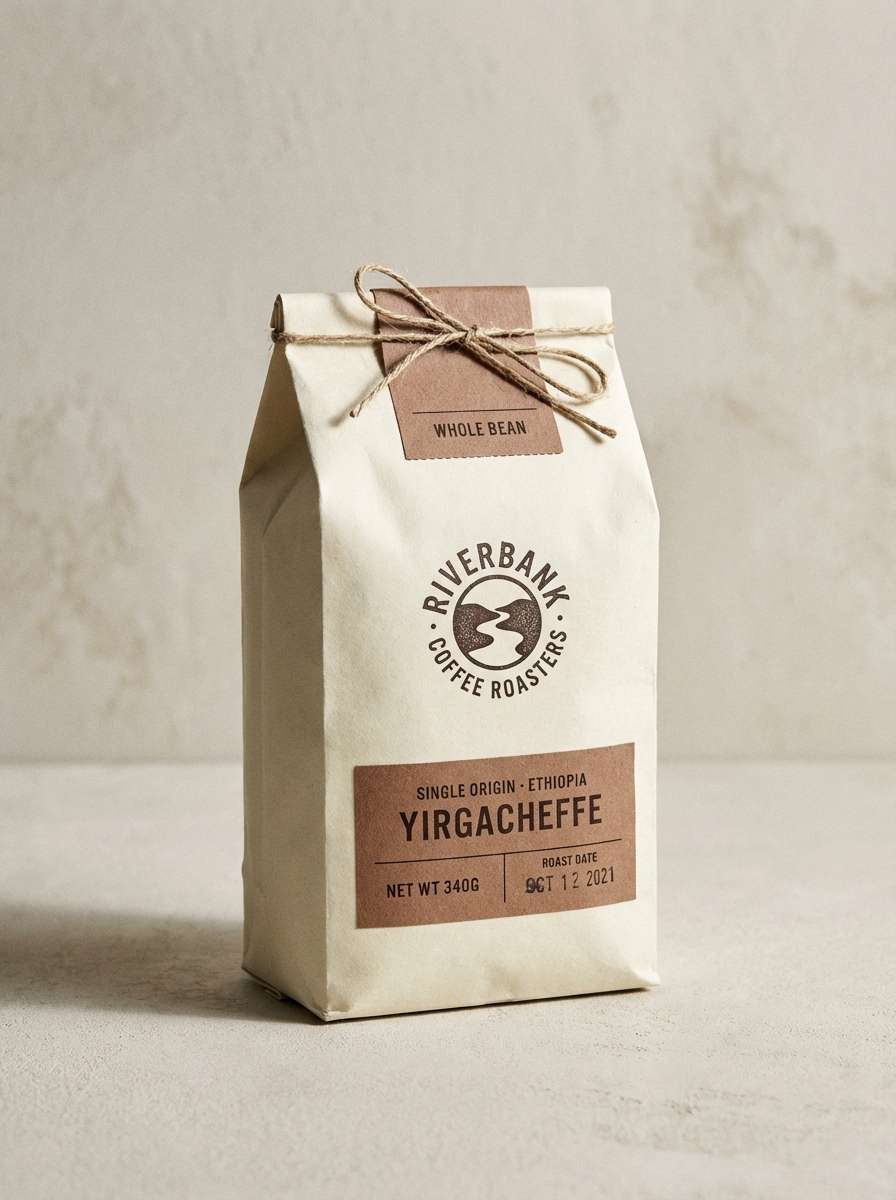
12) Alpine Cocoa
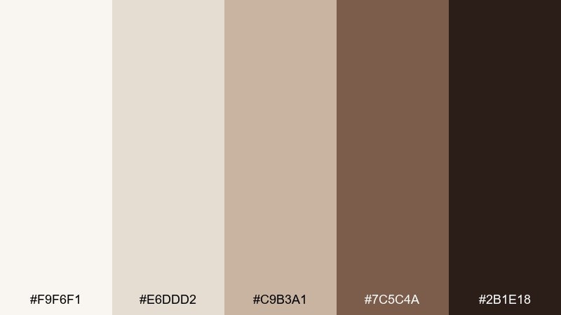
HEX: #F9F6F1 #E6DDD2 #C9B3A1 #7C5C4A #2B1E18
Mood: warm, cozy, artisanal
Best for: coffee bag packaging
Warm and cozy like a lodge mug against a cold window, it feels handcrafted and comforting. The creamy base supports rich cocoa browns for bold labels and badges. Use the mid beige for secondary panels and flavor notes to keep the front clean. A small dark stamp logo looks sharp and leaves plenty of room for product photography.
Image example of alpine cocoa generated using media.io
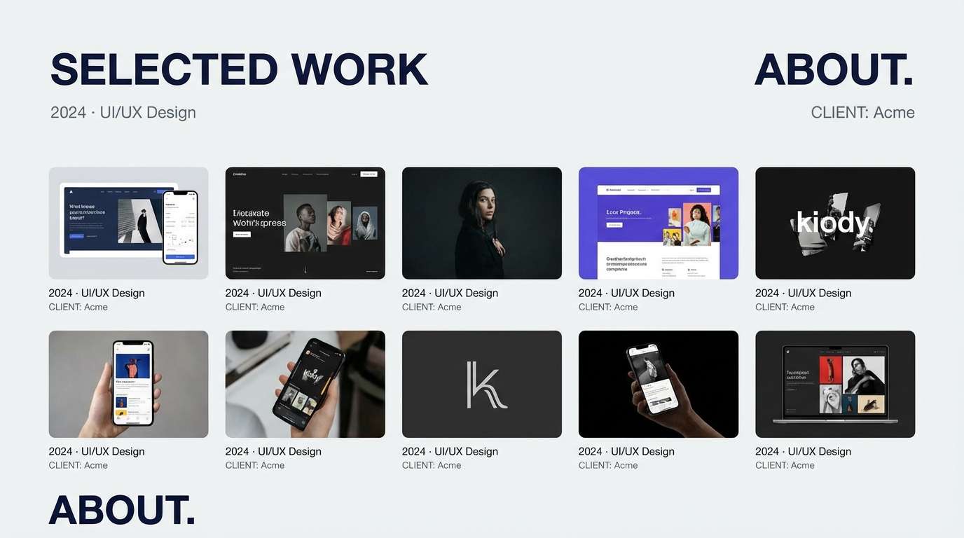
13) Northern Ink
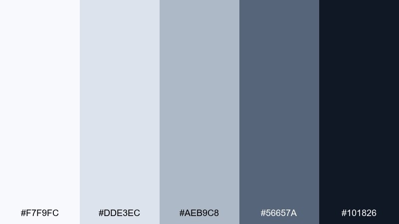
HEX: #F7F9FC #DDE3EC #AEB9C8 #56657A #101826
Mood: moody, sleek, high-contrast
Best for: portfolio website
Moody and sleek like ink on bright paper, it creates a sharp, gallery-like frame for work. The gradient from pale gray to deep navy makes project thumbnails and case studies feel intentional. Use the darkest tone for headers and the mid slate for metadata and tags. Keep accent colors limited to artwork so the site stays curated.
Image example of northern ink generated using media.io
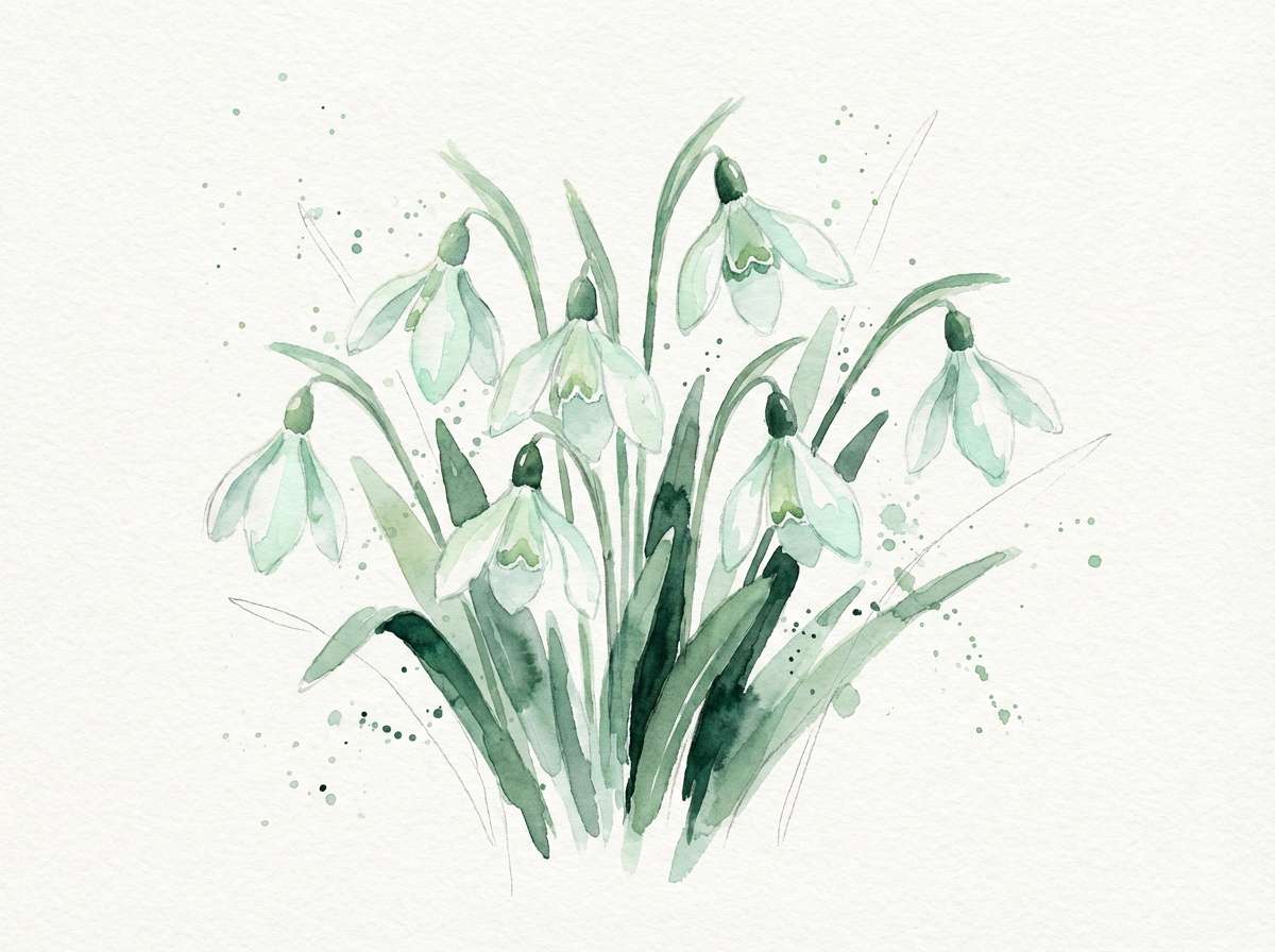
14) Snowdrop Meadow
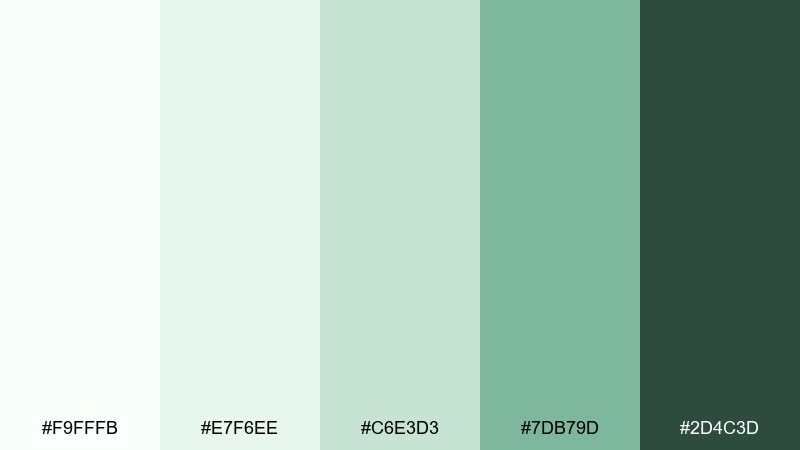
HEX: #F9FFFB #E7F6EE #C6E3D3 #7DB79D #2D4C3D
Mood: fresh, hopeful, botanical
Best for: spring botanical illustration
Fresh and hopeful like the first blooms pushing through thaw, it feels light and alive. The minty whites and soft greens make a gentle pairing for botanical linework and watercolor washes. Use the darker green sparingly for stems, titles, or a small frame to avoid overpowering the delicacy. For balance, keep plenty of paper texture and let the mid green carry most accents.
Image example of snowdrop meadow generated using media.io
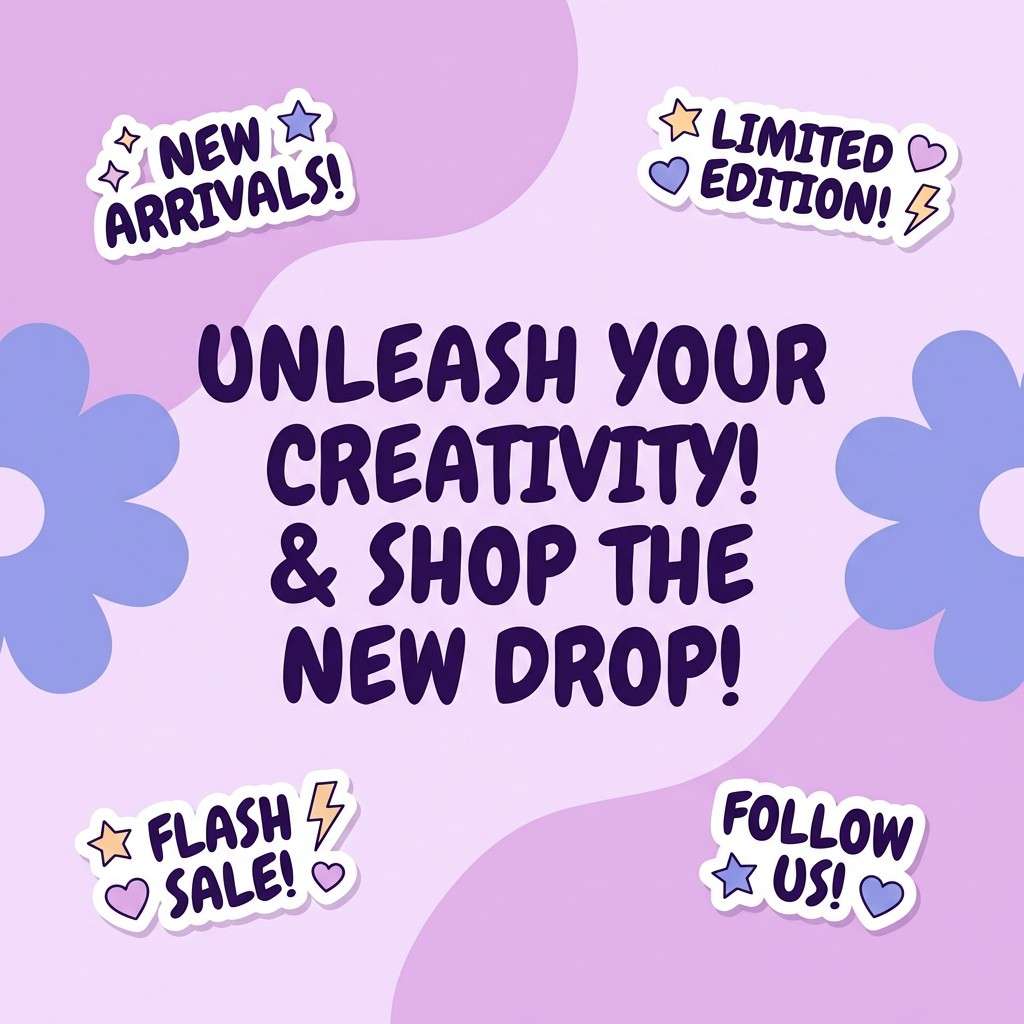
15) Crystal Candy
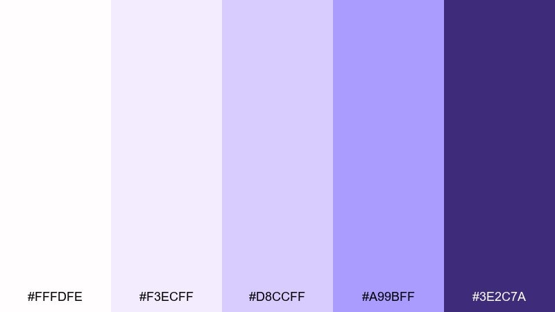
HEX: #FFFDFE #F3ECFF #D8CCFF #A99BFF #3E2C7A
Mood: playful, bright, candy-cool
Best for: social media promo graphic
Playful and glossy like sugared crystals, the purples feel fun without going neon. Use the pale lilac for backgrounds, then stack the mid tones for stickers, badges, and gradients. The deep violet works best for bold type and discount callouts. Try grain or subtle halftone texture to keep flat areas from feeling sterile.
Image example of crystal candy generated using media.io
16) Blizzard Denim
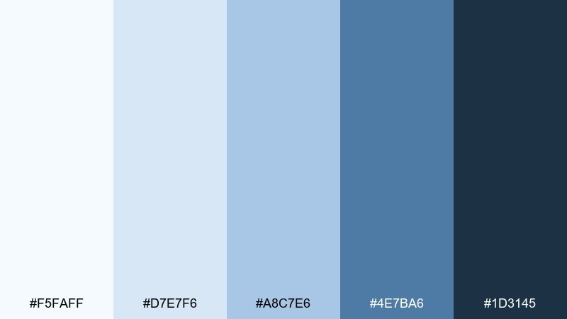
HEX: #F5FAFF #D7E7F6 #A8C7E6 #4E7BA6 #1D3145
Mood: sporty, crisp, energetic
Best for: sports event poster
Sporty and crisp like denim-blue windbreakers in bright weather, it has built-in momentum. The mid blues are strong enough for big shapes and team blocks, while the deep navy holds typography. Use high contrast between the light background and dark text for readability at distance. A diagonal grid or stripe motif will amplify the dynamic feel without adding extra hues.
Image example of blizzard denim generated using media.io

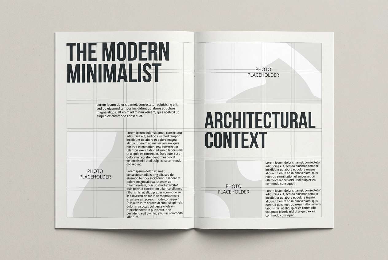
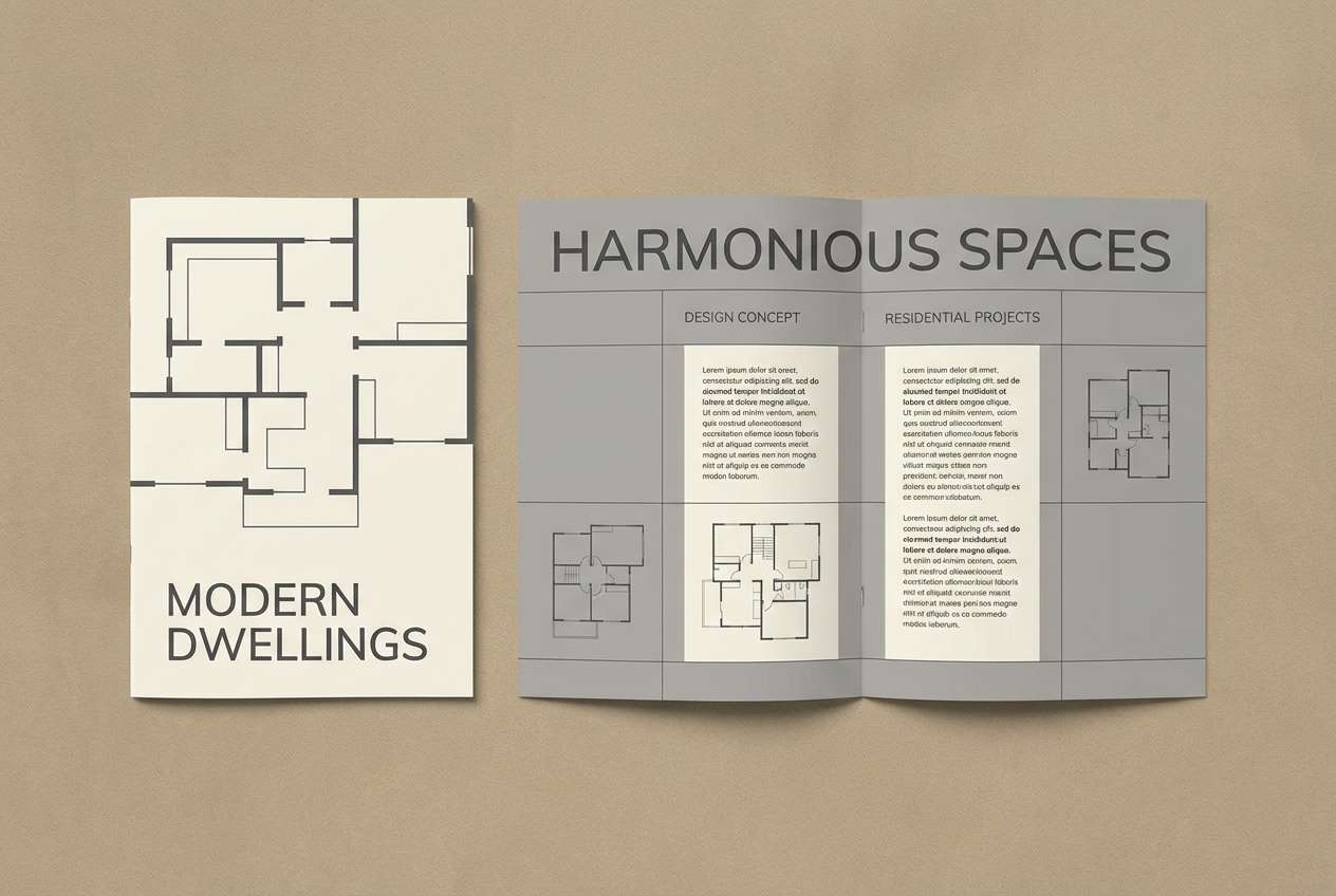
17) Chalkstone Minimal

HEX: #FBFBFA #EFEFED #D8D8D2 #B3B3AA #4A4A44
Mood: minimal, timeless, understated
Best for: architectural brochure
Minimal and timeless like chalkstone walls, these neutrals feel architectural and precise. The gentle warm-gray cast keeps pages from looking too icy, while still reading clean. Use the darkest gray for section titles and floorplan labels, and keep the rest soft for a gallery-like effect. A single spot UV element on the cover adds depth without changing the palette.
Image example of chalkstone minimal generated using media.io
18) Aurora Chill
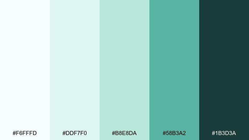
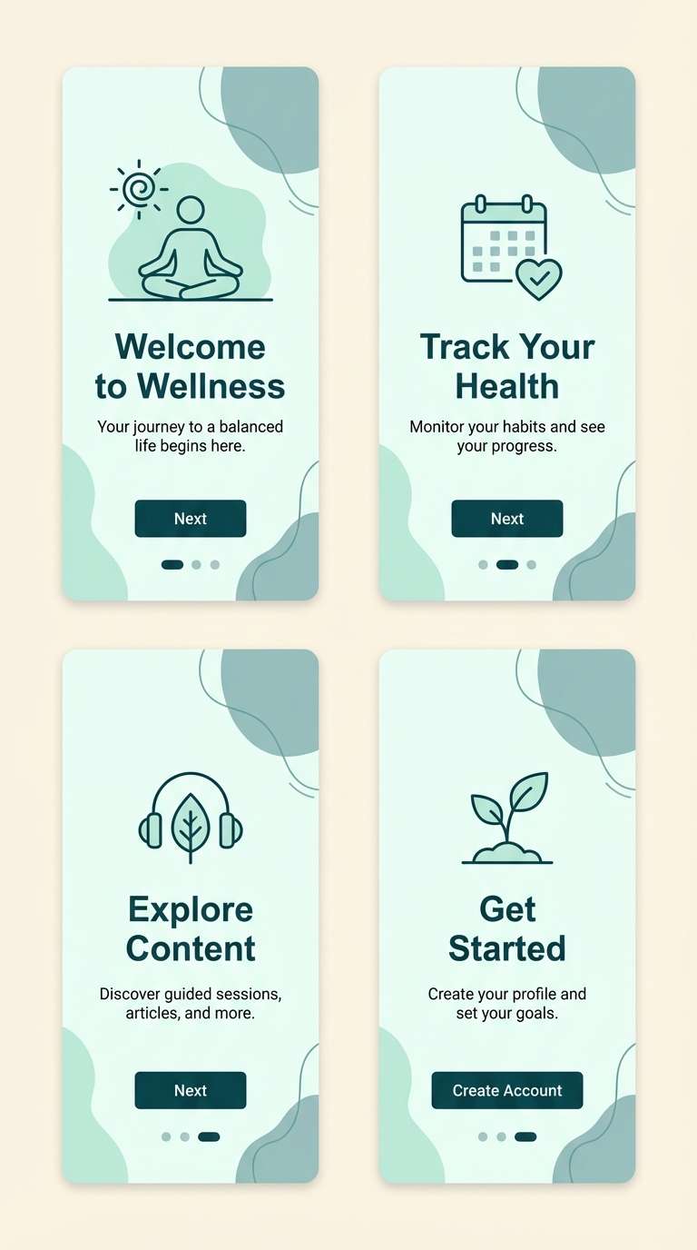
HEX: #F6FFFD #DDF7F0 #B8E8DA #58B3A2 #1B3D3A
Mood: cool, modern, refreshing
Best for: wellness app onboarding
Cool and refreshing like aurora haze over a quiet field, it feels modern and optimistic. The mint-to-teal steps are perfect for onboarding progress, highlights, and gentle gradients. Use the deep teal-green for primary headings so the screens stay readable on bright backgrounds. This snow color palette works best with simple icons and plenty of spacing to keep it calm, not clinical.
Image example of aurora chill generated using media.io
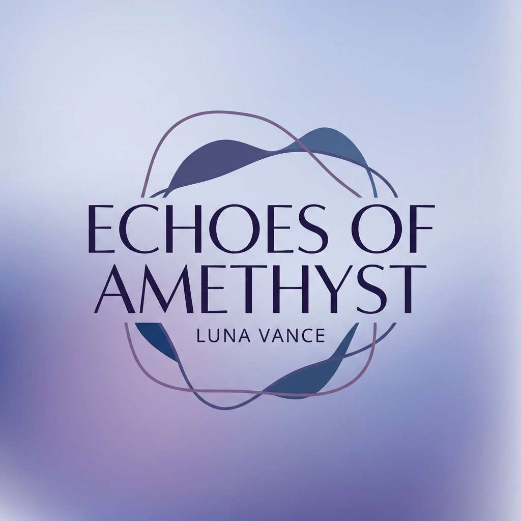
19) Moonlit Slope
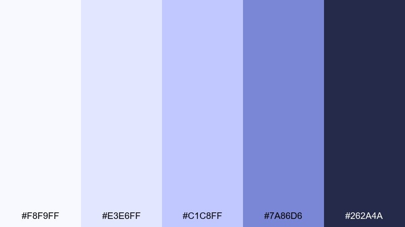
HEX: #F8F9FF #E3E6FF #C1C8FF #7A86D6 #262A4A
Mood: cinematic, cool, dreamy
Best for: music album cover design
Cinematic and cool like moonlight across a silent ridge, it leans dreamy and a touch dramatic. Use the pale periwinkle as the cover base, with the indigo-violet for bold type and artist name. The mid purple is great for soft glows, gradients, and abstract shapes. For a stronger focal point, keep one large element dark and let the rest fade into light.
Image example of moonlit slope generated using media.io
20) Clean Slate Pop
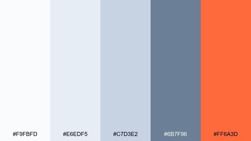
HEX: #F9FBFD #E6EDF5 #C7D3E2 #6B7F96 #FF6A3D
Mood: modern, focused, energetic
Best for: call-to-action banner
Modern and focused like clean stone with a bright signal flare, it is built for conversion moments. The cool grays keep everything tidy, while the orange accent creates instant hierarchy for buttons. Use the accent only once per view so it stays powerful and not noisy. When you need memorable snow color combinations, this pop-with-neutral mix is a reliable choice for campaigns and signups.
Image example of clean slate pop generated using media.io

21) Frostfire Accent
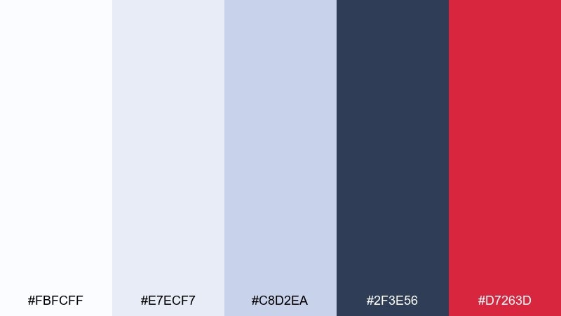
HEX: #FBFCFF #E7ECF7 #C8D2EA #2F3E56 #D7263D
Mood: bold, crisp, high-impact
Best for: news alert UI components
Bold and crisp like cold air with a sudden warning light, it is made for urgency. The cool neutrals handle backgrounds and inactive states, while the red is unmistakable for alerts. Use the navy for headings and keep the red for badges, error states, and the single primary action. If you want snow color combinations that stay professional but still punch through, this contrast does the job.
Image example of frostfire accent generated using media.io
What Colors Go Well with Snow?
Snow tones pair naturally with deep anchors like charcoal, slate, and navy, which keep text readable and layouts grounded. This is the simplest way to make white-heavy designs feel intentional instead of unfinished.
For accents, cool hues like icy blue, muted teal, and soft lavender maintain the winter-neutral vibe while adding personality. If you want higher energy, one warm accent (coral, orange, or cranberry red) can create instant hierarchy for CTAs and alerts.
When mixing, keep saturation low and limit accents to one or two per screen or page. Snow palettes look best when whitespace does most of the visual work.
How to Use a Snow Color Palette in Real Designs
Start with a near-white base for the background, then use one or two light grays for cards, panels, and subtle separators. This preserves the “snowy” openness while still creating structure.
Reserve your darkest tone for critical text, navigation, and data-heavy areas so contrast stays reliable. If pure black feels harsh, a deep blue-gray or charcoal usually reads cleaner against snow whites.
Add accents with restraint: buttons, links, badges, and key highlights. The fewer accent placements you use, the more premium and calm the final design feels.
Create Snow Palette Visuals with AI
If you’re pitching a snow color scheme to a client or team, fast visuals help more than swatches alone. Generate UI mockups, packaging shots, posters, or invitation scenes that match your HEX direction and mood.
With Media.io, you can turn a prompt into on-theme images quickly, then iterate by changing lighting (soft, diffused, studio), materials (matte paper, uncoated stock), and one accent color.
Snow Color Palette FAQs
-
What is a snow color palette?
A snow color palette is a set of light neutrals (snow white, cool white, pale gray) often paired with icy blues or other subtle tints, plus one dark anchor for readable contrast. -
Is “snow” just pure white?
Not usually. Snow whites often include a slight cool (blue/gray) or warm (cream) undertone, which prevents designs from looking stark and helps elements feel more natural. -
What’s the best text color for snow backgrounds?
Deep charcoal or navy typically works better than pure black, keeping strong contrast while avoiding harsh edges against very light backgrounds. -
What accent colors work best with snow palettes?
Icy blue, muted teal, and soft lavender keep the look calm and wintry, while a single warm accent like orange or cranberry red creates strong CTA hierarchy. -
How do I keep a snow-themed UI from feeling flat?
Use tonal steps (two to three light grays), subtle shadows, and low-contrast borders to separate cards and sections without adding loud color. -
Are snow color palettes good for print?
Yes—especially for invitations, editorial layouts, and premium packaging. Choose paper texture, matte finishes, and controlled contrast so whites don’t wash out. -
Can I generate snow palette mockups with AI?
Yes. Use a clear prompt describing the scene, materials, and mood, then iterate by specifying cool whites, layered grays, and one accent tone for buttons or highlights.
Next: Pixel Art Color Palette


