

A savannah color palette blends sun-baked neutrals, clay reds, and acacia greens into a look that feels grounded, warm, and easy to trust.
Whether you’re building a brand, styling a space, or designing a UI, these savannah tones give you natural contrast without looking harsh or overly trendy.
In this article
Why Savannah Palettes Work So Well
Savannah palettes are built around familiar, nature-led hues—sand, clay, bark, olive, and charcoal—so they feel instantly believable. That “real world” grounding makes them a strong default for brands and layouts that need warmth without looking loud.
They also balance readability and mood. Light beiges and creams create roomy negative space, while deep browns and near-blacks give you dependable contrast for type, icons, and UI states.
Most importantly, savannah tones are flexible: shift toward greens for a fresher eco feel, lean into terracotta for artisan warmth, or anchor everything with warm grays for a modern, minimal finish.
20+ Savannah Color Palette Ideas (with HEX Codes)
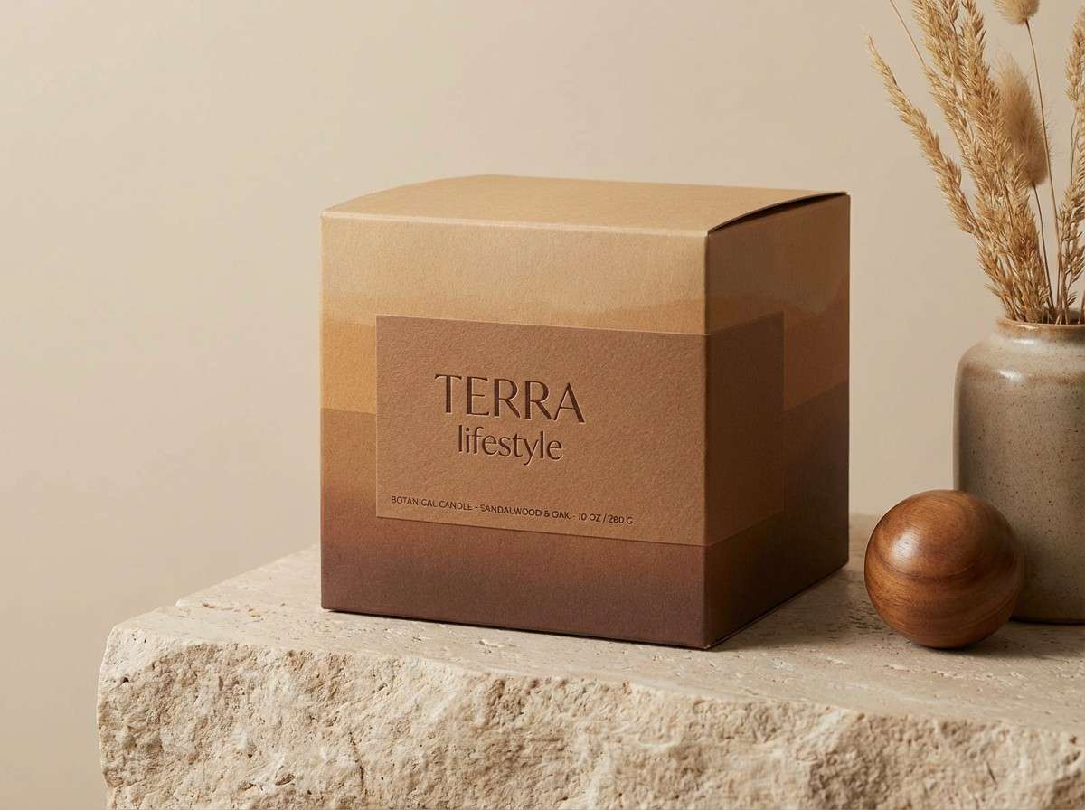
1) Sunlit Dune
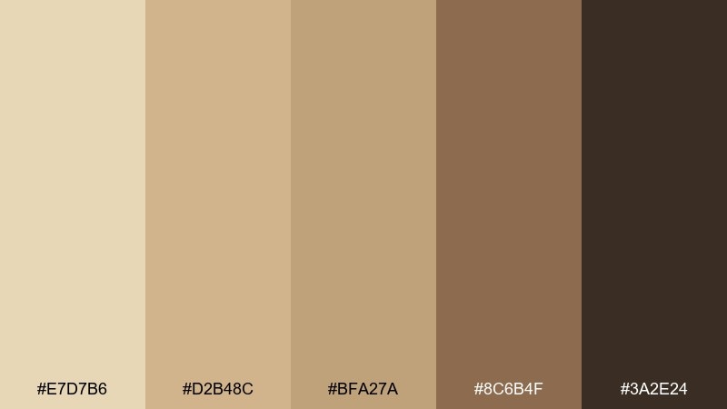
HEX: #E7D7B6 #D2B48C #BFA27A #8C6B4F #3A2E24
Mood: warm, natural, grounded
Best for: lifestyle branding and packaging
Warm and grounded like late-afternoon light on open dunes, these tones feel calm but confident. Use the sandy beiges for large areas, then bring in the deep brown for type and contrast. Pair nicely with matte paper textures, kraft finishes, and minimal line icons. Tip: keep the darkest shade for small anchors like logos, seals, and headings to avoid a heavy look.
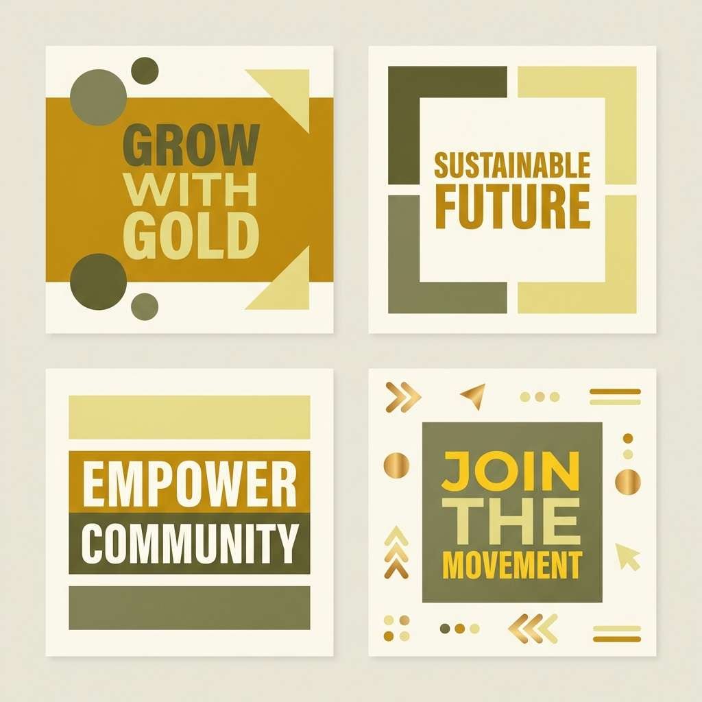
Image example of sunlit dune generated using media.io
Media.io is an online AI studio for creating and editing video, image, and audio in your browser.

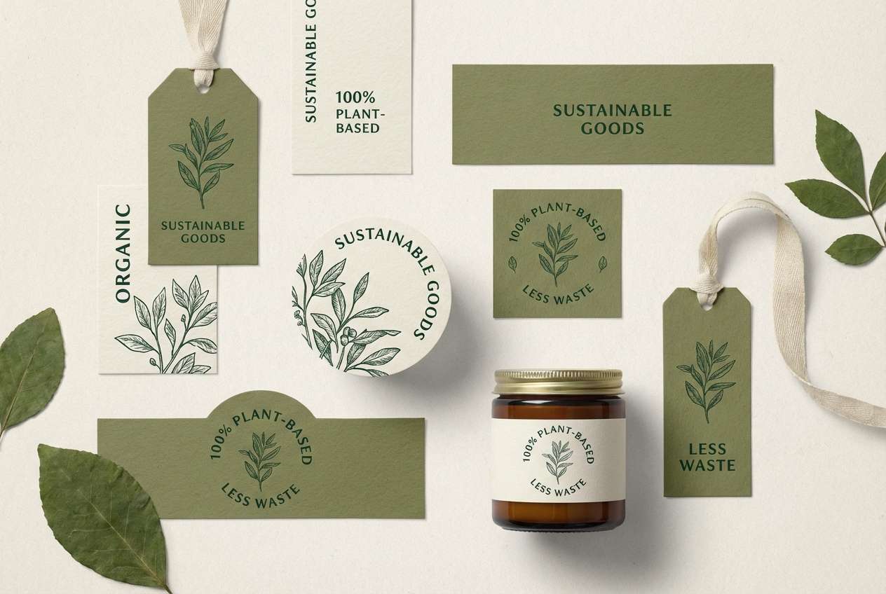
2) Acacia Shade
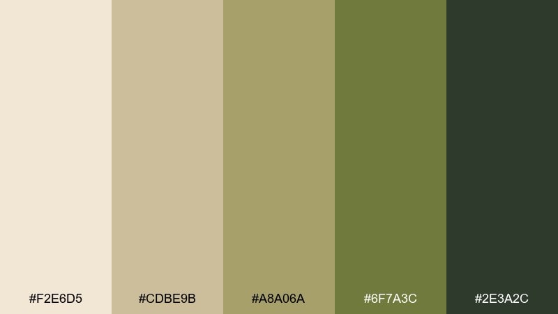
HEX: #F2E6D5 #CDBE9B #A8A06A #6F7A3C #2E3A2C
Mood: earthy, fresh, shaded
Best for: eco brand identity and labels
Earthy and fresh, it evokes shade under acacia branches with sunlit dust in the distance. Let the creamy off-white carry backgrounds while the greens handle navigation, badges, and highlights. These hues pair well with recycled materials, botanical illustrations, and simple sans-serif type. Tip: use the darkest green for compliance text so it stays readable without looking stark.
Image example of acacia shade generated using media.io
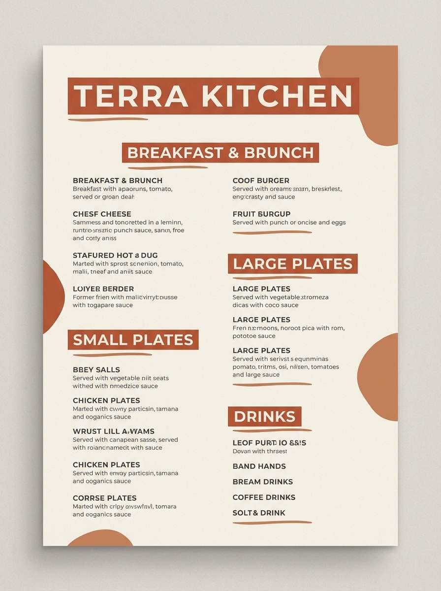
3) Clay Horizon
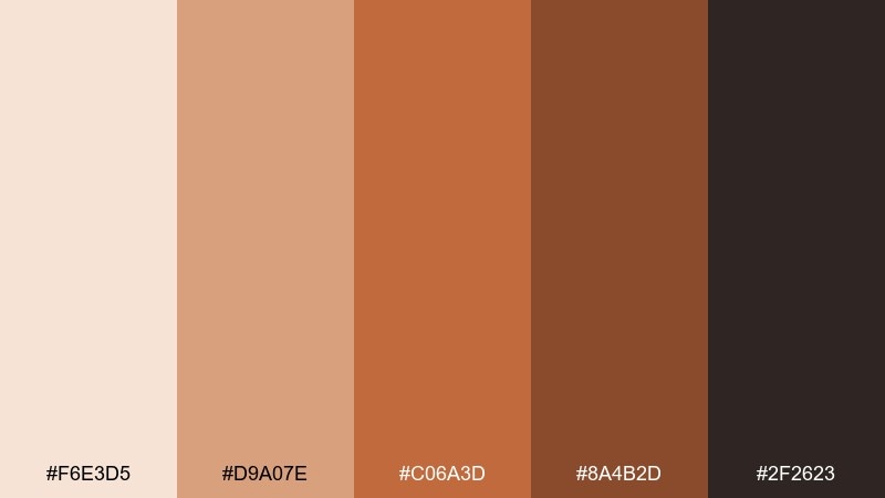
HEX: #F6E3D5 #D9A07E #C06A3D #8A4B2D #2F2623
Mood: sun-baked, artisan, bold
Best for: restaurant branding and menus
Sun-baked and artisan, it feels like clay walls glowing at dusk. This savannah color combination works best when the soft blush becomes the canvas and the terracotta takes the spotlight for headings and stamps. Pair it with textured backgrounds, hand-drawn motifs, and warm photography for a cohesive menu system. Tip: keep the near-black for body text only, so the palette stays appetizing and not too heavy.
Image example of clay horizon generated using media.io
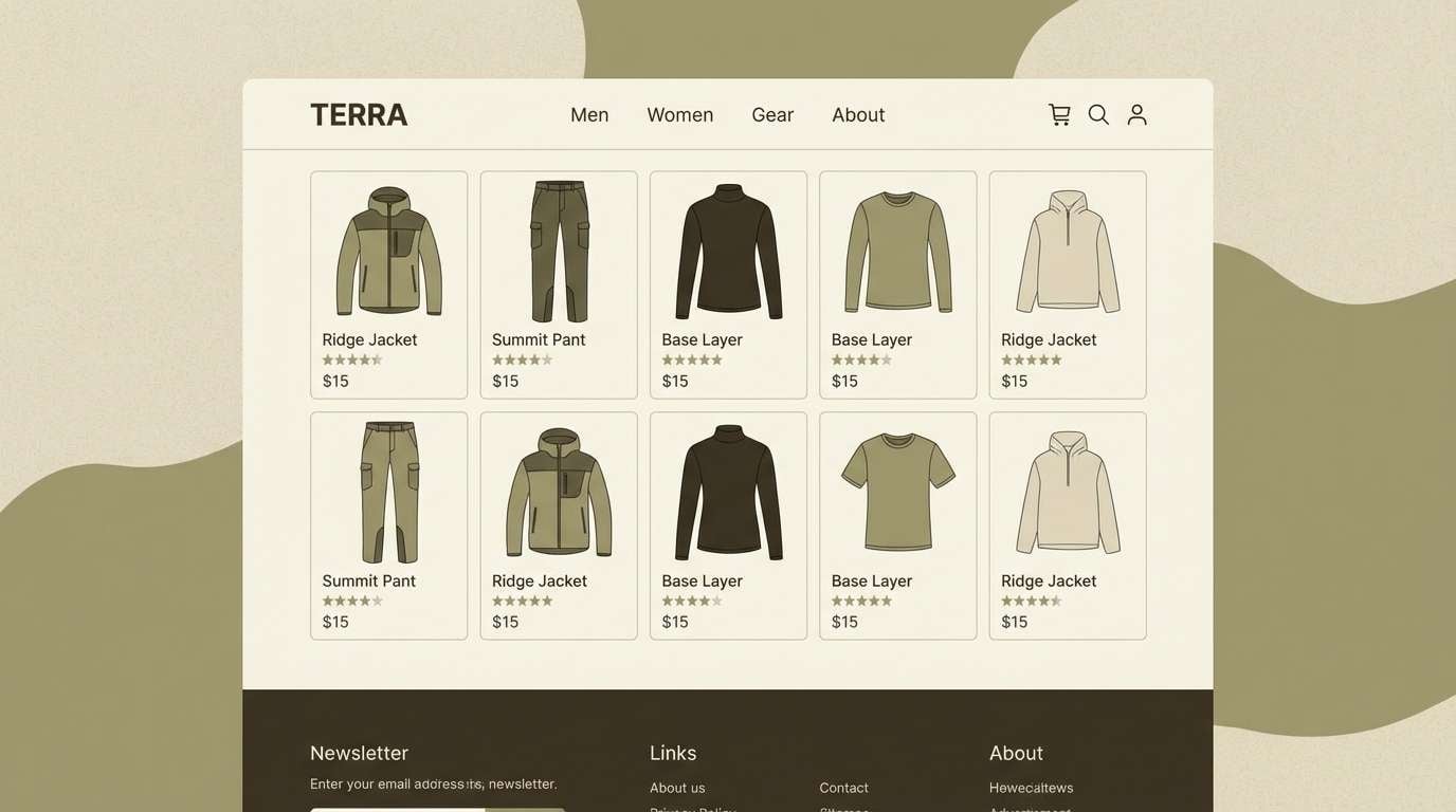
4) Safari Khaki
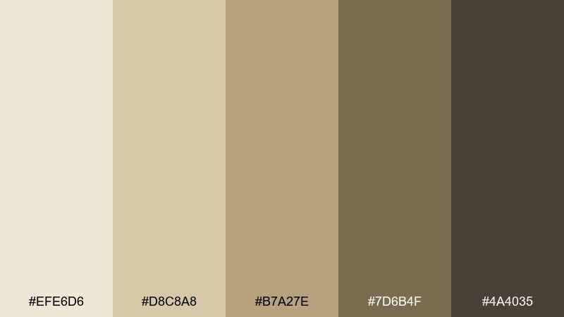
HEX: #EFE6D6 #D8C8A8 #B7A27E #7D6B4F #4A4035
Mood: classic, rugged, neutral
Best for: outdoor apparel web store UI
Classic and rugged, these neutrals recall canvas gear, dusted trails, and sun-faded fabric. Use the lightest beige for pages and cards, then rely on the deeper khaki browns for buttons and headers. It pairs naturally with product photography, stitched textures, and simple icon sets. Tip: reserve the darkest brown for key CTAs so the interface stays airy but decisive.
Image example of safari khaki generated using media.io
5) Golden Grassland
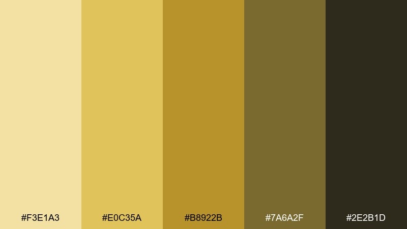
HEX: #F3E1A3 #E0C35A #B8922B #7A6A2F #2E2B1D
Mood: bright, optimistic, sunlit
Best for: social media campaign graphics
Bright and sunlit, it mirrors tall grasses catching golden light and casting olive shadows. Make the pale yellow your base, then layer the richer gold for banners, stickers, and price callouts. It pairs well with bold black typography and minimal geometric shapes. Tip: add the deep olive sparingly to ground the design and prevent the yellows from feeling too sugary.
Image example of golden grassland generated using media.io
6) Twilight Baobab
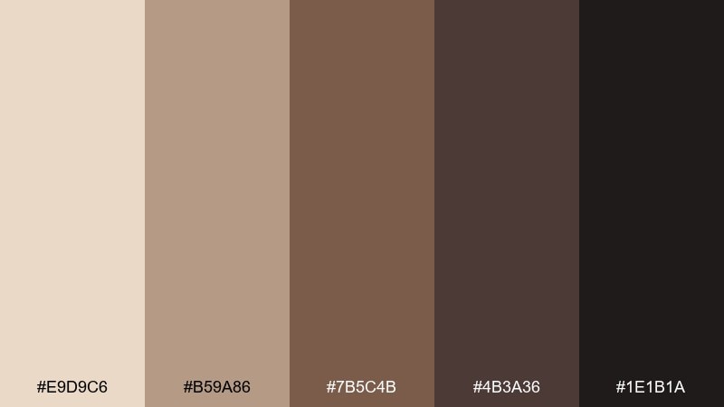
HEX: #E9D9C6 #B59A86 #7B5C4B #4B3A36 #1E1B1A
Mood: moody, earthy, premium
Best for: premium coffee branding
Moody and premium, it suggests twilight settling over bark and earth. In a savannah color palette like this, the creamy beige keeps labels approachable while the espresso browns add depth and luxury. Pair with foil stamping, minimal serif type, and monochrome photography for a refined finish. Tip: use the near-black only for small details like roast level icons and barcodes to keep the warmth intact.
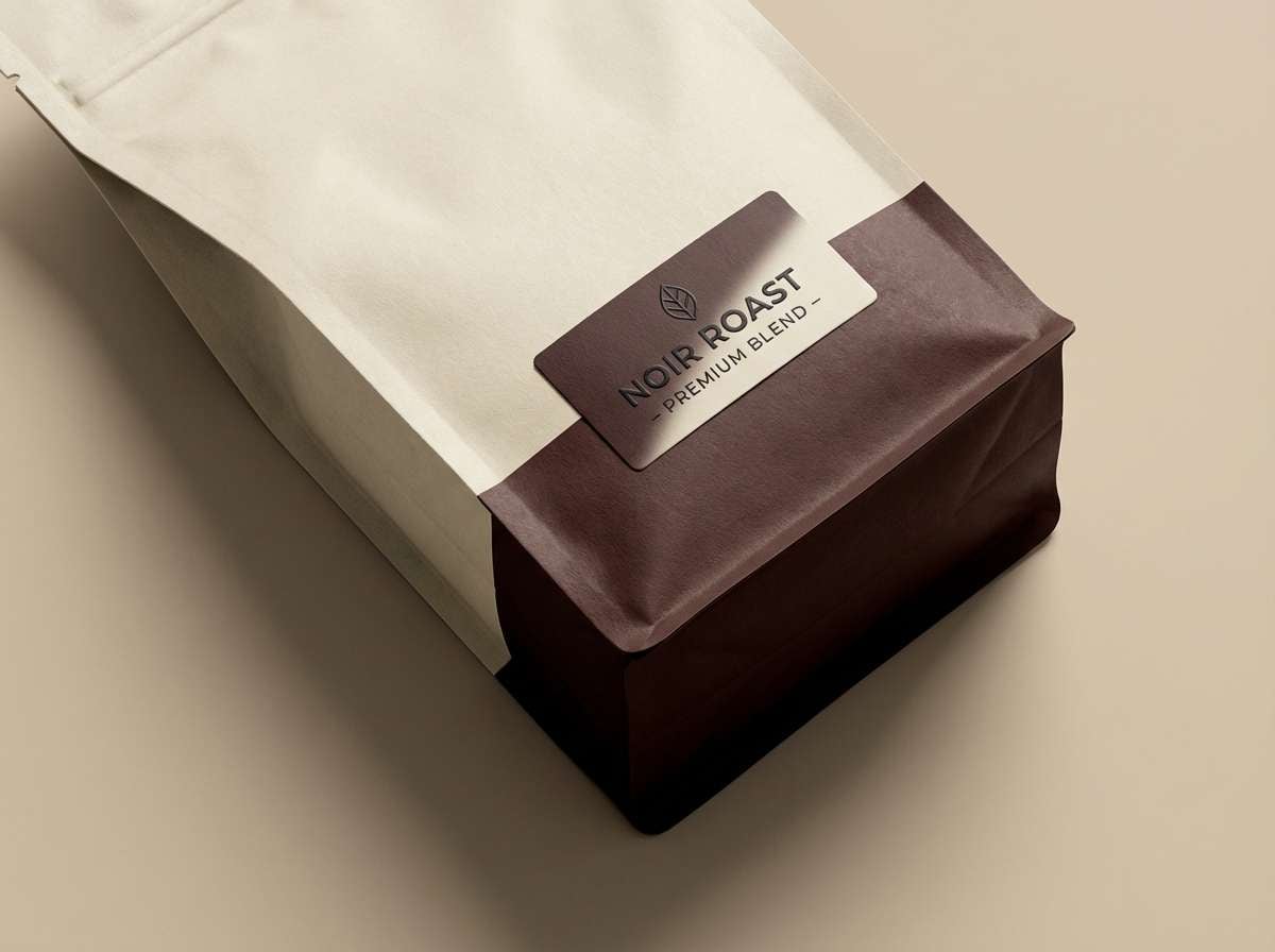
Image example of twilight baobab generated using media.io
7) Dusty Rosewood
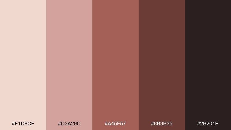
HEX: #F1D8CF #D3A29C #A45F57 #6B3B35 #2B201F
Mood: romantic, vintage, cozy
Best for: beauty brand moodboard
Romantic and cozy, it feels like faded petals and polished wood in warm lamplight. Use the blush tones for backgrounds and soft gradients, then bring in the rosewood red for focal accents. It pairs beautifully with gold line art and editorial-style photography. Tip: keep contrast high by setting body text in the deep brown, not the mid rose, for better readability.
Image example of dusty rosewood generated using media.io
8) Riverbed Stone
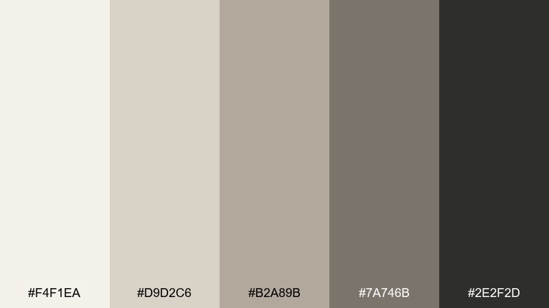
HEX: #F4F1EA #D9D2C6 #B2A89B #7A746B #2E2F2D
Mood: calm, minimal, contemporary
Best for: dashboard UI and data visuals
Calm and contemporary, it evokes smooth stones, dry riverbeds, and quiet morning light. Build the interface on the warm off-white and use the mid grays for cards, dividers, and chart grids. It pairs well with a single accent color if you need highlights, but stays elegant even in monochrome. Tip: use the charcoal for key numbers and selected states to keep focus where it matters.
Image example of riverbed stone generated using media.io
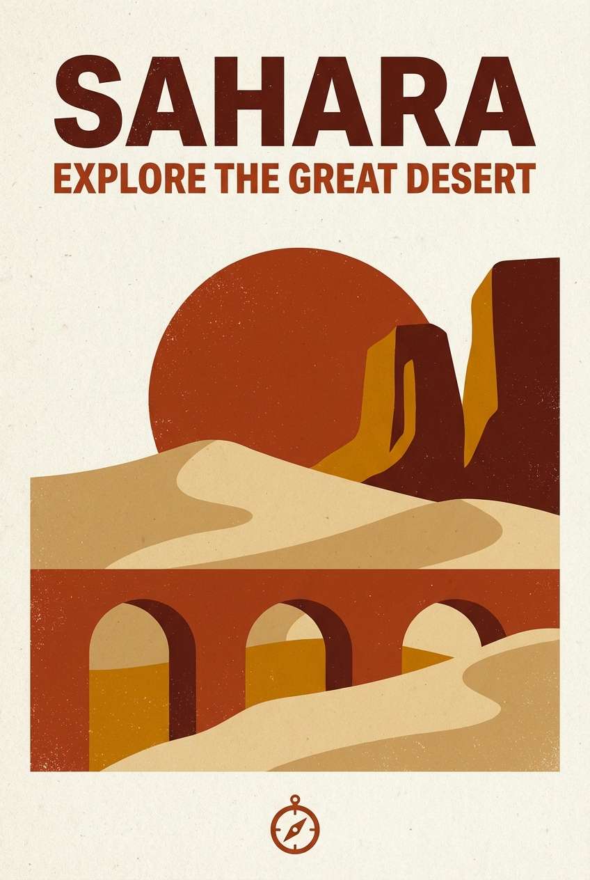
9) Burnt Sienna Trail
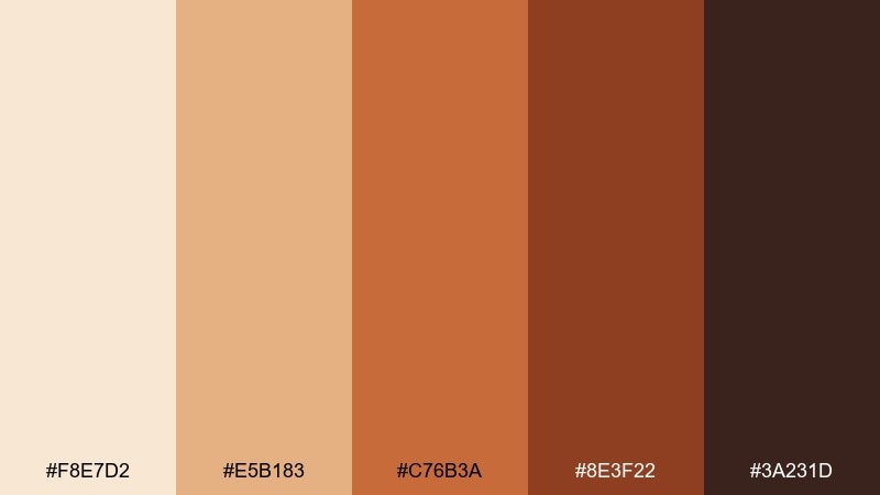
HEX: #F8E7D2 #E5B183 #C76B3A #8E3F22 #3A231D
Mood: adventurous, warm, energetic
Best for: travel poster and print
Adventurous and energetic, it brings to mind dusty paths, rust-colored cliffs, and sun-warmed leather. Use the pale sand as negative space, then let sienna and rust drive big shapes and typography. It pairs well with bold condensed fonts and simple map-like line work. Tip: keep gradients subtle so prints stay crisp and don't muddy the orange tones.
Image example of burnt sienna trail generated using media.io
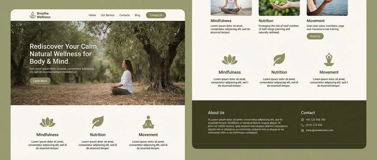
10) Olive Canopy
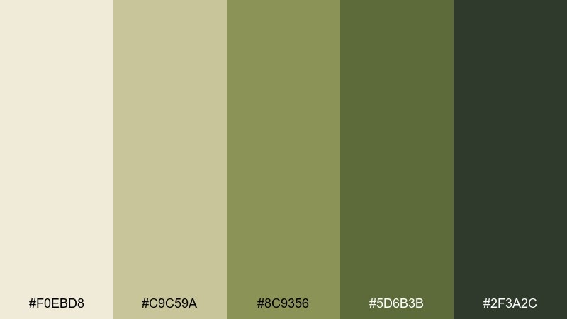
HEX: #F0EBD8 #C9C59A #8C9356 #5D6B3B #2F3A2C
Mood: natural, balanced, modern rustic
Best for: wellness website branding
Natural and balanced, it feels like filtered light through leaves over dry grass. This savannah color scheme shines on websites where calm trust matters, using the pale linen tone for sections and the olive range for navigation and highlights. Pair it with organic shapes, gentle gradients, and warm-neutral photography. Tip: keep CTAs in the deeper olive and leave the mid olive for secondary buttons to preserve hierarchy.
Image example of olive canopy generated using media.io
11) Morning Mist Plains
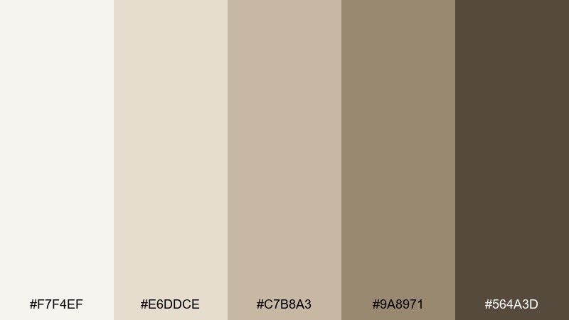
HEX: #F7F4EF #E6DDCE #C7B8A3 #9A8971 #564A3D
Mood: soft, airy, understated
Best for: minimal interior moodboard
Soft and understated, these hues suggest misty air over pale grasses and weathered wood. Use the near-white and beige as your wall and textile base, then add the taupe-brown for frames and hardware. It pairs effortlessly with linen, oak, and brushed metal. Tip: introduce texture rather than more color to keep the look serene and layered.
Image example of morning mist plains generated using media.io
12) Wild Honey
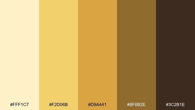
HEX: #FFF1C7 #F2D06B #D9A441 #8F6B2E #3C2B1E
Mood: cheerful, warm, inviting
Best for: food product ad creative
Cheerful and inviting, it reads like honeycomb glow with toasted spice at the edges. Let the pale cream keep layouts bright, then use the richer gold for price tags, badges, and hero shapes. It pairs well with clean sans typography and simple ingredient illustrations. Tip: keep the darkest brown for headlines only, so the warm yellows stay the main story.
Image example of wild honey generated using media.io
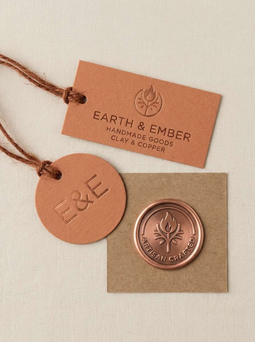
13) Canyon Copper
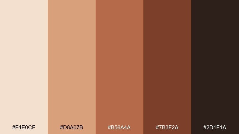
HEX: #F4E0CF #D8A07B #B56A4A #7B3F2A #2D1F1A
Mood: rustic, confident, warm
Best for: artisan product tags and stamps
Rustic and confident, it evokes copper patina, sunlit stone, and handcrafted leather. Use the pale clay for tag stock, then apply copper and chestnut for stamps, borders, and monograms. It pairs nicely with letterpress textures and simple botanical marks. Tip: print the darkest tone sparingly to maintain a handmade softness instead of a harsh contrast.
Image example of canyon copper generated using media.io
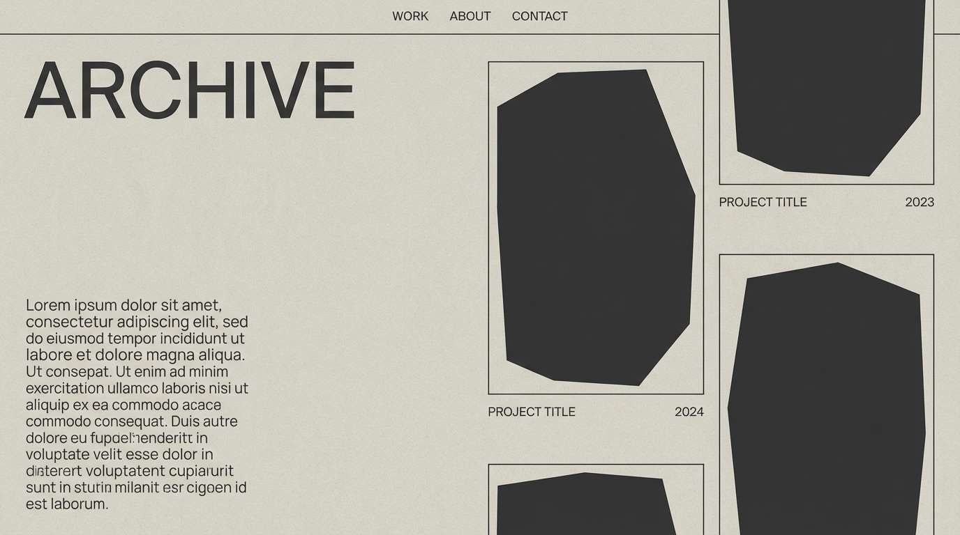
14) Charcoal Safari
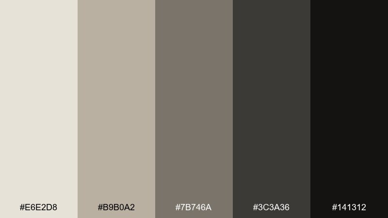
HEX: #E6E2D8 #B9B0A2 #7B746A #3C3A36 #141312
Mood: sleek, cinematic, strong
Best for: editorial portfolio website
Sleek and cinematic, it feels like dust, stone, and charcoal shadows after sunset. Use the light greige as the page base and build contrast with deep graphite for headers and nav. It pairs well with monochrome photography and generous whitespace for a gallery-forward layout. Tip: use the near-black only for micro-elements like active states and fine rules to keep the page from feeling heavy.
Image example of charcoal safari generated using media.io
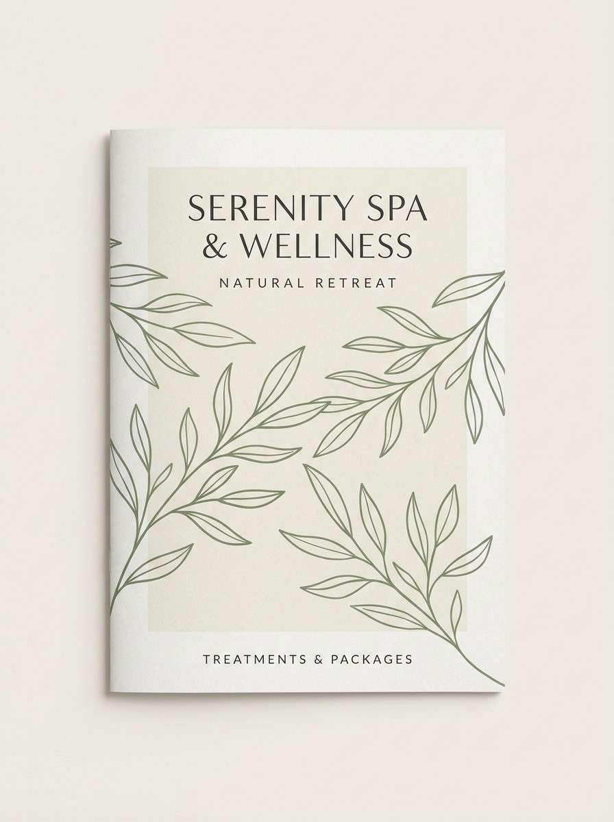
15) Palm and Sand
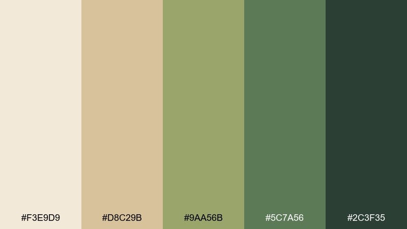
HEX: #F3E9D9 #D8C29B #9AA56B #5C7A56 #2C3F35
Mood: fresh, relaxed, botanical
Best for: spa brochure and print
Fresh and relaxed, it brings to mind palm fronds against warm sand and sunlit linen. Use the creamy beige for large background panels, then layer the greens for section headers and callout boxes. It pairs well with botanical line drawings and airy photography. Tip: keep the darkest green for body text and fine dividers so the brochure stays calm and readable.
Image example of palm and sand generated using media.io
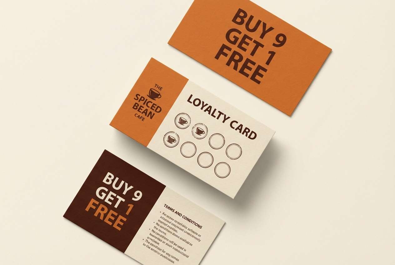
16) Spice Market
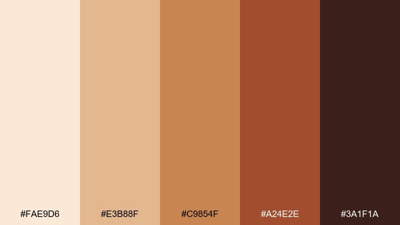
HEX: #FAE9D6 #E3B88F #C9854F #A24E2E #3A1F1A
Mood: vibrant, cozy, handcrafted
Best for: cafe loyalty card and collateral
Vibrant and cozy, it feels like spice jars, toasted cumin, and warm clay bowls. Build your base on the light cream, then use cinnamon and paprika tones for patterns and badges. It pairs beautifully with hand-drawn icons and imperfect textures that feel human. Tip: if printing, keep the mid tones slightly muted so the reds don't overpower small text.
Image example of spice market generated using media.io
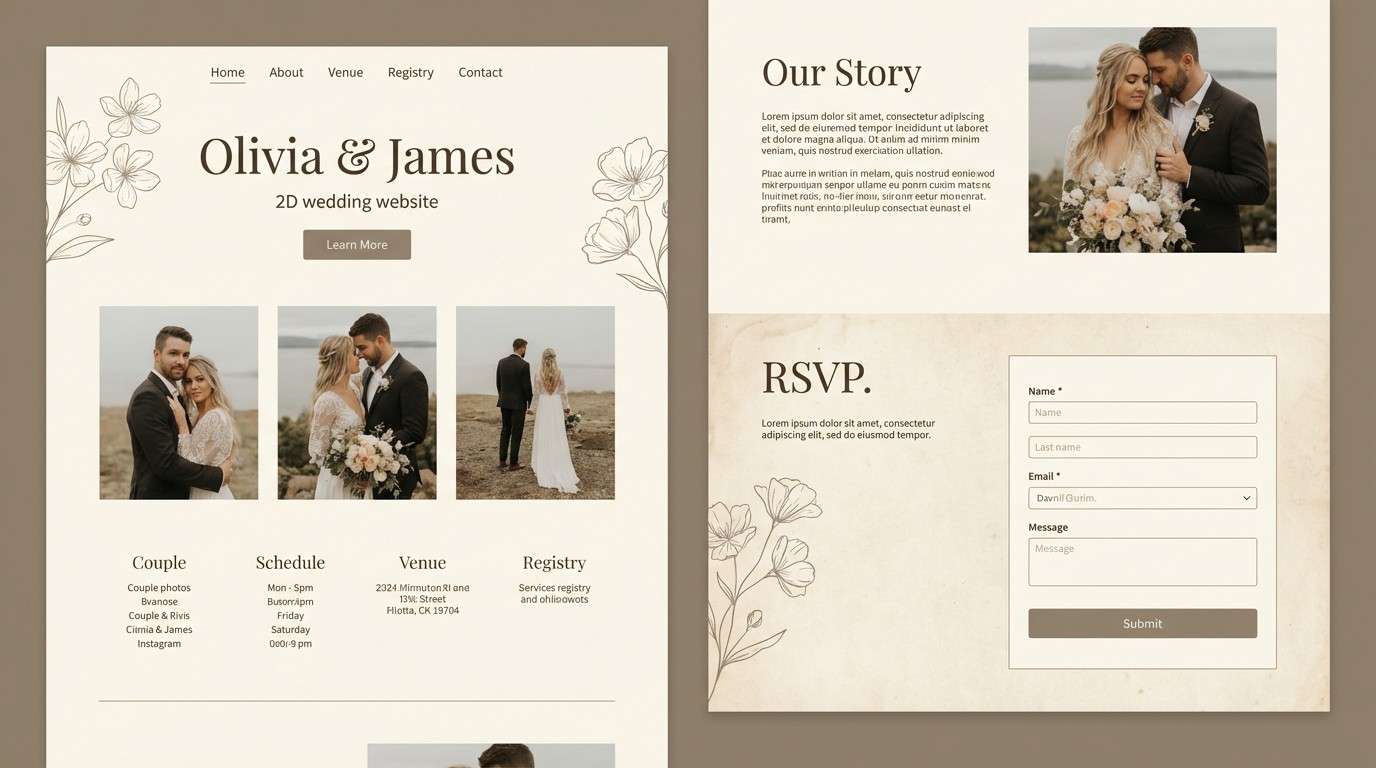
17) Linen Tent
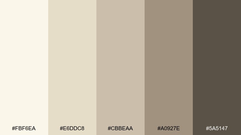
HEX: #FBF6EA #E6DDC8 #CBBEAA #A0927E #5A5147
Mood: clean, cozy, timeless
Best for: wedding website UI
Clean and timeless, it recalls linen fabric, canvas tents, and soft evening light. Use the pale cream for page backgrounds, then bring in the warm taupes for typography and subtle section breaks. It pairs well with serif headings, delicate rules, and minimal florals. Tip: add depth with paper-like textures instead of extra colors to keep everything elegant.
Image example of linen tent generated using media.io
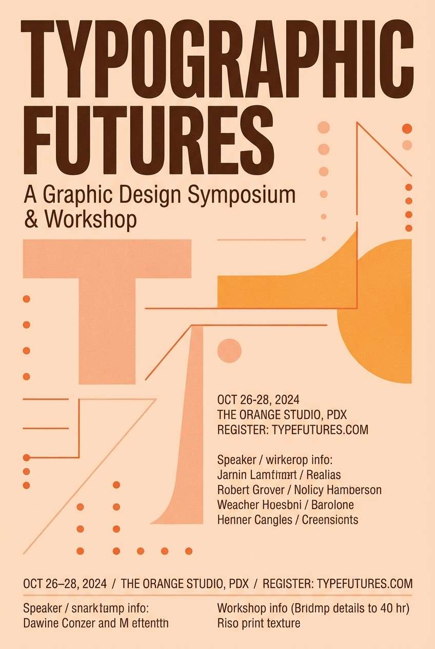
18) Sunset Antelope
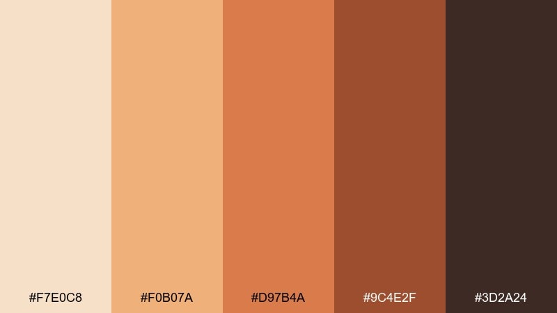
HEX: #F7E0C8 #F0B07A #D97B4A #9C4E2F #3D2A24
Mood: playful, warm, sunset-glow
Best for: event flyer design
Playful and warm, it captures sunset glow on sandy coats with a pop of caramel. Try large peachy shapes for the background and use the deeper orange-brown for headlines and key details. It pairs nicely with modern rounded type and simple gradient overlays. Tip: keep body copy on the lightest tone and avoid placing text over mid oranges unless you add a solid panel.
Image example of sunset antelope generated using media.io
19) Storm over Savanna
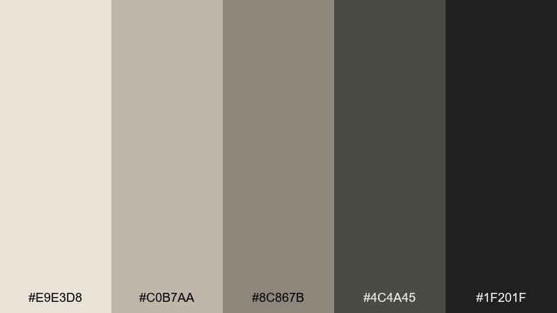
HEX: #E9E3D8 #C0B7AA #8C867B #4C4A45 #1F201F
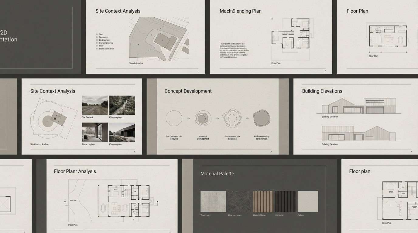
Mood: muted, dramatic, modern
Best for: architecture presentation slides
Muted and dramatic, it feels like a storm front rolling across dusty plains. Use the light warm gray for slide backgrounds and let the darker grays handle diagrams, captions, and section dividers. It pairs well with crisp grids, thin line drawings, and high-contrast building renders. Tip: add one warm accent from your project imagery, but keep it minimal so the deck stays professional.
Image example of storm over savanna generated using media.io
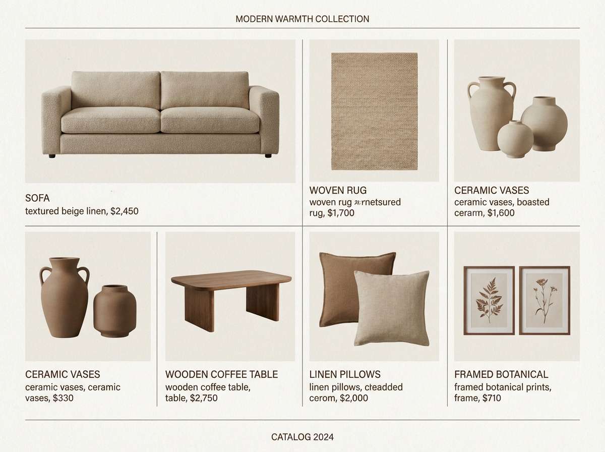
20) Terrace Garden Dust
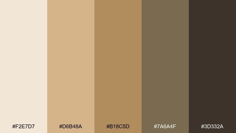
HEX: #F2E7D7 #D6B48A #B18C5D #7A6A4F #3D332A
Mood: earthy, calm, refined
Best for: home decor catalog page
Earthy and refined, it evokes dusty terracotta pots, sun-bleached terraces, and aged wood. These savannah color combinations work well for catalog layouts where you want warmth without losing clarity, using the light beige as a canvas and the browns for structure. Pair with serif headings, soft shadows, and natural materials photography. Tip: keep product prices in the darkest tone for legibility, and use mid browns for secondary labels.
Image example of terrace garden dust generated using media.io
What Colors Go Well with Savannah?
Savannah tones pair beautifully with crisp neutrals like warm white and soft charcoal, which sharpen contrast while keeping the overall look natural. These are great “supporting actors” for layouts that need clarity.
For accents, try muted teal, dusty sky blue, or a restrained copper/gold. Cool accents add freshness against sand and terracotta, while metallic warmth enhances the sunlit, premium feel.
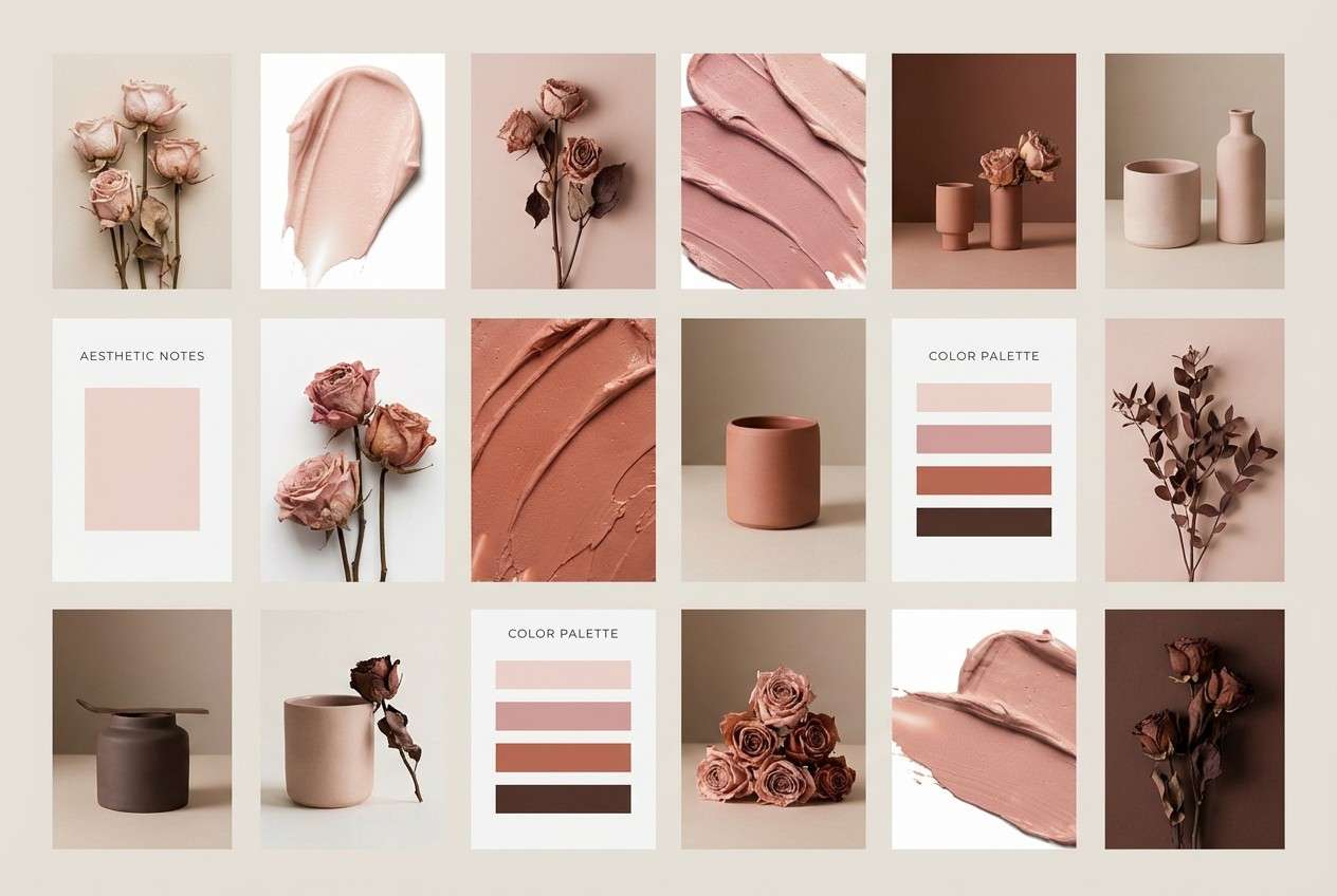
If you want a more romantic direction, blend savannah beiges with blush, mauve, and rosewood browns. Keep saturation controlled so the palette stays grounded rather than candy-like.
How to Use a Savannah Color Palette in Real Designs
Start with a light sand or cream as your base to create breathing room. Then pick one “structure” color (deep brown, charcoal, or dark olive) for typography, navigation, and the most important UI states.
Use mid tones (khaki, taupe, warm gray) for cards, borders, and secondary components. This keeps the design layered and readable without resorting to harsh black-and-white contrast.
Reserve the strongest hue—terracotta, gold, or rust—for intentional moments: CTAs, pricing, badges, or hero headlines. Used sparingly, it delivers energy while the palette remains calm.
Create Savannah Palette Visuals with AI
If you already have HEX codes, you can turn them into on-brand visuals by generating mockups that match your palette’s mood—packaging, UI screens, posters, menus, and more.
With Media.io’s text-to-image workflow, you can quickly iterate prompts, explore lighting and textures, and find the right balance between sandy neutrals, earthy greens, and clay warmth.
Once you find a direction, keep outputs consistent by reusing a prompt template and swapping only the scene (for example: “menu design” to “label design”) while keeping palette cues intact.
Savannah Color Palette FAQs
-
What is a savannah color palette?
A savannah color palette is a set of warm, earthy colors inspired by open grasslands—think sand, khaki, terracotta, ochre gold, olive green, warm browns, and charcoal shadows. -
Are savannah tones good for branding?
Yes. Savannah tones feel grounded and trustworthy, which works well for lifestyle, wellness, food, outdoor, and artisan brands. They also print nicely on natural materials like kraft paper and textured stock. -
How do I keep savannah palettes from looking dull?
Increase contrast with a deep anchor color (dark brown, charcoal, or forest green) and add one controlled accent (gold, rust, or terracotta). Texture and lighting in imagery also add “life” without needing brighter colors. -
What text color works best on sandy backgrounds?
Deep brown or warm charcoal usually reads better than pure black on beige and cream. It keeps contrast strong while matching the palette’s natural warmth. -
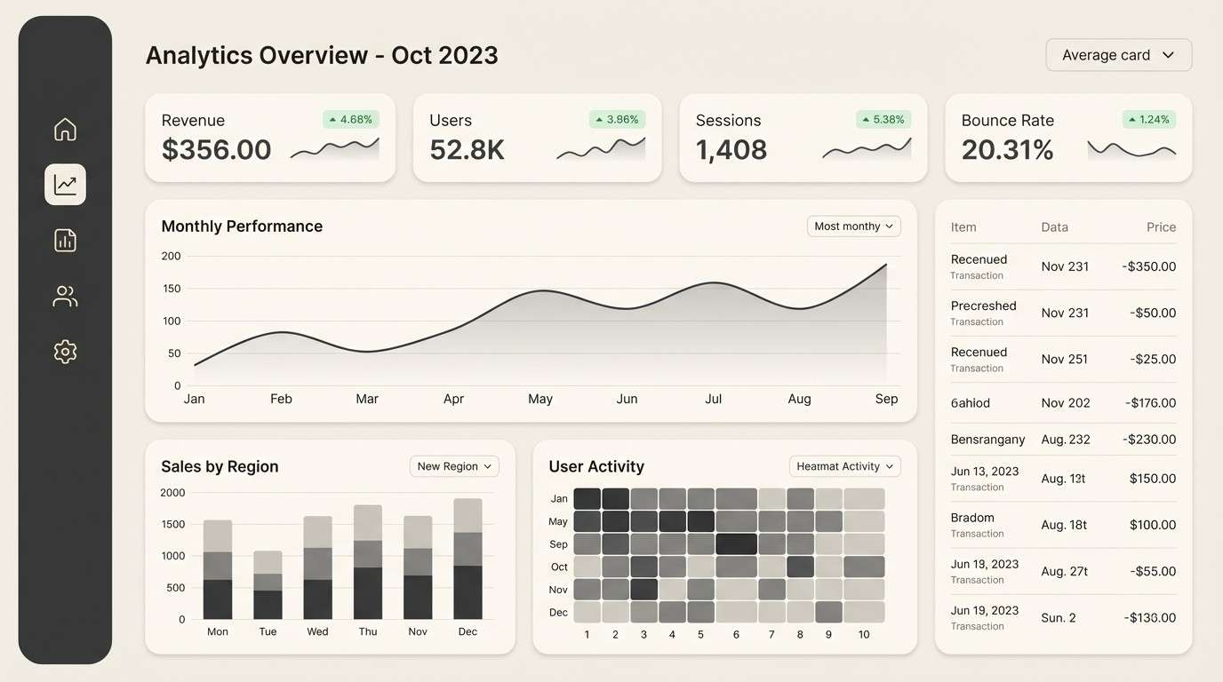
Which savannah palette is best for UI design?
Try Riverbed Stone for dashboards, Safari Khaki for ecommerce, or Olive Canopy for wellness sites. These sets provide clear neutrals plus a strong dark tone for navigation and states. -
Can I mix savannah colors with pastels?
You can—use muted pastels like dusty rose, blush, or soft peach, and keep them as secondary layers. Pair them with a grounded dark brown so the overall look stays balanced. -
How can I generate savannah palette images quickly?
Use Media.io text-to-image: describe your design scene (packaging, flyer, UI, catalog) and include cues like “warm sand,” “terracotta,” “olive,” and “matte natural textures” to guide the output.


