

A garden wedding color palette is all about balancing fresh greens, soft florals, and light neutrals so everything feels romantic, airy, and natural outdoors.
Below are 20+ garden wedding color palette ideas with HEX codes, plus practical tips for invites, florals, linens, signage, and photo-friendly styling.
In this article
- Why Garden Wedding Palettes Work So Well
-
- dewy sage blush
- peony cream eucalyptus
- wildflower pastels
- mossy stone linen
- fern champagne glow
- lavender herb garden
- rosewater olive sprig
- sunlit marigold meadow
- hydrangea blue mist
- terracotta potting shed
- mint gelato ivory
- botanical ink parchment
- coral petal seafoam
- antique gold gardenia
- raspberry rose leaf green
- misty gray soft basil
- plum vine dusty mauve
- citrus zest clover
- orchid pearl meadow
- stone rose tea
- rainwashed meadow
- fresh cut greens pear
- What Colors Go Well with Garden Wedding?
- How to Use a Garden Wedding Color Palette in Real Designs
- Create Garden Wedding Palette Visuals with AI
Why Garden Wedding Palettes Work So Well
Garden wedding colors naturally match the setting: leafy greens, petal pinks, and warm creams echo what’s already around you, so the styling looks effortless instead of over-designed.
They also photograph beautifully in outdoor light. Light neutrals prevent harsh contrast, while deeper greens (and an occasional berry or slate) add definition so details don’t wash out.
Most garden wedding color schemes are flexible across seasons—swap florals, fabrics, and accent metals while keeping a consistent green-and-neutral foundation.
20+ Garden Wedding Color Palette Ideas (with HEX Codes)
1) Dewy Sage Blush
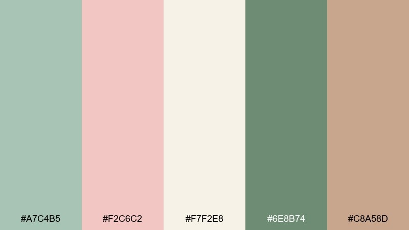
HEX: #A7C4B5 #F2C6C2 #F7F2E8 #6E8B74 #C8A58D
Mood: soft, romantic, morning-fresh
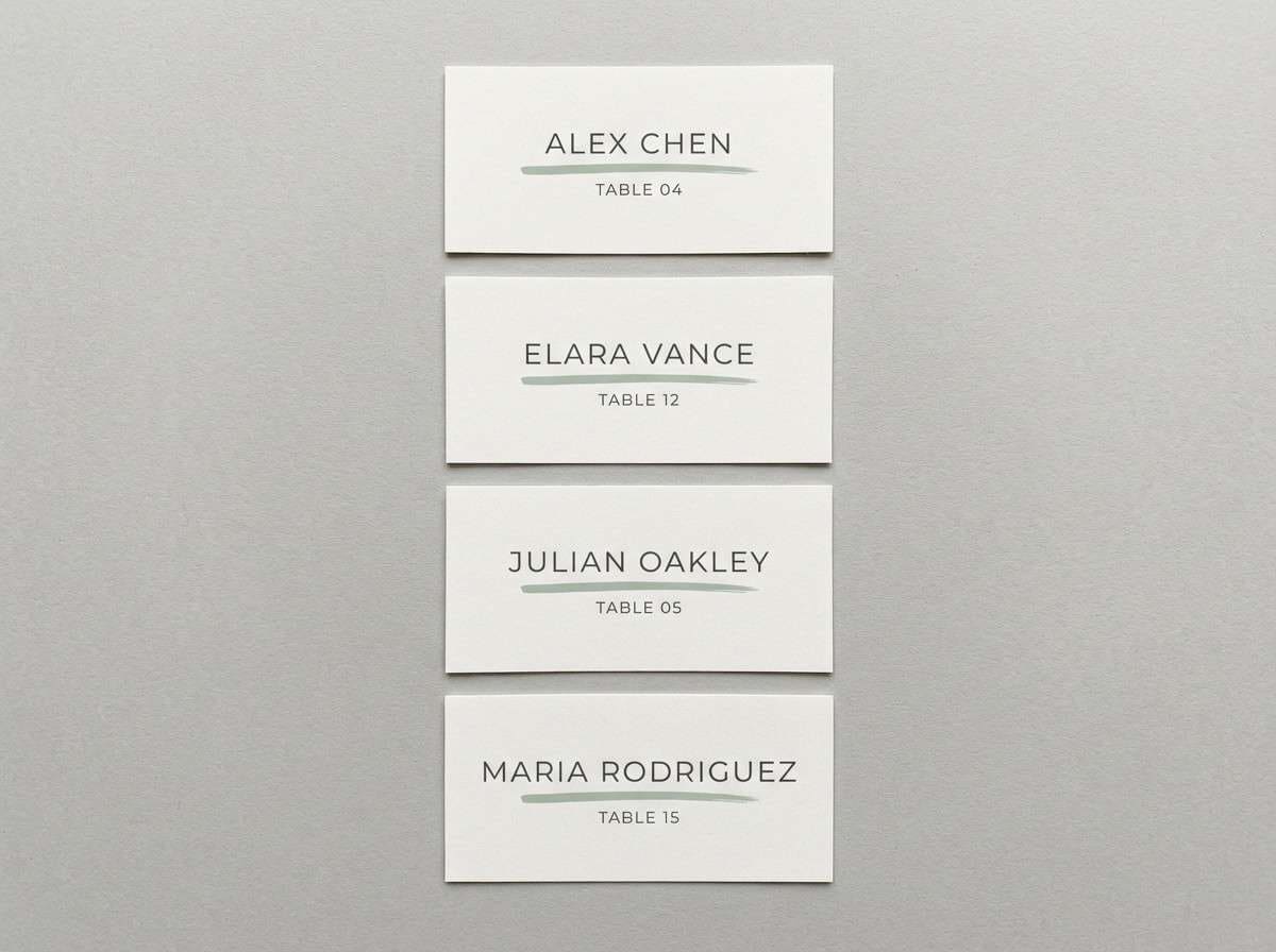
Best for: wedding invitations and day-of stationery
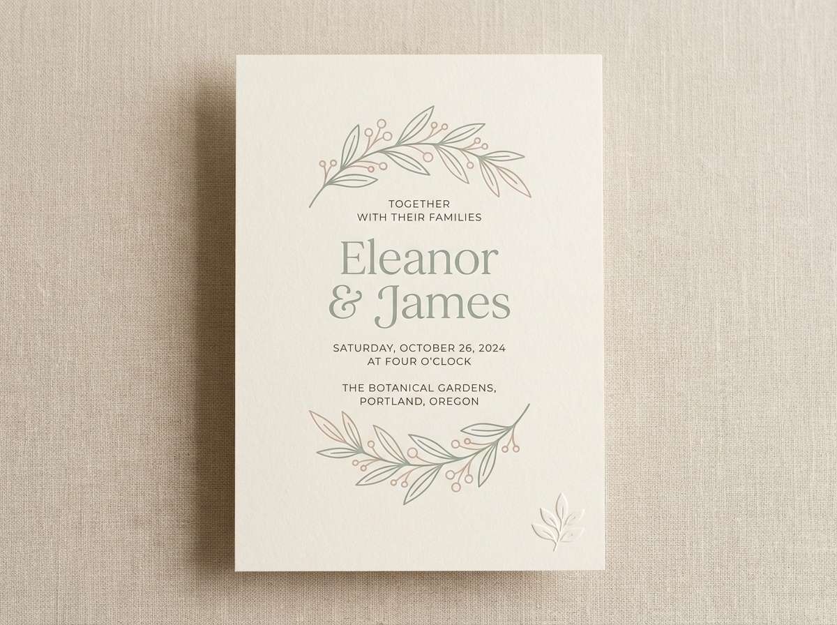
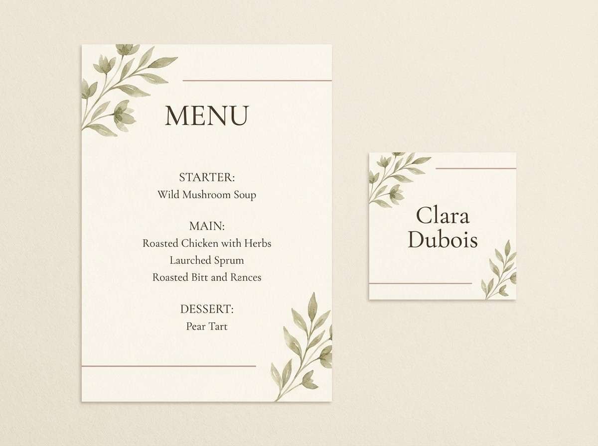
Soft, romantic tones that feel like early sunlight on garden leaves and blush petals. This garden wedding color palette reads elegant without being fussy, especially on uncoated paper. Pair the sage and cream as your base, then bring in blush for headings, monograms, or wax seals. Tip: keep body text in the deeper green to maintain legibility while staying gentle.
Image example of dewy sage blush generated using media.io
Media.io is an online AI studio for creating and editing video, image, and audio in your browser.

2) Peony Cream Eucalyptus
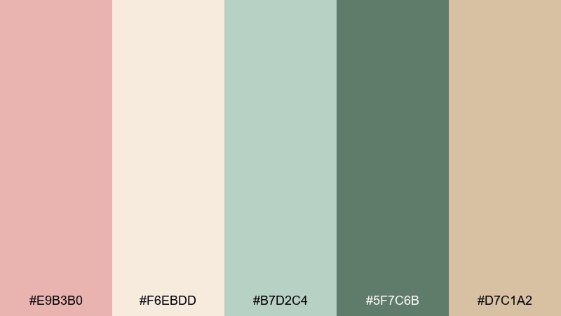
HEX: #E9B3B0 #F6EBDD #B7D2C4 #5F7C6B #D7C1A2
Mood: airy, floral, timeless
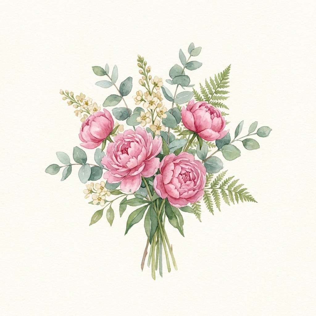
Best for: bridesmaid dresses and bouquet planning
Airy peony pinks and eucalyptus greens create a timeless floral look with a modern, clean edge. The cream keeps everything bright in outdoor photos, while the deeper green anchors the softer petals. Pair with natural textures like linen, rattan, and raw silk for an effortless feel. Tip: repeat the dark green in ribbons or boutonniere wraps to keep the styling cohesive.
Image example of peony cream eucalyptus generated using media.io
3) Wildflower Pastels
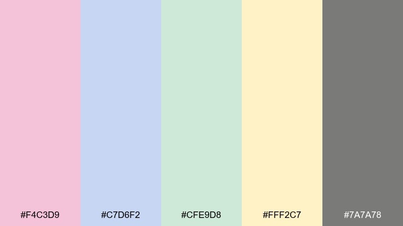
HEX: #F4C3D9 #C7D6F2 #CFE9D8 #FFF2C7 #7A7A78
Mood: playful, springlike, light
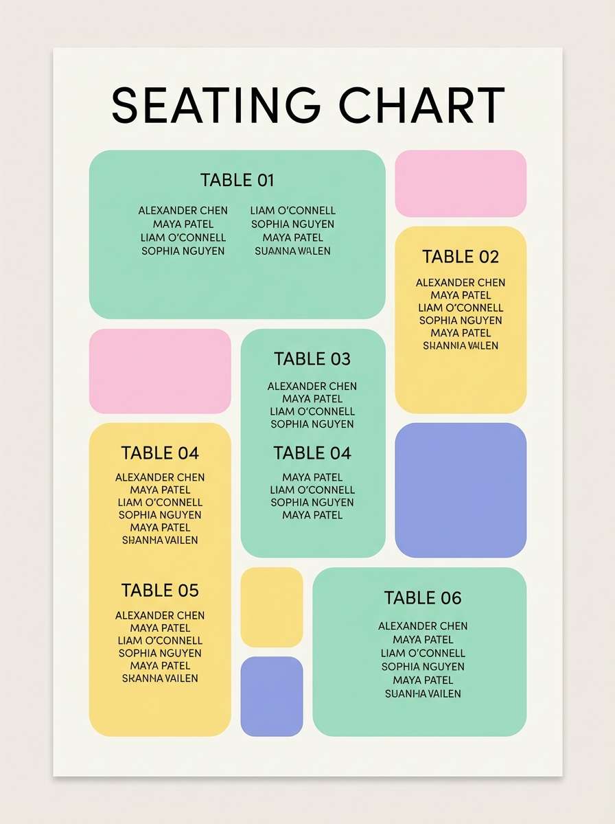
Best for: welcome sign and seating chart designs
Playful wildflower pastels feel like a meadow in full bloom, light and cheerful without going overly sweet. Use the soft yellow and mint as broad areas, then add pink and periwinkle as accents for names, table numbers, or icons. The gentle gray is perfect for type and keeps everything readable. Tip: limit yourself to two accent colors per sign to avoid a confetti effect.
Image example of wildflower pastels generated using media.io
4) Mossy Stone Linen
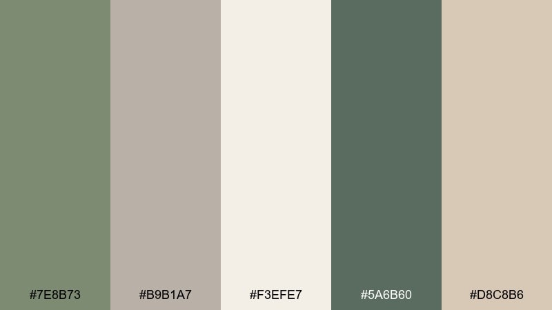
HEX: #7E8B73 #B9B1A7 #F3EFE7 #5A6B60 #D8C8B6
Mood: grounded, organic, understated
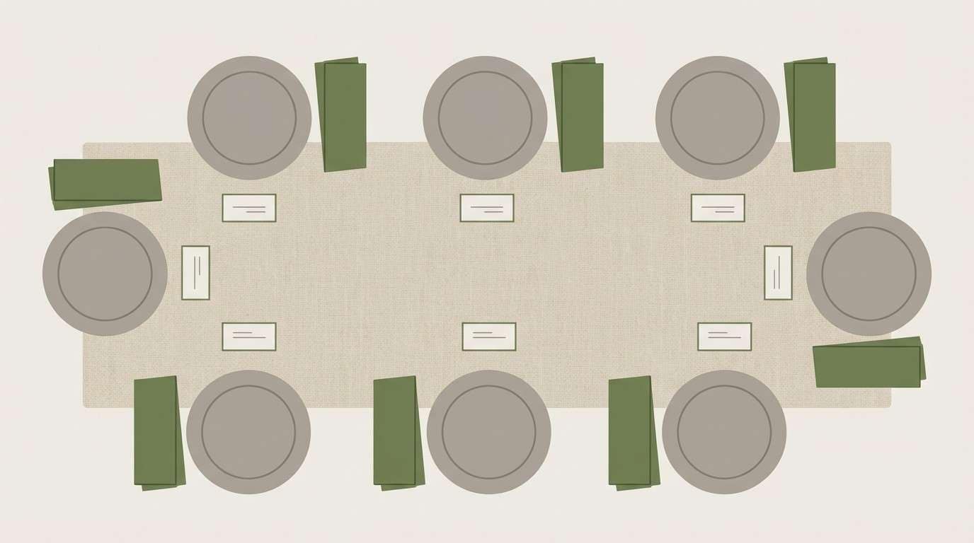
Best for: linen rentals and tablescape styling
Grounded moss and stone neutrals evoke shaded paths, textured bark, and relaxed elegance. The palette works beautifully for long tables, especially when you want florals to stand out without clashing. Pair with matte ceramics, clear glass, and subtle brass details for warmth. Tip: choose one hero green for napkins or runners and keep the rest in linen tones.
Image example of mossy stone linen generated using media.io
5) Fern Champagne Glow
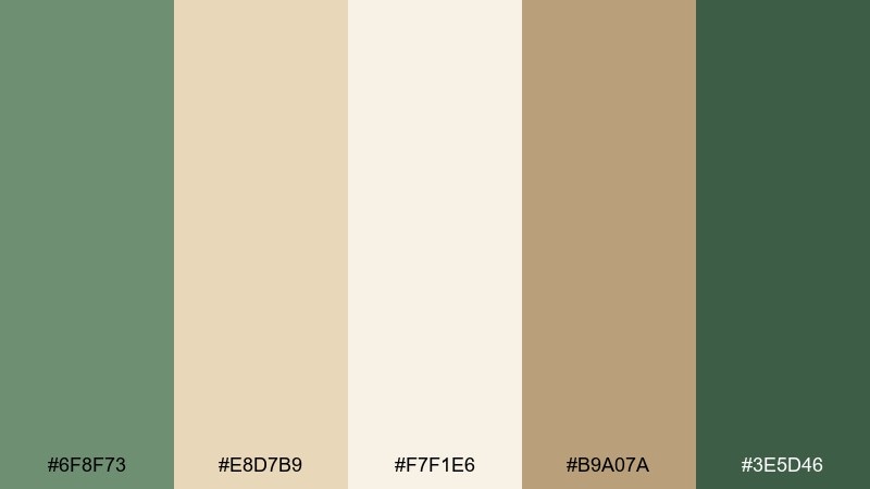
HEX: #6F8F73 #E8D7B9 #F7F1E6 #B9A07A #3E5D46
Mood: warm, polished, golden-hour
Best for: reception decor with candles and metallics
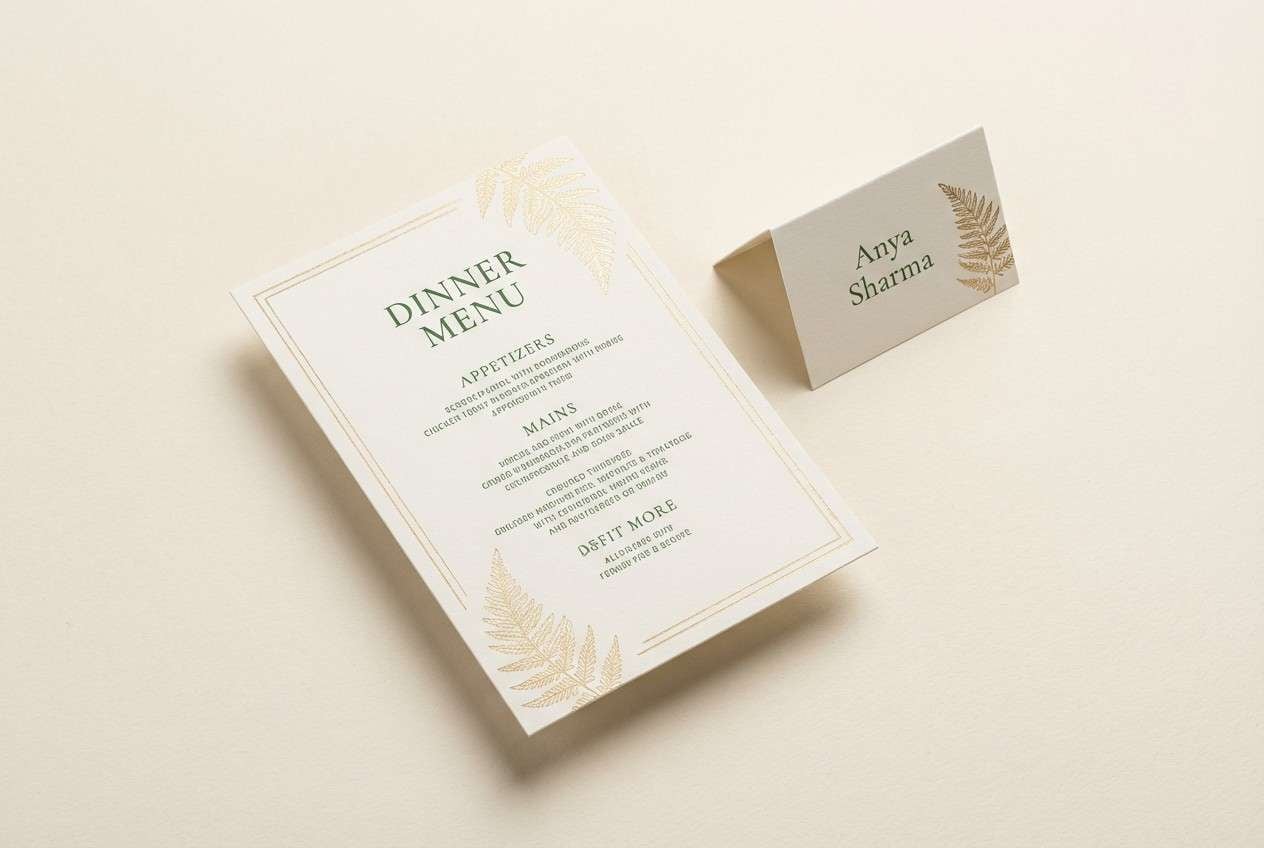
Warm fern greens and champagne notes feel like golden-hour light filtering through leaves. This garden wedding color scheme shines at receptions where candlelight and subtle metallics do the heavy lifting. Use cream for large surfaces, then add champagne and gold as shimmer accents on menus, chargers, or signage. Tip: keep metallic finishes consistent, and let the darkest green appear in small repeats for depth.
Image example of fern champagne glow generated using media.io
6) Lavender Herb Garden
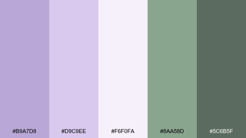
HEX: #B9A7D8 #D9C9EE #F6F0FA #8AA58D #5C6B5F
Mood: calm, fragrant, romantic
Best for: bridal shower invites and spring brunch events
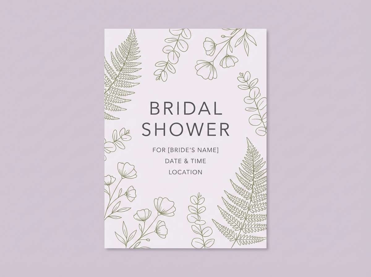
Calm lavender tones with herb greens evoke pressed petals, soft fragrance, and a relaxed spring brunch mood. The pale lilac works as an easy background color, while the darker green keeps the design from drifting too pastel. Pair with line-drawn botanicals and rounded serif fonts for a gentle, modern look. Tip: reserve the deepest green for headings and small illustrations to balance the airy lilacs.
Image example of lavender herb garden generated using media.io
7) Rosewater Olive Sprig
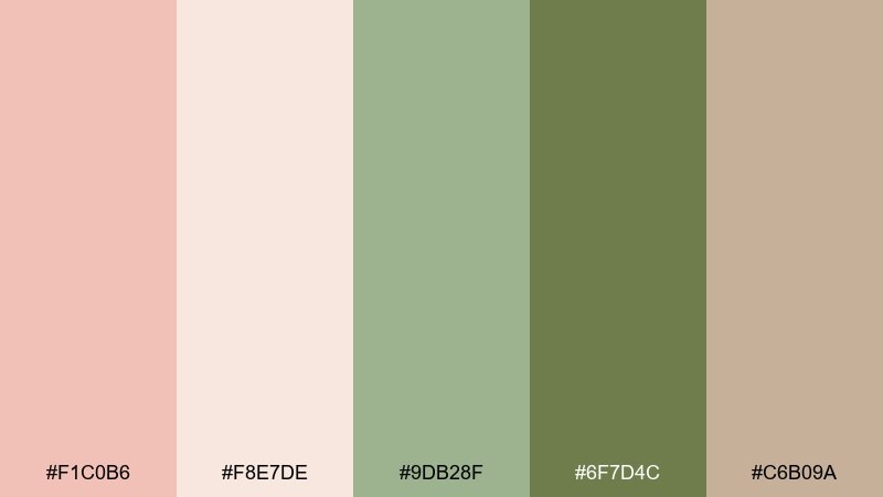
HEX: #F1C0B6 #F8E7DE #9DB28F #6F7D4C #C6B09A
Mood: romantic, natural, softly rustic
Best for: bouquet ribbons and ceremony arch florals
Romantic rosewater and olive greens feel natural, softly rustic, and flattering on camera. Use the blush and cream for larger floral moments, then weave olive sprigs to add structure and contrast. The muted beige keeps everything cohesive when you mix textures like chiffon ribbon and dried elements. Tip: repeat olive in both ceremony florals and reception greenery so the day feels intentionally styled.
Image example of rosewater olive sprig generated using media.io
8) Sunlit Marigold Meadow
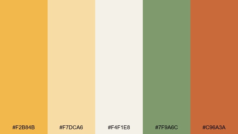
HEX: #F2B84B #F7DCA6 #F4F1E8 #7F9A6C #C96A3A
Mood: bright, joyful, sun-warmed
Best for: summer garden receptions and cocktail hour signage
Bright marigold and warm terracotta evoke sun-warmed petals, citrus cocktails, and a lively outdoor party. Among the most upbeat garden wedding color combinations, it works best when you give the yellow room to breathe with plenty of soft cream. Pair with leafy greens for balance and choose a single warm accent for typography or small icons. Tip: use marigold in florals or napkins, and keep signage backgrounds light for readability.
Image example of sunlit marigold meadow generated using media.io

9) Hydrangea Blue Mist
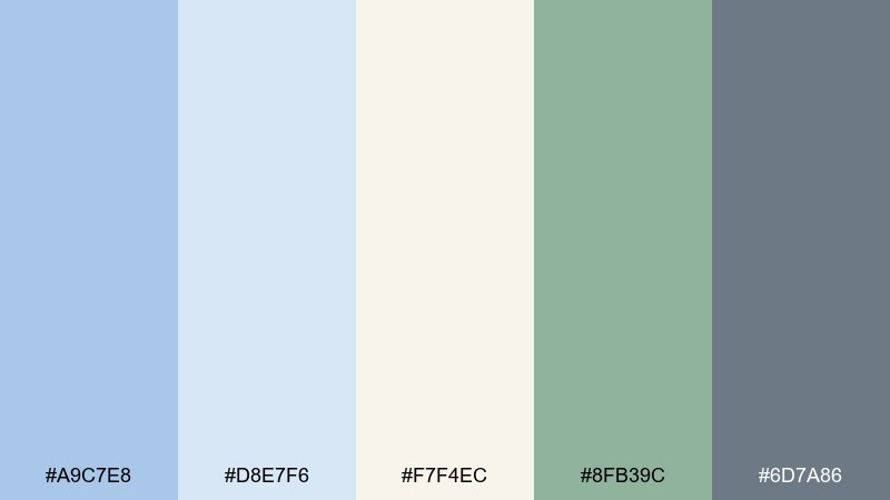
HEX: #A9C7E8 #D8E7F6 #F7F4EC #8FB39C #6D7A86
Mood: cool, airy, refined
Best for: ceremony programs and minimalist monograms
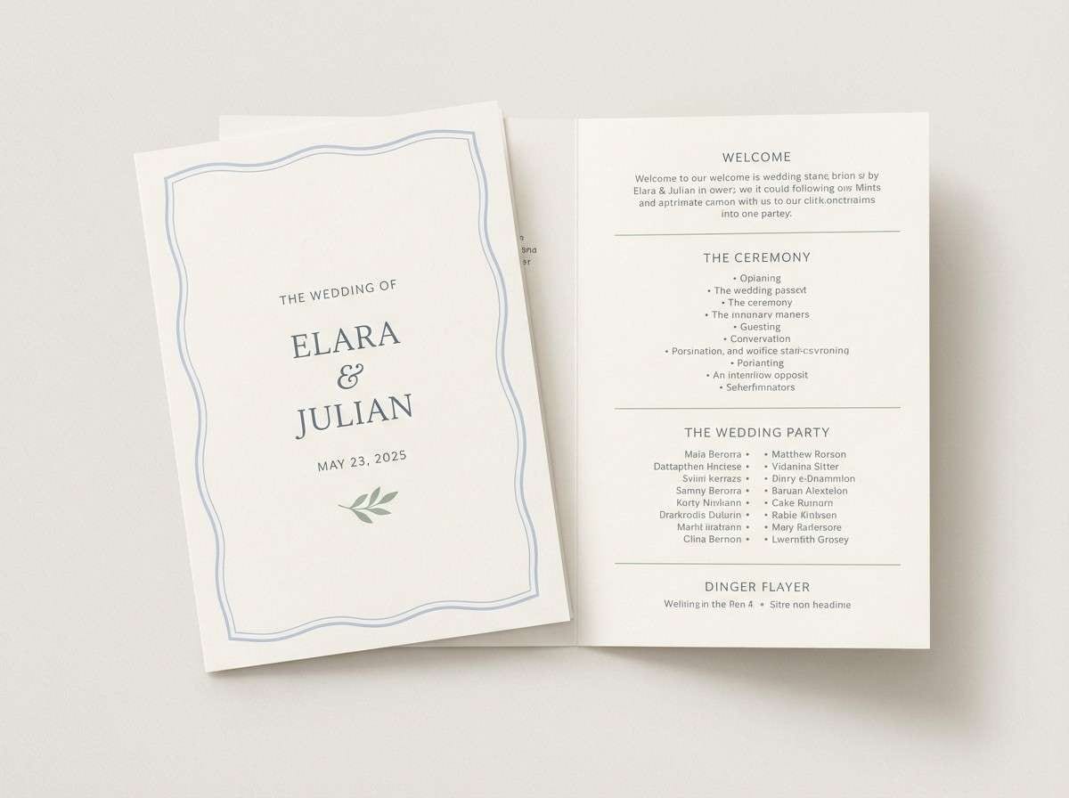
Cool hydrangea blues and misty neutrals feel airy, refined, and quietly luxurious. The soft blue makes a gorgeous wash for programs, while the slate tone keeps text sharp and modern. Pair with pale greenery and cream paper to avoid a chilly look. Tip: use blue sparingly on large blocks and repeat it in a tiny detail like a border or monogram mark.
Image example of hydrangea blue mist generated using media.io
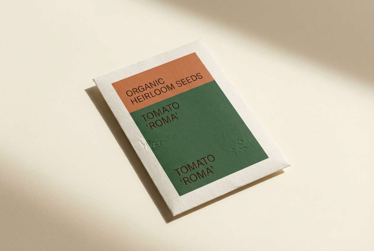
10) Terracotta Potting Shed
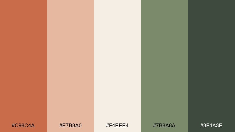
HEX: #C96C4A #E7B8A0 #F4EEE4 #7B8A6A #3F4A3E
Mood: earthy, cozy, handcrafted
Best for: rustic chic weddings and clay-inspired decor
Earthy terracotta and soft peach feel handcrafted, like clay pots, seed packets, and worn garden tools. The greens keep it grounded and prevent the warm tones from feeling too autumnal. Pair with kraft paper details, matte ceramics, and simple greenery-heavy arrangements. Tip: let terracotta be the accent color, not the base, so photos stay bright and fresh.
Image example of terracotta potting shed generated using media.io
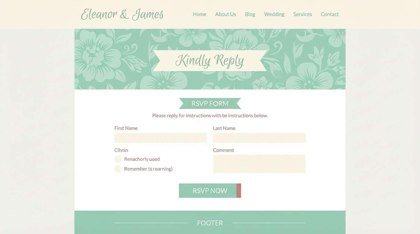
11) Mint Gelato Ivory
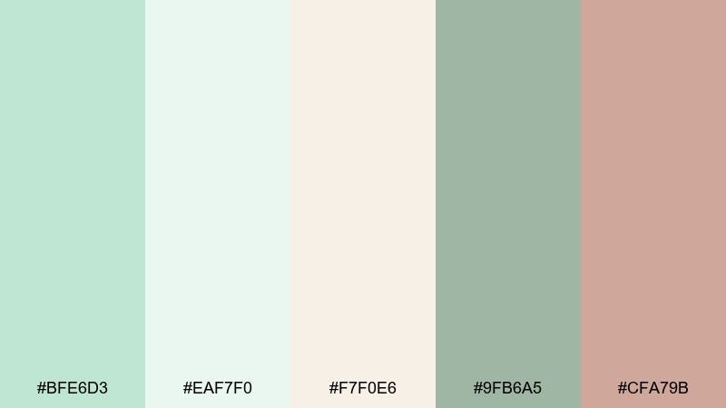
HEX: #BFE6D3 #EAF7F0 #F7F0E6 #9FB6A5 #CFA79B
Mood: fresh, light, modern romantic
Best for: wedding website UI and RSVP forms
Fresh mint and airy ivory create a modern romantic look that feels clean and welcoming. Use mint for buttons and highlights, then lean on ivory and soft cream for backgrounds to keep the interface calm. The muted rose is perfect for micro-accents like active states, dividers, or icons. Tip: keep form fields neutral and use mint primarily for calls to action so the UI stays readable.
Image example of mint gelato ivory generated using media.io
12) Botanical Ink Parchment
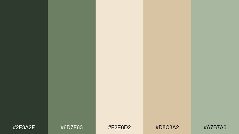
HEX: #2F3A2F #6D7F63 #F2E6D2 #D8C3A2 #A7B7A0
Mood: classic, editorial, elegant
Best for: formal invitations and crest-style branding
Classic ink greens on parchment evoke engraved stationery, heirloom botanicals, and refined formality. This garden wedding color palette is ideal for crests, monograms, and serif typography where contrast matters. Pair with blind emboss, letterpress textures, or a thin border in warm beige to soften the dark ink. Tip: keep the darkest shade for names and headings, and use mid greens for illustration lines.
Image example of botanical ink parchment generated using media.io
13) Coral Petal Seafoam
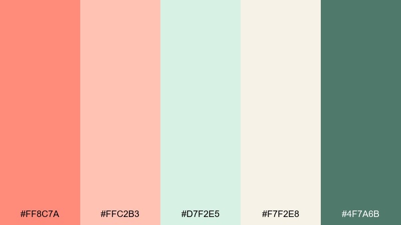
HEX: #FF8C7A #FFC2B3 #D7F2E5 #F7F2E8 #4F7A6B
Mood: bright, breezy, youthful
Best for: engagement party graphics and social posts
Bright coral petals with seafoam green feel breezy, youthful, and full of movement. Use coral for hero moments like headers or key dates, while seafoam keeps the overall look light and modern. Pair with rounded sans-serif type and simple shapes for an upbeat, shareable style. Tip: set coral text only on light neutrals so it stays crisp and easy to read.
Image example of coral petal seafoam generated using media.io

14) Antique Gold Gardenia
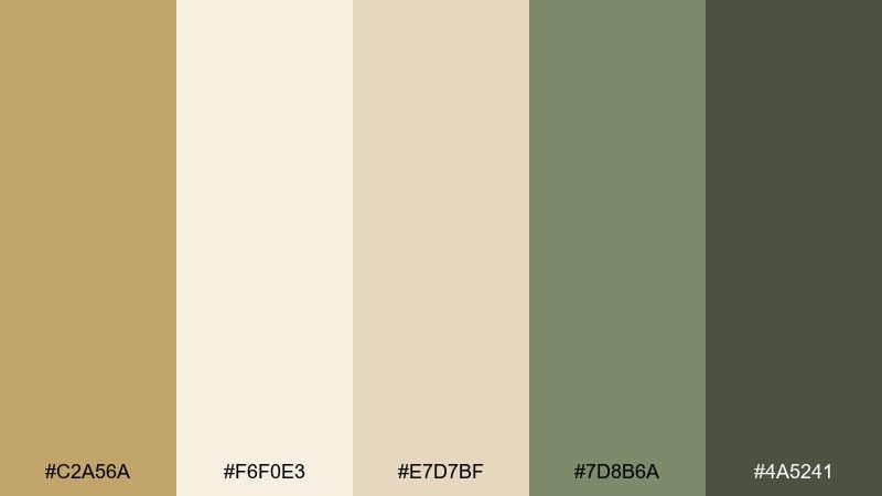
HEX: #C2A56A #F6F0E3 #E7D7BF #7D8B6A #4A5241
Mood: luxe, soft, classic
Best for: menu cards and place settings
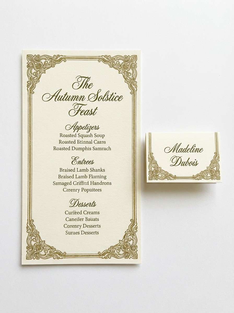
Antique gold and gardenia cream feel luxe yet soft, like vintage frames and candlelit petals. The warm neutrals flatter gold foil and look especially good under string lights. Pair with deep olive for type, and keep green accents minimal for a refined finish. Tip: if you use foil, choose thicker strokes and larger type so it reads cleanly at the table.
Image example of antique gold gardenia generated using media.io
15) Raspberry Rose Leaf Green
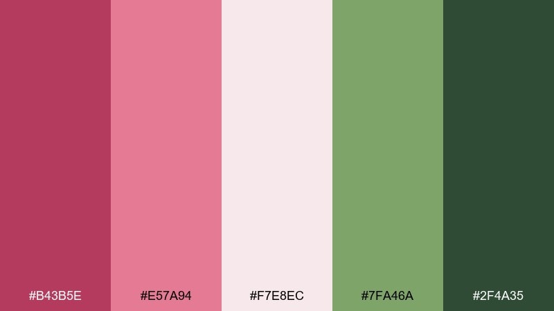
HEX: #B43B5E #E57A94 #F7E8EC #7FA46A #2F4A35
Mood: bold, romantic, statement-making
Best for: bridal bouquet accents and bold signage
Bold raspberry rose tones bring drama, like ripe berries tucked into fresh greenery. Keep it sophisticated by using blush as the bridge shade and reserving the deep berry for focal points. Pair with rich leaf greens to ground the brightness and avoid a neon feel. Tip: use the darkest berry sparingly on type or ribbons so it stays elegant in photos.
Image example of raspberry rose leaf green generated using media.io

16) Misty Gray Soft Basil
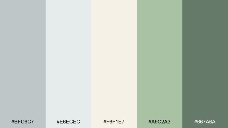
HEX: #BFC6C7 #E6ECEC #F6F1E7 #A9C2A3 #667A6A
Mood: minimal, calm, contemporary
Best for: modern ceremonies and monochrome styling
Misty grays with soft basil green create a contemporary look that feels calm and intentional. The grays act as quiet neutrals for suits, table linens, and signage, while basil adds just enough life. Pair with clear acrylic details or white florals to keep the styling minimal. Tip: choose one basil element per vignette, like napkins or escort cards, for a clean rhythm.
Image example of misty gray soft basil generated using media.io
17) Plum Vine Dusty Mauve
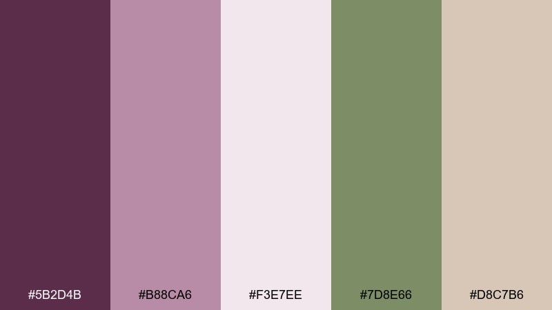
HEX: #5B2D4B #B88CA6 #F3E7EE #7D8E66 #D8C7B6
Mood: moody, romantic, twilight
Best for: evening garden weddings and dramatic florals
Moody plum and dusty mauve feel like twilight vows under climbing vines. Use the pale pink as your buffer so the darker plum reads rich rather than heavy. Pair with olive greenery and warm beige for balance and a slightly vintage finish. Tip: keep backgrounds light and use plum for borders, monograms, or ribbon tails for controlled drama.
Image example of plum vine dusty mauve generated using media.io
18) Citrus Zest Clover
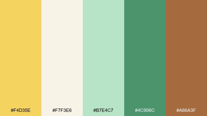
HEX: #F4D35E #F7F3E6 #B7E4C7 #4C956C #A66A3F
Mood: energetic, fresh, sunny
Best for: spring cocktail menus and bar signage
Citrus zest yellow with clover greens feels energetic, like fresh lemonade and new leaves. The creamy neutral keeps the palette from becoming too loud, while the warm tan adds a grounded, natural note. Pair with simple iconography and plenty of whitespace for a bright, modern look. Tip: use yellow for highlights and borders, and let green carry most of the typography.
Image example of citrus zest clover generated using media.io
19) Orchid Pearl Meadow
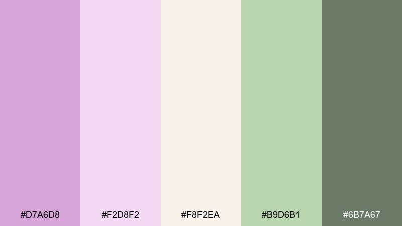
HEX: #D7A6D8 #F2D8F2 #F8F2EA #B9D6B1 #6B7A67
Mood: dreamy, delicate, romantic
Best for: bridal portraits styling and pastel florals
Dreamy orchid tones with pearl neutrals feel delicate and romantic, like soft petals against a bright sky. Use the pearl and blush-lilac shades for dresses, wraps, and paper goods, then add meadow green to keep it fresh. Pair with silver details or clear glass for a light, airy finish. Tip: keep saturation low across florals so the orchid reads refined rather than loud.
Image example of orchid pearl meadow generated using media.io
20) Stone Rose Tea
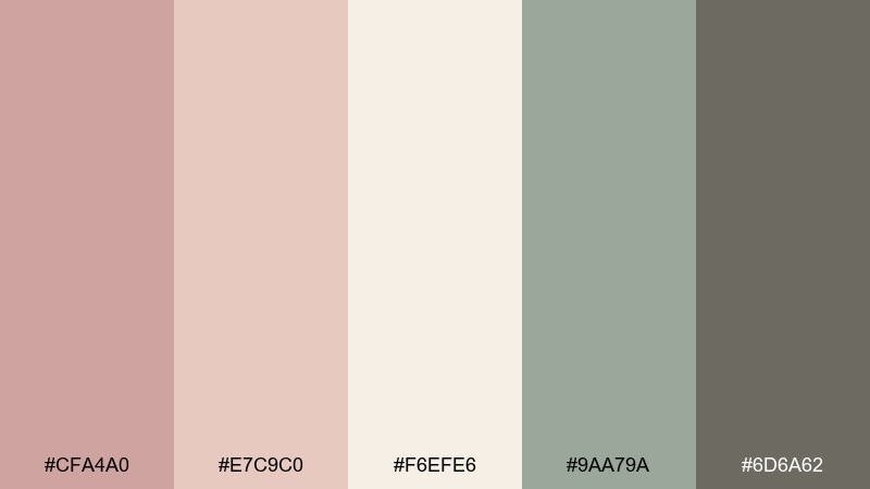
HEX: #CFA4A0 #E7C9C0 #F6EFE6 #9AA79A #6D6A62
Mood: soft, vintage, serene
Best for: tea party receptions and intimate garden dinners
Stone rose and warm tea neutrals feel vintage and serene, like heirloom china and faded florals. The muted greens keep it botanical without turning too rustic. Pair with soft lighting, ivory linens, and delicate floral patterns for a gentle, nostalgic mood. Tip: use the deeper gray-brown for typography to keep menus and place cards readable in low light.
Image example of stone rose tea generated using media.io
21) Rainwashed Meadow
HEX: #8DB5A5 #CFE4DC #F5F1E7 #7C8C95 #4F6B63
Mood: cool, quiet, refreshing
Best for: rain plan signage and cohesive day-of print
Cool, rainwashed greens and soft slate feel refreshing, like a calm garden after a shower. The palette reads modern and organized, making it great for informational pieces like timelines and direction signs. Pair with clean sans-serif typography and simple icons for clarity. Tip: keep the background warm-cream so the cool tones still feel welcoming.
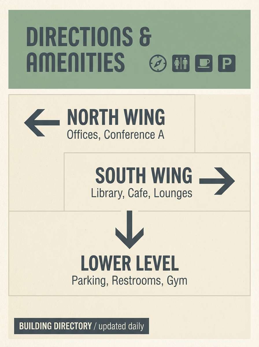
Image example of rainwashed meadow generated using media.io
22) Fresh Cut Greens Pear
HEX: #9ED6A6 #D7F2D7 #F7F6EE #6FAE7C #B8A98A
Mood: crisp, fresh, clean botanical
Best for: minimal branding suites and modern garden weddings
Crisp greens and soft pear tones evoke freshly cut stems, clean air, and a bright modern vibe. These garden wedding color combination ideas work best when you treat cream as the main canvas and let greens carry the accents. Pair with simple botanical silhouettes, thin rules, and plenty of whitespace for a contemporary finish. Tip: repeat the mid-green in both digital and print assets so the branding feels consistent from site to signage.
Image example of fresh cut greens pear generated using media.io
What Colors Go Well with Garden Wedding?
Garden wedding colors pair best with soft neutrals (cream, ivory, warm beige) and botanicals (sage, eucalyptus, fern, olive). These shades echo greenery and sunlight, so they feel cohesive in an outdoor venue.
For florals, blush, peony pink, mauve, lavender, and soft coral add romance without overpowering the natural setting. If you want more contrast, add a deep anchor like forest green, slate gray-blue, or a controlled berry tone.
Metal accents that usually work well include champagne gold, antique gold, and brushed brass—warm enough to complement greenery, and reflective enough to lift reception details at night.
How to Use a Garden Wedding Color Palette in Real Designs
Start with a simple ratio: choose 1–2 neutrals as the base (paper, linens, backgrounds), 1 main green as the botanical thread, and 1 floral accent for highlights like names, borders, ribbons, or blooms.
For stationery and signage, keep readability first: use the darkest shade for body text, and reserve light pastels for backgrounds and decorative shapes. Repeating one “signature” green across invites, programs, and day-of signs makes everything feel intentionally branded.
In photos, avoid using multiple high-saturation accents at the same time. A calm neutral canvas with one standout accent (marigold, berry, or terracotta) will look fresh rather than busy.
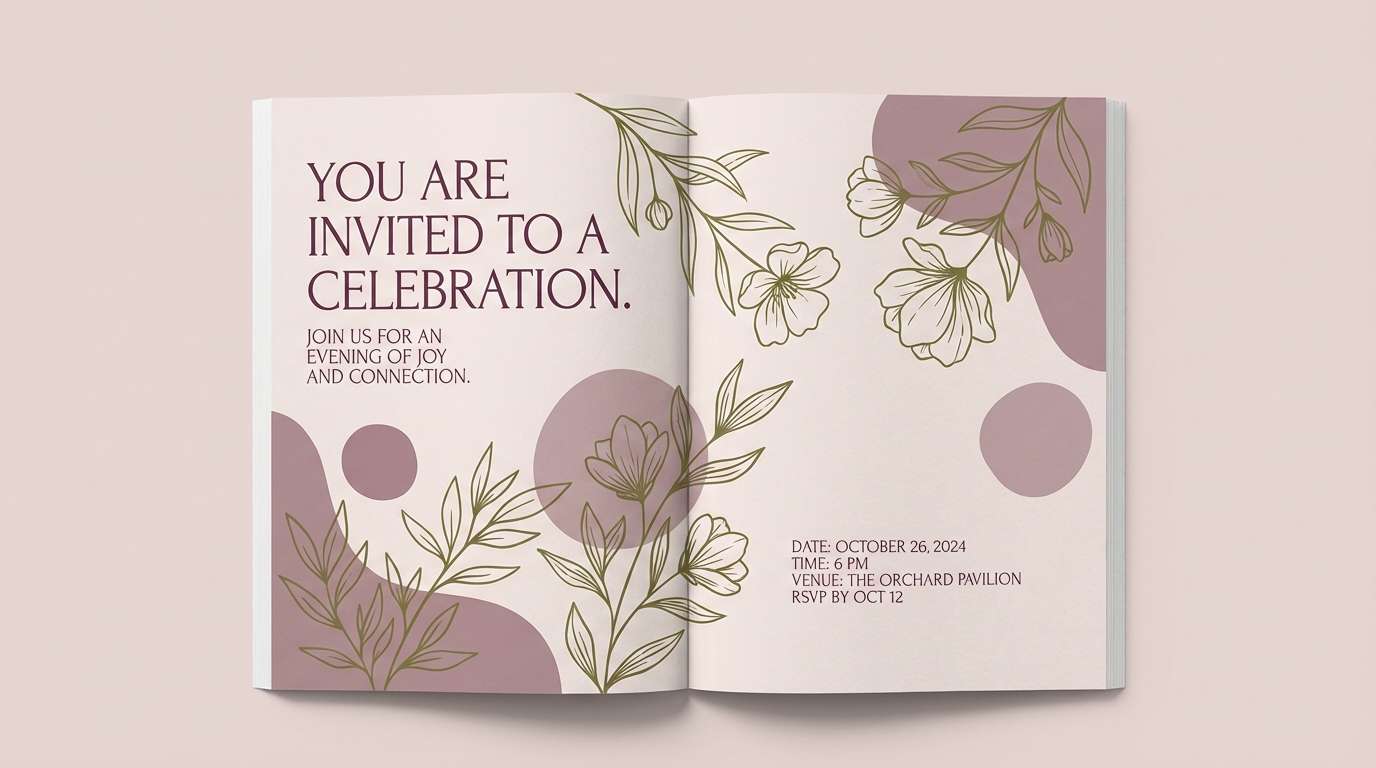
Create Garden Wedding Palette Visuals with AI
If you’re presenting a mood board to a planner or designing printables, generating a few consistent visuals can make your garden wedding color scheme feel instantly real.
With Media.io’s AI text-to-image tool, you can create invitation mockups, seating chart layouts, bouquet illustrations, and menu designs that match your chosen HEX colors—fast and browser-based.
Use the prompts above as a starting point, then swap in your palette name, layout type, or details like “letterpress,” “watercolor botanicals,” or “gold foil accents.”
Garden Wedding Color Palette FAQs
-
What is the best garden wedding color palette for outdoor photos?
Light neutrals (cream/ivory) plus a medium-to-deep green (sage, eucalyptus, fern) photograph reliably in bright sun. Add one soft floral accent (blush, mauve, peony pink) so the palette stays romantic without washing out. -
How many colors should a garden wedding color scheme include?
A practical set is 5 colors: 2 neutrals for backgrounds, 1 main green, 1 floral accent, and 1 darker anchor for text and contrast. This keeps signage and stationery consistent and easy to read. -
Do sage and blush work for a garden wedding?
Yes—sage and blush is a classic garden wedding combination because it mirrors greenery and petals naturally. Use deeper green for typography so delicate blush accents don’t reduce legibility. -
How do I keep pastel garden wedding palettes from looking too “sweet”?
Introduce a grounding neutral (warm gray, stone, parchment) or a darker green for structure. Limit yourself to one or two pastel accents per design piece to avoid a confetti effect. -
What’s a good garden wedding palette for evening receptions?
Choose a warmer, deeper mix like fern + champagne + cream, or plum + dusty mauve + olive. Candlelight and metallic accents (champagne gold, antique gold) will enhance warmth and keep the palette polished. -
Which colors work for a modern minimalist garden wedding?
Misty grays with soft basil, or crisp greens with warm cream, feel clean and contemporary. Keep layouts spacious, use simple botanical silhouettes, and stick to one strong accent green across all assets. -
Can I generate invitation and signage visuals for my garden wedding palette with AI?
Yes. Use Media.io’s text-to-image tool to generate cohesive mockups (invites, menus, welcome signs, seating charts) by describing the layout, style (minimal, watercolor, editorial), and your key colors.
Next: Fresh Color Palette


