

Salmon peach is a warm pastel that feels airy, friendly, and modern—perfect when you want softness without looking washed out.
Below are 20+ salmon peach color palette ideas with HEX codes, plus practical tips for branding, UI, and print design.
In this article
- Why Salmon Peach Palettes Work So Well
-
- sunlit blush
- coastal apricot
- rosewater latte
- desert bloom
- peachy minimal
- garden sorbet
- vintage postcard
- coral clay
- champagne sunset
- playroom peach
- market morning
- evening rosé
- nordic peach
- gelato pop
- autumn nectar
- sakura peach
- modern terracotta peach
- peach and ink
- tropical peach fizz
- soft clay neutrals
- peach blossom night
- apricot editorial
- What Colors Go Well with Salmon Peach?
- How to Use a Salmon Peach Color Palette in Real Designs
- Create Salmon Peach Palette Visuals with AI
Why Salmon Peach Palettes Work So Well
Salmon peach sits between coral and soft peach, so it reads as warm, human, and approachable while still feeling clean on modern layouts.
It’s naturally flattering for lifestyle visuals (skin tones, food, interiors) and pairs well with both light neutrals (cream, paper white) and deep anchors (charcoal, espresso, navy).
Because it’s a gentle hue, it also works as an accent color in UI—guiding attention to key actions without the harshness of saturated reds or oranges.
20+ Salmon Peach Color Palette Ideas (with HEX Codes)
1) Sunlit Blush
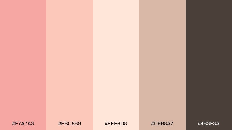
HEX: #F7A7A3 #FBC8B9 #FFE6D8 #D9B8A7 #4B3F3A
Mood: soft, optimistic, airy
Best for: beauty branding and landing pages
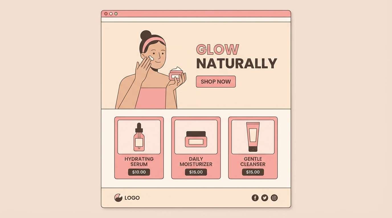
Soft morning light and sheer blush tones make this feel fresh and welcoming. It works beautifully as a salmon peach color palette for skincare, wellness, and gentle lifestyle brands. Pair it with warm off-white layouts and use the deep cocoa as your primary text color for contrast. Tip: keep salmon as the hero color and reserve the darker shade for buttons and headings.
Image example of sunlit blush generated using media.io
Media.io is an online AI studio for creating and editing video, image, and audio in your browser.

2) Coastal Apricot
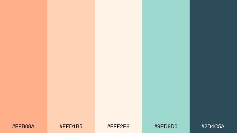
HEX: #FFB08A #FFD1B5 #FFF2E6 #9ED9D0 #2D4C5A
Mood: breezy, beachy, clean
Best for: travel social ads and resort banners
Breezy apricot paired with sea-glass teal evokes a calm shoreline at golden hour. These tones shine in airy banners, carousels, and resort promos where you want warmth without heaviness. Keep teal for calls to action and use the deep blue-gray for readable overlays on photos or gradients. Tip: a subtle peach-to-cream gradient makes a great background for headlines.
Image example of coastal apricot generated using media.io

3) Rosewater Latte
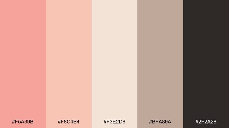
HEX: #F5A39B #F8C4B4 #F3E2D6 #BFA89A #2F2A28
Mood: cozy, café, understated
Best for: coffee shop menus and packaging labels
Cozy rosewater and creamy latte shades create a relaxed, handmade feel. The mix is ideal for menus, bakery labels, and small-batch packaging where you want warmth and legibility. Pair it with textured paper or subtle grain, and let near-black carry your ingredient text. Tip: use the mid taupe as a divider line color to keep layouts soft.
Image example of rosewater latte generated using media.io
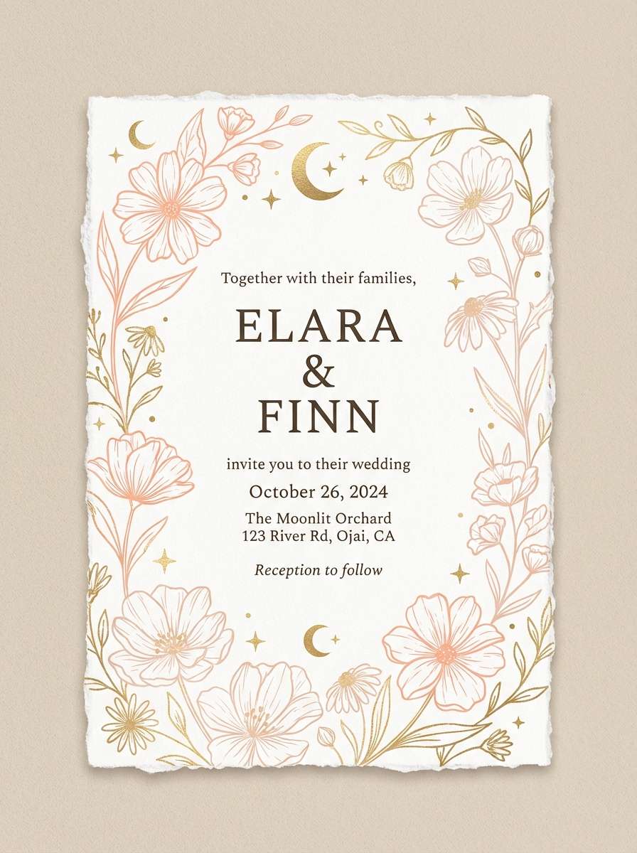
4) Desert Bloom
HEX: #FF9E8B #FFC1A8 #F2D6C9 #C2B280 #5B4A3A
Mood: sunbaked, earthy, romantic
Best for: boho wedding invitations
Sunbaked peach and sand tones feel like desert blooms after a warm rain. They suit invitations and stationery that need a romantic, earthy finish without looking dull. Pair the sand and olive-tan with plenty of cream space, then anchor details in the deep brown. Tip: add a thin border in #C2B280 to frame the layout elegantly.
Image example of desert bloom generated using media.io
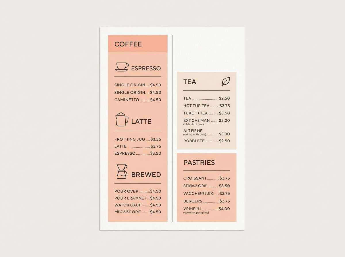
5) Peachy Minimal
HEX: #F7A39A #FAD5C7 #FFF7F1 #C8C1BA #1F1E1D
Mood: minimal, modern, calm
Best for: UI dashboards and SaaS onboarding
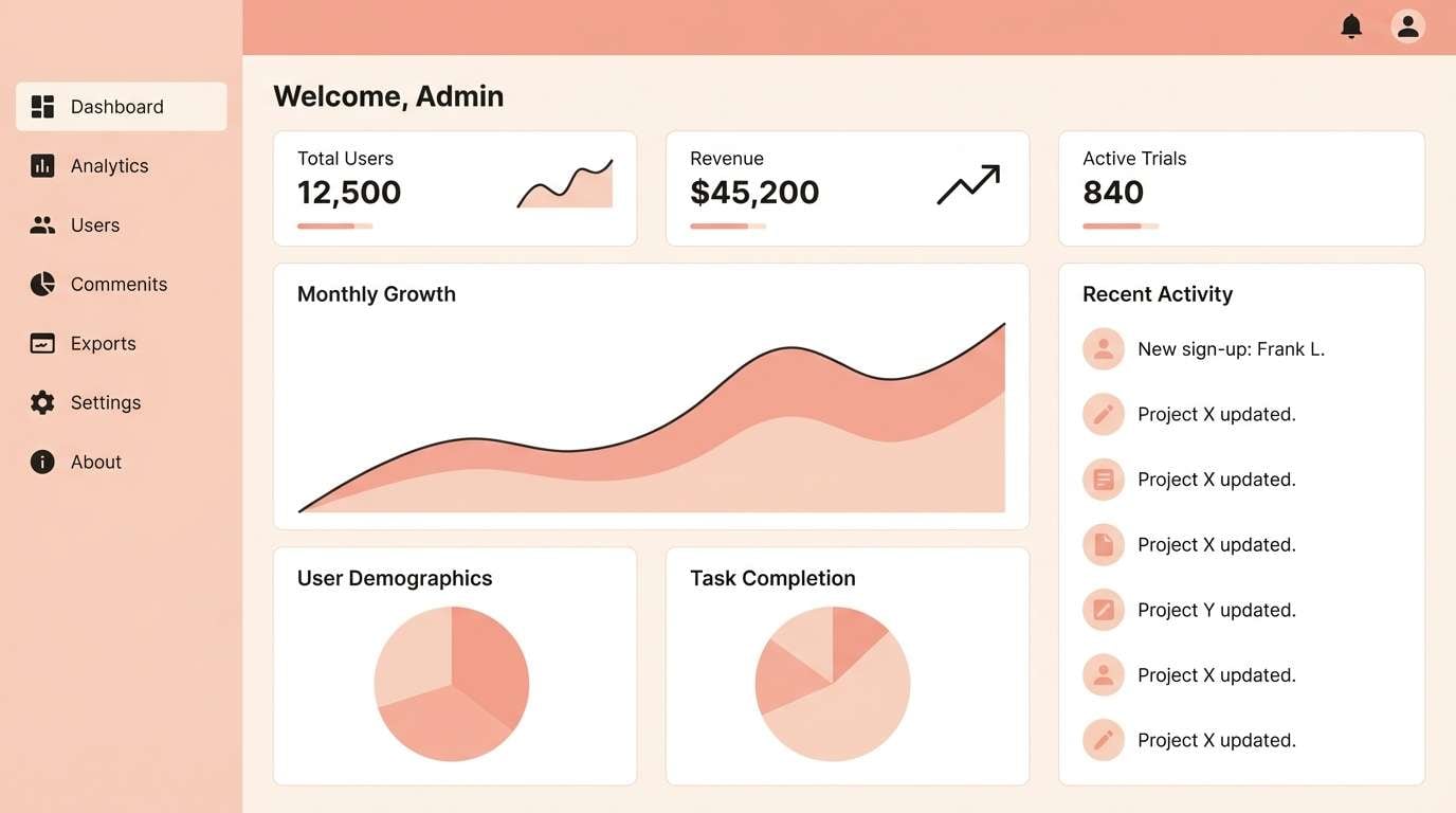
Clean peach tints and soft grays create a modern calm that reads well on screens. This works as a salmon peach color combination for onboarding flows, pricing pages, and lightweight dashboards. Use near-white for panels, peach for highlights, and the charcoal for all critical text and icons. Tip: keep peach to one accent per screen to avoid visual fatigue.
Image example of peachy minimal generated using media.io
6) Garden Sorbet
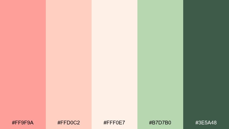
HEX: #FF9F9A #FFD0C2 #FFF0E7 #B7D7B0 #3E5A48
Mood: springy, fresh, wholesome
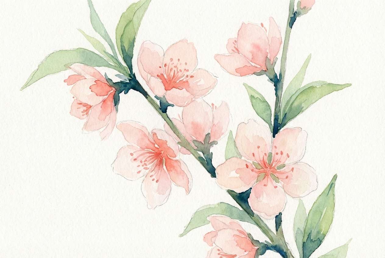
Best for: botanical prints and watercolor art
Spring sorbet tones with leafy greens feel lively, gentle, and naturally optimistic. They fit botanical prints, labels for natural goods, and seasonal campaign graphics. Let the green shades carry stems and foliage while peach handles petals and highlights. Tip: keep outlines soft and slightly desaturated so the palette stays airy.
Image example of garden sorbet generated using media.io
7) Vintage Postcard
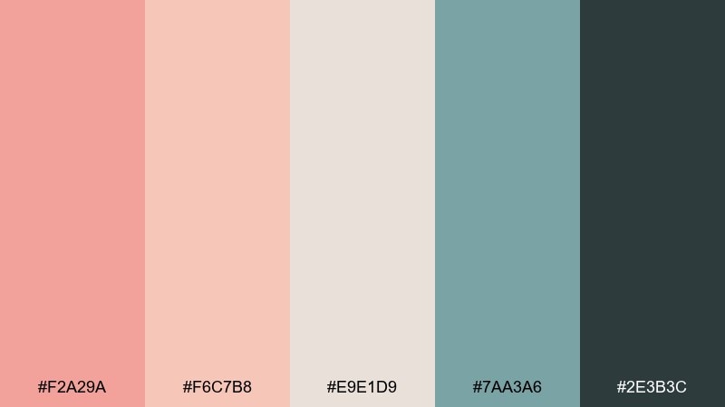
HEX: #F2A29A #F6C7B8 #E9E1D9 #7AA3A6 #2E3B3C
Mood: nostalgic, muted, artsy
Best for: editorial layouts and lookbooks
Muted peach and dusty teal evoke a well-loved postcard with sun-faded ink. These tones work nicely for magazine spreads, lookbooks, and brand stories that lean vintage. Pair the neutral paper shade with generous margins, then use teal for pull quotes or section markers. Tip: keep photos warm and slightly desaturated to match the palette.
Image example of vintage postcard generated using media.io
8) Coral Clay
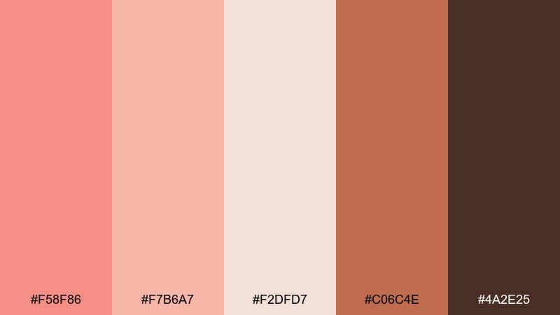
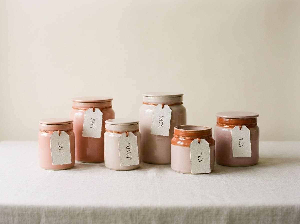
HEX: #F58F86 #F7B6A7 #F2DFD7 #C06C4E #4A2E25
Mood: artisanal, warm, grounded
Best for: ceramics branding and product tags
Warm coral and clay browns feel handmade, tactile, and earthy. The tones are perfect for craft brands, ceramics studios, and rustic product tags. Let the clay orange support secondary elements like badges, while deep brown handles logos and small text. Tip: pair with uncoated stock or subtle paper texture for a true studio look.
Image example of coral clay generated using media.io
9) Champagne Sunset
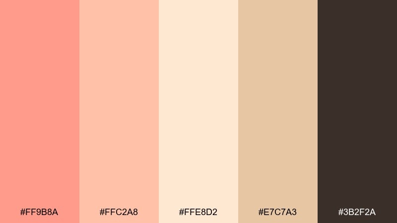
HEX: #FF9B8A #FFC2A8 #FFE8D2 #E7C7A3 #3B2F2A
Mood: glowy, elegant, celebratory
Best for: event posters and gala invites
Glowy peach and champagne neutrals bring a polished sunset elegance. Use it for event posters, gala invites, and premium announcements that need warmth and class. Pair the champagne shades with dark espresso typography for crisp readability. Tip: a thin foil-like line in #E7C7A3 adds instant luxury without overpowering the design.
Image example of champagne sunset generated using media.io
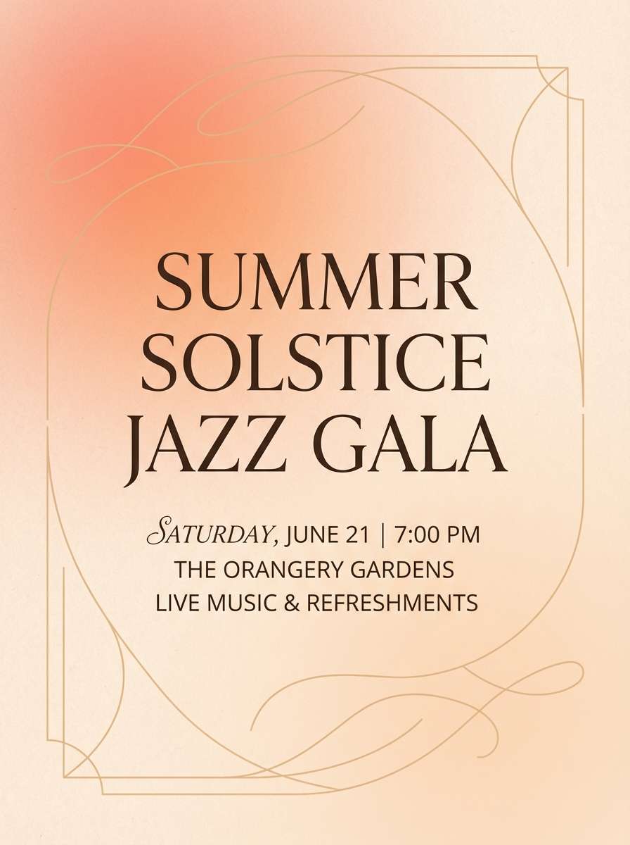
10) Playroom Peach
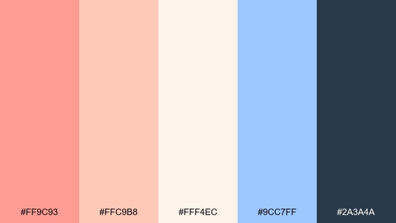
HEX: #FF9C93 #FFC9B8 #FFF4EC #9CC7FF #2A3A4A
Mood: playful, friendly, bright
Best for: kids app UI and onboarding screens
Cheery peach with a pop of soft blue feels playful and safe, like a sunny playroom. It fits kids apps, educational products, and friendly onboarding screens. Use peach for progress states and stickers, while blue acts as a clear action color that still feels gentle. Tip: keep icon shapes rounded to match the palette's softness.
Image example of playroom peach generated using media.io
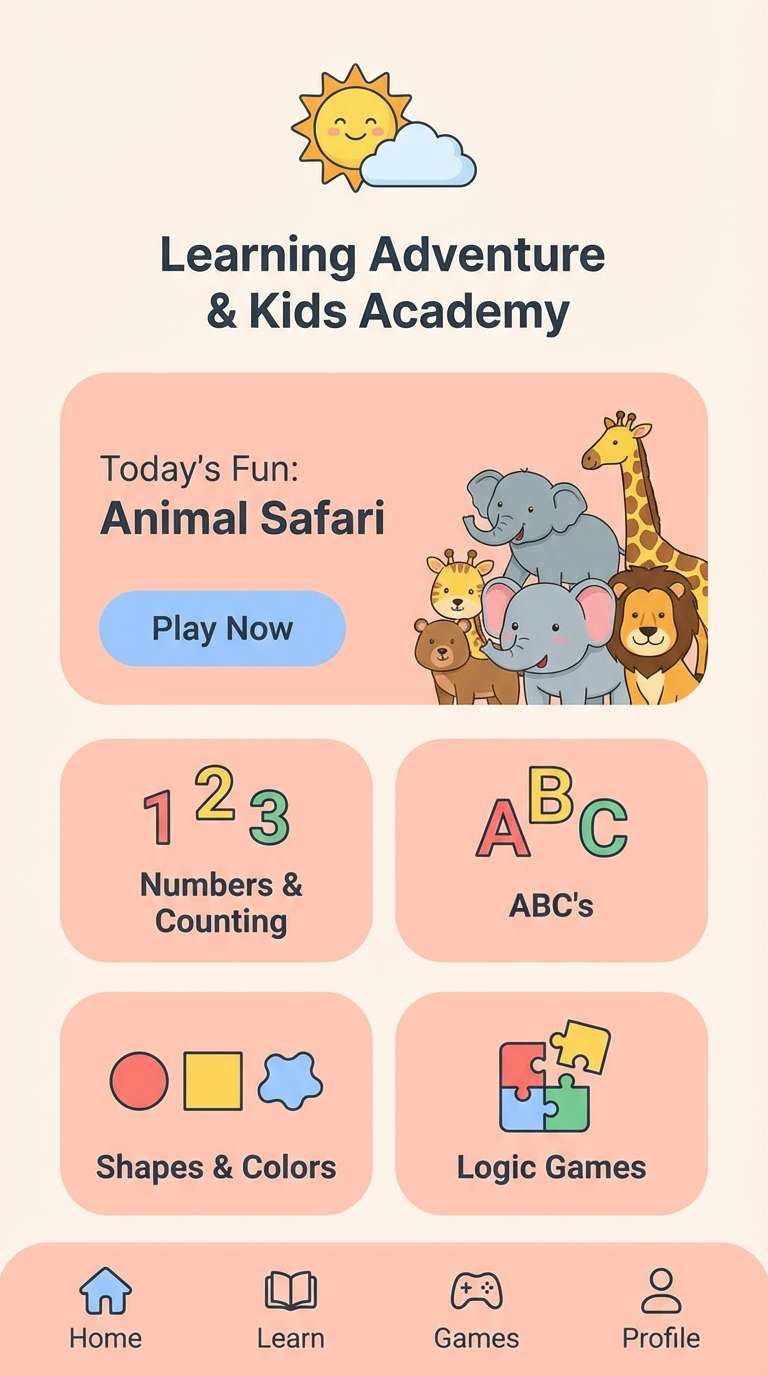
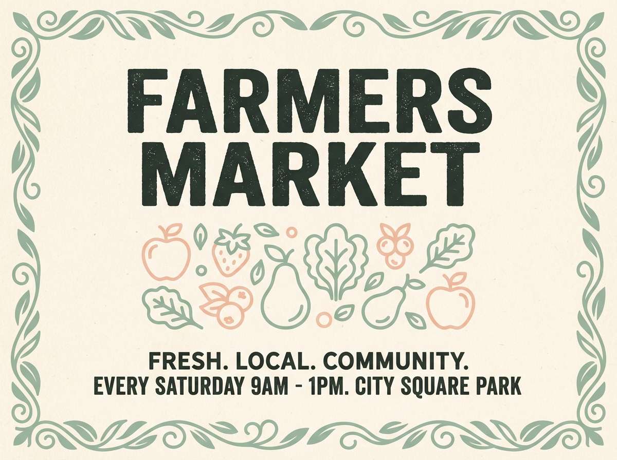
11) Market Morning
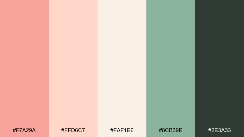
HEX: #F7A29A #FFD6C7 #FAF1E6 #8CB39E #2E3A33
Mood: wholesome, local, organic
Best for: farmers market flyers
Warm peach and leafy green feel like fresh produce laid out at a morning market. These colors suit flyers, signage, and community event graphics that need to look inviting and trustworthy. Pair the creamy base with dark green text for strong readability, and use peach as the headline highlight. Tip: add simple stamp-style icons to keep it friendly and handcrafted.
Image example of market morning generated using media.io
12) Evening Rosé
HEX: #F38C8A #F7B7B0 #F2D7D4 #6B4B5B #1F1B1E
Mood: moody, romantic, chic
Best for: cocktail bar menus and promos
Rosé pinks with plum and near-black feel intimate, like candlelight in a lounge. This palette is great for cocktail menus, night-event promos, and chic brand posts. Keep the pale blush as a soft background, then let plum own dividers and headings. Tip: use black sparingly for small text so the design stays velvety, not harsh.
Image example of evening rosé generated using media.io
13) Nordic Peach
HEX: #F6A09A #FAD1C8 #F6F3EF #A9B3B7 #2B2F33
Mood: scandi, balanced, tidy
Best for: interior mood boards and decor shops
Soft peach meets cool gray like a Nordic room with warm sunlight on pale walls. Use it for interior mood boards, decor store branding, or calm ecommerce layouts. Pair the warm blush with lots of off-white space, and use slate for navigation and product names. Tip: a single peach accent cushion or button creates a clean focal point.
Image example of nordic peach generated using media.io

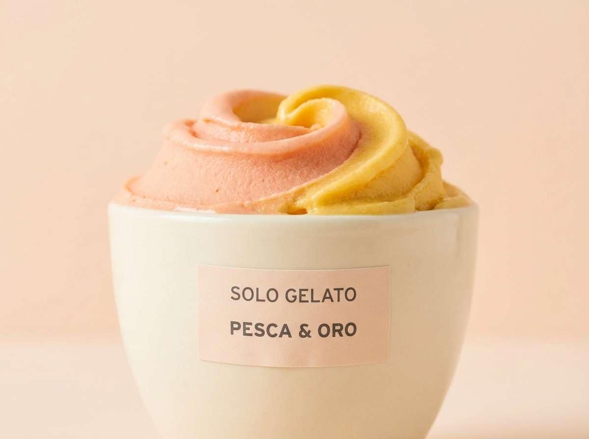
14) Gelato Pop
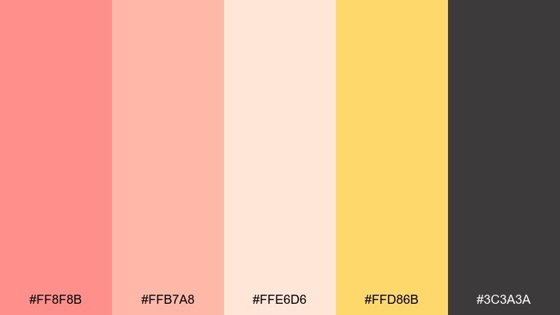
HEX: #FF8F8B #FFB7A8 #FFE6D6 #FFD86B #3C3A3A
Mood: fun, youthful, sunny
Best for: dessert shop ads and signage
Bright peach with a sunny yellow accent feels like gelato on a hot day. It works well for signage, limited-time offers, and cheerful social posts that need instant appetite appeal. Use yellow for price tags or stickers, and keep the charcoal for legible text on light backgrounds. Tip: bold rounded type pairs perfectly with these sweet tones.
Image example of gelato pop generated using media.io
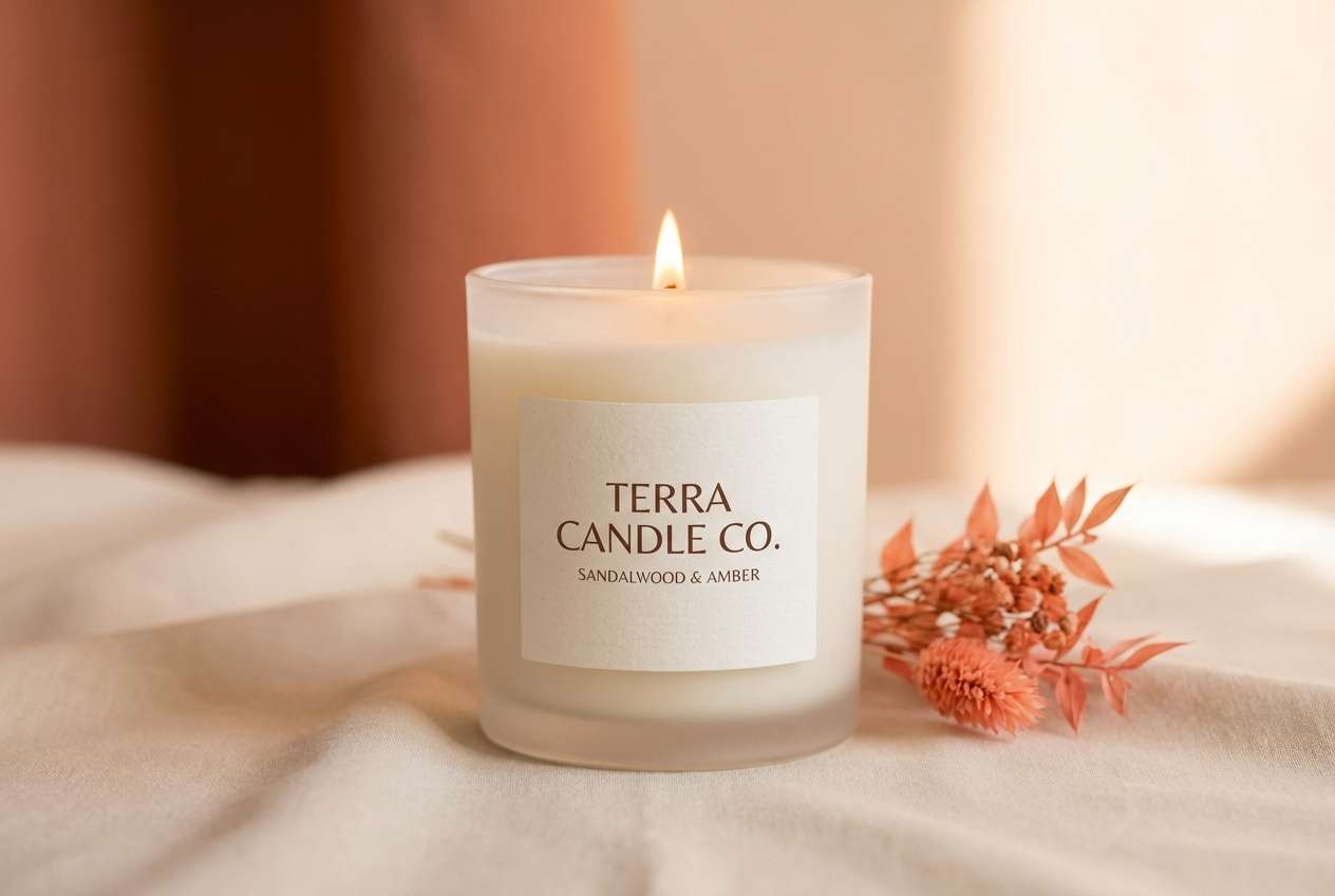
15) Autumn Nectar
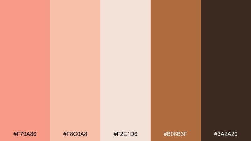
HEX: #F79A86 #F8C0A8 #F2E1D6 #B06B3F #3A2A20
Mood: harvest, warm, comforting
Best for: seasonal product launches
Warm nectar peach and toasted brown feel like baked treats and falling leaves. These tones are strong for seasonal launches, cozy newsletters, and fall-themed promotions. Pair the creamy neutral with rich brown for headlines, and let the caramel shade frame product highlights. Tip: keep backgrounds light so the deeper browns read as premium, not heavy.
Image example of autumn nectar generated using media.io
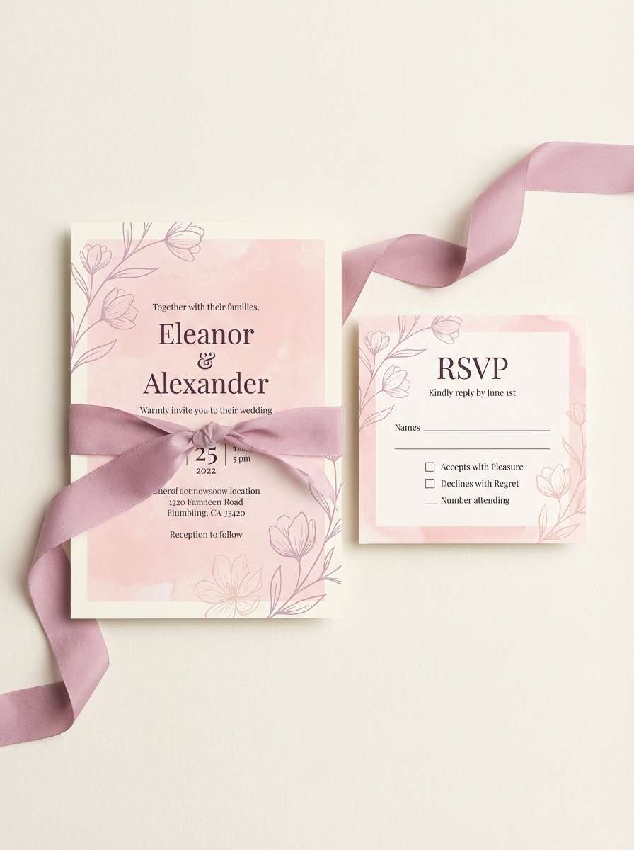
16) Sakura Peach
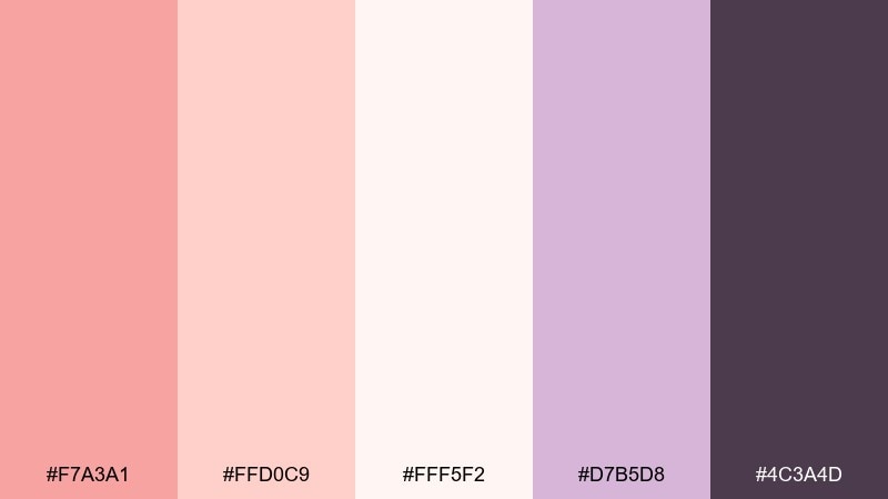
HEX: #F7A3A1 #FFD0C9 #FFF5F2 #D7B5D8 #4C3A4D
Mood: dreamy, delicate, romantic
Best for: spring wedding stationery
Delicate peach and lilac feel like petals drifting through soft air. The pairing works for spring stationery, bridal showers, and gentle brand moments. Use lilac as a secondary accent for monograms and small motifs, while the deep plum handles names and details. Tip: keep embellishments light and line-based to avoid overpowering the pastels.
Image example of sakura peach generated using media.io
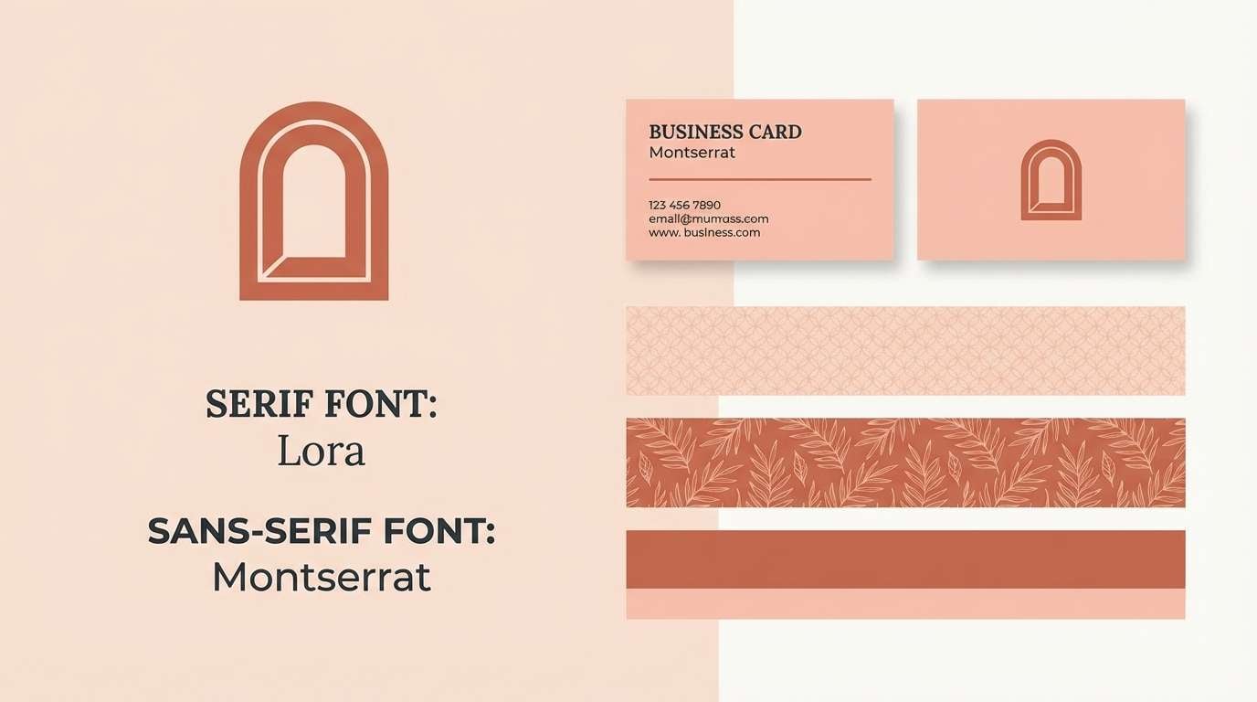
17) Modern Terracotta Peach
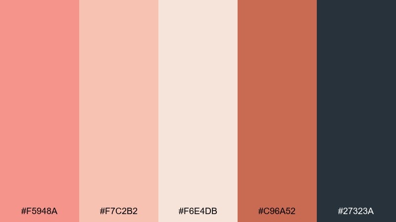
HEX: #F5948A #F7C2B2 #F6E4DB #C96A52 #27323A
Mood: modern, confident, warm
Best for: brand identities and logo systems
Confident terracotta and peach tones feel contemporary, like modern architecture in warm light. These salmon peach color combinations are excellent for identity systems where you want warmth plus structure. Use the deep slate for typography and grids, then bring in terracotta for badges and secondary marks. Tip: keep logo marks in one dark color and let peach live in supporting graphics.
Image example of modern terracotta peach generated using media.io
18) Peach and Ink
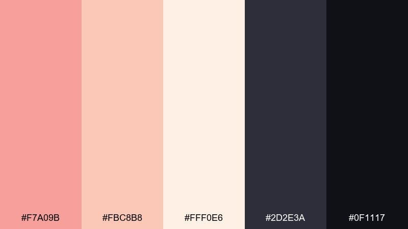
HEX: #F7A09B #FBC8B8 #FFF0E6 #2D2E3A #0F1117
Mood: bold, editorial, high-contrast
Best for: fashion posters and typography-led ads
Soft peach against inky darks creates a striking, editorial contrast. It is a strong salmon peach color combination for fashion drops, typography-led ads, and dramatic hero sections. Keep the light peach for backgrounds and large blocks, then use the deep inks for headlines and sharp lines. Tip: avoid mid-gray text here and stick to near-black for crisp readability.
Image example of peach and ink generated using media.io

19) Tropical Peach Fizz
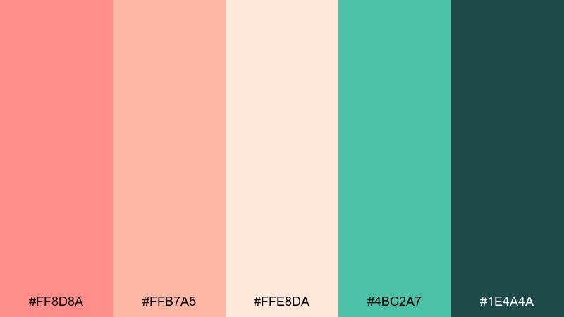
HEX: #FF8D8A #FFB7A5 #FFE8DA #4BC2A7 #1E4A4A
Mood: fresh, tropical, energetic
Best for: summer drink packaging
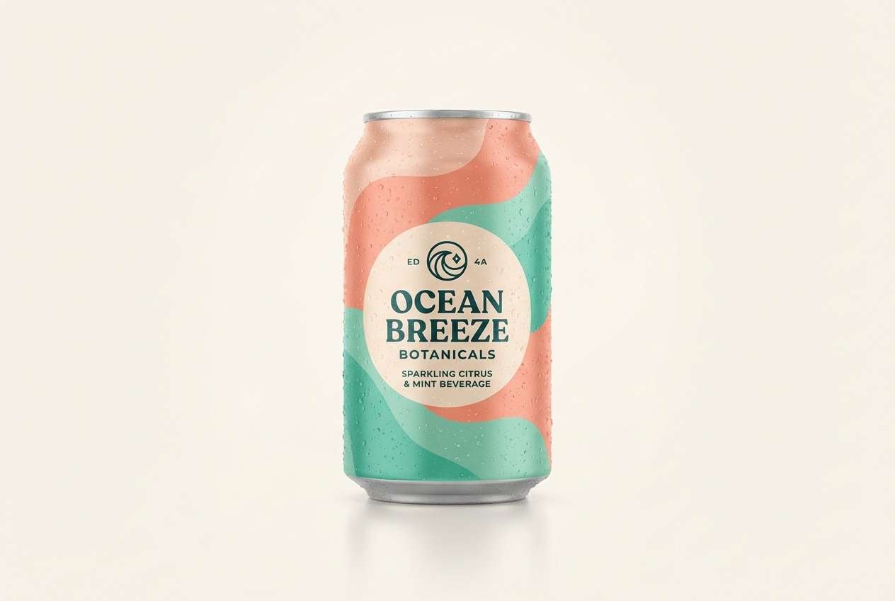
Juicy peach with minty teal feels like a sparkling summer drink. These salmon peach color combinations pop on cans, labels, and promotional key art for seasonal beverages. Use teal for flavor cues and icons, while deep green-blue anchors the brand mark for a more premium finish. Tip: keep the background creamy so the bright accents stay vibrant and readable.
Image example of tropical peach fizz generated using media.io
20) Soft Clay Neutrals
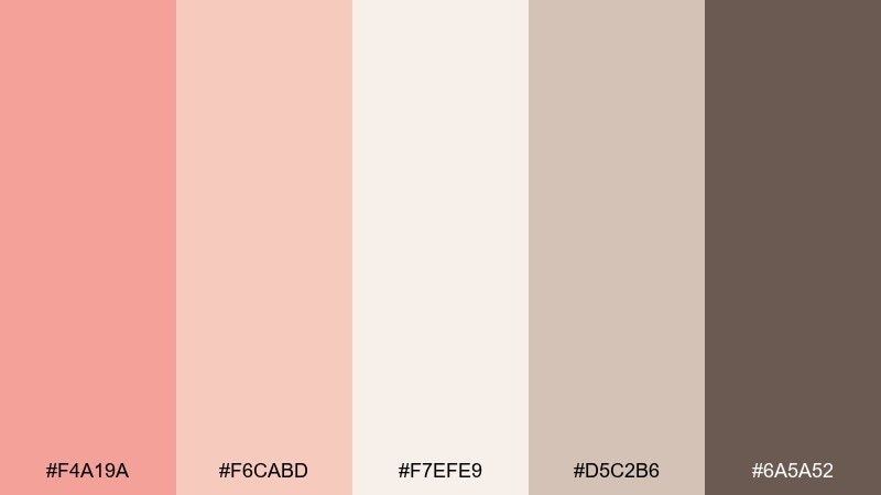
HEX: #F4A19A #F6CABD #F7EFE9 #D5C2B6 #6A5A52
Mood: calm, neutral, timeless
Best for: portfolio sites and minimalist blogs
Quiet clay neutrals feel timeless, like linen fabric and warm plaster walls. The tones suit portfolios, minimalist blogs, and calm ecommerce where content should lead. Use the lightest shade as your base, taupe for UI dividers, and the deeper brown for headings. Tip: add subtle shadows rather than strong borders to keep the look soft.
Image example of soft clay neutrals generated using media.io
21) Peach Blossom Night
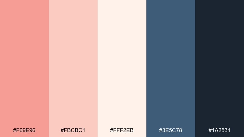
HEX: #F69E96 #FBCBC1 #FFF2EB #3E5C78 #1A2531
Mood: fresh, serene, modern
Best for: app splash screens and hero headers
Fresh peach against deep dusk blues feels serene, like blossoms under evening sky. This mix is a smart salmon peach color palette choice for splash screens and hero headers where you want warmth plus depth. Use navy tones for navigation and icons, then let the peach highlight primary actions. Tip: try a subtle peach glow behind the main headline for a modern, soft focus effect.
Image example of peach blossom night generated using media.io

22) Apricot Editorial
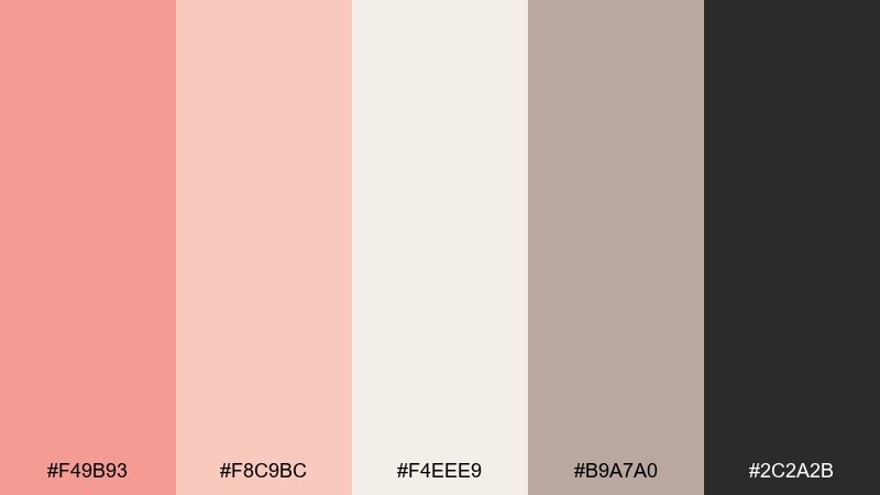
HEX: #F49B93 #F8C9BC #F4EEE9 #B9A7A0 #2C2A2B
Mood: refined, calm, print-ready
Best for: magazine covers and brand stories
Refined apricot and paper neutrals feel like a premium print cover with soft ink. The palette supports long-form brand stories, magazine covers, and elegant announcements. Use the paper base for breathing room and keep typography in the near-black for crisp contrast. Tip: reserve the warmer peach for a single highlight element, like a masthead bar or callout circle.
Image example of apricot editorial generated using media.io
What Colors Go Well with Salmon Peach?
Salmon peach looks effortless with warm neutrals like cream, oat, beige, and soft taupe—these keep layouts bright while preserving that cozy warmth.
For contrast, pair it with deep anchors such as espresso brown, charcoal, slate, or navy. Dark typography on a peach-tinted background usually improves readability and makes the palette feel more premium.
If you want a fresher, more playful direction, try cool accents like sea-glass teal, dusty blue, or soft periwinkle to balance the warmth without clashing.
How to Use a Salmon Peach Color Palette in Real Designs
In branding, let salmon peach act as the “emotion color” (hero blocks, packaging fields, highlights), then use a deep neutral for logos and text to keep the system flexible.
In UI design, salmon peach works best as an accent: buttons, active states, progress indicators, or small badges. Keep backgrounds near-white or very light peach to avoid tinting everything and reducing hierarchy.
For print, salmon peach pairs beautifully with paper-like bases and subtle textures. Consider using the mid-tone neutrals for rules, borders, and section dividers so your layout stays soft and cohesive.
Create Salmon Peach Palette Visuals with AI
If you have HEX codes but need fast visuals (landing page mockups, posters, product ads, or editorial layouts), generating palette-based images is a quick way to validate the vibe.
With Media.io, you can turn a palette prompt into consistent creative directions—then iterate by swapping a single accent (like teal, plum, or navy) while keeping salmon peach as the main character.
Start with one palette above, copy the prompt style, and adjust the subject (UI, packaging, invitation, banner) to match your project.
Salmon Peach Color Palette FAQs
-
What is the best text color for a salmon peach background?
Charcoal, espresso brown, and near-black usually provide the cleanest contrast on salmon peach backgrounds. If the background is very light (peach-cream), a deep slate or dark brown keeps the look warm while staying readable. -
Is salmon peach the same as coral?
Not exactly. Coral is typically more saturated and red-forward, while salmon peach is softer, slightly creamy, and often closer to pastel peach with a salmon tint. -
What accent colors pair well with salmon peach in UI design?
Sea-glass teal, dusty blue, and muted navy are popular accents because they balance warmth with cool clarity. For a minimal UI, pair salmon peach with off-white and a single dark neutral for type. -
How do I keep a salmon peach palette from looking too “sweet” or childish?
Add a strong anchor color (charcoal, ink, slate, or espresso) and reduce the number of pastel blocks on one screen. Using clean typography and structured spacing also makes the palette feel more editorial and modern. -
Does salmon peach work for luxury branding?
Yes—especially when combined with champagne neutrals, cocoa/espresso text, and minimal layouts. Keep the peach as a controlled highlight and rely on dark typography for a premium finish. -
Which colors go well with salmon peach for weddings and invitations?
Cream and sand neutrals create a classic romantic base, while lilac, dusty rose, or olive-tan add a soft seasonal twist. Deep plum or brown works well for names and details. -
How can I generate consistent images using salmon peach HEX codes?
Use prompts that explicitly list your dominant colors and the role of each shade (background, accents, text). Keeping the same subject and layout style while changing only one color makes comparisons fast and consistent.


