

Persian blue is a vivid, modern deep blue that instantly adds confidence to branding, UI, and print. It reads “premium” without feeling old-fashioned, especially when balanced with soft neutrals or one warm accent.
Below are 20+ curated Persian blue color palette ideas with HEX codes, plus practical tips for contrast, hierarchy, and real-world usage across screens and paper.
In this article
- Why Persian Blue Palettes Work So Well
-
- midnight ceramic
- cobalt metro ui
- saffron ink contrast
- glacier electric
- rose quartz night
- indigo sandstone
- neon harbor
- paperwhite blueprint
- berry observatory
- citrus porcelain
- stormglass minimal
- lavender current
- rust and royal
- seaside tilework
- graphite iris
- gold leaf regency
- mossy observatory
- apricot dusk
- arctic signal
- clay ink journal
- pearl and ultramarine
- velvet theater
- sunlit delft
- What Colors Go Well with Persian Blue?
- How to Use a Persian Blue Color Palette in Real Designs
- Create Persian Blue Palette Visuals with AI
Why Persian Blue Palettes Work So Well
Persian blue sits in a “sweet spot” between royal confidence and contemporary clarity. It’s saturated enough to feel energetic, yet deep enough to communicate trust—making it a strong anchor for both expressive brands and serious products.
Because it has a cool, clean bias, it pairs naturally with paper-like whites, slate grays, and near-blacks for legible hierarchy. Add a single warm accent (gold, saffron, rust, apricot) and Persian blue instantly looks more human and design-forward.
In print, it can feel ink-rich and tactile; on screens, it’s crisp and high-contrast. That flexibility is why Persian blue palettes scale from minimal UI systems to bold posters without losing identity.
20+ Persian Blue Color Palette Ideas (with HEX Codes)
1) Midnight Ceramic
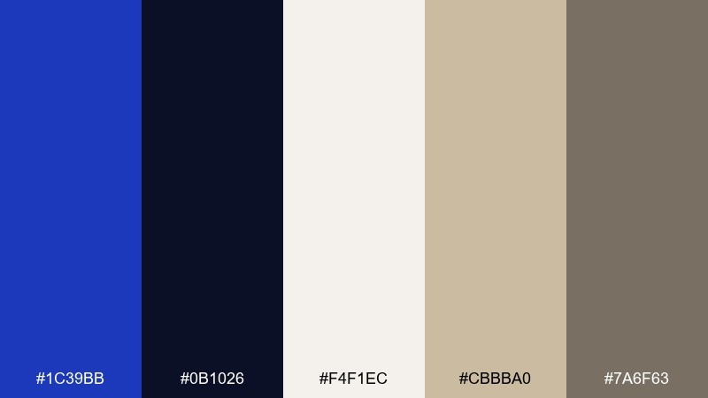
HEX: #1C39BB #0B1026 #F4F1EC #CBBBA0 #7A6F63
Mood: moody, refined, museum-like
Best for: luxury brand identity and packaging
Moody, kiln-fired blues meet gallery neutrals for a refined, museum-like feel. Use the deep navy as the canvas, then let persian blue carry logos, lines, and foil-style accents. Cream keeps it premium while the warm stone tones prevent the mix from feeling cold. Tip: print on uncoated stock to make the blues feel richer and more tactile.
Image example of midnight ceramic generated using media.io

Media.io is an online AI studio for creating and editing video, image, and audio in your browser.

2) Cobalt Metro UI
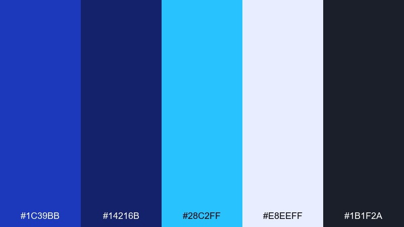
HEX: #1C39BB #14216B #28C2FF #E8EEFF #1B1F2A
Mood: clean, tech-forward, confident
Best for: 2D SaaS dashboard UI mockup
Clean, tech-forward blues evoke transit maps and crisp night lighting. Keep the near-black for navigation, then use persian blue for primary buttons and active states. Sky cyan is ideal for charts and micro-highlights without overpowering the interface. Tip: reserve the brightest accent for one action per screen to maintain clarity.
Image example of cobalt metro ui generated using media.io
3) Saffron Ink Contrast
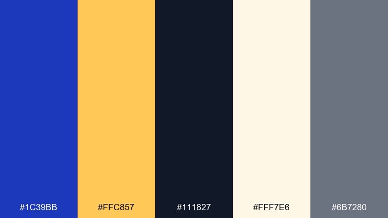
HEX: #1C39BB #FFC857 #111827 #FFF7E6 #6B7280
Mood: bold, editorial, energetic
Best for: poster and event flyer design
Bold ink blues with saffron warmth create an energetic, editorial punch. These persian blue color combinations work best when the yellow is used as a callout, not a background. Anchor type in near-black for readability and use the soft cream to keep margins airy. Tip: try oversized numerals in blue with saffron underlines for instant hierarchy.
Image example of saffron ink contrast generated using media.io
4) Glacier Electric
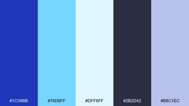
HEX: #1C39BB #76D6FF #DFF6FF #2B2D42 #B8C1EC
Mood: fresh, airy, futuristic
Best for: app onboarding screens
Fresh, airy blues feel like glacial light and polished glass. Pair persian blue with icy tints for gradients, cards, and friendly onboarding illustrations. The charcoal keeps text accessible while the lavender-blue adds softness to empty states. Tip: use a subtle top-to-bottom gradient for depth without adding extra colors.
Image example of glacier electric generated using media.io

5) Rose Quartz Night
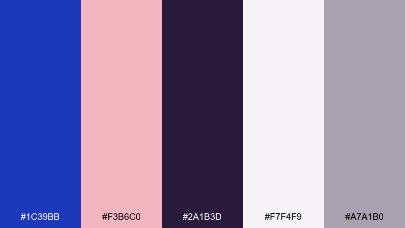
HEX: #1C39BB #F3B6C0 #2A1B3D #F7F4F9 #A7A1B0
Mood: romantic, modern, slightly dramatic
Best for: wedding invitation suite
Romantic blush and night-plum tones make the blue feel elegant rather than corporate. Use persian blue for monograms and borders, then set body text in the deep plum for a softer contrast. The pale paper white helps the pink read as refined, not sugary. Tip: apply blue only to key lines like names and dates for a calm, premium look.
Image example of rose quartz night generated using media.io

6) Indigo Sandstone
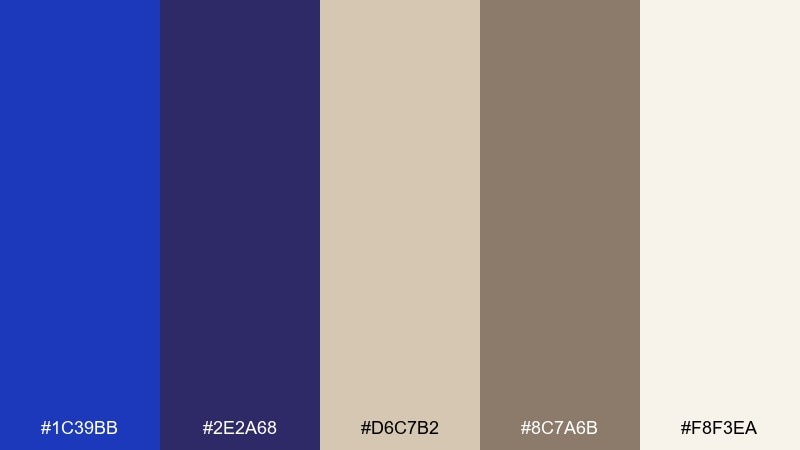
HEX: #1C39BB #2E2A68 #D6C7B2 #8C7A6B #F8F3EA
Mood: grounded, architectural, timeless
Best for: interior paint and decor mood board
Grounded indigo and sandstone neutrals evoke old cities, carved stone, and shadowed archways. Build the room with creamy walls and sandy textiles, then bring persian blue in through accent cabinetry or a statement rug. The muted brown keeps the palette from looking too sharp in natural light. Tip: repeat the blue in at least two small objects to make it feel intentional.
Image example of indigo sandstone generated using media.io

7) Neon Harbor

HEX: #1C39BB #00E5FF #00C853 #0A0F1E #E6F7FF
Mood: nightlife, high-contrast, punchy
Best for: music festival social ad
Night harbor vibes with neon highlights feel loud, modern, and kinetic. Keep the background nearly black, then use persian blue as the main block color behind titles. Cyan and green should stay as sharp accents for dates, stickers, and icons. Tip: add subtle glow effects only to the neon elements to keep type crisp.
Image example of neon harbor generated using media.io

8) Paperwhite Blueprint
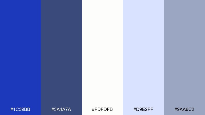
HEX: #1C39BB #3A4A7A #FDFDFB #D9E2FF #9AA6C2
Mood: calm, orderly, professional
Best for: business report and presentation slides
Orderly blueprint tones feel calm, credible, and easy to scan. Use persian blue for section headers and key charts, then lean on pale blue blocks for callouts. The grayed slate tones soften contrast so dense pages never feel aggressive. Tip: limit full-strength blue to one level of hierarchy to keep slides clean.
Image example of paperwhite blueprint generated using media.io

9) Berry Observatory
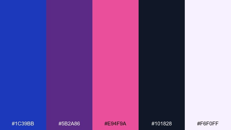
HEX: #1C39BB #5B2A86 #E94F9A #101828 #F6F0FF
Mood: cosmic, playful, creative
Best for: album cover artwork
Cosmic berry tones around a deep sky base feel playful and creative. Let persian blue define the background field, then layer magenta elements for focal points and energy. The violet supports transitions so gradients look intentional rather than random. Tip: keep text in near-black or off-white depending on placement for consistent legibility.
Image example of berry observatory generated using media.io

10) Citrus Porcelain
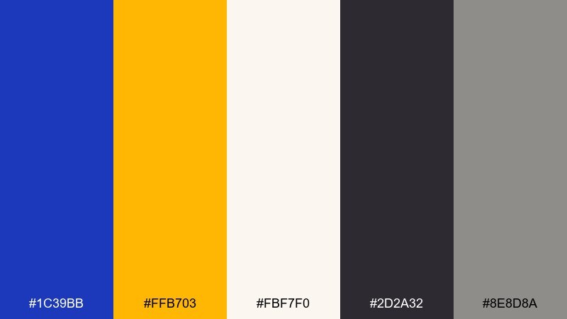
HEX: #1C39BB #FFB703 #FBF7F0 #2D2A32 #8E8D8A
Mood: cheerful, polished, modern-retro
Best for: cafe menu and signage
Cheerful citrus against porcelain neutrals brings a modern-retro charm. Use persian blue for headings and rule lines, then let the amber pop for prices and specials. The soft off-white keeps the menu friendly while the charcoal maintains readability. Tip: repeat the amber in tiny icons so the accent feels cohesive across sections.
Image example of citrus porcelain generated using media.io

11) Stormglass Minimal
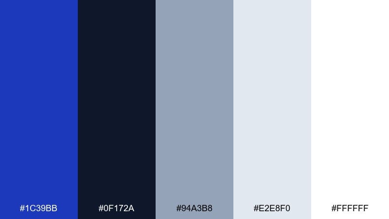
HEX: #1C39BB #0F172A #94A3B8 #E2E8F0 #FFFFFF
Mood: minimal, serious, high-contrast
Best for: fintech landing page
Stormy darks and cool grays create a minimal, serious look that still feels modern. Set the page structure in slate and off-white, then use persian blue for the main CTA and key metrics. The high contrast supports accessibility without looking overly loud. Tip: use thin dividers in the light gray instead of heavy borders to keep it premium.
Image example of stormglass minimal generated using media.io

12) Lavender Current

HEX: #1C39BB #6C63FF #C7D2FE #FAFAFF #3B3B4F
Mood: soft, youthful, optimistic
Best for: beauty brand social templates
Soft lavender currents make the blue feel youthful and optimistic. Treat persian blue as the anchor for logos, then use violet and pale periwinkle for backgrounds and story frames. The near-charcoal helps captions stay readable over light gradients. Tip: keep gradients subtle and use solid blocks behind text for consistency.
Image example of lavender current generated using media.io

13) Rust and Royal
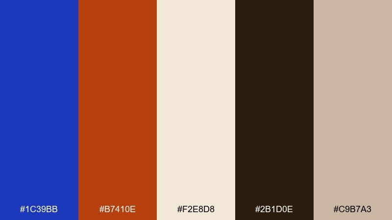
HEX: #1C39BB #B7410E #F2E8D8 #2B1D0E #C9B7A3
Mood: heritage, warm, bold
Best for: craft packaging and labels
Heritage warmth from rust tones makes the royal blue feel bolder and more handcrafted. These persian blue color combinations shine on labels where the blue carries the brand mark and the rust supports badges or stamp details. Cream paper and dark brown keep the mix earthy and premium. Tip: use the rust in small blocks so it reads as spice, not noise.
Image example of rust and royal generated using media.io

14) Seaside Tilework
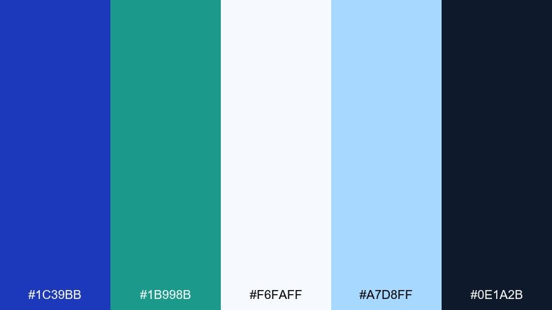
HEX: #1C39BB #1B998B #F6FAFF #A7D8FF #0E1A2B
Mood: breezy, coastal, modern
Best for: travel brochure layout
Breezy coastal tones recall glazed tiles, sea glass, and crisp sunlit shadows. Use persian blue for section headers and map pins, then bring teal into icons and highlights. The pale blues keep spreads airy while the deep night tone anchors captions. Tip: keep photos warm and let the palette guide only the layout elements for balance.
Image example of seaside tilework generated using media.io

15) Graphite Iris
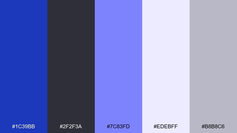
HEX: #1C39BB #2F2F3A #7C83FD #EDEBFF #B8B8C6
Mood: sleek, modern, understated
Best for: editorial magazine spread
Sleek graphite with iris highlights feels modern, understated, and slightly futuristic. Use the dark gray for body copy and grids, then apply persian blue sparingly to pull quotes and section markers. The pale lilac keeps negative space soft without turning sugary. Tip: keep accent use consistent by assigning one highlight color per column.
Image example of graphite iris generated using media.io
16) Gold Leaf Regency
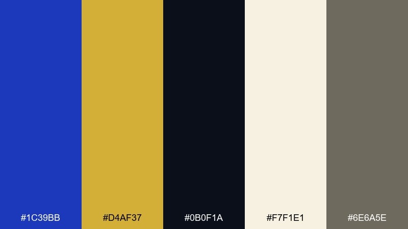
HEX: #1C39BB #D4AF37 #0B0F1A #F7F1E1 #6E6A5E
Mood: opulent, formal, ceremonial
Best for: award certificate design
Opulent regency tones suggest gold leaf, formal stationery, and deep night ink. Build the layout on warm parchment and use persian blue for borders and seals. Gold should be a highlight color for medallions and small rules, not large fills. Tip: if printing, consider spot gold or a metallic ink effect for the accent elements.
Image example of gold leaf regency generated using media.io

17) Mossy Observatory

HEX: #1C39BB #2D6A4F #0B1320 #E9F5DB #A3B18A
Mood: natural, scholarly, calm
Best for: university brochure and stationery
Natural greens around a deep blue feel scholarly, calm, and quietly confident. Use persian blue for crest elements and headers, then let moss tones support charts, sidebars, and icons. The pale sage background makes long-form pages feel gentle on the eyes. Tip: pair with a serif headline font to emphasize the academic mood.
Image example of mossy observatory generated using media.io

18) Apricot Dusk
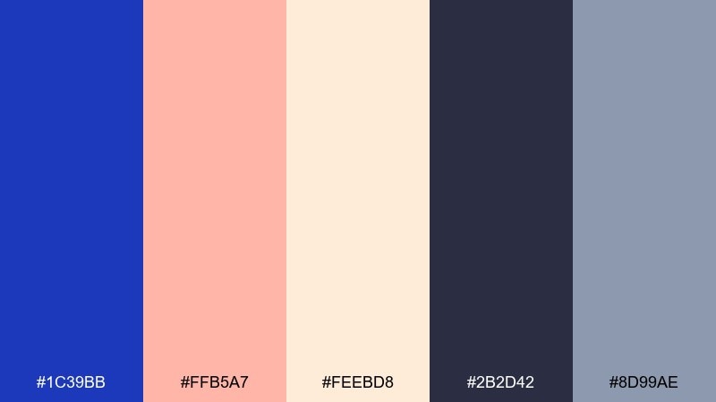
HEX: #1C39BB #FFB5A7 #FEEBD8 #2B2D42 #8D99AE
Mood: soft, friendly, contemporary
Best for: brand mood board for lifestyle startups
Soft apricot dusk tones make the blue feel approachable and contemporary. Use persian blue for the logotype and navigation, then bring in apricot for highlights like tags or feature badges. The warm cream keeps the palette friendly while cool gray supports readable text. Tip: apply apricot in rounded shapes to reinforce a welcoming brand voice.
Image example of apricot dusk generated using media.io

19) Arctic Signal
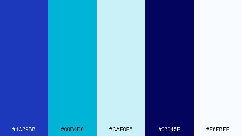
HEX: #1C39BB #00B4D8 #CAF0F8 #03045E #F8FBFF
Mood: crisp, sporty, high-energy
Best for: sports team promotional banner
Crisp arctic blues feel sporty and high-energy, like stadium lights on ice. The palette works as a persian blue color combination when you keep the darkest navy for depth and the cyan for motion lines. Light tints are perfect for backgrounds and subtle textures behind bold typography. Tip: increase letter spacing slightly on white text over dark blues to improve readability.
Image example of arctic signal generated using media.io

20) Clay Ink Journal
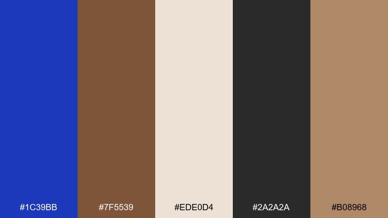
HEX: #1C39BB #7F5539 #EDE0D4 #2A2A2A #B08968
Mood: artisanal, warm, thoughtful
Best for: book cover design
Artisanal clay tones with inky blues feel thoughtful and handmade. Use persian blue for the title block or spine color, while the browns and creams create a tactile paper mood. Dark gray keeps text sharp without the harshness of pure black. Tip: try a subtle grain texture on the cream areas to enhance the craft vibe.
Image example of clay ink journal generated using media.io

21) Pearl and Ultramarine
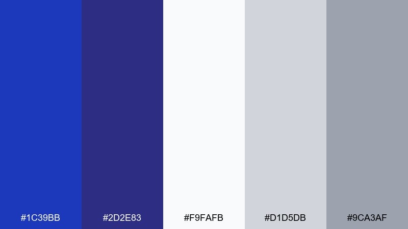
HEX: #1C39BB #2D2E83 #F9FAFB #D1D5DB #9CA3AF
Mood: classic, clean, versatile
Best for: corporate website refresh
Pearl whites and ultramarine tones feel classic, clean, and versatile for day-to-day design work. Use persian blue for links and key UI components, with the grays handling structure and subtle separation. The darker blue supports hover states and depth without needing extra colors. Tip: keep gray backgrounds slightly warm so the blues do not look overly sterile on screens.
Image example of pearl and ultramarine generated using media.io

22) Velvet Theater
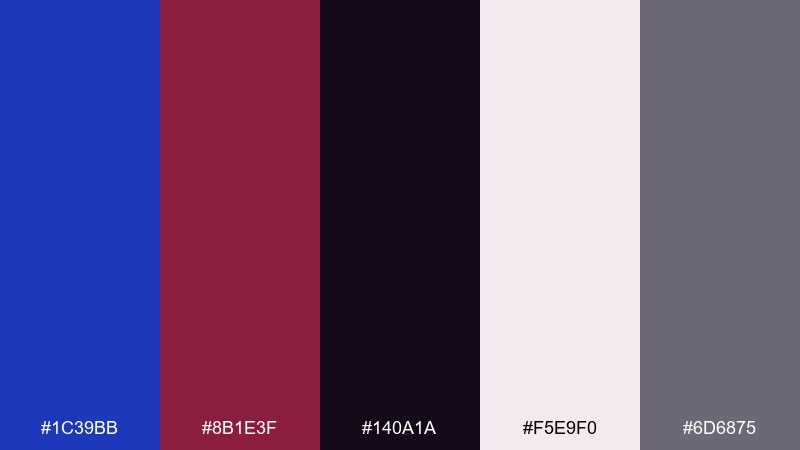
HEX: #1C39BB #8B1E3F #140A1A #F5E9F0 #6D6875
Mood: dramatic, intimate, upscale
Best for: theater event invitation
Dramatic velvet reds and deep shadows make the blue feel intimate and upscale. This persian blue color palette is strongest when the blue frames the layout and the wine tone highlights the headline. Pale blush keeps the invitation readable while preserving that curtain-call drama. Tip: use thin lines and generous spacing so the dark tones stay elegant, not heavy.
Image example of velvet theater generated using media.io

23) Sunlit Delft
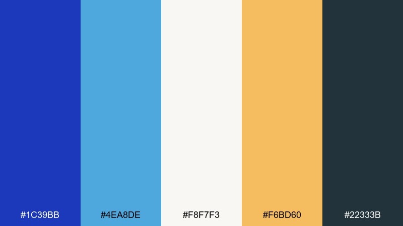
HEX: #1C39BB #4EA8DE #F8F7F3 #F6BD60 #22333B
Mood: sunny, artisanal, travel-inspired
Best for: ceramics product ad
Sunlit delft tones feel artisanal and travel-inspired, like painted pottery in a bright shop window. Use persian blue and sky blue for pattern elements, while the honey accent warms up the composition. The soft off-white keeps products looking clean and premium. Tip: keep the warm accent under 10 percent so the blues remain the hero.
Image example of sunlit delft generated using media.io

What Colors Go Well with Persian Blue?
Persian blue pairs beautifully with crisp whites, soft creams, and cool grays when you want a clean, modern look. These neutrals keep the blue feeling sharp while giving you plenty of room for typography and layout structure.
For richer, more premium combinations, try pairing it with gold, saffron, rust, or warm sand tones. The warm accent offsets Persian blue’s coolness and creates instant contrast that works for badges, highlights, and CTAs.
If you want a more expressive or creative direction, Persian blue also plays well with pinks, magentas, violets, and teals. Keep one accent dominant and let the rest support the hierarchy so the palette stays intentional.
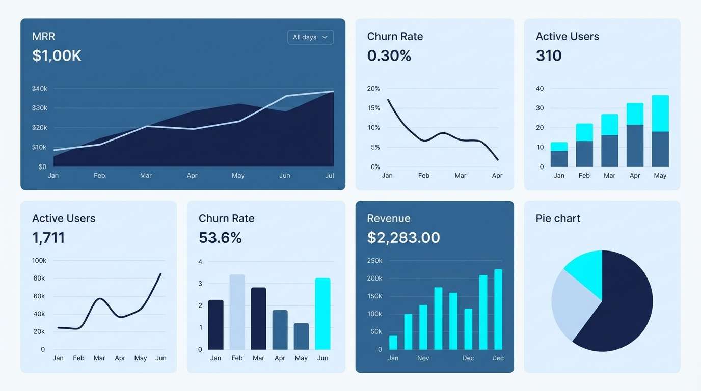
How to Use a Persian Blue Color Palette in Real Designs
Use Persian blue as your anchor color: primary buttons, key headlines, active navigation states, or brand marks. Then assign neutrals to the “plumbing” of the design—backgrounds, dividers, and body text—so readability stays consistent.
For contrast and accessibility, avoid placing saturated Persian blue text on saturated accent backgrounds. Instead, put bright accents in small shapes, icons, labels, or underlines, and keep long-form text in near-black or charcoal.
In print, test proofs if possible—deep blues can shift depending on paper and coating. Cream or off-white stocks often make Persian blue feel more tactile and premium than bright optical white.
Create Persian Blue Palette Visuals with AI
If you’re building a mood board, ad concept, or UI mockup, generating fast visuals helps you validate the palette before production. With AI, you can iterate on lighting, materials, and composition while keeping your HEX direction consistent.
Start with one palette, describe the design scenario (packaging, dashboard, poster, invitation), then refine the prompt to control how much the accent colors appear. Small prompt tweaks can quickly improve balance and hierarchy.
Use Media.io to turn these palette prompts into clean examples you can share with clients or teammates.
Persian Blue Color Palette FAQs
-
What is the HEX code for Persian blue?
A common Persian blue HEX used in modern palettes is #1C39BB. It’s a saturated deep blue that works well for CTAs, headers, and brand marks. -
Is Persian blue closer to royal blue or navy?
Persian blue typically sits closer to royal blue (more vibrant) than navy (more muted and dark). Pairing it with a near-black navy is a popular way to add depth. -
What accent colors make Persian blue look modern?
Warm accents like saffron, gold, rust, and apricot create a modern contrast. For a cool-modern look, use cyan, teal, or lavender—but keep accents limited to avoid a “neon” feel. -
What neutral colors pair best with Persian blue?
Creamy whites, paper off-whites, slate grays, and charcoal tones pair best. They preserve readability and make Persian blue feel premium rather than overpowering. -
How do I use Persian blue in UI without making it too intense?
Use Persian blue for primary actions and active states, then rely on pale tints for surfaces and cool grays for structure. Reserve the brightest accent for one key action per screen. -
Does Persian blue print well?
Yes, but deep blues can shift depending on paper and ink. Uncoated or warm stocks often make Persian blue look richer; always check a proof for large fills or critical brand colors. -
What are the best use cases for a Persian blue palette?
It’s great for fintech and SaaS UI, luxury packaging, editorial layouts, event posters, and premium stationery—anywhere you want trust, clarity, and a bold modern identity.


