

Salmon is a warm pink-orange that instantly feels friendly, modern, and human—without being as loud as pure coral. That makes it a versatile choice for branding, UI highlights, event stationery, and product packaging.
Below you’ll find salmon color palette ideas with HEX codes, plus practical guidance on pairing salmon with neutrals and dark anchors for clean contrast.
In this article
- Why Salmon Color Combinations Work So Well
-
- coastal coral breeze
- blush linen neutral
- sage garden contrast
- midnight navy pop
- terracotta clay harmony
- rosewater minimal ui
- apricot sunrise
- dusty mauve romance
- teal harbor accent
- sandstone dessert
- charcoal modern edge
- mint gelato fresh
- berry wine depth
- lavender haze soft
- citrine spark
- espresso warmth
- seafoam spa calm
- copper autumn glow
- glacier gray balance
- golden hour editorial
- palm spring pop
- What Colors Go Well with Salmon?
- How to Use a Salmon Color Palette in Real Designs
- Create Salmon Palette Visuals with AI
Why Salmon Color Combinations Work So Well
Salmon sits between pink and orange, so it carries both softness (approachable, romantic) and energy (fresh, optimistic). That blend makes it work across categories—from wellness and beauty to tech, lifestyle, and food.
It also pairs easily with both cool and warm companions. Teal, navy, and slate sharpen salmon into a high-contrast, modern look, while creams, tans, and browns turn it into an earthy, premium story.
In UI and branding, salmon is especially useful as an accent color: it’s attention-grabbing for CTAs and highlights, but typically feels less aggressive than pure red.
20+ Salmon Color Palette Ideas (with HEX Codes)
1) Coastal Coral Breeze
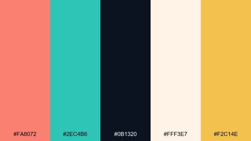
HEX: #FA8072 #2EC4B6 #0B1320 #FFF3E7 #F2C14E
Mood: bright, beachy, optimistic
Best for: travel poster design
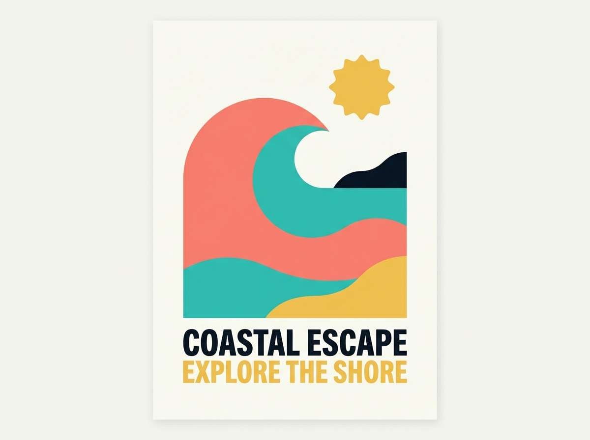
Bright and breezy like a seaside morning, with coral warmth against clean ocean tones. Use this salmon color scheme for travel posters, summer promos, and destination branding where you want instant energy. Pair the salmon and teal as the headline duo, then ground everything with the deep navy. Tip: keep the cream background dominant so the accents feel sunlit, not loud.
Image example of coastal coral breeze generated using media.io
Media.io is an online AI studio for creating and editing video, image, and audio in your browser.

2) Blush Linen Neutral
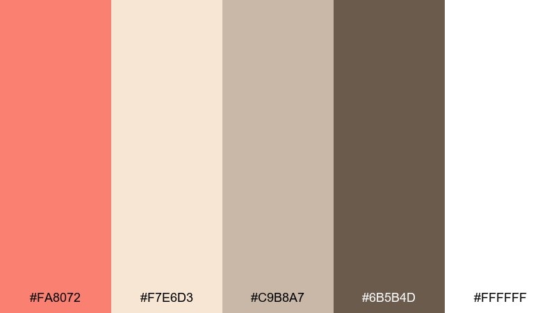
HEX: #FA8072 #F7E6D3 #C9B8A7 #6B5B4D #FFFFFF
Mood: soft, airy, timeless
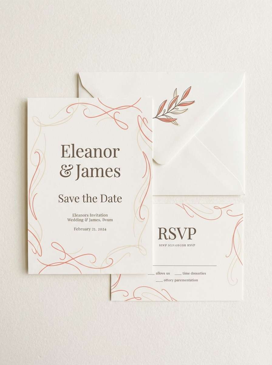
Best for: wedding invitation suite
Soft and intimate like blush fabric and warm linen under gentle light. The salmon color palette works beautifully for wedding stationery, bridal showers, and minimalist event suites. Let the warm off-whites carry the page, then use salmon for names and key details. Tip: choose the deeper brown for small type to keep readability crisp on pale paper.
Image example of blush linen neutral generated using media.io
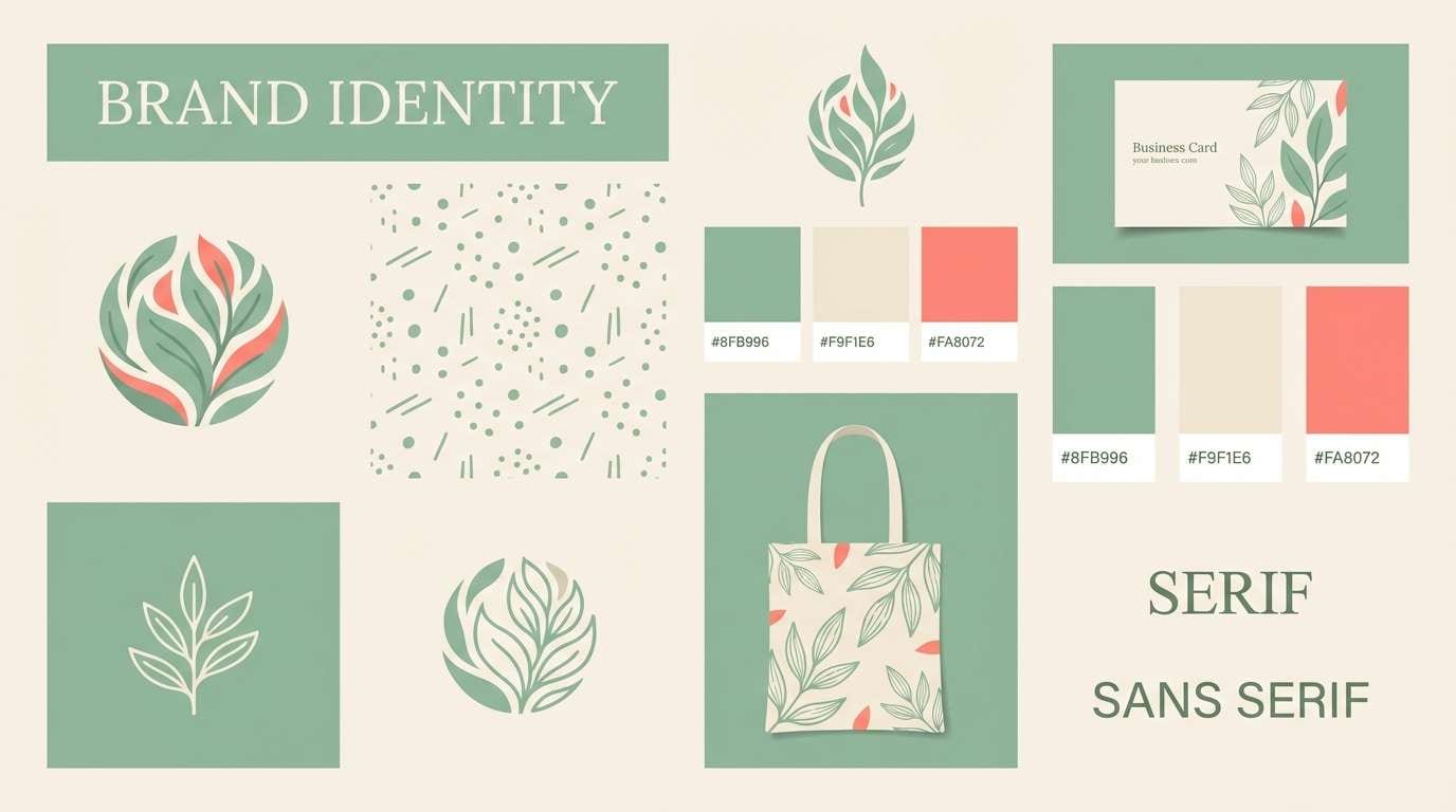
3) Sage Garden Contrast
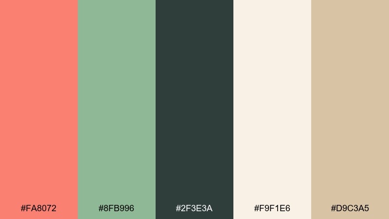
HEX: #FA8072 #8FB996 #2F3E3A #F9F1E6 #D9C3A5
Mood: natural, grounded, calming
Best for: botanical brand identity
Calm and organic like a herb garden with a pop of ripe fruit. It fits botanical branding, wellness labels, and eco-friendly packaging where warmth should still feel natural. Use sage and cream for the base, then bring in salmon as a friendly highlight. Tip: keep the dark green for logos and outlines to prevent the palette from feeling washed out.
Image example of sage garden contrast generated using media.io
4) Midnight Navy Pop
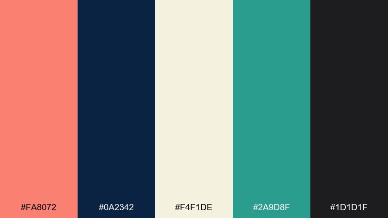
HEX: #FA8072 #0A2342 #F4F1DE #2A9D8F #1D1D1F
Mood: bold, modern, high-contrast
Best for: tech landing page hero
Bold and cinematic, like neon signage over a midnight skyline. These salmon color combinations shine on tech landing pages, pitch decks, and hero sections that need contrast fast. Keep navy as the main canvas and use salmon for primary buttons or key metrics. Tip: reserve teal for secondary actions so the hierarchy stays obvious.
Image example of midnight navy pop generated using media.io

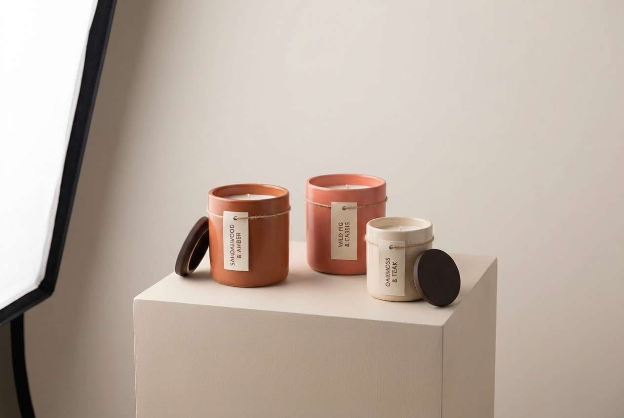
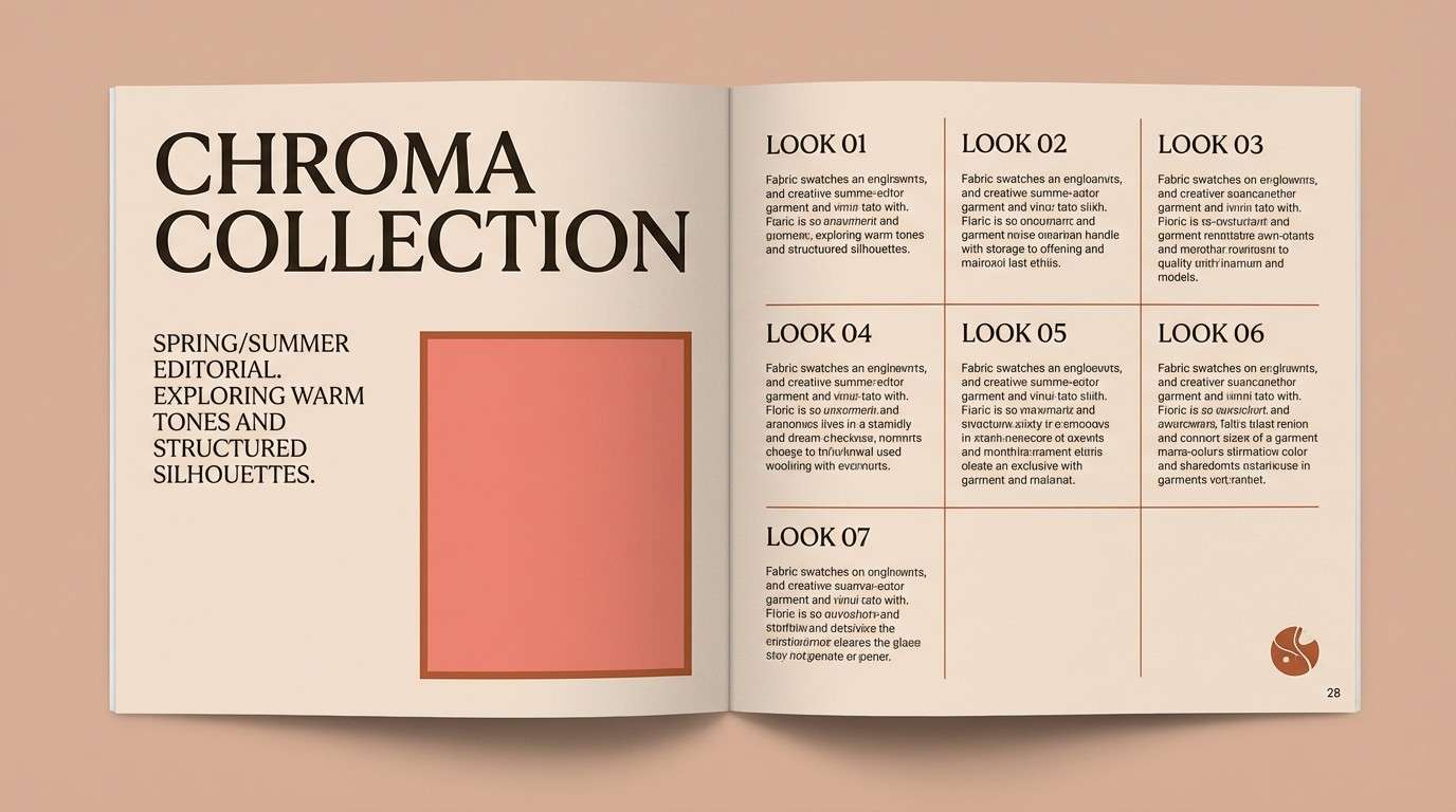
5) Terracotta Clay Harmony
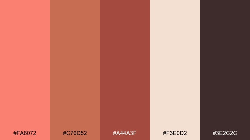
HEX: #FA8072 #C76D52 #A44A3F #F3E0D2 #3E2C2C
Mood: earthy, cozy, artisanal
Best for: ceramics studio branding
Warm and handmade like fired clay, glazed pottery, and a sunlit workshop. This salmon color scheme suits artisan brands, ceramics studios, and handmade product lines where texture is part of the story. Use the cream for breathing room, then layer salmon and terracotta for labels and icons. Tip: add the deep brown only in small doses for type and stamps to keep the look inviting.
Image example of terracotta clay harmony generated using media.io
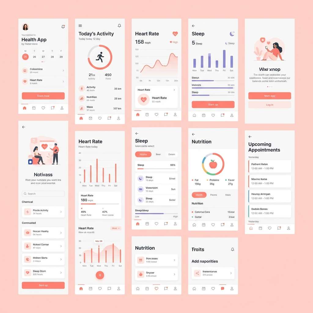
6) Rosewater Minimal UI
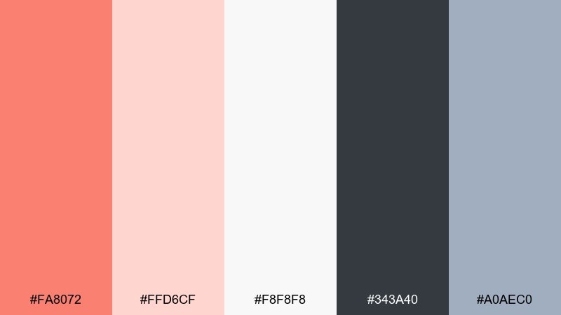
HEX: #FA8072 #FFD6CF #F8F8F8 #343A40 #A0AEC0
Mood: clean, gentle, user-friendly
Best for: health app UI kit
Gentle and polished like rosewater on a bright counter, with soft contrast that feels easy to use. This salmon color palette works well for health apps, onboarding screens, and dashboards that should feel reassuring. Use light blush and white for surfaces, then apply salmon to toggles and progress highlights. Tip: keep charcoal for body text and aim for accessible contrast on buttons.
Image example of rosewater minimal ui generated using media.io
7) Apricot Sunrise
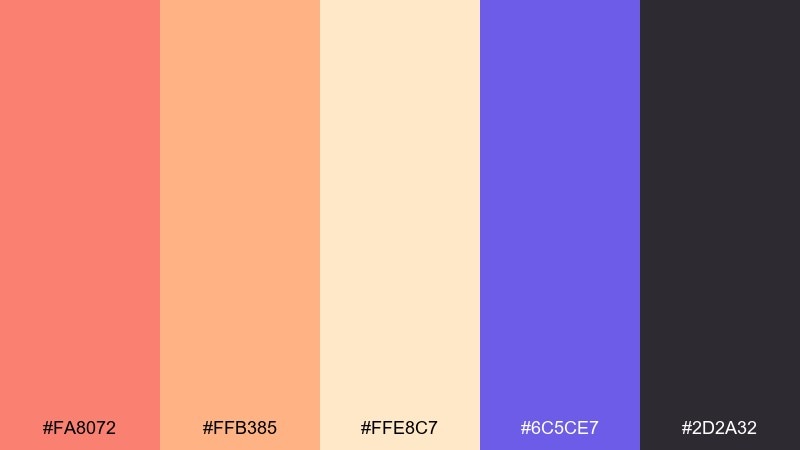
HEX: #FA8072 #FFB385 #FFE8C7 #6C5CE7 #2D2A32
Mood: uplifting, playful, creative
Best for: social media campaign graphics
Uplifting like an early sunrise, with apricot warmth and a surprising violet spark. Great for social posts, creator campaigns, and playful announcements where you want scroll-stopping color. Use salmon and apricot as the gradients or blocks, then bring violet in for badges and highlights. Tip: keep dark text minimal and rely on large type to maintain a light, optimistic feel.
Image example of apricot sunrise generated using media.io
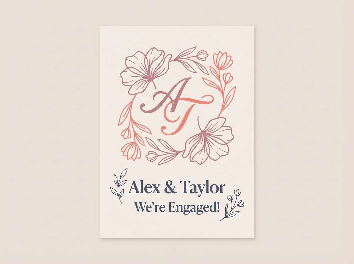
8) Dusty Mauve Romance
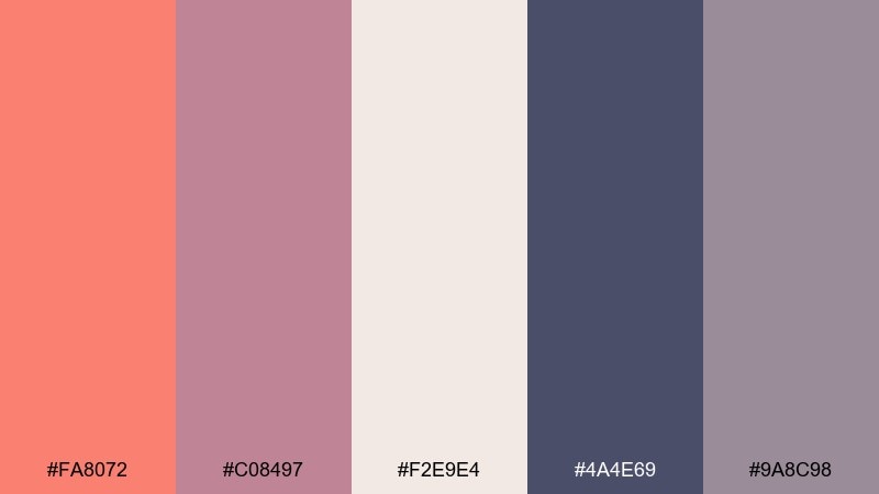
HEX: #FA8072 #C08497 #F2E9E4 #4A4E69 #9A8C98
Mood: romantic, vintage, refined
Best for: engagement announcement card
Romantic and slightly nostalgic, like pressed flowers in an old book. It suits engagement cards, intimate celebrations, and boutique lifestyle branding. Let mauve and soft cream set the tone, then use salmon as a warm accent on monograms or borders. Tip: use the slate tone for long text blocks so the overall look stays refined, not sugary.
Image example of dusty mauve romance generated using media.io
9) Teal Harbor Accent
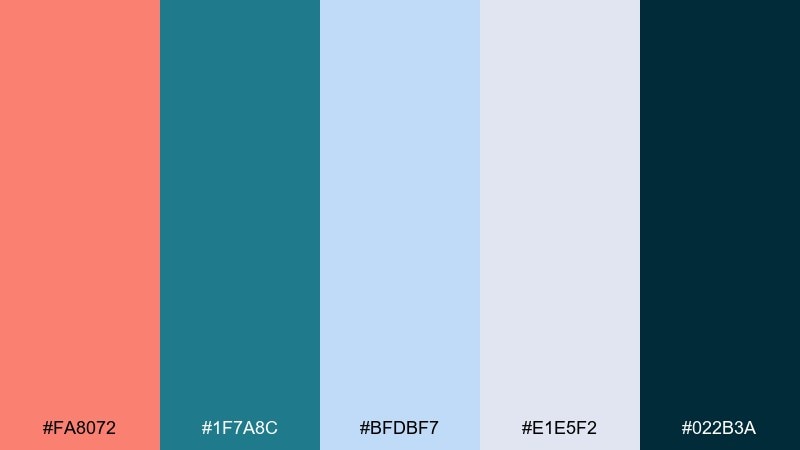
HEX: #FA8072 #1F7A8C #BFDBF7 #E1E5F2 #022B3A
Mood: fresh, nautical, confident
Best for: startup pitch deck slides
Fresh and focused like a harbor view with crisp air and clean lines. These salmon color combinations work for pitch decks, corporate slides, and data stories where clarity matters. Use pale blues for charts and sections, then highlight key numbers with salmon. Tip: keep the darkest navy for headings and axis labels to make the visuals feel sharp and professional.
Image example of teal harbor accent generated using media.io
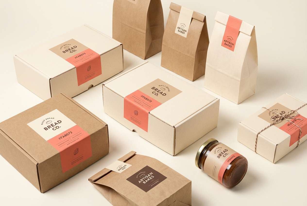
10) Sandstone Dessert
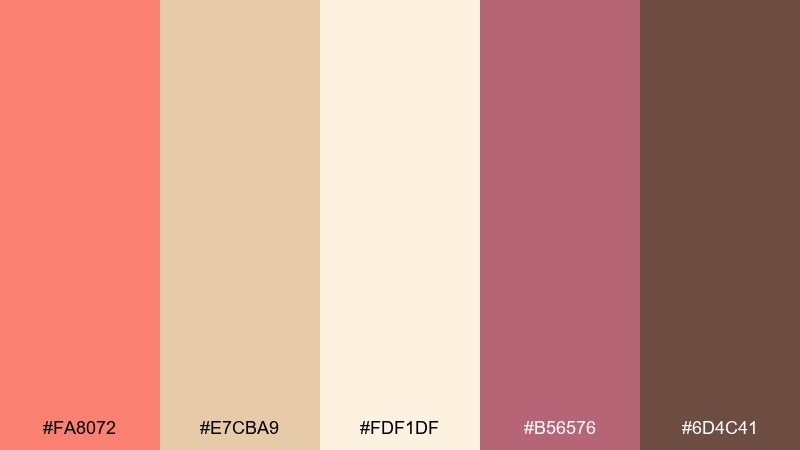
HEX: #FA8072 #E7CBA9 #FDF1DF #B56576 #6D4C41
Mood: sweet, warm, boutique
Best for: bakery packaging and labels
Sweet and cozy like a pastry case at golden hour. These salmon colors fit bakery branding, dessert packaging, and cafe menus that should feel handmade and welcoming. Use cream and sandstone for wrappers and boxes, then bring salmon in for stamps or flavor tags. Tip: keep berry as a secondary accent so the overall warmth stays soft and appetizing.
Image example of sandstone dessert generated using media.io
11) Charcoal Modern Edge
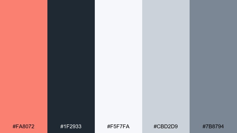
HEX: #FA8072 #1F2933 #F5F7FA #CBD2D9 #7B8794
Mood: sleek, modern, confident
Best for: product landing page UI
Sleek and contemporary like matte charcoal with a warm accent stripe. These salmon tones are ideal for product landing pages, SaaS sections, and feature grids that need strong hierarchy. Use near-white for the main canvas, then reserve salmon for the primary CTA and key icons. Tip: keep grays for cards and dividers so the accent color stays premium and intentional.
Image example of charcoal modern edge generated using media.io
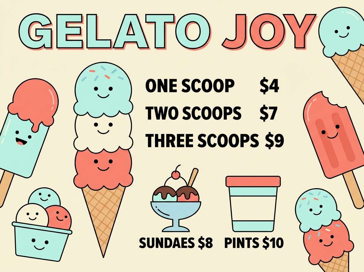
12) Mint Gelato Fresh
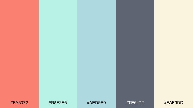
HEX: #FA8072 #B8F2E6 #AED9E0 #5E6472 #FAF3DD
Mood: fresh, light, friendly
Best for: ice cream shop poster
Fresh and playful like mint gelato with a coral drizzle. Great for food posters, seasonal specials, and cheerful retail signage. Let mint and cream carry large areas, then use salmon for prices and featured flavors. Tip: keep the slate-gray for type so the pastels stay readable from a distance.
Image example of mint gelato fresh generated using media.io
13) Berry Wine Depth
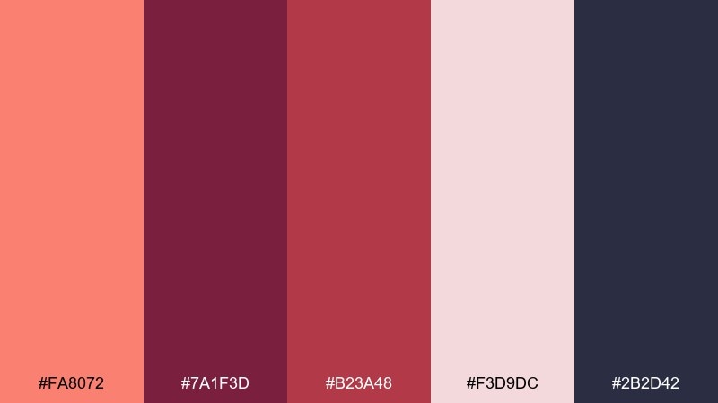
HEX: #FA8072 #7A1F3D #B23A48 #F3D9DC #2B2D42
Mood: rich, dramatic, boutique
Best for: cosmetics product ad
Rich and dramatic like berry wine with a soft rosy veil. Use this salmon color palette for cosmetics ads, premium beauty promos, and editorial-style product banners. Pair salmon with blush for skin-friendly warmth, then use wine tones for luxury contrast. Tip: keep the darkest shade for small typography and logo marks to avoid overwhelming the main product focus.
Image example of berry wine depth generated using media.io
14) Lavender Haze Soft
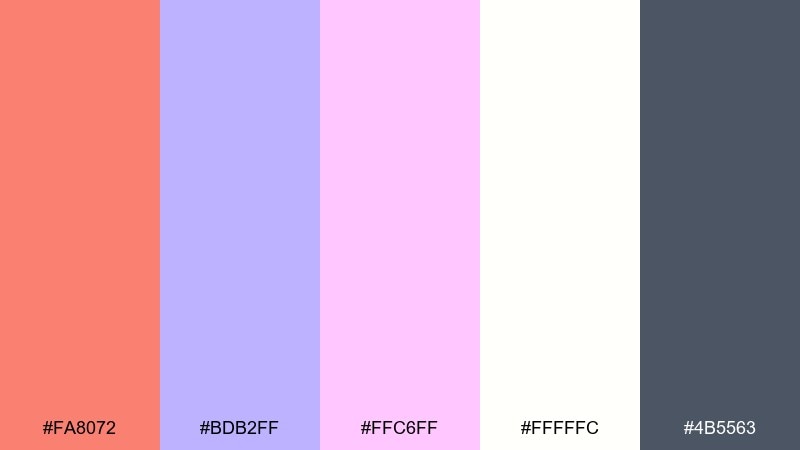
HEX: #FA8072 #BDB2FF #FFC6FF #FFFFFC #4B5563
Mood: dreamy, gentle, modern
Best for: podcast cover artwork
Dreamy and airy like a lavender haze with a warm blush glow. It suits podcast covers, creator thumbnails, and soft lifestyle graphics. Use white as the breathing space, then balance salmon with lavender for a modern, friendly duo. Tip: keep the gray for the show title to maintain legibility at small sizes.
Image example of lavender haze soft generated using media.io

15) Citrine Spark
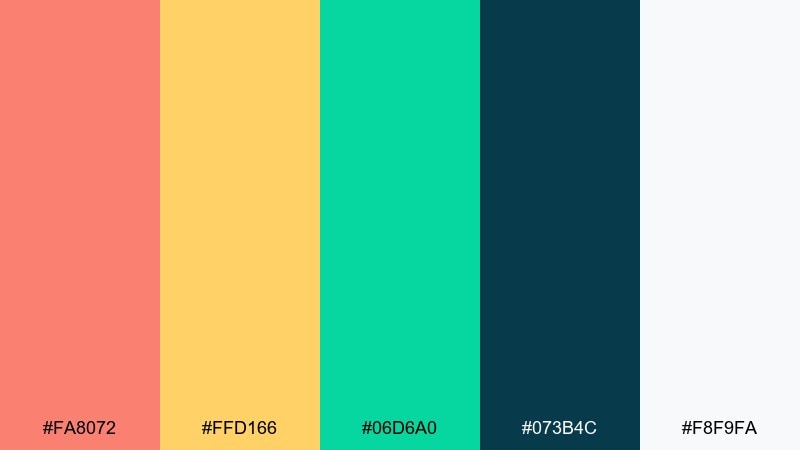
HEX: #FA8072 #FFD166 #06D6A0 #073B4C #F8F9FA
Mood: energetic, sunny, bold
Best for: event flyer design
Energetic and sunny, like citrus slices on a bright table with a cool breeze. These salmon color combinations are perfect for event flyers, music nights, and community promos that need instant attention. Use navy for the base, then let salmon and yellow carry the headline and key details. Tip: keep green as a small accent for icons or tickets so it reads as a fresh pop, not a third lead color.
Image example of citrine spark generated using media.io

16) Espresso Warmth
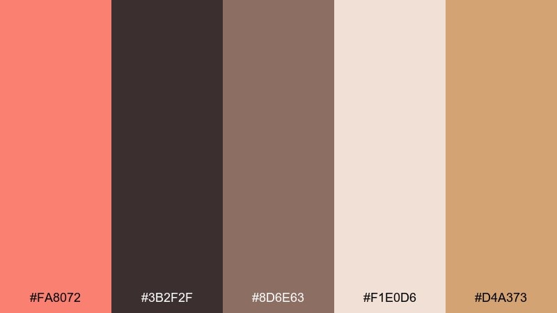
HEX: #FA8072 #3B2F2F #8D6E63 #F1E0D6 #D4A373
Mood: warm, cozy, rustic
Best for: coffee shop menu board
Warm and cozy like espresso crema and baked cinnamon. This salmon color scheme fits cafe menus, roastery branding, and cozy hospitality design. Use cream for the menu background, then bring salmon into section headers for a friendly highlight. Tip: keep the darkest espresso tone for prices and small labels to ensure fast scanning.
Image example of espresso warmth generated using media.io
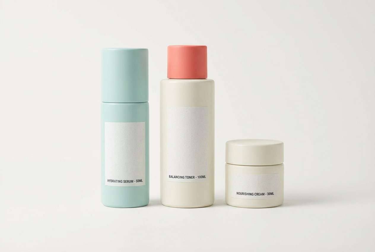
17) Seafoam Spa Calm
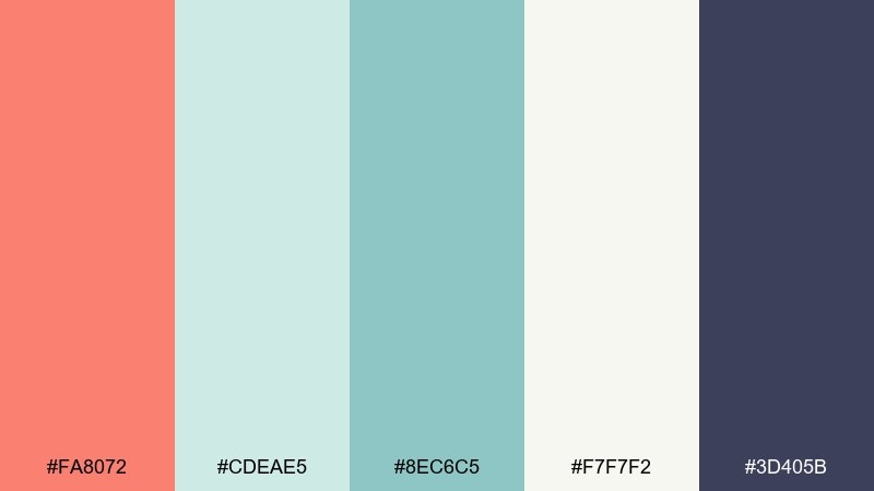
HEX: #FA8072 #CDEAE5 #8EC6C5 #F7F7F2 #3D405B
Mood: calm, clean, restorative
Best for: skincare packaging design
Calm and restorative like seafoam and soft towels in a quiet spa. It is ideal for skincare packaging, wellness labels, and clean beauty branding. Use off-white and seafoam for the package base, then add salmon as a gentle accent stripe or seal. Tip: keep the deep indigo only for ingredient text and small brand marks to preserve the airy feel.
Image example of seafoam spa calm generated using media.io
18) Copper Autumn Glow
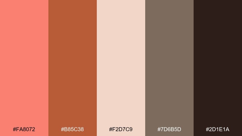
HEX: #FA8072 #B85C38 #F2D7C9 #7D6B5D #2D1E1A
Mood: autumnal, warm, elegant
Best for: fall fashion lookbook
Autumnal and elegant, like copper leaves and warm knitwear. Use these salmon tones for fall lookbooks, seasonal campaigns, and boutique retail layouts. Pair salmon with copper for headlines and callouts, then rely on the soft blush as a background tone. Tip: keep the near-black brown for fine typography so the page still feels luxurious and anchored.
Image example of copper autumn glow generated using media.io
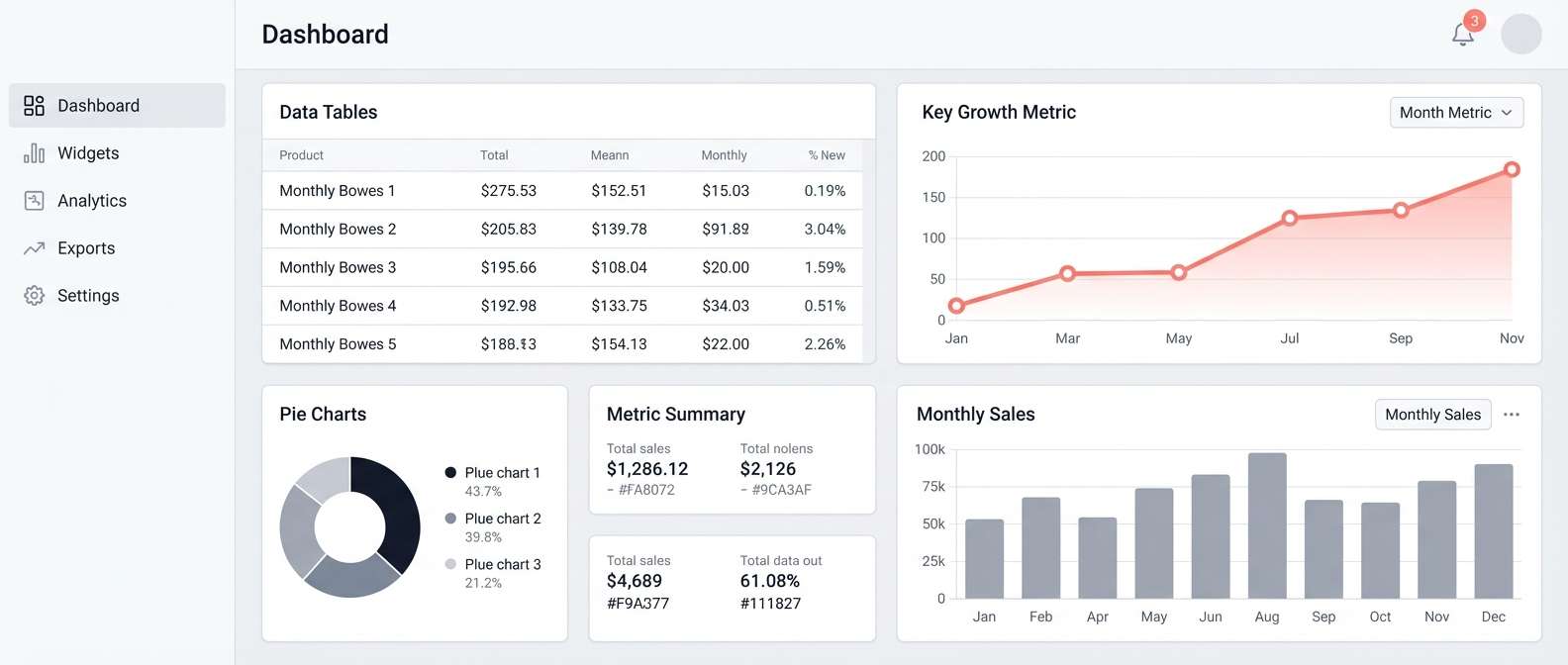
19) Glacier Gray Balance
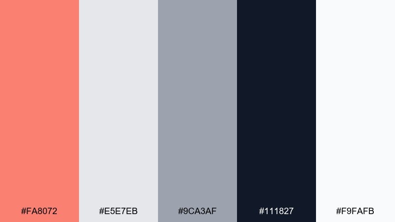
HEX: #FA8072 #E5E7EB #9CA3AF #111827 #F9FAFB
Mood: balanced, minimal, professional
Best for: dashboard data visualization
Balanced and minimal like a clean workspace with one warm highlight. It works for dashboards, analytics views, and B2B interfaces where data should lead. Use the grays for charts and panels, then apply salmon to highlight the key trend line or alerts. Tip: keep the near-black for labels and ensure salmon appears sparingly so it retains meaning.
Image example of glacier gray balance generated using media.io
20) Golden Hour Editorial
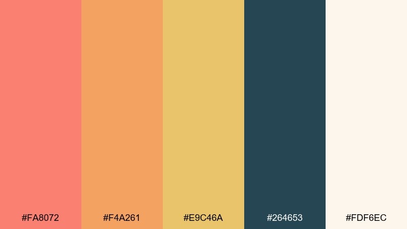
HEX: #FA8072 #F4A261 #E9C46A #264653 #FDF6EC
Mood: editorial, warm, sophisticated
Best for: magazine cover layout
Warm and sophisticated like golden hour light hitting a cream paper stock. This salmon color palette suits magazine covers, editorial layouts, and premium blog headers that want a sun-kissed mood. Use cream as the main field, then balance salmon with amber for cover lines and badges. Tip: anchor the masthead in deep teal to keep the warm tones from blending together.
Image example of golden hour editorial generated using media.io
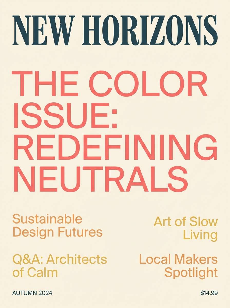
21) Palm Spring Pop
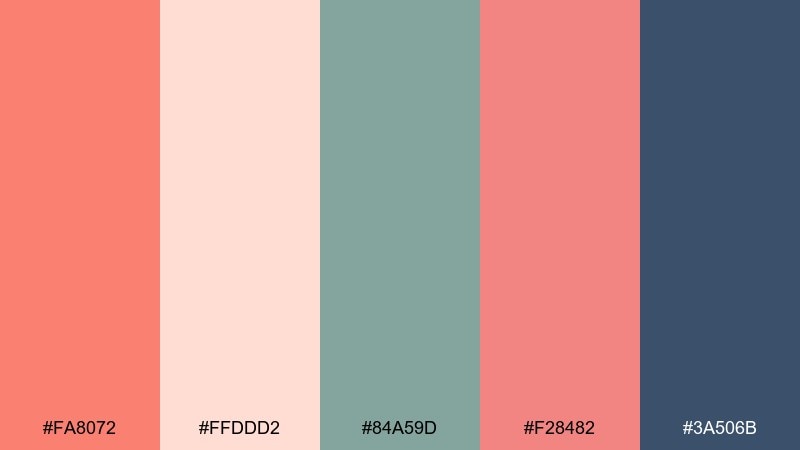
HEX: #FA8072 #FFDDD2 #84A59D #F28482 #3A506B
Mood: retro, sunny, playful
Best for: summer party invitation
Retro and sunny like a poolside postcard with pastel shadows. It is great for summer party invites, playful announcements, and upbeat community events. Let blush and salmon do the heavy lifting, then use sage for leafy motifs or small icons. Tip: keep the deep blue for key info like date and location so the invite reads instantly.
Image example of palm spring pop generated using media.io

What Colors Go Well with Salmon?
Cool tones like teal, seafoam, and soft blues make salmon feel crisp and contemporary, which is great for UI, data visuals, and modern branding. Dark anchors like navy, charcoal, and near-black add instant contrast so salmon can be used for CTAs, badges, or key metrics.
For warmer pairings, try cream, linen, tan, terracotta, and espresso browns to push salmon toward an artisanal or premium look. Muted mauves and lavenders also pair beautifully when you want a softer, romantic palette.
When in doubt, keep salmon as the accent (10–20%), use a light neutral as the base, and choose one deep shade for typography to protect readability.
How to Use a Salmon Color Palette in Real Designs
In branding, salmon works well for approachable categories (beauty, wellness, food, lifestyle) and as a “human” highlight in more technical products. Apply salmon to logos, labels, and icons in small doses, then let neutrals and dark tones do most of the structural work.
In UI, treat salmon like a priority signal: primary buttons, active toggles, progress bars, and alert highlights. Pair it with charcoal text and a near-white surface, and test contrast to ensure buttons and small text remain accessible.
For print (weddings, invitations, packaging), salmon looks best on warm papers—cream, blush, linen—while a single deep ink color (brown, indigo, or navy) keeps details sharp.
Create Salmon Palette Visuals with AI
If you already have HEX codes, you can generate matching posters, UI mockups, and packaging concepts in minutes by describing your layout and style. The key is to mention your dominant colors first, then list accents, and specify “clean background” if you want a modern, minimal result.
Try creating multiple variations of the same prompt (swap typography style, aspect ratio, or add “vector flat design” vs “realistic studio shot”) to quickly explore different salmon color schemes.
Once you find a strong direction, keep salmon consistent as your signature accent and build reusable templates for social posts, slides, or product images.
Salmon Color Palette FAQs
-
What is the HEX code for salmon?
A commonly used salmon HEX is #FA8072. It’s a warm pink-orange that can read more coral or more blush depending on surrounding colors. -
Is salmon a good color for branding?
Yes—salmon feels friendly and modern, which works well for wellness, beauty, lifestyle, food, and even tech brands when used as an accent for CTAs and highlights. -
What colors contrast well with salmon?
Deep navy, charcoal, and near-black create strong contrast with salmon. Cool tones like teal also sharpen salmon and help it feel more contemporary. -
Can salmon work in professional UI designs?
It can, especially as an accent color for primary actions, active states, and key metrics. Use neutral surfaces (off-white/light gray) and dark text to maintain clear hierarchy and readability. -
How do I keep a salmon palette from looking too “pink”?
Add grounded neutrals (linen, taupe, warm gray) or earthy browns/terracotta, and include one deep anchor color (navy/espresso/charcoal) to balance the warmth. -
What are good neutral pairings with salmon?
Cream, warm white, light beige, sandstone, and soft gray pair well with salmon. These neutrals let salmon stand out without making the overall design feel loud. -
How much salmon should I use in a design?
For most layouts, use salmon sparingly (around 10–20%) as the accent. Let a neutral base take the majority, and reserve a dark shade for text and structure.
Next: Chestnut Color Palette


