

Chestnut is a warm brown with a natural, grounded feel—perfect when you want designs to look cozy, trustworthy, and timeless.
Below are chestnut color palette ideas with HEX codes you can use for branding, UI, print, and interiors, plus AI prompt examples to help you visualize each scheme fast.
In this article
- Why Chestnut Color Combinations Work So Well
-
- smoked chestnut studio
- autumn hearth neutrals
- copper and cream balance
- walnut ink contrast
- clay terracotta whisper
- cocoa linen minimal
- forest bark and moss
- rosewood blush accent
- espresso gold luxe
- chestnut slate modern
- cinnamon oat latte
- brick and sage kitchen
- mahogany nightfall
- pecan sandstone ease
- rustic orchard harvest
- sepia paper editorial
- burnt umber gradient
- cedar cream cottage
- chestnut orchid twist
- warm stone exterior
- holiday spice wrap
- What Colors Go Well with Chestnut?
- How to Use a Chestnut Color Palette in Real Designs
- Create Chestnut Palette Visuals with AI
Why Chestnut Color Combinations Work So Well
Chestnut sits in a sweet spot between earthy and elevated. It carries the comfort of wood, leather, and warm foods—without feeling overly rustic when paired with clean neutrals.
It also plays nicely with both warm and cool supporting tones. Creams and beiges make it feel soft and airy, while charcoals, slate blues, and muted greens add modern contrast.
From a usability standpoint, chestnut is a strong “anchor” color: ideal for headers, frames, and key UI accents, especially when you balance it with light backgrounds for readability.
20+ Chestnut Color Palette Ideas (with HEX Codes)
1) Smoked Chestnut Studio
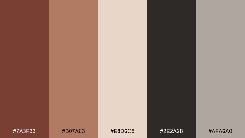
HEX: #7A3F33 #B07A63 #E8D6C8 #2E2A28 #AFA6A0
Mood: warm, grounded, modern
Best for: brand identity for a craft coffee roaster
Warm and smoky, this chestnut color combination feels like roasted beans, aged wood, and a clean studio backdrop. It works beautifully for logos, labels, and social templates where you want depth without looking heavy. Pair the deep brown with cream for readability, then use the muted rose-brown for highlights. Tip: keep charcoal for type and let chestnut lead in large blocks or packaging panels.
Image example of smoked chestnut studio generated using media.io
Media.io is an online AI studio for creating and editing video, image, and audio in your browser.

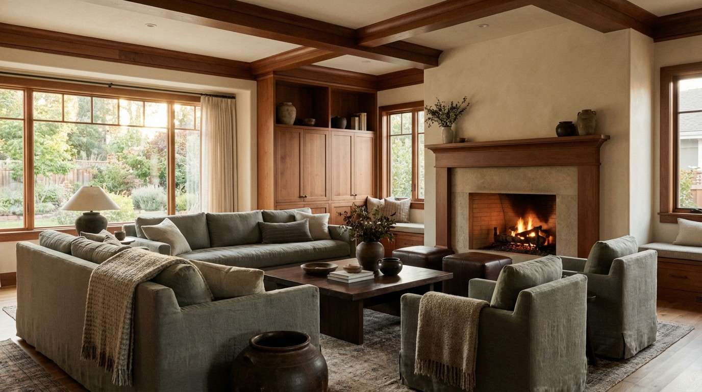
2) Autumn Hearth Neutrals
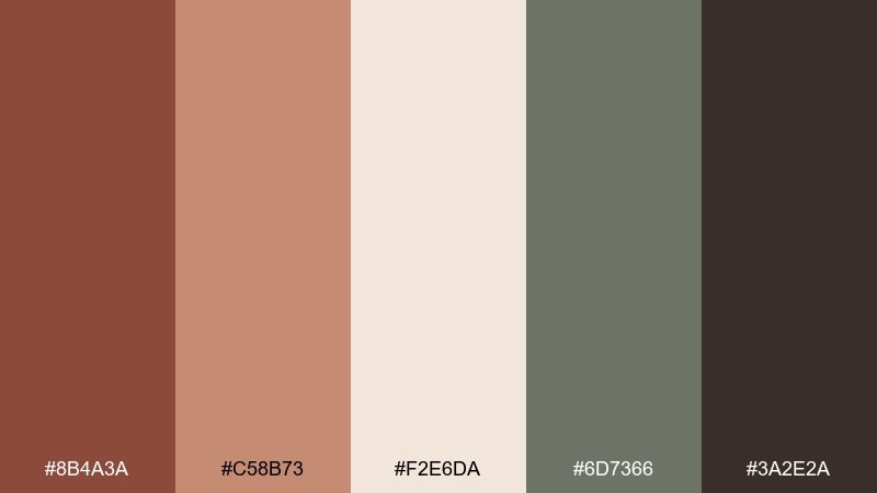
HEX: #8B4A3A #C58B73 #F2E6DA #6D7366 #3A2E2A
Mood: cozy, rustic, calm
Best for: living room interior mood board
Cozy and familiar, it evokes a fireplace glow, wool throws, and weathered stone. Use it for interiors, lifestyle brands, and seasonal landing pages that need warmth and restraint. The sage-gray keeps the browns from feeling too red, while cream opens up negative space. Tip: repeat the lightest tone across large surfaces, then add chestnut in smaller, high-impact details like trims and buttons.
Image example of autumn hearth neutrals generated using media.io
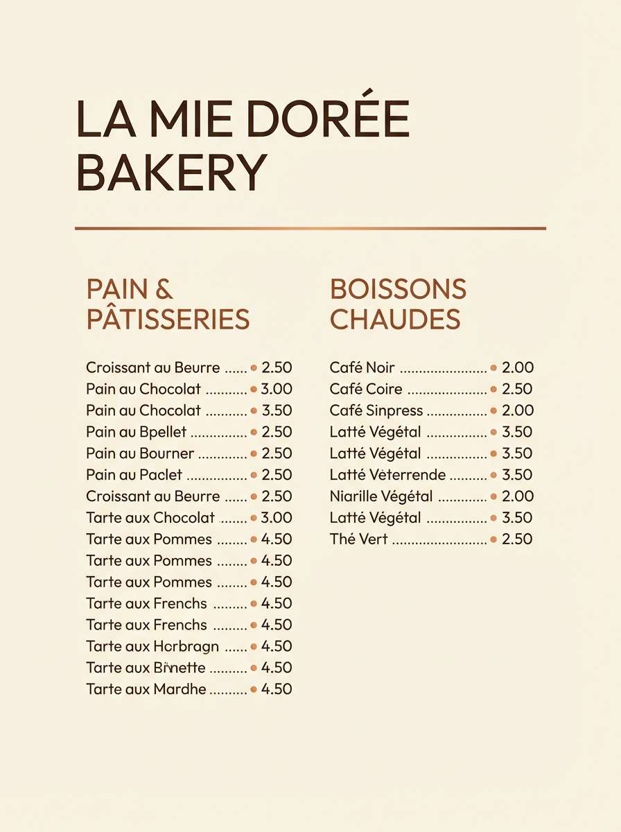
3) Copper and Cream Balance
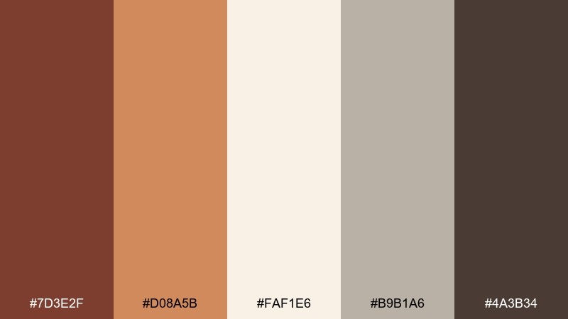
HEX: #7D3E2F #D08A5B #FAF1E6 #B9B1A6 #4A3B34
Mood: inviting, bright, artisanal
Best for: bakery menu and price list design
Inviting and slightly sweet, this chestnut palette brings to mind caramelized crusts, copper pans, and fresh paper. It suits menus, cafe boards, and small business print where warmth should feel clean. Use cream as the base, copper for callouts, and reserve the darkest brown for headings. Tip: keep copper limited to 10 to 15 percent so it reads as a highlight, not noise.
Image example of copper and cream balance generated using media.io
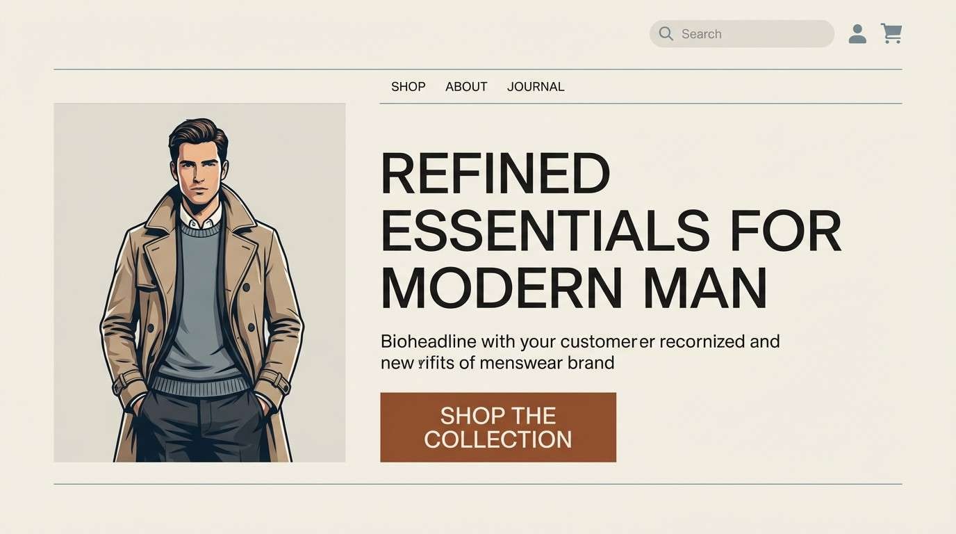
4) Walnut Ink Contrast
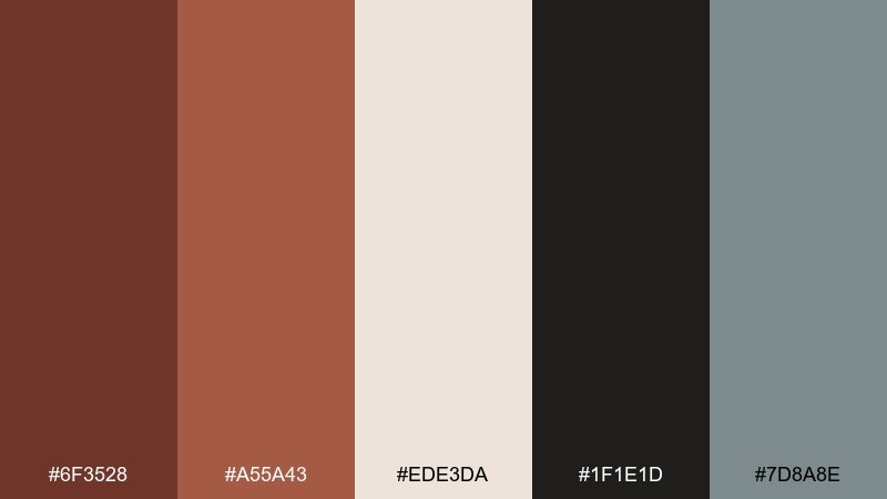
HEX: #6F3528 #A55A43 #EDE3DA #1F1E1D #7D8A8E
Mood: bold, editorial, refined
Best for: website hero section for a menswear brand
Bold and tailored, this chestnut set feels like walnut leather, ink-black type, and cool metal details. It is ideal for hero sections, lookbooks, and premium ecommerce where contrast matters. The soft gray-blue keeps the warmth sophisticated and modern. Tip: use near-black for navigation and buttons, then bring chestnut into photography overlays or section dividers.
Image example of walnut ink contrast generated using media.io
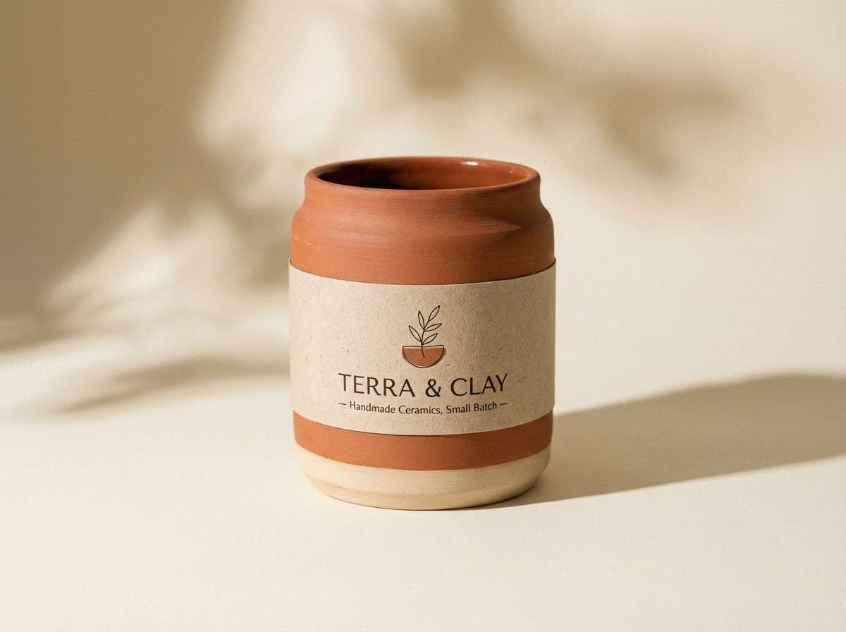
5) Clay Terracotta Whisper
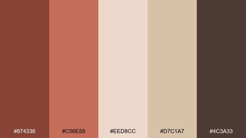
HEX: #874336 #C56E59 #EED8CC #D7C1A7 #4C3A33
Mood: sunbaked, soft, handcrafted
Best for: ceramics product packaging
Sunbaked and tactile, it suggests clay dust, terracotta pots, and soft linen. Great for handmade goods, pottery labels, and small batch skincare that leans natural. Pair the rosy terracotta with creamy paper stock and keep the darkest brown for stamps and seals. Tip: choose matte finishes so these tones stay earthy instead of glossy.
Image example of clay terracotta whisper generated using media.io
6) Cocoa Linen Minimal
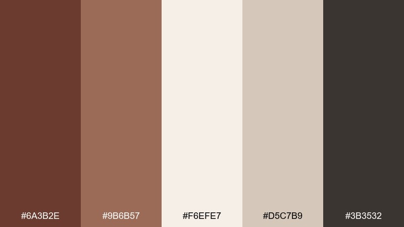
HEX: #6A3B2E #9B6B57 #F6EFE7 #D5C7B9 #3B3532
Mood: minimal, soft, dependable
Best for: clean ecommerce product page UI
Soft and minimal, it reads like cocoa powder on linen with a calm, modern finish. Use this chestnut color palette for product pages, skincare sites, and templates that rely on whitespace. The mid browns work well for cards and borders while the near-black anchors typography. Tip: keep buttons in the medium chestnut tone and use the lightest cream for generous padding and section breaks.
Image example of cocoa linen minimal generated using media.io
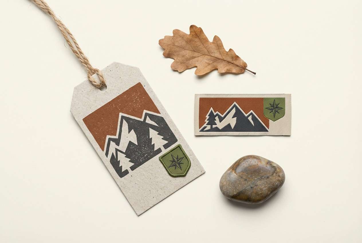
7) Forest Bark and Moss
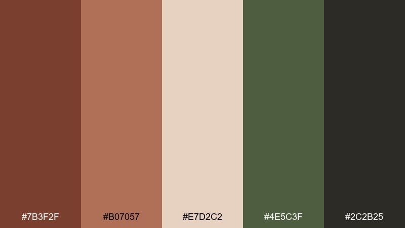
HEX: #7B3F2F #B07057 #E7D2C2 #4E5C3F #2C2B25
Mood: earthy, outdoorsy, grounded
Best for: outdoor gear logo and hang tag
Earthy and outdoorsy, it evokes tree bark, mossy trails, and campfire smoke. It fits outdoor gear, organic food labels, and nature-focused branding that should feel sturdy. The moss green adds freshness without pulling the palette cold, while charcoal keeps text crisp. Tip: use green sparingly as a badge color to guide the eye across tags and stickers.
Image example of forest bark and moss generated using media.io
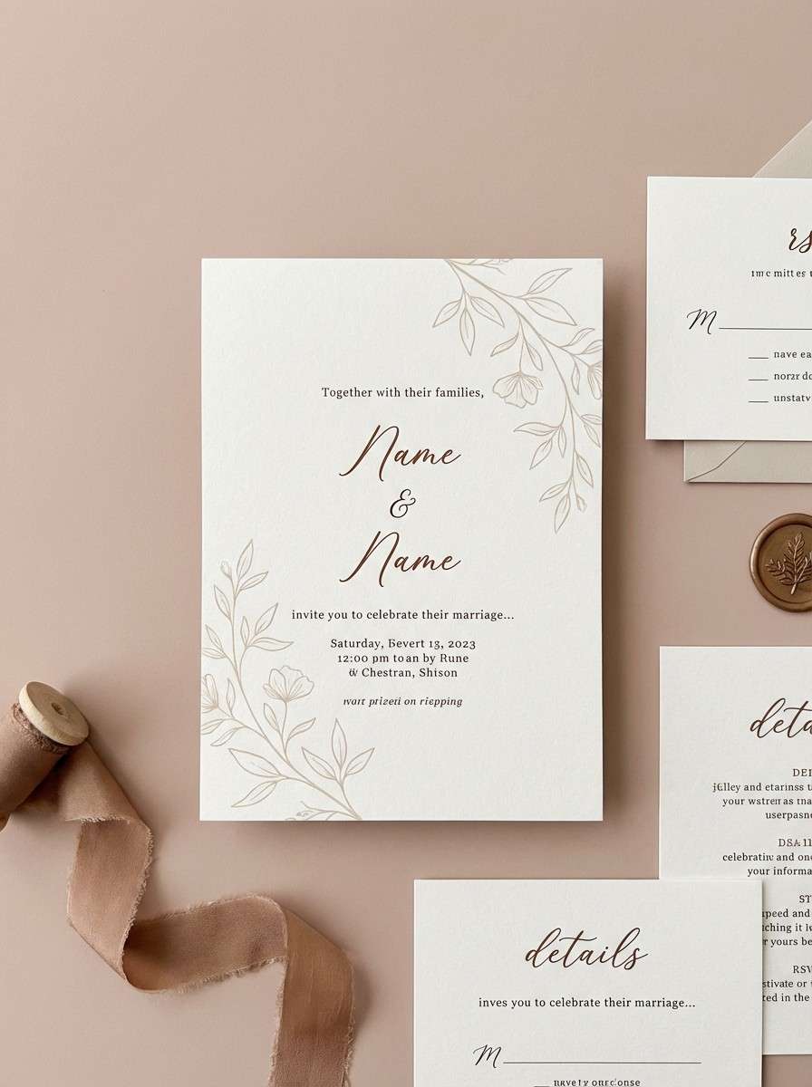
8) Rosewood Blush Accent
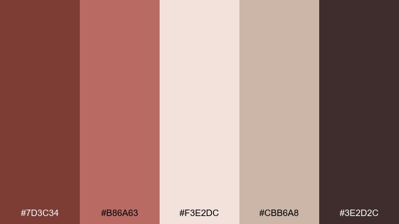
HEX: #7D3C34 #B86A63 #F3E2DC #CBB6A8 #3E2D2C
Mood: romantic, soft, elevated
Best for: wedding invitation suite
Romantic and softly polished, it feels like rosewood furniture, blush florals, and textured stationery. It works well for invitations, beauty branding, and boutique packaging that needs warmth with a delicate edge. Let blush carry the background, then use deep brown for names and key details. Tip: add subtle paper grain and keep contrast high for legibility in small type.
Image example of rosewood blush accent generated using media.io
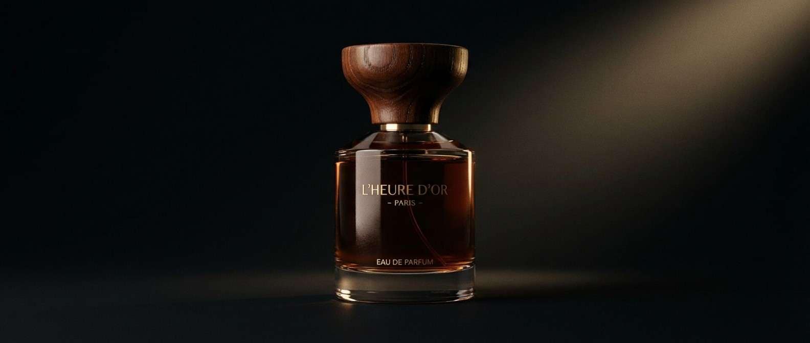
9) Espresso Gold Luxe
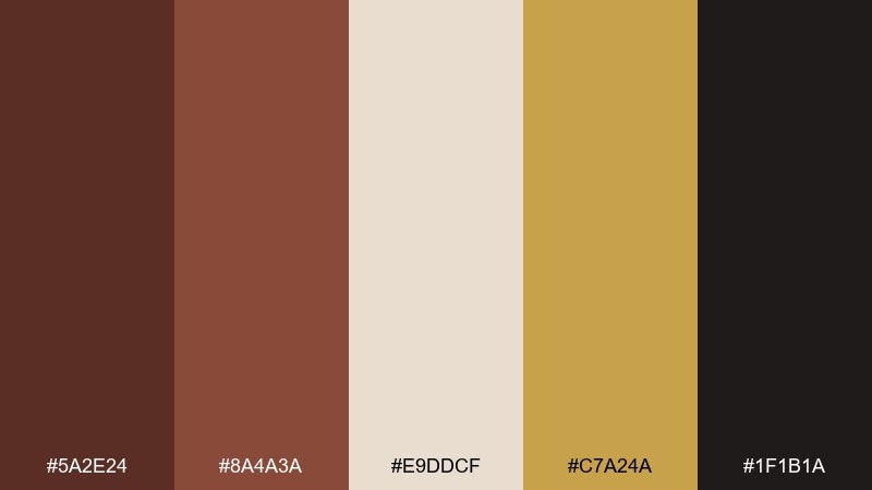
HEX: #5A2E24 #8A4A3A #E9DDCF #C7A24A #1F1B1A
Mood: luxurious, dramatic, premium
Best for: fragrance product ad banner
Luxurious and dramatic, it brings to mind espresso crema, gilded edges, and a night-out mood. It is strong for premium product ads, beauty launches, and high-end social banners. Use the gold as a sparing accent for borders, icons, or a single call-to-action. Tip: keep the background deep and let cream highlight copy blocks so the message reads instantly.
Image example of espresso gold luxe generated using media.io
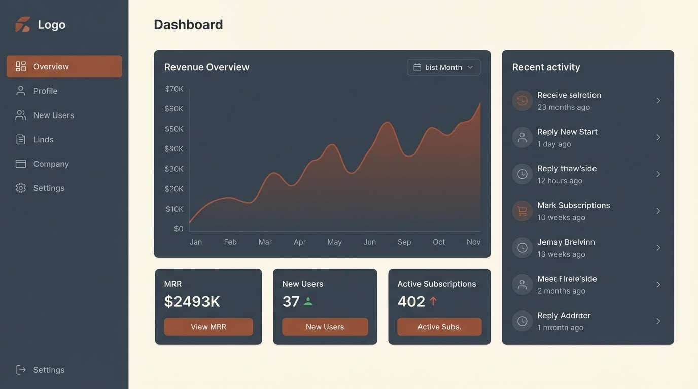
10) Chestnut Slate Modern
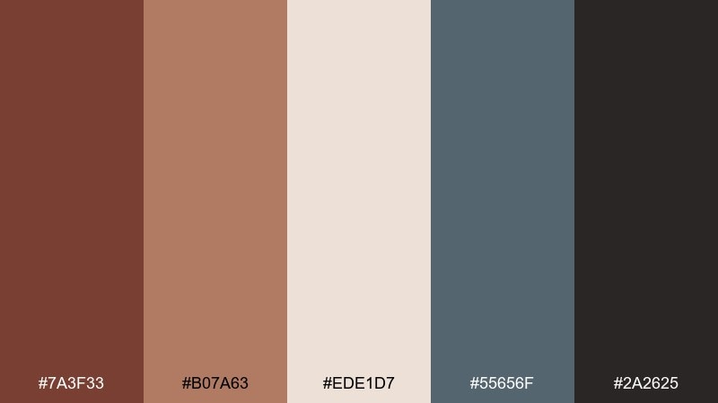
HEX: #7A3F33 #B07A63 #EDE1D7 #55656F #2A2625
Mood: modern, cool-warm balanced, urban
Best for: SaaS dashboard UI theme
Modern and urban, it pairs warm wood tones with cool slate for a confident, tech-friendly feel. These chestnut color combinations shine in dashboards where you need clear hierarchy without sterile grays. Use slate for panels and sidebars, then bring chestnut into key metrics, toggles, or focus states. Tip: reserve the darkest tone for headings and keep contrast checks on small UI labels.
Image example of chestnut slate modern generated using media.io
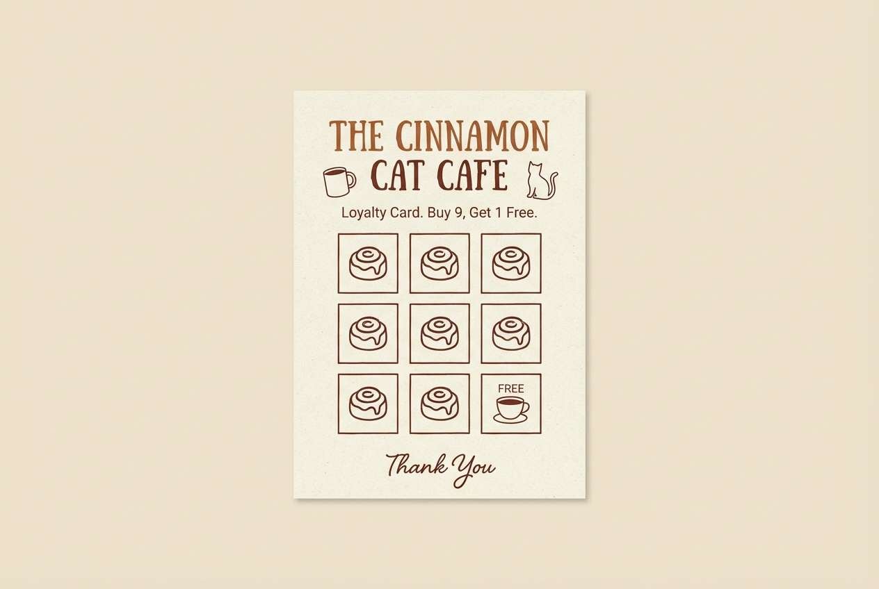
11) Cinnamon Oat Latte
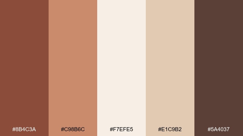
HEX: #8B4C3A #C98B6C #F7EFE5 #E1C9B2 #5A4037
Mood: comforting, friendly, approachable
Best for: cafe loyalty card and stamp
Comforting and friendly, it feels like cinnamon foam, toasted oats, and warm morning light. Perfect for cafes, wellness newsletters, and packaging that should feel approachable. Use the oat and cream tones for backgrounds, then add the richer browns for stamps and small icons. Tip: print the mid-tone on uncoated stock to keep the warmth true and avoid muddy shadows.
Image example of cinnamon oat latte generated using media.io
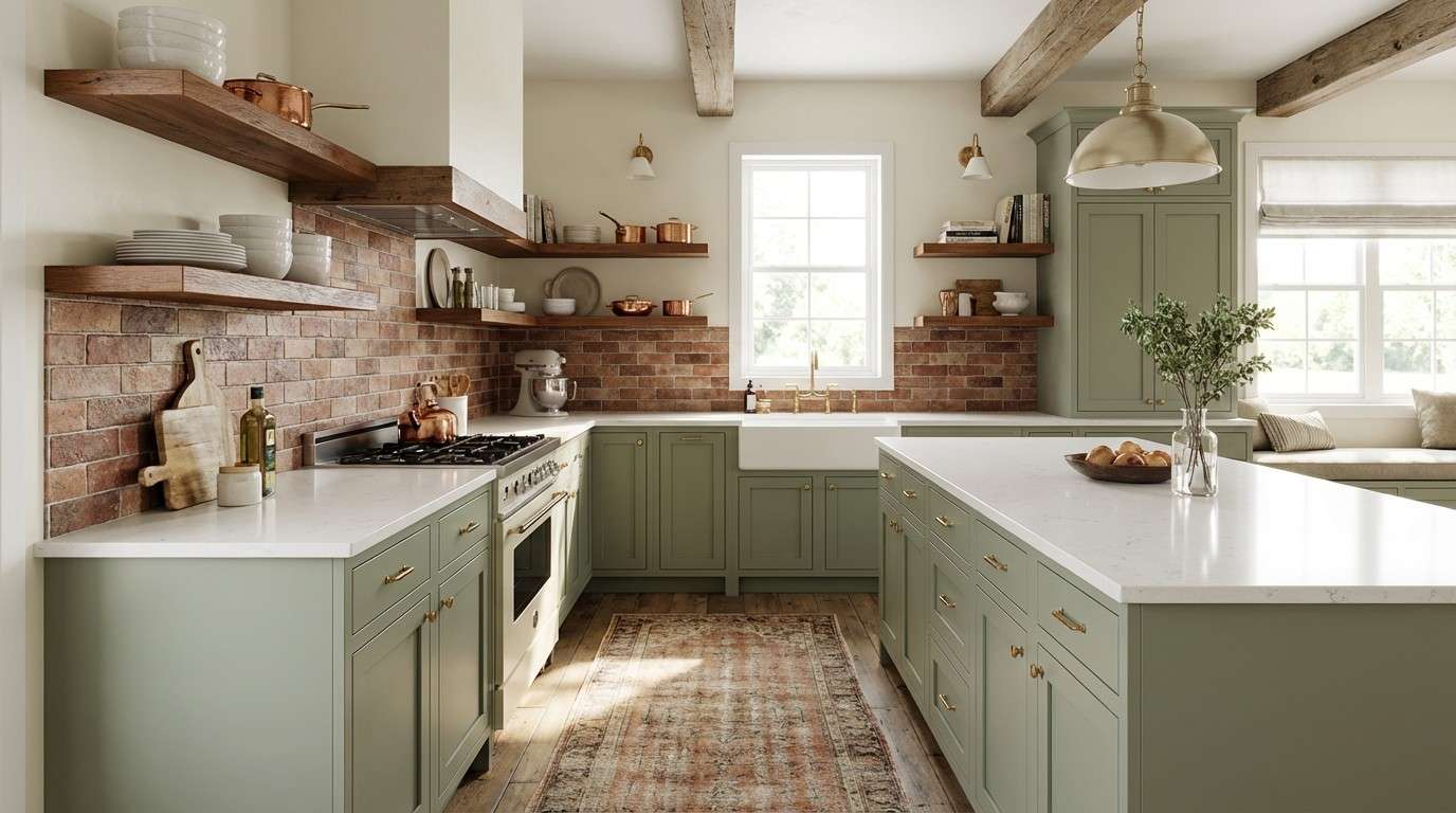
12) Brick and Sage Kitchen
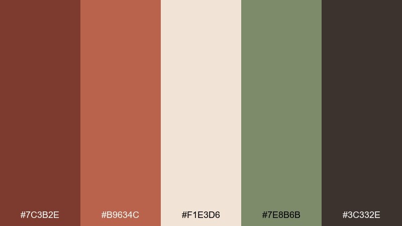
HEX: #7C3B2E #B9634C #F1E3D6 #7E8B6B #3C332E
Mood: homey, fresh, heritage
Best for: kitchen remodel color plan
Homey and fresh, it recalls brick ovens, herb bundles, and painted cabinetry. It is a smart choice for a kitchen palette where warmth needs a clean counterbalance. Sage works well on cabinets or accent tile, while chestnut fits wood floors and open shelving. Tip: keep hardware and grout in the light cream tone to unify the room.
Image example of brick and sage kitchen generated using media.io
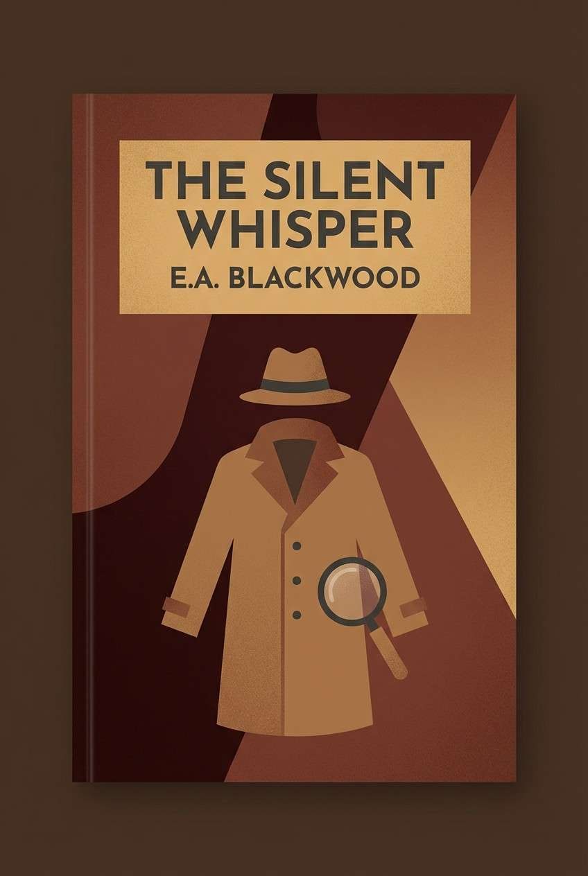
13) Mahogany Nightfall
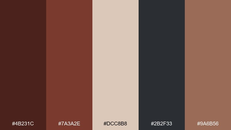
HEX: #4B231C #7A3A2E #DCC8B8 #2B2F33 #9A6B56
Mood: moody, cinematic, confident
Best for: book cover design for a mystery novel
Moody and cinematic, it feels like mahogany shelves, rain at dusk, and low-lit reading corners. Great for book covers, posters, and campaigns that need depth and intrigue. Use the warm tan as a spotlight area for titles, then set body text in cool charcoal for crisp contrast. Tip: add subtle grain and keep the darkest values reserved for edges and shadows.
Image example of mahogany nightfall generated using media.io
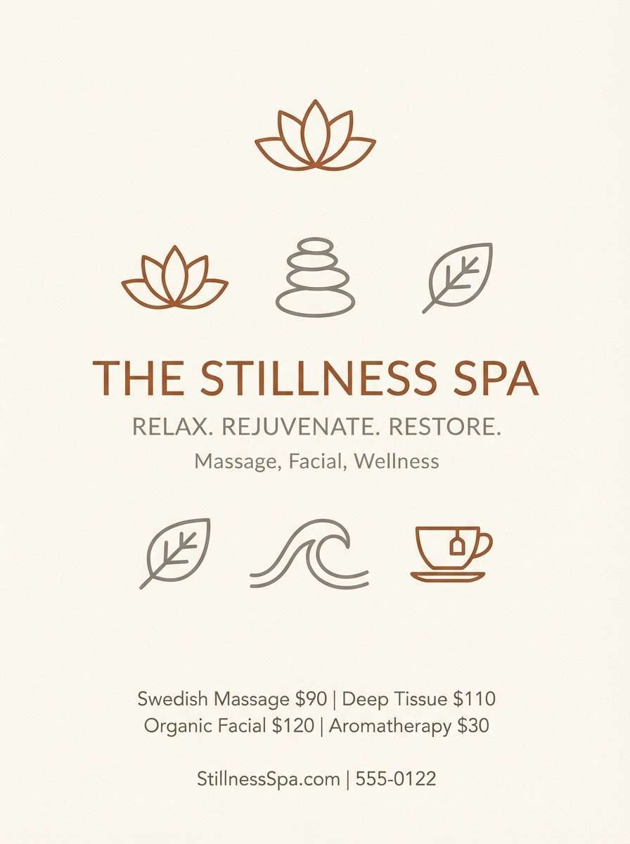
14) Pecan Sandstone Ease
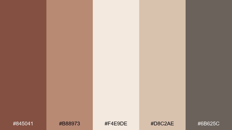
HEX: #845041 #B88973 #F4E9DE #D8C2AE #6B625C
Mood: relaxed, airy, understated
Best for: spa brochure and service list
Relaxed and airy, these chestnut color combinations suggest pecan shells, sandstone paths, and soft cotton robes. They work for spa brochures, slow-living blogs, and calm service menus. Keep the light cream as the dominant base, then use the warm mid brown for headings and section markers. Tip: combine generous line spacing with the taupe-gray to maintain a quiet, premium feel.
Image example of pecan sandstone ease generated using media.io
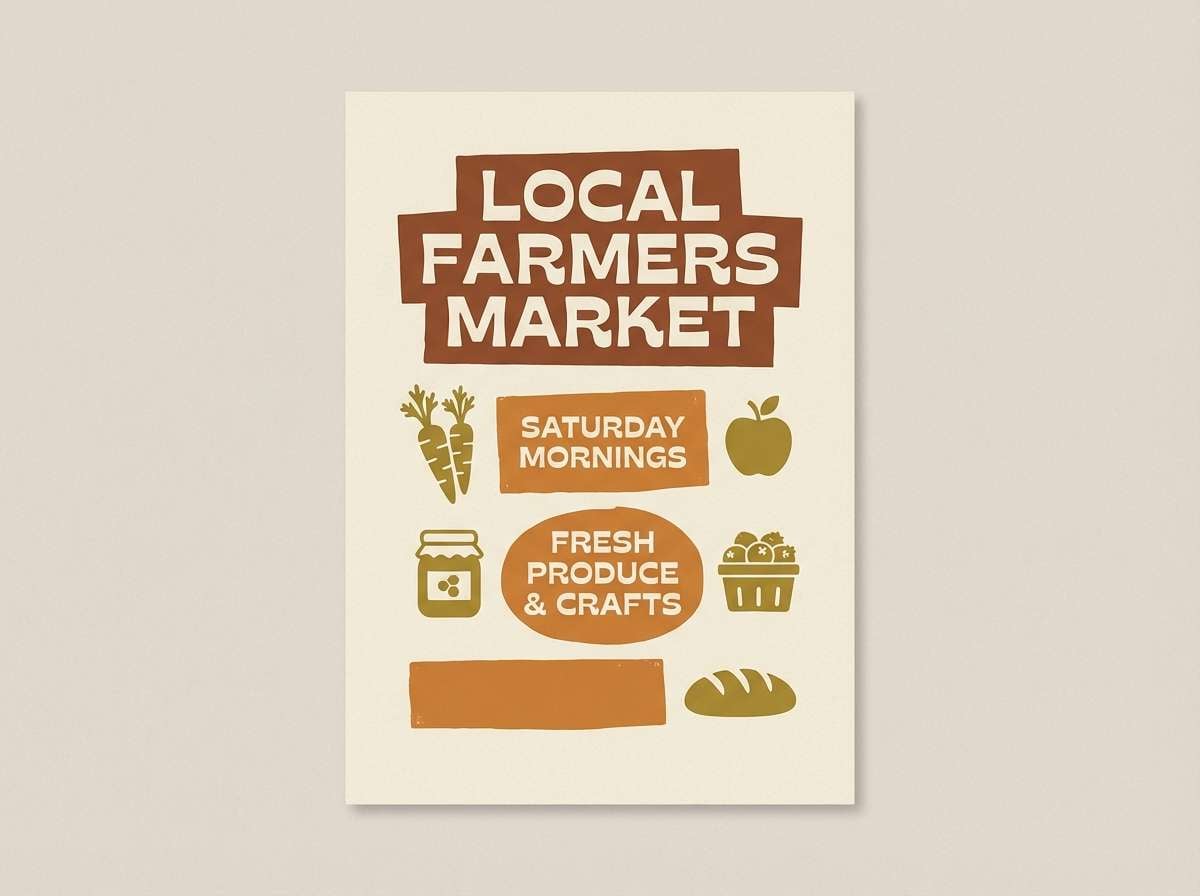
15) Rustic Orchard Harvest
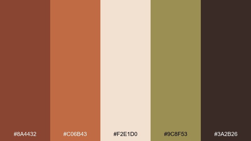
HEX: #8A4432 #C06B43 #F2E1D0 #9C8F53 #3A2B26
Mood: harvest, sunny, nostalgic
Best for: farmers market poster
Harvest-bright and nostalgic, the chestnut color palette evokes apple crates, late-afternoon sun, and warm spice in the air. Ideal for farmers market posters, seasonal promos, and artisanal food branding. The olive-gold supports earthy illustrations without stealing focus from the headline. Tip: use the darker brown for big, bold type and let the lighter tones carry the background.
Image example of rustic orchard harvest generated using media.io
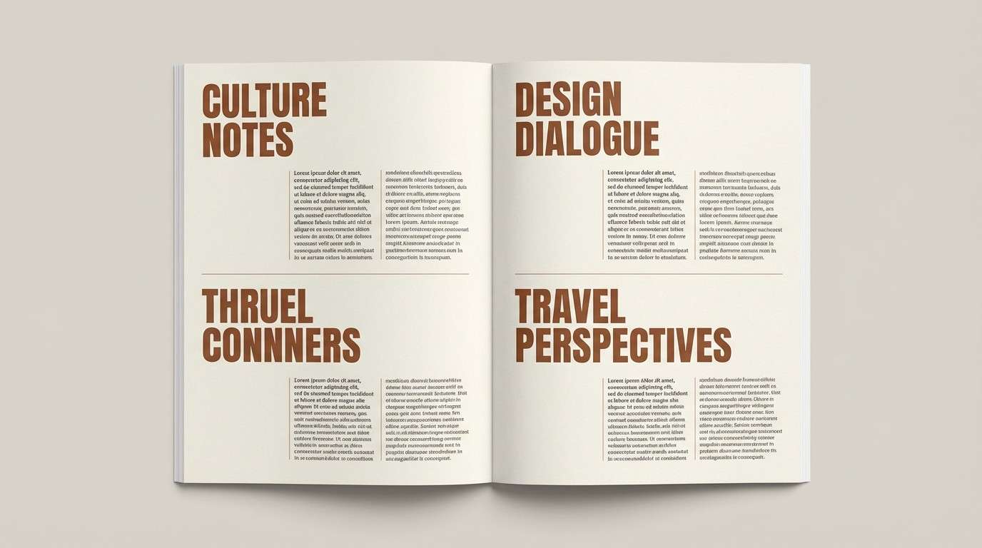
16) Sepia Paper Editorial
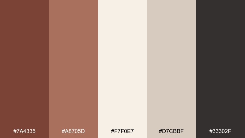
HEX: #7A4335 #A8705D #F7F0E7 #D7CBBF #33302F
Mood: editorial, thoughtful, timeless
Best for: magazine article layout
Editorial and timeless, it reads like sepia ink on creamy paper with a gentle, human touch. Use it for long-form articles, portfolios, and print-inspired websites where comfort matters. The deep neutral keeps text sharp, while the warm browns add rhythm in pull quotes and section headers. Tip: limit accent color to headings and rules so the layout stays calm.
Image example of sepia paper editorial generated using media.io
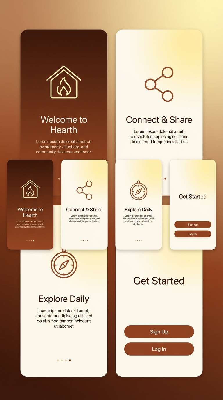
17) Burnt Umber Gradient
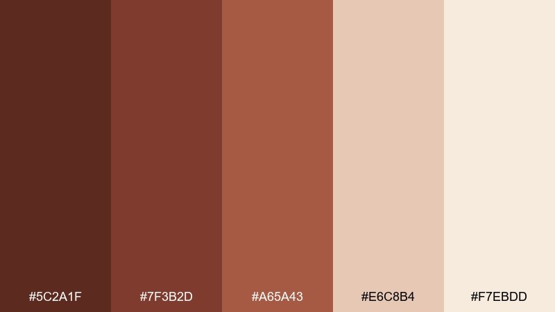
HEX: #5C2A1F #7F3B2D #A65A43 #E6C8B4 #F7EBDD
Mood: bold, warm, energetic
Best for: app onboarding screens
Bold and energetic, it feels like a warm gradient at golden hour moving into rich umber. It is perfect for onboarding flows, splash screens, and banners that need a strong first impression. Use the darkest tone for the first screen and transition into lighter creams to signal progress and clarity. Tip: keep icons simple and set primary text on the lightest background for accessibility.
Image example of burnt umber gradient generated using media.io
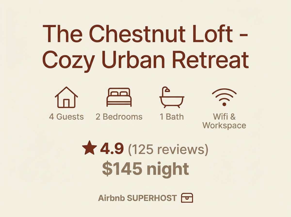
18) Cedar Cream Cottage
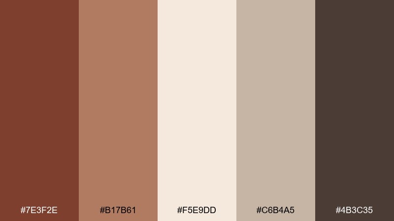
HEX: #7E3F2E #B17B61 #F5E9DD #C6B4A5 #4B3C35
Mood: cottage, gentle, welcoming
Best for: Airbnb listing cover graphics
Gentle and welcoming, it brings up cedar panels, cream curtains, and a quiet cottage weekend. Use it for hospitality graphics, listing covers, and welcome booklets that should feel warm but uncluttered. The soft taupe supports text overlays without harsh contrast. Tip: place titles on cream blocks and echo the mid brown in small icons for a consistent look.
Image example of cedar cream cottage generated using media.io
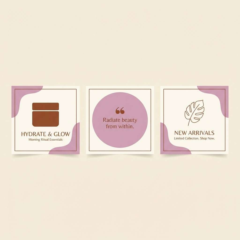
19) Chestnut Orchid Twist
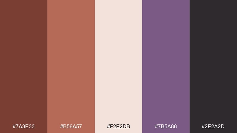
HEX: #7A3E33 #B56A57 #F2E2DB #7B5A86 #2E2A2D
Mood: creative, modern, slightly playful
Best for: beauty brand social post templates
Creative and modern, it pairs warm brown with a muted orchid that feels artsy rather than loud. These chestnut color combinations are great for beauty content, lifestyle posts, and creator templates that need a signature accent. Use orchid for stickers and small shapes, while chestnut stays dominant in typography and borders. Tip: keep the background soft and let the accent appear in one consistent spot per layout.
Image example of chestnut orchid twist generated using media.io
20) Warm Stone Exterior
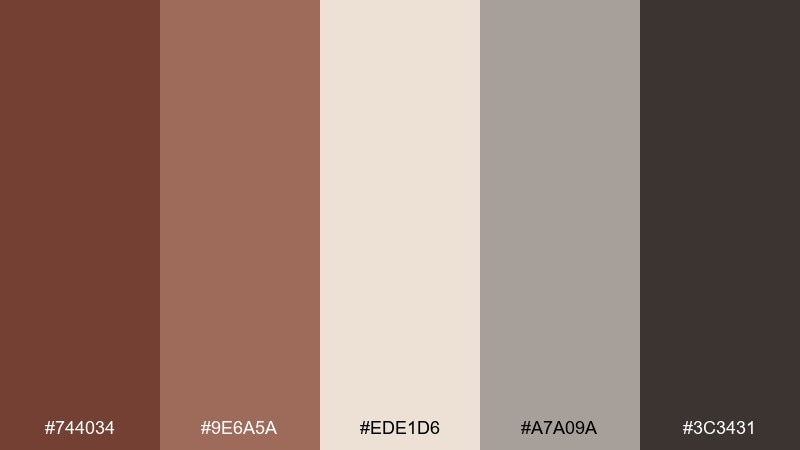
HEX: #744034 #9E6A5A #EDE1D6 #A7A09A #3C3431
Mood: architectural, steady, natural
Best for: home exterior paint planning
Architectural and steady, it suggests warm stone, aged timber, and shaded entryways. It is well suited to exterior planning, real estate brochures, and renovation decks that need grounded neutrals. Use the light cream for trim, the chestnut tone for doors or shutters, and the gray for roofing or stonework references. Tip: sample the mid tone in different daylight before committing to large surfaces.
Image example of warm stone exterior generated using media.io

21) Holiday Spice Wrap
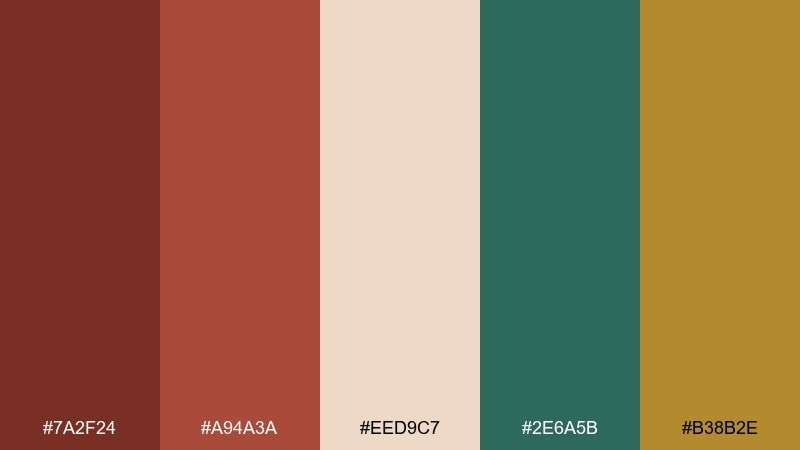
HEX: #7A2F24 #A94A3A #EED9C7 #2E6A5B #B38B2E
Mood: festive, cozy, rich
Best for: seasonal gift wrap and tag set
Festive and cozy, it feels like spiced cocoa, evergreen sprigs, and a hint of metallic ribbon. As a chestnut color scheme, it balances warmth with holiday-ready contrast for wrap, tags, and small packaging. Use deep green for small motifs and keep gold to minimal foil-like accents so it stays tasteful. Tip: print tags on cream stock and punch a green string to tie the set together.
Image example of holiday spice wrap generated using media.io
What Colors Go Well with Chestnut?
Chestnut pairs easily with creamy whites, oat, beige, and warm grays when you want a soft, natural look. These neutrals keep the palette breathable and help chestnut read as premium instead of heavy.
For modern contrast, combine chestnut with charcoal, near-black, slate blue, or steel gray—great for UI and editorial layouts. For a nature-forward twist, try muted sage, moss green, and olive-gold accents.
If you want a more playful or beauty-led vibe, add muted mauve, orchid, or blush tones. Keep the accent color limited so chestnut stays the “hero” tone.
How to Use a Chestnut Color Palette in Real Designs
In branding, use chestnut as the anchor (logo mark, key backgrounds, packaging panels) and let cream handle negative space for clarity. Add one supporting accent (copper, sage, or gold) for highlights like badges, seals, or callouts.
In web and UI, reserve the darkest tone for text and navigation, then use chestnut for active states, buttons, and data highlights. Pair with light creams for sections and cards so the interface stays readable.
In interiors, chestnut works best as a material color—wood, leather, trim, or doors—balanced with warm off-whites and a muted green/gray on secondary surfaces to prevent the room from feeling too red.
Create Chestnut Palette Visuals with AI
If you already have HEX codes, you can quickly generate on-brand visuals by describing the scene and calling out chestnut as the dominant tone. This helps you preview how the palette behaves on packaging, posters, or UI screens before you design for real.
Start with one palette above, reuse its prompt, then swap the subject (menu, label, hero banner) while keeping the same lighting and style keywords. You’ll get a consistent “set” of images that match your chestnut color scheme.
With Media.io, you can iterate fast—testing backgrounds, typography contrast, and accent placement until the palette feels balanced.
Chestnut Color Palette FAQs
-
What is the HEX code for chestnut?
Chestnut doesn’t have one single HEX code, but common chestnut shades include #7A3F33, #8B4A3A, and #744034. Pick the one that matches your desired warmth (more red) or depth (more brown). -
Is chestnut a warm or cool color?
Chestnut is typically a warm color because it contains red/orange undertones. You can cool it down by pairing it with slate, gray-blue, or charcoal. -
What colors complement chestnut brown?
Top complements include cream and beige for softness, sage or moss green for a natural balance, and charcoal/near-black for modern contrast. Gold and copper also work well as premium accents. -
How do I keep a chestnut palette from looking too dark?
Use a light base (cream/off-white) for most of the layout, keep chestnut for key blocks, and reserve the darkest brown or black mainly for text. This preserves warmth while maintaining readability. -
Does chestnut work for modern UI design?
Yes—especially when paired with cool neutrals like slate (#55656F) or gray-blue (#7D8A8E). Use chestnut for CTAs and highlights while keeping backgrounds light for accessibility. -
What’s a good chestnut palette for autumn branding?
Try Autumn Hearth Neutrals or Rustic Orchard Harvest. Both combine chestnut browns with warm creams and muted greens/golds for a seasonal, earthy feel. -
Can I generate chestnut-themed mockups with AI prompts?
Yes. Use a prompt that specifies the subject (packaging, poster, UI), the dominant colors (chestnut + supporting tones), and the lighting/style. Then iterate by changing only one variable at a time to keep results consistent.


