Ocean color palettes sit in the sweet spot between calm and clarity: cool blues and teals feel trustworthy, while high-contrast navies make UI and type look sharp.
Below are modern ocean tones with ready-to-use HEX codes—plus AI prompt examples you can remix for branding, posters, and product screens.
In this article
Why Ocean Palettes Work So Well
Ocean tones naturally communicate stability, depth, and focus—qualities that translate well to digital products and brand systems. Blues and teals also feel “clean” without becoming sterile, which is why they show up so often in UI and wellness design.
They’re easy to build hierarchy with: deep navy can anchor navigation and headings, mid blues support charts and cards, and light blue-whites keep layouts breathable. Add a warm accent (coral, amber, sand) and you get contrast that still feels cohesive.
Most ocean color combinations are also gradient-friendly. Subtle shifts from navy to cyan can add dimensionality to hero sections, banners, and backgrounds without relying on heavy imagery.
20+ Ocean Color Palette Ideas (with HEX Codes)
1) Deep Tide
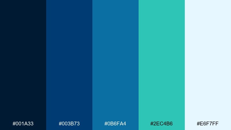
HEX: #001A33 #003B73 #0B6FA4 #2EC4B6 #E6F7FF
Mood: bold, clean, nautical
Best for: saas dashboard ui
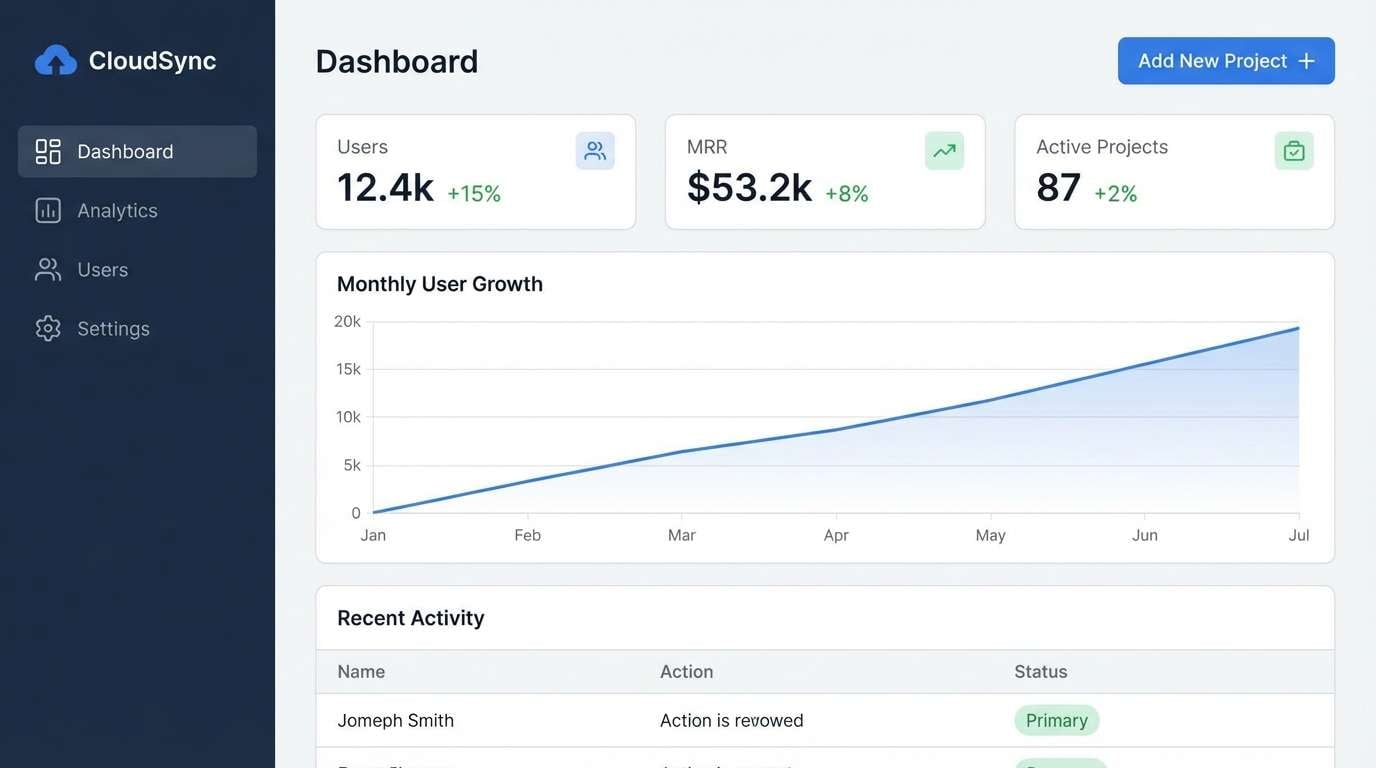
Bold and nautical like a deep channel meeting bright foam. The contrast between navy and aqua keeps layouts crisp while still feeling inviting. Use it for analytics screens, data tables, and navigation-heavy products, and pair it with white space and a warm gray for readability. Tip: reserve the teal for primary CTAs and keep charts mostly in blues for a calmer hierarchy in an ocean color palette.
Image example of deep tide generated using media.io
Media.io is an online AI studio for creating and editing video, image, and audio in your browser.

2) Sea Glass Calm
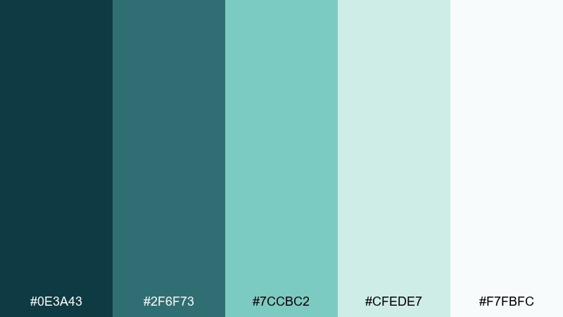
HEX: #0E3A43 #2F6F73 #7CCBC2 #CFEDE7 #F7FBFC
Mood: soft, airy, restorative
Best for: wellness brand identity
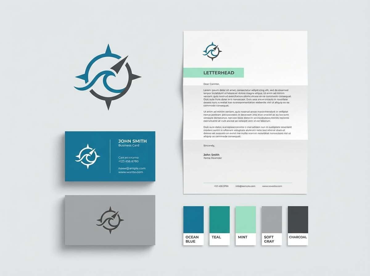
Soft and restorative, like sea glass smoothed by years of water and light. These muted teals and pale mints feel trustworthy for wellness, skincare, and mindful lifestyle branding. Pair with off-white paper textures and a subtle sand-beige to keep it warm instead of clinical. Tip: use the darkest teal for headlines and keep body copy in near-black for contrast.
Image example of sea glass calm generated using media.io
3) Coral Reef Pop
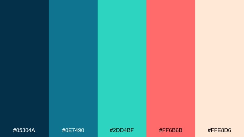
HEX: #05304A #0E7490 #2DD4BF #FF6B6B #FFE8D6
Mood: playful, vibrant, sunlit
Best for: summer event poster
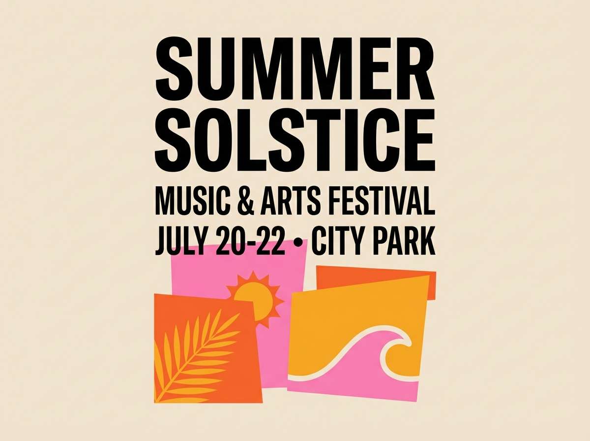
Playful and sunlit, like reef fish flashing between turquoise shadows and coral blooms. The teal-to-coral contrast creates one of those ocean color combinations that instantly grabs attention on posters and social graphics. Pair with creamy neutrals to stop the accents from feeling loud, and keep typography bold and simple. Tip: use coral only for key info like dates and ticket buttons.
Image example of coral reef pop generated using media.io
4) Stormy Atlantic
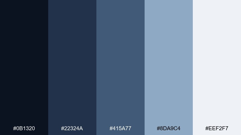
HEX: #0B1320 #22324A #415A77 #8DA9C4 #EEF2F7
Mood: moody, serious, refined
Best for: editorial magazine layout
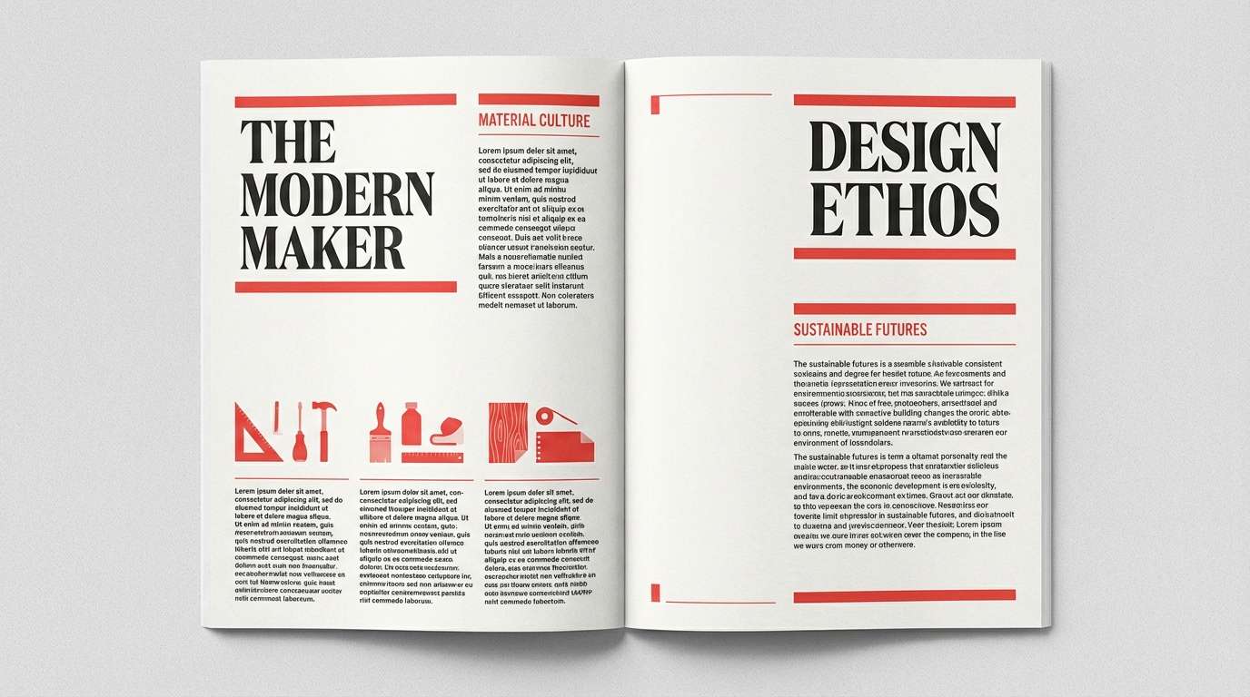
Moody and refined, like slate waves under a heavy sky. These cool blues and grays feel premium for editorial spreads, finance content, and documentary-style storytelling. Pair with a single warm accent like brass or terracotta to keep the page from feeling cold. Tip: set captions in the lightest blue-gray to create depth without losing legibility.
Image example of stormy atlantic generated using media.io
5) Tropical Current
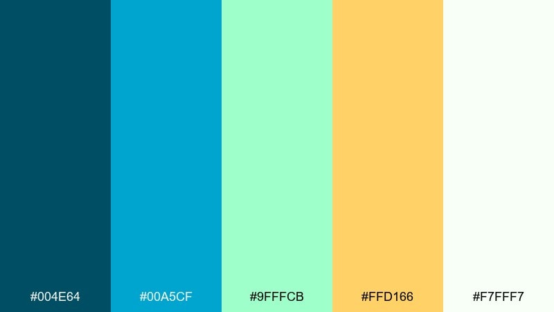
HEX: #004E64 #00A5CF #9FFFCB #FFD166 #F7FFF7
Mood: bright, energetic, vacation-ready
Best for: travel landing page ui
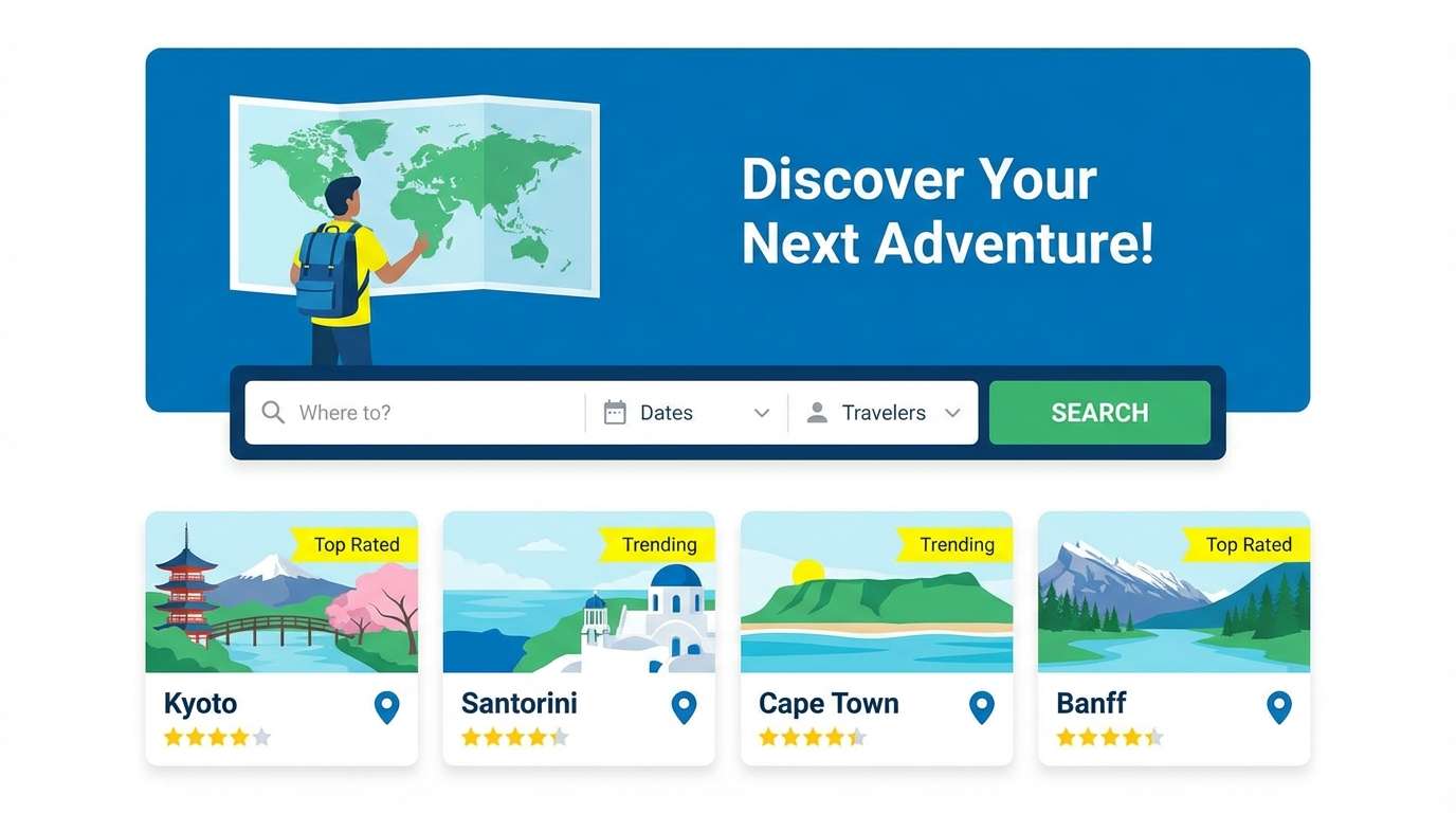
Bright and vacation-ready, like clear shallows lit by midday sun. The cyan and mint feel fresh, while the golden accent brings in warmth for deals and highlights. Use it on travel landing pages, itinerary cards, and booking CTAs, and pair with plenty of white space to keep it breezy. Tip: keep the yellow for badges and price tags so it reads as an intentional accent.
Image example of tropical current generated using media.io
6) Harbor Mist
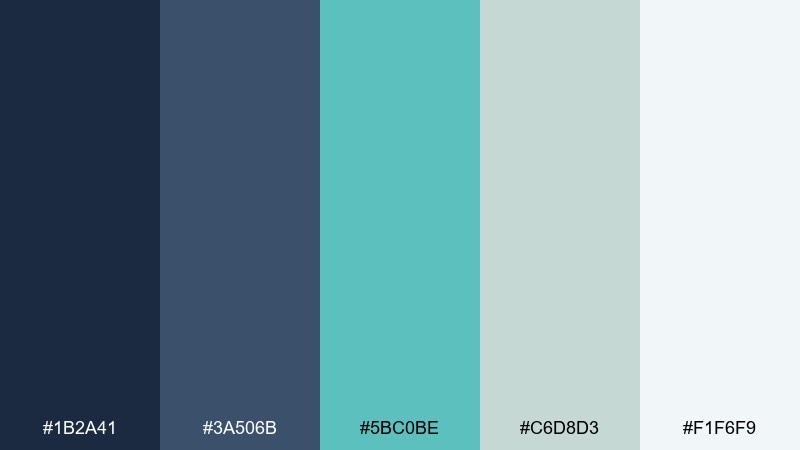
HEX: #1B2A41 #3A506B #5BC0BE #C6D8D3 #F1F6F9
Mood: quiet, modern, professional
Best for: presentation slide deck
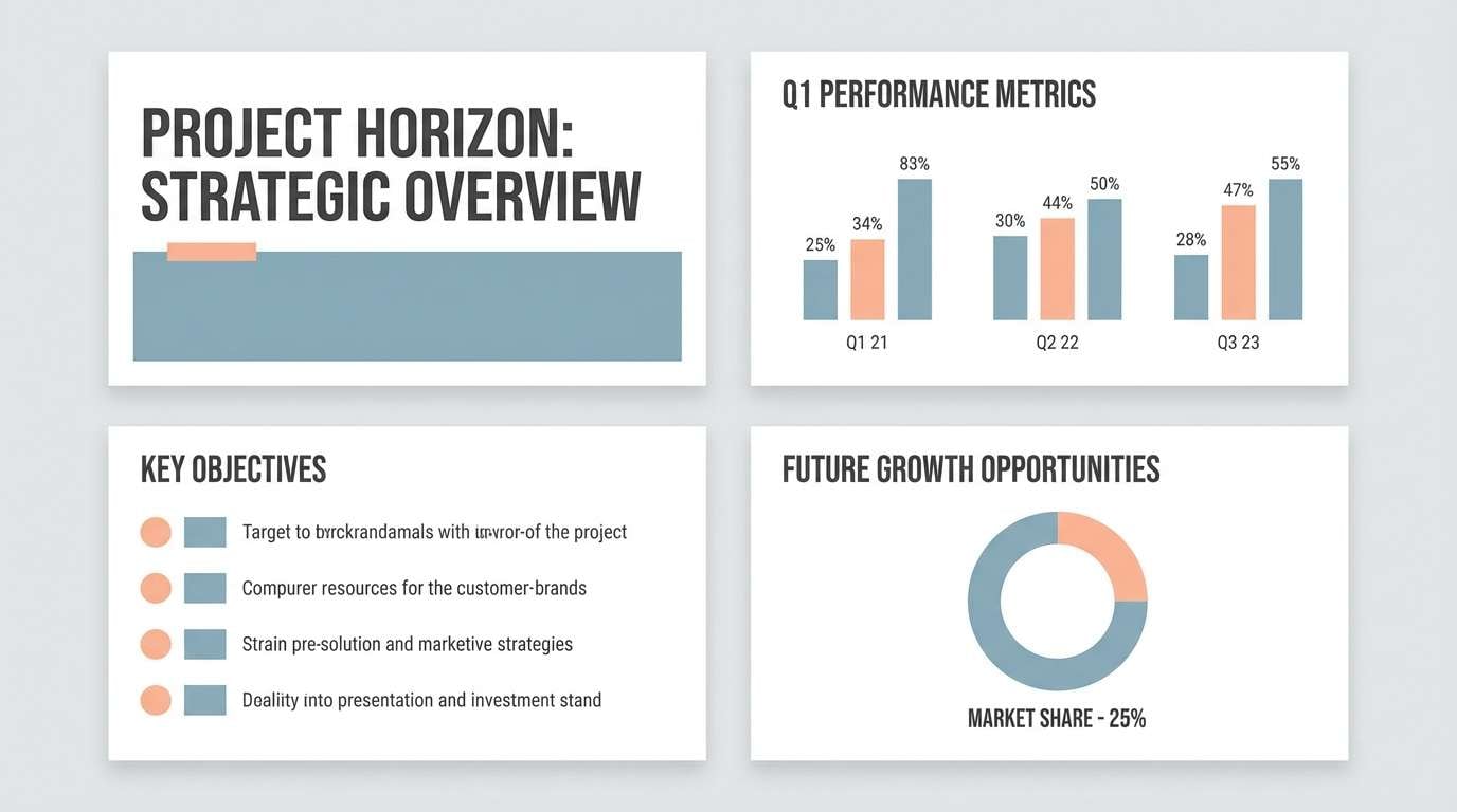
Quiet and modern, like a foggy harbor with teal buoys barely cutting through. The blue-grays keep content serious, while the soft teal adds a friendly, modern edge. It works well for pitch decks, reports, and B2B storytelling, especially when paired with simple iconography. Tip: use the darkest navy for headings and the misty gray for section backgrounds to structure slides.
Image example of harbor mist generated using media.io
7) Midnight Kelp
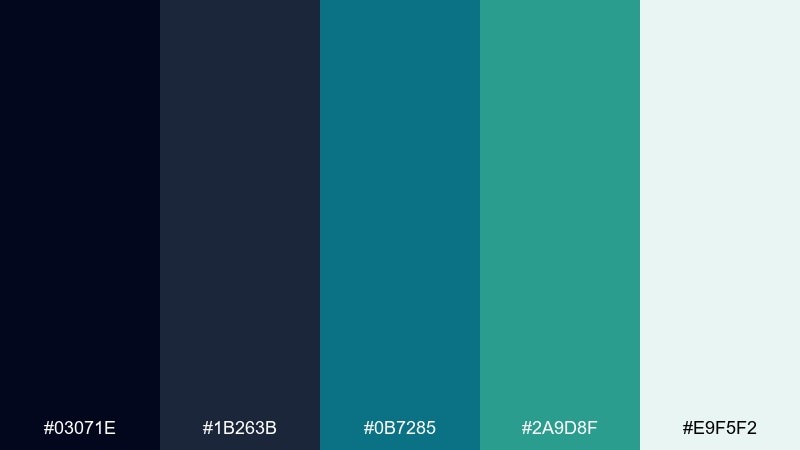
HEX: #03071E #1B263B #0B7285 #2A9D8F #E9F5F2
Mood: dramatic, sleek, underwater
Best for: tech product ad banner
Dramatic and sleek, like kelp forests fading into midnight water. The near-black navy makes the teals glow, which is perfect for tech ads and hero banners. Pair with minimalist typography and a restrained layout so the contrast feels premium, not noisy. Tip: add a subtle gradient from navy to deep teal behind the product headline for depth.
Image example of midnight kelp generated using media.io

8) Sandbar Breeze
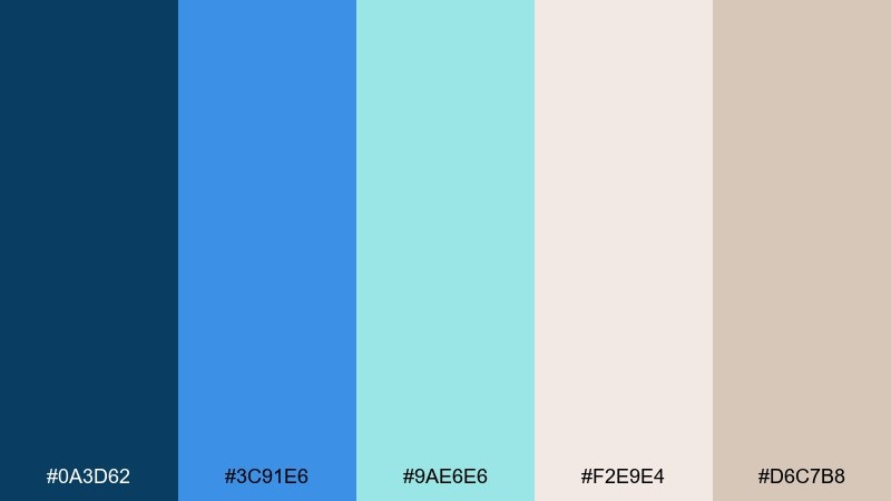
HEX: #0A3D62 #3C91E6 #9AE6E6 #F2E9E4 #D6C7B8
Mood: coastal, relaxed, sun-washed
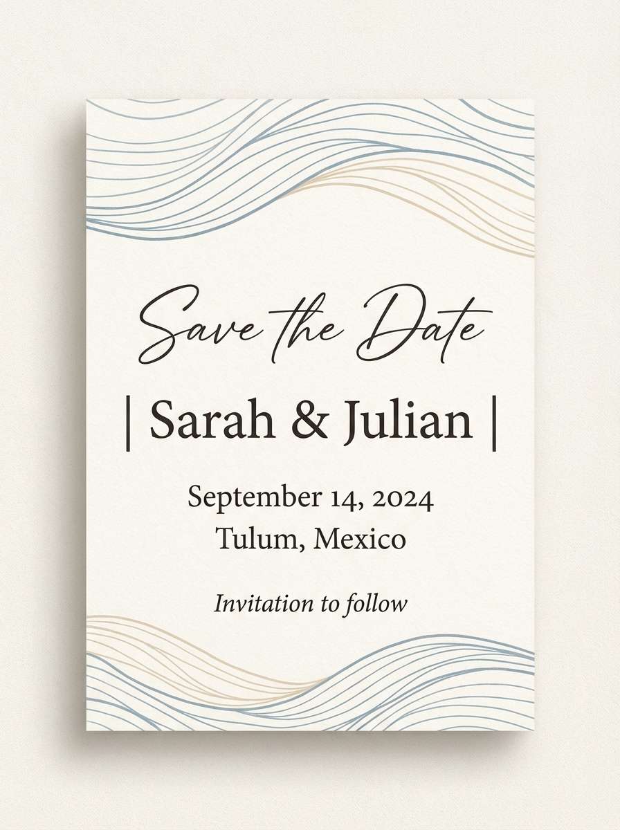
Best for: beach wedding invitation
Relaxed and sun-washed, like a sandbar appearing under clear water. The pairing of airy blues with warm neutrals creates an approachable ocean color scheme for invitations and stationery. Pair with elegant serif type and a thin-line motif, and keep the neutrals dominant for a softer look. Tip: print the tan as a light background and use the navy only for names and key details.
Image example of sandbar breeze generated using media.io
9) Dolphin Play
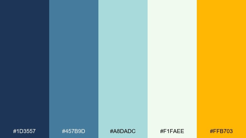
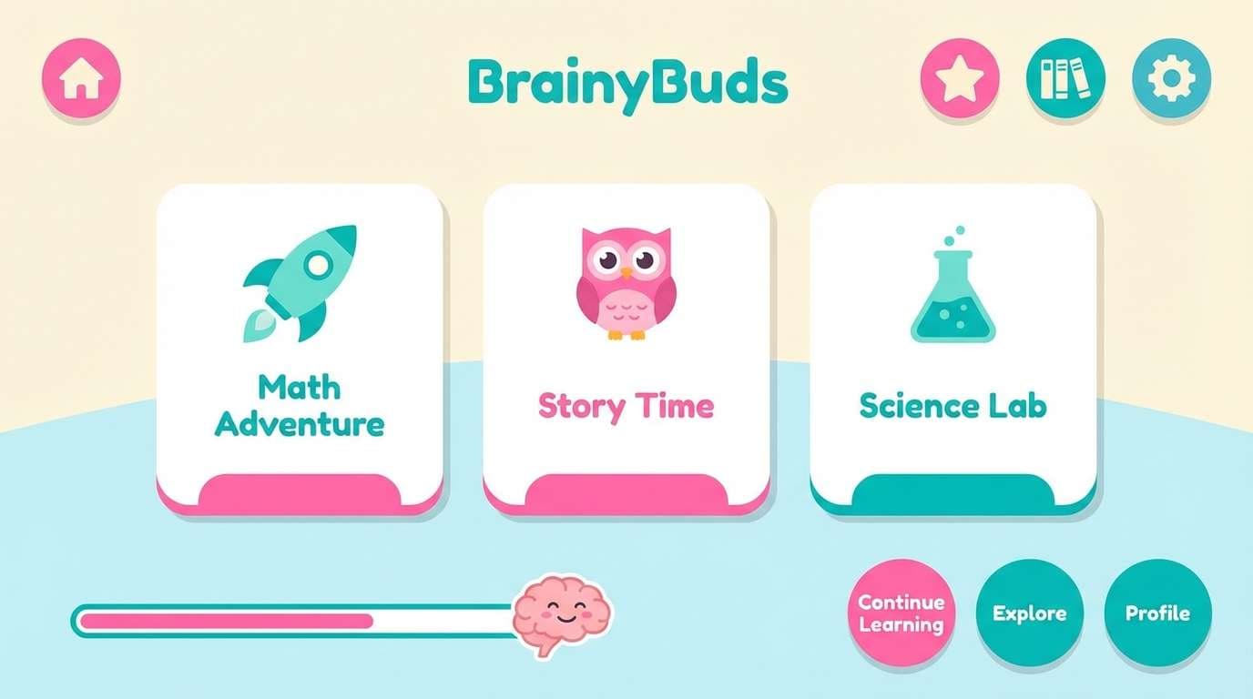
HEX: #1D3557 #457B9D #A8DADC #F1FAEE #FFB703
Mood: friendly, sporty, upbeat
Best for: kids learning app ui
Friendly and upbeat, like dolphins surfacing in bright morning water. The blue family stays calm enough for long screen time, while the sunny accent adds energy for rewards and progress states. Use it for kids apps, onboarding flows, and playful micro-interactions, and pair with rounded shapes and big type. Tip: keep the yellow to small UI moments like stars, badges, and toggles.
Image example of dolphin play generated using media.io
10) Nautical Classic
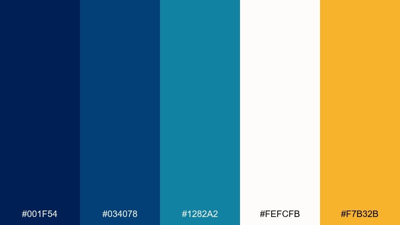
HEX: #001F54 #034078 #1282A2 #FEFCFB #F7B32B
Mood: timeless, crisp, confident
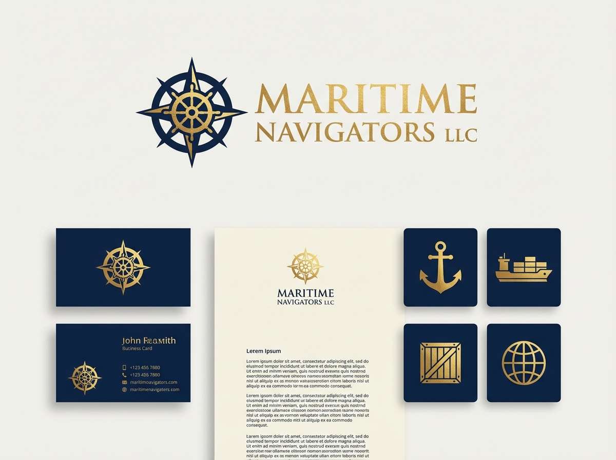
Best for: shipping company branding
Timeless and confident, like crisp uniforms and painted hull numbers. Navy and white keep it authoritative, while the gold accent adds a classic signal color for highlights. It suits logistics brands, service websites, and signage, especially when paired with strong sans-serif typography. Tip: use the gold sparingly for icons and calls-to-action to avoid a sports-team vibe.
Image example of nautical classic generated using media.io
11) Lagoon Neon
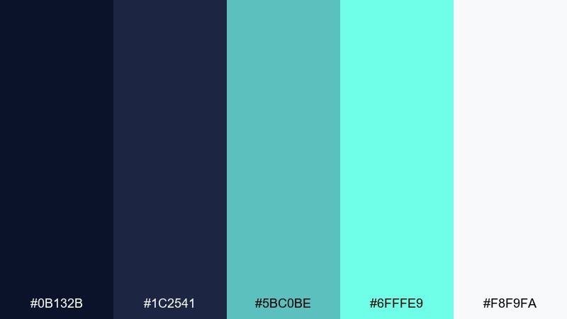
HEX: #0B132B #1C2541 #5BC0BE #6FFFE9 #F8F9FA
Mood: electric, modern, nightlife
Best for: music festival flyer
Electric and modern, like neon reflections rippling across a night lagoon. The bright aqua tones pop against deep indigo, making titles and lineups instantly readable. Use it for music flyers and social posts, and pair with geometric shapes or glitch textures for extra energy. Tip: keep body text in near-white and save the neon mint for the headliner and key accents.
Image example of lagoon neon generated using media.io

12) Glacier Bay
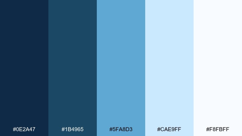
HEX: #0E2A47 #1B4965 #5FA8D3 #CAE9FF #F8FBFF
Mood: cool, crisp, spacious
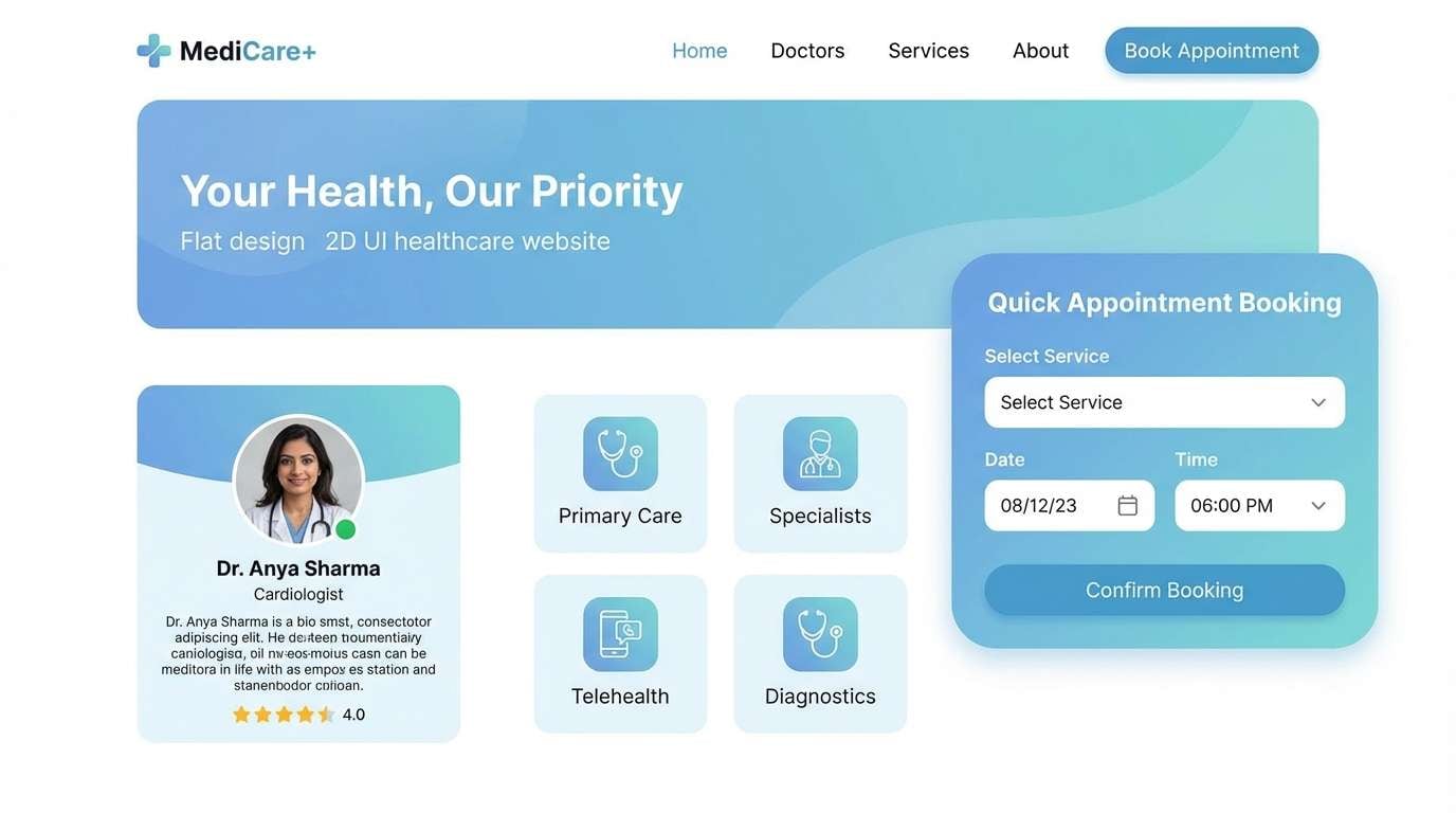
Best for: healthcare website ui
Cool and spacious, like glacial water under clear air. The icy blues feel clean and reassuring for healthcare, clinics, and patient portals. Pair with soft rounded cards, generous spacing, and a tiny warm accent (like coral) if you need stronger emphasis. Tip: use the palest blue as section backgrounds to guide scanning without heavy borders.
Image example of glacier bay generated using media.io
13) Marine Sunset
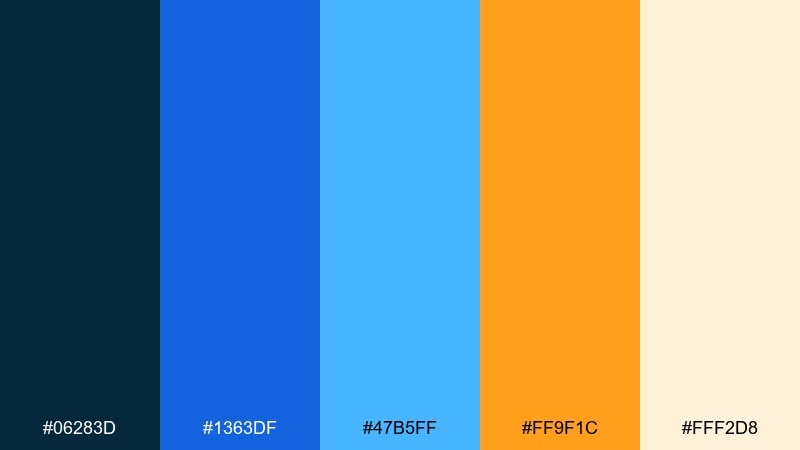
HEX: #06283D #1363DF #47B5FF #FF9F1C #FFF2D8
Mood: warm, optimistic, cinematic
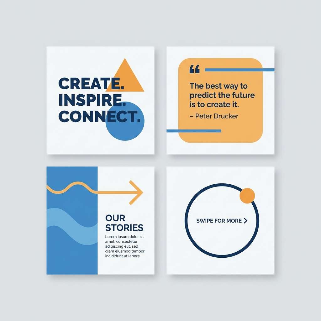
Best for: instagram carousel templates
Warm and cinematic, like the horizon turning orange over a calm blue surface. The blue-to-amber contrast makes punchy slides that still feel polished. These ocean color combinations work great for carousel templates, quotes, and announcements when paired with big type and simple dividers. Tip: let the cream background do most of the work and use orange only for a single highlight per slide.
Image example of marine sunset generated using media.io
14) Pearl Diver
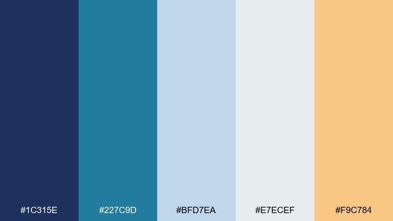
HEX: #1C315E #227C9D #BFD7EA #E7ECEF #F9C784
Mood: elegant, light, premium
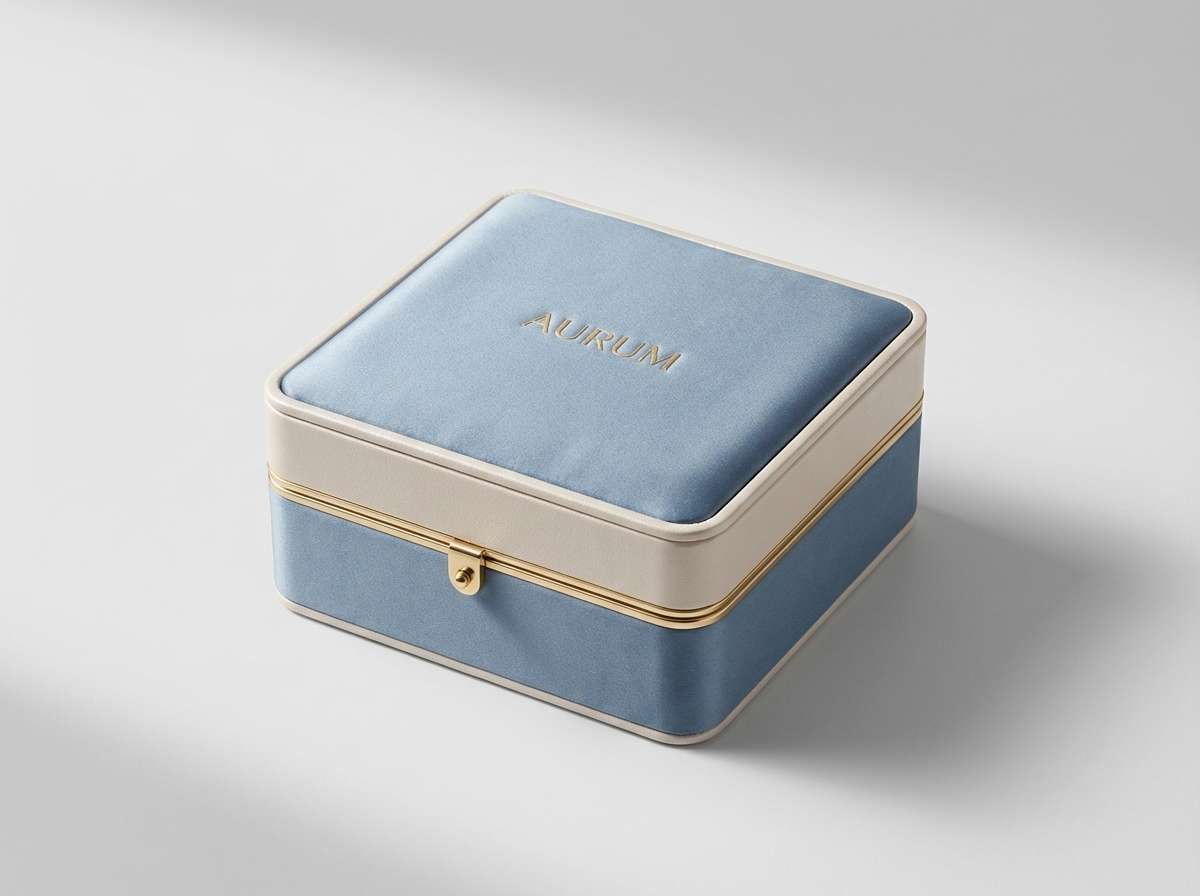
Best for: jewelry product packaging
Elegant and light, like pearls lifted from pale water with a hint of golden warmth. The powdery blues read premium without feeling icy, ideal for jewelry, cosmetics, and boutique packaging. Pair with embossed details, matte finishes, and a dark ink for typography to keep it refined. Tip: use the peach tone as a foil-stamp accent rather than a full panel color.
Image example of pearl diver generated using media.io
15) Blueprint Wave
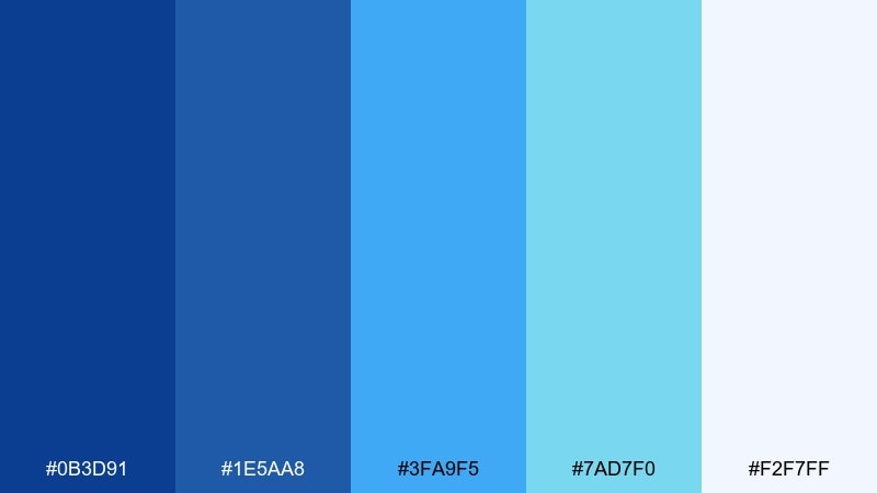
HEX: #0B3D91 #1E5AA8 #3FA9F5 #7AD7F0 #F2F7FF
Mood: structured, bright, innovative
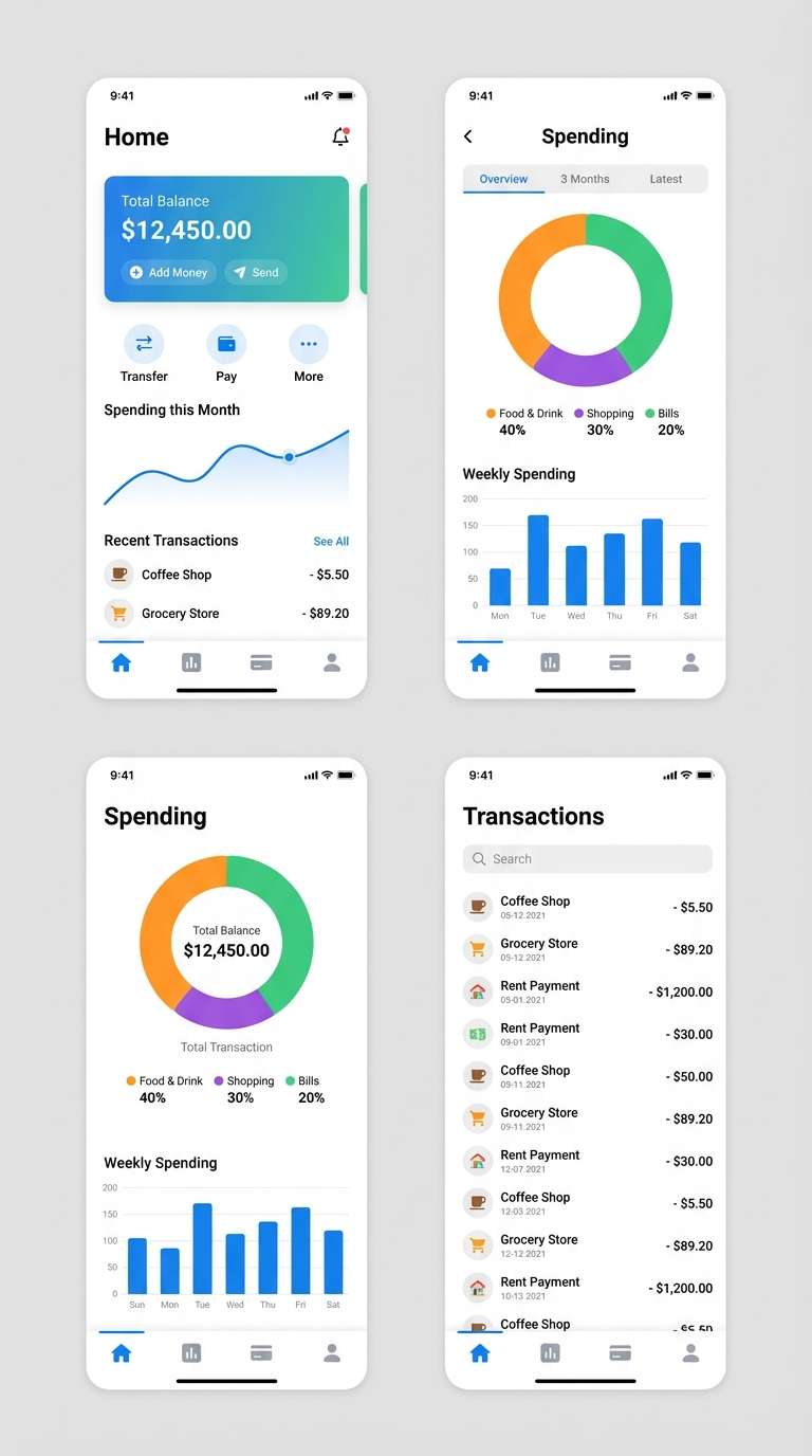
Best for: fintech mobile app ui
Structured and innovative, like technical blueprints drawn over moving water. The gradient-friendly blues are perfect for graphs, cards, and tab bars without visual clutter. Use it for a mobile product where trust matters, and pair with a single warm accent (like coral) for alerts and confirmations. Tip: keep the lightest tone for backgrounds and reserve the darkest for navigation and totals in an ocean color palette.
Image example of blueprint wave generated using media.io
16) Aquatic Pastels
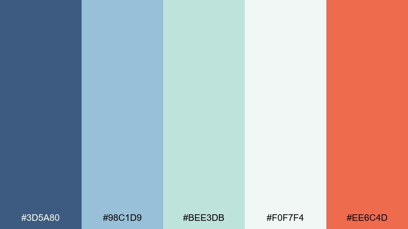
HEX: #3D5A80 #98C1D9 #BEE3DB #F0F7F4 #EE6C4D
Mood: gentle, friendly, modern
Best for: blog header and icons
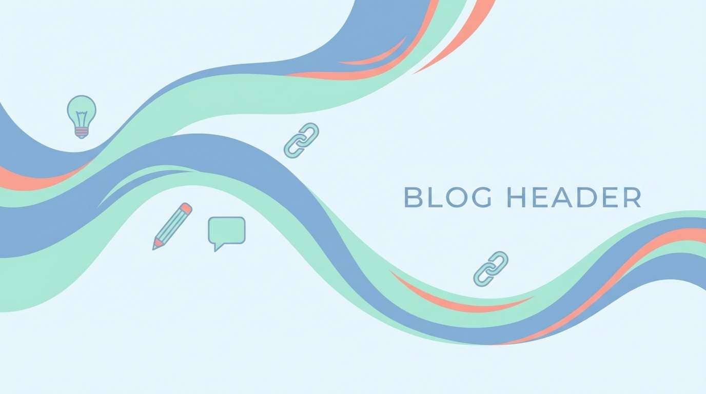
Gentle and friendly, like watercolor washes drifting across shallow water. Pastel blues and mints keep things approachable, while the soft coral adds a modern spark for highlights. Use it for blog headers, icon sets, and simple illustrations, and pair with rounded sans-serif type. Tip: apply coral only to one icon per row to create a clear focal point.
Image example of aquatic pastels generated using media.io
17) Tidepool Botanica
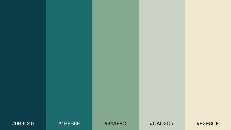
HEX: #0B3C49 #1B6B6F #84A98C #CAD2C5 #F2E8CF
Mood: earthy, coastal, natural
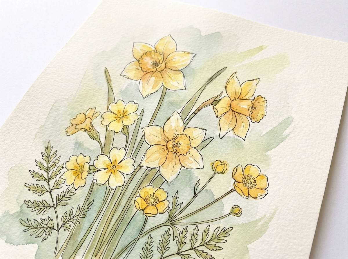
Best for: watercolor botanical prints
Earthy and coastal, like tidepool plants clinging to rocks in brackish water. The green-leaning teals feel organic, making them ideal for botanical art and nature-forward branding. Pair with textured paper backgrounds and soft pencil outlines for a handcrafted look. Tip: keep the cream tone as the page base so the darker greens read like ink, not heavy blocks.
Image example of tidepool botanica generated using media.io
18) Coastal Cafe
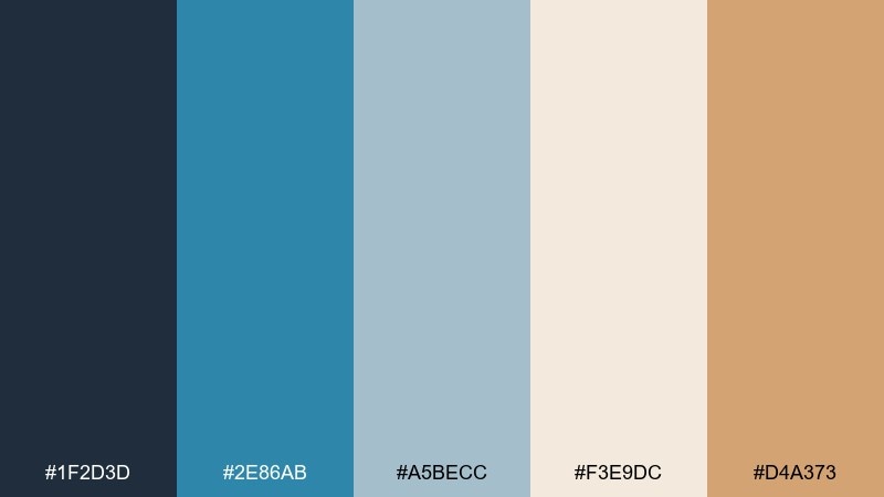
HEX: #1F2D3D #2E86AB #A5BECC #F3E9DC #D4A373
Mood: cozy, coastal, inviting
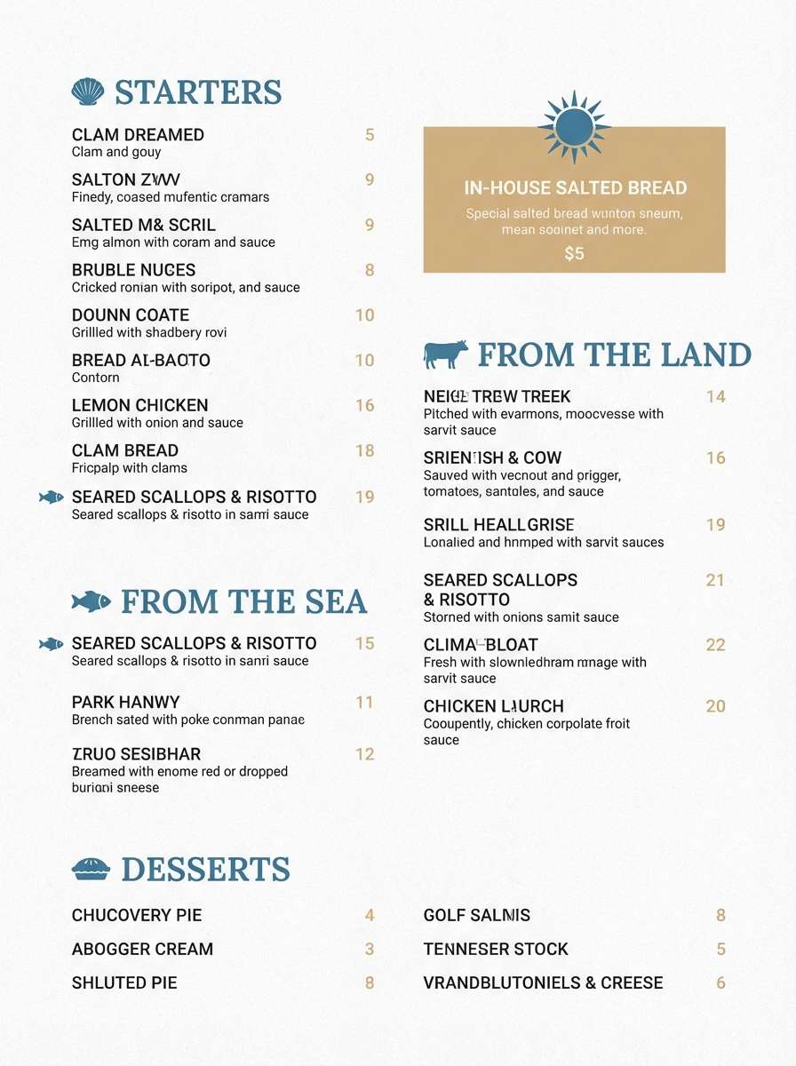
Best for: restaurant menu design
Cozy and inviting, like a seaside cafe with blue-painted trim and warm wood. The sandy cream and caramel tones balance the coastal blues so the design feels comforting rather than cold. Use it for menus, loyalty cards, and storefront signage, and pair with a classic serif for dish names. Tip: highlight specials using the caramel accent in small badges or underlines.
Image example of coastal cafe generated using media.io
19) Sailcloth Neutral
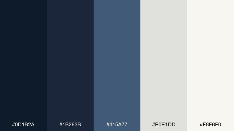
HEX: #0D1B2A #1B263B #415A77 #E0E1DD #F8F6F0
Mood: minimal, mature, dependable
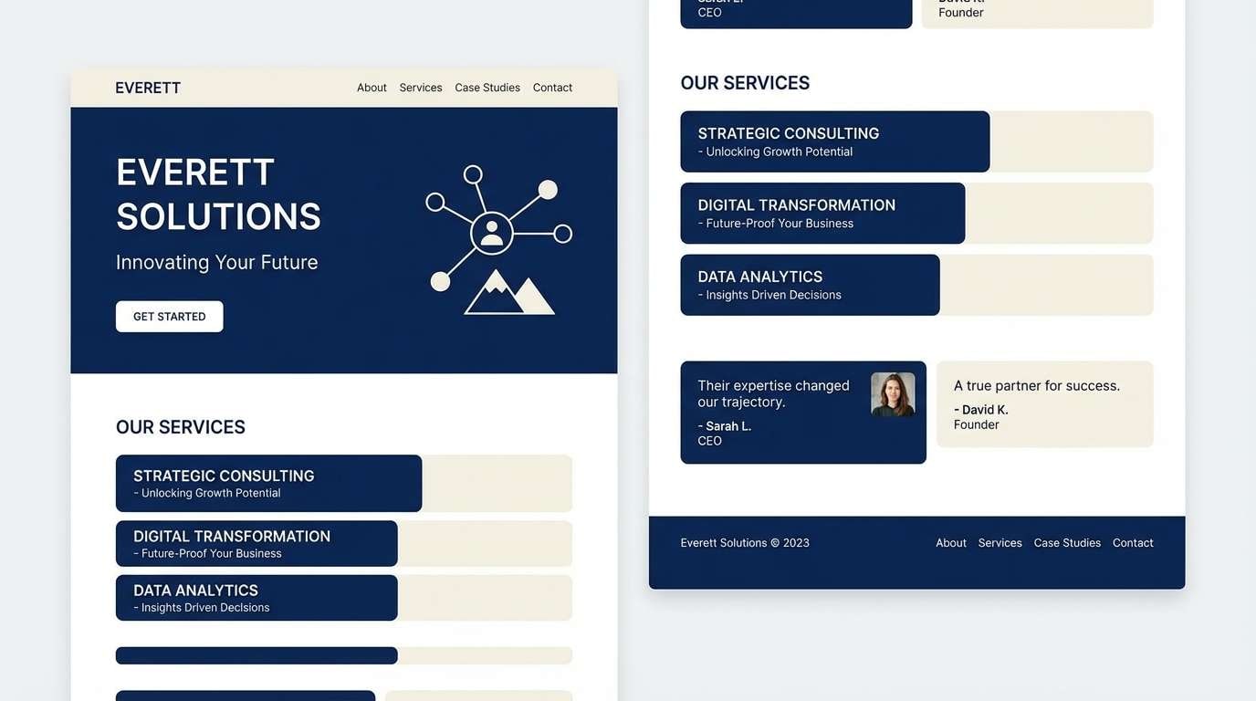
Best for: corporate website refresh
Minimal and dependable, like sailcloth against deep water and steel hardware. The controlled neutrals make it easy to scale across pages, components, and long-form content. Use it for a corporate refresh where clarity matters, and pair with one accent color (teal or amber) for CTAs and status tags. Tip: build a consistent grayscale token set from these tones to keep UI decisions fast.
Image example of sailcloth neutral generated using media.io
20) Deep Sea Luxury
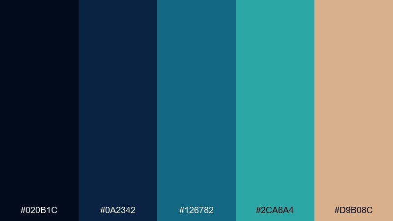
HEX: #020B1C #0A2342 #126782 #2CA6A4 #D9B08C
Mood: luxury, mysterious, high-contrast
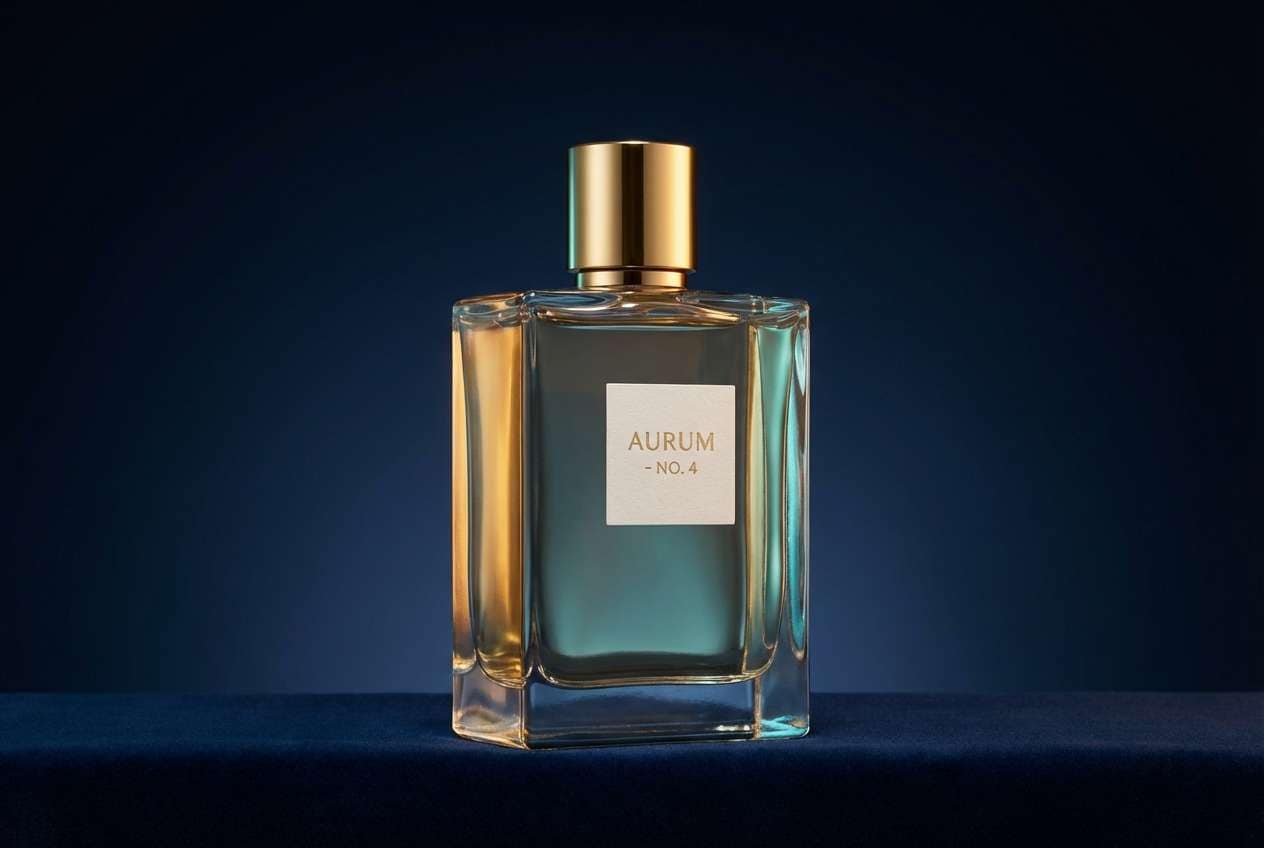
Best for: premium fragrance ad
Luxury and mysterious, like deep water lit by a single beam and a glint of gold. The dark blues feel exclusive, while the warm metallic accent adds richness without turning brassy. Use it for premium fragrance, spirits, or high-end launches, and pair with generous negative space and elegant type. Tip: keep the gold tone as a thin rule line and small logo mark for maximum sophistication.
Image example of deep sea luxury generated using media.io
What Colors Go Well with Ocean?
Ocean blues pair easily with crisp neutrals like white, off-white, and cool grays for a modern, readable base. For a softer coastal feel, use sand, beige, or warm cream to keep the palette welcoming.
If you want contrast, add a warm accent that feels “sunlit”: coral, amber, or peach can highlight buttons, prices, dates, and key labels without fighting the blues. For premium vibes, try muted gold or caramel in small doses.
For nature-forward designs, ocean tones also work well with seaweed greens and sage. This keeps the palette coastal and organic, especially for packaging, prints, or eco branding.
How to Use a Ocean Color Palette in Real Designs
Start with roles, not swatches: pick one darkest ocean tone for navigation and headings, a mid-tone for components (cards, charts, dividers), and a light tone for backgrounds. This keeps your UI consistent even as layouts grow.
Reserve your warm accent for meaning—CTAs, alerts, badges, and “new” labels—so it stays special. If everything is highlighted, nothing is highlighted.
For posters and social graphics, try a dark ocean base with bright aqua for large shapes, then use coral or amber for just one key detail (date, venue, or button). You’ll get impact without visual noise.
Create Ocean Palette Visuals with AI
Want to see your ocean color palette in action before committing to a full design system? Generate quick mockups (posters, UI screens, brand boards) from a short text prompt, then iterate on tone, contrast, and accent placement.
With Media.io’s text-to-image, you can keep the same prompt structure and simply swap palette intent (nautical, tropical, stormy, luxury) to explore options fast. Save the best results as references for your UI tokens or brand guidelines.
When you find a direction you like, generate a small set: one hero image, one detail close-up, and one layout mock. That trio makes decisions easier for stakeholders.
Ocean Color Palette FAQs
-
What is an ocean color palette?
An ocean color palette is a set of coordinated colors inspired by the sea—typically navy, ocean blue, teal, and light blue-white—often paired with a warm accent like coral, amber, or sand for contrast. -
Which ocean colors are best for UI design?
For UI, use a deep navy for navigation and headings, mid blues for components and charts, and a very light blue-white for backgrounds. Add one accent color (teal, coral, or amber) for CTAs and status states to maintain clear hierarchy. -
Do ocean palettes work for branding outside tech?
Yes. Softer teals and mints feel restorative for wellness and skincare, blue-grays feel premium for editorial and finance, and coastal blue + sand neutrals work well for hospitality, weddings, and food menus. -
What accent color pairs best with ocean blue?
Coral and amber are the most reliable accents because they sit opposite cool blues and create readable contrast. If you want a quieter look, use warm cream, beige, or muted gold instead of bright accents. -
How do I keep an ocean palette from feeling too cold?
Increase the amount of warm neutrals (cream, sand, beige) in backgrounds, and use a small warm accent for highlights. Also keep body text near-black rather than teal for better readability and a less “icy” feel. -
Can I use multiple teals in one ocean palette?
You can, but assign roles: one teal for primary actions, one for supporting elements (icons, secondary buttons), and keep most surfaces in blues or neutrals. This prevents the design from looking overly saturated or busy. -
How can I generate ocean palette mockups quickly?
Use a text-to-image tool to generate a brand board, UI mockup, or poster concept from a prompt, then iterate by changing only one variable at a time (mood, lighting, or accent color). This helps you validate contrast and vibe before production.
Next: Lilac Color Palette


