

Dark green is one of the most versatile “deep” hues: it can feel luxurious, natural, modern, or classic depending on what you pair it with. It also plays nicely with both warm neutrals (cream, tan, brass) and cool accents (misty teal, mint, charcoal).
Below are 20 curated dark green color palette ideas with HEX codes, plus practical pairing tips for interiors, branding, and UI.
In this article
Why Dark Green Palettes Work So Well
Dark green is naturally “grounding,” which makes layouts feel stable and intentional. It can read as premium (like velvet or emerald) or organic (like pine and moss) without changing the core hue.
It also supports strong hierarchy: deep greens can anchor navigation, headings, or packaging panels, while lighter tints create breathable space for content. This balance is especially helpful in UI where contrast and readability matter.
Finally, dark green is flexible across seasons and industries—luxury, wellness, outdoor, food, and editorial design all benefit from its calm-but-confident presence.
20+ Dark Green Color Palette Ideas (with HEX Codes)
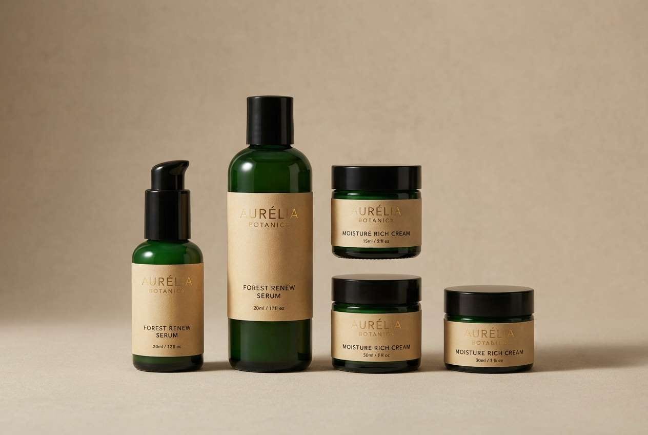
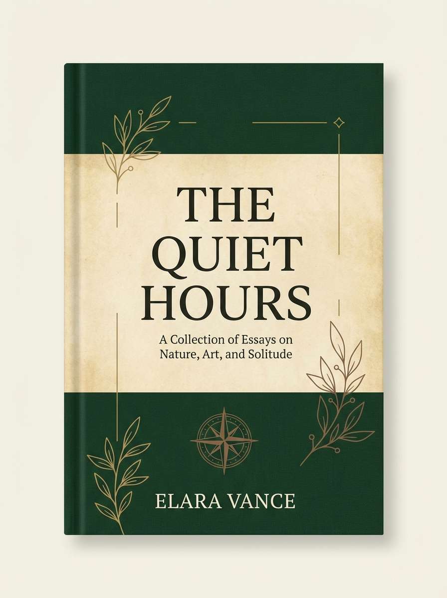
1) Forest Velvet
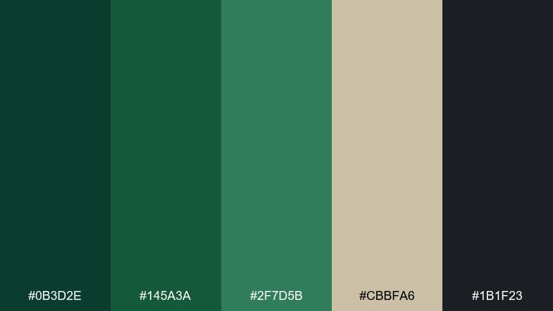
HEX: #0b3d2e #145a3a #2f7d5b #cbbfa6 #1b1f23
Mood: moody, luxurious, grounded
Best for: premium branding and packaging
Moody and plush like velvet drapes in a candlelit study, these greens feel instantly upscale. Use this dark green color palette for premium labels, cosmetics, and boutique food packaging where contrast matters. Pair the deep greens with warm parchment and near-black for legible type and a high-end finish. Tip: add subtle foil or emboss on the light neutral to make the darker tones feel even richer.
Image example of forest velvet generated using media.io
Media.io is an online AI studio for creating and editing video, image, and audio in your browser.

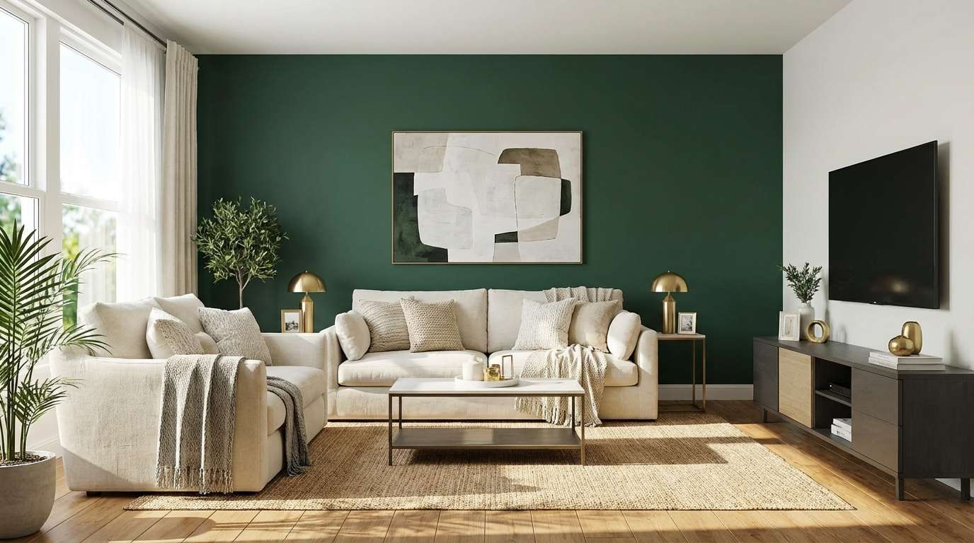
2) Evergreen & Cream
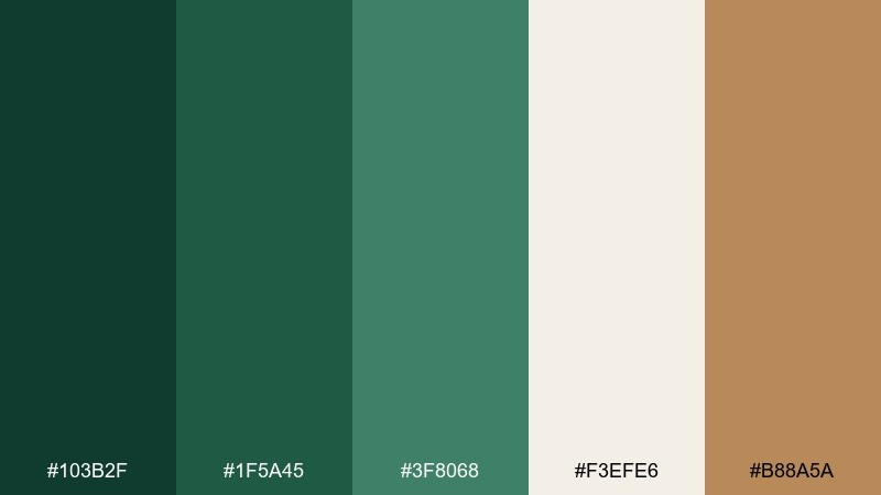
HEX: #103b2f #1f5a45 #3f8068 #f3efe6 #b88a5a
Mood: cozy, inviting, classic
Best for: home interiors and paint planning
Cozy evergreens and whipped-cream neutrals evoke a warm cabin weekend without feeling rustic-heavy. The creamy off-white keeps walls and trim bright, while the greens work beautifully on cabinetry or an accent wall. Bring in brass or caramel leather to echo the soft brown accent and keep the room from going flat. Tip: use the deepest green sparingly on doors or built-ins for a tailored look.
Image example of evergreen & cream generated using media.io
3) Mossy Stone
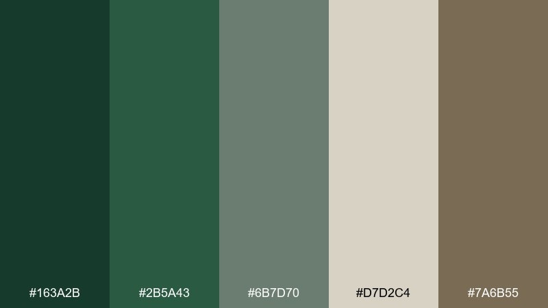
HEX: #163a2b #2b5a43 #6b7d70 #d7d2c4 #7a6b55
Mood: earthy, calm, timeless
Best for: outdoor brands and eco campaigns
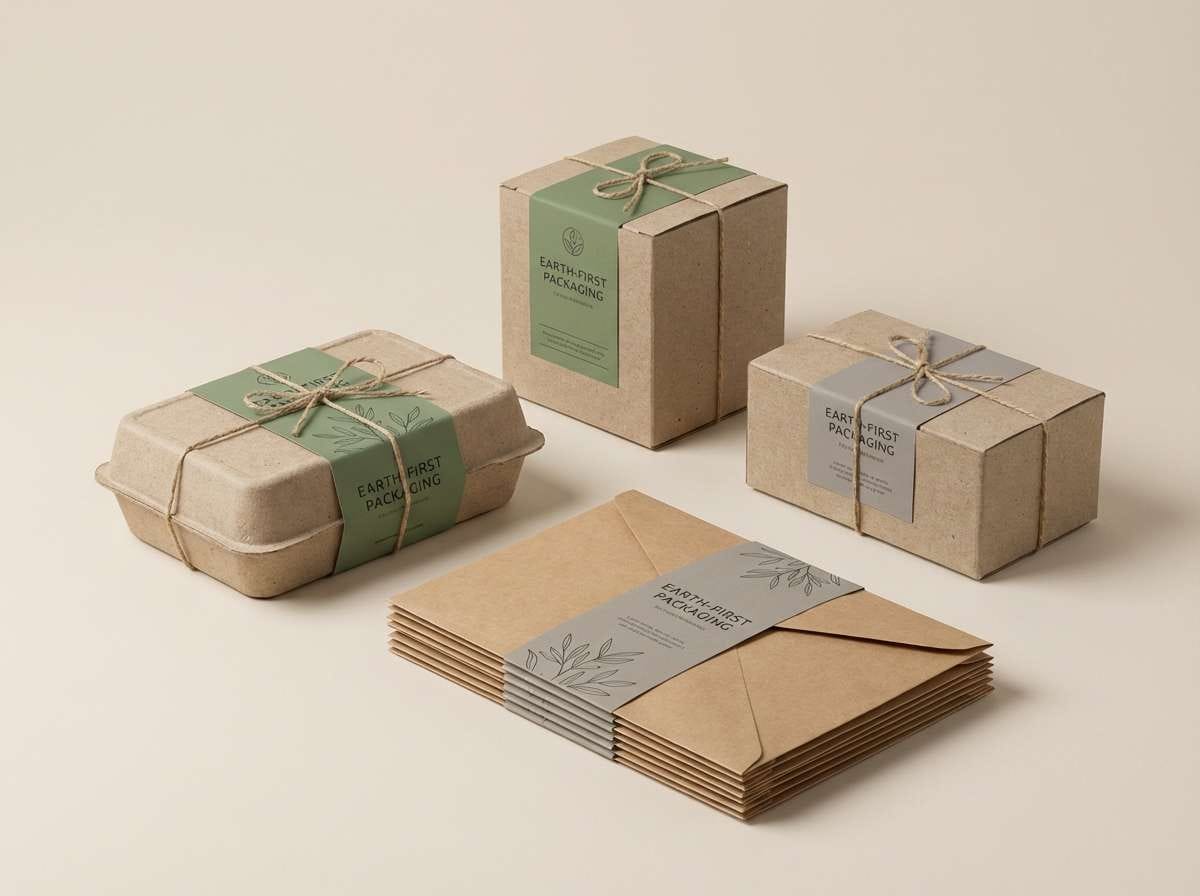
Earthy moss and weathered stone tones feel like a shaded trail after rain. These hues suit sustainable packaging, outdoor gear branding, and nature-forward landing pages. Keep typography in the charcoal-leaning green and use the pale stone as breathing room. Tip: pair with textured paper or grainy gradients to reinforce the organic vibe.
Image example of mossy stone generated using media.io
4) Botanical Noir
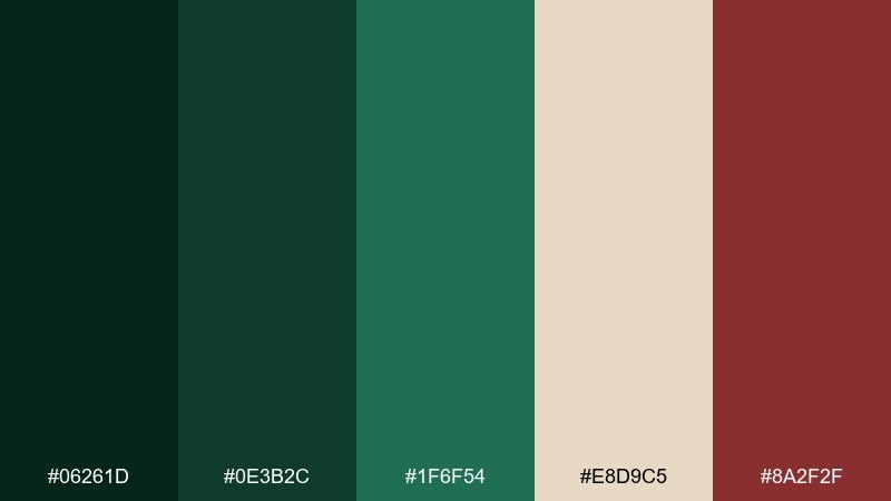
HEX: #06261d #0e3b2c #1f6f54 #e8d9c5 #8a2f2f
Mood: dramatic, editorial, bold
Best for: fashion lookbooks and campaign posters
Dramatic and inky, this mix feels like botanicals photographed on black velvet. The crimson accent creates instant hierarchy for headlines, callouts, or limited-edition tags. Use the light beige as negative space so the deep greens do not swallow the layout. Tip: keep imagery high-contrast and let the red appear only once per section for maximum punch.
Image example of botanical noir generated using media.io

5) Heritage Library
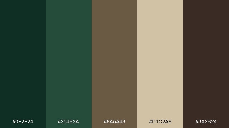
HEX: #0f2f24 #254b3a #6a5a43 #d1c2a6 #3a2b24
Mood: scholarly, warm, traditional
Best for: book covers and academic branding
Scholarly and warm, these tones recall leather bindings, wood shelves, and aged paper. The brown and parchment notes soften the green so it reads approachable instead of severe. Use the darkest shade for titles and the lighter neutral for margins to keep pages readable. Tip: add fine line rules or small caps typography to heighten the heritage feel.
Image example of heritage library generated using media.io
6) Rainy Pine
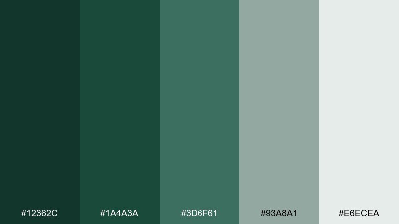
HEX: #12362c #1a4a3a #3d6f61 #93a8a1 #e6ecea
Mood: fresh, quiet, airy
Best for: wellness apps and calm UI
Fresh and quiet, these piney greens sit under a veil of misty gray-blue. The soft neutrals make it ideal for dashboards where long sessions should feel easy on the eyes. Use the darkest green for primary actions, then step down into muted teals for secondary states. Tip: reserve the pale near-white for cards and surfaces to keep contrast accessible.
Image example of rainy pine generated using media.io
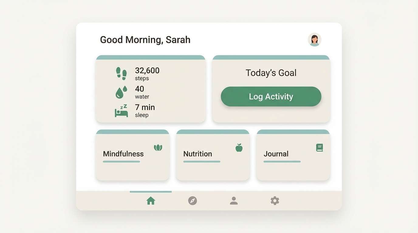
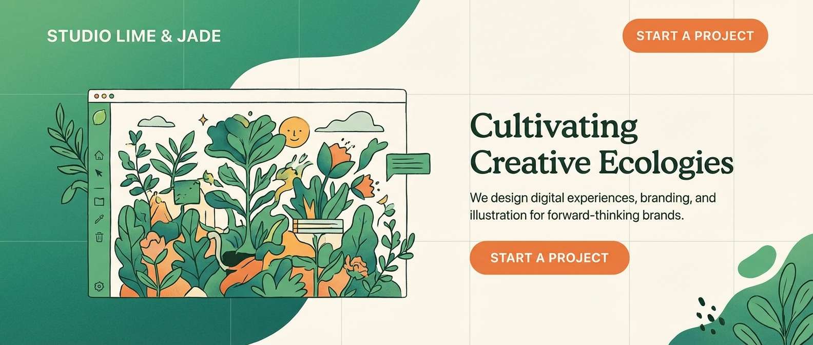
7) Jade Workshop
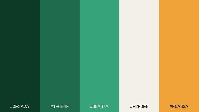
HEX: #0e3a2a #1f6b4f #38a37a #f2f0e8 #f0a33a
Mood: energetic, modern, crafty
Best for: creative studio sites and CTAs
Energetic like a sunlit workshop full of plants and painted tools, the jade tones feel modern and hands-on. These dark green color combinations shine on creative portfolios, startup homepages, and CTA-driven pages. Let the bright green handle highlights, then use the orange as a sparing accent for badges or sale tags. Tip: keep backgrounds warm-white so the greens stay crisp instead of murky.
Image example of jade workshop generated using media.io
8) Olive Grove
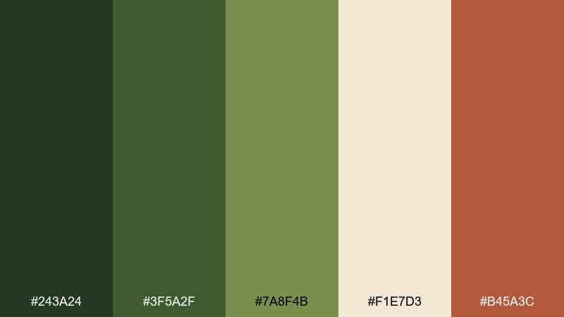
HEX: #243a24 #3f5a2f #7a8f4b #f1e7d3 #b45a3c
Mood: sunbaked, rustic, flavorful
Best for: food packaging and restaurant menus
Sunbaked and savory, these olives-and-herbs tones feel like a late lunch in the countryside. The terracotta accent adds appetizing warmth for menu callouts and featured items. Use the deepest olive for headings and the creamy tone for paper-like backgrounds that read artisanal. Tip: combine with hand-drawn icons or stamp textures to sell the farmhouse story.
Image example of olive grove generated using media.io
9) Deep Seaweed
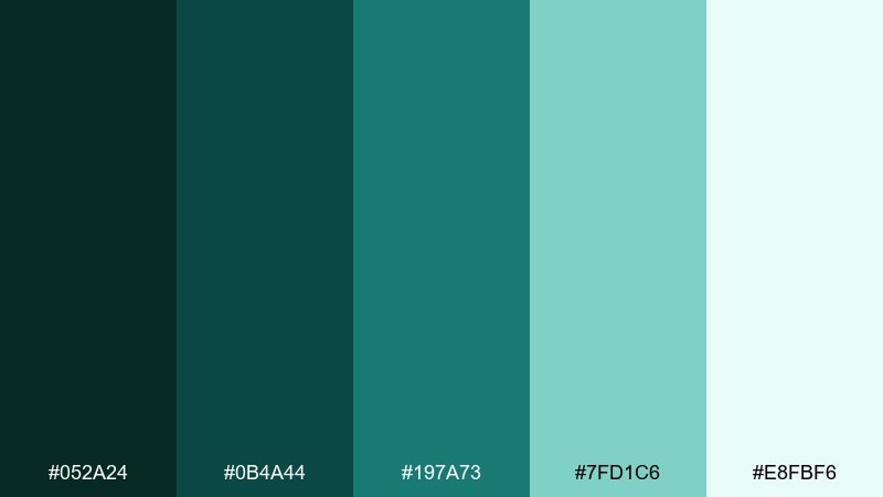
HEX: #052a24 #0b4a44 #197a73 #7fd1c6 #e8fbf6
Mood: cool, clean, aquatic
Best for: spa branding and skincare ads
Cool and clean, these hues evoke seaweed forests and clear tidal pools. The bright aqua brings lift to otherwise deep tones, perfect for spa menus and skincare banners. Use the pale mint as a soft backdrop, then place copy in the darkest teal for clarity. Tip: keep gradients subtle and watery so the palette stays serene, not neon.
Image example of deep seaweed generated using media.io
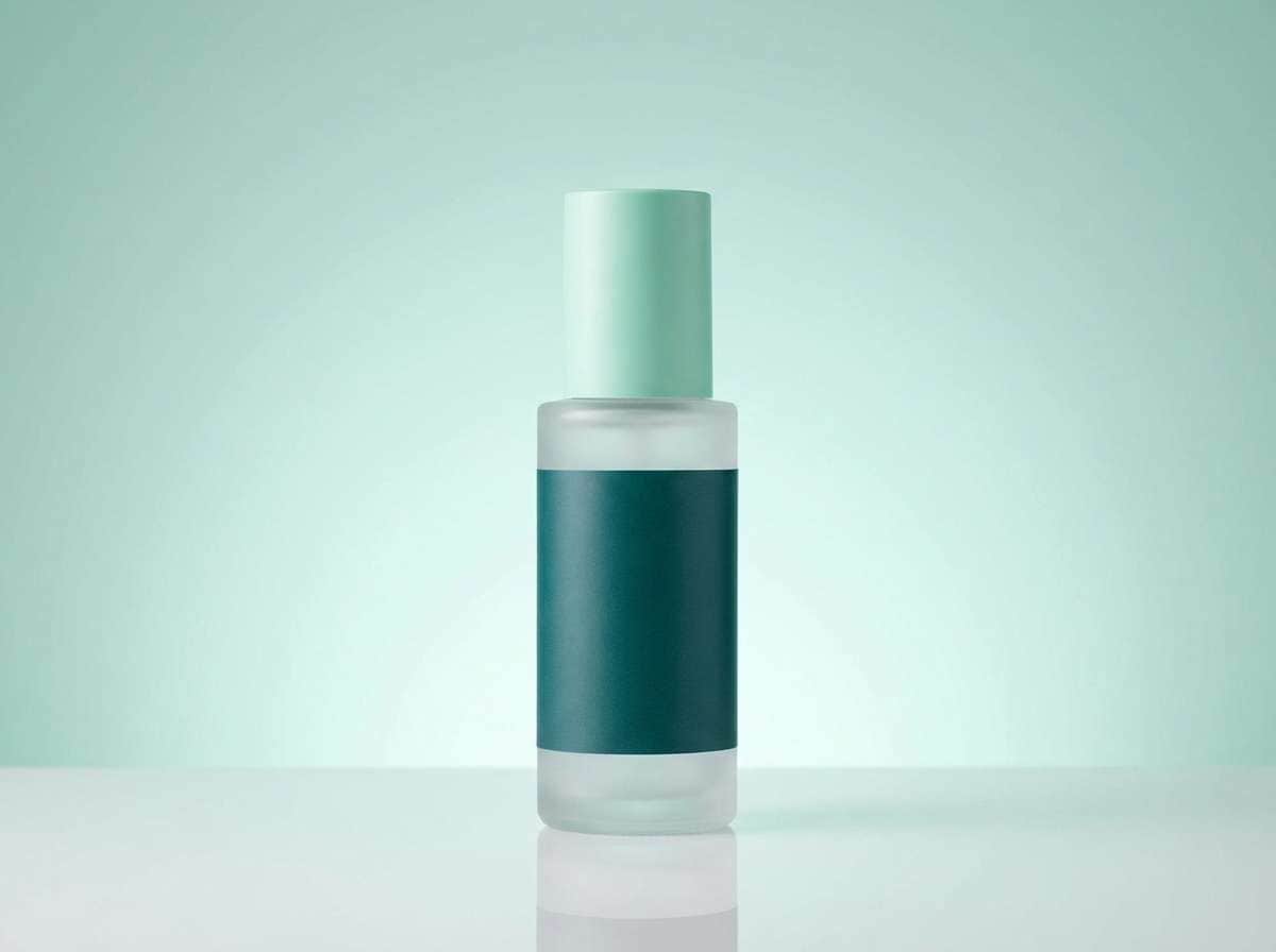
10) Cedar Cabin
HEX: #123226 #2f4a3a #8b6f4e #e9dec8 #2b2b2b
Mood: rugged, warm, practical
Best for: outdoor apparel branding
Rugged and warm, it feels like cedar planks, wool blankets, and a quiet firepit at dusk. The wood-brown makes the greens feel wearable and natural for apparel tags and hang labels. Use the charcoal for text and the pale tan for negative space so logos stay sharp. Tip: add stitched or woven textures to amplify the cabin utility mood.
Image example of cedar cabin generated using media.io
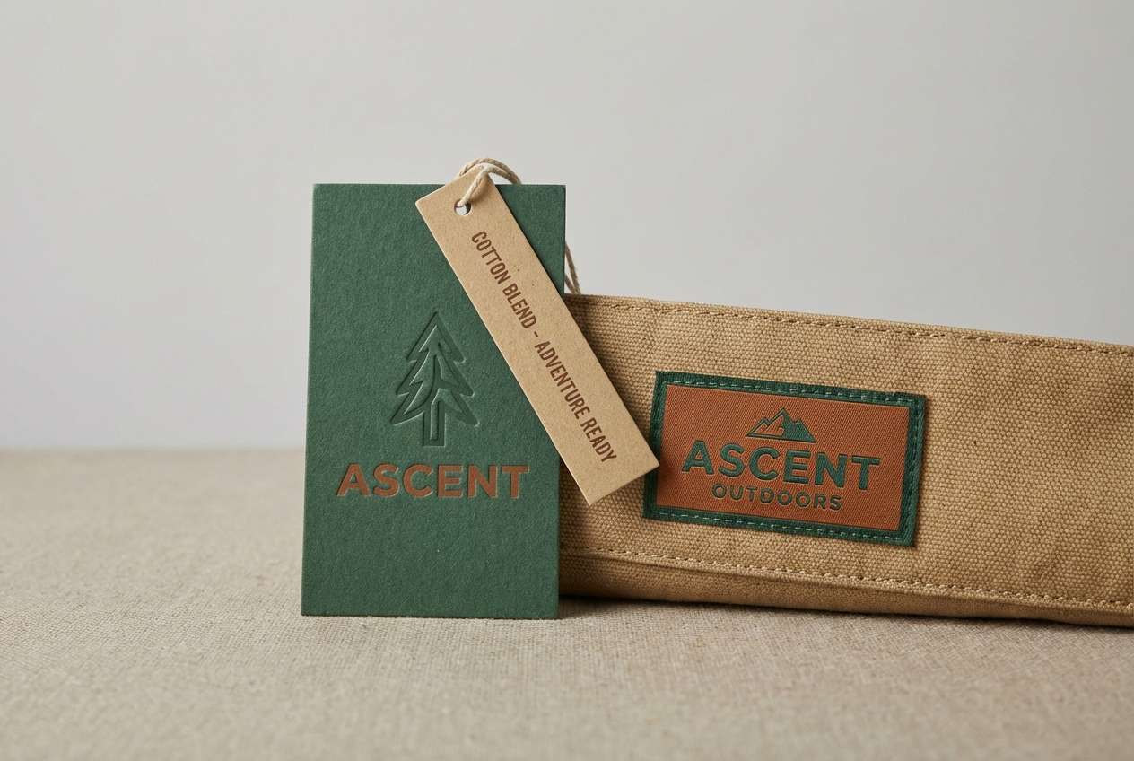
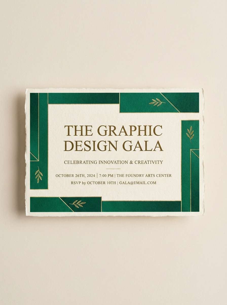
11) Emerald Luxe
HEX: #0a3b2e #0f6a4d #22b07b #f7f1e3 #c7a24b
Mood: glam, polished, celebratory
Best for: event invitations and gala promos
Glam and celebratory, the emerald range sparkles against creamy neutrals and muted gold. It works well for formal invitations, VIP passes, and launch-night promos that need instant elegance. Keep the bright emerald for highlights and pair it with the gold tone for borders, icons, or small flourishes. Tip: choose a refined serif headline and let the darker green carry the body text for readability.
Image example of emerald luxe generated using media.io
12) Sage Minimal
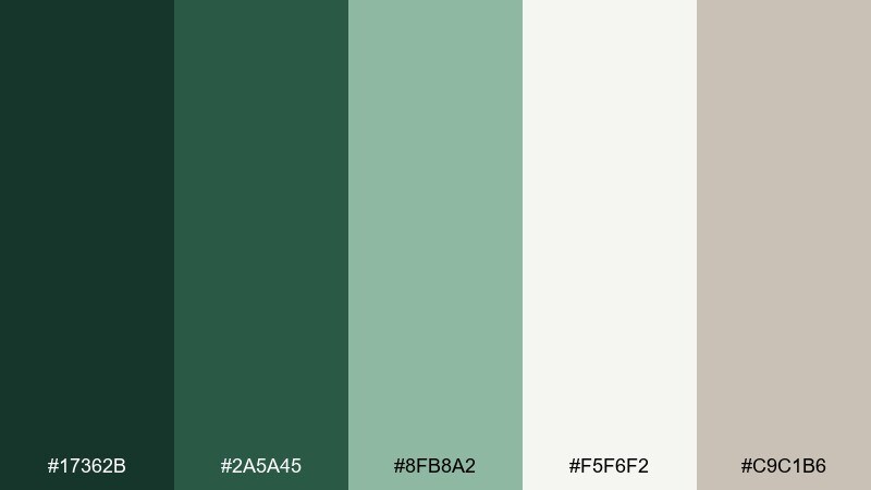
HEX: #17362b #2a5a45 #8fb8a2 #f5f6f2 #c9c1b6
Mood: clean, modern, soft
Best for: minimal UI kits and SaaS
Clean and modern, these greens read like soft sage on matte ceramic. The near-white and warm gray help create a gentle interface with clear structure. Use the darkest green for primary navigation, then shift to the muted sage for hovers and charts. Tip: keep shadows minimal and rely on spacing, not heavy borders, to maintain the airy feel.
Image example of sage minimal generated using media.io
13) Garden Party
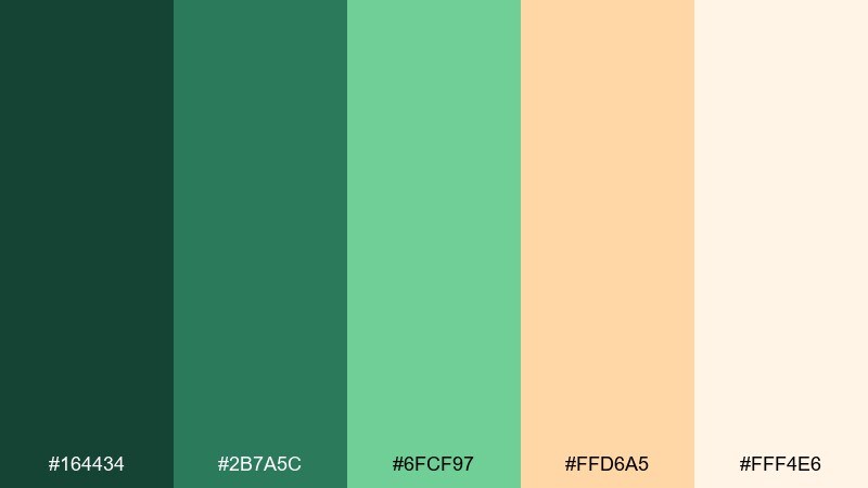
HEX: #164434 #2b7a5c #6fcf97 #ffd6a5 #fff4e6
Mood: playful, fresh, uplifting
Best for: spring posters and social graphics
Playful and fresh, it feels like a sunny garden party with citrus drinks and new leaves. The peachy accent keeps the greens friendly for social posts, seasonal promos, and community events. Use the bright minty green for highlights and icons, and let the soft cream anchor text areas. Tip: pair with rounded type and simple illustrations to keep it upbeat.
Image example of garden party generated using media.io

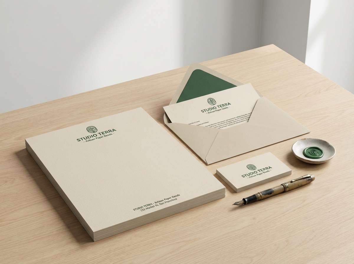
14) Hunter Classic
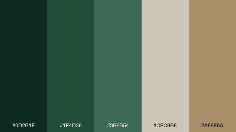
HEX: #0d2b1f #1f4d36 #3b6b54 #cfc6b8 #a88f6a
Mood: refined, traditional, dependable
Best for: heritage logos and stationery
Refined and dependable, these hues resemble tailored wool, antique maps, and well-made stationery. The tan and warm beige soften the greens for letterheads, envelopes, and timeless logotypes. Use the deepest shade for the mark and keep the mid green for supporting elements like rules and icons. Tip: try a single-color crest in dark green for a classic, ink-like finish.
Image example of hunter classic generated using media.io
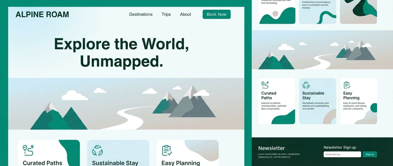
15) Alpine Mist
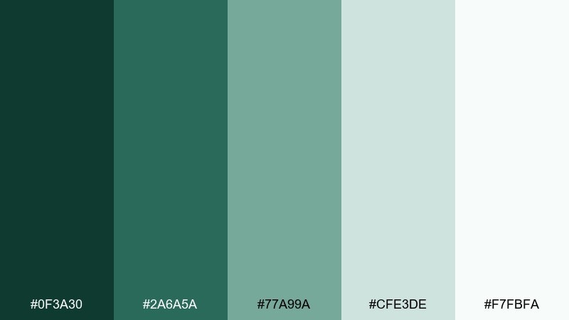
HEX: #0f3a30 #2a6a5a #77a99a #cfe3de #f7fbfa
Mood: crisp, breathable, serene
Best for: travel sites and hero headers
Crisp and breathable, these tones feel like alpine air and pale morning fog. They work well for travel websites, outdoor retreats, and calm hero sections that need a fresh lift. Use the darker greens for buttons and headings, then layer lighter mints for background gradients. Tip: keep photography cool-toned so the palette blends naturally instead of competing.
Image example of alpine mist generated using media.io
16) Greenhouse Glass
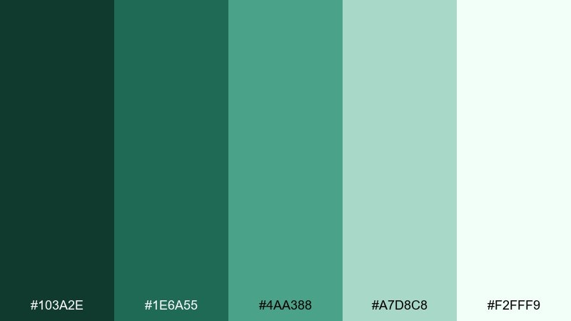
HEX: #103a2e #1e6a55 #4aa388 #a7d8c8 #f2fff9
Mood: bright, botanical, optimistic
Best for: botanical illustrations and prints
Bright and botanical, it evokes sunlit glass panes and fresh stems in water. The lighter greens are ideal for layered leaves and translucent washes, while the deep green anchors outlines. Use the palest tint as paper tone to keep the illustration airy. Tip: add small pops of darker green at leaf joints to create depth without heavy shading.
Image example of greenhouse glass generated using media.io
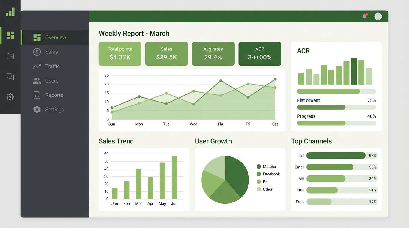
17) Matcha and Charcoal
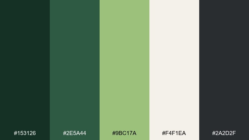
HEX: #153126 #2e5a44 #9bc17a #f4f1ea #2a2d2f
Mood: modern, punchy, balanced
Best for: dashboard UI and data viz
Modern and punchy, the matcha pop feels lively against grounded charcoal. It is a practical pairing for analytics dashboards where you need strong contrast and clear status colors. Keep charcoal for text and frames, and use matcha for success states or key metrics. Tip: avoid using the bright green for long paragraphs; save it for numbers, chips, and small highlights.
Image example of matcha and charcoal generated using media.io
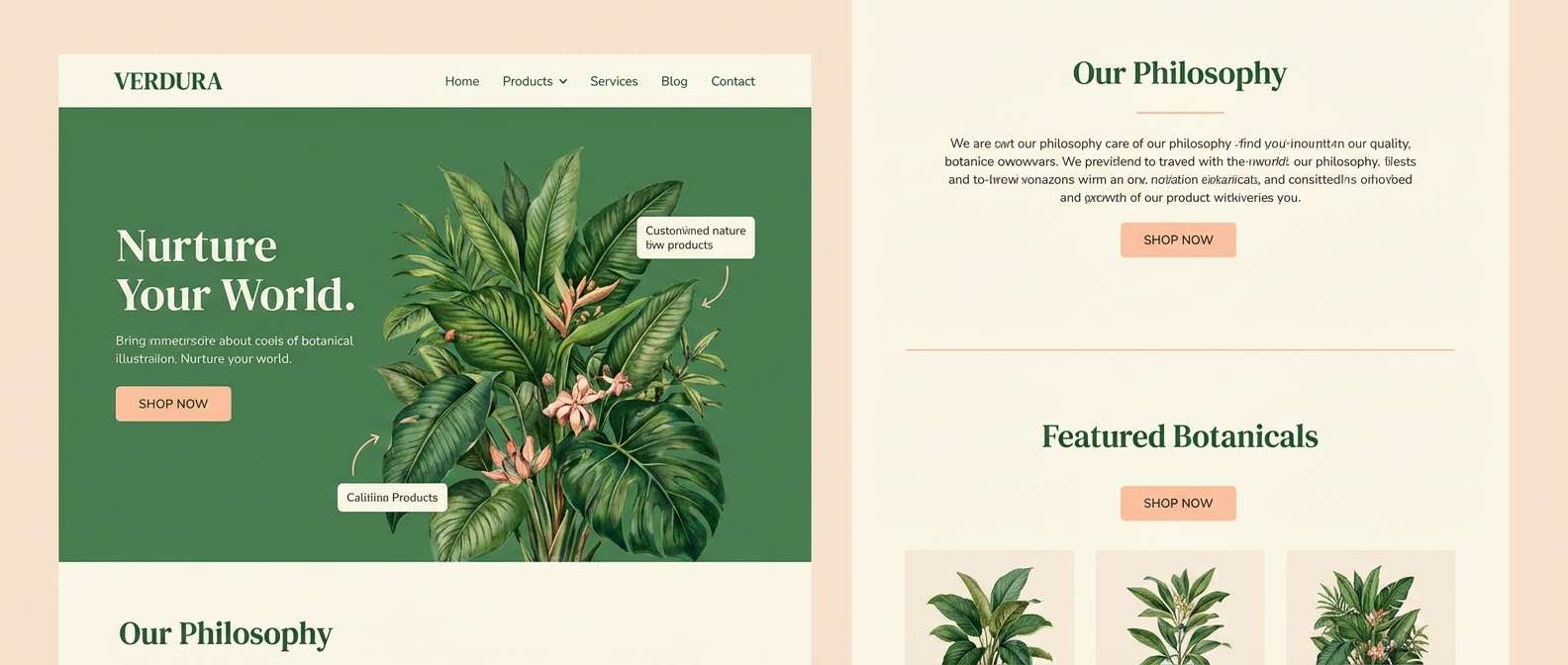
18) Verdant Sunset
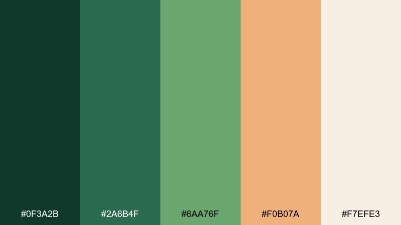
HEX: #0f3a2b #2a6b4f #6aa76f #f0b07a #f7efe3
Mood: warm, cinematic, welcoming
Best for: brand storytelling and landing pages
Warm and cinematic, it feels like green hills lit by late golden hour. The peachy sunset note makes the greens friendlier for storytelling sections and product value callouts. Use the cream for background, the mid green for headers, and the warm accent for emphasis on key benefits. Tip: try a soft grain overlay to keep the gradient transitions natural and film-like.
Image example of verdant sunset generated using media.io
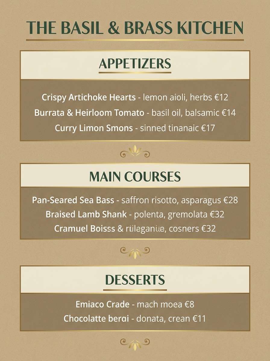
19) Basil & Brass
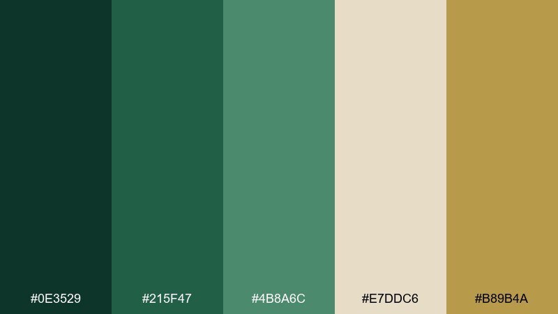
HEX: #0e3529 #215f47 #4b8a6c #e7ddc6 #b89b4a
Mood: elegant, artisanal, confident
Best for: restaurant branding and menus
Elegant and artisanal, it recalls fresh basil, warm lighting, and brushed brass fixtures. Use this dark green color palette on menus and table tents where you want classic contrast without harsh black. The brass-like gold is best as a thin accent for dividers, icons, or a single logo detail. Tip: keep paper stock warm and slightly textured so the neutrals look intentional, not yellowed.
Image example of basil & brass generated using media.io
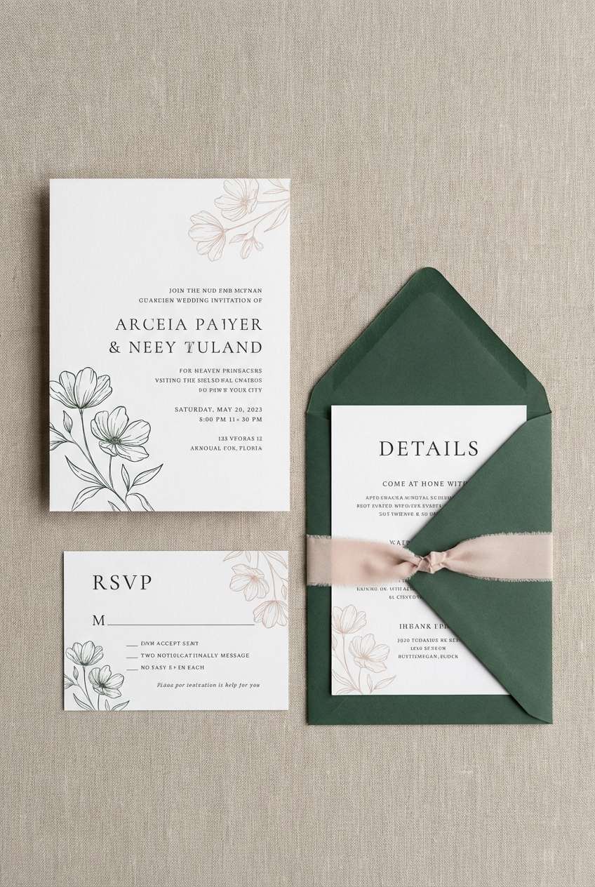
20) Night Garden
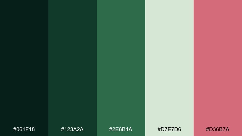
HEX: #061f18 #123a2a #2e6b4a #d7e7d6 #d36b7a
Mood: romantic, mysterious, modern
Best for: wedding suites and floral brands
Romantic and mysterious, it feels like flowers glowing softly in a moonlit garden. These dark green color combinations look stunning with delicate typography and minimal line florals. Use the blush rose as a single accent for monograms, wax seal color cues, or RSVP highlights. Tip: print the deepest greens with a slight matte finish to avoid glare and keep the mood intimate.
Image example of night garden generated using media.io
What Colors Go Well with Dark Green?
Warm neutrals are the easiest win: cream, parchment, tan, and warm gray make dark green feel inviting rather than heavy. If you want a premium look, add muted gold/brass accents and keep backgrounds softly off-white.
For a modern, high-contrast direction, pair dark green with charcoal, near-black, or crisp white—then introduce one bright accent (matcha, aqua, or peach) for UI states and visual hierarchy.
Earthy complements also work beautifully: terracotta, cedar brown, and stone tones keep the palette natural for food brands, outdoor products, and interior paint planning.
How to Use a Dark Green Color Palette in Real Designs
In branding, treat the darkest green as your “anchor” (logo mark, header bars, packaging panels) and reserve lighter neutrals for readability. A single accent color—gold, terracotta, or blush—should be used sparingly for emphasis.
In UI, prioritize accessibility: use the deepest green for primary actions and headings, and place text on light neutral surfaces to maintain contrast. Muted mid-greens and mints are great for secondary buttons, charts, and calm backgrounds.
For interiors, dark green shines on cabinets, built-ins, doors, or one statement wall. Balance it with creamy trim, warm wood, and brass hardware to keep the room bright and layered.
Create Dark Green Palette Visuals with AI
If you can describe the vibe—“moody forest velvet packaging” or “calm rainy pine wellness dashboard”—you can generate on-brand palette visuals quickly. This helps you test styles before committing to a full design system.
Start by picking one palette above, then generate a few variations: change lighting (soft studio vs. daylight), materials (paper texture vs. glossy), or layout (poster vs. UI). Save the best prompt as a reusable creative template for your next campaign.
To keep results consistent, keep your HEX palette nearby and mention the key colors in your prompt (for example: deep forest green, warm parchment, muted gold).
Dark Green Color Palette FAQs
-
What is a good base HEX for a dark green palette?
A reliable anchor is #0b3d2e (deep forest green). Build around it with a mid green for support, a light neutral for background space, and a near-black or charcoal for text. -
Does dark green work well for UI design?
Yes—dark green is excellent for calm, trustworthy interfaces. Use it for navigation and primary buttons, then place text on light neutrals to maintain accessible contrast. -
What accent colors pair best with dark green?
Gold/brass adds elegance, terracotta adds warmth, blush adds romance, and aqua/mint adds freshness. Use accents sparingly to avoid making the palette feel busy. -
How do I keep dark green from feeling too heavy?
Increase negative space with off-white or parchment backgrounds, and limit how often you use the darkest shade. Lighter green tints and warm neutrals help the overall layout breathe. -
Is dark green a good choice for branding?
Dark green signals quality, stability, and nature—making it great for premium packaging, wellness, outdoor brands, and heritage-style stationery. Pair it with a clean neutral and one consistent accent for a polished identity. -
What neutrals look best with dark green?
Cream, warm beige, parchment, stone, and charcoal are the most versatile neutrals with dark green. Choose warm neutrals for cozy/heritage vibes and cooler neutrals for modern/tech aesthetics. -
How can I generate dark green palette mockups fast?
Use an AI text-to-image tool and describe the scene (packaging, poster, UI) plus the mood and materials. Then iterate the prompt to refine lighting, texture, and contrast while keeping the palette consistent.
Next: Vintage Color Palette


