

A strong office color palette makes work feel calmer and more intentional—whether you’re designing a slide deck, a product UI, or a real workspace. The right mix of neutrals and accents can improve focus, readability, and perceived professionalism.
Below are 20 curated office palette ideas with HEX codes, mood notes, and practical “best for” use cases. You’ll also find AI-ready prompts so you can generate matching visuals fast.
In this article
Why Office Palettes Work So Well
Office color palettes are usually built around stable neutrals (whites, grays, navies, and warm beiges), which makes them easy to reuse across documents, dashboards, and interiors. That consistency helps teams ship faster and keeps brand materials feeling cohesive.
They also support readability and hierarchy. When your base is calm and low-saturation, headings, key metrics, and calls-to-action can stand out without needing loud, distracting colors.
Finally, office palettes adapt well to real constraints—printing, accessibility contrast, long-form reading, and all-day screen time. A well-planned set looks professional in both minimal layouts and information-dense designs.
20+ Office Color Palette Ideas (with HEX Codes)
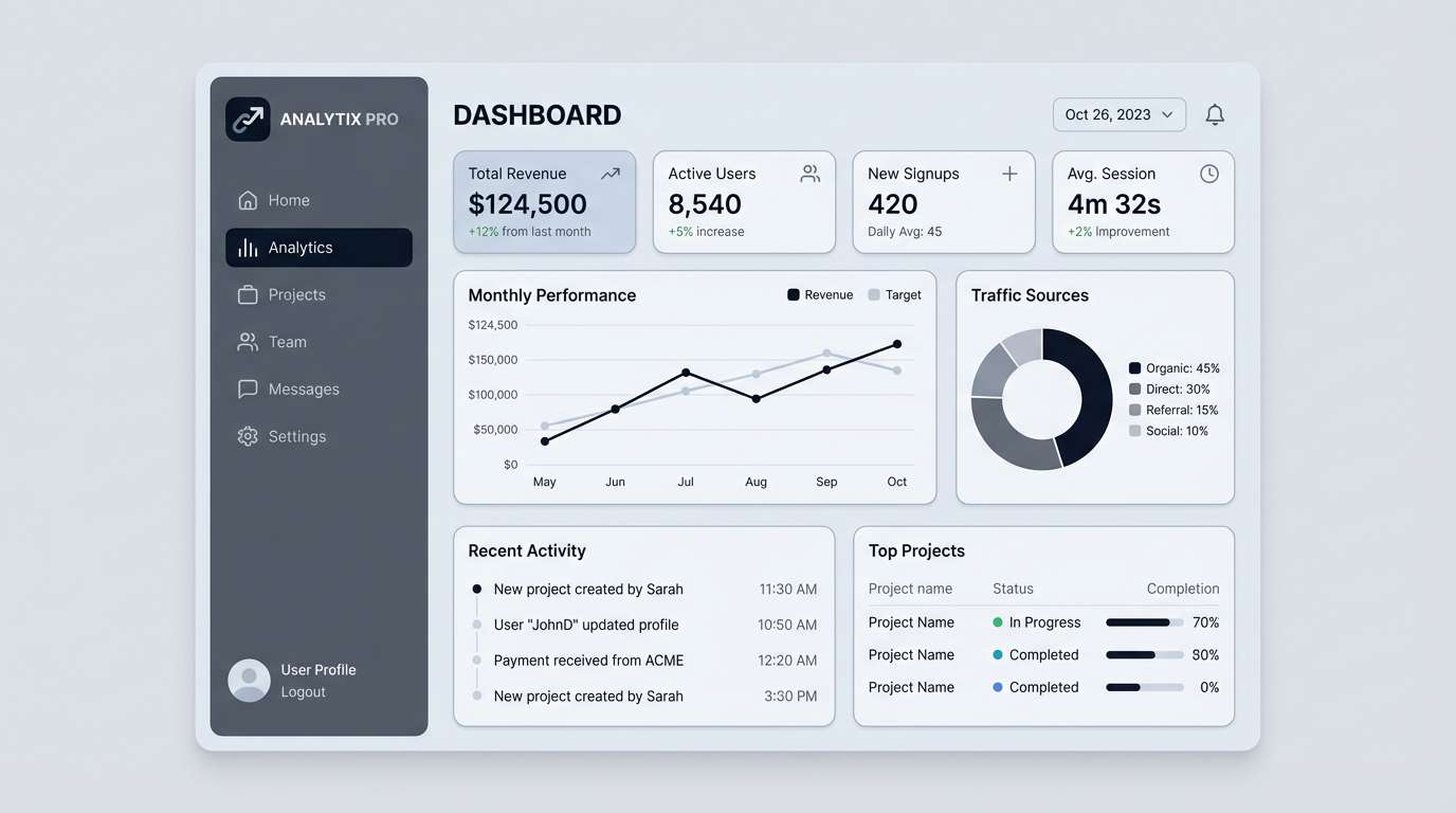
1) Glass and Graphite
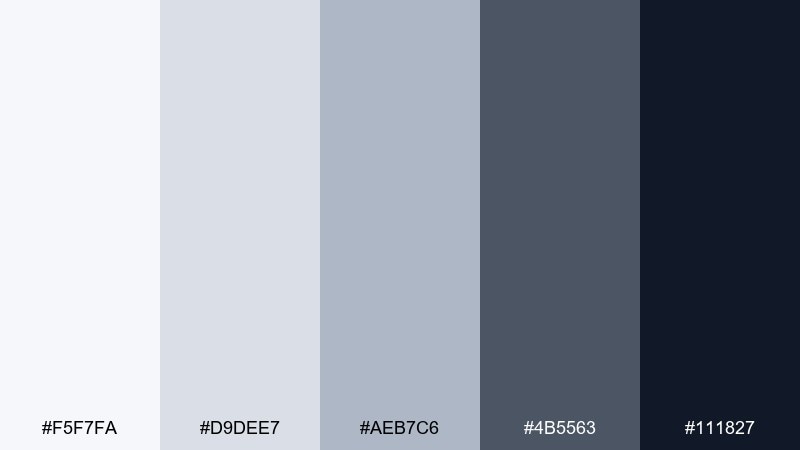
HEX: #F5F7FA #D9DEE7 #AEB7C6 #4B5563 #111827
Mood: clean, technical, dependable
Best for: SaaS dashboard UI mockup
Clean and technical, like light reflecting off glass and polished metal. These cool neutrals keep data-heavy screens readable while still feeling modern. Use the darkest graphite for navigation and key numbers, then layer the pale grays for cards and tables. Tip: reserve the near-black only for headings and critical states to avoid visual fatigue.
Image example of glass and graphite generated using media.io
Media.io is an online AI studio for creating and editing video, image, and audio in your browser.

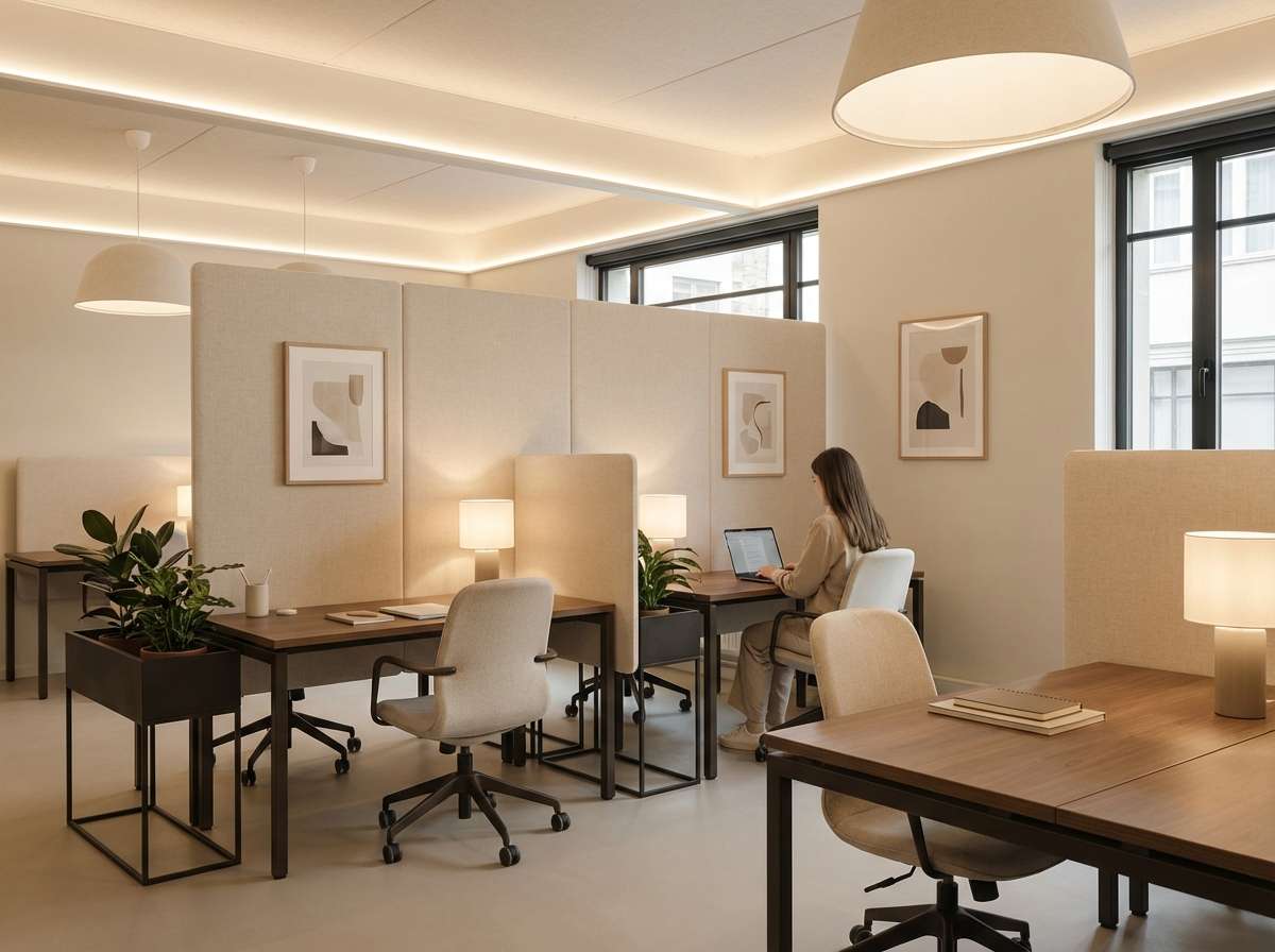
2) Warm Linen
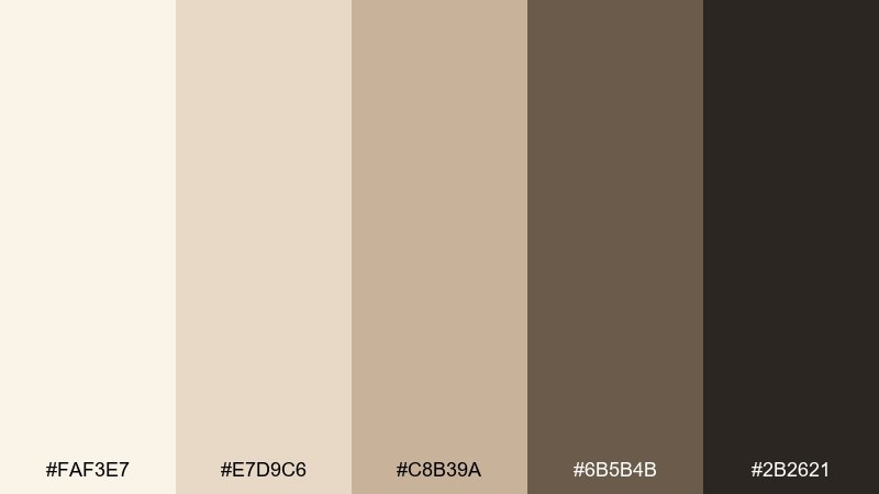
HEX: #FAF3E7 #E7D9C6 #C8B39A #6B5B4B #2B2621
Mood: welcoming, calm, quietly premium
Best for: coworking office interior design
Welcoming and calm, like sunlit linen and soft wood grain. The creamy base tones keep a space bright, while the deeper browns add structure and a sense of craft. Pair with natural materials like oak, wool, and matte black hardware for a balanced look. Tip: use the darkest shade sparingly on trims or shelving to ground the room.
Image example of warm linen generated using media.io
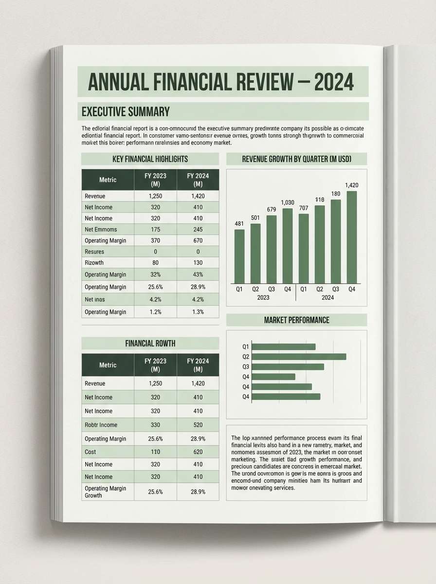
3) Sage Ledger
HEX: #F2F5F1 #D7E2D2 #9BB59A #4C6A54 #1F2D24
Mood: steady, thoughtful, reassuring
Best for: financial report editorial layout
Steady and reassuring, like muted sage leaves pressed between paper pages. The soft green midtone brings friendliness to charts without distracting from the numbers. For strong hierarchy, keep headlines in the deep forest and use the palest tint for section backgrounds. These office color combinations work especially well when you add thin rules and plenty of margin space.
Image example of sage ledger generated using media.io
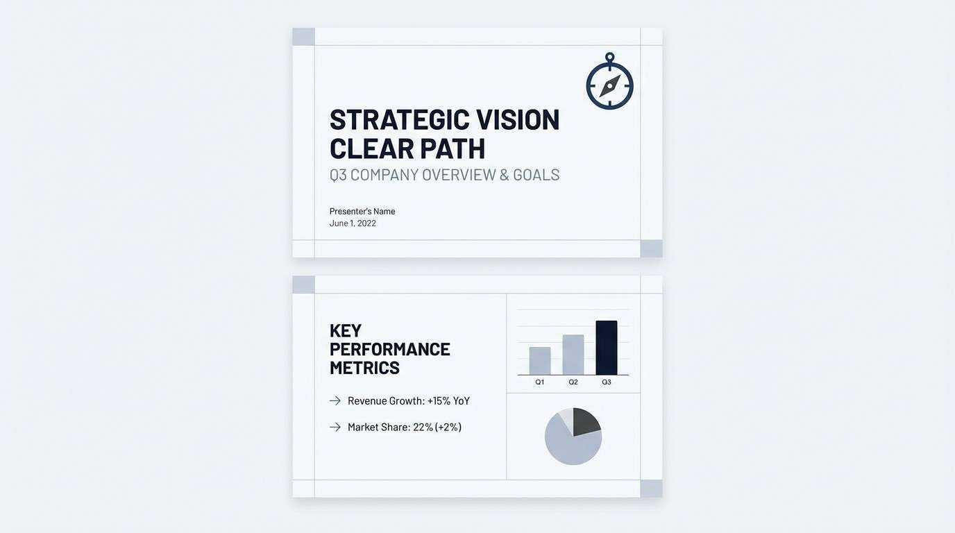
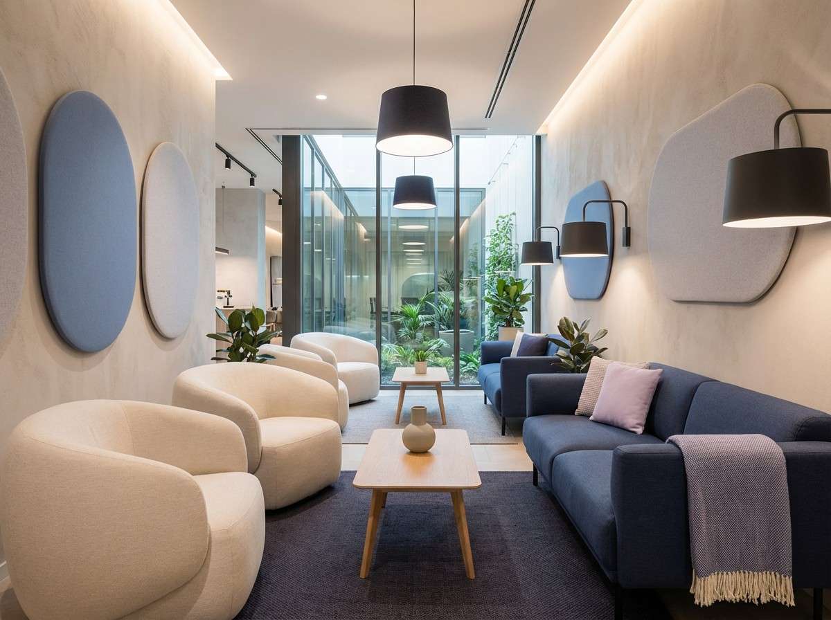
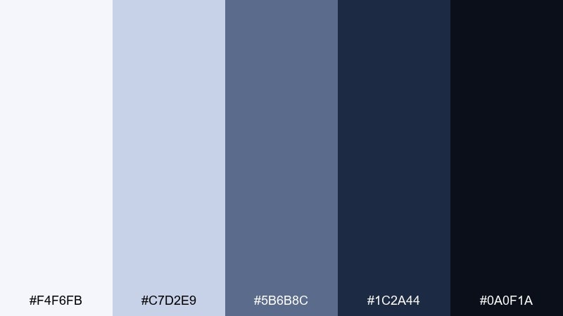
4) Blueprint Neutral
HEX: #F8FAFC #CBD5E1 #64748B #1E293B #0F172A
Mood: precise, modern, confident
Best for: presentation slide deck template
Precise and modern, like clean drafting paper and inked lines. The cool slate gradient supports crisp typography and makes charts feel authoritative. Use the lightest shade for slide backgrounds, slate for dividers, and deep navy for titles. Tip: add one tiny accent element per slide (icon, underline, or callout) to keep the deck energetic without adding new colors.
Image example of blueprint neutral generated using media.io
5) Copper Staple
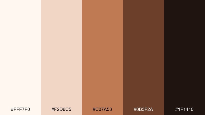
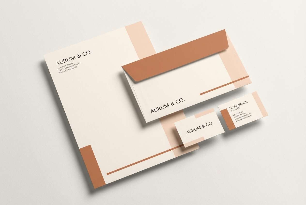
HEX: #FFF7F0 #F2D6C5 #C07A53 #6B3F2A #1F1410
Mood: grounded, artisanal, energetic
Best for: brand stationery set mockup
Grounded and artisanal, like copper clips on warm paper stock. The soft peachy base keeps the set approachable, while the copper midtone adds a lively signature. Pair with uncoated textures and simple serif headings for a premium feel. Tip: use the copper shade for small brand marks and rules, not large blocks, to avoid overpowering the layout.
Image example of copper staple generated using media.io
6) Charcoal and Cloud
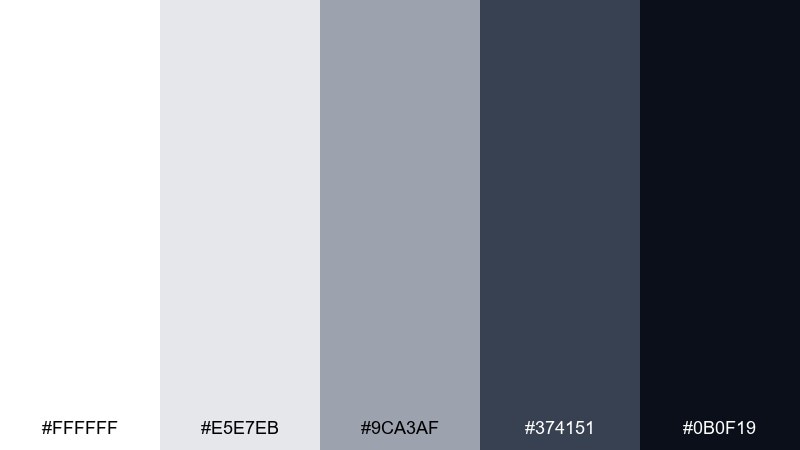
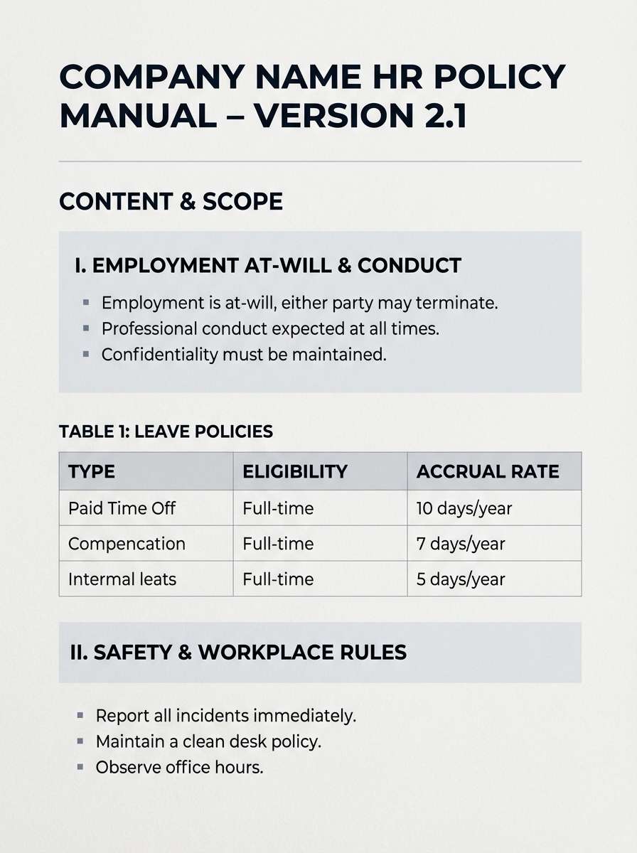
HEX: #FFFFFF #E5E7EB #9CA3AF #374151 #0B0F19
Mood: no-nonsense, sharp, professional
Best for: HR policy document template
No-nonsense and sharp, like a charcoal pencil on bright paper. The contrast makes long-form reading easier, especially for dense policies and instructions. Use the mid-grays for tables, footers, and callout boxes so the darkest tone can stay focused on headers. Tip: keep line spacing generous to prevent the palette from feeling too stern.
Image example of charcoal and cloud generated using media.io
7) Ink and Sand
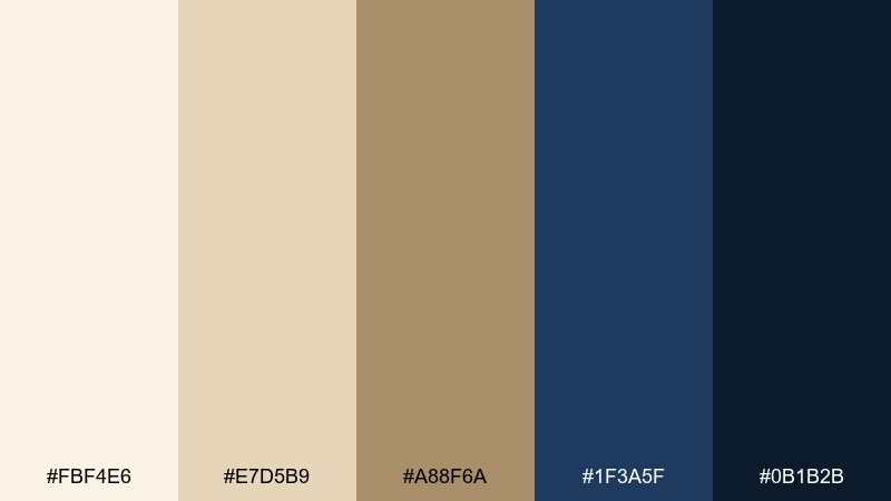
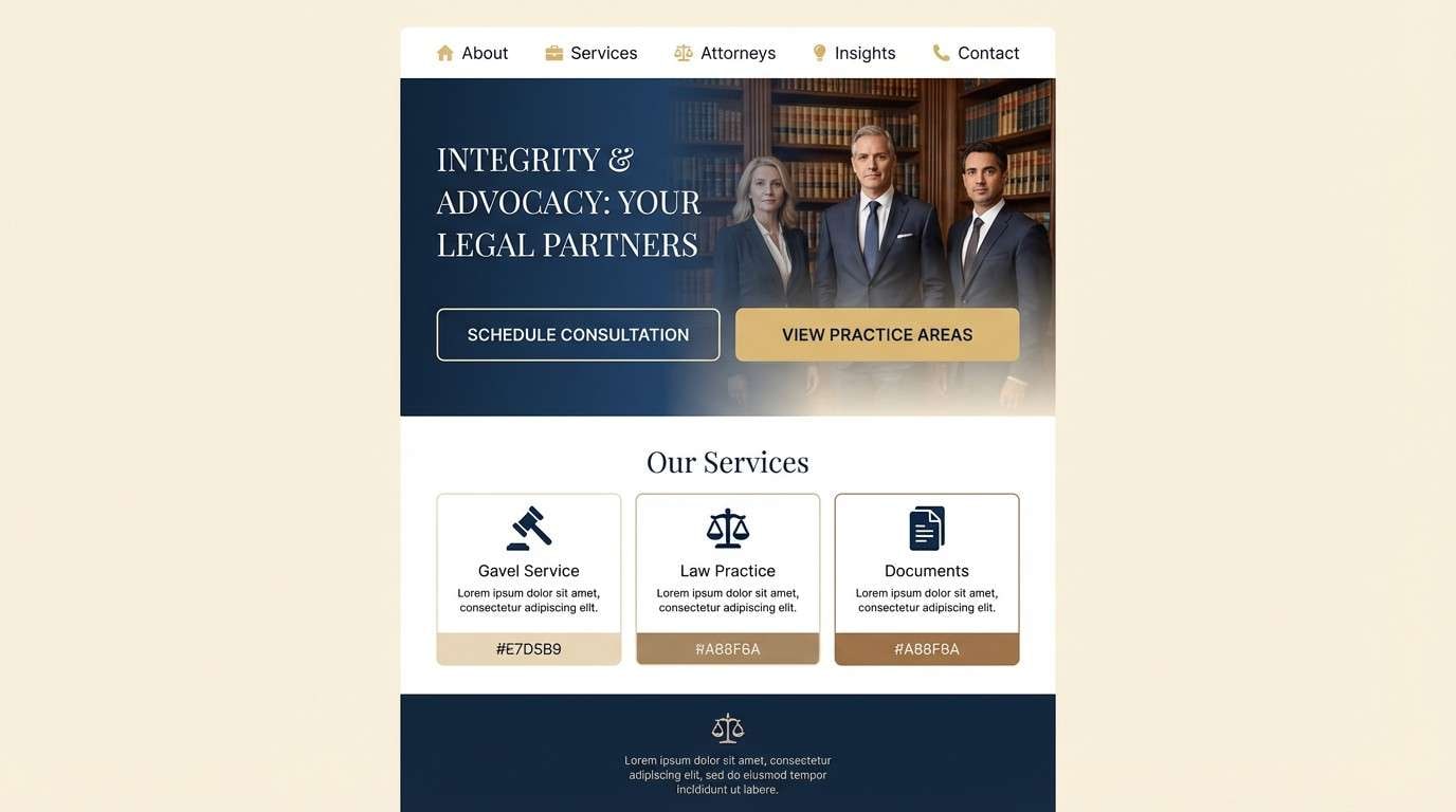
HEX: #FBF4E6 #E7D5B9 #A88F6A #1F3A5F #0B1B2B
Mood: classic, trustworthy, quietly elegant
Best for: law firm website homepage UI
Classic and trustworthy, like fountain-pen ink on parchment. The navy tones bring authority, while the sandy neutrals keep the page warm and approachable. For an office color palette that feels premium, balance large light sections with tight navy headers and subtle gold-brown highlights. Tip: use the sand midtone on secondary buttons to reduce visual pressure on primary actions.
Image example of ink and sand generated using media.io
8) Modern Moss
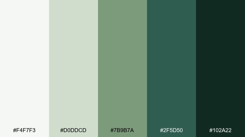
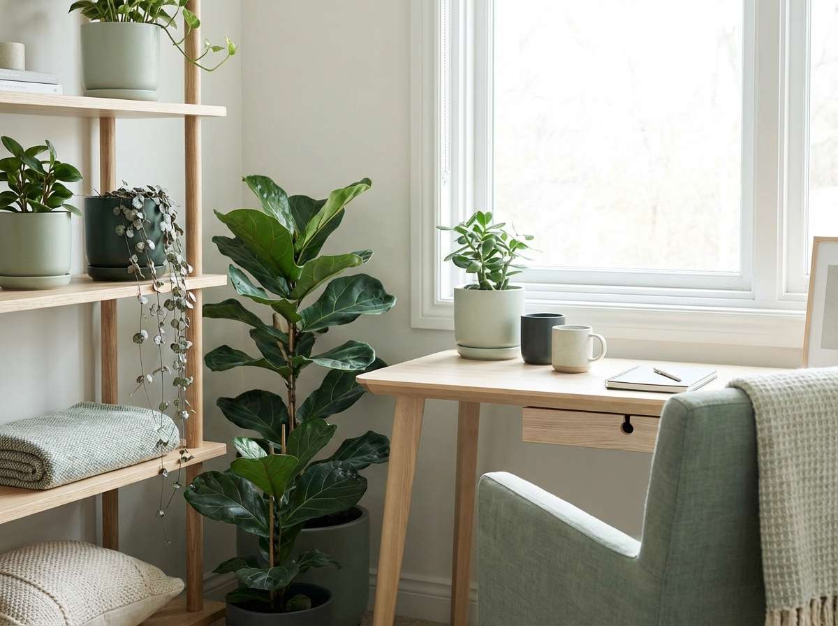
HEX: #F4F7F3 #D0DDCD #7B9B7A #2F5D50 #102A22
Mood: fresh, balanced, restorative
Best for: biophilic office corner interior
Fresh and restorative, like a quiet mossy corner after rain. The gentle greens soften hard edges and help open-plan spaces feel less sterile. Pair with light oak, matte white, and textured fabrics to keep it airy rather than heavy. Tip: repeat the deepest green in just two or three anchor points (planters, shelving, or a pinboard) for cohesion.
Image example of modern moss generated using media.io
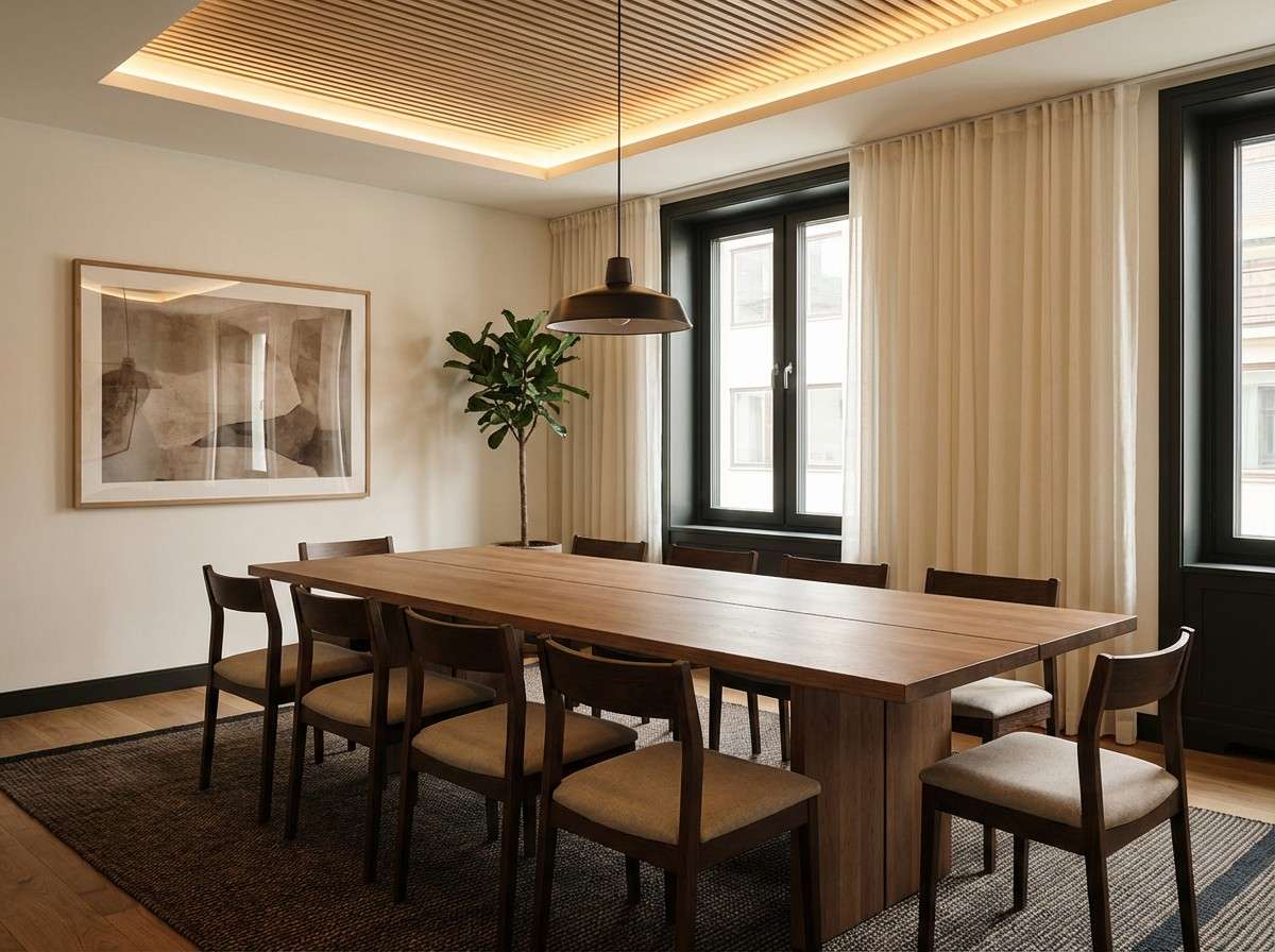
9) Espresso Paper
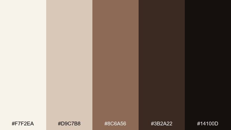
HEX: #F7F2EA #D9C7B8 #8C6A56 #3B2A22 #14100D
Mood: cozy, focused, grounded
Best for: meeting room interior styling
Cozy and focused, like espresso crema against creamy paper. The warm browns add intimacy that works well in small meeting rooms and client consult spaces. Pair with brass details and soft warm lighting to keep it inviting rather than dim. Tip: use the pale cream on the largest surfaces so the darker shades read as intentional accents.
Image example of espresso paper generated using media.io
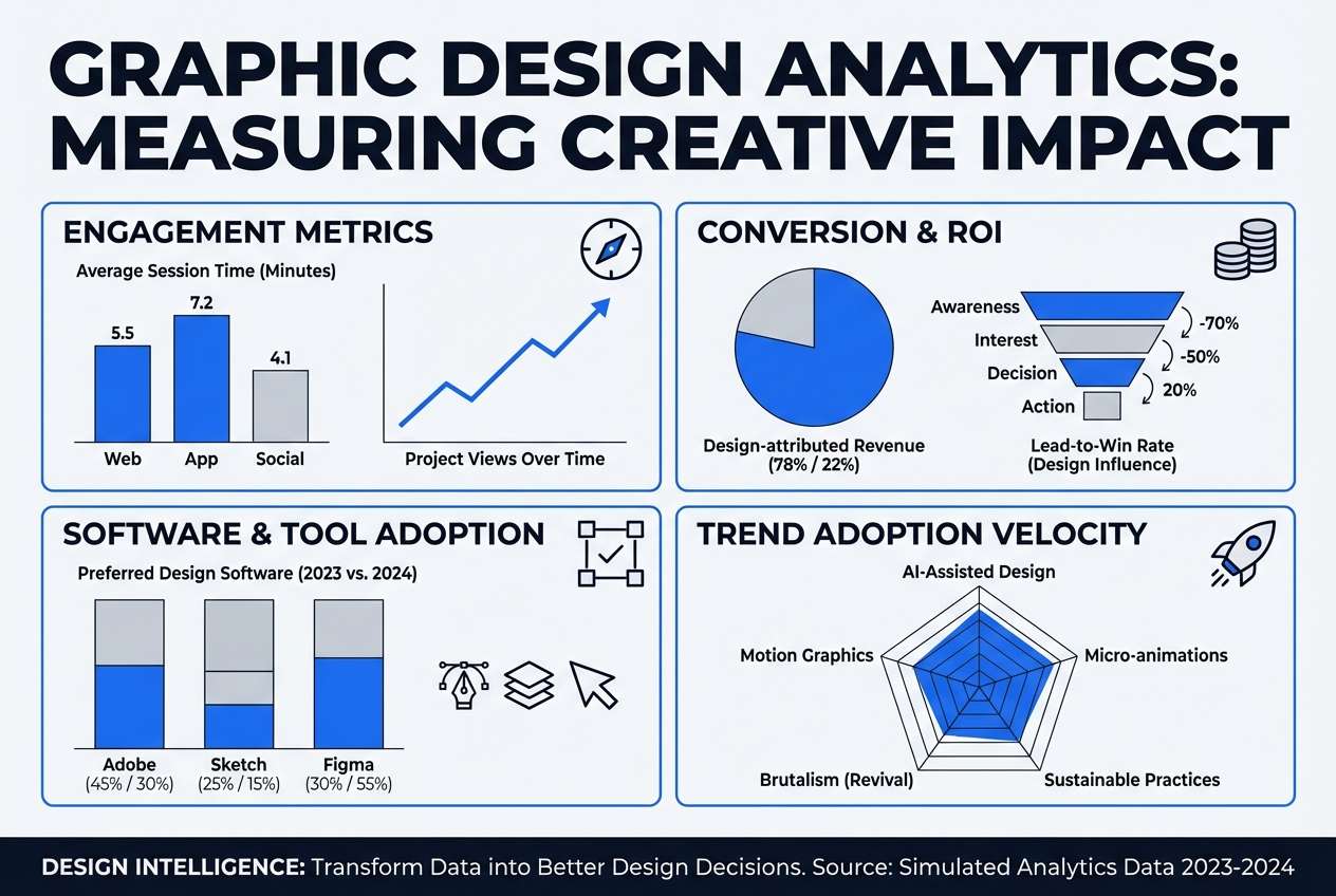
10) Cobalt Accent
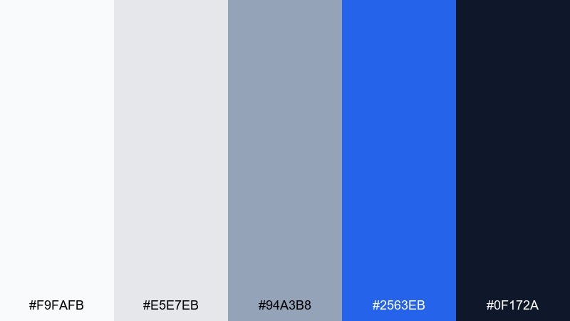
HEX: #F9FAFB #E5E7EB #94A3B8 #2563EB #0F172A
Mood: clear, energetic, high-contrast
Best for: analytics infographic poster design
Clear and energetic, like a cobalt marker on a clean whiteboard. The bright blue gives you instant focal points for key metrics and icons. Keep most of the layout in soft grays, then use cobalt for only one emphasis per section. Tip: set body text in the deep navy to avoid the harshness of pure black on white.
Image example of cobalt accent generated using media.io
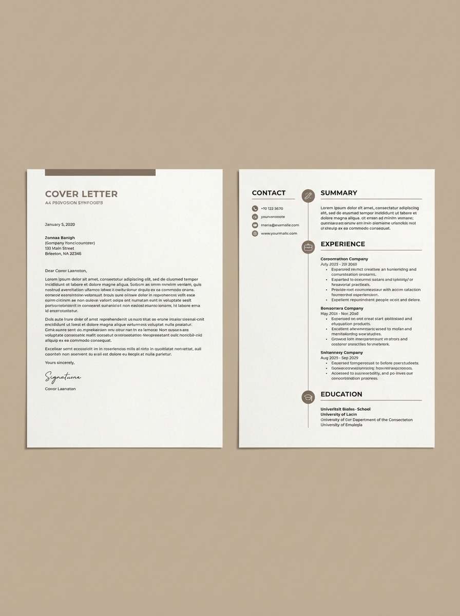
11) Minimal Beige
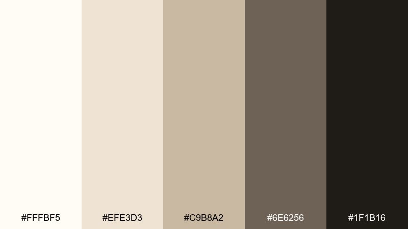
HEX: #FFFBF5 #EFE3D3 #C9B8A2 #6E6256 #1F1B16
Mood: minimal, soft, refined
Best for: resume and cover letter template
Minimal and refined, like creamy stationery with quiet shadows. The beige base tones feel human and approachable while still staying professional. Use the darkest brown for names and section titles, then keep body text in the warm gray for comfortable reading. Tip: add one thin beige divider line between sections to keep scanning effortless.
Image example of minimal beige generated using media.io
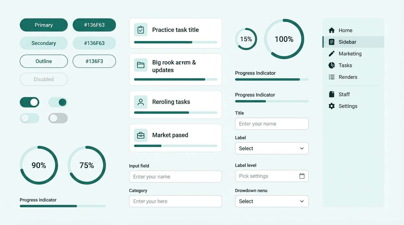
12) Teal Tasklight
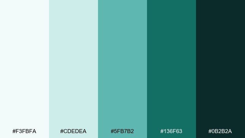
HEX: #F3FBFA #CDEDEA #5FB7B2 #136F63 #0B2B2A
Mood: bright, organized, motivating
Best for: productivity app UI component kit
Bright and organized, like a teal desk lamp lighting up a tidy to-do list. The aqua tints feel modern without the coldness of pure blue, making them great for long sessions. These office color combinations shine in buttons, toggles, and status chips when you keep backgrounds near-white. Tip: reserve the deepest teal for active states so interactions feel instantly clear.
Image example of teal tasklight generated using media.io
13) Plum Notepad
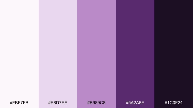
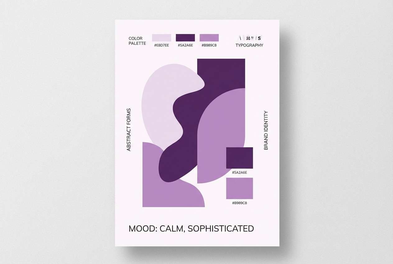
HEX: #FBF7FB #E8D7EE #B989C8 #5A2A6E #1C0F24
Mood: creative, confident, slightly playful
Best for: creative agency moodboard poster
Creative and confident, like inked plum notes on a clean pad. The lavender tints soften the mood while the deep purple adds a bold signature for headings. Pair with simple geometric shapes and lots of white space to keep it contemporary. Tip: use the mid plum for highlights and tags so the darkest tone can stay reserved for titles.
Image example of plum notepad generated using media.io
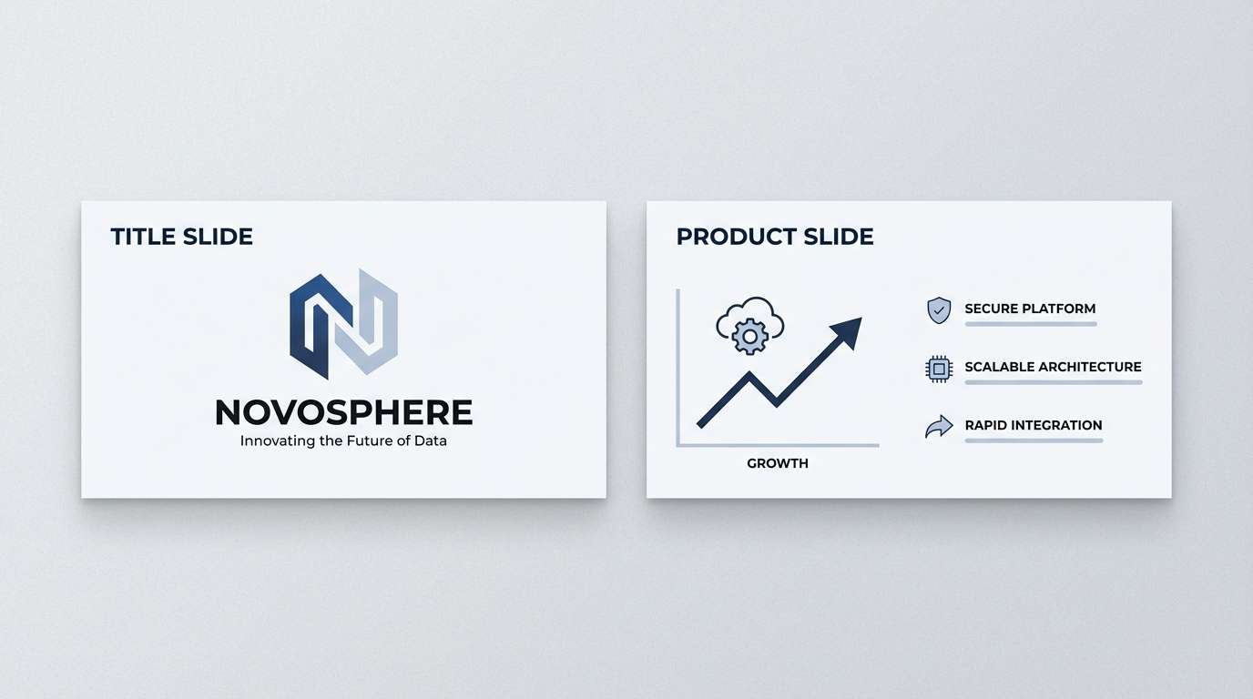
14) Slate Circuit
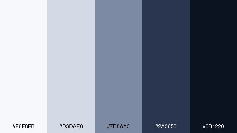
HEX: #F6F8FB #D3DAE6 #7D8AA3 #2A3650 #0B1220
Mood: smart, structured, tech-forward
Best for: tech startup pitch deck
Smart and tech-forward, like slate panels with fine circuit lines. The layered blues help your slides feel cohesive across charts, product shots, and diagrams. Use the lightest tone for backgrounds, then step down the slate values for sections and emphasis. Tip: keep charts to two data colors and let the rest live in slate grays for clarity.
Image example of slate circuit generated using media.io
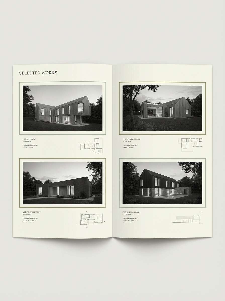
15) Olive Drafting
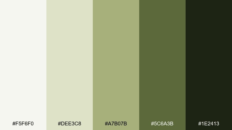
HEX: #F5F6F0 #DEE3C8 #A7B07B #5C6A3B #1E2413
Mood: practical, earthy, design-minded
Best for: architecture portfolio editorial layout
Practical and earthy, like an olive pencil sketch on tracing paper. The muted greens keep spreads calm while still feeling distinctive and design-led. As an office color palette for portfolios, it pairs beautifully with grayscale photography and thin linework. Tip: let the lightest tint dominate the page, then use olive only for captions, section markers, and small diagrams.
Image example of olive drafting generated using media.io
16) Coral Sticky Note
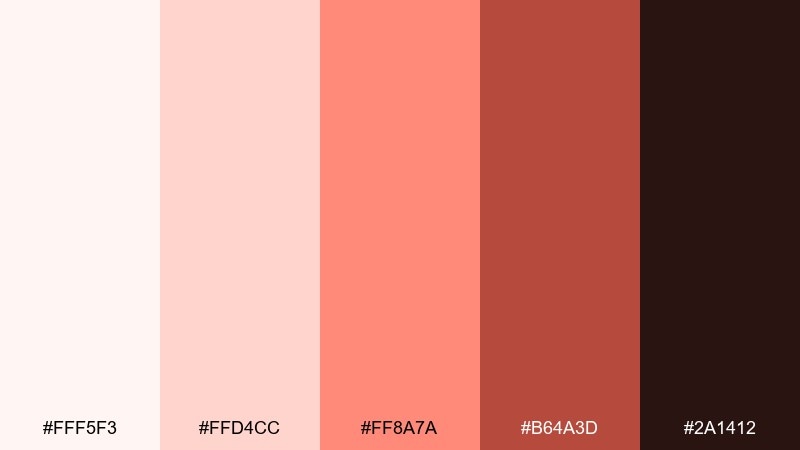
HEX: #FFF5F3 #FFD4CC #FF8A7A #B64A3D #2A1412
Mood: friendly, upbeat, collaborative
Best for: team workshop flyer design
Friendly and collaborative, like coral sticky notes filling a planning wall. The warm accent instantly signals action items, reminders, and key dates. Keep typography dark and clean, then use coral for headers and callouts so the message pops. Tip: limit coral blocks to 10 to 15 percent of the page to avoid visual overheating.
Image example of coral sticky note generated using media.io

17) Steel Lavender
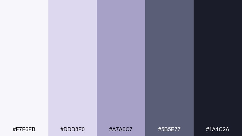
HEX: #F7F6FB #DDD8F0 #A7A0C7 #5B5E77 #1A1C2A
Mood: calm, modern, quietly creative
Best for: wellness-focused office lounge interior
Calm and quietly creative, like lavender mist over brushed steel. The cool purples soften modern furniture lines without turning the space overly sweet. Pair with pale gray upholstery and warm wood to keep the lounge comfortable and adult. Tip: use the steel tone on larger surfaces, then bring lavender in through textiles and artwork.
Image example of steel lavender generated using media.io
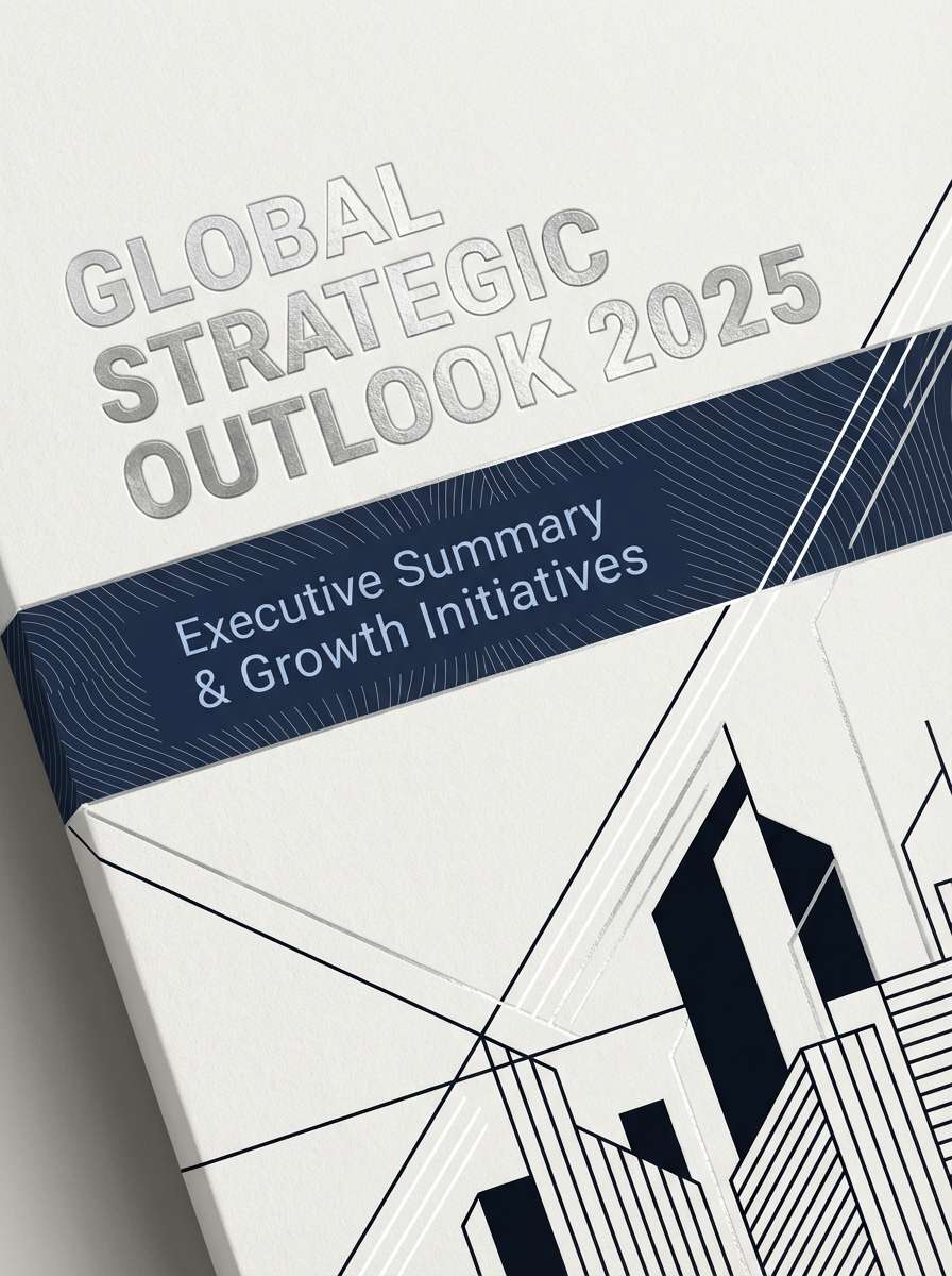
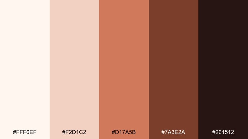
18) Midnight Ledger
HEX: #F4F6FB #C7D2E9 #5B6B8C #1C2A44 #0A0F1A
Mood: executive, serious, trustworthy
Best for: executive report cover design
Executive and serious, like a midnight-blue ledger with crisp page edges. The deep navy carries authority, while the soft periwinkle tint keeps the design from feeling heavy. For a strong office color combination, anchor the cover with navy, then use the pale shades for subtitle bands and data callouts. Tip: add a subtle gradient or thin rule lines to give the dark areas depth without introducing new hues.
Image example of midnight ledger generated using media.io
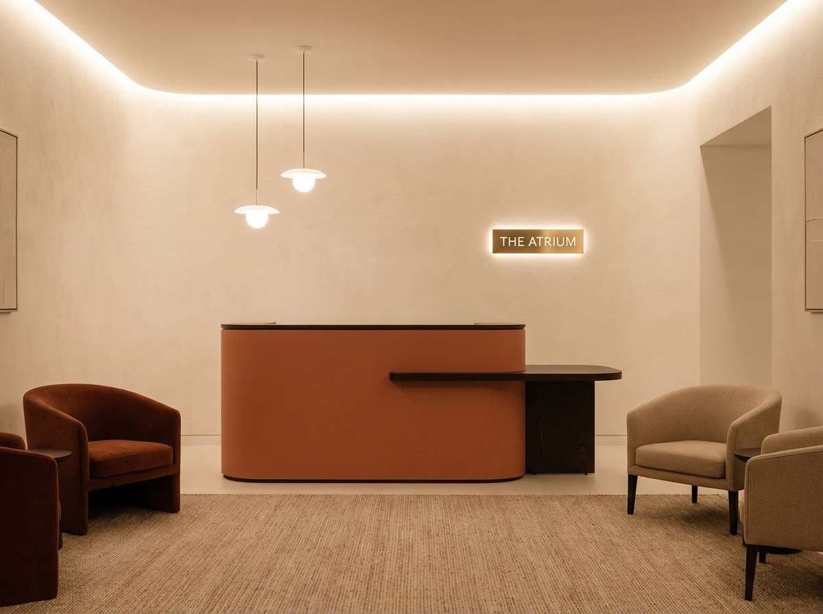
19) Terracotta Tile
HEX: #FFF6EF #F2D1C2 #D17A5B #7A3E2A #261512
Mood: warm, confident, hospitality-friendly
Best for: reception area interior design
Warm and confident, like terracotta tile warmed by afternoon light. The earthy midtone adds personality to front-of-house spaces without feeling trendy in a disposable way. Pair with off-white walls and dark wood to keep it grounded and welcoming. Tip: use terracotta on one feature element (desk front, wall niche, or signage backdrop) and let the creams do the rest.
Image example of terracotta tile generated using media.io
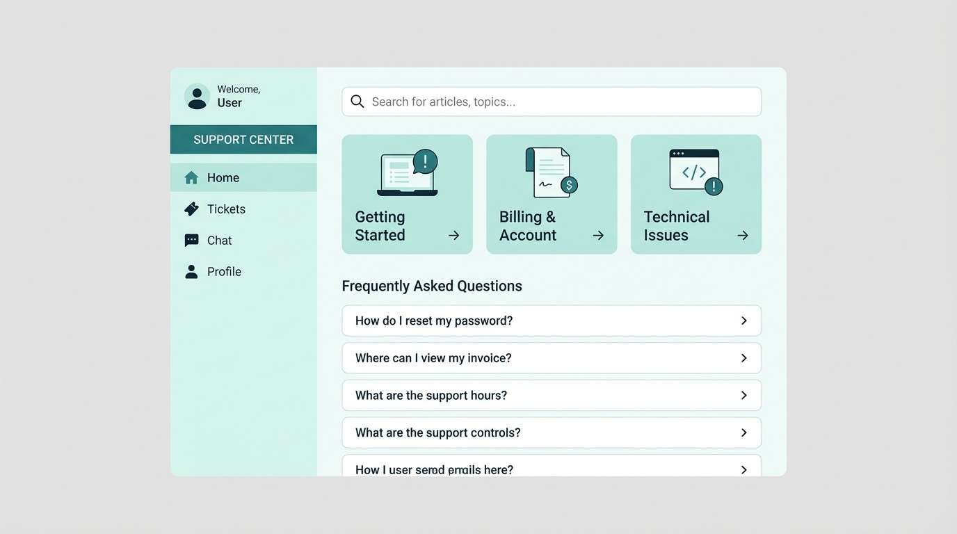
20) Arctic Mint
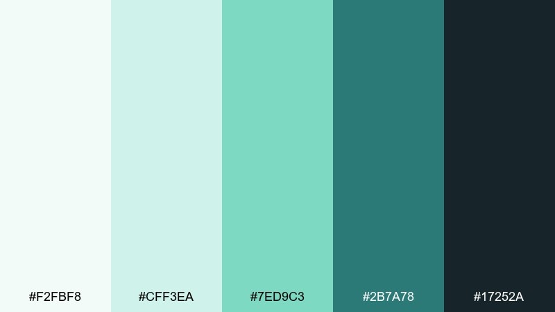
HEX: #F2FBF8 #CFF3EA #7ED9C3 #2B7A78 #17252A
Mood: fresh, efficient, approachable
Best for: customer support portal UI mockup
Fresh and efficient, like arctic air with a minty edge. The light aquas keep interfaces friendly, while the deep teal gives you strong structure for navigation and labels. Use it as an office color palette for help centers by keeping surfaces pale and saving dark tones for headers and active states. Tip: make success states mint and keep error states neutral to maintain a calm support experience.
Image example of arctic mint generated using media.io
What Colors Go Well with Office?
Office-friendly colors usually start with dependable neutrals: soft whites, warm creams, light grays, slate, charcoal, and deep navy. These shades make typography and data easier to read while keeping the overall look calm.
To add personality without losing the professional tone, use one controlled accent such as teal, cobalt, sage, terracotta, copper, or muted plum. Accents work best on small UI components, section headers, icons, highlights, and callouts.
If you’re mixing multiple colors, keep saturation low and maintain consistent contrast rules. A restrained palette feels “corporate” in a good way: clear, structured, and reliable.
How to Use a Office Color Palette in Real Designs
For UI and dashboards, assign roles: one background, one surface (cards), one border/divider, one text color, and one accent. This avoids random color usage and keeps interfaces scannable when the screen is dense with content.
For slide decks and documents, let the lightest color dominate (70–85%), use a mid-tone for structure (tables, sidebars, bands), and reserve the darkest tone for titles and key numbers. That hierarchy makes your message feel organized even before anyone reads.
For interiors, treat darker colors as anchors (shelving, trim, feature walls) and keep large surfaces light to maintain brightness. Repeat the accent color in a few small moments—art, textiles, signage—for cohesion.
Create Office Palette Visuals with AI
If you want your palette to look consistent across mockups, posters, and room scenes, generate a few matching visuals from the same prompt style. This makes stakeholder reviews easier because the colors are shown in context, not just as swatches.
Start with a layout description (dashboard, report cover, lounge corner), then paste the HEX colors into your prompt to lock in the look. Iterate by changing only one variable at a time—lighting, materials, or composition—so the palette stays stable.
Media.io helps you turn these office color combinations into on-brand images quickly, with prompts you can reuse for future projects.
Office Color Palette FAQs
-
What is a good office color palette for professional branding?
A strong professional office palette typically combines light neutrals (white or off-white), a mid gray/slate for structure, a dark navy/charcoal for text, and one controlled accent (teal, cobalt, sage, copper, or terracotta) for emphasis. -
Which office colors are best for readability on screens?
Soft whites and cool light grays work well for backgrounds, while deep navy or charcoal is easier on the eyes than pure black for body text. Use bright accents sparingly so charts and CTAs stand out without visual fatigue. -
How many colors should an office palette include?
Five is a practical sweet spot: background, surface, muted support tone, primary text/contrast, and one accent. This is enough variety for hierarchy while staying consistent across UI, decks, and print. -
What’s the safest accent color for corporate designs?
Blue is the most universally “safe” corporate accent because it reads as trustworthy and clear. If you want something softer, sage and teal are office-friendly alternatives that still feel modern. -
How do I keep an office palette from feeling boring?
Keep neutrals as the base, then add interest through one accent color plus texture and spacing: subtle borders, shadows, thin rules, and strong typography hierarchy. In interiors, mix materials (wood, fabric, matte metal) to add depth without adding extra hues. -
Can I use warm tones like terracotta or copper in an office scheme?
Yes—warm accents can feel welcoming and premium when used in small amounts. Pair them with creams and deep browns/navies to maintain structure, and avoid using the warm tone as a large background color. -
How can I preview an office color palette before implementing it?
Create quick mockups (a dashboard screen, a slide template, a document page, or an interior scene) using the same five HEX colors. Generating a few visuals helps you validate contrast, mood, and consistency before production.


