

Rose quartz is a soft, modern pink that feels calm, romantic, and quietly premium. It’s easy to pair with neutrals, earthy tones, and deeper accents for contrast.
Below are 20+ rose quartz color palette ideas with HEX codes, plus real-world use cases for branding, UI, invitations, packaging, and social content.
In this article
- Why Rose Quartz Palettes Work So Well
-
- petal mist
- warm blush neutrals
- dusty rose & sage
- quartz and cocoa
- modern minimal ui
- sunset satin
- pearl & copper glow
- baby pink serenity
- muted rose monochrome
- vintage rose postcard
- rose quartz + denim
- tea rose brunch
- blush marble luxe
- spring peony garden
- soft clay + linen
- orchid twilight
- stone rose balance
- rose quartz & charcoal
- champagne blush
- desert pink horizon
- berry rose accent
- What Colors Go Well with Rose Quartz?
- How to Use a Rose Quartz Color Palette in Real Designs
- Create Rose Quartz Palette Visuals with AI
Why Rose Quartz Palettes Work So Well
Rose quartz sits in a “soft contrast” zone: it reads as warm and friendly, but it doesn’t overpower layouts the way hot pinks can. That makes it reliable for both backgrounds and accent roles.
It also pairs naturally with modern neutrals like ivory, taupe, and charcoal, which helps keep designs clean and mature. With the right dark anchor color, rose quartz palettes stay legible for UI and print.
Finally, rose quartz supports many moods—romantic, editorial, minimal, botanical—so you can reuse the same core pink across campaigns while changing supporting tones for fresh variety.
20+ Rose Quartz Color Palette Ideas (with HEX Codes)
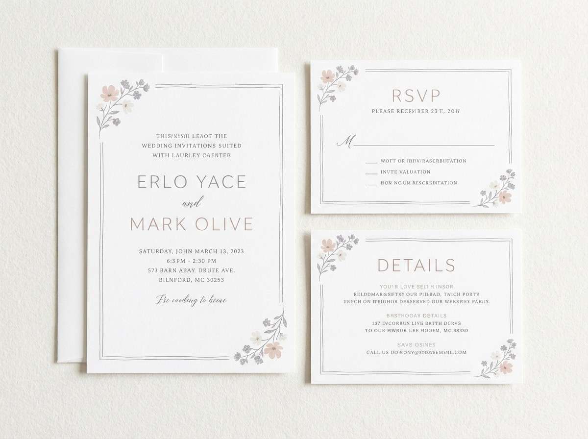
1) Petal Mist
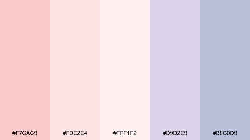
HEX: #F7CAC9 #FDE2E4 #FFF1F2 #D9D2E9 #B8C0D9
Mood: airy, romantic, calming
Best for: wedding invitation suite
Airy and romantic, like rose petals in morning fog, these tones feel soft without looking washed out. Use the pale blush as the base, then bring in lavender-gray for typography and borders. It works beautifully for invitations, RSVP cards, and envelope liners where legibility still matters. Tip: keep your body text in the deeper slate-lavender for a crisp print finish.
Image example of petal mist generated using media.io
Media.io is an online AI studio for creating and editing video, image, and audio in your browser.

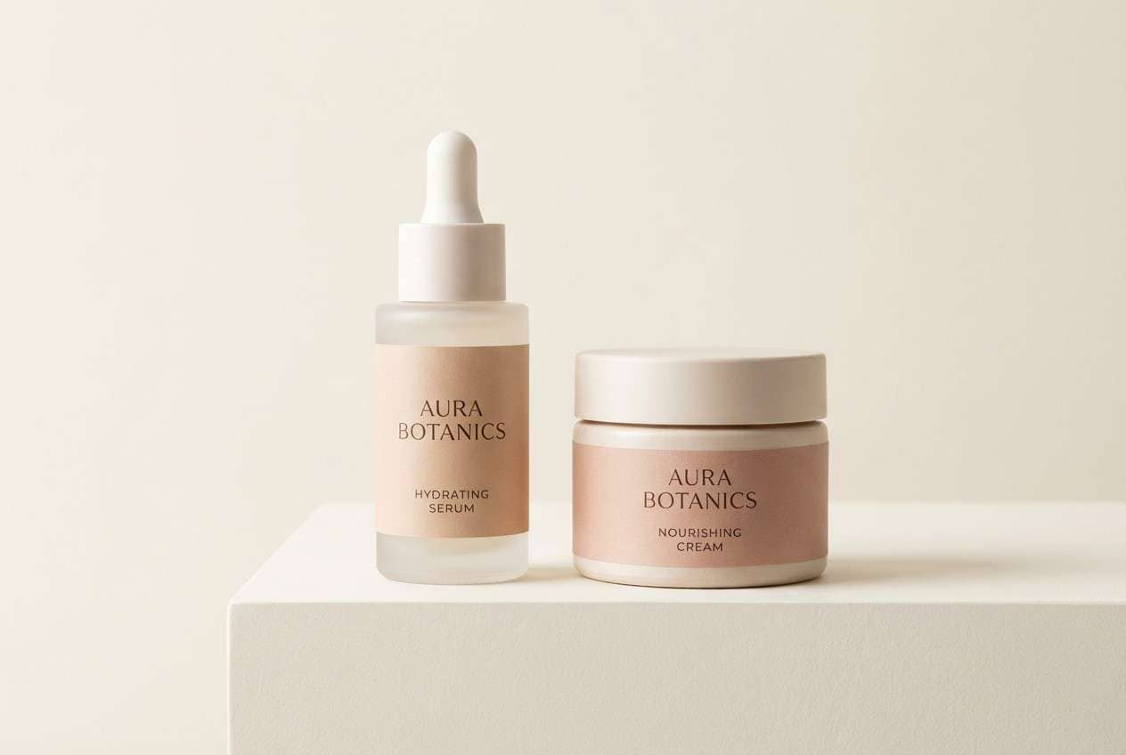
2) Warm Blush Neutrals
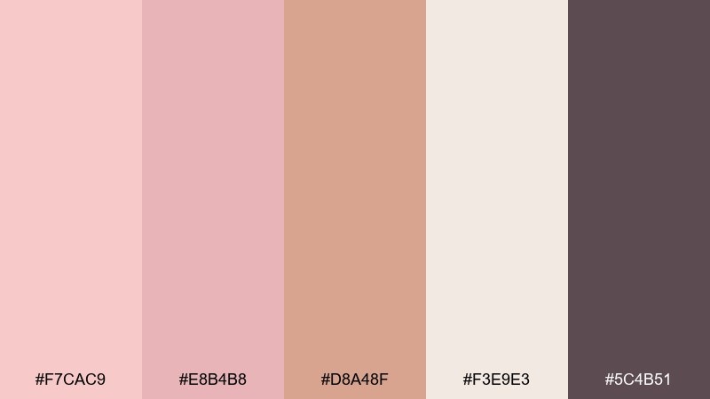
HEX: #F7CAC9 #E8B4B8 #D8A48F #F3E9E3 #5C4B51
Mood: cozy, polished, modern
Best for: skincare product packaging
Cozy and polished, this set feels like warm blush lighting and clean linen. A rose quartz color palette like this shines on minimalist labels, with the cocoa-mauve used for ingredient lists and fine lines. Pair it with matte ivory stock and a soft-touch finish to keep it premium, not sugary. Tip: use the clay tone for a single accent stripe to guide the eye on shelves.
Image example of warm blush neutrals generated using media.io
3) Dusty Rose & Sage
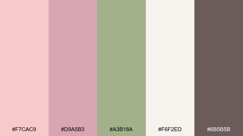
HEX: #F7CAC9 #D9A5B3 #A3B18A #F6F2ED #6B5B5B
Mood: botanical, grounded, soothing
Best for: botanical watercolor wall art
Grounded and botanical, these hues evoke dried roses, fresh sage, and handmade paper. The muted green keeps the pink feeling grown-up, especially in florals, patterns, and nature-inspired prints. Pair with warm off-white negative space so the brush textures can breathe. Tip: reserve the deeper taupe for stems, outlines, and small shadows to add depth.
Image example of dusty rose & sage generated using media.io
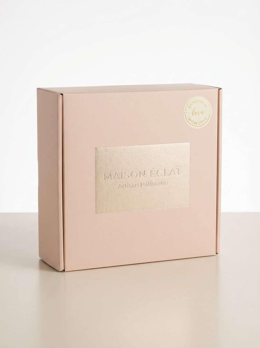
4) Quartz and Cocoa
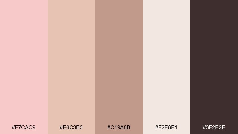
HEX: #F7CAC9 #E6C3B3 #C19A8B #F2E8E1 #3F2E2E
Mood: warm, artisan, sophisticated
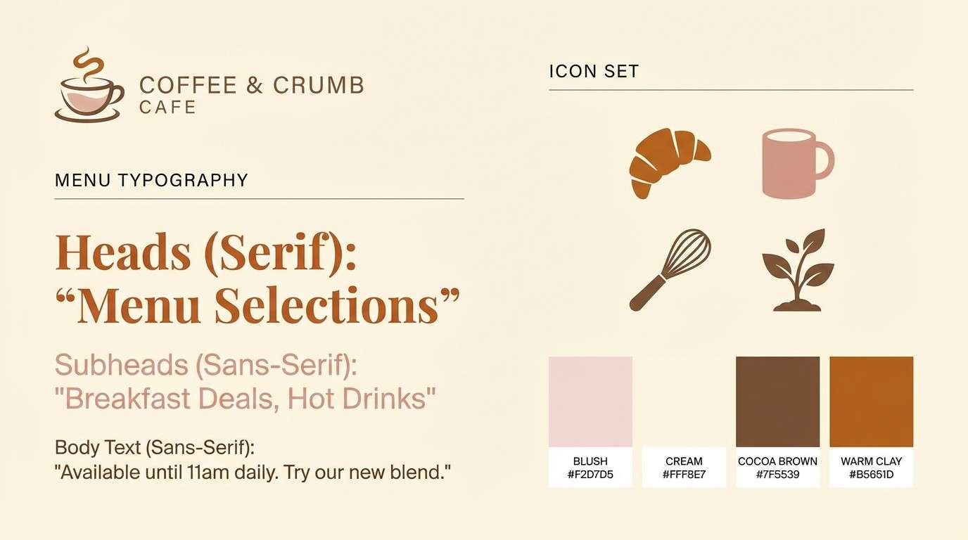
Best for: cafe branding style guide
Warm and artisan, this mix feels like steamed milk, cocoa powder, and blush ceramics. Use the creamy neutrals for backgrounds and menus, then anchor the system with espresso brown for logos and headers. It suits cafes, bakeries, and lifestyle brands that want softness without losing contrast. Tip: keep the medium clay shade for secondary elements like icons and dividers.
Image example of quartz and cocoa generated using media.io
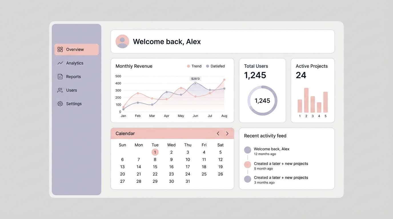
5) Modern Minimal UI
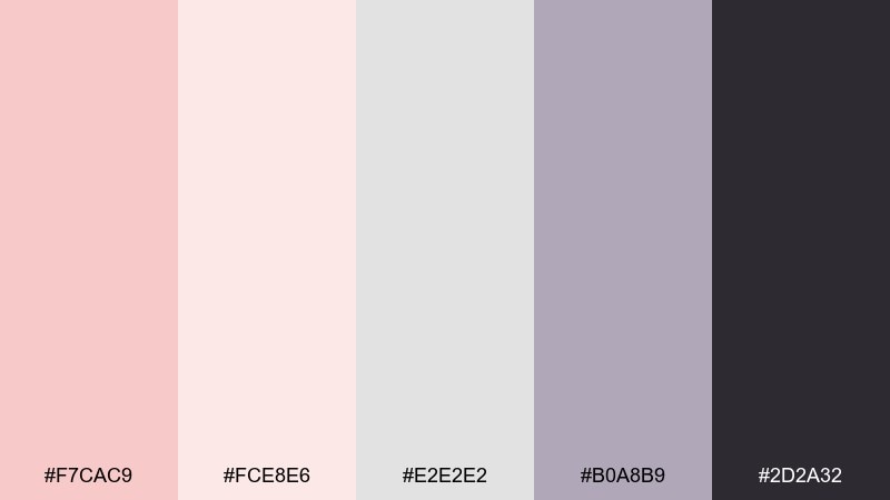
HEX: #F7CAC9 #FCE8E6 #E2E2E2 #B0A8B9 #2D2A32
Mood: clean, calm, contemporary
Best for: 2d dashboard ui mockup
Clean and calm, these tones read like frosted glass and soft-focus blush. For rose quartz color combinations in UI, let the pale pink sit behind cards while charcoal carries navigation and key labels. The cool gray keeps spacing and separators subtle, so the interface stays airy. Tip: use the lavender-gray only for secondary states like hover, tags, or helper text.
Image example of modern minimal ui generated using media.io
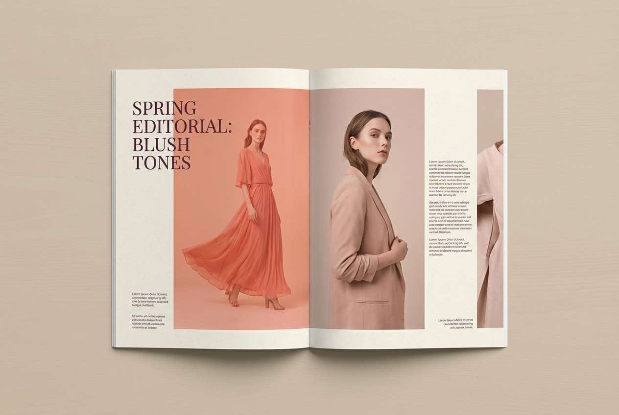
6) Sunset Satin
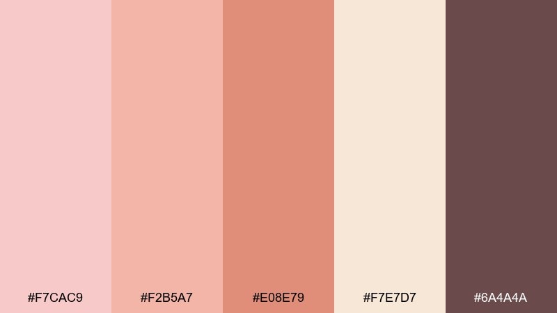
HEX: #F7CAC9 #F2B5A7 #E08E79 #F7E7D7 #6A4A4A
Mood: glowy, confident, editorial
Best for: fashion lookbook spread
Glowy and confident, these shades feel like satin fabric catching golden-hour light. The warmer coral notes add energy while the creamy base keeps layouts bright and premium. Use the deeper brown-plum for headlines and page numbers so the spread stays readable in print. Tip: keep coral accents to one or two elements per page to avoid overpowering photography.
Image example of sunset satin generated using media.io
7) Pearl & Copper Glow
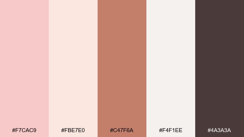
HEX: #F7CAC9 #FBE7E0 #C47F6A #F4F1EE #4A3A3A
Mood: luxe, luminous, romantic
Best for: jewelry product ad
Luxe and luminous, this palette evokes pearls, rose-gold reflections, and soft studio glow. Copper works as a hero accent for call-to-action details, while the blush and ivory keep everything airy. It fits jewelry ads, boutique launches, and premium gift campaigns. Tip: use the deep cocoa for tiny type only, so the metal tones stay the star.
Image example of pearl & copper glow generated using media.io
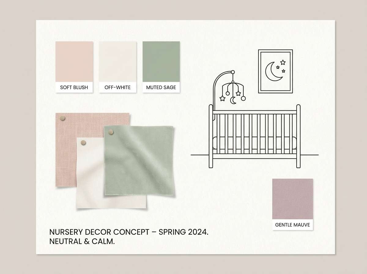
8) Baby Pink Serenity
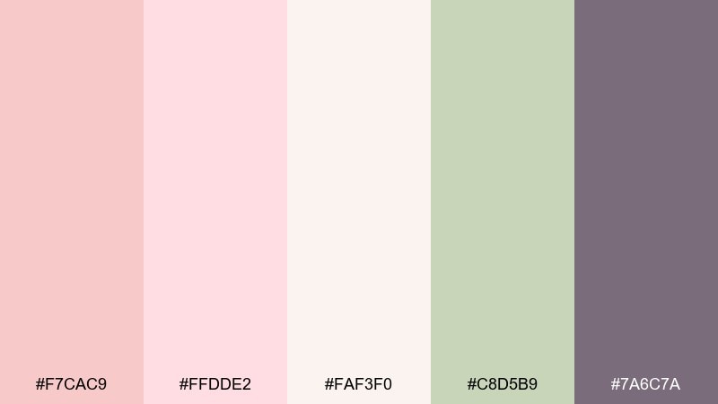
HEX: #F7CAC9 #FFDDE2 #FAF3F0 #C8D5B9 #7A6C7A
Mood: gentle, nurturing, soft
Best for: nursery paint and decor moodboard
Gentle and nurturing, these colors feel like a quiet nursery with sunlight on cotton blankets. The soft green adds a natural, calming counterpoint to blush walls and textiles. Use the off-white as your main canvas, then layer pink in fabrics and small decor pieces. Tip: keep the mauve-gray for frames or lamp bases to ground the softness.
Image example of baby pink serenity generated using media.io
9) Muted Rose Monochrome
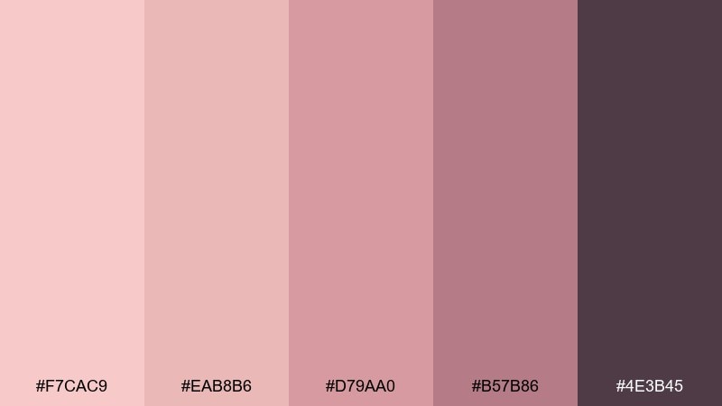
HEX: #F7CAC9 #EAB8B6 #D79AA0 #B57B86 #4E3B45
Mood: moody, elegant, cohesive
Best for: instagram post template set
Moody and elegant, this set looks like velvet roses under low, flattering light. A mostly monochrome approach makes feeds feel intentional, especially with consistent type and generous spacing. Use the darkest plum for text overlays and the mid rose for buttons or stickers. Tip: alternate light and dark backgrounds every other slide to keep the grid dynamic.
Image example of muted rose monochrome generated using media.io
10) Vintage Rose Postcard
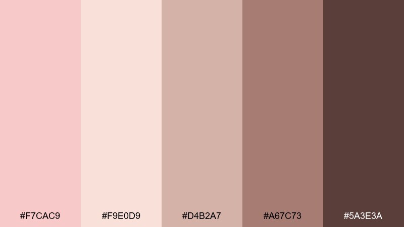
HEX: #F7CAC9 #F9E0D9 #D4B2A7 #A67C73 #5A3E3A
Mood: nostalgic, warm, handcrafted
Best for: postcard graphic design
Nostalgic and warm, these tones feel like a sun-faded postcard tucked inside a journal. A rose quartz color combination with dusty browns makes typography look vintage without sacrificing clarity. Use the pale peach as the paper base, then add the deeper cocoa for stamps, borders, and headings. Tip: introduce light grain or subtle texture to enhance the retro print vibe.
Image example of vintage rose postcard generated using media.io
11) Rose Quartz + Denim
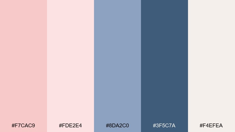
HEX: #F7CAC9 #FDE2E4 #8DA2C0 #3F5C7A #F4EFEA
Mood: fresh, casual, modern
Best for: ecommerce hero banner
Fresh and casual, this pairing feels like blush knitwear with classic denim. Use the pale pink and cream for clean space around product shots, then bring in denim blues for buttons and navigation. It works well for apparel stores, seasonal drops, and lifestyle landing pages. Tip: keep the dark denim only for key actions so the page stays light.
Image example of rose quartz + denim generated using media.io

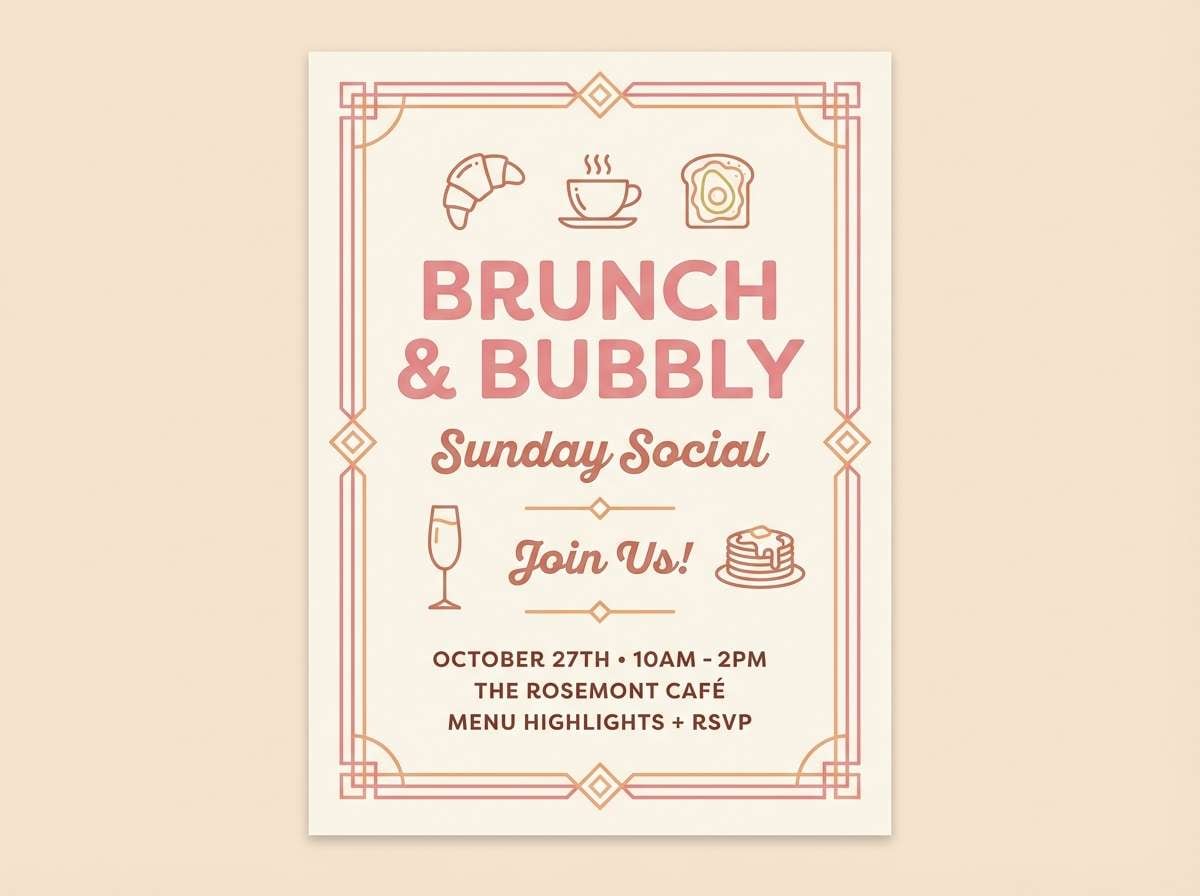
12) Tea Rose Brunch
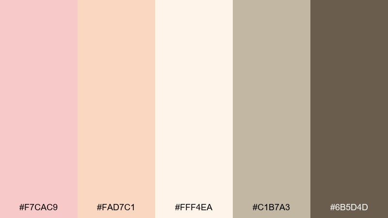
HEX: #F7CAC9 #FAD7C1 #FFF4EA #C1B7A3 #6B5D4D
Mood: inviting, sunny, relaxed
Best for: cafe brunch flyer
Inviting and sunny, these hues evoke tea roses, warm pastries, and soft morning light. The creamy peach and butter tones make an ideal backdrop for menu highlights and specials. Add the olive-beige for subtle frames and icons, then reserve the deep brown for pricing and key details. Tip: use large blocks of the lightest cream to keep the flyer readable at a glance.
Image example of tea rose brunch generated using media.io
13) Blush Marble Luxe
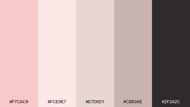
HEX: #F7CAC9 #FCE9E7 #E7D6D1 #C8B3AE #2F2A2C
Mood: premium, clean, understated
Best for: perfume product ad
Premium and understated, these shades recall blush marble, polished stone, and soft shadows. Keep the near-white tones dominant, then use the dusty taupe to shape labels and subtle gradients. It suits fragrance ads, beauty campaigns, and minimalist packaging where details matter. Tip: add one high-contrast black element like a cap or logo to sharpen the luxury feel.
Image example of blush marble luxe generated using media.io
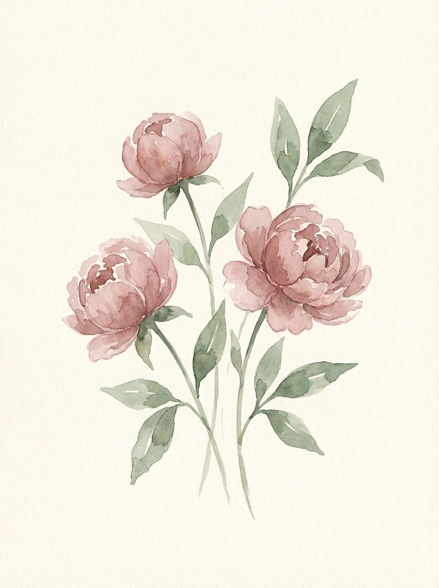
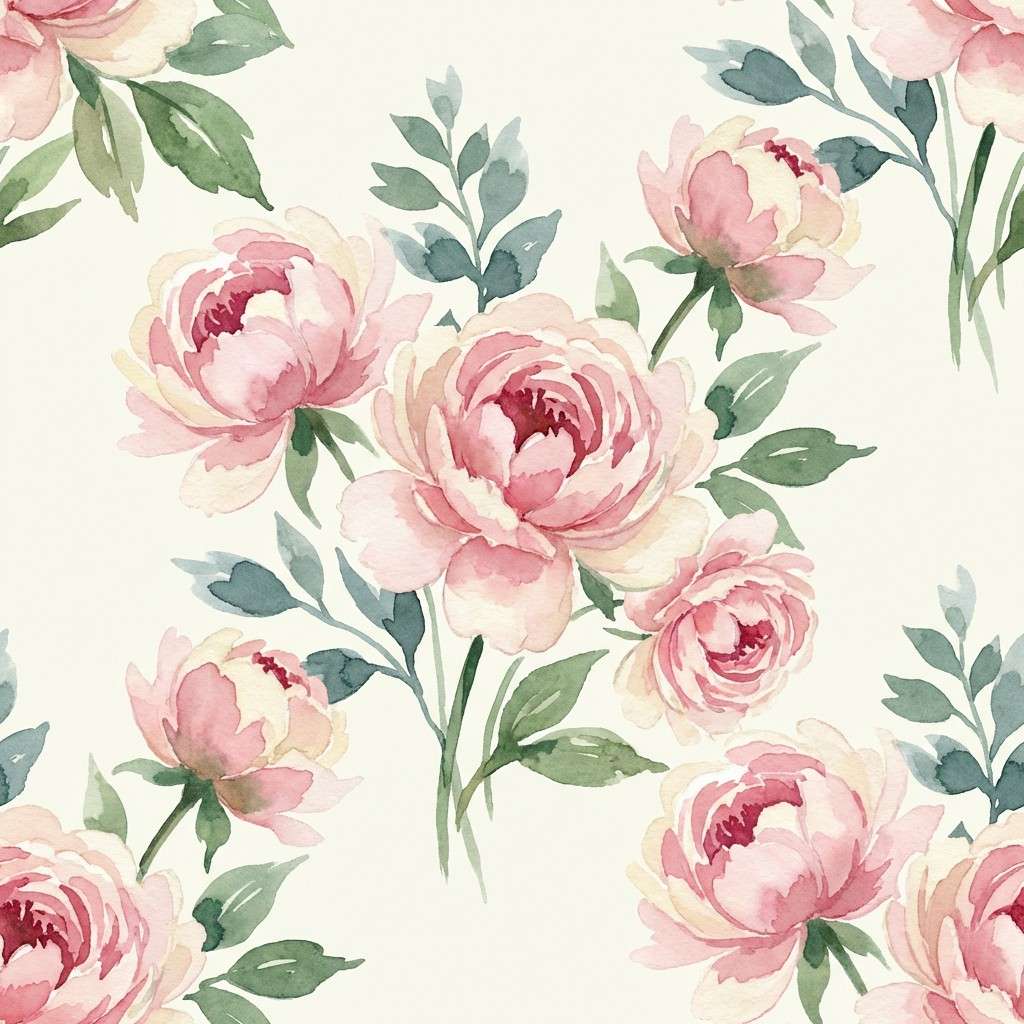
14) Spring Peony Garden
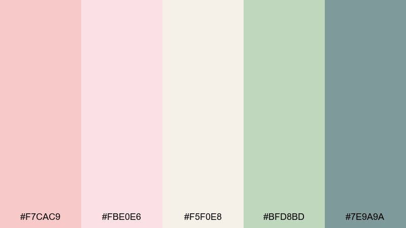
HEX: #F7CAC9 #FBE0E6 #F5F0E8 #BFD8BD #7E9A9A
Mood: springlike, fresh, delicate
Best for: watercolor floral pattern
Springlike and delicate, these tones feel like peonies opening after a light rain. The cool teal-gray adds structure to the florals and keeps the pink from turning too sweet. Use the ivory as negative space so the pattern stays breathable on fabric or stationery. Tip: repeat the teal-gray sparingly in centers and stems for a balanced rhythm.
Image example of spring peony garden generated using media.io
15) Soft Clay + Linen
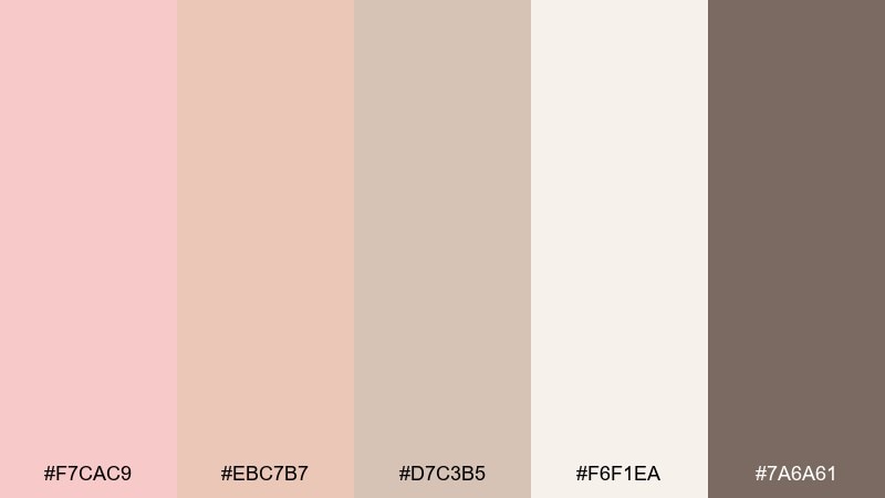
HEX: #F7CAC9 #EBC7B7 #D7C3B5 #F6F1EA #7A6A61
Mood: natural, airy, timeless
Best for: interior design magazine layout
Natural and timeless, these hues echo clay pottery, linen curtains, and sunlit plaster walls. They work well for editorial spreads where photos need a gentle, warm frame rather than loud color. Use the linen off-white for margins and columns, then bring in the clay tones for section headers and callouts. Tip: keep body text in the darker taupe to avoid low-contrast print issues.
Image example of soft clay + linen generated using media.io
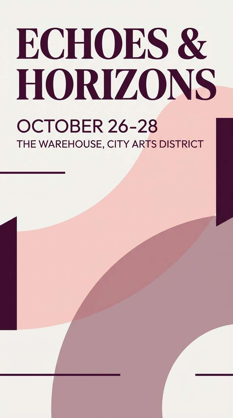
16) Orchid Twilight
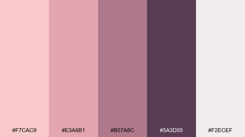
HEX: #F7CAC9 #E3A6B1 #B07A8C #5A3D55 #F2ECEF
Mood: dramatic, romantic, night-ready
Best for: music event poster
Dramatic and romantic, this palette feels like orchids under twilight stage lights. The deep plum brings instant contrast for event titles, while blush keeps the overall look approachable. Use the pale lilac-white as breathing room around dates and venue info. Tip: set the headline in plum with a thin blush outline to boost readability from a distance.
Image example of orchid twilight generated using media.io
17) Stone Rose Balance
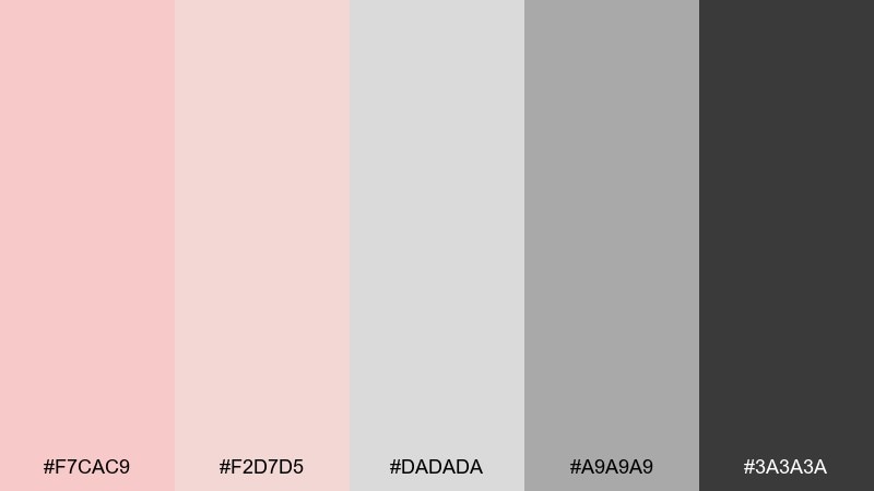
HEX: #F7CAC9 #F2D7D5 #DADADA #A9A9A9 #3A3A3A
Mood: neutral, practical, refined
Best for: presentation slide template
Neutral and refined, these shades look like blush-tinted stone and clean concrete. The grayscale backbone makes it ideal for decks, reports, and portfolios that need calm color without distraction. Use blush only for highlights and section dividers, letting charcoal handle charts and text. Tip: stick to one blush accent per slide for a consistent professional rhythm.
Image example of stone rose balance generated using media.io
18) Rose Quartz & Charcoal
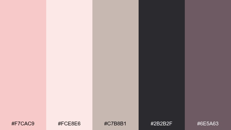
HEX: #F7CAC9 #FCE8E6 #C7B8B1 #2B2B2F #6E5A63
Mood: bold, modern, confident
Best for: tech startup branding kit
Bold and modern, this mix feels like soft blush meeting sharp charcoal tailoring. A rose quartz color palette with this much contrast is excellent for startups that want warmth without losing authority. Use charcoal for the logo and navigation, and keep blush for supportive moments like badges, illustrations, and onboarding screens. Tip: test contrast on small text early to ensure accessibility across components.
Image example of rose quartz & charcoal generated using media.io
19) Champagne Blush
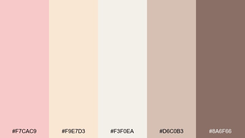
HEX: #F7CAC9 #F9E7D3 #F3F0EA #D6C0B3 #8A6F66
Mood: celebratory, soft, elegant
Best for: bakery box and label design
Celebratory and elegant, these colors evoke champagne foam, blush frosting, and satin ribbons. The warm beige tones make packaging feel gift-ready while staying subtle. Use the champagne tint for backgrounds, then apply the deeper mocha for label text and barcodes. Tip: add a blush wax-seal graphic or sticker to create a focal point without extra ink colors.
Image example of champagne blush generated using media.io
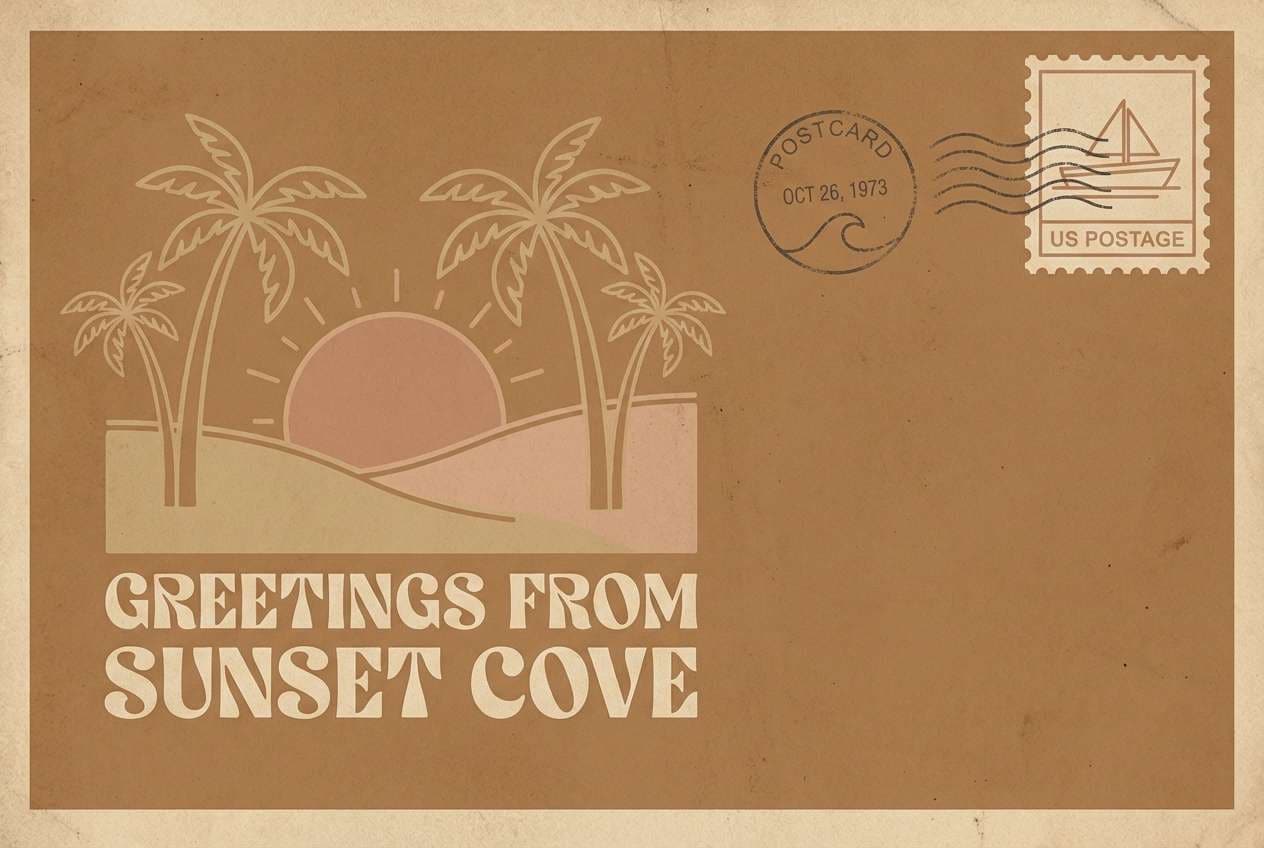
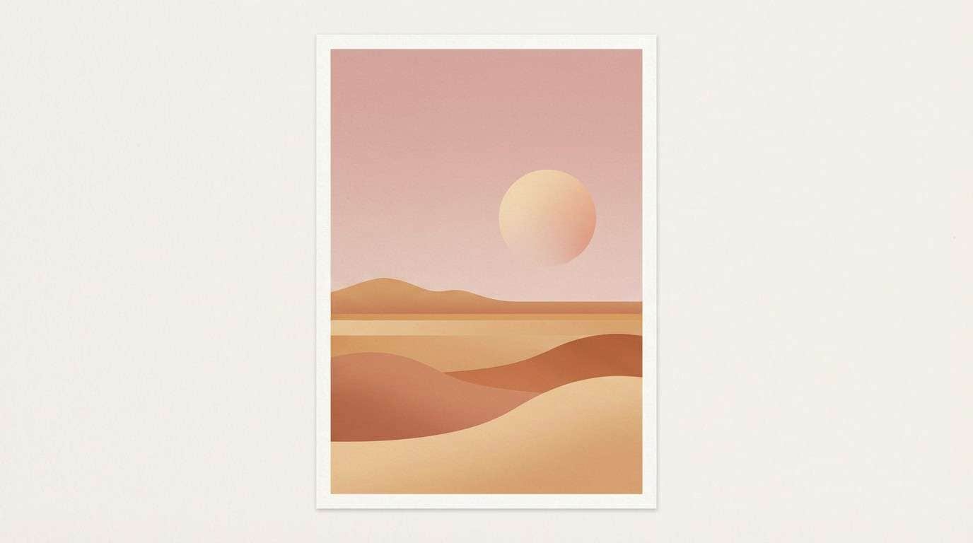
20) Desert Pink Horizon

HEX: #F7CAC9 #E9B7A7 #CFA18D #F4EEE7 #6D5B55
Mood: earthy, serene, sunbaked
Best for: minimal landscape illustration poster
Earthy and serene, these shades feel like a desert horizon at dusk with dusty pink haze. The muted tans keep the blush grounded, making it great for posters, album art, and calm home decor prints. Use the light sand tone as the sky, then layer clay hills for depth. Tip: keep edges soft and gradients subtle to preserve the tranquil mood.
Image example of desert pink horizon generated using media.io
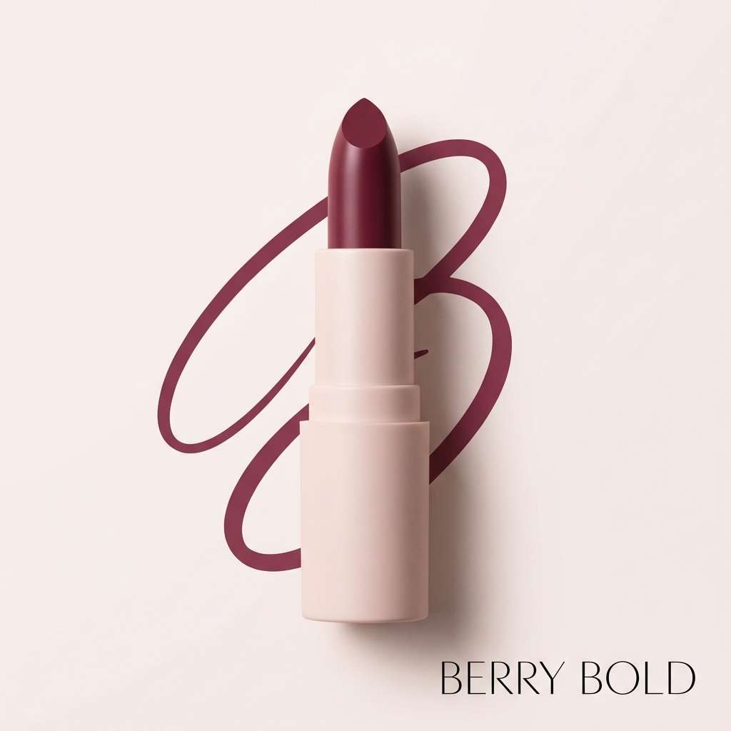
21) Berry Rose Accent
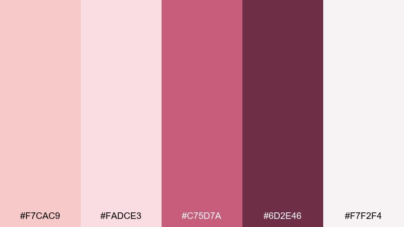
HEX: #F7CAC9 #FADCE3 #C75D7A #6D2E46 #F7F2F4
Mood: playful, flirty, high-impact
Best for: lipstick product ad
Playful and high-impact, these colors evoke berry lipstick, blush cheeks, and glossy campaign visuals. Rose quartz color combinations like this work best when the berry shade is treated as a bold accent against the softer pink base. Use the deep wine tone for small premium details like a logo stamp or price tag. Tip: limit berry to one hero element so the ad stays chic, not loud.
Image example of berry rose accent generated using media.io
What Colors Go Well with Rose Quartz?
Rose quartz pairs beautifully with warm neutrals like ivory, linen, beige, and cocoa because they keep the pink feeling sophisticated rather than candy-like. These combinations are especially strong for packaging, editorial layouts, and lifestyle branding.
For a fresher, more contemporary look, add cool counterpoints like sage, teal-gray, or denim blue. These hues balance the warmth of blush and help build clearer hierarchy in UI and marketing layouts.
If you need strong contrast, anchor rose quartz with charcoal, espresso brown, or deep plum. Dark accents make rose quartz feel more “designed” and improve readability for text, icons, and CTAs.
How to Use a Rose Quartz Color Palette in Real Designs
Start with a role-based system: one light blush for backgrounds, one off-white for breathing room, one mid-tone for UI components or decorative shapes, and one deep shade for typography. This keeps your rose quartz palette consistent across pages and formats.
In print (invitations, labels, postcards), prioritize contrast early—especially for small text. Rose quartz looks best when paired with a darker ink color (taupe, cocoa, charcoal) and plenty of negative space.
For social templates and ads, keep the boldest accent limited to one hero element (a badge, CTA, or headline bar). That way, the palette stays cohesive while still creating a clear focal point.
Create Rose Quartz Palette Visuals with AI
Want to see these rose quartz color combinations in realistic designs like packaging, posters, invitations, or UI screens? Generate quick mockups by turning a short prompt into on-brand visuals.
With Media.io’s text-to-image tool, you can iterate fast: swap accents (sage vs. charcoal), test different ratios, and create multiple layout styles without rebuilding from scratch.
Rose Quartz Color Palette FAQs
-
What is the HEX code for rose quartz?
A commonly used rose quartz HEX is #F7CAC9. In design systems, it’s often paired with off-whites and deeper neutrals to maintain readable contrast. -
Is rose quartz warm or cool?
Rose quartz is generally a warm, soft pink with gentle peach undertones. Depending on surrounding colors (like lavender-gray or teal-gray), it can read slightly cooler. -
What colors complement rose quartz best?
Top complements include ivory/cream, taupe, cocoa brown, charcoal, and muted greens like sage. Blues (denim, slate) also create crisp, modern contrast. -
Can I use a rose quartz palette for a professional brand?
Yes—choose a palette with stronger anchors like charcoal or espresso brown, and keep blush as a supporting color for highlights, illustrations, or background surfaces. -
How do I keep rose quartz from looking too “sweet”?
Balance it with grays, earthy clays, or deep plum, and reduce saturation in secondary pinks. Using texture (paper, stone, linen) also makes the palette feel more mature. -
Is rose quartz good for UI design?
It can be, especially as a background tint or subtle accent. Use a darker text color (charcoal) and verify contrast for buttons, links, and small labels to meet accessibility needs. -
How can I generate rose quartz palette mockups quickly?
Use an AI image generator to create posters, packaging, invitation suites, and UI screens from prompts. You can iterate fast by changing one accent color at a time and keeping the same layout description.


