

A baby shower color palette does more than look cute—it sets the tone for invitations, decor, and photos so everything feels like one thoughtful celebration.
Below are baby shower color ideas you can copy instantly (with HEX codes), plus practical tips for mixing pastels, neutrals, and modern accents.
In this article
- Why Baby Shower Palettes Work So Well
-
- cloudy blush
- minted lullaby
- lavender sprinkles
- peachy ribbon
- buttercream blue
- tea green tulle
- neutral nursery
- rose gold confetti
- soft safari
- seaside cotton
- storybook pastels
- modern monochrome baby
- candy cloud pop
- woodland whisper
- sunshine sprinkle
- vintage lace
- cozy cocoa cream
- minimal mint gray
- coral blossom
- starry night soft navy
- What Colors Go Well with Baby Shower?
- How to Use a Baby Shower Color Palette in Real Designs
- Create Baby Shower Palette Visuals with AI
Why Baby Shower Palettes Work So Well
Baby showers usually include lots of small design touchpoints—invites, signs, stickers, table cards, and social posts. A consistent palette keeps all those pieces coordinated, even if they’re made at different times or by different people.
Pastels and soft neutrals also photograph beautifully, especially in bright rooms with natural light. When your colors are balanced (one main shade, one supporting shade, and a couple of accents), your decor looks intentional instead of random.
Most baby shower themes are naturally “soft,” so gentle hues help details like names, dates, and tiny icons feel welcoming rather than loud. The right palette can also make gender-neutral styling feel effortless.
20+ Baby Shower Color Palette Ideas (with HEX Codes)
1) Cloudy Blush
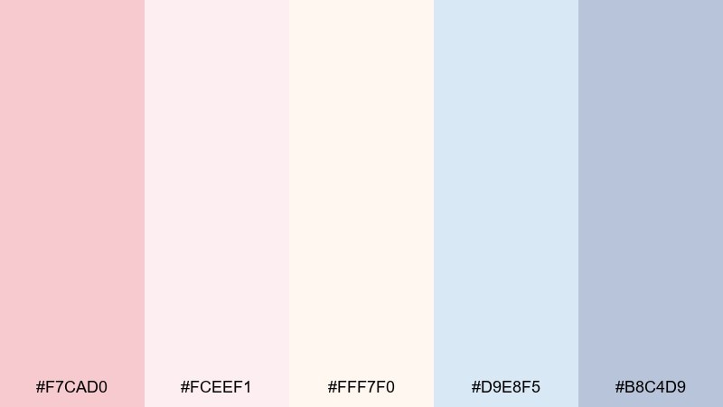
HEX: #F7CAD0 #FCEEF1 #FFF7F0 #D9E8F5 #B8C4D9
Mood: airy, tender, calming
Best for: baby shower invitation suites and envelope liners
Airy blush and powdery blue feel like cotton clouds at sunrise, soft enough for any theme. Use the pale cream as the main background and let blush carry headlines and names. Pair with warm white paper stock and a light gray ink for readable details. Tip: add a thin blue border to keep pastel pink from looking too sweet in photos.
Image example of cloudy blush generated using media.io
Media.io is an online AI studio for creating and editing video, image, and audio in your browser.

2) Minted Lullaby
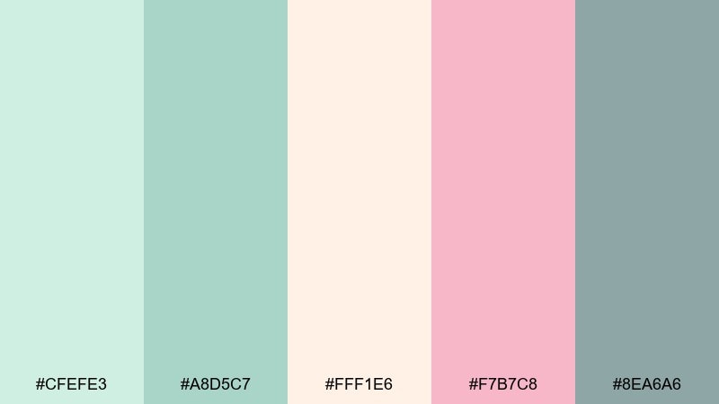
HEX: #CFEFE3 #A8D5C7 #FFF1E6 #F7B7C8 #8EA6A6
Mood: fresh, soothing, modern
Best for: nursery-style gift tags and favor labels
Fresh mint tones and a whisper of blush evoke a quiet nursery with sunlight through sheer curtains. Keep mint as the dominant field color and use peachy cream to soften edges and negative space. The muted teal-gray is ideal for text so small labels stay legible. Tip: print tags on matte stock to keep the greens from shifting under warm indoor lighting.
Image example of minted lullaby generated using media.io
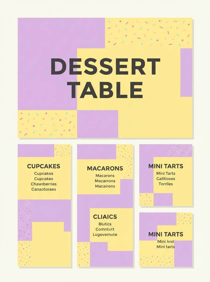
3) Lavender Sprinkles
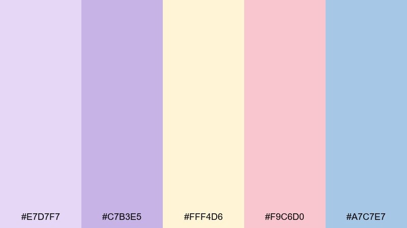
HEX: #E7D7F7 #C7B3E5 #FFF4D6 #F9C6D0 #A7C7E7
Mood: playful, sweet, dreamy
Best for: dessert table signs and menu cards
Dreamy lavender with sprinkle-soft pastels brings cupcake-shop charm without feeling loud. Use the butter-yellow as a warm base so the purples look richer and less chilly. Blush works best as a small accent for prices, flavors, or tiny icons. Tip: keep sign text in a darker lavender for contrast, especially in dim venues.
Image example of lavender sprinkles generated using media.io
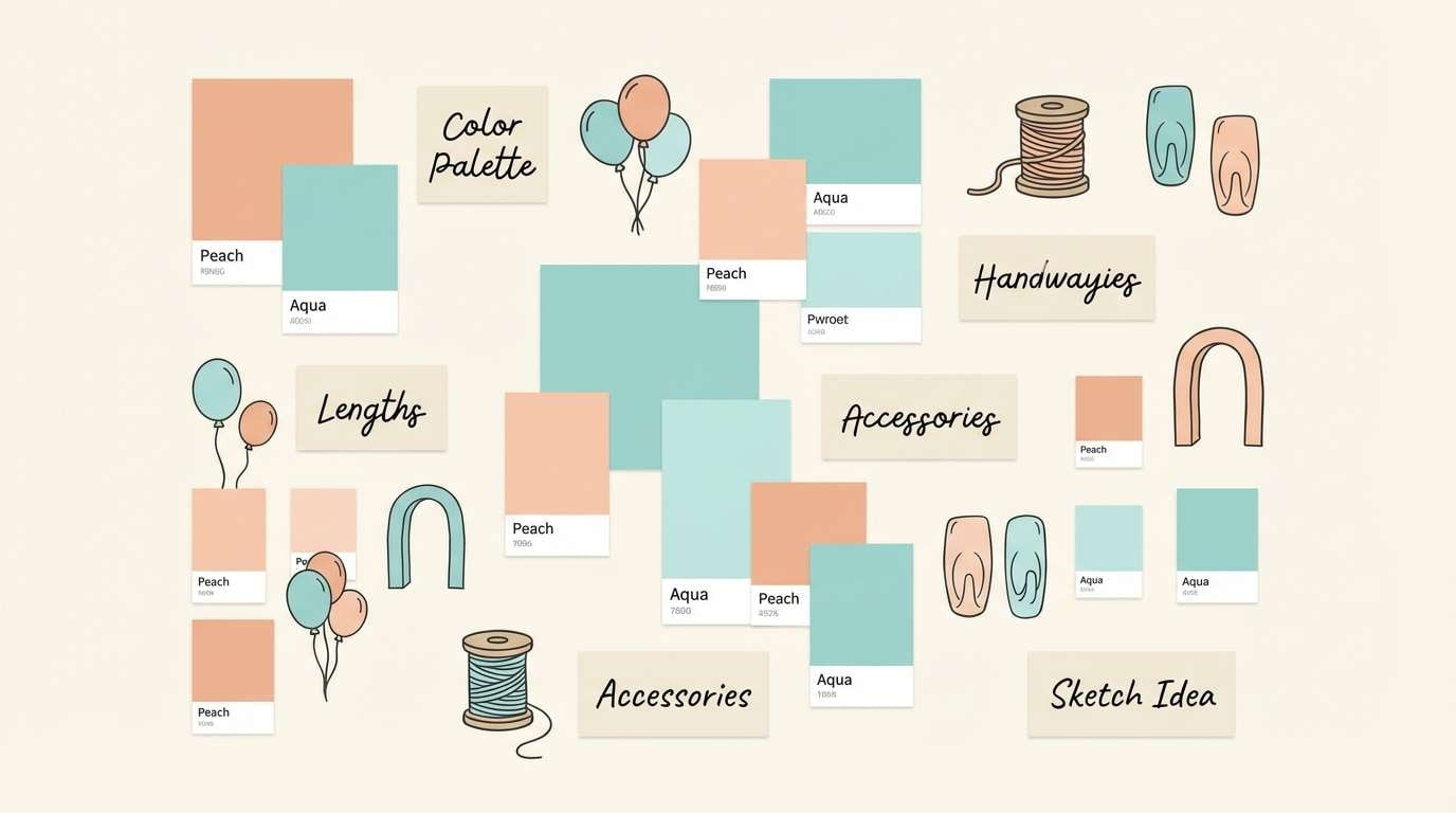
4) Peachy Ribbon
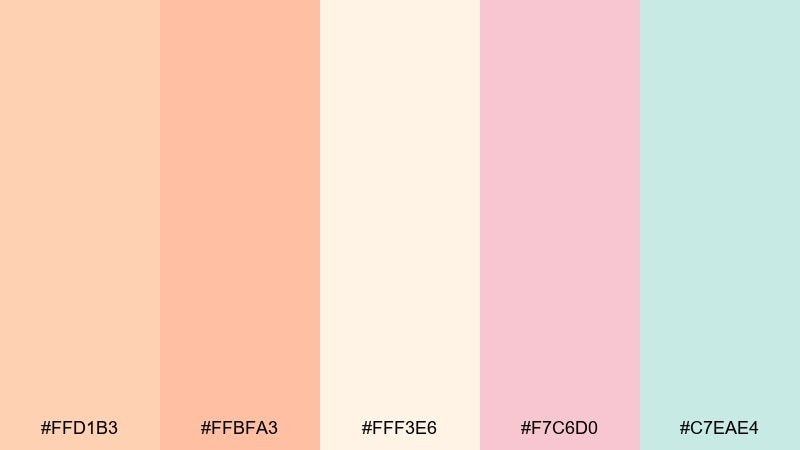
HEX: #FFD1B3 #FFBFA3 #FFF3E6 #F7C6D0 #C7EAE4
Mood: warm, welcoming, romantic
Best for: balloon garland plans and decor mood boards
Warm peach and airy aqua feel like satin ribbons and pastel balloons drifting across a bright room. Build your layout with cream and peach first, then drop in aqua as a cool counterbalance. Blush works best in small hits, like confetti dots or mini labels. Tip: repeat the aqua at least three times in the design so it reads intentional, not accidental.
Image example of peachy ribbon generated using media.io
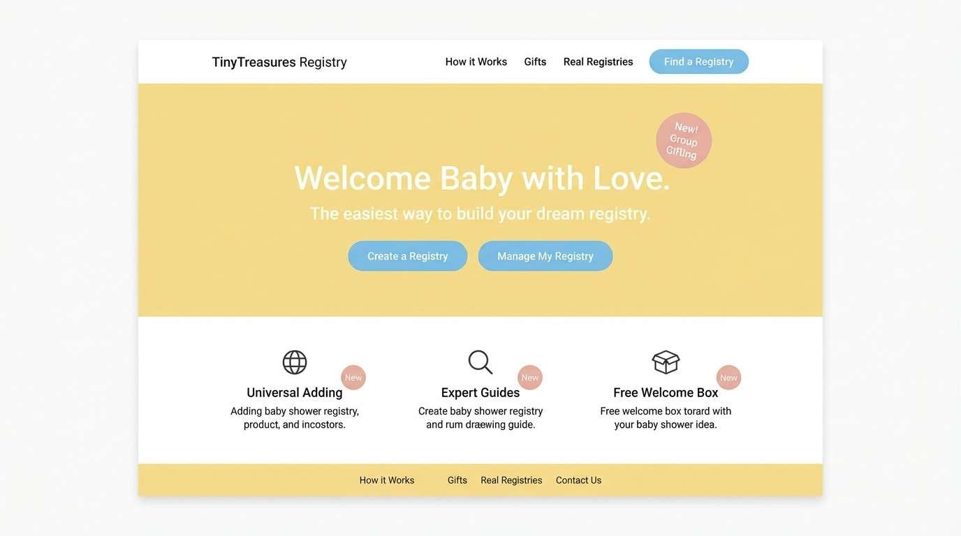
5) Buttercream Blue
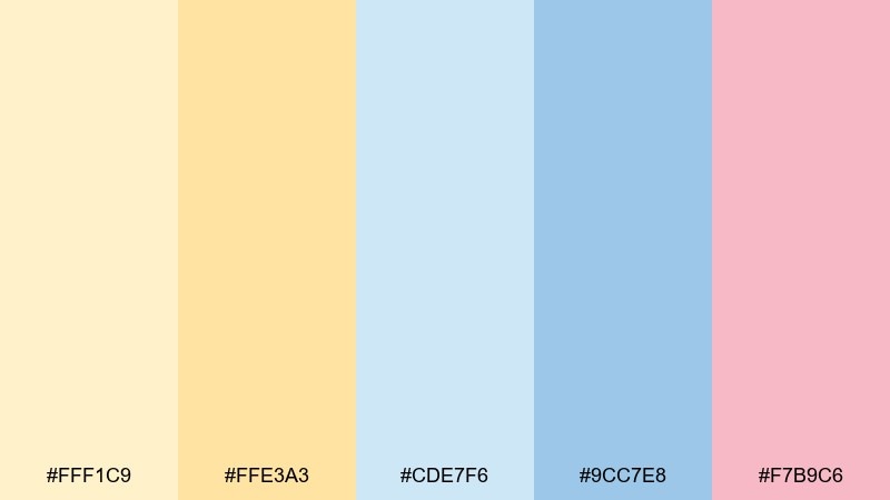
HEX: #FFF1C9 #FFE3A3 #CDE7F6 #9CC7E8 #F7B9C6
Mood: cheerful, bright, classic
Best for: registry landing pages and event microsites
Buttercream yellow and sky blue create a sunny, classic look that photographs cleanly. Use the pale yellow for backgrounds and reserve the deeper blue for buttons and links. A small touch of blush keeps the palette from feeling too primary and adds warmth to hero sections. Tip: keep body text in dark slate or black for accessibility against the light pastels.
Image example of buttercream blue generated using media.io
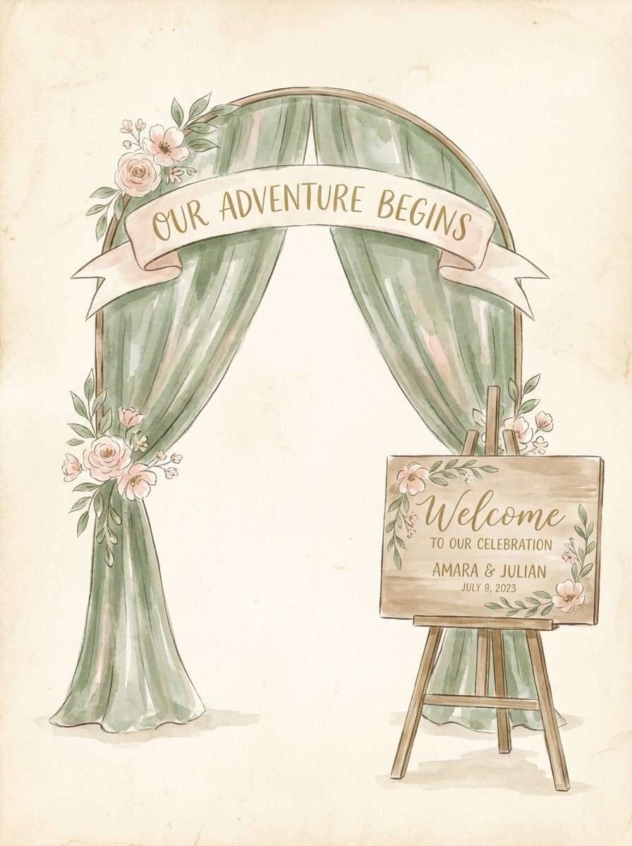
6) Tea Green Tulle
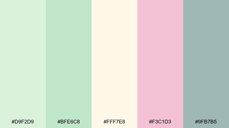
HEX: #D9F2D9 #BFE6C8 #FFF7E8 #F3C1D3 #9FB7B5
Mood: gentle, botanical, serene
Best for: watercolor photo backdrops and welcome boards
Gentle tea green and blush feel like tulle, fresh leaves, and a soft spring breeze. This baby shower color palette works beautifully for gender-neutral themes when you let green lead and keep pink as a subtle accent. Pair with natural wood frames or white foam board to maintain the airy look. Tip: add the muted gray-green for names and dates so text stays crisp over watercolor textures.
Image example of tea green tulle generated using media.io
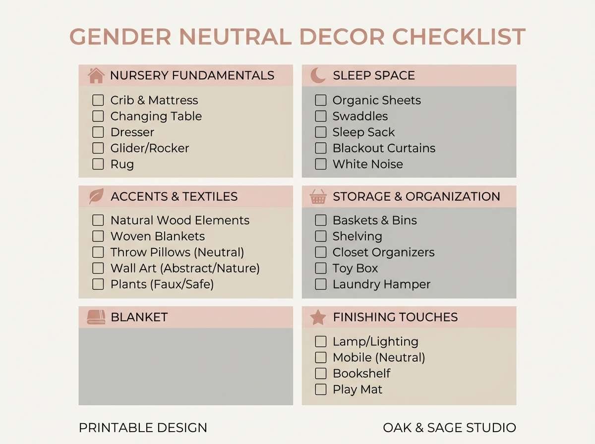
7) Neutral Nursery
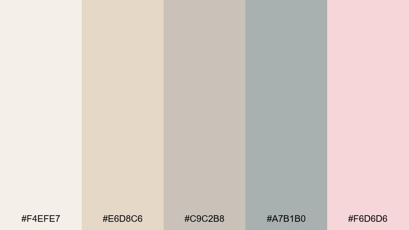
HEX: #F4EFE7 #E6D8C6 #C9C2B8 #A7B1B0 #F6D6D6
Mood: calm, minimal, elevated
Best for: gender-neutral decor checklists and printables
Soft oatmeal neutrals with a blush whisper feel like linen, knit blankets, and quiet mornings. Use the warm off-white as the page base and build sections with sand and stone for structure. The cool gray-green helps headings stand out without turning harsh. Tip: keep blush only for highlights like check marks or section dividers to preserve the minimal vibe.
Image example of neutral nursery generated using media.io
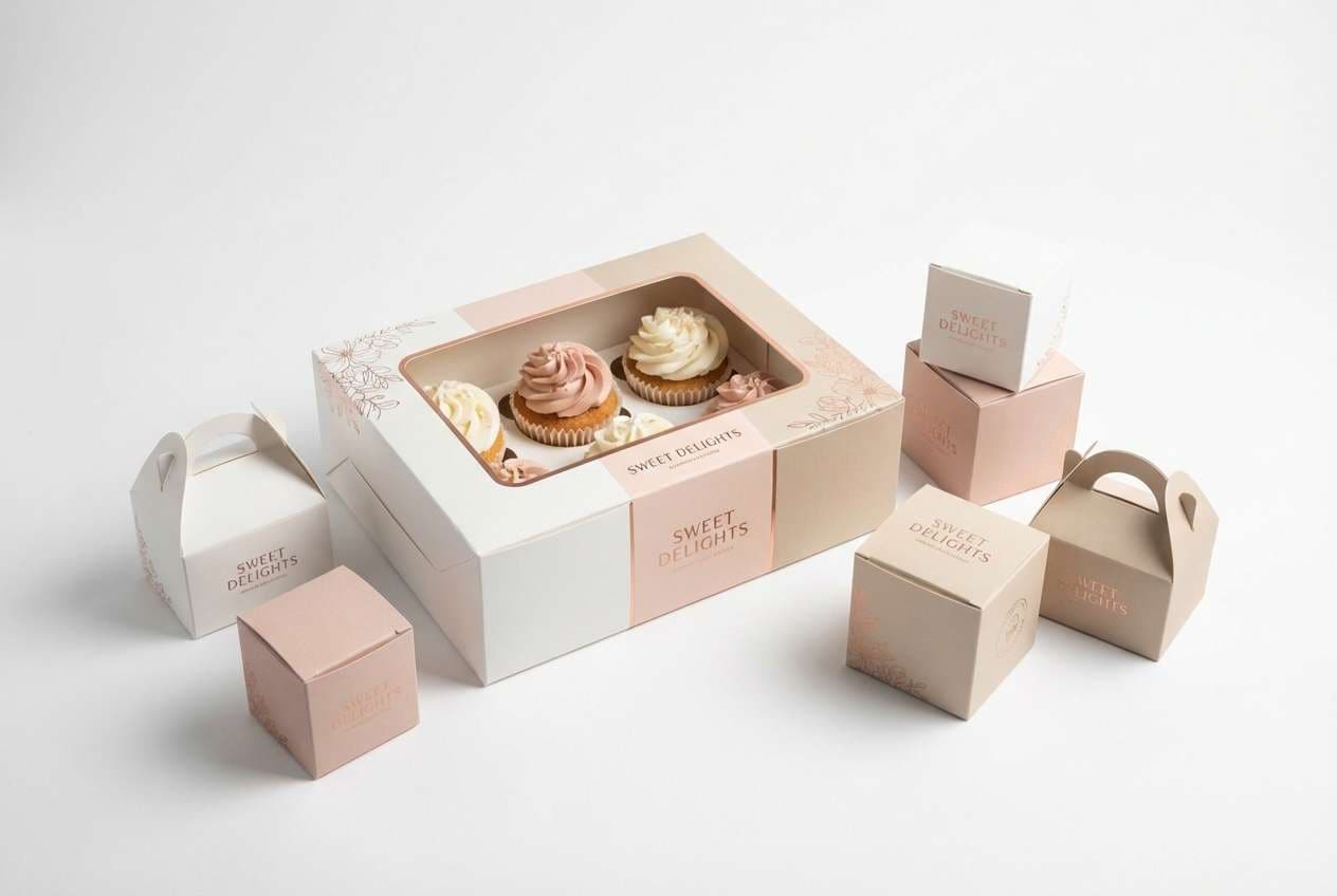
8) Rose Gold Confetti
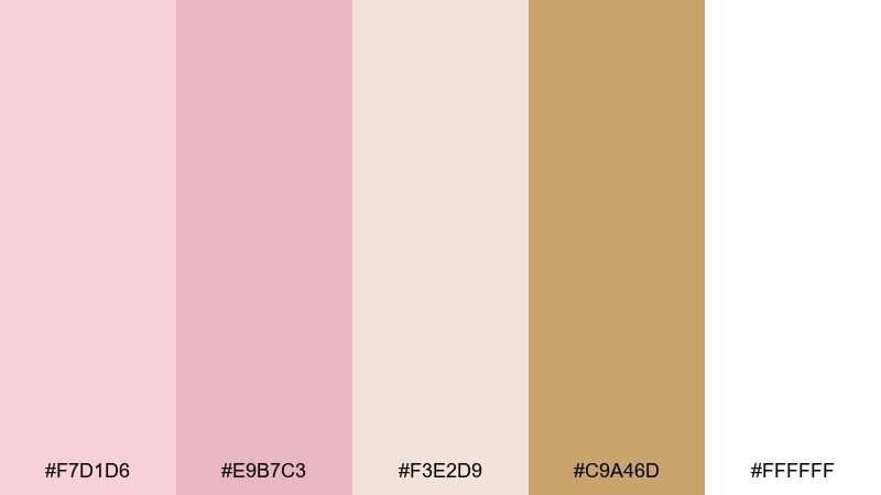
HEX: #F7D1D6 #E9B7C3 #F3E2D9 #C9A46D #FFFFFF
Mood: glam, celebratory, polished
Best for: cupcake box packaging and favor boxes
Rosy pastels with a warm metallic note evoke confetti, satin bows, and a little sparkle under soft lighting. For standout baby shower color combinations, keep the white dominant and use rose and beige as panels, then reserve the gold for thin foils or tiny icons. Pair with simple typography to avoid visual clutter. Tip: if you cannot foil print, mimic the gold with a flat caramel tone and a subtle grain texture.
Image example of rose gold confetti generated using media.io
9) Soft Safari
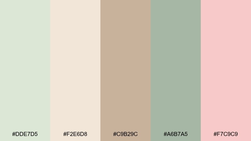
HEX: #DDE7D5 #F2E6D8 #C9B29C #A6B7A5 #F7C9C9
Mood: earthy, cozy, playful
Best for: safari-animal invitations and illustrated inserts
Sage and sand tones bring a gentle safari feel, like plush animals and woven baskets. Use the beige and tan for the main illustration shapes and keep sage as the background wash. Blush works best as a tiny ear, cheek, or balloon accent to keep it sweet. Tip: choose one consistent outline color so the earthy tones stay cohesive across inserts.
Image example of soft safari generated using media.io

10) Seaside Cotton
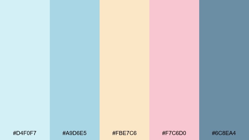
HEX: #D4F0F7 #A9D6E5 #FBE7C6 #F7C6D0 #6C8EA4
Mood: breezy, clean, coastal
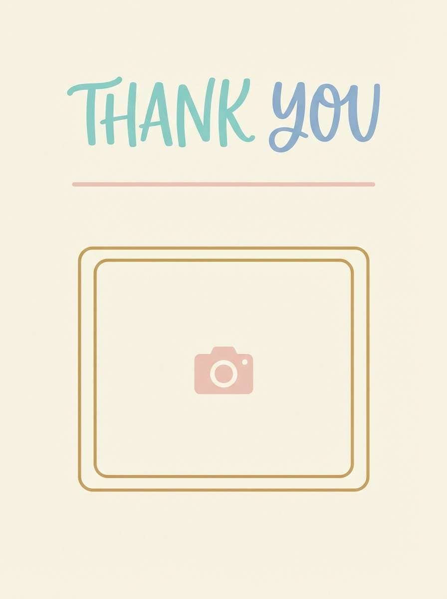
Best for: thank-you cards and photo prints
Breezy sea-glass blues with sandy cream feel like a calm shoreline and crisp cotton. Keep the light aqua as the main field and use the deeper blue for names, dates, and small frames. Blush adds warmth when paired with baby photos, especially under cool lighting. Tip: use cream borders to prevent pale blues from washing out in printing.
Image example of seaside cotton generated using media.io
11) Storybook Pastels
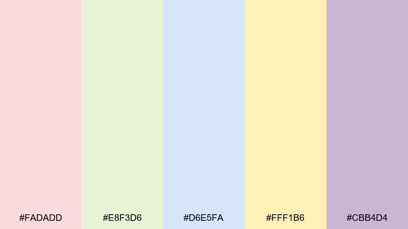
HEX: #FADADD #E8F3D6 #D6E5FA #FFF1B6 #CBB4D4
Mood: whimsical, light, nostalgic
Best for: social announcement posts and story templates
Whimsical storybook pastels feel like illustrated pages, tiny stars, and lullaby lyrics. Use the pale yellow as a glow behind the headline and place pink or lavender shapes to frame the baby name. The soft blue is perfect for secondary text and date blocks. Tip: keep your gradients very subtle so the design still looks crisp on small screens.
Image example of storybook pastels generated using media.io

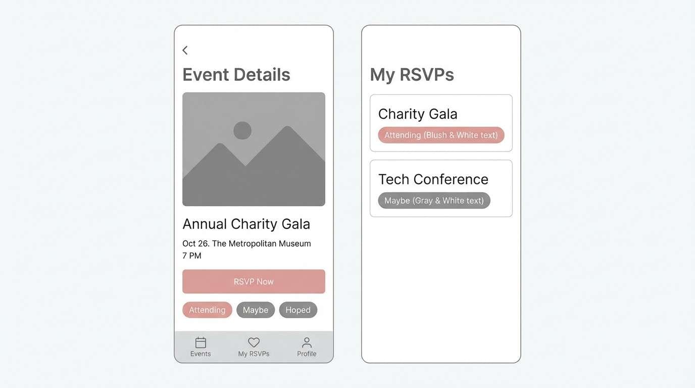
12) Modern Monochrome Baby
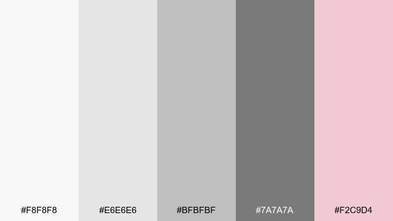
HEX: #F8F8F8 #E6E6E6 #BFBFBF #7A7A7A #F2C9D4
Mood: modern, clean, editorial
Best for: event RSVP app screens and UI components
Crisp grays with a blush accent feel editorial and grown-up, like a minimalist magazine spread. Use light gray panels to separate sections and reserve the dark gray for primary actions and key details. Blush works best as a single accent color for badges, toggles, or icon fills. Tip: keep spacing generous so the neutral tones feel premium rather than plain.
Image example of modern monochrome baby generated using media.io
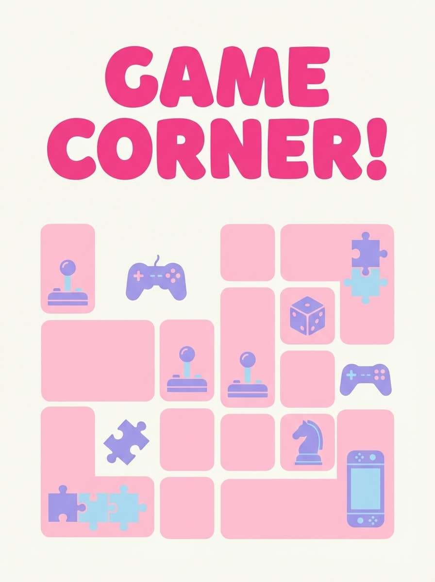
13) Candy Cloud Pop
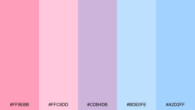
HEX: #FF9EBB #FFC8DD #CDB4DB #BDE0FE #A2D2FF
Mood: bright, cute, energetic
Best for: game corner posters and activity signs
Candy-bright pinks and purples feel like cotton candy, party games, and a playful photo booth. For punchy baby shower color combinations, choose one bold pink for titles and keep the lighter pink as the main background block. Use lavender and light blue for icons so the layout stays balanced. Tip: limit your fonts to two styles so the saturated colors do not compete with busy typography.
Image example of candy cloud pop generated using media.io
14) Woodland Whisper
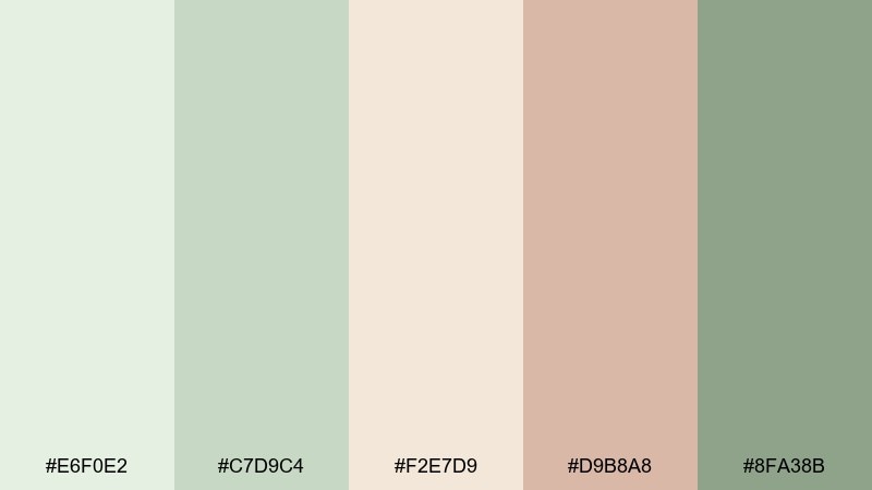
HEX: #E6F0E2 #C7D9C4 #F2E7D9 #D9B8A8 #8FA38B
Mood: natural, cozy, storybook
Best for: woodland banner art and backdrop illustrations
Soft greens and warm clay feel like a quiet forest with little critter footprints. Use the pale sage as the base wash and add deeper green for leaves and simple linework. The tan and clay tones are great for mushrooms, acorns, or name plaques. Tip: keep outlines in the deeper green so the illustration reads clearly from a distance.
Image example of woodland whisper generated using media.io
15) Sunshine Sprinkle
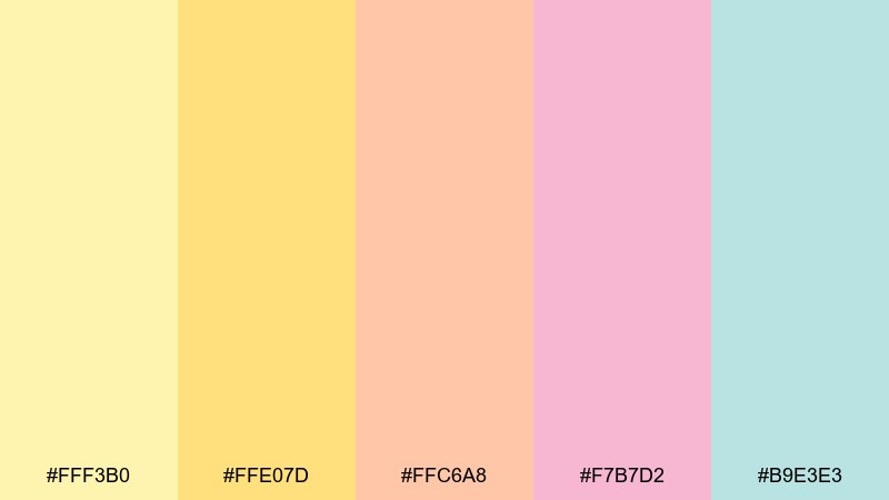
HEX: #FFF3B0 #FFE07D #FFC6A8 #F7B7D2 #B9E3E3
Mood: sunny, happy, friendly
Best for: table number cards and place settings
Sunny yellows with pastel pink and aqua feel like lemonade, confetti, and a bright brunch table. Let the pale yellow be the main card color and use the deeper yellow for numbers and headers. Peach and blush work well as small corner shapes or scalloped borders. Tip: keep the aqua for a single repeating element, like an icon or thin rule, to unify the set.
Image example of sunshine sprinkle generated using media.io
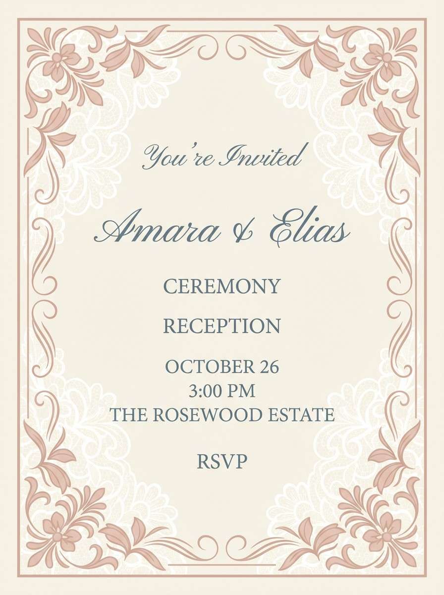
16) Vintage Lace
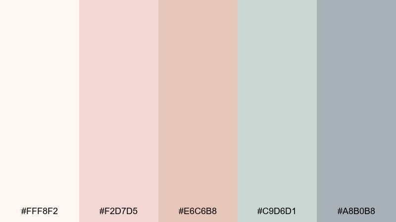
HEX: #FFF8F2 #F2D7D5 #E6C6B8 #C9D6D1 #A8B0B8
Mood: romantic, timeless, delicate
Best for: elegant invitations with lace patterns
Creamy blush and dusty neutrals evoke vintage lace, heirloom blankets, and soft candlelight. Use the warm cream as the paper base and keep dusty blue-gray for typography to stay readable. Blush and nude make beautiful pattern fills for borders and corner flourishes. Tip: if you add a lace motif, keep it low-contrast so it does not fight the event details.
Image example of vintage lace generated using media.io
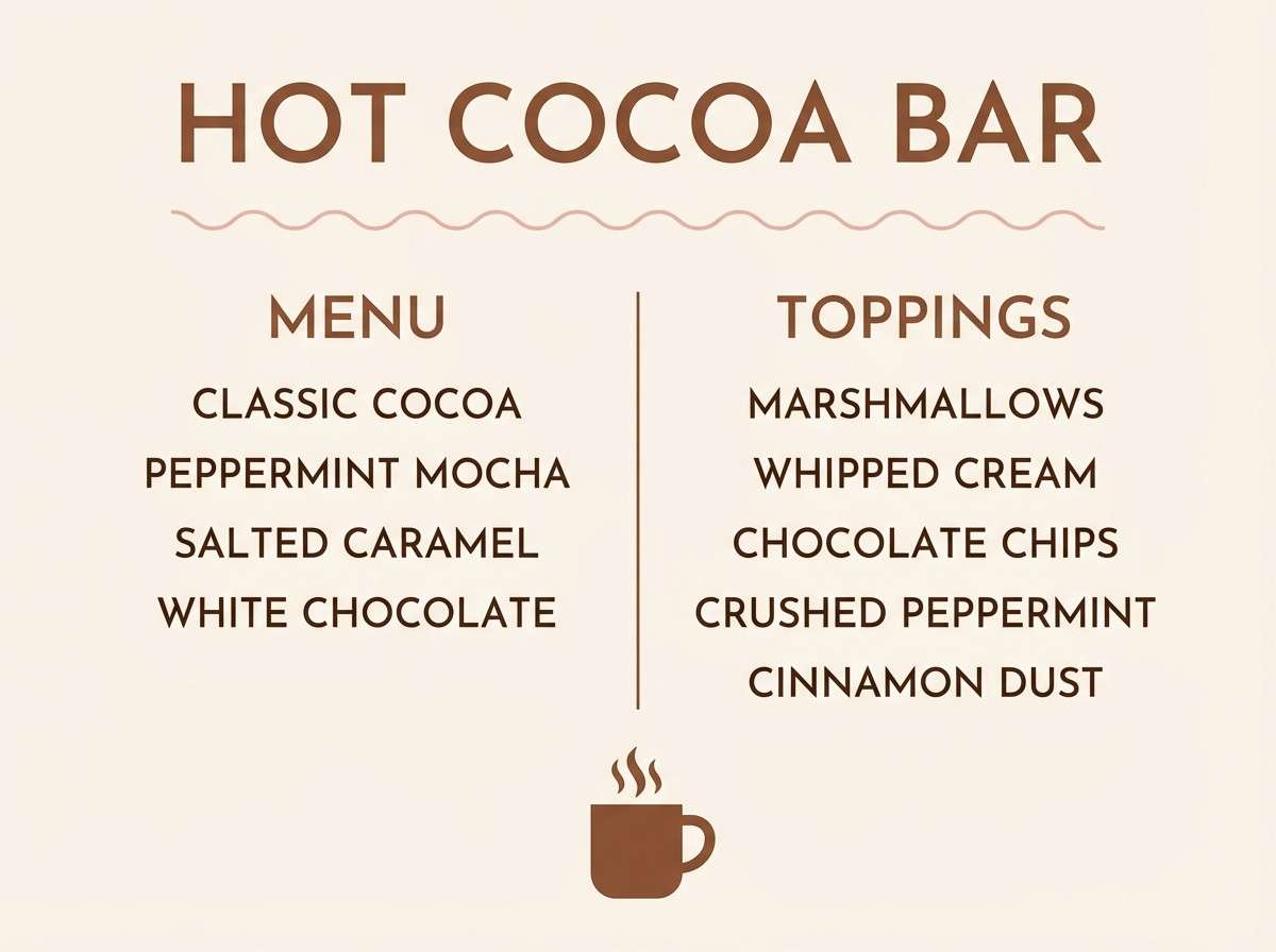
17) Cozy Cocoa Cream
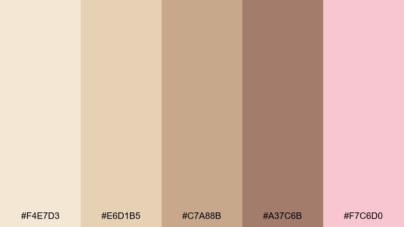
HEX: #F4E7D3 #E6D1B5 #C7A88B #A37C6B #F7C6D0
Mood: cozy, warm, comforting
Best for: hot cocoa bar signage and menu boards
Creamy cocoa browns with a blush accent feel like cozy sweaters and warm mugs on a cool afternoon. Use the light cream for the sign base and reserve the deeper brown for headings and prices. Blush works best as a small heart, ribbon, or divider line to keep things sweet. Tip: choose a bold type weight so the warm neutrals do not reduce readability from across the room.
Image example of cozy cocoa cream generated using media.io
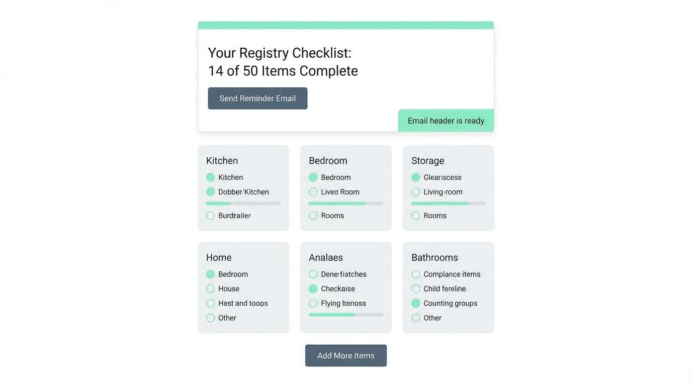
18) Minimal Mint Gray
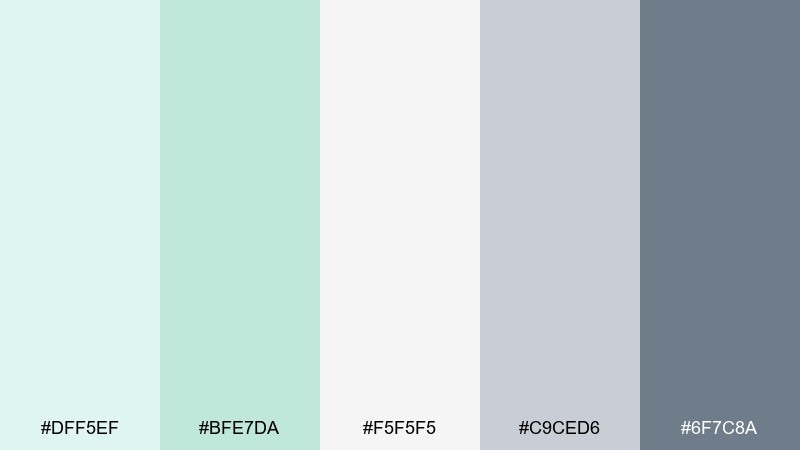
HEX: #DFF5EF #BFE7DA #F5F5F5 #C9CED6 #6F7C8A
Mood: fresh, minimal, professional
Best for: registry checklist UI and email headers
Cool mint and clean grays feel tidy and modern, like a well-organized checklist. Use white and the light gray as primary surfaces, then add mint for section highlights and progress states. The slate tone is strong for buttons and headings without turning harsh. Tip: keep mint to key moments such as toggles and success messages so the interface stays calm.
Image example of minimal mint gray generated using media.io
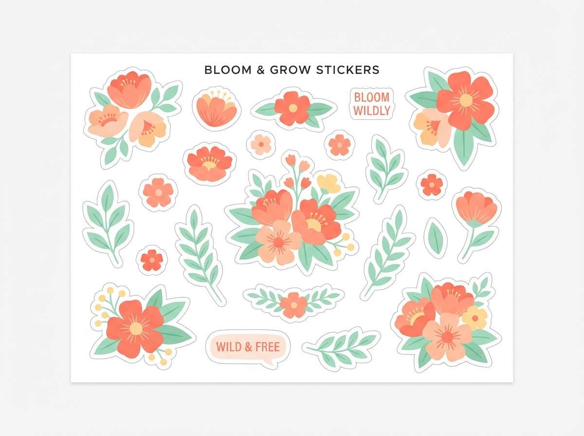
19) Coral Blossom
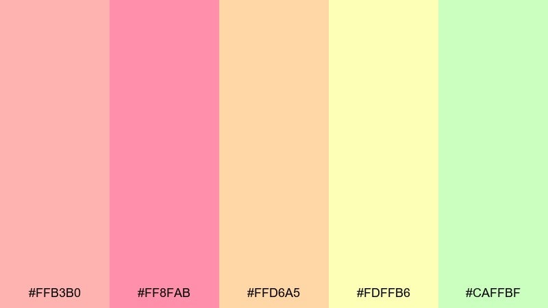
HEX: #FFB3B0 #FF8FAB #FFD6A5 #FDFFB6 #CAFFBF
Mood: bright, springy, upbeat
Best for: floral sticker sheets and label packs
Coral and citrus pastels feel like fresh blooms, fruit punch, and a sunny spring garden. Make coral the hero for the biggest flowers and keep the softer peach and yellow as petals and highlights. The minty green is perfect for leaves and small borders that calm the brighter tones. Tip: leave plenty of white space between stickers so the colors look crisp when cut.
Image example of coral blossom generated using media.io
20) Starry Night Soft Navy
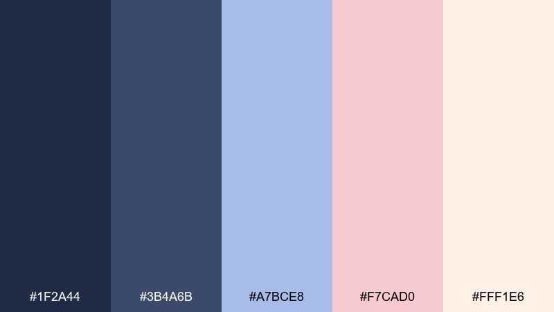
HEX: #1F2A44 #3B4A6B #A7BCE8 #F7CAD0 #FFF1E6
Mood: dreamy, elegant, slightly dramatic
Best for: night-sky themed invitations and headers
Soft navy with blush and cream evokes a starry sky, moonlit clouds, and a calm bedtime story. Use the deepest navy for backgrounds and the pale cream for text blocks to keep details readable. Blush makes a lovely accent for stars, dots, or RSVP highlights without turning the look too bright. Tip: keep gradients subtle so the navy prints smooth instead of banded.
Image example of starry night soft navy generated using media.io

What Colors Go Well with Baby Shower?
Soft pastels are the classic choice: blush pink, baby blue, mint, lavender, butter yellow, and peach. They’re gentle on the eyes, flattering in photos, and easy to repeat across paper goods and decor.
If you want a gender-neutral baby shower palette, combine tea green or sage with warm cream, oatmeal beige, and a tiny blush accent. For a more modern look, pair light grays with one soft highlight color (like blush or mint) for clean contrast.
To keep everything readable, choose one darker “text color” (slate, navy, deep lavender, or muted teal-gray) and use it consistently for names, times, and RSVP details.
How to Use a Baby Shower Color Palette in Real Designs
Start with a simple ratio: pick 1 dominant base color (often cream or a very pale pastel), 1 supporting color for larger shapes, and 2–3 accents for icons, borders, and small highlights. This prevents your design from turning into a rainbow.
Match materials to your palette: matte paper keeps pastels soft, while glossy finishes can shift light colors under warm bulbs. If you’re decorating, repeat your accent color in at least three spots (balloons, signage, and table details) so it feels intentional.
For photos, avoid using multiple very pale colors at the same “lightness.” Add a slightly deeper tone (like muted blue-gray or slate) so details don’t wash out in bright rooms.
Create Baby Shower Palette Visuals with AI
If you have a theme in mind (safari, woodland, lace, starry night), you can generate matching invitation mockups, welcome board concepts, and social templates in minutes using AI.
Use your chosen palette’s vibe words (like “airy,” “botanical,” or “editorial”) and include a clear layout request (invitation, menu card, sticker sheet, UI header) for more consistent results.
When you find a look you love, keep the prompt and only swap the colors or event details—this helps every graphic feel like part of one cohesive baby shower set.
Baby Shower Color Palette FAQs
-
What are the best baby shower colors for a gender-neutral theme?
Tea green, sage, warm cream, oatmeal beige, and soft gray are reliable gender-neutral shower colors. Add a tiny blush or butter-yellow accent if you want the design to feel extra warm in photos. -
How many colors should a baby shower palette include?
Five is a sweet spot: one background/base, one supporting color, one text-contrast tone, and two accents. This is enough variety for invites and decor without making the theme feel busy. -
What colors look best on baby shower invitations?
Blush + cream, mint + peach, lavender + butter yellow, and navy + cream are all popular invitation color ideas. Prioritize readability by using a darker muted tone for the details (names, date, address). -
How do I stop pastel baby shower colors from looking washed out?
Add one deeper anchor color (like slate, muted navy, dusty blue-gray, or deep lavender) for type and outlines. Also consider cream borders and matte paper to preserve softness while keeping contrast. -
Do baby shower palettes need to match the nursery theme?
No, but aligning them helps everything feel intentional. If the nursery is neutral, a neutral nursery palette works naturally; if the nursery is playful, choose one bright accent (like candy pink) and keep the rest soft. -
What are modern baby shower color palettes right now?
Modern styles lean toward minimal neutrals with one soft accent (mint or blush), monochrome gray + blush, or botanical sage + cream. These palettes also translate well to digital invites and RSVP pages. -
Can I generate baby shower invitation visuals with AI using HEX colors?
Yes—include your HEX codes in the prompt and describe the layout (invitation suite, welcome board, menu card). You can iterate quickly by keeping the same prompt and only changing the colors or theme details.
Next: Tea Green Color Palette


