

A retro diner color palette is equal parts neon glow, chrome shine, and comfort-food warmth. It’s a fast way to make menus, posters, and UI feel playful, bold, and instantly recognizable.
Below are 20+ retro diner color palette ideas with HEX codes, plus practical tips for pairing and using them in real design work.
In this article
- Why Retro Diner Palettes Work So Well
-
- cherry float
- chrome counter
- neon jukebox
- checkerboard cream
- mint booth
- ketchup mustard
- soda fountain pastels
- route 66 sunset
- vinyl seat blue
- strawberry pie
- coffee & chrome
- bubblegum & teal
- midnight diner
- lemonade stand
- cherry cola
- pancake morning
- turquoise tiles
- drive-in night
- carhop uniform
- banana split pop
- malts & marble
- peachy sundae
- What Colors Go Well with Retro Diner?
- How to Use a Retro Diner Color Palette in Real Designs
- Create Retro Diner Palette Visuals with AI
Why Retro Diner Palettes Work So Well
Retro diner colors are built for visibility: high-contrast darks, clean whites, and neon-like accents that feel readable from across a room (or across a screen). That makes them perfect for menus, promos, and signage where clarity matters.
They also mix “sweet” pastels with “electric” brights, which creates a fun push-pull between comfort and energy. The result is nostalgic without looking outdated, especially when you keep layouts modern and simple.
Finally, the theme has built-in visual cues—checkerboard floors, chrome counters, vinyl booths, and jukebox glow—so even a small accent color can instantly communicate the diner vibe.
20+ Retro Diner Color Palette Ideas (with HEX Codes)
1) Cherry Float
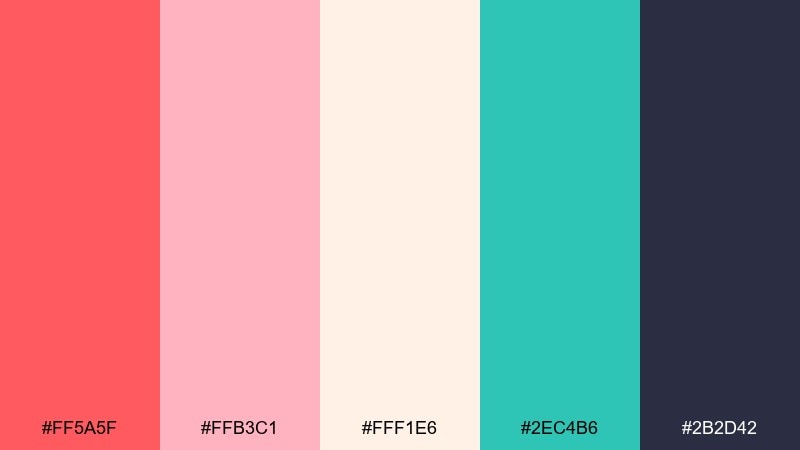
HEX: #ff5a5f #ffb3c1 #fff1e6 #2ec4b6 #2b2d42
Mood: playful, sweet, nostalgic
Best for: social media promo posters for milkshakes and desserts
Playful and sweet like a cherry-topped float under warm counter lights. The hot red and bubblegum pink pop best against creamy white, while teal keeps it crisp and modern. Use the dark navy as type color for strong readability on posters and carousels. Pair with simple geometric shapes and a single bold headline to keep it punchy.
Image example of cherry float generated using media.io
Media.io is an online AI studio for creating and editing video, image, and audio in your browser.

2) Chrome Counter
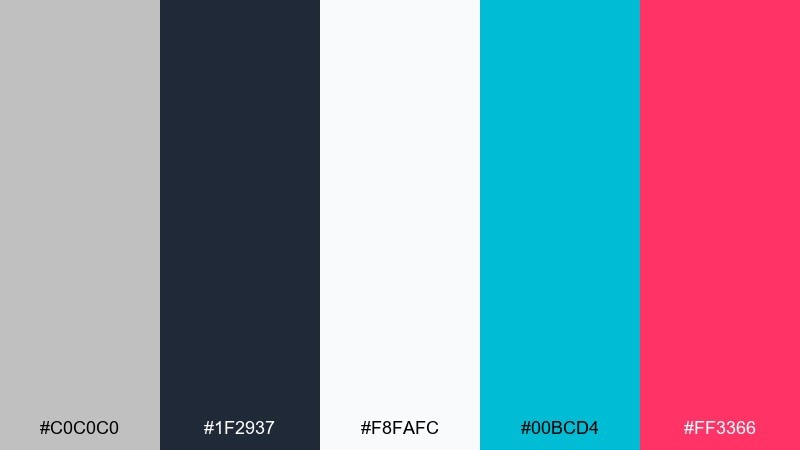
HEX: #c0c0c0 #1f2937 #f8fafc #00bcd4 #ff3366
Mood: sleek, glossy, upbeat
Best for: food ordering app UI and kiosk screens
Sleek and glossy like a chrome counter reflecting neon tubing. This set nails retro diner color combinations by balancing cool cyan and hot pink with steel gray and clean whites. Use cyan for primary buttons, pink for promos, and keep most surfaces light for a modern UI feel. A thin dark header or tab bar anchors the whole interface without feeling heavy.
Image example of chrome counter generated using media.io
3) Neon Jukebox
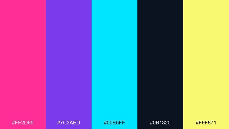
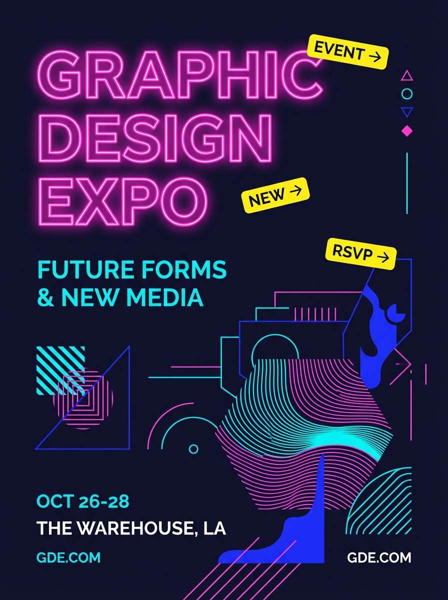
HEX: #ff2d95 #7c3aed #00e5ff #0b1320 #f9f871
Mood: electric, nightlife, bold
Best for: live music event flyers and weekend specials
Electric and loud, like a jukebox glow spilling onto a midnight floor. Keep the navy nearly full-bleed, then let pink and cyan carry the headline and key callouts. Yellow works best as a small highlight for dates, prices, or stickers so it stays readable. Pair with condensed type and simple line icons for a sharp nightlife vibe.
Image example of neon jukebox generated using media.io
4) Checkerboard Cream
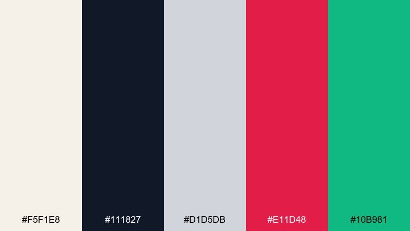
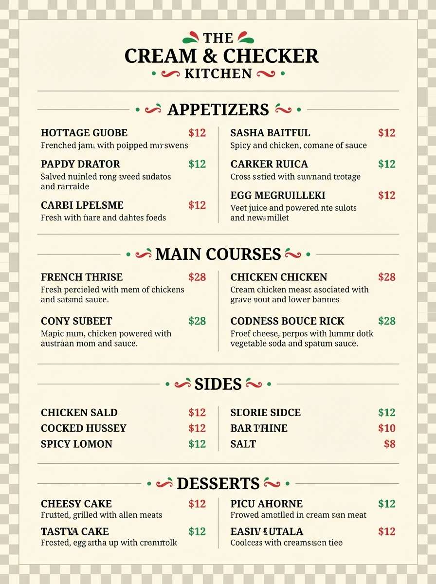
HEX: #f5f1e8 #111827 #d1d5db #e11d48 #10b981
Mood: classic, crisp, approachable
Best for: printed menus and table tent designs
Classic and crisp, like checkerboard floors and fresh napkins at an early lunch rush. A retro diner color palette like this shines when you keep the cream background dominant and reserve red and green for section headers and price highlights. Use black for body text and thin gray rules to structure the menu cleanly. Add a simple checker pattern as a border rather than a full background to avoid visual noise.
Image example of checkerboard cream generated using media.io
5) Mint Booth
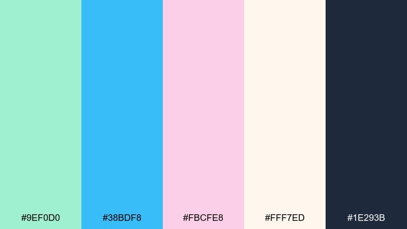
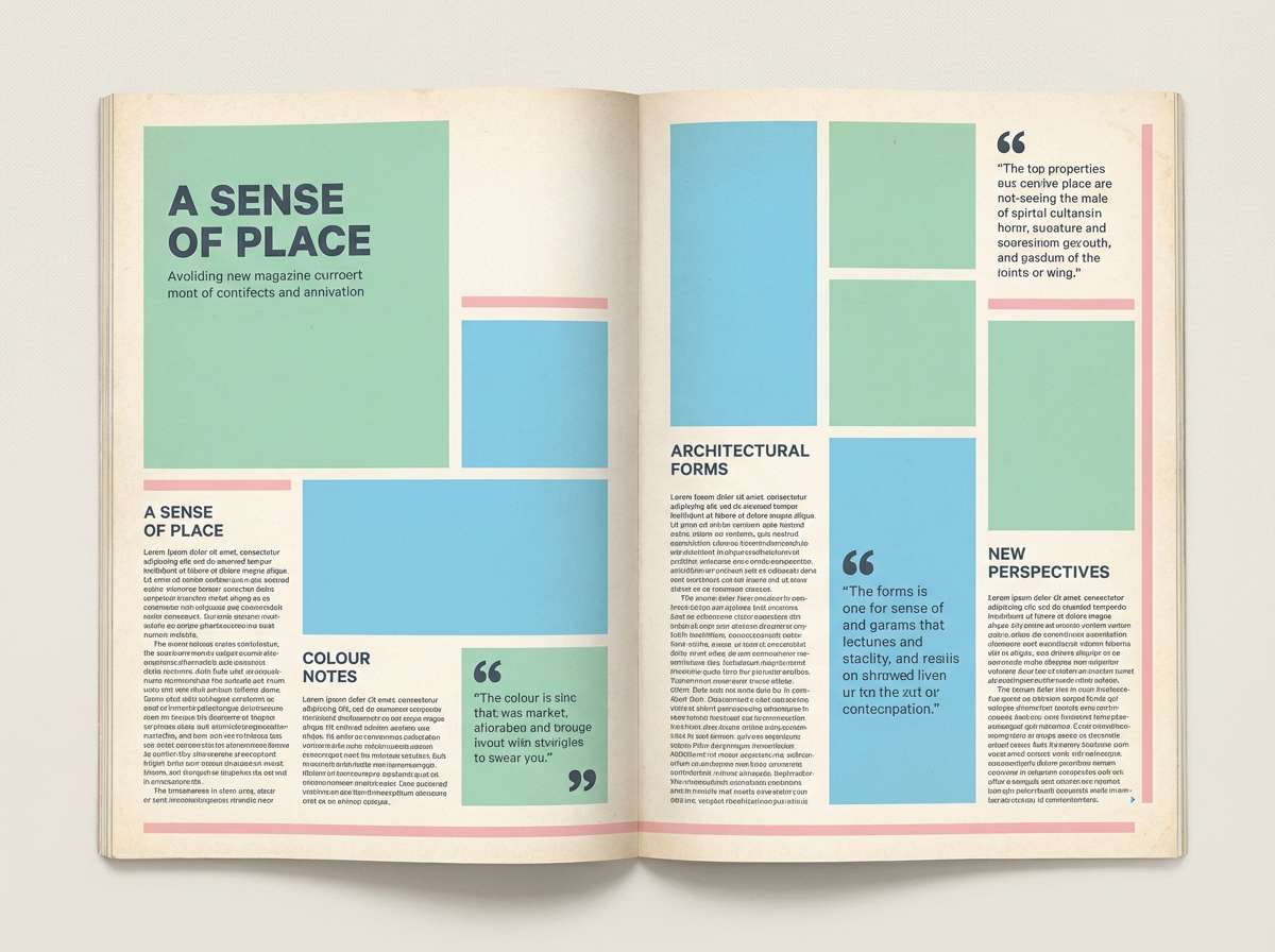
HEX: #9ef0d0 #38bdf8 #fbcfe8 #fff7ed #1e293b
Mood: airy, friendly, soft
Best for: editorial spreads about diner interiors and lifestyle
Airy and friendly, like mint vinyl booths lit by a sunny window. Let the warm off-white act as paper, then use mint and sky blue for blocks, pull quotes, and sidebars. Pink works beautifully as a small accent for captions or page numbers. Keep body text in deep slate to maintain a clean, readable editorial finish.
Image example of mint booth generated using media.io
6) Ketchup Mustard
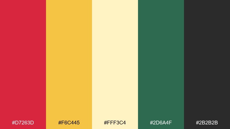
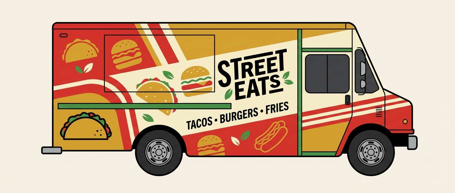
HEX: #d7263d #f6c445 #fff3c4 #2d6a4f #2b2b2b
Mood: bold, hearty, lively
Best for: food truck wrap graphics and signage
Bold and hearty, like burgers, fries, and a squeeze of ketchup and mustard. Use the creamy yellow as the base to keep the red from feeling too heavy, then drop in green for freshness cues like salads or veggie options. Black is perfect for outlines and big, readable lettering from a distance. Try limiting the palette to two hero colors per side panel so the wrap stays clean.
Image example of ketchup mustard generated using media.io
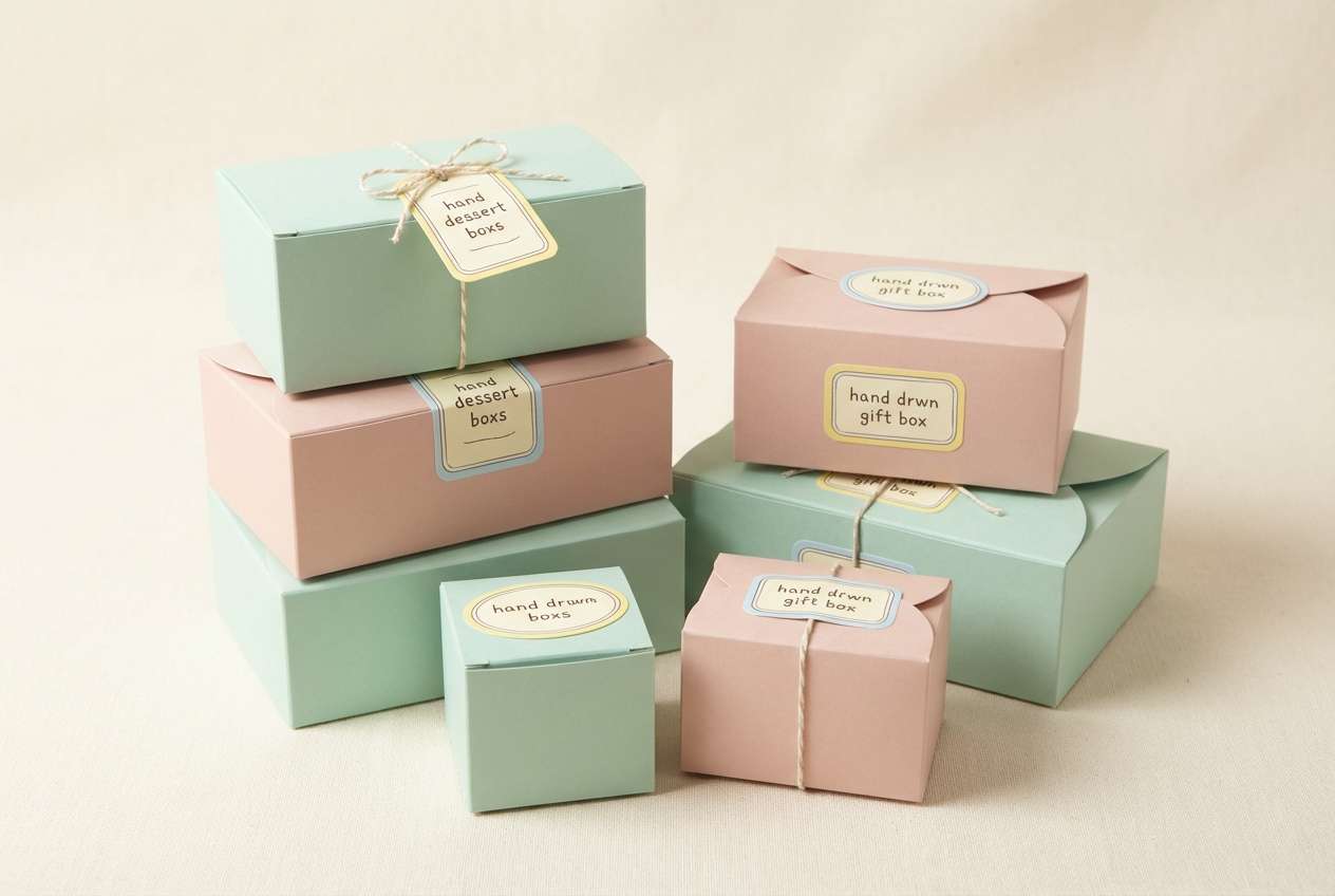
7) Soda Fountain Pastels
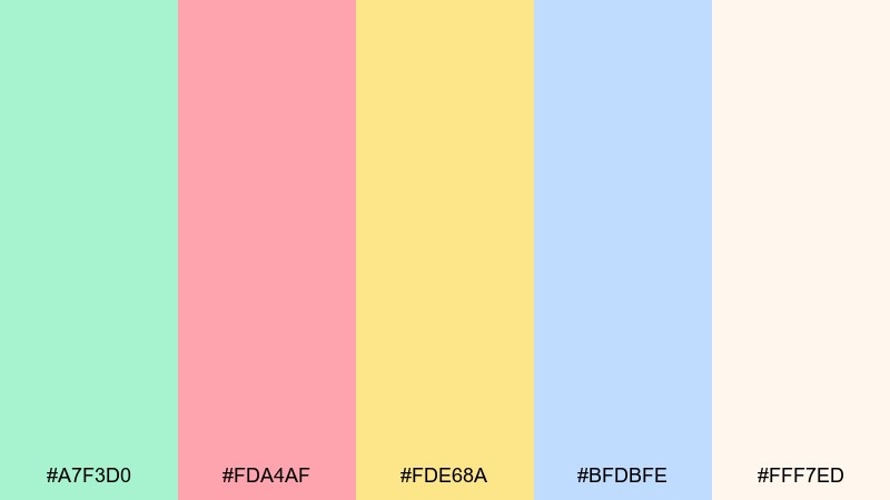
HEX: #a7f3d0 #fda4af #fde68a #bfdbfe #fff7ed
Mood: light, whimsical, sunny
Best for: bakery packaging and dessert gift boxes
Light and whimsical, like pastel syrups lined up at a soda fountain. The warm cream keeps everything soft, while mint and blush become your main brand colors. Use pale yellow for friendly highlights and baby blue for secondary panels or flavor callouts. On packaging, matte finishes and simple labels will make these tones feel premium instead of childish.
Image example of soda fountain pastels generated using media.io
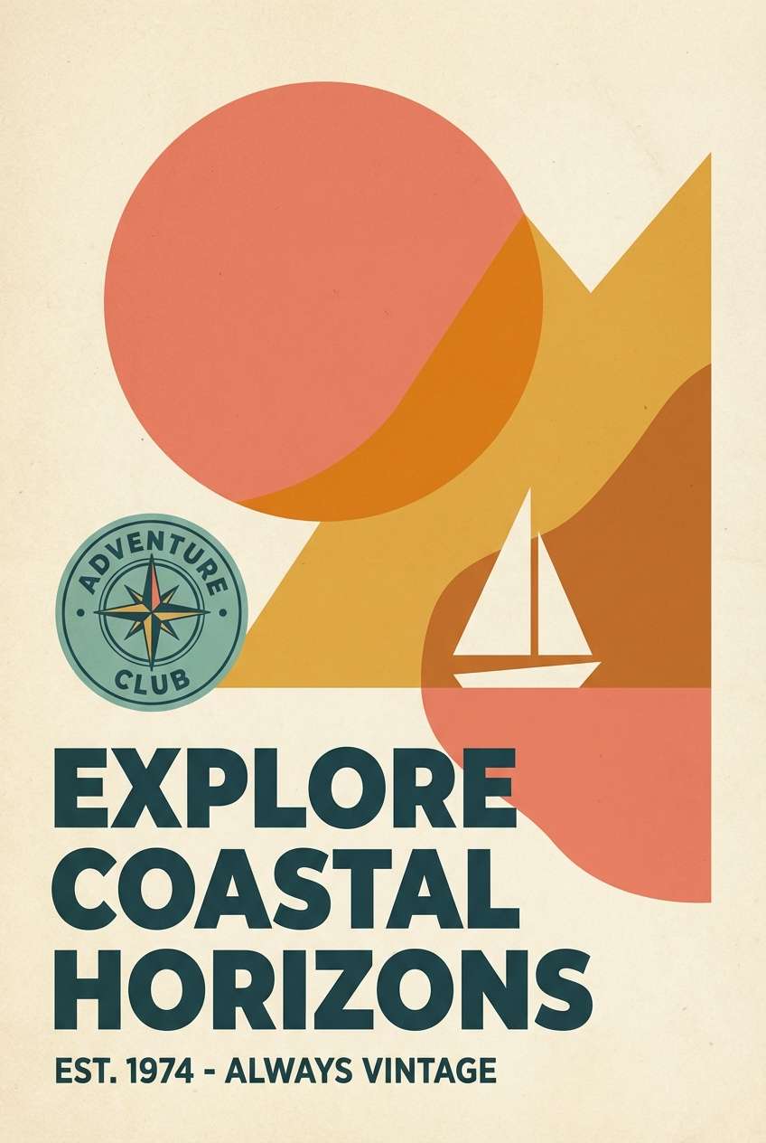
8) Route 66 Sunset
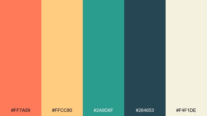
HEX: #ff7a59 #ffcc80 #2a9d8f #264653 #f4f1de
Mood: adventurous, warm, vintage
Best for: travel posters and roadside cafe branding
Adventurous and warm, like a highway sunset behind a vintage sign. Use coral and amber as the headline duo, then cool it down with teal for secondary shapes and badges. The deep blue-green grounds the design for a more grown-up, heritage look. Keep the cream as negative space so the warm colors feel sunlit rather than loud.
Image example of route 66 sunset generated using media.io
9) Vinyl Seat Blue
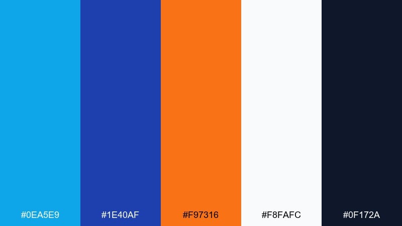
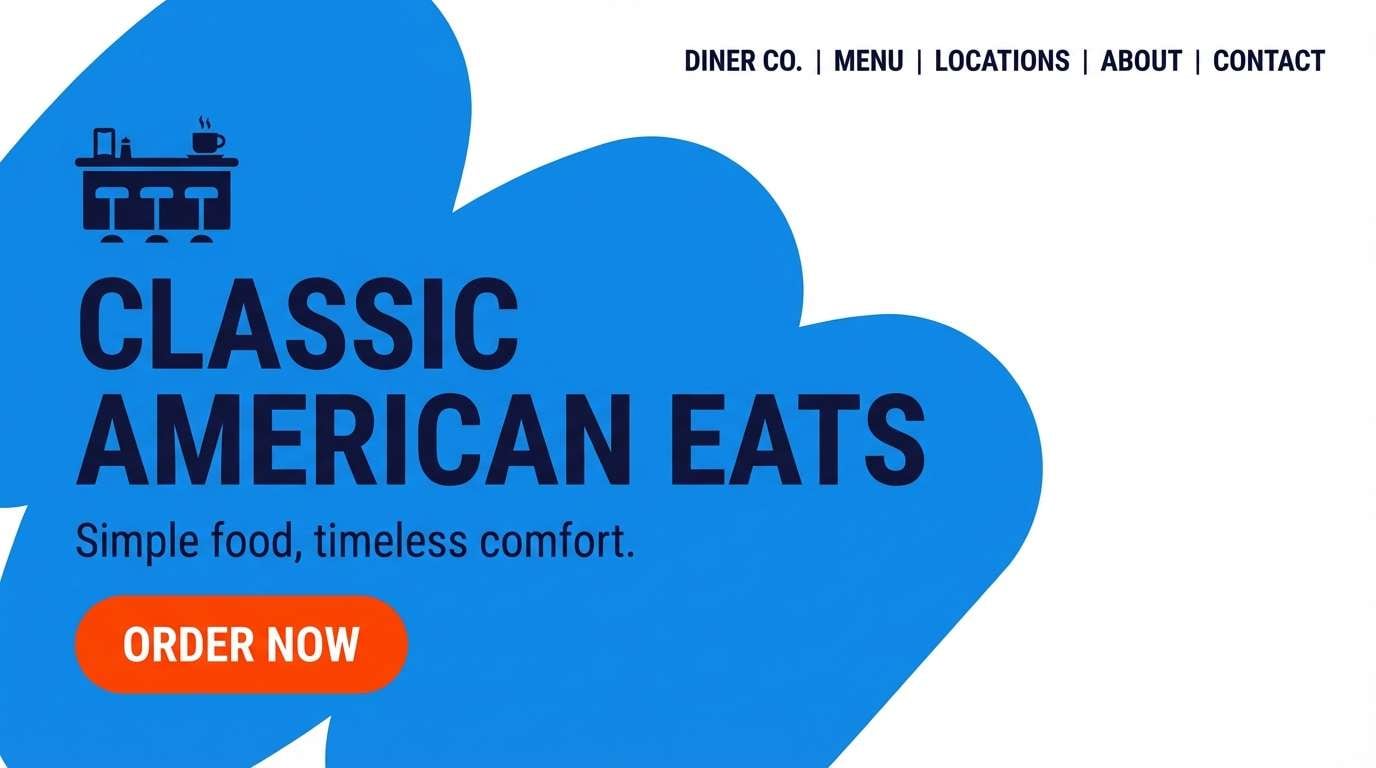
HEX: #0ea5e9 #1e40af #f97316 #f8fafc #0f172a
Mood: sporty, confident, high-contrast
Best for: website hero banners for diner specials
Sporty and confident, like blue vinyl seats with a bright orange accent stripe. Keep the hero area mostly white with strong blue blocks, then use orange for the primary call to action. The near-black navy is ideal for navigation and pricing so it stays legible on light backgrounds. A single rounded badge or starburst shape sells the retro feel without overdoing it.
Image example of vinyl seat blue generated using media.io
10) Strawberry Pie
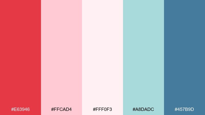
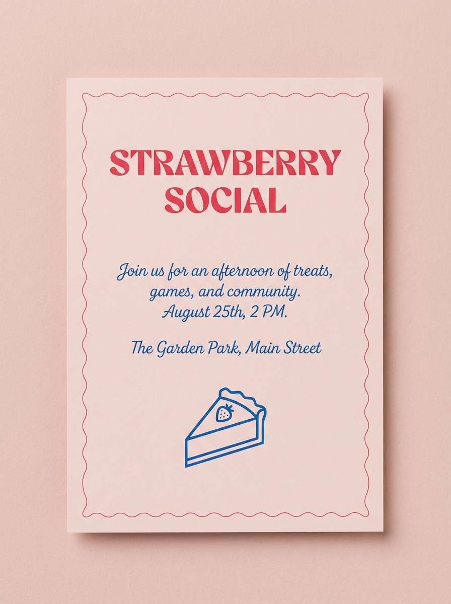
HEX: #e63946 #ffcad4 #fff0f3 #a8dadc #457b9d
Mood: romantic, fresh, cheerful
Best for: invitations for parties and dessert-themed showers
Romantic and fresh, like strawberry pie served on a pastel plate. Use the pale blush as the background, then lean on the bright red for names, dates, or a single illustrative icon. Teal and blue add a cool balance, especially for borders and supporting text. For print, choose slightly thicker type so the soft tints do not wash out.
Image example of strawberry pie generated using media.io
11) Coffee & Chrome
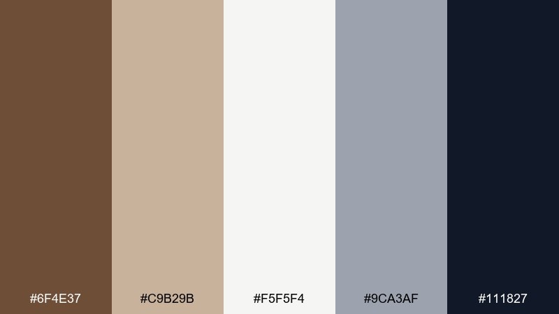
HEX: #6f4e37 #c9b29b #f5f5f4 #9ca3af #111827
Mood: cozy, grounded, classic
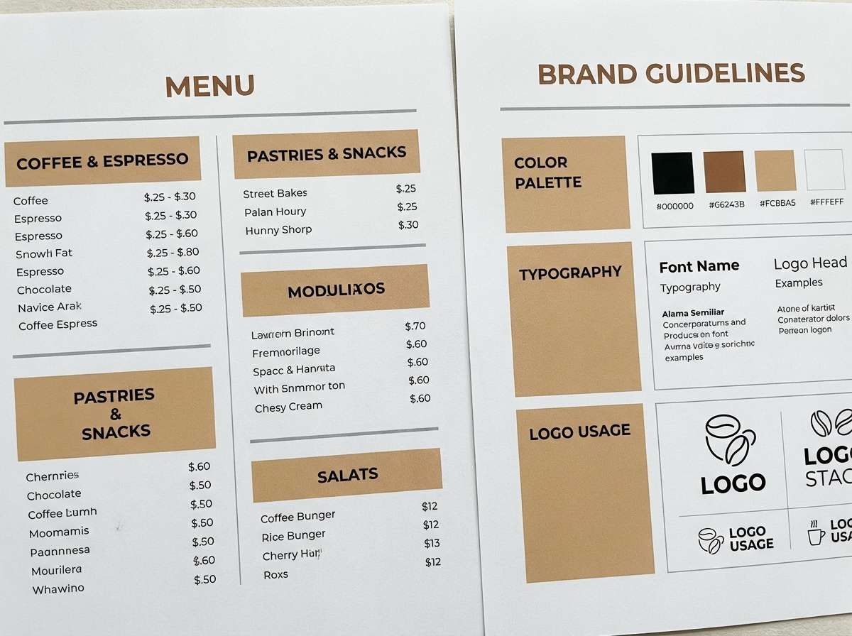
Best for: coffee bar menus and brand guidelines
Cozy and grounded, like fresh coffee beside a polished metal counter edge. Use warm tan and off-white for large surfaces, then reserve brown for headings and signature marks. A touch of chrome gray adds that diner hardware feel without looking cold. Keep the black for typography and small icons to maintain a clean, upscale look.
Image example of coffee & chrome generated using media.io
12) Bubblegum & Teal
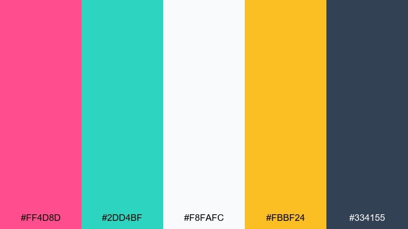
HEX: #ff4d8d #2dd4bf #f8fafc #fbbf24 #334155
Mood: fun, pop, energetic
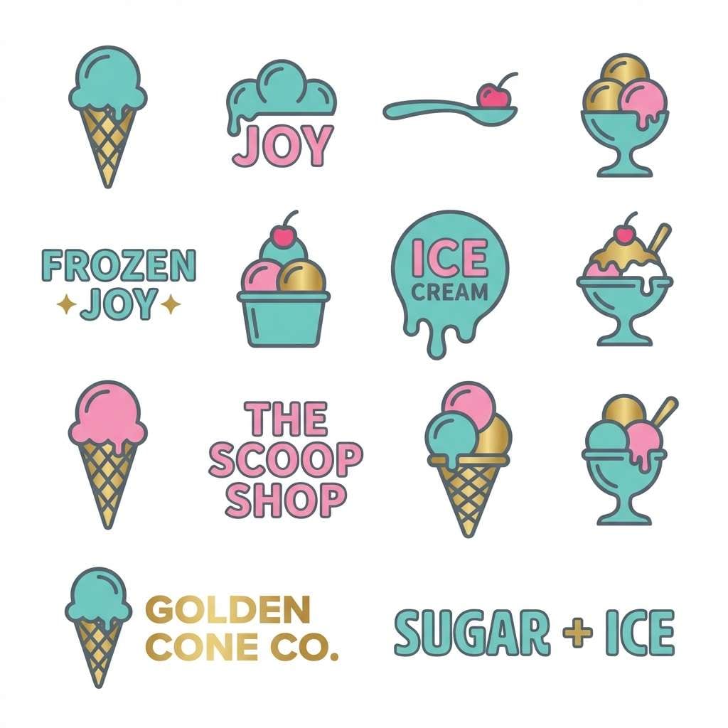
Best for: logo and icon sets for ice cream shops
Fun and pop-forward, like bubblegum wrappers next to a teal neon stripe. Use teal as the core brand color, then let pink take the spotlight for hero marks and stickers. A small hit of golden yellow makes great emphasis for limited-time flavors or new items. Keep the slate for outlines and wordmarks so the design stays sharp on white.
Image example of bubblegum & teal generated using media.io
13) Midnight Diner
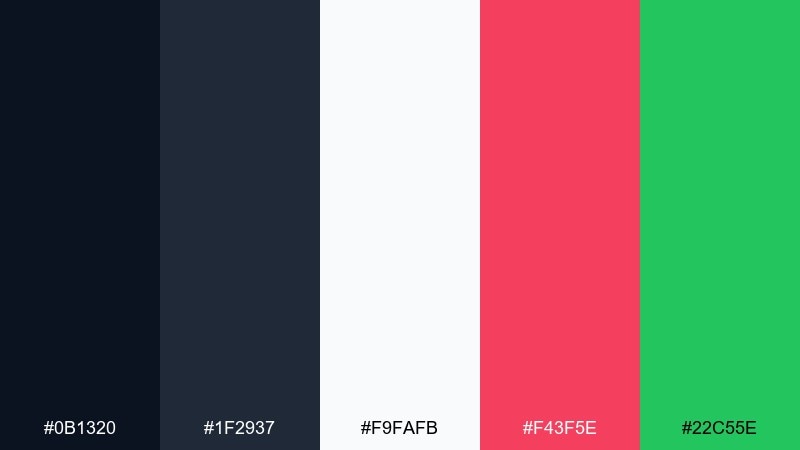
HEX: #0b1320 #1f2937 #f9fafb #f43f5e #22c55e
Mood: moody, late-night, neon-lit
Best for: neon sign concepts and storefront graphics
Moody and late-night, like a glowing sign seen through a rainy window. Use the deep blues as the backdrop, then let hot pink carry the main word or symbol. A small green accent reads like a classic open sign and helps balance the pink. Keep white for light tubes and highlights to sell the neon illusion.
Image example of midnight diner generated using media.io
14) Lemonade Stand
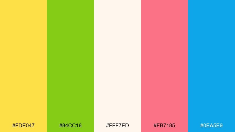
HEX: #fde047 #84cc16 #fff7ed #fb7185 #0ea5e9
Mood: sunny, zesty, cheerful
Best for: summer promo posters and weekend specials
Sunny and zesty, like lemonade in a chilled glass on a bright day. Let the warm cream background keep the yellow readable, then use lime green for freshness cues and buttons. Pink is perfect for playful stickers, while sky blue adds a cool balance for borders and subheads. Use simple shapes and plenty of whitespace so the bright hues do not overwhelm.
Image example of lemonade stand generated using media.io

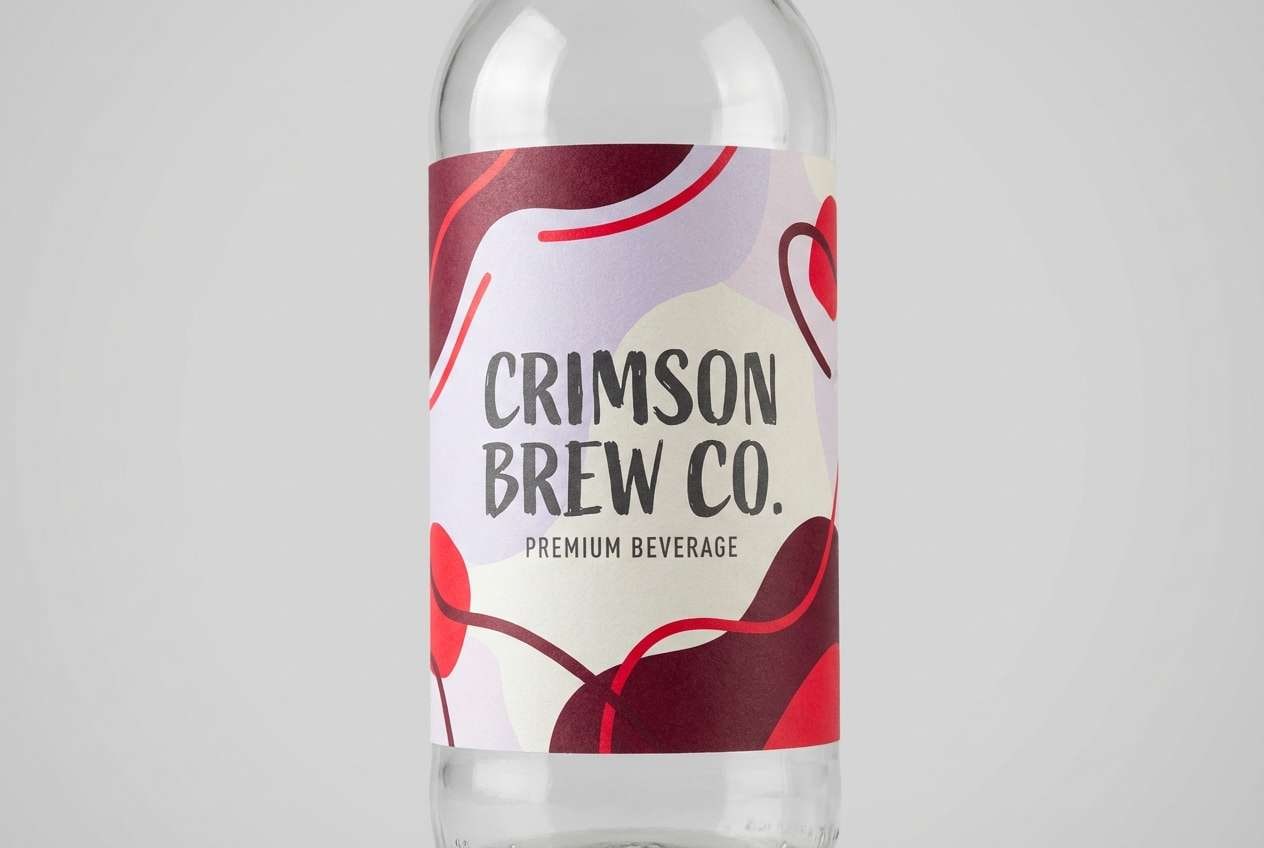
15) Cherry Cola
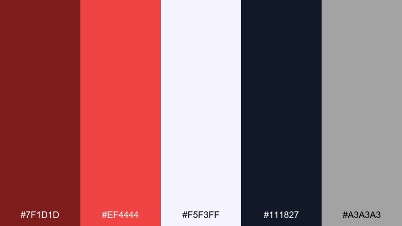
HEX: #7f1d1d #ef4444 #f5f3ff #111827 #a3a3a3
Mood: bold, classic, slightly dramatic
Best for: bottle labels and beverage packaging
Bold and classic, like cherry cola poured over ice in a tall glass. Use the deep maroon for the main label field and bring in bright red for logos and seals. The pale lavender-white adds unexpected softness and keeps the packaging from feeling too heavy. Finish with charcoal type and small gray details for a clean, premium edge.
Image example of cherry cola generated using media.io
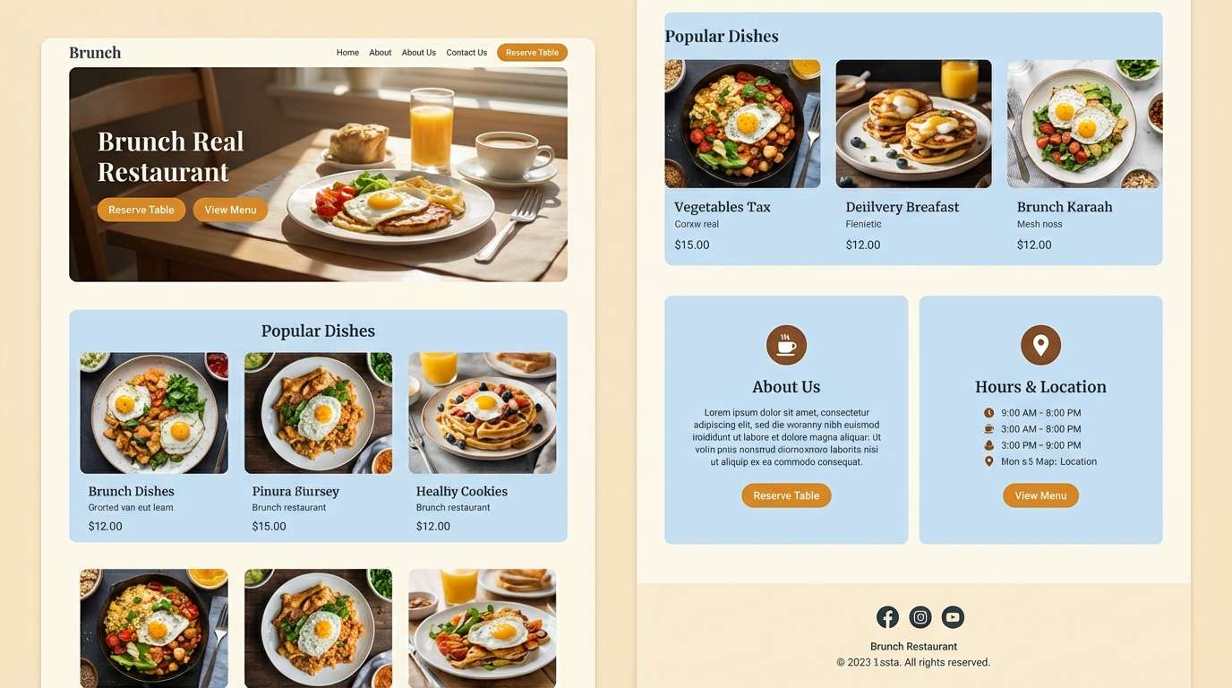
16) Pancake Morning
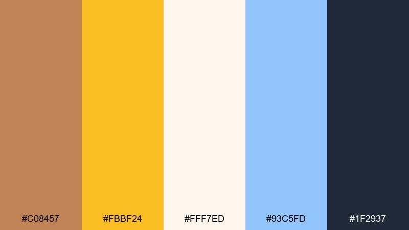
HEX: #c08457 #fbbf24 #fff7ed #93c5fd #1f2937
Mood: warm, comforting, bright
Best for: brunch restaurant landing pages and UI sections
Warm and comforting, like pancakes with syrup in a sunlit booth. A retro diner color palette in these tones works best with cream as the main canvas, amber for calls to action, and soft blue for section backgrounds. Use the brown for dividers and icons to add a cozy, handcrafted touch. Keep dark slate for text and try rounded components to reinforce the friendly vibe.
Image example of pancake morning generated using media.io
17) Turquoise Tiles
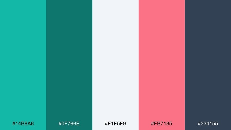
HEX: #14b8a6 #0f766e #f1f5f9 #fb7185 #334155
Mood: clean, graphic, coastal-retro
Best for: seamless patterns for stationery and wrapping paper
Clean and graphic, like turquoise tile walls with a tiny pink accent stripe. Use the light gray-white as the paper tone, then build the pattern with teal and deep green for depth. Pink works best as a small repeating detail so it feels like a deliberate highlight. Keep outlines in slate to make the pattern crisp at both small and large scales.
Image example of turquoise tiles generated using media.io
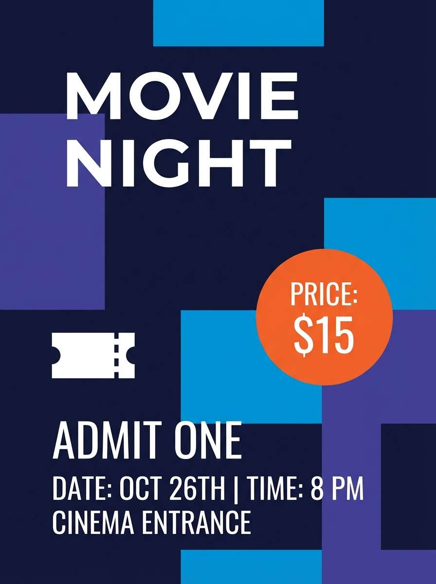
18) Drive-In Night
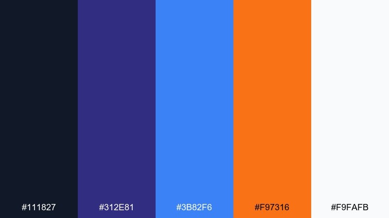
HEX: #111827 #312e81 #3b82f6 #f97316 #f9fafb
Mood: cinematic, cool, high-energy
Best for: movie night ticket flyers and promotions
Cinematic and cool, like headlights in a drive-in lot under a deep sky. These retro diner color combinations feel modern when you keep most of the layout dark and let blue do the heavy lifting. Orange is perfect for the ticket price or callout badge, while white keeps details sharp. Use a single bold icon and strong hierarchy so the flyer reads fast.
Image example of drive-in night generated using media.io
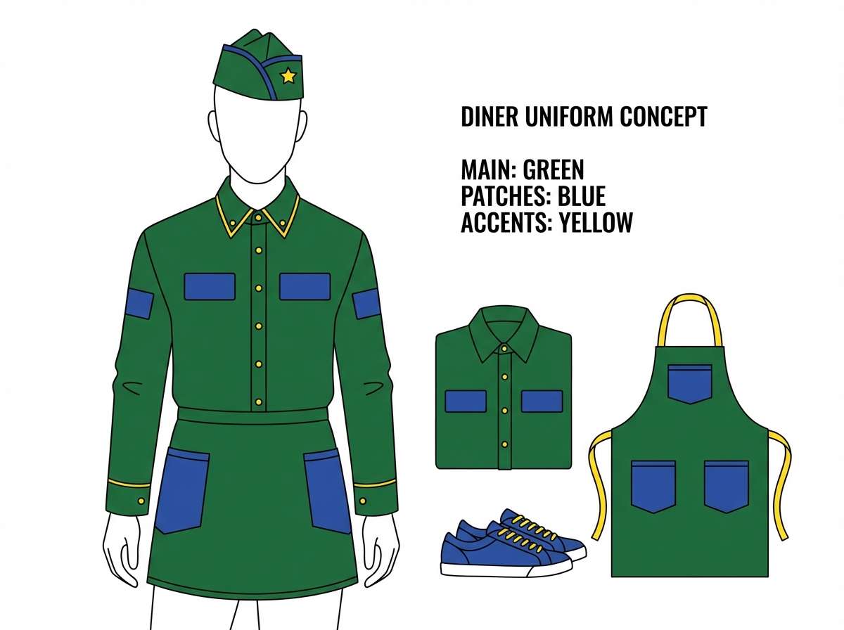
19) Carhop Uniform
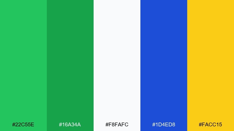
HEX: #22c55e #16a34a #f8fafc #1d4ed8 #facc15
Mood: fresh, sporty, upbeat
Best for: uniform concept sheets and staff style guides
Fresh and sporty, like a crisp uniform with bright trim details. Use white as the base fabric tone, then apply green as the main garment color for instant energy. Blue works well for patches or typography, and yellow makes a great small accent for piping or badges. Keep the design simple and blocky so the colors read clearly at a distance.
Image example of carhop uniform generated using media.io
20) Banana Split Pop
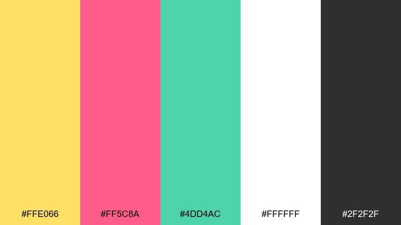
HEX: #ffe066 #ff5c8a #4dd4ac #ffffff #2f2f2f
Mood: bright, punchy, fun
Best for: sticker packs and in-store signage
Bright and punchy, like a banana split piled with candy-colored toppings. Let yellow be the dominant field, then use pink and mint for playful sticker shapes and badges. Black keeps outlines and text crisp, especially on high-contrast signage. Use white sparingly for breathing room so the design stays readable from afar.
Image example of banana split pop generated using media.io
21) Malts & Marble
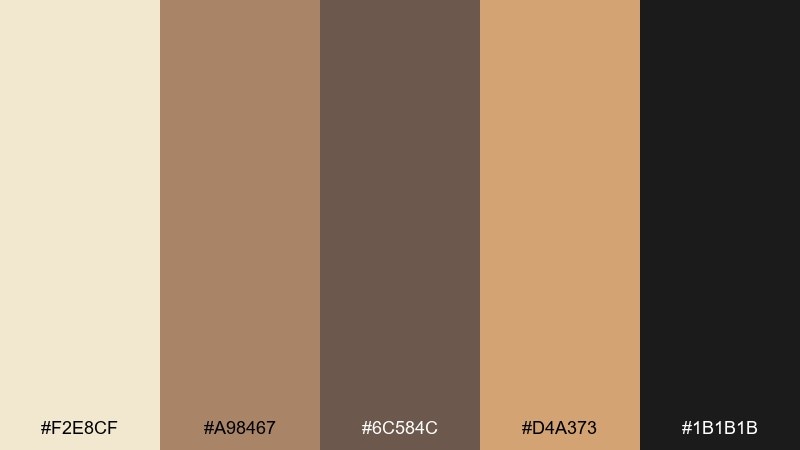
HEX: #f2e8cf #a98467 #6c584c #d4a373 #1b1b1b
Mood: warm, vintage, refined
Best for: brand identity for classic diners and cafes
Warm and refined, like marble counters and malted shakes in tall glasses. Build your core identity with cream and caramel tones, then use the deeper brown for wordmarks and headlines. A touch of near-black adds sophistication and makes typography feel timeless. Pair with serif or slab-serif type and subtle texture to amplify the vintage charm.
Image example of malts & marble generated using media.io
22) Peachy Sundae
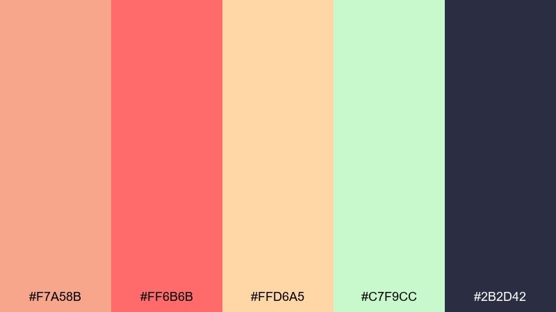
HEX: #f7a58b #ff6b6b #ffd6a5 #c7f9cc #2b2d42
Mood: soft, sunny, modern-retro
Best for: instagram carousel templates for dessert shops
Soft and sunny, like peach syrup melting into a scoop of vanilla. Use peach and coral as the main panels, then add mint for freshness and contrast. The warm cream keeps the carousel bright, while navy makes text and pricing instantly legible. Keep each slide to one big shape and one accent sticker so the feed stays cohesive.
Image example of peachy sundae generated using media.io
What Colors Go Well with Retro Diner?
Retro diner colors pair best when you balance a “sweet” pastel (cream, blush, mint) with a bold accent (hot pink, cherry red, bright cyan) and a grounding neutral (navy, charcoal, black). This keeps the look nostalgic but still readable and modern.
Chrome-like grays and clean whites are also natural fits because they mimic counters, appliances, and signage frames. If you want a classic vibe, add a checkerboard black-and-white touch as a small border or pattern.
For a neon feel, lean into deep night backgrounds (navy/indigo) plus one high-energy highlight (pink or cyan) and one tiny “sticker” color (yellow or lime) for prices, dates, or badges.
How to Use a Retro Diner Color Palette in Real Designs
Start with one dominant base (usually cream/white or deep navy), then pick two hero accents for the “diner pop.” This prevents the palette from turning into a rainbow and makes headlines, buttons, and promos feel intentional.
Reserve your darkest color for typography and structure: navigation bars, menu sections, outlines, and dividers. Retro diner designs often look best with strong hierarchy—big price badges, clear section headers, and simple icon shapes.
To modernize the nostalgia, use more whitespace and flatter shapes, then add retro cues in small doses (starbursts, rounded badges, checker borders, thin chrome lines). This keeps the theme fun without looking cluttered.
Create Retro Diner Palette Visuals with AI
If you want to test a retro diner color scheme quickly, generate a few layout options (poster, menu, UI card, sticker sheet) and compare which accent color reads best at a glance. AI mockups are especially useful for exploring neon-on-dark versus pastel-on-cream directions.
Keep prompts simple: name the design type, background tone, 2–3 key colors, and the style (flat vector, clean layout, no photos). Then iterate by swapping only one color at a time so you can see what actually improved.
With Media.io, you can turn your palette idea into consistent visuals for promos, packaging, and UI—fast, and directly in the browser.
Retro Diner Color Palette FAQs
-
What defines a retro diner color palette?
Most retro diner palettes combine high-contrast neutrals (cream, white, black, navy) with neon-inspired accents like hot pink, cherry red, bright cyan, and sunny yellow, often referencing chrome, checkerboard floors, and jukebox lighting. -
Which retro diner colors work best for menus?
Cream or off-white backgrounds with black/charcoal typography are the most readable, then add small red/green or pink/cyan accents for section headers and price highlights. -
How do I avoid a retro diner scheme looking too childish?
Limit the design to one base color, one primary accent, and one secondary accent, and keep plenty of negative space. Use deeper neutrals (navy/charcoal) and restrained patterns instead of full-bleed pastels. -
What’s the best “neon diner” combo for a dark poster?
Use deep navy as the backdrop, then pick neon pink and cyan for the headline and key callouts. Add a small yellow highlight for dates or prices to keep the hierarchy clear. -
Do retro diner palettes work for app UI design?
Yes—keep surfaces light (white/near-white), use one bright accent (cyan or orange) for primary buttons, and reserve hot pink for promos or limited-time badges so the interface stays usable. -
What neutral colors pair well with bright diner accents?
Charcoal, near-black navy, steel gray, and clean white are the most reliable. They provide structure and make bright hues like pink, red, and cyan feel intentional instead of overwhelming. -
Can I generate retro diner palette mockups with AI?
Yes—describe the layout (menu, flyer, packaging, UI), set a background tone (cream or navy), and specify a few key colors. Then iterate by changing only one accent color to quickly compare variations.


