

Red orange sits right at the sweet spot between passion and optimism—so it naturally feels warm, energetic, and attention-grabbing. If you want visuals that look lively without drifting into harsh neon, a red orange color palette is a reliable choice.
Below are 20 curated red orange color palette ideas with HEX codes you can copy for branding, UI, packaging, posters, and more—plus AI image prompts you can use to visualize each look.
In this article
Why Red Orange Palettes Work So Well
Red orange palettes feel instantly active because they combine the urgency of red with the friendliness of orange. That makes them ideal when you want designs to look bold, warm, and high-impact without feeling aggressive.
They also deliver strong hierarchy: deeper brick/ember tones work well for headers and anchors, while lighter peach and cream shades create breathing space for backgrounds. This natural contrast helps layouts stay readable even when the palette is vivid.
Finally, red orange tones translate beautifully across mediums—from screens to print—especially when you pair them with grounded neutrals like charcoal, cocoa, or linen. The result is energetic color that still feels usable and controlled.
20+ Red Orange Color Palette Ideas (with HEX Codes)
1) Sunset Ember
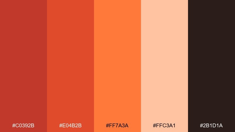
HEX: #C0392B #E04B2B #FF7A3A #FFC3A1 #2B1D1A
Mood: bold, glowing, cinematic
Best for: movie poster design
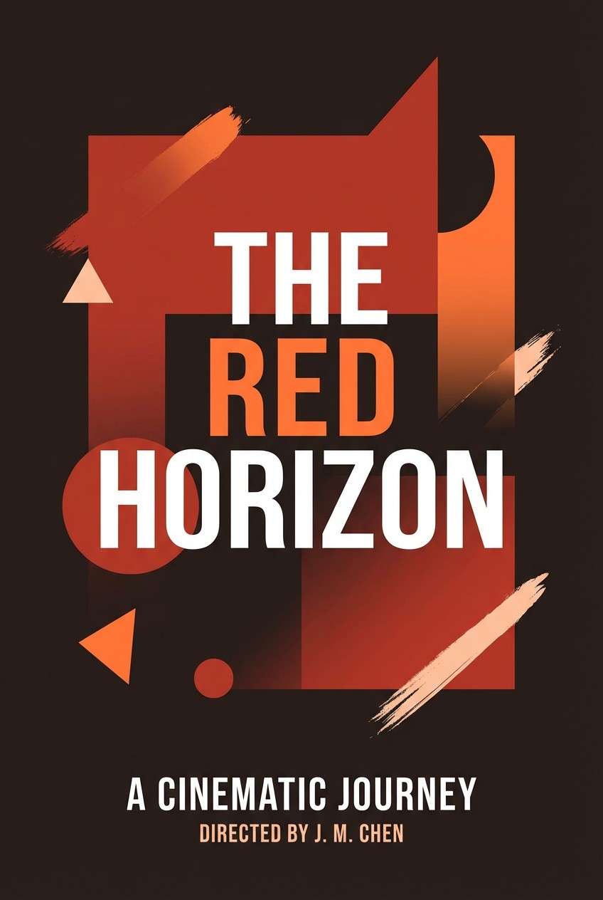
Bold and cinematic like a horizon glowing after dusk, these tones feel hot, dramatic, and a little smoky. Use it for posters, key art, or event graphics where you want instant energy and contrast. Pair the ember reds with the deep espresso shade for typography, and let the peach act as breathing room. Tip: reserve the brightest orange for one focal element like a title highlight or badge.
Image example of sunset ember generated using media.io
Media.io is an online AI studio for creating and editing video, image, and audio in your browser.

2) Terracotta Bloom
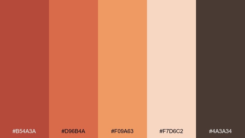
HEX: #B54A3A #D96B4A #F09A63 #F7D6C2 #4A3A34
Mood: earthy, artisanal, warm
Best for: ceramic brand identity
Earthy and artisanal like sun-baked clay with a soft floral blush, this set feels grounded and handcrafted. The red orange color palette works beautifully for pottery studios, handmade goods, and boutique lifestyle branding. Balance the terracotta and apricot tones with the muted cocoa shade for logos and small text. Tip: print on textured stock or kraft paper to make the warmth feel even more tactile.
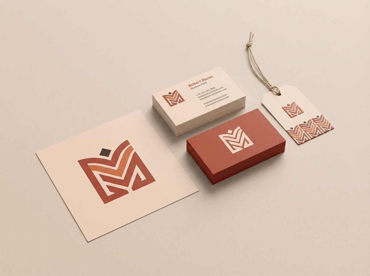
Image example of terracotta bloom generated using media.io
3) Saffron Heat
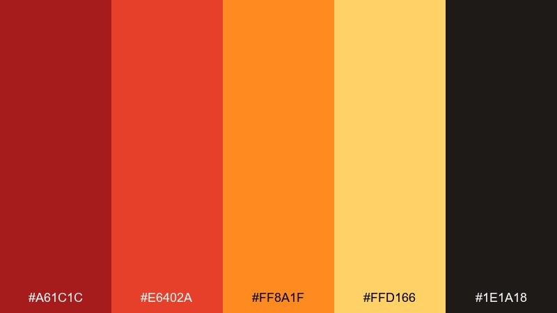
HEX: #A61C1C #E6402A #FF8A1F #FFD166 #1E1A18
Mood: spicy, high-energy, punchy
Best for: food truck menu
Spicy and high-energy like chili oil and saffron steam, these hues feel loud in the best way. They shine on menus, signage, and social posts where appetite and speed matter. Keep the black-brown shade for pricing and body text, and let the golden yellow carry callouts. Tip: use orange as the default button or label color so the layout stays consistent and readable.
Image example of saffron heat generated using media.io
4) Coral Canyon
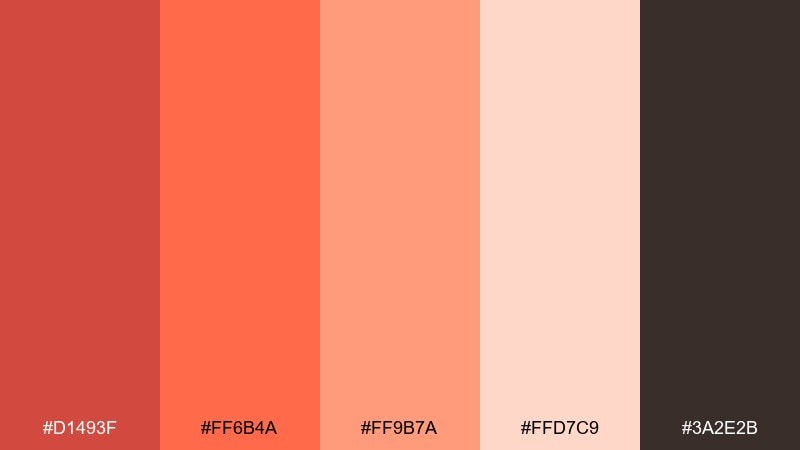
HEX: #D1493F #FF6B4A #FF9B7A #FFD7C9 #3A2E2B
Mood: friendly, optimistic, sunny
Best for: summer event flyer
Friendly and optimistic like sunlit canyon walls, this mix leans bright without feeling harsh. It is ideal for summer flyers, community events, and upbeat announcements that need instant warmth. Pair the deeper red for headings with the soft blush for backgrounds to keep contrast comfortable. Tip: add plenty of whitespace so the coral tones feel airy instead of crowded.
Image example of coral canyon generated using media.io
5) Chili Glaze
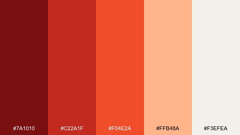
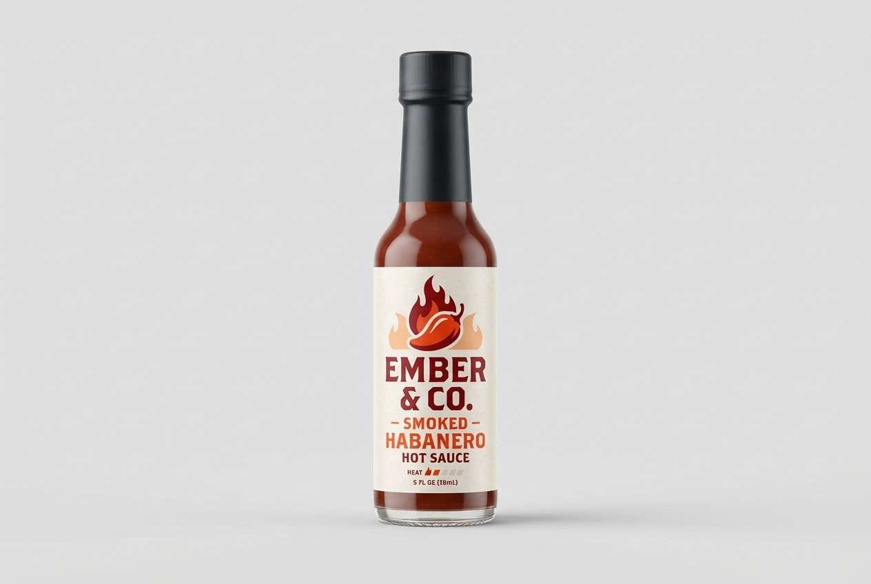
HEX: #7A1010 #C22A1F #F04E2A #FFB48A #F3EFEA
Mood: intense, glossy, premium
Best for: hot sauce packaging
Intense and glossy like a lacquered chili glaze, this set feels premium and bold on shelf. Use it for condiment labels, punchy product ads, and spicy brand systems. The off-white keeps ingredient lists readable while the deep maroon anchors the logo. Tip: apply the brightest orange only to heat indicators or flavor badges to avoid visual overload.
Image example of chili glaze generated using media.io
6) Papaya Cream
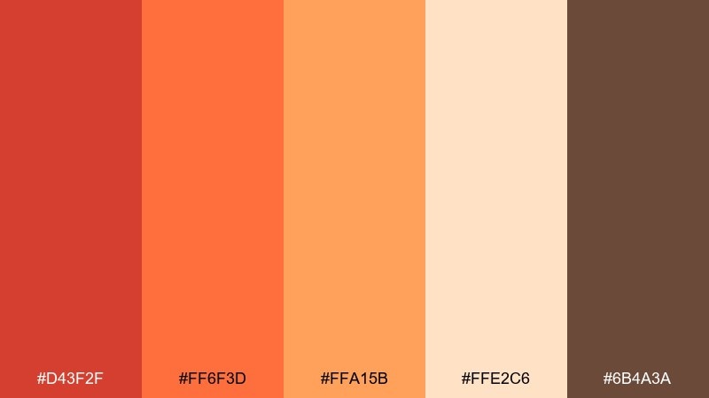
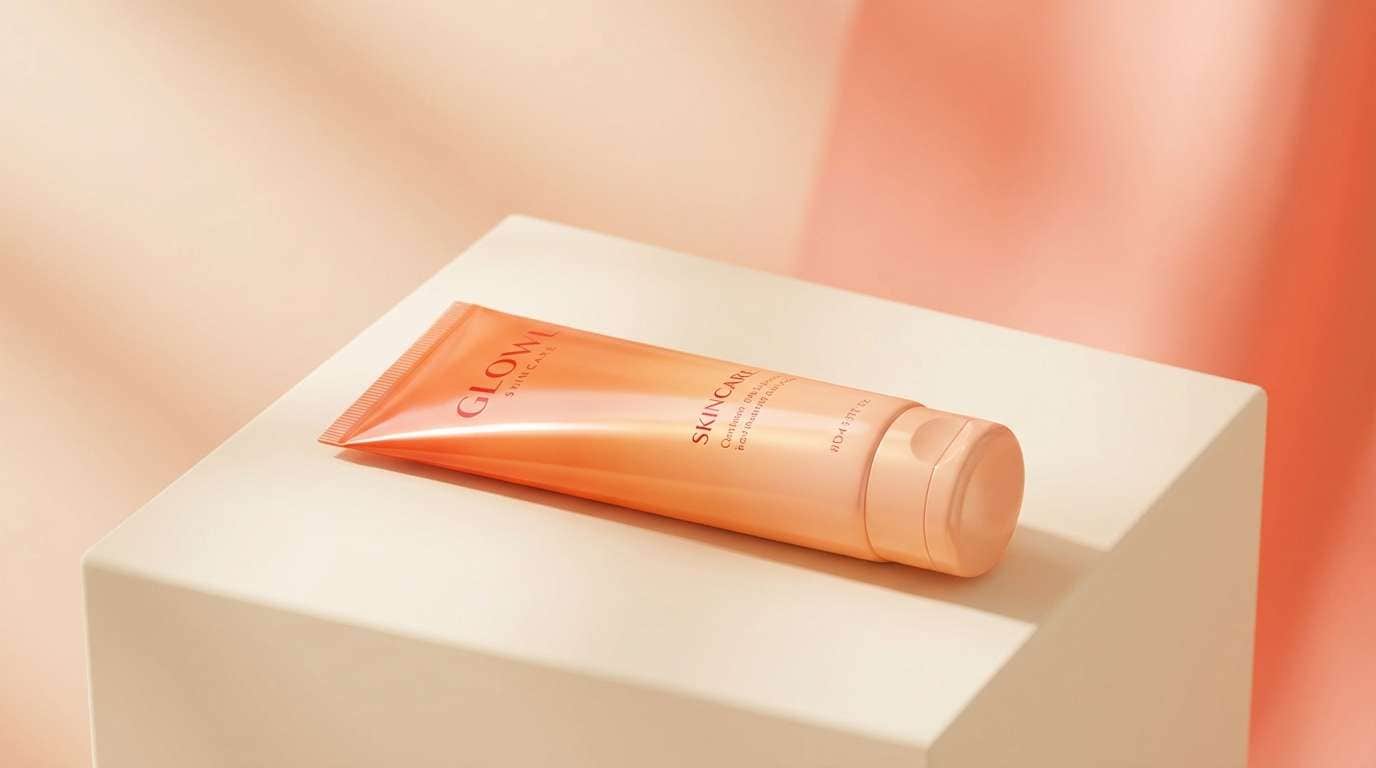
HEX: #D43F2F #FF6F3D #FFA15B #FFE2C6 #6B4A3A
Mood: soft, tropical, welcoming
Best for: beauty product ad
Soft and tropical like papaya slices with whipped cream, these tones feel approachable and glow-forward. For beauty campaigns and skincare launches, they create warmth without drifting into harsh neon. These red orange color combinations look best when the cream shade dominates and the deeper brown supports headlines. Tip: use subtle gradients between orange and apricot for a smooth, dewy finish.
Image example of papaya cream generated using media.io
7) Copper Spice
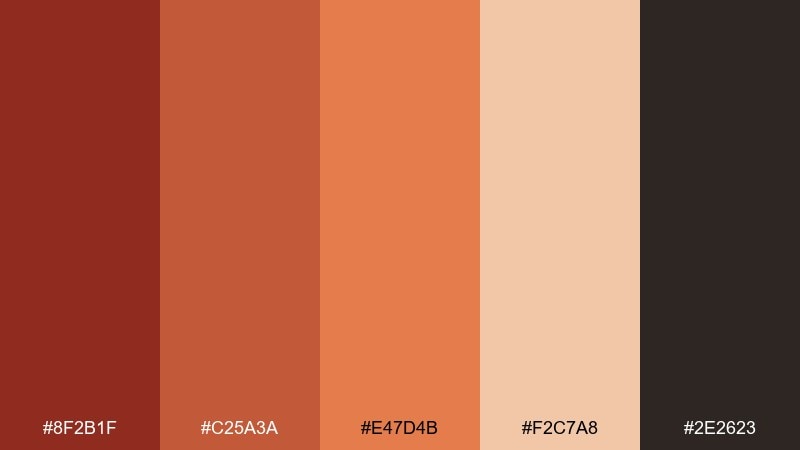
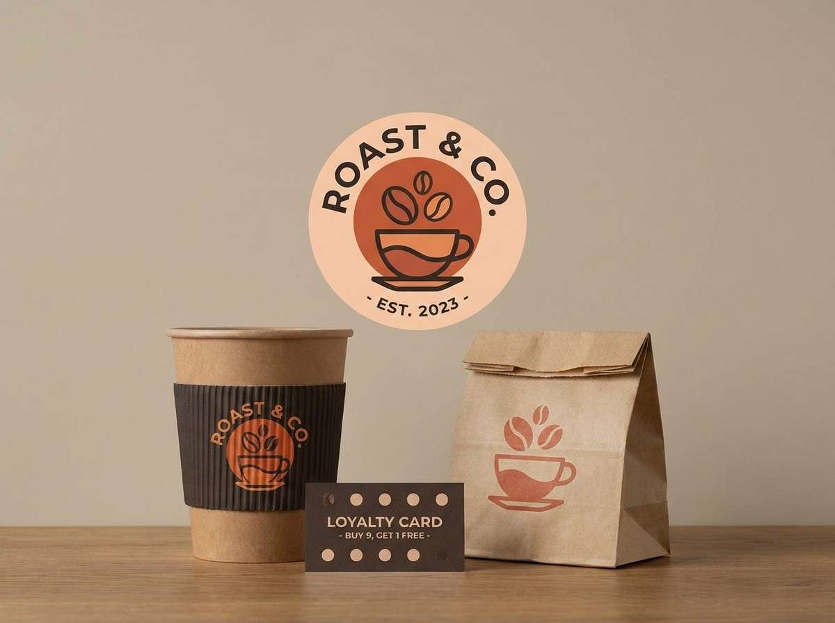
HEX: #8F2B1F #C25A3A #E47D4B #F2C7A8 #2E2623
Mood: rustic, mature, crafted
Best for: coffee shop branding
Rustic and mature like copper cookware and toasted spices, this palette mix feels crafted and steady. It fits café branding, loyalty cards, and packaging where warmth should read sophisticated. Pair the darkest brown with the pale beige for clear type, then use copper as your signature accent. Tip: keep illustrations or icons in one ink color to preserve the artisanal vibe.
Image example of copper spice generated using media.io
8) Autumn Market
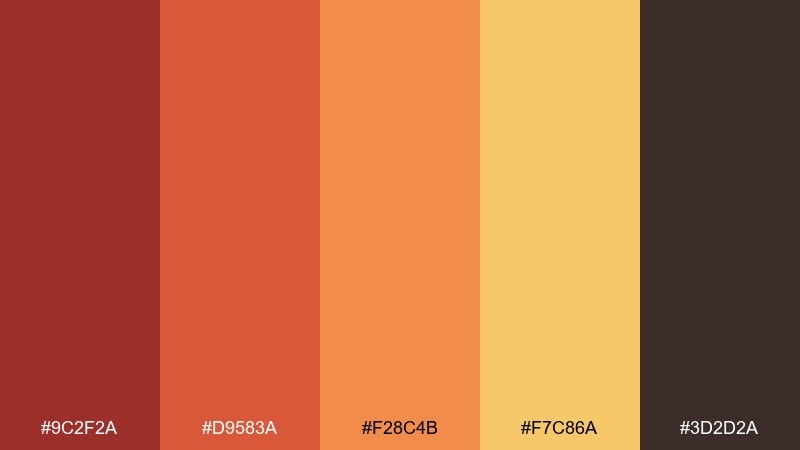
HEX: #9C2F2A #D9583A #F28C4B #F7C86A #3D2D2A
Mood: seasonal, cozy, lively
Best for: fall sale banner
Seasonal and cozy like a busy autumn market, these colors feel festive without going full holiday. Use them for sale banners, home page hero sections, and email headers that need warmth and urgency. The golden tone is perfect for badges, while the deep brown keeps pricing and disclaimers legible. Tip: add simple leaf or line motifs in the darkest shade to tie the look together.
Image example of autumn market generated using media.io

9) Firelight Neutrals
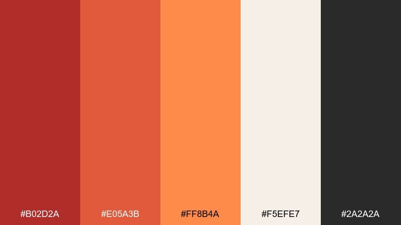
HEX: #B02D2A #E05A3B #FF8B4A #F5EFE7 #2A2A2A
Mood: modern, balanced, confident
Best for: landing page UI
Modern and balanced like firelight against a clean wall, this set feels confident but not chaotic. It is a red orange color scheme that works especially well for landing pages, sign-up flows, and marketing sections that need a warm CTA. Use the off-white as the base, charcoal for text, and the mid orange for primary buttons. Tip: keep error and warning states subtle by reusing the deeper red instead of introducing new hues.
Image example of firelight neutrals generated using media.io
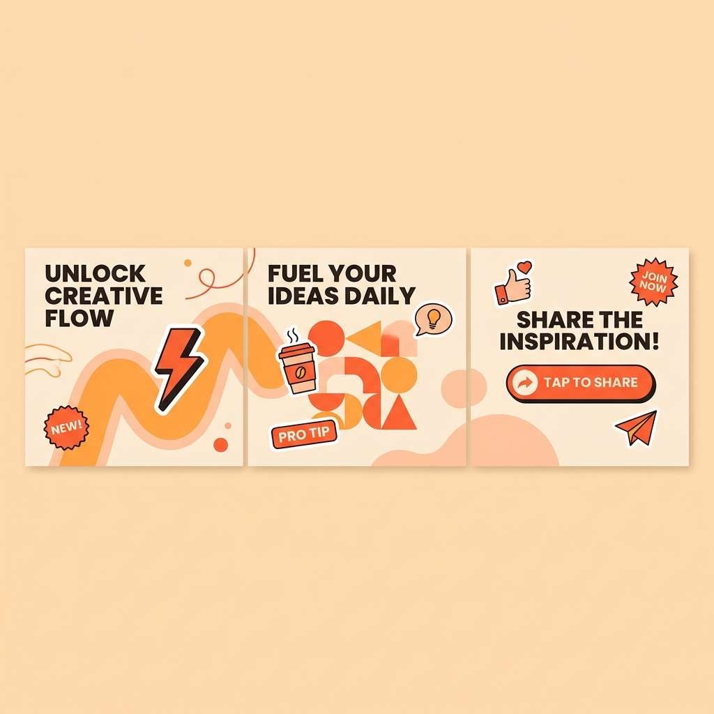
10) Cantaloupe Pop
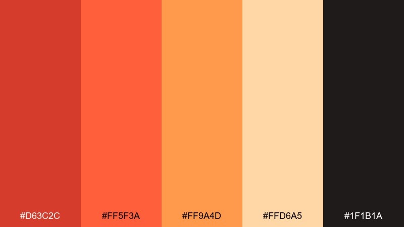
HEX: #D63C2C #FF5F3A #FF9A4D #FFD6A5 #1F1B1A
Mood: playful, youthful, energetic
Best for: social media carousel
Playful and youthful like a fresh cantaloupe bite, these tones are built for scrolling attention. They work great in social carousels, creator templates, and bold announcement posts. Keep the dark shade for captions and small UI details so the orange pops stay readable. Tip: alternate solid color slides with light peach slides to avoid fatigue across a multi-panel post.
Image example of cantaloupe pop generated using media.io
11) Brick and Linen
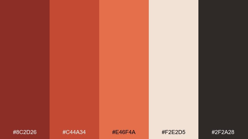
HEX: #8C2D26 #C44A34 #E46F4A #F2E2D5 #2F2A28
Mood: heritage, cozy, understated
Best for: restaurant menu design
Heritage and cozy like old brick paired with crisp linen, these hues feel timeless and inviting. This red orange color palette is a natural fit for restaurant menus, wine lists, and hospitality print pieces that should feel warm but refined. Use linen as the main background, brick for section headers, and the near-black for body text. Tip: keep photography warm-toned or sepia so it blends with the paper-like base.
Image example of brick and linen generated using media.io
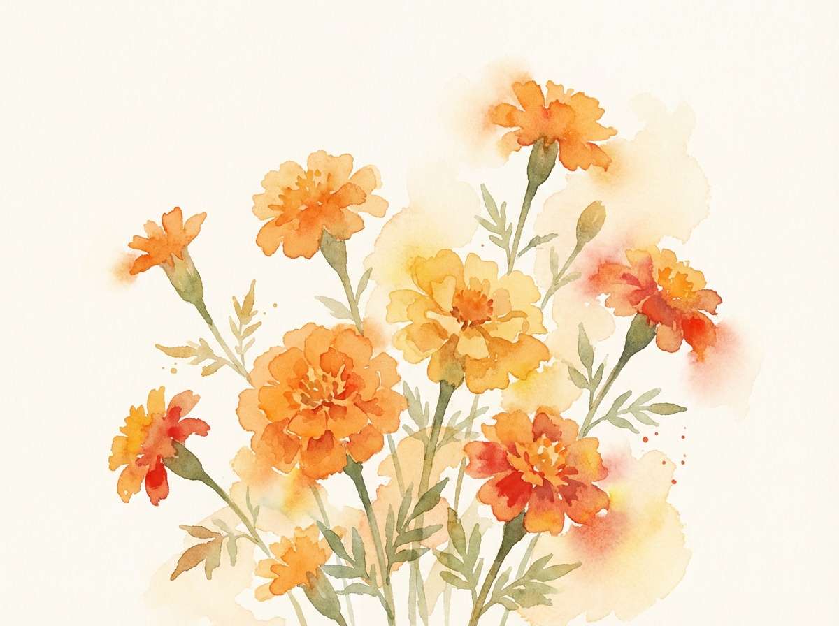
12) Marigold Drift
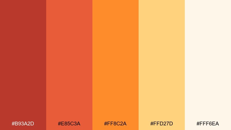
HEX: #B93A2D #E85C3A #FF8C2A #FFD27D #FFF6EA
Mood: bright, airy, sunlit
Best for: spring illustration
Bright and airy like marigolds drifting in a warm breeze, this set feels sunlit and optimistic. It is perfect for spring illustrations, seasonal headers, and cheerful editorial graphics. Let the creamy white carry most of the canvas, then layer marigold and orange for petals and accents. Tip: use the deeper red as a thin outline color to add definition without turning heavy.
Image example of marigold drift generated using media.io
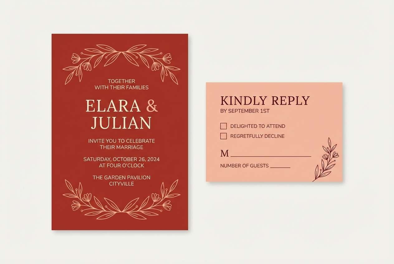
13) Rusty Romance
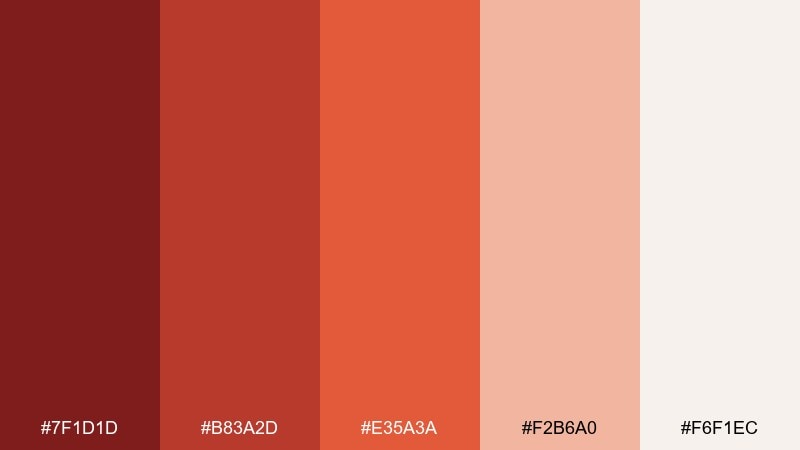
HEX: #7F1D1D #B83A2D #E35A3A #F2B6A0 #F6F1EC
Mood: romantic, moody, elegant
Best for: wedding invitation suite
Romantic and moody like candlelight over rust-colored silk, this combination feels elegant and intimate. Use it for wedding invitations, RSVP cards, and save-the-dates that lean modern instead of pastel. The soft blush keeps the layout gentle while the deep wine shade adds formality for names and details. Tip: choose one luxe finish, like letterpress or foil, and keep the rest minimal.
Image example of rusty romance generated using media.io
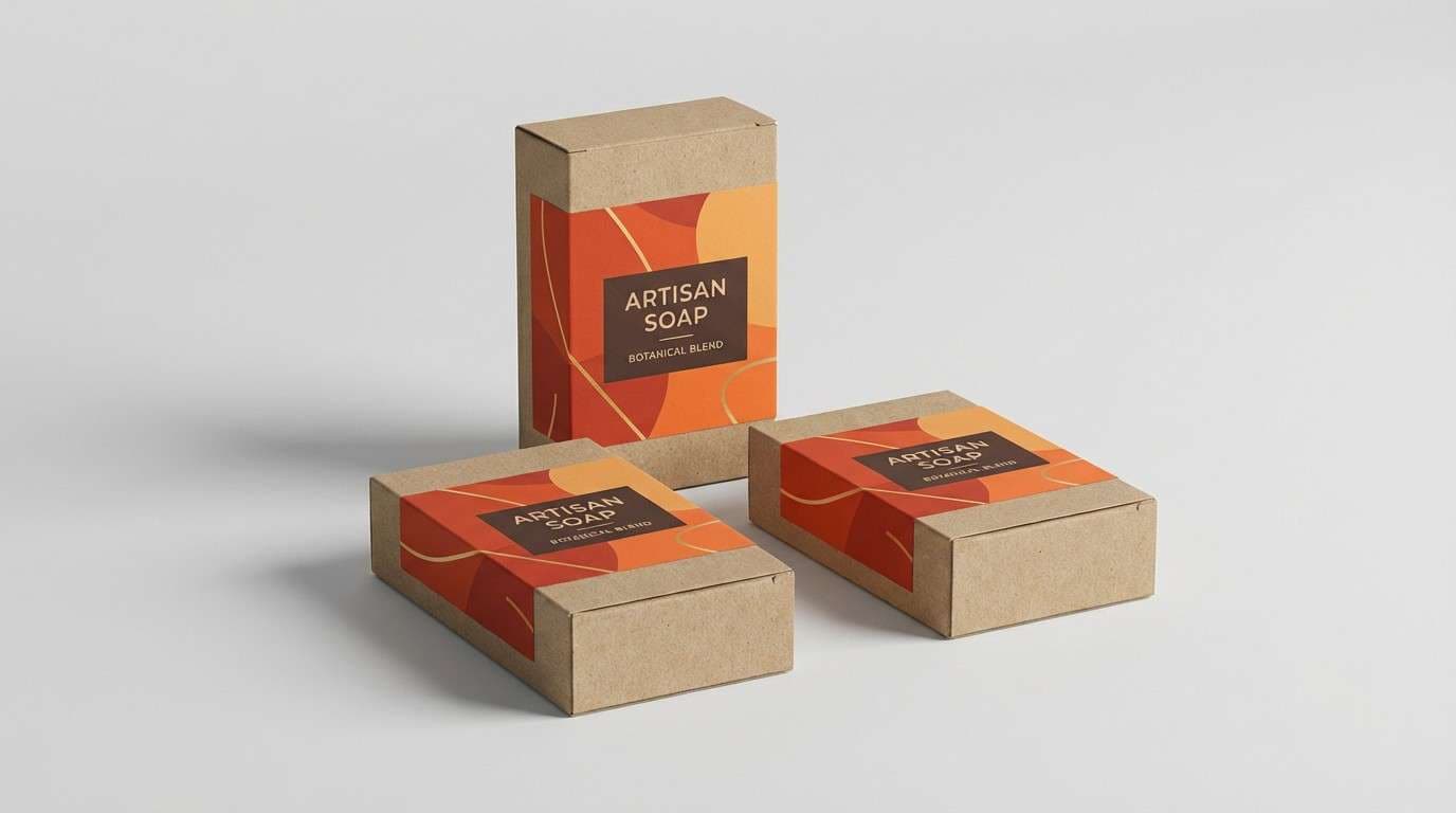
14) Citrus Clay
HEX: #A8322B #DF4F3A #FF7B3A #FFC06B #4B3A33
Mood: zesty, grounded, creative
Best for: artisan soap packaging
Zesty and grounded like citrus peel pressed into clay, these colors feel handmade yet lively. They are strong for soap labels, bath product packaging, and small-batch ecommerce visuals. Use the golden tone for scent variants, while the darker brown keeps ingredients and compliance text crisp. Tip: try simple block shapes and bold type to make the label read quickly from a distance.
Image example of citrus clay generated using media.io
15) Warm Retro Poster
HEX: #9E1F1F #D94A34 #F27A3D #F5C16C #1E1D1C
Mood: retro, punchy, graphic
Best for: gig poster
Retro and punchy like a screen-printed gig poster from the 70s, these hues feel graphic and loud. They work best for concerts, pop-up shows, and bold announcements with strong typography. Keep backgrounds in warm gold, then layer red and orange shapes for movement and rhythm. Tip: limit yourself to two dominant inks plus black to preserve that authentic print vibe.
Image example of warm retro poster generated using media.io
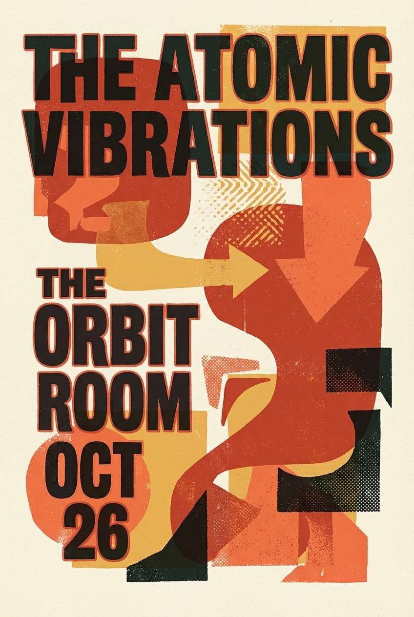
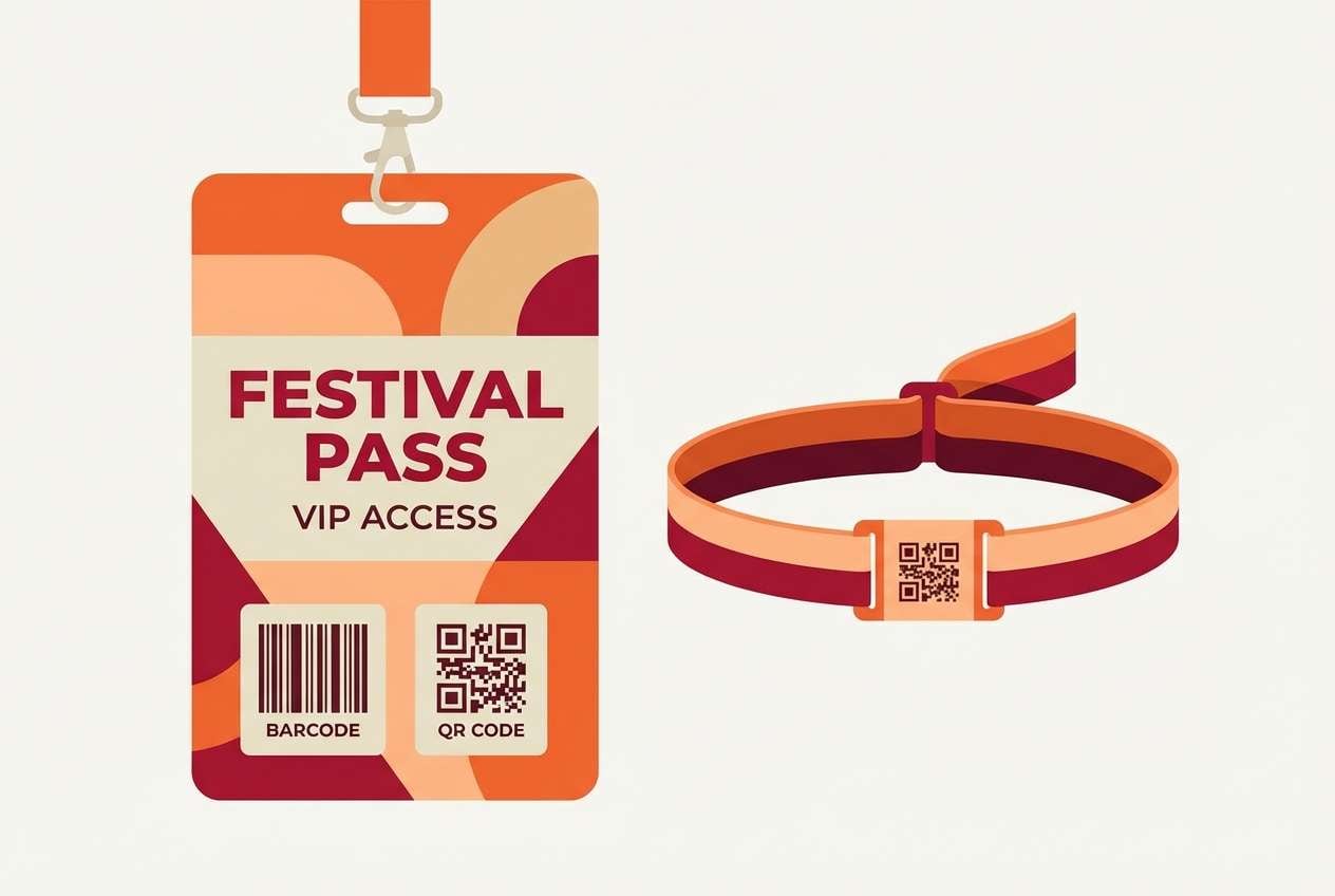
16) Desert Festival
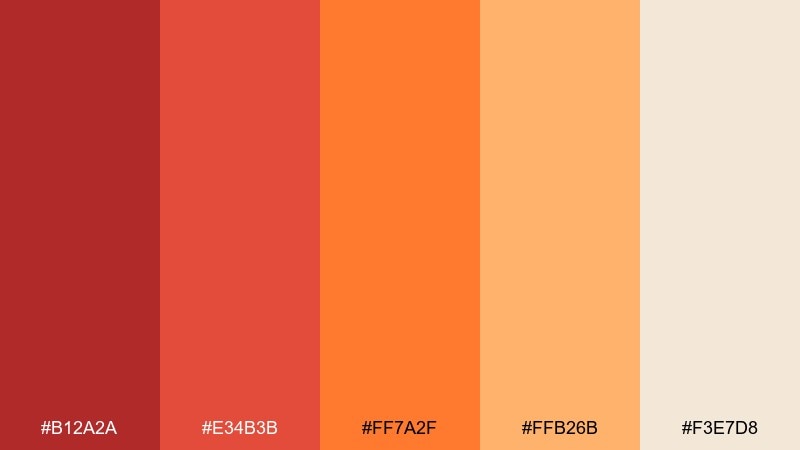
HEX: #B12A2A #E34B3B #FF7A2F #FFB26B #F3E7D8
Mood: festive, sunbaked, adventurous
Best for: music festival wristband and pass
Festive and sunbaked like a desert festival at golden hour, this set feels adventurous and upbeat. Use it for passes, wristbands, badges, and on-site signage where contrast must hold in daylight. The sandy cream is perfect for base materials, while orange carries the main event energy. Tip: keep QR codes and key info in the deeper red for clarity on light substrates.
Image example of desert festival generated using media.io
17) Ember and Sage
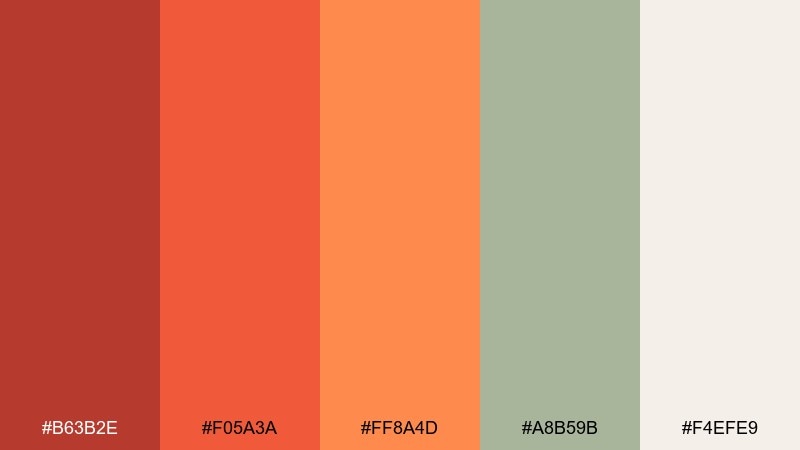
HEX: #B63B2E #F05A3A #FF8A4D #A8B59B #F4EFE9
Mood: fresh, modern, balanced
Best for: wellness blog header
Fresh and modern like glowing embers beside soft sage leaves, this pairing feels balanced and calming. It is great for wellness blog headers, lifestyle thumbnails, and gentle marketing pages that still need warmth. Let sage and cream dominate, then use orange as a sparing highlight for buttons or key phrases. Tip: keep iconography simple and rounded to match the relaxed tone.
Image example of ember and sage generated using media.io
18) Scarlet Apricot UI
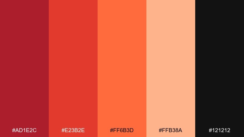
HEX: #AD1E2C #E23B2E #FF6B3D #FFB38A #121212
Mood: sleek, modern, high-contrast
Best for: mobile app UI screens
Sleek and high-contrast like neon signage softened with apricot glow, this mix feels modern and fast. These red orange color combinations are strong for onboarding screens, promo banners, and feature highlights in a dark UI. Keep black as the main canvas, then use apricot for surfaces and scarlet for alerts or key actions. Tip: avoid using the two reds on the same component unless you add spacing and clear hierarchy.
Image example of scarlet apricot ui generated using media.io
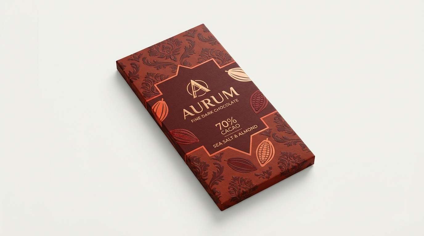
19) Spiced Cocoa

HEX: #6E1F1C #A83A2A #D85A3A #F0B08A #3A2A26
Mood: cozy, rich, intimate
Best for: chocolate bar packaging
Cozy and rich like cocoa dusted with spice, these hues feel intimate and indulgent. They suit chocolate packaging, bakery labels, and seasonal gift sets where warmth signals flavor. Use the darkest brown for the brand mark and legal text, then let the lighter peach create contrast for variant names. Tip: add subtle patterning in the mid rust tone for a premium, craft finish.
Image example of spiced cocoa generated using media.io
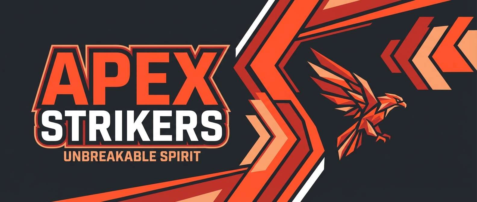
20) Lava and Charcoal
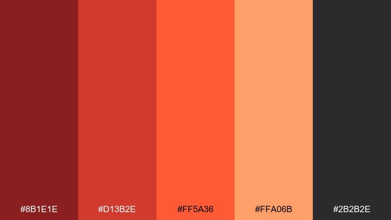
HEX: #8B1E1E #D13B2E #FF5A36 #FFA06B #2B2B2E
Mood: dramatic, edgy, bold
Best for: sports team banner
Dramatic and edgy like lava cutting through charcoal rock, these colors feel bold and competitive. Use them for sports banners, esports overlays, or punchy hero graphics that need strong impact. Charcoal handles the heavy lifting for backgrounds, while the bright orange becomes a clean highlight for scores and calls to action. Tip: keep gradients subtle so the design stays sharp at a distance.
Image example of lava and charcoal generated using media.io
What Colors Go Well with Red Orange?
Red orange pairs especially well with deep neutrals like charcoal, espresso, and near-black because they stabilize the heat and make type feel crisp. If you need a modern, high-contrast look, this is the easiest direction to take.
For softer designs, add cream, linen, blush, or warm beige to give the palette room to breathe. These light companions keep red orange looking inviting rather than overwhelming.
If you want a fresher, more contemporary twist, try muted greens like sage or olive as a counterbalance. The warm/cool tension makes red orange feel intentional and design-forward.
How to Use a Red Orange Color Palette in Real Designs
Use red orange as your “energy” layer: CTAs, key highlights, badges, and headlines. Then keep the majority of your canvas in a neutral base (cream or charcoal) so the palette stays readable and premium.
In print, red orange shines when you limit the number of dominant inks and lean into texture—kraft paper, uncoated stock, or subtle patterns. In digital UI, reserve the most saturated orange for one primary action to avoid visual noise.
For consistent branding, set rules: one main orange, one deeper red for emphasis states, one background neutral, and one text neutral. That simple system scales across web, packaging, and social templates.
Create Red Orange Palette Visuals with AI
If you already have HEX codes, you can quickly generate on-brand visuals by turning each palette into a poster, product mockup, UI screen, or social template. The key is to reuse the same colors across multiple prompts so your outputs feel cohesive.
Start with one palette that matches your goal (cinematic, artisanal, premium, or playful), then generate a few variations—swap layouts, keep the colors. This approach helps you explore styles without losing brand consistency.
Red Orange Color Palette FAQs
-
What does red orange communicate in design?
Red orange typically signals warmth, excitement, appetite, and action. It’s often used when you want something to feel energetic, friendly, and bold at the same time. -
Is red orange good for branding?
Yes—especially for food, entertainment, lifestyle, fitness, and creative brands. Pair it with strong neutrals (charcoal/espresso) or soft bases (cream/linen) to keep the identity versatile. -
What neutrals work best with a red orange palette?
Charcoal, near-black, espresso brown, cocoa, and warm off-whites are the most dependable neutrals. They improve contrast and make saturated oranges easier to use across layouts. -
How do I keep red orange from feeling too loud?
Let a light neutral dominate the design and use red orange as an accent for focal points. Also avoid putting multiple saturated warm tones at equal weight—choose one hero color and support it with softer tints. -
Can I use red orange in UI design?
Absolutely. It works well for primary buttons, highlights, and onboarding moments—just keep text in charcoal/black (or near-white in dark mode) and maintain clear hierarchy for accessibility. -
What colors complement red orange?
Muted greens (sage/olive) complement red orange nicely, as do deep blues in some brand systems. For an easier match, stick to warm neutrals and creams for a cohesive, modern look. -
How can I generate images that match my red orange HEX codes?
Use an AI image generator and include your exact HEX codes in the prompt, specifying which ones should dominate and which are accents. Generate several layout variations while keeping the same palette for consistency.


