

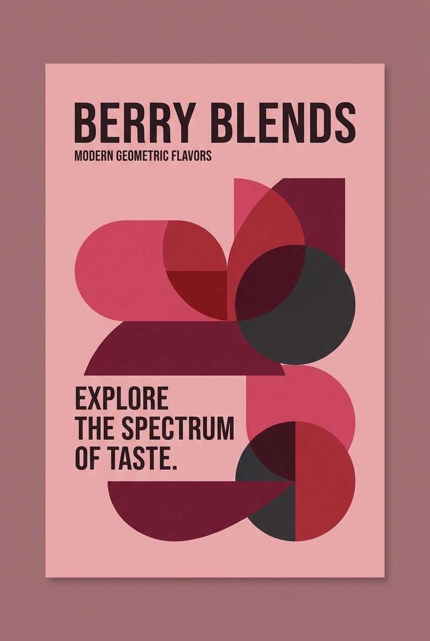
Raspberry is one of those rare colors that can feel both luxe and playful, depending on what you pair it with. It’s bold enough for hero moments, but still warm enough to feel human in UI and print.
Below are 25 modern raspberry color palette ideas with HEX codes, plus practical tips and AI prompts you can reuse to generate matching visuals fast.
In this article
- Why Raspberry Palettes Work So Well
-
- velvet berry
- raspberry sorbet
- rosewood jam
- neon raspberry pop
- raspberry mocha
- raspberry & sage garden
- dusty raspberry linen
- raspberry sunset glow
- raspberry noir
- raspberry champagne
- berry coral crush
- raspberry plum night
- raspberry mint gelato
- raspberry clay studio
- raspberry blossom watercolor
- raspberry citrus punch
- raspberry granite minimal
- raspberry copper luxe
- raspberry denim casual
- raspberry frost
- raspberry sandstone calm
- raspberry orchid chic
- raspberry teal contrast
- raspberry monochrome depth
- raspberry ivory classic
- What Colors Go Well with Raspberry?
- How to Use a Raspberry Color Palette in Real Designs
- Create Raspberry Palette Visuals with AI
Why Raspberry Palettes Work So Well
Raspberry sits in the sweet spot between pink and red, so it carries energy without looking aggressive. That makes it ideal for brands that want warmth, confidence, and a modern “pop” all at once.
It also plays nicely with both warm neutrals (cream, champagne, caramel) and cool contrasts (teal, denim blue, slate). With the right dark anchor, raspberry stays readable and premium rather than sugary.
Finally, raspberry is flexible in proportion: use it as a hero color for impact, or keep it to 10–15% for buttons, highlights, and tags. Either way, it adds a clear focal point.
20+ Raspberry Color Palette Ideas (with HEX Codes)
1) Velvet Berry
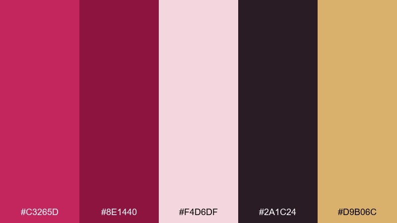
HEX: #C3265D #8E1440 #F4D6DF #2A1C24 #D9B06C
Mood: luxurious, romantic, bold
Best for: beauty branding and premium product packaging
Luxurious and velvety, these tones feel like a deep berry lipstick against soft blush fabric. Use the rich raspberry as your hero color, then lean on near-black for contrast and gold for a premium accent. It works beautifully on boxes, labels, and hero banners where you want instant sophistication. Tip: keep gold to small highlights like borders and icons so the berry stays in control.
Image example of velvet berry generated using media.io
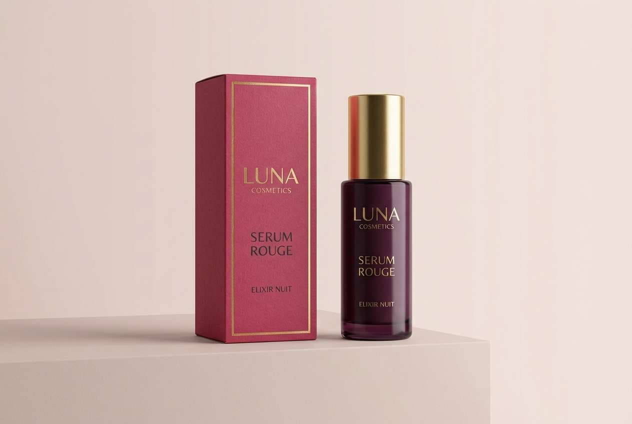
Media.io is an online AI studio for creating and editing video, image, and audio in your browser.

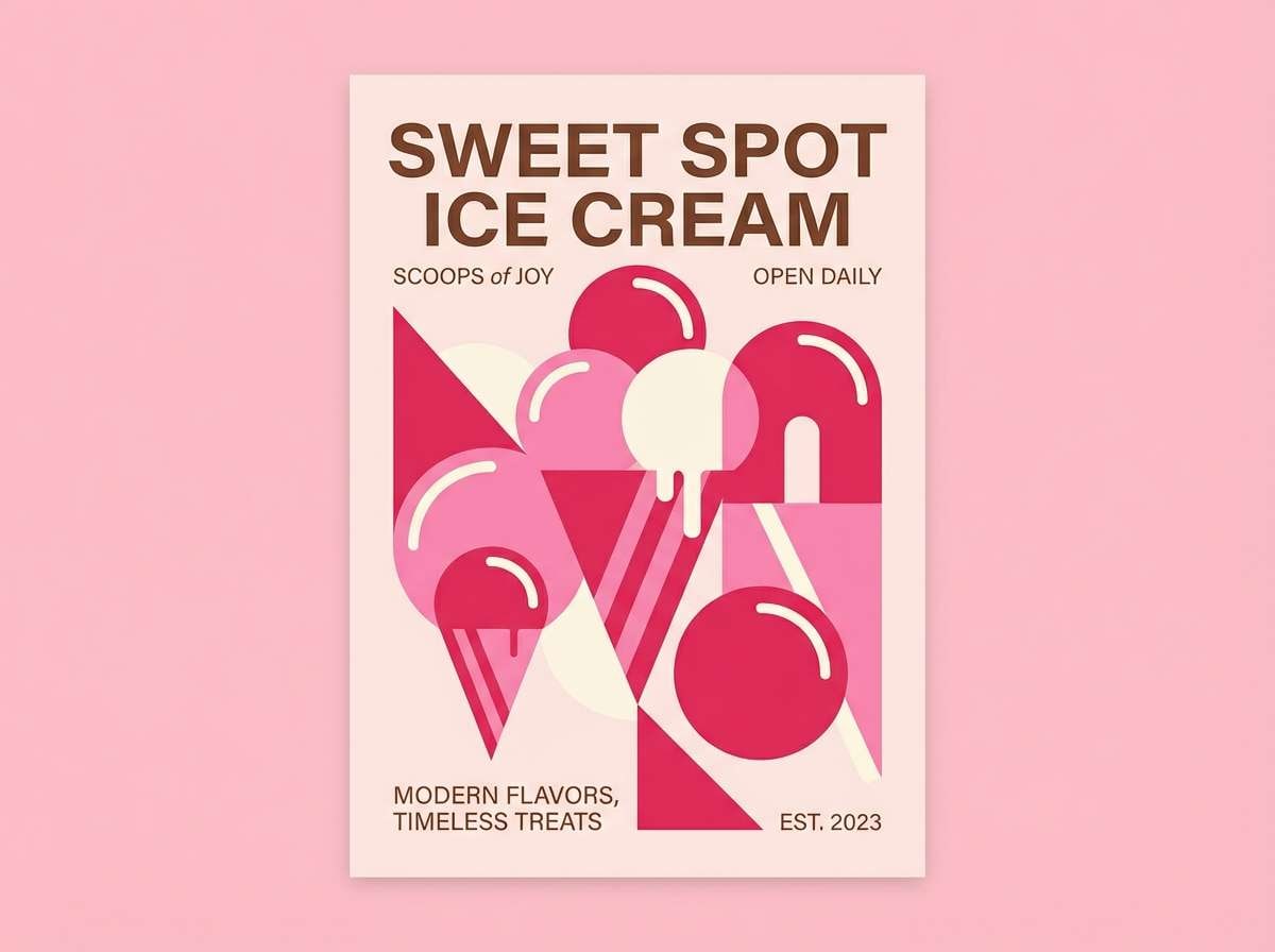
2) Raspberry Sorbet
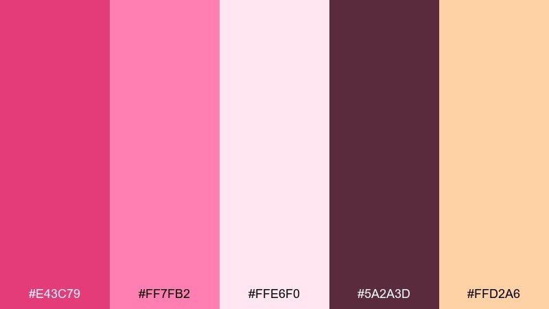
HEX: #E43C79 #FF7FB2 #FFE6F0 #5A2A3D #FFD2A6
Mood: playful, sweet, bright
Best for: ice cream shop posters and social ads
Playful and sweet, this mix reads like a scoop of sorbet melting into creamy pink. Pair the hot raspberry with airy blush for big, friendly shapes, then use the cocoa tone for legible text. It shines on posters, menus, and social tiles where you want an upbeat pop. Tip: set the brightest pink as a background block and keep headlines in the darker brown for clarity.
Image example of raspberry sorbet generated using media.io
3) Rosewood Jam
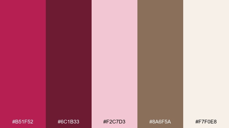
HEX: #B51F52 #6C1B33 #F2C7D3 #8A6F5A #F7F0E8
Mood: cozy, artisanal, rustic
Best for: jam labels and farmers market signage
Cozy and handmade, these hues evoke simmering fruit, rosewood shelves, and paper-wrapped jars. Use the deep berry for brand marks and borders, then balance with warm cream for an inviting label base. The muted taupe keeps things grounded without feeling dull. Tip: try a cream background with rosewood outlines so the jar flavor name pops in berry.
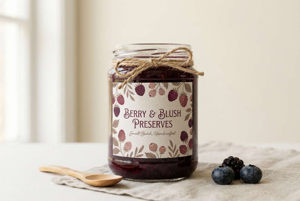
Image example of rosewood jam generated using media.io
4) Neon Raspberry Pop
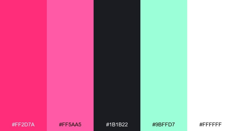
HEX: #FF2D7A #FF5AA5 #1B1B22 #9BFFD7 #FFFFFF
Mood: energetic, modern, nightlife
Best for: music event flyers and club posters
Energetic and electric, this pairing feels like neon signage cutting through a dark street. Let the hot raspberry and bubblegum pink handle the headline and key shapes, while black gives instant edge. Mint works best as a small highlight for dates or icons. Tip: use high contrast blocks and leave plenty of white space so the neon stays crisp, not chaotic.
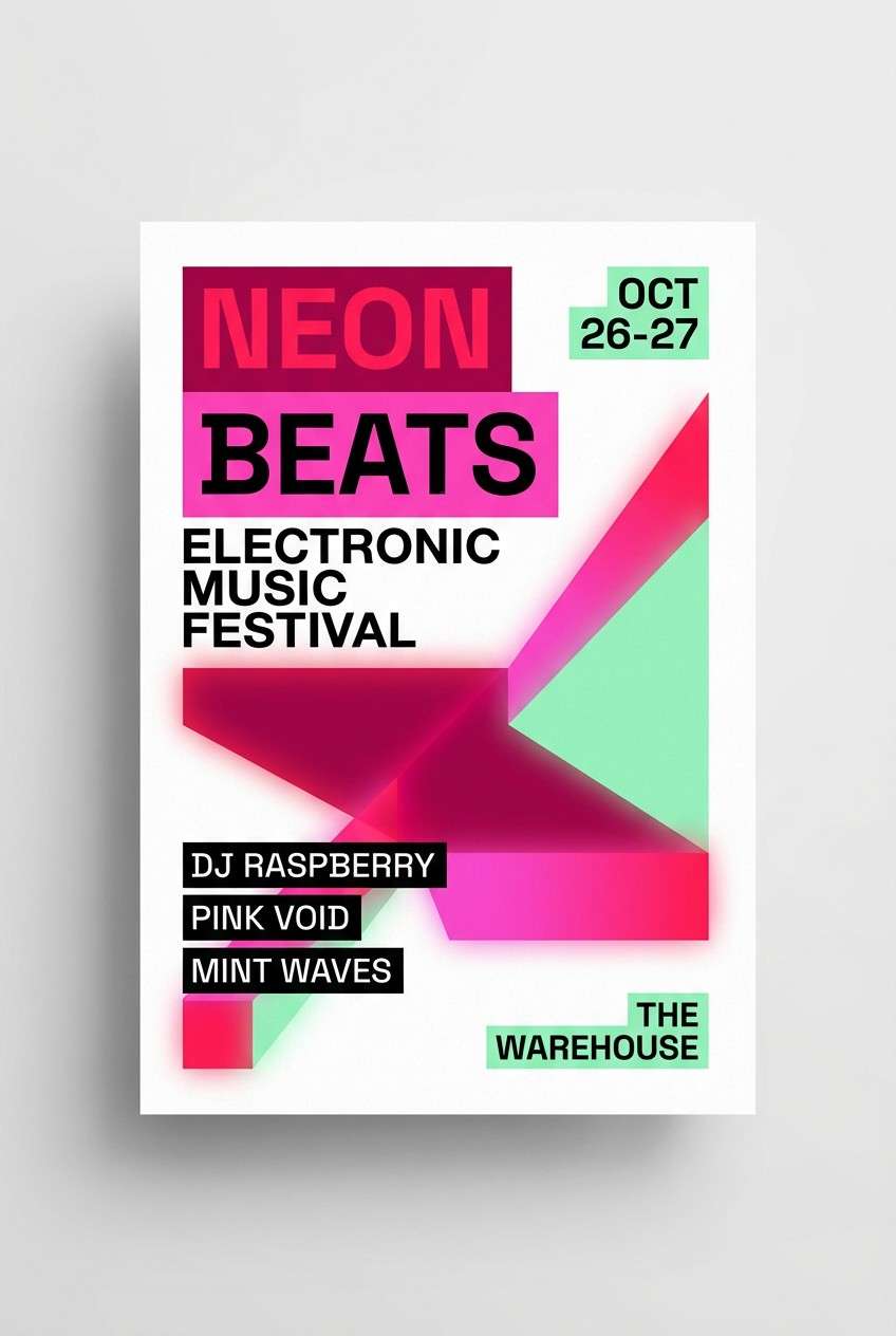
Image example of neon raspberry pop generated using media.io
5) Raspberry Mocha
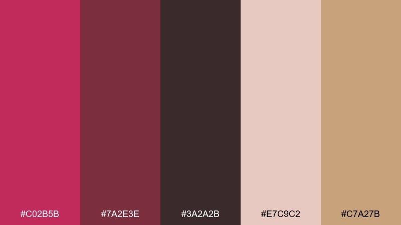
HEX: #C02B5B #7A2E3E #3A2A2B #E7C9C2 #C7A27B
Mood: warm, grounded, sophisticated
Best for: coffee shop menus and packaging
Warm and grounded, these colors suggest berry syrup stirred into mocha foam. Use the raspberry as an accent stripe or callout, then build the layout with cocoa and espresso tones for a mature look. Blush and caramel keep it approachable for menus and loyalty cards. Tip: reserve raspberry for prices or seasonal items so it acts like a visual highlighter.
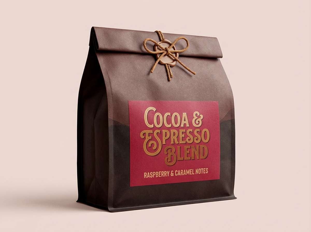
Image example of raspberry mocha generated using media.io
6) Raspberry & Sage Garden
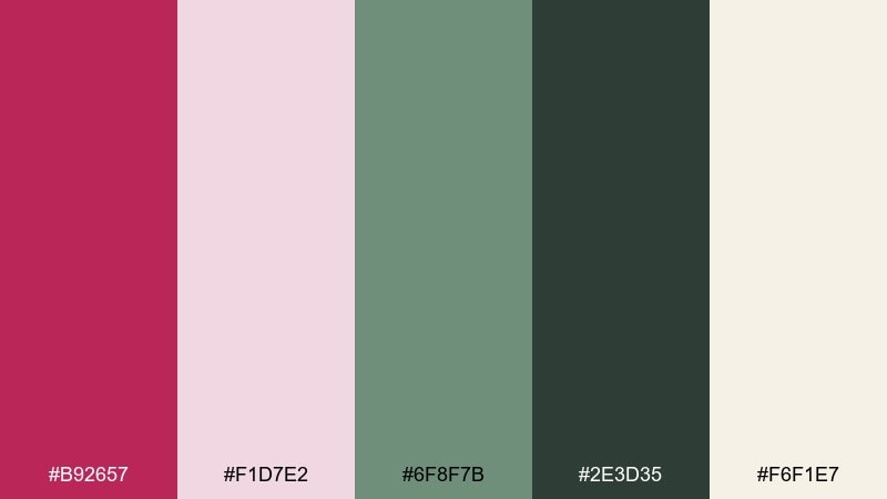
HEX: #B92657 #F1D7E2 #6F8F7B #2E3D35 #F6F1E7
Mood: fresh, botanical, calm
Best for: wellness landing pages and spa brochures
Fresh and botanical, this mix feels like garden herbs with a ribbon of berry bloom. The sage greens soften the raspberry and make it easier to use in larger areas like headers or section blocks. Cream keeps the page airy and spa-like, while the deep pine adds readable contrast. Tip: use raspberry only for primary buttons and key highlights to maintain a calm rhythm.
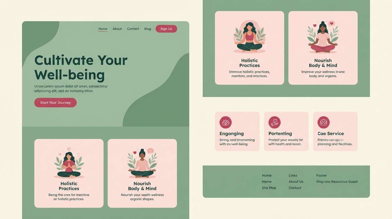
Image example of raspberry & sage garden generated using media.io
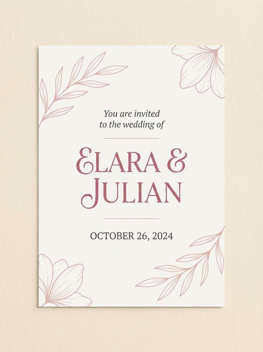
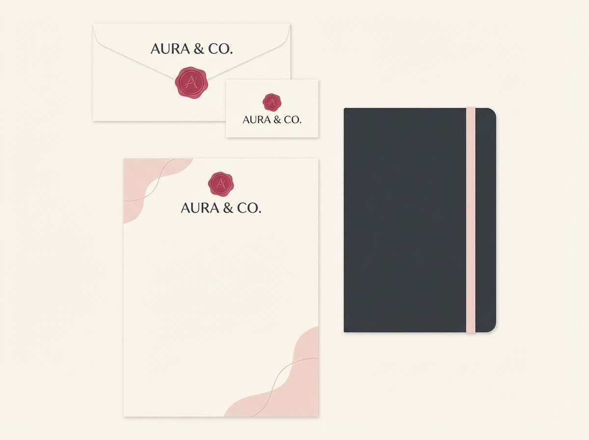
7) Dusty Raspberry Linen
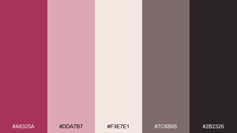
HEX: #A8325A #DDA7B7 #F3E7E1 #7C6B68 #2B2326
Mood: soft, understated, vintage
Best for: wedding invitations and stationery
Soft and understated, these tones look like berry dye washed into linen and aged paper. The dusty raspberry works best for monograms and headings, while the warm off-white keeps everything breathable. Use the stone gray for body copy and the deep charcoal for tiny details like RSVP info. Tip: print the dusty tones on textured stock for a tactile, heirloom feel.
Image example of dusty raspberry linen generated using media.io
8) Raspberry Sunset Glow
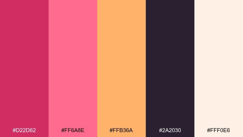
HEX: #D22D62 #FF6A8E #FFB36A #2A2030 #FFF0E6
Mood: radiant, optimistic, summery
Best for: travel ads and summer campaign banners
Radiant and optimistic, this blend evokes a sunset gradient with berry at the horizon and apricot light overhead. Use the peachy orange to warm up backgrounds, then bring in raspberry for titles and badges. The deep indigo anchors the design so it does not feel too sugary. Tip: set a soft gradient from peach to blush, then place raspberry text on the lighter end for clean readability.
Image example of raspberry sunset glow generated using media.io

9) Raspberry Noir
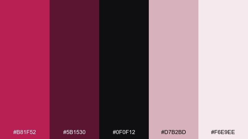
HEX: #B81F52 #5B1530 #0F0F12 #D7B2BD #F6E9EE
Mood: dramatic, elegant, editorial
Best for: fashion editorial layouts and lookbooks
Dramatic and elegant, this set feels like velvet shadows with a berry highlight. The near-black gives you runway-level contrast, while the muted blush tones keep the page from turning harsh. Use raspberry for pull quotes, section dividers, and small graphic marks. Tip: keep body text in deep charcoal and limit berry to 10 to 15 percent for a clean editorial hierarchy.
Image example of raspberry noir generated using media.io
10) Raspberry Champagne
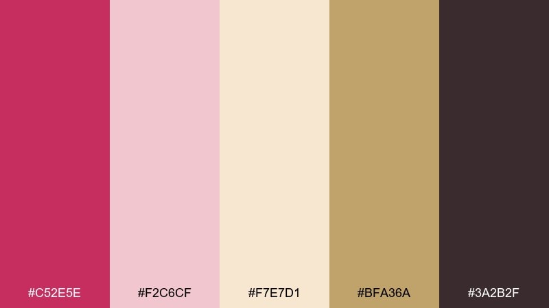
HEX: #C52E5E #F2C6CF #F7E7D1 #BFA36A #3A2B2F
Mood: celebratory, refined, warm
Best for: holiday party invitations and gala posters
Celebratory and refined, these tones suggest bubbles, blush silk, and a hint of gilded sparkle. Use champagne and cream as the base, then add raspberry for the title and key callouts. A touch of soft gold elevates the layout without overpowering the text. Tip: apply gold only to thin rules or small icons to keep print costs and visual noise down.
Image example of raspberry champagne generated using media.io
11) Berry Coral Crush
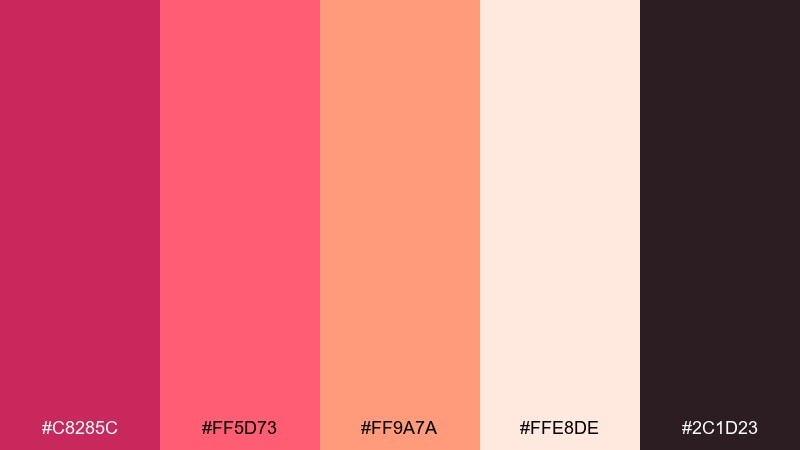
HEX: #C8285C #FF5D73 #FF9A7A #FFE8DE #2C1D23
Mood: bold, friendly, contemporary
Best for: app onboarding screens and CTA sections
Bold and friendly, these colors feel like berry punch with a coral twist. The warm coral and apricot tones make the raspberry look more inviting, which is great for onboarding steps and call-to-action blocks. Use the dark plum for text and icons to keep contrast high. Tip: keep your primary button in raspberry and use coral for secondary actions to clarify priority.
Image example of berry coral crush generated using media.io
12) Raspberry Plum Night
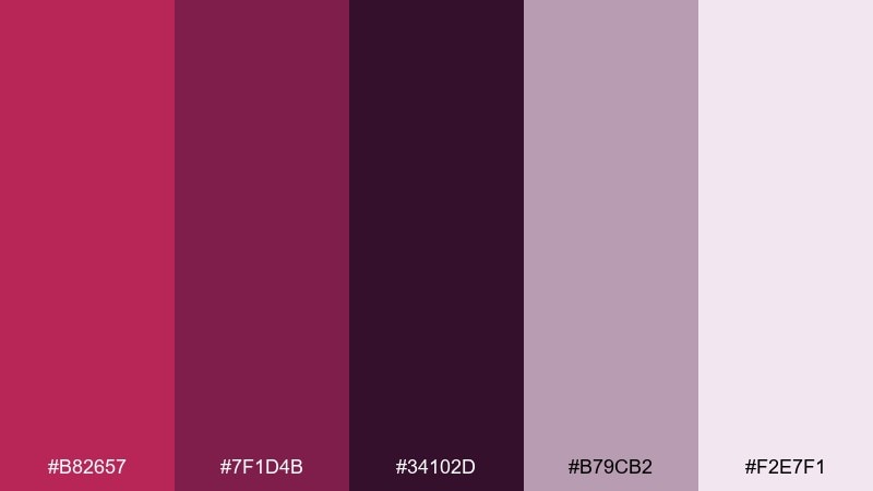
HEX: #B82657 #7F1D4B #34102D #B79CB2 #F2E7F1
Mood: mysterious, rich, moody
Best for: podcast cover art and nightlife branding
Mysterious and rich, this set reads like plum shadows with a sharp raspberry glow. Use the darkest violet as the background, then layer raspberry for the title so it feels luminous. The lilac-gray works well for secondary text and subtle shapes. Tip: add a soft gradient from deep violet to plum to create depth without introducing new colors.
Image example of raspberry plum night generated using media.io

13) Raspberry Mint Gelato
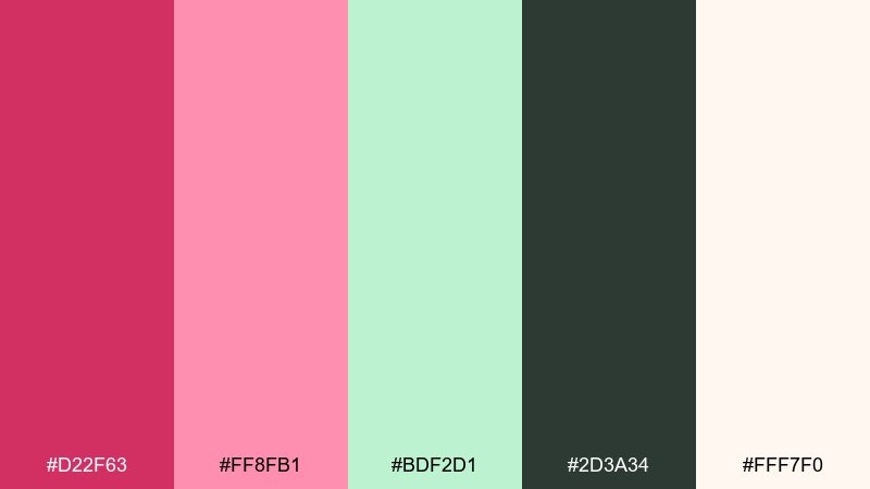
HEX: #D22F63 #FF8FB1 #BDF2D1 #2D3A34 #FFF7F0
Mood: fresh, playful, airy
Best for: spring promos and cafe social posts
Fresh and playful, these colors feel like gelato flavors served on a bright afternoon. Mint brings a breezy contrast that keeps the raspberry from feeling too heavy, especially in social layouts with lots of whitespace. Use the deep green-charcoal for crisp text and icons. Tip: pick either raspberry or mint as the main block color, and use the other only for highlights so the design stays tidy.
Image example of raspberry mint gelato generated using media.io
14) Raspberry Clay Studio
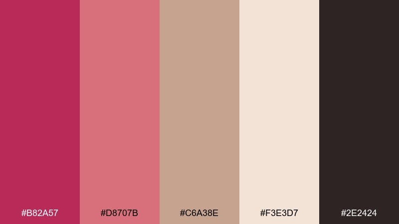
HEX: #B82A57 #D8707B #C6A38E #F3E3D7 #2E2424
Mood: earthy, creative, handmade
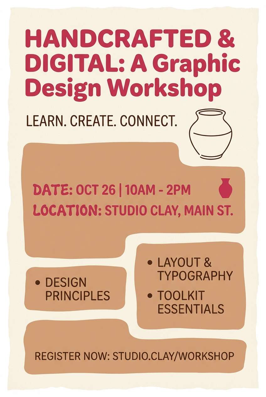
Best for: ceramics brand identity and workshop flyers
Earthy and creative, these tones evoke clay dust, studio shelves, and a berry-stained apron. Use the terracotta-tan and cream as your base materials, then add raspberry for logos, stamps, and workshop dates. The dark brown grounds everything and reads well in print. Tip: try a two-color risograph look by pairing raspberry with the clay tone for a handcrafted feel.
Image example of raspberry clay studio generated using media.io
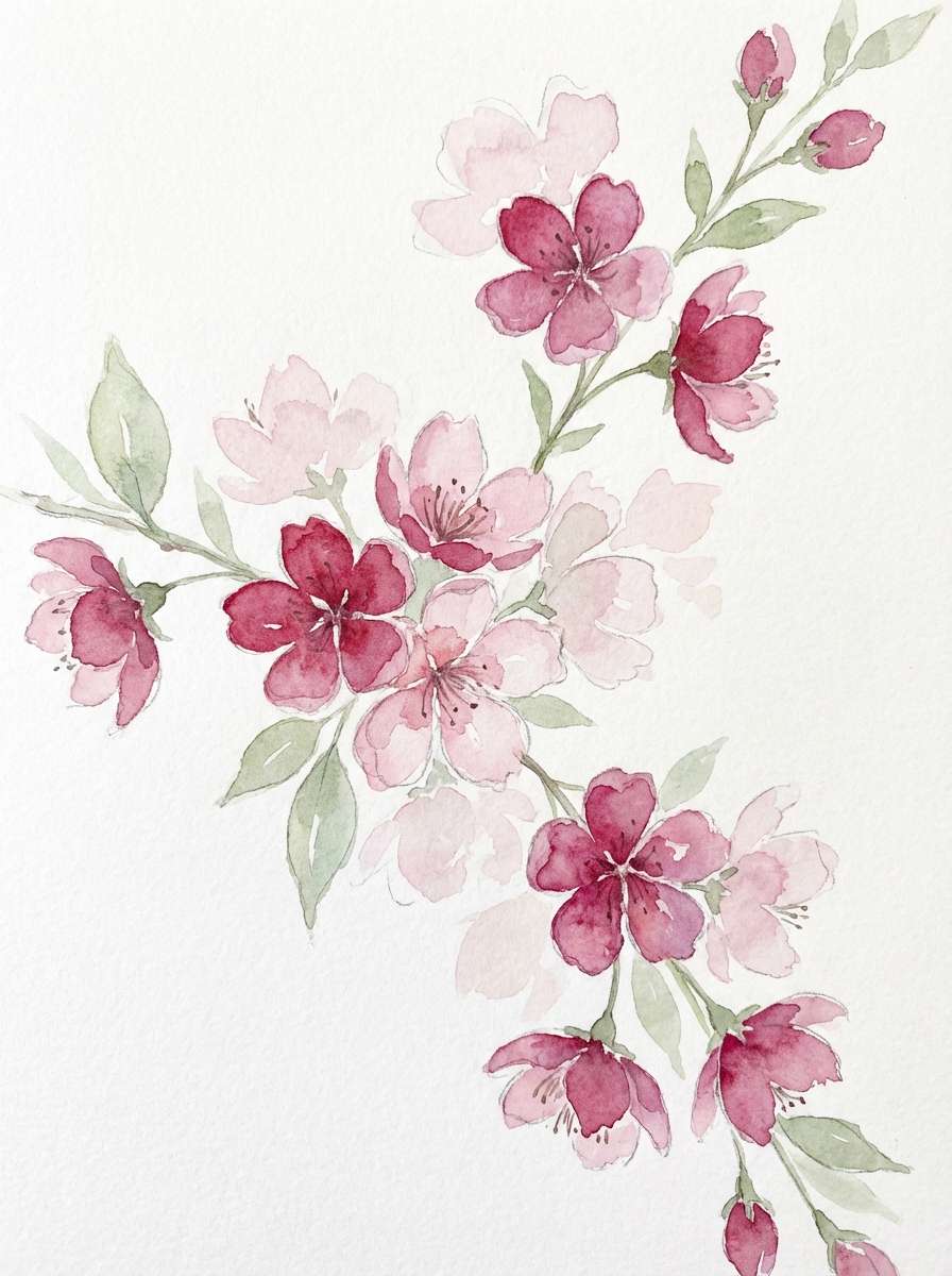
15) Raspberry Blossom Watercolor
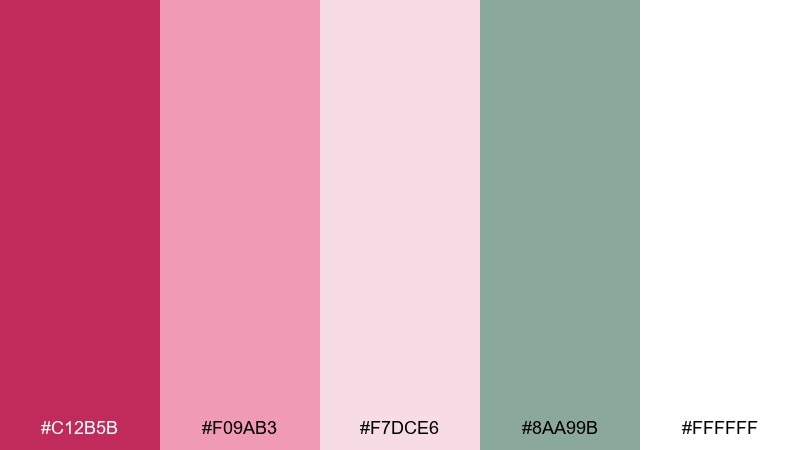
HEX: #C12B5B #F09AB3 #F7DCE6 #8AA99B #FFFFFF
Mood: delicate, romantic, artistic
Best for: botanical prints and spring invitations
Delicate and romantic, this set feels like watercolor petals bleeding into soft paper. Use the pale blush as negative space, then paint raspberry blooms for focal points and headings. Sage green adds a natural stem note that keeps the palette from going overly sweet. Tip: keep edges soft and layered, and avoid hard outlines so the watercolor effect stays believable.
Image example of raspberry blossom watercolor generated using media.io
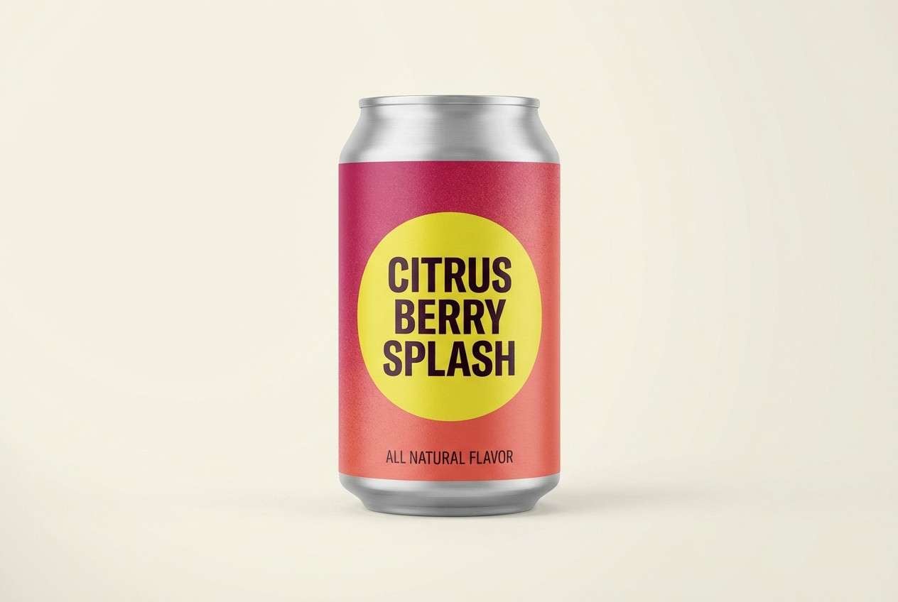
16) Raspberry Citrus Punch
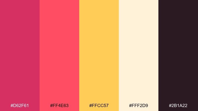
HEX: #D62F61 #FF4E63 #FFCC57 #FFF2D9 #2B1A22
Mood: zesty, upbeat, attention-grabbing
Best for: product ads and launch banners
Zesty and upbeat, these hues feel like citrus slices splashed with berry syrup. Yellow brings instant energy, while the creamy base prevents the palette from looking harsh on screens. Use the deep plum-black for type and fine lines, especially in high-contrast ads. Tip: keep yellow for badges or price tags, and let raspberry handle the brand name and CTA for consistency.
Image example of raspberry citrus punch generated using media.io
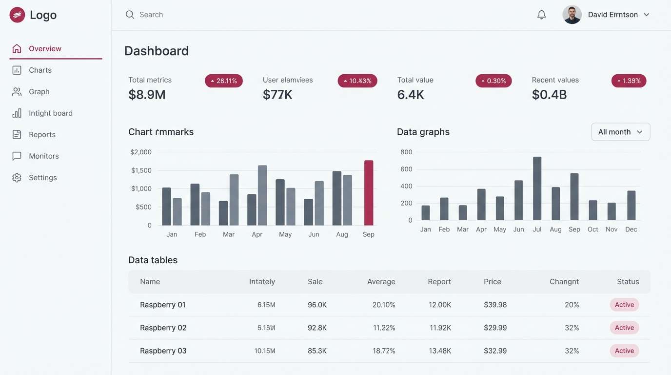
17) Raspberry Granite Minimal
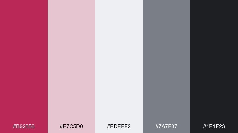
HEX: #B92856 #E7C5D0 #EDEFF2 #7A7F87 #1E1F23
Mood: clean, modern, professional
Best for: dashboard UI and SaaS branding
Clean and modern, this mix feels like a sharp berry accent on cool granite surfaces. Use the light gray as your main canvas, then bring in raspberry for active states, tags, and key metrics. Charcoal and slate handle accessibility-friendly typography and borders. Tip: limit raspberry to interactive elements so users learn the pattern quickly.
Image example of raspberry granite minimal generated using media.io
18) Raspberry Copper Luxe
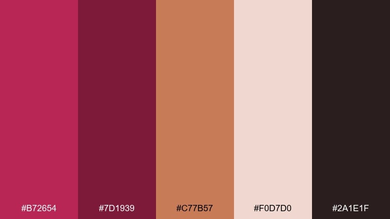
HEX: #B72654 #7D1939 #C77B57 #F0D7D0 #2A1E1F
Mood: opulent, warm, dramatic
Best for: jewelry ads and premium ecommerce banners
Opulent and warm, these tones evoke copper metal catching light beside deep berry velvet. Use copper as the shine color for icons, frames, or product highlights, and keep raspberry for branding and callouts. The soft blush helps transition between dark and bright areas without banding. Tip: use subtle copper gradients and keep text in near-black for a luxe, readable finish.
Image example of raspberry copper luxe generated using media.io

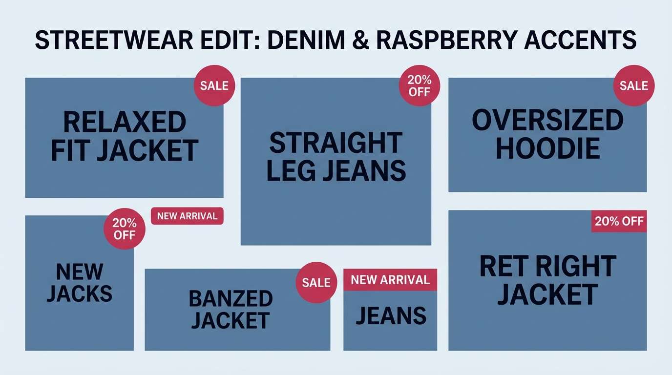
19) Raspberry Denim Casual
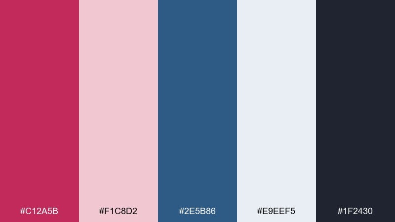
HEX: #C12A5B #F1C8D2 #2E5B86 #E9EEF5 #1F2430
Mood: casual, confident, youthful
Best for: streetwear lookbooks and ecommerce tiles
Casual and confident, this pairing feels like a raspberry graphic tee against worn denim. The blue adds cool balance so the berry reads sporty instead of formal, especially in catalogs and grid layouts. Use near-black for prices and UI labels, keeping the pale blush for breathing room. Tip: make raspberry the hover and sale color so it stands out without repainting the whole page.
Image example of raspberry denim casual generated using media.io
20) Raspberry Frost
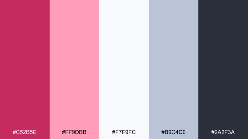
HEX: #C52B5E #FF9DBB #F7F9FC #B9C4D6 #2A2F3A
Mood: cool, crisp, modern
Best for: tech banners and winter promos
Cool and crisp, these tones feel like frosted glass with a bright berry flare. Use the icy whites and blue-gray for spacious backgrounds, then add raspberry for a confident headline and CTA. Charcoal anchors the typography and keeps contrast accessible. Tip: avoid large mid-pink blocks here and instead use raspberry in clean lines, buttons, and badges for a sharp winter look.
Image example of raspberry frost generated using media.io

21) Raspberry Sandstone Calm
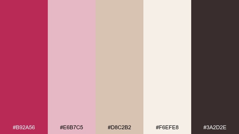
HEX: #B92A56 #E6B7C5 #D8C2B2 #F6EFE8 #3A2D2E
Mood: calm, natural, approachable
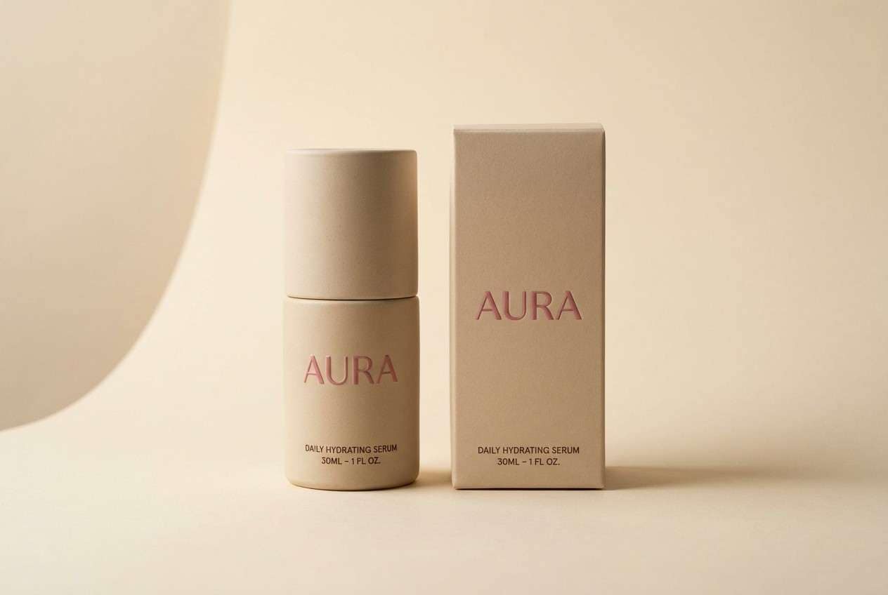
Best for: skincare labels and minimalist packaging
Calm and natural, these tones evoke sandstone, warm light, and a muted berry tint. The beige and cream make an easy label base, while raspberry adds just enough personality for logos and variant names. Use the deep cocoa for ingredients and fine print. Tip: keep your layout airy and let the beige do most of the work so the berry reads intentional, not loud.
Image example of raspberry sandstone calm generated using media.io
22) Raspberry Orchid Chic
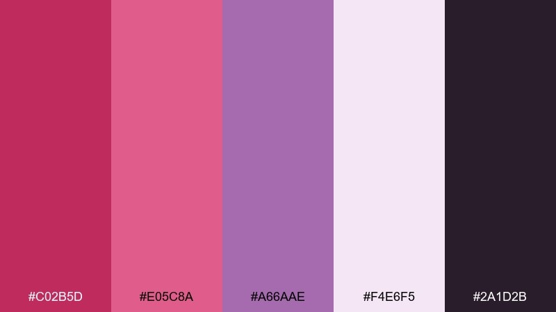
HEX: #C02B5D #E05C8A #A66AAE #F4E6F5 #2A1D2B
Mood: chic, creative, expressive
Best for: beauty UI and creator brand kits
Chic and expressive, these tones feel like orchids under soft studio lighting. The raspberry and pink bring warmth, while the violet adds a stylish twist for cards, highlights, and stickers. This raspberry color palette works well for creator kits, beauty apps, and social templates where you want personality without neon. Tip: use violet for secondary sections and keep raspberry for primary actions to maintain a clear hierarchy.
Image example of raspberry orchid chic generated using media.io
23) Raspberry Teal Contrast
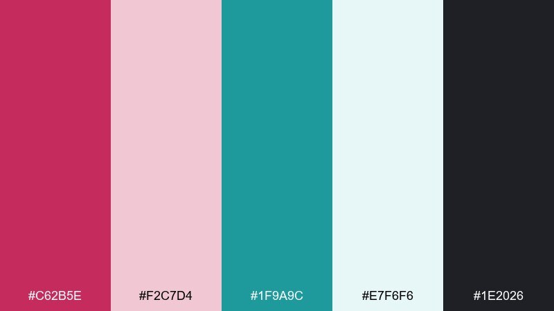
HEX: #C62B5E #F2C7D4 #1F9A9C #E7F6F6 #1E2026
Mood: bold, clean, high-contrast
Best for: conference landing pages and CTA sections
Bold and clean, this pairing pops like berry ink against cool teal glass. Use teal for large sections and navigation, then drop raspberry onto buttons and key announcements for instant attention. These raspberry color combinations are especially strong in digital layouts where contrast drives clicks. Tip: test button states by switching teal and raspberry on hover so the interaction feels intentional and consistent.
Image example of raspberry teal contrast generated using media.io

24) Raspberry Monochrome Depth
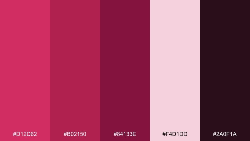
HEX: #D12D62 #B02150 #84133E #F4D1DD #2A0F1A
Mood: intense, cohesive, dramatic
Best for: brand identity systems and bold posters
Intense and cohesive, this monochrome range feels like ink washes from bright berry to near-black wine. A tight raspberry color scheme like this is perfect when you want a strong brand voice without juggling too many hues. Use the pale blush for negative space and the darkest tone for typography and anchors. Tip: assign each shade a role, such as backgrounds, cards, and buttons, so consistency stays effortless across assets.
Image example of raspberry monochrome depth generated using media.io
25) Raspberry Ivory Classic
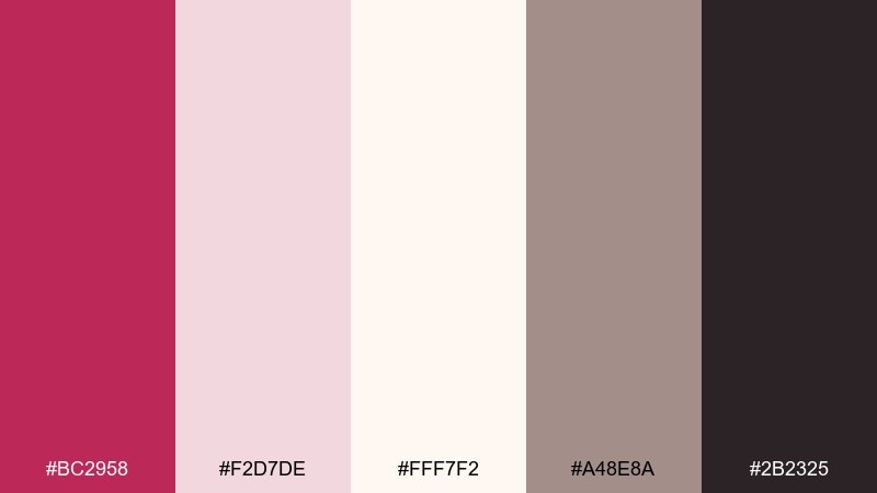
HEX: #BC2958 #F2D7DE #FFF7F2 #A48E8A #2B2325
Mood: classic, elegant, timeless
Best for: boutique logos and refined stationery
Classic and elegant, these tones evoke ivory paper, soft blush, and a polished berry seal. The restrained contrast makes it ideal for logos, letterheads, and small-format designs where nuance matters. Use taupe for secondary text and keep the darkest shade for crisp wordmarks. Tip: print on uncoated ivory stock so the blush and raspberry look warm and natural.
Image example of raspberry ivory classic generated using media.io
What Colors Go Well with Raspberry?
Raspberry pairs beautifully with warm neutrals like cream, champagne, beige, and caramel—these soften the intensity and make it feel premium in print and packaging. Add near-black or deep charcoal to keep typography crisp and accessible.
For a fresher look, combine raspberry with cool greens (sage, mint, teal) to create modern contrast that still feels friendly. For fashion/editorial energy, pair it with deep plum, wine, or indigo for moody depth.
If you want maximum attention, use small hits of high-chroma accents like citrus yellow or bright coral. Keep those accents limited so raspberry remains the brand “signature.”
How to Use a Raspberry Color Palette in Real Designs
Start with roles: choose one raspberry shade for primary actions (buttons, badges, highlights), one dark for text, and one light neutral for backgrounds. This keeps your system consistent across web, social, and print.
Watch proportions—raspberry is strong, so it often performs best as a 10–30% accent unless you’re intentionally going bold (posters, hero banners). Add breathing room with blush, ivory, or light gray to prevent visual fatigue.
For accessibility, test contrast for text and UI states. A deep charcoal on blush usually reads well, and raspberry works best for large type, buttons, and icons rather than long body copy.
Create Raspberry Palette Visuals with AI
If you need on-brand mockups fast, generate matching visuals from your palette with AI. Use prompts that describe the style (minimal, editorial, watercolor), the subject (packaging, UI, poster), and your key colors (raspberry + anchors + accents).
For consistent results, reuse a single prompt structure and only swap the palette name, materials (foil, paper, glass), and layout type. This makes it easy to build a cohesive campaign across multiple assets.
Media.io lets you turn text prompts into high-quality images in your browser, so you can explore multiple raspberry color combinations without manual mockups.


