

French blue sits in that sweet spot between classic navy and bright coastal cyan—polished, calming, and easy to pair. It works across UI, branding, and interiors because it feels both modern and timeless.
Below are ready-to-use french blue color combinations with HEX codes, plus practical pairing tips and AI image prompts you can paste into Media.io to visualize each look fast.
In this article
- Why French Blue Palettes Work So Well
-
- riviera linen
- parisian denim
- seaside fog
- cobalt croissant
- bleu and brass
- winter mariner
- provence tiles
- studio blueprint
- coastal minimal
- midnight bateau
- chalk and indigo
- fleur de sel
- art deco canal
- cloudy harbor
- bleuberry cream
- museum wall
- terrace bistro
- alpine ink
- summer regatta
- ink on parchment
- canal morning
- blue hour bistro
- harbor neutrals
- What Colors Go Well with French Blue?
- How to Use a French Blue Color Palette in Real Designs
- Create French Blue Palette Visuals with AI
Why French Blue Palettes Work So Well
French blue tends to feel “designed” even before you add typography or layouts. It carries enough depth to anchor headers, navigation, and hero sections while staying friendlier than heavy navy.
Because it sits comfortably with both warm and cool neighbors, you can steer it toward coastal calm (with sand, cream, and misty grays) or toward upscale contrast (with brass, charcoal, and deep ink tones).
It also photographs and renders well in digital products: gradients are subtle, shadows stay clean, and the color holds up across light and dark UI without looking harsh.
20+ French Blue Color Palette Ideas (with HEX Codes)
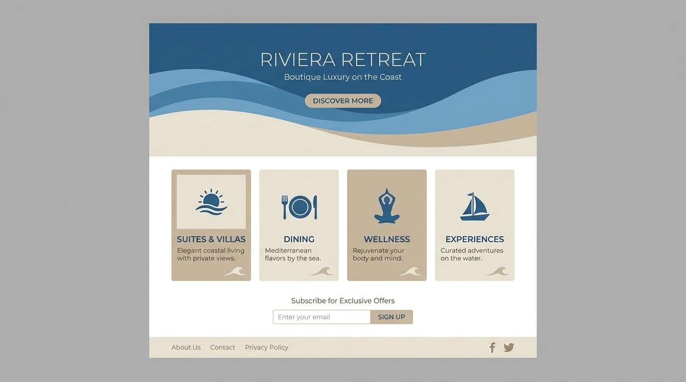
1) Riviera Linen
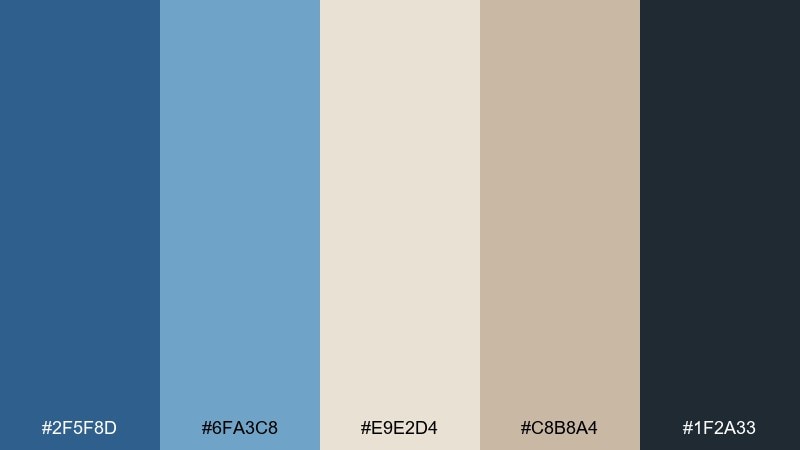
HEX: #2f5f8d #6fa3c8 #e9e2d4 #c8b8a4 #1f2a33
Mood: airy, coastal, refined
Best for: resort landing page UI
Airy coastal calm with sun-bleached linen and a crisp ocean breeze. Use the deep blue as your primary UI anchor, then let the sandy neutrals carry backgrounds and spacing. Pair with thin line icons and generous white space to keep it feeling premium. Tip: reserve the near-black for type only so the blues stay fresh.
Image example of riviera linen generated using media.io
Media.io is an online AI studio for creating and editing video, image, and audio in your browser.

2) Parisian Denim
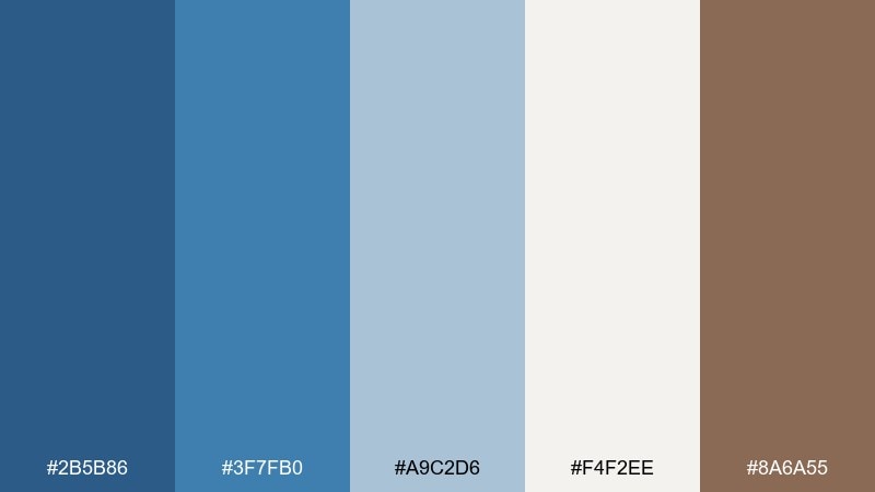
HEX: #2b5b86 #3f7fb0 #a9c2d6 #f4f2ee #8a6a55
Mood: urban, approachable, stylish
Best for: streetwear brand identity
Urban and easygoing, like well-worn denim with a tailored Paris touch. Let the darker blues lead logos and headers, while the pale blue and off-white keep layouts breathable. The warm brown adds a subtle vintage contrast that works great for tags, stitching details, or secondary type. Tip: keep gradients minimal and lean on flat blocks for a modern fashion feel.
Image example of parisian denim generated using media.io
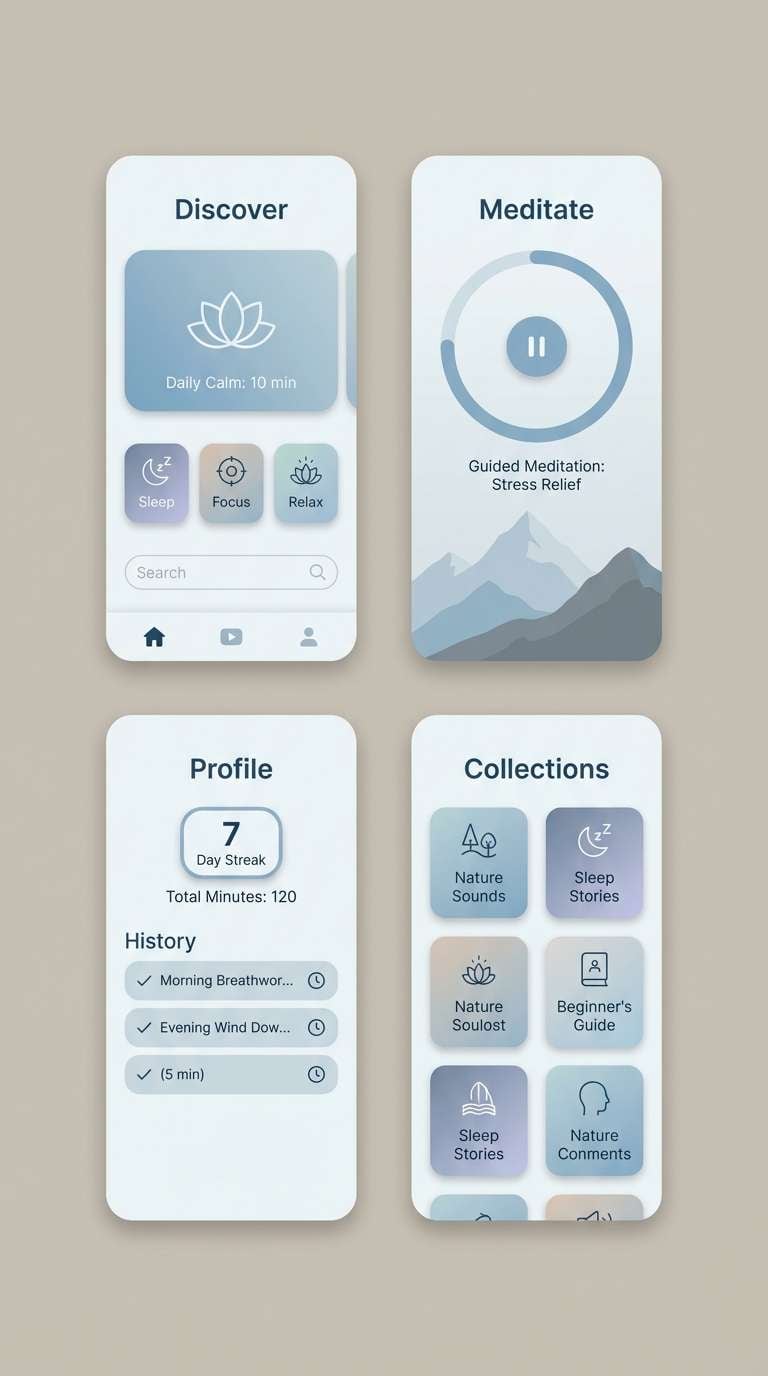
3) Seaside Fog
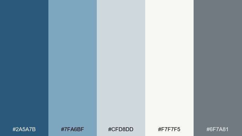
HEX: #2a5a7b #7fa6bf #cfd8dd #f7f7f5 #6f7a81
Mood: misty, quiet, modern
Best for: meditation app UI
Misty and quiet, like early morning air over a calm bay. Use the smoky blue-gray range for soothing screens and subtle states without harsh contrast. Pair the deep blue with soft whites for readable headers and gentle CTA buttons. Tip: lower saturation in illustrations so the interface remains serene.
Image example of seaside fog generated using media.io
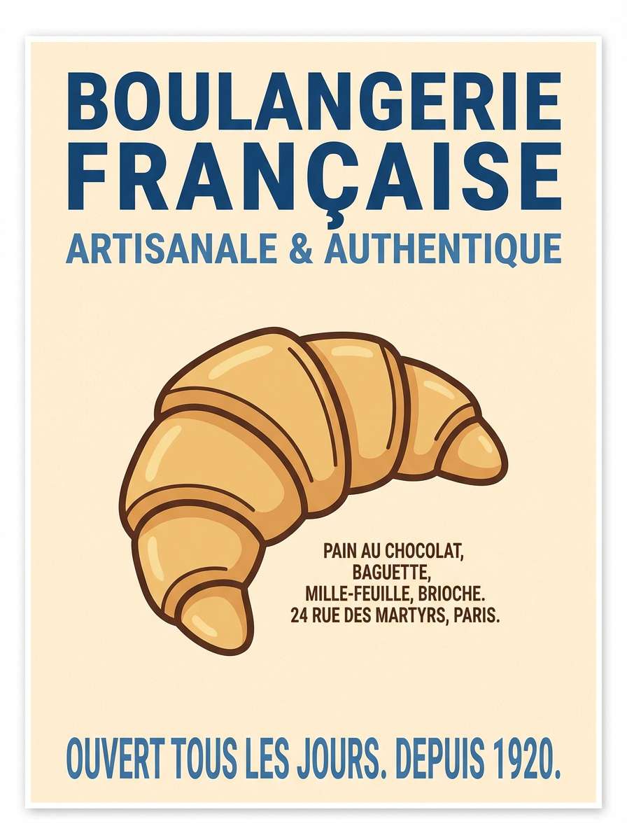
4) Cobalt Croissant
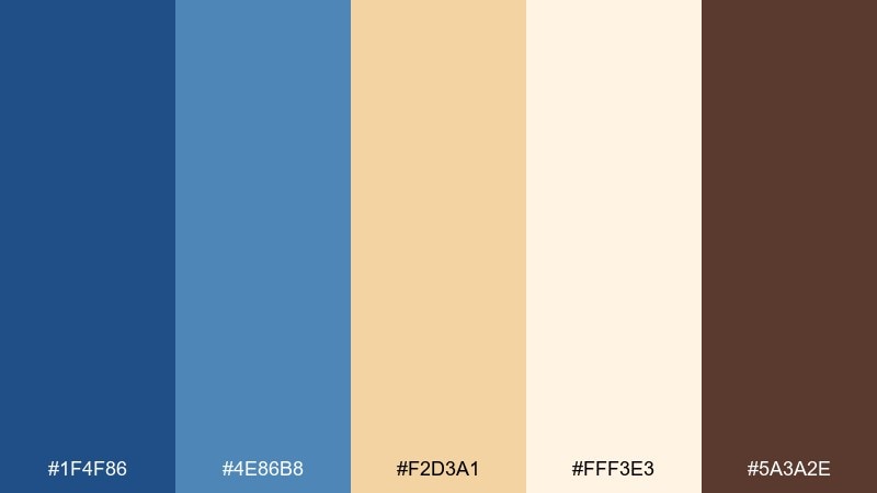
HEX: #1f4f86 #4e86b8 #f2d3a1 #fff3e3 #5a3a2e
Mood: cheerful, cozy, boutique
Best for: bakery poster design
Cheerful and cozy, like a corner bakery with blue tile and warm pastry light. The golden tan and cream make inviting backgrounds, while the cobalt tones add striking contrast for headlines. Pair with friendly serif type and simple illustrated icons for menus and specials. Tip: keep the brown for small accents so it does not muddy the bright warmth.
Image example of cobalt croissant generated using media.io
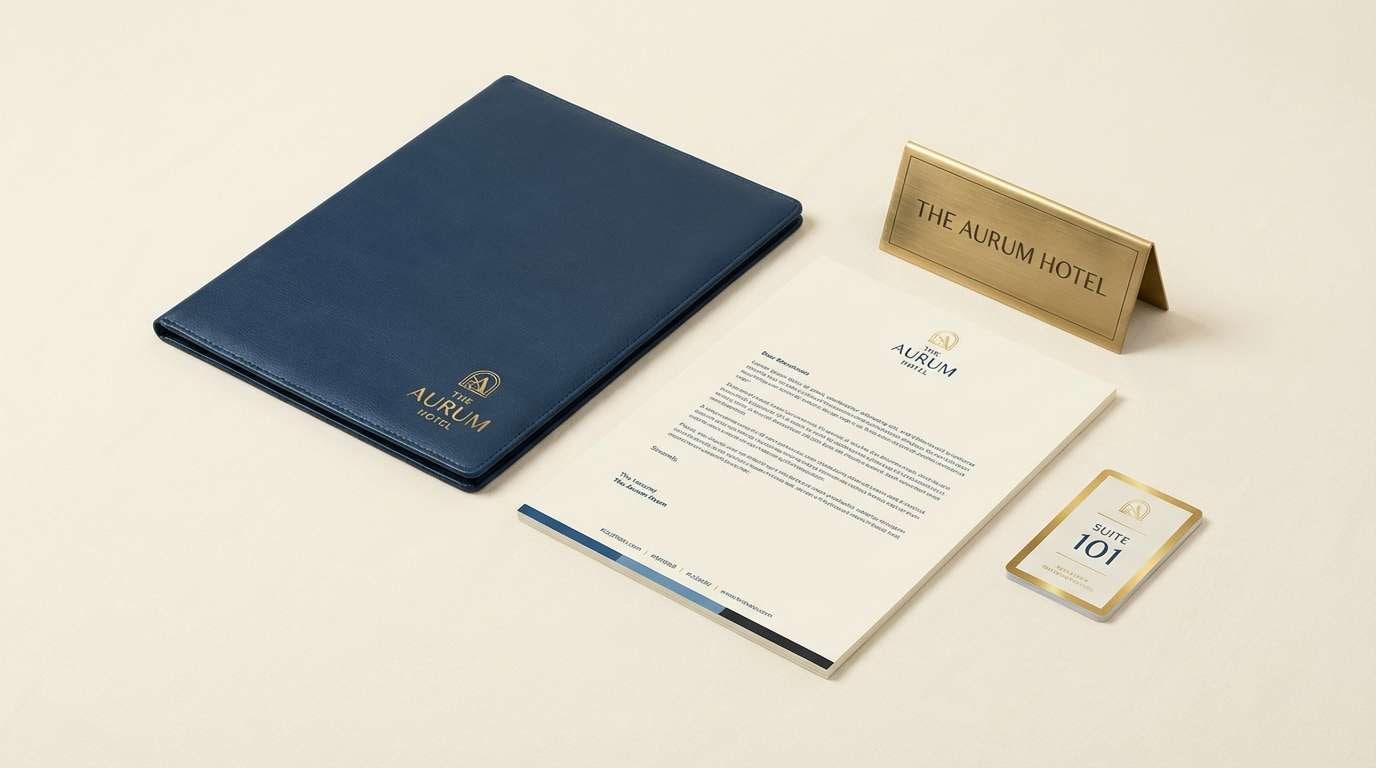
5) Bleu and Brass
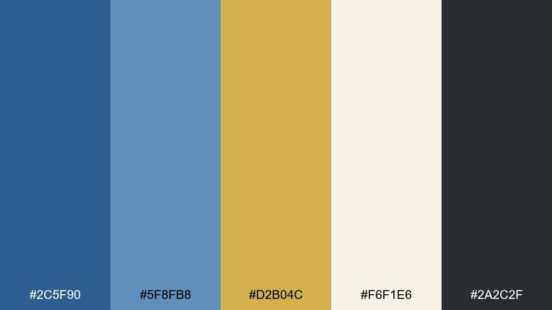
HEX: #2c5f90 #5f8fb8 #d2b04c #f6f1e6 #2a2c2f
Mood: polished, confident, upscale
Best for: luxury hotel branding
Polished and confident, like brass fixtures against painted blue walls. Use the gold as a restrained highlight for seals, dividers, or premium tiers, while the blues handle the brand foundation. Cream keeps collateral elegant and readable, and charcoal sharpens typography. Tip: apply the gold at under 10 percent coverage for a truly luxury feel.
Image example of bleu and brass generated using media.io
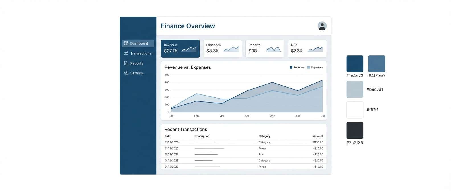
6) Winter Mariner
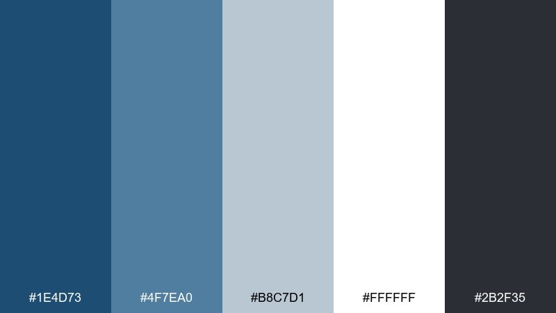
HEX: #1e4d73 #4f7ea0 #b8c7d1 #ffffff #2b2f35
Mood: crisp, nautical, minimal
Best for: finance dashboard UI
Crisp and nautical, like winter light on a harbor with clean lines and sharp air. In a french blue color palette like this, let the darkest tone define navigation and chart axes, while the pale blue-grays keep data panels calm. White space prevents the dashboard from feeling heavy, and charcoal keeps numbers readable. Tip: use the mid-blue for positive states and reserve the dark blue for structure.
Image example of winter mariner generated using media.io
7) Provence Tiles
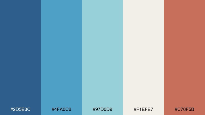
HEX: #2d5e8c #4fa0c6 #97d0d9 #f1efe7 #c76f5b
Mood: sunny, artisanal, lively
Best for: ceramic shop Instagram templates
Sunny and artisanal, like hand-painted tiles in a bright Provençal kitchen. Let the blues and aqua carry patterns and frames, then use the coral as a lively sticker or price highlight. The warm off-white keeps posts readable and avoids a cold wash. Tip: repeat tile motifs in a consistent grid to make the feed feel curated.
Image example of provence tiles generated using media.io
8) Studio Blueprint
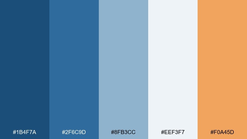
HEX: #1b4f7a #2f6c9d #8fb3cc #eef3f7 #f0a45d
Mood: technical, creative, energetic
Best for: architecture portfolio website
Technical yet creative, like blueprint paper warmed by studio light. Use the deep blue for headers and section anchors, and keep the pale tones for project pages and image captions. The orange accent works best for buttons, hover states, and small callouts without overwhelming the work. Tip: pair with a geometric sans font to reinforce the architectural vibe.
Image example of studio blueprint generated using media.io
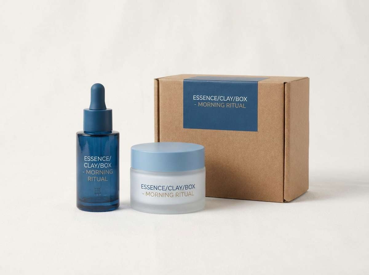
9) Coastal Minimal
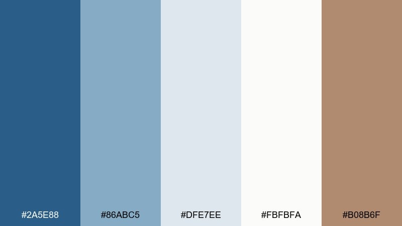
HEX: #2a5e88 #86abc5 #dfe7ee #fbfbfa #b08b6f
Mood: clean, breezy, modern
Best for: skincare packaging
Clean and breezy, like fresh air through sheer curtains. Use the soft blue-gray as the main label field and reserve the deeper blue for product names and key claims. The warm taupe is perfect for small icons or cap color cues to keep the line cohesive. Tip: matte finishes and minimal copy will make the palette feel even more premium.
Image example of coastal minimal generated using media.io
10) Midnight Bateau
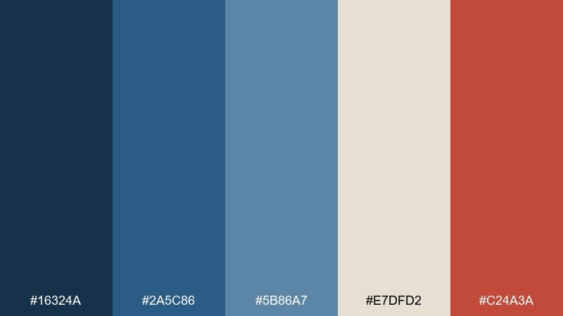
HEX: #16324a #2a5c86 #5b86a7 #e7dfd2 #c24a3a
Mood: moody, cinematic, bold
Best for: film festival flyer
Moody and cinematic, like a late-night boat ride under city lights. Let the near-navy dominate the background for drama, then layer the mid-blues for blocks and type panels. Cream adds a classic paper feel, while the red works best as a single spotlight accent. Tip: keep the red limited to dates and tickets so the layout stays sophisticated.
Image example of midnight bateau generated using media.io

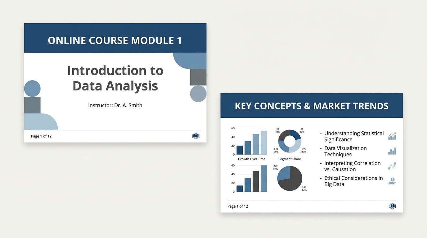
11) Chalk and Indigo
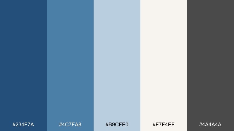
HEX: #234f7a #4c7fa8 #b9cfe0 #f7f4ef #4a4a4a
Mood: soft, academic, calm
Best for: online course slides
Soft and academic, like indigo ink on chalky paper. Use the dark blue for section headers and the light blues for callouts and diagrams. Off-white keeps slides bright, and gray is ideal for secondary annotations and footnotes. Tip: use one accent blue per slide to avoid visual noise in dense lessons.
Image example of chalk and indigo generated using media.io
12) Fleur de Sel
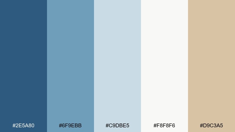
HEX: #2e5a80 #6f9ebb #c9dbe5 #f8f8f6 #d9c3a5
Mood: light, clean, coastal spa
Best for: bath salt product label
Light and clean, like sea salt crystals beside pale blue water. Keep the label mostly off-white and airy, then use the blues for brand blocks and ingredient highlights. The sandy beige supports natural cues without turning the design rustic. Tip: add fine line illustrations in the mid-blue for a delicate, premium finish.
Image example of fleur de sel generated using media.io
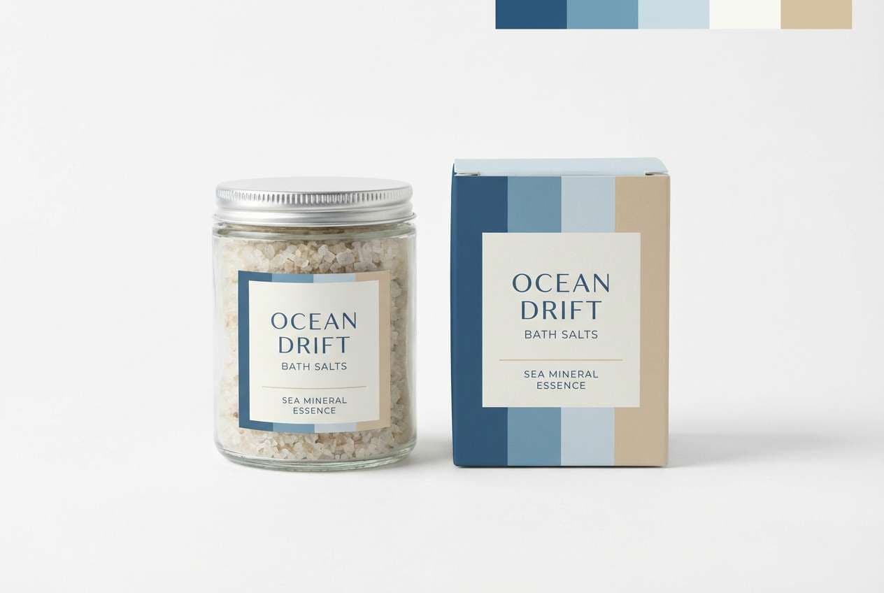
13) Art Deco Canal
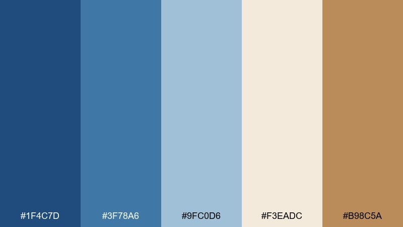
HEX: #1f4c7d #3f78a6 #9fc0d6 #f3eadc #b98c5a
Mood: glamorous, structured, vintage
Best for: event invitation design
Glamorous and structured, like art deco arches reflected on a canal at dusk. Use the deep blue for borders and geometric frames, then layer the lighter blues for pattern fills. Cream and bronze tones bring a refined vintage warmth that pairs well with serif headlines. Tip: emboss or foil the bronze elements to elevate the invite without adding clutter.
Image example of art deco canal generated using media.io
14) Cloudy Harbor
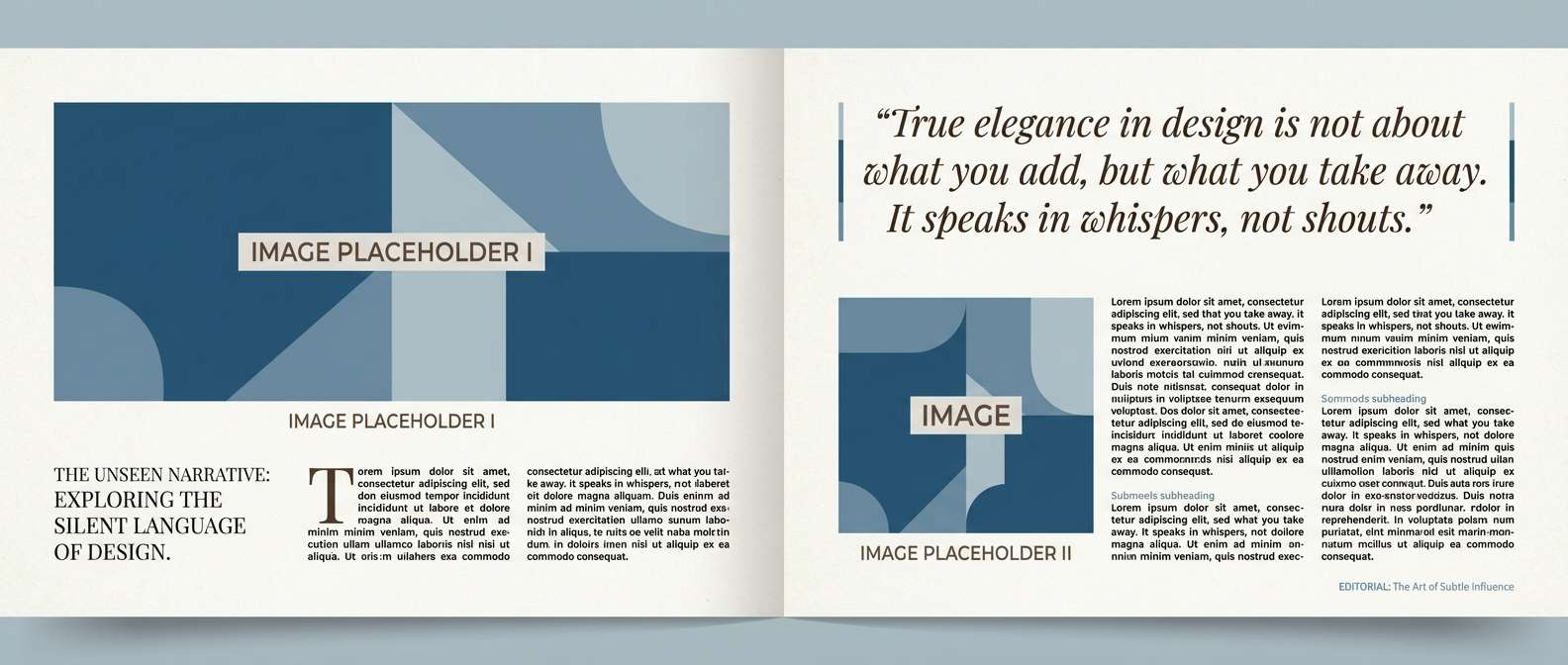
HEX: #2b587a #6c90a8 #aebfca #f0efe9 #7f6a5d
Mood: muted, contemplative, coastal
Best for: editorial magazine layout
Muted and contemplative, like a harbor horizon softened by cloud cover. Use the calm blues for section bands and pull quotes, and let the warm gray-brown ground captions and bylines. The off-white background keeps long reads comfortable and avoids harsh contrast. Tip: choose a restrained photo grade so images blend smoothly with the palette.
Image example of cloudy harbor generated using media.io
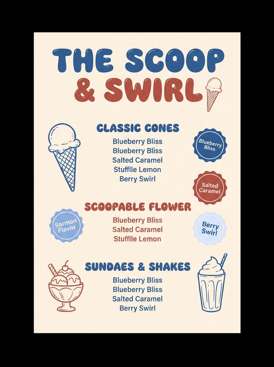
15) Bleuberry Cream
HEX: #2f5e9a #6e98d8 #d7e3ff #fff4ea #b85a4a
Mood: sweet, playful, fresh
Best for: ice cream shop menu
Sweet and playful, like berry swirl against whipped cream. Use the brighter blue for headings and price tags, then soften the layout with creamy backgrounds and pale periwinkle blocks. The warm red-brown works as a cherry-on-top accent for limited flavors or specials. Tip: keep plenty of breathing room so the colors feel light, not candy-heavy.
Image example of bleuberry cream generated using media.io
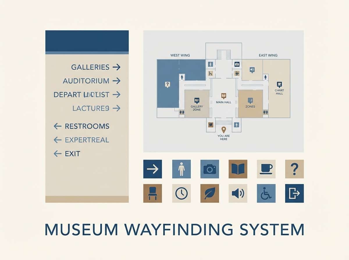
16) Museum Wall
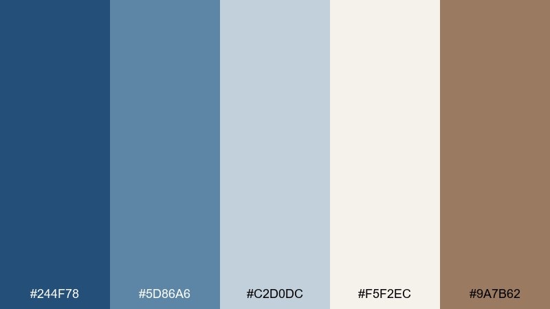
HEX: #244f78 #5d86a6 #c2d0dc #f5f2ec #9a7b62
Mood: quiet, curated, timeless
Best for: gallery wayfinding signage
Quiet and curated, like a softly lit museum corridor with calm blue walls. Use the deep blue for directional headers and the lighter tones for panels and floor-map zones. Warm taupe adds a subtle heritage note that pairs well with classic serif typography. Tip: keep icons monochrome in the darkest blue for crisp readability at distance.
Image example of museum wall generated using media.io
17) Terrace Bistro
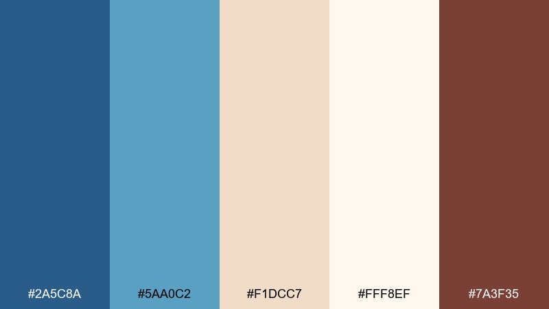
HEX: #2a5c8a #5aa0c2 #f1dcc7 #fff8ef #7a3f35
Mood: warm, social, sunlit
Best for: restaurant website hero
Warm and social, like an afternoon terrace with linen napkins and shaded blue awnings. Use the deep blue for navigation and buttons, and let the peachy neutrals shape the page background and content blocks. The warm brown-red makes a great accent for reservations and special announcements. Tip: pair with food photography that leans golden to match the cozy base tones.
Image example of terrace bistro generated using media.io
18) Alpine Ink
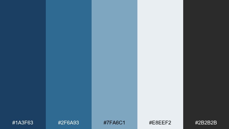
HEX: #1a3f63 #2f6a93 #7fa6c1 #e8eef2 #2b2b2b
Mood: cool, focused, professional
Best for: tech startup pitch deck
Cool and focused, like ink on crisp paper with a mountain-air edge. Use the darkest blue for slide titles and chart frames, then rely on the lighter blues for highlights and supporting shapes. The pale gray-blue background keeps screens bright without looking sterile. Tip: maintain consistent chart color rules so metrics stay easy to scan across slides.
Image example of alpine ink generated using media.io

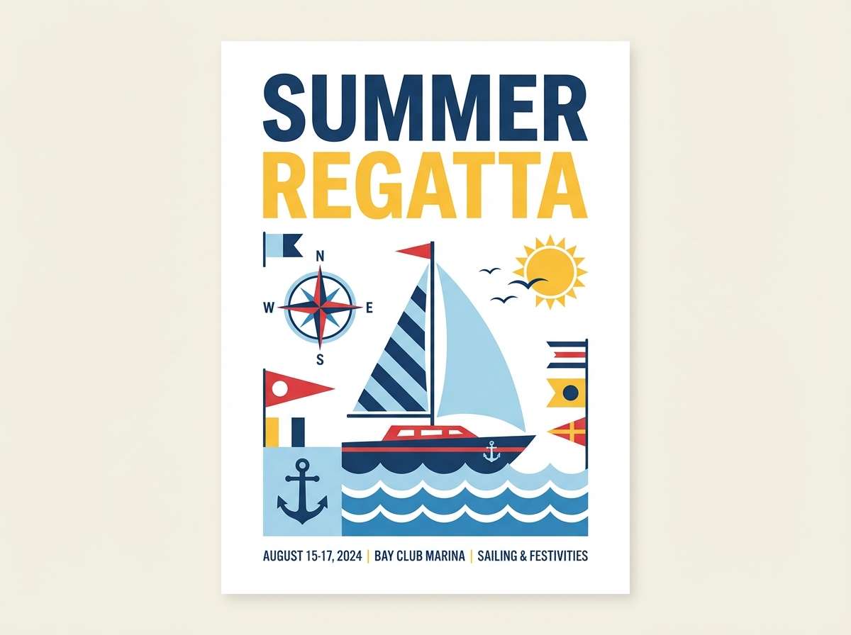
19) Summer Regatta
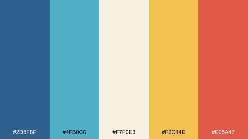
HEX: #2d5f8f #4fb0c6 #f7f0e3 #f2c14e #e05a47
Mood: bright, sporty, optimistic
Best for: sports event poster
Bright and sporty, like sail flags snapping in a sunny breeze. Let the blue lead the layout, then bring in aqua for secondary shapes and motion accents. The yellow and coral deliver energetic highlights for dates, categories, and sponsor callouts. Tip: keep the off-white as the main negative space so the poster stays crisp and readable from afar.
Image example of summer regatta generated using media.io
20) Ink on Parchment
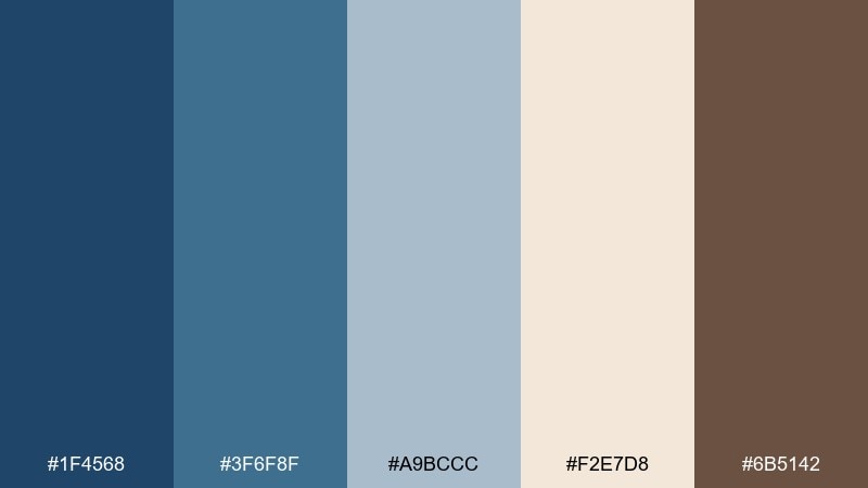
HEX: #1f4568 #3f6f8f #a9bccc #f2e7d8 #6b5142
Mood: heritage, literary, warm
Best for: book cover design
Heritage and literary, like fountain pen ink on aged parchment. Use the darkest blue for title blocks and spine elements, then soften with parchment backgrounds for a classic bookstore feel. The warm brown supports author name treatments and small ornamental rules. Tip: choose a restrained, high-contrast type pairing so the cover reads instantly at thumbnail size.
Image example of ink on parchment generated using media.io
21) Canal Morning
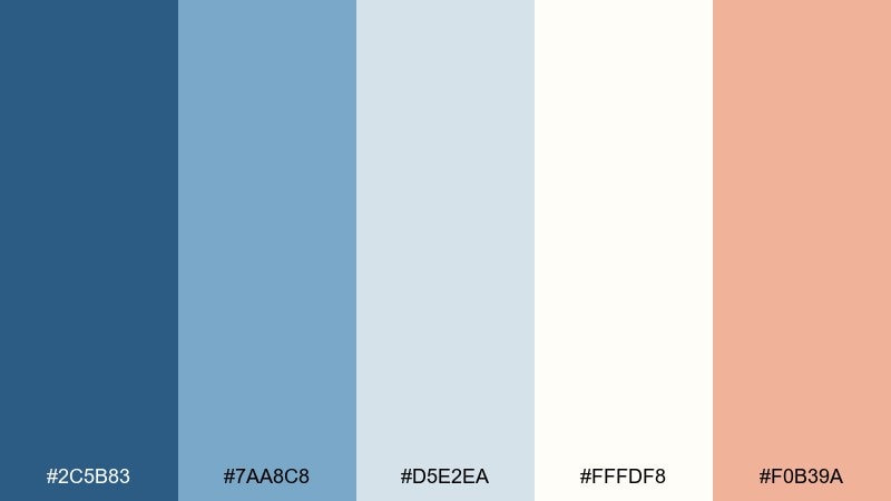
HEX: #2c5b83 #7aa8c8 #d5e2ea #fffdf8 #f0b39a
Mood: fresh, gentle, romantic
Best for: spring wedding invitation suite
Fresh and gentle, like a quiet canal morning with soft light and pastel blooms. Use the powdery blues for borders and monograms, and keep the warm peach as a small floral accent or RSVP highlight. The near-white background keeps the typography airy and formal. Tip: print on lightly textured stock to make the pale tones feel intentional, not washed out.
Image example of canal morning generated using media.io
22) Blue Hour Bistro
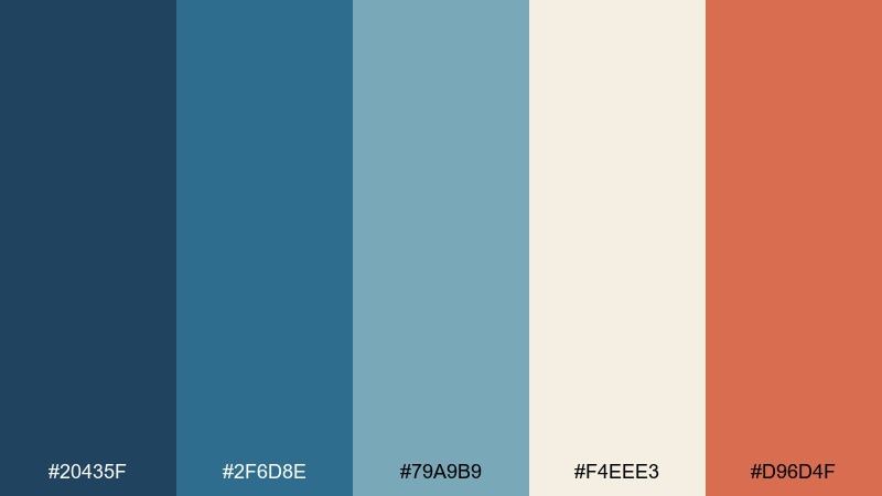
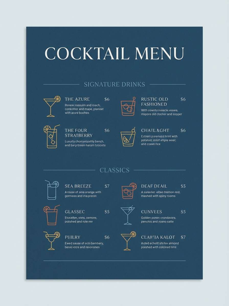
HEX: #20435f #2f6d8e #79a9b9 #f4eee3 #d96d4f
Mood: evening, inviting, atmospheric
Best for: cocktail menu design
Evening and inviting, like the blue hour glow outside a busy bistro window. Let the dark base set a moody backdrop, then use teal-blue for section labels and drink categories. Cream lifts readability, and the warm coral spotlights signature cocktails. Tip: keep iconography simple and use the coral only for top sellers to guide attention.
Image example of blue hour bistro generated using media.io
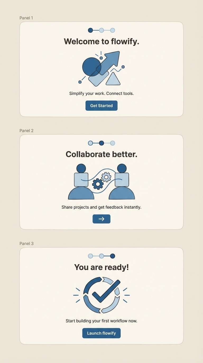
23) Harbor Neutrals
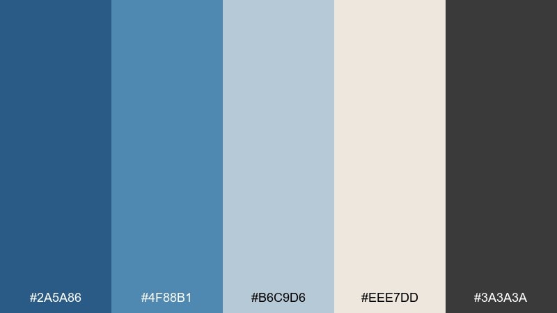
HEX: #2a5a86 #4f88b1 #b6c9d6 #eee7dd #3a3a3a
Mood: balanced, modern, dependable
Best for: SaaS onboarding screens
Balanced and dependable, like a well-organized dock with muted paint and tidy ropes. These french blue color combinations work best when the mid-blue handles primary buttons and progress states, while the pale blue supports cards and helper text. The warm off-white keeps things human, and charcoal ensures accessible contrast. Tip: use the lightest blue for empty states so new users feel guided, not overwhelmed.
Image example of harbor neutrals generated using media.io
What Colors Go Well with French Blue?
French blue pairs naturally with warm neutrals like cream, linen, sand, and parchment. These soften the palette, keep layouts breathable, and make blue feel more “lifestyle” than corporate.
For sharper contrast, combine french blue with charcoal, near-black, or ink gray for typography and UI structure. Add one metallic-style accent (brass/gold) for premium branding, or a warm coral/terracotta for energy.
If you want a cooler, modern feel, lean into blue-grays, pale icy blues, and soft whites. Keep saturation controlled so the palette stays refined instead of sporty.
How to Use a French Blue Color Palette in Real Designs
In UI design, choose one deep french blue for navigation and headings, a mid-blue for primary buttons and active states, and pale blue-grays for cards and backgrounds. This hierarchy keeps interfaces calm while maintaining accessible contrast.
For branding, let french blue own the core identity (logo, wordmark, key visuals), then use a warm accent (brass, tan, coral) sparingly for highlights like seals, tags, or calls to action. Limiting the accent color makes the blue feel more intentional.
In interiors, french blue works best as a wall or cabinetry anchor with warm whites and natural textures. Balance it with wood, beige textiles, and soft black hardware to avoid a cold, overly nautical look.
Create French Blue Palette Visuals with AI
If you’re moodboarding, pitching a client, or testing UI directions, generating quick visuals helps you validate a french blue color scheme before production. With Media.io, you can turn the prompts above into consistent examples in minutes.
Try one palette at a time, then keep the layout constant while swapping colors to compare results. This makes it easy to choose a final direction for branding systems, templates, or product UI.
French Blue Color Palette FAQs
-
What is “french blue” in design?
French blue is typically a medium-to-deep, slightly muted blue that feels refined and classic. It often sits between denim blue and navy, making it versatile for both modern UI and heritage-style branding. -
Is french blue warm or cool?
It’s generally cool, but many french blues have a subtle gray or green undertone that keeps them soft rather than icy. Pairing it with warm neutrals (cream, tan, brass) balances the temperature. -
What accent colors look best with french blue?
Brass/gold for luxury, coral/terracotta for energy, and peachy neutrals for a friendly lifestyle look. For a minimalist style, use charcoal and off-white as your main supporting tones. -
How do I keep french blue palettes from feeling too nautical?
Avoid overusing bright red and pure white together. Swap in cream, parchment, taupe, or muted coral, and use charcoal instead of jet black for a more modern, less “sailor” vibe. -
Which french blue combinations work best for UI?
Look for palettes with a dark anchor blue, a mid-blue for interactive elements, and pale blue-grays for surfaces (cards, panels). Examples above like Winter Mariner, Seaside Fog, and Harbor Neutrals fit this structure well. -
Can I use french blue for luxury branding?
Yes—combine it with cream and a restrained metallic accent (brass/gold) plus charcoal typography. Keep the “gold” coverage low to maintain an upscale, editorial feel. -
How can I generate palette-based mockups quickly?
Use Media.io text-to-image and paste a prompt that names your layout (poster, UI screens, packaging) and includes your five HEX colors. Generate a few variations, then refine typography and composition while keeping the palette consistent.
Next: Old Rose Color Palette


