

Pink violet sits right between playful pink and sophisticated purple, making it one of the most versatile hues for modern design. It can feel soft and romantic, bold and neon, or muted and editorial depending on the tones you pick.
Below are 20 pink violet color palette ideas with HEX codes, plus practical tips for pairing accents and neutrals for branding, UI, weddings, and artwork.
In this article
- Why Pink Violet Palettes Work So Well
-
- rose quartz violet
- berry milkshake
- twilight lilac
- orchid linen
- neon fuchsia night
- plum cocoa
- sakura amethyst
- dusty mauve clay
- lavender fog minimal
- grape soda pop
- vintage boudoir
- cosmic bloom
- peony blush cream
- iris stone
- raspberry truffle
- soft plum ui
- violet rose gold
- mystic garden watercolor
- night orchid contrast
- blush violet neutral
- What Colors Go Well with Pink Violet?
- How to Use a Pink Violet Color Palette in Real Designs
- Create Pink Violet Palette Visuals with AI
Why Pink Violet Palettes Work So Well
Pink violet palettes naturally balance warmth and coolness: pink brings friendliness and approachability, while violet adds depth and a premium feel. That middle-ground makes them flexible across industries, from beauty to SaaS.
They also handle contrast beautifully. You can build soft monochrome layouts with blush and lilac, then anchor readability with deep plum or near-black violet for type, navigation, and key UI states.
Finally, pink violet plays well with modern finishes like gradients, glow effects, and subtle tints. That makes it a go-to choice for contemporary branding systems that need both emotion and structure.
20+ Pink Violet Color Palette Ideas (with HEX Codes)
1) Rose Quartz Violet
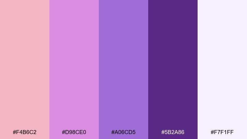
HEX: #F4B6C2 #D98CE0 #A06CD5 #5B2A86 #F7F1FF
Mood: soft, airy, romantic
Best for: beauty branding and gentle hero banners
Soft and luminous like rose petals under evening light, these tones feel calm and inviting. Use the pale blush and lilac as the base, then lean on deep violet for headlines and contrast. It shines on skincare, wellness, and boutique branding paired with warm white backgrounds and minimal typography. Tip: keep shadows subtle and let the darkest purple do the readability work.
Image example of rose quartz violet generated using media.io
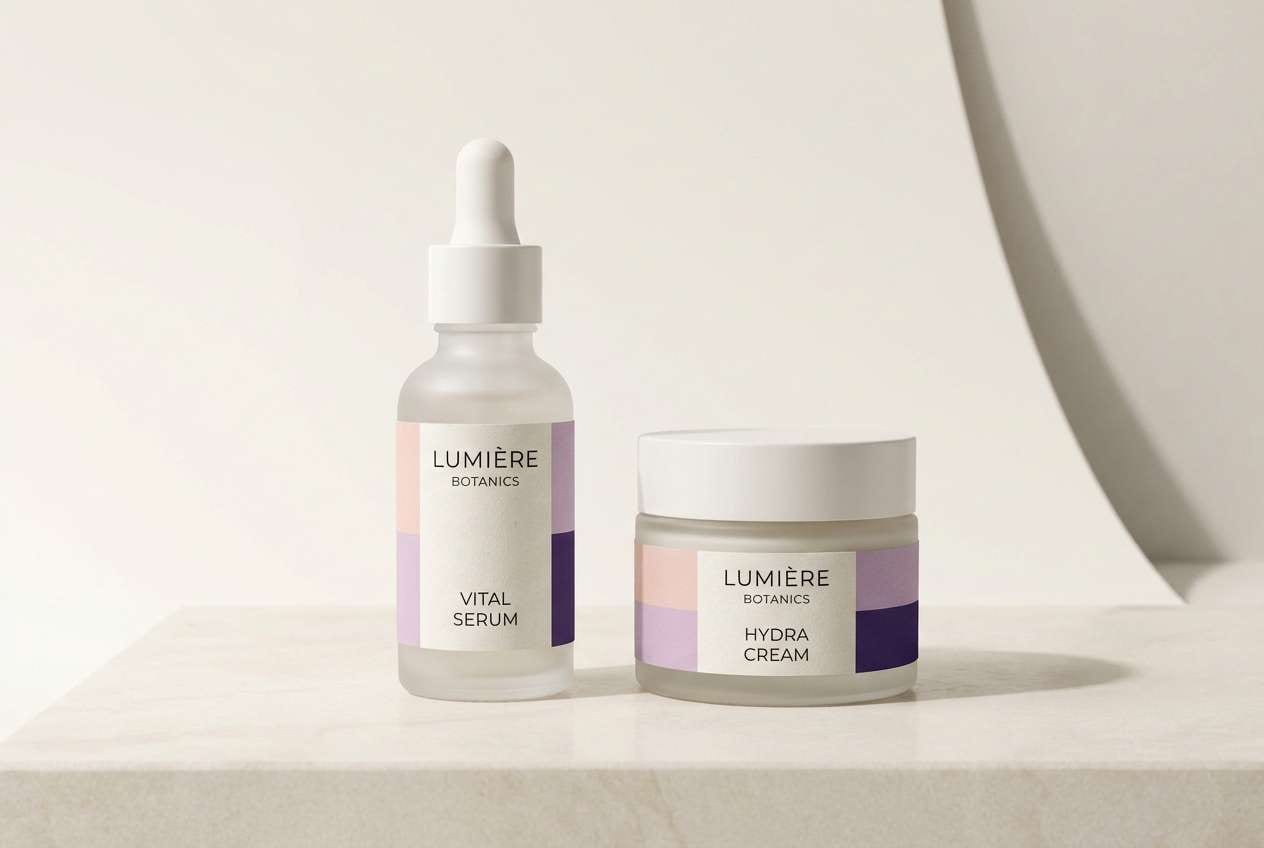
Media.io is an online AI studio for creating and editing video, image, and audio in your browser.

2) Berry Milkshake
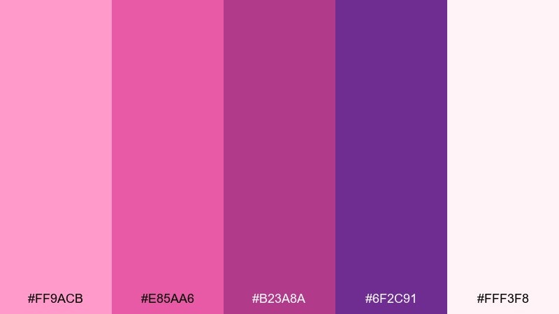
HEX: #FF9ACB #E85AA6 #B23A8A #6F2C91 #FFF3F8
Mood: playful, sweet, energetic
Best for: social posts and creator merch
Bright and candy-like, this mix feels like berry syrup swirled into whipped cream. Let the hot pink lead for buttons and calls to action, with creamy off white as breathing room. It works well for playful merch graphics, stickers, and punchy carousel posts when paired with simple black text for clarity. Tip: reserve the darkest purple for outlines so the lighter pinks stay vibrant.
Image example of berry milkshake generated using media.io
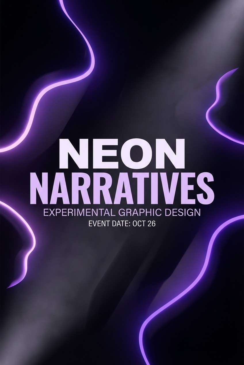
3) Twilight Lilac
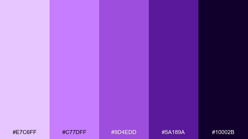
HEX: #E7C6FF #C77DFF #9D4EDD #5A189A #10002B
Mood: mysterious, dreamy, cinematic
Best for: music covers and night event posters
Moody and cinematic like twilight over a city skyline, these purples bring instant drama. The deep near-black gives a premium stage for glowing lilac highlights and gradients. This pink violet color palette fits concert artwork, club flyers, and album covers when you keep type large and high-contrast. Tip: use a soft glow around the lighter tones to amplify the night vibe without adding extra colors.
Image example of twilight lilac generated using media.io
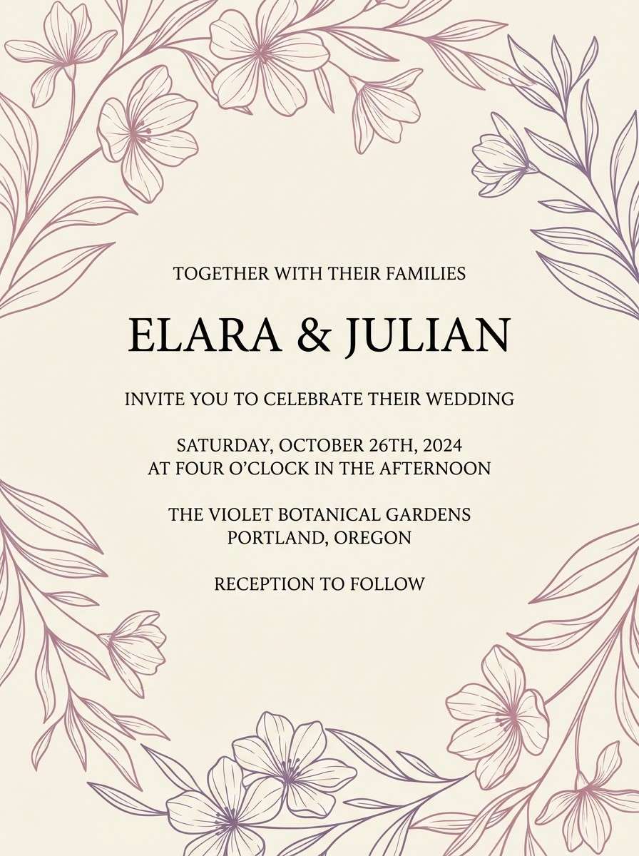
4) Orchid Linen
HEX: #F2D7EE #D4A5D6 #B565A7 #7D5BA6 #F8F4F0
Mood: elegant, calm, boutique
Best for: wedding stationery and invitations
Elegant and powdery like orchids on fresh linen, this palette feels refined and timeless. Use the creamy neutrals for the page and let mauve and violet carry borders, monograms, and floral details. It is ideal for invitations, menus, and thank-you cards with serif type and thin line art. Tip: print the darker purple slightly lighter than screen to keep the look soft and romantic.
Image example of orchid linen generated using media.io
5) Neon Fuchsia Night
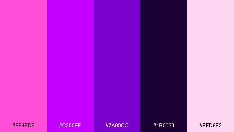
HEX: #FF4FD8 #C300FF #7A00CC #1B0033 #FFD6F2
Mood: bold, electric, nightlife
Best for: tech promos and party banners
Electric and high-voltage, these neon tones feel like club lights cutting through midnight. Let the deep purple act as the canvas, then bring in fuchsia for key shapes and animated accents. Great for tech promos, gaming announcements, and party banners where you want instant pop without clutter. Tip: keep text mostly white and use neon only for emphasis to avoid eye fatigue.
Image example of neon fuchsia night generated using media.io

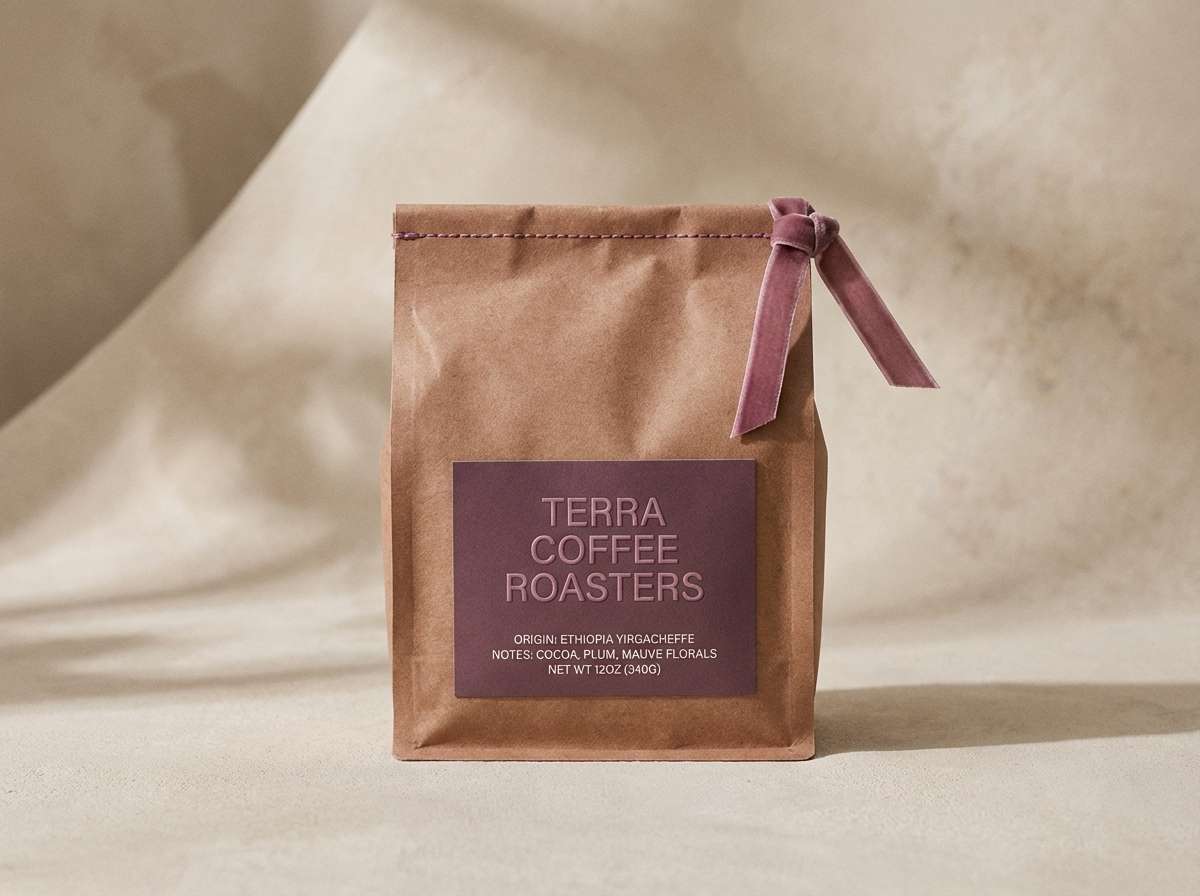
6) Plum Cocoa
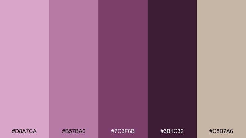
HEX: #D8A7CA #B57BA6 #7C3F6B #3B1C32 #C8B7A6
Mood: cozy, mature, artisanal
Best for: cafe packaging and handmade labels
Cozy and grounded like plum jam and cocoa powder, this set leans warm and artisanal. Use the tan as a natural base and layer mauve and plum for labels, badges, and small illustrations. It fits candle brands, coffee packaging, and handmade product tags paired with textured paper and simple icons. Tip: use the darkest shade for thin rules and micro text to keep everything legible on kraft-like backgrounds.
Image example of plum cocoa generated using media.io
7) Sakura Amethyst
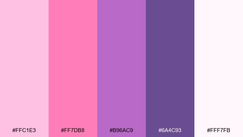
HEX: #FFC1E3 #FF7DB8 #B96AC9 #6A4C93 #FFF7FB
Mood: fresh, youthful, romantic
Best for: spring campaigns and lifestyle ads
Fresh and optimistic like cherry blossoms with a gemstone twist, these hues feel lively without being loud. For pink violet color combinations that stay modern, use the pale blush for space, hot pink for focal elements, and amethyst for structure. It is perfect for spring sales, lifestyle ads, and playful landing pages paired with clean grids and rounded shapes. Tip: keep gradients subtle so the look stays crisp rather than sugary.
Image example of sakura amethyst generated using media.io
8) Dusty Mauve Clay
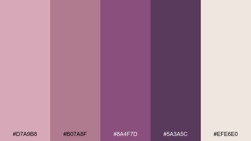
HEX: #D7A9B8 #B07A8F #8A4F7D #5A3A5C #EFE6E0
Mood: muted, earthy, sophisticated
Best for: interior mood boards and slow living blogs
Muted and earthy like dried flowers and clay ceramics, this mix feels calm and lived-in. Use the off-white and dusty pink for backgrounds, then add the deeper mauve for headings and dividers. It suits interior mood boards, slow living blogs, and editorial collages with warm photography. Tip: pair with natural textures like linen and matte paper to keep the palette believable.
Image example of dusty mauve clay generated using media.io
9) Lavender Fog Minimal
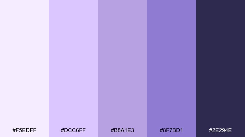
HEX: #F5EDFF #DCC6FF #B8A1E3 #8F7BD1 #2E294E
Mood: minimal, serene, modern
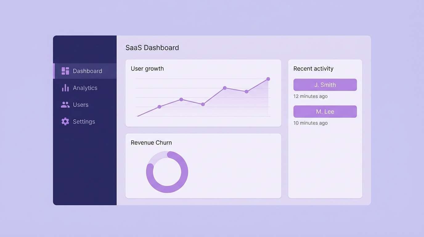
Best for: SaaS dashboards and onboarding UI
Serene and airy like fog over lavender fields, these tones create a clean, modern calm. Use the pale lavender as the canvas and keep the dark indigo for navigation and key labels. It is a strong option for dashboards, onboarding flows, and settings screens where you want softness without losing contrast. Tip: limit saturated elements to one primary button color so the UI stays quiet and readable.
Image example of lavender fog minimal generated using media.io
10) Grape Soda Pop
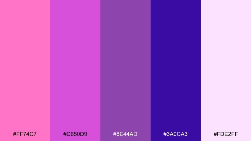
HEX: #FF74C7 #D650D9 #8E44AD #3A0CA3 #FDE2FF
Mood: fun, glossy, pop culture
Best for: stream overlays and gaming thumbnails
Glossy and fun like grape soda fizz, this palette feels fast and youthful. Use the bright pink for highlights and the cobalt-leaning purple for deep contrast in titles. It works best in streaming overlays, gaming thumbnails, and bold announcement graphics paired with thick type and simple icons. Tip: add generous padding around text so the saturated colors do not crowd the message.
Image example of grape soda pop generated using media.io
11) Vintage Boudoir
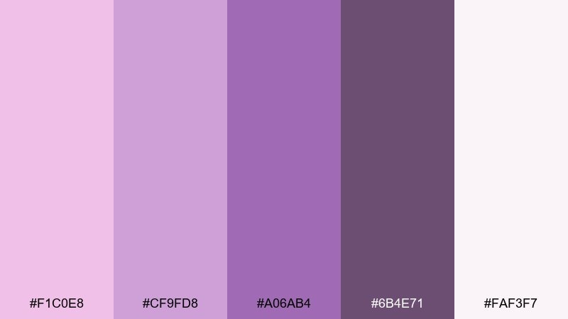
HEX: #F1C0E8 #CF9FD8 #A06AB4 #6B4E71 #FAF3F7
Mood: vintage, soft, intimate
Best for: boutique lookbooks and feminine editorials
Vintage and intimate like a softly lit dressing room, these mauves feel quietly luxurious. Build layouts with the warm off-white and dusty lilac, then use the smoky purple for captions and pull quotes. It fits boutique lookbooks, lingerie editorials, and gentle storytelling pages where elegance matters more than contrast. Tip: choose a slightly warm black for text instead of pure black to keep the mood cohesive.
Image example of vintage boudoir generated using media.io
12) Cosmic Bloom
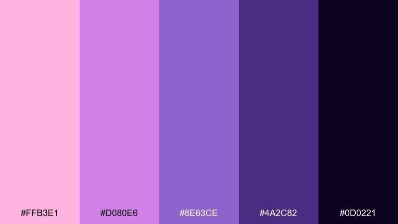
HEX: #FFB3E1 #D080E6 #8E63CE #4A2C82 #0D0221
Mood: cosmic, bold, imaginative
Best for: festival posters and creative branding
Cosmic and imaginative like a bloom floating in space, these hues balance sweetness with depth. The near-black base makes the pink and violet glow, especially in gradients and soft grain textures. It is ideal for festival posters, creative studios, and expressive brand moments where you want impact and artistry. Tip: keep the accent pink to one or two hero elements so the composition stays focused.
Image example of cosmic bloom generated using media.io

13) Peony Blush Cream
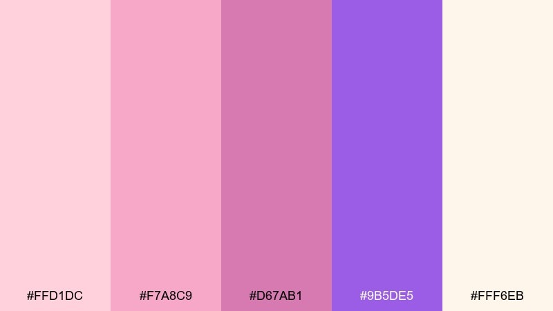
HEX: #FFD1DC #F7A8C9 #D67AB1 #9B5DE5 #FFF6EB
Mood: warm, gentle, optimistic
Best for: baby shower invites and soft promos
Warm and gentle like peonies against whipped cream, this mix feels comforting and sweet. Use the cream and blush as the foundation, then add the violet as a crisp accent for names, dates, and key details. It is great for baby shower invites, soft promos, and community event graphics with rounded illustration styles. Tip: keep line art in the mid magenta so it stays visible without looking harsh.
Image example of peony blush cream generated using media.io
14) Iris Stone
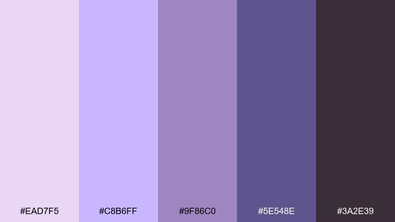
HEX: #EAD7F5 #C8B6FF #9F86C0 #5E548E #3A2E39
Mood: balanced, modern, grounded
Best for: architectural presentations and portfolios
Balanced and grounded like iris petals against cool stone, this set feels professional without going cold. Use the light lilac as a background tint, then rely on slate-like purples for structure and hierarchy. It is a smart fit for portfolio websites, architecture decks, and proposal templates where you want a subtle signature color. Tip: keep charts and icons in the mid purple so the darkest tone can be saved for headings.
Image example of iris stone generated using media.io
15) Raspberry Truffle
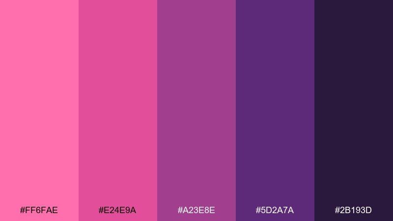
HEX: #FF6FAE #E24E9A #A23E8E #5D2A7A #2B193D
Mood: rich, confident, luxe
Best for: cosmetics launches and premium ads
Rich and indulgent like raspberry truffles, this palette feels luxe and confident. Build contrast with the deep plum background, then layer saturated pinks for product highlights and key offers. It excels in premium cosmetics launches, beauty ads, and bold packaging paired with glossy finishes or metallic foils. Tip: use the brightest pink sparingly as a spotlight color to keep the look expensive.
Image example of raspberry truffle generated using media.io
16) Soft Plum UI
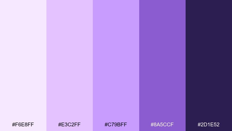
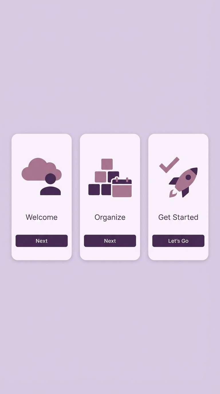
HEX: #F6E8FF #E3C2FF #C79BFF #8A5CCF #2D1E52
Mood: friendly, polished, approachable
Best for: mobile app onboarding screens
Friendly and polished like soft velvet, these purples make interfaces feel welcoming. Use the palest tint for screens and cards, then let the saturated plum anchor primary actions and active states. It is ideal for onboarding, login flows, and productivity apps when paired with simple icons and plenty of whitespace. Tip: test contrast for accessibility and reserve the darkest shade for text on light backgrounds.
Image example of soft plum ui generated using media.io
17) Violet Rose Gold
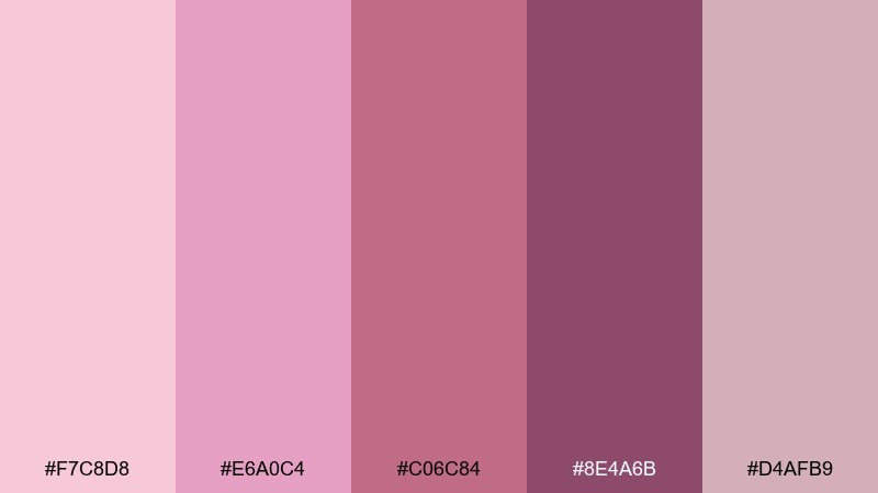
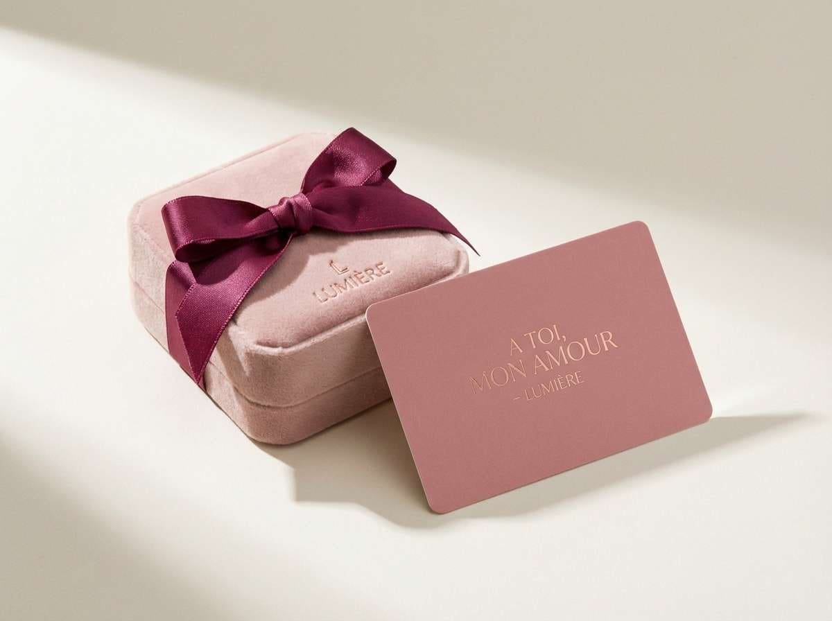
HEX: #F7C8D8 #E6A0C4 #C06C84 #8E4A6B #D4AFB9
Mood: romantic, refined, subtly glam
Best for: jewelry branding and gift cards
Romantic and subtly glam, these tones evoke rose gold metal and velvety petals. Use blush and dusty rose for backgrounds and packaging, then bring in the deeper berry shades for logos and fine details. It suits jewelry brands, gift cards, and premium membership designs paired with thin lines and plenty of negative space. Tip: combine with warm gray or ivory paper stock for a more expensive finish.
Image example of violet rose gold generated using media.io
18) Mystic Garden Watercolor
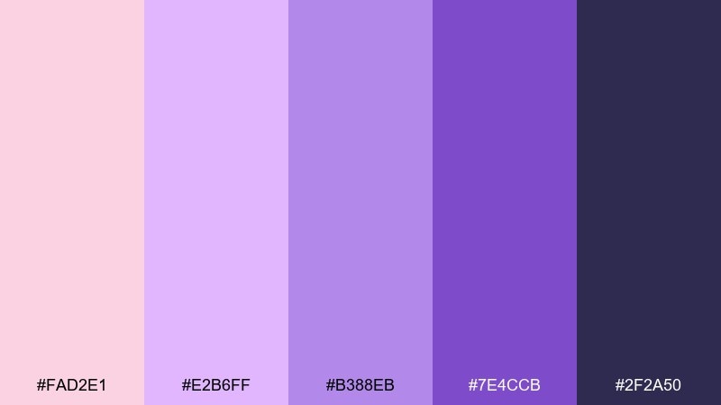
HEX: #FAD2E1 #E2B6FF #B388EB #7E4CCB #2F2A50
Mood: whimsical, botanical, artistic
Best for: spring illustrations and packaging art
Whimsical and botanical, these shades feel like watercolor blooms in a twilight garden. Let blush and lavender wash across large areas, then add saturated violet for stems, outlines, and focal petals. It is ideal for illustrated packaging, greeting cards, and seasonal artwork where softness matters. Tip: keep the darkest tone to small details so the painting stays light and airy.
Image example of mystic garden watercolor generated using media.io
19) Night Orchid Contrast
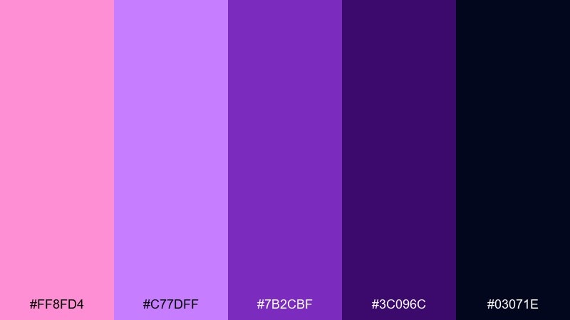
HEX: #FF8FD4 #C77DFF #7B2CBF #3C096C #03071E
Mood: dramatic, modern, high contrast
Best for: brand headers and bold landing pages
Dramatic and modern, this contrast-forward set feels like orchids glowing against a night sky. Use the dark base for hero sections and navigation, then bring in bright pink and lilac for highlights and interactive states. It supports bold typography, clean layouts, and sharp icon sets without looking harsh. Tip: keep gradients directional and consistent so the design looks intentional, not chaotic.
Image example of night orchid contrast generated using media.io

20) Blush Violet Neutral
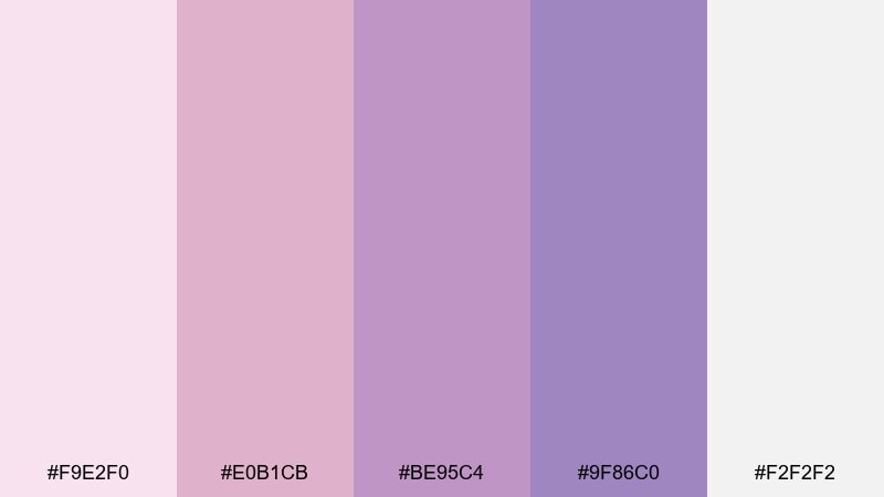
HEX: #F9E2F0 #E0B1CB #BE95C4 #9F86C0 #F2F2F2
Mood: clean, soft, versatile
Best for: presentation templates and calm blogs
Clean and versatile like a cashmere sweater, these blush-to-violet neutrals feel effortless. For pink violet color combinations that stay flexible, lean on the light grays for structure and use the mid violets for emphasis. It works beautifully in presentation templates, calm blog themes, and service-based websites with lots of text. Tip: add one dark neutral for body copy if your layout is text-heavy, keeping the palette tones for accents.
Image example of blush violet neutral generated using media.io
What Colors Go Well with Pink Violet?
Neutrals are the easiest win: warm white, cream, light gray, and charcoal let pink violet feel intentional rather than overwhelming. For text-heavy layouts, use a deep neutral (charcoal or near-black violet) for readability and keep pink violet as accents.
For fresher contrast, pair pink violet with cool blues (like cornflower blue), periwinkle, or icy lavender. This creates a modern, slightly futuristic look that works well for UI, tech promos, and gradients.
If you want warmth, add soft tans, cocoa browns, or muted gold/rose-gold tones. These combinations feel artisanal and premium—great for packaging, weddings, and boutique branding.
How to Use a Pink Violet Color Palette in Real Designs
Start with roles instead of picking favorites: choose one light base (background), one mid tone (surfaces/cards), one strong accent (CTA/buttons), and one dark anchor (text/nav). Pink violet palettes work best when the darkest shade does the heavy lifting for contrast.
Keep saturation under control by limiting “loud” colors to small areas. In many designs, a single hot pink or neon fuchsia is enough for emphasis, while lilac, mauve, and warm whites provide balance.
For print, test how violets shift on paper: deep purples can print darker than expected, and light lilacs can wash out. Slightly lifting shadows and using off-white stock often preserves the soft, romantic mood.
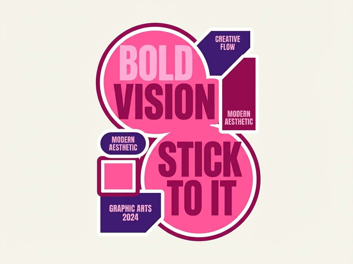
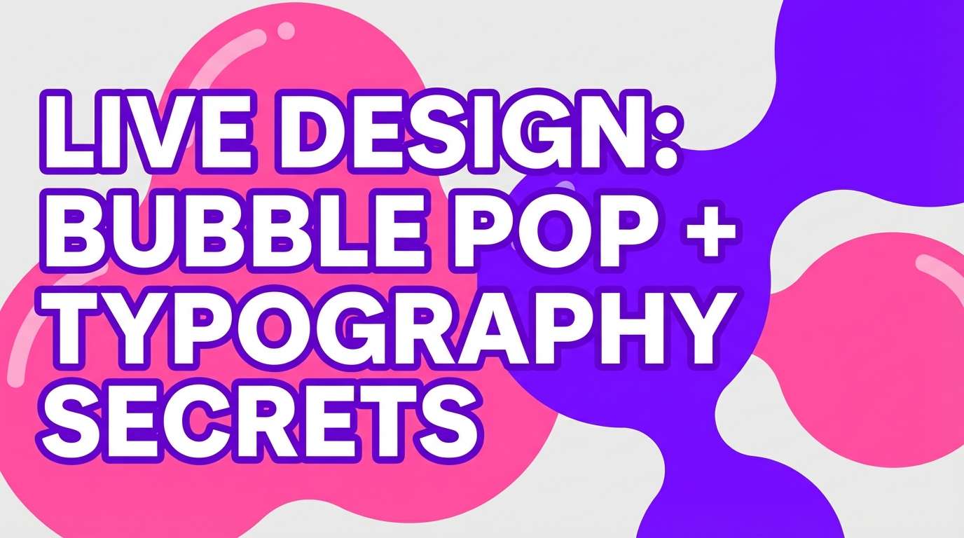
Create Pink Violet Palette Visuals with AI
If you want to preview how a pink violet palette looks in a real scene (packaging, UI mockups, posters, or invitations), generating a quick concept image can save hours. It’s also a great way to test contrast, mood, and composition before final design production.
With Media.io text-to-image, you can paste a prompt (like the ones above), adjust the aspect ratio, and create consistent variations for brand kits, hero banners, and social posts.
Pink Violet Color Palette FAQs
-
What is a pink violet color palette?
A pink violet palette is a curated set of colors that blends pink-leaning tones (blush, fuchsia, rose) with violet/purple tones (lilac, orchid, plum) plus supporting neutrals. It’s used to keep designs consistent across branding, UI, and print. -
Is pink violet more pink or more purple?
It depends on the mix: adding more red/pink creates magenta and fuchsia vibes, while adding more blue pushes it toward lilac and amethyst. Most “pink violet” schemes sit in the middle to balance warmth and depth. -
What neutral colors pair best with pink violet?
Warm white, cream, light gray, and charcoal are the most reliable choices. They soften the palette while protecting readability, especially when pink violet is used for buttons, headings, or illustrations. -
How do I keep a pink violet design from feeling too sweet?
Use a dark anchor (deep plum/near-black violet) for typography and structure, and reduce the amount of hot pink. Adding cool elements like indigo or slate purple also makes the overall feel more modern and less sugary. -
Are pink violet palettes good for UI and apps?
Yes—especially softer, lavender-leaning sets. The key is accessibility: ensure sufficient contrast for text and interactive components, and reserve the most saturated pinks for primary actions or highlights. -
What accent colors make pink violet pop?
Bright white for crisp contrast, deep indigo for structure, and cool blues (like cornflower blue) for a modern complementary twist. Metallic-inspired accents (rose gold, muted gold) also add a premium finish for branding and print. -
Can I generate pink violet palette mockups with AI?
Yes. You can use Media.io’s text-to-image tool to generate posters, packaging scenes, UI mockups, and invitation concepts using prompts, then iterate quickly by changing mood words and aspect ratios.


