

Cornflower blue sits right in the sweet spot between calm and energetic, making it a go-to for modern brand palettes, friendly UI themes, and airy print designs.
Below are 23 cornflower blue color palette ideas with HEX codes, plus practical guidance on what to pair with this blue so your designs feel balanced and intentional.
In this article
- Why Cornflower Blue Palettes Work So Well
-
- coastal breeze
- vintage porcelain
- neon arcade
- dusty denim
- garden party
- midnight observatory
- nordic minimal
- sunset citrus
- soft nursery
- art deco hotel
- mountain lake
- tech gradient
- linen and lace
- comic pop
- spa serenity
- academic library
- tropical surf
- winter frost
- clay studio
- galactic iris
- café blue hour
- clean clinical
- mustard accent classic
- What Colors Go Well with Cornflower Blue?
- How to Use a Cornflower Blue Color Palette in Real Designs
- Create Cornflower Blue Palette Visuals with AI
Why Cornflower Blue Palettes Work So Well
Cornflower blue feels clean, open, and optimistic, so it naturally supports clarity in layouts—from landing pages to posters. It’s bright enough to feel modern, but softer than pure primary blue, which helps it stay approachable.
It also plays well with both warm and cool companions. Pair it with creams and beiges for an airy editorial look, or add deep navy/charcoal for contrast and readability that holds up in UI and print.
Most importantly, cornflower blue is flexible: it can be the hero color, a calm surface color, or an accent—depending on how much saturation and contrast you use around it.
20+ Cornflower Blue Color Palette Ideas (with HEX Codes)
1) Coastal Breeze
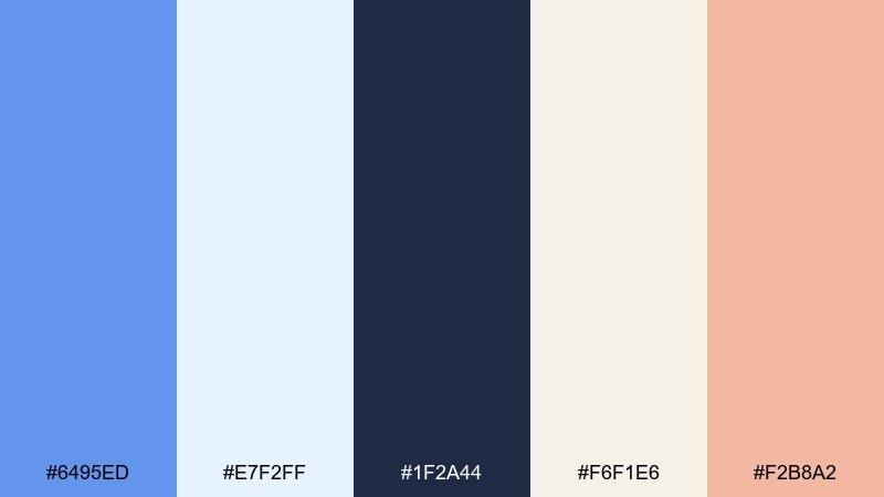
HEX: #6495ed #e7f2ff #1f2a44 #f6f1e6 #f2b8a2
Mood: fresh and airy
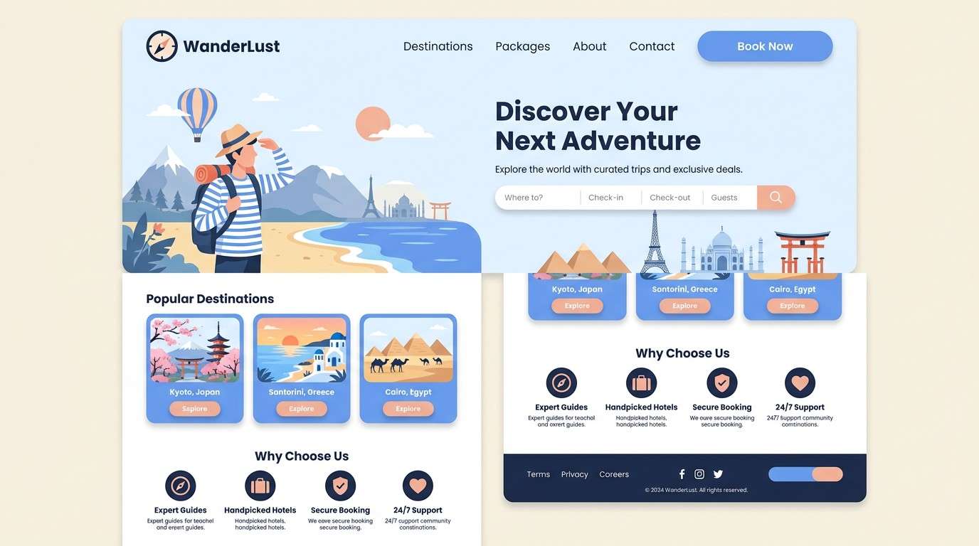
Best for: travel landing page UI
Fresh and airy like sea mist over a bright shoreline, these tones keep the page feeling open and optimistic. Use the light blue and cream as your base, then anchor layouts with deep navy for readability. This cornflower blue color palette pairs especially well with soft peach accents for buttons and micro-highlights. Tip: keep peach to small UI moments so the blues stay in control.
Image example of coastal breeze generated using media.io
Media.io is an online AI studio for creating and editing video, image, and audio in your browser.

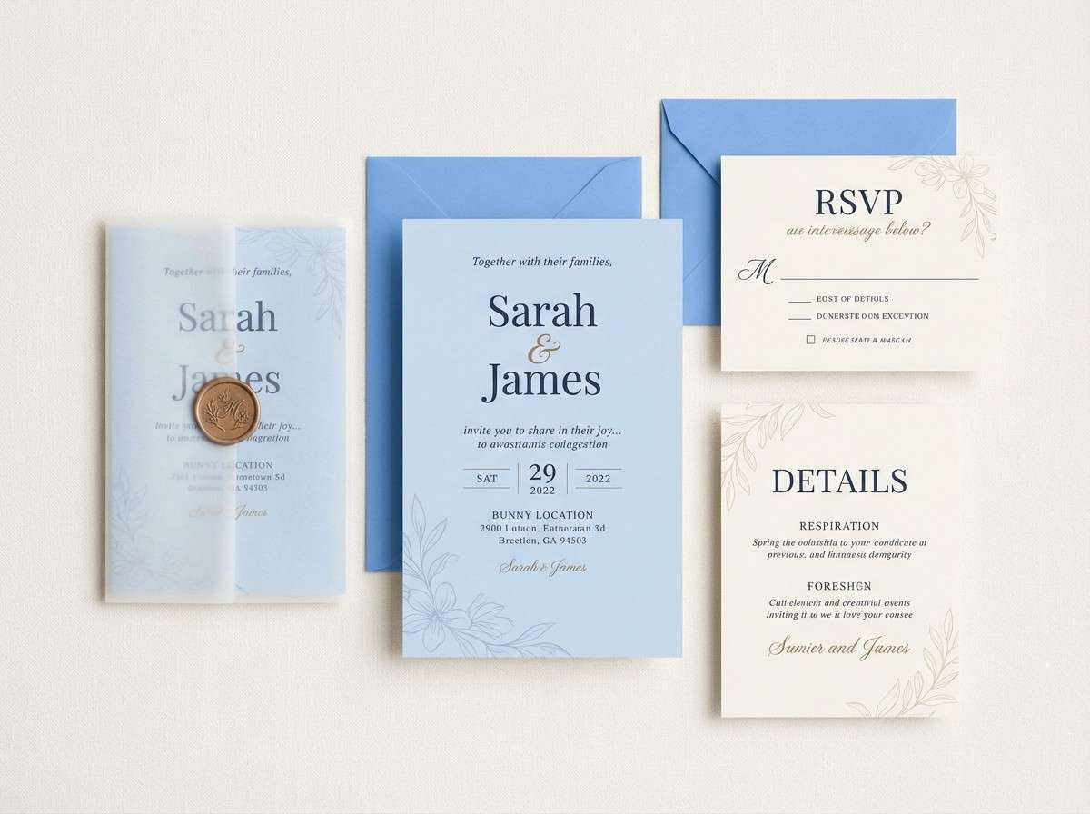
2) Vintage Porcelain
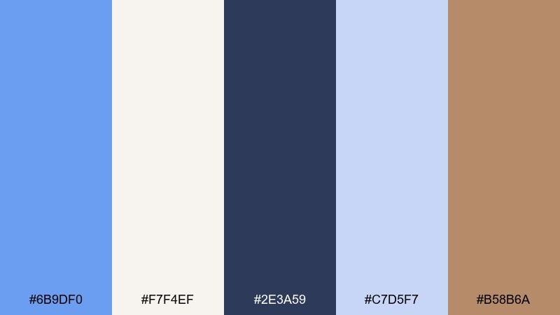
HEX: #6b9df0 #f7f4ef #2e3a59 #c7d5f7 #b58b6a
Mood: classic and refined
Best for: wedding invitation suite
Classic and refined, like painted porcelain with a gentle blue glaze and warm antique edges. Let the ivory and pale blue handle most of the paper space, then add navy for headings and monograms. The warm tan works best as a thin border or wax-seal accent. Tip: print on uncoated stock to keep the vintage softness.
Image example of vintage porcelain generated using media.io
3) Neon Arcade
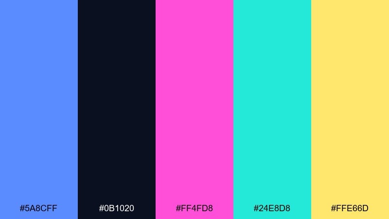
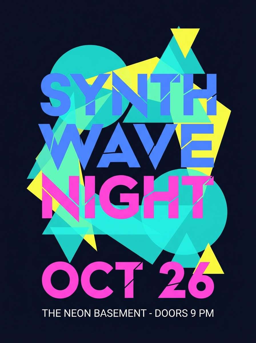
HEX: #5a8cff #0b1020 #ff4fd8 #24e8d8 #ffe66d
Mood: electric and playful
Best for: music event poster
Electric and playful, it feels like arcade lights bouncing off glossy tiles at midnight. Use the deep near-black to make the brights pop, then let the blue carry the headline blocks. Keep magenta and aqua as competing highlights, not equal backgrounds. Tip: add plenty of negative space so the neon stays crisp instead of chaotic.
Image example of neon arcade generated using media.io
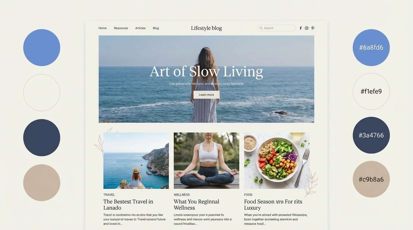
4) Dusty Denim
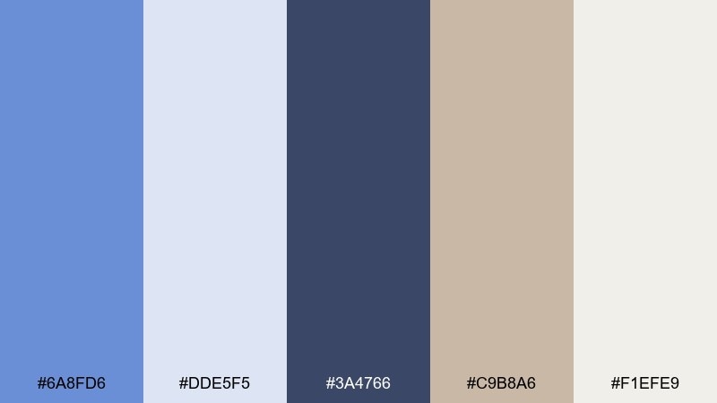
HEX: #6a8fd6 #dde5f5 #3a4766 #c9b8a6 #f1efe9
Mood: grounded and casual
Best for: lifestyle blog theme
Grounded and casual, like worn denim next to sun-faded canvas. Build the page with the off-white and pale blue for an easy reading experience. The slate navy gives structure for navigation, while the warm beige adds a friendly, handmade touch. Tip: use beige for section dividers to avoid heavy lines.
Image example of dusty denim generated using media.io
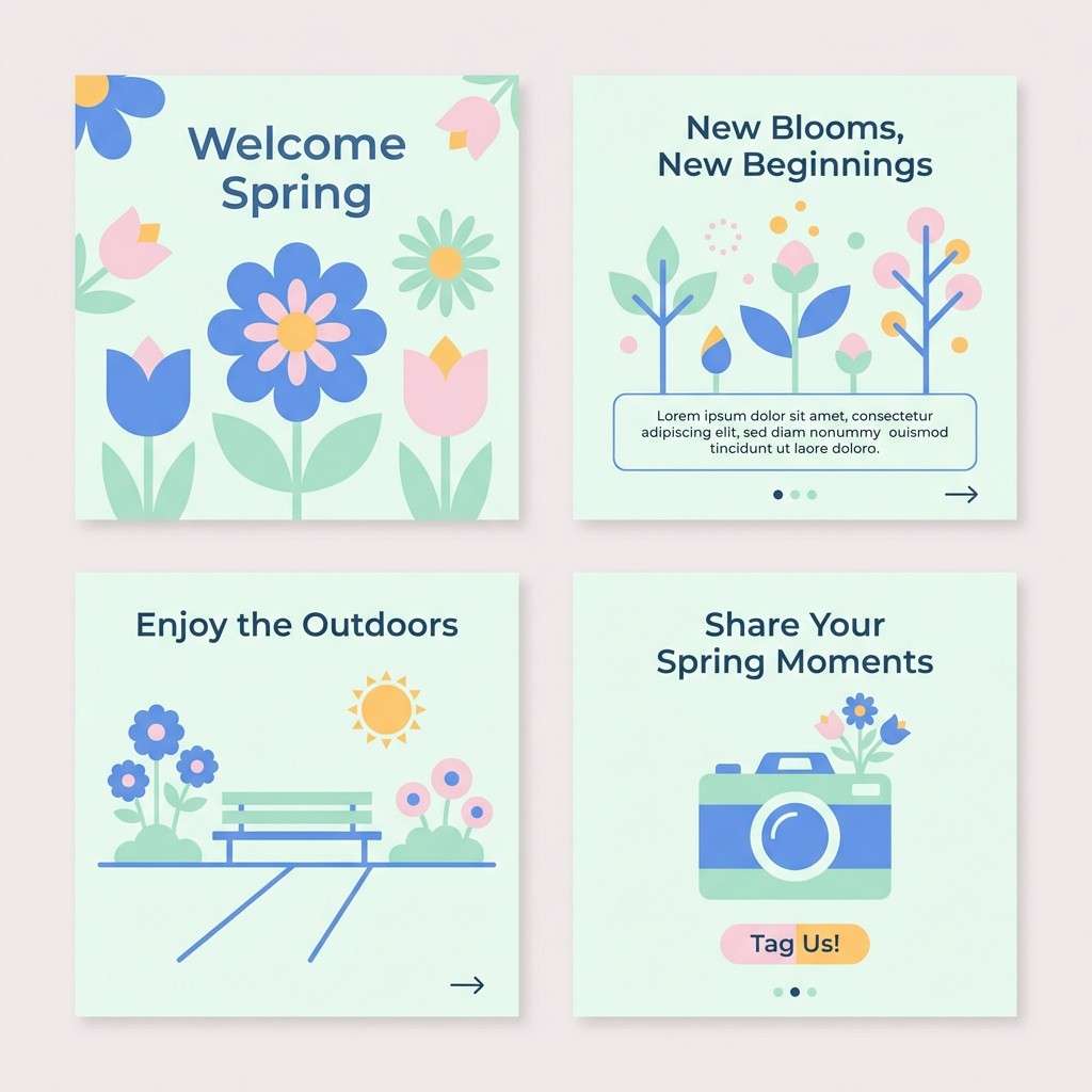
5) Garden Party
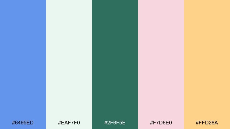
HEX: #6495ed #eaf7f0 #2f6f5e #f7d6e0 #ffd28a
Mood: cheerful and floral
Best for: spring social media carousel
Cheerful and floral, it brings to mind fresh petals, soft sunlight, and a tidy picnic table. Let the blue and mint set the calm base, then layer blush and apricot for friendly calls to action. Deep teal works well for captions to keep everything readable. Tip: use rounded shapes and airy spacing to match the light mood.
Image example of garden party generated using media.io
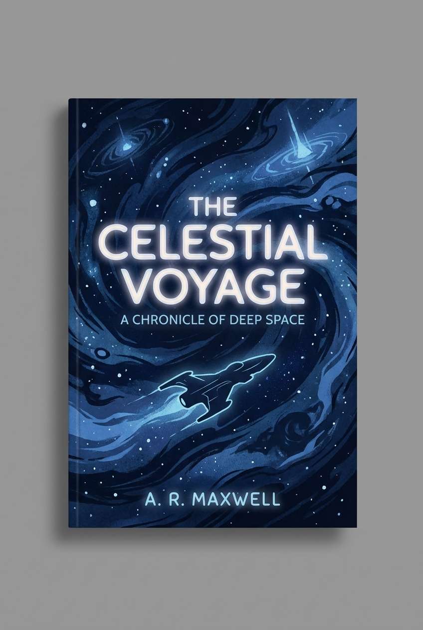
6) Midnight Observatory
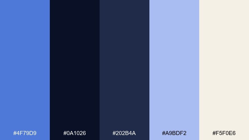
HEX: #4f79d9 #0a1026 #202b4a #a9bdf2 #f5f0e6
Mood: mysterious and cinematic
Best for: sci-fi book cover
Mysterious and cinematic, like a telescope dome opening onto a clear night sky. Use the inky navy as a dramatic field, then bring the brighter blue in for titles and glow effects. The pale lavender-blue works like starlight for subtle gradients and highlights. Tip: keep cream to tiny text or logos so the cover stays nocturnal.
Image example of midnight observatory generated using media.io
7) Nordic Minimal
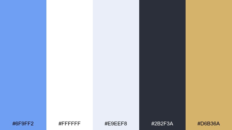
HEX: #6f9ff2 #ffffff #e9eef8 #2b2f3a #d6b36a
Mood: clean and modern
Best for: SaaS dashboard UI
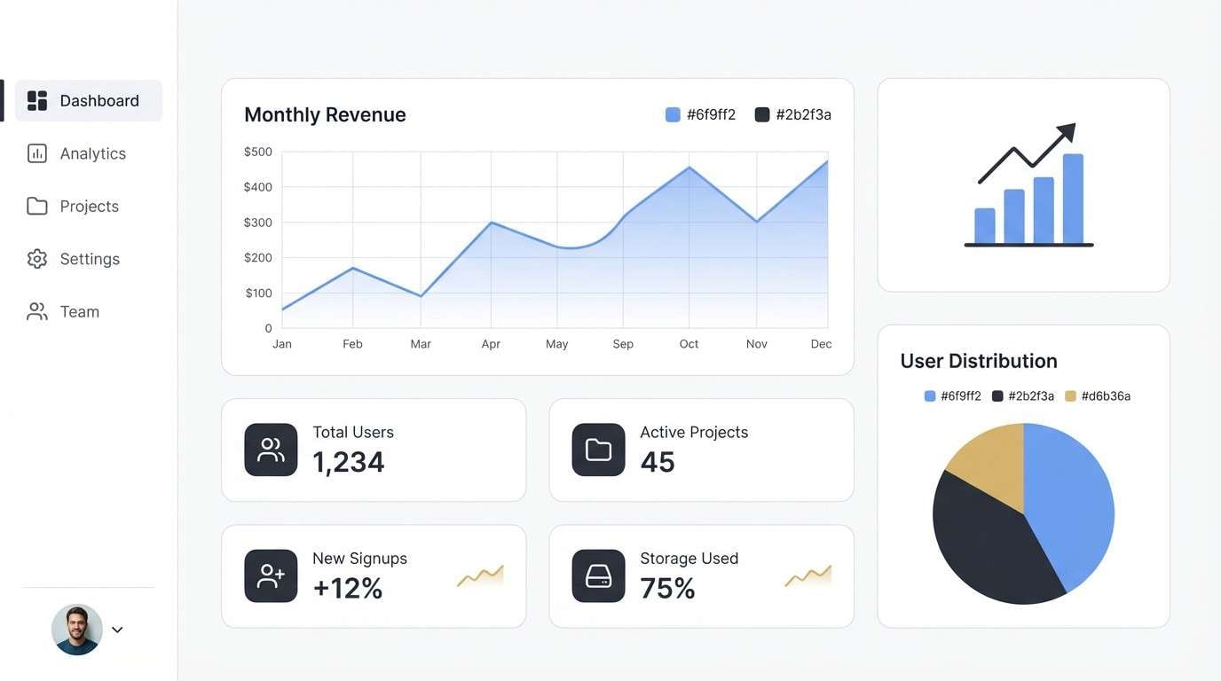
Clean and modern, it feels like winter daylight in a bright Scandinavian studio. The blues work best as calm navigation and chart colors, while white and ice-gray keep interfaces uncluttered. For cornflower blue color combinations that still feel premium, add a muted gold sparingly for highlights and badges. Tip: reserve the dark charcoal for text so the screens stay light.
Image example of nordic minimal generated using media.io
8) Sunset Citrus
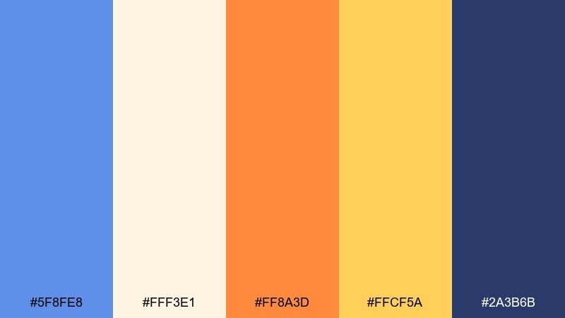
HEX: #5f8fe8 #fff3e1 #ff8a3d #ffcf5a #2a3b6b
Mood: warm and upbeat
Best for: product launch email header
Warm and upbeat, it recalls late sun hitting citrus slices on a bright kitchen counter. Use the cream as a breathable base, then let the blue and navy frame the message for contrast. Orange and golden yellow bring energetic emphasis for new features or limited-time offers. Tip: keep the warm accents in one cluster so the layout feels intentional.
Image example of sunset citrus generated using media.io

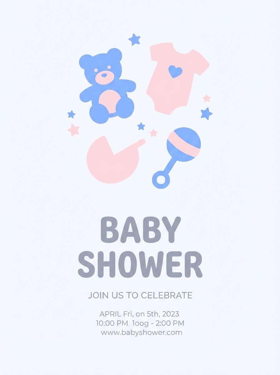
9) Soft Nursery
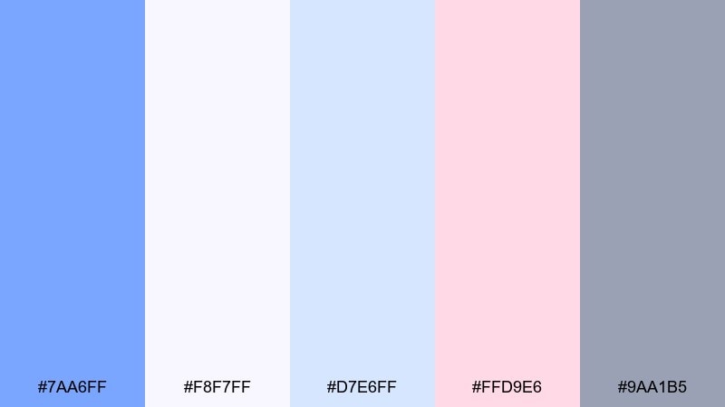
HEX: #7aa6ff #f8f7ff #d7e6ff #ffd9e6 #9aa1b5
Mood: gentle and comforting
Best for: baby shower flyer
Gentle and comforting, like a cloud-painted nursery wall with blush toys and soft blankets. Let the near-white and powder blue do the heavy lifting, then sprinkle pink for warmth and sweetness. The muted gray is perfect for readable details without looking harsh. Tip: choose rounded, friendly type to match the softness.
Image example of soft nursery generated using media.io
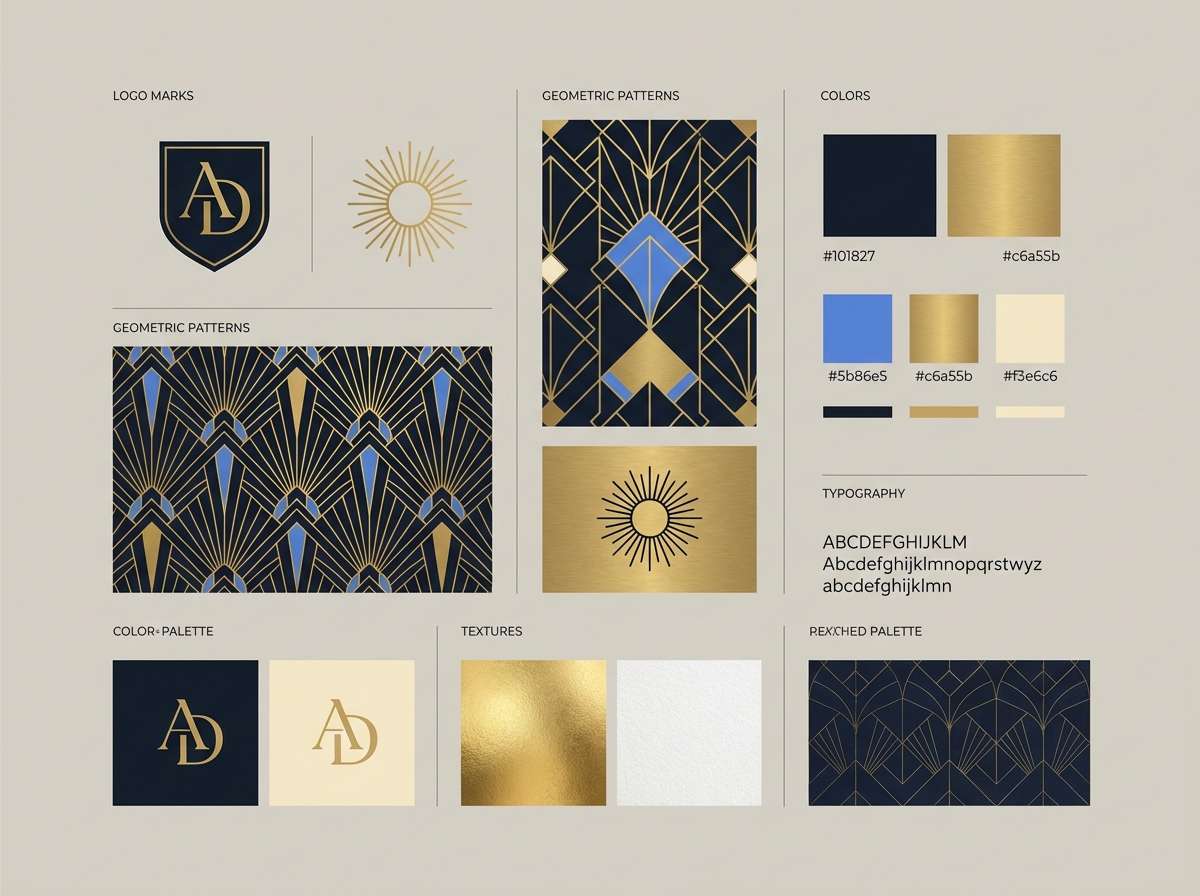
10) Art Deco Hotel
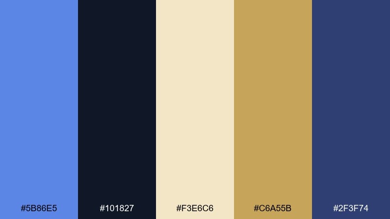
HEX: #5b86e5 #101827 #f3e6c6 #c6a55b #2f3f74
Mood: luxurious and structured
Best for: brand identity moodboard
Luxurious and structured, it feels like a grand lobby with geometric inlays and polished brass. Use the deep navy as a backdrop for gold typography and lines, then bring cornflower blue in as a refined accent for modernity. Cream keeps the set from turning too heavy, especially on print. Tip: lean on sharp symmetry and thin strokes to sell the deco vibe.
Image example of art deco hotel generated using media.io
11) Mountain Lake
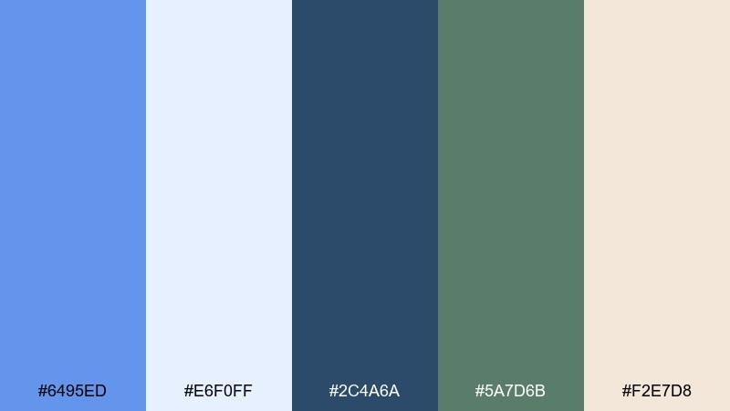
HEX: #6495ed #e6f0ff #2c4a6a #5a7d6b #f2e7d8
Mood: calm and outdoorsy
Best for: nature documentary thumbnail
Calm and outdoorsy, it evokes clear water, distant pines, and a cool breeze off the mountains. Pair the bright blue with evergreen tones for an authentic landscape feel, and use the warm sand neutral to balance the chill. The deep slate makes titles legible on light skies or misty water. Tip: keep saturation moderate so it still feels natural.
Image example of mountain lake generated using media.io

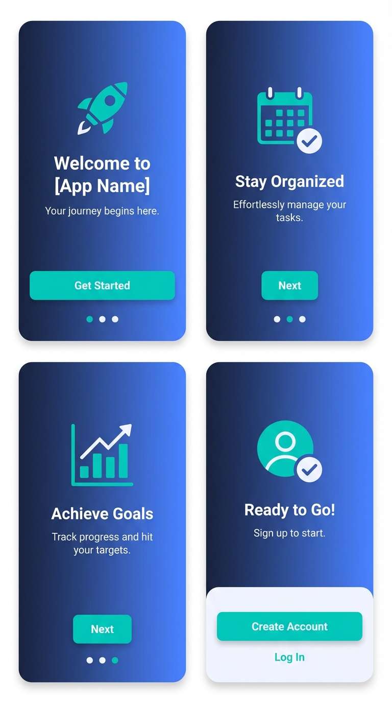
12) Tech Gradient
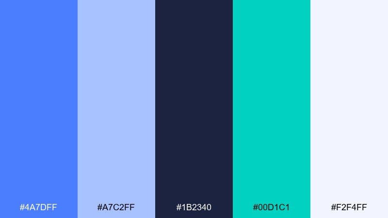
HEX: #4a7dff #a7c2ff #1b2340 #00d1c1 #f2f4ff
Mood: sleek and future-ready
Best for: app onboarding screens
Sleek and future-ready, it reads like glowing gradients over a dark tech canvas. Use the deep blue-black for screen backgrounds, then layer light blues for depth and progress states. The teal brings a crisp, modern accent for primary actions. Tip: keep gradients subtle so text contrast stays accessible.
Image example of tech gradient generated using media.io
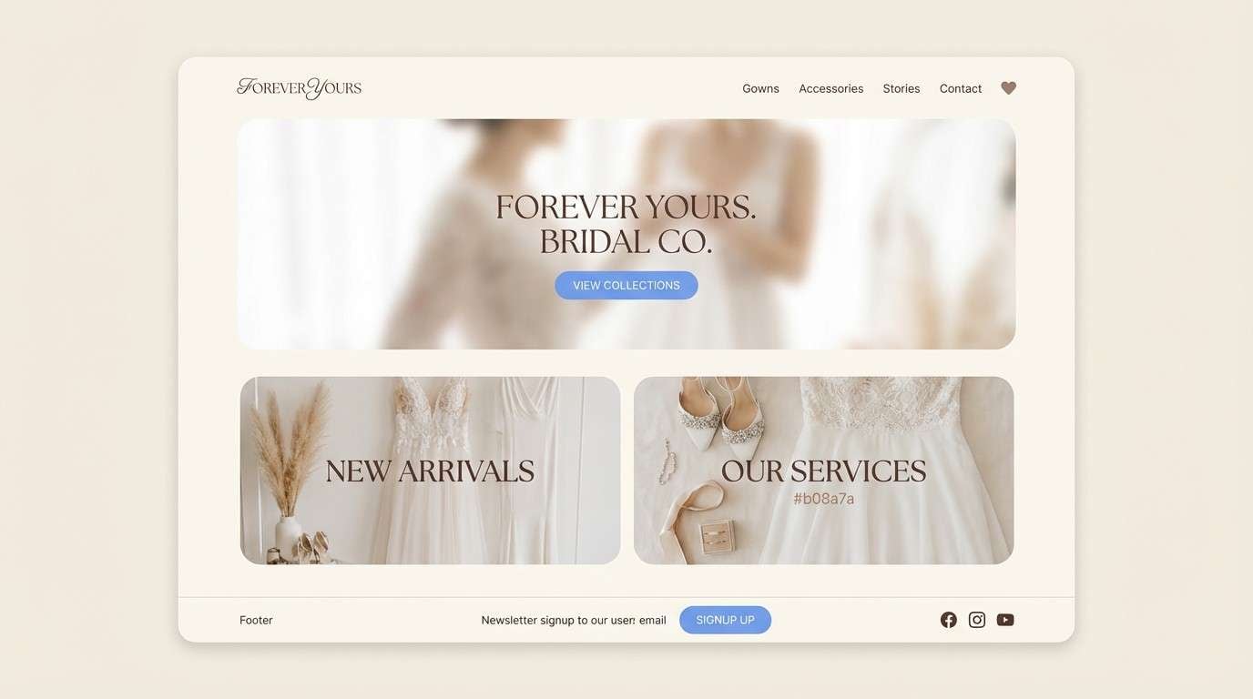
13) Linen and Lace
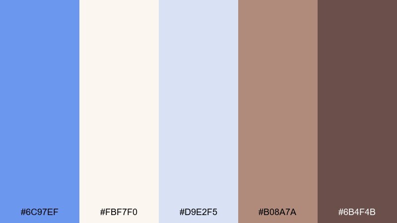
HEX: #6c97ef #fbf7f0 #d9e2f5 #b08a7a #6b4f4b
Mood: romantic and soft
Best for: bridal boutique website
Romantic and soft, it suggests linen texture, lace detail, and a quiet morning glow. Let the cream and pale blue dominate the site so photography feels elevated and airy. Add the warm taupe for buttons and subtle separators, then use the deeper cocoa for headers. Tip: keep shadows faint to preserve the delicate feel.
Image example of linen and lace generated using media.io
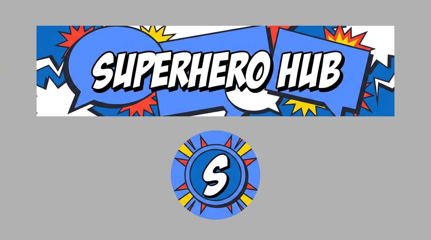
14) Comic Pop
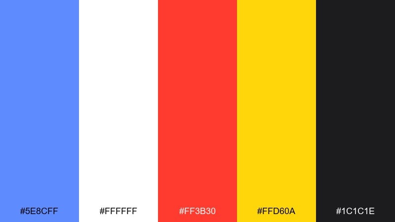
HEX: #5e8cff #ffffff #ff3b30 #ffd60a #1c1c1e
Mood: bold and punchy
Best for: YouTube channel branding
Bold and punchy, it feels like a comic panel with crisp ink lines and shouty headlines. Use the blue as the brand anchor, then deploy red and yellow as attention magnets for stickers and callouts. Black keeps outlines sharp and makes thumbnails readable at small sizes. Tip: limit red to one focal element per tile to avoid visual noise.
Image example of comic pop generated using media.io
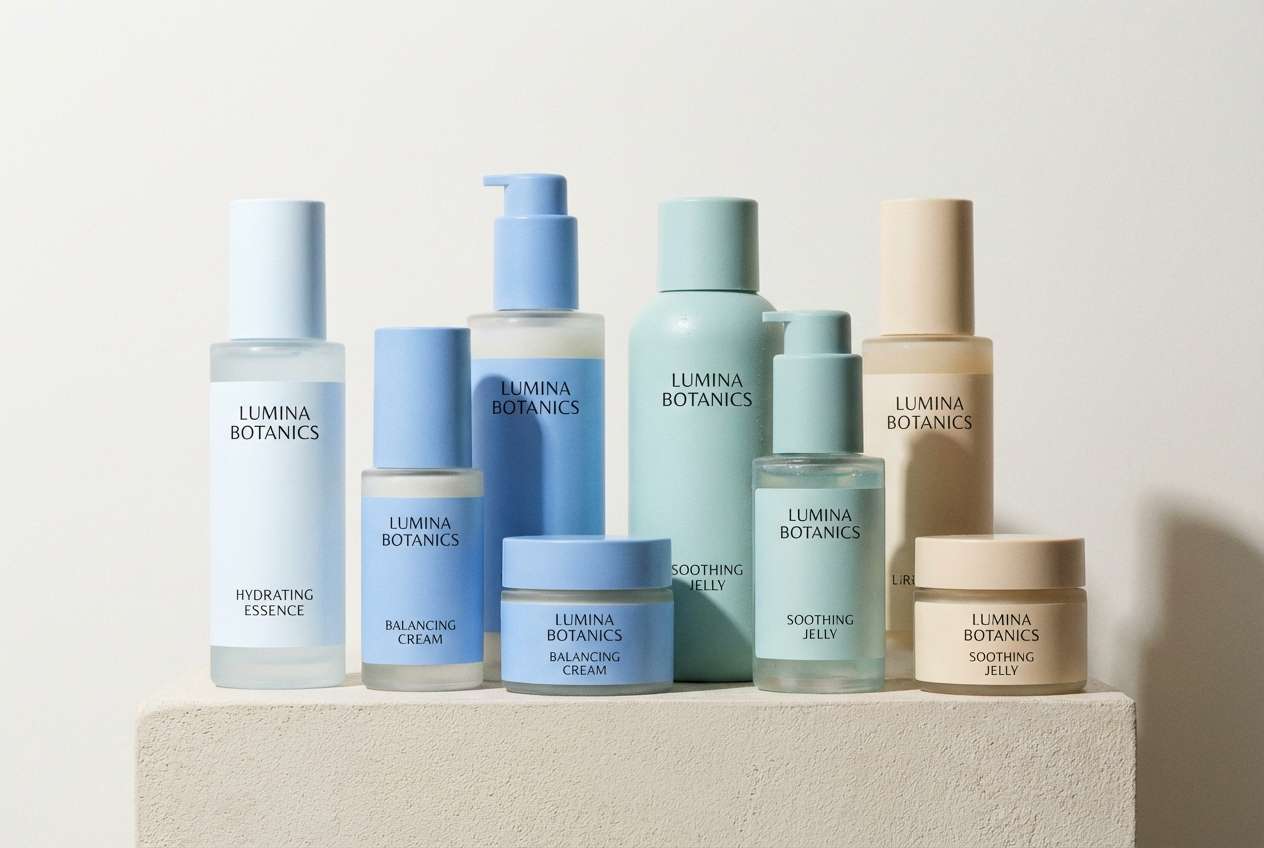
15) Spa Serenity
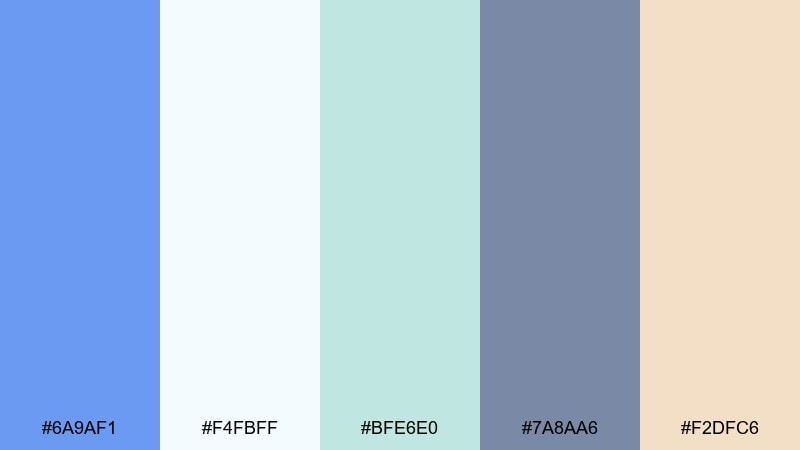
HEX: #6a9af1 #f4fbff #bfe6e0 #7a8aa6 #f2dfc6
Mood: soothing and clean
Best for: skincare packaging
Soothing and clean, it brings up cool water, fresh towels, and quiet spa lighting. Use the icy white-blue as the label base, with cornflower blue for the brand mark and key claims. Seafoam adds a wellness cue, while warm sand keeps the palette human. Tip: choose matte finishes so the colors feel calm, not glossy.
Image example of spa serenity generated using media.io
16) Academic Library
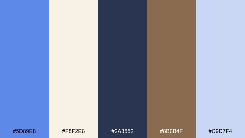
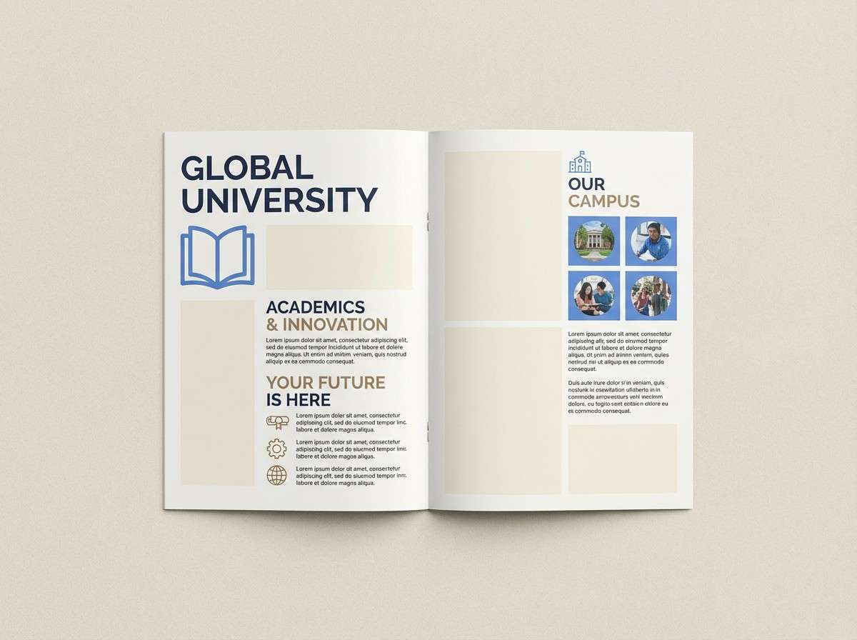
HEX: #5d89e8 #f8f2e6 #2a3552 #8b6b4f #c9d7f4
Mood: scholarly and warm
Best for: university brochure
Scholarly and warm, it feels like hardcover books, cream paper, and quiet study rooms. Let the cream mimic print stock, then use blue for section headers and callouts. The brown works as a grounded accent for icons, rules, and pull quotes. Tip: keep navy for body text blocks to maintain comfortable contrast.
Image example of academic library generated using media.io
17) Tropical Surf
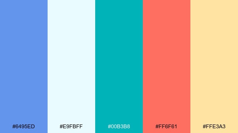
HEX: #6495ed #e9fbff #00b3b8 #ff6f61 #ffe3a3
Mood: bright and beachy
Best for: summer sale banner
Bright and beachy, it looks like surf wax, turquoise water, and coral sunsets. Put blue and aqua on the largest shapes for a cool base, then use coral to drive urgency on prices and buttons. Pale yellow keeps the whole banner sunny without overpowering the blues. Tip: avoid heavy shadows so it stays light and summery.
Image example of tropical surf generated using media.io

18) Winter Frost
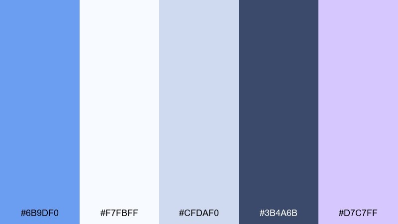
HEX: #6b9df0 #f7fbff #cfdaf0 #3b4a6b #d7c7ff
Mood: icy and quiet
Best for: holiday greeting card
Icy and quiet, it evokes frosted windows and pale twilight over snow. Use the near-white background with cool blues for illustrations, and keep the dark slate for greetings and names. A hint of lavender adds a magical shimmer without turning too sweet. Tip: add subtle grain to avoid flat, sterile whites in print.
Image example of winter frost generated using media.io

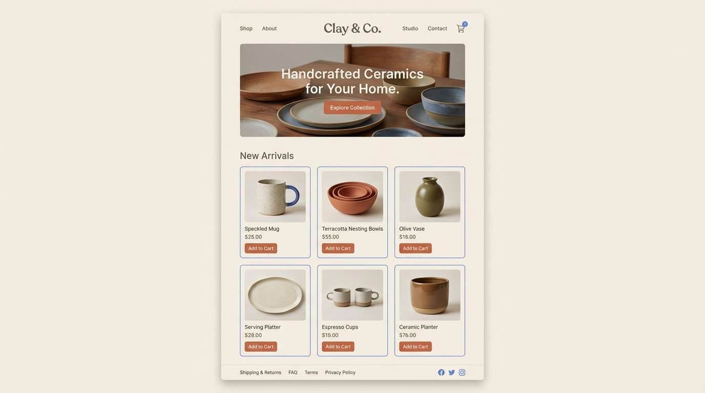
19) Clay Studio
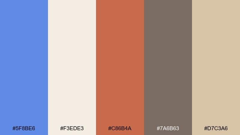
HEX: #5f8be6 #f3ede3 #c86b4a #7a6b63 #d7c3a6
Mood: artisanal and earthy
Best for: ceramics shop product page
Artisanal and earthy, it feels like a pottery studio with terracotta dust and sunlit shelves. Use the warm creams and clays for background and product framing, then bring in the blue for links, badges, and trust cues. Charcoal-taupe keeps text calm and grounded. Tip: pair with natural textures but keep the UI lines thin and clean.
Image example of clay studio generated using media.io
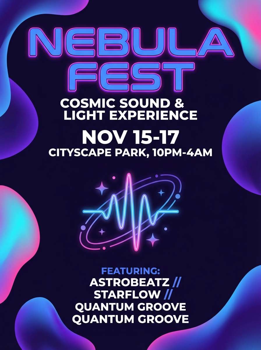
20) Galactic Iris
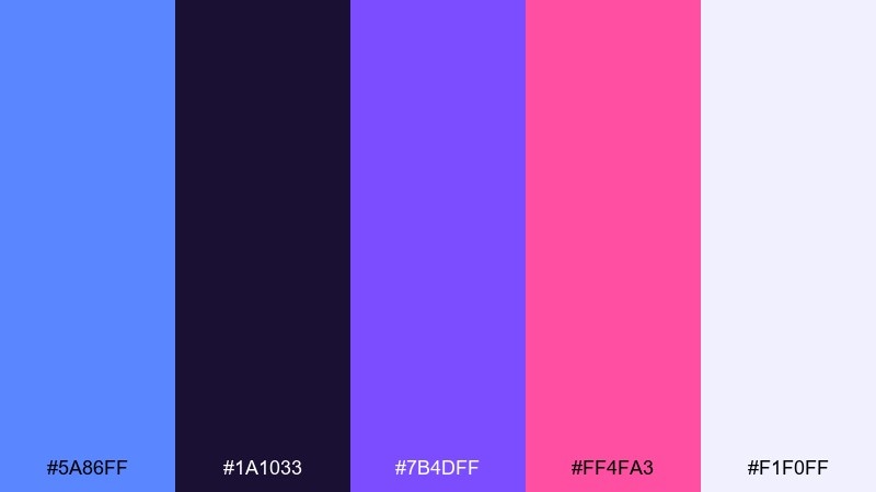
HEX: #5a86ff #1a1033 #7b4dff #ff4fa3 #f1f0ff
Mood: dreamy and cosmic
Best for: festival flyer
Dreamy and cosmic, it suggests purple nebulae with bright blue sparks and a touch of neon romance. Use the deep indigo as your base, then let blue and violet share the spotlight in gradients and shapes. For cornflower blue color combinations that feel modern at night, add hot pink as a small, high-impact accent. Tip: keep body text on the light lavender-white for clarity.
Image example of galactic iris generated using media.io
21) Café Blue Hour
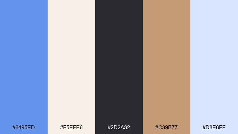
HEX: #6495ed #f5efe6 #2d2a32 #c39b77 #d8e6ff
Mood: cozy and moody
Best for: coffee shop menu
Cozy and moody, it feels like the blue hour outside a café window with warm wood and soft shadows inside. Use cream for the menu base, then set headings in deep charcoal for a premium feel. The warm caramel works perfectly for price highlights and small icons, while the blue adds calm personality. Tip: keep the blue to section titles so the menu stays appetizing and warm.
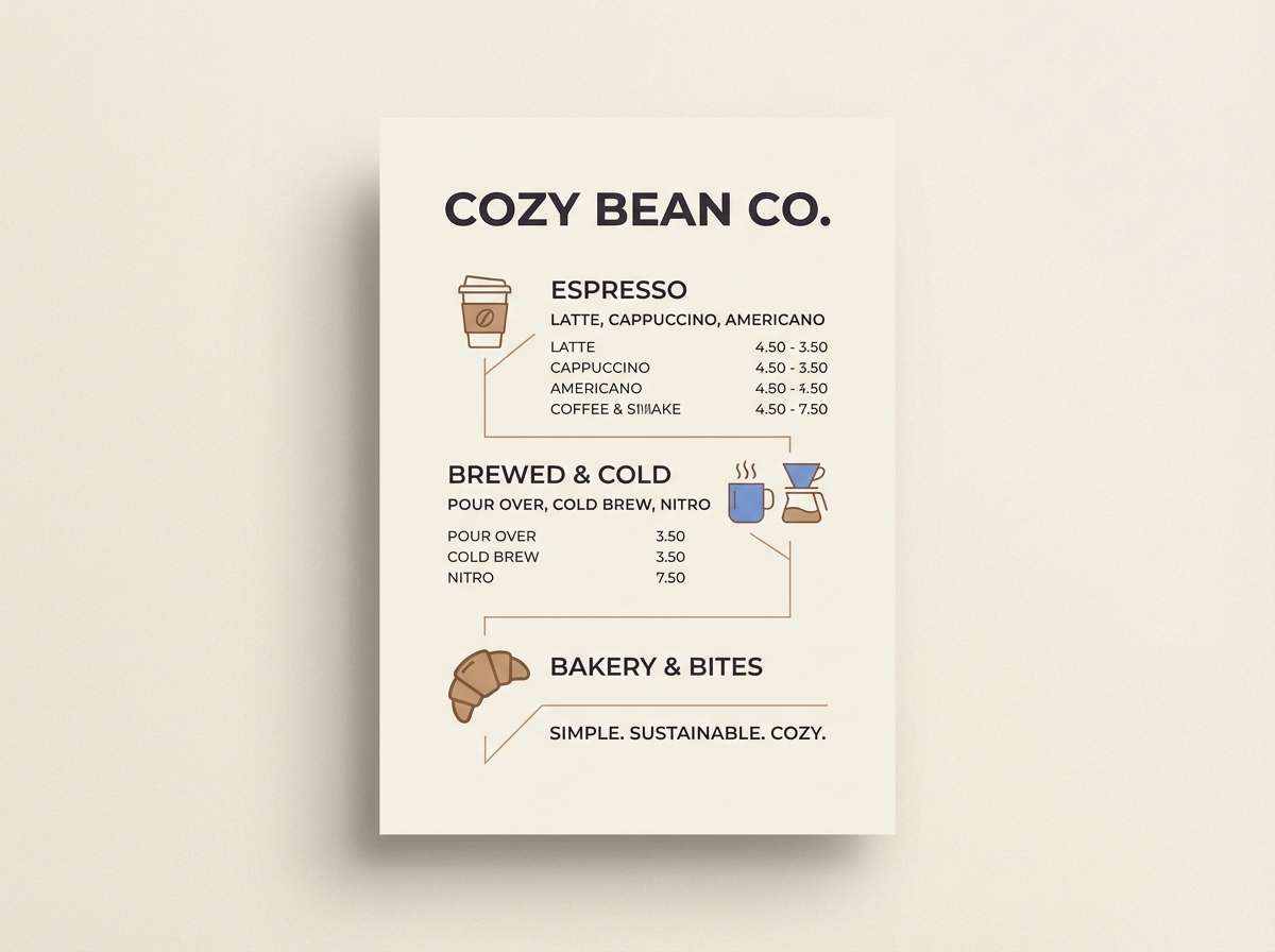
Image example of café blue hour generated using media.io
22) Clean Clinical
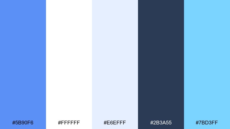
HEX: #5b90f6 #ffffff #e6efff #2b3a55 #7bd3ff
Mood: trustworthy and crisp
Best for: healthcare app UI
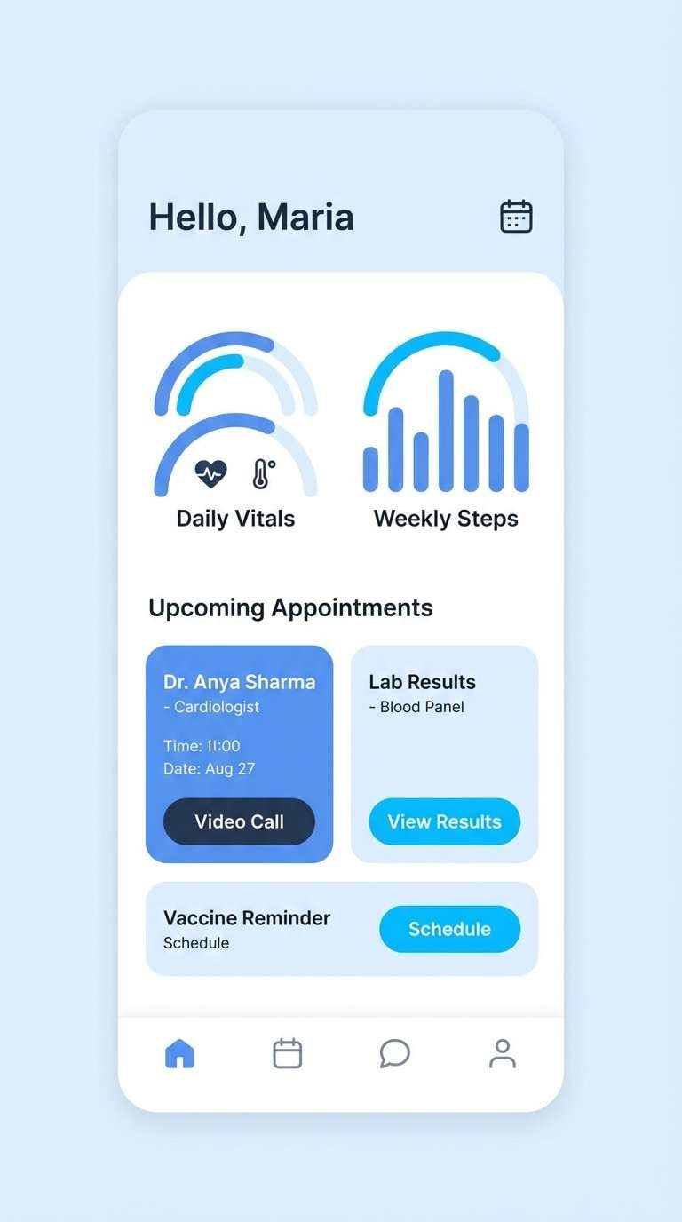
Trustworthy and crisp, it reads like clean corridors, clear charts, and calm reassurance. Use white and pale blue for most surfaces, then rely on deep navy for type and key navigation. The bright sky accent is ideal for success states and friendly highlights. Tip: keep contrast high on form labels to improve accessibility.
Image example of clean clinical generated using media.io
23) Mustard Accent Classic
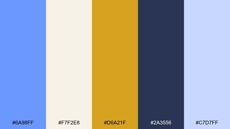
HEX: #6a98ff #f7f2e8 #d6a21f #2a3556 #c7d7ff
Mood: confident and balanced
Best for: startup pitch deck
Confident and balanced, it feels like a sharp blazer with a golden pocket square. Use the cream slides with soft blue fills for charts, then bring in navy for headlines and structure. This cornflower blue color palette gets extra energy from mustard, especially for key metrics and callouts. Tip: keep mustard to one highlight per slide so it stays premium.
Image example of mustard accent classic generated using media.io

What Colors Go Well with Cornflower Blue?
Warm neutrals like cream, ivory, sand, and light taupe soften cornflower blue and make it feel editorial and premium. This is a reliable route for websites, packaging, and print pieces where you want calm clarity.
For contrast and accessibility, pair cornflower blue with deep navy, charcoal, or near-black. Dark anchors keep typography readable and help the blue look more vibrant without needing heavy saturation.
If you want more energy, add a warm accent like peach, coral, orange, or mustard. Use those brights as small “signal” colors (buttons, badges, highlights) so the palette stays balanced.
How to Use a Cornflower Blue Color Palette in Real Designs
Start with role assignment: choose one light neutral for backgrounds, a dark tone for text, and let cornflower blue be your primary brand/UI color. This structure prevents “too much blue” while keeping the theme cohesive.
In UI, use cornflower blue for interactive states (links, primary buttons, focus rings) and keep large surfaces closer to white, ice gray, or pale blue. You’ll get a clean, modern feel while maintaining contrast for readability.
In print, test how the blue reproduces on your chosen stock—uncoated paper can mute blues nicely, while glossy finishes amplify brightness. Adjust saturation slightly if the blue shifts too purple or too cyan in production.
Create Cornflower Blue Palette Visuals with AI
If you already have HEX codes, you can turn them into instant mockups—posters, brand moodboards, landing pages, packaging, and more—by generating styled visuals that match your palette.
Use your palette name as the concept, then paste the colors into your prompt (or describe them) and specify an aspect ratio that fits your use case, like 16:9 for hero sections or 3:4 for flyers.
With Media.io’s text-to-image, you can iterate quickly: adjust contrast, add negative space, or swap accents (like mustard vs coral) until the design feels right for your brand.
Cornflower Blue Color Palette FAQs
-
What is the HEX code for cornflower blue?
A common digital reference for cornflower blue is #6495ED. In practice, many palettes use close variations (slightly lighter or deeper) depending on contrast and brand tone. -
Is cornflower blue warm or cool?
Cornflower blue is generally a cool color, but it has a soft, slightly violet-leaning feel that can seem less “icy” than brighter cyan blues. -
What colors complement cornflower blue best?
Great complements include warm neutrals (cream, sand, beige), deep anchors (navy, charcoal), and warm accents like peach, coral, orange, or mustard for emphasis. -
Can I use cornflower blue for UI design?
Yes—cornflower blue works well for buttons, links, navigation states, and charts. Keep backgrounds light and reserve dark tones for text to maintain accessible contrast. -
How do I keep a cornflower blue palette from feeling childish?
Pair it with navy/charcoal and muted neutrals, and use bright accents sparingly. Matte finishes and restrained typography also make the palette feel more premium. -
What’s a good accent color for cornflower blue in branding?
Mustard is a standout accent because it adds warmth and confidence without clashing. Coral/peach works for friendly CTAs, while muted gold reads more luxury. -
How can I generate palette mockups from these HEX codes?
Use an AI generator like Media.io: include your HEX codes in the prompt, describe the design type (poster, dashboard, packaging), and set an aspect ratio so outputs match your layout needs.
Next: Mustard Color Palette


